I(m)PRESS:
THE ROLE OF ARTISTS’ BOOKS IN THE RELATIONSHIP
BETWEEN BODY AND EXPERIMENTAL TYPOGRAPHY
A Master’s Thesis
by
ŞEYDA GÜNÖNÜ
Department of Communication and Design İhsan Doğramacı Bilkent University
Ankara May 2017
I(m)PRESS:
THE ROLE OF ARTISTS’ BOOKS IN THE RELATIONSHIP BETWEEN BODY AND EXPERIMENTAL TYPOGRAPHY
The Graduate School of Economics and Social Sciences of
İhsan Doğramacı Bilkent University
by
ŞEYDA GÜNÖNÜ
In Partial Fulfillment of the Requirements for the Degree of MASTER OF FINE ARTS
THE DEPARTMENT OF COMMUNICATION AND DESIGN İHSAN DOĞRAMACI BİLKENT UNIVERSITY
ANKARA May 2017
ABSTRACT
I(m)PRESS:THE ROLE OF ARTISTS’ BOOKS IN THE RELATIONSHIP BETWEEN BODY AND EXPERIMENTAL TYPOGRAPHY
Günönü, Şeyda M.F.A., in Media and Design Supervisor: Assist. Prof. Andreas Treske
May 2017
The aim of this project is to approach the relationship between body and artists’ books in the context of an autobiographical narrative. This thesis questions the role of
artists’ books in the relationship between body and experimental typography. It investigates why artists prefer to tackle with body issues on artists’ books and how artists implement their reflections on artists’ books. This thesis is accompanied with the installation, which is called I(m)Press. This installation demonstrates a self-reflection about conversations which I received from various people about my body. The installation is the result of a response toward words from conversations. These words are projected on hanging papers by two channels video, which is composed of a recorded reaction against words by my body.
ÖZET
Baskı(yım):BEDEN VE TİPOGRAFİ İLİŞKİSİNDE SANATÇI KİTAPLARININ ROLÜ
Günönü, Şeyda
Yüksek Lisans, İletişim ve Tasarım Bölümü Tez Yöneticisi: Yrd. Doç. Andreas Treske
Mayıs 2017
Bu tezin amacı otobiyografik anlatıcı kapsamında beden ve sanatçı kitapları ilişkisinde yaklaşımda bulunmaktır. Bu tez, sanatçı kitaplarının rolünü beden ve deneysel tipografi çerçevesinde rolünü sorgulamaktadır. Neden sanatçıların beden meselesini sanatçı kitaplarında ele aldığını ve sanatçıların sanatçı kitaplarına bu konuyu nasıl yansıtıp uyguladıklarını inceler. Bu tez Baskı(yım) adlı enstalasyon çalışması ile desteklenmektedir. Enstalasyon, farklı insanlardan bedenim hakkında yapılan konuşmaları öz yansıtma olarak göstermektedir. Enstalasyon, konuşmalardaki sözcüklere karşılığının sonucudur. Bu sözcükler asılmış kağıtlara bedenimle
sözcüklere karşı vermiş olduğum tepkinin, kaydedilmiş videosu iki kanaldan yansıtılmaktadır.
ACKNOWLEDGMENTS
First of all, I would like to thank my thesis advisor Assist. Prof. Andreas Treske for his contribution on my thesis and my project. Also, I would like to thank Assist. Prof. Marek Brzozowski who pushed my limits for my project in order to find my voice. I would also like to thank Assist. Prof. Ersan Ocak to contribute on my project.
Furthermore, I would like to thank Assist. Prof. Ece Akay Şumnu for accepting to be on my thesis committee and her appreciation for my project. I also would like to thank members of our meetings and the rest of people who contribute to develop my ideas through accomplishing this project.
Lastly, I thank my friends who are with me with their words to move forward on my thesis and project. Last but not least, I am so happy to be the part of my family who always courage and support me passionately.
TABLE OF CONTENTS
ABSTRACT...iii ÖZET...iv ACKNOWLEDGMENTS...v TABLE OF CONTENTS...vi LIST OF FIGURES...viii CHAPTER 1. INTRODUCTION ...1CHAPTER 2. CONCEPTUAL FRAMEWORK...4
2.1. The Definition of the Artist’s Book...4
2.2. The Role of Artists’ Books...8
2.3. Perception of Body in Artists’ Books...13
2.4. Materiality in Artists’ Books...19
CHAPTER 3. EXPERIMENTAL TYPOGRAPHY...25
CHAPTER 4. THE PROJECT: I(m)PRESS...38
4.1. Development Process of The Project...38
4.2. Artist’s Statement...69
4.3. The Installation...70
CHAPTER 5. CONCLUSION...77
A. APPENDIX A...87 B. APPENDIX B...89
LIST OF FIGURES
1. Ed Ruscha. Twentysix Gasoline Stations. 1963, 3rd edition 1969. [photo]....10
2. Susan Joy Share. Carrots Anyone?. 1999. [Photo from The Book as Art]...14
3. Ana Maria Devis. Partitura. 2003. [Photo]...16
4. Susan King. Treading the Maze, an Artist’s Book of Daze. 1993. [Photo from The Book as Art]...17
5. Muriel Prince. From Acapulco to Ovarian Ablation. 2005. [Photo from The Bonefolder: an e-journal for the bookbinder and book artist Vol.4(2)]...18
6. Lise Melhorn-Boe. A Sad Little Girl. 1995. [Photo] ...21
7. Richard Minsky. Freedom of Choice. 2009. [Photo] ...22
8. Richard Minsky. Freedom of Choice. 2009. [Photo]...23
9. Theo van Doesburg. A poster for ‘Dada Matinée. 1923. [Photo]...26
10. Filippo Marinetti. Une assemblée tumultueuse (A Tumultuous Aseembly). 1919. [Photo]...28
11. Tristan Tzara. Une Nuit d’Echecs Gras. 1920. [Photo from The Visible Word] ...29
12. El Lissitzky. Book cover for The Isms of art. 1924. [Photo]...31
13. Theo Van Doesburg. Cover for Klassiek, Barok, Moderne. 1920 [Photo]...32 14. Laszlo Moholy-Nagy. Proposed title page from Broom. 1923 [Photo from
15. David Carson. Ray Gun Magazine. August 1988. [Photo]...35
16. Lawrence Weiner. Blue Moon Over. 2001. [Photo]...36
17. Şeyda Günönü. Gittikce kilo ali… 2016. [Photo]...43
18. Wei Lin Yang. Stream of consciousness. 2011. [Photo]...44
19. Jaume Plensa. Spiegel. 2010. [Photo]...45
20. Bronia Sawyer [Photo] ...45
21. Park Chan-Girl [Photo]...45
22. Die Kelten. Augmented Reality Book. [Video still]...47
23. Şeyda Günönü. A Sketch. [Photo]...48
24. Lorenzo Nanni. Textile design. [Photo]...49
25. Anish Kapoor. Fold, I. 2014. [Photo]...50
26. Jennifer Hines. Skin. 2004. [Photo from the 500 handmade books]...51
27. Heather Crossley. Ti. 2006. [Photo from the 500 handmade books]...52
28. Jenna Marie David. Labyrinth. [Photo]...53
29. Şeyda Günönü. A project idea. [Photo]...53
30. Şeyda Günönü. An idea for the project. [Photo]...54
31. Şeyda Günönü. The prototype of the idea of a loop installation. [Photo]...56
32. Şeyda Günönü. The prototype of the idea of a loop installation. [Photo]...56
33. Şeyda Günönü. The prototype of the idea of a loop installation with projector. [Photo]...57
34. Şeyda Günönü. The prototype of the idea of a loop installation when it fell down.[Photo]...58
35. Peter Gentenaar. Paper Sculptures. [Photo]...59
36. Megan Bostic. I’m Writing This Letter. 2011. [Photo]...60
38. Şeyda Günönü. A small scale paper attempt. [Photo]...62
39. Şeyda Günönü. Making the first demo paper. [Photo] ...63
40. Şeyda Günönü.The first real size paper with Mr. Brzozowski. [Photo]...64
41. Şeyda Günönü. The progress of making papers. [Photo]...65
42. Şeyda Günönü. Gittikçe. [Video still]...66
43. Şeyda Günönü. Ver. [Video still]...66
44. Şeyda Günönü. Merhaba. [Video still]...67
45. Şeyda Günönü. Verirsin. [Video still]...67
46. Şeyda Günönü. O. [Video still]...68
47. Şeyda Günönü. Tut. [Video still]...68
48. Şeyda Günönü. First draft for the placement of the work. [Photo]...70
49. Şeyda Günönü. Revised draft for the placement of the work. [Photo]...71
50. Şeyda Günönü. Revised draft for the placement of the work. [Photo]...71
51. Transporting papers to the university. [Photo]...72
52. The team of the construction. [Photo]...73
53. The ceiling construction. [Photo]...73
54. The projector’s placement. [Photo]...74
55. The placement of projectors. [Photo]...75
56. The view of the installation from the back side. [Photo]...76
57. The view of the installation. [Photo]...76
58. The exhibition. [Photo]...87
59. The exhibition. [Photo]...87
60. The exhibition. [Photo]...88
CHAPTER 1
INTRODUCTION
It is always the body which has a considerable impact in my life. The image of my body has created most of the problems in my life. Furthermore, I have kept this difficulty of mine as a secret and never showed it to the people who are not really close to me. The reason is that this subject is my weakness, and nobody desires to show the weakest part of themselves. Although people have talked about my body, I did not stop their talking because they might have been seen my fragility side. On the other hand, this secret part of mine is a fundamental part of my thesis, and even this secret is demonstrated as an installation which is a shifting period in my life. It was not easy for the first time I have talked about my problem about my body in order to create an artwork for the first semester of the master program, but this was a
necessary for my previous project because the body is all my concern. As the time went by I get used to create something about my apprehension around my appearance. Nevertheless, this subject of the thesis was not my first choice because I escaped from creating something again about my body, but I could not escape any more. My body itself becomes my subject. My body is not just about physical but also psychological.
The thesis project I(m)Press is the reflection of my cumulative years of receiving every word about my body. In addition, the title I(m)Press comes from words “imprint” and “impression” which are related to the psychological effect of the pressure coming from people’s words. This is an installation which is the narrative of myself. The project is the result of research on artists’ books in the scope of the body and experimental typography. My very first idea for the thesis project was to create an artist’s book. Nonetheless, it turned out that the installation is my voice.
Notwithstanding the installation, the project has progressed within the light of the research of artists’ books. The aim of the thesis is formed with the words of Audrey Niffenegger,
To make books is to create physical form for ideas. All artists do this, of course. But the book has been the body of human thought for many centuries, and when we make unusual books, artists’ books, we are messing with that body (as cited in Wasserman, 2007:13).
Messing with the body of human thought within the body of books was the compelling side for my thought. In addition, Tony Godfrey words pushed me to consider “It has been women above all who have turned the camera on themselves and the image back on viewer.” (as cited in Wasserman, 2007:22). Therefore, the objects of the thesis are why artists choose to make artists’ books in the context of the body image or identity rather than other mediums, and how artists approach these subjects to create artists’ books.
Before creating a thesis project on the intention of the body, the research and the project ideas for this thesis were begun with the consideration on typography. My main interest is always typography, and this interest lead me to make something in this particular area. Therefore, for my thesis project, creating something within the
context of typography was a desire for me. However, before the I(m)Press, my other project ideas were not actually corresponding to typography. Therefore, I received a suggestion to make an artist’s book with an efficient way of the usage of typography. My aim was not to create a new shape for letters, it was to tell something bothers me through letters. There are a lot of things to consider by myself, but one thing that always limits me is my body and my appearance. As it mentioned the above, the body became my subject in order to tell through letters because this is the best thing, which is an essential consideration and knowledge for myself, to reflect all my feelings as a powerful narrative.
My determination to concentrate on experimental typography was combined a desire with an autobiographical narrative. The manipulation of the visual form of the language demonstrates and approaches the manipulation of thoughts because of the statements about my body. Since experimental typography provides the connection between literariness and visual presence, this particular field offers me endless experimentation and acting through the process of creating.
CHAPTER 2
CONCEPTUAL FRAMEWORK
2.1. The Definition of the Artist’s Book
When someone asks about how you define art, the answer always contains a lack of satisfaction and explained parts because there is not one answer for this specific question, on the contrary, various explanation and thoughts have been developed for years.
“What ‘s art?” is a troubled and seriously contested question, as we all know.
Troubled questions are music to philosophers’ ears, grist for their mills. The “What is art?” industry certainly is humming along. But the question is problematic in ways that make it ill-suited to define the identity of a major field of philosophy. It is not at all clear that these words —“What is art?”—express anything like a single question, to which competing answers are given, or whether philosophers proposing answers are even engaged in the same debate (Walton, 2007: 148).
Since there are endless thoughts for the question “What is art?”, defining an artist’s book is not straightforward to explain as the definition of art.
Dianne Perry Vanderlip is the first person who used the term of ‘Artists’ Books’ for the title of a catalog which Richard Hamilton, David Hockney, Dieter Roth, Ed Ruscha and other artists’ book works exhibited at Moore College of Art in
Sciascio, 2010:14) indicates that arguments on the usage of apostrophe of ‘Artists’’ is not concluded. In order to serve the concept of artists’ books, the following terms are also used: artists books (without an apostrophe), book as art, book art, bookworks and so forth. Kostelanetz (as cited in Rossman, 2003) specifies the term of book art:
There is a crucial difference between presenting an artist's work in a book form – a retrospective collection of reproductions – and an artist making a book. The first is the honorific art book. 'Book art' should be saved for books that are works of art, as well as books.
Along with the description above, Phillpot (1998:33) differentiates “artists’ books” from “bookworks” by explaining that artists’ books are authored books and booklets by artists, and bookworks are artworks in book form. Furthermore, he adds that artists as makers and as citizens integrate their preoccupations and sensibilities on their artists’ books. This viewpoint on artists’ books is a crucial point to me. Artists take shape from ideas of their environment, lifestyles, thoughts or visions. In addition, sensitivities of artists are also taken forms through countries they are resident. In the scope of this situation, it is unavoidable that artists’ creates their artists’ book in the shape of apprehensions and sensitivities which are taken shape by their environment.
The term livre d’artiste occurs most of papers and books when I research about the definition of artists’ books. The meaning of livre d’artiste is the term of artists’ books in French. In the book of The Century of Artists’ Books by Johanna Drucker
highlights the term livre d’artiste. In the light of this book, the Parisian art dealer Ambroise Vollard produced the early type of the usage of the artist’s work in a book format in the mid-1890’s. This new form has served as a new market in order to display visual arts, poets and artwork in an unconventional and sophisticated way (Drucker, 1995:2). Consequently, livre d’artiste has become a marketing strategy for
bourgeois which publishers established a new approach to luxury market to serve works of art. These books were unique with their image and visual based pages, binding methods were upgraded, and materials had high quality. Even though, livres d’artistes developed for the market, every market did not have them because they were not affordable pieces (Rossman, 2003). At this point, Drucker emphasizes that livre d’artiste separates from the meaning of artists’ books (Drucker, 1995:3).
In one of the Oregon Humanities Center series, Barbara Altman made an interview with Johanna Drucker, and she shared her knowledge on livre d’artiste and artists’ books in the light of her book The Century of Artists’ Books. Drucker (2010) makes a distinction between livres d’artiste and artists’ books as clarifying that livres d’artistes are produced by publishers not artists, but artists create visuals or texts in that book. Although livres d’artistes have qualified thick papers, fine binding, and typographic arrangement around visuals, they do not serve the purpose of artists’ books which have a separate scope from them. The contradiction between two type of classification is not limited only the separation above. Another point of this distinction is the
relationship between an artist and a writer within the frame of livre d’artistes. As the strategy of livres d’artistes are mentioned above for market, the outcome of the livre d’artiste is a collaboration between a writer and an artist (Drucker, 1995:3). Editors of publishing houses make arrangements accompanied with particular backgrounds, literature and visual arts, in order to represent a unique form of books in those specific times as market productions. Correspondingly, the producer of the product is not the artist is but visionary.
As a result of the summary of the differentiation between livres d’artistes and artists’ books, Drucker illustrates what artists’ books mean and do not mean, and how the format of artists’ books can be defined and cannot be defined. Hence, Johanna Drucker (1995:10) defines artists’ books as clarifying that:
Artists' books take every possible form, participate in every possible convention of book making, every possible "ism" of mainstream art and literature, every possible mode of production, every shape, every degree of ephemerality or archival
durability. There are no specific criteria for defining what an artist's book is, but there are many criteria for defining what it is not, or what it partakes of, or what it distinguishes itself from. In mapping out this initial definition my intention has been to demonstrate the incredible richness of artists' books as a form which draws upon a wide spectrum of artistic activities, and yet, duplicates none of them. Artists' books are a unique genre, ultimately a genre which is as much about itself, its own forms and traditions, as any other art form or activity. But it is a genre as little bound by constraints of medium or form as those more familiar rubrics "painting" and "sculpture" which also cover a tremendous range of activity.
Furthermore, Drucker (2010) emphasizes the significant shift from early centuries which artists access to the mean of the production and engage the production of their own work directly. Consequently, the mean of the book production has changed the way its meaning uniquely within in the frame of artist’s book.
Another definition from Dick Higgins (as cited in Greer, 2009:15) summarizes general lines of artists’ books:
… a book done for its own sake and not for the information it contains. That is: it doesn’t contain a lot of works, like a book of poems. It is a work. Its design and format reflect its content [...] The experience of reading it, viewing it, framing it, - that is what the artist stresses in making it.
Definitions on artists’ books are continuous as long as artists’ engage and desire to create artists’ books. Regardless of the fact that the ideal term of artists’ books has not been concluded, the concept of artists’ books is comprehensive in order to experience with them.
2.2. The Role of Artists’ Books
There is no doubt that books have been evolved their forms through the development of printing machines and letterpress techniques. In addition, the Arts and Crafts movement supported the alteration of books. In the late nineteenth century, publishers expanded traditional books format into livres d’artiste as mentioned in the previous section. Therefore, the change of the image and text relation and the usage of the typography on books can be observed in livres d’artiste. Moreover, artists were associated with the books, not completely, but in order to produce visuals of these specific books. Hence, livre d’artiste has gained recognition with the reputation of artists like Picasso, Matisse and other cubist artists (Drucker, 1995:2).
The situation where artists were not producers of books was changed, and artists had not just producers of visuals, but they became authors, artists and creator of books. Perrée claims this alteration between text and visual in the following:
It is certainly clear that literature and visual art, text and image had made serious incursions into one another’s territories prior to 1920. It was a reunion, in fact, if one recalls that even before the Middle Ages, in the many hand-written and hand-illustrated religious volumes, the bond between text and image was experienced as perfectly normal. One may debate whether it was now a union or reunion, but in the first two decades of the 20th century, the first ‘artists’ books’ were produced, paving a solid and normal foundation so that as a medium in its own right, books by artists could develop and expand from there (2002:16). Also, Strizever confirms that around Carrion’s thought: “The difference between creating text and making a book is the consciousness of the writer/artist and reader about the physical and formal structure of the work (2010:18).”
a way for artists’ books (Drucker, 1995:7). Before this book, there were plenty of artists’ books. However, they were not concretized as a specific name. The reason Ruscha’s book is an icon among the artists’ books is that Ruscha created his book along with the definition and embodying the artist’s book (Drucker, 1995:7).
Furthermore, the other reason is time. In the 1960s, art, politics, and new formations were changing, and conceptualism was rising. In parallel with all transformation, definitions were expansed (Wallis, 1998:94). Donald Judd emphasized the entire possibilities of art in 1966 as claiming that “If someone says his work is art, it’s art.” (as cited in Lauf & Phillpot, 1998:94). Along with that, Drucker also analyses the artist’s books and its format’s fitting into the sixties, “They fit the sensibility of the 1960s alternative scene, whether produced independently by artists or by galleries as an extension of an exhibition, also giving rise to the hybrid genre of the catalogue as artist's book.” (Drucker, 1995:8).
Figure 1. Ed Ruscha. Twentysix Gasoline Stations. 1963, 3rd edition 1969. [photo] Retrieved from: http://www.tate.org.uk/about/projects/transforming-artist-books/summaries/edward-ruscha-twentysix-gasoline-stations-1963
The significant feature of artists’ books is the hybrid form, so they can consist of various medium in the frame of the book such as sculpture, installation, hypertext, printmaking techniques and so forth (Strizever, 2010:17). As well as Hubert identifies the multiplicity of artists book, “Like other postmodern genres, such as installations, artists’ books allow, and even require, versatility in the use of materials; and, by virtue of their built-in complexity, encourage intertextuality as well as
multimedia experimentation.” (1999:7). The capacity of artists’ books, which have a malleable format, shows that artists’ books reflect the complexity of thoughts rather than other mediums, and Drucker adds:
Where painting or traditional sculpture have recently been perceived as moribund signs of the outmoded artisanal tradition, books remain viale,
mechanical reproduction, the multiple, the non-unique and non-auratic object in a way which was not conceptually legitimate in the art world before the 20th century. Rare, affordable, unique, or banal, books are a major staple of the artworld - as yet uncanonized and marginal, but omnipresent (2007:363).
Lucy R. Lippard summarizes the role of artists’ books with these words, “Inexpensive in price, modest in format, and ambitious in scope, the artist’s book is also a fragile vehicle for a weighty load of hopes and ideas.” (as cited in Lauf & Phillpot, 1998:94).
Besides the flexibility of artists’ books, the factor of exhibiting them plays a crucial specialty. The effortless transportation, without any technical problem, or arranging a physical space provides the book as an exhibition space itself, so it is not temporary and can be seen after years (Adema, J. & Hall, G., 2013:8). Even though artists’ books demonstrate complexity and flexibility, they are all individual and solid in themselves. Hubert expresses this situation, “... books as containers for independent contributions - textual, graphic, and typographic- they take full responsibility for the entire undertaking. The artist’s book, whether an offset multiple, a signed limited edition or one-of-a-kind volume, becomes the thing itself.” (1999:8). Furthermore, Drucker articulates that:
Early 20th-century publications of visual works provide a precedent for using a publication as a form of exhibition. These proved the value of the journal or book as a form of exhibition space, one capable of circulating images and aesthetic ideas to a wide audience in an accessible and affordable form (2007:320).
In addition to the artist’s book and its exhibition scope, the experience of the artist’s book is another aspect to consider. The size of the book, the reading experience or inner pages of it gives an influence while the reader/the viewer holds in his hands. Further, Adema and Halls consider the following in the frame of Hunt and Rolo’s idea:
The relationship between the book and reading, and the way in which the physical aspect of the book can change how we read, was certainly an important topic for artists throughout this period. Many experiments with artists’ books focused on the interaction between author, reader and book, offering an alternative, and not necessarily linear, reading experience (2013:12).
Moreover, Rowell explains the experience of the book and holding it by claiming that: For the initated viewer, (the) book offers among the most intimate of art experiences. Holding such a book in one’s hand, perusing its pages,
scrutinizing its images and text, the viewer relates to this distinctive art form in an altogether personal way. Unlike a painting, which makes a initial immediate impact, a book reveals itself only in a time-related sequence (as cited in Greer 2009:38).
In the 1960s, ideas had to spread and reach in a wide range in the scope of political issues and social events. Therefore, artists’ books played a crucial role to expand these ideas expeditiously and affordably. Drucker illustrates activist artists and the function of artists’ books in her book:
Activist artists often give little thought to financial return or careerist investment (though both publishers and artists often establish a name and a reputation which they can leverage to future successes as a result of these efforts). Much activist work is topical, politically or socially motivated in its thematics, and distributed through inexpensive editions as cheaply and widely as possible. Artists with a social or political motivation for their work have frequently turned to the inexpensive multiple as a means of gaining a wider audience for the work. Books, because they have the capacity to circulate freely, are independent of any specific institutional restraints (one finds them in friends' houses, motel rooms, railroad cars, school desks). They are low maintenance, relatively long-lived, free floating objects with the capacity to convey a great deal of information, and serve as a vehicle to communicate far beyond the limits of an individual life or contacts. The notion of the book as a means of available communication is part of what informs the myth of the book as democratic multiple, in spite of the many paradoxes of production involved in this idea (1995:7,8).
In conjunction with publishing and supporting artists’ books, artists’ books propose a space for critical, political thoughts and an experimental area in order to create art (Adema & Hall, 2013:8).
2.3. Perception of Body in Artists’ Books
According to Wasserman, a considerable number of artists’ books are gathered around subjects of food and the body, and women concern about their physical self
(2007:22). Furthermore, she clarifies that,
Women artists also engage in the investigation of the psychological self and are prodigious autobiographers. Tony Godfrey, in his book Conceptual Art, claims that “It has been women above all who have turned the camera on themselves and the image back on viewer.” He points out the shift from the generic to the autobiographical in the work of conceptual and book artists, many of whom are women, and notes that women artists are often concerned with issues of identity and gender that find expression in confessional and autobiographical narrative (2007:22).
In addition to Wasserman words, Joan Lyons also monitors that the malleability of artists’ books provides diaristic and narrative interest, and because of this
characteristic, a plenty of women artists turned towards to create books (as cited in Greer, 2009:37).
Figure 2. Susan Joy Share. Carrots Anyone?. 1999. [Photo from The Book as Art]
The artist’s book of Carrots Anyone? demonstrates the words of Wasserman about food and the body. In this book, Share addresses to food industry through messages of industry’s reflection such as think thin, low in fat, look and feel good. Additionally, she refers to the negative influence of the industry which makes people obsess about their weight (Wasserman, 2007:64). Wasserman analyzes the relationship between carrots and its message with these words, “It is a wearable component of a
performance piece in which the carrot books are sold the way sensual ‘cigarette girls’ once offered their wares in dance hall.” (Wasserman, 2007:64).
Muriel Prince clarifies that the reason of women making artists’ books is perhaps that women in the society generally keep family records and ephemera, so this could be an inspiration for them (2008:10). Furthermore, she claims that,
One, perhaps pertinent facts, is that in the 1970s when the artist's book emerged, many feminist artists were turning away from painting and other art practices, feeling their gender to be undermined and devalued by the
domination and influence of male practitioners and critics. As the artist’s books had not, historically, been coded as male, women could embrace it as an art practice, on equal terms with men (2008:9).
In addition, Drucker in her essay in “The Book as Art” points out that women show their own issues by giving a voice to artists’ books with their way of imagination and lives (Wasserman, 2007:14). Further, she articulates that,
Female practitioners have been highly influential in the growing field of artists’ books, both by virtue of their art and through their careers as teachers as mentors. To find the reasons why women artists are drawn to the book form - a complex format that is difficult to exhibit and laborious to produce - one must consider the power of books to confer authority upon their makers. The cultural icon of a book remains a potent sign, even in this era of technology. At the same time, the experience of making and reading books occurs in a private and meditative space, amounting to immersion in a virtual world. For the woman artist, the paradoxical private-public nature of books serves dual desires -for self-protection and recognition, for the preservation of modesty and the display of competence (Wasserman: 2007:16).
Figure 3. Ana Maria Devis. Partitura. 2003. [Photo] Retrieved from: UC Irvine, Libraries, Special Collections https://calisphere.org/item/ark:/87280/t0w66hpf/?_pjax=%23js-itemContainer
As it can be seen in figure 3, Ana Maria Devis shares her experience in Spanish by making an artist’s book while she was pregnant with her daughter Antonia. She says “In an interactive way, I talk about the transformation and invasion of what I initially feel alienated in my body, the abnormal, the perverse, the permanent dreams and what is vital in nature that is the beginning of life.” As a result of the process of this book, Devis adds that she faces with the experience of sharing life and death fearlessly.
Figure 4. Susan King. Treading the Maze, an Artist’s Book of Daze. 1993. [Photo from The Book as Art]
In the book of Susan King, two journeys united as in one relation: one of them is a sabbatical visit to Europe in medieval sites in summer, and the other one is a winter time in order to recover from breast cancer. King assimilates that “Spending time in the land of illness was like traveling through a foreign country. Consequently, what started as an artist’s book about travel took on a more layered meaning as I struggled through cancer.” (as cited in Wasserman, 2007:78). Furthermore, she explains her reason why she made an attribution between cancer and labyrinth,
As I labored at my drawing table to refine the structure, I looked up and saw a labyrinth on a poster I’d brought back from France. I found the key to the book: the reader would explore a maze, treading her way through a series of looming images to the center of the book and then reading her way out again. Once inside, she would suffer the disorientation of being lost in a maze, because the book embodies my experience struggling through the labyrinth of illness (as cited in Wasserman, 2007:78).
Clearly, Partitura and Treading the Maze clarify Drucker’s words which artists’ book are a vital form for women to express themselves, who have various backgrounds and education when in the progress of the twentieth century, traditional book arts altered toward books which demonstrate interdisciplinary art (as cited in Wasserman, 2007:15). Additionally, Drucker confirms the power of the artist’s book “The
overwhelming force of this medium its power to give form to the stories according to which women imagine their lives will be led. The symbolic orders of imagery and text shape experience into knowledge and then memory.” (as cited in Wasserman,
2007:16).
Figure 5. Muriel Prince. From Acapulco to Ovarian Ablation. 2005. [Photo from The Bonefolder: an e-journal for the bookbinder and book artist Vol.4(2)]
Likewise Susan King, Muriel Prince also created an artist’s book to express herself while she was diagnosed with breast cancer. Before making a book, she keeps a diary to write down her good and bad memories, so she used this diary as a reference and inspiration to her artist’s book. Within the light of this diary, she wrote short poems and prose pieces. Prince clarifies why she chose to make an artist’s book for her experience with these words, “I needed to find beauty in such a frightening experience
In the scope of artists’ books, the medium has a role of narrative which gives voice to speak out notion, experience, and stories behind all of them. Brian Wallis defines the aspect of storytelling and its function,
Given that storytelling is a form that melds personal experience and political desire, it is appropriate that many artists and writers have turned to storytelling and other fictional modes as a form of cultural criticism. Artists’ books often use such fictions to suggest the social relationships that underlie artistic production and the ties between individual experience and mass culture or mass consumption. In other words, these writings suggest that it is not a special perception that lends credence to these artists’ writings, but a particular cultural position - of simultaneous marginality and authority (as cited in Lauf & Phillpot, 1998:94).
In conjunction with narrative and storytelling feature of artists’ books, artists apply metaphoric side to them. Drucker makes attention to this,
The idea of using books as the material or site of metaphoric work has developed in tandem to the production of artists’ books. Many works which make use of books as objects with metaphoric value use them generically: it is the general category of “book” rather than a particular book which serves to indicate “book-ness” within a sculptural work assemblage (2007:360). Furthermore, she informs that most of the medium, such as painting, writing,
sculpting, video and film, associated with metaphoric specialty and pragmatic value. Nevertheless, she articulates the difference between artists’ books and other mediums, “These metaphors attach to the book’s iconic form as well as its cultural significance in so many ways it is impossible to invoke the book as a form without some of these many phantoms attaching themselves.” (2007:360).
2.4. Materiality in Artists’ Books
One of the crucial thing in artists’ books is to give voice to this medium. In order to provide that feature, materiality has an essential role for contribution. After 1945, Ulises Carrión, theorist and artist, made an attention to the relationship between books
and materiality. Adema and Hall state the importance of materiality within the scope of Carrión,
He defines the book as a specific set of conditions that should be (or need to be) responded to. Instead of seeing it as just a text, Carrión positions the book as an object, a container and a sequence of spaces. For him, the codex is a form that needs to be responded to in what he prefers to call ‘bookworks’. These are ‘books in which the book form, as a coherent sequence of pages, determines conditions of reading that are intrinsic to the work.’ From this perspective, artists’ books interrogate the structure and the meaning of the book’s form (2013: 11).
Although artists concern to the notion of materiality are associated with a book as a material metaphor, pre-existing books which were transformed by artists is an artifact. Moreover, these transformed books compose a category which artist manipulate more than once as an edition of a book (Strizever, 2010:10). The single page is not adequate for the conceptual artist in order to communicate, so the book as a whole creates integrity with its elements (Perrée, 2002:68).
Strizever (2010) debates the contradiction between artists’ books and materiality. Even though artists’ books mess with materiality, artists still utilize the book and its materiality in which the book does not incorporate unexpected objects. Plus, she adds that in the book’s production and its impression, paper has a considerable role.
Therefore, artists make a preference between using machine-made papers and making their own paper (2010:9). Artist consider that a book is an object because they are used to work with objects. Therefore, artists pay attention to paper whether it is sufficiently bound and produced (Lauf & Phillpot, 1998:143). Glenn O’Brien asserts that “Artists may not know everything but they know their paper. And by now they should know a real bind when they see one.” (Lauf & Phillpot, 1998:143).
Figure 6. Lise Melhorn-Boe. A Sad Little Girl. 1995. [Photo] Retrieved from: UC Irvine, Libraries, Special Collections
https://calisphere.org/item/ark:/87280/t07h1ggn/?_pjax=%23js-itemContainer
A Sad Little Girl consists of a wardrobe trunk which includes a cast-paper doll and her
dresses which composed of handmade paper dresses with lace, ribbons, beads, and hanging on pink wire hangers. This is a story of Beth Cook who has a touching story about growing up. During this period, she believes that she was bad. Therefore, every dress shaped page reflects her memories with stamped text behind pages about herself why she thinks she is a bad girl.
Figure 7. Richard Minsky. Freedom of Choice. 2009. [Photo] Retrieved from: http://minsky.com/choice-details.htm
Freedom of Choice is an installation by Richard Minsky whose aim is to create a reading experience within the frame of his philosophy “material meets metaphor.” The book in this work “Three Poems Love and Death” by Lucie Brock-Broido handle shotgun suicide and electrocution. Minsky records these poems as his reading, and it plays on an MP3 player which is attached to a head restraint. Moreover, this head restraint consists of three electrodes and one of them applies it to the leg. Plus, shotgun, a Manila hangman’s noose, a wakizashi sword, razor blades, poison and a hypodermic syringe stores on the back of the chair (Minsky, 2010: 32).
Figure 8. Richard Minsky. Freedom of Choice. 2009. [Photo] Retrieved from: http://web.library.yale.edu/sites/default/files/files/Material_Meets_Metaphor-Minsky2.pdf
Kurt Vanbelleghem claims that an artist’s book is an exhibition space which is actually a mental space, in fact, it is also a physical fact. Hence, the work must
(as cited in Perrée, 2002:112). In most cases, artists’ books are not seen as a mental space or metaphorical image, and N. Katherine Hayles points out this situation, "We are not generally accustomed to think of a book as a material metaphor, but in fact it is an artifact whose physical properties and historical usages structure our interactions with it in ways obvious and subtle.” (as cited in Strizever, 2010:2). Also, Drucker (2007) states “All books are tactile and spatial as well - their physicality is
fundamental to their meaning.” Even though books depend on the type, or
extraordinary materials, or those which just contain blank sheets as a visual existence and character, all books are visual (Drucker, 2007:197).
CHAPTER 3
EXPERIMENTAL TYPOGRAPHY
Art and design movements of the twentieth century -Dada, Futurism, de Stijl,
Constructivism, Postmodernism, and others- questioned the existing situation, reacted to new technologies, and demonstrated considerable approaches in the field of
typography (Carter, 1997:7). Within the scope of these art movements and theirs visually striking experimental works, “Typographic experiment,..., offered an opportunity to move between the fields of literary and art historical studies in a manner which seemed closer to the activity of the early twentieth-century artists than the pursuit of either field on its own.” (Drucker, 1994:7). Therefore, standing on the line between these fields, many early twentieth- century artists and poets integrated experimental typography with synaesthetic investigations (Drucker, 1994:7).
Nevertheless, computer desktop technology made a significant progress of typography establishment in all of technologies except the invention of movable type (Carter, 1997:7).
Figure 9. Theo van Doesburg. A poster for ‘Dada Matinée. 1923. [Photo] Retrieved from: http://www.sightunseen.com/2013/04/joel-evey-graphic-designer/
Frequently, modern art and literary movements in the early twentieth century produced their manifestos, treaties, critical texts and practiced theoretically in the field of experimental typography (Drucker, 1994:9). With the twentieth-century painting, poetry, and architecture are interangled with the roost of modern typography (Spencer, 1991:11). Spencer (1991,11) clarifies that “Photography, technical changes in printing, new the frontiers between the graphic arts, poetry, and typography and have encouraged typography to become more visual, less linguistic, and less purely linear.” Furthermore, he states the beginning of the modern typography which showed a bright showed with these words “The ‘heroic’ period modern typography may be said to have begun with Marinetti’s Figaro manifesto in 1909 and to have reached its peak during the early twenties.” (Spencer, 1991:11).
The movements Futurism, Dadaism, de Stijl,and Constructivism were created in different countries. Even though their objectives were different and sometimes conflicting, they influenced and devoted each other, and they had a considerable impact in order to shape modern typography and merge word and image (Spencer, 1991:27). Marinetti’s article was published in the June 1913, and this article
announced a typographic revolution against the classical tradition (Meggs & Purvis, 2012:259). This revolution contains this,
Harmony was rejected as a design quality because it contradicted “the leaps and bursts of style running through the page”. On a page, three or four ink colors twenty typefaces (italics for quick impressions, boldface for violent noises and sounds) could redouble words’ expressive power. Free, dynamic, and piercing words could be given the velocity of stars, clouds, airplanes, trains, waves, explosives, molecules, and atoms. A new and painterly
typographic design, called parole in libertá or “words in freedom,” was born on the page (Meggs & Purvis, 2012:259).
Within the context of revolution calling, the experimental typographic work of Filippo Tomasso Marinetti demonstrates visual, literary, and graphic from (Drucker, 1994: 105). Moreover, futurist artists demanded that in typography, the form should strengthen the content (Spencer, 1991:15). Spencer also identifies Futurism,
Futurism was a violent reaction against the status quo and the oppressive weight of the past. It enthusiastically embraced modern civilization and recognized the beauty of machines. The Futurist sought new forms that would enable them to break the limitations of two dimensions and to express
‘revolution and movement’ without resorting to illusionary visual effects. The violent, incendiary technique of propaganda which they used was later widely imitated throught Europe-by the Dadaist in France and Switzerland and Germany, by the Constructivists in Russia, and by the De Stijl in Holland among others (1991:15).
Graphic designers used an ascendant horizontal and vertical structure in their designs since the invention of Gutenberg’s movable type, however, the futurist poets threw this restriction of the structure (Meggs & Purvis, 2012:261). Furthermore, Meggs and Purvis (2012:261) acknowledges that “Freed from tradition, they animated their pages
with a dynamic, nonlinear composition achieved by pasting words and letters in place for reproduction from photoengraved printing letters.”
Figure 10. Filippo Marinetti. Une assemblée tumultueuse (A Tumultuous Aseembly). 1919. [Photo] Retrieved from:
http://indexgrafik.fr/les-avant-gardes-et-leur-relation-avec-le-graphisme-et-la-typographie/
Since futurism established the visual vocabulary, Dadaist artists enriched it within the scope of their rejection to art and tradition. Therefore, “through a synthesis of
spontaneous chance actions with planned decisions, Dadaists helped to strip
typographic design of its traditional precepts.” (Meggs & Purvis, 2012:269). When the French painter Marcel Duchamp joined the Dada movement, and became the leading visual artist who expressed that “…art and life were process of random chance and willful choice.” (Meggs & Purvis, 2012:265). Drucker makes a
And the typographics which come onto the pages of his Dada work are all evidence of that discourse: they bear the material traces of their original sites in their typographic form. The visual form of language here reveals the context, history, origin of the phrases within the public sphere of printed matter (1994:193).
Furthermore, she demonstrates that the belief of the Dada and Futurist artist by claiming that,
The idea that the Dada and Futurists artists were the inventors of a particular typographic vocabulary falters in the face of such graphic evidence. … The Dada and Futurists artists were aware of the place the particular visual
properties of type, layout, and graphic design had in the social realm of public language and saw that they had become sufficiently codified and organized so that they could be manipulated (Drucker, 1994:102).
The art movement which established in Russia is Constructivism whose
“experimentation in typography and design characterized their futurist publications, which presented work by the visual and literary art communities.” (Meggs & Purvis, 2012: 298). Constructivism is one of the art movements which shapes and gives an identity to the art of 1920s, and its stylistic movement has significant role to influence and make a trend in the history of art (Henry, 1990:15). Aleksei Gan, one of the founder of Constructivism movement, highlighted the fundamental problem,
The conditions of our work are very difficult. We must fight first of all for social existence. We are completely cut off from the consumer, because there is still a stage between us and them-the store buyer. They give us the orders, taking into account only their own tastes, and so all we can do is either take the work or work experimentally. Secondly, we have to fight the critics. The critic comes from somewhere or other and destroys all the work of the productivist (Henry, 1990:144).
Aleksie Gan worked generally as a typographer, and he used typography and its power in order to give his message for the social and political area (Lodder,
1983:183). Lodder identifies the situation in 1920s around the Constructivist artists, Recognizing the impossibility of working within the existing industrial framework of the Soviet Union in the early years of the 1920s, the
Constructivists in general eagerly embraced graphic design as an area of work which could respond to their social and political imperatives, and through which they could participate in the construction of a Socialist society, although at one remove from the material constructions they initially envisaged
producing. This field had originally been an incidental form of
experimentation, as for example in Gan’s designs for Constructivism, but as the 1920s progressed Constructivists became increasingly reliant upon it for their economic survival (1983:204).
Along with the Gan, Lissitzky’s work illustrates an exceptional example with his creative book design and his striking typographic work (Spencer, 1991:33). Lodder (1983:191) also explains the principle of Lissitzky “His principles of ‘optics instead of phonetics’ and that the idea should be given form through the letters.”
Figure 12. El Lissitzky. Book cover for The Isms of art. 1924. [Photo] Retrieved from: http://www.bl.uk/learning/images/whywrite/new/large7421.html
De Stijl is one of the major art movement in 1920s which was created and promoted by the Dutch painter, designer, writer, and propagandist Theo van Doesburg who also published the magazine De Stijl the with the same name of the movement (Overy, 1991:7). The crucial thing for the De Stijl movement is harmony which could only be provided by abstract means (Hans as cited in Walker, 1982:11). Moreover, Hans (Walker, 1982:11) clarifies the importance of abstract means “In visual terms, the group had a shared point of departure: the principle of absolute abstraction-that is to say, the complete elimination of any reference to objects in nature.”
Figure 13. Theo Van Doesburg. Cover for Klassiek, Barok, Moderne. 1920 [Photo] Retrieved from: https://www.behance.net/gallery/5509877/Typography-De-Stijl-presentation
“The Bauhaus and De Stijl had similar aims.” (Meggs & Purvis, 2012:328). Moholy-Nagy, one of the artists in Bauhaus style, had passion about typography and
photography. His passion and inspiration from Bauhaus style led him to experiment in both field, and accordingly, he made a unification (Meggs & Purvis, 2012:329). Furthermore, Moholy-Nagy clarified typography as,
into a preconceived framework, for instance a square… We use all typefaces, type sizes, geometric forms, colors, etc. We want to create a new language of typography whose elasticity, variability, and freshness of typographical composition [are] exclusively dictated by the inner law of expression and the optical effect (Meggs & Purvis, 2012:329).
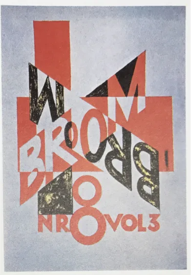
Figure 14. Laszlo Moholy-Nagy. Proposed title page from Broom. 1923 [Photo from Meggs’ History of Graphic Design]
The meaning of the word of ‘experiment’ in the field of typography and graphic design is to indicate unconventional stuff or to confound possibilities and beliefs (Bil’ak, 2005). Drucker emphasizes the importance of typographic experimentation,
But the most important context for typographic experimentation, the realm in which these printed artifacts gain their specificity, is in their relation to mainstream publications, including advertising graphics. The graphic arts witnessed the development of typographic forms to accommodate the burgeoning needs of the advertising industry. In tandem with the increased production of consumer goods resulting from industrial capitalism, the advertising industry provoked production of an unprecedented variety of typographic means. (1994:93-94).
Nonetheless, the question of what comprises an experiment in typography cannot be explained definitely, so the definition of the experimental typography and its purpose will be redefined continually when more people study in this field. (Bil’ak, 2005). Drucker (1994:9) clarifies that “To come to terms complexity of this typographic work requires a critical inquiry into its structure, forms and processes.” Furthermore, she addresses that “To understand typographic experimentation as a theoretical practice requires analysis of specific works within the context of writings about the character of materiality and in both literary and visual arts domains.” (Drucker, 1994:11). The experiment is during the process of creation, and it forms and remains as part of the body of work when the process is completed. Moreover, Bil’ak (2005) declares that “As soon as the experiment achieves its final form it can be named, categorized and analyzed according to any conventional system of classification and referencing.”
David Carson, the Godfather of grunge typography, affirms that “Experimental is something I haven’t tried before … something that hasn’t been seen and heard”. ( as cited in Bil’ak: 2005). In addition to Carson, several other designers also propose that “the nature of experiment lies in the formal novelty of the result.” (Bil’ak: 2005). Carson, whose works are a significant model for experimental typography, has gained his reputation with his editorial design for the magazine Ray Gun. In his work, he
challenged legibility which is an essential part for typography. In the book of ‘Meggs’ History of Graphic Design,’ the experiment of Carson is described,
He explored reverse leading, extreme forced justification, text columns
jammed together with no gutter, text columns width of a page (and, on at least one occasion, a double-page spread), text with minimal value contrast between type and image or color underneath, and text columns set in curved or
irregular shapes. White display type placed over text covered some of the words, but the text could still be understood. (Meggs & Purvis, 2006:495). Even though he experiments with typography and legibility, his designs are possible to be read. In this case, Meggs emphasizes Carson’s consideration with these words “Writing and subject matter receive Carson’s careful attention, for his designs emerge from the meaning of the words, or comment on the subject, as he seeks to bring the layout into harmony.” (2006:495).
Figure 15. David Carson. Ray Gun Magazine. August 1988. [Photo] Retrieved from: https://nvtodorova.files.wordpress.com/2013/10/2.jpg
Bill Hill asserts “Once we have learned the pattern of the word ‘window,’ we never again read the individual letters; the larger pattern is immediately matched as a
gestalt.” (Hill, 1999 as cited in Ayiter, Yazıcıgil, Çetin, & Türkmen, 2013). Therefore, words are not read instead they are perceived as a pattern or shape, and the legibility of typographic artwork comprehend in the following “...text that is meant to be ‘felt’ as an artwork, rather than to be ‘read’ as informational content.” (Ayiter et al., 2013).
“Typography can function is dutifully deliver a message, just as a postman delivers a letter, but it can also provide the elements and inspiration for uninhabited play.” says Carter (1997:24). Moreover, he adds through play the pleasure of typographic
expression is experienced, and designers accept new approaches in order to solve problems of typography.
Text, type, and related subjects, which deliver ‘message,’ are essential in the context of books. On the other hand, Drucker (2007:227) emphasizes the appearance of text by claiming that “In artists’ books the appearance of text is malleable and liable to be subject to manipulation through formal means.” Furthermore, Marley comments that “ “...artists now emphasize the textuality of writing itself, that is, of writing as a visible form functioning within a specific space…” (as cited in Greer, 2009: 28).
Figure 16. Lawrence Weiner. Blue Moon Over. 2001. [Photo] Retrieved from:
http://colonbooks.com/0engine/tokyo_bbs.cgi?mode=show&now_log_num=30&call_dir=..%2Fm uscat2%2F&engine_dir=..%2F0engine%2F
In the artist’s book of Weiner, objects are letters and words. Weiner sees texts as sculptures. Hence, he frequently uses letters in different work in the various medium. Nonetheless, Perrée makes a clarification about Weiner’s thinking “Weiner does not want us to see the texts as metaphors, although in their abstract quality, they lend themselves to this.” (2002:33).
CHAPTER 4
THE PROJECT: I(m)PRESS
4.1. Development Process of the Project
I(m)Press is an artist’s book based installation which consists of approximately 2-meter dia2-meters of hanging thirteen papers and two video channel project words through paper. In this chapter, I will clarify how the project has taken form
considering inspiration from different artists’ works and feedbacks from meetings of the Media and Design program.
From the beginning of the journey, the idea of the project had a distinctive purpose that I have now. My previous project was created previous semester, which was not the point, but one thing was common with the beginning point of two projects which is typography. My curiosity towards typography has begun since I was a little child. Of course, I did not know what typography was in that times, but I have known that I was passionate about letters and writing them differently on paper. When I preferred to study on science rather than fine arts in high school, I was not pleased at all. Before
Then, my starting point with typography has begun since I had a class on graphic design. From that point, typography becomes sort of a passion for me.
Before creating the thesis project, my previous project’s idea was offered in the early design meetings, but it did not seem to correspond to typography. After a couple weeks later, a feedback to my previous project changed the way that I have not thought at all. That was sure that my main interest is typography. Accordingly, Mr. Brzozowski asked that why I do not make letters my main character and suggested a book that is named 500 handmade books. This was the starting point for me, so my previous project idea has changed to a new project into artists’ books.
There was no consideration to create an artist’s book, and there were questions how letters can be used in artist’s book, and how letters can be my voice as my project. In other words what the topic and my question will be to research in the scope of the artist’s book? The answer came from thinking my previous work in the Master of Fine Art program’s classes, which are graduate studio I and II, which I have experienced to find my voice and my style to study on. In the graduate studio, my two artworks were exhibited which were discovery for me to explore my subject to study. Instead of just studying about my desire, I put also something which I have never desired to work on or talk about. That was my body which I hate. The reason I hate my body is based on my childhood memories, and this hate becomes my ambition to release my bond with that. Accordingly, there were thoughts in my mind about to study on body rights and body activism. On the other hand, body rights, body activism or body politics are extensive areas. Therefore, my necessity was to be specific what the research will be about the body. Also, the statement by Ramsey (2014) made me think of the situation
I am in: “Our culture’s obsession with image is holding us back.” After thinking these words, I have made a decision to make my body as my study subject because this is part of me, and this is a subject I know surely. Also, this is the subject which I can reflect my thoughts in the best way.
There are three main headings, which are my body, typography, artists’ books, in order to narrow down the boundaries of the project. The next question is how
typography can be used in the frame of the subject of my body. While I was thinking about words, letters and the body connection, I was also questioning myself why I hate my body. The reason of this situation is conversations that I have had with most of every person that I meet. After gaining considerable weight as an adolescent, I have received similar estimated question whether I gain too much weight. Then, the
question is followed other parallel statements and questions. Subsequently, I have been exposed endless comments and judgments. On the other hand, my reaction was to be quiet or not to talk too much about this body topic, and it is still going.
Nevertheless, this silence has become turmoil in my head. Consequently, the same words and the same statements from other people make an effect that I hate my body, and I do not love myself because of the impression of my appearance. All the same words cause harmful memories in my life. Therefore, my desire was to display this pain as my answer to all cruel words that I have received. As a consequence, this demonstration could be possible with typography. Besides, my aim is to experience these words as a typographical approach.
artist’s book, my first thought was to create my own handmade paper, which I have never experienced, as a representation of my skin. For this reason, making my paper from different scratches was a first experience, but the result was not pleasing for my very first handmade paper attempt because of the variety of paper scratches. Then, another idea came to me in order to use the papers in printmaking press for the
typographic approach of words. In order to show the pain of words, the first following idea occurred that statements about my body appear on paper in the form of
arrowheads which extend outside the book in the vertical way of the direction of the reader. Letters of statements will lose their forms from the middle to the end of letters, so the legibility of words will be lost. This reason is that after receiving endless
statements about my body, my mind involves a vicious circle of the same words. In this circle, they lose their forms and their meanings, and just the impression of words remain in my mind. Therefore, my plan was to demonstrate this reflection of words as implying printmaking process. Next, I reshaped the forms of letters and transferred to linoleum block in order to emboss by printmaking press. The reason for the choice of embossing method is to demonstrate the effect of the trace of words, which cause unforgettable trace in my mind. It cannot be seen outside of my appearance, but my desire was to show this impression in contrast to this invisible part of mine.
Another point was the size of the work. There was uncertainty whether the size will be nearly body size or not. Maybe, this artist’s book could be a book which can be experienced by bodies. Then, for the meeting, I have made a draft to somehow demonstrate what I had in my mind, and one feedback was to make an installation to represent the body as its size. Also, the typeface of the project was a question whether it will be a unique typeface. In that matter, Mrs. Kılıç Ezer suggested a video clip
which words are projected on female bodies, so letters change their forms in
accordance with the shape of bodies. Thus, the video inspired me in a way that there is no need to be worried for the specific typeface of the project, which is actually not my main concern, because the following idea corresponds to my project which the experience can be made with the transformation of a typeface by my body.
After all the consideration on material and techniques of the project, the decision of the heading of the project was not clear. Every word or every letter was not enough to represent the work. One day, I wrote down all words that are related to my project which are the artist’s book, the body, words, letters, type, typography, impression, reflection, impressive and so forth. Accordingly, the word “impression” was striking because words are impressed me in a way of my life, and these impressions will be reflected in the meaning of my project, so I have tried to alter the word impression in order to internalize its meaning. Then, the word ImPress or I am press came in sight after altering which emphasizes the pressure in my mind because of my body, and conversations about my body make me under pressure while having conversation with someone. Next, there are there options, which are ImPress, I-m-Press and I(m)Press. The reason I(m)Press was chosen is because parentheses are about internality which is connected to my project.
After these processes, a new prototype was ready for the next meeting. Hence, my first attempt for the prototype was handmade papers and tried to press the linoleum cut. The result was not close to my expectation, but this was the starting step of following steps.
Figure 17. Şeyda Günönü. Gittikce kilo ali… 2016. [Photo]
Figure 12 is a page from my first attempt, and my inspiration was Figure 13. My plan of the artist’s book pages was similar to Figure 13 but not exactly. My plans was to exhibit my work similar to the work of Wei Lin Yang, and my linoleum cuts could be placed vertically.
Comments for my first prototype made me think other possibilities. First necessity was to find another material for the paper because the one I have made is not quite fine. Next one was to change the scale and the format of the book. One comment was that maybe when the reader opens the book, he/she can see my body through folding pages. Another feedback was that in my prototype there is nothing to represent the body if my plan was to make an installation within the frame of the artist’s book, so it was compulsory to think about how the relationship between the artist’s book and the body can be settled. For this issue, a new develop for another solution was must.
Figure 18. Wei Lin Yang. Stream of consciousness. 2011. [Photo] Retrıeved from:
https://weilinyang.me/fiberart/%E6%84%8F%E8%AD%98%CB%99%E6%B5%81stream-of-consciousness/
Sculpture is one of the areas which gives plenty inspirations in order to analyze the body and consider the abstract form of the body along with typography. One of the works that I am quite impressed is Plensa’s work. When I first saw this sculpture in 2014 at Rice University, I was amazed. Still, it gives inspiration to me for my project. Another work, which is very attractive, is Sawyer’s book sculpture. The sculpture does not show the body exactly, but viewers comprehend that this is the sculpture of the body. Also, the form of papers supports the idea of the body. Additionally, Park’s sculpture has an exciting form of the body. The approach of topography on the body features has given an idea to me for my next concept.
Figure 19. Jaume Plensa. Spiegel. 2010. [Photo] Retrıeved from:
http://www.toledomuseum.org/2016/06/17/june-17-art-minute-jaume-plensa-spiegel/
Figure 20. Bronia Sawyer [Photo] Figure 21. Park Chan-Girl [Photo]
In the light of last meeting’s feedback and ideas from the field of sculpture, my
progress was to tackle the issue of the body which is a reflective object to demonstrate the conversation about my body. Therefore, the presentation of mine was a
![Figure 1. Ed Ruscha. Twentysix Gasoline Stations. 1963, 3rd edition 1969. [photo] Retrieved from: http://www.tate.org.uk/about/projects/transforming-artist-books/summaries/edward-ruscha-twentysix-gasoline-stations-1963](https://thumb-eu.123doks.com/thumbv2/9libnet/5788236.117682/23.892.163.788.106.563/twentysix-gasoline-stations-retrieved-projects-transforming-summaries-twentysix.webp)
![Figure 3. Ana Maria Devis. Partitura. 2003. [Photo] Retrieved from: UC Irvine, Libraries, Special Collections https://calisphere.org/item/ark:/87280/t0w66hpf/?_pjax=%23js-itemContainer](https://thumb-eu.123doks.com/thumbv2/9libnet/5788236.117682/29.892.166.782.107.452/figure-partitura-retrieved-libraries-special-collections-calisphere-itemcontainer.webp)
![Figure 4. Susan King. Treading the Maze, an Artist’s Book of Daze. 1993. [Photo from The Book as Art]](https://thumb-eu.123doks.com/thumbv2/9libnet/5788236.117682/30.892.163.786.107.362/figure-susan-king-treading-maze-artist-book-photo.webp)

![Figure 6. Lise Melhorn-Boe. A Sad Little Girl. 1995. [Photo] Retrieved from: UC Irvine, Libraries, Special Collections](https://thumb-eu.123doks.com/thumbv2/9libnet/5788236.117682/34.892.164.785.105.576/figure-melhorn-little-retrieved-irvine-libraries-special-collections.webp)
![Figure 9. Theo van Doesburg. A poster for ‘Dada Matinée. 1923. [Photo] Retrieved from:](https://thumb-eu.123doks.com/thumbv2/9libnet/5788236.117682/39.892.178.771.107.557/figure-theo-doesburg-poster-dada-matinée-photo-retrieved.webp)
![Figure 11. Tristan Tzara. Une Nuit d’Echecs Gras. 1920. [Photo from The Visible Word]](https://thumb-eu.123doks.com/thumbv2/9libnet/5788236.117682/42.892.269.677.494.1042/figure-tristan-tzara-nuit-echecs-gras-photo-visible.webp)
![Figure 12. El Lissitzky. Book cover for The Isms of art. 1924. [Photo] Retrieved from:](https://thumb-eu.123doks.com/thumbv2/9libnet/5788236.117682/44.892.282.722.107.672/figure-el-lissitzky-book-cover-isms-photo-retrieved.webp)
![Figure 13. Theo Van Doesburg. Cover for Klassiek, Barok, Moderne. 1920 [Photo] Retrieved from: https://www.behance.net/gallery/5509877/Typography-De-Stijl-presentation](https://thumb-eu.123doks.com/thumbv2/9libnet/5788236.117682/45.892.270.678.107.730/figure-doesburg-klassiek-moderne-retrieved-behance-typography-presentation.webp)