EVALUATION OF STORE IMAGE WITH RESPECT TO THE
VALUE AND WARMTH OF COLOR ON STORE SURFACE
ELEMENTS
A Master’s Thesis
by
SEÇKİN SAĞIROĞLU
Department of
Interior Architecture and Environmental Design
İhsan Doğramacı Bilkent University
Ankara
December 2013
EVALUATION OF STORE IMAGE WITH RESPECT TO THE
VALUE AND WARMTH OF COLOR ON STORE SURFACE
ELEMENTS
Graduate School of Economics and Social Sciences
of
İhsan Doğramacı Bilkent University
by
SEÇKİN SAĞIROĞLU
In Partial Fulfilment of the Requirements for the Degree of
MASTER OF ARTS
in
THE DEPARTMENT OF
INTERIOR ARCHITECTURE AND ENVIRONMENTAL DESIGN
İHSAN DOĞRAMACI BİLKENT UNIVERSITY
ANKARA
December, 2013
ABSTRACT
EVALUATION OF STORE IMAGE WITH RESPECT TO THE
VALUE AND WARMTH OF COLOR ON STORE SURFACE
ELEMENTS
Seçkin Sağıroğlu
MFA in Interior Architecture and Environmental Design Supervisor: Assist. Prof. Çağrı İmamoğlu
December, 2013
This study examined the changes in value and warmth of color on store surface elements considering store image. To evaluate the store image, four different existing retail stores were chosen which had surfaces in red, green, yellow and blue colors which also referred four primary colors (red, green, yellow and blue) of Natural Color System (NCS) and these retail stores were manipulated through a 3D modeling program. Manipulated samples represented 20 per cent increased and decreased values as well as opposite colors of these four color hues. A questionnaire was used to understand whether changes in color made any difference on perception of the store image. The questionnaire consisted of 13 adjective pairs and a six-point semantic differential scale to evaluate manipulations in retail store samples in terms of prestigiousness and liking. Eighty Bilkent University students participated from different departments except design departments. According to results, value
manipulations seemed to influence perception of store image. Differences in warmth of color had conflicting results with previous studies when prestigiousness was taken into consideration.
Key Words: store image, prestigiousness, color value, color warmth, surface elements, store environment, color perception
ÖZET
MAĞAZA YÜZEY ELEMANLARININ RENK DEĞER VE
SICAKLIĞININ MAĞAZA İMAJI BAKIMINDAN
DEĞERLENDİRİLMESİ
Seçkin Sağıroğlu
İç Mimarlık ve Çevre Tasarımı Yüksek Lisans Programı Danışman: Yard. Doç. Dr. Çağrı İmamoğlu
Aralık, 2013
Bu çalışma mağaza imajı göz önünde bulundurularak mağaza yüzey elemanlarının renk değer ve sıcaklığını incelemiştir. Mağaza imajını değerlendirmek için aynı zamanda Natural Color System (NCS)’in dört ana rengini de (kırmızı, yeşil, sarı ve mavi) işaret eden kırmızı, yeşil, sarı ve mavi yüzeylere sahip var olan dört farklı ticari mağaza seçilmiş ve bu ticari mağazalar bir üç boyutlu modelleme programı aracılığıyla değiştirilmiştir. Değiştirilmiş örnekler yüzde 20 arttırılmış ve azaltılmış renk değerlerinin yanı sıra bu dört ana renk tonunun zıt renklerini temsil etmektedir. Renkteki değişikliklerin mağaza imajı algısında herhangi bir farklılık yaratıp
yaratmadığını anlamak için bir anket kullanılmıştır. Anket prestijlilik ve beğeni göz önünde bulundurularak ticari mağaza örneklerindeki değişiklikleri değerlendirmek için 13 sıfat çifti ve 1’den 6’ya kadar anlam farklılığı gösteren bir ölçekten
oluşmuştur. Tasarım bölümleri hariç farklı bölümlerden 80 İhsan Doğramacı Bilkent Üniversitesi öğrencisi katılmıştır. Sonuçlara göre, değer değişiklikleri mağaza imajı algısını etkiliyor gibi görünmektedir. Renk sıcaklığındaki farklılıklar prestijlilik dikkate alındığında önceki çalışmalarla çelişkili sonuçlar vermiştir.
Anahtar Kelimeler: mağaza imajı, prestijlilik, renk değeri, renk sıcaklığı, yüzey elemanları, mağaza ortamı, renk algısı
ACKNOWLEDGEMENTS
I would like to thank Assist. Prof. Çağrı İmamoğlu for his invaluable guidance and support throughout the preparation of the thesis. It has been a pleasure to be his student and work with him.
I owe special thanks to my jury members, Assist. Prof. Maya Öztürk and Assoc. Prof. Özlem Sandıkçı Türkdoğan for their valuable comments and helpful suggestions.
I also thank to Dr. Sibel Ertez Ural for her guidance and suggestions to conduct a proper study and to Serpil Altay and Assoc. Prof. Semiha Yılmazer for their invaluable support and encourage.
I would like to thank to the students of İhsan Doğramacı Bilkent University for participation in the research.
I owe special thanks to Ahmet Geldi for his support and encouragement throughout the study and invaluable companionship. I am also grateful to my friends Pınar Ayaz and Zeynep Bora for suggestions, help, support and their valuable friendship.
I wish to express my gratitude to my family; especially to my mother Rezzan Sağıroğlu for her irreplaceable support and patience. I also thank to my dear and beloved nephew Celal Ersagun Karaca for his little smiling face.
I also wish to express my love to my father Hasan Sağıroğlu and I would like to dedicate this thesis to him whom I long for every day.
TABLE OF CONTENTS
ABSTRACT ...iii
ÖZET ...iv
ACKNOWLEDGEMENTS……….………v
TABLE OF CONTENTS ...vi
LIST OF TABLES ...viii
LIST OF FIGURES………ix
CHAPTER 1: INTRODUCTION………...1
1.1. PAD Model…..……...………..….2
1.2. Adjective Pairs Used in Other Studies………….……….5
1.3. Aim of the Study………...6
1.4. Structure of the Study………...7
CHAPTER 2: STUDIES ON RETAIL STORES ……...8
2.1. Today’s Retail Store Environments……….………..9
2.2. The Retail Store Image……….………..………11
2.3. Retail Store Factors………...………..13
2.4. Color As a Design Factor In Retail Stores………..15
2.4.1. Physiological Effects of Color……….16
2.4.2. Psychological Effects of Color………16
2.4.3. Marketing Effects of Color………...18
2.5. Hue, Chroma and Value of Color in the Previous Studies...19 vi
2.5.1. Hue Based Color Studies…………..………...20
2.5.2. Chroma and Value Based Color Studies……..23
CHAPTER 3: THE STUDY……….25
3.1. Objectives of the Study………...…………...……25
3.2. Research Questions………...…….………26
3.3. Method………...27
3.4. Materials………..………...………...27
3.5. Selection and Manipulation of Photographs……..…….…...28
3.6. Questionnaire Form………..…………...………...44
3.7. Procedure………..……….47
CHAPTER 4: RESULTS of the STUDY………...48
4.1. Verifications of the Manipulation of Variables in the Photographs Used in the Study……….………..48
4.2. Factor Analysis of the Rating Data………...…..48
4.3. The Internal Consistency Reliability of the Rating Data.…………...51
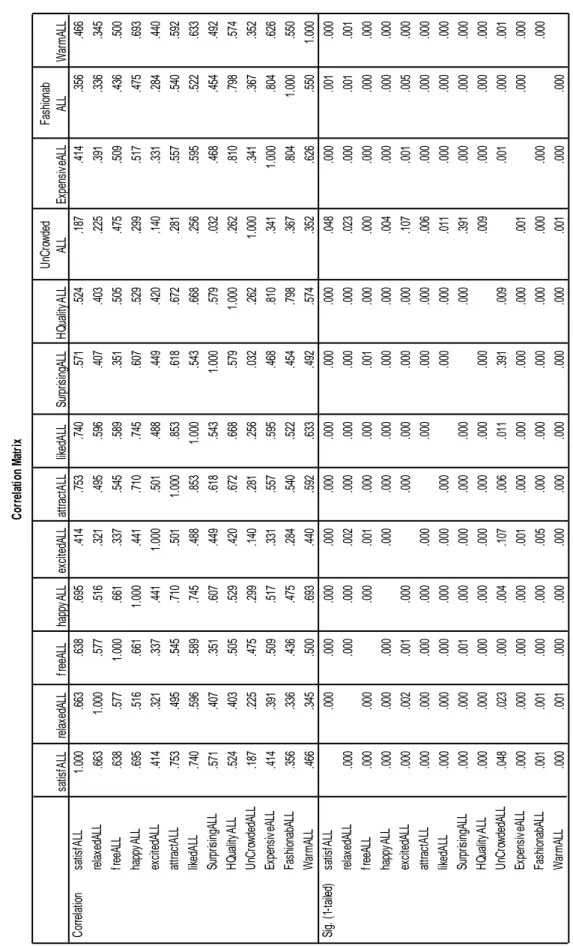
4.4. Correlations Between Main Ratings………..…….52
4.5. T-tests of Cold- Warm and All Pairs……...53
CHAPTER 5: DISCUSSION………...56
4.6. Limitations of the Study………..63
4.7. Directions for Future Research………..….64
REFERENCES………..66
APPENDICES………..………71
APPENDIX A. Questionnaire Forms Used in the Study……….……….….71
APPENDIX B. Results of the Statistical Analysis………..….……..73 vii
LIST OF TABLES
Table 1. Color Red and Its Different Color System Responses………...33
Table 2. Color Blue and Its Different Color System Responses………...36
Table 3. Color Yellow and Its Different Color System Responses…………....……39
Table 4. Color Green and Its Different Color System Responses………..42
Table 5. Factor Analysis: Evaluation Factor……….………...50
Table 6. Factor Analysis: Prestigiousness Factor………..………...51
Table A.1. Introduction Page………..………...71
Table A.2. Questionnaire Form………...………...72
Table B.1. The Results of Paired Samples T-Tests for Warmness-Coldness…….…73
Table B.2. Factor Analysis………..74
Table B.3. Reliability of the Rating Data………...75
Table B.4. Correlations………..……….76
Table B.5. T-Tests of Cold- Warm and All Pairs………...78
LIST OF FIGURES
Figure1. Yves Saint Laurent Store………..…30
Figure 2. Marc by Marc Jacobs Store………...31
Figure 3. Louis Vuitton Store…………..………..….31
Figure 4. Prada Store……….…..32
Figure 5. 20% Increased Value Sample of the Color Red (P1-red 1)...………....…..36
Figure 6. 20% Decreased Value Sample of the Color Red (P2-red 2)…..………...36
Figure 7. Opposite Sample of the Color Red (P3-red 0)……...………..…35
Figure 8. 20% Increased Value Sample of the Color Blue (P10-blue 1)….…...…....37
Figure 9. 20% Decreased Value Sample of the Color Blue (P11-blue 2)...………....37
Figure 10. Opposite Sample of the Color Blue (P12-blue 0) ……...38
Figure 11. 20% Increased Value Sample of the Color Yellow (P4-yellow 1)..…...40
Figure 12. 20% Decreased Value Sample of the Color Yellow (P5-yellow 2)….….40 Figure 13. Opposite Sample of the Color Yellow (P6-yellow 0)………...…41
Figure 14. 20% Increased Value Sample of the Color Green (P7-green 1)…...…43
Figure 15. 20% Decreased Value Sample of the Color Green (P8-green 2)…….….43
Figure 16. Opposite Sample of the Color Green (P9-green 0)………...……44
CHAPTER 1
INTRODUCTION
Environmental psychology (environment-behavior research) is a multi-disciplinary field and association of environmental psychology, marketing, management,
psychology, and architecture is helpful to explain retail store research which needs to be examined by different fields. For this reason, the verb “to sell” is beyond an action and much more complicated when retail stores are considered. A general description of the retail store might be stated as: retail store is a place where shoppers spend time and money. Indeed, it has a deep-rooted history and several characteristics. From the time that human beings looked for a place to live, work and recreates in different type of places are formed with respect to requirements.
Technology could be regarded as one of the most important factors which give human the opportunity to change the environment they live. Man starts to make living environments more functional to meet what they require. For instance, while trading is conducted in outdoor markets, after a while, the action ‘selling’ replaces in
enclosed spaces. This is how retail store characteristics begin to be improved. According to previous studies, a place compromises of different elements. The elements which are incident to architecture create an environment and this environment is perceived by its users: for retail store environments, they can be called as ‘shoppers’ and they may have different perceptions on a place. What makes them perceive a place in different perspectives might be clarified by some arguments. Personal differences, cultural differences, psychological impacts, educational
background, age and sex differences could be just a few justifications for those arguments (Kotler, 1973).
Color is an important element with respect to its physical and psychological characteristics in retail store environments. While, some other elements such as texture, lighting, and layout may affect and manipulate the perception of a retail store’s value; color is also very influential to create an environment to reflect the image of a store and to determine quality of the store image. Various studies question the effects of color by comparing and contrasting methods. Wavelength, saturation (chroma), and brightness (value) differences become subtitles in scientific color research which have effects on perception, as well. Thus, perception of color is studied in psychology or environmental psychology for built environments. For instance, the way to understand how shoppers perceive the store image in accordance with differences in color may be explained by psychological responses of shoppers.
1.1. PAD Model
To understand psychological responses of shoppers Mehrabian and Russell (M-R) created a model to determine emotions within a framework: pleasure-displeasure, arousal-nonarousal, and dominance-submissiveness. This framework was called PAD (pleasure, arousal, dominance) model which gave meaning to emotions in the sense of three dimensions: a cycle of happiness (from unhappiness to happiness) with different stimulating emotion levels and directing feeling levels. They stated the importance of the model as: “Rather, a person is viewed as being in some emotional state at all times, a state that can be described as a region within a three-dimensional space” (Russell and Mehrabian, 1977: 274).
Afterwards, various adjective pairs were formed by the help of PAD model. Donovan and Rossiter used Mehrabian-Russell model for evaluation of retail store environments. This attempt was to understand an architectural fact through an environmental psychology model (Donovan and Rossiter, 1982: 34). They claimed that studies which have been conducted until that point do not question the
perception of shoppers and they generally pay attention to physical characteristics of retail stores (Donovan and Rossiter, 1982: 36). Hence, Donovan and Rossiter used the model to have responses “as approach or avoidance behaviors” by Mehrabian and Russell (Donovan and Rossiter, 1982: 37). Basically, approach and avoidance
behaviors examine an environment whether it affects feelings or not to “stay”, to “explore”, to “communicate”, and to “perform and satisfy” (Donovan and Rossiter, 1982: 37).
Mehrabian and Russell’s model provides guidance for numerous studies and their model is advanced by some other researchers. Russell and Pratt (1980) suggest another version to explain emotional responses which is called “two dimensions of emotion and eight major emotional states”: arousing-sleepy, distressing-exciting, unpleasant-pleasant, and gloomy-relaxing (cited in Donovan and Rossiter, 1982: 38). Furthermore, Donovan and Rossiter advance M-R model and they present these pairs (1982: 44): contented-depressed, happy-unhappy, satisfied-unsatisfied, pleased-annoyed, relaxed-bored, important-insignificant, free-restricted, hopeful-despairing, stimulated-relaxed, excited-calm, jittery-dull, aroused-unaroused, frenzied-sluggish, overcrowded-uncrowded, wide awake-sleepy, controlling-controlled, dominant-submissive, and influential-influence. While these adjective pairs are suggested to evaluate the perception of shoppers, another group of adjectives are introduced to “measure environmental load factor” (Donovan and Rossiter, 1982: 45) which are enhanced version of Mehrabian and Russell’s suggestion. Donovan and Rossiter introduce adjective pairs which measure environmental load factor as: usual-surprising, common-rare, familiar-novel, homogenous-heterogeneous, redundant-varied, similar-contrasting, symmetrical-asymmetrical, patterned-random, sparse-dense, continuous-intermittent, distant-immediate, uncrowded-crowded, small scale-large scale, and simple-complex.
The model is a guide for environment-behavior research and it is convenient to improvement. Dazkir and Read (2012) supported this idea with an instance: “All the other emotions are a combination of arousal and pleasure in varying degrees. For example, calmness is a combination of low level of arousal and high level of
pleasure” (p. 725). In brief, what Donovan and Rossiter’ purpose is to combine adjectives in the model to generate new adjectives and pairs.
1.2. Adjective Pairs Used in Other Studies
To give examples to studies which measure the perception of respondents by models or adjective pairs like Mehrabian and Russell, Donovan and Rossiter; Baker et al. (1994) specified some points where prestige-image design differs from discount-image design. To introduce perception differences of shoppers in functional design factors of stores, especially color, proper adjective pairs were proposed. These pairs were supposed to answer variation of color, layout, and atmospheric factors with regards to perception of shoppers.
Likewise, Yıldırım et al. (2007) suggested eight bipolar semantic scales, because they tried to “measure the perceptual quality of a cafe/restaurant with yellow and violet interiors” to understand perception of shoppers about atmospheric attributes of retail stores by using these adjective pairs: roomy-cramped, high-low, pleasant-unpleasant, attractive-unattractive, interesting-boring, imposing-poor looking, calm-restless, and warm-cold.
By referring to Baker et al.’s studies on classifying retail stores (social, ambient and design factors), Sherman et al. (1997) offered some adjective pairs to measure the effects of store environment on emotions of shoppers and their influence on shopping behavior. The pairs were explained in two categories “Overall Image”: good–bad,
negative–positive; (design factor) large–small, roomy–cramped, colorful–drab, unattractive–attractive, dirty–clean, comfortable–uncomfortable, cluttered aisles– uncluttered aisles, crammed merchandise–well-spaced merchandise, impressive interior–unimpressed interior, well-organized layout–unorganized layout, and “Organism Variables”: (pleasure) happy–unhappy, bored–relaxed, unsatisfied– satisfied, pleased–annoyed, contented–melancholic, despairing–hopeful, (arousal) frenzied–sluggish, stimulated–relaxed, calm–excited, dull–jittery, and unaroused– aroused.
1.3. Aim of the Study
This study examines how prestigiousness of store image is perceived in respect with increasing and decreasing value of store surface colors. Perception of warmth of color scheme used in retail store surfaces is examined in terms of prestigiousness of store image. After reviewing the literature, a gap in the perception of value and chroma of color is specified. Although scientific color research has several studies on the issue, environment-behavior research generally mentions about hue or
wavelength of color and perception of them in built environment. This study focuses on value differences in the perception of prestigiousness to suggest if hue changes affect the perception, differences in value (or chroma) of color can also have some effects on perception since color has these three dimension (hue, chroma, value) to be examined. Especially, using color in prestigiousness perception is very limited, so differences in value and warmth of color can enlarge this scope. Therefore, the aim of the study is to examine changes in value of surface color and warmth of surface color scheme and their relationship to perception of prestigiousness of store image.
According to generated research questions, the study has been formed. Any surfaces of retail stores such as walls, ceilings, shelves, display units, curtains, even chairs, armchairs and tables which are used in retail store environment were manipulated in 3D modeling program. To achieve that, Natural Color System was analyzed and its four primary colors were used since these colors corresponded with the colors in original samples. After a pilot study, the questionnaire was prepared for the main study to evaluate the manipulated samples. Consequently, results were analyzed with the help of computer based statistical software and statistical data were interpreted considering literature review.
1. 4. Structure of the Study
This study is structured in five chapters. The first one is introduction including structure of the study with a literature review. The second chapter is general description of retail stores and its environment with respect to retail store
atmospheric effects and color as a design factor. Afterwards, prestigious store image is related to chapters mentioned before. The third chapter is study which will be analyzed in detail. Before the last chapter as discussion of the study, results of the study will be defined. The study will be concluded in the fifth chapter by giving some limitations of present research and directions for future research.
CHAPTER 2
STUDIES ON RETAIL STORES
Literature suggests that retail store design is associated with not only environmental psychology, but also environmental design to produce a store image, to satisfy needs of consumers in these environments (vanRompay et al., 2012: 2). One of the aims of environmental psychology is to improve and to establish a relationship between environments and users with the help of environmental design. They have a strong relationship and it often makes one’s reason becomes one’s result. Thus, retail stores should be analyzed in many aspects.
Kotler claims that “One of the mixed blessings of human history is that man increasingly lives, works, and plays in artificial environments” (Kotler, 1973: 49). Hence, human being always requires a shelter. In old times, men needed a shelter to protect them against nature. As much as living conditions got improved; to
communicate with each other and to constitute a social community caused need of privacy, also. Thus, humans began to elaborate those artificial environments where
they live, work and play. Since ancient times, these artificial environments were shaped by different concerns such as religion, culture, science and technology. Each era contributed to its own innovations. Especially, architectural approach differs to create an environment; for instance, industrial revolution innovated in technology, especially new ways of producing materials had influences on architecture as well. With the revolution, mass production, comfort, functionality and the use of new materials become significant in architecture and design field. Consequently, all these changes appear in workspaces.
2.1. Today’s Retail Store Environments
To create a functional space for retail stores is a necessity. Each and every day, millions of people visit and go shopping in different environments which leads a need of not only functional, but also attractive spaces to satisfy demands of these people.
Such spaces also can be called as “environment” or “atmosphere” and so on. Kotler was the first name that introduces the term “atmosphere” and “atmospherics” in literature. Moreover, he gives different dimensions to atmosphere. He technically explains atmosphere as “…the air surrounding a sphere. The term is also used more colloquially to describe the quality of the surroundings.” (Kotler, 1973: 50). Besides that, he introduces the term “atmospherics” as an attempt to create more sensual atmosphere that can make demander to improve his buying potentiality (Kotler, 1973: 50). Kotler states four different sensory channels for atmosphere which are sound, scent, and touch (1973: 50-51):
The main visual dimensions of an atmosphere are:
- Color - Brightness - Size - Shapes
The main aural dimensions of an atmosphere are:
- Volume - Pitch
The main olfactory dimensions of an atmosphere are:
- Scent - Freshness
The main tactile dimensions of an atmosphere are:
- Softness - Smoothness - Temperature
2.2. The Retail Store Image
Shoppers who are mentioned as demander before have the first impression about quality and price level of a retail store from the store environment or atmosphere. Therefore, the first impression is highly related to physical attraction which is related to surrounding atmosphere since physical attraction consists of color, texture,
lighting, music and such elements. They can stimulate the five senses of shoppers to affect their choices in reference with Kotler’s main visual dimensions given above.
All these elements create an image in shoppers’ mind about that environment. In retail environments, retail store image is an issue which has various definitions. Firstly, Kunkel and Berry describe retail store image “as discriminative stimuli for an action's expected reinforcement: “Specifically, retail store image is the total
conceptualized or expected reinforcement that a person associates with shopping at a particular store” (Kunkel and Berry, 1968: 22). Moreover, shoppers’ previous
experiences and their motivation is redirector to make shopper evaluate the retail store image either reinforcing or aversive. Besides, retail store image definition may be detailed as: “The overall form that this image will take depends on the respective value that the consumer places on store convenience, fashion and selection of
merchandise, quality and quantity of sales personnel, and other such factors, plus the degree of reward and/or punishment incurred in connection with these factors” (Kunkel and Berry, 1968: 24).
Secondly, “The term "physical attractiveness" used in the Darden, Erdem, and Darden (1983)” as cited in Baker et al., which is a term to explain the relationship
between store image and store environment since physical attractiveness gives some basic clues about store image with design of store environments (1994: 329). In addition, Mazursky and Jacobsy’s retail store image definition is: "A cognition and/or affect (or a set of cognitions and/or affects), which is (are) inferred, either from a set of ongoing perceptions and/or memory inputs attaching to a phenomenon (i.e., either an object or event such as a store, a product, a 'sale,' etc.), and which represent(s) what that phenomenon signifies to an individual" (cited in Baker et al., 1994: 328-329).
Thirdly, Porter and Claycomb explain retail store image with an initial description: “The concept of retail store image first came of interest when Pierre Martineau (1958) described the personality of the retail store” (cited in Porter and Claycomb, 1997: 374). Thus, retail store image is created by shoppers, but there are some factors that construct the image. Perception and feeling of shoppers are quite important while creating a store image: physical attractiveness and elements of the physical environment guide how retail store image is shaped in shoppers’ mind. Retail store image formation is related with what shoppers perceive from environment of that store. Porter and Claycomb claim that “Retail image is generally described as a combination of a store’s functional qualities and the psychological attributes consumers’ link to these” (1997: 374). To support the assertion, they give a description additively “Retail store image is an overall impression of a store as perceived by consumers (Keaveney and Hunt, 1992)” (cited in Porter and Claycomb, 1997: 374).
Forthly, Bloemer and De Ruyter state that “Image is expressed as a function of the salient attributes of a particular store that are evaluated and weighted against each other. Therefore, we prefer to define store image as: The complex of a consumer’s perceptions of a store on different (salient) attributes” (1998: 501). They introduce eight elements which generate a retail store image: “location, merchandise, store atmosphere, customer service, price, advertising, personal selling and sales incentive programs (Bloemer and De Ruyter, 1998: 502). Several combinations of these elements are helpful to create advanced retail store images. In parallel with all these definitions, as an inference, what influences shoppers’ decision in retail stores are atmosphere and atmospheric elements, visible and invisible components of retail store environment.
2.3. Retail Store Factors
The retail store image definitions emphasize on the linkages between store image, store environment, service quality and merchandise quality and lots of environmental variables which have impacts on store image, store environment, service quality and merchandise quality are categorized by Baker in 1986: “ambient factors, design factors, and social factors” (cited in Baker et al., 1994: 330). According to this classification, store ambient factors consist of music, lighting and smell; store functional/aesthetic design factors have elements such as floor covering, wall covering, displays and fixtures, color, cleanliness, ceilings, dressing rooms, aisles, lay-out, and signs; store social factors are about how sales people behave and are dressed. To generalize, store ambient factors which are used in a store environment do not have direct influences on the perception of shoppers. Ambient factors refer to
anything which surrounds shoppers as concern of five senses and shoppers are not aware of them in retail stores as much as design factors. For instance, if a store is too cold or music is too loud in that store or there is bad smell in retail environment, shoppers might feel uncomfortable.
Store functional/aesthetic design factors can be directly observed and realized by the five senses. We may rename them as “store architectural factors”. In contrast to store ambient factors, shoppers are completely aware of design factors and their impacts. The factor has some components which are layout of the store, furniture and
furnishings, and anything related to the function of stores. For instance, if the layout of the store does not direct the shopper where he/she wants to go, shopper may perceive layout of the store as ineffective or complicated. Meanwhile, Baker et al. explain color in this category. They compare colors in prestige-image and colors in discount-image regarding retail environment and retail store image. They present a literature summary about prestige and discount-image and according to
categorization; prestige-image should have pile carpeting; textured walls; decorated displays/fixtures; gold, silver, black, up-to-date, neutral/monochromatic colors on surfaces and a clean environment (Baker et al., 1994: 331). In prestigiousness perception, examining such characteristics may be beneficial.
As befits the name, store social factors are related to sales people and shoppers, more precisely, physical and psychological responses of sales people which may change impressions of shoppers positively or negatively. How sales people get dressed, their behavior and attitude, yet number of sales people is very effective on decision
making, choices, emotions and perception of shoppers. All factors need to be examined with respect to shoppers. Personal preferences of shoppers may differ. Nonetheless, a prestigious retail store image can be achieved by proper combinations of these store factors.
2.4. Color As a Design Factor In Retail Stores
In the literature, there are studies that find color directly affect the perception of store image. For instance, “the possibility exists that color may interact with other ambient characteristics and may alter consumer reactions to a store concept” (Babin et al., 2003: 542). Beside effects of color, some other atmospheric elements and
combination of these elements are related to retail store image, also. “A store described as having a combination of bright, fluorescent lights (soft, incandescent lights) and popular (classical) background music causes consumer reactions consistent with a discount (prestige) image (Baker et al., 1994).
The effects of color should be analyzed in a broad sense. These effects may have different results in different fields. For instance, Belizzi et al. associate color with autonomic biological reactions, emotional responses, and obtaining attention (1983: 21). They prefer to analyze color in two titles regarding retail store research:
approach orientation and physical attraction. Approach orientation is about color which draws attention and its latter effects. In addition, using color as a physical variable gives retailers some opportunities to catch the attention of shoppers;
however, exaggerated use of physical variables can cause irritation and discomfort for shoppers (Belizzi et al., 1983: 22).
While using color, it has to be known that there are various aspects to be considered. Belizzi et al. research and suggest three aspects of color: physiological,
psychological and marketing color research.
2.4.1. Physiological Effects of Color
While examining physiological color research, brain and human body and their responses to a color can be considered. Belizzi et al. give various examples on the issue. By giving reference to Clynes and Kohn (1968), they underline that brain function is much more influenced by red rather than other colors although they have same intensity (1983: 23). In literature, such research are done by comparing
opposite colors and color schemes Nakshian (1964) does, who find “the color red caused significantly greater hand tremor than green, and that speed of movement on a motor inhibition task was significantly faster under the red condition” (cited in Belizzi et al., 1983: 23).
2.4.2. Psychological Effects of Color
Colors have psychological effects on human being. Psychological color research also examines colors within some groups such as high wavelength colors – low
wavelength colors and warm colors – cool colors. In the studies that have been
conducted before, researchers have similar results which are introduced by Belizzi et al. Firstly, in an example of a psychological research of color studies: “The color red is frequently described as active, adventurous, and stimulating, energetic, and vital… (Heline, 1979)” (cited in Belizzi et al, 1983: 25). Red is generally perceived as stimulus color which large companies widely use it such as Mc Donald’s, Heinz, Coca Cola, Cnn or Toyota and so on. Secondly, Belizzi et al. state that “Yellow is often termed the “mind color,” and is thought by some to stimulate the intellect. It is associated with cheer, gaiety, and fun (Sharpe, 1974)” which means the color yellow is stimulating as much as red, because red and yellow are figured in similar
wavelength and scheme (cited in Belizzi et al., 1983: 25). Further, “Adjectives found to be associated with the color green are: secure, comfortable, calm, peaceful,
serene… (Murray and Deabler, 1957), adjective for the color blue are
indistinguishable: …a preference for blue is thought to indicate well-controlled emotions and behavior” (cited in Belizzi et al., 1983: 26). Additionally, they claim that especially the color red and warm colors are more up-to-date which also means more fashionable than cool colors as mentioned in the previous studies; however, shoppers indicate that cool colors used in retail environments are more attractive and more pleasant than warm colors (Belizzi et al., 1983: 38).
The issue is widely studied before. Some of the studies focus on comparison of hues, such as red vs. green (Elliot et al., 2007), violet vs. yellow (Yıldırım et al., 2007), high arousal colors (yellow, red, orange) vs. low arousal colors (blue, green, violet) (Vieira, 2010), red vs. blue (vanRompay et al., 2011) and so on. These studies are based on perceptual responses in general color research. Color preferences can be a matter of fashion. Especially, in perception of prestigiousness, color preferences are
described as ‘up-to-date’ and ‘fashionable’ in the previous studies. To avoid such conflicts, results of general color research are given with several examples. Results of previous research can guide this study. For instance, after reviewing literature, it is obvious that cool colors and low arousal color which are blue, green and violet are mainly preferred. The color blue is the most preferred color in general color research and these results may conduct this study.
2.4.3. Marketing Effects of Color
Marketing impacts of color create certain differences in advertising and retailing (Belizzi et al., 1983). Psychological effects of color also shape effects of color in marketing field. Categorizing colors according to gender (e.g. black for males, white for females) might be a good instance. Brands use color cautiously considering meanings that a color carries. For instance, “Simple colours are vibrant and intense as seen in traffic signs, Toys ‘R’ Us and McDonald’s, whereas sophisticated colours denote elegance and intimate communication as used by Laura Ashley, Armani, Tiffany and Jaguar” (Aslam, 2006: 25). With the help of the psychological impacts of color, some certain notions can be achieved in marketing. In addition, Belizzi et al. mention about the marketing in color research. It is proposed to take the
advantage of “advertising and package design research in order to make retail design decisions (1983: 27).
2.5. Hue, Chroma and Value of Color in the Previous Studies
There are numerous studies to observe color research in different perspectives. For instance, Valdez and Mehrabian claim that “Color stimuli are characterized
completely in terms of hue (i.e., wavelength), brightness or value (i.e., black-to-white quality) and saturation or chroma (i.e., purity or vividness, with lower saturation colors containing more grey)” (Valdez and Mehrabian, 1994: 396). While designing a retail store environment, if the head of design factors is color, these three
characteristics of color should be considered. Whereas, long wavelength colors (red, yellow and so on) are found more arousing, Valdez and Mehrabian underline that the brightness and saturation of color and their psychological effects are not taken into consideration in retail environment studies (1994: 396). They research emotional responses of respondents after the changes in hues, chroma and value levels and different achromatic examples using Mehrabian’s PAD model. They assert that there is a positive relationship between brightness (value) – saturation (chroma) and pleasure (1994: 398). Three relevant components (value- chroma- pleasure) and their connection may be explained as: “As expected, brighter and more saturated colors were associated with being more pleasant”; however, “The present results indicate that brightness had a considerably stronger effect than saturation on
pleasure-displeasure reactions to color samples” (Valdez and Mehrabian, 1994: 398). Besides, “less bright and more saturated colors were more arousing” and “less bright and more saturated colors induced greater feelings of dominance in viewers” (Valdez and Mehrabian, 1994: 398-399). Especially, they draw attention for misleading
perception of color hues by the reason of high saturation level of that hue: “…In fact, it is the high saturation of the red color samples used, rather than its hue, that
accounts for the high levels of arousal observed” (Valdez and Mehrabian, 1994: 19
406). Evidently, hue, brightness and saturation of color should be analyzed elaborately in color research studies.
Ünver and Öztürk (2002) determine colors of buildings according to social-cultural, historical, environmental effects which are measured by the help of the Munsell Color System. Park and Guerin (2002) investigate color meanings in four different cultures by using harmonious color combinations like Ünver and Öztürk (2002). Four different color palettes are tested and they conclude that meaning and preference of color differ from culture to culture.
Ou et al. (2011) use three-color combination and they test it to understand its effects on harmonious/disharmonious feelings by using color wheels and interior images to evaluate the harmoniousness.
2.5.1. Hue Based Color Studies
In retail store environment, different perceptions might be observed by the
manipulation of surface colors. The most known manipulation technique for colors is changing its hue from short wavelength (cool colors) to long wavelength (warm colors) or vice versa. Yıldırım et al., Bellizi et al. and separately Crowley have some studies which use that technique and they finally deduce that “Experimental research suggests that cool-colored store environments are preferred over warm-colored store environments” although previous studies testify that warm-colored environments are found more up-to-date which means modern, fashionable, and present (Yıldırım et
al., 2007: 3234). They have some supportive results for Belizzi et al.: “As a result, it has generally been concluded that blue environments evoke better feelings than do orange environments” (Yıldırım et al., 2007: 3234). They find that violet colored walls are perceived more positive than yellow colored walls when shoppers’ psychological responses are considered. On the other hand, as much as age gets increased shoppers become more critical about store characteristics. For instance, older shoppers’ response for physical environment of retail store is more negative while men are more positive than women.
In the meantime, Crowley research on wavelength of colors and as a result of the study: “Retail store environments in the more extreme wavelength colors (red and blue) were perceived as more active environments” (1993: 67). Crowley also claims that shoppers evaluated environments more positive which has wavelength moving from red to blue (1993: 67). In Crowley’s study, stimulating emotions is one of the titles and he asserts if shoppers’ emotions need to be stimulated, the color green should not be chosen in that retail store environment since it is located in moderate wavelength color. To create an attractive environment, especially for advertising purposes, blue (shorter wavelength) is found as the appropriate one (Crowley, 1993: 67).
Turley and Miliman introduce five variables of retail store image that define atmospheric stimuli which refer to Berman and Evans (1995) model of four variables: external, general interior, layout and design, point-of-purchase and decoration variables. Turley and Miliman improve the model and added a new title
as “human variables” which may be helpful to examine atmospheric stimuli of retail stores. They observe “color schemes” under the title of external variables (Turley, and Miliman, 2000: 194). Color is associated with physical attraction rather than approach behavior. Hence, influences of color depend on environment and merchandise.
Additionally, vanRompay et al. (2012) examines color, layout, and shopping intentions in common. As already mentioned, there are different elements which have impacts on shopping behavior, merchandise quality and buying decision. In their study, color and store layout are studied with shopping motivation. vanRompay et al. demonstrate when shoppers are task-oriented, they demand a roomy
atmosphere. These shoppers keep their pleasure level lower (vanRompay et al., 2012: 15). Authors indicate that task-oriented shoppers are highly related to a goal, hence, retail environment color may not be one of their concerns but task-oriented shoppers prefer the store in blue color (2012: 15). However, recreational shoppers are pleased to shop in red colored retail environments with cluttered layout. vanRompay et al. (2012: 15) assert that “Taking note of these distinctions, the findings support the suggestion that task-oriented shoppers are primarily under the influence of spatial, function related design variables as they most clearly interfere with goal attainment” Additionally, these shoppers are found uninterested in diversity of atmospheric elements, since they mainly focus on how they are motivated.
The relationship between hue, chroma, value and also warmth of color is emphasized in many studies. For instance, Gao and Xin (2006) assert that “…hue is the dominant
factor on color emotions, these studies concluded that the meaning of a color comes mainly from its lightness and chroma and to a less extent from its hue with an
exception for the “warm–cool” pair, which is dependent mainly on hue” (p. 411). As they claim, value (lightness) and chroma make color meaningful which cannot be ignored. Chroma and value based studies are significant to understand all aspects of color.
2.5.2. Chroma and Value Based Color Studies
Gao and Xin discuss color in several aspects such as lightness or value, chroma or saturation, hue and emotional response of color which was divided into two categories: “the experimental aesthetics of color or color preference” and “descriptive dimensions”, in other words, color preference appraises some
dimensions as “comfortable” or “uncomfortable”, “good” or “bad” etc. (2006: 411). Descriptive dimensions are specified as “warm” or “cool,” “light” or “dark”, “heavy” or “light” etc. (Gao and Xin, 2006: 411). They claim that color preference is more individual; however, it shows similarity among people while descriptive dimensions “tend to concentrate on single dimensions such as, weight, distance, size, and
temperature and hue values were deemed to have significant influence on these attributes” (2006: 412). Consequently, warmth of color is dependent on hue rather than chroma found to be more indicative (Gao and Xin, 2006: 417).
In another study, Grandjean (1973) orders advantages of light colors. Grandjean asserts that dark colors are depressing and dark colored places are generally quickly got dirty: “All light colours make life easier, brighter and friendly; they reflect more
light, brighten the room, and encourage cleanliness” (243). This study is conducted for residential environments, yet value of color (lightness) is considered and with some comparisons, it achieves valuable information for surface colors in retail store environments as well.
CHAPTER 3
STUDY
3.1. Objectives of the Study
As defined before, a retail store is perceived by shoppers and due to their thoughts and emotions they form the retail store image and prestigiousness is defined as “the fact or state of being above others in rank or importance” (Merriam-Webster on-line, 2013). Thus, this study examines how the prestigiousness of store image is perceived in respect to increasing and decreasing values of interior surface colors. Moreover, perception of warmth of color scheme in interior surfaces of retail was examined in terms of the prestigiousness of store image. In other words, the aim of the study is to understand the relationship between perception of the prestigiousness of store image, and changes in value and warmth of surface color scheme, as a design factor. To achieve this aim, any surfaces of retail stores such as; walls, ceilings, shelves, display units, curtains, even chairs, armchairs and tables which are used in retail store
environment were manipulated.
The study uses manipulated photograph sets and a two-phased questionnaire. Photograph samples which have increased and decreased values and opposite hue samples to measure differences in perception of warm and cool color schemes used in the study. After specifying samples from photographs, they were drawn in 3D medium and rated by respondents using questionnaires. The questionnaire was firstly experienced in a pilot study which was done by ten interior architecture and
environmental design students and after required modifications, it was repeated by 80 Bilkent University students who did not have architectural education.
3.2. Research Questions
Prior studies found that colors have influences on the perception of store image. As much as color affects retail store environment as a design factor, it is expected to influence the prestigiousness of the store image, also. Prestigiousness is discussed previously in various studies, and the relying on previous studies hypothesis and research questions of this case are presented below:
RESEARCH QUESTION 1: Do changes in the value of surface color affect the perception of prestigiousness of the store image?
RESEARCH QUESTION 2: Do changes in the warmth of surface color affect the perception of prestigiousness of the store image?
3.3. Method
In this study, value differences and changes in warmth of surface colors in retail stores and their effects will be observed to make inferences about perception of store image. To conduct the study, 3D modeling of different stores and a questionnaire will be used.
3.4. Materials
“SketchUp 8” and its rendering plug-in “V-Ray” were used to model existing retail stores in 3D form. Photographs of existing retail stores were manipulated in 3D form. All details in four examples were omitted to reduce clutter and to get a clear
perception of changes in value and warmth of surface colors. First, value of surface colors were both increased and decreased 20 per cent to achieve an observable
difference from the original ones to see whether shoppers’ perception about that store image would differ in a positive or negative way. Beforehand, a pilot study was conducted to find out potential problems about the instruments. In the pilot study, it was found that when a 10 per cent change was applied, the two samples could not be differentiated by the respondents. Thus, in the main study, 20 per cent of increasing and decreasing was preferred in the main study. Secondly, two warm (yellow and red) and two cold (blue and green) colored examples were manipulated to understand whether changes in the warmth of surface colors would affect the perception of prestigiousness of store image or not. Photos taken from manipulated 3D models of the stores were displayed on printouts to participants, and then those participants were asked to complete a questionnaire. Participants of the study were chosen from
Bilkent University students who do not have an architectural background to reduce effects of educational background as has been mentioned before. Eighty students participated in the study. Participants of the pilot study were chosen from interior architecture and environmental design students in different classes. According to the results, some adjustments were made. Photos of the model were shown by portable computer with a HD LED screen (15.6"-R580) to those 10 students. Seventy per cent of the participants stated that photos need to be shown by printout rather than
computer screen to make the questionnaire faster. Also, there were some conflicts on adjective pairs. For instance, “controlling-controlled”, “insignificant-important”, and “familiar-novel” were the adjective pairs which resulted in confusion and they were refined. Participants suggested that photographs of value differences should be displayed successively and percentage of value differences need be increased to understand the differences, as well. Taking into account these comments, questionnaire was simplified and photographs were reorganized in view of these comments (see Table A.1. and A.2.).
3.5. Selection and Manipulation of Photographs
At first, samples needed to refer to well-known brands, reach a wide number of people, bring an image with the name, and arouse feelings that participants would have no idea about the samples; which sample originally belong to which brand. The samples were reviewed via various web sites of brands such as Yves Saint Laurent, Dolce & Gabbana, Prada, Marc Jacobs, Louis Vuitton, Burberry, Armani, Versace, Ralph Lauren, Tom Ford, Gucci, Guess, Calvin Klein, Ferre and Fendi which have worldwide retail store chain with a sophisticated image and famous designer oriented
dress and accessorize shops. Manipulation of dress shop was a preference; hence, there were some example which would be compatible with goals of the study. The stores reviewed were represented signature of that brand with colors, lights, textures, materials, logos which creates an elegant atmosphere. On the other hand, for this study, chosen retail store environments should not give participants any clue about the brands and needed to be different from other retail stores of the brand in terms of physical characteristics. Thus, after reviewing all possible samples, four of them which are Yves Saint Laurent, Marc Jacobs, Louis Vuitton, and Prada were found the optimum samples to be manipulated according to Natural Color System (NCS).
Four different photographs were chosen to be manipulated according to four primary colors of Natural Color System (NCS). They were preferred since the examples had same colors with NCS’s four primary colors which could make the study much more realistic. Consistency was shown in original sample colors to match with four
primary colors: red, blue, yellow and green.
Natural Color System (NCS) is a system which was found in 1979 as “Swedish National Standard for Color” (Ncs Colour on-line, 2013)which has six elementary colors; yellow, red, blue, green and also black and white.
The elementary colours yellow (Y), red (R), blue (B) and green (G) creates a colour circle. Black (S) and white (W) are located above and below the colour circle, creating a three dimensional space. Each colour in the circle represents hues. Each colour hue has many nuances consisting of whiteness, blackness and chromaticness. These three properties create colour triangles in which each nuance has its own distinctive place (Ncs Colour on-line, 2013).
NCS uses hue, chroma (saturation), whiteness and blackness (value) and some advantages on whiteness and blackness makes the system reason for preference. For instance, Nayatani (2005) claimed that evaluation of NCS is easier than Munsell value or CIE metric lightness (p. 296). Due to Nayatani’s assertions, this system is greatly preferred in Europe. NCS has a double-cone and “NCS gives a systematic arrangement on color appearance, using the values of w, s, and c, together with hue. For this reason, it has been recognized useful in color appearance study and artistic color design field” (Nayatani, 2005: 296).
Figure1. Yves Saint Laurent Store, Las Vegas, by Stefano Pilati, 2008.
(Retrieved from; http://elitechoice.org/2011/02/08/stefano-pilati-designs-the-ysl-retail-space-in-las-vegas-in-the-opium-experience/)
Figure 2. Marc by Marc Jacobs, Milano, by Stephan Jaklitsch’s, 2010.
(Retrieved from; http://www.solostyle.it/02042010/sephora-e-marc-jacobs-due-nuovi-store-a-milano/3313/marc-jacobs-milano)
Figure 3. Louis Vuitton, Santa Monica, by Valerio Architects and Interiors, 2010. (Retrieved from; http://www.luxuo.com/events/louis-vuitton-santa-monica-place.html)
Figure 4. Prada, Paris, by Roberto Baciocchii, 2012.
(Retrieved from; http://www.verpan.com/projects/shops/prada)
To manipulate these samples in 3D form HSB (V) color system is preferred. Photographs with the conversion tables and amount of modulation levels are listed:
Table 1. Color Red and Its Different Color System Responses
RED OPPOSITE RED
HSB / HSV H:345° S:99% B (V):77% (-20&, +20%) H:164.85° S:98.98% B (V):76.86% RGB R:196.35% G:1.96% B:50.56% Hex: #C40233 R:2% G:196% B:147% Hex: #02C493 HSL H:345° S:98.02% L:38.89% H:164.85° S:97.98% L:38.82% CMYK C:0 M:252.45 Y:189.34 K:58.65 C:252.4 M:0 Y:63.75 K:59 Source: http://colorizer.org/, http://www.colorschemer.com/online.html, http://www.colorpicker.com/, http://www.colortools.net/color_complementary.html 33
Figure 5. 20% Increased Value Sample of the Color Red.
Figure 6. 20% Decreased Value Sample of the Color Red.
Figure 7. Opposite Sample of the Color Red.
Table 2. Color Blue and Its Different Color System Responses
BLUE OPPOSITE BLUE
HSB / HSV H:197° S:100% B (V):74% (-20&, +20%) H:17.14° S:100% B (V):74.12% RGB R:0% G:135% B:189% Hex: #0087BD R:189% G:54% B:0% Hex:#BD3600 HSL H:197° S:100% L:37% H:17.14° S:100% L:37.06% CMYK C:255 M:72.25 Y:0 K:66.3 C:0 M:182.14 Y:255 K:66 Source: http://colorizer.org/, http://www.colorschemer.com/online.html, http://www.colorpicker.com/, http://www.colortools.net/color_complementary.html 36
Figure 8. 20% Increased Value Sample of the Color Blue.
Figure 9. 20% Decreased Value Sample of the Color Blue.
Figure 10. Opposite Sample of the Color Blue.
Table 3. Color Yellow and Its Different Color System Responses
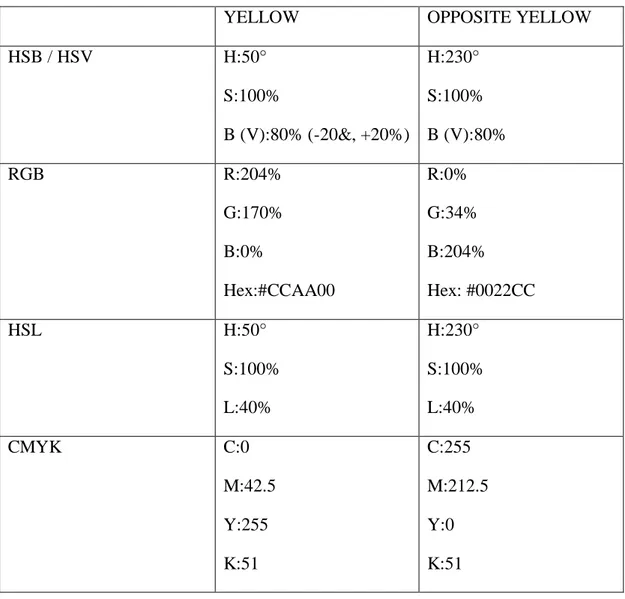
YELLOW OPPOSITE YELLOW
HSB / HSV H:50° S:100% B (V):80% (-20&, +20%) H:230° S:100% B (V):80% RGB R:204% G:170% B:0% Hex:#CCAA00 R:0% G:34% B:204% Hex: #0022CC HSL H:50° S:100% L:40% H:230° S:100% L:40% CMYK C:0 M:42.5 Y:255 K:51 C:255 M:212.5 Y:0 K:51 Source: http://colorizer.org/, http://www.colorschemer.com/online.html, http://www.colorpicker.com/, http://www.colortools.net/color_complementary.html 39
Figure 11. 20% Increased Value Sample of the Color Yellow.
Figure 12. 20% Decreased Value Sample of the Color Yellow.
Figure 13. Opposite Sample of the Color Yellow.
Table 4. Color Green and Its Different Color System Responses
GREEN OPPOSITE GREEN
HSB / HSV H:160° S:100% B (V):62% (-20&, +20%) H:340.38° S:100% B (V):62.35% RGB R:0% G:158.1% B:105.4% Hex: #009E69 R:159% G:0% B:52% Hex: #9F0034 HSL H:160° S:100% L:31% H:340.38° S:100% L:31.18% CMYK C:255 M:0 Y:85 K:96.9 C:0 M:255 Y:171.6 K:96 Source: http://colorizer.org/, http://www.colorschemer.com/online.html, http://www.colorpicker.com/, http://www.colortools.net/color_complementary.html 42
Figure 14. 20% Increased Value Sample of the Color Green.
Figure 15. 20% Decreased Value Sample of the Color Green.
Figure 16. Opposite Sample of the Color Green.
3.6. Questionnaire Form
As has been mentioned, adjective pairs chosen from Mehrabian and Russell’s PAD model was used. In this study thirteen adjective pairs were proposed because they were the most proper pairs for the aim of the study:
Group A measures how/ what retail store environment makes shoppers feel/ perceive the retail atmosphere:
(satisfied-unsatisfied) To examine what shoppers feel when they see
manipulated photographs as a first impression. Different colors can lead different satisfaction levels since they are just variables in those atmospheres.
(stimulated–relaxed) Principally, “vivid” colored stores may make shoppers feel stimulated which are indicated in the study which is conducted by Baker et al.
regarding prestige-image and discount image diversities.
(restricted-free) It is mostly related to layout of retail stores. As it is referred from Baker et al.: “A free-form layout (Burstiner, 1986) in the front area of the store operationalized the functional aspect of the prestige-image design environment”, which gives shoppers an opportunity to feel free in the retail stores.
(unhappy-happy) It is quiet crucial that retail environment makes shopper feel happy or unhappy.
(calm-excited) Certainly, colors have different impacts and when they are used as a design factor in retail stores, they can stimulate emotions which are based on Mehrabian-Russell’s semantic differential “arousal-nonarousal.”
(unattractive-attractive) It can be claimed that prestigiousness perception is highly attached to attractiveness of the atmosphere. By using of different colors, perception of attractiveness can be alternated: “Underlining the importance of color in the retail context, Bellizzi et al. (1983) showed that consumers consider red (i.e., high arousing) retail environments unpleasant, tension-inducing, and less attractive compared with blue (i.e., low arousing) retail environments, arguing that high arousal colors may over stimulate buyers, thereby impairing purchase deliberations and buying decisions” (Baker et al., 1994).
(dislike-like) Examining how a general perception is formed towards to overall atmosphere.
Group B measures how shoppers evaluate the retail store environment:
(usual-surprising) Dated, vivid and declassifier colors cannot be an issue in prestigiousness perception of retail environments as Baker et al. assert before. This is why color may be a surprising variable.
(low quality-high quality) Questioning whether color affects the quality perception of that store or not.
(uncrowded-crowded) To find answers if color makes retail store to be perceived as they are crowded or chromatic color scheme is able to change such a perception or not: “Several studies have shown that crowded conditions that involved other customers in a retail store negatively affected their inferences”, (Baker et al., 1994).
(cheap-expensive) Does color make retail store environment seem like cheaper or more expensive?
(old fashioned- fashionable) Color can affect retail atmosphere perceived fashionable or old fashioned since prior studies prove that dated and vivid colors are used in discount-image design although up-to-date colors are preferred in prestige-image design (Baker et al., 1994).
(cold-warm) To realize the differences between cold and warm color scheme with respect to prestigiousness perception of retail stores, this pair is chosen.
3.7. Procedure
The questionnaire was administered at two of Bilkent University’s food courts, namely Speed and Kıraç; as well as Bilkent University Library. It was applied on six consecutive days in May, 2013 (5 weekdays and 1 day during the weekend), between 13:40 - 18.30. Eighty university students from different departments who did not have an architecture background participated in the survey. Convenience sampling was preferred to find respondents who were ready to participate in questionnaire became helpful to complete the study since content of it was heavily loaded for respondents. To limit participants and to control the study Bilkent University
students were asked: 35 female and 45 male respondents agreed to participate in the study during six days, in same day time period and each respondent finished the questionnaire approximately in 15 minutes. The questionnaire consisted of pictures and adjective pairs (see Table A.1. and Table A.2.). As has been previously
mentioned, eight different picture pairs were printed together (according to pilot study results and comments) however four contrast hue examples were printed one by one and they were shown participants in 15 different orders which was done by hand randomly. Adjective pairs are selected from previous studies and they were divided as A and B parts. Part A was designed for understanding how retail stores in the examples make participants feel with seven adjective pairs and part B was designed to examine how participants evaluate the retail stores with six adjective pairs. Thus, each picture was questioned by 13 adjective pairs which were located according to shown picture; when value samples were shown (13+13) 26 adjective pairs were given to respondents, when opposite samples were displayed to
respondents only 13 adjective pairs were given.
CHAPTER 4
RESULTS of the STUDY
For factor analysis, reliability analysis, correlations and t-tests, Statistics Package for the Social Sciences (SPSS) 15.0 was used to analyze the data.
4.1. Verifications of the Manipulation of Variables in the Photographs Used for The Study
Firstly, to check if warmness and coldness were perceived differently, paired samples t-tests were conducted between the mean warmness ratings (M= 3.66, SD= .72) and coldness ratings (M= 3.31, SD= .64). They differed significantly in the predicted direction (M= -.356, t= 3.85, df = 79, two-tailed p = .00). Ratings indicated that warmness and coldness were perceived differently regarding store image which were shown in manipulated photographs found sufficient (see Table B.1.).
4.2. Factor Analysis of the Rating Data
Secondly, mean ratings of twelve stores which were manipulated by dark and light values of four primary NCS colors and their opposite colors were calculated. These
colors on surface elements considering the perception of store image were examined in adjective pairs for each of the 80 respondents.
Factor analysis was conducted to find the means of adjective pairs. According to correlation matrix, means of ratings for 13 adjective pairs were examined for 80 respondents. There were two groups of adjective pairs; the first group (group A) consisted of seven adjective pairs which questioned how stores made respondents feel and the second group (group B) consisted of six adjective pairs which questioned how respondents evaluated those stores to achieve overall means in 7-point scales. These thirteen adjective pairs were divided into groups of two: the first seven adjective pairs (group A) and next six adjectives pairs (group B) which were analyzed in groups.
In accordance with the results, three components, "Usual- Surprising" in Factor 1 and "Cold- Warm" in Factor 2 were loaded heavily on both factors. As the third factor “Crowdness Factor” could be assumed by 0.86 however it might be studied later which was also loaded heavily. But, “Crowdness Factor” was excluded from further analysis. Factor analysis had two factors as a result which were named as: F1: Evaluation and F2: Prestigiousness.
The first factor was named as “Evaluation Factor” and eight adjective pairs as items in this factor were; “Unsatisfied- Satisfied”, “Disliked- Liked”, “Unhappy- Happy”, “Unattractive- Attractive”, “Stimulated- Relaxed”, “Usual- Surprising”, “Restricted- Free”, and “Excited- Calm” with eigenvalue of 4.54 and accounted for 34.91 per cent
of variance. The second factor was named as “Prestigiousness Factor” and four adjective pairs as items in this factor were; “Old fashioned- Fashionable”, “Cheap- Expensive”, “Low quality- High quality”, and “Cold- Warm” with eigenvalue of 3.55 and accounted for 27.34 per cent of the total variance (see Table 5, Table 6, Table B.2.).
Table 5. Factor Analysis: Evaluation Factor
FACTOR 1 EVALUATION FACTOR
Unsatisfied- Satisfied 0.88 Disliked- Liked 0.77 Unhappy- Happy 0.75 Unattractive- Attractive 0.74 Stimulated- Relaxed 0.73 Usual- Surprising 0.62 Restricted- Free 0.61 Excited- Calm 0.56 50
Table 6. Factor Analysis: Prestigiousness Factor
FACTOR 2 PRESTIGIOUSNESS FACTOR
Old fashioned- Fashionable 0.88
Cheap- Expensive 0.85
Low quality- High quality 0.83
Cold- Warm 0.60
4.3. The Internal Consistency Reliability of the Rating Data
As mentioned above, two factors emerged from the factor analysis Evaluation Factor and Prestigiousness Factor. With respect to these factors, reliability test was
conducted to understand variables which generated each factor were reliable or not. The first group of variables was: “Unsatisfied- Satisfied”, “Disliked- Liked”, “Unhappy- Happy”, “Unattractive- Attractive”, “Stimulated- Relaxed”, “Usual- Surprising”, “Restricted- Free”, and “Excited- Calm” and their reliability considering Cronbach’s coefficient alpha was found to be .909. After factor analysis, for the Factor 2 which was Prestigiousness Factor, variables were: “Old fashioned-
Fashionable”, “Cheap- Expensive” and “Low quality- High quality” and Cronbach’s coefficient alpha was emerged as .923. As a conclusion, two groups of variables in each factor were quite sufficient and these items considered to be highly reliable (see Table B.3.).