Measuring the international digital divide: an
application of Kohonen self-organising maps
Joel I. Deichmann, Abdolreza Eshghi,
Dominique Haughton* and Sam Woolford
Data Analytics Research Team (DART),Bentley College, 175 Forest Street, Waltham, MA 02452-4705, USA E-mail: [email protected] E-mail: [email protected] E-mail: [email protected] E-mail: [email protected] *Corresponding author
Selin Sayek
Bilkent University, Ankara, Turkey E-mail: [email protected]Abstract: With the help of a Kohonen self-organising algorithm, this paper
presents a mapping and analysis of the global digital divide along with its main drivers. Several broad groups and subgroups are identified, consisting of countries that are similar in their digital development and in a number of other attributes. We find that the digital divide seems to occur synchronously with divisions in income, social, demographic and infrastructure measures. By examining a large dataset of 160 countries over a short period of three years, we find evidence of both convergence and divergence among the countries over time. We expect these findings to inform the ongoing debate on drivers of the International Digital Divide (IDD). In addition, this paper provides a novel visualisation of the digital divide and its predictors on a two-dimensional grid. Extensions of this work, with the availability of more years of data, could investigate the potential convergence of countries to particular patterns of digital development.
Keywords: International Digital Divide; IDD; Kohonen maps; Self-Organising
Maps; SOM.
Reference to this paper should be made as follows: Deichmann, J.I.,
Eshghi, A., Haughton, D., Woolford, S. and Sayek, S. (2007) ‘Measuring the international digital divide: an application of Kohonen self-organising maps’,
Int. J. Knowledge and Learning, Vol. 3, No. 6, pp.552–575.
Biographical notes: Joel I. Deichmann is an Associate Professor of
Geography. His research interests are in foreign direct investment, international education and international tourism, specialising in Central and Eastern Europe.
Abdolreza Eshghi is a Professor of Marketing in the Marketing Department. His research interests are in customer relationship management and international marketing issues.
Dominique Haughton is a Professor of Mathematical Sciences. Her research interests include statistics and marketing, the analysis of living standards data, international statistics and data mining.
Sam Woolford is a Professor of Mathematical Sciences. His research interests include statistics applied to marketing and optimisation problems.
Selin Sayek is an Assistant Professor of Economics at Bilkent University. Her research interests are the determinants and effects of foreign direct investment.
1 Introduction
Recent research evidence points to the persistence of a global digital divide among countries (Ho and Tseng, 2006). This is not only a pressing issue for national policymakers, but it is also an issue that has prompted international organisations and governments to intensify their efforts to understand the causes of the divide and formulate policy responses to reduce the problem in the coming decade (Mistry, 2005). These efforts require an in-depth understanding of the many dimensions of the digital divide, including basic access to and use of technology, factors that influence access and use and finally, the application of advanced technology. In this paper, we rely upon the strengths of an advanced visual statistical technique in our examination of the evolution and determinants of the International Digital Divide (IDD).
Specifically, this paper identifies global patterns in the evolution of digital development that correspond to measures of economic and social well-being. Using the data for the years 2001–2003, we employ Kohonen Self-Organising Maps (SOM) to identify the extent of the digital divide, the way in which it has evolved during these three years, and the associated patterns in economic, social and cultural factors. Using these variables, we generate SOMs to facilitate a better understanding of plausible underlying relationships, stopping short of claiming causality.
A key contribution of this paper is the provision and analysis of a two-dimensional grid representation of the digital divide along with its main predictors. Variables representing the digital level of a country as well as its drivers evolve in a monotonic (increasing or decreasing) manner as one moves across the map. This makes it possible to identify groups of countries that are similar in their digital level as well as wealth and social well-being, and to understand the common evolution of the digital level of a country and of some of the predictors. In addition, we find that we are able to use a wider range of variables and countries than in past work. Moreover, our analysis also demonstrates the utility of Kohonen maps as a data reduction and clustering technique.
2 Literature review
The IDD, broadly identified as the variation in the degree of internet access, is a topic of considerable ongoing research. There is very little doubt that the digital gap between least-developed-countries (see http://unstats.un.org/unsd/cdb/cdb_dict_xrxx.asp?def_ code=481 for an official United Nations definition of this term), developing and developed countries (http://unstats.un.org/unsd/cdb/cdb_dict_xrxx.asp?def_code=491)
continues to widen (Nair et al., 2005). More recent evidence, however, suggests that a dual development may be occurring over time. While developed and rapidly developing regions have narrowed the gap towards the Northern European region, the gap between other developing and the least developed countries continues to persist. Overall, Ho and Tseng (2006) contend that the global inequality of internet penetration is extraordinary.
A recent study by Nair et al. (2005) attributes the widening of the digital gap between the least-developed-countries and developing countries to a limited access to affordable Information and Communication Technologies (ICT) infrastructure and services, a lack of competition in the ICT sector, low ICT literacy and a weak e-business environment. It is of course clear that a thorough understanding of the determinants of the digital divide is necessary before any attempt to reduce the gap is put into effect. Therefore, the steady stream of scholarly research on the subject continues to grow. In what follows, we provide an overview of findings from past research.
A large portion of the IDD literature focuses upon the key question of what factors drive the global digital gap. Three categories of determinants, sometimes referred to as first order effects, include economic factors (e.g. per capita income), socio-cultural factors (e.g. religious affiliation) and infrastructure (e.g. the number of telephone lines per population). Hargittai (1999) makes one of the first attempts to identify drivers of IDD. Using the Organisation for Economic Cooperation and Development data, Hargittai concludes that per capita income and telecommunications infrastructure are the most important determinants of the IDD. In their examination of 105 countries, Beilock and Dimitrova (2003) identify per capita income as a major determinant of the IDD. In their subsequent study of digital divide among post-socialist countries, the same authors confirm the important role of infrastructure and income in explaining the IDD (Dimitrova and Beilock, 2005). They find that among these factors income explains 81% of the variation in the number of internet users per 10,000 inhabitants among the transition economies of Central and Eastern Europe.
Norris (2001) explores the influence of the institutional structure of the economy on the digital divide and finds that the level of democratisation falls short of significance when economic and social development variables are controlled for. Focusing on post-socialist countries of Eastern Europe, Dimitrova and Beilock (2005) examine the impact of religious affiliation and civil liberties on the number of internet users per 10,000 individuals, and discover that internet penetration is correlated with religious affiliation.
Another subset of the literature looks at second-order effects (characteristics of individuals) that affect access to and use of ICT. Norris (2001) examines the role of social, economic and demographic factors such as age, gender, income and education in explaining online participation as well as access to new (computer related) and old (cable and television) media technologies.
More recently, Chaudhuri et al. (2005) analyses the impact of socio-economic-demographic variables on internet access and finds that income and education are strong determinants of a household’s decision to pay for basic internet access.
By far the most comprehensive literature review available, Dewan and Riggins’ (2005) survey features more than 100 scholarly papers published between 1987 and 2006. The authors examine published work at three levels of analysis: individual, organisational and global. At each level, they note the theoretical perspective taken, the methodology used, and the key findings. We do not intend to duplicate this extensive review here because not all of the reviewed material is directly relevant to this research,
but we do refer the interested reader to the article. Here, we briefly summarise only the global level IDD determinants identified by these authors from 15 papers published since 1999. Employing various methodologies, these studies covered a wide range of developed and developing countries, and identified the following variables as strong correlates of ICT penetration:
• human capital as measured by level of schooling • international trade
• manufacturing share of the economy • per capita income
• infrastructure
• telecommunications policy, including standards, pricing and regulatory regime • urban population
• competition policy.
Rasiah (2006) examines the link between ICT penetration, measured by the number of telephone lines per 1000 people, and GDP per capita for the years between 1995 and 2000, identifying a strong positive relationship between the two variables. Moreover, the ICT is found to have a synergistic effect on GDP per capita, prompting the author to call for increased government investment on ICT.
In their longitudinal study of 39 countries, Zhao et al. (2007) find that the rule of law, educational systems and the degree of industrialisation significantly influence global internet diffusion. They also examine the impact of uncertainty avoidance, a variable that had not previously been considered in the IDD literature, and find it to be a significant inhibitor of internet diffusion, particularly in less developed countries.
Finally, Chinn and Fairlie (2004, 2007) examine the disparities in personal computer and internet penetration in 161 countries from the period 1999 to 2001. Their research confirms the previous findings that per capita income, years of schooling, illiteracy, youth and age dependency, urbanisation, telephone density, electricity consumption and regulatory quality all play an important role in personal computer and internet diffusion across the countries. They conclude that the global digital divide is mainly, but not entirely, determined by income differentials.
Deichmann et al. (2006a) identify novel aspects of the relationship between IDD and its predictors by exploring interactions among the predictors and identifying the presence of break-points in the relationships. Specifically, the authors identify complex interactions between factors such as wealth, infrastructure, and education while observing the evolution of the digital divide over the years 2001–2003. The variables considered in this paper are based on the study by Chinn and Fairlie (2007), for which a preprint was available in 2004 (Chinn and Fairlie, 2004).
The authors cited in our literature review have explored the IDD from a wide range of perspectives. The research presented in this paper attempts to include a range of variables that represent and integrate the dimensions of variables included in these prior
studies. Using Kohonen SOM, we are able to investigate the nature of the IDD across all the predictor variables simultaneously.
More specifically, the set of variables chosen and carefully justified (on the basis of economic theoretic considerations as well as past literature) by Chinn and Fairlie (2004, 2007) guided the choice of variables for this paper. The variables can be organised in five different groups, which will be described below.
3 Methodology
In order to achieve our objective of understanding how the digital divide has evolved along with its determinants over the period 2001–2003, we employ Kohonen SOMs. An SOM is an exploratory data analysis technique that projects a multidimensional data set onto a space with a small dimension (typically a two-dimensional plane). SOMs thus allow for the convenient visualisation of a data set and the effective identification of groups that share similar characteristics. In this sense, a Kohonen map might be compared to a ‘factor-cluster’ analysis, in which variables are first summarised by the creation of ‘factors’, and the factors are then used to cluster observations (in this case country-year pairs, such as for instance Finland 2001 or Egypt 2003). The advantage of the Kohonen approach is the self-organising feature of the map, a very powerful property that makes estimated components vary in a monotonic way across the map, as will be further explained below.
A detailed explanation of the Kohonen maps can be found in Kaski and Kohonen (1995), and a comprehensive overview of SOM methods and case studies is offered in Kohonen (2001). Since the introduction of SOMs by Kohonen (1982), researchers have applied the techniques to a multitude of areas represented by an extensive bibliography with more than 5000 papers available on the SOM web site (http://www.cis.hut.fi/ research/som-bibl/). We will discuss the SOM methodology in more detail later in this paper, and provide a brief description of the algorithm in Appendix A.
4 Data
Due to data limitations, in an effort to maximise the number of countries included in the analysis, and in line with the choice of variables in Chinn and Fairlie (2007) and Deichmann et al. (2006a), our data set includes variables described in Table 1 and arranged into five groups.
The first group, referred to as Digital Development, includes the number of internet users per 10,000 population (see e.g. Dimitrova and Beilock, 2005), and the number of computers per 100 inhabitants (ranging from less than one in the developing world to more than 50 in Europe).
The four remaining groups, Economic, Infrastructure, Demographic and Risk correspond to the commonly agreed upon factors that explain variations across countries in their digital development.
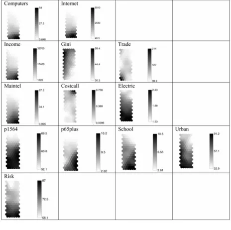
Table 1 Description of variables
Variable Description Year(s) Source Group
Computers Number of computers per
100 people 2001–2003 ITU Digital Dev.
Internet Number of internet users per
10,000 2001–2003 ITU Digital Dev.
Income GNI per capita in
international ppp dollars 2001–2003 World Bank Economic Gini Average Gini index for
reported years 1989–1993 Various Economic
Trade Trade in goods as a
percentage of GDP 2001–2003 World Bank Economic Maintel Number of main telephone
lines per 100 2001–2003 World Bank Infrastructure Costcall Cost of three-minute local
call ($PPP) 2001–2003 ITU Infrastructure
Electric Electricity consumption
kwh/capita 2001–2003 World Bank Infrastructure
p1564 Percentage of population age
15–64 2001–2003 World Bank Demographic
p65plus Percentage of population
65 and older 2001–2003 World Bank Demographic
School Average years of schooling
of adults 2001–2003 World Bank Demographic
Urban Urban population as percent
of total 2001–2003 World Bank Demographic
Risk Composite Risk Rating Index 2001–2003 PRS Group Risk
Note: ‘ITU’ = International Telecommunications Union, ‘PRS’ = Political Risk Services.
Our economic variables include those that are prominent in the literature. First, the income level of a country (‘income’) is measured by the Gross National Income (GNI) per capita in international Purchasing Power Parity (PPP) dollars. The Gini index (‘gini’) measures the inequality of the income distribution (the Gini coefficient takes values between 0, representing one extreme in which everyone has the same income, and 1 representing the other extreme in which one person has all the income and everyone else has no income; see Gini, 1921). To capture trade openness, ‘trade’ takes into consideration the importance of exports and imports of goods relative to the size of the economy. International trade facilitates technology transfer (Connolly, 2003; Saggi, 2002), and is thus expected to play a role in reducing the digital divide. It is plausible that high levels of imports, in particular, would be conducive to the inward diffusion of ICT.
The level of infrastructure is measured by variables on the number of main telephone lines per 100 population (‘maintel’), the cost of a 3 min phone call (‘costcall’), as well as the level of electricity consumption (‘electric’).
The demographic structure of a country is measured by variables on the percentage of people between the ages of 15 and 64 (‘p1564’) and those 65 and over (‘p65plus’), the average number of years of schooling of adults (‘school’), and the percentage of each country’s population that dwells in an urban setting (‘urban’). The relevance of age, gender, education and other cultural traits are established by the microlevel studies discussed above (Kubicek, 2004; Mendoza and Toledo 1997).
In order to capture the risk related to the political situation in each country, we include the Composite Risk Rating Index (‘risk’) compiled by the Political Risk Services Group1
in their International Country Risk Guide publications. This index measures not only cyclical economic risks but also the political soundness of each country. Higher values represent lower risks. For example, the data range from scores in the fifties in Sub-Saharan African states to Scandinavian scores in the mid-eighties. The risk variable is included in our analysis as a sensible proxy for regularity quality and the rule of law as used in Chinn and Fairlie (2004, 2007), since these variables were not available to us.
Our data were collected from 160 countries over the years 2001–2003. At the time of writing, these years were the most recent for which a complete set of data was available. In order to maximise the readability of the Kohonen map graphs, each country is labelled according to its three-digit international code, and each year is represented as 1 (2001), 2 (2002) or 3 (2003). The country codes are listed in Appendix B. The following variables were fully populated in our dataset: p1564, p65plus, urban, maintel, internet and computers. For missing cells in other variables we imputed2
values by regressing predictors on other predictors (but not on ‘internet’ and ‘computers’), as was done in Deichmann et al. (2006a,b).
5 Analysis
Our Kohonen map allows us to examine 160 countries and identify groups along the five dimensions articulated in our data section, reflecting digital development, economic, national infrastructure, demographic and composite risk variables.
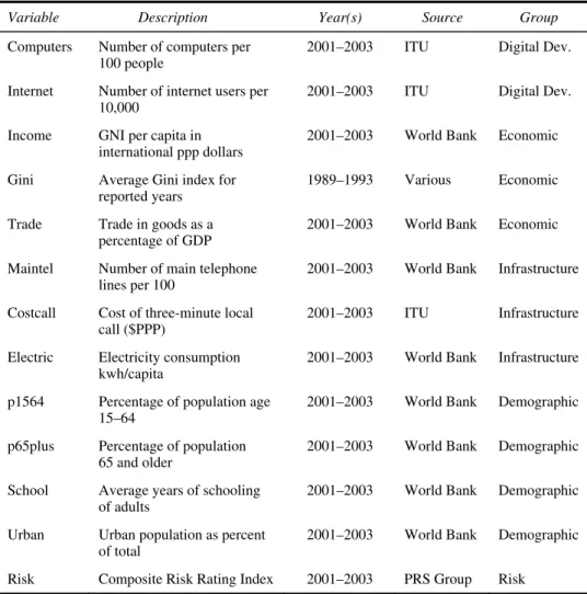
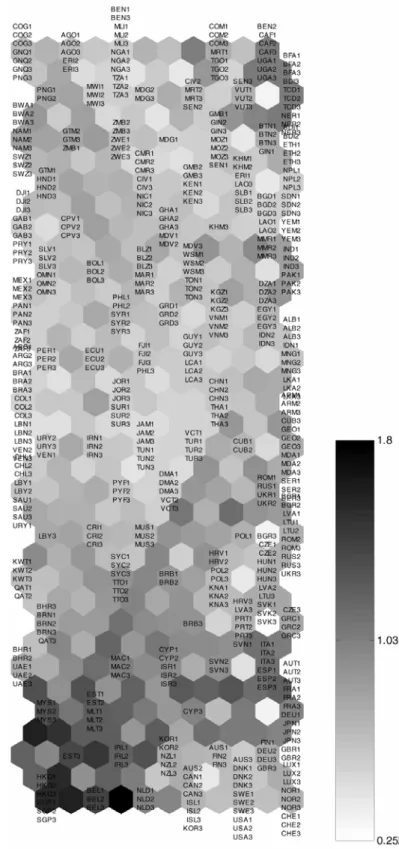
Several tools are available to construct Kohonen maps, differing essentially in the way results are presented graphically. The map in this paper was generated using the software Matlab 6.0 and the SOM Matlab toolkit (http://www.cis.hut.fi/ projects/somtoolbox/) yielding two graphs, the U-matrix (Figure 1) and the component matrix (Figure 4), which will be explained in more detail below. We chose the SOM Matlab toolkit because it features more easily interpretable graphical output, compared with other available tools. Figures 2 and 3 are reproductions of the U-matrix in Figure 1 with clusters of countries delineated for purposes of further interpretation given below, and Figure 5 provides our interpretation of the dimensions; these figures will be discussed at more length below.
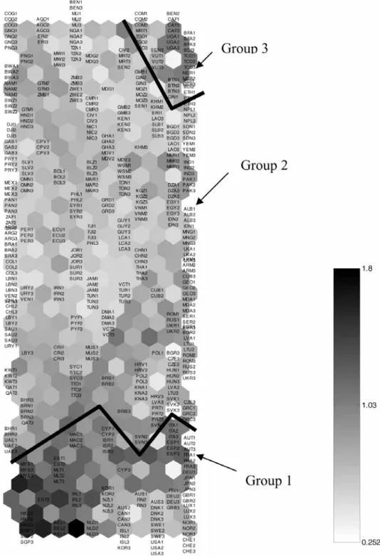
Figure 3 Subgroups identified by the U-matrix
Prior to applying the SOM algorithm, it is typical to standardise the variables used in the analysis. This means that all variables will in fact be replaced by their z-score, consisting of the original variable minus its mean, and divided by its standard deviation. It follows that all such standardised variables have a mean of zero, and more importantly a standard deviation of one. Consequently, all variables enter the SOM algorithm with the same weight. This is important because the SOM algorithm (described intuitively below, and with its equations in Appendix A) computes squares of differences between two sets of values of variables. One would not wish to have a variable carry a very large weight in such computations only because of its scale; if one were to express income in cents, for example, the variable INCOME could easily dominate the computations. The standardisation ensures that this problem does not occur.
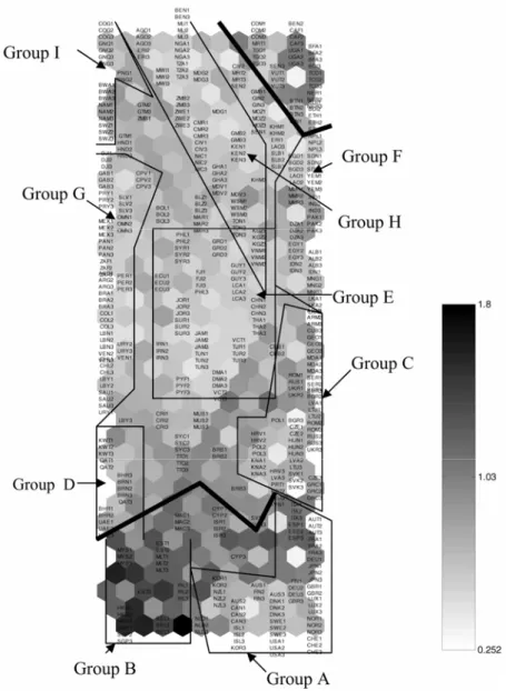
Figure 4 Kohonen components maps (by group on each row: Digital development, Economic,
Infrastructure, Demographic and Risk)
Of course, the decision to give the same weight to each variable is somewhat arbitrary. For example, one might wish to allocate to income twice the importance of another variable. It is possible to do that by standardising the variables as mentioned above, and then multiplying by a factor of square root of two, a variable for which the weight should be doubled in the computation of the squared differences. Finding no a priori rationale to do otherwise, we allocate the same importance to all 13 variables in this paper.
We now explain in an intuitive manner how the SOM algorithm functions. The algorithm first determines a suitable size for the map (i.e. a suitable number of rows and columns) on the basis of how much correlation exists among the variables. In the case of this paper, a map with 18 rows and 6 columns was selected, yielding 18 times 6 or 108 positions.
At this point, the algorithm assigns to each of the 108 positions a random 13-dimensional vector, where the dimension 13 of the vector corresponds to the number of variables used in constructing the map. Therefore, in the initial state of the map, the vectors assigned to the positions have nothing to do with the data for any of the countries. In the first iteration, the first country with its 13-dimensional actual data vector for a given year is considered and the Euclidean distance between the data vector for the country in that year and each of the random vectors (computed as the square root of the sum of the 13 squared differences between each vector component for the country and the random vector component) is computed. A Best Matching Unit (BMU) is then identified as the map position for which that distance is the smallest.
It is useful to note that in any given computation of the Euclidean distance between a pair of vectors, the larger the squared difference is for a particular variable, the higher the contribution of that variable to the Euclidean distance computation for that pair. It could of course happen that different variables contribute to this computation differently for different pairs since pairs will typically differ upon which variables they are similar or dissimilar.
Once the BMU has been identified, the random vector at that position and its neighbours gets modified so as to come closer to the vector of the country considered in that particular iteration. In other words, the data vector for the country is allowed to influence the initial random vectors at the BMU and its neighbours to bring them more in line with actual data. The next iteration considers another country and its data vector for a given year, and performs the same operation. With successive iterations, the BMUs and their modified vectors change less and less; at the point of stabilisation one would say that the map has converged.
At the end of this process, the algorithm has computed a set of 108 estimated vectors, one for each map position. Each component (among 13 such components) of the 108 estimated vectors corresponds to its matching component of the country data vectors (e.g. P1564). In the Matlab SOM toolkit, these estimated values are represented on a graph called the components map. As an illustration, if we examine Figure 4, we see that the algorithm estimated the 12th component (corresponding to the variable TRADE) to be very high (black/dark grey) in the bottom left two cells of the map. Looking closely at each of the components in Figure 4, one can see that 108 positions appear (18 rows by 6 columns), each with a different shade to represent the estimated value of the component in that position of the map.
The self-organising property of the Kohonen algorithm is illustrated in Figure 4. Indeed, one can see the estimated values of the components move monotonically from large values to small values as one moves vertically or diagonally across the map. For example, the estimated Gini coefficient seems to decrease as one moves diagonally from the top left to the bottom right of the map. In our view, it is this property which has contributed to the fame of the SOM algorithm, because of the ease of interpretation afforded by the property: one can now identify for instance that moving from top to bottom on the graph seems to imply an increase in wealth, judging by the estimated values of ‘income’. If estimated ‘income’ fluctuated as one looks from top to bottom on the map, it would be much harder to interpret axes on the map.
One might wonder at this stage how the algorithm determines where on the map the countries (in different years, recalling that each country has three data vectors, one for each of the years) should be positioned. This is actually done very simply: for each country and year, the Euclidean distance between its (standardised) data vector and each of the 108 estimated vectors obtained at the completion of the algorithm is computed, and a position identified where that distance is the smallest.
Of course, it is possible that several countries position themselves at the same map location, if they happen to have their (standardised) data vector closest in Euclidean distance to that of the same position on the map. This occurs for example, for Hong Kong and Singapore (for all three years of data); the data vectors for these 6 observations share the same BMU, because all six have their data vector closest to the same estimated vector, among the 108 such estimated vectors on the map. This implies among other things that the position of Hong Kong and Singapore is very stable over the three-year period.
It is also clearly possible that some map locations have no country attached to them, even though they do have an estimated vector. This would mean that no country found the estimated vector for that position to be closest to its (standardised) data vector; there were always other positions with closer data vectors.
It is worth emphasising at this stage that the positioning of the countries on the map has nothing to do with geography; rather, closeness between two positions on the map is measured by the Euclidean distance between the estimated vectors for these positions. It can of course happen, and this is not infrequent, that countries that are geographically close tend to bunch up together in regions of the Kohonen map; but that is because they tend to have fairly close values for the input variables in that case. For example, the Nordic countries tend to group together, but on the basis of their similarities with regard to the five groups of variables rather than geographic proximity.
The country locations are shown in Figure 1. The first feature we notice is that the U-matrix represented in this figure contains not only the 108 map positions, but also those positions plus an additional hexagon between any two map positions. The shade of these intermediate hexagons reflect the Euclidean distance between estimated vectors for the two bordering hexagons. For instance, in the bottom part of the U-matrix in Figure 1, we see that the estimated vector at the hexagon featuring Belgium (BEL1, 2 and 3) is very distant from that at the hexagon featuring the Netherlands (NDL1, 2 and 3), since these two hexagons are separated by an almost black intermediary hexagon. Shades of hexagons that do represent country positions reflect the average distance between the estimated vector at a map hexagon and those of its neighbours. For instance, the mid-grey shade in the map position featuring Malaysia (MYS1, 2 and 3) near
the bottom left of the map implies that the estimated vector in that position is quite different from those of its neighbours (an average of darker and lighter shades of grey). Streaks of hexagons with higher distance shades thus tend to represent boundaries among groups of countries, yielding the interpretation we present and illustrate in Figures 2 and 3 and specify in Table 2.
Table 2 Broad country clusters identified in the U-matrix
Group 1: Australia, Austria, Belgium, Canada, Cyprus, Germany, Denmark, Estonia, Finland, France, Hong Kong, Ireland, Iceland, Israel, Italy, Japan, Korea, Luxembourg, Macao Special Administrative region of China, Malta, Malaysia, Netherlands, Norway, New Zealand, Singapore, Spain, Sweden, Switzerland, UK, USA.
Group 2: Afghanistan, Albania, Algeria, American Samoa, Angola, Antigua and Barbuda,
Argentina, Armenia, Azerbaijan, Bahamas, Bahrain, Bangladesh, Barbados, Belarus, Belize, Bermuda, Bolivia, Botswana, Brazil, Brunei, Bulgaria, Burkina Faso, Cambodia, Cameroon, Cape Verde, Chad, Chile, China, Colombia, Congo Dem. Rep., Congo Rep., Costa Rica, Cote d'Ivoire, Croatia, Cuba, Czech Republic, Djibouti, Dominica, Dominican Republic, Ecuador, Egypt, El Salvador, Equatorial Guinea, Eritrea, Ethiopia, Fiji, Finland,
French Polynesia, Gabon, Gambia, Georgia, Ghana, Greece, Grenada, Guam, Guatemala, Guinea-Bissau, Guyana, Haiti, Honduras, Hong Kong, Hungary, Iceland, India, Indonesia, Iran, Iraq, Jamaica, Jordan, Kazakhstan, Kenya, Kiribati, Kuwait, Kyrgyz Republic, Lao PDR, Latvia, Lebanon, Lesotho, Liberia, Libya, Lithuania, Macedonia, Madagascar, Malawi, Maldives, Mali, Marshall Islands, Mauritius, Mexico, Moldova, Mongolia, Morocco, Mozambique, Myanmar, Namibia, Nepal, New Caledonia, Nicaragua, Niger, Nigeria, Oman, Pakistan, Panama, Papua New Guinea, Paraguay, Peru, Philippines, Poland, Portugal, Puerto Rico, Qatar, Romania, Russian Federation, Rwanda, Samoa, Sao Tome and Principe, Saudi Arabia, Senegal, Seychelles, Sierra Leone, Slovak Republic, Slovenia, Solomon Islands, Somalia, South Africa, Sri Lanka, St. Kitts and Nevis, St. Lucia, St. Vincent and the
Grenadines, Sudan, Suriname, Swaziland, Syrian Arab Republic, Tajikistan, Tanzania, Thailand, Tonga, Trinidad and Tobago, Tunisia, Turkey, Uganda, Ukraine, Uruguay, Uzbekistan, Venezuela, Vietnam, Virgin Islands, Zambia, Zimbabwe.
Group 3: Burundi, Benin, Bhutan, Central African Republic, Comoros, Ethiopia, Guinea, Mauritania, Togo, Uganda, Vanuatu.
Finally, our dataset allows us to demonstrate yet another strength of SOMs as a tool for analysis. Because we use data for three years, in some cases it is possible to identify movement by countries over time in Figure 1. A few examples include the ‘upward mobility’ of Australia, Cyprus and Poland, all of which move toward the extreme sections of the map. We briefly interpret such movements after identifying main groups in Figure 2.
For example, Group 3 in Figure 2 was identified as a fairly diverse group of positions as compared to the more homogeneous (lighter shade) region near-by. The thick line delineating this group on Figure 2 arises from a streak of darker hexagons indicating higher distances (compared to lighter shades).
The U-matrix and its represented Euclidean distances between map positions is where one can begin to identify clusters in the map as amalgams of hexagons with low distance hexagons separated by ‘walls’ of hexagons with higher distance shades. This of course is the reason why Kohonen maps are also considered as a clustering technique but with the additional SOM property. To summarise, the clusters are seen on the U-matrix with its featured measures of proximity, while the interpretation of what it means to move up and down or across the map is indicated by the components maps (Figure 4) and summarised in Figure 5.
A Kohonen map thus consists of a number of graphs, the U-matrix with 108 positions and all intervening hexagons, and each component map (with as many component maps as there are input variables). It is important to remain aware of the fact that the 108 positions are the same on each component map, and on each non-intervening hexagon of the U-matrix. In other words, for example, the bottom left hexagon represents the same position in Figure 1 and each of the component maps in Figure 4. What changes is what is represented at that particular map position, the average distance (the darker the higher) from its neighbours in the U-matrix in Figure 1, and the value of each estimated component at that map position in the graphs in Figure 4.
For example, if we focus on the bottom left position on the U-matrix in Figure 1 (where Hong Kong and Singapore have positioned themselves for all three years of data after construction of the map), the dark grey of that position in Figure 1 means that the estimated vector in that position is very different from that of its neighbours (the dark grey shade represents an average between the lighter grey and darker grey shades of intervening hexagons which in turn represent Euclidean distances between the bottom left position and its three neighbouring positions). Examining the same position (bottom left) on the component graphs in Figure 4, we can see that this position is associated with a very high estimated value of the variables trade and urban (black), low estimated values for the variable costcall (faint grey) and high estimated values for the variables computers and internet (dark grey).
The clusters delineated in Figures 2 and 3 suggest that the world can be viewed as three distinct groups of countries along the dimensions of digital development and country characteristics. We start by discussing these three broad clusters, since they seem to be very well separated from one another. While it is arguable that distinct subclusters also exist within these three groups, we will progress from the more general to the more specific, seeking insights from the country-specific characteristics (Figure 3). Once we complete the analysis of the country clusters along the five dimensions, we analyse the manner in which each component evolves across the clusters, focusing on the digital access/infrastructure dimension, and capturing the internet connectedness of the country and the ownership of personal computers.
Before going further, it is pertinent to emphasise that clusters identified by Kohonen maps are delineated by streaks of high Euclidean distance shades (between a position and its immediate neighbours) forming ‘walls’ between clusters, but that a certain arbitrariness remains in identifying clusters. Of course, this is true of essentially all clustering techniques, with the exception of model-based clustering methods in very special circumstances. In this paper we chose to identify clusters with Kononen maps rather than alternative clustering methods because of the self organising property of the technique.
Given their extensive membership and relative homogeneity, it is most straightforward to begin by discussing Groups 1 and 3, then moving to Group 2. Group 1 mainly includes developed OECD countries, and wealthy city-states. Table 2 gives the list of countries included in each of these three broad groups. The OECD-member countries are listed in italics in the table, to ease the interpretation of the clusters. Group 3 represents the poorest countries of the world, many of them landlocked, including Burundi, Bhutan and the Central African Republic. Most of this group (in italics in Table 2) is Sub-Saharan but not part of Southern Africa. Specifically, the cluster also includes Uganda, Benin, Guinea, Mauritania and Togo. This observation suggests a strong divide between the industrialised and economically well-developed Group 1 and a
significant portion of the African continent (Group 3). Furthermore, in Figure 3, we identify a clear and substantial divide across regions within Sub-Saharan Africa, where the Southern African countries cluster separately from the Western, Eastern and Central African countries. In contrast to the geographical cohesion of Groups 1 and 3, Group 2 features a very diverse membership. Many countries in this group have economies that are upwardly mobile (e.g. the Central European states), but the subgroups are set off by variation in demography (such as Cameroon), risk (sub as Iraq and Afghanistan) and infrastructure (such as Bolivia). Finally, we pointed out earlier that Australia, Cyprus and Poland are among the countries that change locations over time (in other words, different placements of AUS1, AUS2, AUS3). In these cases, movement occurs within Group 1 or towards that Group from within Group 2. Ghana and Nigeria are two examples of upwardly mobile countries at the other end of Group 2 (especially with regard to ICT as they move to the right of the map), but unfortunately Madagascar and other countries have moved in the opposite direction.
In order to interpret our map in more specific detail, we produce Figure 3. Within Group 1, there seem to be two subclusters, well-defined as the developed-OECD countries and the city-states including Hong Kong and Singapore. We label the former group as “Group A” in Figure 3, while labelling the latter as ‘Group B’. One could also distinguish the Southern European countries from the remaining developed-OECD states. The discussion of the component matrices will help identify which of the five dimensions these groups differ on. Within Group 3, there are few clear subgroups to discuss. However, in the very dense middle of the map, where a wide variety of countries have clustered, several subgroups are identifiable. At this point, it is important to note that while the three broad groups are clearly separate from one another, the broad groups within clusters are not as far apart from each other as the three broad groups are. We next discuss the subgroups within Group 2.
Figure 3 makes it possible to delineate seven clusters within Group 2. Group C includes several of the Former Soviet Republics, as well as a portion of Central and Eastern Europe. In other words, some transition countries can be considered as a cluster, close to the Southern European region, but far enough to form a separate entity. There seems to be some variation among the transition countries as well, as Albania and Armenia, for example, are far from Hungary and the Russian Federation. Although the extensive literature on the transition economies would suggest that clusters formed by similarities in economic and demographic characteristics would map well with the geographic clusters of the transition countries (e.g. the post-Communist European states vis-à-vis the former Soviet republics) here such clear geographic distribution is not evident at all. However, one could observe that the transition countries that have proceeded well into transition such as Hungary, Poland and the Czech Republic group together and are close to the Southern European countries, while the countries that have been slow in reforming and transitioning such as Armenia, Georgia and Moldova group together and are positioned far from the former group.
Another cluster includes the high-income Middle Eastern countries, such as Kuwait, Qatar, Bahrain and the United Arab Emirates, labelled as Group D. These countries are clearly divided from the other clusters. The remaining Middle Eastern countries, such as Saudi Arabia and Libya, seem to diverge from the rest of the oil-rich Middle Eastern countries, and there seems to be a further divide among the Middle Eastern countries. For example, Egypt groups with the South Asian and Turkic countries (Group F), whereas Lebanon, Oman, Libya and Saudi Arabia group with a majority of Latin
American countries (Group G), and Tunisia, Jordan, Syria, Iran and Turkey seem to be clustered together and separately from the other countries in the same region (Group E).
Finally, the remaining African countries that have not clustered into the extreme Group 3, seem to be clustered in Groups H and J, where Group J seems to be mostly composed of the Southern African countries while Group H includes several Western and Central African countries as well as several Central American countries.
Given that the objective of the analysis is to identify the digital divide among these 160 or so countries, we next discuss the component matrix, which features the estimated internet connectedness and estimated ownership of personal computer variables, as well as estimated predictors. The clustering of countries based on both digital access variables follows closely the divide discussed above. In other words, the three-pole world structure identified earlier is found to apply to the digital divide as well, where the Sub-Saharan African countries are very much divided from the rest of the world as well as the developed-OECD countries. While the developed-OECD countries alongside the city-states are found to be digitally very advanced (both with high personal computer ownership and higher internet access), the Sub-Saharan African countries are found to be digitally very poorly developed. Once again, this portion of the map features a large number of countries that do not seem to be distinct within the group.
The components matrices helps one identify how the economic, demographic, infrastructural, digital access and risk-related factors evolve across the groups. Figure 5 summarises the dimensions that separate the above-discussed clusters from one another. If one were to consider the main factors that contrast the three groups, aside from the digital access already discussed, one can observe that as one moves from Group 1 to Group 3, income per capita decreases, schooling ratios are much lower and the digital infrastructure – captured by the cost of calls and the existence of telephone mainlines – is much poorer. This coincides with a worsening of digital access. One could argue that this finding suggests that countries group according to their economic well-being as well as digital infrastructure, which maps very well with the digital divide across the countries. Countries that are economically well-developed coincide with those with better digital infrastructure, and this coincides with areas that have better access to digital resources.
Therefore, one can conclude that the worldwide digital divide is best depicted by the economic development and digital infrastructure-divide. Indeed, the digital access, the economic development and the digital infrastructure evolve in similar patterns across the country groups. For example, the movement from Group 3 to Group 1 reflects a movement from economically poor countries to richer countries, from countries with higher cost of calls and less access to telephone mainlines, that is poor digital infrastructure, to countries that have better developed digital infrastructure. One could also add the ‘electricity consumption per capita’ among the infrastructure related variables. These movements coincide with a movement from digitally poor countries, in terms of the population’s access to personal computers and internet, to digitally better developed countries. As a result, one can argue that the Kohonen map reveals a synchronous picture of the digital divide and the economic and infrastructure divide across the countries. In particular, we note that the finding that the digital divide maps very similarly to an income-divide worldwide is supportive of the arguments provided by Rasiah (2006) that the economic well-being and ICT access are endogenously determined.
Further analysis of the components suggests that as the focus of examination moves from Group 3 to Group 1, the global integration of economies increases, as measured by
the share of trade in the economy’s GDP. Furthermore, the demographics of the three groups are very different from each other. As one moves from the top left to the bottom right of the map, the proportion of older people tends to increase, though the share of the working-age population is still found to be larger in Group 1 than in Group 3, and the rate of urbanisation is higher in the economically developed regions. In other words, the maps suggest that the digital divide seems to also reflect the demographic characteristics of the world. It is clear that urban economies with substantial working-age and elderly populations are digitally much more advanced than countries with younger, rural populations. In short, the digital divide mirrors the demographic divide across countries.
We generate Figure 5 as a simplification of Figure 4 based upon our interpretation of the map. As an illustrative example, consider the estimated component corresponding to ‘p65plus’. One can see on Figure 4 that this estimated component increases diagonally from top left to bottom right; hence the corresponding top left to bottom right arrow labelled ‘Aging’ on Figure 5. Other Figure 5 arrows correspond to movements of other estimated components from Figure 4.
The sketch in Figure 5 reflects the changes in the values of variables in the case of the poorer Group 3 (top of Figure 5) vis-à-vis the wealthier Group 1 (bottom of Figure 5). In other words, the top of the figure represents lower incomes, rural populations, greater disparities in wealth and less openness to trade (Group 3). The bottom represents higher incomes, urbanised populations, longevity and development (inferred from high energy consumption). These latter characteristics are associated with Group 1. Vertical movement in this illustration reflects change in the various measures of well-being, which clearly coincides with use of ICTs and personal computers, illustrated as a continuum on the right. Especially for ‘members’ of the sizable and culturally diverse Group 2, if governments are successful at improving the measures of social well-being on the left hand side of Figure 5, we contend that success in ameliorating the digital gap will follow.
6 Conclusions
The purpose of this paper was to examine the evolution and determinants of the IDD from 2001 to 2003, using an advanced visual statistical technique: Kohonen SOM. While our research confirms many findings of past studies, we will summarise below how, by employing Kohonen maps, we enhance our understanding of the depth and extent of the digital divide, and thus, contribute to the relevant literature and policy discussions.
The application of the Kohonen SOM methodology to our data produced a two-dimensional grid representation of the digital divide along with its key drivers. This made it possible to identify groups of countries that are similar in their digital level as well as wealth and social well-being, and to understand the common evolution of the digital level of a country and of some of the predictors.
By generating and interpreting Kohonen SOM of variables measuring the ICT access and other dimensions of well-being at the global scale, we identify clear evidence of parallel divides without presenting quantifiable causality between variables. Taking into account economic, demographic, risk and infrastructure measures along with digital access measures, we have identified and analysed three main clusters of countries. Two clusters define the extreme poles of digital divide: highly developed OECD countries and
some Sub-Saharan African countries. Between the two is a very large and diverse group of countries. Particularly within this middle group, the digital divide exhibits clear patterns that mirror demographic and economic divides. Countries that have higher incomes are more open to trade, economically less risky, and have better digital ‘accessibility’. Urbanised countries that have substantial working-age and elderly populations are digitally better developed. These conclusions are consistent with the previous findings (Chinn and Fairlie 2004, 2007; Chaudhuri et al., 2005; Rasiah, 2006) that economic development and the level of digital access have mutually reinforcing effects on one another. As supplicated by Norris (2001), we find new reasons to believe that the allocation of societal resources to economic development projects influences digital access and use, which in turn leads to higher levels of economic development.
Our analysis also demonstrates how Kohonen SOM can be used to facilitate the analysis of multidimensional data such as that used here. Kohonen maps capture a wealth of information in a two-dimensional grid that allows the analyst to more easily identify the underlying patterns and relationships in the data. Beyond making the progression of digital development across countries more evident, the Kohonen map allows for the simultaneous evaluation of the relationship between the digital development and various precursor variables. In addition, a closer inspection of Figures 1 and 2 also demonstrates the ability of the Kohonen map to identify trends over time. While three years is a relatively short span in which to capture changes in the type of variables utilised in this analysis, it is still possible to see movement in the positioning of countries over time. We demonstrate this, for example, by highlighting upward movement by Cyprus, Australia, Poland, Ghana and Nigeria, and downward movement by Madagascar and others. As better longitudinal data become available, our findings can be built upon by a deeper analysis of such change in positions over time, which in turn could help identify country-specific policy interventions that help to close the global digital divide.
To conclude, we might note that while no earth-shuttering surprises have emerged from our study of the global digital development and its drivers, we have contributed a novel way of visualising the evolution of the variables involved in the global digital divide as well as the manner in which they interrelate. With the availability of more years of data, one could envisage a future study, which would investigate the convergence of groups of countries to possibly different modes of digital development, along the lines of the paper by Deichmann et al. (2006b), where the convergence of Eurasian countries to the European Union model was examined with the help of Kohonen maps. It is indeed conceivable, and this would be of acute interest to policy makers, that different paths to digital development exist, with possibly different relationships between the digital development of countries and its drivers.
It should nonetheless be mentioned that our study carries a number of limitations. Firstly, it would be very useful if data could be extended to more recent periods of time. Secondly, the equal eight allocated to each variable is somewhat arbitrary. And finally, our technique and data limitations do not allow for the identification of lagged effects, which might arise with some of the variables (e.g. as suggested by a referee, improvements in trade and income may drive investment, in technology, health and education, but this effect could take time to appear). More extensive longitudinal data would be needed to investigate this interesting issue.
References
Bagchi, K. (2005) ‘Factors contributing to the global digital divide: some empirical results’,
Journal of Global Information Technology Management, Vol. 8, No. 3, pp.47–65.
Beilock, R. and Dimitrova, D. (2003) ‘An exploratory model of inter-country internet diffusion’,
Telecommunications Policy, Vol. 27, Nos. 3/4, pp.237–252.
Chaudhuri, A., Flamm, K.S. and Horrigan, J. (2005) ‘An analysis of the determinants of internet access’, Telecommunications Policy, Vol. 29, Nos. 9/10, p.731.
Chen, W. and Wellman, B. (2004) ‘The global digital divide- within and between countries’,
IT and Society, Vol. 1, No. 7, pp.39–45.
Chinn, M.D. and Fairlie, R. (2004) ‘The determinants of the global digital divide: a cross-country analysis of computer and internet penetration’, Bonn: Forschungsinstitut zur Zukunft der Arbeit. IZA Discussion Paper No. 1305.
Chinn, M.D. and Fairlie, R. (2007) ‘The determinants of the global digital divide: a cross-country analysis of computer and internet penetration’, Oxford Economic Papers, Vol. 59, No. 1, pp.16–48.
Connolly, M. (2003) ‘The dual nature of trade: measuring its impact on imitation and growth’,
Journal of Development Economics, Vol. 72, No. 1, pp.31–55.
Deichmann, J., Eshghi, A., Haughton, D., Masnaghetti, M., Sayek, S. and Topi, H. (2006a) ‘Exploring break-points and interaction effects among predictors of the international digital divide: an analytical approach’, Journal of Global Information Technology Management, Vol. 9, No. 4, pp.47–71.
Deichmann, J., Eshghi, A., Haughton, D., Sayek, S., Teebagy, N. and Topi, H. (2006b) ‘Understanding eurasian convergence 1992–2000: application of Kohonen self-organizing maps’, Journal of Modern Applied Statistical Methods, Vol. 5, No. 1, pp.72–93.
Dewan, S. and Riggins, F.J. (2005) ‘The digital divide: current and future research directions’,
Journal of the Association for Information Systems, Vol. 6, No. 12, pp.298–337.
Dimitrova, D. and Beilock, R. (2005) ‘Where freedom matters: internet adoption among the former socialist countries’, The International Journal for Communication Studies, Vol. 67, No. 2, pp.173–187.
Gini, C. (1921) ‘Measurement of inequality and incomes’, The Economic Journal, Vol. 31, pp.124–126.
Hargittai, E. (1999) ‘Weaving the western web: explaining differences in internet connectivity among OECD countries’, Telecommunications Policy, Vol. 23, Nos. 10/11, pp.701–718. Ho, C-C. and Tseng, S-F. (2006) ‘From digital divide to digital inequality: the global
perspective’, International Journal of Internet and Enterprise Management, Vol. 4, No. 3, p.215.
International Telecommunications Union (2007) Available at: http://www.itu.int/home/index.html, Accessed 10th December 2007.
Kaski, S. and Kohonen, T. (1995) ‘Exploratory data analysis by the self-organizing map: structures of welfare and poverty in the world’, Proceedings of the Third International Conference on
Neural Networks in the Capital Markets, London, England, 11–13 October.
Kohonen, T. (1982) ‘Analysis of a simple self-organizing process’, Biological Cybernet, Vol. 44, pp.135–140.
Kohonen, T. (2001) Self-Organizing Maps, 3rd edition, Berlin: Springer Verlag.
Kubicek, H. (2004) ‘Fighting a moving target: hard lessons from Germany’s digital divide program’, IT and Society, Vol. 1, No. 6, pp.1–19.
Mendoza, M. and Alvarez de Toledo, J. (1997) ‘Demographics and behavior of the Chilean internet population’, Journal of Computer-Mediated Communication, Vol. 3, No. 1.
Mistry, J.J. (2005) ‘A conceptual framework for the role of government in bridging the digital divide’, Journal of Global Information Technology Management, Vol. 8, No. 3, pp.28–47.
Nair, M., Kuppusamy, M. and Davison, R. (2005) ‘A longitudinal study on the global digital divide problem: strategies to close cross-country digital gap’, The Business Review, Cambridge, Vol. 4, No. 1, pp.315–327.
Norris, P. (2001) Digital Divide? Civic Engagement, Information Poverty and the Internet in
Democratic Societies, New York: Cambridge University Press.
Political Risk Services (2007) International Country Risk Guide (ICRG), Available at: http://www.prsgroup.com/, Accessed 10th December 2007.
Rasiah, R. (2006) ‘Information and communication technology and GDP per capita’, International
Journal of Internet and Enterprise Management, Vol. 4, No. 3, pp.202–214.
Saggi, K. (2002) ‘Trade, foreign direct investment, and international technology transfer: a survey’,
World Bank Research Observer, Vol. 17, No. 2, pp.191–235. World Bank (2005) World Bank Development Indicators 2005.
World Internet Project (2007) Available at: www.worldinternetproject.net, Accessed 10th December 2007.
Zhao, H., Kim, S., Suh, T. and Du, J. (2007) ‘Social institutional explanations of global internet diffusion: a cross-country analysis’, Journal of Global Information Management, Vol. 15, No. 2, pp.28–55.
Notes
1Political Risk Services’ International Country Risk Guide (ICRG) includes political risk, economic risk and financial risk measures. The ICRG also reports a measure of composite risk which is a simple function of the three base indices. The guide can be purchased from http://www.prsgroup.com/ICRG.aspx. For a critique, please see http://www.duke.edu/ ~charvey/Country_risk/pol/pol.htm.
2The percentage of imputed values ranged between 4.6% (for the variable ‘trade’) and 29.4% (for the variable ‘electric’). After imputation, data from 160 countries resulted in a sample size of 480.
Appendix A
Brief description of the Kohonen SOM algorithm
The Kohonen algorithm can be briefly described as follows (see e.g. Kaski and Kohonen 1996). We begin with a grid in the two-dimensional plane where each position i is assigned an arbitrary (random) vector mi(0)with as many components as there are input variables. At each iteration t, the vector of variables x(t) corresponding to one of the observations (in our case a country) updates the current vectors m ti( ) according to the formula m ti( + =1) m ti( )+h t x tci( )( ( )−m ti( )), where c=arg min (||i x m− i ||)and h tij( ) is a function of t and of the geometric distance on the lattice between position i and position j. Typically hij→0 as the distance between i and j increases and as more iterations are performed. So the vector x(t) is allowed to update the vector m tc( ) it is closest to as well as some neighbouring vectors m ti( ). The algorithm converges when little or no change occurs in the vectorsm ti( ). It is a key feature of Kohonen maps that once the algorithm has converged, the vectors mi tend to be ordered along the lattice in a
‘monotonic’ way, hence the ‘self-organising’ appellation; that means that the components of the vectors in each position of the map when the algorithm has converged tend to decrease (or increase) as one moves across the grid. This contributes to an easier interpretation of the dimensions on the map and is an important reason why the technique has met with considerable popularity.
Appendix B Country codes (abbreviation and name)
AFG Afghanistan ALB Albania
ARE United Arab Emirates DZA Algeria ASM Am Samoa AGO Angola ATG Antigua ARG Argentina ARM Armenia AUS Australia KHM Cambodia CMR Cameroon CAN Canada CPV Cape Verde CAF Central Afr Rep TCD Chad CHL Chile CHN China COL Colombia COM Comoros ZAR Congo, DR COG Congo, Rep. GRC Greece GRD Grenada GUM Guam GTM Guatemala GIN Guinea GNB Guinea-Bissau GUY Guyana HTI Haiti HND Honduras HKG Hong Kong AUT Austria AZE Azerbaijan BHS Bahamas BHR Bahrain BGD Bangladesh BRB Barbados BLR Belarus BEL Belgium BLZ Belize BEN Benin CRI Costa Rica CIV Cote d'Ivoire HRV Croatia CUB Cuba CYP Cyprus
CZE Czech Republic DNK Denmark DJI Djibouti DMA Dominica DOM Dominican Rep ECU Ecuador EGY Egypt SLV El Salvador IDN Indonesia IRN Iran IRQ Iraq IRL Ireland ISR Israel ITA Italy JAM Jamaica JPN Japan JOR Jordan KAZ Kazakhstan BMU Bermuda BTN Bhutan BOL Bolivia BWA Botswana BRA Brazil BRN Brunei BGR Bulgaria BFA Burkina Faso BDI Burundi GNQ Eq. Guinea ERI Eritrea EST Estonia ETH Ethiopia FJI Fiji FIN Finland FRA France PYF French Poly. GAB Gabon GMB Gambia, The GEO Georgia DEU Germany GHA Ghana KGZ Kyrgyz Rep. LAO Lao PDR LVA Latvia LBN Lebanon LSO Lesotho LBR Liberia LBY Libya LTU Lithuania LUX Luxembourg MAC Macao MKD Macedonia
HUN Hungary ISL Iceland IND India MYS Malaysia MDV Maldives MLI Mali MLT Malta MHL Marshall Is. MRT Mauritania MUS Mauritius MEX Mexico MDA Moldova MNG Mongolia MAR Morocco MOZ Mozambique SAU Saudi Arabia SEN Senegal SYC Seychelles SLE Sierra Leone SGP Singapore SVK Slovakia SVN Slovenia SLB Solomon Is SOM Somalia ZAF South Africa ESP Spain UZB Uzbekistan VUT Vanuatu VEN Venezuela, RB KEN Kenya KIR Kiribati KOR Korea, Rep. KWT Kuwait MMR Myanmar NAM Namibia NPL Nepal NLD Netherlands NCL New Caledonia NZL New Zealand NIC Nicaragua NER Niger NGA Nigeria NOR Norway OMN Oman PAK Pakistan PAN Panama LKA Sri Lanka KNA St. Kitts/Nevis LCA St. Lucia VCT St. Vincent SDN Sudan SUR Suriname SWZ Swaziland SWE Sweden CHE Switzerland SYR Syria TJK Tajikistan TZA Tanzania VNM Vietnam VIR Virgin Islands ZMB Zambia MDG Madagascar MWI Malawi PNG P. New Guinea PRY Paraguay PER Peru PHL Philippines POL Poland PRT Portugal PRI Puerto Rico QAT Qatar ROM Romania RUS Russia RWA Rwanda WSM Samoa STP Sao Tome THA Thailand TGO Togo TON Tonga TTO Trin & Tobago TUN Tunisia TUR Turkey UGA Uganda UKR Ukraine GBR United Kindom USA United States URY Uruguay ZWE Zimbabwe