KADİR HAS UNIVERSITY SCHOOL OF GRADUATE STUDIES
PROGRAM OF MANAGAMENT INFORMATION SYSTEM
RECOMMENDATION OF DATA VISUALIZATION TOOLS
FOR NON-TECHNICAL PEOPLE
AHMED OMRAN
MASTER THESIS
A hm ed O m ra ne M .S T he si s 2019 St ude nt ’s F ul l N am e P h.D . (or M .S . or M .A .) T he si s 20 11
RECOMMENDATION OF DATA VISUALIZATION TOOLS
FOR NON-TECHNICAL PEOPLE
AHMED OMRAN
MASTER THESIS
Submitted to the School of Graduate Studies of Kadir Has University in partial fulfillment of the requirements for the degree of Master Program of
Management Information System
TABLE OF CONTENTS
ABSTRACT ... i LIST OF TABLES ... iv LIST OF FIGURES ... v 1. INTRODUCTION ... 1 1.1 Overview of Study ... 11.2 Main Contribution of Thesis ... 2
1.3 Historical Development of Information Visualization ... 2
1.3.1 Pre-17th century initial maps and diagrams ... 3
1.3.2 Data visualization in 18th and 19th centuries ... 4
1.3.3 The 20th century and data visualization... 5
1.3.4 The new millennium: infographics vs. visualization ... 7
1.4 Summary ... 8
2. LITERATURE REVIEW ... 10
2.1 Information Visualization is Inevitable ... 10
2.2 Visualizations Need Analysis ... 11
2.3 Visualization Tools and End Users' Requirement Gap ... 12
2.4 Infovis Tools Evaluation ... 13
2.5 Summary and Justification of the Methodology ... 14
4. METHOD... 16
4.1 Introduction ... 16
4.2 Overlapping with Similar Works and Contribution... 17
4.3 Contribution Outlines ... 18
4.4 What is the General Method ... 18
4.5 The Used Method ... 20
4.6 Designing the Questionnaire ... 21
4.7 The Targeted End Users ... 21
5. RESULTS AND FINDINGS ... 22
5.1 Survey Results and Analysis ... 22
5.2 Data Cleaning and Analyzing the Dataset ... 22
5.4 Grouping Features ... 34
5.4 Sample of InfoVis tools ... 44
5.5 Testing the Framework... 45
CONCLUSIONS ... 46
REFERENCES ... 48
CURRICULUM VITAE ... 50
APPENDIX A: SURVEY QUESTIONS ... 51
APPENDIX B: SURVEY RESULTS ... 58
APPENDIX C: DATA CLEANING AND UPDATES ... 65
D.1 Tableau ... 66
D.2 POWER BI... 67
D.3 IBM Watson Analytics Features ... 68
D.4 Qlik ... 69
D.5 Visme ... 70
APPENDIX E: STATIC SYSTEMS TO COMPARE INFOVIS TOOLS ... 71
RECOMMENDATION of DATA VISUALIZATION TOOLS FOR NON-TECHNICAL PEOPLE
ABSTRACT
Big data analysis and data science are promising trends. Visualization is critical part. It outlines and presents data as information from different perspectives. Consequently, leaders, decision makers, and end users will grasp concepts and identify patterns with new dimensions. However, while time is still a complex dimension, the number of Information Visualization (InfoVis) software tools are increasing rapidly.
This research test out how non-technical people select their InfoVis tools. Generally, end-users have factors affect the selection process of a software tool. A survey is used to detect these features and relations in between. Finally, results are checked and analyzes using python functions of visualization and machine learning functions to outline the grouping of features to simplify the selection process of software visualization tools. The outcome of this research can be used as a general guide to easier understand software visualization capabilities and to compare these tools from end users' perspectives. A framework will be introduced to categorize and suggest InfoVis tools to end users.
Keywords: Visualization, InfoVis tools, End users preferences, Python, Machine Learning, Clustering, Classification
TEKNİK OLMAYAN KIŞILER İÇİN VERİ GÖRSELLEŞTİRME ARAÇLARI
Özet
Büyük veri analizi geçtiğimiz son on yılda oldukça büyük önem kazanmıştır. Görselleştirme, tüm bu veri analizi çalışmalarında oldukça önemli bir yer tutmaktadır. En genel anlamda görselleştirme ile verinin içerdiği bilgiyi farklı bakış açılarından değerlendirme imkanı yaratılabilmektedir. Böylelikle de yöneticilerin, karar vericilerin ve son kullanıcıların bu yeni boyutlar ile veri içerisinde yeni örüntüler algılamaları sağlanmaktadır. Öte yandan çok fazla sayıda yeni görselleştirme aracı bulunmaktadır. Bu çalışma ile teknik olmayan son kullanıcıların görselleştirme araçlarını hangi kriterlere göre seçecekleri analiz edilecektir. Bu amaçla bir anket tasarlanmış ve bu anket ile toplanan veri yardımıyla görselleştirme araçlarına ait hangi özelliklerin bir grup olarak düşünülebileceği incelenmiştir. Bu çalışmanın sonuçları, son kullanıcıların verilerini görselleştirmeleri için en uygun olan aracı önerebilecek bir tavsiye sisteminin kurgulanması için kullanılabilir.
ACKNOWLEDGEMENTS
There are many people who helped during the years of graduate school. Firstly, I thank Dr. E. Fatih Yetkin my dissertation supervisor. Having the opportunity to work with him for a year was intellectually rewarding and informative. I also thank Prof. Hasan Dağ who contributed early to develop this research. I would also like to thank my graduate student colleagues who helped me all during the years full of class work and exams.
The last words of thanks go to my family. I thank my parents for their encouragement. Lastly, I thank my wife and children for their support through this long journey.
LIST OF TABLES
Table 1: Sample of InfoVis tools with features groups
……….. 63
LIST OF FIGURES
Figure 1: Main milestones in information visualization ... 3
Figure 2: Christopher Schneider diagram - sunspots over time ... 4
Figure 3: Playfair's time-series chart ... 4
Figure 4: Playfair's pie chart - population and taxes ... 5
Figure 5: Arthur Bowley's plot chart - exports from Britain and Ireland ... 5
Figure 6: Otto Neurath 's info-graph – Home and Factory weaving ... 6
Figure 7: information dissemination tools... 6
Figure 8: Big data and the need for visualization ... 7
Figure 9: Google trends, Data ScienceVs. Big data ... 8
Figure 10: Google trends, Data Science, Big data Vs. Analytics ... 8
Figure 11: Main phases with the visualization life cycle ... 9
Figure 12: Levels of abstractions and visualization ... 10
Figure 13: Visualization deceitful - Hi-Tech spending Vs. suicides ... 11
Figure 14: Tufte's Suggestion of box-plot ... 12
Figure 15: Visualization of participants in the datavizforall project ... 14
Figure 16: Main phases of visualization process ... 16
Figure 17: Example of recommender system application ... 18
Figure 18: list of charts from end users ... 23
Figure 19: 'Price' feature's evaluation from end users ... 24
Figure 20: 'Ease_of_use' feature's evaluation from end users ... 25
Figure 21: 'Size of Data' feature's evaluation from end users ... 25
Figure 22: 'Customization' feature's evaluation from end users ... 26
Figure 23: 'Migration' feature's evaluation from end users ... 27
Figure 24: 'Hosting' feature's evaluation from end users ... 27
Figure 25: 'Customer_Support' feature's evaluation from end users ... 28
Figure 26: 'Open Source' feature's evaluation from end users ... 28
Figure 27: 'Security' feature's evaluation from end users ... 29
Figure 28: 'Collaborative' feature's evaluation from end users ... 29
Figure 29: 'Privacy' feature's evaluation from end users ... 30
Figure 30: 'Error_Friendly' feature's evaluation from end users ... 30
Figure 31: Operating System used by end users ... 31
Figure 32: 'Mobile_Support' feature's evaluation from end users ... 32
Figure 33: 'Search Engine Ranking' feature's evaluation from end users ... 32
Figure 34: 'Latest_Version' feature's evaluation from end users ... 33
Figure 35: 'Brand' feature's evaluation from end users ... 33
Figure 36: Heat chart of the feature ... 35
Figure 37: hierarchical clustering ... 35
Figure 38: Line chart of the first features group ... 36
Figure 39: Correlation matrix of the first features group ... 37
Figure 40: Elbow method to check clustering in the first features group ... 37
Figure 41: Kmeans chart of the first features group ... 38
Figure 42 : Line chart of the second features group ... 38
Figure 43 : Correlation Matrix of the second features group ... 39
Figure 44 : Corrolation with regression analysis... 39
Figure 45 : Line chart of the third features group ... 40
Figure 46 : Corrolation Matrix of the third features group ... 40
Figure 47 : Elbow method to check clustering in the third features group ... 41
Figure 49: Corrolation Matrix of the third features group ... 42
Figure 50: Corrolation Matrix of the fifth features group ... 42
Figure 51 : Heat chart of the fifth features group ... 43
Figure 52: Elbow method to check clustering in the fifth features group ... 43
Figure 53: Kmeans chart of the fifth features group ... 44
Figure 54: Radar Charts of the best InfoVis tools ... 45
1. INTRODUCTION
1.1 Overview of Study
Data analysis crossed all business discipline through research and problem solving. From the end users' perspectives, this should include mainly common and fundamental visualization approaches: Bar charts, histograms, scatter plots, pie plots, tree maps, line plots, etc…
As a starting point, information visualization (InfoVis)1 is the process of presenting data in a visual and meaningful way, so end-users can better understand. Clearly, visualization enable users to check insights from abstract data to efficient and effective comprehension (Rimland et al., 2019).
Generally, the process start with creating information visualization. This includes process starts with understanding data of the target beneficiaries and their needs. Then, visualization creators should determine which data and modeling forms are needed to achieving the goals. Accordingly, Visual elements (e.g., maps and graphs) are generated, along with appropriate labels, and color, contrast, distance, and size.
Next, visual analysis process will allow the discovery of unstructured actionable insights that incite the process of by human imagination and creativity. Regardless of visualization types in bunch or real-time processing, end users shouldn't be forced to learn any complex methods in order to be able to understand their visualizations outputs.
As an example, to present the importance of visualization capabilities, BBC generated a documentary of information visualization that apparently had the critical role to present information. Hans Rosling, using gapMinder (http://www.gapminder.org/world/) with its time line visualization tool, presented the development of the world countries during the last two hundred years (BBC, 2017).
Clearly, the amounts of data is producing every day by humans and the huge number of data sources in the digital environment can be referred to as "big data". Moreover, information visualization with software tools can be considered as both an art and a science. Many
InfoVis tools claims that as a simple tool theirselves for Business Intelligence tasks. On the other hand, each of them need some certain expertise. Using these tools, end users are directly enable to view information and knowledge presented with new perspectives. Consequently, leaders and end users will grasp concepts and identify patterns with new dimensions.
It is still a critical issue to detect how non-technical people or end users identify their requirements and needs through visualizations which is the main subject of this study.
1.2 Main Contribution of Thesis
The contribution of this work is mainly through focusing on the gap between user needs and their technical skills of the first hand, and on the other hand the complexity of InforVis tools. Mainly, the following has been done at given order:
Historical development of Information Visualization till the new millennium and digital era are presented as introduction chapter
Literature review of the Information Visualization software and the need to enable non-technical people compare tools to better invest and meet their needs
According to literatures and end users' perspective, a list of features of Software tools are detected and grouped as argument in this thesis.
A survey is published to targeted groups where respondents are familiar with visualization outputs, they are not developers nor data scientist.
Using Python, results are Analyzed through both descriptive and inferential visualization functions
Sample of the software Visualization tools are selected. These are used to test the functionality of recommender system in python. This is the skeleton of the proposed framework to compare InfoVis tools. Where end users can input their preferences and the system suggest the most three fits.
1.3 Historical Development of Information Visualization
Visualization is the foremost primitive forms of communication, starting from cave drawings, written communication, to digital era and internet revolution (Meinel et al., 2014).
This old history of information visualization spans over many forms started simply in terms of primitive diagrams and maps were used to help navigation and discoveries. Next, in the 17th century, geometry start to rise, along with birth of measurements. Also, during this
period, important fields of information processing were emerged, this include estimation, probability, demography, and statistics (see Figure 1: Main milestones in information visualization). All of these significantly paved the way to visual thinking.
Starting from the beginning of the 20th century, information visualization become prominent trend. The significant developments were late. Since 1970s, the power of information visualization was introduced as means of exploring and making sense of data. For example, in 1977, John Tukey introduced his book: "exploratory data analysis". Moreover, with emergence of computers, information visualization expanded and evolved using large networks, databases, and documents, especially in companies (Hsuanwei et al., 2017). However, there were remarkable problems with these large-scale data. According to Moore's law, the size of users' data is doubled every 18 months, but during the last decade, the capacity of machines did not increase similarly with the same ratio of users' data sizes.
Figure 1: Main milestones in information visualization
1.3.1 Pre-17th century initial maps and diagrams
In 1626 AD, a representation figure outlines the developments of sunspots over time, This shows multiple photos to depict the recordings of sunspots starting from 23 October 1611 till 19 December of that year. see Figure 2: Christopher Schneider diagram - sunspots over time (Friendly, 2006).
Figure 2: Christopher Schneider diagram - sunspots over time
1.3.2 Data visualization in 18th and 19th centuries
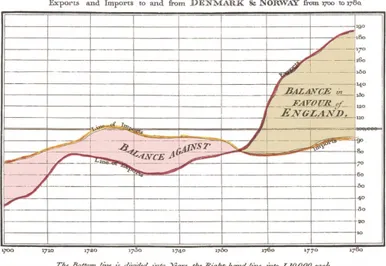
In 1786, William Playfair published a time-series graphic in Commercial and Political Atlas. This outlined export and import between Denmark and Norway from 1700 to 1780 A.D. see Figure 3: Playfair's time-series chart. (Mackinlay, 2016)
Figure 3: Playfair's time-series chart
Also, in 1801, Playfair created the pie-circle-line chart, to compare population and taxes in different nations. see Figure 4: Playfair's pie chart - population and taxes (Mackinlay, 2016).
Figure 4: Playfair's pie chart - population and taxes
Although, graphics were bare and abstract, additionally, they were tools for communication.
1.3.3 The 20th century and data visualization
In 1901, Arthur Bowley plotted the total amounts of exports from Britain and Ireland over 1855– 1899 see Figure 5: Arthur Bowley's plot chart - exports from Britain and Ireland (Chen et al., 2008).
Figure 5: Arthur Bowley's plot chart - exports from Britain and Ireland
In 1930, Otto Neurath designed infographs, that not only easily to show, read numbers, but also with communication purposes. see Figure 6: Otto Neurath 's info-graph – Home and Factory (Park, 2018).
Figure 6: Otto Neurath 's info-graph – Home and Factory weaving
During 1960–70s, In this era, the focus shifted from data presentation to visualization analysis. John Tukey in particular was engaged in what users could learn from the graphics and depictions of data. He invented the box plot, the bubble chart, the radar chart, and more. Bertin insisted that graphical means should be for both analysis and communication. So, his presentational graphics were mostly maps.
During 1970–80s, Nigel Holmes used the term explanation graphic, where the goal: to explain the data throw its context. The final result was information graphics (InfoGraphics) Figure 7: information dissemination tools outlines how information dissemination tools changed over these decades (Korolov, 2011).
Figure 7: information dissemination tools
Edward Tufte discussed the information presentations, his focus was clearly on showing data for analysis. He talks about representations, where the user can examine and explore the data to answer questions. He published series of books, where he elaborated where graphics fail to be informative.
- “Envisioning Information”, (1990)
- “Visual Explanations: Images and Quantities, Evidence and Narrative”, (1997)
The first book is the most interesting one. It explains Tufte's idea of Graphical Excellence and fundamental concepts of the data-ink ratio, chart junk, graphical integrity and the lie-factor. The second and third books elaborate the visualization in terms of ‘verbs’ and ‘nouns’.
1.3.4 The new millennium: infographics vs. visualization
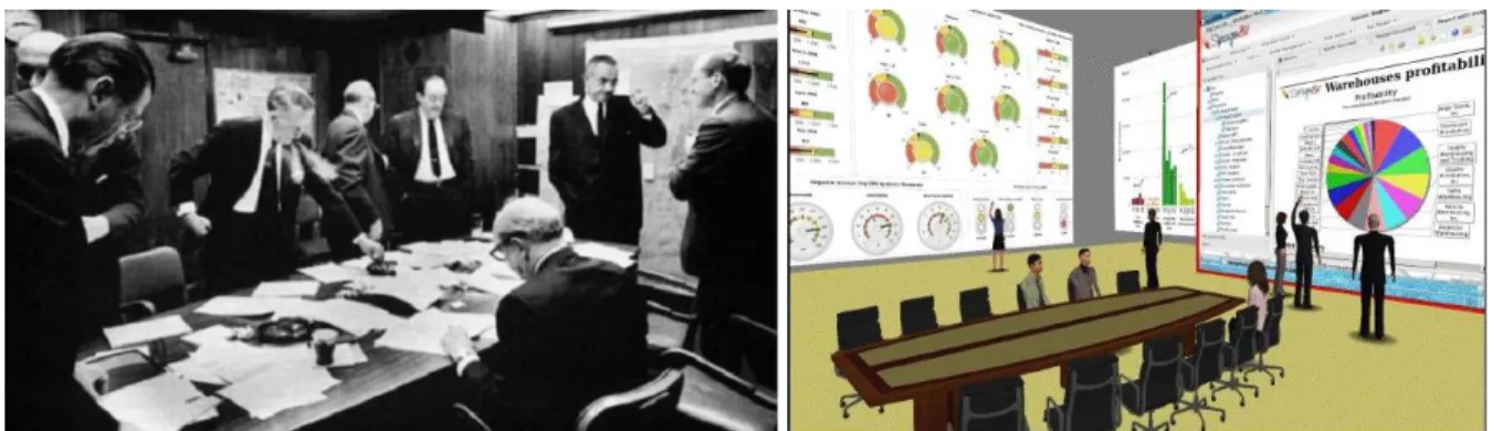
In the digital era, with the context of big data and analytics trends, visualization was the important needs for users to really see their data and patterns. Figure 8: Big data and the need for visualization is an example to outline the difficulty to recognize patterns as raw data (Mackinlay, 2016).
Figure 8: Big data and the need for visualization
The following list can be considered as major milestones emerged in Modern Visualization: 1. 1985: NSF Workshop on Scientific Visualization
2. 1987: Computer Graphics on Visualization in Scientific Computing
3. 1990: IEEE 1st visualization conference http://ieeevis.org in addition to IEEE Computer Graphics and Applications: www.siggraph.org
4. 2000s: Public media started to integrate infographics into TV news, newspaper/ magazine publication. Additionally, academia fields and research DBs have lots or published papers in visualization. For developers, many Techniques such as HTML5, CSS3 are emerged to enabled interactive visualizations even on mobile devices.
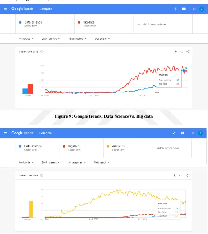
Finally, the digital Era and big data Visualization trends are promising; starting from first IEEE conference in 1990 and up till now where these events are managed annually. (Google trends, 2019) shows a remarkable indicator for visualization and related domains. The Figure 9: Google trends, Data ScienceVs. Big data shows "big data" trend is increasing over the past
10 years, while comparing to data science, where visualization is a major part (Kohlhammer et al., 2019), it starts to sky rocketing since the last five years, even more, it is exceeding the big data trend. Additionally, in Figure 10: Google trends, Data Science, Big data Vs. Analytics, analytics trends in different domains are doubled comparing to both previous trends (Google trends, 2019).
Figure 9: Google trends, Data ScienceVs. Big data
Figure 10: Google trends, Data Science, Big data Vs. Analytics
1.4 Summary
Visualization is developed over historical phases. Clearly, in this digital era, data visualization is triggering Promising Trends
• Visual Data Mining
• Explore new patterns that a data mining couldn't find • Interaction between users and data
• Interaction as analytical process in terms of output from data mining system
• Virtual/ Augmented Reality Visualization (e.g., Google Glass, Hololens, Oculus Rift), • Knowledge Visualization
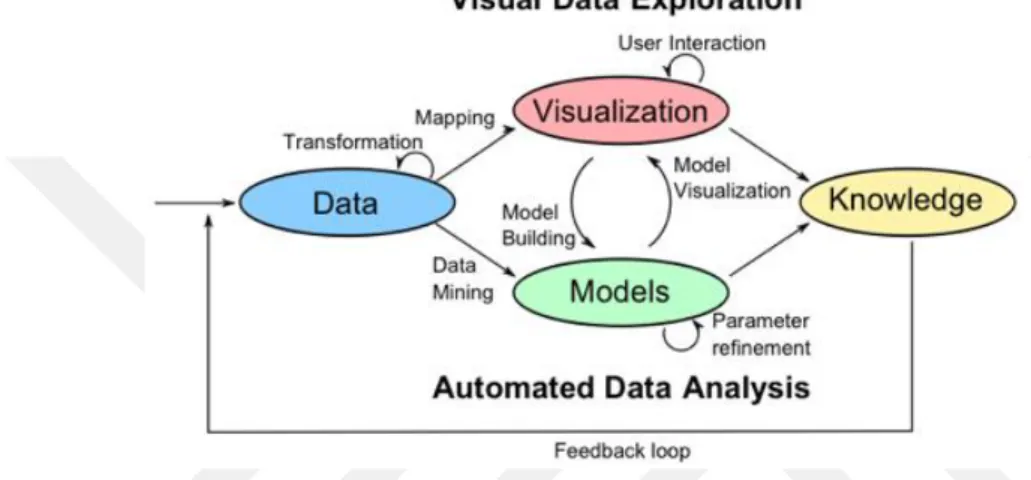
Figure 11: Main phases with the visualization life cycle outline the general lifecycle and main phases of visualization (Keim, 2011).
Figure 11: Main phases with the visualization life cycle
According to Human Computer Interaction and ergonomic disciplines, Fitts's Law: to shorten the movement and lower the index of difficulty:
• Shorten the distance to the target
• Group functions to reduce redundant movements • Enlarge the target to recognize benefits
Simply, InfoVis tools should have workflow with have the following steps:
• Read data
• Analyze data
• Select visualization type • Data overlay
• Visually outline your outputs data • Deploy (Interactive design)
What infographics may lack, is accuracy and depth. In other words, users' requirements do not completely mapped into visualizations. This will happen when infographics just add eye candy, then data will be loose to present.
2. LITERATURE REVIEW
2.1 Information Visualization is Inevitable
Information visualization (InfoVis) is the study of translating data, information, and knowledge to interactive visual representations. Accordingly, (Intezari, 2016) focused on values when working on different levels of abstractions and visualization. Where the higher level means better decisions with more complexity. (see Figure 12)
(Liu et al, 2014) published "A survey of information visualization: recent advances and challenges". It discusses how InfoVis tools spread over all domains starting from finance, sport, to politics.... etc. These inevitable tools, generally, have almost the same functionality: convert data to information and finally to knowledge. Also, the paper presents a comprehensive survey where InfoVis tools have four major insights:
1- empirical methodologies 2- user interactions
3- visualization frameworks 4- applications.
The recommendation in this paper is more and more InfoVis research outputs should be generated to guide the functionality of real-world applications.
Clearly, evidences show a skyrocketing trend where users are adopting visualization and InfoVis tools, with emphasis on the importance of aligning the software tools functionality with the user needs.
2.2 Visualizations Need Analysis
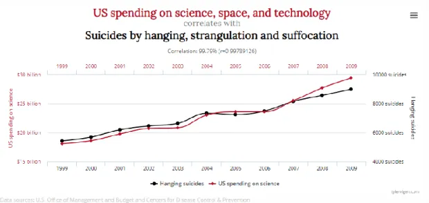
When using the wrong data visualization tool, then wrong interpretation will guide to wrong decisions. The following example outline the deceitful issue:
(Vigen, 2019) outlined when visualization shows high correlation between Hi-Tech research spending and suicides (see Figure 13: Visualization deceitful - Hi-Tech spending Vs. suicides). This was completely wrong with many evidences; it is one of clear example for highly correlation does not mean real causation.
Figure 13: Visualization deceitful - Hi-Tech spending Vs. suicides
(Lee, 2016) discussed how people make sense of information visualizations even with unfamiliar charts. According to empirical findings in this research, four factors influence the graph comprehension:
(1) graph formats, (2) visual characteristics, (3) knowledge about charts (4) knowledge about details
The main output of this study was a proposed model of NOvice’s information Visualization (NOVIS model). End users follow these steps during the process:
1. encounter visualization, 2. construct a paradigm, 3. explore visualization, 4. discuss the frame, and 5. flounder on visualization.
2.3 Visualization Tools and End Users' Requirement Gap
Traditionally, InfoVis concern with detecting new relationships while preventing fake relations from being visualized.
(Hullman et al. , 2011) suggested conditions and circumstances where InfoVis tools would overcome the issue. This includes critical factors such as interaction, active processing, and engagement. Additionally, the paper suggested factors to outline effective charts design such as a trade-off between efficiency and learning difficulties. These should be important guide for researchers and practitioners to organize, explore, comprehend of graphs using and tools. Finally, the paper identifies new views for the design and evaluation of visualization where the end users need in order to optimize their effort for quick and correct interpretation.
The following is an important argument for better modification and visualization. The target goal is to meet end users' requirements. In this example, (Tufte, 2007) suggested a major modification on boxplot. The suggestion is a new shape as mid-gap plot. (see the right shape in the Figure 14: Tufte's Suggestion of box-plot)
Figure 14: Tufte's Suggestion of box-plot
Althoghu, same information can be extracted from the three diagrams, where the boxplots show: means μA=2.2 & μB=2.6, standard deviations σA=0.2 & σB=0.6
The two left diagrams were extracted from visualization tools. However, the critique on Tufte works: it is not a box. These are valid elements through their visualization. There are graphical insights beyond the bare amount of ink.
According to these previous papers and research works, it is clear that end users' perspectives, requirement in certain context, and software tools have major impact on the output results and decisions when they are consistent. And vice versa.
2.4 Infovis Tools Evaluation
(B. Shneiderman, 2006) presented a general review of an evaluation method. The paper summarized features related to Human Computer Interaction (HCI). It suggested ways to refine usage of information visualization according to context.
Similarly, many papers discuss the combination of context, end users, and software tools to successfully generate output. Accordingly, many research and scientific work focused how to evaluate InfoVis tools in order to better generate outputs according to the context.
(Pantazosl et al., 2012) discussed how information visualization tools and toolkits have been developed. There were 13 information visualization tools are evaluated from user perspectives.
(Sindiya et al. , 2013) discussed InfoVis problems and consequences when end users fail to map diagrams to their actual needs. Additionally, the paper argued that end users should move beyond traditionally static outputs. This allow to dynamically manipulate outputs and views through real-time visualized system.
Software tools should be categorized according to users perspectives. (Heer et al., 2008) categorized users in three groups: Novice Users are the ones with no programming skills but they have the domain business knowledge and basically they can interact with predefined visualizations; Expert Users are users with very good programming skills who can construct advanced visualizations and have no domain business knowledge; and Savvy Users, who have some basic programming skills and understanding of the business domain. Savvy users act as an intermediate state between novice and expert users, trying to bridge gap between domain expertise and programming knowledge. It is emphasized that for each user type (novice, savvy and expert), the toolkits and tools are used with 5 dimensions (1) Who constructs the visualization, (2) What type of visualizations (3) Does it support advanced visualizations, (4) How are visualizations created, (5) Does it have a development environment? The final result is: different types of end users should be guided to different InfoVis tools. As an example, novice users should be supported with interactive tools where they can drag and drop, get real-time feedback, filter, sort and so forth.
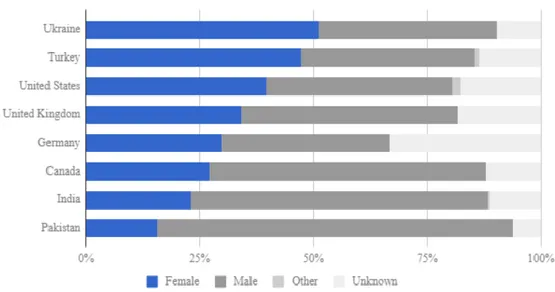
Finally, the following is the real case to categorize end users according to their requirement and needs. This project is a study sponsored by Trinity College, Hartford CT/ USA This study discussed some HCI factors for tools categorization from End user perspectives to meet needs and requirements. Figure 15: Visualization of participants in the datavizforall project outlines the volunteer students worked on this project "Data Visualization for All" They are the Ukraine and Turkey.
Figure 15: Visualization of participants in the datavizforall project
The following were the key parameters with explanation for evaluating Visualizations: 1) Price: Is the tool free, or what pricing criteria is there
2) Easy-to-learn: Is the tool simple for new users or it requires a development or coding skills
3) Power: What is the amount of data the tool can work on: large – medium - small 4) Customization: Can the diagram be modified
5) Data Migration: Can output be exported to other tools?
6) Hosting: Where data and their visualizations will be stored (Online/ Local)?
7) Support: Is there customer support to create new fixes, and do they answer questions 8) Open Source: Is the InfoVis tool free and modified by end users, or redistributable? 9) Security: What and how the InfoVis tool is protected from malicious hackers 10) Collaborative: How several people can work together on one shared product? 11) Privacy: While working on the software tool, is data and work private or public? 12) Error-friendly: When the software tool crash, does it point out the root causes and
possible fixes?
13) Cross-platform: Is the tool supported on different operating systems?
14) Mobile-friendly: Can the tool generate responsive output with mobile platforms
2.5 Summary and Justification of the Methodology
To sum up previous literatures, data visualization software and processing engines are hot topics in the scientific research and academia lab. Many information systems in data science are compromising such as Hadoop and Hive projects. Even though these tools are designed as user-friendly tools still it is not easy to handle that amount of computer based tools for
non-technical users. Their requirement and needs for visualization should be translated using suitable and appropriate InfoVis tools.
In case InfoVis tool successfully meet the needs and requirements, this will lead to important observations on data. Finally, these observations will have a huge impact for decision making. To reach this point, end users need to over look at the same view from different perspectives that may spread over time.
The dilemma in this context, information and their visual representations is simply the creating of maps, charts, or whatever to communicate. However, researchers and developers may forget that the viewer does not have the technical knowledge and may fail to "get the point". Moreover, as information visualization field matures, software tools are frequently used directly by the end users. So there is always a desire for continuous evaluation, to reach the actionable visualizations. InfoVis tools is the critical part for this creative task that requires users to input their hypotheses, search and investigate the tools, and finally refine their targets.
4. METHOD
4.1 Introduction
Information visualization (InfoVis) concerns mainly on transforming data, information, and knowledge into interactive representations (see Figure 16: Main phases of visualization process). End users have different goals that are interpreted as different types of pictorial or graphical formats using a common process (Qlik community, 2019).
Figure 16: Main phases of visualization process
By using interactive software visualization tools, people can easily exploit technology to drill down into charts and graphs for more details through inspection and investigation. Interactively they can change what data they see, and how the output will be modified. Actually, they are moving from data chaos and messy environment toward data science and knowledge management.
4.2 Overlapping with Similar Works and Contribution
To help end users understand and compare InfoVis tools according to their requirements, two types to present and introduce comparisons, the third type is the promising to introduce InfoVis tools to end users as interactive way through using simple concepts of recommender systems.
1- Static table with list of features: (P. Baker, 2019) published a static table with top InfoVis tools to help end users to smoothing the process and to comprehend and select tool. It had a long list of features as rows, whereas columns were the software tools. Data in this table was the static evaluation for each tool in terms of predefined features. Consequently, end users can easily compare different tools for each feature or even check all features for a certain tool.
2- Narrative explanation of main features for a set of top rated tools: An important example presented InfoVis tools by explaining the main features roughly and according to authors' perspectives. In the example, datavisualization.ch, creators categorized InfoVis tools into four main features: Maps- Charts – Data - Color. End user have choice to get a tool with code interface or just generating visualizations. However, all tools are limited to these four categorization. Similarly, in the next example, www.visualisingdata.com, authors categorized InfoVis tools into seven main features: Data Handling – Programming – Web Based – Qualitative – Mapping – Specialists – Color The last example is visualisingadvocacy.org, this is managed by (Indira et al., 2019). InfoVis tools are categorized into nine main features: Data sources – data cleaning - tables and figures – Comparisons and presentations – Maps – network structure – modify image – presentation layout. For all previous examples, tools are grouped into fixed technical and functional groups regardless of users' inputs.
3- Using a recommender system, where candidate software tool should be identified according to context and requirements. This approach should utilize list of discrete features or user preferences in order to suggest the best fit InfoVis tools that potentially will the required properties.
In a content-based recommender system, key features and characteristics of products and user preferences are combined to recommend the candidate items that match user likes. According to (Al-Otaibi, 2012) research, the following is an example of content-based recommendation system in e-recruitment field. The paper analyzed the e-recruiting process and different
aspects related to apply a recommender system in candidates/job matching problem (see Figure 17: Example of recommender system application). Simply it matches Job requirements to Seekers skills.
Figure 17: Example of recommender system application
4.3 Contribution Outlines
Since numbers of the InfoVis tools are still skyrocketing, there is a need for flexible and general framework to categorize these software InfoVis tools according to main features from end users' perspectives as non-technical people. This should be close to content-based recommender system concept.
4.4 What is the General Method
The remaining part till the final output, the work will be developed with the following sequential steps:
- List of Features (that affect end users when selecting a software tool) are detected from literatures and directly from targeted groups of end users. Final list of these features will be grouped into five set of features.
- This argument will be tested in python using both statistical and inferential visualization functions.
- Sample list of InfoVis tools will be used to build a framework: This list of software tools will be extracted from the survey with rough evaluation of the five set of features. The framework will be presented in python: Inputs from end users are values of the main factors, then the framework will check and categorize the predefine list of InfoVis tools that match these factors, then it suggests results to the end users. Consequently, end users can provide their preferences as inputs then the InfoVis software should be presented accordingly.
The following features and grouping will be checked through the survey and python functions:
Features Group#1: "Price", and "Open source"
Since open source software are free, and since InfoVis tools end users has basic skills to run and work on such information systems, moreover, they are familiar with multiple operating system, so, it is expected for majority of users to adopt open source tools when they are interested with the price feature affect.
Features Group #2: "Ease of Use" and "Customer support"
It is expected for end users who are seeking for the "ease of use" feature in a software, also, they will ask for the "customer support" service. These two factors are related to the complexity level of the software tools.
Features Group #3: "Security", "Privacy", and "Hosting"
These three features are technically related. They point to the tool vulnerability. These should be maintained by technical team of the InfoVis tool developer through different modules and supported platforms.
Features Group #4: "Search Engine Ranking", "Version", "Brand"
These features are not related directly to software functions. They are related to marketing and vivid mental image of a specific software tool.
Features Group #5: "Data Size", "Customization", "Migration", "Mobile support",
and "Collaborative"
These features are direct and important technical functions of the software tools. End users are interested in the details of such functionalities. These should be supported by clear best practices for usage of procedures and policies. It is expected for this set of features to be affected each other.
The following diagram outline the survey phases as a life cycle with their expected final results and the proposed paradigm Also, the following diagram show the main functionality of the proposed framework and how end users will use to get results
Start The framework has evaluated list of InfoVis tools
The framework read the user preferences for each
group of visualization features
The framework use combine the user preferences with the
InfoVis tools capabilities
Stop
The framework recommend the best three InfoVis tools to
the user The user can compare
and expect the capabilities of suggested
InfoVis tools
4.5 The Used Method
After literature review and checking similar work, a list of the main features were identified. This list where restructured as questions to be published in a survey. Regarding the targeted respondents, they should be users who are familiar with visualization as end users or even the reporters who use visualizations. For developers and high tech. skilled people, they will be avoided. Results and findings from respondents will be checked using google forms. These will be documented in an appendix B. Since all question will have non limited number of choices, users can add their own answers, and consequently, data cleaning and checking are important and this will be managed by the author of this research. This include wrong values, junk answers…. etc.
Regarding the predefined features, results of the survey will be double checked. Google forms auto generate results. Additionally, using descriptive visualization functions, python will be used to regenerate final results after cleaning the data. And this will be crossed with Google form outputs. Similarly, feature grouping will be checked using inferential visualization functions.
Finally, since same features will be used to evaluate all InfoVis tools, additionally, users' choices are completely separated when selecting their tools. A proposed framework will simply be as a feature-matching matrix. InfoVis tools have different values for each feature. The end users can prioritize and make weighting to these features. Then InfoVis tools will be categorized and suggested to end users according to their preferences. This method will mostly recommend best matching InfoVis tools that meet the end users' requirements. The draft framework will be created using excel to check functionality. Then python will be used to generate a simple feature matching system that simulate the content-based recommender system. This will have inputs from end users about their factors then it will recommend a list of InfoVis tool.
4.6 Designing the Questionnaire
Since this research targets end users to better work with visualizations, arguments or hypothesis should be tested through end users' inputs. Initially, features of the InfoVis tools will be extracted from literatures, however, after the survey will be checked the academic supervisor, questions will be open to enable users easily select or even add their own choices. The survey will consume about ten minutes of the respondents, which will be accepted rather than long list. Finally, Charts and scales will be used to enable for respondent to directly and easily select their answers. Appendix A has the survey questions.
4.7 The Targeted End Users
Different categories of participant will be targeted to cover different types of users. The most import criteria to select end-users of InfoVis tools is: they shouldn't be highly technical or developers. Rather, they have to be familiar with visualizations as end users. So, three different groups will be targeted
1- Non-Technical People 2- KHAS students
5. RESULTS AND FINDINGS
5.1 Survey Results and Analysis
After interviewing number of KHAS students and end users, where all of them had high tech skills, however, they are non-developers. All respondents provide a real data. This make survey data reliable to analyze. Number of total respondents was 32 results over three months. This number was due to the niche of the targeted end users. However, this is a real data that makes it reliable to analyze. Google forms provided results in terms of CSV data file and generated diagrams for the whole results. The file is available on this link (see Appendix B). To sum up, the data had simple results. There is a need to correct simple data. Then, it is easy to use python descriptive statistical function charts to be generated and analyzed and important indication will be documented. This include mainly description of end users' perspective in addition to recommendation for tools developers,
5.2 Data Cleaning and Analyzing the Dataset
Generally, participants have clear and direct questions with many open questions to add choices. Many participants got semi-structured session or even they had easy way to contact in order to explain before answer the survey.
According to many questions of the survey (such as Question #1, Question#2, Question#14, and Question # 15), we can conclude that almost all participants have high technical skills. This covers skills with: Familiarity with many different InfoVis tools, all chart and diagrams can be created, and they prefer to investigate all results to the root causes even error and exception results.
Some answers were updated in order to get a complete data set to be analyzed. For example: 1- To convert cardinal answers into numerical the table below outline the updates 2- Blank data was replaced by average or mode
Finally, this result is completely data integrity and reliable for analysis. Appendix C has a details of data updates and cleaning.
5.3 Survey results and analysis
After data was cleaned, visualization functions in python were used to regenerate data. This was check with google forms charts in Appendix B. It is completely identical. The following are the questions and the analysis for each feature.
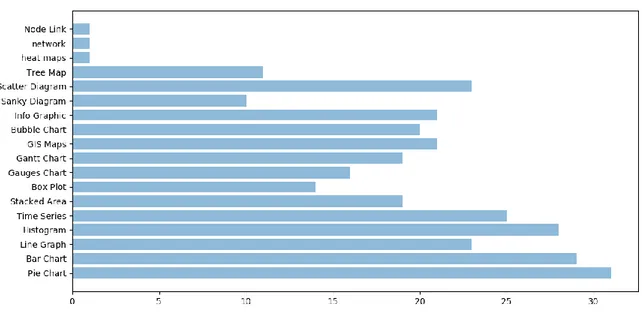
Part1: Charts and diagram in Information Visualization tools Question1:
1- Please check and tick the visualization diagrams that you are familiar with
Figure 18: list of charts from end users
Answer and Analysis: Generally, respondents are familiar with all types of visualization diagrams. Consequently, it is expected that all users will request and work on all types of diagrams through using InfoVis tool. Finally they will adopt the suitable ones.
Part 2: Question2:
2- What information visualization tools or software are you familiar with to create diagrams?
Answers and Analysis: The following tools are used by respondents:
Spotfire – Excel - Google Sheets – PowerPoint – Tableau - Plot.ly - statistical software (R, SAS, SPSS, JMP, Stata, etc. - Raw Graphs - Flourish - d3.js - Google Charts - Vega/Vega-Lite - GraphPad Prism – python – Unfolding – Gapminder – QGIS – Leaflet – Mapbox - Data Illustrator – yWorks - MS-Power BI – GGIS – Tulip - Matplotlib
Clearly there is a wide range of different tools that users use to generate visualizations. So any new InfoVis tool will have a good opportunity to be tested and adopted by end users. The market is still take in new software tools.
Part 3: Please check factors that affect you when selecting Information Visualization Tool Question3:
3- Price: When you want to select or buy a visualization tool, how much the price will affect your decision?
Figure 19: 'Price' feature's evaluation from end users
Answers and Analysis:
Considering respondents are individuals, rather than companies:
90 % of them concern for price. Even more, the majority (more than 65 %) consider this factor as critical. Generally, new software visualization tools should analyze this factor with competitors' comparing the provided services.
Question4:
4- Easy-to-learn/ Ease of Use: To What extent do you think the Visualization tool should be easy-to-learn for new users without need to Hi-Tech or programming skills?
Figure 20: 'Ease_of_use' feature's evaluation from end users
Answers and Analysis:
80 % of respondents consider ease of use is important for them. Even more, at the notes section of the survey, some respondents state this feature as most important. Consequently, ease-of use is important feature. However, some respondents were against this issue and they stated that InfoVis tools users, by default, need high skills and programming concepts.
Question5:
5- Power: What is the average size of your data?
Figure 21: 'Size of Data' feature's evaluation from end users
75 % of respondents require InfoVis tools to deal with big data and to be ready to load sizes of data such as Mega and Giga or even more. Additionally, since all non-technical people have information in forms of data chaos rather than organized data science, it is expected from software tools to accept data in different forms with multiple data sources in order to generate comprehensive visualizations.
Question6:
6- Customization: Do you prefer InfoVis tools that are customizable or you usually just use the predefined temples and reports?
Figure 22: 'Customization' feature's evaluation from end users
Answers and Analysis:
The majority of users need to customize their visualization reports to completely meet their needs. This indicate that end users will work with different settings of the visualization and the tool. Output will be modified multiple times until it meets the end user needs in different context. Consequently, processing will be run multiple times, even with big data, until it is adopted as a final form. Time will be critical in this case.
Question7:
7- Data Migration: Is it important to export your data to another software tools or just to check visualizations as a final output?
Figure 23: 'Migration' feature's evaluation from end users
Answers and Analysis:
About 95 % of users confirm the need visualization to be exported to another software. Integration and standard output are import to get better results and increase benefits. Tools should generate outputs in different standard forms.
Question8:
8- Hosting: Do you prefer your data and visualizations to be stored locally or on the cloud (online)?
Figure 24: 'Hosting' feature's evaluation from end users
Answers and Analysis:
Most users choose and prefer local data rather than online. This may be due to limited experience of technologies regarding security and privacy issues. However, this indication should guide tools creators to generate tools supported with different platforms in addition to online services.
Question9:
9- Support/Customer Service Disk: How often do you need direct help?
Figure 25: 'Customer_Support' feature's evaluation from end users
Answers and Analysis:
Respondents have different answers of importance in this factor, ranging from very low to very high importance. This fluctuation should trigger InfoVis tools creators to support their software with different types of learning and resources materials to cover this combination of needs including YouTube channels, wikis, till knowledge repositories.
Question10:
10- Open Source: What type of Information Visualization tools do you prefer: open source/ Commercial/ free?
Figure 26: 'Open Source' feature's evaluation from end users
Most users prefer free or open source. This may be affected by the price feature of InfoVis tools. For open source communities, an important issue where end-users will adopt their tools rather than COTS systems. This is a potential advantage, where lots of users will adopt any new InfoVis tool under open source rights.
Question11:
11- Security: Are you interested to keep your data protected using password or other types of security?
Figure 27: 'Security' feature's evaluation from end users
Answers and Analysis:
Respondents confirm security is important issue, this tendency may affect the "online Vs. desktop" feature. Consequently, InfoVis vendors should confirm this issue to their customers. Question12:
12- Collaborative: Do you need to have an InfoVis tool with ability to run with other users concurrently?
Figure 28: 'Collaborative' feature's evaluation from end users
31.2 % of respondent do not care with collaborative tools. However, the majority need this feature to be available in the InfoVis tools. This percentage indicates that even with standalone desktop application, visualization output should be sharable with stakeholders, Question13:
13- Privacy: Is it possible to make your data and visualizations public?
Figure 29: 'Privacy' feature's evaluation from end users
Answers and Analysis:
Answers do not give clear trend in this feature. Less than 50 % of Responses were lean to be more interested with privacy issue. Generally, software tools should don't publicize outputs. A clear example is Tablue where free online account are completely public with all outputs. Question14:
14- Error-friendly: During visualization, if something goes wrong with InfoVis software, what do you prefer?
Figure 30: 'Error_Friendly' feature's evaluation from end users
Only 12.9 % of responses were users will not investigate the root cause or check error in details, they just have another trials, then they may move to another visualization diagram. Finally, the worst case they will get rid of the InfoVis tool completely and the will use another tool.
The majority of InfoVis tools will back track and investigate the root causes rather than reading the general outputs and symptoms. Almost all end users will have basic skills to resolve issues.
Question15:
15- Cross-platform: When using the InfoVis tool, what is your Operating System do you use: Linux – Windows – MAC – Android
Figure 31: Operating System used by end users
Answers and Analysis:
Since respondents are Non-technical people then about 80 % are prefer to use infoVis tool on windows. Some of them they indicate they can use on Linux, MAC OS, and Andriod. As an indication for software developers, InfoVis tools should support different platforms.
Question16:
Figure 32: 'Mobile_Support' feature's evaluation from end users
Answers and Analysis:
Less than half of responses confirm they will use mobile. So it is preferred for all tools to run on mobile or even their visualization to be viewable. InfoVis tools should generate outputs to be run on mobile OS or even the tool may have separate version as mobile and tablets application.
Question17:
17- To choose an InfoVis tool, do you consider the search engine ranking
Figure 33: 'Search Engine Ranking' feature's evaluation from end users
Answers and Analysis:
About 70 % of responses prefer to see the InfoVis tool in the first pages of search engine and it should be recognized in the search engine ranking. This will be evaluated positively by end users. In this context, standard interfaces, online Documentation, and formal website will support positively ranking the InfoVis tool on search engine.
Question18:
18- Latest version or update: How much important for you the latest update or version?
Figure 34: 'Latest_Version' feature's evaluation from end users
Answers and Analysis:
Almost all respondents are interested in the last version or updates. Tools should be updated periodically with new versions. InfoVis developer should have a plan for new versions and batches to support new platforms and fix issues. To be up to date system.
Question19:
19- Brand: Do you prefer tools from famous companies such as Google, Microsoft, or IBM, ….?
Figure 35: 'Brand' feature's evaluation from end users
60 % are interested with branding. Whereas, 40 % prefer functionality even from new or unknown companies. This is a positive indicator for startup companies with visualization products. With competitive information systems, it is easy to have a share in the software market.
Question20:
20- Please add more important factors when you select visualization tool Answers and Analysis: This is open question
Number of comments focused on the importance of ease of use One answered concerned about quality
Also, respondents are interested that InfoVis tools should be Interactive Free and price is important factor
5.4 Grouping Features
Before answering the survey, it was argued that groups of features are interrelated. According to literature and discussion with respondents, the following groups of features were set. Features Group#1 "Price" and "Open source"
Features Group #2 "Ease of Use" and "Customer support" Features Group #3 "Security", " Privacy", and "Hosting"
Features Group #4 "Search Engine Ranking", "Branding", and "Versioning"
Features Group #5 "Size of data", "Customization", "Exporting or Migration", "Mobile support", and "Collaborative"
After visualizing features individually to understand end users' behavior, findings and analysis were recommended to developers and researchers, where different descriptive of visualizations are used such as Correlation, Histogram, and line graphs. Similarly, descriptive visualizations were checked to prove grouping, but the overall result was: there were no direct and strong evidences to prove the argument of features grouping. However, partially, there were indirect relations. For example, for group#4, there is relations can be deducted from heat diagram. Where "Branding" and "Latest Version" features have relation with "Search Engine Ranking" feature.
So, Firstly, heat map diagram was adopted initially to simply check relations between features. The results indicate: there are relations but still need more investigations for better evidences to support the hypothesis. There is a need to investigate the relations and grouping deeply using combination of both descriptive and predictive visualization charts. This will confirm the argument and approve the relations among features in each group.
Figure 36: Heat chart of the feature
Then, in order to check the hidden relations and features grouping, Hierarchical Clustering was used as machine learning function. The following diagram suggested the minimum number of groups of features: Green Cyan, Red, and Magenta.
Figure 37: hierarchical clustering
Green Features: Customer Support, size_of_data, Collaborative, and Mobile_Support Red Features: Privacy, Search_Engine_ranking, Branding
Cyan Features: Migration, Hosting
Magenta Features: Price, Ease_of_Use, size_of_data, Customization, Open_Source, Security, Latest_version
Clearly, feature grouping using machine learning function mainly suggested grouping similar to descriptive relations (for example Green, Red, and Cyan). Some feature is combined into a new group that is not detected before (Such as Magenta). This was not recognized by descriptive charts. For example, Price and Open Source have weak relation on Heat Chart while they are detected as one group of related features in the Hierarchical Diagram.
The following will discuss the argument of feature grouping in this research Features Group#1
The following chart shows line graphs for both "Price" and "Open Source" features. Generally, recorded values are high whereas some respondents have low values.
Figure 38: Line chart of the first features group
Two diagrams were generated to check the correlation
Figure 39: Correlation matrix of the first features group
2- Machine learning function, Kmeans, was used to predict the argument. According to Elbow Method number of clusters should be greater than 2. So the data were checked for both number of clusters: 3 and 4
Figure 40: Elbow method to check clustering in the first features group
Figure 41: Kmeans chart of the first features group
Features Group#2
The following chart shows line graphs for both "Ease_of_use" and "Customer_support" features. Generally, most of recorded values are high whereas certain respondents have low values.
Figure 42 : Line chart of the second features group
Figure 43 : Correlation Matrix of the second features group
Using regression analysis, the relation is positive correlation between features
Figure 44 : Corrolation with regression analysis
Features Group#3
The following chart shows line graphs for the three features "Security", "Privacy", and "Hosting". Generally, recorded values are high whereas certain respondents have low consistently values on the three lines.
Figure 45 : Line chart of the third features group
The following correlation matrix is generated using Seaborn library. Results show a general expected pattern where high values are gradually increasing for the three features.
Figure 46 : Corrolation Matrix of the third features group
According to Elbow Method, the predicted clusters should be greater than 2. So the data were checked for both number of clusters: 2 and 3
Figure 47 : Elbow method to check clustering in the third features group
Using number of clusters = 3, results proved the relation between these two features. This was detected and checked.
Figure 48: Kmeans chart of the third features group
Features Group#4:
This group of features were directly detected from the previous heat diagram. Clearly, all these factors are moving to the right and upwards. Additionally, the following correlation matrix show the expected pattern.
Figure 49: Corrolation Matrix of the third features group
Features Group#5
The following correlation matrix is generated to check relations. Results show a general expected pattern where high values are gradually increasing for the three features.
Figure 50: Corrolation Matrix of the fifth features group
Figure 51 : Heat chart of the fifth features group
Only one features from this heat chart has no direct relations with other features is the customization factor. Kmeans will be used to predict any potential direct relation. According to Elbow Method to predict clusters, it should be greater than 2. So the data were checked for both number of clusters: 2 and 3
Figure 52: Elbow method to check clustering in the fifth features group
Using number of clusters = 3, results proved the relation between these two features. This was detected and checked.
Figure 53: Kmeans chart of the fifth features group
To sum up, features grouping is important to guide end users to predict behavior of users and to make the process easy to focus on best InfoVis tools. The sample in this research proved this argument with different level of precisions.
5.4 Sample of InfoVis tools
Using different public resources that evaluate Software Visualization tools (Appendix F), this table was created to be used as a sample input to the framework.
Table 1: Sample of InfoVis tools with features groups
Free Version Feature Group #1 Feature Group #2 Feature Group #3 Feature Group #4 Feature Group #5 Power BI Yes 10 8 9 10 10 Tableau – Desktop NO 6 8 9 10 10 Tableau– Public Yes 10 8 3 10 9 Qlik Yes (Qlikview) 2 9 6 2 5 Visme Yes 10 8 6 6 3
Google Analytics
Yes 10 8 6 10 9
These tools will be used to test the general process of categorizing the InfoVis tools and suggesting results to end users
5.5 Testing the Framework
The above table will be used to test a user that has the following preferences Features Group #1 the weight (priority) is 7 out of 10
Features Group #2 the weight (priority) is 3 out of 10 Features Group #3 the weight (priority) is 6 out of 10 Features Group #4 the weight (priority) is 9 out of 10 Features Group #5 the weight (priority) is 2 out of 10
Using the Table above and the weighting from the end user, using Euclidian distance, the following suggestion were presented to the end user in order. The first choice is Power BI, the second is Tablue, and the third is Qlik
CONCLUSIONS
Firstly, End users' needs for visualization was introduced, in addition to, how these were supported by software tools. The research focused mainly on important features from end users' perspectives. After analyzing the empirical findings, general recommendations were suggested to end users, developers, and Researchers. Features Grouping into five sets argument were proved. Consequently, this help developers to understand how people interact with InfoVis tools. Using a draft of proposed framework, this will help end-users to easily categorize and compare. Consequently, end users can select the best InfoVis tool accordingly. Nowadays, all end-users and even companies are actively using visualizations during the exchange process of news or opinions. According to data hierarchy of needs, end users need tools to move between different levels of requirements and data of abstractions. (see Figure 55: Hierarchy of data needs)
Figure 55: Hierarchy of data needs
As a future work, we are planning to double check our findings and feature grouping methodology by another sample test dataset from designed survey. Also, different machine learning methodologies such as dimension reduction methods (PCA) can be used to approve the feature grouping of visualization tools. After confirming feature grouping, an online system for categorizing InfoVis tools from end users' perspectives can be build using content-based recommender system. This compromising proposed system should be fully automated processes to present measurable InfoVis tools from end users perspective. This system should
be open for all stakeholders to insert InfoVis tools and the evaluation data. Starting from the tools creators or owner, they can insert their visualization tools, then expert people and end users can evaluate the tools. Finally, non-technical people can input their preferences to get a list of recommended software InfoVis tools. Mainly the system should have number of modules:
1- InfoVis tools should be inserted by their owners or creators with initial evaluation in addition to other tools. For example, the process of inserting a new tool should have general questions and evaluation of the tool itself then a machine learning function can suggest the closest one or two tools to be evaluated by this user.
2- Users or expert people should have the ability to evaluate InfoVis tools and insert their success or fail stories.
3- Non-technical people should have the ability to insert their preferences in terms of feature grouping factors. Also their technical level should be tested, then the recommender engine suggests the best set of InfoVis tools
4- The system should have the ability to control any artificial, unreal, or outliers' evaluation.
Appendix E has two important examples of online statics systems to present and compare InfoVis tools without inputs from end users. These can be used as a mockup to the proposed interactive and dynamic system.