DESIGNING FOR WEB AND FOR PRINTED MEDIUM: A COMPARATIVE STUDY
A THESIS
SUBMITTED TO THE DEPARTMENT OF GRAPHIC DESIGN
AND THE INSTITUTE OF FINE ARTS OF BİLKENT UNIVERSITY
IN PARTIAL FULFILLMENT OF THE REQUIREMENTS FOR THE DEGREE OF
MASTER OF FINE ARTS
BY
JAKUB MICHALSKI MAY, 2001
I certify that I have read this thesis and that in my opinion it is fully adequate, in scope and in quality as a thesis for degree of Master of Fine Arts.
Assoc. Prof. Emre Becer (Advisor)
I certify that I have read this thesis and that in my opinion it is fully adequate, in scope and in quality as a thesis for degree of Master of Fine Arts.
Assist. Prof. Dr. Nezih Erdoğan
I certify that I have read this thesis and that in my opinion it is fully adequate, in scope and in quality as a thesis for degree of Master of Fine Arts.
Assist. Prof. Dr. John Groch
Approved by the Institute of Fine Arts
ABSTRACT
DESIGNING FOR WEB AND FOR PRINTED MEDIUM: A COMPARATIVE STUDY
Jakub Michalski M.F.A. in Graphic Design Supervisor: Assoc. Prof. Emre Becer
May, 2001
A thesis comparing two methods of design; the web design and design prepared for the printed medium, covering the physical differences between the two, the methods and techniques of content presentation in both cases, as well, as the perception of the design from the reader’s point of view. Includes a case study.
Keywords: Web Design, Graphic Design, Internet, HTML, Web Site, Web Page, Homepage
ÖZET
WEB TASARIMI VE BASILI MALZEME TASARIMI: KARŞILAŞTIRMALI BİR ANALİZ
Jakub Michalski Grafik Tasarım Bölümü
Yüksek Lisans
Tez Yöneticisi: Doç. Emre Becer Mayıs, 2001
Bu tez, basılı malzeme tasarımı ile web tasarımı arasındaki fiziksel
farklılıkları, yöntem ve içeriğe dayalı sunum teknıklerini okuyucunun bakış açısından karşılaştırmalı olarak ele almaktadır. Tezin sonuna bir web tasarımı incelemesi eklenmiştir.
Anahtar Kelime: Web Tasarım, Grafik Tasarım, İnternet, HTML, Web Sitesi, Web Sayfası, Ana Sayfa
ACKNOWLEDGEMENTS
I would like to thank my advisors, Assoc. Prof. Emre Becer, and Andreas Treske, who helped me to organize, structure and produce this thesis. Without their suggestions and reviews this work would lack of many elements they advised me to include.
For wonderful grounds of my research I would like to express my thanks to Jakob Nielsen, David Siegel, Lynda Weinman and Vincent Flanders, who are the undisputable gurus of web design.
To my family and my girlfriend, Duygu – I would like to thank them for their continuous support and motivation.
Final thanks go to all the reviewers, proof-readers, beta-testers and other people who took time to read my drafts and comment on them.
TABLE OF CONTENTS
ABSTRACT ...III ÖZET ... IV ACKNOWLEDGEMENTS...V TABLE OF CONTENTS... VI LIST OF FIGURES ...VIII
INTRODUCTION ...1
CHAPTER 1: DESIGNING FOR THE PRINTED MEDIUM AND FOR THE WEB – OVERVIEW OF BOTH METHODS ...4
1.1 What is the printed medium?...4
1.2 What is the web medium?...5
CHAPTER 2: A COMPARISON BETWEEN THE TWO METHODS OF DESIGN ...7
2.1 Space, color, time and touch – the physical differences between the two methods of design...7
2.1.1 Space ...8
2.1.2 Color...17
2.1.3 Time ...26
2.1.4 Touch...34
2.2 Content organization and presentation ...37
2.2.1 Interactivity ...37
2.2.2 From page to page – folding the page against scrolling and clicking links ...43
2.2.4 Information about current location and links...53
2.2.5 Style continuity and basic design principles ...59
CHAPTER 3: CASE STUDY ...65
3.1 CNET.COM ...65
3.2 CNET: Site structure...66
3.3 CNET: The main page ...69
3.4 CNET: Organization of links and common design elements ...75
3.5 CNET: Presentation of advertisements ...77
3.6 CNET: Presentation of the articles ...78
3.7 CNET: Layout, typefaces, images and design ...86
3.8 CNET: Summary...91
CONCLUSION ...92
GLOSSARY ...95
LIST OF FIGURES
Figure 1: Default orientation and proportions of different media ...9
Figure 2: Monitor or browser window as the passé-par-tout for the web page... 11
Figure 3: Close-up of the image of the same physical dimensions in different resolutions... 14
Figure 4: Various screen setups affecting the rendering of the same web page... 16
Figure 5: Close-up of the same image displayed using different media ... 18
Figure 6: Color spaces in relation to each other... 20
Figure 7: Adobe Photoshop's Color Picker window ... 23
Figure 8: Adobe Photoshop's Color Palette window ... 23
Figure 9: Corel Draw's Color Profile selection screen... 25
Figure 10: Step-by-step process of loading a web page... 30
Figure 11: Sample advertisement banner, divided into separate frames ... 32
Figure 12: Comparison of different tools and actions available for print and web manipulation ... 35
Figure 13: The reading order of a typical printed article. ... 38
Figure 14: Multiple possible reading orders of web documents... 40
Figure 15: Different types of folds for brochure design ... 44
Figure 16: Sample site map... 48
Figure 17: Proper construction of the main page ... 52
Figure 18: Correct organization and information placement on the web page ... 54
Figure 19: The use of header and tool-tips in site navigation... 57
Figure 20: Different sites belonging to the CNET group... 60
Figure 21: Construction of CNET's main page. ... 71
Figure 22: Advertisement indicator graphic... 78
Figure 23: First page of Netscape 6 review by CNET... 80
Figure 24: CNET's pages in various screen resolutions... 87
INTRODUCTION
The recent development and expansion of World Wide Web (WWW) forced many graphic designers to change their design method and to abandon designing for print in favor of the new, interactive medium. At the same time many people with no previous design experience started
creating web pages. Both groups of those people brought something new to the area of web design, sometimes enhancing, on other occasions
damaging the user experience.
The aim of this thesis is to compare the two different design methods; the design prepared for the printed medium and the web design, prepared for the Internet.
By doing so, I will be able to show which principles of design are universal enough to be shared by the different methods of working, and which are unique and applicable only to one, particular method. By the case study I will also analyze the existing web site and provide the reader with information, examples and explanations on the content creation for the Internet.
The scope of this work concentrates on the text content-based web sites and printed materials. Since both print and web design can utilize various design approaches and styles (content presenting, experimental, movie sites, band sites, art sites, web logs, etc.), I wish to talk mostly about
the designs that are presenting text content such as articles, data charts or essays. This way I will be able to compare similar applications created for different media without the risk of creating the irrelevant comparison between two different approaches that are by the style and approach already designated to be different, even if prepared in the same medium.
The work will start with the brief explanation about both web and printed mediums (Chapter 1). Throughout the rest of this paper it will help those of the readers who are not familiar with both or any of those design methods to understand the topics in-depth.
Following, I will present the comparison of the two methods of design by the means of physical differences (Chapter 2, Section 1), where I will describe how the two differ and resemble each other. I will also provide a range of examples and figures, illustrating the above.
The discussion on the content presentation and perception will follow in the next section as well (Chapter 2, Section 2), where I will concentrate on the applicability of different design principles while presenting the text-based content in both design methods. The principles, which do not apply to the printed medium, will also be introduced, such as interactivity, links or site navigation.
Finally, I will summarize the findings while applying them on the case study (Chapter 3) of the selected web site in order to verify and exemplify them in practice.
Since WWW gives the authors much greater possibilities in presenting the content (web-specific tools and interactivity), in many sections of this work I will abandon the comparative aspect of the topic, and concentrate on the analysis of such applications.
Also it should be noted that I have decided to use the materials published on the Web as my primary reference sources. This decision comes from the fact, that WWW is an evolving medium, and changes in it appear so quick, that most of the printed publications on the subject become obsolete by the time they reach the public. Even some of the web sites discussed in this work may not be already available by the time it is finished.
I believe that such a comparative study may serve both as an interesting work to read in order to analyze the existing content accordingly, or at the same time, as the knowledge base for the people who wish to work and design for the World Wide Web.
CHAPTER 1: DESIGNING FOR THE PRINTED MEDIUM AND FOR THE WEB – OVERVIEW OF BOTH METHODS
1.1 What is the printed medium?
By the term “printed medium” I will refer to the designs prepared
specifically for the offset or home printing. Designed by hand or with the use of the computer, all those will end up being printed out on paper (or other surface).
Printed medium examples may include: brochures, books, computer printouts, posters, flyers, etc. The default printed medium document I would usually have in mind and refer to, will be an A4 format brochure, printed on paper1.
The printed medium documents are device-independent. Once produced, they do not need any additional hardware machinery in order to be viewed. Due to this fact, they will also maintain the original design, unlike the web documents. Printed medium documents are, as well, portable; they can be viewed in most locations.
The qualities of printed medium documents will be explained in-depth in the Chapter 2.
1.2 What is web medium?
By the term “web medium” I will refer to documents accessible via World Wide Web2. Due to the nature of this paper I will exclude standards such as Flash, Shockwave, VRML and other WWW-based applications3, since they were not primarily designed for the needs of text-based content presentation over Internet.
My primary object of interest will be the HTML documents as the most widely spread and standard technology of presenting content over the Internet. I will both analyze the single HTML documents, as well as the Web Sites consisting of a number of those.
The primary characteristics of web medium is the device dependency. Accessing and viewing web medium documents requires the hardware (computer, monitor, WAP-enabled telephone, handheld device), the software (browser) and Internet connection (network card, modem, telephone, device drivers).
The market offers the users various types and configurations of computer systems, different software used to access Internet. Users can also
themselves manipulate the preferences, according to which the web content will be displayed. Those factors contribute to the fact that web medium
2 The glossary of terms is located at the end of this paper.
content can display differently on different users’ computers. Web medium is therefore not a solid one, and instead of being displayed in one definite way, it is rather being interpreted by the computers.
Very important characteristics of web medium are its accessibility and interactivity. Those, and other functions enabled by the WWW will be further explained in the following chapters.
CHAPTER 2: A COMPARISON BETWEEN THE TWO METHODS OF DESIGN
2.1 Space, color, time and touch – the physical differences between the two methods of design
The physical differences between the two methods of design and content presentation may seem very obvious and simple at the first glance. Anyone could try to claim to know and understand them. However, I believe that there is a need not only to state the differences, but also to analyze them in-depth, and draw the appropriate conclusions from the findings.
The important matter is not only how the two differ and resemble each other, but also what are the causes and results of those. When comparing or analyzing the two, I will put the strong emphasis on the technological and psychological elements constituting to the medium’s behavior and its perception by the viewer.
To simplify the process of analysis, I have extracted four major areas in which I will evaluate the two methods of design; space, color, time and touch. On the basis of those I believe I can explore all the physical properties of two design methods and analyze them in organized manner.
2.1.1 Space
Differences in sizes and dimensions are the easiest to observe, and perhaps, the most straightforward in this analysis. Still, we can withdraw some interesting conclusions from the observed facts.
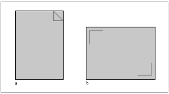
The typical, European “A” standard sheet of paper4 (A1, A2, A3 etc.) has the aspect ratio of 1.445. The typical computer screen with the proportions of 4 to 3 creates aspect ratio of 1.336. It may not seem as a big difference judging from the numbers themselves, but in fact, the geometries of both the sheet of paper and the computer screen create diametrically different design areas on which the designer can operate.
It must be noted, that designs prepared for print come in much wider range of formats than the ones explained here7. The designer has virtually
unlimited choice of the paper size, shape or binding. However, due to the fact that this work focuses on the text-based content, I decided to talk about most commonly spread standards only – the ones one would see in most of printouts, brochures or magazines.
4 American and British standards use respectively slightly different format with aspect ratio of 1.444 5 More information on paper standards can be found in:
Kuhn, Markus. International Standard Paper Sizes. 22 February 2001. < http://www.cl.cam.ac.uk/~mgk25/iso-paper.html>.
6 “Displays.” The PC Technology Guide. 23 February 2001.
<http://www.pctechguide.com/glossary/08displays.htm>.
Figure 1: Default orientation and proportions of different media: a. A4 sheet of paper, b. Computer monitor
The biggest difference in the spatial behavior of both design methods does not lay in the aspect ratio though, but rather in the positioning of the design space.
By default, the assumed arrangement of the sheet of paper is portrait8, and that of the monitor (apart from a small number of innovative designs9) is always landscape. The default assumed arrangement comes from a number of various factors, such as the field of view of the human eye, the eye movement when analyzing content, or simply, the handiness10.
8 I will refer to the design area proportions and arrangement as landscape and portrait (see glossary),
and to the positioning of the design area in the external three-dimensional environment, as vertical and horizontal.
9 Such as discontinued Apple A4 Display. 10 For more information, refer to:
“Video display technology page.” ePanorama.net. 23 February 2001. <http://www.epanorama.net/videodisplay.html>.
We are more likely to present and view the dynamically changing content on the landscape-positioned surface. That comes from the fact, that the human’s field of view is arranged similarly. The angle of our vision is much higher on the horizontal axis, and then smaller on the vertical one. 11
Setting up the computer monitor (as the output device for the web design medium) in the landscape position, enables the viewer to observe the whole surface with one look, rather than part-by-part, as it would be with the portrait format.
In fact the 4/3 screen size proportions offered by almost all of today’s computer monitors and TV sets are already slowly becoming redundant, in favor of 16/9 wide-screen models, much more resembling the cinema screens. I would not, however, like to speculate whether those dimensions of the screens would be the future of the web design. As long, as for the movie playback they pass their role very well, most probably, for content presentation they would not.
The 4/3 proportions (1.33 aspect ratio) of today’s monitors offer the user fairly good design/presentation area for viewing or creating the web content. It must not be forgotten, however, that in terms of content
presentation (more widely discussed in the second section of this chapter,) we are still in favor of the portrait format.
11 Arthur, Kevin. References on field-of-view issues for head-mounted displays. 24 February 2001.
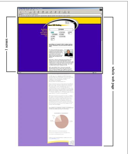
Figure 2: Monitor or browser window as the passé-par-tout for the web page.
Source: GSD Bank: About GSD Holding.13 December 2000. <http://www.gsdbank.com.tr/about.html>.
Most of the web pages we view are created in the portrait manner, and the monitor screen is our passé-par-tout12 for viewing them (Fig. 2). What can be the reason for such a strong ties of the design and portrait positioning of the area?
The determining factor for the portrait arrangement of the content is the presence of text as one of the most crucial elements of the design – the content. We are not likely to read very long lines of text. Neither are we to read a large number of text columns positioned one next to another13 in a horizontal arrangement.14
Perhaps those principles could be broken in the societies where alphabet used allows top-to-bottom text direction, but that cases we can count as the exceptions, since the majority of web sites (and perhaps printed materials) are created with the horizontal text direction.15
Apart from the considerations of portrait and landscape arrangement of the design area, its position within three dimensional space, and relation to the reader should be discussed.
12 Passé-par-tout (fr) to look through. Frame.
13 In fact there are some design motivations why such idea would not work in web design. They will
be discussed further in the third chapter.
14 “Typography.” Web Page Design for Designers. 30 February 2001.
<http://www.wpdfd.com/wpdtypo.htm>.
15 Alternative text positioning techniques are widely discussed in:
W3C Internationalization and Localization. 30 February 2001. <http://www.w3.org/International/>.
Most of the printed material we can manipulate when reading. We can move16 the page, tilt and shift it, we can rotate it, or even bend it. This allows us to find the most comfortable and pleasing angle, light condition and distance for reading. Computer monitor, however, has the fixed position, and usually we do not attempt to move and reposition it too frequently.17
Virtually all the computer monitors have the screen situated vertically in front of the user, in a relatively small distance18. The easiest way to change the view of the content presented is moving the reader rather than the monitor, or using various tools, discussed more widely in the fourth part of this section, named “Touch”.
Under the heading of the design “space” we must also take under the consideration the resolution of the medium we are presenting or viewing the content in. In print, we are dealing with the infinite resolution of the paper. Printing machines set certain limitations to the resolution of the text and images presented to the reader. Still, the paper itself (or any other material we are printing on) does not enforce any limitations to the amount of data presented on the certain physical area.
16 We must of course exclude such instances as posters, billboards or framed reproductions. 17 Proper display placement is analyzed in-depth in:
“Monitor Placement.” All About Vision. 15 February 2001. <http://www.allaboutvision.com/cvs/placement.htm>.
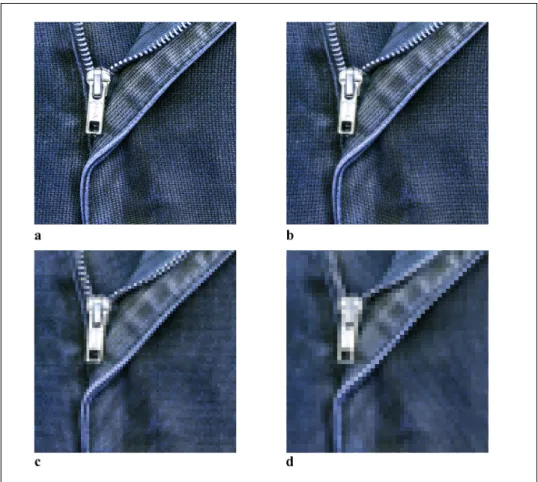
Figure 3: Close-up of the image of the same physical dimensions in different resolutions:
a. 600DPI (high quality print) b. 300DPI (normal quality print) c. 150DPI (low, home printer quality) d. 96DPI (standard PC monitor)
In print we are usually working with the resolutions of 150, 300, 600 or 1200 DPI19 (Compare: Figure 3a, b, c). These allow the content to reach nearly photographic quality of the images. The higher resolution we set in printed design method, the smaller the ink dots20 that constitute
19 In fact, printmakers relay on the LPI (Lines Per Inch) as the measure of the resolution but I would
rather talk about the DPI in order to make comparison with web design easier.
20 The process of creating images in print is explained more carefully in the next part of this section,
to the image as a whole will become, and the reader will no longer be able to see them. The edges of the text would be smoother, and the images would look more “natural”.
In web design, however, we are facing very strong limitations of the space and resolution. By default, most of the monitors work with the resolution of either 72 or 96DPI (Compare: Figure 3d). The great difference from print, being the result of relatively very low resolution is clearly visible21.
Moreover, computer users own different size monitors, running at different screen settings. All those factors affect the ways in which web content is presented and built.
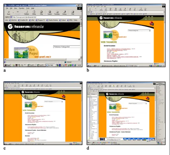
On the Figure 4, I have illustrated how different screen setups may affect the rendering of a sample web page. All the images show the web page, as it would display on a 17” monitor. As it is seen, depending on the current settings the particular viewer is using, the amount of information displayed simultaneously changes. We could compare it to using different size passé-par-tout while viewing the same image22.
Moreover, even the screen settings themselves do not completely determine the amount of data presented on the screen.
21 For more information on screen and print resolutions refer to:
Bear, Jacci Howard. “Resolution Inch by Inch.” Desktop Publishing. 22 March 2001. <http://desktoppub.about.com/compute/desktoppub/library/weekly/aa101800a.htm>.
22 The Straight Scoop on Resolution. 21 March 2001.
The content of the web page is displayed inside the browser window, which occupies a certain amount of space, so that we are never able to use the whole monitor for displaying web content23.
Figure 4: Various screen setups affecting the rendering of the same web page.
a. 640x480 pixels, b. 1024x768 pixels, c. 1280x1024 pixels, d. 1280x1024 pixels with additional windows open.
Source: G-TASARIM | www.gt.com.tr |. 15 October 2000. <http://www.gt.com.tr/gt-referanslar.html>.
23 Even the “full-screen browsing” feature introduced in Microsoft Internet Explorer browser does
not utilize the whole monitor screen – it always leaves a small navigation bar visible, accompanying the web content.
Additionally, any other windows the user may be running whether inside or outside the browser, further limit the available area. On the figure 2d we may see quite typical computer screen with several programs running. Even though the resolution of the screen is high, the area available to the web content is very limited.
2.1.2 Color
The two methods of design: web and print, operate within different color spaces. The technologies used to create colors in both of them differ as well. Due to this fact, not only both methods provide access to different color ranges, but also the behaviors and perceptions of color are not similar.
In print, color is created by the subtractive color synthesis: by mixing various amounts of four basic pigments in the CMYK color model (cyan, magenta, yellow and black24). In web design, color is created on the monitor screen, in additive color synthesis, by mixing different colors of light and operates within the RGB color model (red, green, blue)25.
24 The actual subtractive color synthesis does not require the black pigment. It is used in print process
in order to minimize the usage of the other three.
25 Different color models, in scope of digital media production are described in-depth in:
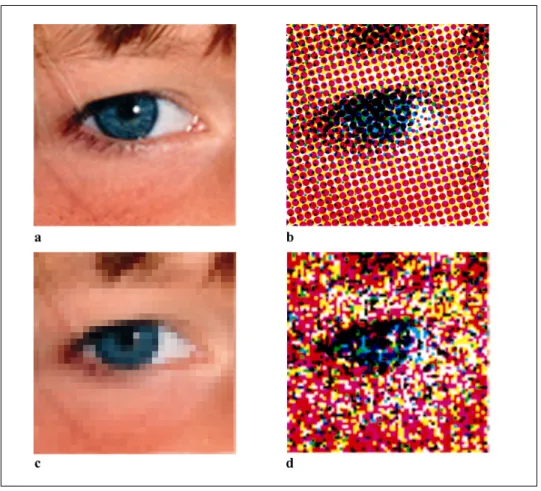
Figure 5: Close-up of the same image displayed using different media:
a. Original image (photograph)
b. Offset (using CMYK halftone screens)
c. Monitor (grid of pixels)
d. Inkjet (random CMYK dots)
The basic colors from which the full range is being composed create certain patterns on the surface. By viewing them, one can understand what
technology has been used in order to create the image. Laser and offset printers use the color halftone screens (patterns of dots in different sizes) for all four basic pigment colors. Inkjet printers create more chaotic sequences of dots. Finally computer displays create colors on a grid of miniature squares (pixels). The comparison of the three methods can
be seen on Figure 5. Please note that viewed from a distance all images will look similar. Slight changes in colors will be also obvious – those are the limitations of the devices.
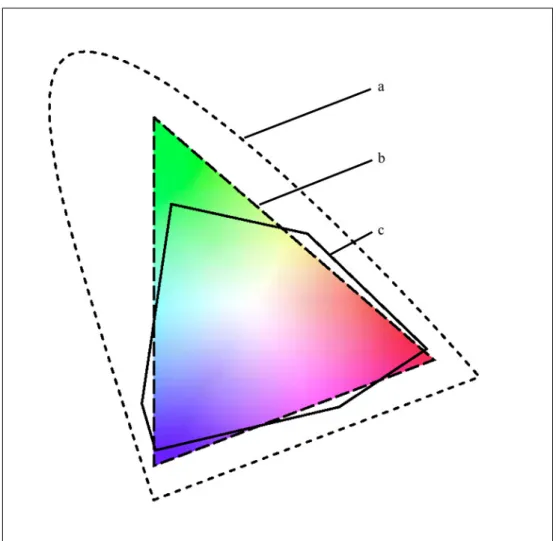
The CMYK and RGB color spaces are not identical. There are some certain colors that can be displayed using one, but not the other. The more detailed representation of both color spaces (gamuts), as in reference to L*a*b color model is presented on the Figure 6.
Apart from the difference in gamut between the two models, affecting the colors that can be used in designs, there is also a great difference in the way the reader perceives colors when viewing the printed or web content.
Looking at the monitor can be compared to staring at the lamp. Since computer monitor emits the light (rather than reflecting and absorbing it, as it happens with printed materials,) viewing intense and bright colors such as pure white or bright green (also known as “lime”) tends to tire the eyes. In opposition, printed material viewers rather rarely experience discomfort due to the colors themselves.
Still, both in RGB and CMYK it is a general rule that the intense complimentary color pairs (such as Green-Red) should not be used as
foreground and background for one element, unless the creation of discomfort is intended26.
Figure 6: Color spaces in relation to each other
a. L*a*b color, b. RGB, c. CMYK
Source: “Adobe Photoshop 6.0 User Guide.” Adobe Photoshop 6.0. CD-ROM. Adobe Systems INC, 2000. 114 pp.
26 Berry, Susan, and Judy Martin, eds. Designing with color: how the language of color works and
The pleasure and discomfort related to the color usage affects and limits the author’s choices while designing either a web page or the material for print. One has to carefully evaluate the usage of large areas filled with bright colors in order to avoid viewers’ negative response.
Many web designers tend to place black text on the white background in the body elements of long articles. Although through similarity with designing for print this could be considered proper, in fact reading long texts becomes tiresome and often irritating27. One easy way of overcoming the problem related to the brightness of white is using a slight tint of some other color as the background.
Texts written on the pale, and slightly “off-white” colored background are more easily adaptable for the eyes, though paleness of the background may decrease the dynamic look of the page that many designers wish to achieve.
Both print and web have certain color systems (palettes) designed to enhance the navigation and communication within the available color ranges. In print, examples of such palettes could be the PANTONE® systems, incorporating a wide palette of colors that can be reproduced in print (by the usage of pigments) and providing each with an unique name that can be used for quick reference28.
27 Nielsen, Jakob. In Defense of Print. 13 January 2001. <http://www.useit.com/alertbox/9602.html>. 28 Pantone: Product Catalog. 22 March 2001. <http://www.pantone.com/catalog/catalog.asp>.
Web provides the designers with the Web-Safe Color Palette (216 colors). However, in this case, the quick reference is not the main goal of creating such a system.
Since the web content is viewed on multiple platforms (Macintosh, Windows, Unix etc.) and different types of color settings are available for each of those, Web-Safe Palette was developed in order to construct a set of colors that should be available and viewable on any system. The Web-Safe Palette consists of colors belonging to the RGB gamut, and created by mixing the amounts of different lights only at certain values29.
The difference between whole RGB spectrum and the Web-Safe Palette30 can be easily understood through looking at Adobe Photoshop color picker window, which is illustrated on the Figure 7 or the color palette window of the same program (Figure 8). It is obvious that while RGB allows you to freely move along the available color set (gamut), Web-Safe Palette enforces certain limitations.
In the Color Picker window such limitations are visible as a grid dividing the whole palette into the set of colors matching Web-Safe colors. In Color palette, user is given specific points on the scale of each component’s
29 In hexadecimal code those values can be represented as 00, 33, 66, 99, CC and FF, which are the
equivalent of 0, 51, 102, 153, 204 and 255 in the decimal 0 to 255 scale.
30 A complete reference and explanations about Web-Safe Palette can be reached at:
Weinman, Lynda. The Browser-Safe Color Palette. 22 February 2001. <http://www.lynda.com/hex.html>.
(R, G, B) intensity, and is limited to use those values only, rather than moving freely through it, as it is the case with RGB color model.
Figure 7: Adobe Photoshop's Color Picker window
a. RGB colors, b. Web-Safe Palette colors
Source: Adobe Photoshop. Vers. 6.0. 20 December 2000 <http://www.adobe.com/products/photoshop/main.html>
Figure 8: Adobe Photoshop's Color Palette window
a. RGB colors, b. Web-Safe Palette colors
Source: Adobe Photoshop. Vers. 6.0. 20 December 2000 <http://www.adobe.com/products/photoshop/main.html>
Web-Safe Palette is slowly becoming obsolete since very less Internet users work on the computers limited to the 256-color displays. Still, among many web designers it is a common practice to work within this palette when
designing the basic color scheme for the pages, and to use them when covering large block areas (such as backgrounds and large single-color fields)31. This comes from the fact that some of the colors may be interpreted and displayed in different ways among different platforms, browsers and monitors, while Web-Safe Palette is (in theory) bound to stay untouched and rendered perfectly the same in all of them32.
Different computers, platforms and monitors affect both web design and print in a very negative way. Often a graphic or a document that looks and prints exactly as the designer intended may suddenly lose colors, saturation or overall contrast when viewed or printed from another device. To prevent it, the International Color Consortium (ICC) designed the standard, named ICC Color Profile33. Each device can be configured according to its specifications and the information about its gamut, color mode, dot gain (for printers) and other parameters – saved in the ICC Color Profile File.
Later, when the document cerated on one machine is being opened on another one, the program interprets the Color Profile information and understands how was it supposed to be rendered at the original machine,
31 More about web graphics and color usage can be found in:
Weinman, Lynda. Designing Web graphics. Indianapolis, Ind.: New Riders Pub., 1996
32 “Graphics and Palettes”. Web Page Design for Designers. 27 February 2001.
<http://www.wpdfd.com/wpdgraph.htm>.
33 Guidelines for device-independent color data processing in accordance with the ICC-Standard.
and reinterprets color information to match the display and print with the intention of the designer. This mechanism is essential when working for print in order to achieve best possible similarity between the images seen on the monitor (in RGB) and the ready, printed medium (in CMYK).
Figure 9: Corel Draw's Color Profile selection screen. Source: CorelDRAW. Vers. 10.410. 23 December 2000 <http://www3.corel.com/cgi-bin/gx.cgi/
AppLogic+FTContentServer?pagename=Corel/Product/ Details&id=CC1IOY1YKCC>
For a long time web lacked the Color Profile mechanisms, and at the time of writing this paper, it still does. The only format fully supporting ICC standards is Adobe’s Portable Document Format (PDF), however, as the name suggests, it is a format for presenting documents, rather than
constructing web sites. Due to big sizes of PDF files, it is also not suitable for constructing web sites.
Work is in progress though, to implement the Color Profiles in the next version on Cascading Style Sheets (CSS level 3). Such move will mean the color revolution in web design. No longer will the Web-Safe Palette be necessary. Instead, any designer will be able to specify the color profile of the machine web site was constructed on, and be sure that every single color will be displayed or printed as close as possible to the original, on any other machine supporting the technology34.
Since the CSS specifications are being developed by the World Wide Web Consortium (W3C), the current leader in standardization of the web, it is rather certain that soon the ICC Color Profiles will become a worldwide standard for the color manipulation over the Internet.
2.1.3 Time
The time factor creates probably one of the biggest differences between print and web design. It determines the way the content is presented to the viewer and viewer’s perception of it.
Printed materials are presented to the viewer “as they are”. Once printed, all the elements are set and positioned on the page35 (or any other medium the print was made on,) and do not change. The viewer is presented the whole
34 CSS3 module: Color. 5 March 2001. <http://www.w3.org/TR/css3-iccprof> 35 I will assume that “the page” is the general term for the printed medium surface.
page at once and he or she decides how will it be evaluated, observed, read or analyzed.
The web pages are behaving in a dynamic manner. They take certain amount of time to load, to format according to the device specifications and to display. They as well often do not fit in viewer’s monitor (passé-par-tout) and may contain dynamically changing elements such as animations, video clips, sounds etc.
Most important of those elements is the page loading36. As long as the animations and other dynamic content elements are optional to use, in the web design it is impossible to avoid the download time. The content is generally placed on the machine different than the one it is viewed from and the data must be transferred, interpreted and then, finally displayed37. The machine hosting the content is known as the server. Viewer’s machine is known as the client. Finally the program that performs all the operations related to the presentation of the web content is known as the browser38.
36 The process of loading pages and the effect of waiting on the user was analyzed in-depth in:
Nielsen, Jakob. The Need for Speed. 3 March 2001. <http://www.useit.com/alertbox/9703a.html>.
37 More information on the technical aspects of data transfer over the Internet can be found in:
Halabi, Bassam, and Danny McPherson. Internet routing architectures. Indianapolis, IN: Cisco Press: New Riders Pub., 2000.
38 In fact the proper term for such program is “user agent”, but since user agents can be as well the
search engines, Internet bots and other devices, I will use much simpler and well-known term “browser”.
The basic timeline of the loading of page can be summarized in the following steps:
1. Viewer chooses the link to some document and activates it.
2. The browser sends the message to the server requesting the document.
3. The server sends the HTML document and the information about any additional files to the client (additional files can be JPEG and GIF images for example).
4. Browser sends a request to the server for the additional files.
5. The server sends additional files to the browser.
6. While receiving data from the server, the browser interprets and displays it. Some browsers display the page as it is loading, some wait for all the content to be downloaded. The web designer should design the page in a way that the browser will be able to start displaying it even before all the images and content are loaded39.
7. The viewer reads the content by scrolling the document to reach the areas that do not fit in the single screen.
39 The techniques that can be employed to achieve such effect are explained in detail in:
Ragget, Dave, Arnaud Le Hors, and Ian Jacobs, eds. HTML 4.01 Specitication. <http://www.w3.org/TR/1999/REC-html401-19991224>.
Depending on the length of the document, amount and size of the images, the presence and size of any additional elements, Internet connection bandwidth, the distance between the client and the server and finally the speed that the client machine renders the pages in browser, the process of loading the page can take from the fraction of the second, to even half an hour during the peek hours. Some more information on creating the web pages that load fast and keep the viewer attracted will be included in the second section of this chapter, dealing with the content organization and presentation.
Typically when displaying the web page, the browser first loads all the text elements and then the images. If any of the elements are positioned within the table, they are displayed after all the contents of table’s cells are fully loaded or recognized. Elements placed below the unloaded sections may (but do not have to) be hidden, even if loaded, until the preceding section is displayed fully40.
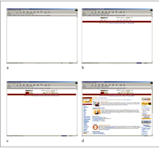
Figure 10 illustrates the process of loading the http://www.amazon.com/ web page. First (fig.10a) the browser confirms the establishing of connection with the server by cleaning up the window contents and displaying the proper URI in the location bar.
40 For more information about proper design and structure of web pages, refer to:
Figure 10: Step-by-step process of loading a web page Source: Amazon.com—Earth’s Biggest Selection. 24 December 2000. <http://www.amazon.com>
As the second step (fig. 10b) the basic layout of already loaded elements is displayed. All the text elements and background colors are shown, and the images are signified by the image placeholders, into which later on proper image files will be loaded.
In the third step (fig. 10c) the images are already loaded and displayed on the screen, but the browser seems to still be processing some data. Nothing new is being displayed in the window for some time.
Finally (fig. 10d) the rest of the page appears suddenly. Since it was placed inside a table41, it could not have been displayed step-by-step42 as the browser was processing the data, and appeared at once on the screen when the whole content of the table was already known.
While the page is loading, the viewer is presented the content step-by-step43 and generally is allowed to view some elements earlier than the others. Often the text of an article would load first and then the images illustrating it would appear, as the viewer already started reading the text. It makes a great difference from the printed materials, where all the contents are already placed on the page and the viewer is the one who chooses the order of viewing them.
The fact that the viewer must wait for the web page to load, affects one’s concentration in a negative way. Viewers of the web content are much more likely to perform multiple tasks, (often reading many documents at the same time,) than the viewers of the printed materials. It has been proven as well that generally web audience does not read but only scans the page with their eyes44.
41 Generally, tables are used by the web designers to format web pages into rows and columns,
similarly to the grids and guidelines used by the designers in print.
42 The latest version of HTML (XHTML 4.01) allows the tables to be displayed step-by-step, while
loading. Unfortunately the browsers currently available on the market are not yet programmed to utilize these mechanisms.
43 There are exclusions from this rule, such as Flash web pages.
44 Flanders, Vincent. “How Big Can I Make My Page?” Vincent Flanders’ Web pages that Suck.com.
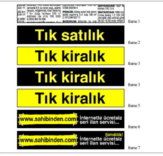
Time factor does not only show through the process of the page loading, but also affects the presentation of the pages themselves. Certain elements transform and change the way they look on the page, in time. Animated banners can be a good example illustrating it. Since animated or moving, those elements easily grab the attention of the viewer. Virtually all advertisement banners on the web use the animated GIF technology to attract potential clients to click on their graphic.
Figure 11: Sample advertisement banner, divided into separate frames.
Source: Tık kiralık. Advertisement. 22 December 2000. <http://www.ada.com.tr/>
GIF animations themselves are not the only changing elements on web pages. Many authors use Macromedia Flash technology to create ads, menus or even whole web sites in this vector-animated format45.
Dynamically updated pages can change certain areas of the page in regular intervals, or reload the whole document after a set amount of time46. Other elements that add dynamism to the web pages are scrolling texts (java applets), scrolling the whole document automatically (java script), button mouse-over effects (java script) or embedded sounds and video clips, to list just some of the possibilities.
Even the static page, though, will gain a limited amount of dynamism through the user interaction. When reading any printed medium, viewer generally sees the whole page at once, reads the texts, watches the images and then flips the page to access the continuation or another information. In web, one can only view the page through the (mentioned earlier) monitor that acts as the passé-par-tout.
To access the area that did not fit on the screen at one time, the viewer is forced to perform the action of scrolling, in order to change the area of the page currently displayed on the monitor. This action will be discussed further in the following sections of this work.
45 For more information on Flash, refer to:
Macromedia – Flash. 24 March 2001. <http://www.macromedia.com/software/flash/>.
2.1.4 Touch
It may be observed, that in general, people tend to pay much closer attention to the content presented to them in the form that they can access physically. One would pay much more attention while reading the book (held in hands) than when looking at the poster. Newspaper would require more attention than the billboard. This can be true for the web content as well. It has been proven that most of the Internet users do not actually read, but only scan the text with their eyes47.
Browsers for a long time strive to make viewing the pages over Internet as pleasant and natural as it can be. However, the tools that they offer, often do not manage to efficiently substitute those of the real life.
In fact, as it can be seen on the Figure 12, WWW offers much wider variety of tools and possibilities than the printed medium. Still, the lack of physical contact with the medium often creates a mental discomfort and renders those tools much less usable then the real-life ones.
Perhaps with the use of touch-screen and high resolution technologies, this situation could be changed, but currently, the users are still forced to manipulate the images on the screen by the use of mouse, trackball,
47 The differences between content creation for web and printed medium can be found in:
Nielsen, Jakob and John Morkes. Writing for the Web. 20 March 2001. <http://www.useit.com/papers/webwriting/>.
keyboard and other input devices that often appeal unnatural, especially to the new users with no prior computer experience48.
Function Real-life tool/action Web browser tool/action
Access to specific sections of the document.
Locating the item in the table of contents, finding the page by the number
Locating the item in main page or site map and clicking the link Access to the
previous or next page.
Flipping the page Clicking the link or Back, Next
buttons of the browser Marking the place
for further reference
Inserting a bookmark or folding
the corner of the page Creating a bookmark entry or a shortcut to the address Noting comments Writing on the margin on the
book, sticking a piece of paper with the note
Creating text entry in the bookmark file comment field Correction of the
display error on the page (as the author)
Revising the document, printing
again or editing an errata Correcting the document and uploading to the server Correction of the
display error on the page (as the viewer)
Acquiring a new copy of the
publication Clicking Reload button
Closer look at some element of the page
Using magnifying glass Changing the text or image
settings, using additional programs or changing display settings.
Also, in Flash, using zoom tool. Cross-reference Locating or acquiring the
additional source Clicking the link
Search for
specific keyword Looking carefully throughout the text or using the glossary Using Find command or using the glossary
Figure 12: Comparison of different tools and actions available for print and web manipulation
It cannot be denied that the web pages require higher level of interactivity than the printed materials. The viewer must load and scroll pages, click links, make conscious decisions about the next destination, sometimes fill
48 Computer mouse, for example, is operated by moving it over the flat, horizontal surface, while the
cursor, which it directs, appears on the vertical screen. For many first-time users this creates a great discomfort and confusion.
the forms and so on. Still, the artificial quality of all those tools makes them less appealing than printed medium.
It could be observed, however, that young children, especially at the elementary and pre-school age have no mental blocks when accessing and utilizing software interfaces. They have the tendency to adopt into the computer environment much easier than the adults49.
The problem with assimilating and getting used to web medium, may then lay not in the nature of the medium itself, but rather within the public, unable to adopt fully to the technology developed recently – the technology they did not grew up with.50
49 Feldman, Dara. Technology and Early Literacy: A Recipe for Success. 13 March 2001.
<http://www.childrenandcomputers.com/Articles/technology_and_early_literacy.htm>.
50 Davidson, Jane Ilene. Children and computers together in the early childhood classroom. Albany,
2.2 Content organization and presentation
In both of the methods of design; print and web, there are certain rules and principles of content presentation. Some of those are common to both methods while the others differ. This chapter will discuss the various ways of presenting content to the reader, outlining the medium-specific
techniques that are being employed to enhance the user experience.
2.2.1 Interactivity
One of the most obvious differences between the two methods of design and content presentation is the way in which the reader navigates through the document. Providing the reader with the choice of the content one wishes to read next, allows the interaction between the two.
A certain level of interaction is employed, in fact, in almost any action a person could take towards another person or the object. While reading the book, one has to take it, open on the certain page, view and read the text, fold the pages etc. Web, however, does not only allow the interaction between the reader and the object, but rather with the content of the article or articles. The action is not only “allowed”. It is the very essence and base on which the whole concept of hypertext and World Wide Web resides51.
51 More information on hypertext can be found in:
Woodhead, Nigel. Hypertext and hypermedia: theory and applications. Wilmslow, England: Sigma Press; Wokingham, England; Reading, Mass.: Addison-Wesley Pub. Co. 1991.
Figure 13: The reading order of a typical printed article.
Reading any printed article52 is usually a very straightforward process. The reader starts from a page on which the article begins, and reads the content, occasionally folding a page until the end of the article is reached. Most often the articles are split on a number of subsequent pages. In some cases, the article may be broken into sections printed either in a number of issues of the same periodical, or on the pages not directly following each other. In such cases, the end of each section indicates where the continuation of article could be found.
It should be important to note at this point, that such information, even though it acts as a “link” to the next section of an article, does not provide options for the reader, only the exact place of the continuation. This technique should not be considered as the interactive feature therefore, since the only choice it provides to the user is whether to continue reading
52 There were certain attempts of breaking a scheme, publishing the interactive adventure books,
where the reader decided on the next action of the character, but those were only the adaptations of the ideas of hypertext into the books, rather than a standard on their own.
the article, or to stop it. The reader can as well, take such decision at any given moment without any indication within the article.
The other feature of the printed medium articles, the bibliography, (especially in the academic writings) could be considered as an attempt towards interactivity. Yet again, I believe it does not match the criteria in a satisfactory way, as to be entitled to such function. The reader is provided with a number of references for further study of the topic, but the medium itself does not provide any mechanisms for accessing such sources quickly and easily.
Other actions and writing techniques within the printed material could be analyzed in the similar way, but we would always come to the similar conclusion: Printed materials are not interactive by their nature, and if they appear to be, it is whether only illusory quality, or the author intended them to utilize some of the mechanisms that do not originally belong to the syntax of printed medium communication and content presentation.
Normally, printed materials are to be read in a linear way, from the beginning until the end, creating a self-contained whole without any significant need to refer to any outside sources in order to accomplish reading them.
Figure 14: Multiple possible reading orders of web documents
In the web, the reader faces a non-linear presentation of content. There usually is a certain order in which the author intends the article to be read, yet that order is not forced upon the reader, and alternative possible directions are most likely provided53.
The mechanisms of hypertext allow the creator of the content to provide the reader with links to other sources of information, articles, graphics,
glossaries, etc. The reader does not need to know where such resource is located, which makes the whole process easy and enjoyable.
53 For information on writing for the web, see also:
Schriver, Karen A. Dynamics in Document Design: Creating Text for Readers. New York: John Wiley & Sons, Inc. 1996
Due to the format and physical characteristics of the web, and on-screen computer displays, it is usually a common practice to split the articles themselves into a number of smaller HTML documents (web pages) which have to be accessed and read one by one in order to complete the single article. Those sections are to be linked to each other as well54.
Although hypertext brings many new possibilities to the designer, it has its drawbacks as well. The designer has to carefully weight the amount of external links55 in order to maintain the important balance:
• The amount of links should be high enough to give the reader the feeling of choice and freedom in decision-making. Too less links can create the feeling of entrapment within the content of a certain document. Those can also arise the feeling as if the author of the page was not confident enough about keeping the reader interested in the content and tried to keep one within the web site or document by refusing to provide any exit.
• On the other hand, a number of external links should be small enough not to distract the reader. Too many links can “tempt” the reader to escape from the site. The large amount of links can, again, create the feeling of lack of confidence in the content expressed by
54 Nielsen, Jakob. Microcontent: How to Write Headlines, Page Titles, and Subject Lines.
11 March 2001. <http://www.useit.com/alertbox/980906.html>.
the author in referring to too many external sources. Finally, large number of links within the page (usually indicated by different color of the text and the underline effect) can destroy the visual harmony of the text and make it difficult and unpleasant to read.
One of the interesting qualities of the web, as opposed to the printed medium, is that there almost always is no actual end of the content. The printed articles end in the certain place, but the web documents always provide, or should always provide, some sort of continuation of the topic. It can be expressed by the links to the works on the similar subject, or to the other documents created by the same author. It can be the feedback form or a link to the discussion group on a given subject. The possibilities are virtually endless.
It is very rare that the web document would simply end, providing no follow-up links of any sort to the user. In fact, the readers are in favor of the sites providing them with more freedom, and continuous browsing
experience, usually avoiding content-based sites that finish with a “dead-end page”.
2.2.2 From page to page – folding the page against scrolling and clicking links
It is often the case that a full-length document does not fit on one page, be it the article printed in the magazine or content published over the WWW. In such occasions the designer has to split the content into several sections and distribute them among the available pages56.
Since folding the page of the printed material is a very simple action that could be performed fast, the designer has more freedom in the way he transfers one part of the article into another. One can decide, for example, to split one sentence between two succeeding pages, or even to hyphenate the word from one page to another. The ease of continuous reading is guaranteed by the nature of the printed medium. The process of moving from one page to another is fast enough for the reader to remember the first part of the sentence and flawlessly continue it with the segment located on the new page. Even in the case that the reader would forget the sentence’s beginning, one can always quickly fold the page back and re-read the missing content.
The fact that pages of the printed medium design correspond so tightly with each other is often used by the designers especially in various types of small flyers and brochures, where alternative ways of folding the paper can create different compositions (Fig. 15).
Figure 15: Different types of folds for brochure design:
1. vertical parallel fold, 2. horizontal, 3. book fold, 4. short fold vertical, 5. short fold horizontal, 6. tent fold, 7. gate fold, 8. z fold
Source: Conover, Theodore E. Graphic Communications Today. St. Paul: West Pub. Co. 1985. 233 pp.
In web, the documents are presented in the entirely different manner. Although each web page belonging to any given site or multi-page
document, undoubtedly is a part of the bigger whole, at the same time it has to be able to stand on its own, independent from the rest of the site57.
The way long texts are split into separate web pages is a direct consequence of those properties. In web, the content has to be split into logical blocks,
56 Adequate for both pages of printed material, and web pages.
57 Nielsen, Jakob. How Users Read on the Web. 14 March 2001.
similarly to the splitting of the novel into chapters and sections. The reader can then read the chosen section as a whole, and then proceed to the next page, without the need of direct continuation of any line of reasoning from the previous one.
Writing for the web is not an easy task. The texts not only have to be constructed in the different way than while writing for the print. They also should be much shorter and operate by keywords rather than by the long explanations. The reader should be able to grasp the quintessence of the text much faster than while reading from paper or other printed material58.
There are multiple reasons for enforcing such techniques on the writers and designers working with the web. Some of them, coming form the physical characteristics of the medium, I have explained in the earlier sections of this work. One of the most important ones has not been discussed yet, however.
As described earlier, moving from one page to another is a quick and easy process when one reads printed material. In web, this simple action becomes a three-step process, involving user interaction with the web medium, hardware and software operations, data transfer over the network, and due to those, is additionally spread in time.
58 For more information, refer to:
Nielsen, Jakob. Inverted Pyramids in Cyberspace. 5 March 2001. <http://www.useit.com/alertbox/9606.html>.
When reading the content of a web page, the reader has to perform the following three steps in order to complete the task and to reach the continuation of the article (or any other document one wishes to read):
1. Scrolling the page: As explained earlier, the whole content of one web page rarely fits onto the screen at one time. Therefore while reading the text, user has to move through the document using scrolling, in order to view the whole content. One already faces with the issue of text fragmentation at this level, since it is usually impossible to see the whole content at once, and again the viewing area is limited by the display device’s screen.
2. Once the reading process is completed, the reader must locate the adequate links that will grant access to next sections of the article, or another document. It is very crucial that the web designer takes into consideration the way the document will be read. Often, designers place the links to other sections of the site only on the top of the page, forcing the reader to scroll back all the way up, once he or she finished reading the text in order to be able to proceed further. Properly placed links should allow the user to access other pages easily at any given moment59.
59 This issue will be discussed more in-depth in the following part named “2.2.4 Information about
3. Finally, the reader must activate the chosen link and then wait for the process of loading next page to complete. Since currently most of the worldwide Internet users are still connecting to the web via telephone modems60, the process of loading pages takes a considerable amount of time. Even with the fast connections, most of the systems still need additional time to render the page on the screen, and therefore the access to the continuation of a document is almost never as fast as in the case of printed material.
2.2.3 Navigation
Since, in print, the whole process of navigation can be summarized into creation of table of contents that informs about the location of the articles in the publications, I will concentrate on the web site navigation and site maps in this section.
Constructing a proper site map and navigation system is perhaps the most important aspect of designing for the web. Without carefully planned
60 The analysis of Internet traffic and devices used for connecting to the net can be found in:
structure, the readers are likely to fall into the “lost in cyberspace” syndrome61 easily, and dislike the web site because of it.
Figure 16: Sample site map
Proper web site should split the content into smaller sections according to the subject matter. The content of each section can be further split into smaller sub-sections etc. However, too many branches and levels in the sitemap, instead of clarity – can bring even greater confusion, and therefore such choices should be taken wisely, and tested with a larger group
of people whenever possible62.
61 This occurs when the reader loses the track of the current location, the alternative exits from the
document etc. finally deciding to give up stop browsing the site, and to come back to the well-known location by manually selecting the URI of site other than currently viewed.
62 “Information Breakdown.” Crating Web Pages with Hot Metal Pro 6.
Figure 16 illustrates the sample site map with 2 levels of branching: sections and sub-sections. The proper navigation should provide the user with the following63:
• On the main page – access to any of the section pages, and optionally, descriptions or links to the sub-sections64. When designing a large web site, the link to the site map should be provided, from where the reader could access any document directly. Site map should be clean and easy to understand,
preferably with the graphical representation rather than text only.
• On each of the section pages – link back to the main page, links to other sections and links to the sub-sections of the current section. Also, if present, the link to site map should be provided.
• On each of the sub-section pages – link back to the main page, link back to the section page and links to the other sub-sections of the current section. Optionally, if the content appears in the continuous way, link to the next and previous sub-section should be provided. Also, if present, the link to site map should be provided.
63 Discussed in:
Siegel, David. Creating killer fourth-generation sites. Indianapolis, IN: Hayden Books. 1997.
64 The sample site is very small and therefore the designer can provide all the links directly from the
main page. In the larger sites only links to the sections and, optionally, selected sub-sections should be provided to avoid confusion.
Additional links should be also placed, allowing users to access any given page within the site when the content of such page can bring additional information to the currently read page. For example, while on the page with a C.V. of the designer, the reader comes across the mention of some award; the link to designer’s portfolio and the award-winning work could be placed as well as the link to the web site of the organization that awarded the work.
The proper design of the web site should also permit more than one way of getting to the document. Designer should take under the consideration the different approaches that users may take in order to reach the searched content65. For example, to locate a document describing the installation of drivers for a graphic card on Windows ME operating system, the user can take following steps:
• Go to “drivers” page, then access the sub-section of drivers for Windows ME, then locate the product and finally the instructions on the list.
• Go to “products” page, locate the graphic card and click the link to the instructions on driver installation for Windows ME.
65 Flemming, Jennifer. Web Navigation: Designing the User Experience. Richard Koman, ed.
• Go to the site map and look for the direct link to the instructions for a specific model and operating system.
Each of those ways should lead the potential reader to the same location as a result. If the site design fails to allow multiple paths of navigation, it must be assured that the existing path is easy to locate and understand by anyone.
Designers may also feature additional links on the main page of the site, allowing direct access to the most visited pages, spotlights, news etc. or a simple search engine that looks for the specific words or phrases within the web site.
Figure 17 shows the proper construction of the web site’s main page. Although the site66 is a big one, there is no site map provided. This is the result of the nature of the web site, introducing new articles every day, making it very difficult, if not impossible to create a clean and easily updated map covering all the documents within the site.
Sharky Extreme does not categorize the articles too well, which is also one
of the causes for the difficulties in creating a proper site map (compare with the case study on CNET.com).
Figure 17: Proper construction of the main page
a. Quick Search, b. Links to the thematic sections of the site, c. Links to the featured spotlight articles, d. Latest News, e. List of recent articles and short summaries.
Source: Sharky Extreme. 28 December 2000. <http://www.sharkyextreme.com/>
When designing large web sites, it is often unavoidable that the reader will have to access multiple levels and branches before reaching the content. The next section discusses the ways to assure that the reader will not get lost within the site, and will always be able to find the way to the desired document.
2.2.4 Information about current location and links
Well-organized academic paper is the example of printed medium
document that comes closest to web application. It usually utilizes a proper combination of header and footer to provide the reader with the information on the current location within the publication. It should as well contain table of contents, table of figures, glossary, references and other additional information.
Often in print such information is considered useless and omitted. In the web design however, providing the reader with constant information on current location and with links to other sections of the site is very crucial.
The reason for such need is very easily explainable. If, for example, a reader is to access a random page of a printed article, one is already holding the publication in the hands and can anytime look at the cover, check the table of contents or simply flip a number of pages in order to learn more about the paper as a whole.
In WWW the user will be often forwarded to the middle of a web site through the link from some other place67, and unless provided proper information by the designer, one would not be able to understand the location of the document within the site’s structure. Without such
information, the user would also not likely decide to browse other areas of the site, or in an extreme case, would not even know about visiting the site.
Figure 18: Correct organization and information placement on the web page
a. Name of the site, b. Current section and sub-section, c. Detailed location within sub-section, d. Menu allowing
access to other areas of the site, e. Body of the document,
f. Links to other documents within sub-section, g. Link back to the main page of sub-section, h. Footer links to main sections of the page.
Source: Portfolio: Web Design 2000 | Prohibition INC. 10 December 2000. <http://portfolio.ProhibitionINC.com/>