– 179 –
Color Ambiance in Interiors
Nilgün Olguntürk and Halime Demirkan
Chapter Summary. Ambiance is the character and atmosphere of a place that is of great importance to interior designers both to express themselves and to create emotionally fulfi lling spaces. Color and lighting are powerful design tools for creat-ing different ambiances. This chapter purports to fi nd out how colored light is used in an interior to provide a specifi c ambiance. One hundred and fourteen undergrad-uate interior architecture students were asked to make twelve groups to create either a “calming” or “exciting” ambiance in a specially designed set-up. All groups were free to use red, yellow, green, blue, and white colored lights. Findings of the study indicated that for an exciting ambiance, general and foreground brightness were kept bright and color contrasts were used. A calming ambiance was created with dimmed general and foreground brightness and with subtle color differences. Furthermore, factor analysis was used to group the related items in creating an ambiance according to their importance.
The character and atmosphere of a place is the most important aspect of an interior de-sign both for dede-signers to express themselves and for users to feel content in a space. If one word needs to be designated to both grasp the character and atmosphere of a space, that word should be ambiance. Ambiance can also be thought of as feelings or mood associated with a particular space. Algase et al. (2007: 266) described ambi-ance as the “person-environment interaction from an emotional or affective rather than cognitive perspective.”
For a designer, creating an ambiance in a space (e.g., a room) is about thinking of this room’s surfaces together with lighting of that room. Color is one of the main in-gredients of creating a specifi c ambiance, although it might be subtle, especially as it is often integrated with the existence of a specifi c material (e.g., wood fl oorings, steel balustrades, etc.). Color is an inherent property of all materials and surfaces and is an inseparable element of design (Dalke et al. 2006: 343). How color affects emotions or mood has recently been studied, mostly by asking the test participants a set of ques-tions on a predesigned space or image (Hårleman et al. 2007; Manav 2007; Smith and Demirbilek 2009). However, there is no research on how a specifi c ambiance could be created. This chapter purports to fi nd out how color is used in interior design to provide
a specifi c ambiance. Also, the aim of the study is to determine the factors that can be evaluated as the color components of ambiance in interior spaces.
METHOD
Setting
In order to explore the effect of color on ambiance, a specially designed set-up was built. The set-up consisted of two perpendicular achromatic vertical surfaces (walls), a set of six lighting units on the ceiling, and a white armchair placed in front of one of the surfaces (Figures 15.1 and 15.2). Lamps 1, 2, and 3 were lighting the background wall. Lamps 4 and 5 were for general ambiance lighting. Lamp 6 was for lighting the armchair.
Figure 15.1 Plan of the setting.
The locations of the lamps are shown in Figure 15.1 and the height of the lamps is shown in Figure 15.2.
Participants and Procedure
One hundred and fourteen undergraduate interior architecture students were asked to make twelve groups consisting of nine or ten students in each group. Six of these groups were asked to create a “calming” ambiance, while the remaining six groups were asked to create an “exciting” ambiance. The set-up was designed to provide a background color at the back of the armchair, a foreground color on the armchair, and a general color within the space. All groups were free to use red, yellow, green, blue, and white colored lights. Light was used instead of surface colors, since color of lights could easily be al-tered in interiors to obtain subtle to dramatic effects on the environment. In other words, potentials of colored lighting were explored in this study as an “invisible” yet strong tool to create differing ambiances. The groups were asked to create their chosen ambiance (calming or exciting) by using the six lighting units with the combination of colors they choose. After the groups worked on their designs, they presented their chosen ambi-ances in the provided set-up (Plates 33 and 34) and also, a set of drawings.
Analysis
The authors analyzed each ambiance through the specifi c cases designed by each stu-dent group. One of the two ambiances (calming or exciting) was voluntarily chosen by each student group, who then created the intended setting accordingly. Specifi c designs were analyzed both through information on color, light (dim or bright), and their usage of warm/cool colors, color contrasts, and color harmonies. The results were statistically analyzed in order to understand how overall color schemes of the space could be formu-lated into creating an intended ambiance (calming or exciting).
Data for each design were tabulated under the following headings: Lamp details for each lamp (color, dim/bright), ambiance information on the visual environment (general ambiance color and dimness/brightness, background color and dimness/brightness, foreground color and dimness/brightness), brightness contrast (high contrast vs. ho-mogeneous treatment), color harmony (monochromatic, analogous [neighboring], nearly neighboring, tricolor [three colors with equal distances], split-complementary, contrast-ing), and color usage (warm, mixed, or cool colors). Factor Analysis was conducted on this data to fi nd the relevant headings and signifi cant inclinations on ambiance. Thus, it would be possible to determine how well the specifi ed headings above correspond with the intended ambiance.
Principal Component Analysis (PCA) was used as a method for data reduction in order to understand ambiance. The PCA method was used to determine the number of components with eigenvalues greater than 1.00 with Statistical Package for the Social Sciences (SPSS).
RESULTS AND DISCUSSION
The correlation matrix was examined in order to fi nd out the specifi c design elements of light and color that would imply the intended ambiance. The correlation values showed that brightness of lamp 6 is highly correlated with ambiance (–0.73). This lamp was dimmed if the intended ambiance was a calming ambiance, and it was kept bright if the intended ambiance was exciting. General brightness level was also highly correlated with ambiance (–0.73). General brightness was dimmed if the intended ambiance was calming and kept bright if it was exciting.
Color contrast was highly correlated with ambiance (0.71). Color contrasts were used if there was an exciting ambiance and contrasts were not used if there was a calming ambiance.
Brightness of lamp 5 was also correlated with ambiance (–0.70). This lamp was dimmed if the ambiance was calming and kept bright if the ambiance was exciting. Lastly, foreground brightness was correlated with ambiance (–0.63). Again dimness was used for a calming effect and brightness was used for an exciting effect.
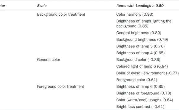
Furthermore, factor analysis was used to group the related items under a factor and to order these items according to their importance. A list of prioritized factors and their items was obtained for the exploration of the effect of color on ambiance. An orthogonal factor rotation was performed using the Varimax with Kaiser Normalization. Among the 5 factors, 3 of them had at least 3 items and the rest had less, thus these 3 factors were considered in this study. These 3 factors accounted for the 59.95 percent of the vari-ance. The loadings of the items on these 3 factors are shown in Table 15.1. The factors
Table 15.1 Prioritized three factors of ambiance with the corresponding items.
Factor Scale Items with Loadings ≥ 0.50 1 Background color treatment Color harmony (0.93)
Brightness of lamps lighting the background (0.85)
General brightness (0.80) Background brightness (0.79) Brightness of lamp 5 (0.76) Brightness of lamp 4 (0.65) 2 General color Background color (–0.86)
Colored light of lamp 6 (0.84) Color of overall environment (–0.77) Foreground color (0.61)
3 Foreground color treatment Brightness of lamp 6 (0.85) Brightness of foreground (0.73) Color (warm/cool) usage (–0.64) Brightness contrast (–0.61)
included only the items with 0.50 or more loading weights. The prioritized factors and their related items are listed from the most important to the relatively less important.
“Background color treatment” was found to be the fi rst principal component for de-signing an intended ambiance. Background color treatment was loaded on 6 positive items: namely color harmony, brightness of the lamps lighting up the background (lamps 1, 2, and 3), general brightness, background brightness, brightness of lamp 5, and brightness of lamp 4. Thus, color harmony was found to be closely related with general and background brightnesses obtained in the room. Less amounts of and closely dis-tanced colors were preferred to be used dimmed, whereas with the increased amount of colors and more increased distances in between colors (e.g., contrasting colors) bright lights were preferred.
The second principal component in designing an intended ambiance was found to be “general color.” General color was loaded on two negative items as the background color and dominant color of the overall environment. Also, it was loaded on two positive items as colored light produced by lamp 6 and foreground color. When choosing a general color for an ambiance, warm background colors and warm colored environments were used together with cool or white foreground lighting. Similarly, cool or white background colors and cool colored environments were used together with warm foreground lighting. The third and the last principal component was found to be “foreground color treat-ment.” It was loaded on two positive items as brightness of lamp 6 and brightness of foreground. Also it was loaded on two negative items as color usage and brightness contrast. In creating an ambiance, when color treatment was preferred to be with warm colors, it was also with bright foreground lighting with high contrast brightness treatment (e.g., dimmed background lighting). If cool colors were used, homogeneous brightness treatment and dimmed foreground lighting were preferred.
CONCLUSION
Finally, it is concluded that “background color treatment,” “general color,” and “fore-ground color treatment” are the three factors that determine an ambiance in interior spaces. The study has shown that “background color treatment” affects the design of ambiance more than other issues when designing with colored lights. There seems to be a close relationship between selecting a color harmony and determining brightness of individual lamps and areas within the visual fi eld.
This study confi rms with Fotios and Levermore’s (1999) statement that color proper-ties of lamps affect the perception of an interior space, which is illuminated with a spe-cifi c light. In the literature, there are studies concentrating on the effects of single and isolated colors. For example, Nakshian (1964) noted that red and the other warm colors such as orange and yellow have arousing or exciting effects on behavior of individuals whereas blue and green have restful effects. However, to the best of the authors’ knowl-edge there is no study using combinations of colored lighting. This study did not limit
itself to single and isolated colors and more than one color could be used in a setting. Thus, the study analyzed color contrasts. Color contrasts were highly correlated with am-biance, and they were used if there was an exciting ambiance and absent if there was a calming ambiance.
This study also helped the students to increase understanding of variables that con-tribute to the ambiance of an interior. They learned the importance of background treat-ment as well as how colors and brightnesses could contribute to their design. Lighting seems to be a more distant tool than paints or soft furnishings for students of interior design. Most of them were hesitant to choose and try different types of lamps. Finally, when they created their chosen/intended ambiance, they were more confi dent to use lighting as a design tool.
This study focused on colored lighting, thus, the fi ndings scientifi cally only apply to lighting. Further studies can be done with settings where colors are present in paint or other coatings/fi nishing materials. Background–foreground color relationship is one of the most important aspects of design, as this would either make perception possible so one could distinguish an object from its background or would camoufl age things by merging them visually in their background. Thus, designing ambiances in interiors re-quires careful planning of background–foreground color relationship whether it is with light, paint, or materials used.
REFERENCES
Algase, D. L., Yao, L., Son, G., Beattie, E.R.A., Beck, C., and Whall, A. F. (2007), “Initial Psycho-metrics of the Ambiance Scale: A Tool to Study Person-Environment Interaction in Dementia,” Aging and Mental Health , 11/3: 266–72.
Dalke, H., Little, J., Niemann, E., Camgöz, N., Steadman, G., Hill, S., and Stott, L. (2006), “Colour and Lighting in Hospital Design,” Optics and Laser Technology , 38: 343–65.
Fotios, S. A., and Levermore, G. J. (1999), “The Effect of Lamp Colour Properties upon Perception: A Summary of Research and the Implications for Lighting Design,” paper presented at CIE Symposium ’99: 75 Years of CIE Photometry, Budapest, Hungary, September 30–October 2. Hårleman, M., Werner, I.-B., and Billger, M. (2007), ‘Signifi cance of Colour on Room Character:
Study on Dominantly Reddish and Greenish Colours in North- and South-Facing Rooms,” Colour: Design and Creativity , 1/9: 1–15.
Manav, B. (2007), “Color-Emotion Associations and Color Preferences: A Case Study for Resi-dences,” Color Research and Application , 32/2: 144–51.
Nakshian, J. S. (1964), “The Effects of Red and Green Surroundings on Behavior,” Journal of
General Psychology , 70: 143–61.
Smith, D., and Demirbilek, N. (2009), “What Is That Place? Observations of the Impact of Envi-ronmental Colour through Photographic Analysis,” in Proceedings of the 11th Congress of the
International Colour Association , Sydney, Australia, September 27–October 2, 2009, http://
eprints.qut.edu.au/28107/.