Effects of Hue, Saturation, and
Brightness on Preference
Nilgu¨n Camgo¨z,
1
* Cengiz Yener,
2
Dilek Gu¨venc¸
3
1Department of Architecture, Faculty of Architecture, Middle East Technical University, 06531 Ankara, Turkey 2Department of Interior Architecture and Environmental Design, Faculty of Art, Design, and Architecture, Bilkent University, 06533 Bilkent, Ankara, Turkey
3Department of Mathematics, Faculty of Science, Bilkent University, 06533 Bilkent, Ankara, Turkey
Received 16 January 2001; accepted 1 June 2001
Abstract: A study was done to investigate preference re-sponses for foreground– background color relationships. To do this, 123 university undergraduates in Ankara, Turkey, were asked to view eight background colors selected from HSB color space on which color squares of differing hues, saturations, and brightnesses were presented. Subjects were asked to show the color square they preferred on the pre-sented background color. Findings showed that colors hav-ing maximum saturation and brightness were most pre-ferred. Blue was the most preferred hue regardless of background. The findings for preferences for foreground– background color relationships are also included in this article. © 2002 Wiley Periodicals, Inc. Col Res Appl, 27, 199 –207, 2002; Published online in Wiley InterScience (www.interscience.wiley. com). DOI 10.1002/col.10051
Key words: color preference; color; color combinations INTRODUCTION
To prefer is to like better or best. In this study the term
preference was considered synonymous with “pleasantness”
and “appeal,” in the sense the study participants were asked to select the color squares that “suited most to” or “looked good on” the background. Preference, pleasantness, and appeal all suggest subjectiveness. Although preference is to some extent specific to individuals, there are many ques-tions surrounding the complexity of the issue. The extent to which preferences on color combinations reflect personal
“taste,” reflect culture, are universal or biological, and are influenced by fashion trends at the time are all unanswered issues at hand. Despite these variables, many, including Birren,1Chevreul,2Munsell,3and Itten,4have studied color,
developing theories by their experiences. In this article these studies are designated as expert views. Note that the expert views did not use controlled-environment setups. Guilford,5
Smets,6 and Eysenck7 did experiments within a controlled
environment on color preference, in which color was treated in isolation. Although a single color in isolation may incite preference responses, in actuality colors are rarely viewed in isolation. Color combinations involve more than one color stimulus being perceived simultaneously. This occurrence may evoke visual sensations that differ from those that result from a single color stimulus. Color combinations have not been studied as widely and intensively as colors in isolation. Studies on preferences for color combinations include those by Helson and Lansford8 and by Camgo¨z.9
The intention of this study was to explore the effects of hue, saturation, and brightness on preference for colors presented on colored backgrounds.
Research Hypotheses
The following hypotheses were investigated to reveal foreground– background color relationships:
1. Hue has an effect on preferences for a specific back-ground color.
2. Varying brightness–saturation levels of color samples have an effect on preferences for a specific background color.
3. The hue of a background has an effect on preferences for color samples.
* Correspondence to: Dr. Nilgu¨n Camgo¨z, Colour Design Research Centre, School of Engineering, South Bank University, 103 Borough Road, London SE1 0AA, United Kingdom (e-mail: [email protected] or [email protected])
4. The location of a color sample on the computer screen has an effect on preferences.
5. Gender has an effect on color preferences.
THE EXPERIMENT
Experimental Setup
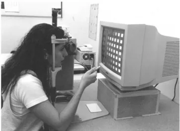
The experimental setup consisted of a computer monitor in a windowless room illuminated with cove lighting (Fig. 1). Cove lighting was preferred as it excluded the possibility of glare on the monitor and created a perfectly diffuse environment without any highlights that might have dis-tracted the subjects. Standard Philips TL 54 fluorescent with
a 6200 color temperature (CT) and a 72 color rendering index (CRI) was used in the coves for lighting the room.
The computer monitor was set to 1024⫻ 768 HiColor (16 bit), all desktop patterns were turned off, and the back-ground color on the monitor was set to a light gray (hue⫽ 0, saturation ⫽ 0, luminance ⫽ 200; red ⫽ 212, green ⫽ 212, blue ⫽ 212). The calibration was set as: contrast ⫽ 240; brightness⫽ 230; B ⫽ 140. The Photoshop monitor setup was: gamma ⫽ 2.0; white point ⫽ 6500°K; phos-phors⫽ Trinitron; ambient light ⫽ medium; gamma (cali-brate) ⫽ 12; white point: all RGB ⫽ 255; balance: all RGB ⫽ 0; black point: all RGB ⫽ 0. The display was spatially uniform and channel independent, which was tested with chromameter measurements.
TABLE I. Brightness–saturation levels that are most preferred on specified back-grounds.
* The mean for BS100 was not singled out in the statistics, thus the response distributions were used.
TABLE II. Hues that are most preferred on specified backgrounds.
* No statistically significant hues were differentiated for these backgrounds, thus inclina-tions from response distribuinclina-tions have been included.
Experimental Procedure
One hundred twenty-three undergraduate students study-ing in art/design-related departments were presented image sets displayed on a computer monitor. Each image set consisted of a background color selected from HSB (hue, saturation, brightness) color space and 63 color squares of differing hues, saturations, and brightnesses. Every subject viewed and answered the experimental question for the eight background colors.
The experimenter verbally asked each participant: “Which color square would you prefer on the background color on the screen?”†No time limits were set for making the decisions. Participants were tested individually over a period of 5–15 min, depending on their response speed.
Despite the quantity of color squares from which to choose (63 color squares for each background), the partic-ipants had no difficulty in choosing one over the others. Making a single choice took about 10 –15 sec for one participant, although it varied from approximately 5 sec to 50 sec because of variation in individual response speed. No matter how long it took to choose a single color square, none of the participants showed any difficulty or hesitation in making a selection of a single color square.
In addition to the main image set, three more image sets were shown to the participants, who answered the same question for those as well. These supplementary sets were used to investigate the effect of location of the color squares on the choices.
All the participants were students in the Faculty of Art, Design, and Architecture at Bilkent University in Ankara, Turkey. The majority were 20- to 24-year-old (78%) female (59%) second-year students (55%) in the Department of Interior Architecture and Environmental Design (81%). All
were from urban areas, with the majority being inhabitants of Ankara (76%); thus, no participants were from diverse cultural backgrounds in small towns or rural areas. Partici-pants with vision deficiencies were asked to take the test wearing the corrective equipment— contact lenses or eye-glasses—that they wore regularly. There were no partici-pants with severe eye or vision problems, which would have required their exclusion from the test. Participants were also given Ishihara’s Tests for Colour-Blindness (Ishihara).10
Anyone unable to read any of the plates shown could not participate.
Image Sets
Adobe Photoshop 4.011 was used to create the entire
image set. The screen area was adjusted to 1024 ⫻ 768 pixels for every image produced. All images were created in JPEG format and RGB mode. The Photoshop color picker function was used to create displayed colors. Foreground and background colors were selected from a color spectrum based on the HSB color model. HSB lets the user choose a color with a hue from 0° to 360°, with saturation and brightness values from 0% to 100%.
The main image set consisted of eight images, each with a different background color. All the background colors were fully saturated (100% saturation) and fully bright (100% brightness). The angle for hue was defined as an angle relative to pure red on the color circle. Hues were selected from the standard color circle beginning with red (0°), continuing at 45° intervals, and ending at magenta (315°). The background colors used are (Fig. 2):
0° Red, 100% saturation, 100% brightness 45° Yellow, 100% saturation, 100% brightness 90° Yellow-Green, 100% saturation, 100% brightness 135° Green, 100% saturation, 100% brightness 180° Cyan, 100% saturation, 100% brightness
†The experimental question was asked in Turkish, which may also be translated as: “Which color combination of square and background would
you prefer?” FIG. 2. Color circle used.
FIG. 1. Experimental setup, in which subjects view the image sets through a headrest depending on their response speed.
225° Blue, 100% saturation, 100% brightness 270° Purple, 100% saturation, 100% brightness 315° Magenta, 100% saturation, 100% brightness
On every background color all the remaining hues (ex-cluding the background hue) were represented in seven rows. Each hue row was then divided into nine columns, in each of which the hue was represented with varying bright-ness and saturation levels. Explanations and examples of the images are included in Appendix A.
Three different supplementary image sets were prepared to test the location effect. The researcher investigated whether any particular brightness–saturation range (col-umn) or hue range (row) was preferred independent of its place in an image. The first two image sets were scrolling sets. In one set, the rows (hues) scrolled downward and in another the columns (brightness–saturation) scrolled to the right. The last supplementary set was a rotating set, in which the whole image was rotated clockwise at 90° intervals (0°, 90°, 180°, 270°). All the supplementary sets were applied on four background colors, which were paired as angular opposites of each other on the HSB color circle. The back-grounds used for the supplementary sets were: red 0°– cyan 180° and yellow 45°– blue 225°. Examples of the images for the supplementary sets are included in Appendix A.
DATA ANALYSIS
Analysis of variance (ANOVA) was used to calculate the statistics for the collected data. The randomized complete block design was used in data analysis. The data were arranged into homogeneous groups and were compared for a number of treatments. For the main image set the homo-geneous groups (blocks) were different amounts of bright-ness–saturation levels, as presented in columns to the ob-server, while the treatments were differing hues, as presented in rows to the observer. A research hypothesis is considered statistically significant if the p value of the test is smaller than 0.05.
SAS (Statistical Analysis System) software12was used in
the analysis of the collected data. Each background color was analyzed for column–row effect using the ANOVA procedure, with the columns representing the brightness– saturation and the rows representing hue. The results of the statistical analysis show that hue had an effect on prefer-ences on specified background colors (with p values be-tween 0.0001 and 0.0209), except for yellow-green and green (p⫽ 0.9248 and 0.1618, respectively). Brightness– saturation also had an effect on preferences on specific background colors (with p values between 0.0001 and 0.0200). Duncan’s multiple-range test was also applied. Pairwise comparison for each possible pair was done using this test, which provided information on the differences between the means of each individual class, brightness– saturation and hue, for the individual background colors. The results from the ANOVA procedure and Duncan’s multiple-range test are included in Appendix B, Table I.
Background effect was also investigated by making a
data structure. The statistics show a brightness–saturation effect (p⫽ 0.0001) and a hue effect (p ⫽ 0.0001) on any background color viewed. Thus, despite the changing hues of the background, certain brightness–saturation levels and certain hues were preferred over others (100% brightness– saturation and blue; see Appendix B, Tables II and III).
The effect of location was investigated by analyzing the responses for the viewed individual background colors. In these images the positions of the color squares were changed while the background color remained the same. Responses were analyzed statistically for each brightness– saturation and hue range for every image shown. The results indicate a hue effect (with p values between 0.0001 and 0.0014) and a brightness–saturation effect (with p values between 0.0001 and 0.0011), despite the changing locations of the hues and brightness–saturation levels on the computer screen (Appendix B, Tables IV–VII).
An ANOVA analysis was done to investigate gender effect for the main image set. The results revealed no gender effect on preference choices (with p values between 0.0604 and 0.2215; see Appendix B, Table VIII).
DISCUSSION
Analyzing the data required an interpretation of all the p values obtained from the main and supplementary sets (Ap-pendix B). Sometimes the data from the main image set did not significantly differentiate among any color attributes (hue, saturation, brightness), but statistically significant groupings were found for supplementary sets. As the colors shown for every image and the subject group were the same, all statistics were interpreted as a whole. The tables and figures indicating the most preferred color attributes contain statistically significant attributes obtained from Duncan’s analysis. If there were no differentiated attribute from Dun-can’s analysis, but the attribute was still statistically signif-icant, the attributes of the highest percentage from the data for that image were included. All the percentages given were obtained from the main image set.
The BS100 range was significantly preferred by the par-ticipants (with p values between 0.0001 and 0.0200; Ap-pendix B, Table I). Therefore, it was found that the brightest and most saturated color squares were preferred on the brightest and most saturated background colors. This find-ing supports the results of experiments with isolated colors. Guilford,5 Smets,6 Guilford and Smith,13 and Sivik14 all
stated that isolated colors that were brighter and more saturated were more preferred. Only Eysenck7stated a
con-tradicting result, that brighter colors were less preferred. Studies on color combinations, especially the ones with foreground– background color relationships, suggest bright-ness contrast. Washburn and Grose15and Reddy and
Ben-nett16 demonstrated that in the judgment of experiment
participants, the more brightness contrast was increased, the more preferred was a color combination. This argument cannot be evaluated within the scope of this study because in participant preferences there was no brightness contrast between the background and foreground colors and the
background colors were presented as a predetermined con-dition. However, in much of the literature on color combi-nations how various attributes of background colors en-hance the pleasantness of foreground colors with varying background presentations has been investigated. One excep-tion to the preferred BS100 range in the current study was seen with the yellow background, where brightness levels of B50 and B75 were also preferred along with BS100 (p⫽ 0.0001, Appendix B, Table VI). On the purple background saturation levels of S50 and S75 were preferred along with BS100 (p⫽ 0.0002, Appendix B, Table I). Another excep-tion was observed for the cyan background, for which saturation levels of S25 and S50 also were preferred along with BS100 (p⫽ 0.0001, Appendix B, Table V). In the third supplementary image set, a saturation of S25 was preferred over the other brightness–saturation levels for the cyan background (p⫽ 0.0001, Appendix B, Table VI).
Regardless of the background colors viewed, the subjects preferred blue the most [Fig. 3 (p⫽ 0.0001, Appendix B, Table III)]. This corresponds with the findings of previous experimental research. Wijk et al.,17Guilford,5 Eysenck,7
Granger,18and Guilford and Smith13all found that blue was
preferred the most when isolated colors were presented. Sivik14stated blue was the color preferred in more instances
despite its change in brightness and saturation. Saito19stated
that blue was named most when people were asked the color they liked best. Washburn and Grose15found that blue was
the most preferred color regardless of its background. Data gathered in this inquiry demonstrated that green (8%), yellow (7%), yellow-green (6%), and the noncolors white (5%) and black (3%) were the hues preferred the least (Fig. 3). The studies by Guilford,5 Eysenck,7 Granger,18
Guilford and Smith,13 and Washburn and Grose15 also
stated yellow was the least preferred hue.
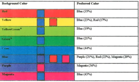
Blue was preferred on background colors of red, cyan, and magenta. Magenta was preferred the most on the purple background (Appendix B, Table I). For the yellow and blue background colors it was hard to determine if there was any agreement on preference. The results from the main image
set for the yellow background showed a scattered distribu-tion of preferences. The first supplementary set (scrolling down) statistically showed a preference for blue, while the last supplementary set (rotating) favored red as the preferred hue on a yellow background. The same participants viewed all the image sets. Thus, it can be concluded that yellow is a difficult background on which to make a hue preference, although there is a considerably significant inclination to-ward preferring blue and/or red. A similar difficulty in deciding on preferences was found for the blue background. No preference was statistically significant for any color set on the blue background in the main image. The results of the first supplementary image set statistically singled out purple as the most preferred hue on a blue background. The results for the last supplementary set (rotating) showed red, ma-genta and purple as the preferred hues on blue (Appendix B, Tables IV and VII). The yellow-green and green back-grounds had scattered response distributions. Although the participants had no statistically significant hue preference on the yellow-green and green backgrounds, there was an inclination towards blue on these backgrounds.
The findings on foreground– background color relation-ships presented above do not support the views of Granger,18
Chevreul,2 and Itten4 concerning hue combinations. There
does not seem to have been a harmony of either analogous or contrasting colors in making preference judgments. It may be interesting to research the issue further by excluding the dominant blue from the image sets. The exclusion of blue may direct subjects to suggest different color combi-nations, or it may simply promote another dominant hue.
The results of the statistical analysis show that in this experiment neither the gender of the participant nor the location of color squares on the computer screen had a significant effect on color preference (Appendix B, Tables IV–VIII).
Findings on the Research Hypotheses
1. Hue has an effect on preferences on a specific back-ground color.
2. Varying brightness–saturation levels of color samples have an effect on preferences on a specific background color.
3. Despite the changing hues of the background, some brightness–saturation levels and some hues are preferred over others.
4. Despite the changing locations of color samples on the computer screen, some brightness–saturation levels and some hues are preferred over others.
5. Gender does not have an effect on color preference.
CONCLUSION
Analyses of data demonstrated that all three attributes of color (hue, saturation, and brightness) were important in preferences. Colors having maximum brightness and max-imum saturation levels were ranked higher than any other
FIG. 3. Percentage scale of preference for hues on any background color.
brightness–saturation combination. Previous experimental studies on isolated colors also have suggested an increase in rated pleasantness with an increase in brightness and satu-ration.
Blue was the most preferred hue regardless of back-ground shown. This confirms the findings of previous stud-ies (Wijk et al.,17Guilford,5Eysenck,7Granger,18Guilford
and Smith13), which found that blue appeared to be the
preferred color in isolation. In the present study analyses of individual backgrounds were tabulated according to most preferred hues on specified background colors (Table II).
The results of the statistical tests showed that location and gender had no significant effect on preference in this exper-iment.
The findings showed that the preferred color choices, although statistically significant, encompassed a low per-centage of the subjects. The choices did not encompass 45% of the respondents and were usually around 20%. This may suggest a variety in preference choices.
Color has always been considered to be linked with subjectivity, especially where preferences are concerned. Culture also is always believed to have an influence, as is gender. The general preference found for blue in this study supports the findings of previous studies having subject groups of varied cultures. No matter what the background, blue was most preferred. There seems to be a global incli-nation toward preferring blue regardless of its presented medium. In many cases, blue was also stated as the most likeable color when people were asked their favorite color without any visual stimuli. This finding contradicts the
views on color combinations of the experts, who had for-mulated numerous color pairs based on the premise that pleasurable combinations result from the hue component of color.
The attributes of brightness and saturation seem to play a great role in creating pleasurable color combinations in abstract representations. The results of this study demon-strated that foreground colors were preferred when their saturation and brightness levels were increased. The partic-ipants picked the maximum levels available. The literature review suggests brightness and saturation contrasts to be effective for preference in foreground– background color relationships. It may be interesting to reverse this experi-ment and present backgrounds of the same hue with varying brightness and saturation levels to find out on which back-ground a specific color square is preferred more. In this way, additional knowledge about the contrast relations be-tween background and foreground may be gained.
Next it is intended to conduct a similar experiment with CIELAB color space and compare the obtained results with those for HSB color space.
The conclusions of this study should be used with cau-tion, taking into account the limitations and delimitations of the experimental setup, and the characteristics of the subject group involved. The results of the study may be used in computer applications such as computer graphics and Web page design and in luminous signage applications. More-over, we believe the study has contributed to the available data on this subject by broadening the understanding of color preferences.
APPENDIX B
p-Values and Duncan Groupings
TABLE I. Brightness–saturation and hue effect.
Background colors
p values for
brightness–saturation
Duncan grouping for brightness–saturation
p values
for hue
Duncan grouping for hue
Red 0.0128 Overlapping 0.0002 H225-Blue
Yellow 0.0003 Overlapping 0.0209 Overlapping
Yellow-green 0.0033 Overlapping 0.9248 None different
Green 0.0001 BS100 0.1618 Overlapping
Cyan 0.0084 Overlapping 0.0001 H225-Blue
Blue 0.0001 BS100 0.0064 Overlapping
Purple 0.0002 BS100, S50, S75 0.0004 H315-Magenta
Magenta 0.0200 Overlapping 0.0001 H225-Blue
TABLE II. Brightness–saturation and background ef-fect.
p values for
brightness–saturation
Duncan grouping for brightness–saturation On any background
color 0.0001 BS100
TABLE III. Hue and background effect.
p values
for hue
Duncan grouping for hue On any background color 0.0001 H225—blue
TABLE IV. Hue effect for the first supplementary im-age set (scrolling down).
Background colors p values for hue Duncan grouping for hue Red 0.0001 H225—blue Yellow 0.0001 H225—blue Cyan 0.0001 H225—blue Blue 0.0001 H270—purple
TABLE V. Brightness–saturation effect for the second supplementary image set (scrolling to the right).
Background colors
p values for
brightness–saturation
Duncan grouping for brightness–saturation
Red 0.0001 BS100
Yellow 0.0011 Overlapping
Cyan 0.0001 S50, S25, BS100
Blue 0.0001 BS100
TABLE VI. Brightness–saturation effect for the third supplementary image set (rotating).
Background colors
p values for
brightness–saturation
Duncan grouping for brightness–saturation
Red 0.0005 BS100
Yellow 0.0001 BS100, B50, B75
Cyan 0.0001 S25
Blue 0.0001 BS100
TABLE VII. Hue effect for the third supplementary im-age set (rotating).
Background colors
p values
for hue Duncan grouping for hue
Red 0.0014 H225—blue
Yellow 0.0001 H0—red
Cyan 0.0001 H225—blue
Blue 0.0001 H0—red, H315—Magenta,
H270—Purple
TABLE VIII. Gender effect on the main image set.
Background colors p values for gender Duncan grouping for gender
Red 0.0667 None different
Yellow 0.0604 None different
Yellow-green 0.1465 None different
Green 0.0635 None different
Cyan 0.1106 None different
Blue 0.0686 None different
Purple 0.2215 None different
LIST OF ABBREVIATIONS Abbreviations for hues
H0 Red H45 Yellow H90 Yellow-Green H135 Green H180 Cyan H225 Blue H270 Purple H315 Magenta
Abbreviations for brightnesses
B0 Brightness 0%, Saturation 100%, (Black) B25 Brightness 25%, Saturation 100% B50 Brightness 50%, Saturation 100% B75 Brightness 75%, Saturation 100% BS100 Brightness 100%, Saturation 100%
Abbreviations for saturations
S0 Saturation 0%, Brightness 100%, (White) S25 Saturation 25%, Brightness 100% S50 Saturation 50%, Brightness 100% S75 Saturation 75%, Brightness 100% BS100 Saturation 100%, Brightness 100%
1. Birren F. Color and human response. New York: Van Nostrand Reinhold; 1978.
2. Chevreul ME. The principles of harmony and contrast of colors and their application to the arts. Rev. ed. West Chester (PA): Schiffer; 1987.
3. Munsell AH. A grammar of color. Birren F, editor. New York: Van Nostrand Reinhold; 1969.
4. Itten J. The elements of color. Van Hagen E, translator; Birren F, editor. New York: Van Nostrand Reinhold; 1970.
5. Guilford JP. The affective value of color as a function of hue, tint and chroma. J Exp Psychol 1934;17:342–370.
6. Smets G. A tool for measuring relative effects of hue, brightness and saturation in color pleasantness. Perceptual and Motor Skills 1982; 1159 –1164.
7. Eysenck HJ. A critical and experimental study of color preferences. Am J Psychol 1941;54:385–391.
8. Helson H, Lansford T. The role of spectral energy of source and background color in the pleasantness of object colors. Appl Opt 1970;9:1513–1562.
9. Camgo¨z N. Effects of hue, saturation, and brightness on attention and preference [dissertation]. Ankara (Turkey): Bilkent University; 2000. 10. Ishihara S. Ishihara’s tests for colour-blindness. Concise ed. Tokyo:
Kanehara Shuppan; 1975.
11. Adobe Photoshop [computer program]. Version 4.0. San Jose (CA): Adobe Systems; 1996.
12. SAS [computer program]. Version 6.12. SAS/STAT User’s guide. Release 6.03 ed. Cary (NC): SAS Institute; 1999.
13. Guilford JP, Smith PC. A system of color-preferences. Am J Psychol 1959;72:487–502.
14. Sivik L. Studies of color meaning. Man-Environment Systems 1975; 5:155–160.
15. Washburn MF, Grose SL. Voluntary control of likes and dislikes: the effects of an attempt voluntarily to change the affective value of colors. Am J Psychol 1921;32:284 –289.
16. Reddy TV, Bennett CA. Cultural differences in color preferences. Proceedings of the Human Factors Society, 29th annual meeting; 1985. p 590 –593.
17. Wijk H, Berg S, Sivik L, Steen B. Color discrimination, color naming and color preferences in 80-year olds. Aging—Clinical and Experi-mental Research 1999;11(3):176 –185.
18. Granger GW. An experimental study of color preferences. J Gen Psychol 1955;52:3–20.
19. Saito M. Blue and 7 phenomena among Japanese students. Perceptual and Motor Skills 1999;89(2):532–536.