PRINTED ADVERTISEMENT AND WEB ADVERTISEMENT:
A COMPARATIVE STUDY ON DESIGN CHARACTERISTICS
OF BOTH MEDIA
A THESIS
SUBMITTED TO THE DEPARTMENT OF GRAPHIC DESIGN
AND THE INSTITUE OF FINE ARTS OF BİLKENT UNIVERSITY
IN PARTIAL FULFILLMENT OF THE REQUIREMENTS FOR THE DEGREE OF
MASTER OF FINE ARTS
By Gökçe Çuhadar September, 2005
I certify that I have read this thesis and that in my opinion it is fully adequate, in scope and in quality as a thesis for degree of Master of
Fine Arts.
______________________________________ Assist. Prof. Marek Brzozowski (Advisor)
I certify that I have read this thesis and that in my opinion it is fully adequate, in scope and in quality as a thesis for degree of Master of
Fine Arts.
______________________________________ Assist. Prof. Andreas Treske (Co-Advisor)
I certify that I have read this thesis and that in my opinion it is fully adequate, in scope and in quality as a thesis for degree of Master of
Fine Arts.
______________________________________ Assist. Prof. Alexander Djikia
Approved by the Institute of Fine Arts
____________________________________________________ Prof. Dr. Bülent Özgüç. Director of the Institute of Fine Arts
ABSTRACT
PRINTED ADVERTISEMENT AND WEB ADVERTISEMENT: A COMPARATIVE STUDY ON DESIGN CHARACTERISTICS OF BOTH
MEDIA
Gökçe Çuhadar M.F.A in Graphic Design
Supervisor: Assist. Prof. Marek Brzozowski September, 2005
This thesis compares two forms of media advertising; printed advertising and advertising designed for the web, and covers the elements of design, the principles of design, and the experimental design aspects of the two mediums by means of the question “Do the principles of printed advertising design apply to web advertising?”
Keywords: Printed Advertising, Web Advertising, Design Elements, Design
ÖZET
BASILI REKLAM VE WEB REKLAMI:
HER İKİ REKLAM ARACININ TASARIM ÖZELLİKLERİNİ KARŞILAŞTIRAN BİR ANALİZ
Gökçe Çuhadar Grafik Tasarım Bölümü
Yüksek Lisans
Tez Yöneticisi: Yar. Doç. Marek Brzozowski Eylül, 2005
Bu tez basılı reklam ile web reklamı arasındaki, tasarım elemanlarını, tasarım prensiplerini ve tecrübesel tasarım özelliklerini karşılaştırmalı olarak incelerken, “Basılı reklam tasarımı prensipleri web reklamına uygulanabilir mi?” sorusunu sorgulamaktadır.
ACKNOWLEDGEMENTS
I would like to thank Assist. Prof. Marek Brzozowski for his invaluable supervision, guidance and encouragement throughout the preparation of this study.
Also I would like to thank Assist. Prof. Andreas Treske, and, Assist. Prof. Alexander Djikia who helped me to organize, structure and produce this thesis.
Also for their invaluable support and trust, I would like to thank to my family; my mother Berin Şenli, my father İbrahim Şenli, my sister Gözde Şenli and my dearest husband Sinan Çuhadar to whom I owe what I have.
TABLE OF CONTENTS
ABSTRACT ………...III ÖZET ……….IV ACKNOWLEDGEMENTS ……….…...V TABLE OF CONTENTS ………..VI LIST OF FIGURES ………...….VIII
INTRODUCTION ……….……..1
CHAPTER 1: DESIGNING ADVERTISING FOR THE PRINTED AND FOR THE WEB MEDIUM ………....5
1.1 Delineating the printed advertising medium ………5
1.2 Delineating the web advertising medium ………9
CHAPTER 2: A COMPARISON BETWEEN THE TWO MEDIUMS OF ADVERTISING DESIGN ……….14
2.1 Comparing elements of design between the two medium………14
2.1.1 Form and Size ………....14
2.1.2 Color ……….……….21
2.1.3 Image……….………...31
2.1.4 Text ……….…..36
2.2 Comparing design principles in both medium……….45
2.2.1 Balance………...45
2.2.2 Unity………...………49
2.2.3 Emphasis ………...57
2.3.1 Interactivity……….65
2.3.2 Time………....71
2.3.3 Touch (Virtual/ Corporeal)……….……76
2.3.4 Navigation………...79
2.3.5 Organization of information………...82
CONCLUSION………..………87
LIST OF FIGURES
Figure 1: Portrait arrangement in application…...16
Figure 2: Eight different banners sizes according to pixel dimensions…………..…18
Figure 3: A screen shot of a typical floating ad………..19
Figure 4: Color spectrum………... 22
Figure 5: Measurement of value (from black to white)………..23
Figure 6: Contrast and brightness levels……….23
Figure 7: No saturation on top, to full saturation on the bottom……….…24
Figure 8: Additive primary colors………..……….24
Figure 9: Subtractive primaries………..….…25
Figure 10: The brown color looks lighter on the left, than on the right…………..…25
Figure 11: The top bar of solid grey seems to contain a gradient of light grey (left) to dark grey (right) in the bottom figure………25
Figure 12: Giorgio Armani’s web advertising example, to show how it works in some ways and how it doesn’t in other way……….…29
Figure 13: Finans Bank banner ad………..……30
Figure 14: Close-up of an image……….…33
Figure15: Stallone High protein puddings banner ads………....34
Figure 16: Ford Advertisings...…...35
Figure 17: Most usable font sizes………...37
Figure 21: Peugeot’s Magazine ad……….41
Figure 22: Place colored text on neutral background to improve legibility……...…42
Figure 23: Banner ads……….………...43
Figure 24: Magazine ads………....43
Figure 25: Magazine ad and a button ad………....44
Figure 26: A full page magazine ad (balancing heavy weight on the center)………46
Figure 27: Banner examples with different sizes……….……..47
Figure 28: Web ad examples………..………48
Figure 29: Magazine ad examples………..……49
Figure 30: Example of proximity………...50
Figure 31: Example of similarity………..….51
Figure 32: Example of continuation………...51
Figure 33: Example of closure………...52
Figure 34: Example of figure/ground………52
Figure 35: Different ads of the same product………....53
Figure 36: Application of a grid system in a magazine ad………55
Figure 37: A web site organized with a grid system……….………55
Figure 38: Alignment in a magazine ad……….……….………..56
Figure 39: Flow in a banner ad……….56
Figure 40: Magazine ad examples about emphasis………..58
Figure 41: American Red Cross banner ad………...59
Figure 42: Visual confusion in a banner……….…..59
Figure 43: Example of focal points in different banner ads………....60
Figure 44: Animated banner examples………..….61
Figure 46: Ads of Garanti………...………64
Figure 47: Example of different banner ads………...64
Figure 48: A book ad from Amazon.com web site……….…..74
Figure 49: Animated banner; divided into frames………...75
Figure 50: Peugeouts’ site map………...…….80
Figure 51: Peugeots’ web sites’ navigation tools………...….81
Figure 52: Peugeots’ fixed navigation tools in every link; including; home and sitemap link………..….82
Figure 53: Example about organization of information……….…..84
Figure 54: Screen shots from Garantis’ Cepbank demo……….85
INTRODUCTION
According to the Wainhouse Research Company, the Rich Media Communication Research report confirms that “Today over 70 percent of all impressions that we comprehend are not spoken nor written but visual.” (2004). The field of visual communication is in the middle of a powerful transition driven by changing technology and a changing marketplace. Communicators are struggling with
ambiguous definitions and expectations. As a graphic designer or as a communicator, it is impossible to avoid taking a part in the continuous and variable developments in this visual field.
After having learned, and still continuing to learn, many aspects of graphic communication, it is time for me to collect all this information and organize it in such a way that both the apparent and unnoticed sides of design can be brought to light.
The aim of this thesis is to compare a number of design aspects of two different advertising media; advertising designed for the printed medium and advertising designed for the web medium.
By doing so, this thesis will be able to show which principles of design are common to both the printed and the web medium, that is, shared by both, and which are unique and applicable to only one particular medium. Moreover, this comparison will
be undertaken through one of the most effective methods of graphic design application forms: “advertising”. This is because, in our century, advertising is one of the most important communication tools since it includes all the principles of design in action in one comparatively small area.
Therefore, in this study the core question examined is, do the principles of printed
advertising design apply to web advertising?
Obviously, this thesis testifies that while there are many parallels between the principles of printed advertising and web advertising, conversely both possess different concessions in their designs. The methods of this research were based on finding and exploring the basic important characteristics of the two media without making a judgement regarding whether one is superior to the other. It means that the aspects of the two media will be clarified clearly and their features will be enlightened with visual materials.
In addition, the reason for choosing printed advertising to compare with web advertising rather than one of the other forms can be explained by considering the user groups of both mediums. In other words, like the web, the most available medium being used by the same middle and small target marketers in the overall mass media is print advertising. Therefore, this common aspect of both media plays a big role in deciding which media are to be compared with each other.
approaches and styles, this study mostly talks about advertising which consists of image and text-based contents. In this way, it is easier to compare similar applications created for different media without the risk of creating an unrelated comparison between the two different approaches.
The first chapter will begin with a brief explanation of both printed and web advertising mediums. Throughout the rest of the paper this short clarification of both mediums will help the reader, especially those who are unfamiliar with these design concepts, to understand what these notions refer to in this study.
In the second chapter the study will present a comparison of the two media of advertising design. In the first section of chapter two, the comparison of the two media will be explored through the means of their formal design differences, where the arguments will depict how they differ from and resemble each other. In addition, in this section examples and illustrations will be used to clarify the subject matter.
In the second section, a comparison of design principles between the two media will be made. This section will explain how the two media apply the same design principles, and again by the means of design principles this section will describe the similarities and differences between them through exemplification and illustration.
In the third section of chapter two, a discussion concerning the similarities and differences of both media will be realized through some experimental aspects such as; time, touch (virtual/corporeal), and the organization of information. This section will concentrate on the applicability of different experimental aspects in both media.
In addition to this, some other aspects such as interactivity or navigation will also be discussed.
Finally, in the concluding part of this research, the results will be presented in relation to the arguments, and this chapter will try to give an answer to the main question of this thesis; do the principles of printed advertising design apply to web advertising?
Since the web is a continually developing medium and changes in it appear so rapidly, some examples may become out of date, but it should be noted that the aspects and principles that are put forward in this study will be enduring.
As a final point, this comparative study is an appealing work which may be read in order to identify the two media, and it may also serve as a source manual for people wishing to work in the design field of advertising and who wish to design for the World Wide Web.
CHAPTER 1: DESIGNING ADVERTISING FOR THE PRINTED AND FOR THE WEB MEDIUM
1.3 Delineating the printed advertising medium
Advertising is the area of marketing concerned with the communication of information by the company to the market or the market participants. At the center of marketing is the commercial or private customer with his purchasing decision. The basis of purchasing decisions is information. Advertising tries to communicate this information in such a way that the company positively distinguishes itself from its competitors so that customers are motivated to make the purchase.In the face of the growing diversity and ever increasing interchangeability of products, advertising has evolved into a critical competitive factor in the marketing mix.
In his book Advertising Today Warren Berger defines advertising media in two senses. For him in a narrower sense, advertising media include TV advertising (commercials), radio features, print advertisements, and billboards and advertising letters (direct mail). In a wider sense, today’s advertising also includes sponsorship, trade fairs, internet advertising and sales-promoting advertising at the point of sale (2001: 16).
Advertising reaches people through varied types of mass communication. In everyday life, people come into contact with many different kinds of advertising. Printed advertising is one of the most commonly used types among them. Although newspapers and magazines have been unable to keep up with the rapid increase in the advertising volume on TV stations, the print media continues to be an important
advertising medium that guarantees great success even in the age of electronic advertising media. According to the International Advertising Association’s (IAA) communication research reports, television has long been the leader in the ranking of classic advertising media. (2004) In the field of print media, newspapers generate the highest advertising sales, while radio and billboard advertising occupy the next lowest ranks.
In this study the expression printed advertising medium will convey the advertising designs prepared especially for every kind of printing. It should be noted that whether the design of the advertisement is prepared by hand or with some other devices such as using a computer, the final result will be that they are printed on paper.
It is known that various different formats are available in the printed medium. Printed advertising media examples may include magazine ads, newspaper ads, brochures, flyers and posters, etc. As Schierhorn and Wearden explained in their article What printed formats do consumers prefer? “Some printed media formats are more accepted, or more effective than other ones.”(2004: 27) Therefore, from among all these formats this study will try to refer to the most appropriate examples of magazine ads, brochures, newspaper ads, etc. in order to help the target reader to understand the subject better.
As has been mentioned above, various types of printed advertising media are available to designers. Choosing the correct advertising medium to suit the purpose is
different printed media alternatives available, one of the alternative rules for arranging information in the printed advertising medium is the AIDA formula. (Ballard, 2003)
In her book Buying Facilitation Sharon Drew Morgen, who is arguably one of the most advanced thinkers of the modern age in selling and decision facilitation, claims that AIDA is an old, tried and tested formula that originated in the late 1950's and which describes the basic process of how to arrange information in the most effective way to create a selling message (2003). Audiences make purchases in line with the AIDA process.
The process of grabbing “attention” is the “A” of AIDA formula. By using effective words in the right type style, or by using effective images, the designer must first grab the attention of the audience. “I” stands for the process of “interest”, in which the designer must stimulate the audiences’ interest with a written text or with a different organized layout. After grabbing the attention and arousing the interest of the target, the “D” stands for “desire.” At this stage the designer must give the audience a strong shot of desire. In other words, the product or service must appear to closely match the audiences’ needs or aspirations. Finally, the “D” for desire is followed by A, which stands for “action.” If the audience is stimulated to overcome their natural sense of caution, they may then become motivated or susceptible and thus take the action to buy. In advertising, by using some devices such as limited time offers and coupons etc. action can be generated. Especially in printed advertising, the AIDA formula ensures a dynamic layout. In addition, the AIDA process also applies to any advertising or communication that aims to generate a
response. It provides a reliable template for the design of a vast array of marketing materials. In consequence, it can be said that this effective formula should not be in use for only specific mediums such as printed ones. All other mediums in other media can apply this alternative formula easily in their selling messages.
It is known that advertising is basically a relationship between words and imagery. A designer should seek to create a match between what s/he says and what s/he shows. According to Media Awareness Network, an official website, the key elements of print advertising are divided between copy and art. The copy elements include headlines, body copy, captions, slogans, and taglines. Art refers to the visual elements, which include illustrations or photography, the type, and the layout itself (2005). The audience reading the printed advertising medium can either scan the material linearly or browse through parts of the document. The visual layout, that is, the way the images and texts appear on paper, enable such browsing. In addition, printed medium advertisings are able to preserve their original design. In other words, once they have been created, they do not need any additional devices in order to be viewed.
In his article Getting More From Print Advertising, Scott Young highlights the fact that due to an advertising overload in our environment, recent researches indicate that 95% of printed advertising is thrown away without even being looked at1. In addition, in printed advertising people generally start with the main visual in an ad and spend the majority of their viewing time there. Also, the Perception Research
Service indicates that ads are rarely considered for more than 15 seconds and that text-heavy ads do not consistently generate longer viewing times (2002).
Every printed advertising medium should exhibit the attributes of good design principles and be legible and readable. In addition, the layout, the use of type and image, and the role of paper and ink are other various elements in creating a printed advertising medium. The objectives of printed advertising can be summarized as delivering brand and product awareness, and giving information to the audience.
Actually, it is possible to point out some other characters of printed advertising media under this heading but in the next chapter other qualities such as form, size, color, etc. will be considered in a more detailed way.
1.2 Delineating the web advertising medium
In order to define the web advertising medium, it is first necessary to try and give a description of what the World Wide Web is. The Web takes advantage of a global computer network that connects thousands of computers throughout the world. The Web makes sharing information both easy and attractive by combining text, graphics, sound, and film clips into a single multimedia document. Further enhancing the Web is its ability to use hypertext links to connect to other sites around the world. These powerful multimedia capabilities have encouraged a lot of people and many organizations to place information on the Web. These organizations place their information on servers that allow other Web users to access the information. The market research firm IDC predicts that with the recent explosion in computer sales
and the number of internet users growing at a phenomenal rate, companies and corporations alike have been quick to realize the internet is an excellent opportunity to advertise, promote and sell their products. (2005)
Consequently, as Barbara Kaye and Norman Medoff, authors of Just a Click Away:
Advertising on the Internet, explain, the internet is an electronic medium used to communicate as well as to sell products and services (2001: 28). The World Wide Web is the fastest-growing new medium of communication ever. The web medium and its technologies offer new and distinct ways of communication to audiences. At the end of the 1990’s many companies did not want to leave this opportunity unused and thus also placed their advertisements on the World Wide Web. The growth rates were enormous. According to an analysis by the Global Reach Company, between 1996 and 1997 alone, expenses for online advertising increased by more than 400 percent2. (1998)
There is a high potential in web advertising. The acceptance of online advertising today is much greater than that of TV commercials. This was the result of a survey by the European Interactive Advertising Association (EIAA) at the end of 2004. In addition, 31 percent of those polled said that brands are provided with a more progressive image through online advertising. Nevertheless, only 1.5 percent of the overall advertising investments across Europe are spent on Internet advertising.
The British inventor of the World Wide Web, Tim Berners-Lee remarked that the Internet was still in its infancy and predicted that new technologies would give it
even more features and possibilities (2004). Also, there are still relatively few people who have access to the Web, and the Web itself is still somewhat limited in its capabilities. However, due to the phenomenal growth that the Web is experiencing, companies are investing huge amounts of money to make the Web both easier and cheaper to access, as well as more entertaining and interesting.
Current global estimates indicate that there are upwards of 840 million of us online, according to the Global Reach Research Agency (2004-5). This means that almost 14 out of every 100 persons in the world use the Internet. Since the year 2000 Internet usage has grown 146.2%. Internet World Stats forecasts that the Internet will hit one billion users by the end of 20053.
Web advertising media has been defined in various ways, but virtually all definitions include the notions that it involves presentation of information through mediated means (technology of some type, whether a computer or a mobile phone) and mutual, relatively immediate interaction between consumers and marketers. An especially important characteristic of web advertising media and one that differentiates it from other media is sustained interactivity. In his Catering to Customers’ Needs article Kent Wertime defines sustained interaction as “purposeful and goal-directed.” (2001). Because it is goal-directed, it is also dynamic, and the interaction itself will tend to change over time.
On the web, advertisers really have two separate goals. The first one is to have the user click on the advertisement, seeking further information about the product or
3
Internet World Stats Blog. 22 January 2005 <http://www.internetworldstats.com/blog.htm>
delivering the user to an ordering page, and secondly to have the user actually purchase the product. This assumes that the advertisement is designed to generate a purchase and not, as many are, to further the brand of the product. In addition to this, cookies, which are a piece of text that a Web server can store on a user's hard disk, can allow a Web site to store information on a user's machine and later retrieve it.
The first goal, once accomplished, may deliver the second; if the advertisement is clicked on, the audience may be persuaded to purchase the product. So the above two goals should encourage the advertiser to think very clearly about the strategy that is used through advertising. Generally, some argue that the hierarchy of effect model (AIDA) which is an alternative method of generating a response, has the same place in web advertising as it does in printed advertising.
In this study, the expression “web advertising medium” will convey the advertisements accessible through the World Wide Web. There are various types of ads in web advertising such as banner ads, pop-up ads, side-bar ads, floating ads, interstitials, etc. The web advertising medium that I want to refer in this study will be generally banner ads, HTML documents, and some web sites consisting of a number of those documents.
Unlike printed media, web advertising media need some additional hardware machinery including a computer, handheld device etc; software, and lastly an internet connection including a modem, network card, telephone etc. in order to be viewed. It can be said that the web advertising medium is dependent on some essential devices,
In addition, the web advertising medium content can be displayed differently on different users’ computers because technical possibilities and various types of computer systems provide the audiences with many different choices, and thus rather than being displayed in one exact way the audiences may easily change their preferences according to their individual taste.
In addition to these qualities, some distinctive characteristics of the web advertising media such as some aspects of interactivity will be discussed in the study.
CHAPTER 2: A COMPARISON BETWEEN THE TWO MEDIA OF ADVERTISING DESIGN
2.1 Comparing elements of design between the two media
At first glance, the formal differences between the two media seem very obvious to us. Anyone could easily list them. However, this study will not only state the differences and similarities between the two mediums. The important thing is to show how the two differ and resemble each other, and what the causes and results of this are.
In this section, to make conclusions more clearly, four major areas will be analyzed in depth. These are form and size, color, image, and text. By taking these four aspects into account, this study can easily explore the differences and similarities between the design elements of the two mediums. Moreover, the main reason for choosing these criteria is because of their important function in graphic design.
2.1.1 Form and size
Both print ads and web ads have a variety of form and sizes, and it can be said that differences in form and sizes are the easiest aspects for the viewers to observe.
When we compare typical printed advertisements with web advertisements, the most common format for the printed ads are the typical A44 standard sheet of paper, which are generally used in magazine advertisements. On the other hand, the most common
format for banner ads are TV and computer screens where viewers are faced with banners all the time. Therefore, it can be said that the formats of both the sheet of paper and the computer screen are different advertising areas which offer the designers different usage alternatives.
When considering the unlimited choice of paper size and form found in printed advertisements, the visual-based and text based formats are the most suitable to enable us to make a comparison between web and print advertisements. For this reason, in print advertisements the most commonly-used formats which I will include under this heading are magazines, newspapers, and brochures.
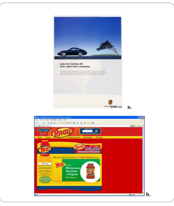
From the viewers’ perception one of the major differences between the two mediums are the positioning of the design space. As seen in Figure 1; while print ads formats are generally vertical, in contrast web ads are placed in a format of horizontal spaces.
When a TV screen is compared to posters on walls it is obvious that the computer screen is a small area on which to view advertising. The viewers do not want to waste space displaying adverts when they have such a limited area for the material they want to read. The web has primarily been used for the presentation of text and graphics onto fairly small computer screens. This size limitation restricts the conventional web ad to a banner, asking the user to click ‘here’ for more information. Therefore, with the use of small advertisements on the screen, the users have a chance to view more information on a wider area by clicking on the ad.
a.
b.
Figure 1: Portrait arrangement in application a. Porche advertising in A4 sheet of paper b.Ragu sauce advertising on a computer monitor Source: < http://www.ragu.com/>
In general, web pages are created in the vertical or we can say in the portrait manner. Moreover, it can be said that the same rule is current for web advertisements too. The most important reason why the portrait arrangement is the most preferable in both web and print advertising occurs when the content of the design comes to the surface.
that the length of the text that takes place on an ad should be short enough to be read easily and the best way of doing this is to work on a vertical axis.
In the design of an advertisement readability is very important, and no one likes to read very long lines of text; moreover it may be irritating to the eyes to try to read a number of consecutive columns in a long text. Thus in this aspect web and print advertisements resemble each other.
Like print ads, banner ads5 are the most common type of ads on the web and they come in a variety of shapes and sizes.
The Internet Advertising Bureau (IAB)6 specifies eight different banner sizes, according to pixel dimensions (2000). (Figure 2)
As technology critic and essayist Bill Thompson states, banner ads are not only annoying for many, but also seem to represent inferior brand products when compared to full page ads (2002). Bill Thompson states that;
“This is first of all because of their small size. Banners simply don’t give the graphical opportunity for presenting a concept- be it a photo-dominated ad or an illustration-dominated ad- or even and especially one which is dominated
5 Banner ads; generally the 468 x 60 pixel ads you see at the top of all web pages. They can be
purchased throughout the Web and provide direct links to homepages. Source:<http://www.marketingterms.com/dictionary/banner_ad/>
6
The IAB is the only association dedicated to helping online, Interactive broadcasting, email, wireless and Interactive television media companies increase their revenues.
by white space. The banner is too small to be aesthetically pleasing or conceptually engaging, and is too intrusive to be taken seriously.” (2002)
Figure2: Eight different banners sizes according to pixel dimensions Source: <http://computer.howstuffworks.com/banner-ad2.htm>
Conversely, web advertising enables designers to create different kinds of forms which are impossible to apply in print advertisements. While surfing the web
everyone notices that actual graphic content, or creativity, varies considerably among web ads.
Take for example Figure 3, a typical floating ad for a Norton product. This ad was completely designed according to its content. These four or five moving parts – viruses-play for about 15 seconds and in that time this ad tries to persuade the viewer to click on it. By using animated viruses on the computer screen the Norton Company tries to advertise its Anti-Virus program. In addition, the content of the ad is strengthened by the attention grabbing viruses.
Figure 3: A screen shot of a typical Floating ad
Source: <http://computer.howstuffworks.com/web-advertising6.htm>
Because of its graphic element and shape, a banner ad is somewhat similar to a traditional ad you would see in a printed publication such as a newspaper or
magazine, but it has the added ability to bring a potential customer directly to the advertiser's Web site. This is something like touching a printed ad and being immediately teleported to the advertiser's store.
Also a web ad differs from a print ad in its dynamic potential. A banner stays in one place on a page, like a magazine ad, but it can present multiple images, include animation and change appearance in a number of other ways.
Naturally, it must be noted that web advertising does not only consist of banners. As an advertising medium a well- organized web site is a very good benefaction for consumers in an advertising area. Sing and Dalal argue that corporate web sites “meet the conceptual definition of advertising, they resemble ads in physical appearance and they perform the same basic functions- to inform and to persuade.” (1999:92). Silk, Klein, and Berndt suggested a company’s website may be its principal point of contact with key audiences (2001:129). As a result, if we take web sites as an advertising medium, we can say that the size of the web site and its content is more advantageous for the ad designers, since unlike banner ads, they have a large space in which to advertise their products to their consumers. Unlike web sites, banner ads are easily ignored by the viewer because of their small size.
In addition, the size of the banners may also sometimes affect the message of the ad. As a result of size, web messages must be shorter and more telegraphic, that is, more like billboards than ads. This translates into shorter sentences and shorter paragraphs. In addition, the fliers of the printed media resemble banner ads in a similar way.
Fliers are small information pages which try to persuade consumers to buy something. Like banners, they run the risk of being thrown away without being read.
The effect of size has been studied many times both in print and web advertising (Homer, 1995; Chtourou and Chandon, 2000). The common rule is that size usually improves memorization. As a result, large ads on the web occupy more screen space, they run better chances of grabbing attention and being seen and remembered. Studies of print advertising have also confirmed this finding. (Finn 1988; Kelly and Hoel, 1991; Naccarato and Neuendorf, 1998)7
2.1.2 Color
Both in web advertising and in traditional advertising one of the most important design aspects is color and the two media have different opportunities to create color. Therefore, it can be said that in web advertising and in traditional advertising the usage of color and the perceptions of color by the viewer have to be examined carefully.
As in most advertising, advertisers may only have a second or two to captivate their audience and inspire them to go into action to buy. The usage of color is one
7 Finn, A. ‘Print ad Recognition Scores’ Journal of Marketing Research 25, 2 (1988): 168-78
Kelly, Kathleen J., and Hoel, Robert F. ‘ The Impact of Size, Color and Copy Quantity on Yellow Pages Advertising Effectiveness.’ Journal of Small Business Management 29,4 (1991):64-72. Naccarato, John, and Neuendorf, Kimberly. ‘Content Analysis as a Predictive Methodology.’ Journal of Advertising Research. 38, 3 (1998):19
attention-grabbing feature in advertising. Especially in the advertising business, the first impressions of color are vitally important.
In his article The Psychology of Color and Internet Marketing Pam Renovato, the web master of the newly renovated “The Free Advertising Network”, stresses that color is the first item by which the viewer judges a web ad or a traditional ad, before either reading its offerings or moving on (2002). It is the first thing the viewers notice and the last thing they forget. Human emotions are very often triggered by color. It is a kind of an entrance to persons’ deepest thoughts and feelings, and desires. Moreover, color creates a psychological and emotional response in everyone. Therefore it is very important to choose the right color combinations in advertising. Before starting to compare the use of color in the two mediums, it is useful to remember a few basic concepts about the Color Theory.
In his book Color and Type, Rob Carter describes the Color Theory as a set of principles used to create harmonious color combinations (1997:18). The Color Theory encompasses a multitude of definitions, concepts and design applications. It has been developed by many artists and scientists; so it can be said that there is not only one color theory. The descriptions below referring to color are cited from Carter’s Color and Type Book (1997).
According to Carter, color is also known as hue and each hue is a specific spot on the color spectrum (1997: 19). A spectrum can be as simple as a band, or wound up in a wheel (Figure 4). To work with color, there are different attributes that should be known about: value, contrast and brightness, and saturation.
The range from black to white is called value (Figure 5).
Figure 5: Measurement of value is from black to white. Source: Color Theory December 2003
<http://old.alistapart.com/stories/color/>
“Contrast is the degree of separation between values.” (Carter, 21) As seen in Figure 6, whereas brightness adds white to an image, the lack of brightness tones the image.
a.
b.
Figure 6: Contrast and brightness levels
a. Contrast levels from low (left) to normal to high (right). b. Brightness levels from low (left) to normal to high (right). Source: Color Theory December 2003
As seen in Figure 7, “Saturation is the measurement of color intensity.” (Carter, 22) The lack of saturation should remind you of black and white television.
Figure 7: No saturation on top, to full saturation on the bottom. Source: Color Theory December 2003
<http://old.alistapart.com/stories/color/>
Figure 8 shows the three additive primary colors: red, green, blue. As Carter explain in Color and Type “When the colors come together in various combinations, they produce other colors in the spectrum – with all three combining to produce white light.” (1997: 18)
Figure 8: Additive primary colors. Source: Color Theory December 2003 <http://old.alistapart.com/stories/color/>
Figure 9 shows the subtractive primaries. Mixing these colors, you get a color that closely resembles black. Take away these colors, and you are left with white. This is the primary system used in printing, commonly referred to as CMYK8.
Figure 9: Subtractive primaries Source: Color Theory December 2003 <http://old.alistapart.com/stories/color/>
Carter claims that when a color is placed near other colors, it takes on a different hue because of the way we perceive colors in relation to one another. (1997:23) Figure 10 and 11 are good examples about this aspect.
Figure 10: The brown color looks lighter on the left, than on the right. Source: Color Theory December 2003
<http://old.alistapart.com/stories/color/>
Figure 11:In this example, the top bar of solid grey seems to contain a gradient of light grey (left) to dark grey (right) in the bottom figure.
Source: Color Theory December 2003 <http://old.alistapart.com/stories/color/>
Finally he claims that value is relative (and the same goes for saturation), and value is a serious concern for Web design due to the way Macintosh and Windows machines display colors (they are always lighter on a Mac OS system). (Carter, 20)
It must be noted that the technical details of how color is created in both media is not a subject which will be dealt with in this thesis because the attitude of this study is to compare both mediums from the design point of view .On the other hand, this subject matter needs to be mentioned because the first inconsistent aspect between the two mediums shows itself here. Therefore, it is better to explain how creating a color differs in the web and in print media. In print advertising the desired color is created by mixing cyan, magenta, yellow and black (CMYK color model). On the other hand, in web advertising color is created with using red, green and blue (RGB color model) and by mixing them with various colors of light.
Apart from the difference in how color is created, there is also another difference which occurs while viewing the printed advertising and web advertisements. Veruschka Götz, the author of Color and Type for the Screen, states that “As looking at the monitor the reader perceives colors more strongly than looking at the printed medium.” (1998: 10). In other words some bright colors such as white or yellow are able to disturb the eye because text printed on paper is a solid object whereas text on the computer screen is based on light waves. Thus, as Götz declared, most of the screen desktop consists of light rays which after a time will become irritating to the eye as well as completely exhausting. On the contrary, the usage of color in printed advertisements hardly ever bothers the viewers. (1998:10)
In her book Color and Type for the Screen, Veruschka Götz, highlights that,
colors and the computer screen is unable to present these with the same intensity. If we compare a color from a printed color scale with the same color on the screen, the screen version always appears paler and more unreal.” (1998:22)
In short, when you are working on the computer desktop and you are selecting colors that will be printed, be aware that the computer screen does not accurately represent color. However, properly converting the RGB colors into CMYK colors ensures that what gets printed looks the same as what appears on the monitor.
Color plays a major role in both traditional advertising and web advertising. It creates a mood or atmosphere which flavors the message of the advertisement. Colors are neither good nor bad in themselves, but they do have a positive or negative, conscious or unconscious psychological effect on the viewer, depending on his or her subjective experience and mood. This means that color has the power to remind us of some coded things, and this rule is current for both traditional advertising and web advertising.
It should be noted that depending on different cultures, different colors can mean different things. If you are designing advertisements for an international audience, particular attention should be given while choosing the color schemes.
Background color is another significant element in advertising. It is really important to choose the screen background color very carefully, since it is generally the largest single area of color. While designing an ad on web or in print, criteria such as, color character, color brightness, and the colors of the other elements, all need to be taken
into consideration. The screen background color is seldom the only color on the screen. It is usually combined with type, symbols, pictures, or logos.
In advertising, if a designer uses poor color combinations and renders the text unreadable, it means it is useless to wait for the readers. Whether in traditional or in web advertising, in either medium the text should be readable. For readability, in everyday use, the general rule is to use black print on plain white paper, for example in business correspondence, books and newsletters. Texts written on a pale color or on a white background are easier to follow and more attention grabbing since they are more easily adaptable for the readers’ eyes. On the other hand in Color and Type
for the Screen Götz explains that “With the computer screen using white background with black text increases alertness but uses up energy more quickly so that the viewer quickly becomes tired.” (1998: 17)
David Johnson, the author of Psychology of Color, claims that black is generally considered a mournful, heavy and depressing color, but in the right context, can be sophisticated and mysterious.(2002) Studies have shown that online reading can be difficult on a black background, but many sites have done this successfully using colors which contrast heavily (white, neon green). The usage of black as a predominant color should always be carefully considered.
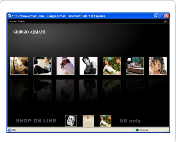
For instance in Figure 12; in Armani’s web ad black background color is used to emphasize the images on the screen. On the other hand, some texts on the screen (at the bottom left to right; Shop on line and US only) are lost in the color of the
Figure 12: Giorgio Armani’s web advertising example; about black background Source:< http://www.armani.com>
Consequently, for both traditional advertising and web advertising, it can be said that if designers do not choose their text and background colors wisely, it may mean that all their effort has been wasted.
Moreover, when looking at a computer screen, there sometimes seems to be a continuous flickering. When this happens, it means that the contrast between the background and the type needs to be reduced.
In web advertising, especially in active banner ads, some background colors change during the advertisement. This characteristic is unique to web advertisements since printed advertisements obviously do not have such a capacity. They are static with
the same color. This means that through the use of a changing background color, web ads may have the opportunity to grab the viewers’ attention more easily than in printed ads. On the other hand, the same features may cause them to be irritating to the viewers.
frame 1 frame 2 frame 3
frame 4 frame 5 frame 6
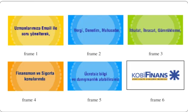
Figure 13: Finans Bank banner ad Source: <http://www.kobifinans.com>
As seen in the Finans Bank’s banner ad (Figure 13), the background color of the ad changes constantly throughout the advertisement. In this example, the color changing does not add to the product but may catch the viewers’ attention.
Likewise, color can be used as an attention getting device when emphasizing important messages. A red headline on a white background, for example, can make a special sale or promotion really jump in both print and web advertising.
2.1.3 Image
In both web and print advertising, one of the most striking factors is the image, and obviously the image factor creates differences between web and print advertising.
Digital images are made up of pixels. As defined in Understanding Digital Image
Resolution, a web source;
“Pixels are the small sections of color and/or tone that together form a digital image. Pixels form an image like pieces of a mosaic. A digital image is a grid of pixels.” (2005).
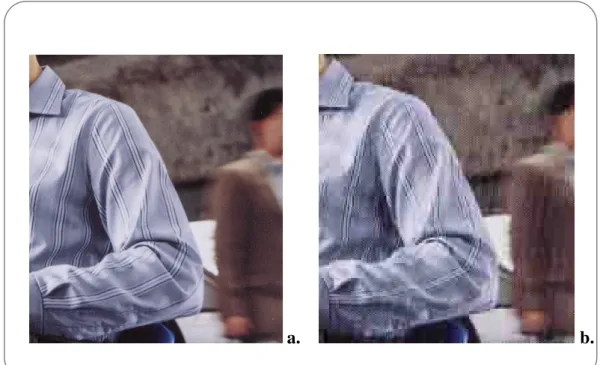
If the issue is about image, the first thing that must be mentioned is the quality of the images in advertising. In her essay Resolution Inch by Inch, published in “Digital Publishing”, Jacci Howard states that in print advertising, according to design or the size of the image, designers usually work with the resolutions of 150, 300, 600 or 1200 DPI9 (2001). These values of resolutions allow the images to be viewed like a photographic quality. When there are enough pixels and they are small enough so as not to be individually discernible, the digital image can achieve photo quality. It means the higher resolutions in print advertising affects the viewers’ image perception, and presents a clearer and smoother image to the viewers. If you want to achieve printed photo quality you generally need to print at 200 to 300 ppi (pixels per inch).
In web advertising, the quality of the image changes according to the different size of the monitors and different screen settings. As Jacci Howard points out, in Resolution
Inch by Inch, generally most of the computers work with the resolution of 72 DPI, so
in this low resolution the quality of the image decreases (2001).
In addition, Howard states that the monitor can be set to different resolutions like 800x 600 and 1024x 768. These are just width and height measurements in pixel dimensions. (2001) Whatever pixel dimensions are set as the monitor resolution, those dimensions fill the view area. So a 17 inch monitor set at 800x 600 will have less pixels per inch (less resolution) than a 15 inch monitor set to the same 800x 600 display setting, because the same amount of pixels have to be stretched over a larger area to fill the larger screen.
Consequently, while print advertising uses very high image quality especially in magazine ads and on flyers, in web advertising an average image quality or sometimes photorealistic images are preferred to attract viewers.
As a result, we can say that mostly high resolution images provide good results in design. On the other hand, it is not useful to use very high resolution images for web ads because readers are impatient and will easily lose interest if they are forced to wait for the advertisement to be downloaded. Therefore, images must be designed for the lowest possible denominator of modem especially in web advertising.
a. b.
Figure 14: Close-up of an image a. 300 DPI (Normal quality print) b. 72 DPI (Standard PC monitor)
Brochure and newspaper readers, like visitors to a web site, are impatient. Designers have just a few seconds to capture their attention, or they are gone forever. Therefore, the visuals on the front cover of a brochure and newspaper should attract the readers into turning the page, or a web ad should provide a reason for visitors to immediately begin following increasingly detailed links. Visitors to a web ad, like readers of a printed ad, will make their decisions to stay or move on within seconds of encountering the message and the images of an ad. So in both web and print advertising the first impression is related directly to the images used.
In reality, the most important function of an image in advertising is to inform the consumers about the product or service being sold, or to create brand awareness by showing the product directly to the consumers. (Figure 15) It is obvious that without seeing the product no one will want to buy it.
a.
b.
Figure 15: Stallone High protein puddings Banner ads a. Graphical ad (with image usage)
b. Text based ad (without image)
Source: <http://www.affordablesupplements.com/highproteinpudding>
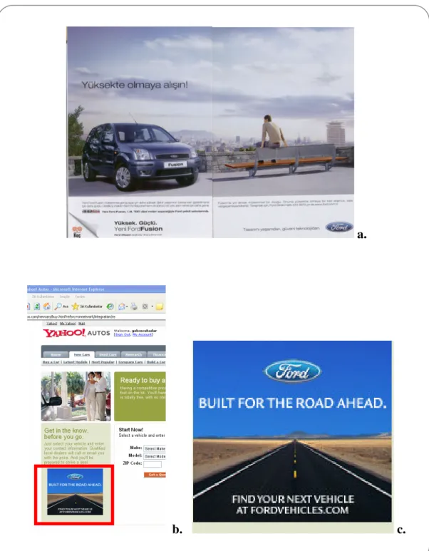
Due to the size of the medium, it is generally impossible to use a large size image in web advertising. Unlike web ads, magazine ads in particular take advantage of using large size images to attract attention, and in this way advertising is becoming more and more in the viewer’s face. In addition, it must be noted that using huge images in advertising triggers our purchase decisions in a positive way. The product automatically takes root in our memory.
prompts their mind to make a connection. The image makes us think ‘why didn’t I think of that before? It brings a smile to our face, or recognition of how cool the idea is.
a.
b. c.
Figure 16: Ford Advertisings
a. A two spread magazine ad (with a large size image) b. A banner ad in a web site (with a small size image) c. Close up image of the banner ad
Prior online advertising studies have examined the web page background image’s effect on advertising attitudes. (Bruner and Kumar, 2000; Stevenson, Bruner, and Kumar 2000) Stevenson, Bruner, and Kumar examined web page background complexity in a laboratory experiment. They found that background image complexity had a negative effect on attitude toward the advertisement but no effect on attention toward the advertising stimuli. That is, with a complex image background the viewer had lower attitudes toward the web advertisement but on the contrary, the background image complexity did not prevent people from paying attention to what was being advertised.
Lastly, colored images are more easily remembered than black and white images especially in advertising. That is, Gilbert and Schleuder compared black and white to colored ads and found that the colored images ads were more readily recalled and were processed with greater speed (1990:755).
2.1.4 Text
In both print and web advertising design, one of the issues requiring attention is text. Text plays a significant role in advertising. The information given to the audience, the content of the product or the service and the most important messages that are announced to consumers are reached to us by the presence of the texts. So ads that are unreadable, for whatever reason, automatically lose their audiences.
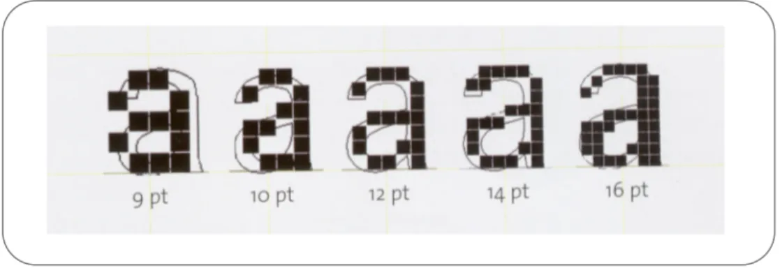
Micheal Bernard, in his essay How Should Text be Presented with in a Web Site? stated that “For both in web and print media, evidence suggests that the most
commonly used fonts tend to be equally legible at 10-, 12-, and 14-point size.”(2003)
Text Text
Text
10 point size 12 point size 14 point sizeFigure 17: Most usable font sizes
In modern typography there are two basic forms of typeface: serif, and san serif. Veruscha Götz , in her book Color and Type for the Screen, defines serif and sans serif as;
“Serif typefaces have clearly emphasized serifs and clear differences in the thickness of the strokes that make up the letter. They are most often used for text in books and newspapers. San serif typefaces are faces without serifs, and they have no differences, or only slight differences, in the thickness of the strokes. They are most often used for titles, headings, and in advertising.” (1998:56).
Serif Sans serif
Times ArielFigure 18: Times and Ariel Fonts
At the normal type size serif typefaces are less suitable for use on the screen than sans serif typefaces. If serif typefaces are being used on the screen, it is important to select a typeface in which the serifs and strokes are not too thin.
Displaying type on the screen requires a high degree of compromise. This is because screen display at present is based on a bitmap of 72 pixels per inch. This resolution requires special processing for small type sizes up to about 20pt, depending on the bitmap. Without this processing, distortion occurs in the bitmap. (Götz, 1998)
Figure 19: Different bitmaps of small type sizes
Source: Götz, Veruschka. Color and Type for the Screen. RotoVision; New York, 1998: 75.
In addition, another important thing which Veruschka Götz points out concerns conventional typefaces. She highlights the fact that as conventional typefaces cannot be simply transferred to the screen; there are special screen typefaces such as Chicago, Geneva, Monaco, and New York. Their type design is specially adapted to the bitmap of a 72 dpi screen and optimized for reading.
When studying the bitmaps of a typeface it is particularly important to check those letters which have round forms (such as the “o”) and oblique strokes (such as the “w”). This will make it possible to decide quickly whether a typeface is suitable for use at a particular size.
because the letters clump together, even if the pixel pattern of the letters is acceptable. In such a case, the typeface should be rejected or the tracking value adjusted.
As Rob Carter draws in Color and Type, the suitability of different type styles such as light, normal and bold for use on the screen depends on the colors chosen for the type and the background. (1997:31) With a white or very light colored screen background, the white or bright areas are much brighter than on paper because of the light generated by the color combination. This means that the edges of the type are obscured by blooming, which makes the type appear thinner than it actually is.
In all types of written advertisements the text line length is important for audiences. Text should be easy to read. The optimal text line length is dependent upon several factors, but it is obvious that we are not likely to read very long lines of text. In his essay How Readers Read on the Web, usability “guru” Jacob Nielsen stressed that;
“It is commonly recommended that shorter line lengths which are about 11 words should be used in place of longer, full-screen lengths both in print and web. This is because longer line lengths require greater lateral eye movements, which make it more likely to loose one's place within the text.”(2001)
He also pointed out that longer line lengths are more tiring to read. Therefore, lines should be limited to lengths of around 40 to 60 characters, which is approximately 11 words per line. (2001)
In their Writing for the Web essay, John Morkes and Jacob Nielsen point out that people with poor reading ability performed better when the line length was approximately seven words.(2001) This suggests that young readers who have not mastered reading online, as well as readers who have vision deficits, may benefit most from having shorter line lengths. As a result, advertisement designers should be more sensitive about the usage of font types and sizes, since these are the factors determining whether the audience read the ad or not.
The readability of a text depends on two main points; the background color and the background texture. Plain backgrounds produce faster search times than medium textured backgrounds. An important determinant, though, is the contrast between the text and the background. If the background is more textured, the greater the contrast should be between them. But, if one is to use a textured background, it is recommended that one is very careful by testing it in different color settings.
a.
a.
b.
Figure 21: Peugeot’s Magazine ad a. The complete ad
b. Close-up of the text. (Background texture makes the text illegible.)
As for color, as long as there is sufficient contrast between the text and the background, many color combinations are possible. However, most studies have shown that dark characters on a light background are superior to light characters on a dark background, as seen in Figure 22.
Figure 22: Place colored text on neutral background to improve legibility
Source :< http://www.sapdesignguild.org/community/design/print_colors_ii1.asp>
If the advertising offers a lot of content, dark text on a light background is generally recommended. In contrast to this is a light text on a dark background that creates a sense of mystery and intrigue. For such ads, the text is kept to a minimum with graphics providing the emphasis.
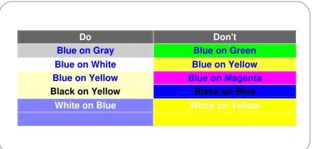
The least readable combinations on the web are green on yellow, white on pink, red on green, and pink on blue. Also, for all combinations, (as in Figure 23 and 24) the lighter background with darker text was considered to be more readable than darker backgrounds with lighter text.
For text colors, it is important to have a good contrast between colors that need to be distinguished. Some color combinations generally frustrate users and make the text virtually unreadable. For many color deficit users, red, green, brown, or purple may look the same if these colors have the same contrast. Since color deficit users cannot
Do Don't
Blue on Gray Blue on Green
Blue on White Blue on Yellow
Blue on Yellow Blue on Magenta
Black on Yellow Black on Blue
a.
b.
Figure 23: Banner ads
a.Dark background with light text b. White background with dark text
a. b.
Figure 24: Magazine ads
a. Dark background with light text b. White background with dark text
colors (make sure one color is darker than the other) between the foreground and background, as well as between other colors that need to be distinguished.
Another important issue in advertising is to show the customer immediately the most important information (text) in an advertisement. In web advertising this kind of important texts should be seen instantly, near the top of the advertisement. In reality, mainly in web advertisements because of the size of the ad, there is not enough space left for the text. Therefore writing for the web is more challenging than writing for print.
On the other hand, generally in print advertising the most important information is emphasized by the size of the text. So here we can say that especially in printed mediums the usage of size has more alternatives than in web advertising design.
a. b.
2.2 Comparing design principles in both media
In both media; print and web, designers should follow some rules in order to be successful. In other words, there are principles of design; balance, unity, emphasis, and rhythm, which can be thought of as what designers do to the elements of design. Also the application of these principles determines how successful the design is going to be.
This section will evaluate the two mediums on the basis of design principles, and put strong emphasis on how the two apply these principles in advertising.
2.2.1 Balance
Balance is an important design principle which should be applied in both printed and web advertising. We strive for balance in many aspects of our life. At times we can be so sensitive about the position of things that we might constantly change our decision about the balance of something until it looks right. This sense of balance in physics is similar to balance in design.
Very simply, balance is an equal distribution of weight. When a design is balanced audience tend to feel that it holds together, looks unified, and feels harmonious. At the same time when the design is unbalanced it can make us uncomfortable. Understanding balance involves the study of several interrelated visual factors: weight, position, and arrangement.
In both printed and web advertising, all the elements found in a design have a visual weight. Visual weight can be defined as creating the illusion of physical weight on a
decided medium. The size, value, color, shape, and texture of an element all contribute to its visual weight.
In addition, the position of this element on the medium such as bottom right, bottom left, center, top right or top left, affects its visual weight directly. In visual perception different areas of the page seem to carry more or less visual weight. For instance, in printed advertising, especially in full-page magazine ads, the center of the page is very powerful and it can carry a good deal of weight.
Figure 26: A full page magazine ad (Balancing heavy weight on the center)
problems. Take for example half banners, button banners, and micro buttons. (Figure27) In these banner types, making decisions about balance may be impossible since the designer’s options concerning the arrangement and position of the elements are limited by the size of the area.
a
b
c d
Figure 27: Banner examples with different sizes a. Half banner
b Button banner c. Micro button banner d. Button banner
There are basically two approaches to the arrangement of elements in printed and web advertising. In other words, we can create a balance which is symmetrical or asymmetrical in design. If you can arrange all the identical or similar visual elements so that they are evenly distributed on either side of an imaginary vertical axis; this is called symmetry, and it is always balanced. A symmetrically balanced layout has elements of equal weight above and below the optical center. To the left and to the right everything is the same, and it has elements of equal size and weight.
When you arrange dissimilar or unequal elements of equal weight on page, it is called asymmetry. To achieve asymmetrical balance, the position, visual weight, size, value, color, shape and texture of an element must be considered and weighted against every other element. Also, asymmetrically balanced layouts achieve a stability that is dynamic rather than static.
For example, in Figure 28(a), imagine a vertical axis dividing the ad in half. You can see an equal distribution of weight on either side of it. But in figure b, we can see an unequal distribution of weight.
a. b.
Figure 28: Web ad examples a. Symmetrical balanced layout ad b. Asymmetrical balanced layout ad
a. b.
Figure 29: Magazine ad examples a. Symmetrical balanced ad b. Asymmetrical balanced ad
In reality, in both printed and web advertising, it is almost impossible to list ways to achieve symmetrical and asymmetrical balance since every element in design and their position contribute to the overall balancing effect in a design solution. Even the movement of one element may affect the delicate balance of design. So it can be said that the decision of whether to use symmetry or asymmetry in advertising design should be dictated by the subject matter, the message, and the feelings you wish to convey.
2.2.2 Unity
In all types of advertising, whether printed ads or web ads; the type, photographs, illustrations, and graphic elements have to work together as a unit. There are many ways to achieve what we call unity; where the elements in a design look as though they belong together. Achieving unity relies on a basic knowledge of the formal elements and an understanding of other basic design principles, such as balance, emphasis, and rhythm.