COLOR FINGERPRINTS OF DIRECTORS
Graduate School of Economics and Social Sciences of
İhsan Doğramacı Bilkent University
by
MEHMET NEBİ SAVCI
In Partial Fulfilment of the Requirements for the Degree of MASTER OF ARTS
THE DEPARTMENT OF COMMUNICATION AND DESIGN İHSAN DOĞRAMACI BİLKENT UNIVERSITY
ANKARA May 2016
iii ABSTRACT
COLOR FINGERPRINTS OF DIRECTORS
Savcı, Mehmet Nebi
M.A., Department of Communication and Design Supervisor: Asst. Prof. Andreas Treske
May 2016
This thesis presents a new analysis and determination method and its example application for the presence of the Kolorit (color use characteristics) specific for a director in his/her films. This characteristic if present forms a color finger print, a signature for that director. Worldwide well known directors are known to have this property. This study aims to introduce a material evidence for the presence of Kolorit for 3 Turkish directors. Example cases are selected to be Turkish directors Fatih Akın, Nuri Bilge Ceylan and Zeki Demirkubuz. It is shown that all three directors have characteristic color use in their films., We have found that the strongest color identity displayed by Fatih Akın.
iv
ÖZET
YÖNETMENLERİN RENK PARMAK İZLERİ
Savcı, Mehmet Nebi
Yüksek Lisans, İletişim ve Tasarım Bölümü Tez Yöneticisi: Asst. Prof. Andreas Treske
Mayıs 2016
Bu tez, bir yönetmenin filmlerinde renk kimliği varlığının analizi ve tespiti için yeni bir metod ve bunun örnek bir uygulaması sunmaktadır. Bu kimlik var olduğu durumda, söz konusun yönetmen için bir renk parmak izi, bir imza niteliği oluşturmaktadır. Dünyaca ünlü yönetmenlerin bu özelliğe sahip olduğu bilinmektedir. Bu çalışma 3 Türk yönetmen için renk kimliğinin varlığına somut delil yaratmak amaçlıdır. Örnek durum olarak Türk yönetmenler Fatih Akın,,Nuri Bilge Ceylan ve Zeki Demirkubuz seçilmiştir. Her üç yönetmende de renk kullanımının karakteristik olduğu gösterilmiştir. Faith Akın en belirgin renk kimliği sergileyen yönetmen olarak belirlenmiştir.
v
ACKNOWLEDGEMENTS
I would like to thank to Asst. Prof. Andreas Treske for his continuous supervision and invaluable guidance. I am truly grateful to him for his patience, support and enthusiasm that motivated me at each phase of this thesis. I would also like to express my gratitude to Asst. Prof. Marek Brzozowski, who introduced me to the color theory and showed me its importance in visual design over the years during which I was his student.
vi TABLE OF CONTENTS ABSTRACT ………. iii ÖZET ……… iv ACKNOWLEDGMENTS ……… v TABLE OF CONTENTS ………. vi LIST OF TABLES ………... ix LIST OF FIGURES ………. x CHAPTER 1: INTRODUCTION ……… 1
CHAPTER 2: AVAILABLE STUDIES IN THE FIELD ……… 7
2.1 Color Palette Based Approaches .….……….………. 8
2.2 Equivalent Color Based Approaches ……….. 10
CHAPTER 3: COLOR THEORY ……… 12
3.1 Color Perception ………. 16
3.2 Color Spaces …….……….. 23
CHAPTER 4: COLOR IN CINEMA ……….……….. 24
4.1 Early Work ………. 26
4.2 Color Identity; Kolorit ………..………. 29
CHAPTER 5: METHOD of ANALYSIS ………...……… 32
5.1 The Equivalent Color Strings of Frames ……… 33
5.2 Color Palettes of Films ……….……….. 34
5.3 Overall Color of Frames and Sub-Frames ………..……… 35
5.4 Equivalent Color Strips of Main and Sub-Frames ………. 36
5.5 Difference Patterns of Sub-Frames ……….... 37
5.6 RGB Color Space Rrepresentation of Films ……….. 37
5.7 HSB Color Space Rrepresentation of Films ………...………… 38
5.8 Histograms of Films ……….……….. 39
vii
CHAPTER 6: VISUAL ANALYSIS OF DIRECTORS ………. 41
6.1 Fatih Akın ….………. 42
6.1.1 Kurz und Schmerzlos ……….. 43
6.1.2 Im Juli ………. 47
6.1.3 Solino ……….. 51
6.1.4 Gegen die Wand ……….. 55
6.1.5 Crossing the Bridge ………. 59
6.1.6 Auf der anderen Seite ……….. 63
6.1.7 Soul Kitchen ……… 67
6.2 Nuri Bilge Ceylan ………...……… 71
6.2.1 Mayıs Sıkıntısı ……… 72
6.2.2 Uzak ……… 76
6.2.3 İklimler ……… 81
6.2.4 Üç Maymun ………. 85
6.2.5 Bir Zamanlar Anadolu'da ……… 89
6.3 Zeki Demirkubuz ……….……….. 92 6.3.1 C Blok ………. 93 6.3.2 Masumiyet ………...… 97 6.3.3 Yazgı ……….. 101 6.3.4 İtiraf ………. 105 6.3.5 Bekleme Odası ……… 109 6.3.6 Kader ………... 113 6.3.7 Kıskanmak ………... 117 6.3.8 Yeraltı ……….. 121
CHAPTER 7: NUMERICAL ANALYSIS OF DIRECTORS ……… 125
7.1 Fatih Akın ……..………. 127
7.1.1 Kurz und Schmerzlos ……….. 128
7.1.2 Im Juli ……….. 129
7.1.3 Solino ……….. 130
7.1.4 Gegen die Wand ……….. 131
viii
7.1.6 Auf der anderen Seite ……….. 133
7.1.7 Soul Kitchen ……… 134
7.2 Nuri Bilge Ceylan ………..……… 135
7.2.1 Mayıs Sıkıntısı ……… 136
7.2.2 Uzak ……… 137
7.2.3 İklimler ……… 138
7.2.4 Üç Maymun ………. 139
7.2.5 Bir Zamanlar Anadolu'da ……… 140
7.3 Zeki Demirkubuz ……….……….. 141 7.3.1 C Blok ………. 142 7.3.2 Masumiyet ……….. 143 7.3.3 Yazgı ……….. 144 7.3.4 İtiraf ……… 145 7.3.5 Bekleme Odası ……… 146 7.3.6 Kader ……….. 147 7.3.7 Kıskanmak ……….. 148 7.3.8 Yeraltı ……….. 149
7.4 Comparative Evaluation of Directors ……….………... 150
CHAPTER 8: COMPARISON AND EVALUATION OF RESULTS ……….. 155
CHAPTER 9: CONCLUSION ……… 161
ix
LIST OF TABLES
1. Film Data of Fatih Akın ……….. 42
2. Film Data of Nuri Bilge Ceylan ……….. 71
3. Film Data of Zeki Demirkubuz ………... 92
4. Ordering of frames - Fatih Akın ... 155
5. Ordering of frames - Nuri Bilge Ceylan ……….. 156
6. Ordering of frames - Zeki Demirkubuz ... 156
7. Types of colors in palettes - Fatih Akın ... 157
8. Types of colors in palettes - Nuri Bilge Ceylan ... 157
9. Types of colors in palettes - Zeki Demirkubuz ... 157
10. Most active sub-frames - Fatih Akın ... 158
11. Most active sub-frames - Nuri Bilge Ceylan ... 158
12. Most active sub-frames - Zeki Demirkubuz ... 159
x
LIST OF FIGURES
1. Newton's Color Circle ……..………... 13
2. Goethe’s Color Wheel ………. 14
3. Sample Equivalent Color Sequence ……… 34
4. Sample Color Palette ………... 34
5. Definition of Sub-Frames ……… 35
6. Sample Equivalent Color Sequences of Sub-Frames ……….. 36
7. Sample Difference Pattern for Color Sequences ………. 37
8. RGB-Space Color Distribution ………... 37
9. HSB-Space Color Distribution ……… 38
10. Sample Histogram Single Color Channel ………. 39
11. Sample Histogram RGB ………. 40
12. Sample Graph ……….. 40 13. Overall Equivalent Colors of Main and Sub-Frames ……….
- Kurz und Schmerzlos
43 14. Color Palette ………
- Kurz und Schmerzlos
43 15. Equivalent Color Sequences of Main and Sub-Frames ………..
- Kurz und Schmerzlos 44
16. Difference Pattern for Color Sequences ……….. - Kurz und Schmerzlos
44 17. RGB-Space Color Distribution (view-1) ……….
- Kurz und Schmerzlos
45 18. RGB-Space Color Distribution (view-2) ……….
- Kurz und Schmerzlos
45 19. HSB-Space Color Distribution (view-1) ……….
xi
20. HSB-Space Color Distribution (view-2) ……….. - Kurz und Schmerzlos
46 21. Overall Equivalent Colors of Main and Sub-Frames ………
- Im Juli 47
22. Color Palette ……….. - Im Juli
47 23. Equivalent Color Sequences of Main and Sub-Frames ………
- Im Juli
48 24. Difference Pattern for Color Sequences ………
- Im Juli
48 25. RGB-Space Color Distribution (view-1) ………..…
- Im Juli 49
26. RGB-Space Color Distribution (view-2) ………. - Im Juli
49 27. HSB-Space Color Distribution (view-1) ………..
- Im Juli
50 28. HSB-Space Color Distribution (view-2) ………..
- Im Juli
50 29. Overall Equivalent Colors of Main and Sub-Frames ………
- Solino 51
30. Color Palette ……….. - Solino
51 31. Equivalent Color Sequences of Main and Sub-Frames ………
- Solino
52 32. Difference Pattern for Color Sequences ………
- Solino
52 33. RGB-Space Color Distribution (view-1) ………..
- Solino 53
34. RGB-Space Color Distribution (view-2) ……….. - Solino
53 35. HSB-Space Color Distribution (view-1) ………..
- Solino
54 36. HSB-Space Color Distribution (view-2) ………..
- Solino
54 37. Overall Equivalent Colors of Main and Sub-Frames ………
- Gegen die Wand 55
38. Color Palette ……….. - Gegen die Wand
xii
39. Equivalent Color Sequences of Main and Sub-Frames ……… - Gegen die Wand
56 40. Difference Pattern for Color Sequences ………
- Gegen die Wand 56
41. RGB-Space Color Distribution (view-1) ……….. - Gegen die Wand
57 42. RGB-Space Color Distribution (view-2) ………..
- Gegen die Wand
57 43. HSB-Space Color Distribution (view-1) ………..
- Gegen die Wand
58 44. HSB-Space Color Distribution (view-2) ………..
- Gegen die Wand 58
45. Overall Equivalent Colors of Main and Sub-Frames ……… - Crossing the Bridge
59 46. Color Palette ………..
- Crossing the Bridge
59 47. Equivalent Color Sequences of Main and Sub-Frames ………
- Crossing the Bridge
60 48. Difference Pattern for Color Sequences ………
- Crossing the Bridge 60
49. RGB-Space Color Distribution (view-1) ……….. - Crossing the Bridge
61 50. RGB-Space Color Distribution (view-2) ………..
- Crossing the Bridge
61 51. HSB-Space Color Distribution (view-1) ………..
- Crossing the Bridge
62 52. HSB-Space Color Distribution (view-2) ………..
- Crossing the Bridge 62
53. Overall Equivalent Colors of Main and Sub-Frames ……… - Auf der Anderen Seite
63 54. Color Palette ………..
- Auf der anderen Seite
63 55. Equivalent Color Sequences of Main and Sub-Frames ………
- Auf der Anderen Seite
64 56. Difference Pattern for Color Sequences ………
- Auf der Anderen Seite 64
57. RGB-Space Color Distribution (view-1) ……….. - Auf der Anderen Seite
xiii
58. RGB-Space Color Distribution (view-2) ……….. - Auf der Anderen Seite
65 59. HSB-Space Color Distribution (view-1) ………..
- Auf der Anderen Seite 66
60. HSB-Space Color Distribution (view-2) ……….. - Auf der Anderen Seite
66 61. Overall Equivalent Colors of Main and Sub-Frames ………
- Soul Kitchen
67 62. Color Palette ………..
- Soul Kitchen
67 63. Equivalent Color Sequences of Main and Sub-Frames ………
- Soul Kitchen 68
64. Difference Pattern for Color Sequences ……… - Soul Kitchen
68 65. RGB-Space Color Distribution (view-1) ………..
- Soul Kitchen
69 66. RGB-Space Color Distribution (view-2) ………..
- Soul Kitchen
69 67. HSB-Space Color Distribution (view-1) ………..
- Soul Kitchen 70
68. HSB-Space Color Distribution (view-2) ……….. - Soul Kitchen
70 69. Overall Equivalent Colors of Main and Sub-Frames ………
- Mayıs Sıkıntısı
72 70. Color Palette ………..
- Mayıs Sıkıntısı
72 71. Equivalent Color Sequences of Main and Sub-Frames ………
- Mayıs Sıkıntısı 73
72. Difference Pattern for Color Sequences ……… - Mayıs Sıkıntısı
73 73. RGB-Space Color Distribution (view-1) ………..
- Mayıs Sıkıntısı
74 74. RGB-Space Color Distribution (view-2) ………..
- Mayıs Sıkıntısı
74 75. HSB-Space Color Distribution (view-1) ………..
- Mayıs Sıkıntısı 75
76. HSB-Space Color Distribution (view-2) ……….. - Mayıs Sıkıntısı
xiv
77. Overall Equivalent Colors of Main and Sub-Frames ……… - Uzak
76 78. Color Palette ………..
- Uzak 76
79. Equivalent Color Sequences of Main and Sub-Frames ……… - Uzak
77 80. Difference Pattern for Color Sequences ………
- Uzak
77 81. RGB-Space Color Distribution (view-1) ………..
- Uzak
78 82. RGB-Space Color Distribution (view-2) ………..
- Uzak 78
83. HSB-Space Color Distribution (view-1) ……….. - Uzak
79 84. HSB-Space Color Distribution (view-2) ………..
- Uzak
79 85. Overall Equivalent Colors of Main and Sub-Frames ………
- İklimler
80 86. Color Palette ………..
- İklimler 80
87. Equivalent Color Sequences of Main and Sub-Frames ……… - İklimler
81 88. Difference Pattern for Color Sequences ………
- İklimler
81 89. RGB-Space Color Distribution (view-1) ………..
- İklimler
82 90. RGB-Space Color Distribution (view-2) ………..
- İklimler 82
91. HSB-Space Color Distribution (view-1) ……….. - İklimler
83 92. HSB-Space Color Distribution (view-2) ………..
- İklimler
83 93. Overall Equivalent Colors of Main and Sub-Frames ………
- Üç Maymun
84 94. Color Palette ………..
- Üç Maymun 84
95. Equivalent Color Sequences of Main and Sub-Frames ……… - Üç Maymun
xv
96. Difference Pattern for Color Sequences ……… - Üç Maymun
85 97. RGB-Space Color Distribution (view-1) ………..
- Üç Maymun 86
98. RGB-Space Color Distribution (view-2) ……….. - Üç Maymun
86 99. HSB-Space Color Distribution (view-1) ………..
- Üç Maymun
87 100. HSB-Space Color Distribution (view-2) ………..
- Üç Maymun
87 101. Overall Equivalent Colors of Main and Sub-Frames ………
- Bir Zamanlar Anadolu'da 88
102. Color Palette ……….. - Bir Zamanlar Anadolu'da
88 103. Equivalent Color Sequences of Main and Sub-Frames ………
- Bir Zamanlar Anadolu'da
89 104. Difference Pattern for Color Sequences ………
- Bir Zamanlar Anadolu'da
89 105. RGB-Space Color Distribution (view-1) ………..
- Bir Zamanlar Anadolu'da 90
106. RGB-Space Color Distribution (view-2) ……….. - Bir Zamanlar Anadolu'da
90 107. HSB-Space Color Distribution (view-1) ………..
- Bir Zamanlar Anadolu'da
91 108. HSB-Space Color Distribution (view-2) ………..
- Bir Zamanlar Anadolu'da
91 109. Overall Equivalent Colors of Main and Sub-Frames ………
- C Blok 93
110. Color Palette ……….. - C Blok
93 111. Equivalent Color Sequences of Main and Sub-Frames ………
- C Blok
94 112. Difference Pattern for Color Sequences ………
- C Blok
94 113. RGB-Space Color Distribution (view-1) ………..
- C Blok 95
114. RGB-Space Color Distribution (view-2) ……….. - C Blok
xvi
115. HSB-Space Color Distribution (view-1) ……….. - C Blok
96 116. HSB-Space Color Distribution (view-2) ………..
- C Blok 96
117. Overall Equivalent Colors of Main and Sub-Frames ……… - Masumiyet
97 118. Color Palette ………..
- Masumiyet
97 119. Equivalent Color Sequences of Main and Sub-Frames ………
- Masumiyet
98 120. Difference Pattern for Color Sequences ………
- Masumiyet 98
121. RGB-Space Color Distribution (view-1) ……….. - Masumiyet
99 122. RGB-Space Color Distribution (view-2) ………..
- Masumiyet
99 123. HSB-Space Color Distribution (view-1) ………..
- Masumiyet
100 124. HSB-Space Color Distribution (view-2) ………..
- Masumiyet 100
125. Overall Equivalent Colors of Main and Sub-Frames ……… - Yazgı
101 126. Color Palette ………..
- Yazgı
101 127. Equivalent Color Sequences of Main and Sub-Frames ………
- Yazgı
102 128. Difference Pattern for Color Sequences ………
- Yazgı 102
129. RGB-Space Color Distribution (view-1) ……….. - Yazgı
103 130. RGB-Space Color Distribution (view-2) ………..
- Yazgı
103 131. HSB-Space Color Distribution (view-1) ………..
- Yazgı
104 132. HSB-Space Color Distribution (view-2) ………..
- Yazgı 104
133. Overall Equivalent Colors of Main and Sub-Frames ……… - İtiraf
xvii
134. Color Palette ……….. - İtiraf
105 135. Equivalent Color Sequences of Main and Sub-Frames ………
- İtiraf 106
136. Difference Pattern for Color Sequences ……… - İtiraf
106 137. RGB-Space Color Distribution (view-1) ………..
- İtiraf
107 138. RGB-Space Color Distribution (view-2) ………..
- İtiraf
107 139. HSB-Space Color Distribution (view-1) ………..
- İtiraf 108
140. HSB-Space Color Distribution (view-2) ……….. - İtiraf
108 141. Overall Equivalent Colors of Main and Sub-Frames ………
- Bekleme Odası
109 142. Color Palette ………..
- Bekleme Odası
109 143. Equivalent Color Sequences of Main and Sub-Frames ………
- Bekleme Odası 110
144. Difference Pattern for Color Sequences ……… - Bekleme Odası
110 145. RGB-Space Color Distribution (view-1) ………..
- Bekleme Odası
111 146. RGB-Space Color Distribution (view-2) ………..
- Bekleme Odası
111 147. HSB-Space Color Distribution (view-1) ………..
- Bekleme Odası 112
148. HSB-Space Color Distribution (view-2) ……….. - Bekleme Odası
112 149. Overall Equivalent Colors of Main and Sub-Frames ………
- Kader
113 150. Color Palette ………..
- Kader
113 151. Equivalent Color Sequences of Main and Sub-Frames ………
- Kader 114
152. Difference Pattern for Color Sequences ……… - Kader
xviii
153. RGB-Space Color Distribution (view-1) ……….. - Kader
115 154. RGB-Space Color Distribution (view-2) ………..
- Kader 115
155. HSB-Space Color Distribution (view-1) ……….. - Kader
116 156. HSB-Space Color Distribution (view-2) ………..
- Kader
116 157. Overall Equivalent Colors of Main and Sub-Frames ………
- Kıskanmak
117 158. Color Palette ………..
- Kıskanmak 117
159. Equivalent Color Sequences of Main and Sub-Frames ……… - Kıskanmak
118 160. Difference Pattern for Color Sequences ………
- Kıskanmak
118 161. RGB-Space Color Distribution (view-1) ………..
- Kıskanmak
119 162. RGB-Space Color Distribution (view-2) ………..
- Kıskanmak 119
163. HSB-Space Color Distribution (view-1) ……….. - Kıskanmak
120 164. HSB-Space Color Distribution (view-2) ………..
- Kıskanmak
120 165. Overall Equivalent Colors of Main and Sub-Frames ………
- Yeraltı
121 166. Color Palette ………..
- Yeraltı 121
167. Equivalent Color Sequences of Main and Sub-Frames ……… - Yeraltı
122 168. Difference Pattern for Color Sequences ………
- Yeraltı
122 169. RGB-Space Color Distribution (view-1) ………..
- Yeraltı
123 170. RGB-Space Color Distribution (view-2) ………..
- Yeraltı 123
171. HSB-Space Color Distribution (view-1) ……….. - Yeraltı
xix
172. HSB-Space Color Distribution (view-2) ……….. - Yeraltı
124 173. Histogram of R channel ………
- Kurz und Schmerzlos 128
174. Histogram of G channel ……… - Kurz und Schmerzlos
128 175. Histogram of B channel ………
- Kurz und Schmerzlos
128 176. Histogram of RGB ………....
- Kurz und Schmerzlos
128 177. Histogram of R channel ……… - Im Juli 129 178. Histogram of G channel ……… - Im Juli 129 179. Histogram of B channel ……… - Im Juli 129 180. Histogram of RGB ……….... - Im Juli 129 181. Histogram of R channel ……… - Solino 130 182. Histogram of G channel ……… - Solino 130 183. Histogram of B channel ……… - Solino 130 184. Histogram of RGB ……….... - Solino 130 185. Histogram of R channel ………
- Gegen die Wand 131
186. Histogram of G channel ……… - Gegen die Wand
131 187. Histogram of B channel ………
- Gegen die Wand
131 188. Histogram of RGB ………....
- Gegen die Wand
131 189. Histogram of R channel ………
- Crossing the Bridge 132
190. Histogram of G channel ……… - Crossing the Bridge
xx
191. Histogram of B channel ……… - Crossing the Bridge
132 192 Histogram of RGB ………....
- Crossing the Bridge 132
193 Histogram of R channel ……… - Auf der Anderen Seite
133 194 Histogram of G channel ………
- Auf der Anderen Seite
133 195 Histogram of B channel ………
- Auf der Anderen Seite
133 196 Histogram of RGB ………....
- Auf der Anderen Seite 133
197 Histogram of R channel ……… - Soul Kitchen 134 198 Histogram of G channel ……… - Soul Kitchen 134 199 Histogram of B channel ……… - Soul Kitchen 134 200 Histogram of RGB ……….... - Soul Kitchen 134 201 Histogram of R channel ……… - Mayıs Sıkıntısı 136 202 Histogram of G channel ……… - Mayıs Sıkıntısı 136 203 Histogram of B channel ……… - Mayıs Sıkıntısı 136 204 Histogram of RGB ……….... - Mayıs Sıkıntısı 136 205 Histogram of R channel ……… - Uzak 137 206 Histogram of G channel ……… - Uzak 137 207 Histogram of B channel ……… - Uzak 137 208 Histogram of RGB ……….... - Uzak 137 209 Histogram of R channel ……… - İklimler 138
xxi 210 Histogram of G channel ……… - İklimler 138 211 Histogram of B channel ……… - İklimler 138 212 Histogram of RGB ……….... - İklimler 138 213 Histogram of R channel ……… - Üç Maymun 139 214 Histogram of G channel ……… - Üç Maymun 139 215 Histogram of B channel ……… - Üç Maymun 139 216 Histogram of RGB ……….... - Üç Maymun 139 217 Histogram of R channel ………
- Bir Zamanlar Anadolu'da
140 0218 Histogram of G channel ………
- Bir Zamanlar Anadolu'da
140 219 Histogram of B channel ………
- Bir Zamanlar Anadolu'da 140
220 Histogram of RGB ……….... - Bir Zamanlar Anadolu'da
140 221 Histogram of R channel ……… - C Blok 142 222 Histogram of G channel ……… - C Blok 142 223 Histogram of B channel ……… - C Blok 142 224 Histogram of RGB ……….... - C Blok 142 225 Histogram of R channel ……… - Masumiyet 143 226 Histogram of G channel ……… - Masumiyet 143 227 Histogram of B channel ……… - Masumiyet 143 228 Histogram of RGB ……….... - Masumiyet 143
xxii 229 Histogram of R channel ……… - Yazgı 144 230 Histogram of G channel ……… - Yazgı 144 231 Histogram of B channel ……… - Yazgı 144 232 Histogram of RGB ……….... - Yazgı 144 233 Histogram of R channel ……… - İtiraf 145 234 Histogram of G channel ……… - İtiraf 145 235 Histogram of B channel ……… - İtiraf 145 236 Histogram of RGB ……….... - İtiraf 145 237 Histogram of R channel ……… - Bekleme Odası 146 238 Histogram of G channel ……… - Bekleme Odası 146 239 Histogram of B channel ……… - Bekleme Odası 146 240 Histogram of RGB ……….... - Bekleme Odası 146 241 Histogram of R channel ……… - Kader 147 242 Histogram of G channel ……… - Kader 147 243 Histogram of B channel ……… - Kader 147 244 Histogram of RGB ……….... - Kader 147 245 Histogram of R channel ……… - Kıskanmak 148 246 Histogram of G channel ……… - Kıskanmak 148 247 Histogram of B channel ……… - Kıskanmak 148
xxiii 248 Histogram of RGB ……… - Kıskanmak 148 249 Histogram of R channel ……… - Yeraltı 149 250 Histogram of G channel ……… - Yeraltı 149 251 Histogram of B channel ……… - Yeraltı 149 252 Histogram of RGB ……….... - Yeraltı 149 253 Mean Values of Histograms – R channel ……….. 150 254 Mean Values of Histograms – G channel ………. 151 255 Mean Values of Histograms – B channel ……….. 151 256 Mean Values of Histograms – RGB ………...…….. 152 257 Standard Deviations of Histograms – R channel ……….. 152 258 Standard Deviations of Histograms – G channel ……….. 153 259 Standard Deviations of Histograms – B channel ……….. 153 260 Standard Deviations of Histograms – RGB ……….. 154 261 Number of Colors Used vs. Time ………. 154
1
CHAPTER 1
INTRODUCTION
In any film a certain number of frames are displayed one after the other to give an illusion of motion. In order a motion to be perceived, the frames must have different compositions either in shape or position coupled with change in hue and/or value. In color films the series of frames containing different colors and/or values (darkness or lightness) constitute a string of changes in the average perceived color of the film. As the human vision is based on the light sensing property of the specialized cells on the retina in the eyes, the structure and properties of these cells are of utmost importance in defining a colour scheme and colour space for any visual that is to be perceived.. Sequence of frames in a film can be scaled down to a single string of dominant colours which changes through the film. These consecutive colours, can be mapped onto a color space which is based on three main colours (depending on the main colours used) will form a series of collection of dots, thus a visual form. The starting question of this study is; “Are these forms representative of the style of the director of the a given film?
We hypothesize in this thesis that; “As colour perception is totally based on human biology, thus related to genetics and environmental effects (Human Vision and Color Perception), and the director is assumed to be the sole autheur of the film according
2
to “Autheur Theory”. (Cook, 1999:235) these forms are representative of the director’s style. In which case, the visual form will represent the identity of the director as well if he/she has a definitive style. As for identity determination, finger prints have been used for many decades, we will name these characteristic forms as Color Finger Print of the director.
In order to evaluate the validity of this hypothesis and to find a verifiable answer to the main question, we have selected three well known directors from Turkey. The selected directors are Fatih Akın, Nuri Bilge Ceylan and Zeki Demirkubuz.
The main argument of this work is the quest for an answer for the question; Does the colour use in films display a revealing pattern for the identity of the director?
As the films are a stack of frames each of which can be represented as photographs, any property that can be derived from photographs can be mapped into a higher dimensioned space due to the sequence of frames appearing in time dimension. Thus, if brightness of the frames change, this can be defined as a function of time, or hue change in time dimension can be defined as a function.
Although the start of the thesis subject was the above defined problem, with the understanding that any property of a frame can be followed and defined by a function with the independent variable time, it must also be made precise what is meant with colour. Actually colour has many sub properties like hue, saturation, value, vibrance etc. (Color Theory) Thus, all of these sub elements of colour can be examined in the above defined understanding.
So the revised question could be:
Do the time dependent variations of hue, saturation, vibrance or any other colour sub-element display a characteristic property that can be related to the identity of the director?
As the first approximation for a colour, hue can be taken as it defines the place of colour in the spectrum (Color Theory).
3
The colour space selection is another important element in the analysis as the results will be displayed in that space. Selection of the appropriate color space should be such that, diffeerences of use of hue, saturation and brightness (value) among different directors can be inspected easily, both visually and numerically..
Mathematical and physical definitions of colours provide us with a very high number of colour schemes such as RGB, CMYK and numerous others (Color Theory). However, the colour is a perceived entity through human vision. This can be best observed in the definition of magenta which is just an artifact of human brain. Because of this, the human visual system must be used as the main reference. The result of choice is the use of RGB colour scheme as human eye works on this basis (Human Vision and Color Perception, 2015).
Also, the availability of films on internet and their format forms provide a rich
resource for monitors and projectors. It must not be forgotten that, the examination of films should use a consistent and comparable method to be valid for a range of films and directors. The most widely available format is AVI (Church, 2015) and the availability of analysis tools like ImageJ (National Institute of Health, 2016) for this format makes this format suitable for the analysis performed in this thesis.
The software ImageJ which is available on the internet as an open project, has the versatility of having many plug-ins that can be used for performing many analysis of visual elements including videos, films and photographs (ImageJ). It must be noted that, the analysis of films are based on a two step procedure in which the first one being the seperating the films into its frames that will be analyzed by the second step in sequence.
The first step can be done by plug-ins which breaks down the films into their frames in terms of stacks of photographs or by specialized software developed for image processing. We have selected the ffmpeg program as it is capable of handling all visual data formats and it is very powerful in terms of processing large amount of data (ffmpeg).
4
An important plugin of ImageJ is the Color Inspector 3D (ImageJ). Developed by Kai Uwe Barthel, this plugin visualizes the numerical values of digital pictures in various formats and color spaces (Barthel).
A fundamentally important notion that forms the main motivation of this thesis study is the equivalent color in digital imaging which is a result of the pixel form of the color units in computer images. An example of this notion can be found in “The Mona Lisa” by Ed Manning, which is a blocpix image in which the photo of the Mona Lisa painting by Leonardo da Vinci is given in 8 different forms including the direct un manipulated photo of the painting itself besides 7 representations of it in different resolutions. As the number of pixels decrease, an average, equivalent colored pixel covers the corresponding area of the painting (cited in Zelansky, 1989:82).
In digital images; digital photography, video, the image is consisted of pixels each in turn is composed of three elements of three basic colors; namely: red, green and blue. By changing the amount of light released from each color element, a pixel may get different colors. The total number of colors that can be obtained through this process is 255X255X255. Also the saturation (pureness) and balance of colors can be
adjusted on the display unit by the spectator (Zelansky:77-79).
Psychological effects of colors are an important result of color perception as they are related to moods associated by colors and physiological end effects created by the psychological effects, such as increase of blood pressure in red environments (Zelansky, 1989:29-30). Directly related to psychology, color preferences are also depended on the person and thus can be accepted as a personal preference (Zelansky, 1989:33). This view plays a major role in this study, as the director’s personal
preferences might be reflected to his work.
It is known that approximately 80% of the knowledge acquired by a person is
through visual medium (Küppers, 1986:7). This amount is too high to ignore and the importance of color is clear.
5
However, color is a result of the human visual perception. Colors only exist in our senses (Küppers, 1986:22-23). Thus, color perception is directly related to the vision of the individual. And as color is perceived because of ambient light, the color temperature of the ambient light (Color Theory) determines the perceived colors. By definition, “The color temperature of a light source is the temperature of an ideal black-body radiator that radiates light of comparable hue to that light source. The temperature is conventionally stated in units of absolute temperature, known as Kelvin (K)” (Westinghouse).
Also we have to take into account that, human eye does not have a homogenous field of vision, thus only a certain part of the visual field can be seen clearly and in detail. This is true for both colors and details (Küppers, 1986:17). Also additional difficulty arises as; human vision has a property that perception of the colors differes when the colors that are being seen interact, i.e. same color can be perceived differently in the presence of other colors (Küppers, 1986:18-19).
Human vision has several complex properties (Human Vision and Color Perception) and one of them is the color sensing structures in the eye. There exist three main colors due to the structure of the human eye. The sensory cells have three different types in the case of color vision and these cells are sensitive to three different colors, namely; violet-blue, green and orange-red (Küppers, 1986:26).
These sensory cells are located in a small area on the retina of the human eye and are sensitive to different wavelengths. The three wavelength groups are, long, medium and short. Violet-blue has the shortest wavelength among these, green constitutes the medium and orange-red the longest wavelength (Küppers, 1986:26-27)
Certain problems in human vison system can cause defective perceptions. These include the different perception of colors due to absence or weakness of the types off sensory cells (Küppers, 1986:28-30).
It is also possible to think of human vision as a computer system as claimed by Küppers (Küppers, 1986:24-25) and seeing is a very important step in self-awareness. Especially seeing oneself in the mirror is key to self-perception and
6
awareness. What if the mirror is false colored exactly as in the movies (Glöde, 2014:37) This brings us to the point where, the perception of others and self can be questioned by a different space where the environment painted differently than the everyday life.
Culture dependency of color perception is a well-known fact (De Bortoli, Maroto, 2001) and language plays a key role in culture. However, the relation between language and image which includes color is highly complex, not just because of the human vision’s complexity but also because of the incompatibility of them as stated by Foucault; image and language are incompatible in the sense that their relation and interactions are not linear and they are complex in nature (Foucault, 1970:9). It must be noted that he is not refusing any interaction between image and language, instead he claims that if one wishes to keep the relation of language to vision open, if one wishes to treat their incompatibility as a starting-point for speech instead of as an obstacle to be avoided, so as to stay as close as possible to both, then one must erase those proper names and preserve the infinity of the task (Foucault, 1970:9-10). This complex interaction is where the cinema stands. Directors are trying to convey concepts, senses, feelings, situations through an image dominated medium to a language dominated receiver; the human. This makes them special in the sense that, their perceptions, ways of conveying notions through images need as much depth as possible. As mentioned by Glöde, “color constituted for one physical dimension” (Glöde, 2014:31) so the color provides additional dimensions to the visual language of cinema which by definition was crippled by the removal of physical space’s depth dimension. Therefore, the directors color identity becomes a determining factor what and how he/she will convey his/her messages.
7
CHAPTER 2
AVAILABLE STUDIES IN THE FIELD
There are many studies and works available on internet that are investigating the differences among films due to their color content and differences among directors due to their color use. However, only few of them have original idea and approach, whereas the rest are consisted of application of those few core examples. In the field of color of films analysis, there exist two main color related approaches.
One is based on the main color palette used in the films and the other is the flow of the average or equivalent colors of the films through the film. Average color or by its name we will be using in this thesis; equivalent color, is based on the notion “The Gestalt Law of Similarity” in color (O’Connor, 2015:89). The overall effect of the vision frame (the area that is seen) in terms of color will be a single overall color. This color can be computed by taking the average of the all of the colors in the scene by taking into account their multiplicity and area of coverage. This is achieved by use of image processing tools available on internet (i.e. ImageJ, Icy). The process is dependent on the frames (stills) selected from the film. Thus this line of approach is somewhat limited in displaying the directors choice, due to the selection of frames is a user action interfering with the will of the director. In order to overcome this problem, all palette based approaches uses the frames that became the trade mark of the film in question. Thus the director choice is preserved and emphasized.
8 2.1 COLOR PALETTE BASED APROACHES
For the examples based on color pallet determination, the process is mainly done by the use of image processing software that is widely used and very user friendly; Photoshop (Adobe, 2016) or online services (i.e. DeGraeve, 2016). The actual mechanism is to convert the image to indexed color mode of Photoshop in which all the colors available in the image are tabulated and narrowed down to the number specified by the user. Thus the result of this process selects the most effective colors in the image. The color palette can be arranged according to several further notions like cool or warm colors. Another method that can be used to create the palettes is based on Adobe Color CC (Adobe, 2016), which is also available as an application on mobile devices. However this product gives 5 color palettes at a time according to the mood specified by the user thus can only be used to present the most dominant colors in a film. The selection of the mood by the user interferes with the authorship of the director and the result is biased towards the user choice other than the actual choice of the director.
One of the original examples is given by Lackey (Lackey, 2015). He gives the five color schemes that are used in films by submitting the color palettes. In doing so, he determines first, into which color scheme the film fits and then determines the color palette. The color schemes he examined are; complementary, analogous, triadic, split complementary and tetradic color schemes (Lackey, 2015).
Complementary color scheme uses the two colors placed opposite to each other on the color wheel. Analogous color scheme on the other hand, uses adjacent three colors on the color wheel (Lackey, 2015).
Among the other color schemes tetradic uses four colors such that, the color chosen form a rectangle on the color wheel. Triadic one forms an equilateral triangle and split complementary forms an isosceles triangle such that the base of the triangle is
9
formed by the two neighboring colors of the complement of the third one (Lackey, 2015). His efforts in classifying the color schemes available in the films is unique among the other color palette based works.
In another work Miller gives 15 films as examples of effective color palette selection (Miller, 2014) in which he presents the color palette data of 15 selected films. His work is noteworthy because it gives the differences and shows the similarities among those 15 films that he has selected.
An important contribution of color palette use by directors is given by Present & Correct in their tumbler account. They examine the films of Wes Anderson. The color palettes they give show a very strong characteristics of use chromatic grays and prismatic colors in a balanced manner. The importance of the distinction between prismatic colors and chromatic grays and their uses were mentioned on several occasions by Marek Brzozowski (personal communications, fall and spring semesters of 2011, 2012, 2013, 2014). Through this color palette Anderson
emphasize the depth of the scene very effectively almost like a painter. Thus there is a very definite and characteristic color use in his films. In Goethe's terminology (Goethe, 1804), which was later revived by Marc Glöde (Glöde, 2014), it is clear that Wes Anderson has a very striking and definite Kolorit (Havlin), (Present & Correct). Lynch gives another example of color palette scheme (Lynch, 2013) in which he processed the frames he captured from famous films and resulting color palettes of the films.
Another online resource for the color palettes of stills from famous films can be found in (digitalsynopsis). The technique is based on the palette extraction utility of Photoshop software (Photoshop) by Adobe. The palettes extracted are from the famous scenes of the films, rather than the overall film.
The most widely known example of the color palette approach is due to Radulescu, who extracted the color palettes of the films using Photoshop and displays the results in her blog (Radulecu, 2016). Her work is even mentioned by others as being a trend setter (Czeck, 2013).
10
The color palette based approach is important as the color palettes help to see the color space that the director was trying to create. However, the color palette gives about the static setting of the film, ignoring the dynamism and flowing nature of movies. This limits their power in determining the director characteristics.
2.2 EQUIVALENT COLOR BASED APPROACHES
Equivalent or average color based schemes are stemming from the fact that film is a dynamic entity and the importance of time and flow of the frames throughout it, are important. In this approach frames are taken from the film at certain intervals and the resulting collection of scenes are then reduced to one pixel with a color equivalent to that of the frame. Thus, in this process the first product is a string of pixels with different colors. This process is mainly done by dedicated software or modified java scripts that the authors wrote.
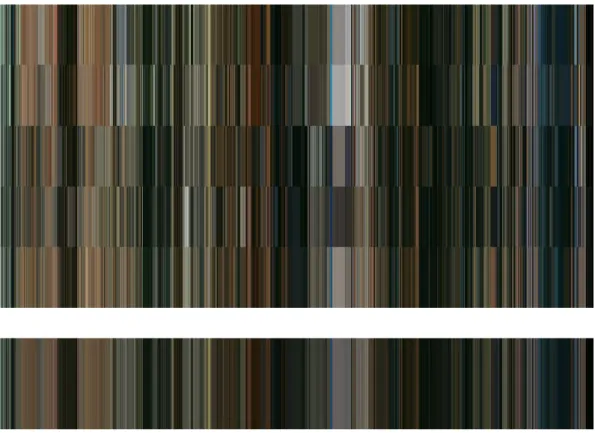
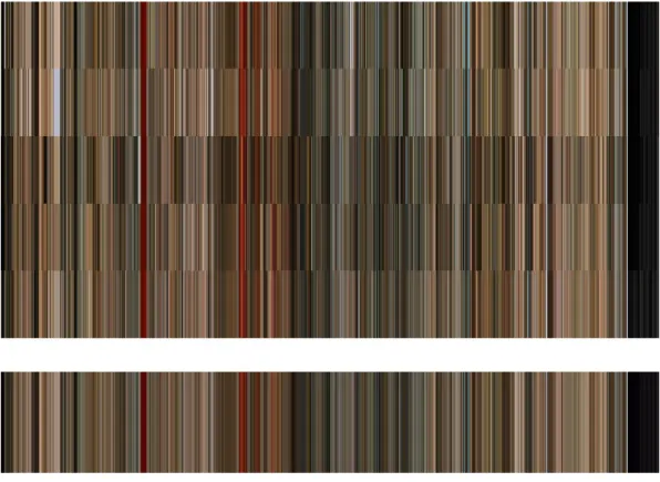
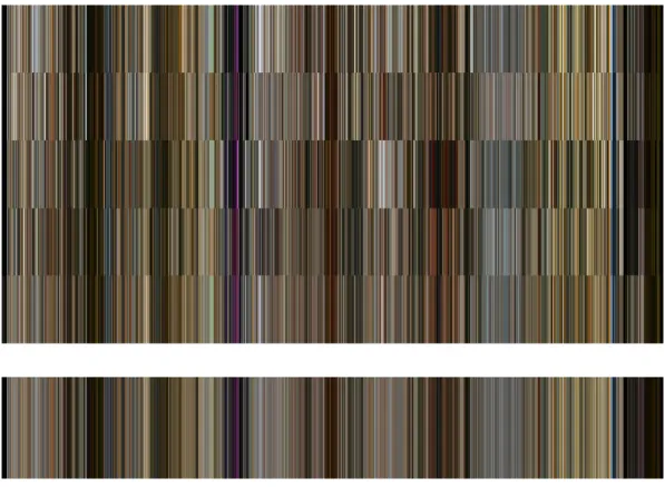
One of the first examples of this approach can be seen in the work of Charlie Clark and he presented his work in a site designed and developed by himself (Clark), where he explores the use of color in movies. The method used by Clark is partly adapted and used in this thesis. His method of employing the equivalent colors for frames is one of the basic ideas that made this thesis possible. In his website Clark extracts the equivalent colors of the frames of films and display them as a strip of colors
following each other (Clark).
Besides using equivalent color notion, another option is the use of long exposure photography to get a visual from the whole of a film. This approach is used by Jason Shulman (as cited in AnOther, 2016) to obtain a series of visuals for some well- known films, which AnOther called them as “cinematic masterpieces” (Another, 2016). The analytical merit of this approach is debatable as human vision is not an additive process as Foucault stated (Foucault, 1970:9), similar to the non-linearity of color formation as stated by Zelansky (Zelansky, 1989:55-56).
11
Similar approach was employed by Kevin Ferguson in analyzing Western films, by adding frames digitally to obtain a single frame (Ferguson). In Ferguson’s work the result is a frame of abstract color composition.
In another equivalent color approach, using the average colors of the frames,
Brodbeck obtains visual respresentations of the colors in the movies by using custom made software (Brodbeck). He uses the “fingerprint” terminology that we adapted in this thesis also.
Dillon Baker uses custom made software to analyze the movies to get average colors for each frame of the films. Displaying them in a strip form, allows him to show how the color changed throughout the film (Baker).
In all of these equivalent color schemes, the flow and change of the color along the film can be seen in a horizontal or vertical strip format. The main issue in this method is the interval that the frames are extracted from the film. Most authors specify 1 second interval for convenience. However, as human vision is a complex mechanism, the frequencey of the frame extraction should also be determined on scientific evidence. Due to this fact, in this thesis, we adapted the perception speed research of Holcombe (Holcombe, 2009) due to which, the perception speed of shape-color combinations are limited to 3-4 Hz. Which means, 3 frames per second is an acceptable level.
12
CHAPTER 3
COLOR THEORY
Humans take color as granted and a reality of life. However, detailed analysis and research have shown that “Color is first and foremost an experience” (Kuehni, 1983:1) and almost contrary to common belief; “there is no such thing as colour, at least in optical physics. Colour is a biological, or even sociological construct” (Rhodes, 2015). Color is not a characteristic property of material to be seen colored (Küppers, 1986:12). Depending on the interferences caused by filters, the light waves can result in produced colors that has no connection to the material (Küppers,
1986:14). The non-existence of color outside human perception is stated by Kuehni as; “Colors “are not real, and the world in front of us is not colored. Our brain creates the sensations of colors, most often from certain quantities and qualities of
electromagnetic radiation which strike our sensory organ”, namely the human retina (Kuehni, 1983:7).
Color is directly related to light. Küppers claims that, material color is relative and color perceived from a material depends on the lighting conditions and the light available (Küppers, 1986:15). The amount of light is related to luminance and
"‘Pure’ luminance variations tend to arise from illumination" (Biggam, 2011:3). Also we have to remember that, the definition of brightness is given as; “perceived
13
the color perceived and a numerical simulation of this can be experienced by using the applets given by Briggs (Briggs).
Color theories have existed since the ancient times. These include, “Hindu Upanishads, early Greek philosophers and physicians and the Arab physicist Alhazen” (Zelansky, 1989:46). Later during Antiquity Aristotle proposed that all colors are the results of mixtures of dark and light (Zelansky, 1989:46). His ideas followed his procedure; “Verifications from experience and observation of similarities are necessary” (Zelansky, 1989:46).
During Renaissance Leonardo da Vinci, and after Newton, Moses Harris, Goethe, Runge, Chevreul, Rood, Munselland Ostwald contributed to the color theory (Zelansky, 1989:47-56). Newton’s contribution to color theory is considerable. "Through his experiments Isaac Newton discovered that you could combine all the colors light together to create white light" (The History and Science of Color Film). Newton showed that white color is the combination of the colors in the spectrum (“spectrum”) and formed a logical understanding of the structure for the colors (Zelansky, 1989:47). Also he gave the first color wheel representation of the colors (Fig.1) showing the order of colors with respect to each other.
14
As color can be created by pigments besides lights, Moses Harris worked with pigments instead of lights and gave color wheel representations of the pigment equivalents of the Newton's color wheel (Zelansky, 1989:48).
Newton’s scientific approach to color theory was opposed by Goethe his book “Zur Farbenlehre, (Theory of Colors)” in 1810 strongly criticizing the approach of
Newton and returning to the tradition set by Aristotle and Leonardo who followed a similar approach as of Aristotle (Zelansky, 1989:49). He also gave a color wheel displaying the relation of colors among themselves (Fig.2). Goethe's book “Zur Farbenlehre” was one of the milestones of color studies although his views presented in his book were criticized by the scientists. In his book Goethe mentioned about the physical, physiological and sense related properties of colors in detail and associated colors with moods and psychological states including the color perception related illnesses. In his work several notions were described like; the colored shadows, chromatic aberrations and refraction besides the notion of kolorit (Goethe, 1812).
Figure 2. Goethe’s Color Wheel
15
At the same time of Goethe's book, German painter Philip Otto Runge published a book named “Die Farbenkugel, The color sphere” and gave the first three
dimensional representation of color space (Zelansky, 1989:51).
Later in 19th century, Michel Eugene Chevreul wrote the book “The principles of Harmony and Contrast of Colors. He gave a detailed and finely graded version of the color wheel which was another two dimensional representation as of Newton and Harris (Zelansky, 1989:52).
Being a scientist, besides an artist, American Ogden Rood, defined the terms of saturation (purity), lumosity (value) and hue (the place of the color on the color wheel) (Zelansky, 1989:52). Although he put great effort to scientific approach, Rood was unable to form a consistent and mathematically logical structured of color. In other words, his efforts of establishing a scientific color system did not finalize (Zelansky, 1989:53). Later in 1905, Albert Munsell used a three dimensional structure to unify all of Rood's concepts and formed the color notation for pigments that is still used in U.S. (Zelansky, 1989:55).
And finally, German color theorist Wilhelm Ostwald formed the scientific system of colors during early twentieth century, by using geometric progression instead of arithmetic, which means that color formations are not based on addition but on multiplication (Zelansky, 1989:55-56).
The basis of color spaces being defined in 3 colors goes back to Thomas Young. "Trichromatic theory was first put forward by Thomas Young in 1802 and refined by and Herman von Helmholtz in the 1850s" (The History and Science of Color Film). "The Young-Helmholtz theory postulated that human retina was made of cones that were responsive to only three colors of light – red, yellow and blue" (The History and Science of Color Film). This was the first version of today’s RGB color space. Later in the middle of 19th century he wrote a paper on the subject. "In his 1855 paper, Experiments on Color, Maxwell used spinning tops to demonstrate that validity of the Young Helmholtz theory, refining the primary colors to Red, Green and Blue" (The History and Science of Color Film). Today three colors are used in
16
creating all the other colors. "It turns out you only need three primary colors to create white or any perceivable color" (The History and Science of Color Film).
3.1 COLOR PERCEPTION
Color is a result of the human visual perception. Colors only exist in our senses (Küppers, 1986:22-23). Thus, color perception is directly related to the vision of the individual. Color is usually perceived though vision. However, exceptions of this can also be seen. Color perception through touching has been noted by and people with synesthesia, associate smell and sounds with color (Zelansky, 1989:27).
Psychological effects of colors are an important result of color perception as they are related to moods associated by colors and physiological end effects created by the psychological effects, such as increase of blood pressure in red environments
(Zelansky, 1989:29-30). It must also be noted that cultural references affect the color meaning and interpretation. An example of this is the use of color red as a warning in west. However, in China such an association with red is not present (Zelansky, 1989:31). Color preferences are also depended on the person and thus can be accepted as a personal preference (Zelansky, 1989:33). Besides its importance, differences in the perception of color among people make it an area to be investigated by the psychologists besides others (Zelansky, 1989:9). Human eye is the first element in human vision before nerves transmit
electrochemical inputs to brain parts responsible for vision, where the incoming signals are processed and visual perception occurs (Zelansky, 1989:19). In human eye, incoming light is focused onto retina where specialized light sensitive receptor cells sense the light. The receptor cells are of two types. The ones with rod shape are sensitive only to the value of the light, which means the darkness or lightness of the incoming light are measured. Thus these receptor cells can only sense the range from black to white in a gray scale. However, the second type of cells in the retina are sensitive to one of the three wave lengths and are called cone cells. These cells are of
17
three types which each can sense only one range of the wavelength spectrum
(“spectrum”), long, medium, short. The long wavelength corresponds approximately to red color, whereas, medium corresponds to green and short corresponds to blue (Zelansky, 1989:19-21).
Additive synthesis is the formation of color through light. In this form of color production, the main colors red, green and blue are reflected at different amounts by different surfaces. The resulting combination of the reflected parts of the main three colors form the final color associated with the reflecting surface through an additive synthesis (Parramon, 1989:16). The three primary colors of additive synthesis when combined in pairs form the secondary colors which in turn are the primary colors of subtractive synthesis of colors that result in use of pigments as is the case in
paintings (Parramon, 1989:20).
The perception of different colors is the result of the stimulation of the cone cells in human eye. As the cone cells are of three types, the combined stimulation of these cells result in different color sensations. Although there isn’t a specialized cell sensitive to yellow color, stimulation of short wavelength and medium wavelength sensitive cone cells result in the yellow sensation. The number of possible color sensations can be maximized by selecting the triple color combination of red, green and blue lights. Thus any color can be represented by these three colors. As a result of this, any color can be described in a 3D space where the main axes are red, green and blue (Kuehni, 1983:71). Indeed, this is the basis of the color representations in “Color Inspector 3D” plug in used in ImageJ (Color Inspector 3D).
The dependency of color on culture can be seen through the analysis of visuals coming from different cultures. Examples of this can be seen by analysis of the color use of ancient Greek civilization, eastern civilizations, i.e. (Gage, 1993:11-27, 39-64). The use of colors as symbols can be seen in the colors of heraldry (Gage, 1993:81-82) and use of colors related to religion and related subjects (Gage, 1993:82-90). Another connection between color and symbolism is through the spiritual metaphors in metallurgy as indicated in the book Color and Culture (Gage, 1993:149-152).
18
Levoy (Levoy, 2012) gives a brief explanation to human vision and the
tri-chromaticity (based on three colors) of human vision mechanism. The applets given in the web page display the various differences in perception of colors due to several medical conditions (Levoy, 2012). The important factor of the image capture
mechanism in color capture can be seen by the different sensitivities of human eye color receptors compared to electronic sensors found in cameras (Levoy, 2012). Thus, even the capturing of the scene by a camera creates a difference in colors depending on the make and model. As the editing of films is also a part of the creation of the film, selection of the captured scenes is another step in which the end color scheme will be determined. As by autheur theory, all the decisions and results of the film are assumed to be determined by the director, the color schemes in the final product should display the choice of the director.
Essentially color is based on physical phenomena and the different colors people perceive are due to the differences in the wave length of the light caught by the color sensitive cells found in the retina of the eye (Zelansky, 1989:18-19).
Color preferences and perception show differences, depending on language, climate (De Bortoli, Maroto, 2001:4), gender and age (De Bortoli, 2001:5). There is also association between culture and color (De Bortoli, 2001:8). The color symbolism may change from country to country and De Bortoli gives the symbolic meanings of colors in various countries over the globe and the differences are striking (De
Bortoli, 2001:15-26).
Besides the differences in perception, differences in color also cause different perceptions. “Differences in color are in most instances results of differences in material, whereas differences in luminance that are unaccompanied by differences in color are in most instances a result of variations in local illumination, e.g. shadows or shading” (Biggam, 2011:8). The depth and color relation is stated by Biggam as; "chromatic variations are a driving force for form and depth perception." (Biggam, 2011:8). However, language is an important element in color perception and understanding as Biggam mentiones by saying; "color discrimination is modulated by language even at a perceptual level" (Biggam, 2011:347). The language
19
grey, anonymous language, always over-meticulous and repetitive because too broad, the painting may, little by little, release its illuminations” (Foucault, 1970:10).
There exist three main colors due to the structure of the human eye. The sensory cells have three different types in the case of color vision and these cells are sensitive to three different colors, namely; violet-blue, green and orange-red (Küppers, 1986:26). These sensory cells are located in a small area on the retina of the human eye and are sensitive to different wavelengths. The three wavelength groups are, long, medium and short. Violet-blue has the shortest wavelength among these, green constitutes the medium and orange-red the longest wavelength (Küppers, 1986:26-27)
Yet, human eye does not have a homogenous field of vision, thus only a certain part of the visual field can be seen clearly and in detail. This is true for both colors and details (Küppers, 1986:17). Also, human vision has a property that perception of the colors differes when the colors that are being seen interact, ie. same color can be perceived differently in the presence of other colors (Küppers, 1986:18-19). "Many of the benefits of color vision only emerge when studying the interactions between color and luminance rather than color vision in isolation." (Biggam, 2011:3) We must also remember that, “visual sense operates on several levels like all other senses and functions of human body” (Kuehni, 1983:3). The first level is anatomical in which; “the sensory, the eye with its anatomical components, and the strands of nerve fibers connecting the eye in a complex pattern with what is called the primary visual cortex in the back of the brain” (Kuehni, 1983:3).
The second level is physiological one in which, “the organic processes of the visual system, the absorption of light energy in the eye, and the transformation of this energy into nerve signals that are passed along to their final destination in the brain” (Kuehni, 1983:3).
The third level is the chemical level which is consisted of the chemical interactions in the brain and nerves as a result of visual stimuli (Kuehni, 1983:3).
20
The physical level is formed as a result of the energy interacting with objects, its description and arrival at the light sensitive specialized cells in the human retina in the eye (Kuehni, 1983:3).
The following level is the psychological level which is related to the perception of the environment through light energy received through eye. This is the level that is responsible for the perception of colors, red, blue and green (Kuehni, 1983:3). The final level is the esthetic/ ethical level in which certain energies that are absorbed result in certain moods and feelings (Kuehni, 1983:3).
The perception of light can be broken into, pereption of hue and perception of brightness or illumination. "We perceive variations in light intensity either as variations in the lightness (or shade-of-grey) of surfaces, or as variations in illumination such as shadows and shading." (Biggam, 2011:3)
However, certain problems in human vison system can cause defective perceptions. These include the different perception of colors due to absence or weakness of the types off sensory cells (Küppers, 1986:28-30).
"some researchers in visual perception have argued that the main role of color vision is to ‘fill in’ the blank areas that are left once the structure of the image has been encoded using luminance information" (Biggam, 2011:3). Kuehni also stated on the same subject as;” Lightness is the judgement of the brightness of a related color in relation to the average brightness of the surrounding colors” (Kuehni, 1983:41). Connecting this light perception of colors he said that, “Achromatic (or hueless) color with maximum lightness (no darkness) is called white” (Kuehni, 1983:41). A color with maximum darkness (no lightness) is called black” (Kuehni, 1983:41). However, there are other ways to perceive colors without light reaching the sensory cells. These can be due to certain illnesses, physical effects on certain parts of the body or even by dreaming. (Kuehni, 1983:6). Yet, for healthy normal people, it can be said that; “Persons with a normally functioning visual system obtain perhaps the largest amount of information about their surroundings from the visual sense and color plays a most important part in this flow of communication” (Kuehni, 1983:1).
21
Color perception is a complex behavior in which association with other variables can affect. Goldstone gives the example of shape categories interfering with the color perception for objects (Goldstone, 1995). Thus the use of colors and color
preferences are not linear and has a complex nature (Goldstone, 1995). This complex nature is solved by the perception on a larger scale. That is called gestalt and Spelke et. al mentions the age dependency of perception and the place of gestalt in the process (Spelke, 1993).
The first law of gestalt is; "The Law of ‘Good Figure’ (Pragnanz)"; "Under this Gestalt law, Pragnanz or ‘good figure’ is considered to be one that is easy to perceive as a whole" (O'Connor, 2015:88). The second law is related to being close; "The Gestalt Law of Proximity"; "This law suggests that shapes, objects or design elements located in close proximity tend to be perceived as a group" (O'Connor, 2015:88). The logic behind this law is that the human eye makes quick scanning movements on an ongoing basis when viewing a scene or performing any activity. Referred to as saccades, it is estimated that the eye makes about three scanning movements per second and that these tend to occur unhindered during both focal and distributed attention" (O'Connor, 2015:86). Also "contrast was a key predictor
variable for visual detection and it can be surmised that contrast attracts saccades and draws focal attention" (O'Connor, 2015:86). The brightness is an important element in perception. Thus, "the human eye tends to notice and focus on objects that are bright or feature movement" (O'Connor, 2015:86). The color and contrast is an important part of perception and also an important basis of this thesis. "In visual communications design, strong contrasts in hue, saturation and/or tonal value can create fixational reflex within a design project and is often used to draw attention to significant areas of text or imagery or create some significant level of differentiation" (O'Connor, 2015:86). And the next law of gestalt is; "The Gestalt Law of Similarity; This law suggests that we tend to group together shapes, objects or design elements that share some level of similarity in terms of color, tone, texture, shape, orientation or size" (O’Connor, 2015:89).
The last one is, "The Gestalt Law of Good Continuation" O'Connor, 2015:89) and possibly the most important for our work in this thesis. Color changes through the
22
films are to be such that. Continuation will make the spectator perceive more than visible. This is achieved by the color space selection and editing during the
production of film. And according to autheur theory, director is the sole responsible one for this.
3.2 COLOR SPACES
The difference of material and color spaces is stated by Giggam as; "One way that color vision informs us about scene structure is by helping decompose the scene into its material and illumination layers." (Biggam, 2011:3)
Color space was first defined in three dimensional form by Philipp Otto Runge and later improved and developed into the latest 3D form by Albert Munsell, who used spherical form with identical sizes for colors to create equidistant placement for the colors in space. (Gerstner, 1986:12-25)
Color spaces can be visualized as three dimensional spaces with the main axes being red, green and blue in the case of additive color mixing, as in the case of light
(Briggs). Other variables can also be used instead of three basic colors. Examples of variables that can be used in constructing color spaces are, hue (place of the color in the spectrum), saturation (pureness of color) and lumosity (lightness) or brightness. Although the last three terms are measuring the same quantity, the lightness, they are not exactly one to one equivalent. However, all those can be converted to others through well-defined formulas. Especially between RGB (red green and blue) space and HSB (hue, saturation and brightness) space, there is one to one correspondence. As the human vision works in RGB mode, RGB color space has a privileged position over others. Originally RGB color space is a rectangular system. However RGB color space can be visualized in cylindrical spaces as well as discussed by Hanbury (Hanbury). “representation of the color coordinates of images in cylindrical
23
and computer vision community” (Hanbury:1). However there are problems associated with each of the possible representations. Transforming values from standard RGB space to these cylindrical representations results in some problems in the applicability of them to certain cases as the saturation values are normalized by the lightness value (Hanbury, 2007:1). The most widely used two cylindrical color spaces are HSL and HSB, in which HSB gives a full cylindrical form whereas, HSL gives a double cone shaped volume (Canon).
The importance and usefulness of the concept of color space can be seen in the definition (Color Spaces)
A "color space" is a useful conceptual tool for understanding the color capabilities of a particular device or digital file. When trying to reproduce color on another device, color spaces can show whether you will be able to retain shadow/highlight detail, color saturation, and by how much either will be compromised.