VISUALIZATION OF PROTEIN-PROTEIN INTERACTION NETWORKS
AHMET EMRE ALADAĞ
KADIR HAS UNIVERSITY 2011 A . E . A L A D A Ğ M S T he sis
VISUALIZATION OF PROTEIN-PROTEIN INTERACTION NETWORKS
AHMET EMRE ALADAĞ
M. S. Computer Engineering, Kadir Has University, 2011
Submitted to the Graduate School of Science and Engineering in partial fulfillment of the requirements for the degree of
Master of Science in
Computer Engineering
KADIR HAS UNIVERSITY 2011
KADIR HAS UNIVERSITY
GRADUATE SCHOOL OF SCIENCE AND ENGINEERING
VISUALIZATION OF PROTEIN-PROTEIN INTERACTION NETWORKS
AHMET EMRE ALADA ˘G
APPROVED BY:
Assoc. Prof. Cesim Erten Kadir Has University
(Thesis Supervisor)
Asst. Prof. Zeki Bozkus¸ Kadir Has University
Assoc. Prof. Haluk Bing¨ol Bo˘gazic¸i University
VISUALIZATION OF PROTEIN-PROTEIN INTERACTION NETWORKS
Abstract
We provide a model to visualize and verify PPI Networks using Gene Expression and Gene Ontology data. A clustered dual (central/peripheral) visualization model is pro-vided and user can cluster PPI Networks according to biological semantics rather than graph-theoretical measures which are common in the literature. Second novelty of our work is that interaction reliabilities are taken into account in the layout computa-tions. For this purpose, weighted modifications on popular graph layouts are employed. Third novelty is that Robinviz can partition PPI Networks according to biclustering results on Gene Expression data and visualize the partitions. Finally, bidirectional verification between PPI Networks and Gene Ontology/Gene Expression data can be performed using our visuals. These features may prove Robinviz to be of value on its own.
PROTE˙IN-PROTE˙IN ETK˙ILES¸˙IM A ˘GLARININ G ¨ORSELLES¸T˙IR˙ILMES˙I
¨
Ozet
Bu c¸alıs¸mamızda Protein-Protein Etkiles¸im (PPE) A˘glarının Gen ˙Ifade ve Gen On-toloji verileri kullanılarak g¨orselles¸tirilmesi ve do˘grulanması ic¸in bir model sunuy-oruz. K¨umeli g¨orselles¸tirme modelimiz merkez ve c¸evrel g¨or¨un¨umden olus¸makta olup kullanıcı PPE a˘glarını yaygın olarak kullanılan c¸izgesel unsurlara g¨ore de˘gil, biyolojik verilere g¨ore k¨umeleyebilmektedir. K¨umelerin ic¸eri˘gi c¸evrel g¨or¨un¨umde g¨or¨unt¨ulenirken k¨umeler arası etkiles¸imler merkez g¨or¨un¨umde g¨or¨unt¨ulenmektedir. C¸ alıs¸mamızın sundu˘gu ikinci yenilik, etkiles¸im g¨uvenilirliklerinin c¸izge yerles¸im algoritmaları c¸alıs¸ırken hesaba katılıyor olmasıdır. Bu amac¸la yaygın olarak kullanılan c¸izge yerles¸im algoritmalarına kenar a˘gırlıklarını hesaba katacak s¸ekilde de˘gis¸iklik yaptık. ¨Uc¸¨unc¨u yenilik ise Robin-viz’in PPE a˘glarını Gen ˙Ifade verileri ¨uzerinde uygulanan ikili k¨umeleme (bicluster-ing) sonuc¸larına g¨ore parc¸alayabiliyor olmasıdır. Son olarak, ¨uretti˘gimiz g¨orseller aracılı˘gıyla PPE A˘gları ve Gen Ontoloji/Gen ˙Ifade verileri arasında c¸ift y¨onl¨u do˘grulama yapılabilmektedir. Bu ¨ozellikleri, Robinviz’in literat¨ure kattı˘gı de˘geri kanıtlamaktadır.
Acknowledgements
I would like to gratefully thank my supervisor Cesim Erten who motivated and guided me during my studies. With his extensive knowledge and outstanding research profile, he helped me in building my academic skills. He let me have a comfortable and stres-free working environment with his patience, tolerance and understanding. I learned a lot from him and I would like to owe my deepest gratitude to this wonderful supervisor.
This thesis would not have been possible without my talented team mate Melih S¨ozdinler. It was a pleasure to work with him and he deserves best praises and thanks. I also would like to thank Filiz Varnalı who helped me with learning Molecular Biology and gave suggestions for my thesis.
Finally, I am heartily grateful to my family and all friends who supported me both during my studies and in writing my thesis.
This study was supported by T ¨UBITAK 109E071 so I am thankful to T ¨UB˙ITAK for their support on our project.
Table of Contents
Abstract ii
Acknowledgements iv
Table of Contents v
List of Tables viii
List of Figures ix 1 Introduction 1 1.1 Visualization . . . 2 1.2 Graphs . . . 3 1.2.1 Graph Layouts . . . 4 1.3 Bioinformatics . . . 4 1.3.1 DNA . . . 5 1.3.2 Gene Expression . . . 5 1.3.3 Proteins . . . 7
1.3.4 Protein-Protein Interaction Networks . . . 9
1.3.5 Gene Ontology and Association . . . 9
1.4 Visualization of Protein-Protein Interaction Networks . . . 9
2 Related Work 12 2.1 Cytoscape . . . 12
2.1.1 MCODE . . . 12
2.1.2 jActiveModules . . . 14
2.1.5 PiNGO . . . 14 2.2 Standalone Tools . . . 17 2.2.1 ProViz . . . 17 2.2.2 Osprey . . . 17 2.2.3 Medusa . . . 19 2.2.4 PIVOT . . . 19 2.2.5 Protopia . . . 19 2.2.6 Polar Mapper . . . 22 3 Robinviz 24 3.1 Visualization Model . . . 26 3.2 Graph Layouts . . . 26 3.2.1 Circular Layout . . . 26 3.2.2 Sugiyama Style . . . 26 3.2.3 Star Style . . . 29 3.2.4 Force-Based Algorithms . . . 30
3.2.5 Spring Embedder on Circular Tracks . . . 31
3.3 Software Architecture and Operation . . . 33
3.3.1 Data Processing . . . 34
3.3.2 Graphical User Interface . . . 38
3.3.3 Computation . . . 39 3.4 Features . . . 41 3.4.1 Visual Aids . . . 41 3.4.2 Other Visualizations . . . 42 3.4.3 Analysis Information . . . 45 3.4.4 Miscellaneous . . . 45 3.5 Case Study . . . 48 3.5.1 Introduction . . . 48 3.5.2 Co-Ontology . . . 48 3.5.3 Co-Expression . . . 53 4 Conclusion 54 References 56 Appendices 60 A Manual 61 A.1 Overview . . . 61 A.2 Installation . . . 61
A.2.1 Linux Binary . . . 61
A.2.2 Linux Source . . . 62
A.2.3 Windows Binary . . . 63
A.2.4 Windows Source . . . 63
A.3 Quickstart . . . 63
A.3.1 Starting the program . . . 63
A.3.2 Running the Wizard . . . 63
A.3.3 Preconfigured Settings . . . 64
A.3.4 Last Settings . . . 64
A.3.5 Manual Settings . . . 64
A.4 Tutorial . . . 64
A.4.1 Introduction . . . 64
A.4.2 Precautions . . . 65
A.4.3 Main Window . . . 65
A.4.4 Menu . . . 65
A.4.5 Execution Wizard . . . 66
A.4.6 Co-Ontology Results . . . 67
List of Tables
1.1 Format of Gene Expression Matrix . . . 7 3.1 Enrichment Analysis for a bicluster . . . 46
List of Figures
1.1 Sample undirected graph [1]. Lines represent edges and circles repre-sent nodes. Number on edges are the edge weights. Number on the nodes can represent either node weights or node IDs depending on the
definition. . . 3
1.2 Bioinformatics involves Mathematics, Biological Sciences, Algorithms, Databases and even Machine Learning [2] . . . 4
1.3 DNA is in the helix form with nucleotides on it.[3] . . . 5
1.4 Information flow from genes to metabolites in cells, the Gene Expres-sion process [39]. . . 5
1.5 In the transcription phase, complementary mRNA is generated from DNA chain. Then in the translation phase, aminoacids forming the protein is produced according to this mRNA.[4] . . . 6
1.6 Central Dogma of Molecular Biology. . . 6
1.7 Primary protein structure is sequence of a chain of amino acids. [5] . . 8
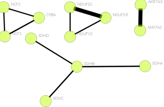
1.8 A sample Human PPI Network portion . . . 8
1.9 Three main categories and children of molecular function listed as a tree. Taken from Execution Wizard. More of the GO Tree can be browsed from AMIGO Browser [21]. . . 10
1.10 Yeast PPI Network [6] . . . 11
2.1 A Screenshot from Cytoscape. . . 13
2.2 A Screenshot from MCODE plugin. . . 13
2.3 A Screenshot from jActiveModules plugin. . . 14
2.4 A Screenshot from GenePro plugin. . . 15
2.5 A Screenshot from BiNGO plugin. . . 16
2.8 A Screenshot from Osprey. . . 19
2.9 A Screenshot from Medusa. . . 20
2.10 A Screenshot from PIVOT. When clicked on IRA1, graph is dynami-cally expanded. . . 21
2.11 Redundancy analysis hypergraph with redundancy scores on edges giv-ing clues about interaction probability. . . 22
2.12 A Screenshot from Polar Mapper. . . 23
3.1 Central View and Peripheral Views around it . . . 26
3.2 Circular Layout example . . . 27
3.3 Sugiyama Style Layout [18] . . . 28
3.4 A Graph in star layout. . . 30
3.5 Waves represent the pulling forces between nodes and stripes represent the pushing forces against nodes [7]. . . 31
3.6 Before and after forces are exerted on the nodes . . . 31
3.7 A Graph with Spring Embedder layout . . . 32
3.8 A Graph with Spring Embedder on Circular Tracks Layout taken from Robinviz . . . 32
3.9 Overview of Robinviz Modules and Features . . . 33
3.10 Data Preparation Flowchart . . . 35
3.11 Execution Wizard Flowchart. (Only important files are specified.) . . 36
3.12 Summary of the Calculation Mechanism . . . 37
3.13 Central Node (top right) is represented with the colors of the corre-sponding peripheral view. . . 42
3.14 1-Hop Neighborhood of the protein EPB41L3 . . . 43
3.15 2-Hop Neighborhood of the protein RAPSN . . . 43
3.16 Heatmap of a sample Gene Expression Matrix . . . 44
3.17 Parallel Plot of a sample Gene Expression Matrix . . . 45
3.18 Proteins associated with chemoattractant activity. Missing edges give clue on false negatives. . . 48
3.19 Co-Expression - Central View PPI Network: Saccharomyces cerevisiae from all experiment types Coloring: Molecular Function Association: Filtered Saccharomyces cerevisiae GEO: Saccharomyces cerevisiae - GSE15352 Biclustering: CC with parameters Number of Bics:50, Max H-Value: 1000, Min Size dim1: 500, Min Size dim2: 5. Node Weights: H-Value with 0.65 edge removal ratio. . . 50
3.20 Co-Ontology Central View - Trusted Association, Untrusted PPI Net-work.
PPI Network: Homo Sapiens from all experiment types Coloring: Molecular Function
Categories: High level molecular function categories Association: Filtered Homo Sapiens
51
3.21 Co-Ontology Central View - Trusted PPI Network, Untrusted Associ-ation.
PPI Network: Homo Sapiens from all experiment types Coloring: Biological Process
Categories: membrane coat, plasma membrane, outer membrane
Association: Filtered Homo Sapiens . . . 52 A.1 Empty Robinviz MainWindow . . . 65 A.2 PreConfiguration Page . . . 66 A.3 In this dialog, you will see a list of organisms and experiment types
under each organism. Please select the PPI Network files you’d like to use here. If you select nothing, the selection in your last execution will be used. . . 68 A.4 In this dialog, you are required to select the verification concept.
Robin-viz shall categorize genes according to their ontology or their co-expression information by looking at this option. . . 68 A.5 Nodes are colored to highlight their high level categories. You are
asked to select which categories you’d like to use for this purpose. Top 10 categories that contain the most genes will be used for coloring. . . 68 A.6 In this part, you are asked to define the what the central nodes
(cate-gories) will be in the central view. Genes will be categorized accord-ing to these categories you select. Note that some categories are in bold. You can double click on those categories to see its sub-category list. Selecting a highlevel category such as “binding” does not include its sub-categories automatically. This is because that the central node “binding” will cover all those sub-categories. . . 69 A.7 In this part, you are asked to select a GO Association source. These
data tell us which gene is in which category. Multiple selection is doable but in this screenshot, only Filtered Homo Sapiens data is used. 69
A.8 If you selected Co-Expression for verification method, you will see some more dialogs such as this one. Here, you are asked to select one Gene Expression Matrix data which will be downloaded from our
servers. This data will be used for biclustering. . . 70
A.9 After GEO Expression Matrix selection, you are asked to select a bi-clustering algorithm and provide its parameters. Each GEO file might require different parameters so you might need to try different param-eters to obtain to optimum biclustering. . . 70
A.10 In this dialog, you are asked to define the method for calculating the central node weights and the ratio of hidden central edges ratio. If you keep this ratio close to 0, almost all the edges will be displayed which may result in cluttered graphs. If you increase this ratio, weaker edges will be eliminated so that only edges representing most reliable interactions will survive. . . 71
A.11 This dialog shows data preparation has been finished and you may now start Robinviz performing calcluations. . . 71
A.12 Co-Ontology results for Homo Sapiens PPI Network and Association data, categorized by molecular functions. . . 71
A.13 Detailed Category Information from AmiGO Browser. . . 72
A.14 Enrichment Analysis for antioxidant activity. . . 72
A.15 Detailed information for protein EBF3 on BioGRID website. . . 74
A.16 Two-hop neighborhood is displayed for protein RAPSN. It has three one-hop neighbors and many other two-hop neighbors. . . 74
A.17 Co-Expression results for Homo Sapiens PPI/Association data with Bi-MAX Algorithm applied on Homo Sapiens GSE1000 GEO data. . . . 75
A.18 Enrichment Table. Biclusters are on the left, highlevel categories are listed on the top. . . 76
A.19 Heatmap representation of a bicluster. Black represents the median, lightest green represents the lowest gene expression value, lightest red represents the highest gene expression value. Dark colors represent values closer to the median. . . 77
A.20 Parallel Plot diagram for a bicluster. y-axis represents the expresison levels whereas x-axis represents the conditions. Each blue line repre-sent a gene’s expression levels. Red line reprerepre-sent the average value for each condition. . . 77
List of Abbreviations
BLAST Basic Local Alignment Search Tool
CC Cheng & Church
DNA Deoxyribonucleic acid
GEO Gene Expression Omnibus
GML Graph Modelling Language
GO Gene Ontology
GPL General Public Licence
GUI Graphical User Interface
mRNA Messenger Ribonucleic acid
PPE Protein-Protein Etkiles¸imi
PPI Protein-Protein Interaction Network
REAL Random Extraction After Localization
RNA Ribonucleic acid
Chapter 1
Introduction
Protein-Protein Interaction Network visualization is a trending topic in Bioinformat-ics. There are several approaches to visualization of large PPI Networks. Some of them prefer to display the whole network at one scene whereas some of them (like ours) use clustered visualizations to display the network consisting of large quantities of node and edges. We think that displaying the whole network is not really useful in terms of readibility. Huang and Eades describes clustered visualization the best: “Groups of related nodes are “clustered” into super-nodes. The user sees a “summary” of the graph: the super-nodes and super-edges between the super-nodes. Some clusters may be shown in more detail than others.” [36]. Most of the approaches apply graph-theoretical clustering on the networks. But we think that biological semantics should be considered in clustering as there are natural interconnections between Gene Expres-sion levels / Gene Annotations and the protein interactions. So we use GO annotations and Gene Expression data to split the graph in to clusters. This is one of the novelties of our work.
In our work, Robinviz, we provide a dual visualization model consisting of cen-tral viewand peripheral views. Central view has nodes representing the clusters and each central node has a corresponding peripheral view (i.e. subgraph). Each periph-eral view has nodes corresponding to proteins and edges corresponding to interactions within this subgraph. The weights of these edges are assigned to the reliability value of the interaction. The edge weights in the central give information about the abundance of reliable cross talks between clusters.
The reliability concept has been used in some works as visual aids but none of them had incorporated the reliability values into the graph layout algorithms and
our contribution is in this place in terms of visualization. Moreover, incorporation of biclustering of gene expression data within PPI visualization model is another novelty we are providing.
Our approach performs a more intuitive way of clustering and improves the read-ibilityof the visualizations. Other feature of Robinviz is that it allows the user to verify the biological datausing one another. For example, trusting the GO Annotation data, a biologist may observe the visuals. She things intuitively that proteins with the same function or that are co-expressed are more likely to interact. The absence of periph-eral edges gives clues about false-negatives as those missing interactions should have existed there and the abundance of cross-talks between clusters gives clue about false-positives as proteins with different function are unlikely to interact. This way, she may study the missing or unexpected interactions in the network more deeply to verify them.
Robinviz is user-friendly with its fully automated data retrieval and processing, preconfigurations for first-time users and simple graphical user interface.
Our work has been published in ISB 2010 conference [13] and Oxford Bioin-formatics journal [12] and it is freely available [8] for download under GPL. In the following sections of this chapter, some preliminary information about Visualization and Bioinformatics is given.
1.1 Visualization
Visualization is a method that converts raw data to visually-understandable forms for humans. With the help of visualization, meaningful information hidden in the crowd of numerical results can be revealed. Patterns, tendencies, and lots of unseen or com-plicated things can be discovered with the visualization methods. If we were to give an example from the real world, it’s like watching the flowers or crops specifically laid out in a pattern from top of a hill and seeing the big picture.
There are several visualization techniques. They can be categorized [9] as below. Data Visualization : Visual representations of quantitative data in schematic for (ei-ther with our without axes). Examples: tables, charts(pie, bar, line), histogram, scatterplot.
Information Visualization : The use of interactive visual representations of data to amplify cognition. This means that the data is transformed into an image, it is mapped to screen space. The image can be changed by users as they proceed working with it. Examples: parallel coordinate, data map, heat map, clustering,
Figure 1.1: Sample undirected graph [1]. Lines represent edges and circles represent nodes. Number on edges are the edge weights. Number on the nodes can represent either node weights or node IDs depending on the definition.
Concept Visualization : Methods to elaborate (mostly) qualitative concepts, ideas, plans and analyses. Examples: mindmap, layer chart, decision tree, graph. Strategy Visualization : The systematic use of complementary visual representations
in the analysis, development, formulation, communication, and implementation of strategies in organizations. Examples: Organization chart, life-cycle diagram, feedback diagram.
Metaphor Visualization : Displays information graphically to organize and structure information. Examples: metro map, iceberg.
Compound Visualization : complementary use of different graphic representation formats in one single schema or frame. Examples: knowledge map, learning map, rich picture.
1.2 Graphs
In representations of both theoretical and practical information, Graphs are commonly used in various fields. A graph models the entities and their relationships [28]. Entities are represented with nodes whereas relationships are represented with edges (connec-tions). Nodes can be drawn in various shapes and edges can be in form of line, curve with or without arrows. At least one node is required to form a graph and one node may be connected to more than one node. Graphs can be directed if direction of the relation is important or undirected otherwise. Cyclic graphs are the directed ones in which we can reach our starting point by navigating through the graph following the directed edges. Both nodes and edges can have weights which may represent the im-portance of the entity or magnitude of the relationship. The number of edges linked to a node defines the degree of that node. See Figure 1.1 for an example.
Figure 1.2: Bioinformatics involves Mathematics, Biological Sciences, Algorithms, Databases and even Machine Learning [2]
1.2.1 Graph Layouts
Graphs are easy to draw on paper when we have only a few nodes/edges. We intuitively place the nodes and the edges that pleases us in an aesthetical way. But when it comes to drawing large graphs, we need to find a systematic way, an aesthetically pleasing drawing style and perform this operation automatically on computer. For this reason, there have been proposed numerous graph layouts. There are several challenges in drawing a pleasant graph such as obtaining minimum number of edge crossings or edge bends. Descriptions and examples for graph layout can be seen in Section 3.2
1.3 Bioinformatics
Bioinformatics is the field where computational techniques are used to analyze and interpret the biological data from various biological sources. Bioinformatics is an in-terdisciplinary field where biology and computational sciences meet (see Figure 1.2). In molecular biology, bulks of data have been generated from the experiments. How-ever these large quantities of data is not only noisy but also have missing data. Other challenge with these data is that it is hard to interpret them by using pure eye. At this point, Bioinformatics helps us remove the noise, interpret the information despite the missing data and visualize the big picture in order to make inferences. Bioinfor-matics is in summary, the application of computer scientific and statistical methods on molecular biology problems such as protein interactions, interaction prediction, in-teraction network alignment between two species, gene expression, drug discovery, protein structure alignment and prediction, sequence alignment, gene finding.
Figure 1.3: DNA is in the helix form with nucleotides on it.[3]
Figure 1.4: Information flow from genes to metabolites in cells, the Gene Expression process [39].
1.3.1 DNA
The information about the nature of organisms is stored in desoxyribonucleic acid (DNA). DNA is a double-helix consisting of two phosphate backbones and nucleotide bases connected to it (see Figure 1.3). Nucleotide bases can be listed with their abbre-viations as adenine (A), cytosine (C), guanine (G), thymine (T) and uracil (U - only in RNA). A and T/U, C and G can be paired when it is required. DNA itself only stores information but in order to sustain the activity of a cell, proteins must be pro-duced. Protein production is done through the gene expression process. See Figure 1.4 for gene expression process and 1.6 for Central Dogma of Molecular Biology. Cen-tral Dogma includes an additional DNA replication phase in which DNA is replicated when the cell is cloning.
1.3.2 Gene Expression
Gene Expression is a two phase process (see Figure 1.4). In the transcription phase messenger ribonucleic acid (mRNA) corresponding to the DNA is produced (see Fig-ure 1.5 for a demonstration). mRNA has complementary nucleic acids (U for A, A for
Figure 1.5: In the transcription phase, complementary mRNA is generated from DNA chain. Then in the translation phase, aminoacids forming the protein is produced ac-cording to this mRNA.[4]
Table 1.1: Format of Gene Expression Matrix
mRNA Condition 1 Condition 2 Condition 3 Condition 4 ...
Gene 1 value11 value12 value13 value14 ...
Gene 2 value21 value22 value23 value24 ...
Gene 3 value31 value32 value33 value34 ...
Gene 4 value41 value42 value43 value44 ...
... ... ... ... ... ...
T, G for C, C for G). Then mRNA is translated to aminoacid sequences by scanning the mRNA with a window size of 3 (triplets - codons). A codon might be in the range AAA - TTT which leads to 43= 64 combinations. These combinations will result in 20 amino acids. Multiple codons might correspond to a single amino acid. With this scan, an amino acid sequence, (i.e. a protein) is generated. Cenral Dogma of Molecular Biology(see Figure 1.6) covers these transcription, translation phases and additionally DNA replication process to show protein lifecycle in the cell.
To quote Eric Lander [41],
“The mRNA levels sensitively reflect the state of the cell, perhaps uniquely defining cell types, stages, and responses. To decipher the logic of gene regulation, we should aim to be able to monitor the expression level of all genes simultaneously ...”
To achieve this, during the gene expression process for each gene, the amount of mRNAs, are measured and recorded at various conditions. These records form a gene expression matrix where rows correspond to genes, columns correspond to conditions such as environmental conditions of interest or time points and cells correspond to the relative amount of mRNA. See Table 1.1 for a demonstration.
1.3.3 Proteins
A protein is a large organic compound consisting of sequences of amino acids (see Figure 1.7 for an amino acid chain). Permutation of the amino acids in the chain define the protein formed and its function. Multiple proteins gathering together or forming a stable complex can perform essential operations inside or outside the cell. Transcription, translation, binding, inhibition, catalization are some examples for these operations.
Figure 1.7: Primary protein structure is sequence of a chain of amino acids. [5]
1.3.4 Protein-Protein Interaction Networks
Proteins rarely act individually but most of the times they collaborate with partner pro-teins for various biological activities. Protein-Protein Interaction (PPI) networks (see Figure 1.8 for an example) are the graph representation of these collaborations. They consist of nodes corresponding to the proteins and edges corresponding to interac-tions. This way, a couple of proteins interacting can be represented as two nodes with an edge between. Proteins might interact with multiple proteins and this is represented as multiple edges towards multiple proteins. A drawback of the PPI Network data and this representation is that they lack information about the conditions of an interaction of interest. But rather they give information about all possible interactions combined. In this representation, understanding whether 2 or more interactions of a protein are occuring at the same time or not is not possible.
1.3.5 Gene Ontology and Association
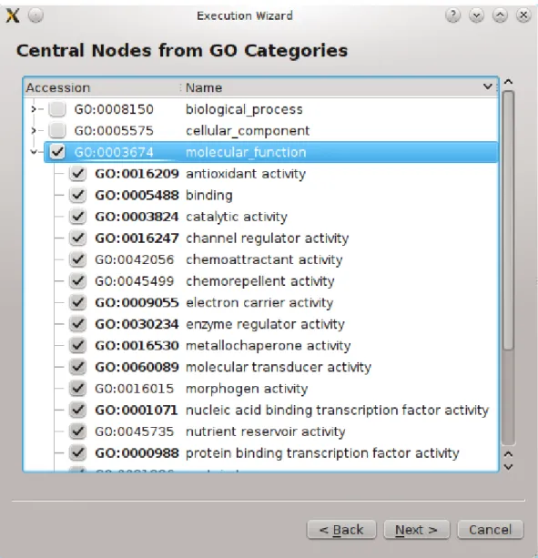
Proteins have different functionalities and their expresser genes need to be categorized according to the functions of the protein. To achieve this goal, there had been several categorizations introduced [62, 24, 16], but each had their own categorization system-atic. Gene Ontology Consortium [14] collaborated with these databases in 1998 and many more afterwards to establish the Gene Ontology Database. In this database, a Gene Ontology (GO) Tree and GO Association information can be obtained.
In the GO Tree, categories with their children are listed. There are three top-level categories: biological process, cellular component and molecular function. There are some number of high-level categories under these 3 top-level categories, and many sub-categories under them forming a tree. One subcategory might be under multiple categories so it can be said that the GO Tree has redundancies. See Figure 1.9 for a portion from the GO Tree in the Execution Wizard.
Besides from the GO Tree, GO Consortium provides information about the gene-category association. In GO Annotation data provided, every gene is listed with the categories it is assigned to. A gene might be in multiple categories and a category might have multiple genes. So there’s a many-to-many relationship between genes and categories.
1.4 Visualization of Protein-Protein Interaction Networks
We have lots of interaction data, thousands of proteins and thousands of interactions. These are not really useful when held as raw data. Drawing the protein interaction network as graphs lets us see the big picture through our eyes. But this crowd of nodes and edges makes the understanding of the network harder. So applying some graph
Figure 1.9: Three main categories and children of molecular function listed as a tree. Taken from Execution Wizard. More of the GO Tree can be browsed from AMIGO Browser [21].
Figure 1.10: Yeast PPI Network [6]
layouts mentioned in 1.2.1 is a requirement. This way, a visually pleasing drawing can be provided to the user to make inferences. With the spring embedder layout, detecting subgraphs (i.e. protein complexes) is much more easier as nodes will be grouped with the force directed simulation.
Nevertheless, with thousands of nodes and edges, it can be hard to make any further analysis in this hairball of nodes (see Figure 1.10). To solve this problem, PPI Networks are partitioned into clusters and each cluster that is smaller than the complete graph can be analyzed more deeply. This clustering is mostly done according to graph theoretical measures. But we prefer to do this partitioning according to Gene Ontology and Gene Expression data.
Chapter 2
Related Work
There are numerous software applications aiming to visualize and analyze protein-protein interaction networks [20, 32, 35, 38, 51, 55, 56, 58]; see [44, 53]. Our work brings some novelties to all of these works but before explaining these novelties, let us give a brief overview about related work.
2.1 Cytoscape
Cytoscape [56, 58], which is a general-purpose visualization tool, allows users to ex-tend the system with plugins for specific purposes. The barebone system allows basic functionalities like drawing a network, computing layout for it, querying it, integrating different bioinformatics sources like expression profiles, molecular states and pheno-types, linking networks to Gene Ontology database and using external web services. Even the core system provides features useful for bioinformatics studies. It can fur-thermore be extended with plugins for bioinformatics, social network analysis and semantic web. Some features coming with the bioinformatics plugins include network inference, network analysis via graph-theoretical properties and functional enrichment analysis of networks. See Figure 2.1 for a screenshot from Cytoscape.
Here are some bioinformatics plugins that are similar to our work Robinviz.
2.1.1 MCODE
MCODE [15] is a plugin with the objective of detecting dense subgraphs in the network using clustering methods according to graph-theoretical measures. See Figure 2.2.
Figure 2.1: A Screenshot from Cytoscape.
Figure 2.3: A Screenshot from jActiveModules plugin. 2.1.2 jActiveModules
jActiveModules [37] detects subgraphs with significant changes in gene expression over some given conditions. This plugin also uses clustering methods for this. See Figure 2.3.
2.1.3 GenePro
GenePro [63] provides clustered visualization. The user defines the clusters of genes and the overlaps or interactions between the clusters are visualized. Spikes represent the gene expression levels and pie charts on the nodes are used to signify the belonging to the same complex. See Figure 2.4.
2.1.4 BiNGO
BiNGO [47] receives an input consisting of genes and finds the over-represented Gene Ontology terms on this set of genes. To achieve this, binomial and hyper-geometric tests are used to give statistical functional enrichment scores. See Figure 2.5.
2.1.5 PiNGO
Similar to BiNGO but providing more flexibility its use of ontologies and annotations, PiNGO [57] can wipe out some genes with certain functional properties obtained from the statistical analysis. See Figure 2.6.
Figure 2.6: A Screenshot from PiNGO plugin.
2.2 Standalone Tools
Various standalone tools with features similar to Cytoscape have been proposed. Below are some of them similar to Robinviz.
2.2.1 ProViz
ProViz [38] uses Tulip library for its visualizations. The tool integrates PPI Networks and GO annotation data. User can define subgraphs by selection, filtering or clustering methods. The tool can automatically organize the visualization into views according to annotations including GO. See Figure 2.7.
2.2.2 Osprey
Osprey [20] uses the protein interactions in BioGRID [59] database and provides vari-ous layout options and node coloring according to GO annotations. The user can filter networks by experimental system or graph-theoretical distances. See Figure 2.8.
Figure 2.8: A Screenshot from Osprey.
2.2.3 Medusa
Medusa [35] uses the protein interaction data from the STRING [26] database. The specialty of this software is that there exists parallel edges with different meanings and the nodes can have background images. The software can also run as a web applet which makes it easier to reach. See Figure 2.9.
2.2.4 PIVOT
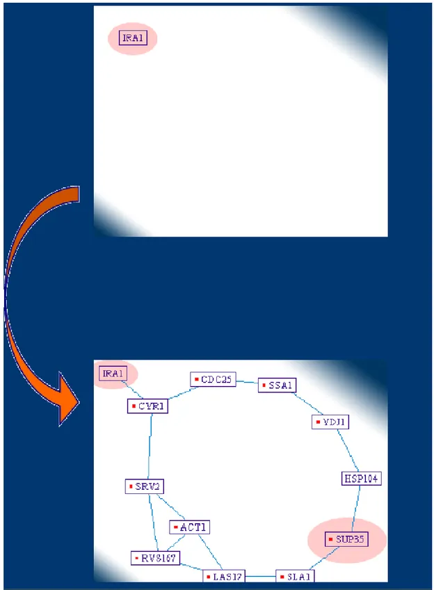
PIVOT [51] gives a flexibility of dynamic layout computations when the user edits the graph. It also can compute shortest graph-theoretical distances between the pro-tein nodes. Node naming can also provide homolog identifiers through the BLAST database. See Figure 2.10.
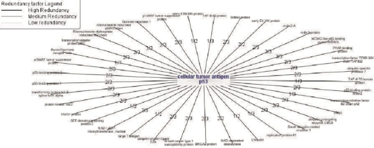
2.2.5 Protopia
Protopia [55] has the feature of integrating multiple databases while removing redun-dancies among them. After the integration, the tools visualizes the results using graph drawing packages such as GraphViz [31]. See Figure 2.11 for a redundancy analysis hypergraph with redundancy scores on the edges. The higher score it is, the higher
Figure 2.10: A Screenshot from PIVOT. When clicked on IRA1, graph is dynamically expanded.
Figure 2.11: Redundancy analysis hypergraph with redundancy scores on edges giving clues about interaction probability.
reliability the interaction has.
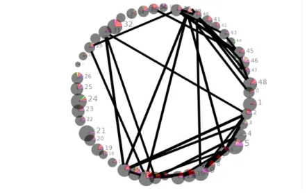
2.2.6 Polar Mapper
Polar Mapper [32] is a similar visualization alternative that is similar to Robinviz in terms of conceptual visualization model. To determine the location of a protein in the visualization layout, radial and angular coordinates are used. To define how far from the center the node will be, betweenness centrality measure is used. The graph is partitioned into modules according to the graph-theoretical measure density and each module has its own angular coordinates calculated. After calculating the coordinates of each module, all the modules are ordered on a circle taking inter-connectivity of module pairs into account. Gene Expression data is provided on the network by as-signing node colors indicating mRNA fold induction relative to conditions. See Figure 2.12.
Chapter 3
Robinviz
Our work, Robinviz, brings several novelties to PPI Network visualization. First nov-elty is the clustering mechanism. Most of the graph drawing tools perform clustering on the graphs according to graph-theoretical measures. However, Robinviz performs clustering using biological semantics such as Gene Ontology or Gene Expression data. Proteins in the network are categorized according to Gene Ontology categories or Gene Expression biclusters. An abstract graph containing these clusters are visualized in the central view and details are provided in the peripheral views. These kind of abstraction is nonexistent within other PPI Network visualization tools. This way, we are provid-ing a dual visualization model. It should be noted that although not in this generality, concepts similar to our dual model have been partly employed in some other tools. For example, filtering mechanisms in ProViz and the Cytoscape plugins BiNGO and PiNGO have such similar concepts.
Proviz can filter the PPI network according to user-selected GO Categories. PiNGO gives an additional feature such as removing genes of a given category to further limit the network.
GenePro plugin of Cytoscape provides a similar clustered visualization model but it does not provide a central/peripheral duality Robinviz has. Although it is claimed that clusters are based on common GO Annotations, tool requires user-defined clusters to be input.
Polarmapper provides a network clustering based on graph-theoretical properties and a special layout algorithm separates each cluster such that they are easily discrimi-nated. Similar separation is also provided in Cytoscape with some special graph layout.
Compared to these related tools, central/peripheral duality of Robinviz is more intuitive and general in terms of clustered visualization and improves the usability. Cross talks can be seen more clearly in the abstract graph and each cluster can be examined in detail independently.
Second important novelty of Robinviz is that it takes interaction reliabilities into account when performing graph layout algorithms. Some tools [20, 35] except from Cytoscape do not provide this feature but just give visual clues such as edge thick-ness to inform the user about interaction reliabilities. Cytoscape, on the other hand, achieves this functionality only for force-directed layout algorithms. Other layouts in Cytoscape are applied via yFiles library. Robinviz, on the other hand, employs in-teraction weights in many graph layout algorithms such as Force Directed, Sugiyama Style, Circular, Star, Spring Embedder, Circular Tracks. To achieve this, nontrivial modifications had to be carried out for each of these paradigms. Regarding Sugiyama Style hierarchical layouts, edge-lengths, edge bends, edge-crossings should be care-fully handled in favor of heavy-weight edges. For example, heavy-weight edges are expected to be shorter with fewer edge bends and crossings whereas low-weight edges aren’t given such special consideration.
Third important novelty of Robinviz is the clustering based on biclustered gene expression data. Expression analysis is implemented through biclustering of the Gene Expression Matrix. Biclustering is seen as one of the most popular methods in the gene expression matrix analysis field; see [45] for a detailed definition and a nice survey on the topic. No other PPI visualization system uses biclustering and incorporate the results in the visualization. In Cytoscape and Polar Mapper, Gene Expression data is used as visual clues such as node colors.
Robinviz uses three popular biclustering algorithms and preference to use one and parameters of the chosen algorithm is defined by the user. Gene Expression data is also chosen by the user which increases the flexibility of the system. The outputs of the algorithm defines the nodes in the central graph and contents of the biclusters are displayed in the peripheral views on demand. Robinviz also provides detailed analysis of the biclusters in terms of enrichment ratios based on high-level GO categories, H-value, p-H-value, PPI hit ratios. This analysis can be extended with heatmap and parallel plotvisualizations.
Although the main purpose of Robinviz is visualization, our tool can be used for bicluster analysis with the statistical methods it employs. All the statistical measures we used except for the H-Value are employed to grouping based on GO Categories.
Figure 3.1: Central View and Peripheral Views around it
3.1 Visualization Model
Robinviz has a dual visualization model in the form of Central and Peripheral Views. Central View contains nodes representing clusters of proteins and each central node has a corresponding peripheral view. In each peripheral view, nodes representing the proteins and edges representing the interactions exist. The edges between the central nodes represent the reliable cross-talks between the proteins of clusters. With this way, PPI Network is meaningfully partitioned into clusters for a better observation. See Figure 3.1. User can double click on a central node to display its contents in an available peripheral view.
3.2 Graph Layouts
3.2.1 Circular Layout
In the circular layout, nodes are distributed around a circle. To achieve a non-overlapping drawing, diameter of the circle and the order of the nodes should be defined properly via calculations. Aim is to draw the smallest circle with minimum number of edge crossings. We have modified this algorithm and minimized the total weights of the crossing edges. See Figure 3.2 for an example from Robinviz.
3.2.2 Sugiyama Style
In the Sugiyama Style (i.e. Hierarchical/Layered) Layout, nodes are distributed among k-levels/layers(see Figure 3.3). There are some constraints defined by the user such as
Figure 3.2: Circular Layout example
number of nodes in a layer, number of layers, minimum horizontal distance between nodes, minimum vertical distance between levels.
The Sugiyama algorithm [60] has four phases:
1. Cycle Removal: Cycles are eliminated by reversing minimum number of edges if the graph is directed.
2. Layer Assignment: Nodes are assigned to layers under some constraints like maximum layer length or number of layers.
3. Crossing Reduction: Number of edge crossings is decreased as much as possi-ble by changing the order of the nodes in the same level.
4. Coordinate Assignment: Horizontal Coordinates are calculated to produce a nice-looking graph without too many edge bends. Minimum separation con-straint is satisfied to avoid untraceable edges.
These major steps require modifications taking into account edge weights; cycle removal, layer assignment, ordering within layers and y-coordinate assignment. In the unweighted settings the goal of the first step is to reverse the smallest subset of edges to obtain an acyclic graph. For the weighted version we propose to reverse the subset of edges with minimum total weight. This way the major flow in the output drawing is preserved in favor of heavier edges (ones with higher reliability score or ones that connect important proteins). Demetrescu et al. provide a two phase algorithm for the weighted feedback arc set (FAS) problem [27], which is exactly what we require of this first step. A minimum weight edge in a cycle is found and its weight is decremented from the weights of all edges in the cycle. Then all edges with zero weight are removed and this process is repeated until no cycle exists. It is guaranteed that this initial phase
produces a result within a ratio bounded by the length of the longest cycle in the graph from the optimum. In the second phase, reversed edges are examined and re-reversed if no cycles are introduced. We modify this examination to be performed on the edges sorted in decreasing weights to achieve minimality first with heavier edges. For the second major step each vertex is assigned to one of k parallel layers. Usual optimiza-tion goals of the unweighted version include minimizing the height or the width of the drawing, or the total length of the edges. We employ a layering algorithm that is based on Coffman-Graham algorithm of [25] and the longest path with promotion heuristic of [50]. Our modifications are towards minimizing total weighted edge lengths while providing a compact drawing area. We perform a lexicographical ordering π(v) on the vertices of the graph based on the distance to a source vertex with indegree zero. Then we pick a new vertex with maximum π(v) and assign it to a layer, starting from the bottom. When v is assigned to a layer and outdeg(v) is zero, the source vertices of incoming edges of v are appended to a waiting list. If more than one candidate vertex available for the waitlist, one whose outgoing edges’ weight sum is the maximum is chosen. To reduce the height of the drawing, we use a promotion heuristic. Going through the set of vertices in no specific order, the gain of moving the vertex v to the upper layer is examined. This may require recursive promotion of u, if u is on the one upper layer of v. If a promotion decreases the total weighted edge lengths and satisfies a given maximum width, promotion is realized. This examination process is repeated until no promotion can be realized. Our last major step involves ordering the vertices in each layer.
In the unweighted settings the goal is to minimize the number of edge crossings between consecutive layers. A crossing minimization heuristic for one-layer-fixed bi-partite drawings is employed while sweeping up and down the consecutive layers. We use the same sweeping strategy but with a carefully chosen crossing minimization al-gorithm which aims at minimizing weighted crossings between consecutive layers and guarantees a 3-approximation for the problem [22]. We finally employ the method of [17] without any modification to achieve an x-coordinate assignment of the vertices while preserving the ordering achieved in the previous step and an y-coordinate as-signment such that the distance between levels should be proportional to the total edge weights between these two levels.
3.2.3 Star Style
In the star style, the node with the highest degree is positioned in the center of the drawing and other nodes are distributed around it so as to form a circle. See Figure 3.4 for an example.
Figure 3.4: A Graph in star layout. 3.2.4 Force-Based Algorithms
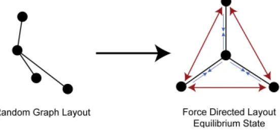
Force-based algorithms is a simulation of Hooke’s Law on edges and Coulomb’s law on nodes. Nodes are electrically charged masses which push each other and edges are springs that pull the nodes at each end (see Figure 3.5). The algorithm works in itera-tions and at each iteration, push and pull forces are calculated for every node. Nodes are moved for a distance proportional to the calculated forces and a predefined step size (see Figure 3.6). After several iterations, the system reaches a balance and the al-gorithm stops. The balance should be defined with a threshold for the net force exerted on the system. When the net force on the system is less than the given threshold, it is assumed to be in balance. See Figure 3.7 for a resulting graph. Spring Embedder is one of the popular Force-Based Algorithms.
Hooke’s Law: F = −kx where k is the spring constant and x is the distance spring is streched when force F is applied on the spring. The negative sign indicates that direction of movement is opposite to the direction of the force exerted on the spring.
Coulomb’s Law: F = keq1rq22 where keis proportionality constant, q1and q2 are the amounts of electrostatical charge for two particles and r is the distance between them.
In the unweighted settings a force-directed layout algorithm applies a suitable combination of attractive forces (between pairs of adjacent vertices) and repulsive forces (between every pair) iteratively until the energy of the system determined by the defined force formulations and the current layout attains a desirably stable level.
Figure 3.5: Waves represent the pulling forces between nodes and stripes represent the pushing forces against nodes [7].
Figure 3.6: Before and after forces are exerted on the nodes
vertices are located in close proximity. We modify the algorithm of [40] by introducing the edge weights to the employed force formulations so that the individual attractive forces are proportional to the assigned weights. Such a modification brings adjacent vertices connected via heavier edges in closer proximity.
3.2.5 Spring Embedder on Circular Tracks
For aesthetically pleasing layouts it may sometimes be useful to limit the vertex co-ordinates to some predefined tracks with regular geometries. We extend the utility of the weighted force-directed drawing method to such layouts where circular tracks constitute the choice of embedding space as the biologists are inclined to such visual output for historical reasons. This is achieved by first running the described weighted modification of the force-directed method. Working on this layout, the vertex posi-tions are moved to concentric circular tracks with as little change to the original layout as possible. We find the center of the layout and start growing a track (circle in this case) from the center until the number of vertices inside the track reaches its
poten-Figure 3.7: A Graph with Spring Embedder layout
Figure 3.8: A Graph with Spring Embedder on Circular Tracks Layout taken from Robinviz
Figure 3.9: Overview of Robinviz Modules and Features
tial, an integer proportional to the circumference of the track. Vertices inside the track are then placed at the closest open spot on the track. Concentric tracks are iteratively grown until all the vertices are placed on suitable tracks not too far from their original locations computed by the weighted force-directed layout method. See Figure 3.8 for an example.
3.3 Software Architecture and Operation
Architecture of Robinviz can be summarized through four major branches: Data Sources we use, preparation of data sources via Execution Wizard, Processing the data and dis-playing the results. A mindmap of these branches can be seen in Figure 3.9.
The workflow of Robinviz is as follows.
1. Execution Wizard is run and user preferences are taken. 2. Required data sources are acquired.
3. Acquired data sources are formatted and integrated, prepared for computation input.
4. Given the prepared inputs, computation (clustering and applying layouts) is run. The results are written to the disk.
5. Results are displayed through Visualization module (Graphical User Interface -GUI).
3.3.1 Data Processing
We have 5 data sources: Gene Identifiers, GO Tree, Gene Annotations, PPI Net-work (from BioGRID and Hitpredict), Gene Expression Omnibus. We integrate these sources according to user’s needs. See Figure 3.10 for data processing diagram and see Figure 3.11 for data preparation for each run according to user preferences.
Identifier Database
Our data sources have different annotations (i.e. gene namings) so in order to inte-grate these data sources, we had to translate all the sources to a common naming. We chose Official Symbol as our default naming system. For the translation, we used Bi-oGRID Gene Identifiers file. We filtered the contents of this huge file and indexed it for a quicker use. The generated SQLite3 file of size 1GB is used through gene query module by the data processing system. The generation of this huge index file is done by us (via identifier db generator.py) and uploaded on our servers to avoid the long generation process by the users.
GO Tree Selection
Gene Ontology website provides GO Tree in XML format. We download go daily-termdb.rdf.xml file, parse it and generate the GO Tree index file goinfo.sqlite3 via ter-mdbparser.py script. User selects GO Categories from the GO Tree provided and GO annotations ( category - gene associations ) are filtered according to these selections.
PPI Generation
We combine PPI Network data from BioGRID and Hitpredict and translate their pro-tein names to Official Symbol. Interactions in Hitpredict contain reliability scores whereas ones in BioGRID do not. So what we do is assigning 0.1 score to BioGRID interactions and normalizing Hitpredict scores between 0.2 and 1.0. This way, in-teractions with known confidence values are given more importance. The translation operations are performed via Data Manager. In the first run of Robinviz, Data Man-ager will show up, ask for downloading required sources and translate them to Official Symbol. Then, in the PPI Network Selection step of the Execution Wizard, the selected PPI Sources are integrated to one single PPI Network and assigned scores. User can select multiple PPI Networks from various organisms and experiment types. What’s more, interactions from BioGRID are represented with gray edges whereas other are represented with black edges for easy discrimination.
Association Data Generation
There are various Gene Annotation sources for different organisms or set of organisms. We let user select the sources she wants and integrate the selected ones. We perform parsing, filtering and merging on these sources. The original Gene Annotation source has one gene-category matching at a line. We convert this format to the format below:
Category 1: gene1, gene2, gene3, ... Category 2: gene49, gene56, gene105, ... ...
After formatting the data, we perform naming conversion to each individual file. Each source might have a different naming system so we developed an automatic nam-ing detection system to intelligently detect the naming used in a file and convert it to Official Symbol. The translated files are saved as files and we call them Association Data as they give information about Category-Gene associations. One gene might belong to more than one category and one category might have multiple genes. As-sociation Data is generated once for each Gene Annotation source. In the following runs, the already converted Association Data is used. Moreover, according to user preferences, the generated Association Data files are merged, producing go.txt. This file contains all the categories available. As we are interested in the categories the user selected in the GO Tree, we perform a filtering on this go.txt and produce go slim.txt. This operation is done through the wizard and may take a while .
GEO Data Generation
Gene Expression Matrices are obtained from Gene Expression Omnibus (GEO), re-formatted and translated into Official Symbol. Then we upload these files to our server. In the GEO Selection step of the Execution Wizard, the preferred GEO data will be downloaded and used without any further processing needed.
3.3.2 Graphical User Interface Main Window
When the user starts Robinviz, the Main Window will be displayed. This window contains a central view in the middle with peripheral views around, a search panel in the right (when at least one computation performed), three main menus named File, View and Help. In the File Menu, you can execute Execution wizard which will initiate the process of computing after user preferences are taken.
Execution Wizard
Execution Wizard can be run through File Menu and will ask for user preferences about data sources, algorithms and their parameters. If any of the data sources are missing, Data Manager will show up and ask for downloading required sources by pressing the download button(s). After all the preferences are taken, computations will start and user will be asked to wait for a while until the process finishes. With the finish of the computations, the resulting graphs will be displayed in the views.
Views
After the computations finish, central graph will be displayed in the central view and the peripheral views will be empty. User can double click on a node (cluster) to display its corresponding peripheral graph in an available peripheral view. Then any of the peripheral views can be displayed in a bigger new window through the view’s right-click menu.
3.3.3 Computation
Biclustering on Gene Expression Matrix
There are various techniques to analyze gene expression data to extract useful informa-tion from this bulk of values [19, 30]. Biclustering is a popular one of these techniques with several variations [10, 11, 29, 33, 42, 43, 48, 49, 52, 61]. See [54] for a survey on topic. Biclustering extracts submatrices from a matrix such that each submatrix shows significant correlation across both columns and rows. Its first appearance was attributed to Hartigan under name of direct clustering [34]. Years later, biclustering technique was applied for gene expression analysis by Cheng and Church [23] and after that many other methods appeared [46]. With these methods, genes that are co-expressed can be detected and this can yield valuable information about the nature of the proteins produced from these genes.
In Robinviz, we employ three biclustering algorithms (Cheng & Church, Bi-MAX, REAL) on Gene Expression data according to user’s preference. All of these algorithms have different parameters that are provided by the user. As a result, sev-eral biclusters which might be overlapping are produced. The genes in the biclusters are expected to produce proteins that will likely interact with each other and all these proteins can be said to be co-expressed. All biclusters contain genes but for the sake of simplicity, we can assume that these biclusters contain the proteins that these genes produce.
Clustering the PPI Network
We have a large PPI Network and would like to partition it into clusters. We have two concept options for partitioning: Co-Expression and Co-Ontology.
If Co-Expression is selected, Gene Expression Matrix of choice is biclustered and each bicluster is represented as a central node in the central view. The peripheral view corresponding to that central node will contain the intersection of proteins (i.e. genes) in the bicluster and the proteins in the PPI Network.
If Co-Ontology is selected, the chosen categories are represented as central nodes in the central view. The peripheral view corresponding to that central node will con-tain the intersection of proteins associated with that category and the proteins in the PPI Network. The list of proteins corresponding to a category is obtained from the association datagenerated from Gene Ontology Annotations.
After these, the interactions between these set of proteins in the cluster are repre-sented as edges between these nodes. Note that only the interactions within this set of nodes will be represented. The edge and node weights are then calculated as follows: Peripheral View: Peripheral nodes (proteins) do not have weights and peripheral edges
(interactions) have weights proportional to the interaction reliabilities.
Central View: Determining the contents of each peripheral view, weights of the edges in the central view will be calculated by counting the sum of reliabilities of cross-talks between central nodes. Let c1 and c2 be two central nodes, wc(c1, c2) be
the weight of central edge between c1 and c2, wp(p1, p2) be the weight of the
peripheral edge between p1and p2. Then the central edge weight between these
two nodes will be wc(c1, c2) = ∑u,vwp(u, v), where u ∈ c1and v ∈ c2.
If the user has chosen Co-Ontology as the partitioning concept, weight of a cen-tral node is defined as the PPI Hit ratio, a combined measure of the size of the related peripheral graph and the density of high reliability interactions in it. If the concept is defined as Co-Expression, then user is provided some alternative measures such as H-valueand functional enrichment values – common measures of biclustering corre-lation.
In a submatrix bicluster AIxJ with I rows and J columns, the residue R of a cell
at ith row and the jth column can be calculated as
RI,J(i, j) = ai, j− aI j− aiJ+ aIJ,
be calculated as
H(I, J) = 1
|I||J|
∑
i, j(RI,J(i, j)2).
According to this definition, the lower h-value is, the more correlated the bicluster is. Taking this into account, our node weights are assigned inverse-proportional to H-Value. More correlated biclusters have higher weights.
With such visualization model, the weight of the central edges represent the weighted sum of possible false-positive interactions according to the trusted verifi-cation data (Gene Expression or GO Annotations in this case). Similarly, each discon-nected pair of nodes give clues about possible false-negative interactions as proteins in a cluster are more likely to interact. This way, a biologist can verify PPI Network according to trusted Gene Expression or GO Annotation data.
On the other hand, this verification can be viewed from the reverse direction. A biologist can verify Gene Expression or GO Annotation data according to trusted PPI Network data.
Layout Computations
After the central view and the peripheral views are determined, graph layouts are com-puted for each view (i.e. graph). The decision for the layout algorithm depends on the structure of the graph. If there are no edges, circular layout is used. Otherwise, spring embedder is the method of choice. We should note that the modified versions of these algorithms are employed. The results of the calculations are written to graph files in GML (Graph Modelling Language) format for future use. With the modifi-cations applied on the layout algorithms, we obtained graphs in which neighborhood of a heavy-weight node is not too cluttered, heavy-weight edges are not too long, and crossings between heavy-weight edges are avoided.
3.4 Features 3.4.1 Visual Aids
Robinviz provides node coloring to enhance understanding of the meanings of the visuals. User is asked to choose among the three main categories: biological process, molecular function, cellular compartments or a combination of the three. The top 10 enriched (represented with the highest number of proteins) high-level GO Categories are assigned colors. Then each peripheral node representing a protein is displayed as a piechart with the colors representing the highlevel categories preferred. If the protein is associated with a high-level category that is not as popular as the ones in top 10, its pie will contain a slice with a specific color representing ’Not popular’. If the protein
Figure 3.13: Central Node (top right) is represented with the colors of the correspond-ing peripheral view.
is not associated to any of the high level categories, then it is colored gray, representing ’Unknown’.
In the central view, central nodes are also drawn as piecharts. The colors in the piechart will be the colors of the nodes in the corresponding peripheral view. In Figure 3.13, the central node (mounted in the top right of the image) gets the two colors of the corresponding peripheral graph.
Another visual aid is selection and hover focus. When the user hovers over a node, node is highlighted. When she clicks on it, a dotted square covers the node indicating the selection. One other interesting feature is the layout animation. User can change the layout of a view from the right-click menu and the change of the layout will be presented through an animation.
Moreover, interaction reliabilities are represented with edge thickness. The thicker an edge is, the more probable the interaction is.
3.4.2 Other Visualizations
Figure 3.14: 1-Hop Neighborhood of the protein EPB41L3
Figure 3.16: Heatmap of a sample Gene Expression Matrix
subgraph. For this reason, we are providing 1-hop and 2-hop neighborhood displaying feature accessible through the right-click menu. This way, interactions of a specific protein in the whole PPI Network can be visualized. Circular layout is used for this purpose and coloring is still employed. See Figures 3.14 and 3.15 for sample screen-shots.
If the user has opted the Co-Expression concept, Heatmap and Parallel Plots of Gene Expression Matrix are generated. These visuals are available through the right-click menu of the central nodes. See Figure 3.16 and 3.17 for samples.
Figure 3.17: Parallel Plot of a sample Gene Expression Matrix
3.4.3 Analysis Information
Apart from visualization, Robinviz provides some analysis results. Each central node has an Enrichment Analysis Report when right clicked on it. In this report (see Table 3.1 for an example), Enrichment ratios based on high-level GO categories (node distri-bution among high level molecular function categories with their ratios with respect to cluster gene space) and Bonferroni corrected p-values are given. Moreover, Proteins in this cluster are listed categorized by their high-level categories.
Robinviz can also provide online information about proteins and GO Categories. When a peripheral node (protein) is right clicked, Detailed Information (Online) option will open a new window and navigate to BioGRID website to display more information about the protein. This information includes interactors, GO categories the protein is associated with, functions, external database linkouts, experiment types, interaction types.
When a central node representing a GO Category is right clicked, Detailed Infor-mation (Online) option will open a new window and navigate to AmiGO Browser. In this page, definition, synonyms, ontology, accession, subset, community and child/parent information are available.
3.4.4 Miscellaneous
There are some other features such as search panel, session save/load mechanism and preconfigurations.
Table 3.1: Enrichment Analysis for a bicluster Categories Number of Genes Ratio Respect to GO or Bicluster Gene Space P-values antioxidant activity 2 0.100000 0.217713 binding 3 0.150000 0.291335 catalytic activity 6 0.300000 0.190744
channel regulator activity 0 0.000000 0.440096
chemoattractant activity 0 0.000000 0.540911
chemorepellent activity 0 0.000000 0.714925
electron carrier activity 1 0.050000 0.395625
enzyme regulator activity 1 0.050000 0.381637
metallochaperone activity 1 0.050000 0.313254
molecular transducer activity 0 0.000000 0.900289
nutrient reservoir activity 0 0.000000 0.772684
protein binding transcription factor activity
0 0.000000 0.232152
protein tag 0 0.000000 0.462688
sequence-specific DNA bind-ing transcription factor activ-ity
1 0.050000 0.304754
structural molecule activity 1 0.050000 0.398044
transcription regulator activ-ity
2 0.100000 0.242301
translation regulator activity 0 0.000000 0.873416
Search Panel lists the proteins/clusters and allows quickly locating a protein/cluster in a view including peripheral view, neighborhood view and even central view. In a perpipheral view, user can type the complete or partial name of the protein she’s look-ing for and press enter to locate the protein. While typlook-ing the name, the protein name list will be filtered to fit the search query. When a protein name is selected from the list, the protein node will be highlighted with a yellow circle. In a central view, user can search for Bicluster or Category name or a protein name. If user chooses to search for a protein, then the Biclusters/Categories containing that protein will be listed. When double clicked on any Bicluster/Category in the list will display the details of it in a peripheral view.
Robinviz also provides session save/load feature which allows saving a snapshot of an execution for future analysis. One other feature is preconfigured settings. In the execution wizard, user is expected to give lots of preferences if she’s chosen to move on with Manual Settings. This may be confusing for a first-time user. So we prepared some pre-defined settings to avoid this. User can choose one setting pack and run the execution without any preference to give.
Figure 3.18: Proteins associated with chemoattractant activity. Missing edges give clue on false negatives.
3.5 Case Study
3.5.1 Introduction
We would like to introduce a sample run of Robinviz to show main features of our visu-alization model and how we use the results for PPI Network visuvisu-alization and analysis. Details regarding other features can be discovered in A. Our dual central/peripheral vi-sualization model provides global, abstract view via central view and details of the ab-straction in the peripheral views. Construction of the abstract graph is performed using biological data such as GO annotations and biclustered gene expression data. Depend-ing on the trustworthiness of biclusterDepend-ing or annotation data, possible false positives and false negatives can be observed. There are two main concepts for partitioning the PPI Network: Co-Ontology and Co-Expression. We will provide a quick tour for each one.
We start with opening the File Menu and running the Execution Wizard. If any major data source is missing, Data Manager is shown and user is asked to download the required data. We click on the download arrow buttons for the ones that are red and wait for the download. Then we go on with Manual Settings and click Next button.
3.5.2 Co-Ontology
In the following dialog, PPI Network sources are listed each categorized by species and experiment type. Considering the fact that we can select multiple sources, we check the box next to Homo Sapiens and select all PPI Network sources for human. After clicking Next button, Robinviz merges the specified networks into one ppi.txt file by combining BioGRID and Hitpredict files. This may take some time depending on the size of the PPI source selected.
We continue with the Verification Concept selection page. We choose Co-Ontology to apply partitioning according to Gene Ontology annotations and click on Next but-ton. Then we are asked to choose a node coloring mechanism. If we select Biological
![Figure 1.2: Bioinformatics involves Mathematics, Biological Sciences, Algorithms, Databases and even Machine Learning [2]](https://thumb-eu.123doks.com/thumbv2/9libnet/4351310.72431/19.892.384.570.124.340/bioinformatics-involves-mathematics-biological-sciences-algorithms-databases-learning.webp)
![Figure 1.4: Information flow from genes to metabolites in cells, the Gene Expression process [39].](https://thumb-eu.123doks.com/thumbv2/9libnet/4351310.72431/20.892.370.588.484.602/figure-information-genes-metabolites-cells-gene-expression-process.webp)