RESONANT FIELD:
A CRITICAL ANALYSIS OF USER INTERFACE DESIGN
IN DIGITAL MEDIA
A Master’s Thesis
by
ERHAN TUNALI
Department of Communication and Design İhsan Doğramacı Bilkent University
Ankara June 2016
RESONANT FIELD:
A CRITICAL ANALYSIS OF USER INTERFACE DESIGN IN DIGITAL MEDIA
The Graduate School of Economics and Social Sciences of
İhsan Doğramacı Bilkent University by
ERHAN TUNALI
In Partial Fulfillment of the Requirements for the Degree of MASTER OF FINE ARTS
THE DEPARTMENT OF COMMUNICATION AND DESIGN İHSAN DOĞRAMACI BİLKENT UNIVERSITY
ANKARA June 2016
I certify that I have read this thesis and have found that it is fully adequate, in scope and in quality, as a thesis for the degree of Master of Fine Arts in Media and Design.
_____________________________________ Assist. Prof. Andreas TRESKE
Supervisor
I certify that I have read this thesis and have found that it is fully adequate, in scope and in quality, as a thesis for the degree of Master of Fine Arts in Media and Design.
_____________________________________ Assist. Prof. Dr. Ersan OCAK
Examining Committee Member
I certify that I have read this thesis and have found that it is fully adequate, in scope and in quality, as a thesis for the degree of Master of Fine Arts in Media and Design.
_____________________________________ Assist. Prof. Dr. Umut ŞUMNU
Examining Committee Member
Approval of the Institute of Economics and Social Sciences
_____________________________________ Prof. Dr. Halime DEMİRKAN
ABSTRACT
RESONANT FIELD:
A CRITICAL ANALYSIS OF USER INTERFACE DESIGN IN DIGITAL MEDIA
Tunalı, Erhan
M.F.A, Department of Communication and Design Supervisor: Assist. Prof. Andreas Treske
June 2016
This thesis analyzes user interface design process in digital media. New methodologies, new perceptions, new approaches and new technologies help unfolding new understandings within this paradigm. Within the shifting nature and definition of art and design, a work has become something that gains value and importance as the audience of such works are transformed into users or participants. The core of this thesis is on the user experience through the interaction of the user/participant with the interface designed by the artist/designer. It probes into the levels of interaction and user interface design through analysis of works from the domain and a designed interactive installation.
Keywords: Digital Media, Installation, Interaction, Resonance, User Experience Design, User Interface Design
ÖZET
TINLAYAN ALAN:
DİJİTAL MEDYADA, KULLANICI ARAYÜZ TASARIMININ ELEŞTİREL BİR ANALİZİ
Tunalı, Erhan
M.F.A, İletişim ve Tasarım Bölümü Tez Yöneticisi: Yard. Doç. Andreas Treske
Haziran 2016
Bu tez, digital medyadaki kullanıcı arayüz tasarımını analiz eder. Yeni metodolojiler, algılar, yaklaşımlar ve yeni teknolojiler bu paradigmayı daha iyi anlamamızı sağlar. Sanat ve tasarımın değişen doğası ve tanımı içerisinde, bu tarz işler, izleyiciyiciyi kullanıcıya veya tasarımcıya çevirerek değer ve anlam kazanır. Bu tezin odağı, kullanıcının/katılımcının sanatçı/tasarımcı tarafından tasarlanan arayüz ile etkileşiminden doğan kullanıcı deneyimini üzerinedir. Alanda üretilmiş işler ve tasarlanmış etkileşimli yerleştirme analizi üzerinden etkileşim katmanları ve arayüz tasarımını inceler.
Anahtar Kelimeler: Dijital Medya, Etkileşim, Kullanıcı Arayüz Tasarımı, Kullanıcı Deneyimi Tasarımı, Rezonans, Yerleştirme
ACKNOWLEDGMENTS
First of all, I would like to express my gratitude to my project and thesis supervisor Assist. Prof. Andreas Treske for his support, patience, motivation and guidance. His knowledge made this research possible.
Also, I am pleased to have Assist. Prof. Dr. Ersan Ocak and Assist. Prof. Dr. Umut Şumnu as the valuable members of my examining committee. This study would not be possible without their insightful comments and guidance.
I would like to thank my dear mother Seçil Tunalı and my sisters Esin Tunalı and Elif Tunali Nikoglou for their support and spiritual guidance. I thank my parents in law, Işık Şenova and İlhan Şenova. I thank Başak Şenova Muratoğlu, Maya Muratoğlu and Erhan Muratoğlu. I should thank Bora Özbaşar, Batuhan Özbaşar and Oğuz Akın for their support.
Finally, I would like to thank my lovely wife Funda Şenova Tunalı, who supported me and was always there whenever I needed her. She gave me the will power and courage to pursue an MFA degree. Most of all I would like to thank my wonderful son Eren Tunalı, without whom I wouldn’t dare to accomplish this task.
TABLE OF CONTENTS
ABSTRACT ...iii
ÖZET ...iv
ACKNOWLEDGMENTS ...v
TABLE OF CONTENTS ...vi
LIST OF FIGURES ...viii
CHAPTER 1. INTRODUCTION ...1
CHAPTER 2. USER INTERACTION AND INTERFACE DESIGN IN DIGITAL MEDIA ...5
2.1. The Software Culture and Its effects on User Interaction and Interface Design in Digital Media ...5
2.2. User Interaction Design ...18
2.3. User Interface Design ...22
CHAPTER 3. OSCILLATION, RESONANCE, AND THE CHANCE FACTOR ...36
3.1. Oscillation and Resonance ...36
CHAPTER 4. THE PLAY ELEMENT ...48
4.1 The Play Concept ...48
4.2. Flow, Flowers, Journey ...54
CHAPTER 5. RESONANT FIELD ...59
5.1. The Project ...59
5.2. Elements, Technology, Implementation ...60
5.3. Analysis ...75
CHAPTER 6. CONCLUSION ...87
LIST OF FIGURES
1. Labyrinth: An Interactive Catalogue, Software, 1971. ...8
2. Web 2.0: last.fm, 2009 ...11
3. A Skeuomorphic Calendar Apple iPad Platform ...26
4. Modern UI ...28
5. Flat UI ...29
6. Material Design ...31
7. Interference Pool, by Annica Cuppetelli and Cristobal, 2014 ...33
8. ClinK, by Markus Schuricht, Paul Schengber and Felix Deufel, 2015 ...34
9. 3 Standard Stoppages, by Marcel Duchamp, 1913-14 | MoMA. ...44
10. Network of Stoppages, by Marcel Duchamp, Paris 1914 | MoMA. ...45
11. 4′33″, by John Cage (1952), A performance by William Marx, 2010 ...47
12. Polyphonic Playground, by Studio PSK, 2016 ...53
13. Flow, by thatgamecompany, 2007, Video Game Screenshot ...56
14. Flower, by thatgamecompany, 2009, Video Game Screenshot ...57
15. Journey, by thatgamecompany, 2012, Video Game Screenshot ...58
16. Resonant Filed, by Erhan Tunalı, 2016, Synthesiser Patch ...64 17. Resonant Field, by Erhan Tunalı, 2016, Arduino Serial Port Patch For Max MSP 66 ..
18. Resonant Field, by Erhan Tunalı, 2016, Arduino Serial Port Code ...66
19. Max MSP Matrix Visual Example ...67
20. Resonant Field, by Erhan Tunalı, 2016, Web Camera Matrix Data Sample ...68
21. Resonant Field, by Erhan Tunalı, 2016, Web Camera Streaming Patch ...69
22. Resonant Field, by Erhan Tunalı, 2016, OpenGL Patch ...70
23. Touch Board ...72
24. Sensor on Wooden Plate ...73
25. Resonant Field, by Erhan Tunalı, 2016, Installation ...75
26. Resonant Field, by Erhan Tunalı, 2016, Tingling Motion ...83
27. Resonant Field, by Erhan Tunalı, 2016, Audio Reaction ...84
CHAPTER 1
INTRODUCTION
My professional engagement in the field of visual design as a graphic designer, an art director, a UX (user experience) and UI (user interface) designer and as a creative director showed me that whether the product is for print media or digital media,
everything that was designed actually is an interface for a specified target audience or a group of users to access a particular content. Hence, the core theme of this thesis is “user experience design”. “User experience” is a phrase that was first used by Donald Norman (in 1998), in the field of human centred design, to “cover all aspects of the person’s experience with the system including industrial design graphics, the interface, the physical interaction and the manual” (as cited in Merholz, 2007, para. 2, Retrieved from http://adaptivepath.org/ideas/e000862).
The thesis project Resonant Field depends on the critical analysis of user experience design in Digital Media. The research question is “How and to what extend the UX and UI designs effect the experience acquired by the digital media user?”
The definition of Art is shifting continuously, it has an ever changing nature. New methodologies, new perceptions, new approaches and new technologies help unfolding new understandings within this paradigm. Within the shifting nature and definition of art and design, a work has become something that gains value and importance as the audience of such works are transformed into users or participants. As suggested, the core of the thesis project is on the user experience through the interaction of the user/ participant with the interface designed by the artist/designer. The project fulfils its promise when the audience acts on it, thus, as she or he becomes the user. Thus, the project is an interactive installation. The user is asked to interact with the audiovisual content that is created by the artist/designer through a programming, which is written by the artist/designer. The outcome of the project is generated by the users as they
experience the project through a designed interface. The possible audiovisual outcomes are formed via a deliberately designed UI, however, the generated outcomes are thought to be unique and unpredictable. Hence, each time a user interacts with the system, a new outcome is formed, making each experience cybernetically a unique one. The project forms a body of data that can be critically analysed based on the theoretical and practical works previously entered and shaped the digital realm.
The project consists of real time generated abstract video sequences by the help of Max MSP, a web camera, a projector, an Arduino board specifically created for conductive paint and stencilled/drawn images/icons. The user experience is aimed to be the final outcome of the project, hence, the moving images to be used are not from a video database but are generated by various compositions of the abstract shapes and the projection of the user to a virtual 3D plane as a texture, that are brought about with the
input gathered from the physical existence and aspects of the user at the installation space. The users send data to the system with their physical presence, while at the same time they are able to interact with the installation through images on a 2D surface which act as proximity sensors painted with conductive paint.
There are two main aims of the project. First and foremost aim is to create a more familiar experience to that of an analogue feel whilst dealing with the digital content. The analogue experience of the user is closely related to the theme of the project, which is resonance. The second aim is one on a more personal level, which is to challenge myself as an UI/UX designer, designing for the digital media for the past 15 years. There are apparent recipes for a successful user interface, which helps the user to reach the content, that most of the user interface designers use through out the field. How relevant are these recipes? Can one construct a better experience without using those recipes? Trying to remove the layer in traditional sense in the course of interaction is a confrontation for the UI/UX designer. Figuring out different modes of interaction will demonstrate the pros and cons of any user interface design and may have the possibility of offering different points of view for the UI design in general.
The thesis is formed in 5 main parts. The 2nd chapter focuses on the concept of “software culture”, which was offered by Lev Manovich and discusses user interface and interaction design in accordance with it. The 3rd chapter analyses and investigates the concepts of “oscillation”, “resonance” and the chance factor as they are integrated in digital media. The 4th chapter deals with the “play” concept, it tries to look at it from Johan Huizinga’s and Roger Caillois’ point of views and articulates these discussions
through examples created for digital media. The 5th chapter is the core of the thesis, where the project Resonant Field is documented and analysed, along with the
discussions laid in the previous chapters. It is followed by the 6th chapter, conclusion, where the outcomes are evaluated and meaningful consideration of an afterimage is implemented.
CHAPTER 2
USER INTERACTION AND INTERFACE DESIGN
IN DIGITAL MEDIA
2.1. The Software Culture and Its effects on User Interaction and Interface Design in Digital Media
To evaluate the state of interaction and interface design in digital media for the time being, one has to look back to where and how the first graphical user interfaces started to surface. A lucid understanding of their aims and intentions should be put forward and analysed.
The underlying fact for the transformations that took place in the human computer interaction design processes was structured on the questions of how these machines could be integrated into the society, what their roles and effects can be when the software running on those machines became abstracted by a more familiar experience through a layer of interface related with the cultural forms. Hence given to a wider range of individuals.
The liberalisation of the usage of computers was the first and foremost motive behind the communication layer to be implemented onto these machines. The mathematically constructed, calculative nature of the computer world had to fuse with the cultural structures of the society so that its use would become understandable and its area of effect would become widened. The whole interface design paradigm was constructed around how to create experiences between the human and the machine which
constituted deep, familiar and effective communications. These motives gave rise to the formation of abstraction layers of interaction design through graphical user interfaces that stood between the user and the code of the software being interacted upon.
The foundations of the most recognisable works related to the graphical user interfaces of today’s software culture came from the Xerox Parc from the 1970’s to 1980’s. The initials stand for Palo Alto Research Center. The developments made inside this research facility gave birth to the personal computer, the basis of the modern graphical user interfaces, the metaphor of a desktop on an operating system and other related software development interface paradigms like the object oriented programming and the basic interaction input point and click system which is called WIMP. WIMP is an
abbreviation for windows, icons, menus, pointer.
One can not study human computer interaction without considering the effects of the ever changing software landscape that is influenced by our own culture and how the improvements in this field effects the ways in which we interface with the computers. The ways in which the algorithms of a software is defined affects the layers of the
whole interaction design process, the graphical user interfaces and as a result our understandings and manipulation techniques of the data being represented. This could be the reason why Manovich, in his renowned book The Language of New Media centres his approach on the interface, but then in his second book Software Takes Command he centres his approach on the subject around the cultural software.
I think of software as a layer that permeates all areas of contemporary societies. Therefore, if we want to understand contemporary techniques of control, communication, representation, simulation, analysis, decision-making, memory, vision, writing, and interaction, our analysis can't be complete until we consider this software layer. Which means that all disciplines which deal with contemporary society and culture – architecture, design, art criticism, sociology, political science, humanities, science and technology studies, and so on – need to account for the role of software and its effects in whatever subjects they investigate (Manovich, 2008: 7).
While Xerox PARC employees were researching communication patterns the art world was also transforming and looking for ways to incorporate this new shift in culture. The Software exhibition that was held at the Jewish Museum in 1970 was such an example. Software, as its name suggested, was an exhibition that demonstrated various works based on software. One of the works was the first public demonstration of an interactive hypertext system where any user could browse through the catalogue of the works exhibited in the exhibition named Labyrinth: An Interactive Catalogue by Ned
Woodman and Theodor H. Nelson. The user had access to a terminal (Figure 1), where he or she could input commands, browse and select portions of the text of the catalogue to finally output the selections through a printer (Burnham, 2003: 247).
Figure 1. Labyrinth: An Interactive Catalogue, Software, 1971
The organiser of the exhibition Jack Burnham stated that “the goal of the Software is to focus our sensibilities on the fastest growing area in this culture: information processing systems and their devices” (Nelson et al., as cited in The New Media Reader, 2003: 248).
What was actually happening? The artworks were considered as hardware until the machines were capable of running software powerful enough to handle the needs of an artwork to be represented and these artworks could be transformed by the media, which in this case, is the software and the interface culture into informative objects about the works themselves.
The computers are calculation machines. They let information to be reconfigured, measured and reinterpreted through algorithms. This means that, in order for the media presented on such a machine to be manipulated and organised, there needed to be a layer of control to be imposed upon this body of data, the media. The software
accompanied by a user interface let the media presented to be taken out of its original boundaries. They give way for the model of the data to be represented in different structures. The interface becomes a gateway between the user and the content. It shapes the nature of the story being told. It controls the way the user perceives the data model structure of the media being presented.
What the research team at Xerox Parc found out was that the traditional tools that were simulated and integrated into software environments gave way to do much more with the media represented than they were used to do and create in the physical world or on older electronic media, where they were transferred and reconstructed from.
For the sake of the arguments that will be presented here, my intention is to focus on the scenery of software culture and its effects on the interface design and interaction
In 2000’s after the revolutions made in the hardware and software environments that were accomplished in the last 40 years, the computers were transformed into digital media generation machines. Digital media generation machines, where even the most computer illiterate users could actually create multimedia presentations, edit videos, construct web sites without writing a single line of code, as a result of the paradigm of Web 2.0. Social media web sites and the new software environments with user centered, data-driven and iterative interface design processes made editing, remixing, reshaping and publishing a breeze.
The term Web 2.0 was first used by Darcy DiNucci in 1999 in Print Magazine (32). This concept was later popularised by Tim O’Reilly in the Web 2.0 Conference in 2004. Darcy DiNucci had a vision of the web that would transform it to become a source of deep remixability. The users of the web would be transformed from information
consumers to content generators, collaborators, producers, authors and contributors. The websites were being transformed from static information holders to applications that let users edit, alter and remix information by the help of the tools that this new shift in culture created. The users were being turned into participators of creation of the media in the world wide web rather than merely being visitors, whom only can access a body of information through it.
Web 2.0 paradigm created its own unique interface language in the World Wide Web. The bold big buttons accompanied by gradients and shadows to give depth, visible and consistent navigation structures, standard and easy to use web layouts utilising the F or Z pattern, the carefully constructed flow of information hierarchy, user funnelling in
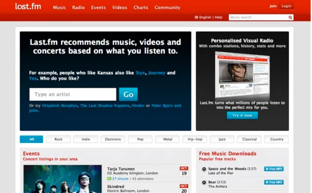
order for the typical computer illiterate user to not miss out on any elements in the process and get the job done (Figure 2).
Figure 2. Web 2.0: last.fm, 2009
The usability matters were taken more seriously than ever before, because Web 2.0 services, the social media platforms that grasped this paradigm depended on the simplicity of content generation by the user rather than the aesthetics of the forms presented as interface layers. Functional interfaces, better flow diagrams, better user experience design became a concern for the software media generation machine to work intuitively and precisely on the World Wide Web platform. The passage from the static environment of the Web 1.0 to the dynamic and ever shifting Web 2.0 environment had turned the web sites into applications that could interchange their data with other web applications through their application programming interfaces, which deepened the
users’ ability to mix different media contents together to create data mashups and new hyper media entities.
Web 2.0 was based on the interconnectedness of the web applications between
themselves. This also brought about the need to create modular software and graphical user interfaces that could make data mashups possible from different diverse web applications. These interfaces had to support semantic relationships between their objects both as the structure of the hyper text mark up language, that would tell how the data would be seen and experienced online, and as stylesheets that described the visual properties of the data gathered.
The need for semantic relationships of the hyper text mark up language as document object models related to the information they contained rises from the popular search engines’ way of crawling and gathering data through out the web. The mark up had to be semantic so that the search engine optimisation could be accomplished. This
optimisation would then enable the search engines to index the data properly, and let the user reach the content easily and precisely.
The Web 2.0 environment also created dynamic data gathering algorithms a must, so that the generated contents could be updated asynchronously which led to the wide use of scripting languages. The interfaces had to be created in a manner which could gather the dynamic data generated and had to service the media in an flexible manner.
Analytics tools also became popular and a necessity in such an environment. These tools, for example Google Analytics, offered interface designers detailed funnelling data of the user’s experience through out the website. For the first time, the user interface designers and user experience designers, had the tools to conduct multivariate testing, A/B testing and event tracking, so that they could understand the problems of
navigational structures and content structures in their products by the help of statistical data poured in from the users themselves throughout a data-driven platform.
After the smart phone revolution, starting from the 2007 and onwards, the devices that the software resided in became fragmented into diverse physical shapes and sizes. This physical diversity of the screen sizes forced the interfaces to become liquid and flexible in nature. Now the interface designers and the application developers had to think of a system that would react to the physical media that their interfaces would live in. Every interface element on an HTML (hypertext markup language) page had to respond to the viewport of the device that it was presented in, which resulted in the wide use of media queries of cascading style sheets, which determine the description style of data in Web documents. JavaScript, which is a scripting language, was also on the rise to reshape document object models that contained the digital media. Now that the physical properties of the digital media landscape had changed, different approaches to design interfaces and the need to prototype the products emerged to the surface.
A very large sum of the user interface designers of the day started to think that popular interface design programs like Adobe Photoshop, Adobe Fireworks were not enough anymore to understand and evaluate the graphical user interfaces and user experience
designs that they have created. Most of the interface designers came to the conclusion that designing in the medium, designing in the web browser within which the interface came into existence could be the correct way to evaluate the qualities of the interface features that they wanted to achieve. One of the first frameworks that let the designers prototype and design in the browser was Bootstrap which enabled a designer to quickly sketch his or her ideas inside the browser without starting from scratch, and the major modern browsers like Mozilla’s Firefox, Google’s Chrome and Apple’s Safari, had already started to incorporate inspection tools which let dynamic data, style and document object model changes possible on the fly.
Mobile application designers had already started prototyping their applications before they were handed to the developers to see how the experience of the end user would take shape. This meant that coding itself had become an interface for creating graphical user interface designs. Some of the popular prototyping tools include Axure, Invision, proto.io and Pixate. With Axure and Invision being a browser based application and Pixate being a desktop prototyping platform.
At the same time art students, the designers, the makers, the coders, the artists now had a plethora of tools to choose from. The software environments shifted its focus from supporting only the engineers, the computer enthusiasts and the coders to a wider ranging community encompassing the designers, the creators and the makers. Other than the main stream software of the industry for the artists and the designers like the Adobe Suite, which now had an accomplished and heterogeneous set of tools enabling the interchangeability of media created between its application spectrum by the help of
import and export commands, external plugins and the scripting features which widened the media hybridity possibilities. There were also platforms for visual artists, makers, coders, designers to create, investigate and research inside the software environments that the software culture offered to them.
One such example of this kind of software is Processing. It first appeared in the
software development scene in 2001, which came with its own integrated development environment. It is designed and maintained by its creators Casey Reas and Benjamin Fry. (Retrieved September, 2015, from https://processing.org) The processing language is a simplified form of Java language and offers instant visual feedback through writing code snippets called sketches. This approach gave the designers, the creators and the makers to create their own interfaces in order for the users to interact with their creations. What the Processing language offered was the liberation of the software environment for the people without much coding experience and also opened the way to create interactive experiences by multidisciplinary teams composed of engineers,
coders, designers, artists and makers.
Similar to this tool there is another programming application called Max MSP (Max Signal Processing). It deploys an interface paradigm for creating a visual programming language like the GRaIL (Graphical Input Language), from 1968. (Kay, 2009, Retrieved December 16, 2015, from https://www.youtube.com/watch?v=QQhVQ1UG6aM)
Max MSP was created by Miller Puckette in the mid-1980s. The current version of Max MSP is a visual programming language developed and maintained for the needs of the
artists, the makers, the designers, the educators and the researchers working with audio, visual tools by a San Fransisco company called Cycling ’74. This company was formed by David Zicarelli in the year 1997 (Retrieved December 16, 2015, from https://
cycling74.com/company).
Why was there a need for this kind of software and interface in the first place? The artists, the designers and the makers were already aware of the fact that the media creation software interfaces were forcing the generation of the content through their own ideology about shaping and remixing media, because as Mark Stephen Meadows states in his book Pause & Effect: The Art of Interactive Narrative, interactivity needs to have sets of rules and constraints to create smoothly functioning experiences (2003: 38). The preconfigured media creation interfaces do not let its user to get deeply involved with the manipulation of algorithms that they use to structure different data models, these algorithms are present to create likely outcomes. In “Transforming Mirrors: Control and Subjectivity in Interactive Media” (1996), David Rokeby covers this issue with the example of the MacPaint program when the first Apple Macintosh surfaced into the market of home computers. He tells about how the first year, when the MacPaint program was released, made the designers create a massive wave of
expressive posters utilising the interface environment of the program, only to understand that the textures and patterns that came coupled with the software made every poster look almost the same because the visual languages it offered were defined as a set of standard visual media databases (1996:144), I remember the same thing happening with the web design community when the domain http://subtlepatterns.com emerged back in 2010 where you could get to the source of tile-able patterns as
backgrounds in the form of a Photoshop plugin. After a year or so, the patterns published on that platform were everywhere, so one can say that the interface comes with a price. The interface comes with its own logic, its own set of data and forces the user to only manipulate the represented data in its own ideology most of the time.
Also, the mode of interactivity that Max MSP and Processing platforms enabled its users to experience generally landed into the immersive navigation category, while the mode of interactivity that was offered by the hyper text markup language (HTML), throughout the World Wide Web and mobile applications could be interpreted as hypertextual navigation for the majority of the entities created in this realm. Immersive and hypertextual navigation terms, were offered by Lister et al. in New Media and New Technologies, where they were discussing different modes of interaction through various models of navigation (2003).
The difference between hyper textual navigation and immersive navigation as modes of interactivity is that, in hyper textual navigation the user interacts with the medium to make reading choices within a database using the interface technology as a constructor of the customised and individualised data set, thus, offering an extractive procedure. On the other hand in the immersive navigation category, the interface offers more of a spatial, visual and sensory interactivity experience (Lister et al., 2003: 21).
These new interface and media manipulation programs also needed to supply new physical input interfacing techniques, which could give way to new modes of interactions. If we take the example of Max MSP we can see that it lets the
programmer/artist/designer to create interfaces, to manipulate media data with his or her own generative algorithms and hybridisation techniques, and it also interfaces with physical media to let the users give input through the use of physical input hardware which are not conventional. One can hook up an old joystick, a Wacom Tablet, a Leap Motion controller, a Kinect or an Arduino board without any hassle and start
customising the experience he or she creates through the use of objects supplied by the programming environment, that lets users experience media content in new and
innovative ways.
2.2. User Interaction Design
In order for any interaction to take place between the user and any interactive system, there needs to be a mutual relationship between them. The input of the user should be transmitted to the input of the interactive system and this interaction should create a change in that particular system, which becomes the output that can be observed by the user as an input to his or her sensory system. This is a feedback loop that is necessary in order for the interaction to make sense. This cause and effect chain should be seamless and the response time of the system must be fast enough so that the user gets immersed into what he or she is experiencing.
In “Transforming Mirrors: Control and Subjectivity in Interactive Media”, David Rokeby states that the interactivity of a technology is directly related to its level of responsiveness to our actions and decisions. He brings about the idea of a mirror and the refractions it creates (1996: para. 1). Our input is transferred into a machine, calculated,
recombined, restructured and transmitted back to us, but this time, it is edited by algorithms created by the author of the software, the artist or the programmer.
Interaction starts with an investigation of the user’s observations of what his or her inputs shape and form in the environment he or she interacts with. It is the unfolding of a story, the starting point of a conversation between the inside and the outside. The outside source is only visible through an interface that is composed of metaphors created from the surrounding culture. It is the interface that frames the story to run around a particular plot, either linear or non linear in nature, and needs to have a symbolical structure in order to communicate the algorithms that run the story. The interface structure needs to be constructed with symbols in order to compress the meanings of the functions or processes that they represent. The results of the interactive processes are shown through the change in content, so the interface, in most cases, blends into the immersive experience, becomes invisible and shapes the whole model of data represented as a story.
The communication between the user and the system should become deeper as the relationship progresses. To create a depth of information exchange between our sensory systems and the interactive system, one needs to create a pendulum like structure that moves between the look and the feel, the interface design and the experience design, the symbol and its connotations. Once the user starts to feel that he or she becomes
connected to the story after a couple of interactions he or she performs, the interactivity of that technology can be considered successful in terms of depth of relationship. This
also means that the system has created a collaborative platform where the user now has an intuitive knowledge about what his or her actions may create in the story.
Once this deepened relationship is accomplished, the system now should create variation in the construction of the data models that it has been fed in through the database of the author or the flowing data source depending on the nature of the narration structure of the software.
Stephen Meadows lines up the steps of interaction into four successive stages; 1. observation, 2. exploration, 3. modification, 4. reciprocal change (2003: 44). By now the observation, exploration and modification stages have been covered in the
interactive system. The reciprocal change takes place inside the user’s mind and in his or her actions. The system now has changed the users way of thinking, and the way he or she perceives the story being told. The interaction cycle is completed.
What exactly happens in the process of a human-computer interaction is a temporal moment, where the user finds himself or herself as the constructor of a virtual story made up of data. The computational data is a dematerialised form of a structure which means that it is intangible. The data presented has its base in the physical or cultural platform, but once it is converted into data and it gets dematerialised, it becomes transient rather than being persistent. When this body becomes transient in nature as data, it turns into an entity whose content is set free, and is converted into a body that has the properties of digital entities. The human computer interaction finds its space
between this tangible and intangible entities resonating on both sides as a connection between the user’s input, the physical objects and the information, content.
This phenomenon is what gives the computers the properties of a metamedium. As Alan Kay and Adele Goldberg put it in Personal Dynamic Media;
Although digital computers were originally designed to do arithmetic computation, the ability to simulate the details of any descriptive model means that the computer, viewed as a medium itself, can be all other media if the embedding and viewing methods are sufficiently well provided. Moreover, this new “metamedium” is active—it can respond to queries and experiments—so that the messages may involve the learner in a two-way conversation. (2003: 393).
The generation of Alan Kay and his colleagues created a shift in software culture where the focus of computing is diverted from bare bone simulation of data crunching to data as media. As this shift took place new ways of human computer interaction had to be accomplished.
Data by its nature on a digital platform is permutable. The physical entity transferred into a metamedium like the computer, can take any shape or form through the usage of algorithms. Data as media is a shift in the perception of data from a set of calculative information to a set of simulative information. As the computers rose to the challenge of representing physical properties of the objects that resided in the physical world, the way we perceive data as a concept also shifted. This shift in the perception of data
created the notion that any medium can be represented in multiple different forms and view models, through interaction can influence its inter actors.
Data as media stored and rendered in computer hardware comes with its own
necessities. The users of such a platform would need software that had user centered interfaces which implemented new modes of interaction to manipulate, reshape, remix, recalculate and remodel these media data, in comfortable, understandable, functional and intuitive pattern structures that encompasses and utilises the abilities of computers as mathematical and logical machines. Which meant that the user had to be guided through the process of accomplishing the above tasks in a way that he or she can feel in control and the manipulation of the data of the media at hand could be achieved in a user friendly manner. Hence this accomplishment of the digital medium gave rise to the paradigms of user interface design.
2.3. User Interface Design
… there is no essential difference between data and algorithm, the differ-entiation is purely artificial. The interface is this state of "being on the boundary." It is that moment where one significant material is understood as distinct from another significant material. In other words, an interface is not a thing, an interface is always an effect (Galloway, 2012: 33).
The interface is the abstraction of a gateway between the software and the user. It lets user inputs to be gathered from the physical realm into the digital realm while creating an abstraction layer between the code and the presented content. It is a means to familiarise the user to the mathematical foundations of the computer by creating layers
of messages, that can be transmitted to the user through the usage of metaphors, cultural elements by using the forms of audio, visual and typographic mediums in combination to clarify the overall message of the content that is being represented in the modern day computers.
The interface is an apparatus for the user to conduct temporal engagements over a body of data represented in a medium. It shapes the experience of the user and alters his or her perception of the content and is responsible from creating a navigable space.
Today we live in a society that actively uses a plethora of different computing devices, from mobile equipment to physical computing interfaces in the form of micro
controllers, to devices which utilise different interaction models. Tactile interfaces, motion detectors, sensors are all over the place.
Since I am a graphic designer by trade, I would like to inspect and analyse user interface design from a visual standpoint, while taking into account how the trends of the
graphical user interface design paradigms evolved in relation to the software culture and marketing paradigms that forced these interfaces to emerge as trends between the years 2004 to 2016 and what effects they created from a usability perspective.
The modern day web and mobile applications have to run on many diverse platforms, their data must be interchangeable between other applications inside this fragmented universe of computing devices. The interface language has to follow the shape and the form of the physical reality it lives in to be functional and effective.
When we look at the history of graphical user interfaces starting from the Web 2.0 paradigm around the year 2004, to the rise of mobile devices and device fragmentation, this pattern is quite easy to grasp.
Back when the iPhone was first introduced and became a commonly consumed mobile device in 2007 the graphical user interface designers found out that the applications were much more forgiving to the nature of graphics that could be introduced into the applications of that era when compared to the world wide web platform. There were still technical specifications that needed to be met, but the fact that the interfaces were localised on the physical medium itself and their assets did not need to be downloaded from a web server or were not streamed, so did not consume any kind of bandwidth, skeuomorphism became the buzz word.
The popularity of rich graphical user interfaces peaked between the years 2007, when the first modern smart mobile device phone the iPhone with its own operating system IOS and its own application marketplace the AppStore had emerged, and the years its competitor operating system Android matured in terms of popularity and physical quality of the device platforms it ran on, which can be marked around the year 2010 and onwards.
Rich graphical user interfaces introduced shadows, gradients, light sources that effected the whole application graphics, bevels, reflections that gave a sense of unity on the
visualisations of the applications and recreated some of the physical objects of everyday use, they were telling much more of a detailed story to the users of their software. Rich graphical user interfaces heavily emulate the physical interfaces of the objects on the outside world transferring their visual properties into the digital media.
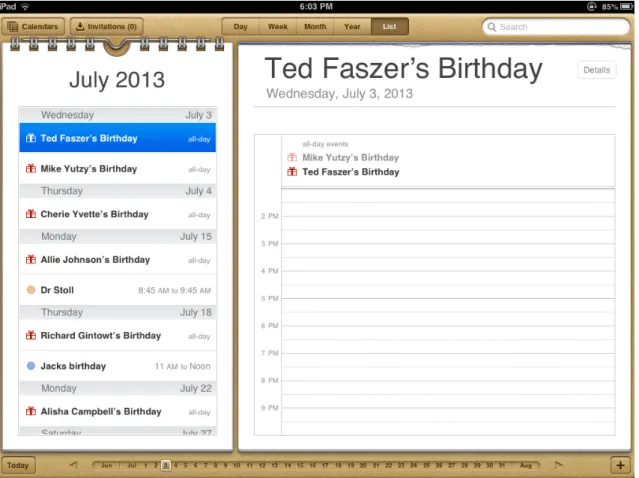
Skeuomorphism as a trend is not actually new. It has existed in the graphical user interface design field since the Xerox PARC research team had included the metaphor of a desktop environment as an interface paradigm, as well as finding its place in architecture and archaeology fields. We can still see the conventional uses of this paradigm in user interface designs like sliders, slider bars, tabbed browsing, files, folders, calendars, to do lists. But the first applications of this particular application marketplace the App Store from Apple, had used the paradigm so heavily that if you would open up say a calendar application, you would be greeted with drop shadows, wooden backgrounds, leather backgrounds, paper textures, metal spirals, gradients, digital clock emulators, lots of other textures and details with no significant function to justify their presence at all. A similar approach was delivered with Web 2.0 platforms of the era, like the overuse of gradients, big fat interface elements, legible and oversized font sizes, background patterns, but not in this kind of highly detailed quality and not in this kind of high frequency because of the bandwidth issues, scalability measures and other software related shortcomings that plagued that era of the world wide web (Figure 3).
Figure 3. A Skeuomorphic Calendar Apple iPad Platform
Although the intention was to create a more familiar experience for the user to complete his tasks in a more user-friendly, personal environment and create a deeper emotional engagement with the products, it became apparent that this kind of interfaces were bulky, cluttered and not transformable to different media screen sizes. This trend also required too much work to transfer the assets needed to create the similar experiences on multiple platforms, when the diversity of the screen sizes of different hardware products began to emerge, also the graphics on these interfaces were so heavily processed that this language leveraged the graphical user interface elements over the content and the user’s experience itself.
While at the time Apple was pushing skeuomorphism into its application designs and influencing the interface design community and application developers to rich graphical experiences, Microsoft was onto something else. They were going after something much more functional and minimal in terms of graphical language.
Apple had taken the majority of the media player device market by its product iPod and Microsoft was creating a new media player device to capture some market share in the media player industry and pushed their product to the market in late 2006 before this rich interface phenomenon took over the interface design community. The device was the Zune media player. It did not become very popular and Microsoft did not pursue the visual language they introduced in this device’s graphical user interface until they released their own mobile operating system dubbed Windows Phone 7, in the year 2010. They first called this graphical user interface design language the Metro and later named it Modern UI.
Modern UI took some of the characteristics and the principles of Swiss design and then brought it into the world of graphical user interfaces. Clean, sharp geometric shapes, bold and bright colours, readable and legible sans-serif typography. It is a visual
language that removed all the unnecessary clutter that was brought with skeuomorphism and principles of rich design, which brought back the functional role of the graphical interface design (Figure 4).
Figure 4. Modern UI
This design trend that brought the important characteristics of the language of modern design into the graphical user interfaces also fit the needs of the fragmented physical devices and made todays responsive, light and minimal graphical user interfaces possible. These devices ran on multiple operating systems and encompassed the use of multiple web browsers with different engines. After the popularisation of the mobile devices world wide web had to respond to this device variety and the paradigm of graphical user interfaces shifted to a liquid, flowing form. The reflections of Modern UI and its characteristics were transferred into the world wide web and it was called the Flat UI (Figure 5).
Figure 5. Flat UI
The Flat UI was the continuation of the Modern UI design language from the operating system platform to the platform of the world wide web. It made responsive design possible, the graphical user interfaces became more and more simple to the point that they almost disappeared and fused into the content. Responsive design paradigm is not compatible with the skeuomorphic design language for a variety of technical reasons. Some of the mobile devices have different pixel density then the traditional desktop environment screens, this means that the resolutions of all the images in an interface had to be doubled in size and quantity which becomes a problem for the mobile devices in terms of the bandwidth restrictions of the EDGE, 3g or 4g networking platforms.
By this time many different coding, prototyping and design frameworks had emerged. These frameworks like Bootstrap, Foundation, Skeleton, Material Design had all embraced the fundamental principles of the Flat UI. All of them came with fluid grid structures, typographical frameworks, common user interface elements like tabs, sliders, calendars, select boxes, dropdown menus, accordion menus, font icons, advanced responsive media embedding classes, buttons, navigation bars, pagination styles, labels, progress bars, list groups, thumbnail classes, breadcrumbs, alert boxes encompassing html, css, javascript modules of their own.
Online code collaboration platforms like the Github emerged along with online code sharing platforms like JSFiddle, Codepen, CSS Deck enabling the code savvy graphical user interface designers to create code snippets, interface patterns, get inspiration and share it through the world wide web. This gave rise to another form of deep remixability in the interface design community. Deep remixability of code had emerged into the graphical user interface designers’ scene.
While skeuomorphism was almost dead, outdated by its functional and clean counterparts Google announced its own graphical user interface framework dubbed Material Design in the year 2014. Its language is both clean and encompasses some forms of the skeuomorphic rich design languages. According to the Google Design Team the intended visual language of Material Design framework was explained as follows;
A material metaphor is the unifying theory of a rationalized space and a system of motion. The material is grounded in tactile reality, inspired by the study of paper and ink, yet technologically advanced and open to
imagination and magic (Retrieved December 16, 2015, from https:// www.google.com/design/spec/material-design/introduction.html)
The new design language of Material Design embraced the traditional design trades from the print design, like space and scale, grid structures, typographic scales, negative spaces to guide the eye of the user, full width full height images and bold, big
typographic treatments as a layer while taking the gradients from the Web 2.0 era and turning them into subtle indicators of dimensionality and applying shadows only when necessary to create a perception in the user that the elements with shadows actually exist as a form of control layer over the entire content of the canvas that they reside in
(Figure 6).
Today the graphical user interfaces utilise every possible technology to compress and lighten the web and mobile application experiences of the software culture. Scalable vector graphics came onto the scene, icon fonts, web fonts were all created for the need to facilitate this new responsive paradigm. The graphical user interfaces of the day are light, liquid, transformable, elastic and scalable.
The languages of the graphical user interfaces come into existence out of the needs and necessities created by the software culture. The trends in these languages emerge from and are shaped by both the physical attributes of the devices and the cultural needs of the users, and their interaction modes.
Exploring interactive artworks created throughout the 2000’s, one can see that models of interaction varies in contrast to the main stream interaction design paradigms used in the market. The usage of a range of unconventional input devices and materials
allowing for different interactive experiences is common in the interactive artworks.
One such work is the Interference Pool which is an interactive audio visual installation made in 2014 by Annica Cuppetelli and Cristobal Mendoza (Cuppetelli and Mendoza, (n.d.). Retrieved January, 2016, from http://www.cuppetellimendoza.com/interference-pool). The materials that constitute the work are video projectors, elastic cords,
plywood, a sound system, a computer and a custom software created for the installation. The work is made up from two sculptures horizontally placed on the floor. The
sculptures are made of elastic cords that are attached to the base of the construction made of plywood which are one inch apart from each other like the strings on an
instrument. There are two projectors over the top of these horizontal constructions to illuminate the cords. The camera placed on the top accompanied with the software successfully tracks the users movements and the generative patterns emerge on the cords according to the directions of the movements of the inter actor. In addition there is a software synthesiser which reacts to the movements of cords and creates a reactive sound environment (Figure 7).
Figure 7. Interference Pool, by Annica Cuppetelli and Cristobal, 2014
The aim of the work according to Annica Cuppetelli and Cristobal Mendoza is the exploration of the tension between the rigid grid structure and the organic experience offered by the natural forces. The overlapping of the physical structure and the video projection as light creates an interference pattern. The pattern is a circular organic shape, yet it is superimposed on a grid of tightly placed cords by the help of a projector.
Another interactive audio visual installation is the ClinK made in 2015 by Markus Schuricht, Paul Schengber and Felix Deufel. The installation contains 30 speakers in a dome construction. 360° projection enables the inter actors to experience modulations and movements of visuals, sounds and shapes by moving their bodies. (Wisp —
CLINK, (n.d.). Retrieved January, 2016, from http://wisp-kollektiv.de/clink-interactive-audiovisual-spatial-sound-installation). The aim of the project is to create a spatial experience where all the inter actors become architects in a temporal unit of time. The installation utilises 3D Sound, 360° projection and body tracking through sensors placed (Figure 8).
Figure. 8. ClinK, by Markus Schuricht, Paul Schengber and Felix Deufel, 2015
According to the artists Markus Schuricht, Paul Schengber and Felix Deufel the artwork is a blend of science and art. It is an attempt to incorporate the physical and the
properties of the world by installing a large dome structure while the projection of lights, and the sound samples triggered by the body movements of the interaction achieve a tension between the tangible and intangible, the transient and the persistent (Wisp — CLINK, (n.d.). Retrieved January, 2016, from http://wisp-kollektiv.de/clink-interactive-audiovisual-spatial-sound-installation).
CHAPTER 3
OSCILLATION, RESONANCE, AND THE CHANCE FACTOR
In this chapter, I am going to investigate how oscillation and resonance relates to each other. How resonance is formed through two or more frequencies of vibration. How it effects the frequency amplitudes of the bodies in place and how this phenomenon can be related to a graphical language so that it can be visualised, why both of these
phenomenons can not be thought without a sense of rhythm, and how they can be related to multimedia and hybrid media of the software culture.
3.1. Oscillation and Resonance
What is oscillation?
“Everything is rhythm, the entire destiny of man is one heavenly rhythm, just as every work of art is one rhythm, and everything swings from the poetising lips of the
god.” (Hölderlin, cited in “On Rhythm, Resonance and Distortion”, Aracagök, 2003: 127)
Oscillation is closely related to rhythm, the sense of vibration, the repetitive variation of a measure in time. In short; It is the measure of variation of an entity between its states of idleness and movement in time.
One possible way of understanding rhythm can be found in a traditional appropriation of the word. Rhythm: division of a supposed continuum into intervals, an attempt at temporaliation? Yet, that which is known as a continuum of time is a continuum only when time is conceptualised as a succession of points – rhythm can thus be conceptualised as a division of a continuum of time into intervals only when time is made of points - of what? Of the experience of the one who experiences it? (Aracagök, 2003: 128)
In order to understand oscillation and rhythm, it should be thought together with sound. Everything we hear is about small fluctuations in the air pressure that were created because of the oscillations of objects that vibrate in space outside of ourselves. These fluctuations cause measurable chain reactions between the air molecules that push themselves in all directions when something vibrates or oscillates, so that when they hit the ear drum we hear things or when they hit a pressure sensor like the microphone we can turn them into digital or analog signals.
Oscillations make up the whole field we reside in and carry the information of that field to the entities that are encompassed by the same field.
One makes the connection of inside and outside through oscillations in space. Oscillation, in a sense shapes the space that it originates in and gives inputs to our sensory interface or lets us capture these fluctuations and turn them into digital or analog signals.
Oscillations make up the whole sound spectrum and give way to different timbres, so that one can recognise the tone colour, tone quality and texture of any sound he or she experiences. Thus the data absorbed from these oscillations give information about the identity of the entity that generates them.
The standard dictionary explanation of oscillation is a frequent change from one state, position or amount to another and back to the original state, position or amount. It could be read as the journey of an entity from its idleness to movement and back to its
idleness again. What happens in between can be translated into signals, can be
calculated mathematically and hence can be graphed and measured. Through the data collected from an oscillation, one can understand the nature of its origin’s true story.
The vibrating entity changes its environment, warps the space around it and its output becomes an input to other bodies that happens to be in the same space time continuum, which vibrate back and forth on their own frequencies.
Oscillation becomes an event that assures something is present, hence it can be
considered as a signal, an attempt of an entity to connect to its environment, to give out data about its presence, an experience of being, a narrative information of some entity’s
whereabouts, its identity, its material, its properties and its body. It gives out clues about the proximity of and the relationships of the entities in that very space or field.
If we were to make an analogy with the software culture of today about oscillation, we could say that oscillation as a metaphor is closely related to the concept of multimedia. Although oscillations send out data about the medium of the entity they belong to, they don’t give way to a deep level of interaction between the entities as long as these entities vibrational frequencies don’t resonate with each other.
But, as I see it, multimedia does not threaten the autonomy of different media. They retain their own languages, i.e. ways of organizing media data and accessing this data. The typical use of multiple media on the Web or in PowerPoint presentations illustrates this well. Imagine a typical HTML page which consists from text and a video clip inserted somewhere on the page. Both text and video remain separate on every level. Their media languages do not spill into each other. Each media type continues to offer us its own interface. (Manovich, 2008: 76)
If we further this analogy, oscillations can be considered as layers containing information about their medium without clashing with other entities’ properties and without transferring their techniques to each other. Oscillations are potentials and stand together without clashing as long as they don’t resonate with each other. If there’s no resonance, there’s no spill from one entity to the other.
Oscillations without resonance do not create a new identity, they are just message carriers, they do not reconfigure the body that they happen to input. The conventional
structure of the entity that receives the vibrational frequency input of another entity does not change, it doesn’t get transformed into another form of being.
What is resonance?
Resonance occurs when two sounds’/objects’/systems’ frequency of vibration matches and produces a higher oscillation. It’s the amplification of two signals originating from different entities that have matching frequencies and telling a new story, a story about something other than themselves.
If oscillation can be interpreted as the signal of the story of the inside of one entity then, one could assume that resonance is the story of the outside, the interaction of the entities in the field or space that the entities reside in, and how they unite in each others bodies. While oscillation is about the identity, the properties, the material, the story and the presence of the entity itself, resonance can be read as the identity, the properties, the material, the story and the presence of the unison of the oscillation of the entities and how they formed an amplified new signal vibrating in their bodies.
Resonance takes place in the field that the oscillations were first created and to some extent were departed from the sources of the oscillations, reconfiguring the bodies they reside in.
Hence the original entities’ connections form a different entity or story, gain new properties and materials through a process of fusion in one of the bodies. The clash of the data from different entities unite to become a new form and distort their space in a
way that creates an amplified new story, exchanging their properties, creating new structures.
Since the data that clashed together from the two or more different oscillating entities have fused into a new form of oscillation and became resonant, with their own new identity, new properties, new material, new body and departed from their original frequency of vibration but kept properties of them, can one ask the question that resonance is actually a meta-medium? Can resonance be read as a temporal hybrid creature that has its own language?
In hybrid media the languages of previously distinct media come together. They exchange properties, create new structures, and interact on the deepest level. For instance, in motion graphics text takes on many properties which were previously unique to cinema, animation, or graphic design. (Manovich, 2008: 76)
If one takes this assumption to be true, resonance as a metaphor can have deep connections with the software culture that we live in today. Resonance can be
interpreted as a temporal platform that fuses entities into a new form. If oscillations are events, resonance is a happening, it is emergent. It is the process of becoming or coming into being, the signals of two entities coming together to form a new and updated DNA.
In the case of media hybrids, interfaces, techniques, and ultimately the most fundamental assumptions of different media forms and traditions are brought together resulting in new species of media. To use a biological metaphor, we can say that media hybridity involves the coming together of
the DNAs of different media to form new offsprings and species. (Manovich, 2008: 75)
That is the reason why while creating the Resonant Field project, I tried to implement technologies that enabled me to accomplish the construction of real time generated audio and graphics. To give a feeling of resonance as I understand it, the visuals and the audio had to be happenings.
The generations of the different forms when the user interacts with the Resonant Field had to be working in a way as if they were using an instrument of sorts. There had to be a live generative feedback loop, so that the users could act and feel instead of trying to figure out what they needed to do. This effect could make them feel as if the installation becomes a part of themselves that extends their abilities of interaction. Rather than forcing a functional interaction experience, I wanted to create an expressive one.
By connecting a video camera stream of the user and putting it on a mesh and making the vertices interact to the sound that he or she creates, I wanted the user to make a connection with the simulated world of Resonant Field. A connection where the oscillations of the user’s body get measured both as a generative source of electricity and his or her physical properties put into resonance with the simulated reality of the field itself.
3.2. The Chance Factor
The chance factor in art has been widely used in many artworks through out the centuries but some of the most important examples of the usage of chance factor in artworks surfaced before the first world war. One of the most influential art movements back in those days was the Dada movement.
The dadaist manifesto was based on resetting the conception of the art world as it existed at the time. Dadaists were trying to eliminate the ideology of the art world which had been cumulated by the culture of art itself through the passing centuries, some of the parameters of the process that needed to be reset included quite basic things like planning, composing, giving a structure to the content being represented. The Dadaist movement was an attempt to recreate the art world and its parameters, which meant that this experimental art movement would need some expressive tools to
represent itself. Randomisation of the creation process of art pieces was one of the most important tools of expression, and the chance factor was being introduced into the art world during this period which would be predominantly used throughout its lifecycle.
“The dadaists also wanted to create work that would be different from traditional fine art - which they considered a meaningless and elitist pursuit. They wanted to annihilate previous notions about Art in order to revitalise culture” (Staniszewski, 1995: 230).
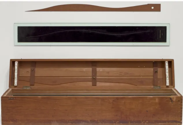
At this conjuncture Marcel Duchamp created the work 3 Standard Stoppages in the year 1913. It was an experiment based on how human beings perceived and standardised the
measure of a length, one meter. He came up with the idea of an investigation on how to represent this unit of length in a different visual and structural format without causing it to loose its identity. He took three one meter long threads and tossed them over on a black canvas and fixed them on the surface. Even though the threads formed curvilinear structures over the canvas they were fixed upon, they still had the correct measurement of just one meter. So the identity of the entity being presented was preserved but was given a new form through a randomised mode of creation. It is a perfect application of the chance factor used as a form of expression (Figure 9).
Figure 9. 3 Standard Stoppages, by Marcel Duchamp, 1913-14 | MoMA
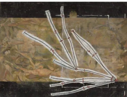
As Marcel Duchamp had redefined the structure of one meter in a new visual and conceptual definition he thought about using these three new one meters on a piece of artwork, which was one of his earlier paintings. He applied these new structures as a
branched curvilinear composition which were connected through nodes over his painting and he called it the Network of Stoppages and released it in the year 1914 (Figure 10).
Figure 10. Network of Stoppages, by Marcel Duchamp, Paris 1914 | MoMA
What Marcel Duchamp did back in 1913 with his artwork 3 Standard Stoppages, is actually also applied in algorithmic, generative and interactive art to conduct
randomisation and apply the chance factor in digital medium.
From the earliest days of algorithmic art, the probabilistic approach to art generation has been very popular. Its modus operandi can be summarized as follows: (1) a space of possibilities is defined in explicit, mathematical terms; (2) a probability distribution is defined over this space; (3) an algorithm is executed which draws random samples from the space, in accordance with the probability distribution (Scha, 2006: par. 1).