INTERPRETING GLITCH;
THE MANIFESTATION OF DIGITAL CULTURE:
A STUDY ON THE ASSOCIATION BETWEEN CONTEMPORARY SOUND DESIGN AND DIGITAL TYPOGRAPHY
A Ph.D. Dissertation
by
FUNDA !ENOVA TUNALI
Department of Graphic Design
!hsan Do"ramacı Bilkent University Ankara
INTERPRETING GLITCH;
THE MANIFESTATION OF DIGITAL CULTURE:
A STUDY ON THE ASSOCIATION BETWEEN CONTEMPORARY SOUND DESIGN AND DIGITAL TYPOGRAPHY
Graduate School of Economics and Social Sciences of
!hsan Do"ramacı Bilkent University by
FUNDA !ENOVA TUNALI
In partial Fulfillment of the Requirements for the Degree of DOCTOR OF PHILOSOPHY
in
THE DEPARTMENT OF GRAPHIC DESIGN
!HSAN DO#RAMACI B!LKENT UNIVERSITY ANKARA
I certify that I have read this thesis and have found that it is fully adequate, in scope and in quality, as a thesis for the degree of Doctor of Philosophy in Graphic Design.
___________________________________ Prof. Dr. Bülent Özgüç
Supervisor
I certify that I have read this thesis and have found that it is fully adequate, in scope and in quality, as a thesis for the degree of Doctor of Philosophy in Graphic Design.
___________________________________ Assist. Prof. Dr. Fulya Ertem Ba!kaya Examining Committee Member
I certify that I have read this thesis and have found that it is fully adequate, in scope and in quality, as a thesis for the degree of Doctor of Philosophy in Graphic Design.
___________________________________ Assist. Prof. Dr. Ça"rı #mamo"lu Examining Committee Member
I certify that I have read this thesis and have found that it is fully adequate, in scope and in quality, as a thesis for the degree of Doctor of Philosophy in Graphic Design.
___________________________________ Assist. Prof. Dr. Dilek Kaya
Examining Committee Member
I certify that I have read this thesis and have found that it is fully adequate, in scope and in quality, as a thesis for the degree of Doctor of Philosophy in Graphic Design.
___________________________________ Assist. Prof. Dr. Ersan Ocak
Examining Committee Member
Approval of the Graduate School of Economics and Social Sciences ___________________________________
ABSTRACT
INTERPRETING GLITCH;
THE MANIFESTATION OF DIGITAL CULTURE:
A STUDY ON THE ASSOCIATION BETWEEN CONTEMPORARY SOUND DESIGN AND DIGITAL TYPOGRAPHY
!enova Tunalı, Funda
Ph.D., Department of Graphic Design Supervisor: Prof. Dr. Bülent Özgüç
May, 2012
This research probes into the concepts of designing and consumption of digital typography that manifest the logic of digital media by following an analogy of the patterns in contemporary sound design which act on the developments within computer technologies as part of digital culture. When a technological system malfunctions and no longer executes its function it loses its essence and we fully became conscious of it. In many of these such cases noise and glitch occur. Therefore, this study tries also to conceive the concepts of noise and glitch within a visual framework following an analogy of the aural designs as used in Sound Art. Departing from the conclusions reached at the end of the investigation and analysis of a parallelism within the design patterns in both spheres through systems approach, it proposes that the emerged patterns demonstrate the manifestation of digital culture and the culture functions depending on its operational logic and productions.
Keywords: Digital typography, contemporary sound design, glitch, graphic design, digital culture.
ÖZET
GLITCH’" YORUMLAMAK; D"J"TAL KÜLTÜRÜN GÖRÜNÜMÜ:
ÇA#DA! SES TASARIMI VE D"J"TAL T"POGRAF" ARASINDAK" "L"!K" ÜZER"NE B"R ÇALI!MA
!enova Tunalı, Funda Doktora, Grafik Tasarım Bölümü Danı$man: Prof. Dr. Bülent Özgüç
Mayıs, 2012
Bu ara$tırma dijital medyayı ortaya koyan dijital tipografi tasarımı ve onun tüketimi ile ilgili kavramları, ça%da$ ses tasarımı ile bilgisayar teknolojileri üzerinden hareket eden örüntüler arasındaki benzerlikleri ara$tırmaktadır. Teknolojik bir dizge arızalandı%ında ve artık i$levini yerine getiremedi%inde özünü yitirir ve o an teknolojinin farkına varırız. Bu durumların ço%unda gürültü ve glitch meydana gelir. Bu nedenle, bu çalı$ma aynı zamanda Ses Sanatı’nda kullanılan biçimleriyle ses tasarımlarının dijital tipografi ile benzerliklerini takip ederek görsel bir çerçeveden gürültü ve glitch kavramlarını ara$tırmaktadır. Her iki alandaki tasarım örüntüleri arasındaki paralellik ara$tırmasının ve çözümlemesinin sonunda dizge yakla$ımı ile ula$ılan sonuçlardan yola çıkarak ortaya çıkan örüntülerin dijital kültürün bir görünümünü sundu%unu ve bu kültürün kendi i$leme mantı%ına ve üretimlerine dayanarak çalı$tı%ını ileri sürmektedir.
Anahtar kelimeler: Dijital tipografi, ça%da$ ses tasarımı, glitch, grafik tasarım, dijital kültür.
ACKNOWLEDGEMENTS
I have numerous motives behind writing this dissertation, none of which is prior to the others. My fascination with digital technologies, my increasing curiosity on human-computer interaction, my interest in the operational logics of systems and my familiarity with the relation formed between digital culture, technology and graphic design are amongst many others.
Throughout my doctorate study exceptional people whom I should mention here helped and supported me along all the stages of this study. I would like to thank my supervisor Prof. Dr. Bülent Özgüç for his guidance, vision and patience in the writing of this dissertation. I would like to thank Assist. Prof. Andreas Treske for helping me during the kick-off of this study. I thank my examining committee Assist. Prof. Dr. Fulya Ertem Ba$kaya, Assist. Prof. Dr. Ça%rı "mamo%lu, Assist. Prof. Dr. Dilek Kaya, and Assist. Prof. Dr. Ersan Ocak for investing time in the evaluation of this study and for their critical comments.
I would also like to thank Dr. Orhan Anafarta and Damla Özer Ülvan. Our discussions and conversations turned into priceless inputs through my academic life. I also thank my dearest friends Halime Fi$enk, Nazife Karamullao%lu, Jülide Ak$iyote, Ça%la Saraç, Gizem Alagöz Mocan, Levent "nce, Pelin Aytemiz and O%uz Akın. They always supported me and gave me courage to carry out this study.
I want to thank Ufuk Önen for his friendship and his books on sound recording and music technologies. Furthermore, I thank the genial people Murad Gürzumar, Ümit Vurkır, Nükhet Büyükoktay, Erol Çalı$kan, Aydın Ramazano%lu, and Cemil Gülyüz.
I should mention Assist. Prof. Dr. Ersan Ocak once again in order to especially thank him for his inspiration, insightful comments and feed-backs, for his support as a friend and as a mentor. With his knowledge and perspective he directed me in the right direction and gave me courage for further studies.
I thank every artist, designer, curator, theorist, scholar and writer who inspired me. I thank Pati HD, Nevron HD, Ashitaka HD, PhD Comics, and our old but mighty car.
My deepest gratitude goes to my parents I$ık and "lhan !enova for always believing in me, and for their endless love. I cannot express enough my gratitude for my husband Erhan Tunalı who supported me no matter what happens and without whom this study would be impossible or meaningless.
I especially thank the best sister and curator Ba$ak !enova, her husband Erhan Murato%lu, and my precious niece Maya for their support and love and for being the sources of invaluable information and insight on the subjects I work on.
I thank Seçil, and Esin Tunalı and Elif Tunalı Nikoglou for their support. I cannot finish without mentioning the two very special beings; Pati and Zip for spreading color and joy to my life. I am thankful to everyday that all these irreplaceable people, my cat, and my dog are parts of my life and supported me through this amazing, yet thoughtful experience.
TABLE OF CONTENTS
... ABSTRACT iii ... ÖZET iv ... ACKNOWLEDGEMENTS v ...TABLE OF CONTENTS viii
...
LIST OF FIGURES x
...
CHAPTER 1: INTRODUCTION 1
... 1.1 The Aim of the Study and Statement of the Problem 1
...
1.2 Research Methodology 4
... 1.3 Objectives and Description of the Research Design 6
... 1.4 On Systems and General Systems Theory 9 CHAPTER 2: THE EVOLUTION OF DIGITAL TYPOGRAPHY
... AND IMPRINTS OF POST STRUCTURALISM 20 2.1 The Precursors; Avant-Gardes ...20
... 2.2 The Computer Age, from METAFONT to Emigre 28
... 2.2.1 The Computer Age and Digital Culture 28
... 2.2.2 Passage from Analogue to Digital 30
...
2.2.3 Typefaces of Digital Culture 31
...
CHAPTER 3: SOUND MACHINES 38
...
3.1 Noise as Power; the Avant-Gardes 40
3.2 John Cage and Brian Eno, The Fluxus;
...
Experimental Music 49
... 4.1 Defining Glitch 56 ... 4.2 Visual Glitches 58 ... 4.3 Audio Glitches 64 ... 4.3.1 Glitch Music 64 ... 4.3.2 A Conceptual Reading of Audio Glitch 68 4.4 The Precedents, Towards a Definition of
...
Glitch Aesthetics 70
4.4.1 At Night, Lying in Bed She Rereads the Letter from Her Gunner at the Front. SCRABrrRrraaNNG, 1919,
...
by F. T. Marinetti 71
4.4.2 Defining the Image of Punk: Sex Pistols
...
and Jamie Reid 79
4.4.3 Typography as Discourse Poster, 1989,
...
by Allen Hori 89
4.4.4 Poème Électronique, 1958, by Edgard Varèse ...95 4.4.5 Frog+, 2003, by Merzbow ...99 4.4.6 The Knotted Constellation (Fourteen Rotted
Coordinates), 2011, by Kim Cascone ...103 ... 4.4.7 Towards an Aesthetics of Glitch 106 4.5 Glint: Audiovisual Glitches, 2010, an experimental video
on glitches and glitch-alikes by F. !enova Tunalı ...109 CHAPTER 5: CONCLUSION ...126
...
LIST OF FIGURES
1. Fig. 2.1.1. The Cover of Zang Tumb Tumb, 1914 and Parole
in Liberta, 1915, designed by F. T. Marinetti ...22
2. Fig. 2.1.2. The Cover of MERZ, 1923 ...24
3. Fig. 2.1.3. Cover examples of Novyi Lef ...25
4. Fig. 2.1.4. Architype Van Doesburg Typeface ...26
5. Fig. 2.1.5. Herbert Bayer, poster design, 1926 ...27
6. Fig. 2.2.3.1. Aliased vs. anti-aliased ...33
7. Fig. 2.2.3.2. Ray Gun covers by David Carson ...34
8. Fig. 2.2.3.3. Screenshot from Foxlife Web Site ...35
9. Fig. 2.2.3.4. The making of Univers Revolved, letters revolved 220º, designed by Ji Byol Lee as a homage to Frutiger’s Univers typeface ...36
10. Fig. 2.2.3.5. Univers Revolved, 1996, designed by Ji Byol Lee as a homage to Frutiger’s Univers typeface ...37
12. Fig. 4.2.2. Alchemy, 2006. Video Still 01, by Erhan Tunalı. ...
(Fragmentation) 61
13. Fig. 4.2.3. Alchemy, 2006. Video Still 02, by Erhan Tunalı. ...
(Replication/Repetition) 61
14. Fig. 4.2.4 and 4.2.5. Alchemy, 2006. Video Stills 03 and 04, ...
by Erhan Tunalı. (Linearity) 62
15. Fig. 4.2.6. The Fly’s Eye, 2002. Video Still, by Andrea Polli. ...
(Complexity) 62
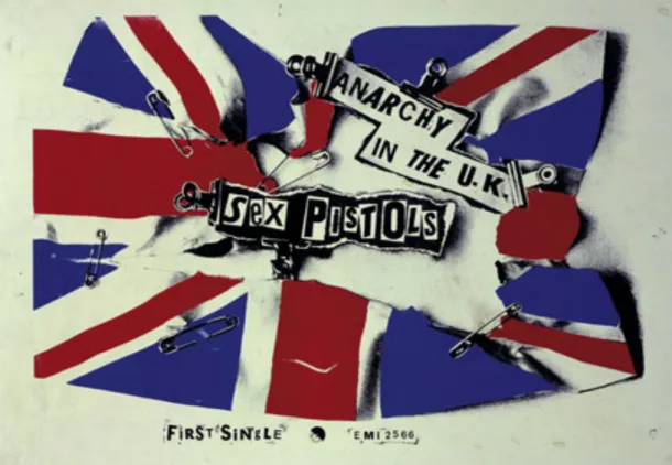
16. Fig. 4.4.1.1. SCRABrrRrraaNNG, 1919, by F. T. Marinetti ...75 17. Fig. 4.4.2.1. Anarchy in the U.K., 1976, promotional poster,
...
by J. Reid 83
18. Fig. 4.4.2.2. God Save the Queen, 1977, promotional poster, ...
by J. Reid 84
19. Fig. 4.4.2.3. Never Mind the Bollocks, Here’s the Sex Pistols, 1977, album sleeve, by J. Reid ...87 20. Fig. 4.4.2.4. Never Mind the Bollocks, Here’s the Sex Pistols,
1977, back cover, by J. Reid ...88 21. Fig. 4.4.3.1. Typography as Discourse, 1989, poster,
...
by A. Hori 94
22. Fig. 4.4.4.1. Philips Pavilion, 1958 ...96 23. Fig. 4.4.5.1. Merzbau, 1933, by K. Schwitters ...100 24. Fig. 4.4.6.1. The Knotted Constellation (Fourteen Rotted
Coordinates), 2011, by K. Cascone ...105 25. Fig. 4.5.1. Video Still from the Glint video, 2010,
26. Fig. 4.5.2. Glint typeface detail sketches, 2010,
by F. !enova Tunalı ...117 27. Fig. 4.5.3. Glint typeface, 2010, (hand-drawn onto
millimetre scale paper), by F. !enova Tunalı ...118 28. Fig. 4.5.4. Glint typeface, 2010,
by F. !enova Tunalı ...119 29. Fig. 4.5.5. Video Still from the Glint, 2010, video,
by F. !enova Tunalı ...121 30. Fig. 4.5.6. Video Still from the Glint video, 2010,
CHAPTER 1
INTRODUCTION
1.1 The Aim of the Study and Statement of the Problem
The technological developments throughout the history brought us a great deal of possibilities and channels that associates the systems with and in correlation of media to communicate, to inform and to distribute data. Hence, the agenda of globe has always been created and shaped through these associations. By locating myself as a designer that processes in this sphere, it is crucial for me to grasp how digital media operates and forms new visual languages that shapes and directs societies of information with different profiles. The definition of visual culture is in continuous flux and this endless change becomes more visible with the introduction of digital apparatuses such as computers, surveillance systems, mobile phones…etc.
Communication technologies are not neutral spaces that only convey messages, they are governed by a set of articulated rules that are effected by and have effects on societies. Technology reterritorializes the public and private space and causes the self to re-identify herself in relation to her environment. Especially communication technologies and digital media encompass the power of creating a society that manifests the operational logic of globalization by promising democratized, diversity-based, and non-hierarchical societies.
Technology is best noticed when it is not functioning. In our everyday lives we are so much accustomed to use technology that we became unaware of its existence in many cases. However, when a technological system malfunctions and no longer executes its function it loses its essence and we fully became conscious of it. In many of these such cases noise and glitch occur.
Thus, this research probes into the concepts of designing and consumption of digital typography that manifest the logic of digital media by following an analogy of the patterns in contemporary sound design which act on the developments within computer technologies. Many theorists and artists like Randal Packer, Ken Jordan, William Gibson, Henri Jenkins, Charlie Gere, John T. Caldwell, Lev Manovich, Geert Lovink, Paul Hegarty, who are producing within and about digital
technologies discuss and question the main features, possibilities and influences of the problems and opportunities inherent in technology. Therefore, this study tries also to conceive the concepts of noise and glitch within a visual framework following an analogy of the aural designs as used in Sound Art.
Hence, the research tries to unveil the possible association and link between sound design especially glitch music and typography that are produced within and about digital media. Departing from the conclusions reached at the end of the investigation of a parallelism within the design patterns in both spheres, it proposes that the emerged patterns demonstrate the manifestation of digital culture and the culture functions depending on its operational logic and productions.
The core question to be researched is “Is there an association between the patterns of design of contemporary sounds and typography in digital media?” The second question to be investigated based on the outcomes of the first question is “How do these patterns manifest the operational logic of digital culture?”
The two domains; digital typography and sound design are the realms with which the artist and designers explore new possibilities of creative acts. The digital technologies used in these two domains are shaped by
cultural inputs and needs. The way these technologies develop and operate allow the users to engage with new forms of thought, production, utilization and consumption. This study is significant in its selection of these two sub-domains, that may seem unrelated, but when analyzed reveal common patterns in the processes of production, distribution, and consumption, through the investigation of the concept of glitch, which is an intrinsic element of digital culture.
The concepts, which are commonly inherent in these technologies are failure, malfunction, and error. Hence, glitch as a minor malfunction within the system manifests itself as the marking of the digital technologies used. The perception and utilization of the concept of glitch as a subversion —by the creators of design and art works within these two spheres of digital typography and contemporary sound design— are the reasons behind choosing the concept of glitch as the pivotal point of the study.
1.2 Research Methodology
The study employs qualitative approaches which aim to explore and manifest the status quo of the tendencies regarding the design sphere and the lived experiences of the designers involved in the development
and creation of those mentioned sound and typographic designs addressed by the study. The aim is to observe if the research disciplines within these approaches allow themes to emerge which illuminate the semblance resulting from a cultural reflection of digital media. Therefore, it is at utmost importance to conduct historical surveys of both domains. The surveys include works of Avant-Garde artists and designers such as Futurists, Dadaists, Constructivists, the Bauhaus School, Fluxus, and other relevant names from the computer age. These surveys play crucial role in highlighting the key theoretical and artistic works that, when analysed, manifest particular methods, techniques and processes used by the theoreticians and artists and their relationship to cultural, historical, artistic, sociological and technological milieu.
The selected works are deconstructed and analysed benefiting also from General Systems Theory in order to highlight the emerging patterns within these systems.
This research refers to the works of theoreticians such as Douglas Kellner, Andrew Darley, Bob Cotton, Jay David Bolter on visual digital culture, Lev Manovich, Lori Landay, Mark J. Brosnan, William Gibson, Henry Jenkins on new media, Ken Goldberg on Internet and Richard Coyne on information technologies, Katherine McCoy, Ellen Lupton, J. Abbott, Miller, Rick Poynor, Jessica Helfand, Lorraine Wild, Donald
Knuth on graphic design and digital media and Marshall McLuhan, Jaques Derrida, Gilles Deleuze, Felix Guattari, and Henri Jenkins on the sociological and cultural theoretical discourses. Within this framework, how noise and glitch are produced and their effects in the creative process will be investigated by taking into account philosophers such as Attali, again Deleuze and Guattari, contemporary sound artists such as Merzbow, Kim Cascone, Pan Sonic and key figures in graphic design and typography such as David Carson, Neville Brody, Zuzana Licko, Rudy Van DerLans, Jeffrey Keedy among others.
1.3 Objectives and Description of the Research Design
The objective of this research is focused on the linkage between sound design and typography which are effected by and effect the emergence of digital culture. Thereby, the history of the communication technologies will not only guide the research, it also will maintain links to various disciplines. The sphere of digital culture appears as the amalgamation of various media such as printed media, television, computer games, and software and hardware related fields. Therefore, the structure of this research will be based on the objectives of processing and distribution of information, digital audio-visual language, interface structures and
designs, and, compatibility through the use of technology in cultural levels.
Furthermore, other related resources are taken into consideration within the scope of this study. Examples each from Flippo Tomasso Marinetti, Jamie Reid, Allen Hori, Edgard Varèse, Merzbow, and Kim Cascone and an audio-visual self-project called Glint: Audiovisual Glitches, are analyzed as the case studies of this thesis. As the case studies: structure of a complete design/product/artwork, production, storage, distribution , consumption, thus, the operational logic of typographic representations, digitally created sound designs and other related sources are analyzed through the works of artists and the design and functioning of number of software, which are used to design typography and sound are mentioned. Moreover, considerable analysis is made referring to General Systems Theory while keeping in mind the semiotic readings which had apparent impacts on both the creations of typographic and audial works.
The next chapter probes into the historical survey of digital typography starting from 1900s, reaching present, grounding the rationale transposed earlier. It tries to unveil the artistic and theoretical key events and people in order to establish the cultural, sociological, technological and historical relations.
Following that chapter, the next one examines the history of events happened in the sound design sphere in 20th Century, focusing especially on the last few decades, again starting with Futurists and ending up with the present status quo of digital media to bring out the above mentioned relationships.
Chapter four is an attempt to manifest the possible association between digital typography and contemporary sound design by making analyses of examples from typographic and aural designs from several prominent designers and an audio visual self project. The term “glitch”, its signification, visual and aural aspects and its application are explained and articulated in this chapter, as it marks itself as a signifier of digital culture. This chapter is the core of the dissertation in the sense that it tries to unveil the possible patterns used in the production in both domains. The found associations inferred from the interpretations of the audial, visual, and textual data presented will show that even the mentioned domains seem apart, since they share the same media for production, storage, distribution and consumption, they inherit basic principles which reveal a manifestation of digital culture.
In the last chapter, the conclusions are derived and presented from the analyses and discussions made in the fourth chapter, and possible future suggestions are made that lead to further researches. In conclusion, this
study argues that digital culture and its operational logic can be manifested through the association between two domains, digital typography and contemporary sound design.
1.4 On Systems and General Systems Theory
Apart from the means of production, distribution and consumption of digital typography and contemporary sound pieces on a sociological level, in order to analyze these two fields in a quest to seek for associations that would yield conclusions about a shared cultural patterns, these two cultural entities should also be evaluated as systems. These complexities and their relations with and reflections on their environment; people, culture, and technology, can be understood through the utilization of systems approach.
A system is by definition a set of interrelated parts that forms a whole with a structure and common behaviors. The whole becomes significant in the sense that its parts are interdependent and works towards a process that forms the whole by the semantic relations constructed between the whole and its parts. Aristotle’s famous statement “the whole is greater than the sum of its parts” manifests itself through a Gestalt view of systems. In order to analyze both domains (digital typography and
contemporary sound design) they can be viewed as systems and through an intensive investigation, their properties, the structural entities, behaviors and rules should be outlined so that a possible pattern matching can be performed. “A system can be defined as a set of elements standing in interrelations.” (Von Bertalanffy, 1988: 55) In such manner, a system cannot be regarded apart from its components. The components of a system are important in the sense that they interact both with each other and the environment surrounding them, thus, forms a new dynamic system as a whole.
Ludwig von Bertalanffy (1988: 32) is the biologist who was one the pioneers of the General Systems Theory (GST), a theory that is based on “the formulation and the derivation of those principles which are valid for ‘systems’ in general.” GST is regarded as an interdisciplinary study that can be applied to many fields such as biology, mathematics, psychology, sociology, cybernetics and so forth. The important issue in GST is the idea that these researched patterns should not be confused with superficial analogies. Pointing out one or two similarities between systems is not the concern here. The development, formation and the processes within a system should be regarded as patterns of values that would form isomorphisms with the emerging patterns of another system in the inquiry of meaningful relations, hence, meaningful principles which are common in the questioned systems.
Von Bertalanffy (1988:35) explains his concerns on the subject matter as such :
But general system theory is not a search for vague and superficial analogies. Analogies as such are of little value since besides similarities between phenomena, dissimilarities can always be found as well. The isomorphism under discussion is more than mere analogy. It is a consequence of the fact that, in certain respects, corresponding abstractions and conceptual models can be applied to different phenomena. Only in view of these aspects will system laws apply.
Regarding systems as isolated structures is what Von Bertalanffy tried to avoid, hence, he also proposed open systems. Closed systems are isolated from their environment, thus the interaction of their entities does not vary, so the system gets no feedback and has always the same outcome since the conditions are stable. However, open systems are interdependent on each other and on their environment, and are affected by different interactions, thus an open system always welcomes new possibilities. Systems theory is of great value at that point because of the fact that typography and sound design are language systems that are in constant change though they have specific rules and properties, thus, both of them appear as open systems and can be analyzed through GST.
Glitch, is one of the many features that these two systems, digital typography and contemporary sound design manifest in common. In this sense it is both a technological and sociological phenomenon and cannot
be regarded as a superficial analogy but as an isomorphism which Von Bertalanffy mentions about.
Typography and sound design are means for human expression, significantly for communication. In both domains there are certain messages that are carried out and generated by the sender, the production methods used, the channels of distribution, and the receiver. In order to communicate in the intended way the perception fields of the sender and the receiver should correspond to each other and the messages should be encoded and decoded in the appointed ways. This can only be achieved through a common language, a common cultural background. Much of these isomorphisms can be analyzed by keeping in mind the semiotical approaches. Such isomorphisms are likely to appear in the analysis of the case studies within this thesis. However, in order to fully grasp the mechanism, the systemic construction of these domains, one has to investigate interrelations other than mere cultural designations. Because of that reason it is important to understand these two domains as systems that we are dealing with and explore the hardware, the software and the production devices that they are dependent on. Searching for certain patterns between them will potentially lead us towards an understanding of these systems as a whole.
Before diving into the possible associations between them, one should analyze each system starting with the parts constituted in them. “If, however, we know the total parts contained in a system and the relations between them, the behavior of the system may be derived from the behavior of its parts.” (Von Bertalanffy, 1988: 55) So, each system can be reduced to other systems forming them, there is a clear hierarchical structure in the formation of a system. Nevertheless, the open system suggests a de-hierarchized structure as a result of the interactions and interrelations that it proposes by nature. Digital typography and sound design practices are products of a common system, the contemporary culture and they share a common history. Furthermore, they are both interactive and participatory because of their digital nature. Digital media offers interaction and participation in the sense that the viewers of the media become the users, participants, and even the co-authors who help in shaping and in the completion of the works that would acquire meaning only through such interactions. This dynamic interdependence of their components generates new systems, new relations and new languages. “The basis of the open-system model is the dynamic interaction of its components.” (1988: 55) So, the interaction and the nonlinear fashion embedded within these components is what the open systems are characterized by. This whole new system which is emerged from digital technologies is based on participatory relations and the idea of freedom of expression and creation where the decision of the parts of
the system and of the outer effects have significant roles in altering the outcome, construction and the reflection of the system others in question. As Alfred Kuhn (1974) argues in The Logic Of Social Systems that “knowing one part of a system enables us to know something about another part.”
Systems Theory is important in this research because of the reason that it can help draw relations and indicate the patterns that are forming within a system and between systems. So it would be possible to draw out conclusions based on these overlapping patterns and speculate upon their implications on technological and sociological levels. “A consequence of the existence of general system properties is the appearances of structural similarities or isomorphisms in different fields.” (Von Bertalanffy, 1988: 33) GST will instruct and guide towards a prospective answer to the questions investigated within the boundaries of this work. With the implementation of the systems approach to the mentioned domains, the relations underlying the cultural formations inherent will be revealed.
Typography has been at the core of graphic design since the beginning. It is considered as the art of designing letters and arranging them on a space. The aim of any graphic design work is to convey a message/an information. Graphic design, as an activity, is very much dependent on
the environmental and cultural inputs such as knowledge, technology and value systems. Designers use mass media to convey these messages. Mass media is a tool for reaching large audiences. Its promise is to deliver objective information to society. However, because of the reason that it is structured within and with ideology it can never carry messages outside ideology. The main mass media channels are radio, television and newspaper that shaped and are shaped by culture. With the advent of technology, the Internet and the World Wide Web emerged as new channels of mass media that also marked society and manifested a new era.
Communication as a concept is significant in this study, since, its operational logic has effects on who communicates with whom, what is communicated, and through which media it is communicated. The answers to these questions play crucial role in determining the interrelations of such elements, which are also inherent in digital culture.
In Deconstructing Communication, Briankle Chang (1996) puts emphasis on the postal system alike operational logic of communication. Communication, as a concept, has to hold a determined identity for the sender and for the receiver in which the delivery of message and return stayed identical and uneffected. However, in application as an experience, communication is exposed to other effects that are the results of a socially constructed order. Cultural theorist and sociologist Stuart Hall (1973)
demonstrates in “Encoding and Decoding in the Television Discourse” that the receiver, in this case the audience, plays a crucial part within this communication model. The message sent may be interpreted by the audience on different levels, based on the socio-cultural structure. The audience is never a neutral receiver because of the reason that he is born into a culture that is built up with and governed by ideologies. He is born into a society where the language is prior.
Typography acts as a significant element in mass media especially in printed media and digital media, where the messages can be transmitted through written texts. However, typography is a practice which is usually neglected or its effectiveness is taken for granted, its significance can easily be observed through the industrial revolution and through out the information age as it became one of the most important practices in printed and digital media. In every message transmission, although the sender sends a specific message in a specific way, there is a chance that the receiver may interpret it in a different way. The graphic designer or the typographer adds another layer to the message sent by the use of visual language. Mass media transmits a message to the audience encoded with certain codes that are inscribed in society through repressive and ideological state apparatuses. Media, in this sense, acts like an institution, as also Althusser stated, which is the communications ideological state apparatus. (1971/1995: 111) A message can attain a
signification in relation to other elements in the system, the system acts like a chain of signifiers. Hall (1973: 131) mentions ‘misunderstanding’s that may occur during the transmission of a message. These misunderstandings or different interpretations may occur if the messages are decoded with different codes other than the presumed ones. These codes are learned by experiences that emerge from cultural conventions.
Connotative signs offer open texts that may be interpreted more freely than the closed texts. For instance, there are immense usages of connotative signs in domains of graphic design and motion graphics. Since these signs call for different but ordered meanings, they are used to grasp the attention of the audience by offering sub-meanings as a strategy for economic and effective usage of them. Moreover, one of the most powerful tools of graphic design used to convey messages is typography and contrary to what Beatrice Warde suggested in 1955 and the philosophy of “New Typography”, contemporary graphic design rarely tries to be a “crystal goblet”, which is transparent and does not interfere with the message sent and the receiver.
The system of encoding and decoding is built on social construction, it is dependent on the ideology that governs the culture. Because of that reason, particular media such as the Internet may lead to such different readings of any messages because of the reason that it is heavily
dependent on the visual language and iconic signs. Althusser (1971/1995: 131) argues that, “the existence of ideology and the hailing or interpellation of individuals as subjects are one and the same thing.” Although, the Internet is a medium that hails to the masses, the existence of the personal web sites, forums and blogs acts like a system, which calls for differentiated readings of the same content, that is made possible by the audial and visual language, involving image, text and sound.
Underlining Marshall McLuhan’s (1964) well-known statement “the medium is the message”, he states that not only what the medium communicates, but the medium itself also has a message. So the message always carries traces of the medium that it is transmitted through. Likewise, Lev Manovich (2001: 64) in Language of New Media states that, “In cultural communication, a code is rarely simply a neutral transport mechanism; usually it affects the messages transmitted with its help.” As a consequence, the medium that the message is transmitted always carries cultural, historical and social marks and they add to the meaning of the message. Moreover, communication technologies reversed the precedence given to space over time. New media constructs its own structure and how it communicates in accordance with the new approaches towards the formulation of time and space. Digital
typography is a domain where these new formations can easily be built and tested.
The history of western typography is often told by mentioning printed letters invented by Johannes Gutenberg as a point of departure. However, for the sake of argument stated here, this study focuses on the digital evolution that happened especially within the past 30 years. Nevertheless, in order to point out some of the similarities with respect to typographic approaches, in addition to digital typographic processes, and the points of view of different designers and artists produced under different circumstances, this section stresses also Dadaists, Futurists, Constructivists, and other Modernists as the precursors of digital typography.
CHAPTER 2
THE EVOLUTION OF DIGITAL TYPOGRAPHY AND
IMPRINTS OF POST STRUCTURALISM
“Typography, in this environment, desperately needs direction” (Helfand, 2001: 237).
2.1 The Precursors; Avant-Gardes
At the beginning of 20th Century, the artists, writers, designers were after revolution in arts and the values attached to it. Avant-garde movements of the early 20th Century are of great importance that each of them was very passionate in their pursuits and in order to pursue their goals they produced a great variety of work. They produced paintings, sculptures, made films, wrote poems, published manifestos, magazines, books, photographs, designed clothing, drew new buildings and worked with typography.
Futurism, which was an Italian movement that had its roots in politics, was concerned with machinery in the 20th Century. It aimed to emphasize the dynamism, motion and power of the machinery, and tried to insert a dynamic notion to the art scene. Futurist artists, like Flippo Tomasso Marinetti, Giacomo Balla, Paola Buzzi, Umberto Boccioni glorified new technologies, and industry, more significantly power. They saw war as the ultimate form of art. “Italian Futurism was perfect vehicle for a movement that advanced cultural renewal through technology and social purification through war” (Heller, 2003: 34). Flippo T. Marinetti, founder of the movement, published in 1909 the “First Futurist Manifesto” and declared that they refuse academies, institutions, rules and values attached to them. In “Destruction of Syntax - Imagination without Strings - Words-in-Freedom”, he manifested a typographic revolution that rejected the conventional rules of design.
Marinetti (1913/1999: 10) stated the following:
I initiate a typographical revolution aimed at the bestial, nauseating idea of the book of passéist and D’Annunzian verse, on seventeenth-century handmade paper bordered with helmets, Minervas, Apollos, elaborate red initials, vegetables, mythological missal ribbons, epigraphs, and roman numerals. The book must be the Futurist expression of our Futurist thought. Not only that. My revolution is aimed at the so-called typographical harmony of the page, which is contrary to the flux and reflux, the leaps and bursts of style that run through the page. On the same page, therefore, we will use three or four colors of ink, or even twenty different typefaces if necessary. For example: italics for a series of s i m i l a r or swift sensations, boldface for the violent onomatopoeias, and so on. With this typographical revolution and this multicolored
variety in the letters I mean to redouble the expressive force of words.
Marinetti published other typographical manifestos that refused the traditional typographic rules in order to emphasize their passions about their pursuits. (Heller, 2003: 36) Later on in 1914, he published his far-famed book Zang Tumb Tumb in which a war in Adrianopolis (Turkey) is depicted through typographic expressions such as the use of different typefaces, styles and type sizes, hence, the work that he visualizes his theory of “words-in-freedom.” (Fig. 2.1.1) Instead of creating “crystal goblet”s, Marinetti and other futurists produced many expressive and loud compositions that glorified machinery, new technologies, speed and power.
This violent reaction, manifested itself as a form of propaganda. Consequently, for this art movement, mass media such as printed media (with which the typographical revolution, that the Futurists defined could be practiced) and radio were perfect tools to reach mass audience.
Later on this dynamic outcome was imitated by Dadaists, Constructivists and De Stijl. (Spencer, 1990: 15) Dadaists were also against the traditional rules set by the institutions. However, their motive was very different than Futurists. Dadaism emerged from the “disillusionment with war” and lasted from 1916 to 1924 (1990: 17). Hugo Ball, John Heartfield, Marcel Duchamp, Hans Arp, Tristan Tzara were among the prominent Dadaists. Dada includes manifestos, typographic compositions, paintings, poetry, ready-mades, montages and collages. Typographic Dada works produced were also inspired by the advertising industry that uses different typefaces, styles, colors, etc., in order to attract consumers. As Heller (2003:53) also states, typography represented the city, crowd and noise.
Kurt Schwitters was one of the striking figures in the art scene who produced Dadaist, Constructivist and Surrealist works. He published a Dada periodical from 1923 to 1932 called Merz in which the influences of Constructivism, De Stijl and later on New Typography are apparent. (Fig.
2.1.2) He worked with Tristan Tzara, El Lissitzky, Van Doesburg, Jan Tschichold and many diverse artists.
Fig. 2.1.2. The Cover of MERZ, 1923. (Chipp, 1968: 384)
Schwitters and Lissitzky also worked together for the design of the advertisings for Pelikan ink company. El Lissiztzy, Aleksander Rodchenko, Vladimir Tatlin are some artists associated with Constructivism. They incorporated abstracted, extreme geometrical forms that symbolized machinery and mass-production. One of the most
memorized visual examples of this movement is the journal LEF (1923-5), later published as Novi LEF (1927-9). (Fig. 2.1.3)
Fig. 2.1.3. Cover examples of Novyi Lef. (moma.org)
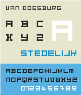
Among the works of Schwitters, Van Doesburg and Lissitzky, contrast appears as one of the most significant design strategies. Theo van Doesburg published the journal Mécano, and in 1919 designed Van Doesburg type face which is formed by using equally weighted, perpendicular strokes. In 1997, this typeface is revived digitally and
named Architype Van Doesburg (Fig. 2.1.4) by Freda Sack and David Quay of The Foundry. (The Foundry, n.d.)
Fig. 2.1.4. Architype Van Doesburg Typeface (foundrytypes.co.uk)
Within this scene, a leap first to expressive typography then towards a rigid, grid based, geometrical design manifests itself through avant-garde movements. One of the prominent movements that had its focus on designs concentrating on functionality and rationality by taking mass production into consideration was the Bauhaus School. Bauhaus School operated from 1919 to 1933 is founded by Walter Gropius in Weimar. Hannes Meyer, Laszlo Moholy-Nagy, and Wassily Kandinsky, Herbert Bayer are among the important figures. Herbert Bayer designed geometric sans-serif typeface called Universal in 1925, which revived digitally as Bayer Universal, That typeface also influenced the designs of
ITC Bauhaus and Architype Bayer (The Foundry, n.d.). Herbert Bayer and Jan Tschichold both embraced geometrical, san-serif typefaces and asymmetrical, grid based compositions that manifested the utility and functionality, which were in the core of Bauhaus. (Fig. 2.1.5)
Fig. 2.1.5. Herbert Bayer, poster design, 1926. (heathershawdesign.com)
As J. Abbott Miller and Ellen Lupton (1992) stated in “A Natural History of Typography”, avant-garde movements tried to “defamiliarize” writing. Defamiliarization, which is a theory of Victor Shklovsky (1992: par. 21) “held that everyday world is invisible until we are forced to see it differently, and that art is primarily means for ‘making strange’ the already-seen and already-known.” Avant-garde movement, though each
one having different motives blurred the boundaries between art and everyday life. They aimed at reaching masses and creating a sense of awareness. By asserting different approaches, avant-garde artists created a shocking effect that defamiliarizes the viewers’ reception by contrasting the artistic and cultural conventions.
2.2 The Computer Age, from METAFONT to Emigre
2.2.1 The Computer Age and Digital Culture
By attacking the typographic norms, avant-garde artist and designers began creating new visual languages, which call for reactions from the audience. They attacked on the structural constructions of typographic formations that allowed the emergence of diverse meanings.
Ellen Lupton (2000: par.2), a pioneer in graphic design education and practice in “Fluid Typography” defines typography as, “the art of designing letterforms and arranging them in space and time.” Until recently, typography was a specialized profession, which was performed by highly skilled craftsman as the punch-cutters and compositors. However, with the advancement of digital technologies, especially, with the introduction of the Macintosh computers into the market, not only
designers but also the lay persons received the chance of performing typography. The availability of personal computers and developing technologies, helped the transformation of typography into an experimental, wide ranged profession. Digital culture calls for new approaches, a new state of mind and inclination. Computers acquired new approaches towards typographic applications. However, it is very easy to fall into a technologic deterministic point of view, in order to avoid such mistake one should analyse the factors that digital culture is building itself upon very carefully.
Charlie Gere (2002: 13) in Digital Culture explains that:
Gilles Deleuze points out, ‘the machine is always social before it is technical.There is always a social machine which selects or assigns the technical elements used.’ Digital refers not just to the effects and possibilities of a particular technology. It defines and encompasses the ways of thinking and doing that are embodied within that technology, and which makes its development possible.
Different from static type, television, video games, the Internet, human computer interfaces, movies, communication technologies, so, all the digital culture media and apparatuses necessitated kinetic type for motion graphics. Digital culture by its electronic nature, which elevates the variable of “time” that introduced motion and speed into the scene, challenged time and space relations. The conventions related to traditional typography is critically challenged. As a consequence, “[w]e
need to look at screen-based typography as a new language, with its own grammar, its own syntax, and its own rules” (Helfand, 2001: 236).
2.2.2 Passage from Analogue to Digital
Computers first perceived as media with which the designers can work in order to create solutions for the printed media. However, as the medium developed and the softwares emerged and upgraded, digital media became a platform for the designers not only to work with but also to work for this interactive medium.
The first explicit visual development concerning typography was the bitmapped fonts that referred to WYSIWYG (“what you see is what you get”) approach that the computers developed. “WYSIWYG employed the use of actual-size images of document pages on the computer screen and the corresponding ability to print them as they appeared” (Staples, 2000, p. 20). In the late 70s and early 80s researchers and programmers were working intensely in exploring new ways of imaging digital type. Donald Knuth’s 1979 METAFONT was and attempt to design type through the use of algorithms of geometrical equations. Although, it is considered as being a groundbreaking event the designers had to stood outside of it as
the programming language required mathematic expressions which most of the designers were unfamiliar to. (Staples, 2000: 22)
2.2.3 Typefaces of Digital Culture
Charles Bigelow’s and Kris Holmes’ typeface, Lucida, which was introduced in 1986 is of great success since it answers the needs for a type that is applicable in both printed media and in online media and it is still in use. Most of the designers preferred to work with Macintosh computers and as a result, the developments and alterations in the visual language of the interface of the Macs defined the look and feel of the computers. For instance, bitmap fonts Chicago and Geneva were addressed to meet the need for display of letters in CRT (cathode ray tube) which uses pixels as defining elements. After dot matrix printers, PostScript Laser printers were introduced and they were using the outlines of the letterforms in order to identify the type for print. As a consequence the screening of a type and its printed version required two different technologies, one of which is for screen playing and the other is for printing.
However, there was the need for variety in the design of the letterforms. Emigre enters the scene at this particular point. Emigre is the name of a
type foundry and a graphic design publication located and published in Berkeley, California, founded by Rudy VanderLans and Zuzana Licko. The magazine used to be published till issue number 69 in 2005. Later on it Emigre no. 70 is published as a compilation of selections from the issues of magazine. Zuzana Licko is one of the prominent designers who acknowledges the significance of screen-based typefaces and image and the new language that digital media offer. Licko designed many typefaces related to the content and context of the Emigre which also celebrated the use of Macs and the freedom of the designer to be able to design new type settings and typefaces that would enhance the message of the design and which would form new associations between image and text by bringing those together on a unified layer.
Likco, (par.46) in the Emigre web-site, where she answers frequently asked questions states that:
Information is increasingly being stored, accessed and displayed in digital form. Thus, on-screen design has regained importance for multimedia CDs, electronic bulletin boards and the World Wide Web. Screen display is no longer a temporary analogy for the final printed piece; it has become the final method of viewing much of our information. This presents the challenge of addressing the coarse resolution of the common computer screen.
She stressed the importance of the primary function of type as communication and emphasizes the visual language as being part of the message with which this communication is made possible. The three most
major typefaces that manifest the look of the pixel that Licko designed are Emperor, Oakland and Emigre.
April Greiman is another important figure in the formation of the visual language of digital typography. She made extensive use of pixellated letterforms and images in both her printed and video works. Her approach of intensifying the pixels manifested as a challenge that questions the conventions of traditional typography.
Adobe Photoshop, which is a raster based digital image editing program, introduced commercially the concepts of anti-aliasing and blurring into the digital typography scene. Although, as a program it was built as a tool to edit photography, with its raster based nature it enabled intermixing of image and text by attributing image qualities to the text. The text apart from the typographic aspects, became an element that could be manipulated visually within the limits of the raster based program, since it transferred the letters into rasterized objects that is formed of pixels. Any visual manipulation, which might not be thought of became possible.
Anti-aliasing is used to get rid of the jagged edges of the letterforms by placing middle color valued pixels next to the edges of the letters that would create a smooth transition between the letterforms and the background (Fig. 2.2.3.1) Neville Brody made extensive use of this power of Photoshop to bring together and manipulate text and image.
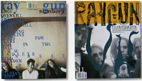
David Carson throughout the 90s, especially in the Ray Gun magazine continued this new style that digital typography offered. He played mostly on the concept of legibility, as a consequence his works contributed a lot to the new language of typography and digital imagery. (Fig. 2.2.3.2)
Fig. 2.2.3.2. Ray Gun covers by David Carson (magspreads.net)
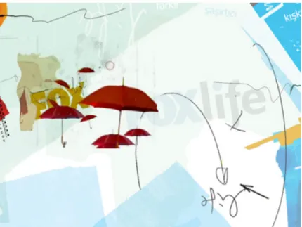
The concerns of digital culture, which are reflected through the dialogical operations between the computers and typography are not limited to
World Wide Web and the TV graphics introduced a new challenge for the designers, namely the interactive media where the viewer becomes participant and own the power to alter what she is interacting, hence, becoming a co-author. (Fig. 2.2.3.3) The designers were responsible of every visual decision in their designs, however, with the emergence of interactive media the users gained power over some decision making. They now can choose with which typeface to view the page, how big will the type appear on the screen etc.
Fig. 2.2.3.3. Screenshot from Foxlife Web Site (foxlife.com.tr, 2008)
A second challenge is the kinetic typography. Motion graphics offered a new dimension for the designers to work for, a dynamic one. As Jessica Helfand (2001: 235) stated in “Electronic Typography”, “As we ‘set’ type, we encounter a decision-making process unprecedented in two-dimensional design: unlike the kinetic experience of turning a printed
page to sequence information, here, time becomes a powerful and persuasive design element.”
In 1996 J. Abbot Miller published Dimensional Typography, which was constituted of case studies the shape of the letters within a virtual environment. With those case studies by different designers, he analysed the spatiality and temporal dimension added to typography, enabling our senses to engage with the text on a higher level of reception.
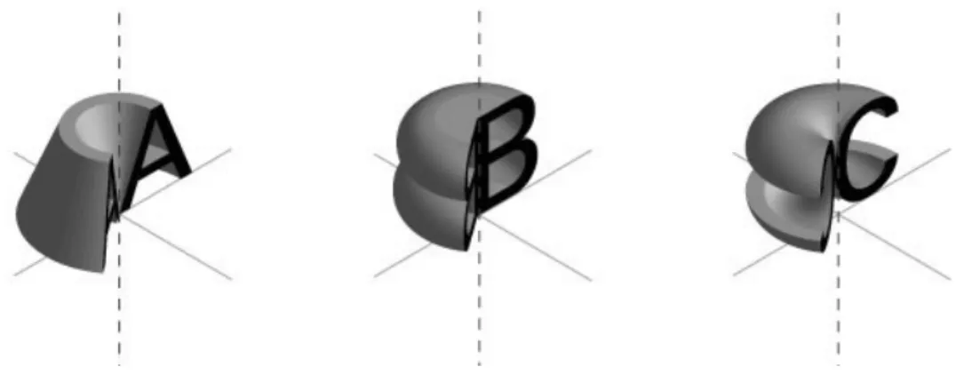
Ji Byol Lee’s Univers Revolved is such an exercise, where the letters with Univers typeface are revolved around themselves at a vertical axis drawn from the “left-most point” of each letter by the help of a 3D computer program. (universrevolved.com) The resulting forms require more effort from the readers and offers a reading practice different from the conventions. (Fig. 2.2.3.4) The letters by being revolved become symmetrical forms, thus, the reading direction is freed from the conventions of linear reading. (Fig. 2.2.3.5)
Fig. 2.2.3.5. Univers Revolved, 1996, designed by Ji Byol Lee as a homage to Frutiger’s Univers typeface (from Dimensional Typography, 1996, J. Abbott
Miller)
It is obvious from the developments mentioned, that the computers have distinctive effects on the typography as they cause the creation of a new visual language that expresses the technological, social and cultural changes. Digital media appear not only as a platform, which the designers use only as a tool but also as a cultural sphere in which the social, historical and political agenda is defined and reflected upon.
Digital culture transformed typography into a whole new asset by introducing spatiality and temporality not only through the used technologies but also by the new ways of thinking and cognition.
CHAPTER 3
SOUND MACHINES
The previous chapter focused on the significance of changing of the cultural realm, and its manifestation by use of typography. The Western Culture is a visually dominant culture. Within this visually dominant sphere the significance of sound has usually been overlooked by the theorists/analysts. Until recently, the theories regarding perception, cognition and construction were grounded on visual manifestations of ideas, and representations. However, there is a new audio culture that has emerged over the past century.
The difficulty of examining such a culture may lie in its ephemeral nature. Sound is heard by the ears and felt by the body as a physical sensation as the result of vibrations. Because of its temporal essence it vanishes promptly. “Sound inhabits its own time and dissipates
quickly” (Kahn, 2001: 5) Recording techniques as Kahn suggested enabled sound to be fully analysed as they grasp sound and prevent it from vanishing. One other aspect of sound is its dynamic relation with its environment. Sound’s relation with time and space continuum is different from a visual element’s relation with it, since, sound is formed of waves, it does not occupy a visible pictorial space. Peter Krapp (2011: 61) in Noise Channels: Glitch and Error in Digital Culture explains that:
The cultural history of sonification is marked by two aspects: on one hand, it makes audible something one would not get to hear without its data being transcoded, that is, without the use of media technology that can store, reproduce and transmit data in a number of ways. On the other hand, this variable access to data can lead to insights that otherwise are hard to come by: examining light or color or humidity or temperature as sound waves, as practiced both in sound art and in experimental contemporary music.
As Brandon LaBelle (2006) argued in Background Noise the modes spatiality of sound is “at the core of the very practice of sound art” (p. ix). The technical and technological developments, as well as socio-political changes, and cultural adjustments revealed the acoustic space that was present before the establishment of visual space in the minds of Western people.
This section tries to examine the key developments that were triggered with the technological innovations under the influence of changing and evolving culture and the already effected ideas and notions that took
forms as responses towards a definition of an acoustic culture in order to comprehend and render the discourse within a theoretical framework.
3.1 Noise as Power; the Avant-Gardes
With the emergence of Industrial Age, starting with the Futurists such as Luigi Russolo, Hugo Ball, and Francesco Balilla Pratella and later on accelerating with the experiments of artists like John Cage, Brian Eno and the others sound has gained importance in the art scene. The Western Classical Music is based on harmony and melody. Then the focus has shifted from the system of music that is formed with the wanted, filtered and desired resonances, which is purified from the unwanted resonances towards the background sounds that were neglected and eliminated. “The basic composition of ‘background’ is comprised of data we filter out to focus on our immediate surroundings” (Cascone, 2000: 13) Consequently, this shift of focus from foreground to background impelled the artists to explore new territories. The reversal of this relation appears as the consequence of the influence of digital culture, hence, technology in our lives. According to Attali (1985: 10) “the only thing that primitive polyphony, classical counterpoint, tonal harmony, twelve-tone serial music, and electronic have in common is the principle of giving form to noise in accordance with changing syntactic structures.” As the
approaches towards music changes through shifting technologies and evolving culture, noise, which was regarded as a dissonance became part of the audial pieces and new meanings could be assigned to it.
Contemporary Sound Design/Art, which is considered as new media art is based on experimentation through the application of different techniques and diverse apparatuses and various approaches and the search for new art forms and creative acts. The preceding pioneers are Luigi Russolo, Edgard Varèse, Pierre Schaeffer, Pierre Henry, Karlheinz Stockhausen, John Cage, Iannis Xenakis, Steve Reich, Hildegard Westerkamp among others.
As was also stated in the previous section, Futurists embraced power, dynamism, motion and technology. The Italian Futurist painter Luigi Russolo after being influenced by the performance of Balilla Pratella wrote a manifesto called the “Art of Noises” as a letter to Pratella in 1913. With the help of noise machines, Russolo tried to control noise since he saw new potentials and multiplicities in “the noises” that egressed by the machines, which were triumphed with the industrial age. He was concerned mainly with the noises that the industrial machines are producing. He claimed that our ears are educated and are used to hear the sounds. However, the variety of the ‘noise-sound’ is more promising and can answer the call of our ears. Russolo (1913) stated in “The Art of
Noises” that “this musical evolution is paralleled by the multiplication of machines.” Thus, Russolo is considered as the pioneer theorist of electronic music because of his involvement with machinery and the possible noise-sounds that can be acquired from them. He designed noise machines that are called intonarumori (noise intoners) in order to experiment with the created sounds that imitate that of the machines’. In The Art of Noises: Futurist Manifesto (1913), Russolo declares that there are 6 families of noises: 1. roars, thunderings, explosions, hissing roars, bangs, booms, 2. whistling, hissing, puffing, 3. whispers, murmurs, mumbling, muttering, gurgling, 4. screeching creaking, rustling, humming, crackling, rubbing, 5. noises obtained by beating on metals, woods, skins, stones, pottery, etc., 6. voices of animals and people, shouts, screams, shrieks, wails, hoots, howls, death rattles, sobs.
Therefore, the sounds which were previously considered as unwanted elements that were seen redundant and even as disturbances became significant components of the production process and important parts of the acoustic realm.
As Torben Sangild (2002: 3) stated “noises are the sounds which used to be denounced as non-musical.” The aesthetic power of noise used in sound art comes from the multiplicity of the machines that are introduced to the society and are part of daily lives. Digital culture is built upon the
interrelations, interactions and the dialogues formed between every single element within its system.
Attali (1985: 26) defines noise in Noise: The Political Economy of Music as:
A noise is a resonance that interferes with the audition of a message in the process of emission. A resonance is a set of simultaneous, pure sounds of determined frequency and differing intensity. Noise, then, does not exist in itself, but only in relation to the system within which it is inscribed: emitter, transmitter, receiver.
When we examine noise music, we see that what is reversed in noise music within the system, which it is inscribed in, is the exclusion of harmony, flow, melody and composition that forms the Western music and the introduction of the sounds, which are considered to be noises since they interrupt, disturb and distract. Music is structured like society and changes in accordance with it (Attali, 1985: 10). If music is the “organization of noise” then it signifies that noise cannot be fully controlled. Sounds are also structured within culture, through language we assign meanings to them, so when we cannot articulate any sound or load meaning to it we tend to consider it as noise. Sound is thus embedded in culture. Our auditory senses are developing as the culture is also in a continuous flux. New meanings are generated through generating, recording, sampling, repetition, juxtapositioning of sound.
Hugo Ball, one of the prominent Dada artists that founded Cabaret Voltaire with politic, as well as artistic reasons performed sound poetries which were consisted of nonsensical words. The performances were reactions towards the status quo of society, culture and art sphere, and a revolt against institutions. A well-known example of these poetries is Karawane, which Ball performed in 1916, in Zurich.
Ball in Dada Manifesto (1916: par. 4 and 5) states with a great enthusiasm his position:
I shall be reading poems that are meant to dispense with conventional language, no less, and to have done with it. Dada Johann Fuchsgang Goethe. Dada Stendhal. Dada Dalai Lama, Buddha, Bible, and Nietzsche. Dada m'dada. Dada mhm dada da. It's a question of connections, and of loosening them up a bit to start with. I don't want words that other people have invented. All the words are other people's inventions. I want my own stuff, my own rhythm, and vowels and consonants too, matching the rhythm and all my own. If this pulsation is seven yards long, I want words for it that are seven yards long. Mr Schulz's words are only two and a half centimeters long.
It will serve to show how articulated language comes into being. I let the vowels fool around. I let the vowels quite simply occur, as a cat miaows ... Words emerge, shoulders of words, legs, arms, hands of words. Au, oi, uh. One shouldn't let too many words out. A line of poetry is a chance to get rid of all the filth that clings to this accursed language, as if put there by stockbrokers' hands, hands worn smooth by coins. I want the word where it ends and begins. Dada is the heart of words.