“METAMUSEUM” INFORMATION, DESIGN, AND INTERACTION: BEYOND THE CATEGORIZATION OF THE MUSEUMS
Master’s Thesis
by SEMRA AY
Department of Communication and Design İhsan Doğramacı Bilkent University
Ankara September 2018
“METAMUSEUM” INFORMATION, DESIGN, AND INTERACTION: BEYOND THE CATEGORIZATION OF THE MUSEUMS
The Graduate School of Economics and Social Sciences of
İhsan Doğramacı Bilkent University
by SEMRA AY
In Partial Fulfillment of the Requirements for the Degree of MASTER OF FINE ARTS
THE DEPARTMENT OF COMMUNICATION AND DESIGN
İHSAN DOĞRAMACI BİLKENT UNIVERSITY ANKARA
ABSTRACT
“METAMUSEUM” INFORMATION, DESIGN, AND INTERACTION: BEYOND THE CATEGORIZATION OF THE MUSEUMS
Ay, Semra
M.F.A. in Media and Design, Department of Communication and Design Supervisor: Assist. Prof. Marek Brzozowski
September 2018
The technological enrichment of visual communication has been reflected more and more in cultural heritage and museums. In particular, data visualizations are being used gradually by scholars, museum curators, and collection managers to analyze multiple layers of museums data in dynamic ways. Visualization techniques provide creative user engagements through interactive forms, various genres, and numerous options. This study looks into museums in Turkey and seeks to develop new methods to visualize the data collected from analysis and categorization in order to reveal the relationships between museums. MetaMuseum is therefore designed as a digital tool to represent knowledge of the museums with principles of graphic design and interactive art.
ÖZET
“METAMÜZE” BİLGİ, TASARIM VE ETKİLEŞİM: MÜZE KATEGORİZASYONUNUN ÖTESİ
Ay, Semra,
Yüksek Lisans, İletişim ve Tasarım Bölümü Tez Danışmanı: Dr. Öğr. Üyesi Marek Brzozowski
Eylül, 2018
Görsel iletişimin teknolojik zenginliği, kültürel miras ve müzelerde giderek daha fazla yansıtılmıştır. Özellikle veri görselleştirmeleri, kültürel miras verilerinin birden çok katmanını dinamik yollarla analiz etmek için araştırmacılar, müze küratörleri ve koleksiyon yöneticileri tarafından kademeli olarak kullanılmaktadır. Görselleştirme teknikleri, etkileşimli formlar, çeşitli türler ve çok sayıda seçenek aracılığıyla yaratıcı kullanıcı etkileşimleri sağlar. Bu çalışma, Türkiye'deki müzeleri incelemekte ve müzeler arasındaki gizli ilişkileri ortaya çıkarmak için analiz ve sınıflandırmadan toplanan verileri görselleştirmek için yeni yöntemler geliştirmeyi amaçlamaktadır. MetaMüze bu nedenle, müzelerin bilgisini grafik tasarım ve interaktif sanat ilkeleriyle temsil eden bir dijital araç olarak tasarlanmıştır.
ACKNOWLEDGEMENT
First of all, I would like to express my sincere gratitude to my supervisor, Assist. Prof. Marek Brzozowski, for his guidance and companionship throughout my study, as well as to Dr. Funda Şenova Tunalı for being fully supportive and understanding throughout the whole journey. I am very grateful for their guidance and inspiration throughout this long walk in-between the areas of art, design, and theory, which gradually led me to find artistic expression and motivation to work on my project.
It has been a great pleasure to get to know and collaborate with the professors in the faculty. I would like to individually mention my Jury members, Assist. Prof. Marek Brzozowski, Assist. Prof. Andreas Treske, and Assist. Prof. Dr. Elif Boyacıoğlu, for their valuable comments and suggestions.
Without the support of all my friends, I couldn’t have finished this project. I would like to extend my warmest thanks to my friends. Lastly, I do not know how to express my sincere gratitude to my sisters and parents for their love, support, and trust in me.
TABLE OF CONTENTS
ABSTRACT ... ii ÖZET ... iii ACKNOWLEDGEMENT ... iv TABLE OF CONTENTS ... 1 LIST OF FIGURES ... 3 CHAPTER 1 INTRODUCTION ... 5CHAPTER 2 MUSEUMS AND RESEARCH METHODOLOGY ... 10
2.2 Mixed-Method: Data Collection ... 12
2.2.1 Qualitative Research Method ... 12
2.2.2 Quantitative Research Method ... 13
2.2.3 Mixed-Method Research ... 13
2.2 Data Collection of “MetaMuseum” ... 15
CHAPTER 3 DESIGN CONCEPT: DATA VISUALIZATION ... 19
3.1 Narrative Visualization ... 22
3.2 Use of Interactive and Dynamic Graphics: Interface Design ... 26
3.3 Method of Online Presentation ... 28
3.4 Artworks and Artists ... 31
CHAPTER 4 “METAMUSEUM” ... 37
4.1 Overview of the Project ... 38
4.2 Prototype Design Process and Implementation ... 39
4.3 Interface design: Developing the Visualization Tool as MetaMuseum ... 40
CHAPTER 5 ... 61 CONCLUSION ... 61 BIBLIOGRAPHY ... 65
LIST OF FIGURES
Figure 1. “MetaMuseum” Research Design ... 11
Figure 2 Monomethod and mixed-model designs(Johnson & Onwuegbuzie, 2004, p. 21) ... 14
Figure 3. Lallemand’s L’ abaque du bateau “Le Triomphe,” allowing determination of magnetic deviation at sea without calculation. Source: Courtesy of Mme Marie-Noëlle Maisonneuve, Les fonds anciens de la bibliothèque de l’École des Mines de Paris (Friendly, 2008) ... 20
Figure 4. Mouvement des voyageurs et des marchandises dans les principales stations de chemins de fer en 1882 (Friendly, 2008). ... 21
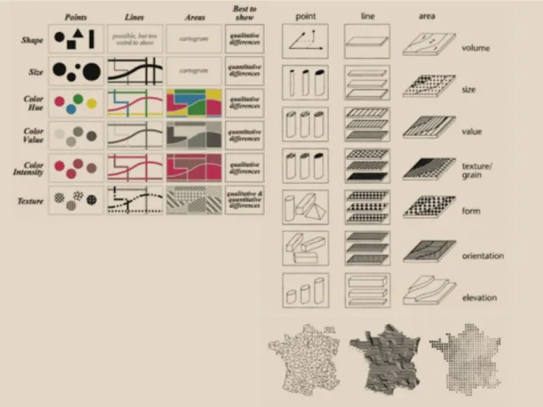
Figure 5. Figure 6 Jacques Bertin, Graphic Variables, Semiology of Graphics (Drucker, 2014). ... 24
Figure 6. MetaMuseum circle and line form ... 25
Figure 7. MetaMuseum color value and intensity ... 25
Figure 8. Figure 6 Jesse James Garrett, elements of the user experience (2000). ... 28
Figure 9. https://britishmuseum.withgoogle.com ... 29
Figure 10. Figure 12 http://www.histography.io ... 30
Figure 11. The Gleaners by Jean, François Millet, 1857. https://artsandculture.google.com/asset/gleaners/GgHsT2RumWxbtw?hl=en. 32 Figure 12. City DATA; Seoul Daily Expenditure ... 33
Figure 13. Network Map of Artists and Political Inclinations, https://burak-arikan.com/. ... 35
Figure 14. Figure 8 Network Map of Artists and Political Inclinations, https://burak-arikan.com/. ... 35
Figure 15. Lev Manovich, TimeLine ... 36
Figure 16. Graph Commons Draft ... 39
Figure 17. Color Palette and Font Family ... 41
Figure 18. MetaMuseum Website Layout ... 42
Figure 19. MetaMuseum Website Map ... 43
Figure 20. Wireframe of MetaMuseum Website Design ... 44
Figure 21. MetaMuseum / Introduction / Play Tour ... 45
Figure 22. MetaMuseum / Introduction ... 45
Figure 23. MetaMuseum Interface Design 1 ... 46
Figure 24. MetaMuseum Interface Design 2 ... 46
Figure 25. MetaMuseum Interface Design / Start ... 47
Figure 26. MetaMuseum Interface Design / Locations ... 47
Figure 27. MetaMuseum Interface Design / Locations ... 48
Figure 28. MetaMuseum Interface Design / Types of Museums ... 49
Figure 29. MetaMuseum Interface Design / Types of Museums ... 49
Figure 30. MetaMuseum Interface Design / Types of Museum / Private Museums . 51 Figure 31. MetaMuseum Interface Design / About ... 58
Figure 32. MetaMuseum Interface Design / Contact ... 58
Figure 33. MetaMuseum as an artwork in an MFA exhibition ... 59
CHAPTER 1
INTRODUCTION
There is a growing interest in visual communication and visualization techniques that provide creative user engagements through interactive forms, various genres, and numerous options. These developments in design and technology bring some possibilities to the table to establish new associations between data and interactive media as an artwork. These can be used to communicate, connect, interact, inform, and share inside and outside of museums.
As an artist and designer, it is essential for me to criticize and interpret the big picture. As a research study and an artwork, “MetaMuseum” has been created to seek out a connection among museums and re-categorize them by considering their relationships to design a medium through an interactive display that encourages people to get information. Thus, “MetaMuseum” is a connection to see how digital media provide well-organized and interactive visuals that help users to analyze and understand the research very clearly. In order to contextualize the overall research, the previously established re-categorization of museums in Turkey, data
visualization, and interaction design must be carefully analyzed and examined in order to grasp and improve them in a theoretical and practical discourse of the project as an artwork.
Data visualization for museums is being used gradually by scholars, museum
curators, and collection managers to analyze multiple layers of museums with data in interactive ways. The long-standing commitment to the interactivity of data, by considering correlations of the museums, has altered the individual's way of thinking about networks as a creative medium.
The second chapter focuses on the design of the research, in which the description of the museum, the categorization process, the scope, and the limitations are examined. The International Council of Museums describes the museum “as a non-profit, permanent institution that is established with the purposes of education, study and enjoyment” (ICOM). The historical evolution of the museum has been shaped in multiple ways through different institutions and researchers who consider their common features. For example, history, architecture, artifacts, artists, and time period could all be regarded as multiple layers of characteristics to be assessed. Throughout time, the definitions and categorizations of the museum have been updated as a result of developments in society. According to G. Brown Goode’s classification, there are two ways: one is the character of the content, such as the museum of art, historical museums, and the second one is the purpose of their foundation national museums, local, provincial or city museums (1896, p. 157). This is the basis of the thesis, where the role of “MetaMuseum” is to visualize the
networks among museums in Turkey. A couple of questions can be raised, such as: “How can it be possible to describe and re-categorize the museums in Turkey?” and “How will this re-categorization make it possible to create a relationship as a mutual point among a huge number of museums?” First, the quantitative research, including a numeric and classical data collection from a large sample size, allows the
interpretation of great volumes of information. Then, this numerical and hybrid categorization sample result leads to a better interpretation of the context, through collections, online sources, regions, history, and more features as qualitative method. This research aims to analyze and explore the complex relationships within the museums. Thereby the project makes a point of understanding and visualizing abstract and disorderly information about museums and their features by placing
them in a visual context.
In the third chapter, the design concept of data visualization is analyzed in terms of the method of categorization, interface design, online presentation, artworks, and artists. The long-standing commitment to a dynamic way of communication catches the attention of a large number of cultural heritage institutions such as art galleries and museums. In particular, technological and visual developments enhance participation in both spatial and digital platforms because museums are becoming more and more complex spaces with large-scale and multi-dimensional facilities. Thus, the role of museums’ “knowledge production” gains importance to enhance the engagement of the audience, collections, and spatial and digital space. Building a visual language provides a new display to perceive different dimensions of the dataset with the contributions of connections. Use of graphical methods by applying a digital visualization technique has taken place in cultural heritage where a huge space is provided to the audience. From the guide of classification of visualizations, hybrids1 as an “exploratory explanation” method are applied and the project is created as an interactive design that enables information to encode in a pattern parameter by leaving a freedom of discovery space for the users (Iliinsky & Steele, 2011).
The third chapter primarily introduces encoding information as an interactive design where the analysis of relationship triangle of the designer, reader, and data is done.
1 The Hybrid category that is mentioned by Iliinsky and Steele contains a curated dataset that leaves a space to
the audience to be part of some exploration. The visualization is presented usually as an interactive tool that is created as a kind of graphical interface. So, the user could choose and constrain some parameters, patterns and whatever the curated data offer. (Iliinsky & Steele, 2011)
The relationship of information, design, and culture has been discussed under the umbrella of data visualization. The Well-known new media theorist Lev Manovich focuses on the idea of cultural analysis and cultural analytics. He aims to explore massive cultural information flows and datasets in order to analyze and develop new methods and apply computer-based methodologies (Manovich, 2009). Hence, this research concentrates on exploring the cultural implications, trends, collections, networking databases, images, video, and a greater variety of contents, and it aims to analyze and visualize the data that is obtained and interpreted in the cultural contexts. As a second step, the meaning of the message is analyzed in the sense that the reader becomes able to decode the graphic form as a visual art rather than as merely being informative or persuasive. As a representation, a dynamic way of communication has been embraced to allow the audience to decode a large amount of information on a display (Iliinsky & Steele, 2011, p. 8). The method of presentation of MetaMuseum is designed by customizing user experience through an interface design and online user accessibility. Thus, human-computer interaction and centered navigation has gained importance in representation and composition of the research design. In this regard, Johanna Drucker states that “the interface is a mediating structure that
supports behaviors and tasks. It is the space between human users and producers that happen according to complicated protocols” (2014, p. 138). In other words, interface design has become a bridge to gain access to data visualization. Designing a human-interaction structure gives a form of communication, and the readers’ mode plays a unique role not only as a reader, but also as an interpreter. Visual art reveals a deeper understanding of large datasets underlying the information and aesthetics. Thus, the form of the projects provides a knowledge position that gives power to the users in a broad definition and for interpretation. The last part of the chapter is finalized by
comparing and contrasting visual artworks by different artists with current debates.
The fourth chapter concentrates on the “MetaMuseum,” defined as a digital tool to represent information of the museums through principles of graphic design and interactive art. By diving into museums, the complexity, scale, and different types of museums in Turkey allowed the creation of a tool to define multiple patterns and classify new research-based layouts. After discovering different aspects,
“MetaMuseum” has been designed as a medium to tell stories and parameters on a web-based interactive display. Prototype design processes and implementations are analyzed and evaluated from the perspective of the user/receiver. The meaning and significance of cultural heritage content in digital media are discussed in terms of human-interaction visual art.
In the conclusion, the big picture of this research, which is based on museums, data visualization, and interface design, is interpreted. In that respect, the connectivity and relationships among museums are generated through the “MetaMuseum” via usage of visualization techniques applied to output data. On each level, research design, data visualization, and interface design are analyzed through research dimensions, design process, and the user’s perception. This study concentrates on the research and design methodologies to visualize the data collected from analysis and categorizations that aim to reflect relationships embedded in the network of museums.
CHAPTER 2
MUSEUMS AND RESEARCH METHODOLOGY
2.1 Design of Research
Foucault characterizes the museum as a space of difference and representation, a space in which the difference between words and things is put on display, which contains pieces from different times, regions or sides. A form of era, type, and idea for the aim of the museum have been differently shaped historically. For him, the museum’s effort to introduce the totality of time is historically contingent. “Yet if the seventeenth-century cabinet of curiosities and the twenty-first-century science
museum are no less heterotopian than the nineteenth-century universal museum” (Lord, 2006, p. 4), this implies that the form, nature, and purpose of the museum have been shaped historically through changes over time.
“The museum is an ‘empowering’ institution, meant to incorporate all who would become part of our shared cultural experience” (Alexander & Mary, 2008, p. 1). Therefore, museums have varying types and aims to collect, preserve, interpret, and display artifacts to the public. By considering the multiple forms, functions, and contents, classification is a suitable way to contextualize museum information within the multiple aspects.
The major motivation of this research appeared when I was visiting several
museums, conducting research on the historical side of Turkey and studying history and design. Two main questions triggered my curiosity: “How many museums are there in Turkey?”and “What are their mutual and different basis effects on the historical and cultural dimension?” Thus, the curiosity of relationship between
museums guides the mindset of this research. The number of museums and their various features allow the creation of a large, detailed network picture. The common features of the museums draw the path while collecting information and building the output of a skeleton through mutual contexts such as history, architect, and location, enabling it to create a pattern from multiple angles.
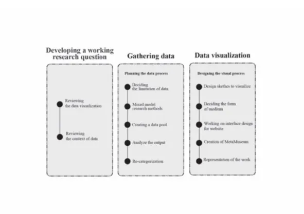
Figure 1. “MetaMuseum” Research Design
As a starting point, the Turkish Republic Ministry of Culture and Tourism data is taken as a first source in order to consider the definition of a museum created in Turkey. Besides the number of museums listed on the website, the study covers their website pieces of information that are gathered in order to keep the process up to date. Thus, the creation of the essential research strategy and the limitation of
research was conducted properly, in which the quantitative side of the algorithm was drawn out. Regarding the main research motivation, how the museums communicate with each other, the second focus is to find unknown characteristics of museums,
which dovetails algorithm in the context of the information set. As the last step, the gathered data pool increases the complexity and expands inheritance relations between different characteristics of museums. The choice of the data pool must divide into different parts and build categories and subcategories focused on
relationship dimensions, which are defined through the qualitative research method. The leading attempt to reflect this output aims to show the relationship between different museums while drawing the network map-based knowledge of the results.
2.2 Mixed-Method: Data Collection
Within the scope of this research, the data gathering journey and its visualization process has encouraged me to perceive and interpret information. Deeper analysis with different methods enhances through interconnections and conceptualization and seeks to move beyond methods of the research practices.
2.2.1 Qualitative Research Method
As a method used by the social and natural sciences, qualitative research can be defined as a scientific approach to collecting non-numerical information. The method is shaped by the concept of data, features, characteristics, and meaning of the
contexts, so the approach seeks to properly answer the questions. The method
includes a diversity of ways to tackle conceptualization. That is why its identification implies the mode of understanding and contains a potential expanded outcome. There is an attempt to collect and examine the information. In the book titled The SAGE
Students, scholars, and professionals who are new to qualitative research typically need guidance in defining the boundaries of this type of work, including guidance in selecting specific methods, knowing what types of data are appropriate for qualitative studies, identifying theoretical frameworks for particular projects, and so on. (Given, 2008, p. XXIX)
As a tool of research and analysis of “MetaMuseum,” the websites were taken as a source while gathering information by considering what the museums and
responsible institutions provide online. This is because the Internet takes the role as a social phenomenon, a tool, and also a field-site for qualitative research.
2.2.2 Quantitative Research Method
Quantitative research as a basic term could be defined as methods that are engaged in gathering and analyzing data consisted of numerical techniques. Different models and methods can be used to develop hypothesizes and researches theories. The main aim of the method is to establish trustworthy and certain measurements that enable people to build statistical and unbiased results (Goertzen, 2017). When it comes to the research process of “MetaMuseum,” the quantitative method provided the project to concentrate on measurable data by answering “what,” “how,” and “how many” questions. The method allows exploration of the scope of the data by finding the numeric insights. Thus, the use of quantitative research contributes to filling in these data gaps and analyzes the final numerical datasets collected.
2.2.3 Mixed-Method Research
It is possible to find multiple interdisciplinary approaches that involve the
has been gradually characteristic and common. So far, the combination of the two has become a remarkable research practice that allows researchers and authors to integrate different methodologies from varying perspectives (Bryman, 2006). While building the body of “MetaMuseum” project, dimensions of two research methods draw a path through the process.
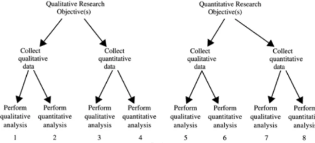
In order to create a taxonomy of pattern, mixed-method research, which is defined as a combination of qualitative and quantitative research, is used while collecting the data from multiple angles. That opens a space for a designer to model and analyze data, which provides a connectivity generated through the information multiple methods (Johnson & Onwuegbuzie, 2004). In the case of the study, this method leads the study to apply multi-method research, which emphasizes the pluralism of data sources, paradigms, approaches, methodologies, and points of view. According to Burke Johnson and Anthony Onwuegbuzie, this is the research method tree:
Figure 2 Monomethod and mixed-model designs(Johnson & Onwuegbuzie, 2004, p. 21)
It is useful to think of an effective explanatory data visualization as being supported by a three-legged stool consisting of the designer, the reader, and the data. Each of these “legs” exerts a force, or contributes a separate perspective, that must be taken into consideration for a visualization to be
stable and successful. Each of the three legs of the stool has a unique relationship to the other two. While it is necessary to account for the needs and perspective of all three in each visualization project, the dominant relationship will ultimately determine which category of visualization is needed. (Iliinsky & Steele, 2011, p. 9)
According to the method process, the first step is determining a research question, the second one is following the question to decide if a mixed-method is acceptable or not, the third step is to choose mixed-method or mixed-model research, the fourth step is to gather data, and the fifth is to analyze data. The last, eighth step is to draw a conclusion to make a final report on the result (Johnson & Onwuegbuzie, 2004).
2.2 Data Collection of “MetaMuseum”
As a starting point, several of the museums were taken as samples to analyze the meaning-producing of information to draw a layout of the structure. With the exploration of the data, the sampling—which is started with ten museums, in the beginning—reached the aimed point with the information obtained. The Rahmi Koç
Museum, the Museum of Anatolian Civilizations, the Ethnography Museum, the MTA Museum , the Sakıp Sabancı Museum / İstanbul, the Pera Museum, Topkapı Palace,
the İstanbul Archaeology Museums, and the Bodrum Underwater Archaeology
Museum were selected for deep research. The reason why these were taken as a
sample group is that the information that they provided online was enough to compare and contrast their features. In other words, the selected museums were reflecting the basic concepts that are determined by location, types, history, and activities. The next step was to find different relationships with more in-depth
research with a large number of museums. So, in order to extend the research, the list of museums from the Turkish Republic Ministry of Culture and Tourism website
drew a path of data collection. According to the 2016 statistics, there are 417 museums in Turkey, among which 193 have been awarded the Museum of the Year in Europe, and 224 are private museums under the control of the Turkish Ministry.2 The number of museums has increased in the last two years, and today there are 439 museums and 139 ruins in Turkey.3 Their information is provided on their websites, such as activities, collections, history, and location. With the critical and analytical frameworks, data was obtained via the new headings and subheadings by the
familiarity and connectivity of up-to-date online information. As a starting point, the categorization of their location is listed by considering their cities. The list covers all cities that house museums and contains them in alphabetic order, which starts with museums in Adana, Adıyaman, and Afyon, and ends with museums in Van, Yozgat, and Zonguldak. The types of museums contain the classical categorization methods and consist of the subsections of natural history, technology, art, anthropology, city, commercial, private, and history. The history and architect classifications focus directly on the ages and the architectural structure of the museum. The exhibitions title stresses museums that provide the temporary and contemporary in their space to audiences. The admission category covers the list of museums that sell the museum card. The international side classification is formed with museums that work with international institutions, conferences, and museums. The field work title
concentrates on museums that have a space for new researche projects on history and excavations. Laboratory and restoration cover museums that provide the scope of the field for the discovery and analysis of new works. Museums that provide a library space or collection to audiences are listed under the title of library. The research and publications, conferences, education, and organizations categories stress the specific
2 Tüik Cultural Heritage Data, 2016, http://www.tuik.gov.tr/PreTablo.do?alt_id=1086.
museums that enable people to reach these opportunities under the umbrella of these museums. The children title is created based on the visitor profile and a project that contains children-friendly museums. Daily and weekly activities aim to give more information to an audience for social activities. Cafes and restaurants and store classifications focus on museums that offer the visitor cafes or restaurants. The technology title reflects the number of museums that accommodate the usage of technology into the museum. Lastly, the UNESCO (The United Nations Educational, Scientific and Cultural Organization) title includes the cultural heritage that comes together under the umbrella of the institution.
In this process, both the design and the data collection processes were planned together in order to manage the output and complexity of the representation.
Whereas categorization led to skeletal dimensions in visual language creation, in the detailed research phase, a whole consisting of pieces was obtained by combining different points such as history, location, collections, and physical possibilities. Numerical data was collected in the process of data collection and systematic classification was provided by considering its qualitative characteristics.
As an overview of the data collection, similarities and differences in particular, played an important role in the evaluation and the organization of these groupings. The availability of online accessibility of museum and artworks, use of technology in the museums, or activities with educational focus can be considered as key points. Quantitative data was used to draw a path to figure qualitative data out, and the result is displayed as a big picture of reflected numerical data on the screen. Widespread scale and complexity enable the process to apply the mixed-method research into the
research, but it also created a challenge to accurate visual representation through the abstraction of data.
CHAPTER 3
DESIGN CONCEPT: DATA VISUALIZATION
“Graphical elegance is often found in simplicity of design and complexity of data.” (Tufte, 1983, p. 177) It is generally known that statistical graphics and data visualization had
comparatively developed in modern times in statistics. Actually, when it is deeply searched in the historical background, the roots of the graphic representation of quantitative information are based in “the histories of the earliest map-making and visual depiction, and later into thematic cartography, statistics and statistical graphics, medicine, and other fields” (Friendly, 2008, p. 16). In the big picture, technological developments and the usage of different practices provide a
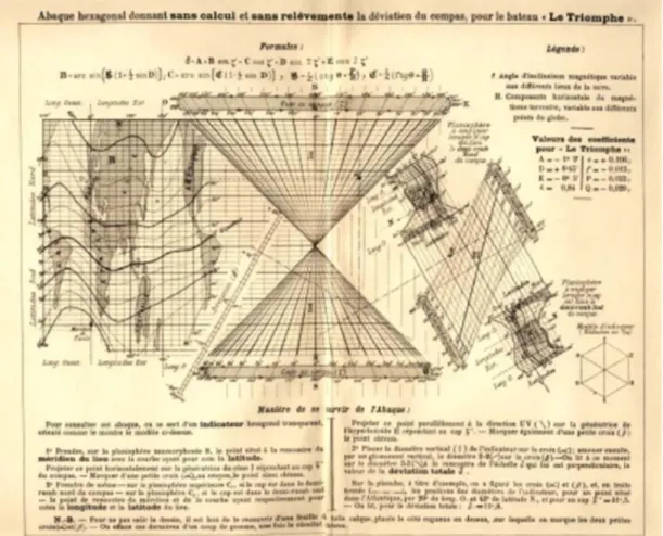
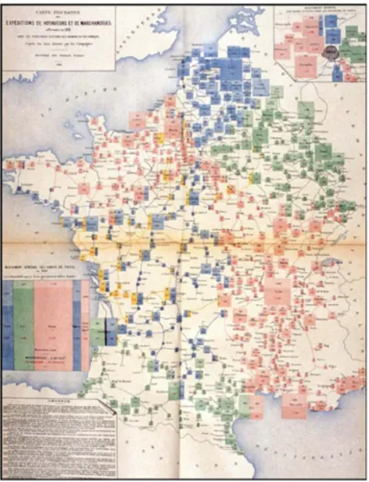
comprehensive field in different contexts and forms for data visualization. The form and function of data visualization is shaped by diverse purposes and various needs. Cartography, mapping, atlases, charts, statistical graphics, pie charts, and plots are some of the forms of data display methods, and they have been developing with a wide range of potential of topics. In the timeline of information visualization, “Lallemand’s L’ abaque du bateau Le Triomphe” “and “Mouvement des voyageurs et des marchandises dans les principales stations de chemins de fer en 1882
(Movement of travelers and goods in the main railway stations in 1882)” would be considered as the representations to understand and reach into the historical roots. “Le Triomphe” was created as a combination of multiple variables into a
multifunction nonogram using maps, coordinates, and grids. “Mouvement des voyageurs et des marchandises dans les principales stations de chemins de fer en 1882 (Movement of travelers and goods in the main railway stations in 1882)” was
aimed to have categorizations and sub-categorizations to create a display to compare various dimensions of states.
Figure 3. Lallemand’s L’ abaque du bateau “Le Triomphe,” allowing determination of magnetic deviation at sea without calculation. Source: Courtesy of Mme Marie-Noëlle Maisonneuve, Les fonds anciens de la bibliothèque de l’École des Mines de Paris (Friendly, 2008)
Figure 4. Mouvement des voyageurs et des marchandises dans les principales stations de chemins de fer en 1882 (Friendly, 2008).
Tufte, who is a statistician, writer, and sculptor, is regarded as a pioneer of modern data visualization, and he claims that information variety and complexity introduce a major change for a potential storytelling narration, since visual display of
information provides appropriate and attractive power for content and interpretations. In 1983, Tufte wrote a book titled The Visual Display of Quantitative Information, where he points out the importance of information design principles that draw a path for data visualization and interface design. According to him, information should:
• have a properly chosen format and design • use words, numbers, and drawing together
• reflect a balance, a proportion, a sense of relevant scale • display an accessible complexity of detail
• often have a narrative quality, a story to tell about the data
• are drawn in a professional manner, with the technical details of production done with care
• avoid content-free decoration, including chartjunk. (Tufte, 1983, p. 177)
3.1 Narrative Visualization
In the scope of information visualization, it is necessary to focus on the definition of information and underline the meaning of information in the museum context, as the concept of information is related to knowledge that is made by the minds of the human being. According to Elizabeth Orna and Charles Pettitt’s definitions,
knowledge is what humans gain from communication with the world by looking for “things” and “know-how” (Parry, 2010). Information is a knowledge transformation where people interact with other people and the process makes the knowledge visible in different concept forms such as written, printed, speech, and more (Parry, 2010).
The word “data visualization” is entitled to draw a visual process of information transformation that is collected and created by means of measurements of a set of data. It could be used to gather data from the psychical world or computer-generated format. The data visualization aims to focus on transferring data to the users to enable them to get information, discover points, and understand better in an effective and easy way (Parry, 2010). Data visualization is a way to link information and visuality in different dimensions. The information is encoded in the graphics in order to be decoded by the users/readers as forms of knowledge from the visual forms. In
other words, it is an act of creating a visual language to reach the users by providing them with easy access, understanding, and clear interpretation. In order to build the language, the roots of data visualization, which is considered as a system of signs, are created based on an understanding of visual epistemology.4 In order to build the form, multiple core topics are stressed and followed to provide information of visual understanding.
Firstly, knowledge is the key point to unlock the concept of interpretation, because to organize it is the fundamental standpoint of visual representation and categorization. Another point is creating a language of form to enable the system to be organized and characterized. That allows the creator to build a conceptual system to express the produced context to others. To reach the audience, dynamic form follows the
languages with design, which focuses on graphical perception of the language to communicate within the design principles. While creating the visual perception, the essential principles have to be on the canvas, which are the Gestalt principles.5 For the representation of graphics, the principles take a crucial standpoint while creating the structure since the method of design creation should contain the basis of visual knowledge that offers an effective structure for human psychology and experience. So, the skeleton of the design is established to see patterns in groupings and to enhance human visual perception. While creating the visual mapping, the semiotics of graphics is taken into consideration to provide a broadly comprehensive and rational sign system (Bertin, 2011). So, the use of basic graphic variables enables the
4 Visual epistemology is developed principally by British artist Joshua Reynolds. As an artist, he explains it using
two steps. Firstly, the artist takes the role of analyzing nature and forming the idea. In the second step, the idea that was formed is prepared to be brought on the canvas to combine and depict an abstraction (Klinke, 2014).
5
“Gestalt is offered as a set of observations that have the potential to provide techniques for stability. It presents a range of possible anchorage points to help the human subject, who may be lost in something, to find himself or herself again: simplicity, 3D (or "visual depth"), homogeneity, familiarity, similarity, and proximity”
structure to become more visible, and it reduces the confusion on a maximum level. To construct a correct representation, it is necessary to consider driven structure expressions, which contain sense, points, lines, areas, shape, size, color, texture, volume, size, value, orientation, elevation, and design variables. These variables are also simply summarized by Johanna Drucker.
Figure 5. Figure 6 Jacques Bertin, Graphic Variables, Semiology of Graphics (Drucker, 2014).
The “MetaMuseum” project is also designed by considering the principles of Jacques Bertin. In terms of shape, the circle as an organic form is used to represent data because the circular from makes the data representation clear while underlying its layout of the composition structure. The use of visual form supports the eye movement and simplifies the visual organization. In order to represent different degrees of the data and their sizes, positions, the color value, and intensity are used
to create an effective graphic form. To reveal the connection between the circular layout, lines are utilized in the display to show relationship. The value, size, and volume of circular shapes changes when the degree of the data increases and decreases in the area. As an example, when the number of museums is higher than Ankara, the circles are bigger and darker. The circles for Ankara are smaller and lighter. Hence, each category is created by this visual method and graphic variables in the project.
Figure 6. MetaMuseum circle and line form
Figure 7. MetaMuseum color value and intensity
In order to manage the information structure with Gestalt’s principle, it is necessary to consider visual editing and reading to create a dynamic and visual perception to present the context to the audience (Drucker, 2014). Along the way, to build the visual language under the umbrella of design structure, the analysis and production
steps of visual composition need to be considered while serving it in the expandable space of the screen. Because embedded complex information is encoded specifically into the graphics, it needs to be decoded by the readers properly in order to provide communication. Hence, it is essential to analyze computational processes and govern properties of forms through knowledge representation mapping and responses
(Drucker, 2014). Besides information transmission forms, the connectivity of interface design struggles with the logic of typography. The connectivity of vocabulary composes rhythms of the skeleton of user interfaces. The
multidimensional nature of interface design with all the graphic elements needs to be analyzed under the rules of human-centered design and logical structure. Since the representation of information is available on both print and digital platforms, there is an aim to properly reach a large number of audiences, and websites with huge data exist to go beyond the borders. “MetaMuseum” is conducted to simplify the multidimensional information structure and embed into it visually on a digital user-friendly display. The website structure is well organized with the design, typographic solutions and theoretical side of black and orange colors.
3.2 Use of Interactive and Dynamic Graphics: Interface Design
“In 1989, interface is defined as ‘a critical point of interaction between life worlds.” – by sociologist Norman Long (Drucker, 2014, p. 147) While drawing a path is presenting the data, the decision of how information is displayed in reaching the users, because the layout of the representation of data in a pictorial or graphical format enables various concepts to simplify and create a space to identify new patterns. To reach this goal, the layered structure plays a crucial role
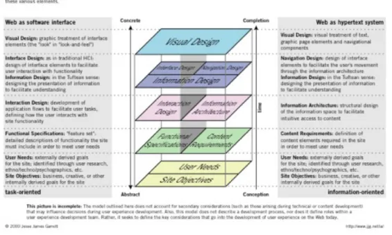
to represent data on a display to show complex dimensions of data. The websites designed with a hierarchical path allow the creators to use the screen while serving deeply structured information, because the two-dimensional surface could support using multiple axes and provide use of graphics through the storytelling journey of the data. One of the fundamental media would be considered as online works such as applications and websites. The website design as online screen display provides menu bars, buttons, and icons to operate the process and guide the users. In order to engage with the community, this has become a bridge between the users and the messages as a form of powerful presentation. “The interface is a mediating structure that supports behaviors and tasks. It is a space between human users” (Drucker, 2014, p. 138). In the scope of interface design, Jesse James Garret provides an interface diagram that highlights the terminology of the user experience. The
relationship and connectivity of the web as a software design and hypertext system is presented below with details.6
6 Hypertext is defined as a software system enabling users to connect and create multi-linked databases by cross-referencing communication.
Figure 8. Figure 6 Jesse James Garrett, elements of the user experience (2000).
Understanding the multilayer process between structures and needs would allow both users and creators of a space to extend the relationship in an appropriate way. The web as a software mostly concentrates on the design of interface elements and
functionality, and the hypertext design focuses on information architecture, the user’s movement, and content elements to provide a development experience for readers. Hence, the method of visual representation shapes the users’ decision-making process, and the creation of concepts and identification of patterns take a step to further the perception of the data.
3.3 Method of Online Presentation
There are multiple ways to discover knowledge and share information to reach a large number of viewers. In consideration of current user dynamics and platforms, it can be said that an interactive web-based tool is one of the appropriate ways to
transmit the message by designing an advanced visualization to quickly draw attention. Web-based platforms are utilized commonly to enable a huge number of users to explore through clickstream and share multidimensional information. The levels of technological development allow the combination of informative elements into one platform.
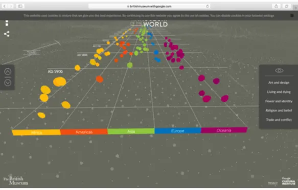
Figure 9. https://britishmuseum.withgoogle.com
As an example, The British Museum represents artworks with names and continents on a timeline that enable the users to travel from past to present. A list of five different categorizations provides an easy navigation to the users while discovering various contexts of artifacts rather than just showing their basic information.
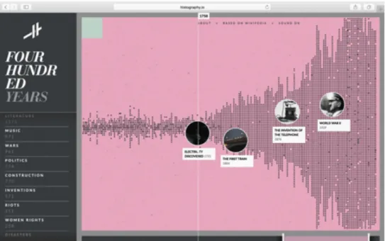
Figure 10. Figure 12 http://www.histography.io
The second example would be the “histography” website, which contains important historical events on a timeline. Besides the dates and event combinations, it allows the users to discover specific categories such as music, art, women’s rights, or politics. The users could narrow down the subjects and explore them under a contextual umbrella. In order to reach further information, the pop-up interface enables the users jump to events’ Wikipedia webpages.
The online system presents a potential for special interest and web-based dynamics through the contextualization of textual information. It makes the process easily managed and expands it across cultures. As a challenge, the online communication method has to cope with the universal visual language for users having different backgrounds and cultures.
In order to discard difficulty, digital resources present human beings with the challenge of managing and making sense of large amounts of complex textual
information within cultures as well as across cultures. As a step, the interpretation of interfaces, information, and navigation systems become a baseline of digital
environments to reach the goal of interpretation. As a tool, the digital way of
visualization has become a bridge to reveal missing links. “A basic distinction can be made among visualizations that are representations of information already known and those that are knowledge generators capable of creating new information through their use” (Drucker, 2014, p. 65). Besides the function of data visualization, there is a growing field that creates a space for artworks and users.
3.4 Artworks and Artists
Humankind has been producing data since ancient history by writing texts and drawing on surfaces, papers, or in caves in order to record how they lived in the world. When data has become part of a visual art, an idea is revealed as a considered digital realism because of its reflection. In visual art history, artworks have been inspired from different movements, and the definition of realism is mentioned as an artistic representation of real life, which means facts and life.
They attempt to show that art reflects nature and/or the artificial world of human society. Realist theory of art does not necessarily claim that art
mirrors the world, but rather that artists construct a symbolic reflection of
their environment. (Truitt, 1978, p. 141)
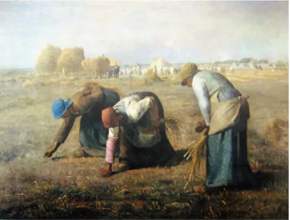
Compared to other movements, which underline personal experience and emotion, realism became part of ordinary life. The effects of the movement are reflected through 19th-century paintings of daily life among the working class. From 1857, The
of labor in a realistic view of the working class. In the digital era, the form of realism has been affected by technological developments, and movements, artistic
approaches, and intentions in arts find different forms that depict parts of daily life.
Figure 11. The Gleaners by Jean, François Millet, 1857.
https://artsandculture.google.com/asset/gleaners/GgHsT2RumWxbtw?hl=en.
We live in an age where we are bombarded by data gathered by sensors, arrayed by software, and dispersed via ever-proliferating networks. To visualize this data is to understand it. As the projects in this exhibition demonstrated, designers and scientists create diagrams, three-dimensional maps, and other graphics to help us make sense of the copious amount of information with which we are confronted daily. (Min, 2015)
In the previous sections, the analysis of data visualization has been outlined by discussing the research methods and online representation tools in a critical analysis.
Another method is the representation of the projects that are physically designed to be exhibited in a place like an art gallery. Representation of the work is another way to help transmit an amount of information to the people. Data visualization also takes place in a way of current artistic approaches. As is mentioned by Sey Min, who is a designer and an artist, it is nor so possible to stay away from technological platforms, and producing data even in daily life has become a composition of its own. It is not a pleasant experience to see numbers, texts, or images randomly in order to remember and create a connection with each other. The method of data representation carries the process to another level that makes the experience more meaningful and pleasant. Data visualization has become an intriguing point where people could have diverse views of the same data and people could define the experience as good, different, unknown, known, and with unusual feelings or common thoughts. Today, there are many museums and galleries hosting plenty of artworks related to data visualization.
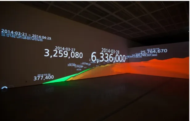
“City DATA; Seoul Daily Expenditure” is an example that highlights the expenditure
patterns collected over 100 days in Seoul. The project shows a bigger picture beyond daily life and shows a daily truth of individuals, and it aims to catch attention on the amount of money spent and where citizens in Seoul spend it in their daily lives (randomwalks, 2014). Rhythms of data transition in daily expenditure were presented in art centers as an artwork, and it was exhibited in public places such as subway screens and media facades in order to raise awareness in the community.
One of the artists from Turkey working on networks is Burak Arıkan, who is the founder of Graph Commons.7 He concentrates on “social, economic and political issues as input and runs trough custom abstract machinery, which generates network maps and algorithmic interfaces” (Arıkan, n.d.). His subjects are empowered by network relationships. For example, Network Map of Artists and Political Inclination, which was exhibited at the 7th Berlin Biennale, is designed to reveal missing and hidden connections between “4592 artists and 395 unique political inclinations” (Arıkan, n.d.).
Figure 13. Network Map of Artists and Political Inclinations, https://burak-arikan.com/.
Figure 14. Figure 8 Network Map of Artists and Political Inclinations, https://burak-arikan.com/.
Another example is Lev Manovich’s work named TimeLine that consists of 4535
Figure 15. Lev Manovich, TimeLine
The work as an image was rendered 53,000 pixels wide with the ImagePlot software. The visualization of Time magazine covers is exhibited to make the change in color, print, margin, brightness, saturation, and other dynamic elements visible.
CHAPTER 4
“METAMUSEUM”
“Explanations that give access to the richness of the data make graphics more attractive to the viewer.” (Tufte, 1983, p. 180)
“Information Visualization” is relatively a new area of study that is acquiring more and more attention in both academic and business sectors. This concise introduction to the subject explores the use of computer-supported interactive graphical
representations to explain data and increase the volume of cognition (Mazza, 2009). The name of the project is derived from the definition of meta, “which is outside the normal limits of something” (Cambridge Advanced Learner's Dictionary &
Thesaurus, n.d.). The museums collect, categorize, and represent in a visual form that draws a path to the audiences. This way they show and dictate how the visitor should look at the artifacts. “MetaMuseum” follows the same path to reach the users with an online platform. The solicited data about the museums is categorized and visualized to be delivered to the users on the web. It aims at the set of visualizations of different aspects of museums with the initial look at the structure of standards. The subject matter of the thesis is to focus on research on museums’ connections, which are analyzed in terms of the capacity of links and revealed in a display with
“MetaMuseum,” which was created as a web-based graphic work. An effective and useful system design was created based on dynamic interactive representations to point out information visualization in order to understand their cognitive and computational characteristics.
4.1 Overview of the Project
“MetaMuseum” was created based on a research visualization that contains special categorization of museums by highlighting the effects of their detailed features with an extended number of data. The project aims to analyze museums in Turkey with the expanded number, which visualizes connections through 20 categories, which are 1) Location, 2) Types of Museum, 3) History, 4) Architects, 5) Exhibitions, 6) Types of Collections, 7) Online Exhibitions, 8) Admission, 9) International Side, 10) Field Work, 11) Laboratory and Restoration, 12) Library, Research and Publication, 13) Conferences, Education, 14) Organizations, 15) Children, 16) Daily and Weekly Activities, 17) Cafes and Restaurants, 18) Stores (Gift and Book), 19) Technology, and 20) UNESCO.8 It is crucial to understand the concept of visualization to develop a tool for data visualization, where also the data collection of museums provides visual representations of a large amount of data in order to be more usable and understandable for visitors, museums researchers, and managers in the field.
From the guide of classification of visualizations, hybrids as an “exploratory explanation” method are applied, and the project takes the shape of an interactive design that enables information to encode in a pattern parameter by leaving freedom for discovery space for the users. The project is designed to apply the data output of museums, which is a multi-disciplinary approach that includes elements of human-computer interaction, visual design, graphics, and implementation processes. Visualization and graph drawings are identified to transfer the information of the
museum to users in order to increase the access of knowledge in systematic and easy ways.
4.2 Prototype Design Process and Implementation
In order to create the structure and skeleton of the project, various online platforms such as Graph Commons and handmade mapping methods are implemented. The collected data were replaced into the network of diagrams and the process took a step forward.
Figure 16. Graph Commons Draft
In order to conceptualize the process, the visual drafts helped me to look deeply and provided the work with a large picture. As a first step, I focused on the location-based museums to draw a map in my mind. Turkey and cities opened a path to the skeleton, as seen in the example of Figure 12. As a second step, the detailed features revealed on the table a common point to relate them to each other. In the example, I listed some types of museums in Ankara and İstanbul and placed them onto one canvas. After multiple drafts, I gave the shape of the project as a website design. The basis of digital form of the project reflects Tufte’s data visualization theory.
4.3 Interface design: Developing the Visualization Tool as MetaMuseum
“MetaMuseum” is a project based on data visualization that refers to Tufte’s explanation about the effects of visualizations for both designers and users.
According to his theory, format and design needs to be chosen appropriately by using all visual elements such as words and numbers. Within the concept of visualization, one consideration is the sense of balance and scale of the work, because narrative equality is important to tell the story of the data in a free decoration design.
The visualization maintains the same graphical layout across tabs, modified only slightly for the different content. This consistent visual platform provides easy transitions between tabs, and the colors serve as an indication that a switch has occurred. The visual highlighting of provinces serves to draw the viewer’s eye to the relevant areas, a necessary feature given the density of the map. Finally, each interactive component is clearly adorned with markers of interactivity,
explicitly pointing out the potential for interaction. (Segel & Heer, 2010, p. 1142)
In the space that the interface design provided, I aimed to use multiple features. I used multidimensional structures such as hybrid design process color coding, lines, dots, and dynamic structure.
Figure 17. Color Palette and Font Family
Firstly, people’s eyes and brains perceive colors physically, experience them mentally, and interpret them emotionally. Thus, each color symbolizes different meanings associated with color theory. In “MetaMuseum,” the color palette is created with the combination of gray and orange scales to design the project. Orange is a color that represents Autumn and symbolizes “creativity, invigoration, energy, vibrancy and activity” (Morioka & Stone, 2006, p. 28). The creation of the orange color is as a secondary color that is a mixed element of the creative passion of red and elements of joy and energy. The black color represents power and authority, gray represents “balance and reliability,” and lastly white symbolizes “perfection,
lightness and simplicity,” which reflect the aim of the project design (Morioka & Stone, 2006, p. 30). The meaning of colors formed the skeleton of the website while aiming for a simple and dynamic website layout and interface design.
The website layout is designed as four parts. The logo is located in the upper left corner and the menu bar is placed in the upper right corner of the page. The middle area is designed for active content, which is organized according to the selection of the category navigation.
Figure 20. Wireframe of MetaMuseum Website Design
The working progress of the website is visualized in Figure 19 in order to show how the order of the menu bars, buttons and interface structure work.
In the website design, dots, lines, buttons, and the menu bar help users to explore in an easy way. The size of the dots represents the intensity and numbers, in order to visualize them properly. When the size of the dot gets bigger, that means the number of museums increases. The opposite is the also the case. The size of the dot becomes smaller if the number of museums decreases. The method of visual representation is designed to apply to each category in the same way of how it works. To exemplify, under the types of museums subcategory, the private museum subcategory is visualized with a bigger circle, which means that it contains more museums than many subcategories.
Figure 21. MetaMuseum / Introduction / Play Tour
The design begins with the particles flow, which is created from many circular forms. The particles refer to the data collected from the museums’ websites. It turns into a big circle form that allows the logo to appear in the middle of the circle.
Figure 23. MetaMuseum Interface Design 1
The smaller particles start to unite with one another and turn into the bigger circles. In the last step of the introduction, the menu bar, logo and start buttons appear to interact with the users.
Figure 25. MetaMuseum Interface Design / Start
The navigation bar appears when the users click the start button, and the representation of categories enables users to select one and enter easily.
In terms of the location category, the design allows the user to see the entire country with cities and regions. There are city names under city codes, which help the users to follow cities. While the placement in the map shows their location, the size and intensity of the color are designed to keep the visual relationship balance. The size of circles means a high number of data, and when its size gets bigger, the color has gray tones. When the sizes of the dots become smaller, there is a small number of
museums. Small sizes represent fewer numbers with the white color. In this way, the size and color combination are balanced.
Figure 28. MetaMuseum Interface Design / Types of Museums
“Types of Museums” allows users to explore museums around Turkey and find them on a display. Museums from different history periods, types, and locations come together under “Private Museum.”
There are over one hundred private museums in Turkey. As a sample, the list covers the PTT Stamp Museum, the Rahmi Koç Museum Ankara, The Museum of Innocence, the Kapadokya Art and History Museum, the Ege University Ethnography Museum, the TCDD Museum and Art Gallery, the Ziraat Bankası Museum, the Ankara
University History Museum, the BJK Museum, the Sakıp Sabancı Museum, the Türkiye İş Bankası Museum, the Yapı Kredi Vedat Nedim Tör Museum, the Sadberk Hanım Museum, the II. Bayezid Turkish Bath Culture Museum, and the İstanbul Archaeological and Culture Museum. The private museums are spread around
Turkey and have been established by universities, institutions, or companies such as İş Bankası, Sakıp Sabancı or Yapı Kredi. Rather than features that include the entire culture, they have a structure that includes artifacts that specifically reflect the history and characteristics appropriate to the context purposes of the intuitions.
In the last part of the design, users click the name of the museum and the page jumps to the museum’s official website in order to reach detailed information (Figure 29).
Figure 30. MetaMuseum Interface Design / Types of Museum / Private Museums
The second subtitle is national history museums, which are the Natural History
Museum - MTA / Ankara, the İstanbul Zoology Museum / İstanbul, Kırklareli Museum / Kırklareli, the Ali Demirsoy Natural History Museum / Erzincan, the Natural History Museum of İhsan Ketin / İstanbul, the Natural History Museum of Ege University / İzmir. They contain current and historical data of plants, geology,
paleontology, and animals. Looking at their insights shows that they cooperate with research intuitions, such as the Scientific and Technological Research Council of Turkey (TUBITAK), or universities in order to continue the sustainability of scientific research. The types of collections category move with types of category.
The history category focuses on the time periods in which the museums were established, so as to represent the data in a timeline moving from left to right in a circular design. The beginning of the 19th century is the beginning of the story of the museum in Turkey, and there was a small number of museums at this time, such as the İstanbul Archaeology Museum and the Islamic Museum. After the 1920s, the number of museums started to increase with the restoration or conversion of
historical places, palaces, and buildings. Twenty-six museums had been established by 1940. The list of museums is the following: the Museum of Anatolian
Civilizations (1921), the Antalya Museum (1922), the Sivas Museum (1923), the Adana Museum(1924), the Bergama Museum(1924), the Topkapı Palace Museum, (1924), the Edirne Museum(1925), the İzmir Museum(1925), the Ethnography Museum (1925), the Tokat Museum (1926), the Konya Museum (1926), the Amasya Museum (1926), the Kayseri Museum (1929), the Ephesus Museum (1930), the Afyon Archaeology Museum (1928), the Sinop Museum (1932), the Van Museum (1932),
the Hagia Sophia Museum (1934), the Diyarbakır Museum (1934), the Manisa
Museum(1937), the Tire Museum (1935), the Çanakkale Museum (1936), the Niğde Museum (1936), the Tire Museum (1936),and the İstanbul State Art and Sculpture Museum (1937). Throughout the 1980s, the number of museums increased
significantly, and the established museums included the Amasya Museum (1980), the
Atatürk Museum (1981), the T.C. Ziraat Bankası Museum (1981), the Cumhuriyet Museum (1981), the Gazi Köşkü (1981), the Çanakkale Military Marine Museum (1982), the Kossuth House Museum (1982), the Aşık Veysel Museum (1982), the Gevher Nesibe Museum (1982), the Carpet Museum (1982), the Stamp Museum (1982), the Atatürk House (1983), the Adana Ethnography Museum (1983), and the Söğüt Ertuğrul Gazi Museum (1986). Throughout the 2000s the number of museums
took a big step and reached 342 museums. Today the number is over 400. In terms of the architecture category, there is a relationship between historical areas and
museums. Beyond establishing new museums, historical houses and places have been transformed into museums or restored to use as museums. The 1920s museums are listed in the previous category and show the beginning of the Republic of Turkey through architectural form and historical progress.
The exhibition category focuses on understanding the relationship between museums that have a space to houses exhibitions. Over thirty museums provide an opportunity to artists and artworks under the museum: the Sakıp Sabancı Museum, the Rahmi M
.Koç Museum (Ankara), the Republic Museum, the TCDD Open Air Steam Locomotive Museum (Ankara), the War of Independence Museum, the Antalya Museum, the Baksı Museum, the Bursa Energy Museum, Topkapı Palace, the Dolmabahçe Museum, the Naturençay Museum, the Pera Museum, the Rahmi M. Koç Museum (İstanbul), the İstanbul Military Museum, Borusan Contemporary, the Marmara University Republic Museum, the İstanbul Museum of Graphic Arts, the Türkiye İş Bankası Museum, the Palace Collections Museum İstanbul, the TCDD Open Air Steam Locomotive Museum (İstanbul), the Yıldız Palace Museum, the Elgiz Museum, the Atatürk Orman Çiftliği Museum and Exhibition Hall, the İstanbul Lale Museum, the Press Media Museum, the Turkish and Islamic Arts Museum, İstanbul Modern, the İstanbul Naval Museum, the Rezan Has Museum, the Sadberk Hanım Museum, the Turkcell Dialogue Museum, the İstanbul Photography Museum, and the İzmir Art and Sculpture Museum. It is not easy to analyze the pattern, but palaces
The online exhibition category covers over forty museums that offer users online accessibility. Primarily, museums that present a virtual tour on their website or are involved in the Google Art Project were taken into consideration while creating the context of this category. The included museums are the Sakıp Sabancı Museum, the
Ankara Art and Sculpture Museum, the Ankara Ethnography Museum, the Antalya Museum, the Hagia Sophia Museum, the Bodrum Museum of Underwater
Archaeology, the Burdur Archaeology Museum, the Çorum Museum, the Edirne Archaeology and Ethnography Museum, the Edirne Turkish & Islamic Art Museum,
the Ephesus Museum, the Gordion Museum, the Isparta Museum, the İkizevler
Museum, the Kahramanmaraş Archaeology Museum, the Kapadokya Open Air Museum, the Kars Museum, the Karatepe Aslantaş Open Air Museum - Osmaniye,
the Konya Mevlana Museum, the Mardin Museum, the Mersin Anamur Museum, the
Side Museum, the Sivas Archaeology Museum, the Congress Hall Atatürk and Ethnographical Museum, the Sumela Ruin, the Trabzon Museum, the Uşak
Archaeology Museum, the Uşak Atatürk and Ethnography Museum, the Yeşilırmak Havzası Virtual Museum, the Zeugma Mosaic Museum, the Rahmi Koç Museum, the İstanbul Contemporary Art Museum, the Pera Museum, The Museum of Innocence,
and the Elgiz Museum. Use of online platforms also refers to the technological development of the intuitions. That is why the museums create a connection with the technology category as well.
The admission category gives a list of over fifty places officially selling museum cards according to the Turkish Ministry of Culture and Tourism. The official main sale points are the Side Ruin, the Termessos Ruin,the Antalya Archaeology Museum,
the Phaselis Ruin, the Olympos Ruin, the Perge Ruin, the Side Museum, the Ephesus
Museum, the Ephesus Ruin, the St. Jean Aniti Afrodisias Ruin, the Akropol Ruin, the Assos Ruin, the Asklepion Ruin, the Pamukkale Ruin, the Bodrum Underwater Archaeology Museum, the Mausoleum Ruin, the Kaunos Ruin, the Knidos Ruin, the Kayaköy Ruin, the Didim Ruin, the Simena Ruin, the Patara Ruin,the İzmir Türsab Byk, the Konya Mevlana Museum, the Eskişehir Türsab Byk, the Gaziantep Zeugma Museum, the Museum of Anatolian Civilizations, the Chasm of Heaven and Hell, the Hatay Archaeology Museum, the Dösimm Shop,the Göreme Open Air Museum, the Derinkuyu Underground City, the Kaymaklı Underground City, Ihlara Valley, Selime Cathedral, Belisirma, the Zelve Ruin, Sümela Monastery, the Samsun Archaeology and Ethnography Museum, Trabzon Kostaki Mansion, the Topkapı Palace Museum,
the Hagia Sophia Museum, the İstanbul Archaeology Museum, the Kariye Museum,
The Mosaics of Great Palace, Türsab, the Turkish and Islamic Arts Museum, the Bursa Museum of Turkish and Islamic Art, and the Troia Ruin.9 This shows that, statistically, sale points are placed around ruins, the entrances of specific museums, and outside two historical places.
Excavations and Field Work have a connection with research departments rather than common museum relationships. Archaeological excavations focus on specific
historical places such as Göbekli Tepe, Troia, Çatalhöyük, Hattuşa, Sagalossos, Hasankeyf, Pergamon, Zeugma Ancient City, Ephesus, and Anavarza. In terms of museums, the Museum of Anatolian Civilizations takes a role in Ankara.