THE EFFECTS OF COLOR TEMPERATURE ON PERFORMANCE AND MOOD OF USERS: A COLOR TASK IMPLEMENTATION MODEL
A Master’s Thesis
by
ESRA KÜRKÇÜ
Department of
Interior Architecture and Environmental Design İhsan Doğramacı Bilkent Üniversitesi
Ankara July 2017
ESRA KÜRKÇÜ
THE EFFECTS OF COLOR TEMPERATURE ON PERFO
R MANCE AND MOOD OF USERS: Bilkent University 2017
A COLOR TASK IMPLEM
E
NTATION
THE EFFECTS OF COLOR TEMPERATURE ON PERFORMANCE AND MOOD OF USERS: A COLOR TASK IMPLEMENTATION MODEL
The Graduate School of Economics and Social Sciences of
İhsan Doğramacı Bilkent University by
ESRA KÜRKÇÜ
In Partial Fulfillment of the Requirements for the Degree of MASTER OF FINE ARTS
THE DEPARTMENT OF
INTERIOR ARCHITECTURE AND ENVIRONMENTAL DESIGN İHSAN DOĞRAMACI BİLKENT UNIVERSITY
ABSTRACT
THE EFFECTS OF COLOR TEMPERATURE ON PERFORMANCE AND MOOD OF USERS: A COLOR TASK IMPLEMENTATION MODEL
Kürkçü, Esra
MFA, Department of Interior Architecture and Environmental Design Advisor: Assist. Prof. Dr. Semiha Yılmazer
Co-advisor: Dr. Sibel Ertez Ural
July, 2017
This study aimed to explore the effects of color temperatures on color task
performance, and also to propose a color task implementation model to be used in future research. In the study, three attributes of color were the focus in the color differentiation task. The study was conducted with 100 participants as with-in subjects design, in a full-scale office set-up under two different color temperature; warm white light (2700K and cold white light (4000K. The speed and accuracy of the color task were examined as an indication of task performance. The mood change of participants was assessed by Watson’s Positive and Negative Affect Schedule (PANAS mood measurement, self-satisfaction was assessed by Office Lighting Survey (OLS and perceived performance was assessed by questionnaire. The results showed that the total time spent for the color tasks performances have no significant
difference between 2700K and 4000K. It also showed that total accuracy of color task performances is statistically better under 4000K, compared to 2700K. Whereas color temperatures did not affect value differentiation task performance significantly, hue and chroma differentiation tasks performance were significantly better under 4000K color temperature. In terms of the effects of color temperature on mood, it is found that 4000K color temperature affected participants mood in a positive way. Also, self-satisfaction and perceived performances of participants are significantly better under 4000K color temperature.
Keywords: Color Temperature, Color Differentiation Task, Mood, Office Environment, Task Performance
ÖZET
IŞIĞIN RENK SICAKLIĞININ KULLANICILARIN PERFORMANSI VE DUYGU DURUMU ÜZERİNE ETKİLERİ: RENK İŞİ UYGULAMA MODELİ
Kürkçü, Esra
MFA, İç Mimarlık ve Çevre Tasarımı Bölümü Tez Danışmanı: Yard. Doç. Dr. Semiha Yılmazer
2. Tez Danışmanı: Dr. Sibel Ertez Ural
Temmuz, 2017
Bu çalışmanın amacı ışığın renk sıcaklığının renk işi performansı üzerine etkisini araştırmak ve gelecek araştırmalarda kullanılacak renk işi uygulaması önermektir. Bu çalışmada renk ayırt etme işlerinde rengin üç boyutuna odaklanılmıştır. Çalışma 100 katılımcıyla, tekrar ölçümlü araştırma deseni ile, tam ölçekli ofis düzeneğinde iki farklı renk sıcaklığı; sıcak beyaz ışık (2700K) ve soğuk beyaz ışık (4000K) altında gerçekleştirilmiştir. İş performansının göstergesi olarak renk işindeki hız ve doğruluk incelenmiştir. Katılımcıların duygu değişimi Watson’ ın Pozitif Etki Ve Negatif Etki İzlencesi ile, kişisel menmuniyet Ofis Aydınlatma Anketi ile, algılanan/beklenen performans ise anket ile ölçülmüştür. Elde edilen sonuçlar, renk işi performansları için harcanan sürelerin 2700K ve 4000K arasında anlamlı bir fark olmadığını göstermektedir. Sonuçlar ayrıca renk işi performanslarındaki doğruluğun 4000K
altında 2700K’e kıyasla anlamlı bir şekilde daha iyi olduğunu göstermektedir. Değer ayırt etme performansına aydınlatma koşullarının anlamlı bir etkisi olmamasına rağmen, renk türü ve renk doygunluğu ayırt etme performansları 4000K renk sıcaklığı altında anlamlı bir şekilde daha iyidir. Renk sıcaklığının duygu durumuna etkisi açısından; 4000K renk sıcaklığı katılımcıların duygu durumunu olumlu bir şekilde etkilediği saptanmıştır. Katılımcıların kişisel menmuniyeti ve
algılanan/beklenen performansları da 4000K renk sıcaklığı altında anlamlı bir şekilde daha yüksektir.
Anahtar Sözcükler: Duygu Durumu, Işık Renk Sıcaklığı, İş Performansı, Ofis Ortamı, Renk Ayırt Etme İşi
ACKNOWLEDGEMENTS
I would like to express my deepest gratitude to my advisor Asst. Prof. Dr. Semiha Yılmazer and my co-advisor Sibel Ertez Ural for their valuable guidance,
encouragement, support and advices that steered me in the right the direction whenever I needed, insight throughout the research and trust on me. It is an honor for me to share their knowledge and wisdom.
I express appreciation to my jury members, Asst. Prof. Dr. Çağrı İmamoğlu and Prof. Dr. Banu Manav for their helpful suggestions and valuable comments.
I would like to thank Serpil Altay for her encouragement, support, trust and helps to conduct the experiment.
At last, I thank to my family; to my brother Burak Kürkçü who has always helped, supported, and encouraged me in my life; to his wife İrem Kürkçü who become a sister to me and to my parents Saliha Kürkçü and Macit Kürkçü, for their everlasting support, patience and motivating speeches and love. I am blessed to have them in my life. I would not achieve this thesis without their existence.
TABLE OF CONTENTS
ABSTRACT………...…iii ÖZET………...v ACKNOWLEDGEMENT………...…..…..vii TABLE OF CONTENTS………..…..viii LIST OF TABLES……….xi LIST OF FIGURES………..xii CHAPTER I: INTRODUCTION………...11.1. Aim of the Study………...……….3
1.2. Structure of the Thesis………...3
CHAPTER II: LIGHTING AND COLOR………...5
2.1. Lighting in Office Environments………...5
2.1.1. The Luminous Environment………...6
2.1.2. Visual Task Considerations……….10
2.1.3. Psychological Aspects of Lighting in Offices……….14
2.2. Fundamentals of color………..18
2.2.1. Color Order Systems………...21
2.2.2 Color Vision………...22
2.2.3. Color and Lighting………...24
2.2.4. Previous Studies on Color Task Performance…..………....25
2.3. Munsell FM-100 Hue Test………...28
CHAPTER III: EXPERIMENTAL STUDY………..30
3.1. Aim of the Study………..30
3.2. Methodology……… ...32
3.2.1. Experimental Set-up……….32
3.2.2. Sample Group………...37
3.2.3. Experimental Procedure………...38
3.2.4. Design of The Experimental study………...41
3.2.4.1. Color Task Implementation Model………....41
3.2.4.1.1. Hue Differentiation Task……….42
3.2.4.1.2. Chroma Differentiation Task………...43
3.2.4.1.3. Value Differentiation Task………..44
3.2.4.2. Questionnaire.………46
3.2.4.2.1. Watson’s Mood Measurement Test Positive Affect Negative Affect Schedule (PANAS) ………...46
3.2.4.2.2. Self-satisfaction Test by Office Lighting Survey (OLS)………..47
3.2.4.2.3. Perceived Performance Test………....48
3.3. Findings………....49
3.3.1 Effects of Color Temperature on Color Task Performance………50
3.3.1.1 Color Differentiation Sensitivity...………..55
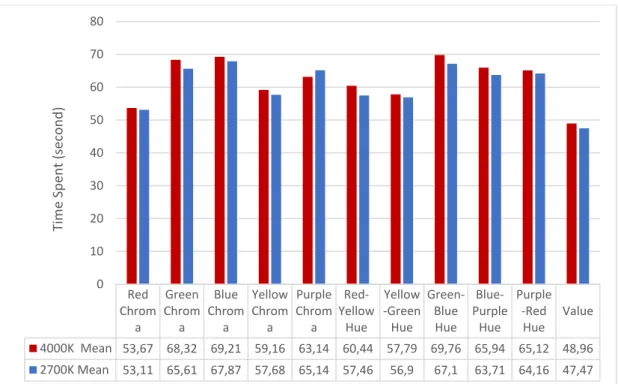
3.3.1.2. Effects of Color Attributes on Color Task Performance……59
3.3.2 Effects of Color Temperature on Mood………...62
3.3.3 Effects of Color Temperature on Self- Satisfaction……….66
3.3.4 Effects of Color Temperature on Perceived Performance………69
CHAPTER IV: CONCLUSION………78
REFERENCES………...81
APPENDICES……….88
Appendix A. Questionnaire….………..88
Appendix B. Photographs of the Experiment Set-up and Color Task………..93
LIST OF TABLES
Table 1. Statistical Comparison of Accuracy and Speed of Color Task
Performances………..53
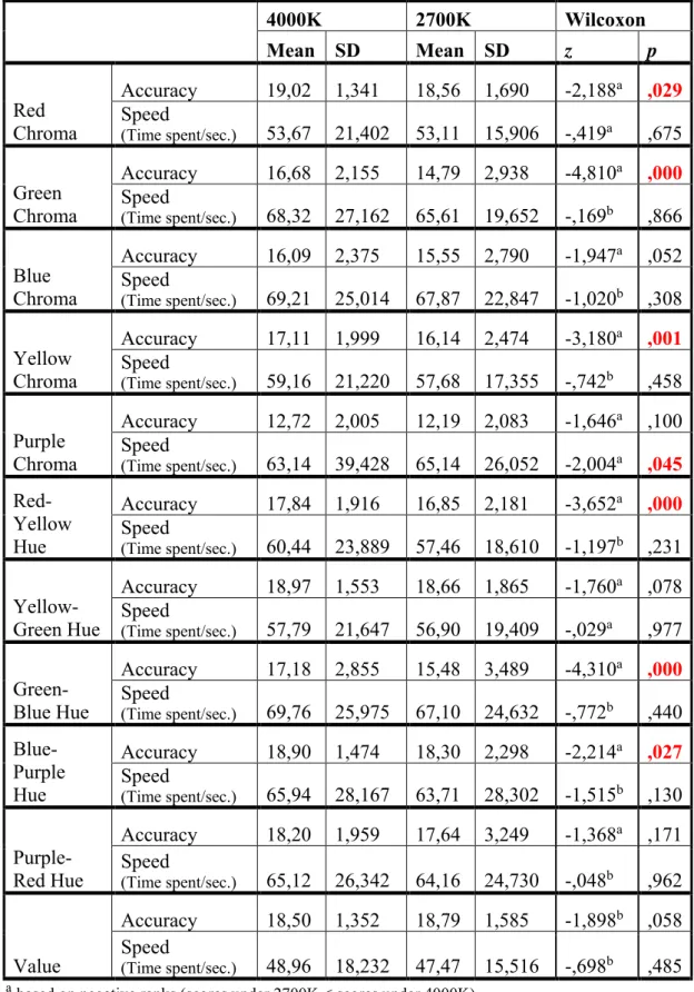
Table 2. Statistical Comparison of 2700K and 4000K with Accuracy and Speed of Three Attributes of Color Task Performances………...55
Table 3. Means of Color Chips………...………..57
Table 4. Standard Deviations of Color Chips…………...………....58
Table 5. Performance Differences among Color Attributes………..59
Table 6. Performance Differences among Color Attributes under 4000K Color Temperature………61
Table 7. Performance Differences among Color Attributes under 2700K Color Temperature………62
Table 8. Before and After PANAS Values under 4000K Color Temperature……..63
Table 9. Before and After PANAS Values under 2700K Color Temperature……..64
Table 10. Statistical Comparison of 4000K and 2700K PANAS Values……...65
Table 11. Self-Satisfaction Comparison of 4000K and 2700K by McNemar Test………...67
Table 12. Self-Satisfaction Comparison of 4000K and 2700K by Wilcoxon Test……….68
LIST OF FIGURES
Figure 1. Spectral power distribution of different light sources……….7
Figure 2. Recommended illuminance ratios and surface reflectance……….9
Figure 3. Environmental comfort model of workspace quality………15
Figure 4. A diagram of hue, chroma and value in their relation to one another…...19
Figure 5. The color wheel……….20
Figure 6. Munsell’s hue, chroma and value charts...22
Figure 7. Munsell FM-100 Hue Test………....29
Figure 8. Plan of the experiment room……….33
Figure 9. Section of the experiment room………....33
Figure 10. Reflected Ceiling Plan of the experiment room………...34
Figure 11. Office set up under 4000K (left side) and 2700K (right side) fluorescent lighting……….35
Figure 12. Spectral Power Distribution of 4000K fluorescent lamp……….36
Figure 13. Spectral Power Distribution of 2700K fluorescent lamp……….36
Figure 14. Order of CCT setups and participant groups………38
Figure 15. Schematic illustration of the experimental process………..40
Figure 16. Hue differentiation tasks………..42
Figure 18. Value differentiation task……….44 Figure 19. Example of color task administration method (random arrangement)….45 Figure 20. Example of color task administration method (correct arrangement)…..45 Figure 21. Example of color task administration method (checking the answers)…46 Figure 22. Perceived Performance Test……….48 Figure 23. Bar chart of color task performance differences in terms of accuracy….51 Figure 24. Bar chart of color task performance differences in terms of speed……..52 Figure 25. Color task performance differences based on attributes of color……….54
CHAPTER I
INTRODUCTION
Over the last decades, the concept of work environment has changed and working area of employees and working hours are highly influenced by this change. Average working hour for an employee is approximately nine hours per day and most of this time is spent within the office buildings (Xu, 2013). It is found that physical
conditions of an indoor environment can affect office workers’ health, well-being, comfort, satisfaction and productivity (Roulet et al.,2006; Fotios& Cheal, 2011). To improve the quality of work life, the workplace design becomes a very important factor. For instance, the new offices should provide not only working facilities but also personal comfort. There are three types of comfort; physical comfort; based on basic human needs like safety and hygiene, functional comfort; ergonomic support for work related tasks such as appropriate lighting, and psychological comfort; the feeling of belonging to a workspace. When workspace quality is assured of these three comfort types, work performance can be maintained at high levels. Work performance is affected by environmental conditions such as temperature and humidity, furniture ergonomics, acoustics, lighting and visual conditions
(Vischer,2008). Lighting parameters such as luminance values and the color of the light source are extremely important aspects of the office lighting environment. An adequate luminance value provides good visibility of task and comfort, and the color of the light source affects the appearance of room furniture, work instruments. Therefore, a well-designed office lighting enables the employees to see and carry out their tasks accurately, quickly and easily (IESNA, 1993; Boyce,2006; Fotios& Cheal, 2011). In the office environments, mood, well- being and task performance have directly related each other. When lighting conditions affect workers psychologically; mood and feelings of workers affect task performance (Rea, 2000).
Since color is generated by light, lighting conditions also affect color vision and color appearance and visual performance. Visual tasks are separated from each other according to their difficulties. Tasks involving color take part in difficult tasks. Appropriate luminance values and color of the light provide good color visibility and improves visual performance for color including tasks (Van Bommel & Van den Beld, 2004; Luo, 2011; Holtzschue, 2012). The color tasks, mentioned in the literature review, are generally based on color discrimination performance which is analyzed by Farnsworth- Munsell 100- hue test. The arranging set of colors in the FM 100 test have the same value and chroma levels and the test just assesses hue differentiation ability (Cranwell, Pearce, Loveridge& Hurlbert, 2015). However, colors are perceived fully and accurately depending upon the recognition of three attributes which are hue, value, and chroma (Cooper, 1941). For this reason, there is still a need for considering and understanding all three attributes of color in color task performance studies in the office environment. Also, there are no significant studies about the effects of lighting conditions on the combination of color task
performance and mood. Therefore, this study has potential of filling the gap in the literature.
1.1. Aim of the Study
The main purpose of this study is proposing a new kind of color task implementation model and replacing text-based task performance methods with color based one. It also aimed to investigate effects of color temperature on color differentiation (hue, chroma, and value) performances and mood. In the literature, although there are numerous experimental studies based on lighting conditions and task performance, there is no significant research regarding the effect of color temperature on work performance of people whose instruments are color oriented tasks in the office environment. So, this study aims to fulfill the gap in the literature. The findings of the study can be helpful for workers who deal with colors in an indoor environment, interior designers and light designers who are able to create well designed office environments and enhance productivity, satisfaction, and mood of workers in workplaces.
1.2. Structure of the Thesis
The thesis contains four chapters. The first chapter is a brief introduction to study based on effect of office environments especially luminous environment of offices on users’ task performance, mood, comfort, and satisfaction. In addition, lighting and
color relationship are mentioned. This chapter also describes the aim of the study and the structure of the thesis.
The second chapter is a comprehensive literature review. This chapter consists of three main parts based on lighting and color studies. In the first part, the effect of office lighting on human comfort, task performance, and mood are investigated under the headings of the luminous environment, visual task considerations, and psychological aspects of lighting in offices. In the second part, the color is analyzed by basic color theory, color order systems, perception and vision of color. Also, the effects of lighting on color perception and appearance are explained. Lastly, previous studies based on color and lighting are investigated under the headings of color task considerations.
The third chapter is the main part of the study based on the experimental study. In this chapter, the aim of the study, research questions and hypotheses are given. The method of the study is described by explaining the experimental setup, identification of participant groups, and process of the experiment firstly. Then the design of the experimental study; color task implementation method and questionnaires are described respectively. Also, in this chapter, statistical analysis methods and evaluation of the data are presented. Lastly, findings of the study are discussed in relation to the previous studies about the topic mentioned in the second chapter.
The last chapter is the conclusion. This chapter contains the important aspects of results and limitations of the study.
CHAPTER II
LIGHTING AND COLOR
2.1. Lighting in Office Environments
In the office environments, the main subjects are work and work-related activities such as reading, typing, and computer based works. The lighting conditions in an office environment, as one aspect of the indoor work environment, affect workers both physiologically and psychologically. A well-designed lighting enables workers to carry out the tasks accurately, quickly and easily and therefore increase the performance of workers. It can also increase comfort, health, well-being, and mood of the workers. (Fisk, 2000; Roulet, 2006; Veitch, 2008; Boyce, 2014).
Lighting condition can change the visibility of the task, the atmosphere of the office room and motivation of workers so office lighting can support visual performance and enhance psychological conditions (Fotios, 2011).
2.1.1. The Luminous Environment
One of the key factor that affects work performance, mood and health of occupants is the luminous environment (Boyce, 2010; Park, Chang, Kim, Jeong& Choi, 2010). A good luminous environment enables workers to focus on the job and prevents the distractions (Egan& Olgyay,2002). Lighting parameters such as the color of the light source and luminance values are extremely important aspects of the office lighting environment (IESNA, 1993).
The color of the light source affects the appearance of room furniture, people and work instruments as a whole of the atmosphere of an office environment. The most important characteristics of the color of the light source are correlated color
temperature (CCT), color rendering index (CRI), and spectral power distribution (SPD). CCT is the measurement of the color appearance of a light source which is determined by its color temperature in Kelvin (K). The color of the light changes according to its temperature; at 0K, it appears black, around 1000K red, around 2500K yellow, around 4500K white and around 6500K bluish white. An ordinary cool white fluorescent lamp has 4100K, and the warm white fluorescent lamp has 2700K and 3000K (Nassau, 1997). CRI refers to the color rendering properties of a light source and it is based on the average magnitude of the color shifts of objects compared to the natural color of objects. Low CRI of lighting causes limited
information on color shifts. However, while the light sources have the same CRI they may not have the same color rendering according to their CCT and SPD. SPD refers to the wavelength of light sources in the visible region of the electromagnetic
spectrum (360 to 770 nanometers) (see Figure 1). SPD of the light source has a significant impact on the recognition of color and color rendering properties of the light source (IESNA, 1993; Fotios& Cheal, 2011; Luo, 2011; Kuhn, Johansson, Laike& Govén, 2013; Aste, Tagliabue, Palladino, & Testa, 2015).
Figure 1: Spectral power distribution of different light sources (Source: Boyce, P. R. (2014). Human factors in lighting. Crc Press.)
The other parameter of the office lighting environment is luminance values. In order to provide good visibility and comfort, there should be adequate luminance values since inadequate and excessive luminance reduces visibility, causes discomfort,
eyestrain, and headaches. Luminance refers to the measurement of the amount of light which is perceived by the human eye and illuminance refers to the measurement of the amount of light on a given surface area which is perceived as the brightness of an illuminated area and measured in lux. In order to ensure human comfort,
illumination must prevent glare, reflection, and shadows and provide luminous differences and color contrast (IESNA, 1993; Smith& Parmenter, 2016; Aste, Tagliabue, Palladino, & Testa, 2015).
Luminous differences and color contrast are one of the important aspects of the luminous environments which enable good vision. In order to discriminate the details of objects or tasks, there should be a contrast between objects and immediate
surroundings. Smith and Parmenter (2016) claims that luminance and illuminance values affect the contrast considerably. Also, veiling reflection which is caused by high luminance affects contrast reduces the ability to distinguish the details of the task, therefore, affects task performance. The other effect of improper luminance is glare. When the illuminance (brightness) differences become excessive in the field of view, glare can occur and it causes impaired vision and discomfort. The high
illuminance value on desk surface and low illuminance on the task cause shadow and it also reduces the ability to distinguish the details of tasks. In order to provide proper contrast, prevention of reflection, glare and shadow recommended illuminance ratios should be considered (see Figure 2). It is important to supply adequate luminance and luminance difference to enable good visibility and improve the visual
environment (The Charted Institution of Building Services Engineers (CIBSE), 1984).
Figure 2: Recommended illuminance ratios and surface reflectance
(source: CIBSE, C. (1984). Code for interior lighting. London: The Chartered Institute of Building Services Engineers.)
An office environment which is poorly designed in terms of luminous environment can cause impaired vision, discomfort and health problems such as eyestrain and headaches. Therefore, in such office environments, visual performance is affected negatively. Likewise, properly designed luminous environments have positive effects on visual impression of the workplaces and task performances by increasing task visibility and stimulating mood of workers (Van Bommel & Van den Beld, 2004; Boyce, 2006).
2.1.2. Visual Task Considerations
In office environments, workers spend most of their time on visual tasks. Visual task performance is mainly based on detection, recognition, and identification problems. Visual performances are defined as the speed and accuracy of processing visual information. In order to detect, recognize and identify visual tasks and increase performances of the workers, offices should provide optimum lighting conditions. The main parameters that affect the visual task considerations are quality of light (related to the proper visibility of the task) and quantity of light (related to the illumination level of an efficient visual performance) (Egan& Olgyay,2002; Rea, 2000; Fotios, 2011).
In the literature, there are numerous studies demonstrating the effects of various lighting condition on subjective impressions and visual task performance
(Harrington,1954; Steffy, 2002; Manav,2007; Izsó, Láng, Laufer, Suplicz & Horváth, 2009).
Early studies about the effects of lighting conditions on subjective impressions found that the higher CCT conditions generate higher brightness perception and facilitate better work performance compared to lower ones in comparison of 3000K, 3500K and 4000K (Harrington,1954; Steffy, 2002). A study which was conducted by Manav (2007), investigated the effects of CCT and illuminance level on the subjective impression which was evaluated by perceived brightness, the impression of
The experiment was conducted in a full-scale office room. Three different CCTs (2700K, 4000K and combination of 2700K and 4000K) and four different
illumination levels (500lux, 750lux, 1000lux and 2000lux) were used for the study. The results showed that 2000lux illumination level was preferred for the impression of spaciousness and comfort, brightness and saturation evaluations. Comparison of CCTs showed that for the impression of spaciousness and comfort 4000K was preferred, and for relaxation and saturation evaluations 2700K was preferred. There was no significant effect of CCT found on perceived brightness. Another research by Izsó et al. (2009) was compatible with Manav’s study in terms of relaxation. It found that the combination of low CCT (2700K) and low illuminance level (100lux) created relaxing environment compared to the combination of high CCT (4000K) and high illumination level (1300lux).
Ju, Chen and Lin (2012) made another research on effects of CCT on spatial brightness perception. In the experiment, a total of nine lighting conditions; a combination of three different CCT (3000K, 5000K, and 8000K) and three different illumination levels (100 lux, 300 lux, and 1000 lux) were used. The study found that the higher CCT generated the higher spatial brightness perception compared to lower CCTs (Ju, Chen& Lin, 2012).
Wei et al. (2014) conducted a field study investigating effects of CCT (3500K and 5000K) and lumen output (2330lm and 3000lm) of fluorescent lighting on visual comfort, brightness perception, satisfaction, and self- reported productivity. The results showed that higher CCT (5000K) was perceived brighter than the lower one (3500K). However, visual comfort, satisfaction, and self- reported productivity were
better under 3500K compared to the 5000K color temperature. Participants evaluated 5000K as too cool (Wei et al., 2014).
Another study conducted by Boyce (2006) consists of two experiments which investigated the effects of different lighting quality on performance, health, and well-being of workers. The results showed that there was no significant effect of lighting quality on task performance although the expected changes in performance were associated with task visibility, practice, and fatigue.
Ödemiş, Yener and Camgöz (2004) carried out a study which investigated the effects of different lighting types (wall washing, cove lighting, and uplighting) on visual task performance. The experiment was conducted in a test chamber. The
performance was tested by matching task and measured by speed and accuracy of the task. The results of the study showed that lighting conditions did not have significant influence on the performance of participants.
To evaluate the effects of different color temperatures on worker’s alertness, visual comfort level, preferences and task performance, Shamsul, Nur Sajidah and Ashok (2013) carried out a study using three different light's color temperature; warm white (WW) light (CCT=2700K), cool white (CW) light (CCT=4000K) and artificial daylight (DL) (CCT=6200K). The experiment was conducted in a controlled
experiment laboratory. Visual comfort and preference were tested by Office Lighting Survey and task performance was tested by typing task and measured by speed and accuracy of the task. The results of the study showed that subjective alertness level
was significantly decreased under 2700K and there was no significant difference between 4000K and 6200K. In term of task performance, typing speed of participants was significantly faster under 4000K and 6200K compared to 2700K and under 6200K light participants made fewer errors and it was followed by 4000K. They made the highest percentage of typing errors under 2700K light. Although
participants felt most comfortable under 6200K, they mostly preferred 4000K for office lighting. The study suggested 4000K and 6200K lighting were more beneficial for the computer-based task in office environments. Another study by Sivaji,
Shopian, Nor, Chuan and Bahri (2013) also investigated the effects of CCT of lighting (2700K, 4000K and 6200K) on task performances, alertness, visual comfort, and preferences. Similarly, visual comfort and preference were tested by Office Lighting Survey and task performance was tested by typing task and measured by speed and accuracy of the task. The results of the study are conflicted with Shamsul et al.’s study and found that visual comfort level and preferences showed that participants were most comfortable under the 4000K light. They found that subjective alertness level was highest under 2700K light. There was no significant difference found under different CCT of lights in terms of visual task performance.
Another study conducted by Chellappa et al. (2011) investigated effects of different color temperatures (2500K, 3000K, and 6500K) of fluorescent light on alertness and cognitive performance. The results of the study showed that higher CCT causes higher subjective alertness and better cognitive performance.
2.1.3 Psychological Aspects of Lighting in Offices
Although in workplaces the main importance is given to task performances, a lighting design should not only meet the visual task requirements for reading and typing tasks but also satisfy psychological needs of users; provide long-term user satisfaction and consider workers’ well-being. Lighting plays a significant role in the perception of space (reinforcing the subjective impression of space), activity, and mood (Kaufman, 1987). An optimal lighting condition can increase comfort, health, well-being, and task performances (Roulet et al., 2006; Veitch et al., 2008). The term ‘comfort’ consists of three categories: physical comfort, functional comfort, and psychological comfort. Physical comfort involves basic human needs such as safety and hygiene. Functional comfort is related with ergonomic support of performance on work-related tasks for users such as appropriate lighting conditions. Psychological comfort is highly related with feelings about the workspace. When workspace quality is assured of these three comfort levels, satisfaction, well-being and a better mood are provided for occupants (Vischer, 2008) (see figure 3). There is a direct
relationship between mood and feelings of health and well-being. Mood and feelings related to the workspace affect the task, therefore, task performance (Rea, 2000).
Figure 3: Environmental comfort model of workspace quality
(source: Vischer, J. C. (2008). Towards an environmental psychology of workspace: How people are affected by environments for work. Architectural science review, 51(2), 97-108.)
In the literature, there are several studies focused on the effects of different lighting conditions on psychological aspects. A study which was conducted by Knez and Enmarker (1998), investigated the effects of office lighting on subjects’ mood, cognitive performance among the gender by memory tasks, problem-solving task, a judgment task, mood and room lighting questionnaire. The experiment was
conducted in a chamber was furnished as a real office space. Two color
temperatures; 3000K and 4000K CCT were investigated. Both of the lightings have the same CRI (95) and illumination level (1500 lux). The results showed that preservation of positive mood and decrease in negative mood was observed under 3000K for male participants and under 4000K for female participants. While female participants evaluated the 4000K color temperature as the warmest and 3000K as
coolest light, male participants evaluated the lighting opposite to females. For the cognitive performance, there was no significant difference found between the color temperatures.
Park, Chang, Kim, Jeong, and Choi (2010) explored the effects of different color temperature conditions on the psychological aspects and subjective mood. Brightness perception, subjective impression, and work performance were analyzed by field tests and photo-image test under four different color temperature fluorescent lamps (3000K, 4000K, 5000K and 6000K) with the same illuminance value (580 lux) in an office space, living room, and bedroom. The study found that people prefer different color temperatures depending on the purpose of space, and different color
temperature conditions for specific activities performed in that space. In the office environment, the results of the field and photo image test showed that 4000K is the most preferred color temperature and work performance is better under the 4000K compared to other color temperatures. Brightness perception showed that 5000K was rated as the brightest color temperature and 6000K was the darkest one for the office environment. The mood results showed that under higher color temperatures;
participants were more alive, concentrative, and tensioned and less sleepy, tedious, and undesirable compared to lower color temperatures.
Another study by Lee, Moon and Kim (2014) examined visual response and mood under a variety of lighting conditions, including different target illuminance levels and color temperature conditions in office environments. Visual perception and annoyance tests were conducted in a full-scale mock-up space where six office lighting conditions, a combination of 500 lux and 750 lux with 3000K, 4000K and
6500K were set up for computer and paper-based reading tasks. The results of the study showed that combination of 3000K and more than 500 lux illumination levels cause visual discomfort by glare and brightness. Participants preferred a combination of 500 lux and 6500K lighting condition, and 500-750 lux and 4000K lighting
condition for better visual satisfaction when performing office tasks. The study also found that visual comfort was the most important factor on mood. Lower color temperatures generated better mood at lower illuminance levels, while higher color temperatures were preferred at higher illuminance levels.
Borisuit, Linhart, Scartezzini& Münch (2015) have carried out a study investigating whether realistic office daylighting and electric lighting have effects on visual comfort, alertness, and mood. The Visual Analogue Scale (VAS) was used for assessments of visual comfort and subjective alertness, mood and well-being and Office Lighting Survey (OLS) was used for detailed visual comfort assessments. Since daylight was a variable of the study, illumination level, color temperature and CRI were changed throughout the day. In the first half of the afternoon, color temperature values were higher compared to the end of the afternoon. Their results showed that subjective assessments on alertness, physical well-being and mood becomes worse towards the end of the afternoon. They also found that daylight availability is the indicator of work satisfaction for both visual and non-visual functions.
Gou, Lau& Qian (2015) conducted a study evaluating the effects of naturally lit and artificially lit environments on participants’ mood and task performance. The
room was lit by daylight and the other was lit by 4000K artificial light. The mood of the participants was measured by Watson’s Positive and Negative Affect Schedule (PANAS). Results showed that naturally lit environment gave a better first
impression of space to participants. However, after applying task performance, it was seen that 4000K artificial lighting generated higher Positive Affect (PA) and lower Negative Affect (NA) compared to natural lit environment.
2.2. Fundamentals of Color
“Color is that part of perception that is carried to us from our surroundings by differences in the wavelengths of light, is perceived by the eye, and is interpreted by the brain” (Nassau, 1997:3). The color is not a physical substance it is a visual sensation which is generated by light as a physiological response. Colors are perceived fully and accurately depending upon the recognition of three attributes which are hue, value, and chroma (see figure 4). In order to make use of color efficiently, it is necessary to learn to distinguish in every color sample according to these attributes. Hue is the name of the color such as red, green, blue, yellow, purple, etc. Chroma is the degree of intensity (strength) of the color. It changes in between neutral gray to strongest chroma obtainable in any hue and gives the measurements of the lack of white, gray and black for a color. Value is the strength of light and it changes in between black and white (Cooper, 1941; Nassau, 1997).
Figure 4: A diagram of hue, chroma and value in their relation to one another (Source: Boyce, P. R. (2014). Human factors in lighting. Crc Press.)
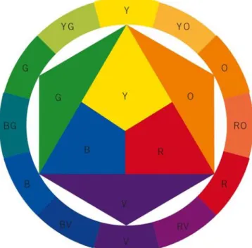
To deal with color effectively, basic color theory categories which are the color wheel and color schemes should be learned. The color wheel is a circle that shows hues according to their spectral (natural) order (see figure 5). The order of colors in the wheel is fixed and presented in a continuous circle. A color wheel consists of sort of all visible hues. There are three primary hues; blue, red, and yellow. All the colors are derived from these hues. With the mixture of the primary hues, secondary hues are obtained which are purple, green, and orange. Each secondary hue is the visual midpoint of two primary colors. When the primary and secondary hues are mixed, their midpoints originate the intermediate colors. The intermediate hue names are based on their creator primary and secondary colors; yellow-orange, orange, red-violet, blue-red-violet, blue-green, and yellow-green. The basic color wheel is made up
from six hues, the combinations of primary and secondary hues and expanded spectrum color wheel is made up from twelve hues, the combination of primary, secondary and intermediate hues (Holtzschue, 2012; Matters, 2012).
Figure 5: The color wheel
(Source: Holtzschue, L. (2012). Understanding color: an introduction for designers. John Wiley & Sons.)
Color schemes are developed utilizing the color wheel. There are four basic color schemes; achromatic, monochromatic, analogous, and complementary. The achromatic color scheme does not consist of any hue. It comprises just grayscale colors; white, grays, and black. The monochromatic color scheme consists of single hue only and varied tints and shades of that hue such as dark red, red, and light red. The analogous color scheme consists of three hues which are adjacent to each other
on the expanded spectrum color wheel such as green, yellow green, and yellow. The complementary color scheme consists of colors which are located directly opposite to each other on the color wheel such as orange and blue (Holtzschue, 2012; Matters, 2012).
2.2.1. Color Order Systems
There are more than 17 million different colors being used in design software and distinguished by human eyes. In order to classify and identify the colors, no single color-order system can be truly inclusive so different color systems have been developed. Color order systems are based on the appearance of colors on three-dimensional arrangements. Color order systems organize the confusion of the color range by presenting colors in an order based on the relationship between each other. Each color can be described related to the position of the color in the notation. There are different color order systems; CIE Lab System, HSB System, The
COLORCURVE, The DIN (Deutsche Industrie Normung- German Standardization Institute), Hungarian color order system, NCS and Munsell color order systems. Munsell color system is the most accepted color system among the others and most of the color courses give education based on Munsell system (Nassau, 1997).
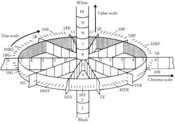
Munsell color system based on three attributes of color; hue, chroma, and value. The system comprises of five Principal Hues; red (5R), yellow (5Y), green (5G), blue (5B), and purple (5P) and five Intermediate Hues; yellow-red (5YR), green-yellow (5GR), blue-green (5BG), purple-blue (5PB), and red-purple (5RP). The principal hues are visually equidistant from each other and divided the color wheel into five
equals distant. The intermediate hues are the midpoint of the two analogous principal hues. The combination of principal hues and the intermediate hues are generated the major hues. Through sub-dividing each major hue into ten sections; secondary intermediate and special intermediate hues are generated. Munsell’s 100 hues circuit consists of 10 major hues, 10 secondary intermediate hues, and 80 special
intermediate hues. The hue circuit has the equal chroma level for each hue. The chroma scale is ranged from neutral gray to highest chroma. The value scale is ranged from white to black with ten equal steps (Cooper, 1941).
Figure 6: Munsell’s hue, chroma and value charts
(Source: Gohl, E. P. G., & Vilensky, L. D. (1989). Textile science. Longman Cheshire.)
2.2.2. Color Vision
The color is a visual sensation and the eye is the sense organ that receives light, detects environments and objects. Retina of the eye get a stimulus, transmits the stimulus to the brain and identifies the stimulus as color in the brain. In the retina, there are two types of photoreceptors; the rods and cones. The function of rods is to
create a vision in low- level light situation without a color appearance. The cones operate details and color vision (Van Bommel & Van den Beld, 2004). The human color vision system is trichromatic with three sensor types which are sensitive to light of different wavelengths; red, green, and blue. All of the colors are seen by the combinations of these wavelengths. Reduced number of cones causes color blindness in which people lose ability to differentiate between colors. People, who have just one type of cone are not able to perceive colors they only perceive shades of gray. They are defined as monochromatic color blind (Bleicher, 2012). For the normal color vision people, the color experience was explained by Holtzschue (2012:3) as:
The beginning of every color experience is a physiological response to a
stimulus of light. Colors are experienced in two very different ways. The colors on a monitor screen are seen as direct light. The colors of the physical world — of printed pages, objects, and the environment — are seen as reflected light. The perception of colored light is a straightforward experience: light reaches the eye directly from a light source. The experience of real-world color is a more complex event. Real-world colors are seen indirectly, as light reflected from a surface. For tangible objects and printed pages, light is the cause of color, colorants (like paints or dyes) are the means used to generate color, and the colors that are seen are the effect.
Human eyes can recognize about 150 distinct colors (hues) whether they are seen as direct or reflected light. Color vision enables people to distinguish slight differences between colors such as blue and blue-green, or green and green-yellow (Holtzschue, 2012). A color difference whether it based on hue, chroma or value can also be distinguishable. However, in addition to whole color appearance, the ability to see the difference between the attributes of color may not be the same. It is possible that someone who discriminates difference between value differences (grayscale) may not be able to discriminate chromatic difference (Holtzschue, 2012). Among the color attributes, chroma differences are the least accurately distinguished ones
whereas value differences are the most accurately distinguished ones. Value differences, even the slight differences are detected easily compared to hue and chroma. Large hue differences detected more easily than smaller ones. Identification of yellow hue differences is more difficult than the others (Melgosa, Rivas, Hita& Vienot, 2000).
2.2.3. Color and Lighting
Since color is generated by light, every variation in light has the potential to alter the color perception. Most of the lamps used for general lighting, produce white light which enables all colors to be visible. For a good color visibility amount of light; illuminance level and characteristics of light; SPD, CRI, and CCT have an important impact (Luo, 2011; Holtzschue, 2012).
Illuminance level of a light does not affect the appearance of color but it affects the visibility of color. An inadequate light level causes having difficulties to see colors and an uncontrolled and excessive light also impair color perception. Glare destroys the color perception abilities and can cause temporary blindness (Holtzschue, 2012).
All the white light sources do not generate the same white light. Each type of lamp emits different wavelength according to its spectral distribution curve. The curve provides a visual profile for source color: the light can be seen as pure white, cool white (stronger in green or blue), or warm white (stronger in the yellow-red range). A lamp may not emit all the primaries (red, green and, blue) equally, it can emit
some primaries at a higher level of energy than the others or some primaries can be missed completely. Differences in spectral distribution determine how various kinds of lamps render the colors of objects (Holtzschue, 2012).
CRI gives information of color rendering properties of a light source. When illuminated subjects are color, CRI assumes faithful color rendition and has the ability to judge colors as realistic or natural compared to a reference source, so in order to make a good color judgment, the CRI should be as high as possible. Good color rendering index also enables colors to appear natural and enables to
discriminate similar colors. Lower CRI values cause colors to appear unnatural when illuminated by the lamp (Rea, 2008; van der Burgth & van Kemenade, 2010).
The whiteness of a color of light is measured by the color temperature of the lamp. However, it does not show how a light source will render the colors of objects. CCT has an important impact on the appearance of color. Particular CCTs enable colors to be more visible, clear and have an appropriate appearance. Under lower CCT red, red-yellow, and yellow colors have good color visibility whereas, under higher CCT green-yellow, green, blue, blue-green, and purple colors have good color visibility (Hong et al., 2017).
2.2.4. Previous Studies on Color Task Performance
There are certain difficulties of visual tasks in the office environments; moderately difficult tasks such as accounting, reading, and typing tasks and difficult tasks such
as color inspection works and color related tasks. A sufficient lighting condition improves visual performance (Van Bommel & Van den Beld, 2004).
In the literature, there are a number of studies regarding the effects of lighting on color task performance. Different light sources and characteristics of light sources (CCT, SPD, and CRI) on color task performance are examined. Jiang, Lei and Jin (2014) studied spectrum effects on color visual performance under mesopic (night) vision. The research was conducted in an experiment room under three types of light sources (high-pressure sodium, phosphor-converted white LED, and RGB LED). The light sources differed in terms of their SPD (590nm, 450nm, and 460nm), CRI (-23,5, 68, and 49,2) and CCT (1935K, 5045K and 6670K). In the experiment,
participants viewed a set of color objects and are asked to evaluate in which light the color of objects seemed most natural, most saturated, and suitable for street lighting. The results of the experiment showed that colors were seen most natural under white LED. In the color matching task, white LED light was found better in terms of accuracy and RGB LED was found better in terms of consumed time on matching performance (Jiang, Lei& Jin, 2014).
Another research conducted by Veitch, Whithead, Mossman& Pilditch (2014) investigated the effects of three SPD on color perception by Farnsworth- Munsell 100 hues test performance, judgments of skin color attractiveness and preferences for the saturation of printed images. The experiment was conducted in a light booth under three lighting setups: filtered quartz halogen lamp (HQ), LED lamp with low Ra (LED A), and LED lamp with high Ra (LED B). The lighting setups had the same illuminance level (400lux), same CCTs (3500K) and different SDPs (650nm, 530nm,
and 465nm). The results showed that color discrimination performance and two perceptual judgments were better under HQ and LED B compared to LED A and there was no significant difference between LED B and HQ.
Royer, Houser, and Wilkerson (2012) conducted a research on color discrimination performance. They used Munsell FM-100 hues test under four different lighting sources having 2700K CCT; RGB LED, two fluorescent lamps, and a tungsten-halogen lamp. The performance was calculated based on total error score of FM-100 hues test. The results showed that among the light sources participant’s performance was worse under RGB LED light whereas there was no difference between
fluorescent lamps and tungsten-halogen lamp although they have different SPD and CRI levels.
The study conducted by Cheng, Ju, Sun& Lin (2016) investigated the effects of CCT on color differentiation performance and preference. The difference of the study from the previous ones was the participants who were elderly people. The
experiment was conducted under two different CCTs; 2800K and 6000K and three different illuminance levels; 30lux, 100lux, and 1000lux. Like the other studies color differentiation performance was assessed by FM-100 hues test. The results showed that higher CCT of light source provid better color differentiation performance and higher illuminance levels perceived as more comfortable and brighter.
Another study investigated the effects of CCT on melatonin production and visual performance in working environment. Seven CCTs (1600K, 1950K, 2750K, 3900K,
6100K, 7100K, and 14000K) were compared with 6500K in terms of particular color discrimination and melatonin synthesis. All the tested lights had 200lux fixed
illumination level and reference light source had 2500lux. Color discrimination was assessed by Munsell FM-100 hues test and its results showed that CCTs lower than 2000K are not suitable for color discrimination in workplaces. Error score of the Munsell FM-100 hues test was the least under 6100K and highest under 1600K lighting. While in between 1600K to 6100K the error score was decreasing, from 6100K to 14000K error score increased (Kraneburg, Franke, Methling& Griefahn, 2017).
2.3. Munsell FM-100 Hue Test
The studies about color task performance were mostly based on Farnsworth Munsell 100 Hue test. The test was designed to assess color vision problems and color discrimination ability of observers. In the test, there are 85 colored caps from the whole hue spectrum split across four trays. The test requires participants to arrange these caps into color graded order between two fixed reference caps at the first and last caps in the trays (See Figure 7). The 85 color caps have the same chroma and value levels and vary only in hue with as slight differences between neighboring caps (Rigby, Warren, Diamond, Carter, & Bradfield, 1991; Cranwell et al., 2015).
However, chroma and value differences are as important as hue differences since colors are perceived depending upon recognition of these three attributes. Therefore, in this study, color task was created based on Munsell FM-100 Hue Test and it was developed regarding the choma and value attributes.
CHAPTER III
EXPERIMENTAL STUDY
3.1. Aim of the Study
To understand the effects of color temperature on performance of workers, a lot of experimental studies were done as mentioned in Chapter II. However, most of the studies used typing and problem-solving tasks as an instrument and there was no significant research about work performance of people whose instruments are color oriented task in office environment. The main purpose of this study is to see the effects of different color temperatures on color based tasks. For this purpose, a color task implementation model to be used in future color task performance experiments was designed. It is also aimed to investigate the effects of color temperature on three attributes of color (hue, chroma and value) differentiation performances and mood. Understanding the differences between 4000K and 2700K color temperatures in color task performance, users’ mood and satisfaction from the office lighting quality can be helpful for workers who deal with colors in office environments and light designers to improve workers’ performance and well-being.
3.1.1. Research Questions and Hypotheses
In order to reach the aim of the study four research questions were formulated. The research questions of the study are as follows:
Q1: Is there any significant difference of color task performance under different color temperatures?
Q2: Are existing color task models sufficient to measure task performance in terms of three attributes (hue, chroma, value) of colors?
Q3: Do color attributes of the color task affect the performance?
Q4: Is there any significant effect of color temperatures and color task performance on mood of participants?
The hypotheses that are formulated in response to the research questions are as follows:
H1: Color task performance is higher under 4000K compared to 2700K color temperature.
H2: A new color task implementation model is needed to measure color task performance.
H3: Among the color attributes value differentiation is effective on color task performance.
3.2. Methodology
3.2.1. Experimental Set-up
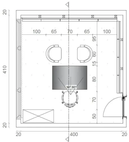
The study was conducted in a full-scale experiment room at the department of Interior Architecture and Environmental Design at Bilkent University. The
experiment room was set up as a real office room. The dimensions of the room were 4.00 m length, 4.10 m wide and 3.20 m height. Since daylight is affected from position of the sun and weather conditions, it changes throughout the day. In order to eliminate daylight factor and control the effect of artificial light on the performance of worker, windows were covered with 5mm black foam board and daylight
penetration to the room was prevented. Previous studies found that wall and furnisher colors affect performance of worker (Ozturk et al., 2012). In order to control the environmental effects on the task performance, in this study sliding plywood panels were constructed on two sides of office walls which were in the visual field of the participants and painted matte neutral gray color. All the furniture and floor were covered with gray fabrics. The ceiling was painted matte white color. Any material and color in the office space generate no specular reflection.
In the experimental office room, there was an office desk with an office chair, two armchairs and one file cabinet for the folders. The layout of the office room was arranged according to participants’ visual field. They saw the achromatic wall panels during the experiment. As the orientation of the worker to the task influences of the effect of veiling reflection (CIBSE,1984), the color task performance test was
conducted on 40 degrees inclined setup to establish an offending zone for reflection with the 40-degree sitting line of sight and 60-degree cone of vision (IESNA,1993).
Figure 8: Plan of the experiment room
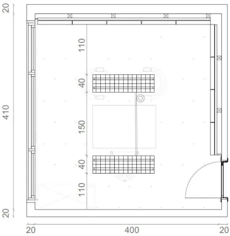
Figure 10: Reflected ceiling plan of the experiment room
The existing general direct (downward) lighting by the luminaries of recessed troffer with parabolic louvers was used as artificial lighting fixture of the room. Two
fluorescent lighting fixtures were placed in the middle of the ceiling at appropriate distances to meet required illuminance levels (300-500 Lux) for office tasks (IESNA, 1993). The experiment was conducted under two lighting set-ups; four OSRAM fluorescent lamps LUMILUX T8 36W/827 (2700K warm white light) and four OSRAM fluorescent lamps LUMILUX T8 36W/840 (4000K cold white light). Both of the lighting equipment had the same luminous flux; 3100 Lm. The illuminance level was measured by using Konica Minolta T-1 Illuminance Meter Meter (range of 0.01 to 99,900 lux) on the working surface. The average illuminance value for 4000K recorded 426 lux and for 2700K was 424 lux. The SPD of fluorescent lamps
are also similar (See Figure 12, Figure 13). When accurate color judgments are necessary good color rendering index (CRI) is required. In this case, CRI should be in between 80-90 Ra (CIBSE, 1984). Both of the lighting equipment were chosen according to their CRI level which is in the good color rendering group: 1B (Ra: 80…89).
Figure 11: Office set up under 4000K (left side) and 2700K (right side) fluorescent lighting
Figure 12: Spectral Power Distribution of 4000K fluorescent lamp
(Source: https://www.osram.com/osram_com/products/lamps/fluorescent-lamps/fluorescent-lamps-t8/fluorescent-lamps-t8-special-versions/lumilux-t8-1-m/index.jsp?productId=ZMP_60437)
Figure 13: Spectral Power Distribution of 2700K fluorescent lamp
(Source: https://www.osram.com/osram_com/products/lamps/fluorescent-lamps/fluorescent-lamps-t8/lumilux-t8/index.jsp#)
3.2.2. Sample Group
The sample group was chosen from Department of Interior Architecture and
Environmental Design at Bilkent University, Ankara, Turkey. Total of 100 students, 73 females and 27 males participated in the experiment voluntarily from the
department. The mean age of participants was 23,14 ranging from 19 to 31 years. Participants carried out the task performance one by one and the color task
performance and questionnaire took almost 45 minutes for each participant. Firstly, it was decided to conduct a repeated measures design; the same participant group was repeatedly tested because when separate groups carry out the experiment, individual differences among participants such as age, sex, and personal characteristics affect the results of the study and it cannot be eliminated. However, this design has a disadvantage; when the same participant group was tested once again, they may improve their performance with practice since they learn more about the task or become more familiar and relaxed in the experimental situation. The chances of the performance between the conditions are called practice effects (Shaughness et al., 2012). To control the practice effect, a counterbalancing technique was designed. In order to counterbalance practice effect, which may cause increase in speed of
participants when they perform the task second time and mislead the results, order of conditions was systematically varied so that each condition was presented equally in each ordinal position (Shaughness et al., 2012).
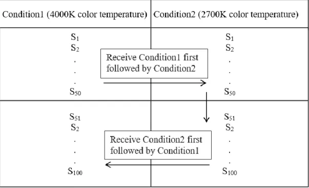
Participants were divided randomly into two groups; half of the participants, between 1 to 50 participants, completed the color task performance at 2700K for the first time
and at least one-week period carried out the same color task at 4000K lighting setup. The other half, between 51 to 100 participants, completed the color task performance at 4000K for the first time and at least one-week period carried out the same color task at 2700K lighting setup, thus under both experimental setups, an equal number of participants involved experiment at first order without any knowledge of the task.
Figure 14: Order of lighting setups and participant groups
3.2.3. Experimental Procedure
The experiment was conducted in a certain order. Participants were taken to the experiment one by one and first of all Ishihara color blindness test was applied. If they had a color vision problem they could not participate in the experiment. After two-minute adaptation to the condition, surveyor gave information about the
PANAS mood test. Then, participants were given the color task and asked to arrange the color chips in correct order. The color task was composed of five hue
differentiation tasks, five chroma differentiation tasks and one value differentiation task. In order to eliminate practice effect, participants received the total of 11 color tasks randomly by using random number generator application. Color tasks were performed on matte Plexiglas sheet to make it easy to check the answers. Since performance is measured by speed and accuracy of task workers done and their satisfaction from their work (Gaska et al., 2016, Jiang et al., 2014, Öztürk et al., 2012), surveyor recorded both the time spent and answers. In this study, speed of task refers to the duration of the time that participants completed each color task and accuracy of task refers to the number of correct chip placement. After completing the color task performance, Watson’s PANAS Mood test was repeated, OLS office lighting satisfaction test and self- satisfaction questionnaire were applied. All answers of the questionnaire were recorded by surveyor. When participants
completed the experiment under first color temperature, they were appointed for the repetition of the experiment under the other color temperature. The experiment took two months started at March 15th, 2017 and finished at May 18th, 2017.
3.2.4. Design of Experimental study
The experimental study consists of two parts; color task implementation model and questionnaires. Color task implementation model is explained under the sections of hue differentiation task, chroma differentiation task, and value differentiation task. Questionnaires are explained under the sections of Watson’s mood measurement test Positive Affect Negative Affect Schedule (PANAS), self- satisfaction test by Office Lighting Survey (OLS) and perceived performance test.
3.2.4.1. Color Task Implementation Model
It is known that color temperature of lighting is highly related with task performance and affect the perception of color (Egan& Olgyay, 2002). The experiment based on two-dimensional color differentiation tasks. Since colors are perceived depending upon the recognition of three attributes which are hue (name of the color), value (lightness of color) and chroma (degree of strength of color), the color tasks were designed in order to assess how three attributes of colors are differentiated. The color tasks were prepared by using Munsell system since the participants received their basic design education based on Munsell System. Three types of color task (hue differentiation, chroma differentiation, value differentiation) were designed with Adobe Photoshop CS6, printed out high quality (600 dpi) by HP DESIGNJET Z6200 Photo Production Printer on matte paper and cut into 20 pieces with the dimensions of 2cm (length) to 4cm (height). The size of the chips was determined based on previous research which was studied unique hue selection and used color chips 2x4
cm (Shamey, 2015). In order to find out in which range color differentiation is more sensitive, each chip differs one and other 5% levels.
3.2.4.1.1. Hue Differentiation Task
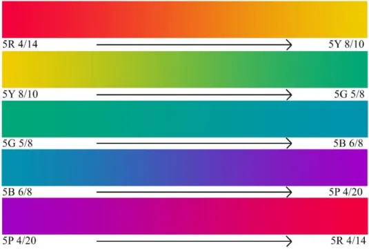
In the Munsell color system, there are five Principal Hues (red, yellow, green, blue and purple) which are visually equidistant from each other. These hues divides the hue circle into five equals distance. Each principal hue has 20 steps distant to the other principal hue (Cooper, 1941). To assess hue differences, five principal hues and their evenly-graded alteration from one hue to another were used. Hue differentiation task contains five sets; red to yellow, yellow to green, green to blue, blue to purple and purple to red. Tasks assess color differentiation performance on all of the hues in the 100-hue circuit and hue differentiation sensitivity.
3.2.4.1.2. Chroma Differentiation Task
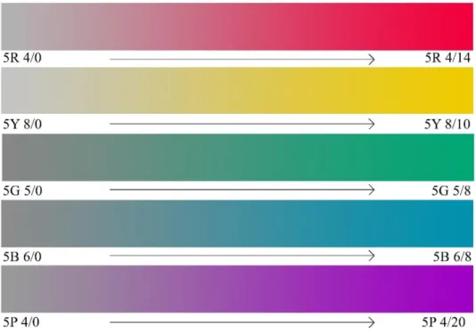
Colors are classified into three main types according to chroma attribute;
Maximum/Strong Color (a color of very strong chroma), Moderate Color (found near the fourth to sixth step of chroma), Weak Color (reduced chroma found in the
neighborhood of second or third steps of chroma). The strongest possible chroma varies depending on the hues, and at different levels of value. A hue reaches its maximum color at its “home” value. For example; Yellow is strongest only when it has a prominent level of lightness and it can be divided into more distinguishable steps whereas purple-blue is strongest when it has a low level of lightness (Cooper, 1941). Chroma differentiation task also contains five sets based on Principal Hues. Each set evenly-graded from maximum color to its equaled achromatic gray (home value). Tasks assess color differentiation performance and sensitivity between weak color to maximum color.
3.2.4.1.3. Value Differentiation Task
In the Munsell Color Sphere, the five Principle Hues are evenly distributed between black and white. The top of the Color Sphere is White and the bottom is Black, and the axis between black and white is neutral grays scale which is placed at the center of the Sphere. Since white has the full lightness level and black has the full darkness level any color can be seen in neither white nor black. But in-between darkest gray to lightest gray, there are distinguishable degrees of light strength and colors can be seen at these levels (Cooper, 1941). Value differentiation task is based on evenly-graded steps from white to black. This task also assesses color differentiation performance and sensitivity.
Figure 19: Example of color task administration method (random arrangement)
Figure 21: Example of color task administration method (checking the answers)
3.2.4.2. Questionnaire
The questionnaire consisted of three parts; Watson’s mood measurement test Positive Affect Negative Affect Schedule (PANAS), self- satisfaction test by Office Lighting Survey (OLS) and perceived performance test.
3.2.4.2.1. Watson’s Mood Measurement Test Positive Affect
Negative Affect Schedule (PANAS)
In the literature, although there are a number of mood scales, they are showing low reliability, inadequacy, or poor convergent. Watson’s PANAS (Positive Affect and Negative Affect Schedule) is a reliable, brief and easy to administer self- reported mood measurement (Gou et al., 2015; Knez, 1998; Buelow, 2015; Watson et al.,
1988). PANAS comprises two mood factors which are strongly negatively correlated with each other; Positive Affect (PA) and Negative Affect (NA). It consists of two 10-item mood scales. PA is related with the feelings of enthusiasm, activeness and alertness. NA is related with general dimensions of subjective distress and unpleasant conditions. The items of PA scale are interested, excited, strong, enthusiastic, proud, alert, inspired determined, attentive and active and the items of the NA scale are distressed, upset, guilty, scared, hostile, irritable, ashamed, nervous, jittery and afraid (See Appendix A, Figure A1). PANAS measures mood of the participant on 5-point scale which were labeled “very slightly or not at all”, “a little”, “moderately”, “quite a bit” and “extremely”. Participants’ mood was measured twice, before and after color task performance, in order to assess whether difficulty of task affected the mood or not. The mood chance was measured by the difference between first and second mood score. That measurement indicates to what extend the environmental condition in the experiment moderated the mood chance related to the task (Gou et al., 2015).
3.2.4.2.2. Self-satisfaction Test by Office Lighting Survey (OLS)
Office Lighting Survey (OLS) is a questionnaire-based office lighting satisfaction assessment method designed by Eklund and Boyce in 1996. The survey consists of 30 questions; seven questions about demographic information; 10 questions in agree- disagree format, eight questions 5-point scale format, two questions yes-no format and three open ended questions. The questions are based on lighting quality
satisfaction. OLS is a simple, rapid to administer and score questionnaire, and it provides considerable diagnostic information (Eklund & Boyce, 1996) (See Appendix A Figure A2, A3, A4, A5).
In the study, the questions in the survey which required being in a real office environment, required conducting a task performance different than color task such as reading, typing, and filing were not evaluated.
3.2.4.2.3. Perceived Performance Test
Perceived performance test was designed as questionnaire based test. In this test, participants were asked to evaluate their performance on the given tasks to obtain self-reports of the task under 4000K and 2700K color temperature. The test contains three 5-point scale questions to evaluate participants’ expected success, self-speed and self- accuracy.