EFFECT OF AREA ON COLOR HARMONY IN INTERIOR SPACES
A Ph.D. Dissertation
by
SEDEN ODABAŞIOĞLU
Department of
Interior Architecture and Environmental Design
İhsan Doğramacı Bilkent University
Ankara
June 2015
EFFECT OF AREA ON COLOR HARMONY IN INTERIOR SPACES
Graduate School of Economics and Social Sciences
of
İhsan Doğramacı Bilkent University
by
SEDEN ODABAŞIOĞLU
In Partial Fulfilment of the Requirements for the Degree of
DOCTOR OF PHILOSOPHY
in
THE DEPARTMENT OF
INTERIOR ARCHITECTURE AND ENVIRONMENTAL DESIGN
İHSAN DOĞRAMACI BİLKENT UNIVERSITY
ANKARA
June 2015
I certify that I have read this thesis and have found that it is fully adequate, in scope and in quality, as a thesis for the degree of Doctor of Philosophy in Interior Architecture and Environmental Design.
---
Assoc. Prof. Dr. Nilgün Olguntürk Supervisor
I certify that I have read this thesis and have found that it is fully adequate, in scope and in quality, as a thesis for the degree of Doctor of Philosophy in Interior Architecture and Environmental Design.
--- Prof. Dr. Halime Demirkan Examining Committee Member
I certify that I have read this thesis and have found that it is fully adequate, in scope and in quality, as a thesis for the degree of Doctor of Philosophy in Interior Architecture and Environmental Design.
--- Assist. Prof. Dr. Katja Doerschner Examining Committee Member
I certify that I have read this thesis and have found that it is fully adequate, in scope and in quality, as a thesis for the degree of Doctor of Philosophy in Interior Architecture and Environmental Design.
--- Assoc. Prof. Dr. Sezin Tanrıöver Examining Committee Member
I certify that I have read this thesis and have found that it is fully adequate, in scope and in quality, as a thesis for the degree of Doctor of Philosophy in Interior Architecture and Environmental Design.
--- Assist. Prof. Dr. Elif Güneş Examining Committee Member
Approval of the Graduate School of Economics and Social Sciences ---
Prof. Dr. Erdal Erel Director
iii
ABSTRACT
EFFECT OF AREA ON COLOR HARMONY IN INTERIOR SPACES Odabaşıoğlu, Seden
Ph.D., Department of Interior Architecture and Environmental Design Supervisor: Assoc. Prof. Dr. Nilgün Olguntürk
June 2015
The main aim of this study is to examine the effect of area on color harmony in interior spaces. Area in color harmony is the relative amount of different color areas represented as a proportion on which color harmony depends. Colors in the color scheme of an interior space are usually not applied in equal proportions of surface areas and considering the complex relations of colors in interior spaces, it is
important to search for the principles of color harmony and area effects in interiors. The secondary aim of the study is to investigate how the term color harmony was defined and the link between color harmony and related terms used to define it. The related terms that are used to define color harmony can explain why a color scheme is evaluated as harmonious. In this study, three primary (red, blue, yellow) and three secondary (green, purple, orange) colors of Itten’s color wheel were studied in a simulated office interior with three-color schemes emphasizing different proportional use of each color. There were four color combinations, each consisting of six images differing in areas of the constituent colors. Firstly, participants evaluated the
harmony content of the images by comparing them in pairs. Secondly, they evaluated each image regarding the thirteen terms related to color harmony. Findings indicated that area had an effect on color harmony for two of the color combinations (warm and cool color schemes). However, there were no strong but rather moderate and weak correlations between color harmony and the terms.
Keywords: Color Harmony, Three-Color Combinations, Experimental Color
iv
ÖZET
İÇ MEKANLARDA ALANIN RENK UYUMU ÜZERİNE ETKİSİ Odabaşıoğlu, Seden
Doktora, İç Mimarlık ve Çevre Tasarımı Bölümü Tez Yöneticisi: Doç. Dr. Nilgün Olguntürk
Haziran 2015
Bu çalışmanın başlıca amacı iç mekanlarda alanın renk uyumu üzerine etkisini incelemektir. Renk uyumunda alan, renk uyumunun bağlı olduğu bir oran olarak temsil edilen, farklı renk alanlarının göreli miktarıdır. Bir iç mekanın renk
şemasındaki renkler, genellikle, yüzeylere eşit oranlarda uygulanmamaktadır ve iç mekanlarda renklerin kompleks ilişkileri de göz önünde bulundurulduğunda iç mekanlarda renk uyumu ve alan etkilerinin ilkelerini araştırmak önemlidir.
Çalışmanın ikincil amacı ise renk uyumunun nasıl tanımlandığını ve renk uyumu ve onu tanımlamaya ilişkin kullanılan terimler arasındaki ilişkiyi araştırmaktır. Renk uyumunu tanımlamaya ilişkin kullanılan terimler, bir renk şemasının neden uyumlu olarak değerlendirildiğini açıklayabilir. Bu çalışmada, Itten’ın renk çemberindeki üç ana (kırmızı, mavi, sarı) ve üç ara (yeşil, mor, turuncu) renk, her rengin farklı oranlarda kullanıldığı üçlü-renk şemalarıyla, modellenmiş bir ofis mekanında incelenmiştir. Dört adet renk kombinasyonu ve her bir kombinasyon için kendisini oluşturan renklerin farklı alanlara uygulandığı altı görüntü bulunmaktadır. Öncelikle, katılımcılar görüntülerdeki renk uyumunu onları çiftler halinde karşılaştırarak
değerlendirmişlerdir. İkinci olarak, katılımcılar her bir görüntüyü renk uyumuyla ilgili on üç terime ilişkin olarak değerlendirmişlerdir. Çalışma sonuçlarına göre, iki renk kombinasyonunda (sıcak ve soğuk renk şemaları) renk uyumunda alan etkisi bulunmuştur. Fakat, renk uyumu ve terimler arasında güçlü bir korelasyon yerine orta ve zayıf korelasyonlar bulunmuştur.
Anahtar Kelimeler: Renk Uyumu, Üçlü-Renk Kombinasyonları, Deneysel Renk
v
ACKNOWLEDGMENTS
I would like to thank Assoc. Prof. Dr. Nilgün Olguntürk for her invaluable support, guidance and encouragement throughout the preparation of the thesis. I am honored to thank my committee member Prof. Dr. Halime Demirkan for her guidance, advice, encouragement and crucial contribution throughout my graduate education and doctoral studies. I am also grateful to another member of my committee, Assist. Prof. Dr. Katja Doerschner, for her helpful suggestions and valuable comments.
I would like to thank Assoc. Prof. Dr. Sezin Tanrıöver and Assist. Prof. Dr. Elif Güneş for their crucial comments regarding the finalization of the thesis. Besides, I would like to express my appreciation to Assoc. Prof. Dr. Türkün Şahinbaşkan for his help and support during the experiments and I would also thank to Prof. Dr. Ahmet Dirican for his suggestions throughout the statistical analysis of the thesis.
I would like to thank TÜBİTAK – BİDEB for the financial support (2211- Yurt İçi Doktora Burs Programı) throughout my doctoral studies.
vi
I also thank to Akan Murat Çimen for the computer program used in the experiments and Paul Williams for proofreading.
I am thankful to all faculty members and staff of İhsan Doğramacı Bilkent University Department of Interior Architecture and Environmental Design and Marmara
University Department of Interior Architecture and also to the students who participated in the experiments.
I am grateful to Segah Sak and Begüm Ulusoy for their friendship and moral support. I owe special thanks to İlayda Soyupak for her friendship, patience and help and I am indebted to Ozan Soyupak for his help. I would like to thank Seda Bütün for her friendship and help. I also thank to Refia Anıl Ağrılı, Seylan Öztürk, Ceren Koç and Çağrı Uludüz for their friendship. Additionally, I owe special thanks to my dear friend Can Tunçsan for his invaluable trust and support.
I am also grateful to my parents Gülay Odabaşıoğlu and Enis Odabaşıoğlu, and my sister Sinem Odabaşıoğlu for their support and encouragement through all my life.
vii
TABLE OF CONTENTS
ABSTRACT ... iii
ÖZET... iv
ACKNOWLEDGEMENTS ... v
TABLE OF CONTENTS ... vii
LIST OF TABLES ... xi
LIST OF FIGURES ... xiv
CHAPTER 1: INTRODUCTION ... 1
1.1 Aim of the Study ... 3
1.2 General Structure of the Thesis ... 4
CHAPTER 2: COLOR HARMONY ... 6
2.1 Basic Definitions and Concepts of Color ... 6
2.2 Definition of Color Harmony ... 12
2.3 Theories of Color Harmony ... 14
2.4 Attributes of Color Harmony ... 31
2.5 Color Harmony Research Using Experimental Evaluation Methods ... 44
viii
2.5.2 Color Harmony based on the Three Color Appearance Attributes
(HSB) ... 49
2.5.2.1 Color Harmony of Two-Color Combinations ... 52
2.5.2.2 Color Harmony of Three-Color Combinations ... 57
2.6 Color Harmony and Preference... 59
CHAPTER 3: COLOR HARMONY IN INTERIOR SPACES ... 64
3.1 Interior Space ... 64
3.2 Color Harmony Research in Interior Spaces... 70
CHAPTER 4: THE EXPERIMENT ... 80
4.1 Aim of the Study ... 80
4.1.1 Research Questions ... 81
4.1.2 Hypotheses ... 81
4.2 Method of the Study ... 82
4.2.1 Sample Group ... 82
4.2.2 Experiment Room ... 83
4.2.3 Procedure ... 85
4.2.3.1 Selecting the Function ... 85
4.2.3.2 Specifying the Colors ... 86
4.2.3.3 Creating the Interior Space ... 90
4.2.3.4 Preparing the Questionnaire ... 98
4.2.3.5 Phases of the Experiment ... 104
4.3 Findings ... 107
4.3.1 Consistency Analysis ... 107
ix 4.3.3 Correlation Analysis ... 119 CHAPTER 5: DISCUSSION ... 128 CHAPTER 6: CONCLUSION ... 138 BIBLIOGRAPHY ... 142 APPENDICES APPENDIX A: COLOR ORDER SYSTEMS ... 153
APPENDIX A.1: Color Order Systems based on Subtractive Mixing ... 153
APPENDIX A.1.1: CMYK Color Model ... 154
APPENDIX A.1.2: CIELAB ... 155
APPENDIX A.2: Color Order Systems based on Additive Mixing ... 157
APPENDIX A.2.1: RGB Color Model... 158
APPENDIX A.2.2: CIELUV ... 159
APPENDIX A.2.3: Ostwald Color System ... 160
APPENDIX A.3: Color Order Systems based on Perceptual Evaluation . 162 APPENDIX A.3.1: Munsell Color System ... 163
APPENDIX A.3.2: Natural Color System (NCS) ... 165
APPENDIX A.3.3: Coloroid Color System ... 168
APPENDIX B: EQUATIONS FOR PREDICTING COLOR HARMONY .... 170
APPENDIX B.1: Models for Two-Color Combinations ... 170
APPENDIX B.2: Models for Three-Color Combinations ... 173
APPENDIX C: RGB VALUES OF THE COLORS ... 178
APPENDIX D: QUESTIONNAIRE ... 208
APPENDIX D.1: Questionnaire (in English) ... 209
x
APPENDIX E: DESCRIPTION OF THE WORDS ... 213 APPENDIX F: GLOSSARY ... 215
xi
LIST OF TABLES
1. Summary of color harmony theories ... 17
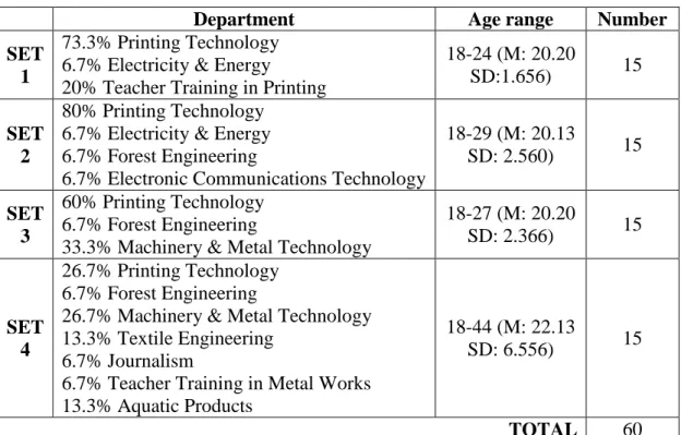
2. Information on the subjects ... 82
3. Three-color combination sets ... 88
4. Presence test results (pilot 1) ... 96
5. Presence test results (pilot 2) ... 96
6. Presence test results of the video moving back and forth ... 97
7. The terms related to color harmony ... 99
8. Categorization of the terms ... 100
9. Word pairs of the third phase of the experiment ... 101
10. Subject consistency values for the second phase of the experiment ... 110
11. Number of subjects whose evaluations were accepted for further analysis ... 111
12. Mean ranks of the images in each set ... 115
13. Correlations between harmony and its related terms ... 120
14. Correlations of harmony of the scenes and the terms related to color harmony (Set 1) ... 122
15. Correlations of harmony of the scenes and the terms related to color harmony (Set 2) ... 123
xii
16. Correlations of harmony of the scenes and the terms related to color harmony
(Set 3) ... 124
17. Correlations of harmony of the scenes and the terms related to color harmony (Set 4) ... 126
18. Correlations of the 13 word pairs ... 127
19. Color harmony values of the images according to the model developed by Wang, Ou & Luo (2007) ... 133
C1. RGB values of Set 1- Office 1 ... 180
C2. RGB values of Set 1- Office 2 ... 181
C3. RGB values of Set 1- Office 3 ... 182
C4. RGB values of Set 1- Office 4 ... 183
C5. RGB values of Set 1- Office 5 ... 184
C6. RGB values of Set 1- Office 6 ... 185
C7. RGB values of Set 2- Office 1 ... 187
C8. RGB values of Set 2- Office 2 ... 188
C9. RGB values of Set 2- Office 3 ... 189
C10. RGB values of Set 2- Office 4 ... 190
C11. RGB values of Set 2- Office 5 ... 191
C12. RGB values of Set 2- Office 6 ... 192
C13. RGB values of Set 3- Office 1 ... 194
C14. RGB values of Set 3- Office 2 ... 195
C15. RGB values of Set 3- Office 3 ... 196
C16. RGB values of Set 3- Office 4 ... 197
xiii
C18. RGB values of Set 3- Office 6 ... 199
C19. RGB values of Set 4- Office 1 ... 201
C20. RGB values of Set 4- Office 2 ... 202
C21. RGB values of Set 4- Office 3 ... 203
C22. RGB values of Set 4- Office 4 ... 204
C23. RGB values of Set 4- Office 5 ... 205
xiv
LIST OF FIGURES
1. Analogous, complementary colors and modified triads ... 9
2. Triads and tetrads on Itten’s color wheel ... 10
3. Image of an American flag in reverse colors ... 11
4. In clockwise order, Munsell color system, color space, color solid and color atlas ... 12
5. Newton color spectrum ... 24
6. Newton color circle ... 24
7. Goethe color circle ... 25
8. Chevreul chromatic diagram ... 26
9. Coordinate systems in metric space ... 37
10. Experimental stimuli for (a) area proportions (1:4:1), (1:3:1), (1:2:1), (2:1:2), (3:1:3) and (4:1:4); (b) area proportions (1:1:4), (1:1:3), (1:1:2), (1:1:1), (2:2:1), (3:3:1) and (4:4:1) ... 40
11. Experimental stimuli for area proportions in percentage 1-(100:0), 2-(87.5:12.5), 3-(75:25), 4-(62.5:37.5), 5-(50:50), 6-(37.5:67.5), 7-(25:75), 8-(12.5:87.5), 9-(0:100) ... 41
xv
12. Matrix of Spearman coefficient correlations for eight color harmony
Attributes ... 42
13. Basic color pattern for two-color combinations ... 47
14. Basic color pattern for three-color combinations ... 47
15. More complex patterns used in the experiments ... 48
16. A complex image used in the experiments ... 48
17. Color harmonies based on hue ... 50
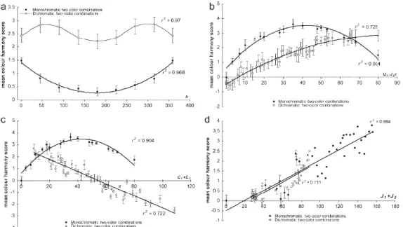
18. Predicting perceived color harmony for two-color combinations as a function of (a) CIECAM02 hue, (b) absolute lightness, (c) absolute chroma difference and (d) lightness sum ... 56
19. Predicting perceived color harmony for dichromatic two-color combinations as a function of (a) hue preference, (b) sum of chroma ... 56
20. The relationship between color preference and color harmony ... 61
21. Rietveld’s Schroder House ... 68
22. Google office İstanbul. Designed by: Burcu Şenparlak, Bülent Dündar, Vural Armutçuoğlu ... 69
23. Skype Office in Stockholm designed by PS Arkitektur ... 69
24. Zenith Barter Office designed by Nuri Ciğerci, Esat Polat, Tülay Daşdemir, Yunus Kaya ... 69
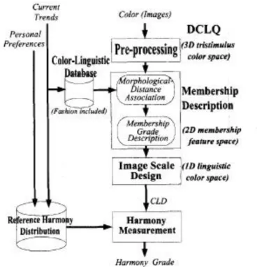
25. Flowchart of the proposed system, including the three main blocks of DCLQ algorithm, harmony measurement, and reference harmony distribution (RHD) ... 72
26. Six images evaluated by the participants ... 73
xvi
28. Color selection of plate images: (LEFT) originally inharmonious (exciting)
images; (RIGHT) correspondingly harmonious (calm) results ... 76
29. Six background-rendered images ... 77
30. Color selection of blue-rendered inharmonious image ... 77
31. Interior image used in the study of Ou et al. (2011) ... 78
32. X-RITE Color Laboratory of Faculty of Technical Education ... 84
33. Plan of the office ... 86
34. Selected three-color combinations ... 87
35. Selected colors with equal brightness and saturation (above), selected colors with equal saturation and different brightness but fixed in grayscale (below) ... 89
36. Illuminance levels ... 91
37. View of the office (Set 1) ... 92
38. View of the office (Set 2) ... 93
39. View of the office (Set 3) ... 94
40. View of the office (Set 4) ... 95
41. Eye-One Match program ... 104
42. Interface of the computer program ... 106
43. Offices of Set 3significantly different in color harmony content ... 113
44. Offices of Set 4 significantly different in color harmony content ... 114
45. Mean ranks of the images regarding color harmony in Set 3 ... 117
46. Mean ranks of the images regarding color harmony in Set 4 ... 118
A1. CMYK colors ... 155
A2. CIELAB color solid ... 156
xvii
A4. RGB color wheel ... 159
A5. CIELUV u’v’ chromaticity diagram ... 160
A6. Ostwald color circle ... 161
A7. Ostwald color solid ... 162
A8. Munsell color wheel showing the steps between the principal and intermediate colors ... 164
A9. Munsell color solid ... 165
A10. NCS color solid ... 166
A11. NCS color circle ... 167
A12. Example of an NCS hue triangle ... 168
A13. Coloroid color solid and circle ... 169
B1. Predicting perceived color harmony for three-color combinations as a function of (a) CIECAM02 hue, (b) absolute lightness difference, (c) absolute chroma difference, (d) lightness sum ... 176
C1. Grids for measuring the RGB values, for the walls (top), for the table-bookshelf-coffeetable (middle), for the seating units (down) ... 179
C2. Colors of the 6 images related to the shadows and interreflections (Set 1) ... 186
C3. Colors of the 6 images related to the shadows and interreflections (Set 2) ... 193
C4. Colors of the 6 images related to the shadows and interreflections (Set 3) ... 200
1
CHAPTER 1
INTRODUCTION
Color is in every part of our lives. It is in everything we see: In a flower, in the feather of a bird or in fabric. Colors we see around us are not isolated single colors, they work together creating interrelated visual appearances and
perceptions. For example, when we look at nature we see the blue sky, the green and brown of trees, green grass, gray rocks and the different colors of flowers all working together in harmony. This relationship of colors leads many people to question how colors work together, how they interact and how they can be harmonized.
Color is an important tool for artists and designers. It is a powerful element of design such as interior design, graphic design, industrial design and fashion design. Designers and artists, while selecting colors, consider that color may have an effect on the psychology and physiology of people. Another consideration for artists and designers is to select colors that are harmonious and work well together,
2
regarding aesthetics. Harmony, defined as “the pleasant effect made by parts being combined into a whole” (Longman dictionary of contemporary English, 1991), is one of the principles of art and design.
The selection of a color scheme is dependent upon the skills and experience of artists and designers. Consequently these color schemes may differ between individuals and may even be related to the psychology of the artists or designers in question. Artists may use harmonious colors in their works by selecting them intuitively. However, in design, selection of harmonious colors objectively may please a wider range of users. Establishing principles in color harmony should help designers by creating a useful and accurate tool for selecting the most pleasing color combinations for the users. In order to find out these principles many research studies have been done and there is an excessive number of color harmony theories and models (see Chapter 2) (Birren, 1969a,1969b; Chevreul, 1987; Chuang and Ou, 2001; Goethe, 1970; Granger, 1953; Itten, 1973; Moon and Spencer, 1944a; 1944b, 1944c; Nemcsics, 2007, 2008, 2009a, 2009b, 2011, 2012; Nemcsics and Takacs, 2013a, 2013b; Ou, Chong et al., 2011; Ou and Luo, 2003, 2006; Ou, Luo et al., 2011; Polzella and Montgomery, 1993; Szabo, Bodrogi and Schanda, 2010; Wang, Ou and Luo, 2007) but there is a marked lack of consensus in the literature regarding color harmony (see Chapter 2).
It is important to investigate color harmony in relation to interior design because interior designers intend to use harmonious colors in spaces in order to please their users. Colors in the color scheme of an interior space are usually not applied in
3
equal proportions over surface area and considering the complex relationships between colors in interior spaces, it is important to search for the principles of color harmony and area effects in interiors. There have been studies that have stressed the effects of area on color harmony of color chips (see Chapter 2.4) (Granger, 1953; Moon and Spencer, 1944c; Wang, Ou and Luo, 2007) and plates (see Chapter 2.5) (Nemcsics and Takacs, 2013b) but the effect of area on color harmony has not been studied in interior spaces.
1.1 Aim of the Study
The main aim of this study is to examine the effect of area on color harmony in interior spaces. Area in color harmony is the relative amount of different color areas represented as a proportion on which color harmony depends. Studies investigating color harmony in interior spaces (see Chapter 3) (Ou, Chong et al., 2011; Shen, Chen and Hsu, 1996; Shen et al., 2000) are few in number and these studies overlook the effect of area. However, area in color harmony is an important factor in interior spaces since colors usually are applied in different proportions in interiors. In this study, three primary (red, blue, yellow) and three secondary (green, purple, orange) colors of Itten’s color wheel were studied in a simulated office interior with three-color schemes emphasizing different proportional use of each color.
4
The secondary aim of the study is to investigate how the term color harmony is defined and the link between color harmony and related terms used to define it. The term ‘color harmony’ is defined differently by different authorities, and in experimental studies researchers prefer to use one of these definitions in order to inform evaluators. However, it is also important to know how evaluators define color harmony and on what basis they evaluate a color scheme as harmonious. The related terms that are used to define color harmony can explain why a color
scheme is evaluated as harmonious.
Research questions of the study are:
1. Is there a general pattern of color harmony which differs depending on the proportions of colors used in interior spaces?
2. Is there a relationship between color harmony and the related terms used to define it?
3. Is there a relationship in between the related terms used to define color harmony?
1.2 General Structure of the Thesis
This thesis consists of six chapters. After an introductory first chapter, the following two chapters review related literature. In the second chapter, basic definitions and concepts related to color are elaborated on, a definition of color harmony is provided and theories and attributes of color harmony are examined.
5
The effect of area on color harmony and the relationship between color harmony and color preference are analyzed. In addition, the second chapter explores color harmony research using experimental evaluation methods and contains detailed information on measuring color harmony, color harmony based on three color appearance attributes, and color harmony for two-color and three-color combinations. The third chapter comprises information on color harmony in interior spaces.
The fourth chapter describes the experiment with its aim, research questions, hypotheses and methodology. The methodology of the experiment, detailed information on the sample group, experiment room and procedures are provided. The fourth chapter also includes findings of the experiment.
In the fifth chapter, the findings are discussed in relation to the relevant literature. The sixth chapter features the major conclusions of the study and suggestions for further research. Some of the visual and written materials related to literature and experiment are included in the appendices.
6
CHAPTER 2
COLOR HARMONY
2.1 Basic Definitions and Concepts of Color
It is necessary to understand the basic terminology of color and its dimensions for discussing color harmony. Color, as Pile (1997) defined it, is a characteristic of light or surfaces that the human eye can perceive. Colors are basically divided into three types: primary, secondary and tertiary colors.
Primary colors are those that cannot be obtained by mixing other colors. The primary colors of light and pigments/dyes are different. The former’s primary colors are red, green, blue and the latter’s primary colors are red, yellow, blue (Pile, 1997). Secondary colors are those that are obtained by mixing of two primary colors. The secondary colors of light are yellow, cyan and magenta whereas the secondary colors of pigments and dyes are green, purple and orange
7
(Pile, 1997). Additionally, there are tertiary colors that are obtained by mixing primary and secondary colors such as a mixture of red and orange (Pile, 1997).
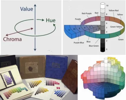
Colors have three dimensions which are hue, value (lightness or brightness) and chroma (saturation or intensity). Hue is the quality that gives a chromatic color its name such as red or yellow and refers to a pure color. As Pile (1997: 33) defined, hue is “a term for the position of a color along the band of the spectrum” that is based on the wavelengths of the light energy creating these colors. Munsell (cited in Birren, 1969b: 18) defined hue as “the quality by which we distinguish one color from another, as a red from a yellow, a green, a blue, or a purple”.
Value is the quality indicating how much a pure color includes black or white. It is the degree that a color reflects light (Pile, 1997). Light colors, including white, reflect much of the light falling on them and dark colors, including black, reflect little light. Munsell (cited in Birren, 1969b: 20) defined value as “the quality by which we distinguish a light color from a dark one”. Related to the value of a color, tints and shades of it are obtained. Tints are light values of a color obtained by adding white whereas shades are dark values of a color obtained by adding black. In addition, tones are between tints and shades.
Chroma, saturation and intensity are the terms for the purity of a color (Pile, 1997). It is the measurement of weakness and strength of a color (Birren, 1969b). A pure color becomes desaturated, or of a lowered chroma, when it is added white,
8
black, or gray. Another option to make a pure color desaturated is to add a color away from that color in the spectrum (Pile, 1997).
Regarding their hue content, colors are divided into two categories as achromatic and chromatic colors. Achromatic colors are black, white and gray and chromatic colors are the ones other than these colors. Considering their positions on the spectrum and the perception of the viewers, colors are categorized as warm and cool. Warm colors, which are red, orange and yellow, are the ones near the red end of the spectrum and cool colors, which are green, blue and violet, are the ones near the violet end of the spectrum. Related to its red or blue content, violet may be perceived as warm or cool (Pile, 1997). In addition to achromatic and chromatic colors there is also a term, monochromatic colors, used for color schemes which consist of all the colors (tints, shades or tones) of a single hue.
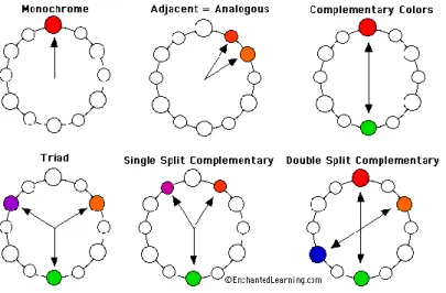
It is also important to define the orderly relationships between colors. Hues appearing on opposite sides of a color circle are called complementary colors (see Figure 1). The mixture of a complementary pair produces a gray color or a similar tone having a weaker chromatic hue (Pile, 1997). According to Marx (1983) there are three different meanings of complementary colors:
a. Subtractive complementary colors are the colors that, when they are mixed (paints or inks) produce a gray or neutral color.
b. Optical complementary colors are ones that appear to gray when they spin on a Maxwell disk.
9
c. Afterimage complementary colors are a color and its afterimage seen when the color is stared at and removed.
Hues appearing adjacent to each other on the color wheel are defined as analogous colors (see Figure 1). Triad colors are three equally-spaced colors on a color wheel forming an equilateral triangle or an isosceles triangle (see Figure 2). According to Itten’s color wheel, the combination of red, blue and yellow is one example of a triadic color triangle. There are also modified triads which are made up of three colors having one color between each on a twelve-color wheel such as on Itten’s color wheel (Leland, 1998; Leland, 2008) (see Figure 1). Tetradic colors are four equally-spaced colors on a color circle forming a square or a rectangle and consist of two complementary pairs (see Figure 2). Blue, green, red and orange are of the examples of tetradic colors on Itten’s color wheel.
Figure 1. Analogous, complementary colors and modified triads (Adapted from Birren, 1970: 21).
10
Figure 2. Triads and tetrads on Itten’s color wheel (Birren, 1970: 21).
The term mentioned above, afterimage, is the ghost-like image that appears after a stimulating color is taken away (Holtzschue, 2006). It is an effect that an inverted or retained image continues to appear in one’s vision after the original stimuli is removed. For instance, staring intensely at a red image will produce a green image if the gaze is turned onto a white surface. This kind of afterimage, in which
apparent colors are shifted to their complementary, is called negative afterimage (Kuehni, 2005). As Kuehni (2008) stated, a well-known example of negative afterimage is the American flag in reverse color (see Figure 3). A person can see the image of the flag with its original colors, if he/she looks at a white surface after staring at the white dot on the center of this image for some time. There are also positive afterimages, in which the perceived color of objects remains nearly unchanged in the images (Kuehni, 2005). Positive afterimage can be seen, for instance, by looking at a light bulb shortly and then turning off the light (Byrne and Hilbert, 1997). When the light is turned off, one continues to see the previous scene for a very short period of time. As Byrne and Hilbert (1997) stated, short and
11
intense flashes produce positive afterimages whereas longer-duration stimuli cause one to see negative afterimages.
Figure 3. Image of an American flag in reverse colors (Kuehni, 2008: 90).
Since it will be mentioned in chapter 2.2, it is also important to give the definition of the color order system, color space, color solid and color atlas. Color order system is the term used for a system that systematically arranges color experiences (Kuehni and Schwarz, 2008) (see Figure 4 and Appendix A). Color space is a frame of three-dimensional axis that defines the dimensions and divisions of these dimensions of a color solid (Kuehni and Schwarz, 2008) (see Figure 4). Color solid is the occupied color space with symbols of colors that have a volume (Kuehni and Schwarz, 2008) (see Figure 4). Finally, color atlas is a systematic collection of color chips or color prints consisting of a large range of possible colors of a color system (Kuehni and Schwarz, 2008) (see Figure 4).
12
Figure 4. In clockwise order, the Munsell color system, color space, color solid and color atlas.
(http://munsell.com/color-blog/time-for-a-munsell-revival/) (http://www.naturephotographers.net/articles0809/ab0809-1.html)
(http://en.wikipedia.org/wiki/Munsell_color_system)
2.2 Definition of Color Harmony
Color harmony has been a focus of interest for many researchers since Goethe (1970) published Farbenlehre in 1810. For two centuries, ‘color harmony’ has attracted interest in aesthetics from both philosophical and scientific perspectives. Many theorists have defined color harmony with the principles they posited based on their experiences to create harmony in colors. These principles were
‘completeness’ for Goethe, ‘complementary/analogous’ for Chevreul, ‘order’ for Ostwald, ‘balance’ for Munsell (cited in Ou and Luo, 2006).
13
As can be inferred from the different principles posited by different theorists, color harmony “is a viable and abstruse concept described differently by different
authorities” (Burchett, 2002: 30). Polzella and Montgomery (1993) defined color harmony as the ‘suitability’ of juxtaposed colors. Whereas Judd and Wyszecki (1975: 390) defined color harmony as: “When two or more colors seen in neighboring areas produce a pleasing effect, they are said to produce a color harmony”. Color harmony definitions similar to this definition, combining harmony with the emotion pleasantness, can be seen in various studies as stated below.
Granville (1987) defined color harmony as the color usage that pleases people. Chuang and Ou (2001: 30) explained the term harmonious as “that which pleases the viewer” or “that which is perceived as harmonious”. Additionally, Burchett (2002: 28) suggested “colors seen together to produce pleasing effective response are said to be in harmony”.
Moreover, color harmony was recently defined by Schloss and Palmer (2011: 551) as “how strongly an observer experiences colors in the combination as going or belonging together”. This definition of color harmony has a similarity with the definition of Polzella and Montgomery (1993) related to the suitability of juxtaposed color. It removes the link between the emotion of pleasantness and color harmony but still includes subjectivity that harmony is related to the experience of the observer.
14
Considering the definition of harmony, defined as “the pleasant effect made by parts being combined into a whole” (Longman dictionary of contemporary
English, 1991), color harmony can be defined as the pleasant effect made by colors seen together. However, in this thesis, the definition of color harmony was
obtained from the participants of the experiments who evaluated the harmony content of the color combinations. It was important to know the definition of color harmony in their minds since they were the decision-makers. According to their answers, color harmony can be defined as a balanced combination of colors that has a positive and pleasing effect in relation with the proportion, configuration, similarity and tone of the colors. This definition, obtained from a number of subjects, covers many of the theories and definitions of color harmony explained above and in Chapter 2.3.
2.3 Theories of Color Harmony
The concept of color harmony and how it can be obtained has been a question interesting many people. Artists may choose harmonious colors for their works intuitively but designers should select harmonious colors for the users of their products more systematically. Artists have created harmony and their rules for obtaining it are related to their art experience. However, researchers, who work on color, have searched for the so-called ‘laws of color harmony’ to describe the relationship between the psychological experience of color harmony and the physical attributes of color (Chuang and Ou, 2001).
15
According to Heddell (1988), color harmony theories can be categorized into two as the ones which are based on complementary colors and the ones that are based on commonality such as ‘equal hue’, ‘equal chroma’ or ‘equal value’. On the other hand, Ou and Luo (2006) divided color harmony studies into two categories: the ones that are based on an orderly arrangement of colors and the ones that are based on the interrelationship between colors. Studies of Ostwald (1969a), Munsell (1969b), Itten (1973) and Nemcsics (2007, 2008, 2009a, 2009b, 2011) can be placed in the first category since these studies assumed that harmonious color combinations can be created when the colors are selected systematically from a hue circle or from a particular path in an ordered color space. Studies of Goethe (1970), Chevreul (1987), Moon and Spencer (1944a, 1944b, 1944c) and Chuang and Ou (2001), Ou and Luo (2006) can be placed in the second category since these studies assumed that harmonious color combinations can be created when the colors are complementary or analogous either in hue, lightness or chroma.
Additionally, O’Connor (2010) divided the approaches to color harmony into three categories. The first category defines color harmony as a universal phenomenon and assumes it is created and predicted with a mathematically-derived proportion and order. This first category includes the theories of Newton, Ostwald, Munsell, Moon and Spencer, and Chuang and Ou since these theories proposed that color harmony was based on proportional and orderly arrangement of colors (O’Connor, 2010). In the second category, including the theories of Goethe, Chevreul,
Munsell, and Itten, color harmony is aligned with the notion of balance and
16
color harmony (O’Connor, 2010). According to these theories in the second category (Goethe, Chevreul, Munsell, and Itten cited in O’Connor, 2010), color harmony required the balance of contrasting or complementary colors. The third category includes the theories of Itten, Munsell, Hard and Sivik, wherein color harmony is defined as groups of colors that are similar in hue and chroma (O’Connor, 2010). These theories in the third category indicated that there was a link between analogous colors and color harmony (Itten, Munsell, Hard and Sivik cited in O’Connor, 2010).
It is important to know how color harmony theories emerged and how they were developed through time. Generally, the concepts of color harmony have been designated by artists but from a scientific point of view and as a basis of modern understanding of color and light, color harmony theory dates back to the time that Newton explored the color spectrum in the late 1660s (Gage, 1995). Subsequently various color harmony theories were developed by different authorities. A brief summary of these theories is given in Table 1 and further information is given in the following-pages.
17
Table 1. Summary of color harmony theories.
Theory System Example Area
NEWTON
18th century
Color harmony was associated with the orderly steps between seven hues on his color circle.
Seven hues were correlated with musical notes (analogy between aural and visual harmonies).
(https://commons.wikimedia.org/wiki/Fil e:Newton's_color_circle.png)
Gold and indigo are harmonious.
Red and blue are discord.
X
GOETHE
19th century
Color harmony was created if colors were selected from the both sides of his hue circle which he divided hues into two sides as positive and negative.
(completeness of complementary colors)
(Goethe, 1970: 184)
Yellow and Red-blue Blue and Red-yellow
Red and Green are harmonious.
18
Table 1 (cont’d),
Theory System Example Area
CHEVREUL
19th century
Identified two types of color harmonies: the harmony of
analogous colors and the harmony of contrasts.
(http://www.colorsystem.com)
Harmony of contrast colors: Red-Green, Blue-Orange, Light-Dark, etc.
Harmony of analogous colors: Redish orange- Red, Greenish blue-Blue, etc.
X
OSTWALD
20th century
Color harmony was equal to order. Two primary orders:
1) Equal value (equal white and equal black) of different hues (3, 4, 6, 8, 12 steps from the selected hue on the hue circle) 2) Different values of the same hue
(monochromatic triangle) Additionally:
3) Gray harmonies: Achromatic colors arranged by equal intervals Simple intervals: a, c, e, or g, i, l Double intervals: a, e, i or g, l, p Triple intervals: a, g, n or c, i, p (http://www.daicolor.co.jp/englis h/color_e/color_e01.html)
1) 12 steps (complementary color pairs): Yellow- Blue, Red-Seagreen, etc.
8 steps (triads): yellow- purple- turquoise, etc.
2)
(http://www.colorsystem.com)
3)
(http://www.colorsystem.com)
19
Table 1 (cont’d),
Theory System Example Area
MUNSELL
20th century
Balance was the key for making harmonious color combinations. There are nine principles of harmony (balance) (Birren, 1969b):
1) Balance of neutral grays 2) Monochromatic harmonies 3) Opposite colors of equal chroma
that center on middle value N5 (in equal area)
4) Opposite colors of equal value but
of different chroma(weaker chroma larger area than the stronger
chroma)
5) Opposite colors of the same
chroma but of different value
6) Opposite colors of different value
and different chroma (darker value or weaker chroma larger area than lighter value or stronger chroma)
7) Harmony of neighboring hues and
split-complements
8) Harmony of diminishing sequences 9) Harmony of the elliptical path
(http://munsell.com/ color-blog/time-for-a-munsell-revival/) 1) N1-N3-N4-N7 2) R 7/5-R 3/5 3) R 5/5-BG 5/5
4) R 5/10- with a twice larger area of BG 5/5 5) R 7/5-BG 3/5, R 8/4-BG 2/4
,
6) R 7/8- BG 3/4
7) Neighboring hues: YR 5/5-R 5/5-Y 5/5
Split-complements: R 6/10-B 4/5-G 4/5 8) Y 8/9-GY 7/8-G 6/7- BG 5/6- B 4/5- PB 3/4 9) Y 7/12- YR 6/8- R 5/4- RP 5/4- P 4/8- PB 3/12- B 4/8- BG 5/4- G 5/4- YG 6/8
√
20
Table 1 (cont’d),
Theory System Example Area
ITTEN
20th century
Color harmony would be obtained if positions of the colors in his hue circle formed a well-defined polygon, such as dyads, triads, tetrads, and hexads. Seven color contrasts:
1) Contrast of hue 2) Light-dark contrast 3) Cold-warm contrast 4) Complementary contrast 5) Simultaneous contrast 6) Contrast of saturation 7) Contrast of extension (Birren, 1970: 21)
Dyads: Red-Green, Blue-Orange, etc. Triads: Yellow-Red-Blue,
Orange-Violet-Green, etc.
Tetrads: Yellow-Violet-RedOrange-BlueGreen,
YellowOrange-BlueViolet-Red-Green, etc.
Hexads:
Yellow-Violet-Orange-Blue-Red-Green, etc.
Seven color contrasts:
1) Yellow-Red-Blue, Red-Green, Blue-Yellow-Violet, etc.
2)
3) Yellow-Violet, RedOrange-BlueGreen, etc.
4) Yellow-Violet, Blue-Orange, Red-Green, etc.
5) 6)
7) , ,
21
Table 1 (cont’d),
Theory System Example Area
MOON & SPENCER
20th century
Color harmony was created if the color difference between individual colors appeared unambiguous.
(Moon & Spencer, 1944b: 48)
(Moon & Spencer, 1944b: 50)
Munsell Samples:
Analogy: Y 8/8-YR8/8 Contrast: 5R 7/8-10GY 7/8
22
Table 1 (cont’d),
Theory System Example Area
NEMCSICS
21st century
Color harmonies can be obtained through particularly selected colors within the Coloroid Color System.
1) same A and T color characteristics, and their V color characteristics constitute an arithmetical or geometrical sequence 2) same A and V color characteristics, and
their T color characteristics constitute an arithmetical or geometrical sequence 3) Summing the above two special cases
the color characteristics are the same, but their T and V color characteristics change jointly on one straight line, where the distances of the points of division constitute an arithmetical or geometrical sequence.
4) The above rules can be equally related to one or more hues as well. Among the many hues the 3-hues or trichrome harmony is of prime importance. 5) Any two hues selected from the above
set constitute a dichrome hue harmony even if A basic hue is omitted
(http://www.colorsystem.co m/?page_id=551&lang=en)
1) A35 Coloroid hue, T11.82 (d30V)
2) A55 Coloroid hue, V71.29 (d30T) 3) A12, T28-26-23-20-18-15, V91-83-76-68-60-53 4) A12, T10, V80-67-53-40 A52, T35, V80-67-53-40 A25, T9, V80-67-53-40 5) A12, T20, V60-70-80 A10, T50, V80 A10, T70, V90
√
23
Table 1 (cont’d),
Theory System Example Area
OU & Colleagues
(21st century)
A color-difference-based model for color harmony
was developed. CHABC= Overall color harmony
value
Characteristics: Average
characteristics of each individual color (A, B, C)
Interactions: Average interactions
for color pairs (AB, BC, AC)
Among the selected colors in Ou, et.al. (2011):
Most harmonious: (20 light grayish cyan: L83.1, a-4.7, b-4.9; 25 grayish blue: L77.5, a-2.0, b-7.4; 35
achromatic white: L85.3, a0, b0)
Least harmonious: (4 vivid green: L51.1, a-50, b31.3; 2 vivid orange: L59.7, a33.6, b60.9; 27 dark greyish red: L52.8, a10.1, b5.4)
24
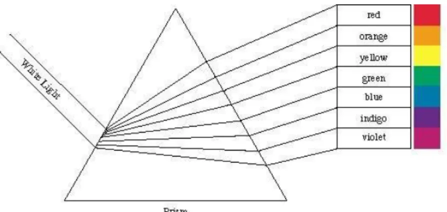
Newton, when he explored the color spectrum, created a color circle consisting of seven colors and color harmony was associated with the orderly steps between these hues (see Figure 5 and 6). With this arrangement of colors, Newton brought order into the chaos of color and his color circle became a useful tool for artists and also it formed a basis to various color systems of 18th and 19th centuries (Gage, 1995). The study by Newton developed an objective and quantitative basis for light and color studies (Gage, 1995).
Figure 5. Newton color spectrum.
(http://www.ehow.com/about_5101113_newtons-theory-color.html)
Figure 6. Newton color circle.
25
According to Newton, color was a physical problem seen as the light fell on objects and then reflected and entered our eyes. On the other hand, Goethe (1970) realized that color vision was influenced by perception and that how colors were seen was dependent on the object, the light and the viewer’s perception. Thus, he brought a deeper understanding to color harmony theory and his studies on color harmony attracted the interest of many researchers.
Goethe worked on after-images, complementary colors and colored shadows. He created his color wheel based on his observations on opposed colors and placed the hues symmetrically with three hues on one side of the circle and the other three on the other side (see Figure 7). According to him, color harmony would be obtained if the colors were selected from both sides of the circle.
Figure 7. Goethe color circle (Goethe, 1970: 184)
As Gage (1995) stated, many color harmony theories following the studies of Newton and Goethe can be traced back to the theories of these two influential researchers. Chevreul’s color harmony theory was similar to Goethe’s regarding
26
the harmony of opposing colors. According to Chevreul (1987), color harmony was created in two ways: with the harmony of contrast colors and the harmony of analogous colors. He created a chromatic diagram with the three primary colors of red, yellow, and blue, and the three secondary colors of violet, green, and orange and with eleven steps between each hue, making 72 hues in total (see Figure 8). Chevreul also created a hemispheric color order system which included the tones of these 72 hues but he had considerable problems in placing the colors
systematically in the hemisphere by putting them in a way so as to be perceptually uniform (Kuehni and Schwarz, 2007). Thus, he did not published a complete proposal of this color system (Kuehni and Schwarz, 2007).
Figure 8. Chevreul chromatic diagram.
(http://en.wikipedia.org/wiki/File:Chevreul%27s_RYB_chromatic_dia gram.png)
27
Many artists and scientists dealing with color theory developed various color circles. Considering these color wheels developed by different colorists, there have been various harmony relationships described such as analogous, complementary, split-complementary, triads and tetrads. However, these relationships of color regarding hues do not embody different tints, shades and tones (see Appendix F for definitions of tint, shade and tone). Hence, some colorists created their color systems including hues and their tints, shades and tones and based these systems on their color harmony theories.
Albert Munsell (1858-1918) was one of the colorists who developed a color system and his color system is one of the most widely used in the world. According to Munsell (cited in Birren, 1969b), in order to create harmony in compositions, colors must be balanced. This balance may be obtained, for
example, by bringing an extremely strong color with a grayer color but the areas of these colors are also important for balance. Thus area is another factor in color compositions (Birren, 1969b). What Munsell meant by balance is reason and consistency and harmony is based on a measured and orderly relation of colors (Birren, 1969b).
Similar to the theory of Munsell, according to Ostwald (cited in Birren, 1969a), harmony of colors can be obtained if there is a lawful relationship between colors and he believed that harmony is equal to order. Ostwald (cited in Birren, 1969a) also believed that all the possible orders of the color solid must be studied to find all the possible harmonies and he mentioned two primary orders which were equal
28
value hue circles and the monochromatic triangles. Circles show harmonies of equal value of different hues and triangles show harmonies of different values of the same hue (see Appendix F for the definition of value).
Moreover, according to Itten (cited in Birren, 1970), color harmony is the systematic relationship of colors and can be formed as dyads, triads, tetrads, etc. selected from his 12-hue color circle. Harmonious color combinations obtained from the color wheel can be varied considering the seven contrasts that were detected by Itten investigating the characteristics of color effects (Birren, 1970). For instance, the hues of the main chord can be combined with their shades, producing contrast of saturation, or they can be combined with their tints and shades, producing light-dark contrast. A harmony of contrast of extension can be obtained, if the colors have the same lightness value and the pure colors are added in small areas (Birren, 1970). These variations offer different possibilities for harmonious color combinations.
As most color harmony researchers do, Antal Nemcsics (1927- ) is one of the color harmony researchers who developed his own color order system regarding his color harmony theories. Nemcsics (2007, 2008, 2009a, 2009b, 2011, 2012; Nemcsics and Takacs, 2013a, 2013b) with a series of experiments clarified some rules for creating harmonious color combinations by using the Coloroid Color System. According to Nemcsics (2003: 10) the color compositions explained below are harmonic color combinations, the elements of which (A denotes hue, T denotes saturation and V denotes luminosity):
29
1. have the same A and T color characteristics, and their V color characteristics constitute an arithmetical or geometrical sequence, 2. have the same A and V color characteristics, and their T color characteristics constitute an arithmetical or geometrical sequence, 3. Summing the above two special cases the color characteristics are the same, but their T and V color characteristics change jointly on one straight line, where the distances of the points of division constitute an arithmetical or geometrical sequence. The (T, V) pairs can be placed on more parallel straight lines as well, in each case according to the same arithmetical or geometrical sequence.
4. The above rules can be equally related to one or more hues as well. Among the many hues the 3-hues or trichrome harmony is of prime
importance. The SET of possible trichrome basic colors belonging to the A basic hue are: {A±1.0,A±4.6,A±6.6, Complementary hue (K)
K±1.0,K±4.6,K±6.6} hues. From this set, the basic hue A and more two hues selected next to it, constitute a trichrome color harmony.
5. Any two hues selected from the above set constitute a dichrome hue harmony even if A basic hue is omitted.
In addition to these theories, there are also theories predicated on indicating the degree of color harmony using mathematical formulas. Moon and Spencer (1944a; 1944b), in order to explain the relationship between color harmony and color intervals, developed a mathematical model. According to Moon and Spencer, if there is an ambiguous interval between colors (differences between colors regarding the attributes of hue, value and chroma) of a combination, the
combination is found unpleasing and therefore is found to be disharmonious. The studies of Chuang and Ou (2001), Ou and Luo (2006) and Ou, Chong et al., (2011) also followed the theory of indicating color harmony with a formula. These studies developed universal formulas for predicting color harmony, however they still need to be tested for different conditions and cultures. For instance, Granger (1955b) tested the predictive performance of the formula of Moon and Spencer (1944a, 1944b) and found that it had a poor predictive value. The formulas also
30
have some features missing that should be considered, such as area effect and complex environments.
On the other hand, some researchers doubted the existence of rules for obtaining color harmony based on the belief that color harmony depends on subjective judgments (Birren, 1985; Granville, 1987; Kuehni, 2005; Pope, 1944; Sivik and Hard, 1994). Therefore, the existence of objective rules of color harmony was denied. Kuehni (2005: 164) stated that there were no laws of color harmony as told and that if there were, universal laws would be “stifling, because limiting, for creativity”. In addition, Pope (1944: 764) stated that “In the discussion of color harmony in the past there has been too much of a tendency to lay down rules which must be followed. There are no rules; there are only possibilities”. Contrarily, Moon and Spencer in their reply to the article of Pope (1944) stated that color harmony was found too complex to allow mathematical treatment by Professor Pope but they were more optimistic and believed that in the fields of poster design, interior decoration, fabric design, and dress this theory of mathematical treatment would be of practical benefit.
It can be inferred from the literature of color harmony research that the doubts of some researchers, who disbelieved in the existence of objective rules for color harmony, were unable to persuade other researchers who believed the opposite. Researchers in the second group have carried on searching for rules of color harmony (Chuang and Ou, 2001; Granger, 1953, 1955c; Nemcsics, 2007, 2008, 2009a, 2009b, 2011, 2012; Nemcsics and Takacs, 2013a, 2013b; Ou and Luo,
31
2003, 2006; Ou, Chong et al., 2011; Ou, Luo et al., 2011; Polzella and
Montgomery, 1993; Szabo, Bodrogi and Schanda, 2010) and the rules they have created provide avenues for further research.
2.4 Attributes of Color Harmony
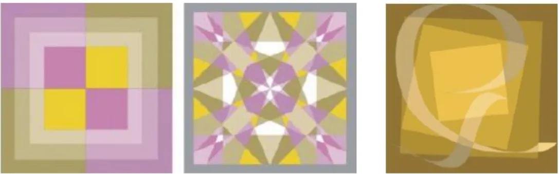
Color harmony is a complex phenomenon that may be influenced by many factors. Burchett (2002) categorized the factors influencing color harmony as order, tone, configuration, interaction, similarity, association, attitude, and area. These
categories were obtained by doing content analysis of 12 books on color (Interaction of Color, by Josef Albers; Art and Visual Perception, by Rudolf Arnheim; Principles of Harmony and Contrast of Color, by M. E. Chevreul; Theory of Colours, by Johann Wolfgang von Goethe; Physiological Optics, by Hermann Ludwig Ferdinand von Helmholtz; Art of Color, by Johannes Itten; Language of Drawing and Painting, by Arthur Pope; Color in Business, Science and Industry, by Deane B. Judd; and Gunter Wyszecki; Concerning the Spiritual in Art, by Wassily Kandinsky; World of Color, by David Katz; Color Notation, by Albert H. Munsell; and Measurement of Color, by William David Wright). The amount and types of color harmony meanings were identified and the terms for the categories were synthesized from the selected books. In order to clarify the
32
Order is color interval and refers to the color combinations selected according to an orderly plan from a color system such as triad, tetrad or complementary. When colors of a combination are selected considering a system with certain interval between them, it is described as harmonious. When there is an unambiguous interval between the colors, the combination is described as disharmonious. Related terms of this attribute gathered from the 12 books are: “absolute harmony, circular principle, chord, color solid, color space, elliptical principle, equal
spacing, equidistant, interval, locus, organization, paths, plan, regular path, ring star concept, scales, schemes, score, sequences, single surface principle (planes), straight-line principle, system, unambiguous, uniformly scaled, and unity” (Burchett, 2002: 29).
Tone is a term used as a synonymous with color including the color dimensions: hue, saturation and value. As Burchett (2002) states, it is the fundamental attribute of color harmony influencing determination of preference. As was mentioned in Chapter 2.3 and Chapter 2.5.2, hue, saturation and value dimensions of color are the main components effecting color harmony. Terms used in the literature related to this attribute are: “brightness, brilliance, broken, chroma, cleanness, depth, hue, insistence, intensity, pronouncedness, purity, saturation, shade, strength, temper, timbre, tint, and value” (Burchett, 2002: 30).
Configuration refers to the overall design of the colors influencing the interrelationship of colors. Responses to colors may differ depending on the influence of shape or the proximity of colors (Burchett, 2002). For instance, a
33
green carpet will appear brighter adjacent to a red wall and duller adjacent to a blue wall (Pile, 1997). Terms related to this attribute are: “arrangement,
background, color distance, composition, design, direction, form, juxtaposition, orientation, placement, proximity, recurrence (extension of number), shape, and space” (Burchett, 2002: 29).
As a physiological phenomenon, interaction includes the effects related to the adaptation of the eyes such as afterimage and simultaneous contrast. For instance, when two colored surfaces in juxtaposition are viewed simultaneously they exhibit modifications to the eye (Chevreul, 1987). These modifications on the appearance of colors may influence color harmony. Terms related to this attribute of color harmony are: “adaptation dynamics, appearance modification, false color, hue shift, illusion, influence, intersection, leveling, outer equalization, sharpening, simultaneous contrast, successive contrast, and visual displacement” (Burchett, 2002: 29).
Similarity describes the combinations of colors that have something in common and are perceived as more or less alike. This shared characteristic perceived by the viewer may be caused by predominant hue, value or chroma. It can also be
achieved by adding to each color of the combination an amount of the other colors (Burchett, 2002). Terms related to this attribute are: “affinity, analogous,
approximate harmony, attraction, color connection, color sets, commonality, consistency, consonance, constellations, family, harmony of attraction, monochromatic, mutual, predominance (of hue, etc.), relationship, sameness,
34
similarity of the dominant, similarity of the subordinate, structural contradiction, structural inversion, subordinate elements, and themes” (Burchett, 2002: 29).
Association is the attribute that links color harmony with the affective responses based on traditional color association and symbolism. Pile (1997) stated that colors can transmit emotional and cognitive messages in two ways. These are conviction, in which reactions to color are inborn, intuitive and universal to everyone, and learned associations, which depends on realities that are known to everyone and on meanings that are learned within a particular time and place (Pile, 1997). Terms related to association are: “appropriates, color retention, familiarity, local color, memory color, natural color, preference, preferred direction, purpose, realistic, recognizable, symbolism, and taste” (Burchett, 2002: 29).
Attitude is related to individuals’ feelings and refers to the innate personality of a color or a color combination that evokes a feeling of an individual. Terms related to this attribute are: “atmosphere, climate, effect, essence, expression, felt unity, inner need, intuition, mood, soul vibration, temperature (warm, cool), and weight (light, heavy)” (Burchett, 2002: 29). For instance, warm colors (red, orange and yellow hues and their tints and shades) are generally seen as comfortable, cozy and pleasant and cool colors (green, blue and violet hues and their tint and shades) produce calm and relaxing feelings (Pile, 1997). Whereas neutral colors such as white, black, gray and chromatic colors desaturated with high content of neutrals are thought as boring but also practical for creating utilitarian atmospheres with a minimum of emotional content (Pile, 1997).
35
As one of the attributes of color harmony and the focus of this study, area refers to the scale of the color areas and color harmony depends on the amounts or
proportions of color used (Burchett, 2002; Hard and Sivik, 2001). Burchett (2002) also stated that the visual effectiveness of color combinations is directly related to color area. In other words, the proportionate area that any color should occupy in a given color scheme is a matter of its suitability and color harmony is also defined as the ‘suitability’ of juxtaposed colors. Terms related to this attribute of color harmony are: “angular size, caricature, color measure, displacement, enlargement, extension, magnification, miniature, proportion, quantitative, ratio, reduction, relative size, and scale” (Burchett, 2002: 29).
There have been a few theories about the influence of area on color harmony, namely those developed by Munsell and by Moon and Spencer (Granger, 1953). According to Granger (1953) and Morriss and colleagues (Linnett et al., 1991; Morriss, Dunlap and Hammond, 1982; Morriss and Dunlap, 1987; Morriss and Dunlap, 1988), who examined these two theories, none of the theories was found to be acceptable in providing an accurate prediction. Munsell (cited in Granger, 1953) proposed a rule for areas that the stronger the color the smaller must be its area; while the larger the area, the grayer the chroma (ex. R 7/6, 7 indicates value and 6 indicates chroma - nine parts of this red combined with R 3/3, first 3 indicates value and second 3 indicates chroma- forty-two parts of this red). The rule proposed by Munsell for areas can be shown with the equation below (where A represents area, V value and C chroma):
36
Moon and Spencer (1944c) also claimed that relative area was a function of both value and chroma. According to Moon and Spencer (1944c), the effect of area in color harmony is based on three basic principles:
- They considered that a pleasing balance among n color patches was obtained when the scalar moments regarding the adaptation point (neutral gray) were equal for all patches.
- Other pleasing balances could be obtained when the scalar moments of the color patches were simple multiples of each other.
- The psychological effect of a group of color patches depends on the balance point.
The scalar moment of a color patch is the multiplication of the area of the patch and the distance between the adaptation point and the color point in the w space (a metric space developed by the authors). The adaptation point is “the point in w space corresponding to the state of adaptation of the eye” (Moon and Spencer, 1944c: 93). In this case the adaptation point is neutral gray in the w space. The balance point is the point corresponding to the color obtained by the disk mixture of the component colors of a combination.
Concerning the first principle, if the colors (P and Q) and the adaptation point (A-neutral gray) were on a horizontal line (see Figure 9), a pleasing balance was obtained by:
S1r1=S2r2 (in which S indicates the area of colors)
37
different plane. In this situation, a pleasing balance was obtained by (for colors P’ and Q’) (see Figure 9):
S1[(r1)2+(z1-zA)2]⅟2=S2[(r2)2+(z2-zA)2]⅟2
According to the second principle, a coefficient was added to the equation in order to obtain other pleasing balances:
nS1[(r1)2+(z1-zA)2]⅟2=S2[(r2)2+(z2-zA)2]⅟2 (where n is an integer)
For any number m color patches, pleasing effects could be obtained by: n1S1[(r1)2+(z1-zA)2]⅟2=n2S2[(r2)2+(z2-zA)2]⅟2=…=nmSm[(rm)2+(zm-zA)2]⅟2
In these equations S indicates area of the color, r and z indicates the coordinates of a color in the w space. The z axis in the w space represents the achromatic colors (see Figure 9).
Figure 9. Coordinate systems in metric space (Moon and Spencer, 1944c: 95).
Moon and Spencer (1944c) showed that the equations they proposed could be expressed with Munsell notations, where r in metric space equals to Munsell
38
chroma, θ equals to hue, and z equals to value. The scalar moment of any color from the adaptation point (Munsell N5) is:
S[(chroma)2+64(value-5)2]⅟2
Concerning the third principle, if the two colors to be used in a design are placed on a Maxwell disk and the proportion of the areas of these colors are kept identical with the design, the disk mixture shows the balance point of these colors.
Assuming that the trichromatic coordinates of two colors are (X1, Y1, Z1) and (X2,
Y2, Z2) and their areas are S1 and S2, the coordinates of the balance point are:
X=[(X1S1)+( X2S2)]/(S1+S2),
Y=[(Y1S1)+( Y2S2)]/(S1+S2),
Z=[(Z1S1)+( Z2S2)]/(S1+S2),
Accordingly, the position of the balance point in the chromaticity diagram is calculated by:
x=X/(X+Y+Z) y=Y/(X+Y+Z)
This balance point, which is influenced by the areas of colors in a combination, has an influence on the psychological effect of a group of colors. For instance, as Moon and Spencer (1944c) stated, if a designer wishes to obtain a cool and restful effect, he/she will select colors that have a balance point in green or if he/she wishes to obtain a warm and stimulating effect, he/she will select colors that have a balance point in red or orange.
Itten also suggested a ratio for harmonious color combinations in one of the seven contrasts he mentioned which is the contrast of extension. According to Itten (cited
39
in Birren, 1970), the power of a pure color is determined by two factors: light value and extent. He based his theory of color extension (area) on light values of hues proposed by Goethe which are yellow-9, orange-8, red-6, violet-3, blue-4, green-6 (Birren, 1970). These values were used to obtain ratios between different hues to obtain harmony such as proportions for the complementary pairs were given as yellow:violet= 3:1, orange:blue= 2:1, and red:green=1:1. However, they indicated the inherent lightness of pure colors and they were valid only when all the hues appeared in their maximum purity (Birren, 1970).
Later, a study was undertaken by Wang, Ou and Luo (2007) investigating any influence of area on harmony for three-color combinations and accordingly to develop a new quantitative model (see Figure 10). As this new model would be based on a two-color harmony model previously developed by the authors, the previous model was first tested using the newer study’s experimental data. This model indicated a somewhat good predictive performance, with a correlation coefficient of 0.81, suggesting that there was no significant difference in color harmony between different area proportions. However, in order to justify this claim, the authors searched for a pattern in the effect of area proportion
considering the experimental data. These patterns showed that when a color in a combination became larger in size, its contribution to the color harmony value increased and as a result area proportions can be used as weightings in the prediction of harmony. Therefore, a new predictive model was developed adding the areas of the constituent colors to the previous three-color harmony model and