fa 'S H T lK G ^ M S R C H Á N DİSiNĞ İK-" SHOPS"
■ - ' -■ - /-.- :^ivî =: - 1:
■■·/ ;γ;0
LIGHTING MERCHANDISING AREAS IN SHOPS
A THESIS
SUBMITTED TO THE DEPARTMENT OF INTERIOR ARCHITECTURE AND
ENVIRONMENTAL DESIGN
AND INSTITUTE OF FINE ARTS OF BILKENT UNIVERSITY IN PARTIAL FULFILLMENT OF THE REQUIREMENTS
FOR THE DEGREE OF MASTER OF FINE ARTS
By
ipek Adalioglu January, 1995
TU I ñ o v . Λ-i 2
I certify that I have read this thesis and in my own opinion it is fully adequate, in scope and in quality, as a thesis for the degree of Master of Fine Arts.
I certify that I have read this thesis and in my own opinion it is fully adequate, in scope and in quality, as a thesis for the degree of Master of Fine Arts.
Prof. Dr. Mustafa Pultar
I certify that I have read this thesis and in my own opinion it is fully adequate, in scope and in quality, as a thesis for the degree of Master of Fine Arts.
f l r r
5iSt. ^rof.
Assist, ^rbf. Dr. Feyzan Beler
Approved by the Institute of Fine Arts
LIGHTING MERCHANDISING AREAS IN SHOPS
İpek Adalıoğlu M.F.A.
in
Interior Architecture and Environmental Design Supervisor; Assoc. Prof. Dr. Cengiz Yener
January, 1995
The purpose of this study is to evaluate the factors affecting the lighting design of the merchandising areas and depending on the findings, to achieve lighting criteria that are necessary to constitute a comfortable and attractive selling environment. In order to determine these general criteria, the factors which affect the correct and comfortable perception of the merchandise and the effects of light on color are stated. Afterwards, several methods are indicated in order to avoid glare in the shop windows, and mostly preferred lighting methods are defined. Additionally, light sources, lighting fixtures, lighting systems used for the illumination of the merchandising areas are discussed. Finally, general lighting criteria are obtained for the merchandising areas in shops.
Keywords: Merchandise Lighting, Merchandising Area, Shop Window, Shop.
ABSTRACT
ÖZET
DÜKKANLARDA SATIŞ ALANLARININ AYDINLATILMASI
İpek Adalıoğlu
İç Mimarlık ve Çevre Tasarımı Bölümü Yüksek Lisans
Tez Yöneticisi: Doç. Dr. Cengiz Yener Ocak, 1995
Bu çalışmanın amacı satış alanlarlarının aydınlatma tasarımına etki eden etmenleri araştırmak ve bulgulara dayanarak rahat ve etkili satış alanları oluşturmak için gereken aydınlatma ölçütlerine ulaşmaktır. Bu ölçütleri belirlemek için, malın doğru ve rahat algılanmasına etki eden etmenler ve ışığın renk üzerindeki etkileri incelenmiştir. Daha sonra, vitrinlerde oluşan göz kamaşmasını azaltmak için çeşitli yollar gösterilmiş ve en çok yeğlenen aydınlatma yöntemleri anlatılmıştır. Ayrıca, satış alanlarının aydınlatılmasında kullanılan ışık kaynakları, aydınlatma elemanları ve aydınlatma sistemleri tartışılmıştır. Son olarak dükkanlardaki satış alanları için genel aydınlatma ölçütleri saptlanmıştır.
ACKNOWLEDGMENTS
Foremost, I would like to thank Cengiz Yener for his invaluable help, support, and endless patience, without which this thesis would have been a much weaker one, if not totally impossible.
Secondly, I would like to thank my family, especially my mother Gönül Adalioglu for her patience, continual support and motivations.
Finally, I would like to thank Ali Karaduman for his helps during the research.
TABLE OF CONTENTS
Abstract... jjj
Özet... iv
Acknowledgments... v
Table of Contents... vi
List of Tables... viii
List of Figures... ix
Page 1. INTRODUCTION 1.1. The Aim of the Dissertation... 1.2. The Structure of the Dissertation. 1 3 2. FACTORS AFFECTING MERCHANDISE VISIBILITY 6 2.1. Luminance... 8
2.1.1.Illuminance Level... 11
2.1.2.Surface Reflectances and Textures... 13
2.1.3. Luminance-Contrast... 15
2.2. Glare... 17
2.3.. Modeling Effect... 20
2.4. Size and Time... 22
3. EFFECTS OF LIGHT ON COLOR AT MERCHANDISING AREAS 24 3.1. Functions of Light and Color in Interiors... 25
3.1.1. Attracting Attention... 25
3.1.2. Controlling Circulation... 28
3.1.3. Creating An Atmosphere... 30
3.2. Color Appearance in Merchandising Areas... 32
3.2.1. Color Appearance of Objects... 33
3.2.2. Color Appearance of People... 37
4. LIGHTING OF SHOP WINDOWS 44
4.1. Types and Sizes... 47
4.2. General Methods Used to Reduce Glare in Shop Windows... 51
4.2.1. Increase in the Brightness Level... 51
4.2.2. Different Treatments of Glass... 53
4.2.3. Canopies and Blinds... 58
4.3. Lighting Systems in Shop Windows... 59
5. LIGHTING OF INTERIORS 67 5.1. Shop Profile... 68 5.2. Lighting Plan... 76 5.2.1. Lighting Sources... 76 5.2.1.1. Incandescent... 77 5.2.1.2. Fluorescent... 80 5.2.1.3. H.I.D... 81 5.2.2. Lighting Fixtures... 84
5.2.2.1. Direct Lighting Fixtures... 84
5.2.2.2. Indirect Lighting Fixtures... 91
5.2.3. Lighting Systems... 93
5 2.3.1. General Lighting... 93
5.2.3.2. Display Lighting... 95
5.2.3.3. Accent Lighting... 100
6. GENERAL CRITERIA FOR LIGHTING MERCHANDISING
AREAS IN SHOPS 103
7. CONCLUSION 113
BIBLIOGRAPHY 117
LIST OF TABLES
Table 2.1. Illuminances for Lighting Design in Merchandising
Areas... 11
Table 2.2. Illumination Levels for Lighting Design in Areas Associated with Merchandising Areas... 12
Table 2.3. Reflection Values of Some Materials... 15
Table 2.4. Intensities Between Areas... 17
Table 3.1. Damage Factors... 42
Table 4.1. Typical \A/indow Sizes for Various Types of Stores... 49
Table 5.1. Very General Division of Shops According to Price Class with a Note as to the Possible Lighting... 70
Table 5.2. Shop Profile... 71
Table 5.3. Electric Light Source Characteristics... 83
Table 5.4. Guide to Accent Factors... 101
Figure 2.1. The Field of Vision... 7
Figure 2.2. Types of Reflections... 14
Figure 2.3. Location of the Downlighting Units... 19
Figure 2.4. Influence of Light Direction on Texture and Pattern... 21
Figure 2.5. Physical Size Versus Visual Size... 23
Figure 3.1. Eye sensitivity... 27
Figure 3.2. Color Whiteness (amenity curve)... 38
Figure 3.3. Effects of Light on Human Complexion and Background... 39
Figure 4.1. Buying Survey Made by E.l. Dupond de Numours & Co., Inc... 46
Figure 4.2. Lighting for Enclosed Display Window... 48
Figure 4.3. Lighting For Open Display Windows... 48
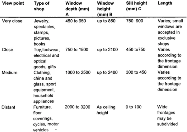
Figure 4.4. Window Dimensions... 50
Figure 4.5. Glass Tilted Backwards Having Two Flat Panes... 54
Figure 4.6. Glass Tilted Forwards... 55
Figure 4.7. Curved Glass... 56
Figure 4.8. The Location of Shop Window Panes in Oblique Position to the Building... 57
Figure 4.9. Curved Corners... 57
Figure 4.10. Access of Daylight into Shop Window... 58
LIST OF FIGURES
Figure Page
Figure 4.11. Various Lighting Systems Inside the Shop Windows... 61
Figure 4.12. Side Lighting... 63
Figure 4.13. Methods of Lighting a Showcase Unit... 65
Figure 5.1. The Shop Type Diagram, or Matrix, Used in the Four-comer Philosophy... 72
Figure 5.2. Shop Types... 73
Figure 5.3. Six Lighting Diagrams... 73
Figure 5.4. The Seven Light Selection Diagrams- General Lighting... 75
Figure 5.5. The Five Lamp Selection Diagrams - Accent Lighting... 75
Figure 5.6. The Shapes and the Names of Incandescent Lamps Used in Retail Stores... 79
Figure 5.7. A Recessed Incandescent Downlight Housing... 85
Figure 5.8. A Nonreflector Downlighting... 86
Figure 5.9. A Typical Track Lighting... 88
Figure 5.10. High-Intensity-Discharge Pendant Lamp Fixture... 90
Figure 5.11. Vertical Section of a Cove Lighting Fixture for an Indirect Fluorescent Lamp... 92
Figure 5.12. General Shop Lighting Provided By Recessed Ceiling-Mounted Luminaries... 94
Figure 5.13. Methods of Lighting A Counter Showcase... 97
Figure 5.14. Valance Light for Vertical Displays... 99
1. INTRODUCTION
1.1. The Aim of the Dissertation
Light's powerful impact that is created both on to the space and as well to the human is obvious. Mahnke (1987) indicates that: "For years, the lighting industry adhered to the belief that the only significant role of light is to provide adequate illumination, that it should be an aid in seeing" (47). In today's changing merchandising scene which reflects the life styles and preferences of consumers, lighting is not only a tool for seeing but a concrete design element to accentuate merchandise and create psychological influence affecting people's buying attitudes.
As it is stated by Bauer (1986) that "Lighting is the silent salesperson" (6), it really reinforces the visual communication between the customer and the merchandise itself without using verbal expressions. Only with the help of lighting by lightening, darkening, dazzling, coloring or revealing, it is possible to obtain various kinds of effects and different visual perceptions in order to indicate and accentuate the product that the customer could not escape noticing it. On the other hand, although there are many shops designed with thought and care as a theater stage, it is always possible to see the merchandise which does not show itself and is lost within the display units or in the shop windows because of unconsciously, wrong designed lighting.
Therefore, lighting merchandising areas means more than just to illuminate that space. Novak (1977) indicates that:
Light, like a message, must be both sent and received. Different lighting sources and types of lighting fixtures transmit their varied light in different ways. The human eye "receives" light, and the brain interprets a "message." This message varies according to the design of the lighting system. It is for this reason that care must be exercised in designing the lighting of stores. Each design has a direct functional impact on ambiance, decor, and sales. Each offers a massage that can either enhance or detract from the store and its merchandise (140).
Due to this importance, there are three objectives of lighting in the merchandising areas:
1 - Lighting to attract the customer: The main step to be considered is to attract the customers by providing the optimum desired appearance of the merchandise or creating special effects among the other stores along the street or in a mall of many stores.
2- Lighting to initiate the purchase: As stated in the lES Lighting Handbook (1987): "Buying decision starts when the customer is visually intrigued. The actual purchase is not accomplished until the customer can visually evaluate the merchandise and read labeling through adequate illumination" (8-1).
3- Lighting to complete the sales : Proper lighting is essential in order to constitute a suitable environment so that the customers can examine the merchandise and give their decision whether to buy or not, and
makes the sales personal enable to perform their duties such as packaging, quickly and comfortably.
If properly designed lighting has this powerful impact on the customers and has an inevitable potential to help the increase of the sales, there is a need to think the lighting design considerations, and the important points that provides an appealing and comfortable selling environment.
The aim of this dissertation is to reach a lighting criteria which determines the possible lighting requirements in order to achieve lighting objectives. In this dissertation, it is intended to stress that lighting of these areas is not just locating the lighting fixtures above the counters, or illuminating the shop windows as bright as possible. Instead, in order to obtain quality, quantity and effectiveness of the light in merchandising areas, there have to be common lighting design requirements which lie at the basis of all the shops, each selling different goods. These requirements should be explained in order to contribute the right lighting condition to have the right presentation of the merchandise.
It is hoped that, this study can be helpful for designers when the lighting decisions are given for merchandising areas. Consequently, consciously designed lighting plan does not only constitute the desired selling environment, but also provides economy from the lighting point of view.
1.2. The Structure of the Dissertation
The dissertation is composed of 7 chapters including the introduction and conclusion. The information presented has been obtained by a review of the literature.
Since the comfortable and easy seeing is essential in selling environments, determinant effects of factors like luminance, glare, modeling, size and time to the visibility of the merchandise in shops are analyzed in the second chapter.
In the first part of the third chapter, the functions of both light and color, which are attracting attention, controlling circulation and creating atmosphere are examined. In the second part, the effects of light on the appearance of both the merchandise and the human are discussed since in some cases, human appearance becomes as important as the merchandise itself. Fading, that is one of the major effect of light on color and mostly considered as a problem for the merchandising areas is analyzed in the last part.
The concern of the forth chapter is shop windows, one of the most important merchandising areas. These convey the first impression to the customer of the products on sale. In the first part of the chapter, the types and the recommended sizes of the shop windows are stated briefly. It is a known fact that daylight could obscure appearance of the merchandise which is placed there to be seen by the customer. In most of the shop windows, instead of the merchandise, the reflected image of the customer or the moving traffic is observed. To reduce these unwanted effects of daylight some specific methods have to be considered and are to be stated in the second part. In the third part, mostly preferred lighting systems used to illuminate the merchandise in the window are discussed.
The fifth chapter deals with the illumination of the interiors of the shops and grouped under two main parts: shop profile and the lighting plan. In the first part, some questions are aimed to be answered like how to chose
the suitable lighting condition since there are variety of shops each selling different articles, or how to give the store its intended image at the same time reaching the appreciation of the consumer target group. With the help of "Four-corner philosophy" which has been developed by Philips, these kinds of questions can be answered simply. In the second part, lighting plan that is composed of a selection of lighting sources, lighting fixtures and then lighting systems are discussed under particular sub-titles.
2. FACTORS AFFECTING MERCHANDISE VISIBILITY
Comfortable and easy seeing is the basic requirement in selling environment so that merchandise can be viewed to its best appearance. Flynn, et al. (1992) mention that: 'Visibility refers simply to 'how well an individual can see the task.' A task that can not be seen very well is said to have poor visibility" (45). Fames (1948) notes that more quickly and effectively the merchandise can be seen, the more the shopper will buy. It is within designer's initiative to create a pleasant atmosphere for people to perform effectively through their sense of vision.
According to ZijI (1955), the following factors should be noted for good lighting conditions in a merchandising area;
Adequate task luminance.
Limited contrast in luminance or color between task and background.
Limited luminance-contrast between background and surrounds.
Avoidance of glare (134).
Before examining the requirements for the visibility of merchandise, the field of vision in which all these conditions occur has to be defined. As Figure 2.1. illustrates, there are three zones of vision; the total field of vision, the immediate field of vision, and the moving field of vision while traveling through space. Kenneth C. Welch, an authority about store lighting, states that:
Calling the line of our horizontal fixed gaze the central axis, the total field of vision can extend almost 80 to 90 degrees to each side and below this central axis and about 30 to 40 degrees above it. The restricted upward angle is of course due to the eyebrow obstruction. One is only subconsciously aware of general areas and objects in the outer parts of this zone, but can be conscious of and distracted by lesser areas of comparatively greater brightness anywhere within the zone" (quoted in Ketchum, 1954: 57).
(Ketchum, 1954, p.57).
The immediate field of vision is the zone where one can consciously differentiate the brightness differences and forms within the angle of 40 to 60 degrees. Since the customers are moving all the time around the displays, the scope of the concentrated vision in a more or less horizontal plane increases (Ketchum, 1954).
It is natural to concentrate the gaze downwards if the attention is directed that way. However, particularly for a store, it is less natural to focus the gaze much over 12 to 15 degrees above the horizontal axis. Welch indicates as: "This view-point point is the basic reason why about 45 degrees above the horizontal can be considered as a safe cut-off angle
when shielding primary light sources". Consequently, it is possible to conclude with Welch's words a s : " The normal field of vision in a store can be defined as being unlimited laterally and downward, but limited upward as to point of fixation to 15 degrees above the horizontal" (quoted in Ketchum, 1948; 57).
It is always of great importance to contribute controlled selling environments so that customers could appreciate the merchandise on display sufficiently and selling staff could feel comfortable. After defining the limits of the visual field, the requirements of good visibility should be determined. In this chapter, with respect to the merchandising areas, the optical factors that influences the visibility of the merchandise will be mentioned under the following headings: luminance, glare, modeling, size and time.
2.1. Luminance
Luminance can be defined as the amount of light which is reflected from a surface to the observer's eyes. The common term used for luminance is brightness. Luminance of a display is a factor of illumination, i.e., how much light is delivered to the display (lumens per square meter or lux) and how much is reflected back to the customer (candelas per square meter).
The overall apparent brightness o f a scene is largely related with the proportion of the light and dark areas in the visual field. As the luminance of merchandise becomes greater, seeing happens to be made easier. For example, under equal lighting conditions, it is easier to distinguish the pattern on a light colored suit than that on a dark colored one; on the
other hand, a dimly illuminated white surface seems much brighter than a highly illuminated black surface. That's why the light colored suit is brighter because of having a higher reflectance value than the dark one. If the illumination level is increased enough, the dark colored suit can be made equally visible (lES Lighting Handbook, 1987 and Green, 1986;).
Luminance of an object always has to be considered together with the luminance of the immediate surrounding. If the difference between two luminances is so high in the zone, the eye has a difficulty to adapt simultaneously to the situation. Lechner (1991) indicates the reason as: "The eye can concentrate on one brightness area at a time, all brightness areas in the field of view have some impact" (26). This is glare.
If a comparison is made between display places and other areas like service or storage, display places should appear brighter than all other task areas, because the main aim of any lighting merchandising areas is to channel the customer's attention towards the merchandise. In other words, the areas that have to be appear bright to the shopper must be carefully selected.
Grosslight (1990) indicates that display and appraisal areas have to be illuminated at similar levels, since different levels create difficulty when buying decision is given. For example if sweaters are displayed in a showcase and appraised in a dressing room, the showcase should not be more than three times as bright as the dressing room.
One point has to be stressed that the background brightness of a display system should not be so great when compared with the area for the goods to be displayed on sale and their near surrounding. It is possible to control
the luminance of merchandise by arranging the amount and the quality of light falling on a surface, or by the contrast value of its near display background. It is a fact that, to control the reflectance values of the materials on merchandise is difficult but it is more convenient to control the background reflectance values. Goods with a high reflective value, such as light summer clothing, show up best if given a darker background.
Under the scope of the information above, here are some propositions which are required particularly for merchandising areas given by Green (1986), Grosslight (1990) and Illuminating Engineering Society of North America (1986).
1 - The luminance ratio between the displayed surface and its immediate surrounding must not exceed 4:1
2- If a noticeable transition from one area to another is desirable one
space should be 10 times brighter than another. If only a break in lighting continuity from space to space is required, the ratio should be at least 3:1.
3- If lighting continuity is required, a ratio less than 3:1 should be maintained.
4- Color discrimination will be lost at levels below nearly 30 nits.
The luminance (brightness) of what we see is, therefore, a function of: the intensity of the illumination, the reflectance of a surface, and the luminance contrast. These factors will be examined in the following sections.
The definition of illumination can be given as the amount of light that is falling on a surface. lES Lighting Handbook (1987) indicates that the variations can be seen in the illumination levels depending on the type of the store, or even in the departments within a store. It is because of the need to accentuate the merchandise according to its specifications and in order to create special effects. Referring Table 2.1. it is possible to see the desirable values for particular locations inside the selling environments.
2.1.1. Illumination Level
Table 2.1. Illumination Levels for Lighting Design in Merchandising Areas
Areas or Tasks Description Type of Activity Lux
Circulation A rea not used for display or High activity 3 00
exam ination of m erchandise M edium Activity Low Activity
2 0 0 100
Merchandise T he plane area, horizontal to High activity 1000
(Including vertical, w here m erchandise is M edium Activity 7 5 0
showcases and wall displays)
displayed and readily accessible for custom er exam ination
Low Activity 300
Feature Displays Single item or items requiring High activity 5 0 0 0
special highlighting to visually M edium Activity 3 000 attract and set apart from
surrounding
Low Activity 1500
Shop Windows D aytim e lighting
Nighttim e lighting
General Feature
2 0 0 0 10000
Main business districts G eneral Feature
2 0 0 0 10000
Secondary business G eneral 1000
districts or sm all towns Feature 5 0 0 0
Support Spaces Alteration room 1
000-2 0 0 0 Fitting room
Locker rooms
Stock rooms, wrapping and packaging Dressing areas Fitting A reas 2 0 0 -50 0 1000-2 0 0 0 100-2 00 2 0 0 -500
Illumination levels must be considered not only for the actual merchandising areas, but also for the support areas or the places devoted for the specific visual tasks where wrapping and packaging is done. Table 2.2. shows the illumination levels as lux for the special task areas that are equally important for the merchandising areas.
Table 2.2. Illumination Levels for Lighting Design in Areas Associated
with Merchandising Spaces
Area or Tasks Illuminance (lux)
S ales Transactions R eading Copied Task
M im eograph, xerography 2 0 0 30 0 5 0 0
Ditto copy 50 0 7 5 0 1 000
T herm al copy, poor copy 1000 1500 2 0 0 0
R eading Electronic D ata Processing Inform ation C R T screen
Im pact printer, good ribbon; in k je t printer; keyboard reading
50 75 100
2 0 0 30 0 50 0
Im pact printer, poor ribbon; therm al printer 50 0 7 0 0 1000
R eading Handwriting Ball point pen, felt tip pen
n. 3 pencil and softer leads, carbon 50 0 7 5 0 1 000
copies
n. 4 pencil and harder leads
1000 1 500 2 0 0 0
Reading printed m aterial
Typed originals, newprints 8- and 10
point type 2 0 0 300 500
Typed 2nd copy and later, telephone books 5 0 0 7 5 0 1000 Support Services Alteration Room s 1000 1 500 2 0 0 0 Fitting Room Dressing Areas 2 0 0 30 0 5 0 0 Fitting Areas 1000 1500 2 0 0 0 Locker Room s 100 150 2 0 0
Stock rooms, wrapping and packaging 2 0 0 30 0 50 0
It is possible to see the illumination levels of some tasks in Table 2.2. which are commonly occurring in relation with the merchandising areas. However, these areas generally placed apart from the merchandising areas such as in offices or stock rooms. If two or more tasks occurring at the same time requiring different types of illuminances, it would be true to choose the higher level.
One thing has to be noted that these values showing illumination levels must be considered as a guide for the designers and it is a fact that the values seen will be modified periodically as further study indicates need for a change (lES Lighting Handbook, 1987).
2.1.2 Surface Reflectances and Textures
When light strikes an object, some amount of it is absorbed, some transmitted and the rest is reflected. The reflectivity of a surface is largely depends on both its material and its color. At the same time, the nature of the surface determines the extent of its luminance (brightness), since the reflectivity of a surface also influences how bright the surface seems to be.
The nature of the surface is directly responsible for the reflectivity of the incident light. Surface characteristics of a material can be classified as specular (mirror like), or totally diffuse (matte). Since matte surfaces have irregularities in the texture, they scatter all the light rays to several directions; whereas specular ones reflect the ray with the same angle of the incident ray. There are other surfaces neither specular, nor matte but a combination of both. Tfiey are called preferential surfaces. The brightness distribution of these surfaces depends on the illumination distribution and
the surrounding luminous field. Figure 2.2. shows the surface characteristics and light reflectances from these surfaces.
Vertical
Incident ray
j
Reflected raySmooth surface
■ I 'M i m i l I I f ; ; n i I I I I f r n 1/ M // / M l i f M I Specular Reflection
Incident ray t Diffusely reflectet light
Mat surface
r t t t t n >' » I 'l f i T 'iy y / ' U l l / l Diffuse Reflection
Incident ray R eflected light
Preferential Reflection
Figure 2.2. Types of Reflections (Philips Lighting, 1964, p. 94).
As stated in IBS Lighting Handbook (1987), for specular surfaces; the direction of viewing, the location and size of the light and its luminance, and the degree of specularity change the brightness appearance. Since the reflection is totally diffuse in matte surfaces, the surface will be seen same when viewed from all directions.
Lechner (1991) mentions that; the reflectance factor indicates how much of the light falling on a surface is reflected. Table 2.3. showing the reflectance percentages of some materials.
Table 2.3. Reflection Values of Some Materials
LIGHT REFLECTED FROM VARIOUS SURFACES
Surface Per cent of Light Reflected
Aluminum Finish (Sheet Aluminum) 80-85
Polished Silver 92
Mirrored glass 82-88
White Blotting Paper 80-85
White Paint 75-85 Black Paint 3-5 Aluminum Paint 60-70 White Plaster 90-92 Marble 30-70 Granite 20-25 Light Oak 25-35 Dark Oak 10-15 Mahagony 6-12 (Fames, 1948, p.169).
It is true that the luminance level of the surfaces can be controlled by changing the illuminances on the surfaces. As stated in section 2.1. darker surfaces require higher level of illumination, while lower level is appropriate for the lighter ones. Nevertheless, light-colored objects have a greater reflectance factor, they will always appear brighter than dark- colored objects under the same light source with the same background.
2.2.3. Luminance -Contrast
Ketchum (1954. 66) states that good visibility depends more on contrast rather than brightness. Steinmetz indicates the importance of contrast in both color and luminance, saying:
Objects are seen and distinguished by differences in quality, that is, color and In intensity, that is, brightness, of the light reflected by them. If there were no differences in color or in intensity throughout the field of vision, we would see light but would not distinguish objects. Therefore, in good illumination, the differences in color and in intensity should be sufficiently high to see clearly by them, but still limited so as not to distract the attention from smaller differences" (quoted in Emhardt, 1977: 316).
Under the light of the information above, in order to constitute a comfortable and distinguished vision, it must be noted that the difference in the intensity should be high enough to give distinction to the product from its near surrounding. At the same time it is restricted to a degree not to cause fatigue and contraction of pupil.
Since too much contrast results with glare, and the uniform brightness makes the products appear invisible, the intensity of the light must be sufficient. In addition, the background materials and their reflection values play a vital role for determining the luminance contrast. In order to achieve a proper luminance contrast, the possibility of reflected glare has to be considered while choosing the background materials. Too much reflectance from the background reduces the contrast with the displayed object, as well as obscuring the appearance of the merchandise (see section 2.3.). Matte surface materials as a background could be used in order to reduce the risk of reflected glare since they scatter the incident light.
In this respect, in order to achieve a proper brightness contrast, it would be wise to differentiate the display and the circulation lighting intensities. If it is to be classified; low brightness in the aisles, higher brightness of
If it is to be classified; low brightness in the aisles, higher brightness of the merchandising areas and counter displays, also higher for special accent displays could be preferred (Fames, 1948). Table 2.4. shows the relationship between intensities and the areas.
Table 2.4. Showing Intensities Between Areas
1 UNIT 3 UNITS 5 UNITS 10 UNITS
Circulation Area 200 (150-300) lux Merchandising Areas 600 (300-700) lux Showcases, Shelves 1000 (700-1500) lux Feature Display 2000 (1500 up) lux (Fames, 1948, p. 232).
According to the table above, one unit of illumination is defined as 200 lux. For elevators, entrances, and other services where product discrimination is not necessary, one unit of illumination is essential. For the merchandising areas, it is 3 units, whereas for the display cases, counters requiring localized lighting it is 5 units. Finally, feature displays need the highest level of illumination as 10 units (Fames, 1948 and Ketchum, 1954). These intensities have to be considered with a minimum glare and a moderate amount of shadow contrast as examined in the following sections.
2.3. Glare
The main purpose of illuminating a place is to establish a comfortable and productive environment for people without having glare. This enables the observer to perceive the merchandise and maximize the ability to see the fine details clearly. However, in practice, it is difficult to arrange light sources and illumination levels without causing glare. It is a fact that,
illumination which is directed towards the human eye as well as reflecting from surfaces within the field of vision, may result as what we call direct and reflected glare.
Glare occurs when there is a great level of brightness in the field of view than the general level which the eye is adapted. In a way, it is a result of excessive contrast. Some reflections may decrease the contrast between the details and the backgrounds, so the merchandise is obscured by these "veiling" reflections and glare appears as well. In merchandising areas, veiling reflections are caused by reflections in packing materials and glass surfaces in front of products such as counter tops and shop windows. Veiling reflections occurring in shop windows and methods used to avoid them will be discussed in detail in section 5.2.
Glare may either lessen the ability to see, what we call disability glare, or can cause discomfort; that is discomfort glare. Steinmetz explains the cause and effect of glare as:
The pupil of the eye automatically reacts , by contraction, to high brilliancy at or near the sensitive spot, that is, the point of the retina on which we focus the image of the object at which we look at . . . If, therefore, points of areas of high brilliancy are in the field of vision, especially if near to objects which we look, the pupil contracts the more the higher the brilliancy, and thereby reduces the amount of light flux which enters the eye .. . intensified by the uncomfortable effect of seeing brilliancy. Points of high brilliancy thus must be kept out of the field of vision, (quoted in Emhardt, 1977: 267).
In this context, there are several ways to avoid glare as stated by Philips (1964), Flynn, et al. (1992) and lES Lighting Handbook (1987). These are the following:
1- Controlling the luminance levels by: reducing the luminance of the source; reducing the area of the source seen from normal viewing angles; increasing the illuminance of the immediate surroundings of the source.
2- Shielding the light sources out of sight by using baffles and louvers. 3- By relocating the source outside of the visual field.
4- Reducing the reflectance characteristics of excessively bright surfaces. 5- Positioning light sources so that they will not be above or behind the
customer as seen Figure 2.3.
Figure 2.3. Location of the Downlighting Units
Consequently, when the minimum amount of glare is introduced inside the selling environment, a greater visibility of the merchandise will occur. The reflections provided in order to show the merchandise, must enhance the appearance of the product, not obscure the whole details and veil the appearance.
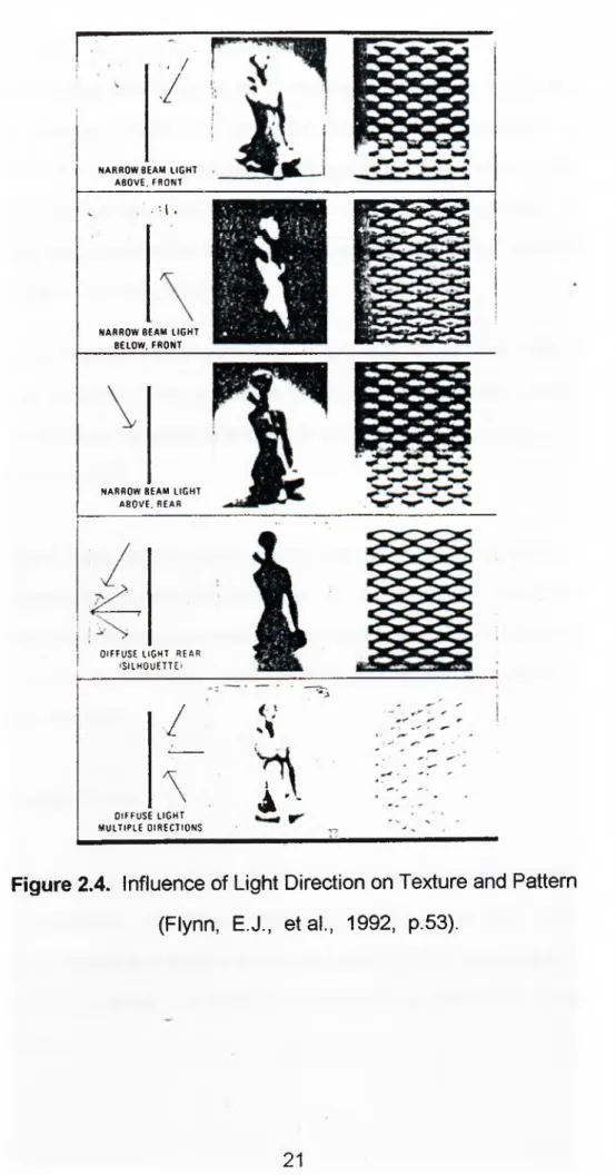
2.4. Modeling Effect
Diffused light removes all the shadows, creates a flat and monotonous· appearance: it is the incident light which gives them a three dimensional effect, this is called modeling. Modeling effect is essential for the visibility of the merchandise in order to discriminate the form and the texture of the products on display.
Ketchum (1954) indicates that: "The degree of modeling and shadow depends on the luminances in the whole field surrounding the object, including the light sources; it is an important concept to specify designed appearance. Small sources produce sharp shadows; large sources produced soft-edged shadows" (59).
As stated Philips Lighting Handbook (1993), the direction of the light is very important for defining the modeling effect. It is stated that:
The greater the angle of incidence (light from above), the more dramatic is the effect obtained and the more accentuated is the texture of the material, although the ability to identify the object may actually diminish. The smaller the angle of incidence (light from the front), the^ greater the chance of reflected glare (238).
r
. /
NARR OW BEAM LIGHT ABOVE. FR O N T
. M .
NA RROW BEAM LIGH T BELOW, FR ON T
NARROW BEAM LIGHT ABOVE. REAR
DIFFUSE LIGHT REAR «SILHOUETTE)
/
1
DIFFUSE LIGHT MULTIPLE DIRECTIONS
A '
-Figure 2.4. Influence of Light Direction on Texture and Pattern
Figure 2.4. presents the influence of light rays coming from different directions with different angles, both on texture and form.
The source size that is used to illuminate an object is important. The smaller sources create the sharpest and blackest shadows. When reflected off specular surfaces, small sources give minute sparkling highlights. At the opposite extreme, very large sources provide minimal highlights and almost no shadow. Objects appear flat, forms obscure, and texture is almost totally lacking.
It is stated by Gardner and Hannaford (1993) that: "In general, single types of source, emanating from one direction, create poor modeling, whereas a mixed of sources, emanating from different directions, will tend to create the best effect" (11).
Some retail tasks require quite a great degree of modeling effect: others none; transparent objects like glassware, perfume bottles or such are best presented when lighted from rear or from below. Modeling is necessary for the customers so that they could examine the texture of a fabric or of a sculpture, properly.
2.5. Size and Time
The size of an object and the time taken to see it are two determining factors comprising the requirements of visibility. As size increases, visibility increases and-seeing becomes easier up to a certain point. Also when the size is small, it is possible to enhance the visibility by increasing
Ernhardt (1977) states that: "There is evidence to support the belief that the light level at which visibility begins is inversely proportional to both time and area. The smaller the object or the shorter the viewing time, the higher the illumination that will be required to cross the threshold of visibility" (86).
Helms (1980) indicates that the most important aspect for the visual acuity is not the physical size, but the retinal size. He says that:
. . . the size of an object modifies the size of the image on the retina. In fact, the important aspect of size is not the physical size of the object, but the visual angle that the object subtends at the eye. When an object is brought closer to the eye, we are actually increasing the visual angle and making the object clearer (17).
Figure 2.5. clearly illustrates the Helm's words.
h sconstant
►eye
• d
eye
Figure 2.5. Physical Size Versus Visual Size
(Helms, R.N., 1980, p.17.)
Therefore, the visual angle is an important aspect when the visibility requirements are considered and if more time is devoted to the inspection of the product, it is obvious that more details will be seen instead of a quick look.
3. EFFECTS OF LIGHT ON COLOR AT MERCHANDISING AREAS
As it is known that, color is used as an important visual selling element. According to sales figures, it is obvious that right colors sell. Especially for some products, color is an important factor to achieve maximum sales (Danger, 1987). Color values and color compositions can be used to accent and identify the merchandise, as well as provide the character of the store front or the sales space when used in an appropriate and creative way.
The appearance of the merchandise and its relation to the surrounding determines the customer appreciation whether to pay or not for the apparent merchandise. In order to determine the appropriate color for the merchandising areas, Judd and Wyszecki (1975) offer these factors to be considered:
1- Suitability to the merchandise. 2- Harmony of colors.
3- Illumination suited both to the merchandise and its background (41).
Generally, color choices for merchandising areas begin with the merchandise color itself. Characteristics of the products on sale are determinant factors for contributing the color scheme around it. Well chosen colors, in combination with good lighting, can show the merchandise appealing, stimulate sales and constitutes the overall atmosphere of the store. '
The aim of this chapter is to examine the affects of light on color. The functions of light and color in merchandising areas will be stated in the first section. In the second section, factors that affect the appearance of color are considered with regard to both people and object's appearances. One of the major problems of the merchandise lighting is the color fading of the products. This subject is deeply analyzed in the last section of the chapter.
3.1. Functions of Light and Color in Interiors
The main aim of all selling environments is to sell merchandise and lighting is essential in any selling environment since without it, it is impossible to see the merchandise. It is a matter of fact that adapting general lighting rules may become difficult because many specific components depend on the type of the establishment, the kind of the products sold and the design of the interior space. But what does not change is the inevitable impact of color and light can do to any store environment.
The main functions of color and light; attracting attention, controlling circulation and creating an atmosphere, are basic concerns of this discussion which will be analyzed in detail.
3.1.1. Attract! ng Attention
The main aim of any selling environment is to catch the attention of the passers by, stop them to look at and enter the shop in order to examine and see the merchandise which in the end may result buying it. This could be possible by contributing a favorable impression which people are convinced to enter in it. At first glance what attract attention is the exterior
lighting, in particular lighting of shop-window if it exists. In some cases, even a brilliant sign can be the central point of attention.
As mentioned in the second chapter, brightness patterns catch attention whereas dimness is passed by. If there Is a shop-window, brightness inside It stimulates visual and emotional response of the customer and may initiate a motion towards inside the door. In other occasions where there is not a shop-window, the main entrance could be the focal point of brightness backed up by a brightly lit reception area (Danger, 1987). Therefore within the field of vision, highest level of brightness which draws desired attention normally be on the merchandise in the window but for the other situations, a sign or the entrance facade are likely to be the attraction points.
When the customer enters inside, the impression of the interior as a whole is extremely important since the customer may turn away if the appearance is unsatisfactory. In order to attract people, it is of great importance to use appropriate color selection to the kind and nature of the trade, to the atmosphere and the image that aimed to be created. Danger (1987) indicates that:
The fact that some colors attract and others do not, is tied up with the way the eye sees and the brain perceives. Because the eye is primarily a lens, the brain is the organ that makes sense of what the eye sees, and the image registered on the brain is affected by the conditions under which the eye records the image. Long before color becomes associated with coolness or warmth or other emotions, it imposes itself in a primitive way. When the eye views the spectrum, the brain will immediately sort out the elemental hues -red, yellow, green- and the simplest form of these colors will attract
attention most easily, irrespective of likes and dislikes; the brighter the color, the greater the attraction, because brightness stimulates eye to a great extend (93).
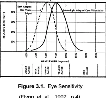
According to Birren (1988) and Danger (1987), yellow is the point of highest visibility in the spectrum, the region where there is greatest brightness. Other ones that follow in order are orange, red, yellow-green.
Figure 3.1. Eye Sensitivity
(Flynn, et. al., 1992, p.4).
Regarding the appearance of colors, the warm colors will advance while cool ones will retire. When white light passes through a prism, prism separates it into different color bands. Some colors are refracted slightly (red), some are more sharply (blue). Birren (1988) states that:
Being only slightly refracted by the lens of the eye, red will focus at a point behind the retina. To see it clearly, the lens will grow more convex, thus pulling the color forward, making its image larger. Blue will be more sharply refracted and will cause the lens of the eye to flatten out. This will push the image of blue back and decrease its size (40).
Colored light could be another consideration in order to attract attention, particularly when used at night for the illumination of the buildings' exteriors. It could be a good solution to distinguish the one shop from the other and draw attention.
Therefore, colors that are used for the merchandising areas must be appealing. Starting from the outside; a well lighted sign or shop window could give the first impression and direct attention. Last but not the least, too much impulse colors are self-defeating (Danger, 1987). It could be not only destructive but also psychologically uncomfortable and since it would be difficult to choose where to look at; the merchandise or the colorful display surfaces or walls.
3.1.2. Controlling Circulation
Controlling circulation means, in effect, making sure that potential customers who have been attracted by the exterior of an establishment and persuaded to enter it, do not lose interest once they are inside (Danger, 1987).
It is a fact that lighting is more likely to control the traffic than color (Danger, 1987). First of all, it must be considered that the customers entering inside are coming from the daylight condition which the illumination level is high. Lighting level inside the selling environment must be high enough for their eyes to readapt the inner situation. If the level is low, it will take time to readapt and within this period of time, possibly, the customer may loose interest. Such a problem does not exist at night since the eye has already been dark-adapted. As Danger (1987) states that; "Eye adapts more quickly to brightness than it does to dimness" (337).
Customers always have a tendency to be directed towards the high brightness areas. They are likely to be denser in places where brightly lit, than the areas where there is not enough light and can be left more or less deserted. Using more light and bright colors on the back walls helps them to direct towards inside. According to Danger (1987), better traffic flow can be achieved by using brighter colors around the periphery of an area, and brightening up dark comers will move people away from the center of the area. A reasonably bright colored floor, perhaps with a directional pattern, will induce people to move in a desired direction, and where appropriate, increasing the use of light and brightening colors on the walls of corridors and staircases will encourage people to explore.
According to Fitch and Knobel (1990), generally for the circulation paths lower level of illumination is needed when compared to the display areas. The actual pattern of lighting can establish the apparent circulation areas. It is possible to do it by using a light track that follows the circulation path or a neon stripe that defines the walkways and circulation paths by its appropriate color and intensity.
In addition to the design of a lighting system, the treatment of the ceiling, and the color of the floor will help to direct customer's movement. Ease of movement is also a matter of planning the display elements. They could be planned in a way to allow the traffic flow. Color, as well, can be used to separate the departments from each other. Color used for the signs is also an affective way to guide customers to the different sections.
When light rays falling on a surface, some amount is absorbed or transmitted and others are reflected. This reflected value expressed as percentages and important in order to provide a satisfactory environment
(see section 2.1.2.). For the circulation areas, recommended reflectance value is up to 70 percent. Reflectance is related with the lightness of the color perceived: the higher the percentage reflected by the product, the lighter is the color perceived. According to Danger (1987); "Reception areas, entrance halls, areas around escalators and lifts benefit from light colors, which give a sense of space and encourage busy traffic. Good lighting and bright colors are particularly useful in the entrance hall" (337).
Therefore, the decisions about the lighting merchandising areas should be made by the considerations of lighting circulation areas as well. Well designed lighting system helps people to circulate inside the selling environment without any difficulty. It is stated that the bright areas in the field of view make people to direct towards that way and get their attention. Thus, using bright colors on the rear walls or the comers, customers could be led to the point of sales. Change in the color of the floor pattern could be helpful to direct circulation as well.
3.1.2. Creating An Atmosphere
In order to be differentiated many stores on the same street or in the same department store, possibly selling similar merchandise should have an image of their own. In merchandising areas, it is of great importance to contribute an appropriate atmosphere that shows the store image and identity. When customers have entered inside, the overall impression or the feeling that is created inside the store affect them to stay or come again soon. Danger (1987) stresses that; "The selling environment should not only be attractive in terms of design but it should also be visually comfortable and should awaken a response in the minds of the observers.
This response is partly influenced by the type of lighting employed and the way that is used" (338).
The nature of the light source is a vital factor to create the desired appearance of the interior. They could be grouped as warm and cool sources. Cool sources contributes an uninviting environment whereas warm sources are inviting, appealing, sufficient to create an attractive atmosphere. They suggest luxury, comfort, extravagance, while a cooler source has a more clinical effect suggesting cleanliness and efficiency (Danger, 1987). Nuckolls, as well, states about the mood created by the light sources, that is: "Warm lighting throughout the store in random light patterns will create an atmosphere of gaiety and intimacy while general cool lighting in a higher intensity will create a feeling of sombemess and detachment (quoted in Green 1986: 113).
Interiors that have saturated colors, lit with low intensities give a feeling of rich quality, cleanliness and a pleasant atmosphere. In some cases if the illumination level is high, cool light can be stimulating otherwise creates dull, uninteresting and depressing atmosphere.
Emhard (1977) indicates that: "Bright scenes with high color saturation take on a carnival feeling and gaiety and spontaneous exuberance" (315). According to Danger (1987), a colorful environment is best produced by normal light reflected from surfaces such as walls and fittings, and not by tinted light, and therefore it is the color of the surfaces which produce the right atmosphere. We have to note that the overall surrounding and the general atmosphere must not direct more attention away from the merchandise (that is displayed).
The type of the establishment and the customers coming to these places impress the color selection and the general feeling that has to be awaken. As an example, bright colors are generally preferred in the stores for children, or it would not be a good selection to paint all the walls red in a butcher shop. In this respect, color determines the nature of the establishment and must be appropriate according to the type of the merchandise and the customer.
Consequently, color helps to create an atmosphere that refers to the customer's preferences and likes. The more a mood is appropriate for the type of the trade and kind of the establishment whether it is a women's store or a supermarket, the higher the sales will be since they are feeling comfortable and fine, willing to come often. Regarding all these aspects, the nature of the light source that is selected to use, has a dominant influence on the interior atmosphere as well as creating the image of the merchandising areas.
3.2. Color Appearance in Merchandising Areas
It has already been mentioned that color determines the general appearance of interior space; it has a power to enhance proportions, creates visual illusions as a space may seem to look small, wide, or narrow. Light sources used in an environment can affect the total appearance of colors but this becomes more important especially in merchandising areas. Since the main aim is to sell the merchandise and make the customers happy so that they could come again, the good (correct) appearances of the products and for some situations the desired appearances of customers are vital.
When the human face is lit below, there is a high probability to have an unnatural appearance. A dress may seem to be nice but if the woman wearing it sees herself pale and unnatural, she can immediately change her mind and may not buy the dress. This situation, of course, directly influences sales.
The color of the objects can be perceived by means of the source illuminating them. The amount of light which is reflected back to human eye defines the color of that object since the source must emit those wavelengths of light corresponding to the object color. As Grosslight (1990) states: 'The color of a product can not be seen unless the color of the product is present in the lighting source" (183).
It is generally accepted that the lighting which is as close as possible to daylight is concerned as the best situation for the illumination of a space. It is more common to observe the customers who tend to step outside for a moment in order to see the color of the merchandise in daylight.
In the following sections, it is aimed to understand how objects and people appear under different light sources in a selling environment. The appearance of objects and people will be examined in detail as well.
3.2.1. Color Appearance of Objects
As stated earlier, color appearance of objects mostly affected by the pigment of the surfaces and objects viewed, and the color of the light sources used in the environment. Light sources like daylight, florescent, incandescent, and HID lamps are regarded as sources of "white light" but
they have different amount of energy in each portion of the visible spectrum, ranging from violet through red (lES Lighting Handbook, 1981).
Colored objects will have different appearances when lit with different light sources: because each light source renders color differently. It is evident to see the difference in color when the same product is first perceived under incandescent lamp then fluorescent lamp.
Color rendering properties of light sources, with respect to the nature of the light source, have a special importance when the color discrimination is necessary. "Aristotle wrote that the colors in embroidery are often mistakenly perceived when observed by lamplight. So color rendering of illumination has obviously long been a problem" (quoted in Thornton, 1982: 33).
As Thornton (1982) mentions, one contemporary merchandiser has 50 million dollars worth of merchandise returned annually because of the problems of color rendering: much of this amount directly bound to the differences in color rendering properties of illuminants. The color rendering properties of light sources are mentioned in section 5.2.1.
Consequently, lighting that is deficient in color rendering property can adversely affect the customers' shopping attitudes. Accurate color judgments can not be made if the color properties of illuminants are not sufficient. In the light of a poor color rendering, apparent color matching of a product may be found false when re-examined under the light of a better color rendering.
Danger (1987) indicates the reason why these diiferent appearances occurs as:
The human eye sees white when all the receptors of the eye are stimulated equally, and white light consists of all the hues of the spectrum in roughly equal proportions. When there is more energy in one of the wavebands than in the others, the light is tinted with the spectral color of maximum energy and the receptors change their sensitivity to compensate for the extra energy, with the result that the brain receives nearly equal nerve impulses and the light is seen as white. It follows that the color of any object or surface seen will be slightly modified because the eye adapted themselves to the light source. An object of a given color will therefore look slightly different under natural daylight, under incandescent light and under any other type of light (32).
In this respect, what is expected from a lighting system is to show merchandise with the same color appearance as the place it is going to be used. This will minimize the returns and disillusions.
Danger (1987) states that if an extra light source which have a different spectral distribution or different colored object is placed in the field of view, the eye's sensitivity will change again and the small variations could be seen in the appearance of the original object.
According to the displayed object, light source could either enhance or gray the color of the product since the spectral distribution of each source is different. Cool fluorescent illuminants emit large amounts of shorter wavelength, and violet, blue, and green are the colors they accentuate. By contrast, incandescent illuminants emit longer wavelengths, producing
yellow, orange and red hues. Some products can be best presented under incandescent lighting which naturally enhances the colors like reds, browns, and yellows. On the other hand some jewelers such as diamonds must appear clean white so that there is a desire to buy them. Due to this importance, as there will be yellow brilliance, it will not be correct to use incandescent lamps in order to illuminate them. Thus, diamonds should be displayed under a cool light source.
Another specific consideration is the lighting of food. Most food especially bakery products look better when lit with warm light sources. Appearance of meat is also important. Using red lamps or red filters are not recommended since fats seem to appear pinkish and lean look unnatural. To accentuate the contrast between fat and lean, de luxe natural fluorescent or filament lamps are advised to be used (Danger, 1987).
Sometimes, in order to present the merchandise and show off the apparent specialties, backgrounds are necessary elements generally used in selling environments. If the color of the product is similar to its background, visibility is obstructed and more light is required. Depending on the product's color, details may be less visible. Needless to say that the backgrounds must not receive more attention than the merchandise. In an experiment, a shop window is designed with movable panels; each have mirrors in the middle. Instead of noticing the merchandise, all the attention is drawn to the mirrors; customers adjust their hats and ties and passed on (Wingale, 1963).
As far as varying and cotorful merchandise is concerned, light reflectance and neutral backgrounds must be used. However, it must be noted that this reflectance value must be more than 55 percent. According to lES
lighting Handbook Application Volume (1987: 8-4); "The use of large areas of strong colors could clash with the color of the merchandise displayed and could adversely affect the color of reflected light reaching the merchandise."
Therefore, in order to have the desired appearance of displayed objects, the type of the light source, incandescent, fluorescent or HID, and the color emitted from the source are of great importance. Generally, for the merchandising areas, warm sources are suggested to be used. Colors must not be exaggerated by using cool sources or filters directed towards the object. Consequently, effects of light on color should be considered in planning the lighting system in merchandising areas.
3.2.2. Color Appearance of People
People's appearance is as important as the merchandise itself because a dull, and unnatural look easily affects the customer's buying attitudes negatively. Using fluorescent light to light a blue textile or blue carpet, creates pale, bad looking faces (Birren, 1988).
Cool light sources are likely to give a particular product its desired appearance but at the same time constitutes an unwanted look on the faces. Surveys show that people prefer light sources towards red when appearance is important because they seem to have a healthy, rosy look. On the other hand, when high level of illumination is desired, most people tend to prefer cool lighting (Birren, 1988).
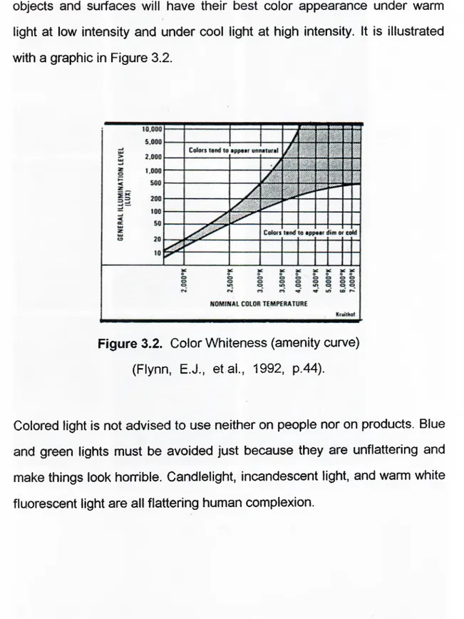
In 1941, Kruithof made several studies in order to understand the effects of warm and cool light sources on people and objects. He found that
people prefer a cool color temperature when illumination is intense and a warmer color temperature when illumination is low. He also reported that objects and surfaces will have their best color appearance under warm light at low intensity and under cool light at high intensity. It is illustrated with a graphic in Figure 3.2.
Figure 3.2. Color Whiteness (amenity curve)
(Flynn, E.J., etal., 1992, p.44).
Colored light is not advised to use neither on people nor on products. Blue and green lights must be avoided just because they are unflattering and make things look horrible. Candlelight, incandescent light, and warm white fluorescent light are all flattering human complexion.
a.b.c
d,e,f
g.h.i
Figure 3.3. Effects of Light on Human Complexion and Background (Birren, F., 1988, p.65).