Effects of Material Pairs on Warmth Perception in Interiors
Begüm Ulusoy
University of Huddersfield, School of Art, Design and Architecture, HD1 3DH, Huddersfield, Western Yorkshire, United Kingdom E-mail: [email protected]
Nilgün Olguntürk
Department of Interior Architecture & Environmental Design, Faculty of Art, Design and Architecture, Bilkent University, Bilkent, Ankara TR-06800, Turkey
Abstract. The study is the second part of a previous study which explored the effects of color pairs on warmth perception in interiors. The main aim of this study is to investigate the effects of material pairs and their single materials on warmth perception in interiors with the same methodology, since paired materials have not been investigated yet. Each material pair and their two single materials were assessed by 32 different participants, thus 96 different participants assessed three groups of material models (Fabric and Timber material pair, Fabric and Plasterboard material pair, Timber and Plasterboard material pair, and their single materials) under controlled conditions. Results indicated that as single materials Timber and Fabric have the same level of warmth and are warmer than Plasterboard whereas there is no difference between their pairs. Findings revealed that these two natural materials are perceived to be warmer than the artificial one and pairing them on interior walls provides similar level of warmth. c 2018 Society for Imaging Science and Technology.
[DOI: 10.2352/J.ImagingSci.Technol.2018.62.5.050408]
1. INTRODUCTION
Warmth perception, as a multisensory concept [1], defines built environment for both architects and non-architects [2]. The concept has been investigated by researchers in different disciplines [1–6]. In this study warmth perception is defined as ‘‘a physical, emotional, and sensorial bond between people and their environments’’ and its three aspects correspond to Desmet and Hekkert’s [7] framework for product experience: ‘‘aesthetic experience correspondence physical aspects, experience of meaning correspondence semantic aspects, and emotional experience correspondence emotional aspects’’ which was presented in the previous report [8].
Some earlier studies focused mostly on the physical aspects ([5], according to [9]: [10]); however, more recent studies [1–3] have investigated different aspects of warmth perception in relation to both colors and materials separately. Fenko et al. [1] investigated both color effects and material effects on the perception of warmth in the context of product experience. The authors stated that figurative meaning of warmth, which is related to vision, might be underestimated during users’ product experiences while literal meaning,
Received Apr. 14, 2018; accepted for publication Sept. 7, 2018; published online Oct. 10, 2018. Associate Editor: Rita Hofmann-Sievert.
1062-3701/2018/62(5)/050408/9/$25.00
which is related to touch, might be overestimated [1]. Two fundamental studies [2, 3] about warmth in architectural context focused on figurative meaning as well. According to Wastiels et al. [2] surface color has more influential effect on the concept than surface roughness; however, both affect warmth perception independently. Fenko et al. [11] mentioned that dominant modality might depend on when a product has been used. For example, visual sense dominates the perception of warmth in architectural context [2].
In addition to previous studies [1–3], the recent studies [12, 13] have discussed nonphysical aspects of warmth perception and how literal and metaphorical warmth exit in design. Materials are inevitably important part of colors and surfaces which are affecting these metaphorical aspects of warmth perception. These previous studies in architecture and product design proved that materials affect warmth perception independent from their physical warmth. For both interior architecture and industrial design, materials are rarely used as single materials. There are some industrial design objects, such as some stationery items (e.g., papers) or some furniture (e.g., chairs) which only have single materials. Similarly, there are some interiors which only have single materials such as storage rooms. However, nowadays both users and designers prefer more sophisticated and complicated material palettes with two or more materials on the same surface of not only interiors but also interior walls. Nonetheless, how material pairs affect the perception of warmth in interiors have not been investigated yet. Therefore, in the current study, the researchers focused on how paired materials affect warmth perception in interiors. 1.1 Aspects of Warmth Perception
Warmth perception was analyzed according to four basic aspects: sensorial, physical, semantic, and emotional as-pects [8]. As a multisensory concept [1], its sensorial aspect is based on five senses of human being [14]; however, visual sense dominates warmth perception in interiors [2]. Physical aspect consists of environments’ and/or materials’ physical features, which can be measured regardless of individual differences: thermal properties, surface properties, density, and ambient temperature [8]. Except thermal effusivity, all thermal properties; thermal conductivity, contact surface temperature, heat capacity, and initial material temperature
and warmth perception have a positive linear relation-ship [1–4]. Moreover, thickness, glossiness, pattern, color, and roughness are surface properties [2, 3, 15], and roughness, thickness, density, and ambient temperature have a positive linear relationship with the warmth perception [2]. According to Schifferstein and Wastiels [15] glossiness of a surface might have an effect on the perceived warmth. Although, in the context of interior architecture, there has been no agreement on the direction all of these properties’ effects have, these findings still indicate the importance of materials on warmth perception in different design disciplines [1–3,15].
The researchers embraced Brunswik’s lens model [16], which was applied to environmental perception by Gif-ford [17]. In the light of this interpretation, actual envi-ronment corresponds physical aspects of warmth perception whereas perceived warmth includes semantic and emotional aspects [8]. The semantic aspect of the concept includes both literal and figurative meanings of warmth: actual warmth is literal meaning whereas energy and intimacy associations are figurative warmth which have more influence on the concept [1]. The previous study suggests that figurative meaning, which includes ‘‘energy’’ (35%) (with ‘‘‘active’ (10%), ‘en-ergized’ (8%), ‘excited’ (8%), ‘creative’ (3%), ‘proud’ (3%), and ‘healthy’ (3%)’’ [1] connotations) and ‘‘intimacy’’ (35%) (with ‘‘‘loving’ (10%), ‘being together’ (11%), ‘atmosphere’ (10%), and ‘memories’ (4%)’’ [1] connotations), are more influential than literal meaning (30%), which is related to physical properties: ‘‘physical warmth and comfort’’ [1]. The emotional aspect includes human social cognition with emotions, which embraces warmth as a fundamental dimension during the assessment of other individuals and other individuals’ behaviors [18], whereas emotional aspects are hard to investigate without the meaning aspect [19].
In the current study, the semantic aspect was inves-tigated in order to reveal the meanings of materials and material pairs in the context of the perceived warmth in interiors. In order to achieve that aim, all physical aspects except material types were fixed. The color (red) was fixed and three materials (fabric, timber, and plasterboard) were interchanged to explore the effects of material pairs on warmth perception in interiors.
1.2 Materials and Warmth Perception
The effects of materials on warmth perception were studied by different design disciplines such as textile, product design, and architecture. In an earlier study [20], two different types of materials’ (paper and cloth) and 11 different colors’ effects on affective value and apparent warmth were investigated and their findings suggest that influence of color is higher than influence of materials’ surface texture. Textile studies [21, 22] mostly focused on tactile sense while exploring material effect on warmth. One explanation of this tendency might be the scale of products in the discipline. Similarly, product design studies [1,4,23] probed warmth perception and tactile sense in their experimental settings; thus, both textile studies and product design studies
contribute to clarify how materials and colors affect the perceived warmth in interiors. Both fabric and timber were mentioned in these previous studies. A previous study [3] investigated both visual and tactile warmth and revealed that smooth surfaces are perceived less warm than rough ones on interior walls. In addition, Wastiels et al. [2] found that technical parameters of interior wall materials are good indicators of perceived warmth. Research investigating the relationship between materials and warmth perception in the architectural context highlighted roughness as a determinant of the concept [2,3]. Timber, as an interior material since first humans’ shelters [24], is a literally warm material for tactile sense [19]. In addition, soft materials are related to ‘‘being alive’’ [19] and Schifferstein and Wastiels [15] mentioned effect of ‘‘previous life’’ of a material on metaphorical meanings. Therefore, not only timber but also fabric, as a soft material, could have positive effects on the perception of warmth in interiors.
2. METHOD 2.1 Present Study
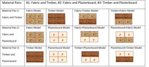
The main aim of these two studies is to investigate how paired colors and paired materials affect warmth perception separately under the same experimental conditions and with the same methodology [8,14]. As colors and materials are rarely viewed in isolation, researchers chose pairs as stimuli in this study [8,14]. The results of color pairs were presented in the previous report [8]. In the current study, researchers used three material pairs with one fixed color. Each set consisted of two materials and their pairs, and thus every participant saw a set of models with four different stimuli (e.g., Fabric Model, Timber Model, Fabric + Timber Model, and Timber + Fabric Model) (see TableI, Material Pair-1). Each set was assessed by 32 different participants (16 males and 16 females), for a total of 96 different participants.
The research question: ‘‘How can materials be paired in interiors to induce the effective perception of warmth?’’ was explored. The following result was hypothesized by the researchers: ‘‘Different material pairs affect the perception of warmth in interiors.’’
2.2 Participants
Ninety-six (96) voluntary people were chosen randomly to participate in the study in Belfast, Northern Ireland, UK. Participants in the material pairs study were not the same participants in the previous color pairs study [8] so that there is neither order effect nor learning/maturation effects. No payment or encouragement were applied. Potential participants who did not have normal color vision were detected by Ishihara Color-Blindness Test and excluded from the experiment. The sample group was between 18 and 68 years of age and included males and females without eye deficiencies (corrective lenses, if necessary, were required to be worn). The average age of the gender balanced sample groups was 32 (see AppendixA, TableA.1).
Table I. Procedure for representing material pair sets (F: Fabric, T: Timber and P: Plasterboard), all models were painted the identical Red color (with ‘‘S 3070-Y90R’’ NCS Code), colors
on the image are representing material differences not color.
2.3 Experiment Setting
The same experimental setting, which was used for the previous study, was utilized to exhibit material models [8]. The experiment box (with following dimension: 40 cm height, 50 cm width, and 50 cm depth), a lamp (a Thorn PP118 light bulb with Philips TL-D 90 Graphica 18W 965–59 cm (MASTER) which provided required lighting and viewing conditions), and measurement equipment (NCS 96 Atlas, Konica Minolta Illuminance Meter T-10A, NCS Color Scan 2.0, a temperature gauge, and a digital thermometer with Samsung Galaxy S4 sensors) were used in order to constitute controlled conditions such as controlled light and temperature [8].
Natural light was blocked with curtains and black cardboard to eliminate any effect of changing daylight. The only light source, which ensures 6500 K color temperature, excellent color rendering index with 90 to 100 Ra and approximately 400 lux illuminance level, was the fixture in the experiment box so that it provided homogeneous illuminance level on models and in the box in addition to its excellent color rendering index. The experiment box, which was used to exhibit the models under controlled conditions, was covered with black cardboard from outside and with gray (S-3000N) cardboard inside.
In order to measure physical conditions several mea-surement equipment were used. The illuminance levels of the models and their environments were measured by a Konica Minolta Illuminance Meter T-10A. NCS 96 Atlas was used to determine colors and NCS Color Scan 2.0 was used to measure the color (Red, with an ‘‘S 3070-Y90R’’ NCS Code) on the models. A temperature gauge and a digital thermometer with Samsung Galaxy S4 sensors were utilized to measure indoor temperature, which was kept at 22 C as stated by Neufert [25], which was controlled with heating equipment when needed.
3. STIMULUS 3.1 Materials
Three typical construction materials which are frequently used in interior architecture were selected: Fabric, Timber, and Plasterboard. Moreover, these materials are preferred because the researchers could modify them without loss of identity on their surfaces with water-based protectors [14,
26]. The researchers chose 100% cotton fabric because of its absorption ability and because it does not include any plastic ingredients, which can cause sparkle on a surface. Fagus-covered laminated veneer boards were selected because of its reaction to paint and sandpaper, which ensured visually and tactually identical surfaces for all timber models and its less obvious grains. The researchers selected the standard plasterboard because of its wide usage with matte paint which does not cause any glare on a surface. Materials and paints were selected in order to ensure similar glossiness level on models’ surfaces without any glare on them (see Figure1).
Wide range of timber and fabric types were investigated, and because timber had more restricted color palette, selection of colors was based on water-based protectors’ color palette for timber [14,26]. Timber and Fabric models were painted with the water-based protector, which can penetrate the surfaces, in order to protect their surface properties. Unlike other dyes, water-based protectors penetrate and protect surface qualities such as texture, grain and structure, and can change surface color properly. Sirca CT5503 paint was used for both Timber models and Fabric models in order to ensure the same color, and Marshall water-based matte indoor wall paint with the same NCS code was used for the Plasterboard models. Color measurements with NCS Color Scan 2.0 after painting process of each model showed that ‘‘S 3070-Y90R’’ NCS code was achieved on all models.
3.2 Models
In order to create pairs, each material was viewed with another material. Any effect of material location was
Figure 1. Surfaces of the models (Fabric, Timber and Plasterboard) (used from ref. [26]) c 2016 Wiley Periodicals, Inc.
Table II. Three direct questions, adapted from [8].
1. Please imagine these surfaces as an ordinary interior space and please rate them according to how warm they make you feel, using the following 7-point scale. 2. Please imagine these surfaces as an ordinary interior space and please rate them
according to how energetic you think they are, using the following 7-point scale. 3. Please imagine these surfaces as an ordinary interior space and please rate them
according to how intimate you think they are, using the following 7-point scale. eliminated by presenting both upper and lower combinations of pairs (see Table I). In the text, the upper materials are written first. The table demonstrates how these material pairs were organized: each material pair had four different models (see TableI). The color (red with ‘‘S 3070-Y90R’’ NCS code) was fixed, and three different material types were used as pairs: red Fabric and red Timber pair, red Fabric and red Plasterboard pair, and red Timber and red Plasterboard pair. Researchers used single materials for the material pairs to investigate particularly the relationship between them. Each participant assessed a model set, consisting of four different models, for example, Material Pair Set-1 (see TableI). Each participant assessed the four different models of his or her set one by one. The sets consisted of two single material models and two paired material combination models, which were upside down versions of each other to eliminate any effect of location of material. Each participant assessed four models of their set in a different order to control for the prospective order effect. Twenty four different order types could be varied for four different models; therefore, eight extra orders were selected randomly.
3.3 Procedure
Two pilot studies were conducted before the main ex-periment (for details Ref. [8]). There were two phases of the experiment. Before the first phase, researchers asked participants questions about eye and vision deficiencies, and applied Ishihara’s Color-Blindness Test. The remaining vol-unteers received an information form about the experiment and, if they still wanted to participate in the experiment, they filled out a consent form. Next, all indoor lighting except the light in the experiment box was turned off. Participants completed the first part of the questionnaire
which includes demographic information under controlled experiment conditions, thus provided adaptation time to participants’ eyes. Finally, participants were shown the first model in their set.
The second phase of the experiment included assessing the models under laboratory conditions. Participants an-swered two open-ended questions, which were previously published in their findings [26] and three direct questions (see TableII) on a 7-point semantic differential scale (1: very cold and 7: very warm; 1: not energetic and 7: energetic; 1: not intimate and 7: intimate), in the same way as the previous study about effects of paired colors on warmth perception [8]. A semantic differential scale was used for these questions: ‘‘warm,’’ ‘‘energetic,’’ and ‘‘intimate,’’ with their opposing adjectives. These three scales were used as descriptors because they are consistently related to the concept throughout the literature [1–3,13]. In addition, they correspond to Heise’s EPA structure (evaluation, potency, and activity), which is required to probe any concept on semantic differential scales [27]. ‘‘Warm’’ was used for evaluation, whereas ‘‘intimate’’ and ‘‘energetic’’ were utilized for potency and activity, respectively [8]. More scales were not preferred by researchers in order to concentrate the participants on these three fundamental scales of warmth perception [8].
In this study, because the visual assessment is the focus, participants were not allowed to touch the models before or during the experiment. The model represented a corner of an empty room, which was defined as an ordinary interior with no door, furniture, window, or any other interior element [8,
26]. No function was assigned to this interior. Each volunteer, who were individually participating in the experiment, sat on the open front of the experiment box in the same chair. Both paired and single models were split horizontally along the height of a wall halfway in order to represent more common real life indoor wall application and the same area for each material type. To ensure exactly the same visual properties, four fragments were utilized in each model to provide the same conjunction quality for both single material models and paired material models. More details about the methodology were presented in the previous studies by the authors [8,14,
Table III. Symbols of the materials used in TablesIV–VII. All material models were painted in the identical Red color (with ‘‘S 3070-Y90R’’ NCS Code), the symbols are representing abstract material type differences.
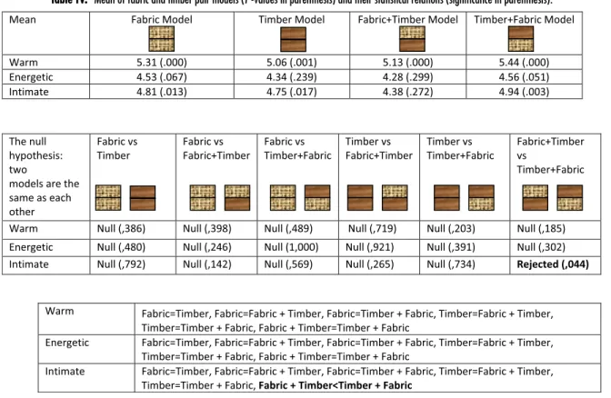
Table IV. Mean of fabric and timber pair models (P -values in parenthesis) and their statistical relations (significance in parenthesis).
4. RESULTS
Quantitative questions were investigated by the Wilcoxon matched-pair signed-rank test with IBM’s SPSS Statistics 20 program. All single materials with the other two materials and material pairs were compared. The results of the Wilcoxon test are demonstrated in Tables IV–VII (see Table III for symbols of materials). Both upper and lower combinations of a same material pair (e.g., Fabric upper + Timber lower paired material and Timber upper + Fabric lower paired material combinations) were compared as well (see tables IV–VI). In addition, researchers compared the material pairs with other two material pairs separately (see TableVII). The null hypothesis is the same hypothesis in the previous report [8] that: ‘‘two models are the same as each other and there is no difference in warmth perception.’’
The Fabric and Timber pair was the first material pair which the researchers analyzed. For the questions regarding ‘‘warm’’ and ‘‘energetic,’’ there was no significant difference between Fabric, Timber, or their pairs (both combinations: Fabric + Timber Combination and Timber + Fabric Combination). For the question regarding ‘‘intimate,’’ the only significant difference between the models was that the Timber + Fabric paired combination (with Timber on top)
was found to be more intimate than the Fabric + Timber paired combination (with Fabric on top) (see Table IV), which is the only material location difference in the study.
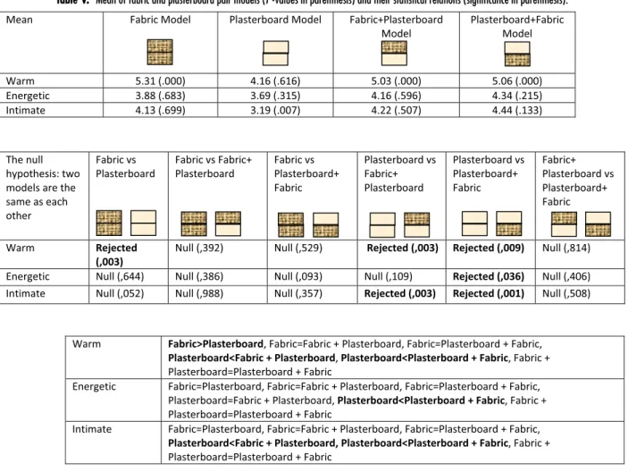
The Fabric and Plasterboard pair was the second material pair that researchers analyzed. For the question regarding ‘‘warm,’’ Fabric was found to be warmer than Plasterboard and Plasterboard was assessed as the less warm one. There was no significant difference between Fabric and the paired combinations. For the question regarding ‘‘ener-getic,’’ the only significant difference between the models was that the Plasterboard upper Fabric lower combination was found to be more energetic than Plasterboard as a single material. For the question regarding ‘‘intimate,’’ Plasterboard + Fabric paired combination and Fabric + Plasterboard paired combination were more intimate than Plasterboard as a single material. Material location had no effect on warmth perception in the paired combinations (see TableV).
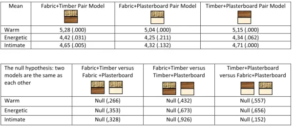
The third material pair, which researchers analyzed, was Timber and Plasterboard material pair. For the question regarding ‘‘warm,’’ Timber was found to be warmer than both single Plasterboard and the Timber + Plasterboard paired combination, while the Plasterboard + Timber paired combination was warmer than Plasterboard as a
Table V. Mean of fabric and plasterboard pair models (P -values in parenthesis) and their statistical relations (significance in parenthesis).
single material. For the question regarding ‘‘energetic,’’ the only significant difference between models was that the Plasterboard + Timber paired combination was found to be more energetic than Plasterboard as a single material. For the question regarding ‘‘intimate,’’ Timber was more intimate than both the single material Plasterboard and Timber + Plasterboard paired material combination. Plasterboard was less intimate than the Plasterboard + Timber paired material combination. Material location had no effect on warmth perception in the paired combinations (see TableVI).
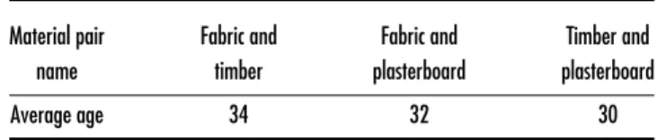
Between sequences, researchers compared the Fabric and Timber, Fabric and Plasterboard, and Timber and Plasterboard material pairs with each other to determine how material pairs affect warmth perception in interiors. After every three questions, researchers compared the materials in pairs but found no significant difference between material pairs in terms of warmth perception. For all comparison pairs the null hypothesis cannot be rejected (TableVII).
5. DISCUSSION
Previous studies [1–4] revealed the relationship between ma-terial properties and warmth perception; therefore, it could be assumed that different material types have different effects on warmth perception in interiors. In this study, semantic
aspect of warmth perception with its three fundamental scales, was investigated on one natural–natural and two natural–artificial material pairs as an interior architecture concept. Fabric as a single material and Timber as a single material were assessed as warmer than Plasterboard as a single material. Their level of warmth became the same, when these three materials were paired (Fabric and Timber material pair, Fabric and Plasterboard material pair, and Timber and Plasterboard material pair). The study reveals that these single materials can have different effects on the perception of warmth in interiors by themselves, but when paired they lose their potency for warmth perception and have similar effects in interiors. The results also show that there is no difference in warmth perception among material location in the combinations (i.e., whether a material is on the top or the bottom of the combination), except Timber and Fabric material pair. It is interesting to note that Timber + Fabric paired material combination is more intimate than Fabric + Timber paired material combination, which are the only natural–natural paired material combinations of the study.
5.1 Warmth
The study results demonstrate that both Fabric and Timber, as single materials, have the same level of warmth; there
Table VI. Mean of timber and plasterboard pair models (P -values in parenthesis) and their statistical relations (significance in parenthesis).
Table VII. Mean of material pairs (P -values in parenthesis) and their statistical relations (significance in parenthesis).
is no difference between these materials or among their paired combinations. As single materials, Fabric and Timber were assessed as warmer than Plasterboard separately. Fabric dominates their paired material combinations with Plaster-board (Fabric + PlasterPlaster-board paired material combination and Plasterboard + Fabric paired material combination)
whereas Timber does not. Fabric and its two paired material combinations found to be warmer than Plasterboard (see TableV). On the other hand, Timber was assessed as warmer than the Timber + Plasterboard paired material combination but equals for warmth in the Plasterboard + Timber paired material combination (see TableVI). Plasterboard + Timber
paired material combination was assessed as warmer than the single Plasterboard. However, single Plasterboard equals to the Timber + Plasterboard paired material combination. The results could be interpreted that Timber may not be able to dominate material pairs as much as Fabric does, although, both have similar effects as natural materials.
5.2 Energy
The results reveal that all single materials were also perceived the same in terms of energy. As a single material, Plasterboard was assessed as less energetic than the Plasterboard + Fabric paired material combination; however, there was no difference between both other models in terms of energy. Similarly, Plasterboard as a single material was perceived as less energetic than the Plasterboard + Timber paired material combination, and there was no difference between the other models. According to these results, in interiors, there is no difference between Fabric, Timber, and Plasterboard in terms of energy. It might be interpreted that there is a tendency with higher energy level of Plasterboard upper paired material combinations, which are paired with two natural materials separately (Fabric or Timber). 5.3 Intimacy
As a single material there is no difference between Fabric and Timber in terms of intimacy. However, when paired as Timber + Fabric paired material combination with Timber on top, they are perceived as more intimate than the reverse combination. As single materials, Fabric and Plasterboard have the same intimacy level, whereas Plasterboard as a single material appears to be less intimate than both their paired material combinations. Participants assessed Timber as more intimate than Plasterboard. Nonetheless when they were paired, Timber + Plasterboard paired material combination was perceived less intimate than Timber single material, and Plasterboard + Timber paired material combination was assessed as more intimate than Plasterboard alone. As a less intimate material in the study, there is a tendency with intimacy level of Plasterboard to be increased by pairing it with these natural materials.
5.4 Overall Discussion
In this study, warmth perception was investigated through three semantic scales that constitute the meaning aspect of the concept. Although, there are slight differences between these three semantic scales, their results proved that Fabric and Timber have the same level of perceived warmth that is higher than Plasterboard, and their three pairs have the same effect in interiors. These results show that single materials might affect the perceived warmth in interiors in similar or different levels. However, their natural–natural and natural–artificial material pairs may have similar effect on the concept in interiors. Therefore, the semantic aspect of the concept might be more apparent with single materials.
The current study demonstrates that natural materials (Fabric and Timber for this study) are perceived as warmer than the artificial material (Plasterboard). According to the
previous study, materials that have previously been part of a living creature are associated with warmth [15]. Similar to previous studies [15,19], the results also support that there is a strong positive correlation between natural materials and warmth perception in interiors: both cotton fabric and timber have a ‘‘previous life’’; therefore, they are related to ‘‘being alive’’ and thus they might be perceived as warmer. Knowing that these two materials have rooted from living organisms might positively affect their perceived warmth in interiors. As previous studies suggested [15,19], these results show that natural materials may be related to figuratively warm concepts.
Considering the results in general, paired materials might lose their potency for warmth in interiors. Apparently, in this study, when natural materials (Fabric or Timber) are paired with the artificial one (Plasterboard), the paired materials could be perceived as warmer than the artificial one on its own. In this study, only one natural–natural and two natural–artificial material pairs were investigated, there was not any artificial–artificial material pair. Therefore, it can be interpreted that natural materials, with a previous life, might increase warmth level of Plasterboard. However, the pair of these two natural materials (Fabric and Timber material pair) cannot have higher degree of warmth than their single materials on interior walls. It could be suggested that, in order to provide higher perceived warmth in interiors, Plasterboard, which has less obvious texture might be used with natural materials which are less firm and have less smooth surfaces (instead of single Plasterboard).
Another interesting finding is that the pair of Fabric and Timber is not warmer than either single Fabric or single Timber and this phenomenon is consistent for all three scales. Pairing these two natural materials might cause overstimulation which was mentioned as a negative feature of an interior by the previous study [28].
Moreover, the study’s findings revealed that there is no effect of material location in paired materials, except Fabric and Timber material pair for intimate scale. The finding is fruitful because the previous study proved that there is no effect of color location on warmth perception [8]. In addition, the other two material pairs, and the warm and energetic scales of Fabric and Timber material pair, do not have statistically significant difference in the same context (see tablesIV–VI).
6. CONCLUSION
In this study, the experimental setting was utilized to investigate the relationship between warmth perception and material pairs with their single materials, which frequently appear in interiors. Three fundamental scales (warm, energetic, and intimate), which constitute the semantic aspect of warmth perception, were used to probe the concept in interiors. According to results, the hypothesis is rejected for these three material pairs in all three semantic scales; however, study findings could be useful for different design disciplines and future studies. The results reveal that both Timber and Fabric, as single materials,
are assessed to be warmer than Plasterboard. However, there is no statistically significant difference in warmth perception among their three material pairs, which include at least one natural material with a previous life. As a result, in the context of warmth perception, the study findings suggest that Plasterboard could be paired with these two natural materials (Fabric or Timber) on interior walls in order to create higher level of warmth (compared to single Plasterboard). In the scope of this study one natural–natural and two natural–artificial material pairs were investigated. Results indicated that pairing these three materials on interior walls will provide similar warmth levels. During last decades, plasterboard with paint has been prevalently used in interiors. Therefore, more research studies are needed in order to understand its effects on users. For instance, how its pairing with another interior material (such as plastic as an artificial material or another natural material with smooth surface such as marble without a previous life) affects warmth perception in interiors. In the light of these findings, it can be anticipated that plasterboard might be paired with natural materials, which are rooted from living organisms, in order to provide higher level of warmth for interiors’ users; however, more paired materials should be explored in order to clarify this result. The study provides architects, interior architects, and designers more knowledge about how material pairs affect the perception of warmth in interiors. In addition, it could be anticipated that these results can be beneficial for future research studies on the concept.
Although, the study contributes the literature, na-tionality of participants is a limitation. In addition, the study includes only one natural–natural material pair and two natural–artificial material pairs. Artificial–artificial material pairs should be investigated to elucidate the gap in the literature. Future studies could concentrate on more material pairs with different visual surface qualities (e.g., glass, concrete, etc.) and three or more materials could be investigated in different combinations in interiors. In addition, innovative materials that have been produced by recent technologies could unfold different aspects of the concept in interiors as well.
ACKNOWLEDGMENTS
This experimental research was conducted as part of Begüm Ulusoy’s PhD dissertation in the Department of Interior Architecture and Environmental Design, Bilkent University, Ankara. The authors thank Dr. Geraint Ellies (School of Planning, Architecture and Civil Engineering, QUB) and Dr. Gül Kaçmaz Erk (QUB) for their contributions to the questionnaire and the experiment room, Serap Günay Ulusoy and Ismail Orhan Ulusoy for their encouragement, Inci Apaydin (Middle East Technical University, Ankara) for statistical calculations, Rana Nelson (Bilkent University) for proofreading various versions of the article, and Queen’s University Belfast (QUB) and Bilkent University for their support. The first author additionally acknowledges the grateful receipt of 2-year’s TUCEV financial support during the research.
APPENDIX A. AVERAGE AGE OF THE SAMPLE GROUP
Table A.1. Average age of the sample group.
Material pair Fabric and Fabric and Timber and
name timber plasterboard plasterboard
Average age 34 32 30
REFERENCES
1A. Fenko, H. N. J. Schierstein, and P. Hekkert, Mater. Des. 31, 1325
(2010).
2L. Wastiels, H. N. J. Schierstein, A. Heylighen, and I. Wouters,Building
and Environment49, 359 (2012).
3L. Wastiels, H. N. J. Schierstein, A. Heylighen, and I. Wouters, Mater.
Des.42, 441 (2012).
4Y. Obata, K. Takeuchi, Y. Furuta, and K. Kanayama,Energy30, 1317
(2005).
5J. Itten, The Elements of Color, translated by E. Van Hagen, edited by
F. Birren (Van Nostrand Reinhold, New York, 1970).
6B. Wright,Am. J. Psychol.75, 232 (1962).
7P. M. A. Desmet and P. Hekkert, Int. J. Des. 1, 57 (2007).
8B. Ulusoy and N. Olguntürk,J. Imaging Sci. Technol.60, 50408-1 (2016)
ISSN: 1062-3701.
9F. H. Mahnke and R. H. Mahnke, Color and Light in Man-Made
Environments (Van Nostrand Reinhold, New York, 1987).
10L. A. Clark, The Ancient Art of Color Therapy (Devin-Adair Publishers,
Old Greenwich, C.T., 1975).
11A. Fenko, H. N. J. Schierstein, and P. Hekkert,Appl. Ergon.31, 34 (2010). 12E. Baek, H. J. Choo, H. Oh, and S. Y. Yoon, J. Consum. Behav. 1 (2018). 13E. Baek, H. J. Choo, and S. H. M. Lee,J. Bus. Res.88, 91 (2018). 14B. Ulusoy, Warmth Perception in Association with Colour and Material.
Doctoral thesis, (Bilkent University, Ankara, 2016).
15H. N. J. Schifferstein and L. Wastiels, ‘‘Sensing materials: Exploring
the building blocks for experiential design,’’ in Materials Experience Fundamentals of Materials and Design, edited by E. Karana, O. Pedgley, and V. Rognoli (Butterworth-Heinemann, Oxford, 2014), pp. 15–26.
16E. Brunswik, Perception and the Representative Design of Psychological
Experiments (University of California Press, Berkeley, 1956).
17R. Gifford, Enviromental Psychology: Principles and Practice, 3rd ed.
(Optimal Book, Canada, 2002).
18W. Lin, J. Wang, H. Lin, H. Lin, and B. T. Johnson,J. Psychol.145, 247
(2011).
19P. Hekkert, E. Karana, and E. Karana, ‘‘Designing material experience,’’
in Materials Experience Fundamentals of Materials and Design, edited by O. Pedgley and V. Rognoli (Butterworth-Heinemann, Oxford, 2014), pp. 3–11.
20M. A. Tinker,Am. J. Psychol.51, 532 (1938).
21L. Bacci, F. Camilli, S. Drago, M. Magli, E. Vagnoni, A. Mauro, and
S. Predieri,Textile Res. J.82, 1430 (2012).
22A. M. Schneider and B. V. Holcombe,Textile Res. J.61, 488 (1991). 23X. Chen, C. J. Barnes, T. H. C. Childs, B. Henson, and F. Shao,Mater. Des.
30, 4299 (2009).
24R. Gagg, Basics Interior Architecture 05: Texture1Materials (Ava
Publish-ing, Muttenz, Switzerland, 2012).
25E. Neufert, Architect’s Data, 2nd Int’l. English ed. (Halsted Press, London,
1980).
26B. Ulusoy and N. Olguntürk,Color Res. Appl.42, 261 (2017).
27D. R. Heise, ‘‘The semantic differential and attitude research,’’ in Attitude
Measurement, edited by G. F. Summers (Rand McNally, Chicago, 1979), p. 235.
28F. H. Mahnke, Color, Environment & Human Response (Van Nostrand
![Figure 1. Surfaces of the models (Fabric, Timber and Plasterboard) (used from ref. [26]) c 2016 Wiley Periodicals, Inc.](https://thumb-eu.123doks.com/thumbv2/9libnet/5684688.114507/4.918.138.781.105.273/figure-surfaces-models-fabric-timber-plasterboard-wiley-periodicals.webp)