INFLUENCE OF COLOR-TEXTURE ASSOCIATIONS
ON PREFERENCE
A Master’s Thesis by ELA FASLLIJA Department ofInterior Architecture and Environmental Design İhsan Doğramacı Bilkent University
Ankara July, 2017
INFLUENCE OF COLOR-TEXTURE ASSOCIATIONS ON PREFERENCE
The Graduate School of Economics and Social Sciences of
İhsan Doğramacı Bilkent University
by
ELA FASLLIJA
In Partial Fulfillment of the Requirements for the Degree of MASTER OF FINE ARTS
Department of
Interior Architecture and Environmental Design İhsan Doğramacı Bilkent University
Ankara July, 2017
vi ABSTRACT
INFLUENCE OF COLOR-TEXTURE ASSOCIATIONS ON PREFERENCE
Fasllija, Ela
M.F.A Department of Interior Architecture and Environmental Design Supervisor: Assoc. Prof. Dr. Nilgün Olguntürk
July 2017
This study analyzes the possible existence of a relationship between color and texture
in terms of preference. One hundred design-trained and 96 non-design trained
respondents underwent an experiment carried out in a virtual and abstract
environment. 12 color-texture mapped squares, (4 colors x 3 textures) were placed in
a neutral grey colored background and shown to the respondents. They responded the
question about their most preferred color-association. As a second part of the
experiment, they answered also about their most preferred texture strength of the
previously selected square. Results of the study deny the existence of a dependency
between color and texture. Moreover, blue was the overall most preferred color in
any context. Fine textures were preferred more compared to coarse ones. In addition,
small changes were observed in terms of preference between the design trained and
non-design trained respondents. However, gender was not a prominent factor
affecting preferences in this study.
vii ÖZET
RENK-DOKU İLİŞKİLERİNİN TERCİHLER ÜZERİNDEKİ ETKİSİ
Fasllija, Ela
İç Mimarlık ve Çevre Tasarımı Yüksek Lisans Programı Danışman: Doç. Dr. Nilgün Olguntürk
Temmuz 2017
Bu tez, renk ve doku tercihleri açısından bağımlılık mevcudiyetini incelemiştir. 100
tasarımla ilişkili, 96 tasarım eğitimi olmayan katılımcı sanal ve soyutlanmış ortamda gerçekleştirilen deneye tabi tutulmuştur. 12 adet eşlenmiş renk-doku kareleri (4 renk
x 3 doku), nötr gri renkli arka plana yerleştirilmiş ve katılımcılara gösterilmiştir.
Katılımcılar, en çok tercih ettikleri renk-doku ilişkileriyle alakalı soruları
cevaplamışlardır. Deneyin ikinci aşaması olarak, seçtikleri dokunun en çok tercih
ettikleri biçim düzeniyle alakalı soruları da yanıtlamışlardır. Çalışmanın sonuçları
renk ve doku arasındaki bağımlılık mevcudiyetini reddetmiştir. Bununla birlikte, mavi tüm durumlarda en çok tercih edilen renk olmuştur. İnce dokular, kalın olanlara
kıyasla daha çok tercih edilmiştir. Ayrıca, tercihler açısından tasarımla ilişkili ve
ilişkili olmayan katılımcılar arasında küçük değişiklikler gözlenmiştir. Ancak
cinsiyet, bu çalışmada tercihleri etkilemede öne çıkan bir faktör olmamıştır.
viii
ACKNOWLEDGMENTS
Firstly, I would like to express my gratitude to my advisor Assoc. Prof. Dr. Nilgün
Olguntürk for her valuable support and encouragement throughout the study. Her
academic and intellectual guidance through these two years were a crucial part for
the fulfillment of this study. At the same time, I would like to thank instructor Dilek
Güvenç for her guidance during the conduction of statistical analysis of the study.
Secondly, I would like to thank the members of the examining committee, Asst. Prof.
Dr. Çağrı İmamoğlu and Asst. Prof. Dr. Begüm Ulusoy for their valuable
evaluations, comments and recommendations during the defense of the thesis.
Moreover, I am thankful to my friends and officemates who were my companions
during this process. I am indebted to Dilay Seda Ozgen for helping me find the
necessary materials in order to conduct this study. A special thanks goes to my
friends Ali Ranjbar and Elif Aksel for their support during the last phases of the
thesis.
I am eternally grateful to my parents Astrit and Liljana Fasllija who always gave me
the necessary support and encouragement needed to pursue my dreams. Thank you
for always believing in me!
Moreover, this thesis wouldn’t have been possible without the guidance my sister
Edona Fasllija always gave me throughout the important steps of my educational life.
I would also like to thank my niece Earta Xhelilaj for always reminding me the
ix
Last but not least, I want to express my fond gratitude to my fiancé Besmir Kamberi
x
TABLE OF CONTENTS
ABSTRACT...vi ÖZET...vii AKNOWLEDGEMENTS... viii TABLE OF CONTENTS...x LIST OF TABLES...xiv LIST OF FIGURES...xvii CHAPTER 1: INTRODUCTION...11.1 Aim of the study…...3
1.2 Structure of the thesis...4
CHAPTER 2: COLOR...6
2.1 Definition of color...6
2.1.1 Color attributes...7
2.2 Color systems...8
2.2.1 RGB Color system...8
xi
2.2.3 Munsell Color system...11
2.2.4 Natural Color System...12
2.3 Human responses to color...14
2.3.1 Color preferences in terms of color attributes...14
2.3.2 Color preference factors...16
2.3.2.1 Color preferences by age...16
2.3.2.2 Color preferences by gender...18
2.3.2.3 Color preference by culture...19
2.3.2.4 Color preferences by context...20
2.3.2.5 Color preference by design training background...22
2.3.3 Cross preferences...23
CHAPTER 3: Texture...25
3.1 Definition of texture...25
3.1.2 Texture characteristics...26
3.1.2.1 Opacity and transparency of textures...27
3.1.2.2 Relief of textures...27
3.2 Color and texture...28
3.2.1 Color-Texture related studies...29
3.2.1.1 The effect of texture on color difference...29
3.2.1.2 The effect of texture on color attributes...31
3.2.1.3 The effect of texture on color judgement...32
CHAPTER 4: METHODOLOGY...34
xii 4.1.1 Research questions...34 4.1.2 Hypotheses...35 4.2 The experiment...35 4.2.1 Sample group...35 4.2.2 Experimental sets...36 4.2.2.1 Texture sets...36
4.2.2.2 Color mapped sets...38
4.2.3 Settings of the experiment...41
4.2.4 Procedure...43
CHAPTER 5: Results...44
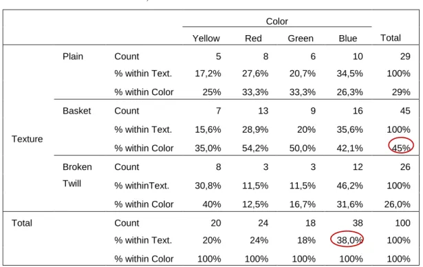
5.1 Cross tabulations for color-texture associations...45
5.1.1 Design trained sample set...45
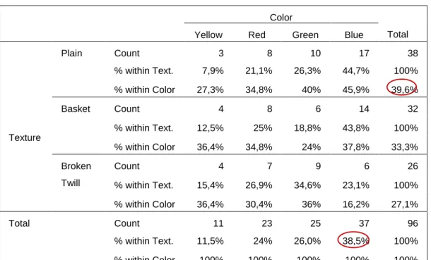
5.1.2 Non-design trained sample set...46
5.2 Color-texture dependency...46
5.3 Preference of texture apart from colors...47
5.3.1 Texture preference distributions between genders...48
5.4 Preference of color apart from texture...49
5.4.1 Color preference distributions between genders...50
5.5 Color-Texture strength dependency...51
5.6 Texture strength preference...53
5.6.1 Texture strength preference distributions between genders...54
5.6.2 Texture strength preference for texture type...54
5.6.3 Texture strength preference for color …...55
xiii CHAPTER 6: CONCLUSIONS...61 BIBLIOGRAPHY...65 APPENDICES...73 APPENDIX A...74 APPENDIX B...90
xiv
LIST OF TABLES
1. Distribution of respondents by background and gender...36
2. Color texture cross tabulation, DT………...45
3. Color texture cross tabulation, NDT………...46
4. Texture strength-Color preference, DT………...52
5. Texture strength-Color preference cross tabulation for NDT...52
6. Age frequency table, DT...74
7. Department frequency table, DT...74
8. Grade frequency table, DT...75
9. Age frequency table, NDT...75
10. Gender frequency table, NDT...75
11. Department frequency table, NDT...76
12. Grade frequency table, NDT...76
13. Color preference frequency table, DT...77
14. Color preference frequency table, NDT...77
xv
16. Color- texture chi square for dependency ,NDT…………...77
17. Basket-broken twill binomial test...78
18. Green- Blue binomial test, DT...80
19. Yellow-Blue binomial test, DT...80
20. Yellow- Blue binomial test, NDT...81
21. Red- Blue binomial test, males NDT...82
22. Color- texture strength chi square test for dependency, DT...83
23. Color- texture strength chi square test for dependency, NDT...83
24. Texture strength preference, DT...83
25. Texture strength preference, NDT...83
26. Texture strength preference, males NDT...84
27. Texture strength preference, females NDT...84
28. Texture strength preference for plain textures, DT...84
29. Texture strength preference for basket textures, DT...84
30. Texture strength preference for plain textures, NDT...85
31. Texture strength preference for basket textures, NDT...85
32. Texture strength preference for yellow color, DT...85
33. Texture strength preference for red color, DT...85
34. Texture strength preference for green color, DT...86
xvi
36. Texture strength preference for yellow color, NDT...86
37. Texture strength preference for red color, NDT...86
38. Texture strength preference for green color, NDT...87
39. Texture strength preference for blue color, NDT...87
40. Preference of blue within a specific texture, DT...87
41. Preference of green within a specific texture, DT...87
42. Preference of red within a specific texture, DT...88
43. Preference of yellow within a specific texture, DT...88
44. Preference of blue within a specific texture, NDT...88
45. Preference of green within a specific texture, NDT...88
46. Preference of red within a specific texture, NDT...89
xvii
LIST OF FIGURES
1. A visual explanation of hue, saturation and brightness...8
2. RGB additive color mix...9
3. RGB color wheel...9
4. The CIE chromaticity diagram...10
5. Munsell Color Circle...11
6. Munsell Color Solid...11
7. NCS Color circle...12
8. NCS hue triangle of Y90R...13
9a. Wool fabric’s texture...26
9b. Linen fabric’s texture…...26
10. Metallic filaments...27
11. Nurus design office samples...36
12. Tepe home design office samples...36
xviii
13b. Basket texture...37
13c. Broken twill texture...37
14a. Plain coarse...37
14b. Basket coarse...37
15. Yellow (2050-Y)...39
16. Red (2050-R)...39
17. Blue (2050-B)...39
18. Green (2050-G)...39
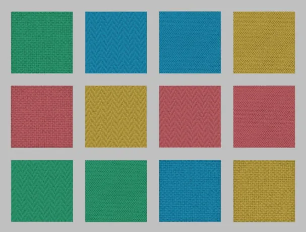
19. Texture-color mapped images...40
20. Fine-coarse basket texture mapped with blue...40
21. Experiment at lab in the FC building with design-trained respondents...41
22. Experiment in the Library Booth...42
23. Texture preference distribution, DT………...47
24. Texture preference distribution, NDT………...48
25. Color preference distribution, DT………...49
26. Color preference distribution, NDT………...50
27. Color preferences for males, NDT………...50
28. Color preferences for females, NDT………...51
29. Texture strength preference percentages, DT…...53
xix
31a. Fine plain texture...54
31b. Fine basket texture...54
32. Red fine textures...55
33. Blue fine textures...55
34. Texture preferences apart from color, DT...78
35. Texture preferences apart from color, NDT...78
36. Texture preferences apart from color, males NDT...79
37. Texture preferences apart from color, females NDT...79
38. Preference of color apart from texture, DT...80
39. Preference of color apart from texture, NDT...81
40. Preference of color apart from texture, males NDT...81
41. Preference of color apart from texture, females NDT...82
42. Preference of color (green, red & blue) apart from texture, females NDT...82
43. A randomized sequence shown to one of the respondents...90
44. Fine-coarse pairs of basket textures in blue, green, red and yellow...92
45. Fine-coarse pairs of plain textures in blue, green, red and yellow...93
1
CHAPTER I
INTRODUCTION
Preferences of individuals are related to different sensorial aspects such as visual,
tactile, auditory and olfactory. To prefer means to like the most. Visual aesthetics has
been considered as the primary factor affecting preference (Yi & Choi, 2008). People
show specific preferences towards different aspects of their surroundings; some
prefer some colors to other, or some specific shapes, patterns or textures rather than
others (Chen, Tanaka, Matsuyoshi & Watanabe, 2015). At the same time responses
to color preferences can be influenced by age, gender and background (Manav,
2006).
As one of the most appealing visual elements, color plays a crucial role on
preference. Color, by behaving as an emotional messenger, can convey affective qualities of itself or of the environment/product (D’Andrade & Egan, 1974; Clarke &
Costall, 2008). That’s why it is one of the most popular experimental variables used
in different researches related to design and psychology.
In our surroundings color is rarely seen as an isolated element. More specifically, in
2
most of the materials used to create these spaces, have their own specific textures. ‘‘Non-uniformity of objects colors (texture) and their environment seems to be the
rule rather than the exception’’ (Lucassen, Gevers & Gijsenij, 2010).
Color and texture are complementary of each other in design fields. Especially in
textile industry color and texture relationships have been widely studied. Color
affects the quality of the fabric (Luo, Tsang, Shen, Shao & Xin, 2014) but also this
color is influenced by the texture of the fabric (Xin, Shen & Chuen, 2005; Kandi,
Tehran & Rahmati, 2008). Texture can perceptually and instrumentally affect the
color of the fabric (Kandi et al., 2008).
Luo et al. (2014) divides studies related to the effect of texture on color of the fabric
in three categories as below: the influence of texture on color difference, the
influence of texture on color attributes and the relationship between texture
descriptors and colors. This study pertains to the last group tending to find any
relationship between color and texture in terms of preference.
Psychological responses to color are an important matter of studies related to
environmental design. The oldest study related to color-texture relationship
conducted by Tinker (1938) states that the differences in surface texture, have little
effect upon apparent warmth and affective value of colors. A more recent study
indicate that surface texture can change the emotional responses to textile samples,
depending on color (Enhart & Irtel, 2006). Also, addition of texture has a significant
impact on the perceived unpleasantness of colors (Simmons & Russells, 2008).
The effect of texture on the visual color is more dependent on the type of the
3
Moreover, the advances in electronic technologies can provide realistic visualization
of the desired color information by using scanned images or Cathode Ray Tube
(CRT). Cathode Ray Tube is a high vacuum tube which is created by emitting
electrons in order to produce a luminous image in a fluorescent screen. These
methods have been widely used in the textile industry because they reduce the
production process time (Xin et al., 2005). Additionally, Suk & Irtel (2010) found
that media type (physical vs. CRT) has no effect on emotional responses to color.
These studies supported the methodology used in the current study which is carried
on in a Virtual Environment (VE).
1.1 Aim of the study
This study aims to find a relationship between two main design basics, color and
texture, in terms of preference. It is also of interest to understand if there exist
differences between the two samples groups having different backgrounds in terms
of design training, in their preference choices. The gap in knowledge consisted of not
having enough sources related to the association of these two variables in terms of
preference. The majority of the studies analyzed the effect of texture on color
difference or color attributes but none of them explored the existence of a
relationship between them. This study is concerned not only about the texture type –
color association but also about the texture strength (Coarseness level) - color one.
This research is made possible by using four primary colors obtained from the
Natural Color System and three most popular textures used in the textile industry. By
having an abstract context, this study can be of use to professionals in many fields
4
findings of this research can help them use the most preferred color-texture mappings
in their designs.
1.2 Thesis structure
This thesis is composed of six chapters. The first chapter explains the context in
which this study takes place. It briefly explains previous works concerned about the
effect of texture on both instrumental and perceptional color. It also talks about the
color-texture relationship works in terms of the methodologies used. Additionally,
the aim of the study, its significance and the structure of the thesis are explained in
this chapter.
The second chapter discusses all the relevant literature in the field of color and color
preferences. The first part of this chapter consists of definition of color, its attributes
and the color order systems. Moreover, it mentions about human response to color
and more specifically about color preferences. Being an important part of the current
dissertation, previous studies on color preference are described in terms of age,
gender, culture, context and design related background. Additionally, the last part of
this chapter consists of cross preferences for different domains.
The third chapter is more concerned about the second variable of the study, texture.
It goes through its definition and main characteristics. Afterwards, studies related to
the effect of texture on color difference, color attributes and color judgments are
described.
The methodology of the study is described in the fourth section. Firstly, aim of the
5
including the sample groups, experimental sets and the experimental setting is
explained in detail. Then, the procedure of the experiment is shown step by step.
Afterwards, the data gathered from the experiment is statistically analyzed in the fifth
chapter and the findings are examined in relation to the relevant hypotheses and
research questions. It also consists of a discussion based on of the findings of the
study according to the related literature.
In the last chapter, conclusion of the study, along with limitations and suggestions for
6
CHAPTER 2
COLOR
2.1 Definition of color
Color has different specialized meanings in different scientific domains such as
chemistry, physics, psychology and design (Agoston, 1987). Scientifically, color
stimulus is known to be created when light from a natural or artificial object is
interrupted by a dust particle (Meervein, Rodeck & Mahnke, 2007). The psychologist
Hurvich (1981) states that our perception of color derives from the interaction of our
visual system with light rays. Simply, color is a characteristic of light that comes to
the retina of the eyeball.
On the other hand, color is studied also about its physiological aspect, mostly
concerning associations of particular amounts of color stimulus to specific responses
(Burhnam, 1963). These studies are usually engaged with the color responses
respondents have to different colors in terms of influence, attention, preference,
memory etc. Moreover, color perception is a visual attribute that is described by
color names (Kuehni, 1983). At the same time, ‘‘Color is a salient element of the
7
Niemman, Camgöz, Steadman, Hill & Scott, 2005, p.343). Its role is as aesthetic as
functional. The last definition has been embraced in this study.
2.1.1 Color attributes
Isolated perceived colors have been found to have simply three attributes: hue,
saturation (chroma) and brightness (Evans, 1974) (Figure 1). Simply, hue is the
pigment of the color itself and can be easily distinguished from each other (as red,
blue, green, purple etc.). Four hues from almost 200 that human eye can perceive, are
not perceived as mixtures and are called unitary hues (Evans, 1974). They are unitary
red (R), unitary yellow (Y), unitary green (G) and unitary blue (B). All the other
perceived colors are mixtures of the unique colors mentioned above. At the same
time colors that possess a hue are called chromatic colors, and the ones who do not
are called achromatic (Agoston, 1987). White, black and greys belong to the latter group.
Saturation or also known as chroma is another attribute of perceived color in which
the relative amount of the hue component in the color is the perceptional measure
(Agoston, 1987). Simply, saturation is the strength of the hue and can distinguish
vivid colors from pale ones. Also saturation is denoted as the purity of a color.
The third attribute concerning color is brightness, which is defined as the
illumination in which an object is viewed (Evans, 1974). Brightness, also known as
lightness or value, makes the distinction of a dark color from a light one. It is also
described as the amount of black that exists in a color (Melara, Marks & Potts,
8
Figure 1. A visual explanation of hue, saturation and brightness (http://www.snap2objects.com/2009/03/color-theory-101/)
2.2 Color systems
Color systems are produced in order to specify and distinguish colors from each
other. These systems sometimes are based on subtractive mixture, additive mixture
and perceptual evaluation (Kuehni, 2000; Wyszecki, 1986). The systems most
commonly used in design fields are RGB, CIELAB, Munsell, and Natural Color
System. All these systems use the abovementioned attributes of color (hue,
saturation, brightness) to order color in a systematic way according to their
principles.
2.2.1 RGB Color system
The RGB color system is an additive mixture model and uses three primary color
lights as red, green and blue. As mentioned, these are the hues that are pure and aren’t obtained as a mixture of other hues. These primary colors are mixed with each
other to form secondary colors yellow (red +green), cyan (blue +green) and magenta
9
equal proportions within each other to form the tertiary colors such as orange,
yellow-green, cyan-green, cyan- blue, blue- magenta and red magenta. The mixture
of all these mentioned color lights forms white (Feisner, 2006).
Figure 2. RGB additive color mix
(http://www.snap2objects.com/2009/03/color-theory-101/)
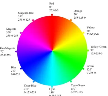
Hues in the RGB Color Circle are arranged from the top 0˚ (red), continuing by 30˚
clockwise for each color as seen in Figure 3.
Figure 3. RGB color wheel
10
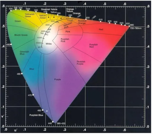
2.2.2 CIELAB color system
CIELAB is a recent system derived from the CIE color space and is based on
spectrophotometric measurements of color samples illuminated by specific types of
lighting and uses the responses of a standard observer (Ferhman & Ferhman, 2000,
p.209). CIELAB uses color attributes as three dimensions (x- hue, y-saturation, and
z-brightness). In this system relative amounts of primary colors (red, green, blue) are
mixed to describe and indicate any color (Figure 4). It supports a uniform color
system to differentiate industrial color differences in scientific studies (Agoston,
1987). Color samples of this system are described in terms of coordinates (Mahnke
& Mahnke, 1987).
Figure 4. The CIE chromaticity diagram
11
2.2.3 Munsell Color System
Munsell Color System developed by A.H. Munsell in 1905, is a widely
internationally accepted system and is used in various research fields. It explains
surface colors in terms of three attributes such as hue, chroma (saturation) and value
(brightness) (Agoston, 1987). This system consists of five major hues such as red
(R), green (G), yellow (Y), purple (P) and blue (B); five intermediate hues such as
yellow-red (YR), green-yellow (GY), blue-green (BG), purple-blue (PB), and
red-purple (RP) (Hunt, 1987) (Figure 5&6).
Figure 5. Munsell Color Circle Figure 6. Munsell Color solid (http://munsell.com/)
Each hue mentioned above is subdivided further into four sections and denoted by its
initial such as: 2.5R, 5R, 7.5R, 10R (Mahnke & Mahnke, 1987). Chroma is indicated
by numbers ranging from 2 (the least saturated) to 14 (the most saturated) (Beach,
Wise & Wise, 1988). The Value (V) (brightness) level is described on a scale from 1
to 10 and describes the brightness of comprehended color as the luminance effect; 1
is the value of black, 10 the one of white and in between values belong to grey
12
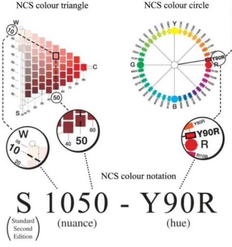
2.2.4 Natural Color System (NCS)
NCS, produced by the Swedish physicist Tryggue Johansson enables the observers
with normal vision to evaluate surface colors without color measurement
instruments. It is the most used system in psychological studies related to color
perception, since it does not involve having any particular color knowledge in order
to use it (Agoston, 1987). This system is based on the experiences of the observers
when coping with color stimuli, making it widely used by architects and designers
(Kuehni & Schwarz, 2008).
This system uses the four primaries such as red, yellow, green and blue since they are
not a result of any mixture of colors (Hunt, 1987). These colors are arranged in a
circle with 9 subdivisions between each, obtaining in this way 40 hues in total. As
seen from the Figure 7, hues obtained from the combination of the primaries are
named as Yellow-Red (YR), Red-Blue (RB), Blue-Green (BG) and Green-Yellow
(GY) (Figure 7). If the hue has 10% unitary yellow and 90% unitary red it is denoted
as Y90R.
Figure 7. NCS Color circle
13
Furthermore, each hue is explained in color triangles regarding the pure hue in
relation with black and white. If the relative amounts of blackness (S) is 10% and
50% hue (C), its NCS notation is S1050-Y90R (Figure 8). The color triangles explain
values of blackness, whiteness and chromaticness. In the NCS Atlas there are 1750
color samples (Swedish Standards Institution, 1996).
Figure 8. NCS hue triangle of Y90R (http://thelandofcolor.com/color-theory-podcast/)
14
2.3 Human responses to color
While being used in design areas, color as a stimulus, has an important influence on
the psychological and physiological responses of humans. Its affective impact on the
viewer (user) has been of wide interest in various disciplines such as: color image,
color preference, color semantics, color emotion etc. (Ou, Luo, Sun, Hu & Chen,
2011).
Psychological and physiological responses of humans happen as a result of the
perception of the stimulus by the respondent. When a wavelength of light leans on
an object, the surface absorbs everything apart from that one color wave reflected
from it. This is the color that enters in our eyes and is absorbed by one of its cones
(red, blue or green) (Morton, 1995). The nerves located in the eye transmit this
information to our nervous system and consequently we give responses according to
the interpretation our brain has done. Different variables such as culture, background color, lighting and context can affect people’s perception about color, their responses
and preferences (Chen et al., 2015).
2.3.1 Color preferences in terms of color attributes
Preferences have a salient impact on our judgements and decisions, such as which
furniture to buy and which kind of clothing to wear (Palmer, Schloss & Sammartino
2013). In a big domain of things, we tend to prefer something more than the rest.
Color, as an important visual element in our everyday life has been widely studied in
terms of preference. Learning how visual preferences are structured gives insights into the role of visual cues which shape an individual’s decisions. This is a very
15
Changes in color’s attributes, (hue, saturation and brightness) influence color
preferences. Studies have found that at a constant saturation and brightness
short-wave length colors are preferred to long-short-wave length ones (Guilford, 1934; Guilford
& Smith, 1959; Sivik, 1974).
More specifically, Guilford (1934) conducted a research for the affective value of 40
colors (18 hues equal in saturation and brightness, 11 hues varying in brightness and
low in saturation, and 11 hues in high saturation) chosen by the Munsell Color
System. The sample group consisting of 5 men and 5 women ranked the colors
according to a pleasantness scale. The researcher found that when the hue is kept
constant, lighter and more saturated colors are preferred more than darker and less
saturated ones. In another study in collaboration with Smith, Guilford (1959) used
316 color stimuli from the same color system. Also, they increased the number of
respondents to 40, 20 men and 20 women. This study contributed to literature by
finding that at a constant saturation and brightness level, green-blue colors range is
preferred more than yellow-reddish one.
Sivik (1974) asked a stratified sample of Swedish adults to give responses about 71
color spaces chosen from the NCS Atlas according to different semantic scales in
terms of four factors: excitement, evaluation, potency and temperature. The study
(Sivik, 1974) supports the assumptions that brighter and more saturated colors are
preferred more, and blue was found to be the most preferred hue apart from
saturation and brightness level.
A more recent study conducted by Camgöz, Yener & Güvenc (2002) resulted in the
same line as the studied above. The importance of this study stands because until
16
mentioned study, stimuli were presented on other colors, but the findings were still
consistent with previous studies. Brighter and more saturated colors were preferred
more and blue was the most preferred color above all. They also stated that all the
three attributes of color stimulus influence color preference.
In another study, respondents experienced realistic full scale red and blue interior
spaces. After physiological and affective measures were taken, it was found that
saturation compared to hue and brightness, had the biggest influence on people’ color
perception and responses (Mikellides, 1990). This study is important because it gives
some insights about human responses to colors in interior spaces.
In terms of color attributes, it can be concluded that bright, high saturated and short
wavelength colors are preferred more than the other ones. Blue is the overall
preferred color (Eysenck, 1941; Valdez & Mahrebian, 1994; Dittmar, 2001; Bakker
et al., 2015; Sivik, 1974; Camgoz et al, 2002).
2.3.2 Color preference factors
There are some factors which may affect color preference of individuals. Color
preferences are mainly influenced by age, gender, culture, context and design
training (Chen et al, 2015).
2.3.2.1 Color preference by age
Different studies have found differences in color preferences of two or more sample
groups differing in age. Ou et al. (2011) analyzed if individual responses in terms of
17
respondents, respectively 20 young and 20 old ones. They underwent an experiment
by showing colors in isolation and combined, and consequently answered in terms of
4 word pairs: like-dislike, warm-cool, heavy-light and harmonious-disharmonious.
Results showed that for single colors, all color samples were evaluated as less active,
less liked and cooler by older respondents rather than the young ones.
Another research by Manav (2007) supported that age is a determining factor in
selection of achromatic black for color preferences. In her research with 50
respondents divided in three groups according to their age ranges: 18-32 years old,
33-47 years old and 48-62 years old, it was concluded that all the respondents
belonging to the last group preferred black.
Dittmar (2001) carried out a study with 842 adults aging from 19 to 90 years old.
They were divided in two groups according to their age and were asked about their
least and most preferred color that they had chosen by name out of four given colors
(blue, green, red, yellow). He concluded that color preference is a variable changing throughout a human’s life span. He also found that with the increasing of age, the
tendency to prefer blue decreases and an inclination towards green and red starts to
appear.
Bakker et al. (2015) conducted an important study in terms of color preferences. It is
important because of the large number of the sample set and the wide information
obtained. In the questionnaire handled to 1095 Dutch people, they asked about their
color preferences about different topics (general, clothing, interior spaces, and mood)
in relation to personal characteristics such as age, education, gender etc. This study
18
2.3.2.2 Color preference by gender
Gender issues are of wide interest in color studies. Researchers have found
differences in color preference according to gender (Eysenck, 1941; Funk & Ndubisi,
2006; Manav, 2007; Beniani &Yamamoto, 2014; Bakker et al., 2015)
Funk & Ndubisi (2006) in their research about how color can simulate and increase
appeal power of product found some preference differences between male and
female Lithuanian respondents. The findings obtained from 196 consumers who were
randomly selected and responded to the questionnaire, show that female respondents
chose white, blue and green as their favorite color much more frequently, whereas
men preferred red more often than women.
Another study tested 208 observers whose majority were British and aged 20–26
years old. They picked their preferred color from a series of pairs of small colored
rectangles in a neutral CRT display. In terms of gender differences it was found that
female observers preferred red-range colors more than male ones (Hurlbert and Ling,
2007).
Manav‘s (2007) study about color preferences including 30 males and 20 females,
found a relation between gender and responses for the achromatic black. Female
respondents had positive responses towards black color samples, whereas men did
not.
Bakker et al.’s (2015) study concluded that in general blue is the overall preferred
color, when 25% of males and 13% of females preferred it. Secondly,18 % of
females and 16% had not a particular color preference. In the clothing context, black
was found to be in the first place mostly chosen by women, whereas male
19
Conflicting with the studies above, there are also some studies which in fact did not
find any gender differences in color preferences (Ou, Luo, Woodcock & Wright,
2004; Camgoz et al., 2002). It is an aim of this study to investigate gender
differences in the color-texture association preferences.
2.3.2.3 Color preference by culture
Cross-cultural studies have shown that culture and the meanings given to specific
colors also affect color preference (Gunnerod, 1991; Saito, 1996; Shoyama,
Tochihara & Kim, 2003; Beniani & Yamamoto, 2014 etc).
Saito (1996) in a study containing three surveys showed cross-cultural differences
and similarities in color preference among Asian groups. In the first survey
respondents from four large cities in Japan were asked to rank the three most liked
and the three least liked color chips from 65 of them. The second survey applied the
same method to respondents from Seoul, Korea and Tokyo, Japan focusing more on
the preference of white. The last survey consisted of respondents form Taipei and
Tokyo and it also focused on the preference of white. Findings demonstrated that,
there exists a general inclination of Asian people towards the preference of the white
color. Specifically for this study, Japanese respondents significantly ranked white as
their first, second and third most preferred choice.
Even in between Asian cultures there exist differences. Gunnerod (1991) in his study
related about marketing flowers stated that Japanese people prefer white, while Hong
Kong originated respondents prefer red.
Shoyama et al. (2003) carried out a comparative study between Japanese and Korean
20
elderly clothes were shown to the sample group. They concluded that Japanese
women consumers prefer black and light greyish orange for clothing, while Korean
women preferred light grey and dark blue.
Baniani & Yamamoto (2014) on their comparative study on correlation between
personal background and interior color preference, found differences in the color
varieties used by respondents while coloring the given space images. Foreigners
living in Japan (originating from all continents) and Iranians used more colors while
painting the given spaces than Japanese respondents.
In another study, where 582 undergraduate students were asked about their color
preferences, it was found that African Americans prefer colors in the range of
red-purple-black, whereas white race respondents prefer blues and greens (Silver et al.,
1988)
The above mentioned results were also supported by Weigersma and Elst (1988) in
whose study blue was the most overall preferred color by Dutch respondents, apart
from the ones from Senegal who preferred red and black.
2.3.2.4 Color preference by context
Some of color preference studies are concerned about the preference of an overall
favorite color, while some studies aim is to find a favorite color for a specific
context. Context plays a crucial role in color preference (Bakker et al., 2015). For
example colors located in the yellowish range are rarely mentioned as preferred
colors, but in advertisements yellow is one of the most used colors because of its
21
Gage (1995) and Bakker et al. (2015) found that black is the overall preferred color
for clothing. Even though gender and educational derived differences were found in Bakker’s study; in the clothing context, females prefer black while males prefer more
blue or dark blue. It is originated by the fact that people are viewed as more elegant
and attractive while dressed in black and red (Roberts, Owen & Havlicek, 2010).
Furthermore respondents having a university educational level chose blue as the most
preferred clothing color, while other respondents who had a higher or lower
vocational education level chose black as their most preferred color (Bakker et al.,
2015). Moreover, Schloss, Strauss & Palmer (2012) asked 48 respondents about
their preference towards 37 colors in different clothing contexts: dress shirts/blouses,
ties/scarves, and T-shirts. They concluded that there exist differences in color
preferences according to clothing type.
Color plays a prominent role in physical environments because of its effects on user’s psychology. Because of the spaciousness it evokes, white is the most preferred
color for physical environments especially for workplaces (Kwallek, Lewis,
Lin-Hsiao & Woodson, 1996). A total 675 respondents participated in the study which
used nine office colors: red, green, white, orange, yellow, blue, beige, grey and
purple with two saturation and two value levels, and were evaluated according to
proofreading performance, mood states, and color preference. Respondents revealed
that they were more likely to work in white and beige environments (Kwallek et al.,
1996).
Bakker et al., (2015) asked in a questionnaire about the respondents’ most preferred
color for the physical environment. 41% of the respondents chose white as the most
22
In another study concerned about influences of red and blue colors on perceived
well-being and productivity of employers during regular meetings, the 52
respondents’ responses who completed the distributed questionnaires demonstrated
that low saturated colors of light blue, light aqua green are found to be preferred in
offices. (Bakker, van der Voordt, Vink & Boon, 2013)
Manav (2007) color preferences research for the case of residences stated that the
existence of a strong dependency and use of green in residences. When asked about
the color they would associate within a particular space, the frequency distributions
of the 50 respondents show that pink is more preferred in the sleeping and children’s
room; light blue in the living room; light yellow in the dining areas and corridors and
white in wet cores.
Color preferences change also according to the mood of the respondent. It was found
that respondents prefer white for ‘being quiet and focused’, red for ‘being energetic’
and no color preference for being creative (Bakker et al., 2015).
2.3.2.5 Color preference by design training background
Having a background in design related fields which give a specific knowledge on
color and color harmony can affect color perception, preference and usage. Beniani
and Yamamoto research (2014) asked respondents to color the given space images
(an interior and exterior one) with 24 given colors. In the demographic questionnaire
they handled first, they also asked about the major of the respondents and if their
parents had art related backgrounds.
The finding of this study showed that respondents who had a major in art and design
23
not. Additionally, students who had parents with a design related background, made
use of more colors than the remaining part of the sample group. This leads to an
assumption that individuals who have an art or design tie in their life are more
sensitive to the use of color as a visual element.
The current study tends to find any difference in color preferences of two different
sample groups having different design related backgrounds. The first sample group
consists of people studying a major in art, design and architecture. They are named
as Design Trained (DT) respondents, whereas the second group consists of
individuals studying other majors rather than the ones mentioned above. They belong
to the Non Design Trained (NDT) sample group.
2.3.3 Cross preferences
Accumulated evidence suggests that individual preferences for different domains are
not independent but on the contrary they are correlated with each other. People who
show a specific preference in a particular domain also tend to prefer certain
information in other domains. These associated preferences lead to intertwined or
cross preferences between different domains. They can be determined by different
factors such as individual taste or personality traits (Chen et al, 2015).
Eysenck (1941) while studying aesthetic preferences for different domains (color,
painting, polygons, lines of poetry and odors) noted some correlated preferences
between these domains. He suggests a factor named ‘good taste’ has the main impact
on these correlations.
Later, Palmer and Griscom (2010) found that preferences for different domains (color, shape, volumetric location and music) were correlated with individuals’ own
24
harmony judgements. In their study, ninety respondents were asked about their
preference towards 127 visual stimuli in terms of aesthetic preference and later for
harmony. Before they responded about their visual preference they were also
presented to the musical selections.
Chen et al. conducted a study in 2015 which is related to cross preferences of color
and shapes. They concluded that color and shape preferences were partly but
systematically correlated. Individuals who preferred simple shapes, had a tendency to
prefer light and warm colors; while the ones who preferred complex shapes tended to
prefer dark and cold colors.
It was assumed that the current study would find any relationship of this kind
between color and texture. It was expected that people who prefer a specific color
25
CHAPTER 3
TEXTURE
3.1 Definition of texture
‘‘Texture includes the visual surface appearance and the feel of material’’ (Koester,
1993, p.1). It stimulates both our visual and our tactile perceptions. ‘‘The sensation of touching, holding and squeezing textures is also known as hand’’ (Koester, 1993,
p.1). The word itself comes from the Latin word ‘textere’ which means to weave
(Larsen &Weeks, 1975, p.6). All fabrics not only the woven ones have texture and
use it to make a material more desirable. Our presumption that texture is the
roughness or the granularity of a material is too narrow and partially wrong. Sleek
satins and frosty taffetas have textures too. ‘‘Fabric texture is the bas-relief of highlight and shadow on the ‘ups and downs’ of the construction’’ (Larsen &Weeks,
1975, p.8). The main texture descriptors are: the weave (texture type), its density
26
3.1.2 Texture characteristics
There are different adjective pairs describing the overlapping of the visual and tactile
sensation such as: crisp-limb, firm-flexible, opaque-transparent, rough- smooth,
shiny-dull, stretchy-stable etc. (Koester, 1993).
Fiber is the smallest component of the fabric but it strongly influences the texture of
the material. For example, wool gives soft textures while linen gives crisp ones
(Figure 9 &10). These fibers are joined in different lengths and methods to form a
yarn.
Figure 9a. Wool fabric’s texture Figure 9b. Linen fabric’s texture
(https://www.fabric.com/)
Spinning of the yarn is an important factor determining both the weave and the
density of the texture. This is also called as fabric construction, which is the result of
yarn, the order of interlacing and the density. At the same time spinning (the amount
of yarn) determines the texture strength of a fabric, whether it will be a fine or a
coarse texture. (Larsen & Weeks, 1975). The weave of the fabric determines
important aspects of the fabric such as its weight, flexibility, firmness and stability
27
3.1.2.1 Opacity and transparency of textures
Other important characteristics of texture are the opacity and transparency of the
fabric and the amount of these characteristics. Fabrics can be opaque, which slightly
admit light, or transparent in which you can see through. The range between
opaque-transparent is immense, though making possible innumerable textures. There exist
also fibers which sparkle in light such as metallic or translucent monofilaments
(Koester, 1993) (Figure 10).
Figure 10. Metallic filaments
(http://www.thesewingdirectory.co.uk/fabric-glossary/)
3.1.2.2 Relief of textures
For the visual aspect, relief is known as highlight and shadow. That’s why the
amount and the direction of the light which illuminates the texture are of great
importance. For the tactile aspect, the relief of texture is the broken or the uneven
surface sensed by touching the fabric. In some fabrics relief can be only visual,
because of the two different yarns (light-dark) that are perceived as highlight and
28
The effect of the relief of textures on the psychology of individuals dates long ago in
time. These rhythmic textures and patterns, presented in the physical environment
behave as a stimuli for humankind. During modern architecture, the variety of
natural textures found in sound and foliage seemed to be absent because of the
massive use of concrete (Larsen & Weeks, 1975). Lately, because of the awareness
of sustainable materials and design solutions, natural textures have become an
important part of our lived spaces.
In interior spaces, paint, plastic and glass by offering smoothness consequently lack in relief. That’s why among the readily available materials fabric is the one that
mimics nature by its broken color and its shades and shadows. Fabric’s relief
(softness and textured surface) influences psychological responses of users. As an
example, light and airy casements fabrics provide privacy regardless the usage of
outdoor spaces or sunlight (Larsen & Weeks, 1975).
3.2 Color and texture
Color and texture are tightly tied up with each other in design fields. While buying a
fabric, they are the main aesthetic values a consumer gives attention to. Color is
usually introduced in interiors by the use of materials. Fabrics within their wide
range in colors and textures have become a changeable and feasible design
component.
Color is usually judged according to its amount, or the juxtaposition it has to other
colors. On the other hand, for fabrics, color can be judged also in relation to the
29
3.2.1 Color-Texture related studies
A lot of various studies had on focus the investigation of the fabric’s texture impact
on its color. Color affects the quality of the fabric and on the other hand the color
itself is influenced by the texture of the fabric (Xin et al., 2005). Texture structures
are known to have an effect on both instrumental and perceived colors (Luo, Tsang,
Shen, Shao & Xin,2014). The instrumental color of a fabric is the color measured by
a device called spectrophotometer, which assumes the surfaces of the fabric are flat
when measured (Hunter & Harold,1987). Studies related to color and texture are
mainly divided in three main categories: the effect of texture on color difference; the
effect of texture on color attributes; the effect of texture on color judgements (Luo et
al, 2014). The current study aims to belong to the last stated group.
3.2.1.1 The effect of texture on color difference
The first ones investigating how addition of texture to a color affects its perception
were Kuehni and Marcus (1979). Their study concerned about visual scaling of small
color differences included six colors. The object-color samples were evaluated
according to their subjective estimation and ranking. In this study, they concluded
that the minimum value to perceive a difference between different texture types was
one CIELAB unit.
Furthermore, Xin, Lam & Luo (2003) studied the effect of texture and the texture
pattern amount of 15 woven textiles on the visual color difference evaluation. The
findings of the study supported the assumption that fabric samples have a significant
30
(CRT) monitor also contributed to the literature by finding that when texture strength
is increased 10 times, color difference evaluation decreases by 0.25 CIELAB unit.
Moreover, another study conducted by Han, Cui & Luo (2003) explored the effect of
the texture pattern on the visual color difference evaluation. 15 different textures
mapped within 3 colors: red, green and blue were shown in a CRT display. In total,
30 color difference image pairs were produced, two for each texture. The color
differences between textured and non-textured color samples demonstrated that color
texture mapped pairs show a reduction of 35-43% of visual color difference. They
also found that the increasing of texture strength, decreases visual color difference
result.
Furthermore, in a research by Kandi & Tehran (2008) eight different polyester
textures were dyed by seven colors: red, orange, brown, yellow, green, blue and
purple in five different concentrations of these colors. In the end 280 samples were
achieved for the experiment (8 x 7 x 5) and investigated in terms of color difference
formulae. Twenty three observers assessed the color differences of the displayed
pairs by using the grayscale method. The findings indicated that texture structures
had a significant effect on the color difference formulae.
Han et.al (2003) simulated fine and coarse textures in CRT to investigate color
difference for automobile coating. They found an insignificant impact of texture on
color difference in this particular context. This was inconsistent with the previous
31
3.2.1.2 The effect of texture on color attributes
Addition of texture to a color sample, consequently affects its color attributes. Luo et
al. (2014) explored the influence of texture surface of fabrics on its instrumental
color. This study used eighty four knitted cotton yarn dyed fabrics. They were dyed
in four colors: green, grey, red, blue and had 21 different texture structures. The
findings of this study could be used to remove the effect which texture has on the
instrumental color of a fabric measured by spectrophotometer. They could achieve a
reduction of 79%, 55%, 71% and 57% on the effect textures have on the color
difference of the four colors used in this study.
Shao, Xin, Zhang & Zhou (2006) explored the influence of texture structures of
knitted fabrics on visual and instrumental color. It was found that textures have a
significant impact on the hue, chroma and lightness values of the color of the fabric.
An important study conducted by Montag and Berns (2000) resulted that textures
increase the lightness tolerance thresholds. The term tolerance used in this study is the ‘‘perceptibility of color differences in comparison to a standard color difference
set’’ (Montag & Berns, 2000, p.1). The experiment consisted of simulated thread
wound textures in a card on CRT. The investigation was finalized by approving that
texture affect lightness tolerance, and lightness tolerances affect lightness thresholds.
Another important finding of this study was stating that texture’s impact on the
increasing of lightness tolerance thresholds is two times higher compared to the
regular stimuli.
Huertas, Rivas, Yebra and Perez (2004) studied a similar topic which investigated the influence of texture on color attributes’ tolerances. They used simulated textures
32
influences the tolerances of lightness, chroma and hue. Textures have a bigger
impact on the lightness tolerance rather than hue and chroma ones.
The effect of surface texture on its color has been investigated also in terms of
luminance and chromaticity values. Luminance is the intensity of light a surface
emits for surface unit. (Luo, Tsang, Shao & Xin, 2013). In this study 268 knitted
fabrics in 67 texture types and dyed in 4 color spaces are used and evaluated in terms
of color difference. It was found that texture of the fabric influences its luminance
rather than its chromaticity (Luo et al., 2013).
3.2.1.3 The effect of texture on color judgement
Texture has an impact on color and its attributes. Color’s hue, saturation and
brightness have a major impact on color perception and color judgements. The
earliest study exploring the effect of texture on value of colors and their apparent
warmth (preference) was conducted by Tinker in 1938. It used only paper and a cloth as two different textures and in fact, he didn’t find any significant effect of texture on
the two tested variables. Reasons behind these results may be the lack of available
methods provided at that time.
Recent studies found that surface texture changes the emotional effect of colored
textile samples (Lucassen, Gevers & Gijsenij, 2010). Ten respondents were asked
about their emotional responses towards simulated color chips in terms of four
scales: warm-cool, masculine-feminine, hard-soft and heavy light. In the first phase
of the experiment, they had to rank only solid colors according to the scales before
mentioned. After, grayscale textures produced by using Perlin Noise were displayed
33
structure used in pseudo-random appearance of texture generations. All the visual
details in Perlin noise images are the in same size meaning that it represents a single
texture. The textures produced for this study are achromatic, differing only in
lightness. By parametrizing Perlin noise we can obtain random sample of textures by
only randomly sampling the Perlin parameter space. As the last part of the
experiment, color and texture were mapped with each other and the respondents
ranked their emotional responses once again. As a result, the study concluded that
when texture is added to uniform color samples, color emotions change. More
specifically, the hard- soft scale of emotional responses is totally determined by
texture (Lucassen et al., 2010).
In the same line with this study, it was found that adding texture can significantly
influence the perceived unpleasantness of colors according to texture type (Simmons
& Russell, 2008). Even though this study is concerned only about one type of
34
CHAPTER 4
METHODOLOGY
4.1 Aim of the study
This study purports to find the existence of a relation between two design elements:
color and texture in terms of preference. Its aim is to explore color texture mapping
associations according to the visual preference of two different samples in a Virtual
Environment and abstract context.
4.1.1 Research questions
This study aims to find answers to the following questions:
1. Is there a dependency between color and texture in terms of preference?
2. Are there some specific texture types preferred more with some specific
colors?
3. Are there some specific texture strengths preferred more with some specific
35
4. Are there any differences in color-texture association preference between
design and non-design trained respondents?
5. Are there any differences in the preferences of color texture associations
between males and females in the non-design trained sample set?
4.1.2 Hypotheses
1. There is a dependency between color and texture in terms of preference.
2. One texture type is preferred more than the others apart from color.
3. Blue is the most preferred color apart from texture.
4. There exists a dependency between color and texture strength.
5. One texture strength is preferred more than the other apart from color and
texture type.
4.2 The experiment
4.2.1 Sample group
There were two sample groups participating in the study divided according to their
design-related background. The first group consisted of 100 design trained
respondents where 82 of them were female and 18 were male. Most of the
respondents (71%) of the first sample were sophomore students from the Interior
Architecture and Environmental Design Department of Bilkent University. The
remaining part were from Architecture, Graphic Design, Landscape Architecture and
Communication and Design Departments in different grades (See Appendix A).
36
On the other hand, the second group consisting of 96 non design trained respondents
had a more normal distribution in terms of gender such as 44 males to 52 females
(Table 1). The respondents studied in different departments of Bilkent University and
their mean age was 21.8 (See Appendix A).
None of the respondents in either sample groups were color blind according to
Ishihara Color Blindness Test and they had no other vision or color deficiencies
preventing them to participate in the study.
Table 1. Distribution of respondents by background and gender
Male Female Total
Design-trained 18 82 100
Non design-trained 44 52 96
Total 62 134 196
4.2.2 Experimental sets
4.2.2.1 Texture sets
Nurus design office and Tepe Home Mobilya donated some of their upholstery
textile catalogues to the Material Laboratory of Bilkent University on behalf of this
study. Since in between textures, the saturation and brightness values differed for the
same color, it was impossible to use these textile samples as physical experimental
sets for the study (See Figure 11 & 12).
Fig.11 Nurus design office samples Fig.12 Tepe home mobilya samples
37
Some studies (Kandi et al., 2008; Xin et al., 2005) have used an alternative but yet
innovative way to have realistic-like textile samples by scanning and then displaying
them in a Virtual Environment. At the same time this method would eliminate the
tactile sensation which could influence the preference results of the respondents in
the current study. Firat Color studio in Ankara scanned the neutral beige samples
from the textiles above, in grayscale mode by the help of Canon image FORMULA
DR-F120 Desktop scanner having a 2400dpi. The three scanned textile samples were
100% polyester and each had one of the three textures mostly used in the textile
industry: plain, basket, and broken twill (Xin et al, 2005). The images were modified
in Adobe Photoshop CS6 (RGB mode) with brightness and contrast values in order
to achieve the same light grey color (R: 214, G: 214, B: 214) (Figure 13).
Fig.13a Plain texture Fig.13b Basket Texture Fig.13c Broken twill
This study is concerned also about texture strength and two of the textures namely
plain and basket having also two texture strength levels: fine and coarse. The
following images show coarse levels of two of the textures (Figure 15).
38
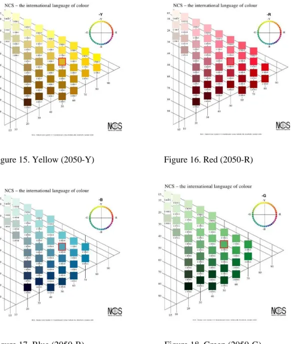
4.2.2.2 Color mapped sets
Because of its basic and abstract context, this study used the four unique hues
(Yellow, Red, Blue, Green) obtained from the Natural Color System Catalogue. NCS
is suitable for everyone with normal color vision to make color evaluations without
using color-measuring instruments (Agoston, 1987, p. 133). This system is used to
directly determine the perceived color of a specific surface. This color measurement
is an absolute measurement according to color perception. It describes the formal
basic elements of color language and it provides the ability to identify characteristic
similarities and relations between colors (Hard and Sivik, 2001).
In this study the four psychological primaries were used: yellow, red, green and blue.
In the NCS, colors are defined by the relative amounts of the basic colors that are
perceived presented by percentages (Hunt, 1987). The saturation and brightness
values used are the ones who mostly resemble the ones of physical samples. The
used NCS specifications are S2050-Y, S2050-R, S2050-G, and S2050-B. . For
instance, the S2050-Y color the yellow value is 100%, whiteness value (W) is 30%,
and blackness (S) is 20% and the C (chromatic component) 50%. In the hue triangle,
by the relative amounts of S, W, and C, the perceived color can be represented (see
39
Figure 15. Yellow (2050-Y) Figure 16. Red (2050-R)
Figure 17. Blue (2050-B) Figure 18. Green (2050-G) (http://www.ncscolour.co.uk/information/ncs_system.html)
By installing the NCS color swatches in the Adobe Photoshop Software, the chosen
color specifications were picked by Color Picker Tool and then were mapped with
the texture patches prepared previously. The achieved images (4 colors x 3 textures
=12) having dimensions of 5x5 cm were placed in a neutral grey background (R:
192, G: 192, B: 192) (See Figure 19). The same was applied for the coarse texture
40
In order to reduce order effect, the squares’ location changed randomly for every
respondent according to a sequence obtained by random.org.
Figure 19. Texture-color mapped images
41
4.2.3 Settings of the experiment
Design trained respondents carried out their experiment in the building science
laboratory of the Department of Interior Architecture and Environmental Design, at
Bilkent University (Figure 21). It is a 17.138 m2 space having white painted walls and ceiling. This room was suitable for the experiment because of its lack of
windows and the facility to have controlled lighting. The environmental setup had
cove lighting which is suitable for experiments carried out in front of computer
screens in order to prevent glare. Standard Philips TL 54 fluorescent, having 6200
color temperature (CT) and 72 color rendering index (CRI) were used to provide
lighting in the room. The illuminance level measured by Minolta Illuminance meter
in the room was measured and fixed as 300 lx
42
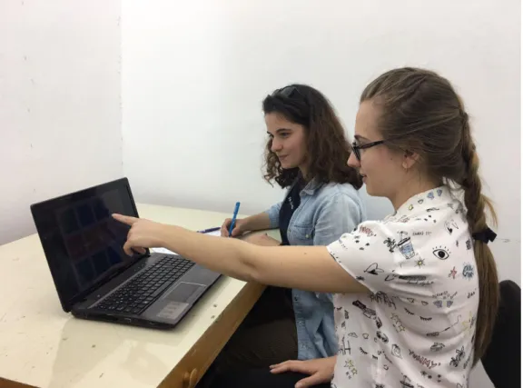
On the other hand, non-design trained respondents completed the experiment in one
of the windowless booths (NO: 8) in the Multimedia Room at Bilkent University
Library. These spaces are rooms used mostly for group study and at the same time
supply an isolated area in which there is not any obvious interaction between the
inside and outside.
This space satisfied the same conditions in terms of lighting as the laboratory in the
FC building stated above. At the same time it was one of the most accessible places
to find respondents who had no design related background (Figure 22).
43
4.2.4 Procedure
The experiment consisted of showing the respondents a 1366 x 768 pixels, 32 bit
color depth and 60 Hz refresh rate calibrated built- in (laptop) display. (See
Appendix B). Twelve color-texture mapped squares were shown in a neutral grey
background (R: 192, G: 192, B: 192). The respondents were sit 50 cm far from the
front of the monitor placed in the experimental setups mentioned above (see 4.2.3).
Firstly they answered some questions about their demographic information (See
Appendix B). Respondents with vision deficiencies used the necessary equipment
(glasses or lenses) to correct them.
The respondents were asked to carefully observe all the squares in the image, and
then to choose the square they prefer the most without considering it in any context. The question was asked in Turkish ‘‘Bu kareleri inceledikten sonra, en çok tercih
ettiğiniz kare hangisi?’’. The English version of the question was: “After observing
all the mapped squares in the image, which one do you prefer the most?’’ If the
selected square had a plain or basket texture, the experiment continued with a second
phase. The preferred square was shown in the same color and texture but only the
texture strength changed. The respondent had to choose between fine or coarse
textures of the previously chosen color-texture association. After the researcher
marked down the answers, the experiment was over. Respondents also answered the
questions about whether they have conservative or changing color preferences (See