468
|
wileyonlinelibrary.com/journal/cote © 2020 Society of Dyers and Colourists Coloration Technology. 2020;136:468–475.1
|
INTRODUCTION
“To prefer” means to like the most and preferences are based on taste as well as on visual, tactile, auditory and olfactory signals. Visual aesthetics is considered to be the primary fac-tor affecting preference.1 People show specific preferences
towards different aspects of their surroundings; some prefer certain colours, and specific shapes, patterns and textures to others.2 In our surroundings, colour is rarely seen as an
isolated element. More specifically, in interiors colour has a major impact on the quality of space, where most of the mate-rials used have their own specific textures. “Non-uniformity of objects colours (texture) and their environment seems to be the rule rather than the exception (p. 426).”3
Colour and texture are complementary to each other in design fields. Especially in the textiles industry, the relation-ships between colour and texture have been widely studied.4-6
Colour affects the quality of fabric,4 but colour itself is also
influenced by the texture of fabric.5-6 Texture can
perceptu-ally and instrumentperceptu-ally affect the colour of fabric.6
Researchers divide studies related to the effect of fabric texture on colour into three categories5: the influence of
tex-ture on colour difference, the influence of textex-ture on colour attributes and the relationship between texture descriptors and colours. This study pertains to the last group and at-tempts to find a relationship between colour and texture in terms of preference. There is a gap in knowledge in that there are not enough sources related to the association of these two variables in terms of preference. The majority of studies analyse the effect of texture on colour difference or colour attributes but none have explored the existence of a relation-ship between these factors. This study is concerned not only with texture type-colour association, but also with the texture strength (coarseness level)-colour association.
O R I G I N A L A R T I C L E
Colour-texture mapping associations in terms of preference
Ela Fasllija
1|
Nilgün Olguntürk
1|
Dilek Güvenç
21Department of Interior Architecture and
Environmental Design, Bilkent University, Ankara, Turkey
2Department of Mathematics, Bilkent
University, Ankara, Turkey
Correspondence
Ela Fasllija, Bilkent University, Ankara, Turkey.
Email: [email protected]
Abstract
Basic design is the origin of many design-related fields and covers different concepts such as pattern, colour, texture and relief. Because colour is rarely seen as a uni-formly plain element, current research embraces colour and texture as equally impor-tant variables. Investigations consider the association of colour and texture in terms of preference. One hundred individuals trained in design, as well as 96 individuals not trained in design, participated in an experiment in a virtual and abstract environ-ment. We chose four primary colours from Natural Colour System colour space (yel-low, red, green and blue) with the same saturation and brightness values. They were associated with three different texture types (plain, basket and broken twill), which we obtained by scanning the physical textile samples. In the second part of the exper-iment, we attempted to find a relationship between colour and one texture variable, in this case texture strength. The results of the study do not verify the existence of a de-pendency between colour and texture in either sample group. Also, there is no verifi-cation that a relationship between colour and texture strength exists. Furthermore, the results show that overall blue is the most preferred colour. Moreover, all participants preferred fine textures to coarse ones. Design-trained participants often associate fine strength level with basket texture whereas the non-design–trained participants more often associate it with plain textures. Lastly, the majority of participants state that blue is their most preferred colour in fine rather than coarse textures.
1.1
|
Colour-texture related studies
Kuehni and Marcus7 were the first researchers to investigate
how the addition of texture affects colour perception. They evaluated object-colour samples according to their estima-tion and ranking, and concluded that the minimum value to perceive a difference between different texture types was one CIELab unit. Xin et al8 also studied the effect of texture
and texture pattern in 15 woven textiles upon visual colour difference evaluation. Their findings supported the assump-tion that fabric samples have a significant impact on colour difference evaluation. Another study9 explored the effect of
texture pattern on visual colour difference evaluation. The colour differences between textured and non-textured col-our samples demonstrated that colcol-our-texture–mapped pairs showed a reduction of 35%-43% in visual colour difference. The authors also found that increasing texture strength de-creased the visual colour difference. In another study, Kandi and Tehran10 dyed eight different polyester textures with
seven colours, red, orange, brown, yellow, green, blue and purple (each in five different concentrations of colour). The results indicated that texture structures have a significant ef-fect upon colour difference. Han et al9 simulated fine and
coarse textures in automobile coatings and found an insignif-icant impact of texture on colour differences in this particular context. These results may have turned out like this because of the specific context given to the study.
The addition of texture to a colour sample affects the co-lour's attributes. Shao et al11 explored the influence of texture
structures of knitted fabrics on visual and instrumental colour and discovered that texture had a significant impact on the hue, chroma and lightness values of fabric colour. Montag and Berns12 revealed that textures increase lightness
toler-ance thresholds, and concluded that texture affects lightness tolerance, which in turn affects lightness thresholds. Another important finding of this study was that the impact of texture on the increase in lightness tolerance threshold was two times higher than that of regular stimuli. A similar study13
investi-gated the influence of texture on colour attribute tolerances. The authors used simulated random dot-textures on single co-lour samples and found that this type of texture influences the tolerances of lightness, chroma and hue.
Since texture has an impact on colour and its attributes, hue, saturation and brightness each have a major impact on colour perception and colour judgements. The earliest study to explore the effect of texture on the value of colours and their apparent warmth (preference) was conducted by Tinker14 in 1938. He only used paper and cloth as his texture
samples and did not find any significant effect of texture on the variables. One explanation for this may be a lack of avail-able materials at that time.
Lucassen et al found that surface texture changed the emo-tional effect of coloured textile samples.3 Ten respondents
were each asked to describe their emotional response to sim-ulated colour chips in terms of four scales, warm-cool, mas-culine-feminine, hard-soft and heavy-light. In the first phase of the experiment, the participants had to rank solid colours according to the scales. Next, grayscale textures produced by using Perlin Noise were displayed on the computer monitor and were ranked horizontally. The textures produced for this part of the study were achromatic, differing only in lightness. In the last part of the experiment, colour and texture were mapped with each other and the respondents were asked once again to rank their emotional responses. The conclusion was that when texture was added to uniform colour samples, the respondents’ emotional reactions to each colour changed. More specifically, the hard and soft scales of emotional re-sponses were entirely determined by texture.3
In line with this study, it was found that adding texture can significantly influence the perceived unpleasantness of colours according to texture type.15 Even although this study
was only concerned with only one type of emotion, it pro-vides clues as to the importance of texture in colour samples. The current study aims to find a relationship between two design elements, colour and texture, in terms of preference. The intention is to explore colour-texture–mapping associa-tions according to visual preference for two different samples in a virtual environment as well as an abstract context.
2
|
METHODS
2.1
|
Sample groups
To gain deeper insights into people's preferences two sam-ple groups were recruited, each with a different background in terms of design training. Previous studies16,17 suggest that
sample groups with different educational backgrounds ex-hibit contrasting approaches in terms of colour preference. An empirical study compared architects' and non-architects' evaluative and cognitive opinions and found that colour pref-erence and the semantic rating of arousal and naturalness differed between the two groups.16 Furthermore, a study
com-paring the colour preferences of graphic design and informa-tion technology students with regard to living rooms verified that there is a significant relationship between educational background and colour preferences.17 In the current study,
the design-trained sample group consisted of 100 participants (82 females and 18 males). Most of the respondents (71%) in the first sample were sophomore students from the Interior Architecture and Environmental Design Department, Bilkent University. The others were from the Architecture, Graphic Design, Landscape Architecture and Communication and Design departments and of different grades. Ninety-six non-design–trained participants (44 males and 52 females) also participated in this experiment. None of the participants
in either sample group were colour blind according to the Ishihara Colour Blindness Test and they had no other vision or colour deficiencies preventing them from participating in the study.
2.2
|
Experimental sets
Nurus Design Office and Tepe Home Mobilya donated up-holstery textile catalogues for use in this study. Because the saturation and brightness values between textures differed for the same colour, it was impossible to use these textile sam-ples as physical experimental sets for the study.
Some studies5,6 have used an alternative but innovative
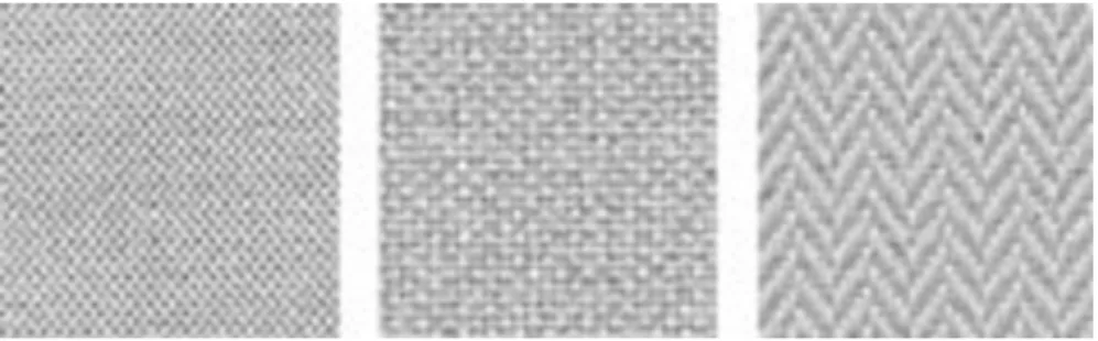
way to produce realistic textile samples by scanning then dis-playing them in a virtual environment. This method eliminates the tactile sensation. This is relevant in that tactile sensation could influence the preferences stated by the participants in the current study. Fırat Color studio scanned the neutral beige samples from the textiles in grayscale mode with the help of a Canon image FORMULA DR-F120 desktop scanner with 2400 dpi. The three scanned textile samples consisted of 100% polyester and each was one of the three textures used in the textiles industry, plain, basket or broken twill.6 The
images were modified in Adobe Photoshop CS6 (RGB mode) with brightness and contrast values to achieve the same light grey colour (R: 214, G: 214, B: 214; Figure 1A-C).
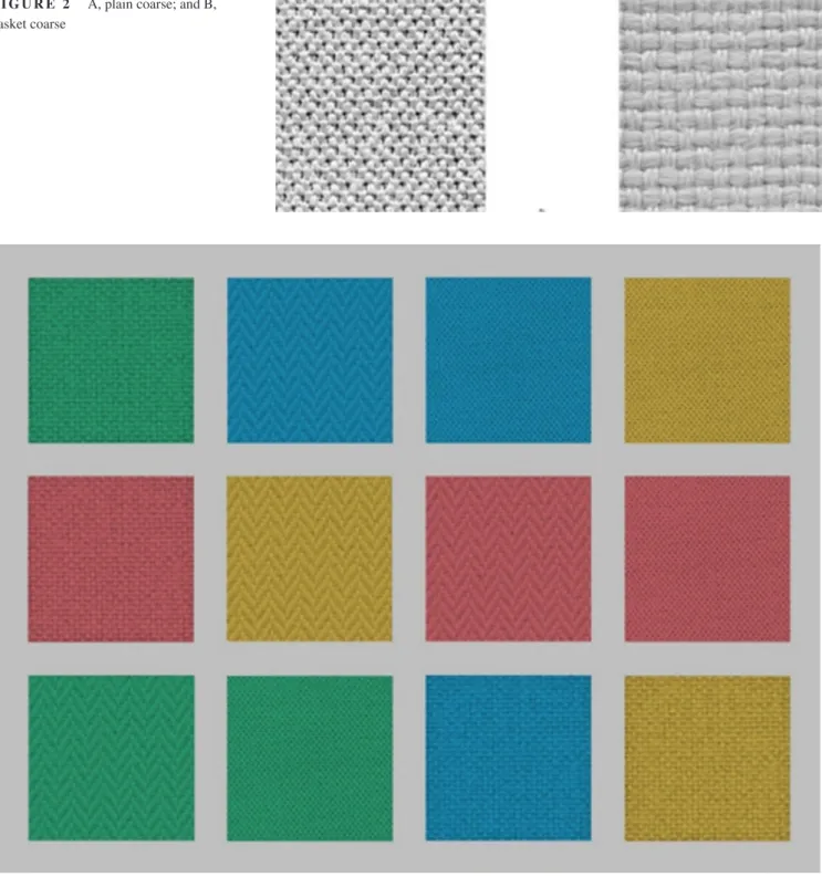
The current study also examined texture strength. Two of the textures (plain and basket) have two texture strength lev-els, fine and coarse (Figure 2A,B). Broken twill has only one fine texture strength.
2.3
|
Colour-mapped sets
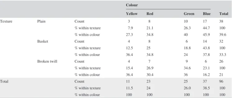
Because of its basic and abstract context, this study used the four unique hues known as the psychological primaries (yellow, red, blue, green) as obtained from the Natural Colour System (NCS) catalogue. The saturation and brightness values were those which most closely resembled the physical samples. The NCS specifications are S2050-Y, S2050-R, S2050-G and S2050-B. By installing the NCS colour swatches in Adobe Photoshop, we were able to pick the chosen colour specifications using the
Colour Picker Tool. These were then mapped with the texture patches prepared previously. The 5 x 5 cm images (4 colours x 3 textures = 12) were placed on a neutral grey background (R: 192, G: 192, B: 192). The same process was applied to the coarse texture samples in the second phase of the experiment. To reduce order effects, the squares’ locations were changed randomly for every respondent according to a sequence ob-tained by random.org (Figures 3 and 4).
2.4
|
The experiment
The experiment was conducted in a science laboratory (17.138 m2 with white walls), which was ideal because it was
windowless with controlled lighting. The environmental set-up had cove lighting, which is suitable for experiments car-ried out in front of computer screens as it prevents glare. The room was lit with Standard Philips TL 54 fluorescent lights with a 6200 Kelvin colour temperature and 72-colour render-ing index. The illuminance level was measured and fixed at 300 lx by a Minolta Illuminance meter.
In the experiment, the respondents were shown a 1366 x 768 pixels, 32-bit colour depth and 60 Hz refresh rate calibrated built-in (laptop) display. Twelve colour-tex-ture–mapped squares were shown on a neutral grey back-ground (Figure 3). The participants were seated 50 cm from the front of the monitor then asked to provide de-mographical information. Participants with visual defi-ciencies used spectacles or contact lenses to correct them. They were asked to carefully observe all 12 squares in the image then choose the square they preferred the most. If the first selected square had a plain or basket texture then the experiment proceeded to the second phase, when the pre-ferred square (eg, plain blue) was shown in the same colour and texture but with two different texture strengths (eg, fine plain blue and coarse plain blue; Figure 4). The participant had to choose between two squares, the fine or coarse tex-ture of their previously chosen colour-textex-ture association. If, in the first phase of the experiment, a participant chose any colour associated with the broken-twill texture, then the experiment ended for that participant in the first phase and they were not included in the analysis related to co-lour-texture strength associations.
FIGURE 1 A, plain; B, basket; and C,
3
|
RESULTS
3.1
|
Colour and texture
The data from the experiment were analysed using Statistical Package for the Social Sciences (SPSS) 20.0 software. To establish the existence of a possible depend-ency between the two main variables, colour and texture, we ran a Chi square test for independence. We then ran Chi
square goodness of fit tests to determine if the distribution of colour and texture was equal between their respective categories. One-sample binomial tests were used to ana-lyse colours, textures and texture strengths by comparing them in pairs.
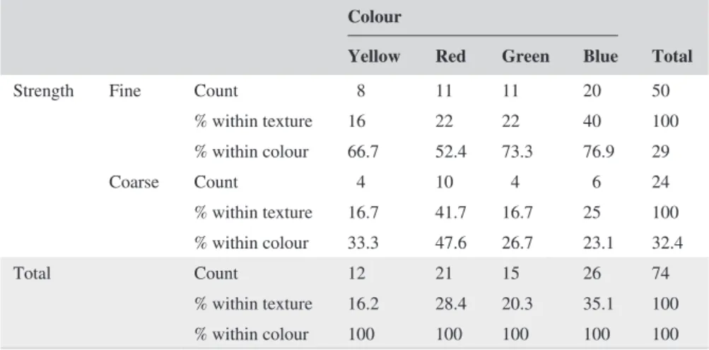
Participants’ colour-texture–mapped square preference frequencies are shown in Tables 1 and 2. Table 1 shows that 45% of participants chose the same basket texture irrespec-tive of colour, and that 38% chose blue as their most preferred colour, irrespective of texture type.
FIGURE 2 A, plain coarse; and B,
basket coarse
FIGURE 4 Fine coarse basket texture
mapped with blue [Colour figure can be viewed at wileyonlinelibrary.com]
TABLE 1 Colour-texture cross tabulation (design-trained)
Colour
Total
Yellow Red Green Blue
Texture Plain Count 5 8 6 10 29
% within texture 17.2 27.6 20.7 34.5 100
% within colour 25 33.3 33.3 26.3 29
Basket Count 7 13 9 16 45
% within texture 15.6 28.9 20 35.6 100
% within colour 35.0 54.2 50.0 42.1 45
Broken Twill Count 8 3 3 12 26
% within texture 30.8 11.5 11.5 46.2 100
% within colour 40 12.5 16.7 31.6 26.0
Total Count 20 24 18 38 100
% within text. 20 24 18 38.0 100
% within colour 100 100 100 100 100
TABLE 2 Colour-texture cross tabulation (non-design–trained)
Colour
Total
Yellow Red Green Blue
Texture Plain Count 3 8 10 17 38
% within texture 7.9 21.1 26.3 44.7 100
% within colour 27.3 34.8 40 45.9 39.6
Basket Count 4 8 6 14 32
% within texture 12.5 25 18.8 43.8 100
% within colour 36.4 34.8 24 37.8 33.3
Broken twill Count 4 7 9 6 26
% within texture 15.4 26.9 34.6 23.1 100
% within colour 36.4 30.4 36 16.2 21
Total Count 11 23 25 37 96
% within texture 11.5 24 26.0 38.5 100
In the second sample group (Table 2), the most pre-ferred colour was again blue (38.5%). The most prepre-ferred texture was plain (39.6%). To establish if there was a de-pendency between the two main variables, we ran a Chi square test for independence for both sample sets and found that colour and texture are independent of each other in terms of preference. For the design-trained sam-ple the results show that χ2 = 5.788, df = 6, P = .447 and
P > .05; for the non-design–trained sample, χ2 = 4.560,
df = 6, P = .589 and P > .05. These findings reject the
first hypothesis of this study, which states that a depen-dency between the variables exists. Moreover, a Chi square goodness of fit test explored whether different tex-tures would have resulted in different preference rankings and revealed that it was only in the design-trained sample group that texture types were not preferred equally (χ2
(2) = 6.260, P = .044, P < .05). The binomial one-sample test between texture types showed that the basket texture was preferred to broken twill (P = .033).
Previous studies18,19 suggest that blue is the preferred
co-lour in any context. A goodness of fit Chi square test was conducted to discover whether colour categories (yellow, red, green, blue) are equally preferred by the participants in both sample groups. It was found that different colours were not preferred equally by participants in the design and non-de-sign–trained groups ([χ2 (3) = 9.760, P = .021, p < 0.05] and
[χ2 = 14.167, df = 3, P = .003, P < .005], respectively). The
binomial one-sample tests found that blue was more preferred than yellow (P = .026) or green (P = .011) in the first sample group.
3.2
|
Colour and texture strength
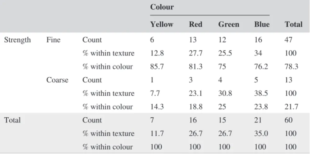
Tables 3 and 4 show the choices participants made in the second phase of the experiment. Seventy-four of 100 design-trained participants chose those textures which had two tex-ture strengths.
3.3
|
Texture strength preference
The results show that there was no significant association be-tween colour and texture strength in terms of preference in the design and non-design–trained groups ([χ2 (3) = 3.481,
P = .323, P > .005] and [χ2 = 0.641 df = 3, P = .887,
P > .05], respectively). To establish if there was a more
pre-ferred texture strength irrespective of texture type and colour, a one-sample binomial test was run. P-values of .004 (design-trained) and P = .000 (non-design–(design-trained), both of which are less than the significance level, show that fine textures were preferred over coarse ones.
Moreover, in the non-design–trained set, the results from the binomial test showed that fine plain textures were preferred to coarse plain textures (P = .000). For basket textures, fine strengths are more often preferred in both sets (P = .037; P = .017). We ran extra tests to ascertain if a particular texture strength was preferred within a spe-cific colour. The results showed that red fine textures were preferred more than red coarse textures in the non-design– trained group (P = .21). Finally, all of the participants preferred fine blue textures to coarse textures (P = .011;
P = .027).
4
|
DISCUSSION AND
CONCLUSIONS
Based on the literature, it was expected that individuals who indicated a specific preference in one domain would state a similar preference in another domain.2 This study aimed to
find an association between colour and texture as they over-lapped with one another. Typically, in colour studies, colour is studied within its attributes. In the current study, colour dimensions (apart from hue) remained constant. The chang-ing variable was texture strength. For two textures, two dif-ferent texture strengths were used and analysed in terms of preference. Specifically, plain and basket had fine and coarse
Colour
Total Yellow Red Green Blue
Strength Fine Count 8 11 11 20 50
% within texture 16 22 22 40 100 % within colour 66.7 52.4 73.3 76.9 29 Coarse Count 4 10 4 6 24 % within texture 16.7 41.7 16.7 25 100 % within colour 33.3 47.6 26.7 23.1 32.4 Total Count 12 21 15 26 74 % within texture 16.2 28.4 20.3 35.1 100 % within colour 100 100 100 100 100
TABLE 3 Colour-texture strength cross tabulation (design-trained)
texture levels. They were also mapped with the chosen col-ours of yellow, red, blue and green.
The first hypothesis of the study (stating the existence of a dependency between colour and texture) was rejected in both groups. Even although accumulated evidence shows that individual preferences for different domains are not in-dependent of each other, the domains (colour and texture) overlapped one another. The methodology of the study did not consist of showing colours and textures separately, but instead these were mapped with each other, which is why the preference stated was a result of the combination of texture and colour. It is known, especially in the case of fabrics, that the combination of colour and texture affects consumers’ preferences.20 If colour chips were shown first, and
non-co-loured textures second, perhaps a cross-preference between the two domains would then exist. This method would still not be accurate enough to evaluate colour-texture associa-tions because of the influence they have on each other. We examined participants only according to their age, gender and background, but many other factors can affect individ-ual preferences. Another factor that may affect this result is the number of the participants. The analysis test (Chi square test for independence) requires a large sample set. This study also assumes that one texture will be preferred over the oth-ers, which was verified in the design-trained sample set. This occurs because, as the literature suggests, the sample set is composed of individuals who are more sensitive to de-tail.18 Apart from choosing colours, they paid more
atten-tion to texture choice. This study's findings agree with other researchers who reported that overall blue is the favourite colour.18-19,21-23 Chi square tests show an unequal
distribu-tion of responses in colour preferences. Blue has the highest preference percentage in both sets.
Next, we probed for possible associations between co-lour and texture strength. Because previous studies proved that texture strength has a significant impact on the light-ness values of colour,12 and because lightness also
influ-ences colour preferinflu-ences,24 it was deduced that a specific
texture strength would be preferred over another. We found no dependency between colour and texture strength in ei-ther set, but we did verify the hypothesis which assumes that one texture strength is preferred over another: fine textures were preferred to coarse textures. Furthermore, the texture strength preference for each colour was investi-gated. Because blue had the largest frequency distribution, it was the only colour with an association between the blue hue and fine textures for all of the participants. The same occurred for basket texture type and fine strength. In this case, it can be inferred that a large number of responses yields more accurate statistical results.
This study also has other limitations. Using physical tex-tile samples might have been interesting in terms of texture effects. Even although the study was only concerned with the visual effect of texture, tactile sensation could provide further data. Nevertheless, conducting this study in a virtual envi-ronment was more feasible in terms of time and costs.6 Also,
designers are used to working in virtual environments and do not experience difficulties in translating simulated works into realistic ones. Supporting this statement, Suk and Irtel25
found that media type (physical vs simulated) had no effect on emotional responses to colour.
It should be noted that this study's results are neither defin-itive nor prescriptive due to a variety of confounding factors that affect individual preferences. However, it is of value for design professionals seeking to gain an insight into colour-tex-ture combinations. Manufaccolour-tex-turers could also benefit by under-standing what the most preferred colour-texture matches are.
Because this was a preliminary study, it offers several pos-sibilities for future research. Further work could investigate colour-texture association preferences in a physical environ-ment. Additionally, more colours and textures, or perhaps even the combination of two colours with two textures, could be investigated under the concept of colour-texture harmony. The most used colours in upholstery fabrics (such as brown and beige) could also be chosen for future study. More fabric types and more texture strength levels could also be used. Colour
Total Yellow Red Green Blue
Strength Fine Count 6 13 12 16 47
% within texture 12.8 27.7 25.5 34 100 % within colour 85.7 81.3 75 76.2 78.3 Coarse Count 1 3 4 5 13 % within texture 7.7 23.1 30.8 38.5 100 % within colour 14.3 18.8 25 23.8 21.7 Total Count 7 16 15 21 60 % within texture 11.7 26.7 26.7 35.0 100 % within colour 100 100 100 100 100
TABLE 4 Colour-texture strength cross tabulation (non-design–trained)
It would be practical for future studies to provide new in-sights into the experimental methodology. Another approach would be to show the colour-texture–mapped images one by one and to ask for each user's preference rating. This would give mean data then more statistical tests could then be con-ducted. But preferring is different to liking. To have a prefer-ence is to like one alternative more than another (or others). Ranking the images from the most to the least preferred could be another way to examine the relationships we are interested in. This would give median values. On the other hand, using a lot of variables (more colours and textures) could result in the data becoming too complicated to understand.
To secure “universal” preference results, a large number of people should participate in the experiment. Additionally, because texture is present not only in fabrics but also in other architectural materials, one could consider using these in other studies. People can have a different combination of preferences for curtains or for carpets. The investigation of preferences for all of these topics would provide better infor-mation for architects to design spaces that users will enjoy. Design is not an exact field of study; nevertheless, architects tend to have “universal standards” in terms of design har-mony, in order to produce quality spaces for their clients.
ORCID
Ela Fasllija https://orcid.org/0000-0002-5631-029X
Nilgün Olguntürk https://orcid.
org/0000-0001-7947-1101
REFERENCES
1. Yi E, Choi J. Intergenerational differences of color sensa-tion and preference for naturally dyed fabrics. Fibers Polym. 2008;9:646–652.
2. Chen N, Tanaka K, Matsuyoshi D, Watanabe K. Correlated prefer-ences for color and shape. Color Res Appl. 2016;41:188–195. 3. Lucassen M, Gevers T, Gijsenij A. Correlated preferences for color
and shape. Color Res Appl. 2011;36:426.
4. Luo L, Tsang K, Shen H, Shao S, Xin J. An investigation of how the texture surface of a fabric influences its instrumental color. Color Res Appl. 2015;40:472–482.
5. Xin J, Shen H, Lam C. Investigation of texture effect on visual color difference evaluation. Color Res Appl. 2005;30:341–347. 6. Kandi S, Tehran M, Rahmati M. Colour dependency of textile
sam-ples on the surface texture. Color Technol. 2008;124:348–354. 7. Kuehni RG, Marcus RT. An experiment in visual scaling of small
color differences. Color Res Appl. 1979;4:83.
8. Xin JH, Chuen LC, Luo MR. Congress of the International Colour Association, (AIC03rd–8th). Bangkok, Thailand: 2003:60.
9. Han B, Cui GH, Luo MR. Congress of the International Colour Association, (AIC03rd–8) vol. 176. Bangkok, Thailand: 2003. 10. Kandi S, Tehran M. Color naming for the Persian language. Color
Res Appl. 2010;35:94.
11. Shao SJ, Xin J, Zhang YG, Zhou LM. The effect of texture struc-ture on instrumental color difference evaluation and visual assess-ment. AATCC Rev. 2006;6:42.
12. Montag E, Berns R. Lightness dependencies and the effect of texture on suprathreshold lightness tolerances. Color Res Appl. 2000;25:241–249.
13. Huertas R, Melgosa M, Hita E. Influence of random-dot textures on perception of suprathreshold color differences. J Opt Soc Am. 2006;23:2067–2076.
14. Tinker MA. Effect of stimulus-texture upon apparent warmth and affective values of colors. Am J Psychol. 1938;51:532–535. 15. Simmons D, Russell C. Visual texture affects the perceived
un-pleasantness of colors. Perception. 2008;37:146.
16. Cubukcu E, Kahraman I. Hue, saturation, lightness, and building exterior preference: an empirical study in Turkey comparing archi-tects' and nonarchiarchi-tects' evaluative and cognitive judgments. Color Res Appl. 2008;33:395–405.
17. Hanafy I, Sanad R, Miljkovic D.6th World Conference on Psychology, Counseling and Guidance (Wcpcg-2015), 2015;205:437.
18. Camgoz N, Yener C, Guvenc D. Effects of hue, saturation, and brightness on preference. Color Res Appl. 2002;27:199–207. 19. Bakker I, van der Voordt T, Vink P, de Boon J, Bazley C. Color
preferences for different topics in connection to personal character-istics. Color Res Appl. 2015;40:62–71.
20. Larsen JL, Weeks JG. Fabrics For Interiors: A Guide for Architects, Designers, and Consumers. New York, NYVan Nostrand Reinhold Co; 1975.
21. Eysenck HJ. A critical and experimental study of colour prefer-ences. Am J Psychol. 1941;54:385–394.
22. Manav B. Color-emotion associations and color preferences: a case study for residences. Color Res Appl. 2007;32:144–150.
23. Baniani M, Yamamoto S. A comparative study on correlation be-tween personal background and interior color preference. Color Res Appl. 2015;40:416–424.
24. Guilford JP, Smith P. A system of color-preferences. Am J Psychol. 1959;62:487–502.
25. Suk H, Irtel H. Emotional response to color across media. Color Res Appl. 2010;35:64–77.
How to cite this article: Fasllija E, Olguntürk N,
Güvenç D. Colour-texture mapping associations in terms of preference. Coloration Technol.