IC
ON
A
RP
ICONARP International Journal of Architecture & Planning Received 17 Nov 2018 Accepted 30 Jan 2019 Volume 7, Issue 1, pp: 99-120/Published 28 June 2019 DOI: 10.15320/ICONARP.2019.68-E-ISSN: 2147 -9380 Research Article
Abstract
In this study, it was aimed to determine the perceived quality of three modeled virtual design studios which have the same characteristics but different colors (warm, cool and neutral) and to determine whether there was a difference between the real space and the evaluations made in the virtual space. Accordingly, it was assumed that the wall coloring of the virtual studio space models that were modeled could affect the perceptions of the students and that virtual space evaluations would be in parallel with real space evaluations. To test the assumption, the study modeled the environments of three design studios with different colors assumed to exist at a design studio of the Selçuk University and students were asked to evaluate these virtual spaces with the aid of virtual reality goggles. As a result, it has been determined that there was no difference between the perceptual evaluations of real and virtual spaces designed with the same features. In addition, according to the spatial scale, it was determined that the cool colored space were perceived as “more roomy” and “more inviting” by the students compared to the warm colored space and that the cool colored space was also evaluated more positively for the social adaptation and individual productivity scales.
Effects on Students’
Perceptual Evaluations of
The Wall Colors Used in
Design Studios by The
Virtual Reality Method
Kemal Yıldırım
*M. Lütfi Hidayetoğlu
**Nurettin Gökbulut
***M. Kübra Müezzinoğlu
****Keywords: Design studio, wall color; perception, virtual reality, interior design
*Prof.Dr. in Department of Furniture and Decoration in Gazi University, Ankara, Turkey E-mail: [email protected]
**Corresponding Author) Prof.Dr. in Department of Industrial Design in Selcuk University, Konya, TURKEY
E-mail: [email protected]
*** Postgraduate in Department of Wood Product Ind. Eng. In Gazi University, Ankara, Turkey
E-mail: [email protected]
**** Ph.D. in Department of Interior Architecture and Enviromental Design in Selcuk University, Konya, Turkey
Kemal Yıldırım & M.Lütfi Hidayetoğlu & Nurettin Gökbulut & M.Kübra Müezzinoğlu 0/ IC O N ARP. 20 19 .68 – E-ISSN : 21 47 -9380 INTRODUCTION
Human beings shape the environs in which they live according to their own wishes and these environs shaped affect the perceptions and behaviors of human beings (Sommer, 1969).In this context, when it is considered from the aspect of space-user relations, then it is expected that the user meets the personal needs of the space and constitutes satisfactory platforms. When designers design a livable and satisfactory space in accordance with these wishes of the users, then they are in the position of benefiting from various disciplines and from the techniques and methods set forth by these.
When space is treated within the scope of a three-dimensional spatial (environmental) order, then the physical environmental factors set forth the “spatial perception” concept and constitutes an environment that provides favorable conditions for the solution of order in the relationship between humans and environment (Aydinli, 1986). In the studies made on spatial perception, the individual differences in the perception and in the perception of different space organizations is a factor and it is observed that other than these factors, the effect of the internal space environmental factors is important to an extent that cannot be ignored. Many researchers in the literature have worked on the classification of environmental factors and it has been stated that a majority of these have been formed by taking the classification of environmental factors made by Baker (1986) as the basis (Muezzinoglu, 2018). In this study as well, the color variable, which is from the physical environmental factors classified by Baker (1986), was evaluated.
The design that was constituted in the three-dimensional virtual reality environments, which are a form of visual representation, set forth within the scope of the study the effects on the perceptual evaluations of students for the wall colors in design studios. The use of color in the educational spaces and the contribution provided to education are an important field of study. The studies that research the effects of color on physiological and psychological perception show that the color of the environment is effective on the creativity of the user, the emotional mental status, motivation, concentration and performance, environmental communication and behaviors (Cagatay, Hidayetoglu, & Yildirim, 2017; Engelbrecht, 2003; Hathaway, 1987; M.L. Hidayetoglu, 2010; Muezzinoglu, 2018; Stone, 2003; Stone & English, 1998; Wang & Russ, 2008; K. Yildirim, Cagatay, & Ayalp, 2015; K. Yildirim, Hidayetoglu, & Capanoglu, 2011). Even if there have been guiding, significant findings obtained in this field,
olu m e 7, Is su e 1 / Pu bli shed : Jun e 20 19
the studies related to the effects on perceptual evaluations of the users of wall colors in educational spaces are still insufficient.
Theoretical Background and Hypothesis Development
In the studies made especially in the educational spaces, it was observed that a need was felt for more experimental studies on organizations that could be made for students to adopt the spaces where they receive education and for providing for them to be pleased from being in these spaces. Since the use of conscious color in the space is important in the formation of healthy environments, color should be thought of as a design element in the perception of spaces and a conscious use should be provided with the correct color information.
It has been shown in the literature studies related to color that classroom wall color could have positive and/or negative
influences on the behaviors and learning performan. NN M JCJKJKDJHces of students. Of these, it was stated in the studies by
Hathaway (1987) and Engelbrecht (2003) that the mental stimulus obtained passively with the color of the classroom assists students and teachers in focusing on their duties. In a survey made on the feelings and thoughts of students who followed the environment in the work environments by Stone (2003), it was expressed that the students announced that they felt quieter and better within a blue room in comparison with a red room. Furthermore, in the study, since blue was calming from the aspect of environmental relations, whereas, red was a color that was inciting, they also emphasized that it was necessary to select the environmental colors that were appropriate for the attributes of the work.
In the study made by Nelson, Pelech & Foster (1984) with the objective of determining which wave length colors were preferred in the preference of colors of people who were extroverts and introverts, it was observed that persons who had an impulse to high activity preferred red and persons who had an impulse to low activity preferred blue (Grangaard, 1993; Nelson et al., 1984). In the studies by Camgoz, Yener & Guvenc (2004) that examined the effects on the attention of users for color tone, satisfaction and brightness, it was stated that in the situations where the colors were the brightest and most satisfactory, also increased their attractiveness. It was stated in the study that the most attractive colors were yellow, green and turquoise and that red and purple came later. In the studies by Wang & Russ (2008), it was claimed that the cool colors in the Master Palette Color System were preferred more compared to the other colors for the wall colors in
Kemal Yıldırım & M.Lütfi Hidayetoğlu & Nurettin Gökbulut & M.Kübra Müezzinoğlu 0/ IC O N ARP. 20 19 .68 – E-ISSN : 21 47 -9380
a computer classroom. In addition to this, in the studies by Moore, McCarty & Jelin (1995),it was emphasized that the use of warm color tones would be appropriate to use for creating a quieter environment. On the other hand, Olds (1989)proposed the use of warm tones for controlling the movement in moving areas and the use of cool tones for quiet and calming areas (Read, Sugawara, & Brandt, 1999).
In the study by Read, Sugawara & Brandt (1999) they determined that the wall colors of the classrooms strengthened the cooperative behaviors of the students. Whereas, in the study by Hamid & Newport (1989)that examined pink and blue colored spaces, they reported that the mental statuses of the students were more positive in warm colored spaces.
In the study by Hidayetoglu (2010), it was stated that warm colors had an attractive feature and ability to be remembered and were higher compared to the other colors. In the study by Yildirim, Cagatay & Ayalp (2015),it was claimed that blue classrooms were perceived more positively compared to cream and pink classrooms by male students and furthermore, classrooms with different colors were evaluated by being perceived as more positive by students. In the study by Cagatay, Hidayetoglu & Yildirim (2017)of school corridors in which different colors were used, it was stated that the cream-colored corridors were perceived more positively compared to blue- and green-colored corridors. In the doctorate dissertation by Muezzinoglu (2018), it examined the effects on the perceptual evaluations of test specimens for three different colors (warm, neutral, cool) used in educational spaces according to the spatial quality, social adaptation and individual productivity scales. A total of 113 students from universities who did or did not receive design education participated in this study. In the study used real spaces controlled by all environmental factors as a working environment. In the study, it was stated that the warm colored spaces were perceived as “warm” to a definite extent compared to the neutral and cool colored spaces; the cool colored space were perceived as more “inviting” and “roomy” compared to the warm and neutral colored spaces; and on the other hand, the cool colored space was perceived as facilitating communication more easily and as putting one at ease compared to the warm colored spaces. Whereas, the neutral colored space was perceived as more negative compared to the warm and cool colored spaces from the aspect of social adaptation; and the cool colored space was evaluated more positively compared to the other spaces from the aspect of individual productivity.
olu m e 7, Is su e 1 / Pu bli shed : Jun e 20 19
According to the color literature given above, the effect of color on the perception of design studios formed in virtual reality environments was examined in this study and was tested with statistical methods on whether the wall color had a significant effect on the perception of spaces. Within this scope, by taking as a reference the study by Muezzinoglu (2018),which previously examined the evaluations by students of the colors of the design studios at the School of Fine Arts of the Selçuk University, the research hypotheses formed have been given below.
Hypothesis 1. The warm colors used in the design studios
experienced with the virtual reality method positively affect the evaluations of “spatial quality” of the students.
Hypothesis 2. The cool colors used in the design studios
experienced with the virtual reality method positively affected the “social adaptation” evaluations of the students.
Hypothesis 3. The cool colors used in the design studios
experienced with the virtual reality method positively affected the “individual productivity” evaluations of the students.
The change in the perception of internal space by the users with the start of the digital age and the increase in the expectations from internal spaces has been the cause of the onset of new searches in the field of interior architecture. This situation has made widespread the thought that the concept of reality could be a new means for meeting the expectations of the users from the aspect of designers (Wolbers & Hegarty, 2010). However, it is important to assess similarities and differences between knowledge obtained in real life and that obtained in virtual environments (VE) (i.e., to verify that the best transfer of knowledge from the VE to the real situation is obtained). Transfer studies make a distinction between transfer of skills (from one sensory modality to another) and transfer of spatial knowledge (knowledge conservation from learning to test situation). Several studies have demonstrated an effective transfer of skills and/or spatial knowledge from virtual to real environments (virtual/real transfer), indicating that the spatial knowledge acquired in virtual environments is very similar to that acquired in real environments (Wolbers & Hegarty, 2010).It was reported in the study by Kuliga, Thrash, Dalton & Hölscher (2015) that virtual environments could be used as controlled laboratory environments and that the data obtained was compatible with the data obtained from real spaces. Bozdag (2018)expressed that in three-dimensional virtual reality environments, architectural spaces can be comprehended in the third dimension with the aid
Kemal Yıldırım & M.Lütfi Hidayetoğlu & Nurettin Gökbulut & M.Kübra Müezzinoğlu 0/ IC O N ARP. 20 19 .68 – E-ISSN : 21 47 -9380
of digital goggles and due to the fact of the perception that the user himself/herself moves, not the image, it can come to a static state like the real world and the togetherness and continuity of time-space can once again be provided. The studies by Gobbetti & Scateni (1998) as well, just like many researchers, adopted the view that virtual reality created or could create a satisfying visual and auditory perception. It was observed in the literature studies that the virtual environments can be used with trust in the scientific studies (Nur Ayalp, Yildirim, Bozdayi, & Cagatay, 2016; N. Ayalp, Yıldırım, & Çağatay, 2017; Hwang, Yoon, & Bendle, 2012; Tlauka, Brolese, Pomeroy, & Hobbs, 2005; Tsunetsugu, Miyazaki, & Sato, 2005; Wallet, Sauzéon, Larrue, & N'Kaoua, 2013; K. Yildirim, Akalin-Baskaya, & Hidayetoglu, 2007; Kemal Yildirim, Ayalp, Guner Aktas, & Lutfi Hidayetoglu, 2014; Yıldırım & Oğuzhan, 2010). According to this determination, it is of great importance in the present-day to set forth whether there are similarities or differences between the findings obtained from virtual spaces with the findings obtained from real educational spaces. According to the color literature given above, the research hypotheses formed have been given below. In the study by Muezzinoglu (2018) for testing this hypothesis, virtual copies were formed in a manner that would have all the characteristic features of the real spaces used. The experimental process, questions and evalution methods used in this reference study were also used the same in this study. In conclusion, the data obtained from this study will be compared with suitable statistical methods with the data obtained by Muezzinoglu (2018).
Hypothesis 4. There is no difference between the perceptual
evaluations of the students for the real and virtual design studios, which were designed having the same spatial features.
MATERIAL AND METHOD Participants
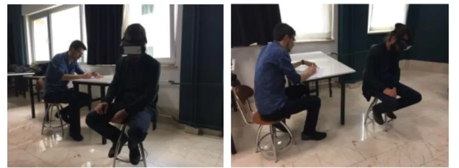
A total of 61 test students, 31 females (50.8%) and 30 males (49.2%), who were receiving design education at the School of Fine Arts of the Selçuk University, participated in this research. Participants were selected from students with normal color vision and no visual impairment. Students' ages ranged from 20 to 23, with an average age of 21.7 for all students. The students in the research were measured with the semantic differential scale, composed of three perceptual evaluation groups for the design studios by using virtual reality goggles (Figure 1).
olu m e 7, Is su e 1 / Pu bli shed : Jun e 20 19 Design of the Questionnaire
The questionnaire form used consisted of two parts: the first part asked for general information such as the age, gender and visual defects of the students. The second part consisted of the semantic differential scale which measures students' moods about the perceptual evaluations of the virtual design studios. Moods are subjective experiences and, therefore, must be measured through self-report. A number of questionnaires have been developed to measure moods (McAdrew, 1993). Some of the measures that have been widely used in research include the Mood Adjective Checklist (MACL) developed byNowlis (1965), the Profile of Mood States (POMS) (McNair, Lorr, & Droppleman, 1971). Curran & Cattell’s (1976) Eight State Questionnaire (8SQ), and the Multiple Affect Adjective Checklist (MAACL) (Zuckerman & Lubin, 1985). Many measures of mood employ some form of the semantic differential developed by Osgood, Suci & Tannenbaum (1957). The semantic differential consists of pairs of bipolar adjectives, or adjectives that are opposites of each other. For example, good / bad or pleasant / unpleasant are typical pairs of bipolar adjectives (McAdrew, 1993).
The evaluation of the virtual design studios experienced was made by the students for testing the research hypotheses that were previously developed by Muezzinoglu (2018) and whose validity and reliability were found in the studies made by Hidayetoglu (2010), Yildirim et al. (2014), Berlyne (1974), Imamoglu (1975), Erturk (1983) and Yildirim, Akalin-Baskaya & Hidayetoglu (2007). The students then had to evaluate the importance of each of the bipolar adjective pairs on a 1–7 semantic differential scale where 1=roomy and 7=cramped. A total of fifteen bipolar adjective pairs were evaluated by the students after familiarizing themselves with the items, five of which dealt with spatial quality, five of which with social adaptation, while the rest measured individual productivity. The Likert-type scales of spatial quality (warm / cool, light / dark, stimulating / drowsy, inviting / uninviting, roomy / cramped), social adaptation (facilitates communication / prevents communication, sincere / formal, relaxing / disagreeable,
Figure 1. Evaluations of spaces by the students using virtual reality goggles (It was taken by the authors)
Kemal Yıldırım & M.Lütfi Hidayetoğlu & Nurettin Gökbulut & M.Kübra Müezzinoğlu 0/ IC O N ARP. 20 19 .68 – E-ISSN : 21 47 -9380
encouraging / pacifying, open to cooperation / closed to cooperation) and individual productivity (motivating / boring, provides concentration / disrupts concentration, peaceful / unpeaceful, useful / useless, open to creativity / closed to creativity) were used.
Research Setting and Procedure
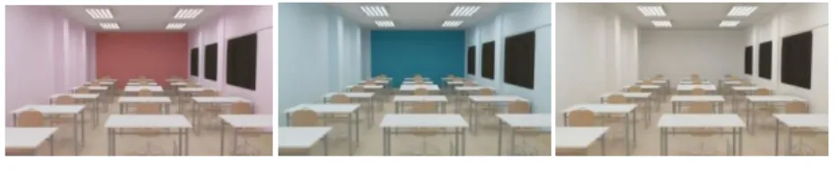
The modeling of the virtual design studios used in the experimental environment of this study were formed especially for the previous study by Muezzinoglu (2018)and were made use of from the design studios that were evaluated in the process of use. This design studio is a space with a size of 62 m2 (12.8 x 4.85 m) where design classes are held at the School of Fine Arts of the Selçuk University. In the illumination of the virtual design studio, six quadruple group fluorescent lamps were used, giving daylight (about 5000 Kelvin). All the spatial features such as size, height, material, wall colors, lighting, reinforcement styles of the studios used in Muezzinoglu's (2018)study have been transferred to the digital studio in a proper manner. Subsequently, the studios that would be made in the experiments were modeled in global spaces with the override field of view of 360º in the 3Ds Max program in a manner in adaptation with the virtual reality goggles (Figure 2).
In the experimental study made for being able to determine the effects on the spatial perception of the color factors in the study, three each design studios drawn with the 3Ds Max program according to warm, cool and neutral colors, were modeled as the experimental environment of the design studio. The values used by Muezzinoglu (2018) were benefited from in the determination of the design characteristics and space color tones of the equipment used in forming the virtual space with the objective of providing an opportunity for being able to make an objective comparison of the virtual and real space experiments. In the study by Muezzinoglu (2018), 113 students were asked to show 6 different color combinations and to evaluate the color combinations according to the “warm and cool” adjective pairs for
Figure.2..Modeling of the
experimental.environments (Drawing by authors)
A room layout of single tenants in Yimuyuan neighborhood (Drawing by author)
olu m e 7, Is su e 1 / Pu bli shed : Jun e 20 19
determining objectively the colors to be used in the design studios and for evaluating as warm, cool and neutral. The students evaluated the colors shown to them as 1-Warm and 7-Cold. As a result of this process, the warmest evaluated color combination with an average of 1.75 and the coolest evaluated color combination with an average of 6.22 were determined. An achromatic color was determined as neutral color. The wall colors and the RGB color codes used in the experiments have been given in Table 1.
Table 1. Wall colors used in the experiments
In these spaces modeled, other than the wall color, which would be evaluated as an independent variable, all the other physical features were taken under control by being fixed. At the test stage that used the virtual spaces modeled, after giving information for approximately 10 minutes on the aims of the study, the students answered the survey that also included within it the adjective groups by making observations with a 360-degree viewpoint at a fixed point in the space by using the virtual reality goggles (Figure 3). The survey was implemented for a period of 1 week in 2017.
Warm space rendering Cool space rendering Neutral space rendering
Evaluation of the Data
The effects on the perceptual evaluations of the students were examined in this study for different wall colors used in the design studios formed in a virtual environment. Accordingly, the evaluations of the students for the wall colors of the design studios were accepted as dependent variables, whereas, the wall color was accepted as an independent variable. SPSS package program was used in the evaluation of research data. The percentage
Figure 3. Modeled design studios according to warm, cool and neutral colors (Drawing by authors).
Kemal Yıldırım & M.Lütfi Hidayetoğlu & Nurettin Gökbulut & M.Kübra Müezzinoğlu 0/ IC O N ARP. 20 19 .68 – E-ISSN : 21 47 -9380
values, arithmetic averages and standard deviation values of the data obtained in the study were calculated, the Cronbach Alpha reliability tests of the data were made and finally, the statistical aspect of the differences between the dependent and independent variables were tested with the one-way analysis of variance (ANOVA) technique on whether they were statistically significant at a level of p<0.05. The Tukey’s Honest Significant Difference (HSD) Test was made for being able to compare with each other the variables found to be significant in the ANOVA and the data was stated graphically for being able to compare the averages of the variables with each other.
RESULTS AND DISCUSSION
It was aimed in this study to reach information that would assist designers in designing perceptible high-quality spaces. On the other hand, it was also determined whether there was a difference between the evaluations made on real spaces and virtual spaces. With this purpose, the effects on students of different wall colors used in design studios for developing in a positive manner the evaluations of the spatial quality scale, social adaptation scale and individual productivity scale of students and for increasing the conditions of comfort and satisfaction. As a sampling, a design studio located at the School of Fine Arts of the Selçuk University was modeled by drawing it in a digital environment and it was transformed into an experimental environment. The data obtained from the virtual spaces modeled were tested with statistical methods and the results reached have been given in a systematic listing below.
The reliability of the data obtained from this study was tested with the Cronbach Alpha Test and the results have been given in Table 2. According to the results of the Cronbach Alpha reliability analysis, it was determined that the reliability coefficient of the spatial quality scale, which includes the color evaluations, was 0.69, the social adaptation scale was 0.78, whereas, the individual productivity scale was 0.80. In the studies made previously by Cronbach (1951), McKinley, Manku-Scott, Hastings, French & Baker (1997), Kaplan & Saccuzzo (2009) and Panayides (2013), it was reported that when the alpha reliability coefficients for all elements is above 0.60, then it could be accepted to be “reliable”. It was observed that the Cronbach alpha coefficients obtained in this study were above the specified value. Accordingly, the data obtained can be accepted to be “reliable”.
olu m e 7, Is su e 1 / Pu bli shed : Jun e 20 19
Table 2. Cronbach alpha reliability analysis results
The main research topic of this manuscript is on whether or not the virtual space experiences obtained similar results as the real space experiences. The validity of Hypothesis 4 (There is no difference between the perceptual evaluations of the students for the real and virtual design studios, which are designed having the same spatial features) formed for testing this was analyzed by establishing ties with the other hypotheses treated as follows below.
The categorical averages, standard deviation values and the Tukey HSD test results for the data obtained for the effects on the perceptual evaluations of the students according to the spatial quality of the colors used in the virtual design studios have been given in Table 3.
Table 3. The average, standard deviation and Tukey HSD test results of the adjective pairs formed by the spatial quality scale connected to wall color
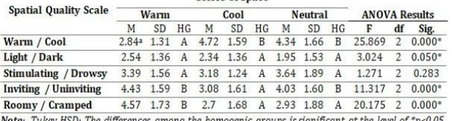
It was observed in Table 3 that there were statistically significant differences among the perceptual evaluations of the students according to the spatial quality scale for the wall colors used in the design studios for the adjective pairs of “warm / cool” (F=25.869, df=2, p=0.000), “light / dark” (F=3.024, df=2, p=0.050), “inviting / uninviting” (F=11.317, df=2 p=0.000) and “roomy / cramped” (F= 20.175, df=2, p=0.000). However, for the “stimulating / drowsy”
Kemal Yıldırım & M.Lütfi Hidayetoğlu & Nurettin Gökbulut & M.Kübra Müezzinoğlu 0/ IC O N ARP. 20 19 .68 – E-ISSN : 21 47 -9380
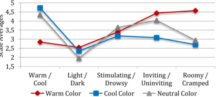
(F=1.271, df=2, p=0.283) adjective pair a statistically significant difference was not found at the level of p<0.05. According to the Tukey HSD test, when comparing the warm colored space with other cool and neutral colored spaces for a warm / cool adjective pair, it was observed that there were statistically significant differences between the group mean values of the warm colored space with the cool and neutral colored spaces at the level of p<0.05. The significance values of the Tukey HSD test results for other adjective pairs have been given in Table 3. In conclusion, it can be stated that the three different colors used in the design studios had significant effects on the perceptual evaluations of the students according to the spatial quality scale. The graphical expression of these results has been given in Figure 4.
According to Figure 4, the average values of the spaces having the warm, cool and neutral wall colors were rather close to each other for the “light / dark” and “stimulating / drowsy” adjective pairs. It was understood from the figure that the cool colored space were perceived as more “roomy” and “inviting” compared to the warm colored space. This result did not support the H1 hypothesis, which asserts “The warm colors used in the design studios
experienced with the virtual reality method affects positively the “spatial quality” evaluations of the students.” This same hypothesis
was not supported in the study by Müezzinoglu (2018), which forms the basis of this study. In the study by Müezzinoglu, these values have been reported for the adjective pairs “warm / cool” (M=2.35, SD=1.45), “light / dark” (M=2.94, SD=1.46), “stimulating / drowsy” (M=3.09, SD=1.55), “inviting / uninviting” (M=3.15, SD=1.7) and “roomy / cramped” (M=3.01, SD=1.76) in the warm colored space and the adjective pairs “warm / cool” (M=4.53, SD=1.91), “light / dark” (M=2.76, SD=1.68), “stimulating / drowsy” (M=2.92, SD=1.72), “inviting / uninviting” (M=2.95, SD=1.68) and “roomy / cramped” (M=2.51, SD=1.51) in the cool colored space. In both studies, cool and neutral colored spaces gave the same result, except for the roomy / cramped adjective pair. However, compared to the digital space, the warm colored
Figure 4. Evaluation according to the spatial quality scale of different colored studios (Drawing by
olu m e 7, Is su e 1 / Pu bli shed : Jun e 20 19
real space was evaluated positively for the other adjective pairs except the light / dark adjective pair. In this respect, the results obtained from the two studies support each other.
The categorical averages, standard deviation values and the Tukey HSD test results of the data obtained for the effects on the perceptual evaluations of the students according to the social adaptation scale of the colors used in the virtual design studios have been given in Table 4.
Table 4. The average, standard deviation and the Tukey HSD test results of the elements forming the social adaptation scale connected to wall color
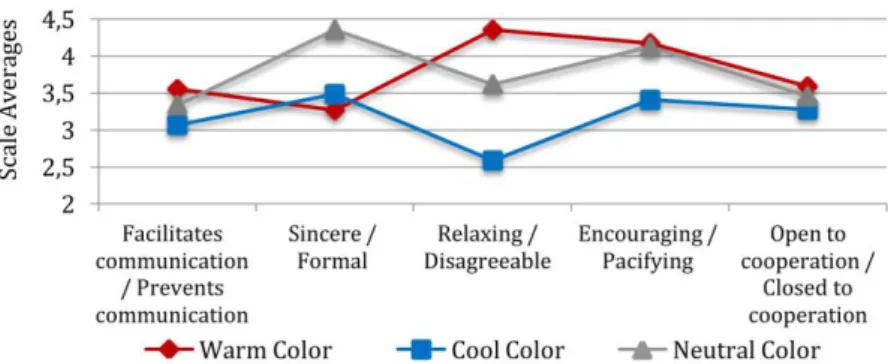
It was observed in Table 4 that there were statistically significant differences among the perceptual evaluations of the students according to the social adaptation scale for the wall colors used in the design studios for the adjective pairs of “sincere / formal” (F=5.176, df=2, p=0.007), “relaxing / disagreeable” (F=18.670, df=2, p=0.000) and “encouraging / pacifying” (F=4.998, df=2, p=0.008). However, for the “facilitates communication / prevents communication” (F=1.905, df=2, p=0.152) and “open to cooperation / closed to cooperation” (F=0.366, df=2, p=0.694) adjective pairs a statistically significant difference was not found at the level of p<0.05. According to the Tukey HSD test, when comparing the warm colored space with other cool and neutral colored spaces for the “facilitates communication” and “open to cooperation” adjective pairs, it was observed that there were no statistically significant differences between the group mean values of the warm colored space with the cool and neutral colored spaces at the level of p<0.05. The significance values of the Tukey HSD test results for other adjective pairs have been given in Table 4. In conclusion, it can be stated that the three different colors used in the design studios had significant effects on the perceptual evaluations of the students according to the social adaptation scale. The graphical expression of these results has been given in Figure 5.
Kemal Yıldırım & M.Lütfi Hidayetoğlu & Nurettin Gökbulut & M.Kübra Müezzinoğlu 0/ IC O N ARP. 20 19 .68 – E-ISSN : 21 47 -9380
It was observed in Figure 5 that the cool colored space was evaluated more positively compared to the neutral and warm colored spaces for social adaptation. However, the warm colored space was perceived as more sincere compared to the cool and neutral colored spaces. When it was considered as of the results in general, the “social adaptation” evaluations of the cool colored spaces by the test subjects had a more positive effect. This result supports the H2 hypothesis, which claims, “The cool colors used in
the design studios experienced with the virtual reality method positively affected the “social adaptation” evaluations of the students.” This same hypothesis was supported in the study by
Müezzinoglu (2018), which forms the basis of this study. In the study by Müezzinoglu, these values have been reported for the adjective pairs “facilitates communication / prevents communication” (M=3.38, SD=1.54), “sincere / formal” (M=2.57, SD=1.61), “relaxing / disagreeable” (M=3.03, SD=1.71), “encouraging / pacifying” (M=3.37, SD=1.8) and “open to cooperation / closed to cooperation” (M=3.31, SD=1.51) in the warm colored space and the adjective pairs “facilitates communication / prevents communication” (M=2.76, SD=1.51), “sincere / formal” (M=3.12, SD=1.76), “relaxing / disagreeable” (M=2.60, SD=1.59), “encouraging / pacifying” (M=3.08, SD=1.73) and “open to cooperation / closed to cooperation” (M=3.04, SD=1.53) in the cool colored space. In both studies, cool and neutral colored spaces gave the same results. However, the warm colored real space was evaluated positively for all adjective pairs compared to the digital space. These results, it was seen that cool colors had positive effects for “social adaptation” except for the sincere / formal adjective pair.
The categorical averages, standard deviation values and the Tukey HSD test results of the data obtained for the effects on the perceptual evaluations of the students according to the individual productivity scale of the colors used in the virtual design studios has been given in Table 5.
Figure 5. Evaluation according to the social adaptation scale of different colored studios (Drawing by authors).
olu m e 7, Is su e 1 / Pu bli shed : Jun e 20 19
Table 5. The averages, standard deviations and Tukey HSD test results of the elements formed by the individual productivity scale connected to wall color
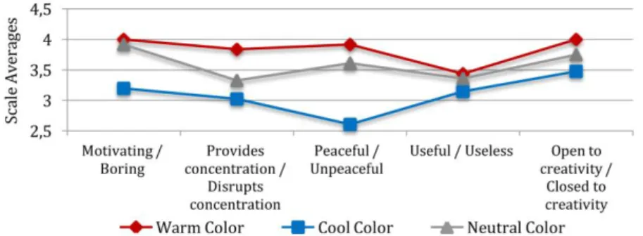
It was observed in Table 5 that there were statistically significant differences among the perceptual evaluations of the students according to the individual productivity scale for the wall colors used in the design studios for the adjective pairs of “motivating / boring” (F=5.154, df=2, p=0.007), “provides concentration / disrupts concentration” (F=4.141, df=2, p=0.017) and “peaceful / unpeaceful” (F=9.881, df=2, p=0.000). However, for the “useful / useless” (F=0.532, df=2, p=0.388) and “open to creativity / closed to creativity” (F=1.530, df=2, p=0.219) adjective pairs a statistically significant difference was not found at the level of p<0.05. The significance values of the Tukey HSD test results for other adjective pairs have been given in Table 5. In conclusion, it can be clearly observed that there were significant effects on the perceptual evaluations of the students according to the individual productivity scale. The graphical expression of these results has been given in Figure 6.
As it can be observed in Figure 6, although the cool colored space was evaluated more positively compared to the other spaces for the individual productivity scale, whereas, the warm colored space was evaluated more negatively compared to the other spaces. It is understood from the figure that the cool colored space was found to be more motivating and peaceful compared to the other spaces. This result supports the H3 hypothesis, which asserts, “The cool colors used in the design studios experienced with
Figure 6. Evaluation according to the individual productivity scale of different colored studios (Drawing by authors).
Kemal Yıldırım & M.Lütfi Hidayetoğlu & Nurettin Gökbulut & M.Kübra Müezzinoğlu 0/ IC O N ARP. 20 19 .68 – E-ISSN : 21 47 -9380
the virtual reality method positively affected the “individual productivity” evaluations of the students.” Accordingly, it can be
stated that the cool colored space had a positive effect on the evaluations of the students on the individual productivity scale. In the study by Müezzinoglu (2018), which is the basis of this study, the same result emerged that cool colors had positive effects for “individual productivity”. In the study by Müezzinoglu (2018), these values have been reported for the adjective pairs “motivating / boring” (M=3.07, SD=1.66), “provides concentration / disrupts concentration” (M=3.58, SD=1.72), “peaceful / unpeaceful” (M=2.76, SD=1.61), “useful / useless” (M=3.2, SD=1.63) and “open to creativity / closed to creativity” (M=3.1, SD=1.89) in the warm colored space and the adjective pairs “motivating / boring” (M=2.7, SD=1.56), “provides concentration / disrupts concentration” (M=2.73, SD=1.61), “peaceful / unpeaceful” (M=2.37, SD=1.54), “useful / useless” (M=2.56, SD=1.54) and “open to creativity / closed to creativity” (M=2.77, SD=1.68) in the cool colored space. In both studies, cool and neutral colored spaces gave the same results. However, the warm colored real space was evaluated positively for all adjective pairs compared to the digital space. These results, it was seen that cool colors had positive effects for “individual productivity”.
On the other hand, the results of the H1, H2 and H3 hypotheses of this study showed parallelness with the data obtained previously in a real space by Müezzinoglu (2018). In both studies, the same hypotheses were tested by creating the same indoor environmental factors, with the same adjective pairs, one being the virtual realm and the other being the real one. These comparative results support the H4 hypothesis, which claims, “There is no difference between the perceptual evaluations of the
students for the real and virtual design studios, which are designed having the same spatial features.” Accordingly, it can be stated that
in the scientific studies of the virtual spaces, correct results were reached and that they could be obtained with much less expense than from the real environmental scenarios.
CONCLUSIONS
It was focused in this study on the determination of the perceptual quality of three each modeled virtual design studios having the same characteristic features, but different wall colors (warm, cool and neutral) and on the determination of whether there was a difference between the evaluations made on real spaces and virtual spaces. With the data obtained from this study, it was aimed to design interior spaces that could be perceived by the users with high quality spaces and by using different colors. The
olu m e 7, Is su e 1 / Pu bli shed : Jun e 20 19
data obtained from this study have been treated in a systematic listing below.
In general, results support the results obtained previously by Muezzinoglu (2018) in real spaces with the same features. In other words, these results obtained with the VR 360 reality technology in the virtual design studio support each other with the results obtained in the real design studios having the same features. Supportive results were also reached in the study by Witmer, Bailey & Knerr (1996). These significant results showed that the virtual space scientific studies provided for reaching the correct results and that they could be obtained with much less expenditure than the real environmental scenarios. It was observed that there were different effects on the perceptual evaluations of the students according to the spatial quality scale of the colors used on the walls of the design studios modeled. Accordingly, perceptual evaluation results that were rather close to each other were found in the studios having warm, cool and neutral wall colors for the adjective pairs of “light / dark” and “stimulating / drowsy”. On the other hand, it was determined that the neutral and cool colored studios were perceived as more “roomy” and “inviting” compared to the warm colored studios. These results also showed parallelness with the studies by Hidayetoglu, Yildirim & Akalin (2012). Furthermore, it was determined that the different colors used in the design studios had different effects on the perceptual evaluations of the students according to the social adaptation scale. Accordingly, it was observed that the cool colored studio was perceived more positively compared to the neutral and warm colored studios from the aspect of social adaptation except for the sincere / formal adjective pair. In a similar manner, it was also observed that the perceptual evaluations of the students for the colors used in the design studios for the individual productivity scale had different effects. From this result, it was understood that the cool colored studio was found to be more motivating and peaceful compared to the other studios. It was emphasized in many studies, among which were the studies by Stone & English (1998) and Helvacıoglu (2007), that cool colored spaces were evaluated as peaceful and calming. Similar studies that would be made later can also benefit from the virtual reality technology.
ACKNOWLEDGEMENTS
The authors would like to thank both Ellen Andrea Yazar for her careful translation and proofreading of the English text and the valuable design students who participated in the survey study.
Kemal Yıldırım & M.Lütfi Hidayetoğlu & Nurettin Gökbulut & M.Kübra Müezzinoğlu 0/ IC O N ARP. 20 19 .68 – E-ISSN : 21 47 -9380 REFERENCE
Ayalp, N., Yildirim, K., Bozdayi, M., & Cagatay, K. (2016). Consumers’ evaluations of fitting rooms in retail clothing stores. International Journal of Retail & Distribution
Management, 44(5), 524-539.
doi:10.1108/IJRDM-06-2015-0085
Ayalp, N., Yıldırım, K., & Çağatay, K. (2017). Effect on Users of the Seating Element Types in Cafés/Restaurants. Gazi
University Journal of Science, 30(4), 15-28.
Aydinli, S. (1986). Mekansal Değerlendirmede Algısal Yargılara
Dayalı Bir Model (Doctoral Dissertation). Istanbul.
Baker, J. (1986). The role of the environment in marketing services: the consumer perspective. In: J. Sahanahan (Ed.).
The services challenge: Integrating for competitive advantage, 79-84.
Berlyne, D. E. (1974). Studies in the new experimental aesthetics:
Steps toward an objective psychology of aesthetic appreciation: Hemisphere.
Bozdag, N. (2018). Gerçeklik ve Mekan: Melez Mekan Mimarlıgı
(Master Dissertation). Karadeniz Technical University,
Trabzon.
Cagatay, K., Hidayetoglu, M. L., & Yildirim, K. (2017). Effects of Colors Used For Corridor Walls of High Schools on Perceptual Evaluations of Students. H.U. Journal of
Education, 32(2), 466-479. doi:10.16986/HUJE.2016016
672
Camgöz, N., Yener, C., & Güvenç, D. (2004). Effects of hue, saturation, and brightness: Part 2: Attention. Color
Research & Application, 29(1), 20-28. doi:10.1002/col.1
0214
Cronbach, L. J. (1951). Coefficient alpha and the internal structure of tests. psychometrika, 16(3), 297-334. doi:10.1007/BF 02310555
Curran, J. P., & Cattell, R. B. (1976). Manual for the eight state questionnaire. Champaign, IL: Institute for Personality and
Ability Testing.
Engelbrecht, K. (2003). The Impact of Color on Learning. Chicago,
Illinois: Perkins & Will.
Erturk, S. (1983). Mimari Mekanların Algılanması Üzerine Deneysel Bir Çalışma. Karadeniz Teknik Üniversitesi
Yayınlanmış Doktora Tezi, Trabzon.
Gobbetti, E., & Scateni, R. (1998). Virtual reality: Past, present, and
future. Amsterdam:IOS: Virtual environments in clinical
psychology and neuroscience: Methods and techniques in advanced patient-therapist interaction.
olu m e 7, Is su e 1 / Pu bli shed : Jun e 20 19
Grangaard, E. M. (1993). Effects of Color and Light on Selected
Elementary Students (Doctoral Dissertation). Las Vegas.
Hamid, P. N., & Newport, A. G. (1989). Effect of colour on physical strength and mood in children. Perceptual and motor skills,
69(1), 179-185. doi:10.2466/pms.1989.69.1.179
Hathaway, W. E. (1987). Light, colour & air quality: important elements of the learning environment. Education Canada,
27(3), 35-44.
Helvacıoglu, E. (2007). Color contribution to children’s wayfinding
in school environments (Doctoral Dissertation). Bilkent
University Institute of Fine Arts, Ankara.
Hidayetoglu, M. L. (2010). Üniversite Eğitim Yapılarının İç
Mekanlarında Kullanılan Renk ve Işığın Mekansal Algılama ve Yön Bulmaya Etkileri (Doctoral Dissertation). Gazi
Universty Institute of Science, Ankara.
Hidayetoglu, M. L., Yildirim, K., & Akalin, A. (2012). The effects of color and light on indoor wayfinding and the evaluation of the perceived environment. Journal of Environmental
Psychology, 32(1), 50-58. doi:10.1016/j.jenvp.2011.09.0
01
Hwang, J., Yoon, S. Y., & Bendle, L. J. (2012). Desired privacy and the impact of crowding on customer emotions and approach-avoidance responses: Waiting in a virtual reality restaurant. International Journal of Contemporary
Hospitality Management, 24(2), 224-250. doi:10.1108/0
9596111211206150
İmamoğlu, V. (1975). Spaciousness of interiors. Glasgow:
University of Strathclyde. Unpublished Ph. D. Thesis.
Kaplan, R. M., & Saccuzzo, D. P. (2009). Psychological Testing:
Principles, Applications and Issues. Boston, MA: Cengage
Learning.
Kuliga, S. F., Thrash, T., Dalton, R. C., & Hölscher, C. (2015). Virtual reality as an empirical research tool—Exploring user experience in a real building and a corresponding virtual model. Computers, Environment and Urban Systems, 54, 363-375. doi:10.1016/j.compenvurbsys.2015.09.006 McAdrew, F. T. (1993). Environmental Psychology. Wadsworth,
Inc., Belmont, California: Brooks/Cole Publishing Company.
McKinley, R. K., Manku-Scott, T., Hastings, A. M., French, D. P., & Baker, R. (1997). Reliability and validity of a new measure of patient satisfaction with out of hours primary medical care in the United Kingdom: development of a patient questionnaire. Bmj, 314(7075), 193. doi:10.1136/bmj.314 .7075.193
Kemal Yıldırım & M.Lütfi Hidayetoğlu & Nurettin Gökbulut & M.Kübra Müezzinoğlu 0/ IC O N ARP. 20 19 .68 – E-ISSN : 21 47 -9380
McNair, D. M., Lorr, M., & Droppleman, L. F. (1971). Manual for the profile of mood states (POMS). San Diego: Educational and
Industrial Testing Service.
Moore, G. T., McCarty, A. L., & Jelin, G. (1995). Children's Village: A safe haven for children of stress and violence. Children's
Environments, 12(1), 1-24.
Muezzinoglu, M. K. (2018). Eğitim Mekânlarında Kullanılan Renk
ve Işığın Öğrencilerin Fonksiyonel ve Algısal Değerlendirmeleri Üzerindeki Etkileri (Effects on Functional And Algorithm Values of Color And Light Students Used in Educational Areas). Doctoral Dissertation.,
Selcuk Universty Institute of Science, Konya.
Nelson, J. G., Pelech, M. T., & Foster, S. F. (1984). Color preference and stimulation seeking. Perceptual and motor skills,
59(3), 913-914. doi:10.2466/pms.1984.59.3.913
Nowlis, V. (1965). Research with the mood adjective check list. In
Affect, cognition, and personality: Empirical studies. (pp. xii,
464-xii, 464). Oxford, England: Springer.
Olds, A. R. (1989). Psychological and physiological harmony in child care center design. Children's Environments
quarterly, 6(4), 8-16.
Osgood, C. E., Suci, G. J., & Tannenbaum, P. H. (1957). The
measurement of meaning: University of Illinois Press.
Panayides, P. (2013). Coefficient alpha: interpret with caution. doi:10.23668/psycharchives.1414
Read, M. A., Sugawara, A. I., & Brandt, J. A. (1999). Impact of space and color in the physical environment on preschool children’s cooperative behavior. Environment and
Behavior, 31(3), 413-428. doi:10.1177/0013916992197
2173
Sommer, R. (1969). Personal Space: the Behavioral Basis of Design. Englewood Cliffs, NJ: Prentice Hall. doi:DOI
Stone, N. J. (2003). Environmental view and color for a simulated telemarketing task. Journal of Environmental Psychology,
23(1), 63-78. doi:10.1016/S0272-4944(02)00107-X
Stone, N. J., & English, A. J. (1998). Task type, posters, and workspace color on mood, satisfaction, and performance.
Journal of Environmental Psychology, 18(2), 175-185.
doi:10.1006/jevp.1998.0084
Tlauka, M., Brolese, A., Pomeroy, D., & Hobbs, W. (2005). Gender differences in spatial knowledge acquired through simulated exploration of a virtual shopping centre. Journal
of Environmental Psychology, 25(1), 111-118. doi:10.1016/j.jenvp.2004.12.002
Tsunetsugu, Y., Miyazaki, Y., & Sato, H. (2005). Visual effects of interior design in actual-size living rooms on physiological
olu m e 7, Is su e 1 / Pu bli shed : Jun e 20 19
responses. Building and Environment, 40(10), 1341-1346. doi:10.1016/j.buildenv.2004.11.026
Wallet, G., Sauzéon, H., Larrue, F., & N'Kaoua, B. (2013). Virtual/real transfer in a large-scale environment: impact of active navigation as a function of the viewpoint displacement effect and recall tasks. Advances in
Human-Computer Interaction, 2013, 8. doi:10.1155/2013/879563
Wang, H., & Russ, R. R. (2008). Computer classroom wall colour preference and the relationship with personality type of college students. Colour: Design and Creativity, 2, 1-13. Witmer, B. G., Bailey, J. H., Knerr, B. W., & Parsons, K. C. (1996).
Virtual spaces and real world places: transfer of route knowledge. International journal of human-computer
studies, 45(4), 413-428. doi:10.1006/ijhc.1996.0060
Wolbers, T., & Hegarty, M. (2010). What determines our navigational abilities? Trends in cognitive sciences, 14(3), 138-146. doi:10.1016/j.tics.2010.01.001
Yildirim, K., Akalin-Baskaya, A., & Hidayetoglu, M. L. (2007). Effects of indoor color on mood and cognitive performance. Building and Environment, 42(9), 3233-3240. doi:10.1016/j.buildenv.2006.07.037
Yildirim, K., Ayalp, N., Guner Aktas, G., & Lutfi Hidayetoglu, M. (2014). Consumer perceptions and functional evaluations of cash desk types in the clothing retail context.
International Journal of Retail & Distribution Management, 42(6), 542-552. doi:10.1108/IJRDM-03-2013-0056
Yildirim, K., Cagatay, K., & Ayalp, N. (2015). Effect of wall colour on the perception of classrooms. Indoor and Built
Environment, 24(5), 607-616. doi:10.1177/1420326X145
26214
Yildirim, K., Hidayetoglu, M. L., & Capanoglu, A. (2011). Effects of interior colors on mood and preference: comparisons of two living rooms. Perceptual and motor skills, 112(2), 1-16. doi:10.2466/24.27.PMS.112.2.509-524
Yıldırım, K., & Oğuzhan, U. (2010). The effects of space quality of dormitory rooms on functional and perceptual performance of users: Zübeyde Hanım Sorority. Gazi
University Journal of Science, 23(4), 519-530.
Zuckerman, M., & Lubin, B. (1985). Manuel for the MAACL-R: The
multiple affect adjective check list: Educational and
Industrial Testing Service.
Kemal Yıldırım & M.Lütfi Hidayetoğlu & Nurettin Gökbulut & M.Kübra Müezzinoğlu 0/ IC O N ARP. 20 19 .68 – E-ISSN : 21 47 -9380 Resume
Kemal Yıldırım is presently employed as a Professor at the Gazi University in Ankara, Turkey. He received his MA and PhD in Interior Design from the same University. His main research topic has been the analysis of interior space and user satisfaction in connection with the visual perception of space. Prof. Yıldırım has written over 100 national and international scientific articles in the field of Furniture and Interior Design. He has received awards in furniture design from many national and international prestigious design competitions.
Mehmet Lütfi Hidayetoglu is Professor of Industrial Design at Selcuk University in Turkey. He was assigned to Interior Architecture and Environmental Design Department, Faculty of Arts in Selcuk University as a Research Associate in 2005. He participated in many exhibitions with his designs and published numerous academic papers about interior architecture, sustainability, smart environment, spatial perception, environmental psychology, colour, light, traditional civil architecture and furniture designs.
Nurettin Gökbulut is currently a graduate student in the Department of Furniture and Decoration, Gazi University Institute of Science, researching human-object density and color perceptions in architectural spaces.
Menşure Kübra Müezzinoğlu is an interior architecture and environmental designer and lecturer in Selcuk University faculty of Fine Arts. Currently she is a doctoral student in the Department of Architecture, Selcuk University Institute of Science, researching color perceptions in educational spaces.