EFFECT OF COLOR ON MEMORY THROUGH SIGNAGE SYSTEMS
IN TRAIN STATIONS
A Master’s Thesis
by
EZGĠ MEMNUNE DOĞAN
Department of
Interior Architecture and Environmental Design Ġhsan Doğramacı Bilkent University
Ankara September 2020 EZ G Ġ MEMNU NE DO ĞA N EF F ECT O F C O LOR ON MEMORY THROU GH B il ke nt Univer sit y 2 020 S IGN AG E SYS TEMS IN TRA IN S TAT IO NS
EFFECT OF COLOR ON MEMORY THROUGH SIGNAGE SYSTEMS
IN TRAIN STATIONS
The Graduate School of Economics and Social Sciences of
Ġhsan Doğramacı Bilkent University
by
EZGĠ MEMNUNE DOĞAN
In Partial Fulfillment of the Requirements for the Degree of MASTER OF FINE ARTS
THE DEPARTMENT OF
INTERIOR ARCHITECTURE AND ENVIRONMENTAL DESIGN ĠHSAN DOĞRAMACI BĠLKENT UNIVERSITY
ANKARA September 2020
ABSTRACT
EFFECT OF COLOR ON MEMORY THROUGH SIGNAGE SYSTEMS IN TRAIN STATIONS
Doğan, Ezgi Memnune
MFA, Department of Interior Architecture and Environmental Design Supervisor: Assoc. Prof. Dr. Nilgün Olguntürk
September, 2020
In complex buildings, it is important to remember the color of information while finding the way with correct identifications. The purpose of the study is to understand the relationship between misleading information and color with the wayfinding process in train stations to compare different colors in terms of
recognition. Recognition of color is tested according to false memory studies with misinformation paradigm. The experiment was conducted with six different colors; orange, magenta, turquoise, purple, white, and black. The participants were a total of ninety people of various ages and professions. The study was conducted in two phases. Firstly, they answered questions about the viewing conditions of their devices (smartphones, pad, laptop, and desktop). Secondly, they watched the first and the second videos that consisted of different sign colors in a virtual train station and answered questions that included images of the signage. It was found that there was no difference between different colors on remembering the sign color,
misleading information, color scheme, location of the signage, color order, and color pairing. The colors included in the study were remembered in all considerations.
The findings of the experiment can guide architects, interior architects and graphic designers who may be interested in sign design.
Keywords: Color, Memory, Signage, Train Stations, Virtual Environment
ÖZET
TREN ĠSTASYONLARINDAKĠ ĠġARETLEME SĠSTEMLERĠ ÜZERĠNDEN RENGĠN HAFIZA ÜZERĠNE ETKĠSĠ
Doğan, Ezgi Memnune
Yüksek Lisans, Ġç Mimarlık ve Çevre Tasarımı Bölümü Tez Yöneticisi: Doç. Dr. Nilgün Olguntürk
Eylül 2020
KarmaĢık binalarda yön bilgisinin rengini doğru hatırlamak yön bulmak için önemlidir. Bu çalıĢmanın amacı tren istasyonlarında yanıltıcı bilginin farklı iĢaret renkleriyle yön bulmaya çalıĢırken renklerin hatırlanmaları arasındaki iliĢkiyi anlamaya yöneliktir. Rengin hatırlanması sahte anı (Ġng. false memory)
çalıĢmalarında kullanılan yanlıĢ bilgi paradigmasına göre test edilmiĢtir. Deney, altı farklı renk ile gerçekleĢtirilmiĢtir; turuncu, çingene pembesi, turkuaz, mor, beyaz ve siyah. ÇalıĢmaya farklı yaĢ ve meslek gruplarından olmak üzere doksan kiĢi
katılmıĢtır. ÇalıĢma toplam iki aĢamadan oluĢmaktadır. Ġlk olarak, katılımcılardan cihazlarının (akıllı telefon, tablet, dizüstü bilgisayar ve masaüstü bilgisayar)
görüntüleme koĢulları ile ilgili soruları cevaplamaları istenmiĢtir. Ġkinci olarak, sanal ortamda oluĢturulan tren istasyonunun, farklı iĢaret renklerinden oluĢan birinci ve ikinci videolarını izledikten sonra iĢaret renklerinin görsellerinin yer aldığı soruları cevaplamaları istenmiĢtir. Farklı renklerin; iĢaretlerin hatırlanması, yanlıĢ
bilgilendirme, renk Ģeması, iĢaretlerin yeri, renklerin sırası ve tek renkler ve renk çiftleri çerçevesinde birbirlerinden farklılıkları gözlenmemiĢtir. ÇalıĢmada kullanılan
renklerin, her değerlendirme göz önüne alındığında hatırlanmıĢ olduğu saptanmıĢtır. Bu çalıĢmanın sonuçları, iĢaret tasarımıyla ilgilenen mimarlar, iç mimarlar ve grafik tasarımcılar için yol gösterebilir.
Anahtar Sözcükler: Hafıza, ĠĢaretler, Renk, Sanal Ortam, Tren Ġstasyonu
ACKNOWLEDGEMENTS
I would like to thank and express my gratefulness to my thesis supervisor, Assoc. Prof. Dr. Nilgün Olguntürk, in any case, for her understanding, patience, and support. I would never be able to conclude my thesis without her valuable guidance and tremendous expertise. It is a pleasure for me to be able to work with and learn from her experiences.
Also, I would like to thank my jury members Asst. Prof. of Practice Burçak Altay and Assist. Prof. Dr. Ġpek Memikoğlu for their contributions and valuable comments.
I would like to thank my family, without their endless and unconditional support I would not be able to finish my thesis. I owe special thanks to Marci Nelson Özer for her valuable support.
In addition, special thanks to my dear friends Mine Nihan Doğan, Zekiye ġahin, Samah Obeid and Rengin Aslanoğlu.
TABLE OF CONTENTS
ABSTRACT………..……….iii
ÖZET………....………...v
ACKNOWLEDGEMENTS……….………vii
TABLE OF CONTENTS………... viii
LIST OF TABLES……….…………xi
LIST OF FIGURES……….…………xiii
CHAPTER I: INTRODUCTION………...…………...1
1.1 Aim of the Study ………...………..…………..2
1.2 Structure of the Thesis………..……….3
CHAPTER II: COLOR AND MEMORY ..…………...…………...………..5
2.1 Definition of Color ……….5
2.2 Color Order Sytems ………...6
2.2.1. Munsell Color Sytem ……….. ..6
2.2.2 Natural Color System ………..8
2.2.3 CIELAB ………...9
2.2.4 RGB Color Model ……….10
2.3 Definition of Memory ………...………...11
2.4 False Memory ………...………...………14
2.4.1 Deese Roediger McDermott (DRM) Paradigm ……..………..15
2.4.2 Misinformation Paradigm ………….…………..………..17
2.5 Color Memory ………...………..…….21
CHAPTER III: WAYFINDING …………..……….…………...………...26
3.1 Definition of Wayfinding…………...………...………26
3.2 Virtual Environment in Wayfinding Studies ...…….………30
3.3 Different Aspects in Wayfinding Behavior ……….………31
3.4 Graphic Components of Wayfinding Design ..………..…………..34
3.4.1. Maps………..34
3.4.2. Signage ……….35
3.4.2.1 Signage Design ………..35
3.4.2.2 Signage Types ………36
3.4.2.3 Sign Design ………....38
3.5 Color in Wayfinding Studies ………...45
3.6 Characteristics of Train Stations Affecting Wayfinding ……...………47
3.7 Signage Design in Train Stations ………..……..52
CHAPTER IV: THE EXPERIMENT ……… .. 58
4.1 Aim of the Study ………. 58
4.1.1 Research Questions ……….. 59
4.1.2 Hypotheses ………... 60
4.2 Method of the Study ………....60
4.2.1. Description of the Site ……….60
4.2.2 Sample Group ………...62
4.2.3 Procedures ………64
4.2.3.1 Phase 1 ………...64
4.2.3.2 Phase 2 ………...65
4.2.3.3 Sets of the Experiment ………...…73
4.2.3.4 Preparing the Questionnaire ………...75
4.3 Findings ………...84
4.3.1 Relationship between different colors on remembering the sign color ………..……….86
4.3.2 Relationship between misleading information and remembering the sign color …..………..88
4.3.3 Relationship between misleading information and color scheme on remembering the sign color………..89
4.3.4 Relationship between misleading information and
the location of the signage on remembering the sign color ...91
4.3.5 Relationship between misleading information and order of the color on remembering the sign color ………...…………..…92
4.3.6 Relationship between misleading information and single and paired colors on remembering the sign color ……….……95
4.4 Discussion ………98 CHAPTER V: CONCLUSION………..…....………103 REFERENCES………...……….106 APPENDICES……….……...……….132 Appendix A ...….………...…133 Appendix B ……...……….…...……...164 Appendix C ..………169 x
LIST OF TABLES
Table 4.1. Frequency and percentages ofparticipants’ demographic information………...63
Table 4.2. Number of the participants’ familiarity…………...…..………63
Table 4.3. Number of the participants’ familiarity frequencies...……….……..64
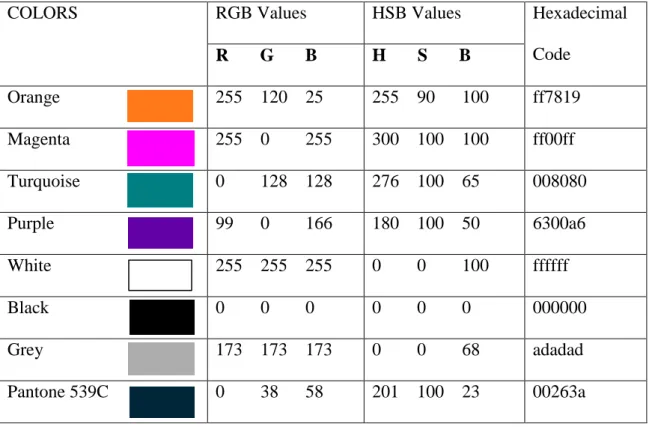
Table 4.4. RGB, HSB and Hexadecimal codes of the colors used. ...………….….73
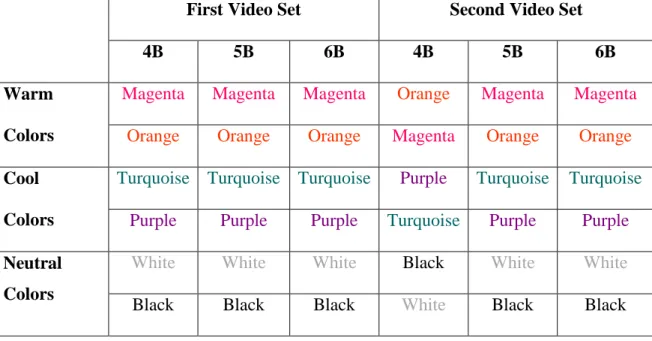
Table 4.5. Demonstration of changing colors in the first and the second videos ………...………75
Table 4.6. Demonstration of the questions from 1 to 12 ……..……….77
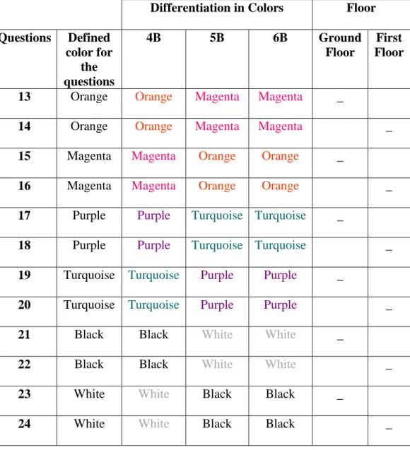
Table 4.7. Demonstration of the questions from 13 to 24 …………...…………...78
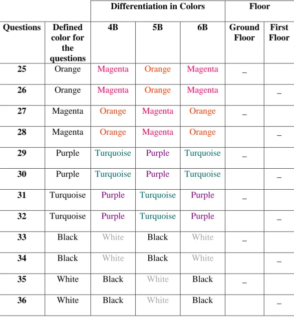
Table 4.8. Demonstration of the questions from 25 to 36 ……..………...79
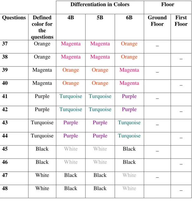
Table 4.9. Demonstration of the questions from 37 to 48 …..………...80
Table 4.10. Percentage and frequency table of yes and no answers for each color...……….….….87
Table 4.11. Percentage and frequency table of accurate answers for true and false memory for each colors …….………..89
Table 4.12. Percentage and frequency table of accurate answers for each color scheme for true and false memory ………..……….90
Table 4.13. Frequency table of accurate answers for each color in the ground and the first floor ………92
Table 4.14. Percentage and frequency table of accurate
answers for each city name……..………..94 Table 4.15. Frequency table of accurate answers for
the single colors and paired colors for each floor ………..………96 Table 4.16. Demonstration of p values of Chi square test for
single colors, single and paired colors and paired colors………...97
LIST OF FIGURES
Figure 2.1. The Munsell color system ……….7
Figure 2.2. NCS color circle and NCS color triangle ………..8
Figure 2.3. CIE chromaticy chart ……..……….………9
Figure 2.4. Additive colors ….………...………10
Figure 2.5. Types of memory ………12
Figure 2.6. Differences between short- term and long-term memory………13
Figure 3.1. Demonstration of the relation between sign distance and cap height of letter ………...………...……….…………...41
Figure 3.2. Roman letters …………...……….……...42
Figure 3.3. Demonstration of route- colored map, trunk-colored map shaded color map.………..……...………..……...56
Figure 4.1. Ankara railway station plan demonstrates route from Yüksek Hızlı Tren (YHT) entrance to platform 4B ………...61
Figure 4.2. Location of signage on decision points ………..…….68
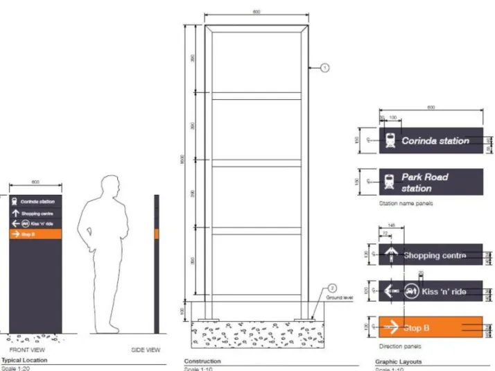
Figure 4.3. Demonstration of the typical location and graphic layout of the directional sign……….70
Figure 4.4. Dimensions of the signage design for this study……….71
Figure 4.5. Demonstration of sign colors differentiation for the first and the second videos………81
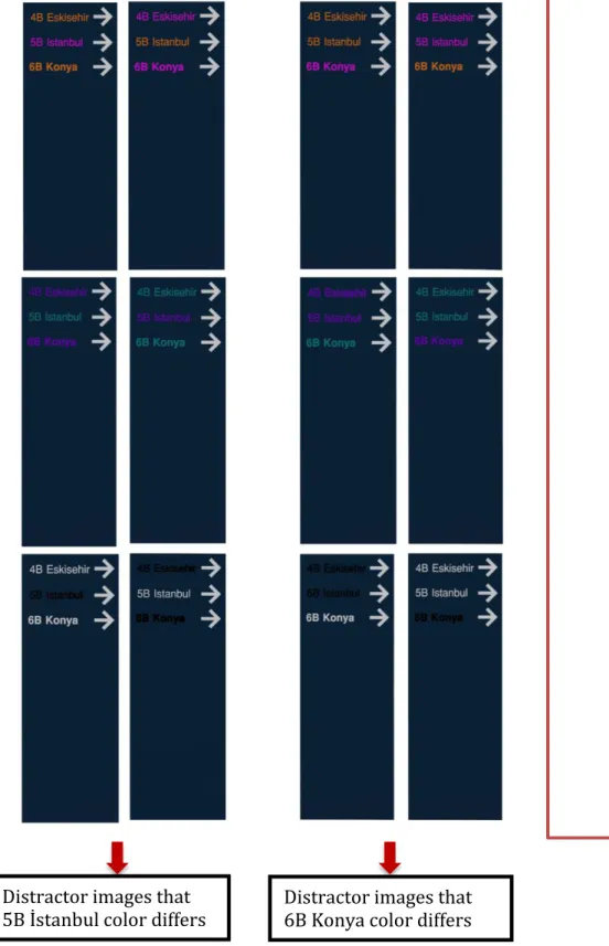
Figure 4.6. Demonstration of sign colors differentiation for distractor images...…..82
Figure 4.7. Flowchart of the experiment………..…………..83
CHAPTER I
INTRODUCTION
Train stations are complex environments where people encounter some difficulties while finding their train (Arthur & Passini, 1992). Good wayfinding system should provide information about the current position of the user, give directions about the transport modes and routes, and inform the users after reaching the destination (Transport Design Manual, 2019). Signs can improve legibility of spaces by assisting wayfinding processes. Especially, locating signage improves the usability of large buildings (Nassar, 2011). Also, in the design process, designers should take into consideration the signs to improve the wayfinding process.
Color has an impact on memory by increasing the level of attention so that the information is remembered (Dzulkifli & Mustafar, 2013). However, people cannot remember the information because of forgetting or because of the distortion of the memory. These affect remembering the events accurately. False memory described in the psychological literature on memory distortion (Loftus, 1996) has two
paradigms. These are Deese- Roediger- McDermott (DRM) paradigm and misinformation paradigm. In this study misinformation paradigm, which is remembering a situation that never occured or differently from the way they occurred (Roediger & McDermott, 1995), is studied.
It is important to understand the effect of misinformation on sign color in train stations in order to observe the influence of given information on directions for wayfinding. In order to perceive the space and provide legibility, accurately
remembering the colors on a sign is significant. Thus, healthy wayfinding processes are conducted with decreased confusion and reduced possibility of being lost and missing the train (Wang et al, 2019).
1.1 Aim of the Study
The main aim of the study is to understand the effect of misleading information on remembering different colored signs in the train station. It is important to understand how color influences the train station users while finding the destination.
Recognizing and recalling the first encountered color can ease the wayfinding process by guiding the user who follows the color of indicated direction. The findings of the study can be beneficial for architects, interior architects, graphic designers and those who are interested in memory, color and signs.
1.2 Structure of the Thesis
The thesis consists of five chapters. The first chapter is the introduction, in which the approach of memory, wayfinding and how they can be influenced by color are briefly mentioned. Moreover, the aim of the study and the structure of the thesis are mentioned in this chapter.
The second chapter consists of color and memory. Basics of color that includes the characteristic of the color, and color order systems which are Munsell Color System, Natural Color System (NCS), CIELAB and RGB Color Model are defined. Also, it captures expression of memory. Firstly, memory is defined in general to acquire information about the distortion of memory. Secondly, false memory and its paradigms are explained with the literature review. Thirdly, in order to understand the effect of color on memory, color memory is clarified with experimental studies.
The third chapter analyzes the definition of wayfinding. The significance of wayfinding is explained in order to understand the perception of built environment through the wayfinding process. The wayfinding studies in virtual environments (VE) are including explanations and beneficial features. Additionally, advantages and restraints of experimental studies in virtual reality (VR) are indicated. Individual differences which are familiarity, age and gender are clarified. Graphic components of wayfinding design that maps and signage are defined. Afterwards, signage design,
sign types and the sign design emphasizing the font, color and material are examined in detail. Studies on the impact of color in wayfinding are included. Lastly,
characteristics of train stations affectin wayfinding are explained. Train station types and wayfinding behavior in train stations are included through the urban scale to the interior scale of stations. Besides, signage design in train stations with legibility and design requirements are indicated.
The experiment is clarified in the fourth chapter. First, the aim of the study, research questions and hypotheses are explained. Then, the method of the study is defined with the description of the site, identification of the sample group and the procedure of the experiment including the phase 1 and phase 2, sets of the experiment,
preparing the questionnaire and phases of the experiment. The findings of the experiment are statistically analyzed and evaluated. The results are discussed and compared in relation to the preceding studies.
In the last chapter, the conclusion of the thesis and limitations are included. Visual and written documents of the experiment and charts of the statistical analysis are involved in the appendices.
CHAPTER II
COLOR AND MEMORY
2.1 Definition of Color
Color impacts every part of our lives which surrounds us (Fehrman & Fehrman, 2000). Meervein, Rodeck and Mahnke (2007) explained the common definition of the color which is “a specific visual sensation produced by visible radiation, or “color stimulus" (p.18). They stated that if natural light or artificial source of light is interrupted by an object or a dust particle, color stimulus occurs. Color has an impact on lots of are in design. Dalke et al. (2005) indicated that color is an intrinsic
property of all materials and surfaces. It is included in lots of area in design.
Fairchild (2005) defined color as a visual perception characteristic which consists of any combination of chromatic and achromatic color.
Color sensation has three attributes which are hue, saturation and brightness. Hue is the quality that provides differentiating one color from another like red from yellow, green from blue or purple. It is a distinctive feature of coloring in an object or on a surface that equal luminosity and chroma may differ (Munsell, 1988). According to the consideration of the hue, white, gray and black are achromatic colors which are
lack of hue (Raskin, 1986) and apart from these colors are defined as chromatic colors. Besides, color can be classified as warm colors (Chijiiwa, 1987). Warm colors are hues from red to yellow and cool colors are hues from green to violet. Saturation is the quality of color that provides to “difference between strong and weak colors, the degree of color sensation from that of white and gray; the intensity of a distinctive hue; color intensity” (Munsell,1988, p.16). Fehrmen and Fehrman (2000) defined saturation as the amount of pigment in a color which is strength or vividness of that hue. Saturation reduces when adding white to a color that produces a tint (Raskin, 1986). Value or brightness is about a light color differing from a dark one (Munsell, 1988). Adding black to a color reduces its brightness that produces a shade (Raskin, 1986).
2.2. Color Order Systems
When a large number of colors are necessary and intermediate colors between samples are considered, a system is required. These systems are known as color order systems (Hunt, 1988). It provides us to communicate to each other (Fehrman & Fehrman, 2000).
2.2.1. Munsell Color System
In Munsell Color System surface colors are identified by three quantities which are
hue, chroma, and value (Agoston, 1987) (see Figure 2.1.). There are five principle hues which are red (5R), yellow (5Y), green (5G), blue (5B), and purple (5P). The intermediate hues are yellow-red (5YR), green-yellow (5GY), blue-green (5BG), purple-blue (5PB), and red-purple (5RP) (Hunt, 1987). Hue range includes 11 hue radii from 0 to 10, the value indicates the lightness of the color from 0 to 10 scale (Agoston, 1987). He defined that chroma is the difference from a gray of the same lightness that measured along the hue radius which is zero at the center.
Figure 2.1.: The Munsell color system
(https://en.wikipedia.org/wiki/Munsell_color_system#/media/File:Munsell-system.svg)
2.2.2. Natural Color System
The Natural Color System is the relative amounts of the basic colors expressed as percentages, which are perceived to be present (Hunt, 1978). It is the “recognition of the six psychological primaries which are white, black, yellow, red, blue and green” (Agoston, 1987, p.95). The unitary hues which are Y, R, G, and B are systematically located on the NCS color circle. The dashed lines demonstrating hues of 50/50 mixtures: YR (yellow-red), RB (red-blue), BG (blue-green), and GY (green-yellow) and hue ranges (Agoston, 1987) (see Figure 2.2.).
Figure 2.2.: NCS color circle (left hand side), NCS color triangle (right hand side) (Akbay & Avcı, 2018, p. 144)
2.2.3 CIELAB
CIELAB is a system that is “based on spectrophotometric measurements of color samples illuminated by specific types of lighting and related to the visual response of a standard observer” (Fehrman & Fehrman, 2000, p. 209). Tri stimulus values of X, Y, Z can be converted to three quantitates L, A, B, with simple calculations. These three quantitates supply a different color space. Moreover, it is developed to maintain a standardized color scale to discriminate the industrial color differences (Agoston, 1987) (see Figure 2.3).
50
Figure 2.3: CIE chromaticy chart (Ghazijahani et al., 2016, p.20).
2.2.4 RGB Color Model
In this study RGB color system is used on arrangement of the colors. Also, it is preferred because of displays on the devices’ screen. RGB color model constitutes of mixing various proportions of colored light which is called “additive color
mixture”(see Figure 2.4). Mixture of three primary light colors which are red, green and blue produces white light (Raskin, 1986). Mixture of the red and green light constitutes yellow light, red and blue lights produce magenta and blue and green lights create cyan (Eiseman & Herbert, 1990).
Figure 2.4: Additive colors
(https://marketingaccesspass.com/what-colors-make-red-what-two-colors-make-red/ )
2.3 Definition of Memory
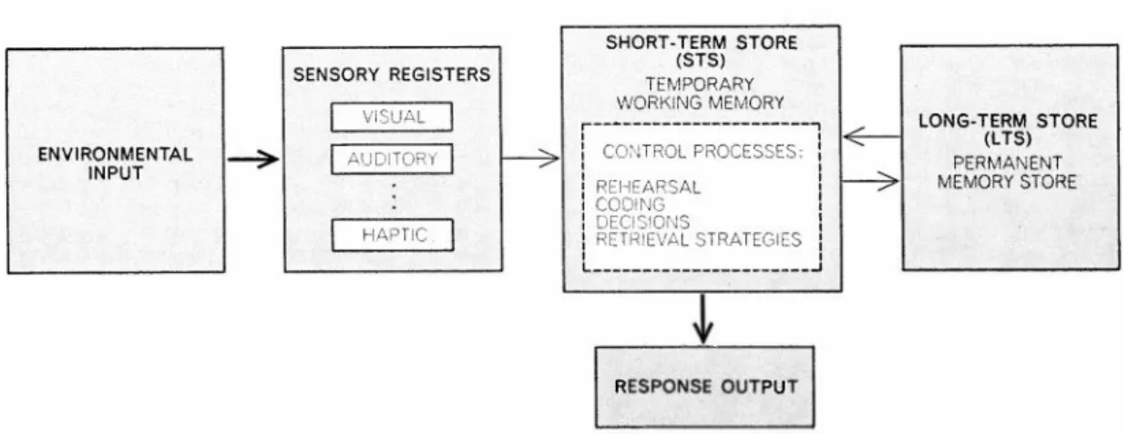
Memory is the capability to achieve and maintain new information and retrieve it in a conscious or unconscious way, when required that consists of a set of independent systems acting collectively (Squire & Kandel, 1999, as cited in Guarnieri, Bueno and de Souza Silva Tudesco, 2019). It is a method which provides people with past experiences and thoughts to advance from one idea to the next (Bower, 2000). Also, it is defined as encoding, storage and retrieval of the past experiences in human mind (Memory, n.d.). Tulving (2000) stated that memory is a neurocognitive resource to encode, store and retrieve information, a hypothetical store that information is held and memory as a property of information, componential process of retrieving information and people’s exceptional awareness of remembering something.
Memory has two types which are explicit memory and implicit memory. Explicit memory is consciously remembered knowledge or experience that consists of firsthand experiences which is episodic memory and semantic memory, knowledge of facts and concepts about the world (Stangor & Walinga, 2014). Implicit memory is the impact on current perceptions and behavior that individual is unconscious of the influences (Einstein & May, 2013). It has three types that procedural memory is often unexplainable awareness of the way things are done, classical conditioning effects that creating a naturally occurring response with correlation of neutral stimuli
(like a sound or a light) with another stimulus (like food) and priming is the alter in behavior resulting from the experiences that happened frequently or recently (Stangor & Walinga, 2014) (see Figure 2.5).
Figure 2.5: Types of memory (Stangor & Walinga, 2014, p.338).
Memory comprises three stages. These are sensory memory, short-term memory and long-term memory. Sensory memory is a short-lived memory that includes sensory details of events how things look, sound, feel, smell and taste (Cowan, 2008). Short-term memory is “a number of memory systems with limited capacity, concerned with the temporary (in the range of seconds) retention of a variety of materials” (Vallar, 2002, p. 367). It is a short term interval that keeps information 30s or less (Healy, 2001). Working memory and short-term memory can be confused. Working memory is the process of using the information to make sense of, modify, interpret, and store (Stangor & Walinga, 2014) information that lasts 2 to 18 seconds (Einstein & May, 2013). Long-term memory stores the information a long time with learning and repetition that obtains the information by using triggers or cues (Clarkson, 2008)
(see Figure 2.6).
12
Figure 2.6: This flowchart indicates the differentiation between short-term and long-term memory (Atkinson & Shiffrin, 1971, p.3).
Memory has three processes; encoding which is converting a physical and sensory information into a kind of identification that takes place in memory. Storage holds encoded information in memory and retrieval is recovering the information stored in memory (Sternberg & Sternberg, 2011). Okado and Stark (2005) stated that
forgetting is a well-accepted behavior because through passage of time or through building new information, memories can be lost. Poor encoding, failure to
consolidate or store memories like reactivation or rehearsal, lack of adequate hints for remembering and interference of information with the cues to the target
reasons for forgetting (Johnson et al., 2012). Nevertheless, it is thought that memories are stored in a secure location in our head, from which accurate
13
recollections of the past events can be extracted. However, it is also unreliable and deeply susceptible to incorrect information or misinformation chasing an event (Benedict, Richter & Gast, 2019).
2.4 False Memory
Loftus (1996) stated that false memory originated from the psychological literature on memory distortion. Schacter et al. (2003) explained memory distortion in seven sins that transience reducing of memory accessibility over time, absent-minded lapses of attention that result in forgetting to do things, blocking information that has not faded out of memory but is temporarily unavailable for a variety of reasons. Misattribution is a lack of source when people could not remember where they have got information, suggestibility is guiding questions or suggestions that direct people to believe something has never happened, bias is current knowledge and beliefs that change memories about the past, persistence is undesirable recollection that people cannot forget (like traumatic experiences) (Schacter et al., 2003).
True memory is the real retrieval of an event of any nature, be it visual, verbal, or otherwise (Guarnieri, Bueno & de Souza Silva Tudesco, 2019, p. 50). On the other hand, false memory is remembering a situation that never occured or differently from
the way it occurred (Roediger & McDermott, 1995). Johnson (2001) described false memory as a mental experience that erroneously was taken as a veridical
14
representation of an incident of individuals’ past occurrence. Memories have profound impacts on oneself and others like believing falsely someone is the originator of an idea in major ways and remembering the keys are in the kitchen while they were in the living room in minor ways (Johnson, 2001). False memories are the remembrance of occurrence by a witness that indeed did not happen
(McGrath & Turvey, 2014). False memories occur in different ways, from changes in the meaning of a memory (e.g. thinking that you saw something imagined or
thinking that you heard about an incident on television news rather than from a friend) to changes in the substance of the memory itself (e.g. believing that a suspect held a weapon rather than a knife), making it possible that there are several
mechanisms by which these distortions occur (Okado and Stark, 2005).
Two paradigms are used specifically to analyze the false memory. These are Deese- Roediger- McDermott (DRM) paradigm and misinformation paradigm.
2.4.1 Deese, Roediger and McDermott (DRM) Paradigm
The Deese, Roediger and McDermott (DRM) paradigm was built by Deese (1959) and revitalized by Roediger and McDermott (1995). In the DRM paradigm
participants learn a list of related words (e.g. “bed, rest, awake, dream”, etc.). After learning the words each of them semantically closely related words items which
correspond to a critical non-studied word (so called lure, e.g., “sleep”) and unknown control items are presented falsely in a recognition test (Roediger & McDermott,
15
1995). In this paradigm “in a recognition test with a subset of encode words which are the critical lure words and irrelevant lure words are demonstrated to participants. They have to make simple judgements whether they remember each word or not. In a recall test, they have to write down all the words they are able to remember”
(Pardilla-Delgado & Payne, 2017, p.1).
A false memory occurs when participants report the non-studied words on tests of recall or recognition test, even those words were demonstrated (Eslick, Kostic & Clearly, 2010). In the recognition phase participants identify objects which seem merely familiar. They recognize preceding stimuli (words or images) when
compared with the items presented (study phase) in a list which are not demonstrated before (recognition phase). Familiarity appears to operate faster than the recollection when the concerned the quick decision of recognition. (Guarnieri, Bueno & de Souza Silva Tudesco, 2019).
In this paradigm impact of false memory on color is evaluated with the words related to the color names. Roediger and McDermott (1995) studied a list of words
correlated with the "black" but only for one color name, list of words associated with the color names may evoke another color name which increases the possibility of false memory (Eslick, Kostic, & Cleary, 2010). Eslick, Kostic, & Cleary (2010)
conducted a study in order to understand the impact of false memory for color variation in color names. For example, if the color- related words are displayed in
16
different font colors compared with the actual font color would participant remember the actual color name or show false memory with remembering the font color. They reported that participants falsely recall the word of color among the related word list when compared to the seeing the color (e.g. red) in different font colors. Moreover, colored fonts reduce the impact of false memory when compared the standard non-color related lists. Impact of false memory on non-color was also studied by the
misinformation paradigm.
2.4.2 Misinformation Paradigm
Misinformation paradigm is described by Loftus, Miller and Burns (1978). Exposing misleading information causes memory impairment which is called the isinformation effect (Loftus, 2005). In this paradigm, participants watch videos or slides showing crimes or criminal plots. After that in a distractor or retention phase, misinformation concealed in a narrative text or a list of questions about the represented event (Volz et al., 2019). The majority of the information presented were accurate, but one or more pieces of information were consciously presented false. After that participants take a recall test. The effect of misinformation arises when participants accept encountered misinformation. The participant who encountered with the
misinformation have more tendency to remember falsely compared to the people who did not have a misinformation (Moore & Lampinen, 2016).
17
Misinformation paradigm has three phases. In the first phase participants watch an event, secondly, misinformation is given by questions or narrative, lastly participants are asked to recall or recognize the original event. According to the misinformation, participants’ results may be influenced or not (Challies, 2011). Misinformation paradigm is usually introduced by indirectly hiding them in the questions about the event and post-event that narrative describing the event. Also misinformation is introduced directly with face to face interaction between people who witnessed an event. Another way is that participants discuss the observed event with a co-witness (experimental confederate), who inserts misleading information on conversation, before the memory test which effects individual’s memory performance (Blank et al. 2013).
Memory tests concentrate on the two impacts of misinformation. These are participants who are misled about the information, having poor performance for original event details compared with the no-misinformation control group who evaluate with forced-choice recognition, yes-no recognition or cued recall tests (Blank & Launey, 2014). Another concentration is about participants who strongly accept the misinformation in the cued recall test and yes- no tests that in source monitoring test they mistakenly claim that they encountered misinformation in the original event (Blank & Launey, 2014).
One of the well-known experiments that Loftus (1977) conducted had two stages. In
18
the first experiment, participants watched a series of color slides of a car accident between a red Datsun and a green car on one scene. Half of the participants answered questions with misinformation that the color of the car was blue and the other half of the participants without this written misinformation (blue). After that, they read an unrelated story to answer questions. In the color recognition test, participants
selected the color of ten objects including the car. After seven days, the control group answered new questions without a demonstration of the slides. The control group was divided into two to observe the impact of misinformation with new color recognition test. They indicated that participant who had misinformation about the color (green) of the car remembered the color as blue. In the second experiment, the same as the first experiment, initial color recognition test was not given. According to the two experiments, participants who had misleading information answered questions according to that misinformation (Loftus, 1977).
There are two other studies concerned about the correlation between misinformation and color. One of them is Braun and Loftus (1998) demonstrating an advertisement about a chocolate bar in a green wrapper divided into four experiments. In the first experiment they tried to observe the impact of difference, presenting misinformation (blue wrapper) visually and verbally. Misinformation had an impact on participants’
responses more with visually than verbally. In the second experiment, participants were warned about the color that it was not accurate. Comparison between the
19
warned and unwarned participants indicated that warning was not an effect on the results. In the third experiment, impact of color on consumers’ decision making was evaluated. Color had a huge impact on searching grocery rather than a chocolate bar. In the last experiment, alteration of color had an impact on participants’ subjective assessment of the product. Misinformation about the color that correlated with less contamination and higher safety had favorable decisions and high tendency to buy that chocolate in the future (Braun & Loftus,1998).
Another study was conducted by Belli (1988) with slides. It demonstrated to the participants that misinformation about color of a green plastic pitcher displayed in one slide changed in the question either yellow or blue or no color information. According to the results of the study, among the range of options of a color wheel, misled participants selected the color of misinformation. These studies give common results about the misinformation impact with restricted colors. Even though color memory studies are not scope of the study. It gives more detailed information about the memory and color.
When comparing DRM paradigm with the misinformation paradigm, DRM paradigm is simple in several respects. Its encoding includes the quick depiction of the list of
words either visually or aurally (Pardilla-Delgado & Payne, 2017). Volz et al. (2019) identified differences of DRM paradigm from misinformation paradigm that DRM
20
paradigm has a different method which is schematic activation method and types of false memory which is false recognition of new information to evoke false memory. However, the misinformation paradigm has misleading information method and false recognition of mislead information rather than original information. In the present study, the experiment was conducted according to the misinformation paradigm.
2.5 Color Memory
Burnham and Clark (1954) defined that people encounter recognitive memory for color in occupational and daily life activities. They exemplified that artists used color memory when looking back and forth between the canvas and the landscape and, housewives used color memory when choosing a curtain to match the trim of the kitchen, and that the examples can be increased.
The “color memory” is relating colors with familiar objects which an individual has frequent visual experience (Bartleson, 1960). Witzel and Hansen (2015) stated that color memory is memorizing a specific color over time. They exemplified that people recalled orange more accurately than other colors when demonstrated Halloween pumpkin. Because its color is typically orange. It is a successive color matching by comparing colors after a certain time lapse required to use memory,
matching the present with the remembered (Pérez-Carpinell et al. 1998a). Witzel and Gegenfurtner (2013) stated that memory color is the relation between objects and
21
colors taking place with familiarity, idea about the typicality among colors and association between the object and its typical color.
Color makes a contribution to memory. Borges, Stepnowsky and Holt (1977) investigated performance of recall and recognition in three different modes of
demonstration (written words, black and white pictures of objects and color pictures of the same objects). They found that color pictures and names of objects had better recognition performance than the black and white pictures of objects. Spence et al. (2006) experimented with color and gray scale images indicated that color supported remembering the natural scenes.
Memory is related with attention. Attention is a cognitive process of selecting information involved in an environment (Dzulkifli & Mustafar, 2013). Color allows a person to memorize the information by increasing the attention level (Dzulkifli & Mustafar, 2013). Pan (2010) conducted a study in which participants had to
memorize the color and shape of the object. He found that color is more effective on the attention rather than shape.
People restore information in short-term memory and long- term memory. Short-term memory for monochromatic hues indicated that violets, green-blues and yellow-
oranges were correctly remembered (Nilsson & Nelson, 1981). The consideration of
22
long term memory in color constancy for matching a test color demonstrated that long and medium wavelengths (reds and greens) have more tendency to be remembered accurately than shorter wavelengths (blues) (Jin & Shevell, 1996).
Pérez-Carpinell et al. (1998a) conducted a study with the color wheel in which
participants had to remember the demonstrated colors on the wheel. According to the results of the study, orange was the easiest color to recall among ten tested colors. Yellow, light green, blue and pink were the hardest to recall. Another study of memory for color chips indicated that yellow was most accurately remembered, followed by purple and orange and the least accurately classified colors were green (Bynum, Epps & Kaya, 2006).
Another study Pérez‐Carpinell et al. (1998b) was conducted among familiar objects to find the impact of familiarity on color memory in physics (PHY) and School of Fine Arts (ARTS) students with two illuminants. These illuminants are “Illuminant D65 which is the daylight illuminant and Illuminant A which represents the spectral power distribution of a typical tungsten incandescent lamp” (Goodman, 2012, p. 424). Results indicated that the best remembered color in illuminant D65 are purple aubergine and green lettuce for PHY; green water-melon and red tomato for ARTS.
Under illuminant A the most remembered objects were red tomato and purple aubergine and green water-melon for PHY; green water-melon and red tomato for
23
ARTS. The worst remembered colors in illuminant D65 were brown chestnut and orange. Under illuminant A the worst remembered objects were yellow melon and pink rose for both of the students.
Color memory studies showed that differed among the age range and gender. Pe´rez-Carpinell et al. (2006) conducted a study of simultaneous and successive color matching with a comparison of a set of five Munsell color samples. The age range is between 64 to 80 years of 50 older adults. They found that younger adults matched the target color and remembering the original color of better than elderly adults. Also, gender did not have a significant effect on memory. However, men matched the colors poorly than the women, especially for bluish green, violet and pink. Another study, conducted by Pe´rez-Carpinell, Camps, and Trottini (2008), comprised of 50 children whose ages ranging from 9 to 11. The method of simultaneous and memory color matching with a set of five Munsell color was analyzed. According to the results of the study, children performed better in matching orange, bluish, and yellow green color than young adults. Women remembered violet better than men, girls remembered orange and pink better than boys. Moreover, in short-term memory boys remembered bluish green better than
girls and women remembered yellow green better than girls. These studies indicated that remembering the target colors differs with age and gender.
In the color memory studies, color was compared according to the hue differences
24
(Pérez‐Carpinell et al., 1998a, Nilsson & Nelson, 1981), familiar objects (Pérez‐ Carpinell et al., 1998b) and different illuminant conditions (Pérez‐Carpinell et al., 1998b). Also, age range and gender had some different effects on remembering the colors. These studies did not include the method of false memory but gave
information about the recalled colors with the comparison of the colors. In the study, the purpose is to identify the color difference in memory. In order to select the colors for the study and compare the results, these studies were taken into consideration.
25
CHAPTER III
WAYFINDING
3.1 Definition of Wayfinding
Lynch (1960) analyzed the characteristics of the city plan and people’s perception of the environment. According to his studies the term “wayfinding” was revealed. Lynch (1960) analyzed environmental setting in five type of elements. One of them is the paths which are the channels people move through like streets, walkways, transit lines, canals, railroads; edges are linear elements that defines the boundaries between two phases. Walls are an example of the built environment. Districts are medium to large sections of the city, also described as regions that specify it with their recognizable characters. Nodes are the points, the strategic points that are primarily are junctions between different places. Landmarks are a type of point-referencing physical objects such as building, sign, store or mountain. These elements have been considered on the designing process by urban planners,
architects and interior architects who adapted work inside of the buildings (Hidayetoğlu, Yıldırım & Akalın, 2012).
There are five building attributes which help the construction of mental maps (Pollet
26
& Haskell, 1979). These are; clearly defined path and circulation systems, markers which stand out from the general background stimuli, identifiable nodes where paths converge, strong edges such as walls and landscape features and easily identified the zones/districts (Pollet & Haskell, 1979). Including these building facilities
contributes to the perception of space.
Arthur and Passini (1992) defined wayfinding as problem solving of making a journey and reaching a destination. It provides ease of circulation, accessibility and building safety in emergent situations (Passini, 1996). It is the process of deciding and following a path or route between starting point and the destination (Golledge et al., 2000). Three categories of wayfinding are; travelling between two familiar places labeled as commute, travelling into unfamiliar territory for learning the surrounding environment named as explore and traveling from familiar place to the origin of the unfamiliar destination is called as quest (Allen, 1999a).
Golledge et al. (2000) divided human movement into two which are navigation and wayfinding. They explained that navigation is the process of spatial information concerning position and rate of travel between origins and destinations, shortly
following a path. Wayfinding is defined as selecting and linking path segments from an established network as one travels along a specific route (Golledge et al., 2000). People feel disoriented if they cannot position themselves and cannot develop a place to reach the destination (Arthur & Passini, 1992). In an unfamiliar environment,
27
people requires information to make decisions which are about the setting to find their destination, information to execute decisions, information about the destination and information to conclude the decision-making/executing process (Arthur & Passini, 1992).
Arthur and Passini (1992) stated that wayfinding has three specific but interrelated processes. These processes are; “decision making and the development of a plan of action; decision execution which transforms the plan into appropriate behavior at the right space; information processing understood in its generic sense as comprising of environmental perception and cognition, which, in turn, are responsible for the information basis of the decision-related processes” (Arthur & Passini, 1992, p.25).
Being in an unfamiliar place of feeling that it is difficult to find a place has some psychological impacts on people. The frustration and stress that people are exposed to while getting around in the built environment are as bad as being lost (Arthur & Passini, 1992). Having difficulties with wayfinding might have negative impacts like loss of time, decreased safety, stress, or discomfort (Doğu & Erkip, 2000). Vilar,
Rebelo and Noriega (2014) indicated that having difficulties with wayfinding made visitors avoid places like shopping malls, hospitals, museums, airports, train stations and convention centers. However, easy wayfinding provokes positive feelings that make people want to visit it again (Çubukçu, 2003).
28
Working memory takes part in recognition of the places. Davis, Therrien and West (2009) defined working memory as attending, selecting and remembering
appropriate environmental information. Balaban et al (2017) claimed that
navigationally relevant data such as landmarks must be stored in long-term memory and later accessible in the working memory in order to avoid getting lost.
Legibility of typographic information provide with distance, angular distortion and background contrast are significant for wayfinding (Passini, 1996). Common identifying property of legibility and orientation is recognition (Doğu & Erkip, 2000). Legibility contributes to the recognition of space and the identification of users from their visual qualities (Wang et al., 2019).
Spatial cognition enables people to represent, arrange, understand and navigate the environment to take part in specific objects, to control them and transmit knowledge about the objects and the environment to others (Spence & Feng, 2010). Visuospatial perception and memory maintain to perceive and retain the size, proportion, layout and localization of spaces and objects (Min & Lee, 2020). According to the concern of relation of cognition and environment, spatial orientation gains importance.
Spatial orientation is the ability of individuals identify themselves in an area that is entirely based on creating an adequate cognitive map of the space (Arthur & Passini, 1992). People need to perceive the space to find the paths or alternative ways to reach the destination. According to the spatial orientation, cognitive map should be considered. Cognitive map is a whole mental image or representation of the area and
29
the environmental layout (Arthur & Passini, 1992). It differs from the cognitive mapping, which is the process of mental structuring, which incorporates what has been perceived in parts into the whole (Arthur & Passini,1992).
3.2 Virtual Environment in Wayfinding Studies
People can visualize and interact three dimensional spatial environment of real spaces in virtual environment technologies (Çubukçu & Nasar, 2005). Blascovich et al. (2002) defined virtual environment (VE) as “synthetic sensory information that leads to perceptions of environments and their contents as if they were not synthetic” (p. 105). Virtual reality (VR) is advanced computer technology. It can give users several intuitive sensations, when simulating mechanisms in a physical or imagined environment (Guo et al. 2020).
Flexibility is essential aspect of virtual reality (VR) that researcher can design according to the requirements of the study objectives and have higher variable control that is very difficult to accomplish when used in real-world settings (Vilar,
Rebelo & Noriega, 2014). Preferring VR in navigation training has significant benefits on performing exercises rather than real environments (Claessen et al., 2016).
Virtual environment technology systems are categorized into two which are desk-top
30
systems and immersive-display terms. Desk-top systems demonstrate the virtual environment on a fixed computer screen while immersive-display systems
demonstrate it from two small scenes of a head-mounted display (Pe´ruch, Belingrad, & Thinus-Blanc, 2000). These technologies advantages are possibility of designing environments in varying complexity, allowing online measurements during
navigation, monitoring several spatial learning parameters like amount of exposure to the environment and number, position and nature of landmarks (Pe´ruch,
Belingrad, and Thinus-Blanc, 2000). They indicated the advantages of the VR that provide control of environmental factors such as noise, light, materials and presence, gain time and financial cost from the production and installation which can be hard in the real environment. VR makes observations in real world become possible in virtual worlds (Conroy, 2001).
3.3 Different Aspects in Wayfinding Behavior
Familiarity, age and gender are the main aspects of the differences. Familiarity is one of the issues of wayfinding. Passini (1996) stated that spatial orientation is the ability of the individuals to reflect the special characteristics of an environment and placing themselves in it. It can be hard for them to be familiar if they could not place
themselves in the environment. O’Neill (1992) stated that complexity of the floor
31
plans impact wayfinding performance negatively. He added that low level of familiarity is affected from the plan complexity. Chebat, Gélinas-Chebat and Therrien (2005) stated familiar people use information in their long-term memory however unfamiliar people use maps, signs and other people. Hölscher et al. (2006) indicated that familiar participants rely on their knowledge while unfamiliar
participants consult information from the building and outside. According to the results they found that familiar participants performed better in achieving a target. Armougum et al. (2019) conducted a study to examine the cognitive load (reservoir of cognitive resources for various tasks to perform) in real- life situations with travelers in train stations. They compared the cognitive load in real-life
environmental condition and virtual reality simulation of train station. Performance of the regular (experts) and ocassional (novice) travelers were compared. The results demonstrated that experts have higher performance than novices. These studies indicated that familiarity improves the wayfinding performance.
Another determinant on the individual differences is the gender. Galea and Kimura (1993) found that males were more effective than females at learning the road. Males
are better when considered the Euclidean measure that refers to parameters of the map studies. Females, on the other hand remembered more landmarks than males. Schmitz (1999) reported that when concerning the route direction in maps and descriptions, men performed better than women. However, women were better than men in the use of landmarks to route directions. In the studies of Çubukcu and Nasar
32
(2005), it was found that in comparing directions and navigation errors males are better than the females. Lin et al. (2012) conducted a study with locating targets in grid-like virtual environments. When they compared the performance of females and males, they found that males moved quicker than females. However, males could not navigate the spatial surrounding more efficiently than females. According to the evaluation of the wayfinding performance, gender efficiency differs.
Age is another point in wayfinding studies. Çubukcu and Nasar (2005) reported that younger respondents had better performance on navigation errors than the older ones, performance decreased as the age increased. According to Osmann and
Wiedenbauer’s (2004) report, participants learned a route from the slide
presentations after they had to remember the landmarks in order to find their way in a virtual environment. When comparing the results according to age, second graders relied more on the landmarks than the six graders and adults remembered fewer landmarks. Six graders and adults had close recognition in landmark rates. Head and Isom (2010) conducted a study between young and older adults who completed wayfinding and route learning tasks in a virtual environment. There were
age differences in the wayfinding process with recalling landmarks and recognizing environmental scenes. When concerned the route learning conditions, older adults had some difficulties with the landmarks.
33
3.4 Graphic Components of Wayfinding Design
The memory of spaces may be distinguished relying on whether it comes from direct or indirect sources. Direct sources include the navigational experience of space by walking or standing and indirect sources involve maps and navigational aids that provide an external description of the environment (Willis et al., 2009). There are two graphic component of wayfinding design. These are the maps and the signage in building orientation.
3.4.1 Maps
Maps provide nearly complete route planning in advance (Hölscher et al., 2007). Having a map even in simple buildings is beneficial for orientation purposes. It supplies information for people to understand where they are and the whole of the building (Pollet & Haskell, 1979). The interpretation of maps requires understanding a “stand for” relationship between environmental characteristics and cartographic conventions used to symbolize and creating a relationship between the map user and the environment with “you are here” (Allen, 1999b). You-Are-Here maps may
theoretically serve to help self-locate and track one’s progress toward the target (Hölscher et al., 2007). You- Are- Here maps are solidly installed vertically on walls or signposts (Richter & Klippel, 2002). It needs to be located near decision points. Also, they should be positioned on the entrances that visitors can orient themselves at these points, decide their destination and the route (Richter & Klippel, 2002).
34
3.4.2 Signage
Signage systems are visual information systems that use graphics and characters to convey direction, identification, safety and regulations of environmental information (Calori & Vanden-Eynden, 2015). By simplifying the apparent complexity of a building, an effective signage system may indicate quick and efficient evacuation routes (Zhang, Jia & Qin, 2017).
3.4.2.1 Signage Design
Signage has significant effect on the safety and usability in public spaces when concerned wayfinding in open urban spaces or large indoor building spaces (Nassar, 2011). Nowadays, smartphones have an advantage on locating the position and finding the best route for the destination in outdoors (Motamedi et al., 2017). Nevertheless, low accuracy of indoor positioning technologies and outdated floorplans affects indoor navigation that maps and signage provide to reach the destination (Motamedi et al., 2017). Good signage is important to help traveler in their journey by including essential information (Greenroyd et al., 2018). Zheng
(2020) stated that regardless of the type of map used, signage is the most commonly used landmark for finding the way.
Signage is the primary wayfinding attribute considered to assist individuals
achievetheir way to a desired destination (Vilar et al., 2015). Signage includes visual
35
indicators for the mental picture of the environment by increasing the user’s
knowledge of the space with map, signs and other aids (visual or otherwise) to reach the destination (Jalees, 2020). People who used the signs reached the destination more quickly than people who used the You- Are- Here map (Butler et al., 1993).
Readable signs decrease the incidents of confusion, tension and danger. Designers associate readability with the color that enhance interior signage and effectiveness in interior spaces (Lomberski, 2008). “Signage must often be read at a distance by pedestrians walking quickly or passengers in moving cars, letterform legibility is critical to the success of a wayfinding program” (Gibson, 2009, p.80). Legibility is a visual property of a character or symbol which determine how easily it is recognized (Humar et al., 2014). The changes in visibility resulting from improvements in sign and print size, luminance and interactional effect of visual angle should be
considered all in signage design (Rousek & Hallbeck, 2011). According to the study of the Shi et al. (2020), achromatic color combinations was more legible than
chromatic color combination. In addition, they found that different types of signs and set a different height was not influence the legilbility.
3.4.2.2 Signage Types
Arthur and Passini (1992) indicated that in unfamiliar places people requires orientation and general information to make decisions about the place, where they
36
are and where their destination lies, directional information to execute decisions that guide them along their destination, identification to conclude the decision-
making/executing process.
There are four sign categories which are:
Orientation Signs; inform the visitor about an overview of their surroundings. Its design needs to be coordinated with the identification signs and directional signs to ease the circulation of the route (Gibson, 2009).
Identification Signs; located at destinations to identify destination or place, the first impression of the destination that demonstrates the name and function of the places (Gibson, 2009).
Directional Signs; positioned for guiding the way from the destination to direct people to various destinations (referred as wayfinding signs),
circulatory system of wayfinding that provides cues about the place (Gibson, 2009). Also it includes the information which is demonstrated at destinations like signs with names or pictographs at entrances to the destination (Arthur & Passini, 1992).
Regulatory Signs; manage peoples’ behavior or forbidding certain activities like Authorized Personnel Only and No Smoking (Calori and Vanden-Eynden, 2015)
37
3.4.2.3 Sign Design
Signs are a symbol or message that provides information or directions in a public place (Sign, n.d.). Signs are the most prevalent aspect in information systems (Pollet & Haskell, 1979). It has only one aim that communicates information about its environment to people (Calori & Vanden-Eynden, 2015). Sign should indicate three distinct types of information which are generic search words, instructive symbols and anticipatory phase (Corlett, Manenica & Bishop, 1972). They explained that generic search words provide direction for finder in order to identify their objective within the system. Instructive symbols include arrows and symbols to select appropriate direction-finding. Lastly, anticipatory phase supplies visitors to anticipate their next route choice and remember it upon arrival.
Analysis of arrival, departure, and decision points which are circulation paths and signing opportunities should be considered when planning the location of the signage (Gibson, 2009). Direction of traffic and space configuration lead on deciding the
location of the signage as concerned designers experience (Nassar, 2011). All signs should be located in order to see it in each choice point and positioned perpendicularly in relation to the flow of traffic (Corlett, Manenica & Bishop, 1972). Corlett, Manenica and Bishop (1972) claimed that it decreases the feeling of being lost in direction-finding situation. Signs should be located in decision points, when
38
concerned the vehicular signage reaction time is a factor that give people enough time to maneuver, place the identification signs at the destinations in order to confirm their arrival to place (Calori & Vanden-Eynden, 2015).
While designing the sign there are some accessibility features that need to be considered (Pollet & Haskell, 1979). These are;
Prevent obstruction of signs with building features like lights and air vents In a single directional sign, prevent more than five messages and five line of
text
Reinforcing text with the familiar pictograms
Directional signage put emphasis on architectural indicators (wall graphics or landscaping) that lead to the destination
Signs located on the transitional areas should provide people to be on correct route
Floor levels and their uses (e.g., entrances to the complex, offices, concourse, parking) clearly identified in elevator lobbies and at the tops of ramps, stairs, and escalators
Signs installed at intersections to ensure the information can be noticed by those coming from all directions
39
Type of the sign should be decided according to the purpose and the included information. Arthur and Passini (1992) constructed a sign in three categories. These are the “self-supporting on a post, a slab or a plinth; wall mounted, either flat on a vertical surface or projecting and suspended from a soffit or ceiling” (Arthur and Passini, 1992, p. 147).
Content defines the type of the signage and form has an impact on accessibility that consists of color, shape, font, size and space (Yuzhu, 2010). Sign messages and locations need to be hierarchically ordered and the locations of the signs need to be considered while deciding on plans (Calori & Vanden-Eynden, 2015). It should be the same in every identification and vocabulary have to be concise (Calori & Vanden-Eynden, 2015).
“Every letterform or distinctive alphabet has its own legibility distance factor, depending upon its design characteristics. The term “legibility distance” really defines the “efficiency” of the letter (or other graphic element) in terms of use. It dictates the size that letters in a sign must be if they are to be
perceived and recognized from a given distance” (Arthur& Passini, 1992, p. 165) (see Figure 3.1.).
Figure 3.1: Demonstration of the relation between sign distance and cap height of letter (Arthur & Passini,1992, p. 165).
Typography, symbols and arrows need to be cooperated to successfully communicate (Calori & Vanden-Eynden, 2015). Typography is significant for sign design and typeface is the main issue of the typography that it should have formal suitability; visually compatibility with the environment, stylistic longevity, legibility and sustainability with ADA/SAD guidelines (Calori & Vanden-Eynden, 2015). Font
41
has an impact on legibility (Yuzhu, 2010). Basic anatomy of the roman letter forms consist of the x-height, ascender, descender, bowl, stern and serif (Gutjahr & Benton, 2001) (see Figure 3.2.). General characteristics of the fonts are bold, vertical and sans serif (Yuzhu, 2010). Common used shapes are circle, triangle and square. Language of vision utilizes shape of circle for regulations, triangles for warning and squares for identification (Arthur & Passini, 1992). Arrows can be located at sides in a way that arrows and symbols are located in line with the typography and are stacked positioning arrows and symbols above or below of the typography (Calori & Vanden-Eynden, 2015). Location of the arrows should be decided according to which way they point (Arthur & Passini, 1992).
Figure 3.2.: Roman letters (Gutjahr & Benton, 2001, p.8)
Lighting and material are important when designing the signage. Location of the lighting and type of the lighting fixture need to be considered while preferring the material of the signage. Ambient light for illuminating signs is practical to use inside the buildings however position of the light source should be considered (Arthur &
42
Passini, 1992). Moreover, the material of the signage should be considered that it may have a shiny surface, a matte or non-lustrous finish (Arthur & Passini, 1992). Also, the type of material has an impact on the color of the sign. Material selection is important because each surface has different reflection quality and lighting condition can damage the colored surfaces of sign panels (Gibson, 2009).
Color has a universal language (Yuzhu, 2010). There are common sign colors for particular purposes (e.g., yellow for warning signs, red for emergency signs or devices, and green for safety equipment or facilities signs) (Gibson, 2009).
Passini and Arthur (1992) indicated that restriction on the selection of color on color coding is not valid for sign colors. However, contrast should be considered when combined with a second color. Color contrast has an impact on emphasizing the information on signage, attempting to convey and differentiate the information from the background (Yuzhu, 2010).
Coding the categories of information is one of the major issues of effective wayfinding (Gibson, 2009). It provides to graphically distinguish transit lines, pedestrian pathways, or urban districts on maps and signage (Gibson, 2009). Passini and Arthur (1992) stated that each color should have a purpose that link similar places to identify. For example; one color for the entrances, elevators, stairs, and another color to link different parts of departments or facilities. (Arthur & Passini, 1992). Color should stand out or be compatible with the environment, contribute to
43
the meaning of sign messages, distinguish the messages from one another and be decorative (Calori & Vanden-Eynden, 2015).
People may have some difficulties with the signs;
“Ambiguity, even though the message is understandable, it can be unclear to the observer. Conflict, that not removing the old signs after installing the new ones. Deficiency, because of including too little or too much information. Excess, because of including more data that is not required on decision points. Glare, because of the location in some points where signs can be distorted by reflected light. Illegibility, that information is too small to see from the reading distance. Inaccuracy, that information has to supply all the information that must be right, up to date and accurate information, recent and accurate. Obstruction, because of blocking the view that light fixture or