THE EFFECTS OF COLOR SCHEME ON THE APPRAISAL OF
AN OFFICE ENVIRONMENT AND TASK PERFORMANCE
A THESIS
SUBMITTED TO THE DEPARTMENT OF
INTERIOR ARHITECTURE AND ENVIRONMENTAL DESIGN
AND THE INSTITUTE OF ECONOMICS AND SOCIAL SCIENCES
OF BİLKENT UNIVERSTY
IN PARTIAL FULFILLMENT OF THE REQURIMENTS
FOR THE DEGREE OF
MASTER OF FINE ARTS
By
Elif Öztürk
July, 2010
ABSTRACT
THE EFFECTS OF COLOR SCHEME ON THE APPRAISAL OF AN OFFICE ENVIRONMENT AND TASK PERFORMANCE
Elif Öztürk
MFA in Interior Architecture and Environmental Design Supervisor: Assoc. Prof. Dr. Semiha Yılmazer
July, 2010
The purpose of this study is to explore the differences between achromatic and chromatic schemes in the appraisal of an office environment and task
performance. To investigate only the hue effect on the subjective impressions of the offices and participants’ performance, it was important to use the colors with the same value (lightness) on the surfaces of achromatic and chromatic scheme. The study has two phases. In the first phase, a field survey was conducted at the Fine Arts Faculty of Bilkent University to obtain data in order to determine the artificial lighting and color specifications of the experiment room that was to be used in the experimental study. In the second phase, an experimental study was conducted. The same sample group participated in the experiment for two color schemes which were achromatic and chromatic. The participants were sixty office workers who are academic and administrative staff from different departments of Bilkent University in Ankara. The study was carried out in an office room at the Department of Interior Architecture and Environmental Design at Bilkent
University, and the room was redesigned according to the purposes of the study. In the first stage of the experiment participants were tested for color vision
deficiencies and after a few minutes of adaptation, they were given performance tasks consisting of problem-solving and proofreading tests while the coordinator of the experiment was timing this process. Later, the participants evaluated the task they performed (self-report of the task) and the presented office setting by filling out the questionnaire, consisting of a set of bipolar adjective pairs,
preference and association questions in 5 point scale likert-type and open-ended questions. In the second stage, the same procedure was followed for the other color scheme (achromatic or chromatic). Statistical Package for the Social Science (SPSS) 13.0 was used to analyze the data. It was found that the office environment with chromatic scheme was found more pleasant, attractive, satisfying and dynamic than the achromatic scheme. In terms of task
performance the results showed that participants’ performances were better in the chromatic scheme than their performance in the achromatic scheme.
KEYWORDS: office environment, color scheme, environmental assessment, task performance.
ÖZET
RENK ŞEMASININ OFİS ORTAMININ DEĞERLENDİRİLMESİ VE İŞ PERFORMANSININ ÜZERİNDEKİ ETKİLERİ
Elif Öztürk
İç Mimarlık ve Çevre Tasarımı Yüksek Lisans Programı Danışman: Doç. Dr. Semiha Yılmazer
Temmuz, 2010
Bu çalışmanın amacı akromatik ve kromatik renk şemaları arasındaki farkın ofis ortamının değerlendirilmesi ve iş performansının açısından incelemektir.
Mekanların sübjektif değerlendirmesinde ve katılımcıların performansında sadece rengin etkisini inceleyebilmek için akromatik ve kromatik renk şemalarında
renklerin ışıklık oranlarının (yansıtıcılıklarının) aynı olmasına dikkat
edilmiştir.Çalışma iki aşama olarak planlanmıştır. İlk aşamada, ikinci aşamada kullanılacak olan deney odasının yapay ışıklandırma ve renk özelliklerini belirlemek üzere veri toplamak amacıyla Bilkent Üniversitesi Güzel Sanatlar Fakültesi’nde bir alan araştırması yapılmıştır. İkinci aşamada, deneysel bir araştırma yapılmıştır. Kromatik ve akromatik olan iki renk şeması için aynı örnek grup deneye katılmıştır. Katılımcılar Ankara’daki Bilkent Üniversitesi’nde farklı bölümlerde akademik ve idari görevli bulunan altmış ofis çalışanından
oluşmaktadır. Deney, Bilkent Üniversitesi İç Mimarlık ve Çevre Tasarımı Bölümü’nün bir ofisinde yapılmıştır ve bu oda araştırmanın amaçlarına uygun olarak yeniden düzenlenmiştir. Deneyin ilk aşamasında katılımcılara renk körlüğü testi yapılmış ve birkaç dakikalık adaptasyon süresinden sonra, deney yöneticisi sure tutarken katılımcılara problem çözme ve hata düzeltme sorularından oluşan performans testleri verilmiştir. Daha sonra, katılımcılar yapmış oldukları
performans testlerini ve sunulan ofis ortamını bir anket doldurarak
değerlendirmişlerdir. Deneyin ikinci aşamasında aynı prosedür (kromatik veya akromatik) diğer renk şeması için tekrarlanmıştır. İstatistiksel incelemelerde Sosyal Bilimler İstatistik Paket Programı (SPSS) 13.0 kullanılmıştır. Elde edilen sonuçlara göre, katılımcılar kromatik şemalı ofis ortamını, akromatik şemalı ofis ortamından daha hoş, çekici, tatmin edici ve dinamik bulmuştur.İş performansı açısından sonuçlar katılımcıların kromatik şemadaki performansının akromatik şemaya göre daha iyi olduğunu göstermiştir.
ANAHTAR SÖZCÜKLER: ofis ortamı, renk şeması, çevresel değerlendirme, iş performansı.
ACKNOWLEDGMENTS
I would like to thank Assoc. Prof. Dr. Semiha Yılmazer for her invaluable support, guidance, and encouragements throughout the preparation of the thesis. It has been a pleasure to be her student and to work with her.
I express appreciation to my jury members, Assist. Prof. Dr. Çağrı İmamoğlu and Assist. Prof. Dr. Banu Manav for their helpful suggestions and valuable
comments.
I would like to thank Prof. Dr. Fatin Sezgin for his guidance and suggestions throughout the statistical analyses of the thesis. In addition I would like to thank Assoc. Prof. Dr. Reyhan Bilgiç, Dr. Sibel Ertez Ural, Saadet Akbay, and K. Eren Şansal for their help to conduct the experiment.
I would like to thank to the Interior Architecture and Environmental Design Department of Bilkent University, for the financial support of the experiment equipment.
I also thank to the academic and administrative staff of the Bilkent University who participated to the experiment.
I owe special thanks to Pelin Meriç Gezginer for her help and friendship. I would also like to thank my roommate Deniz Atlı for her friendship and support. I would like to thank Yonca Yıldırım, Burcu Çakırlar, Guliz Muğan, Elif Helvacıoğlu, Segah Sak, Papatye Dökmeci, and Seden Odabaşıoğlu for their friendship and moral support. I also would like to thank Çiğdem Menteşeoğlu and Bülent Cebeci.
I am grateful to my parents Kadir Öztürk and Şükran Öztürk and my dearest sister Bilge Öztürk for their invaluable support, trust and encouragement throughout the preparation of the thesis.
TABLE OF CONTENTS SIGNATURE PAGE………..……ii ABSTRACT………iii ÖZET………..iv ACKNOWLEDGMENTS………...………v TABLE OF CONTENTS………..vi LIST OF TABLES……….ix LIST OF FIGURES………x 1. INTRODUCTION 1
1.1. Aim of the Study……….. 3
1.2. Structure of the Thesis………...….4
2. LIGHT AND COLOR IN OFFICE ENVIRONMENTS 7
2.1. Lighting in Office Environments………..7
2.1.1. The Luminous Environment……….8
2.1.2. Visual Task Considerations………...10
2.1.3. Psychological Aspects of Lighting in Offices………..13
2.2. Color in Office Environments ………..….. ….17
2.2.1. Basic Color Theory……….18
2.2.2. Color Vision ……….25
2.2.3. Color and Space Perception……….27
2.2.5. Psychological Responses to Color in Offices………35
2.2.6. Color and Human Performance………38
3. EXPERIMENTAL STUDY ON THE APPRAISAL OF AN OFFICE ENVIRONMENT AND TASK PERFORMANCE 43
3.1. Aim of the study………. …43
3.1.1. Research Questions and Hypotheses……….44
3.2. Phase I: Survey in the field……….. 44
3.2.1. Method of the Study………44
3.2.2. Results………..46
3.2. Phase II: Experiment……….49
3.2.1. Sample Group………...……..49
3.2.2. Experimental Set-up………...50
3.2.3. Design of Experiment……….57
3.2.3.1. Preparation of Questionnaire……….57
3.2.3.2. Preparation of Task Performance……….59
3.2.3.3. Process of the Experiment……….61
3.2.3.4. Phases of Experiment……….62
4. RESULTS AND DISCUSSION 64
4.1. Results ……….64
4.1.1. Effects of color scheme on the assessment of office environments….. ………..…….65
4.1.2. Effects of color scheme on the task performance……….73
5. CONCLUSION 82 6. REFERENCES 86 7. APPENDICES
APPENDIX A………...91 APPENDIX A1.1. The Questionnaire of Phase I (in English)……….. 92 APPENDIX A1.2. The Questionnaire of Phase I (in English)………….… 95 APPENDIX A2. Statistical Results of Phase I………....98 APPENDIX B……….101
APPENDIX B1. Photographs of the Construction Phase of the
Experiment Room………..…………..102 APPENDIX B2. Photographs of the Experiment Room with Achromatic and Chromatic Color Schemes ……….106 APPENDIX C………..……….…110
APPENDIX C1.1. Questionnaire of the experiment: Set 1(in English)...111 APPENDIX C1.2. Questionnaire of the experiment: Set 1(in Turkish)…115 APPENDIX C2.1. Questionnaire of the experiment: Set 2(in English)…118 APPENDIX C2.2. Questionnaire of the experiment: Set 2(in Turkish)…123 APPENDIX D. Statistical Results of the Experiment………..………….127
LIST OF TABLES
Table 2.1. Recommended luminous ratios between task and
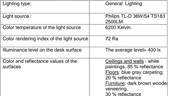
the other surfaces………10 Table 2.2. Required illuminance levels for visual tasks………..…..12 Table 3.1. Phase I:Artificial lighting and surface specifications
of the office rooms………....45 Table 3.2. Specifications of lighting and surface conditions
for experiment room………49 Table 3.3. Distribution of office workers according to their departments….…..…50 Table 3.4. Age and gender of participants……….…….50 Table 3.5. Specifications of the artificial lighting of the experiment room………..51 Table 3.6. NSC color codes and reflectance of the surfaces………...56 Table 4.1. Wilcoxon Signed Rank test for significantly different adjective pairs...65 Table 4.2. Frequency distribution of adjective pairs……….….66 Table 4.3. Factor Analysis of Achromatic scheme: Total variance……….…68 Table 4.4. Factor Analysis of Achromatic scheme: Rotated Component Matrix..68 Table 4.5. Factor Analysis of Chromatic scheme: Total variance………...69 Table 4.6. Factor Analysis of Chromatic scheme: Rotated Component Matrix....69 Table 4.7. Adjective pairs under each factor in achromatic scheme…………..…70 Table 4.8. Adjective pairs under each factor in chromatic scheme…………..….70 Table 4.9. Frequency distribution of preference and association evaluations. …71 Table 4.10. Paired sample T-test for differences between achromatic and
Chromatic Scheme in terms of task performance
(accuracy and speed)………..…74 Table 4.11. Mean values of error number and speed……….75 Table 4.12. Frequency distribution of self-report of the task performance……..75
LIST OF FIGURES
Figure 2.1. Recommended reflectance for room and furniture
surfaces in offices……….9
Figure 2.2. Color Wheel devised by James Maxwell………....19
Figure 2.3. Examples of color combinations of color schemes……….…..21
Figure 2.4. Munsell’s arrangement of colors………..22
Figure 2.5. Munsell’s value and chroma………..23
Figure 2.6. NSC color circle……….…….24
Figure 2.7. NSC triangle……….…...25
Figure 2.8. The perceived color reflected from the surface………..26
Figure 2.9. Robert W. Bailey’s Human performance model……….39
Figure 3.1. A view from an office room (Phase I)……….….45
Figure 3.2. Bar chart of preferred color attributes (Phase I)………....47
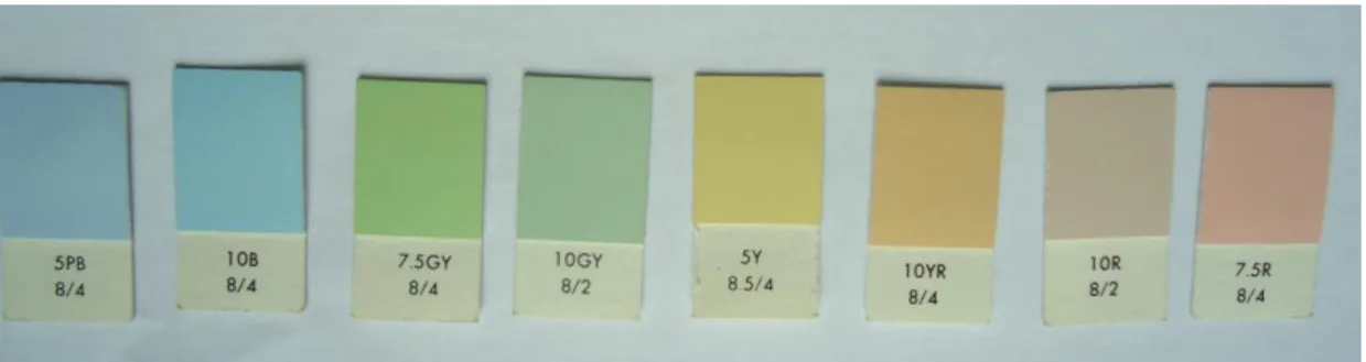
Figure 3.3. Bar chart of preferred color chips for the office walls (Phase I)……..48
Figure 3.4. Color chips from Munsell Color System (Phase I)……….…48
Figure 3.5. Binocular visual field profiles………53
Figure 3.6. The plan of the experiment room……….…54
Figure 3.7. The vertical section of the experiment room……….……….54
Figure 3.8. A view from experiment room with chromatic scheme……….…55
Figure 3.9. A view from experiment room with achromatic scheme………….…..55
Figure 3.10. NSC color scan……….…57
Figure 3.11. Experimental Design………....62
Figure 4.1. Frequency distribution of open- ended questions: 1: general idea….72 Figure 4.2. Frequency distribution of open- ended questions: 2: complaints …...72
1. INTRODUCTION
Office buildings are the most common work environments among others and many individuals spend nearly one-third of their lives at offices. It has been demonstrated that the physical environment of an office has impacts on variables such as employees’ health, comfort, satisfaction, performance and social
relations (Galitz, 1984). According to Vischer (1989), to improve the quality of working life, the physical environment and the users who occupy it must be considered together as a whole. In addition, he claims that to achieve
organizational success, designers and managers need to provide solutions that systematically integrate the information from users’ complaints and perceptions, the technical building performance information, and the management philosophy of the organizations.
Numerous studies have shown that each one of or a combination of the
environmental attributes, which are air quality, thermal comfort, spatial comfort, privacy, office noise control, building noise control, and lighting comfort, color and workstations, are influential variables to understand how office environments relate to the workers’ perceptions and behaviors at work (Vischer, 1996;
Sundstorm,1986). Most studies indicate that the more satisfied people are with their over all office environment, the more satisfied they are with their job; therefore, it becomes an essential topic to understand the workers’ needs and perceptions to make more inviting and pleasant work environments
Thanks to a number of surveys about office environments, it has been seen that light and color in workplaces are important factors contributing to the workers’ comfort and satisfaction. According to Galitz (1984), “Poor or improper lighting can cause eyestrain or headaches while good lighting can increase a person’s productivity” (p. 69). In terms of psychological conditions of workers, it is also demonstrated that color, as an environmental factor, has the potential to enhance the psychological conditions and productivity of workers (Sundstrom, 1996;
Wineman, 1986). In the literature, there are initial studies conducted by
psychologists to analyze whether particular colors excite particular feelings and can influence people’s subjective impressions and preferences by showing them various hues from color slides or color pictures of interiors (Jacobs & Suess, 1975). The results of these studies can provide cues to enhance color design of interiors. However, as Kwallek, Woodson, Lewis & Sales (1997) stated, simply viewing color pictures or slides of interiors were not realistic, so people need to be exposed to real interior environments that can be more representative for subjective evaluations. In addition, there were initial studies about the relation between color and human performance conducted in sets with isolated stimulus or restricted objects (Jacobs &Hustmyer, 1974) which were not enough to examine the detailed relation between the color in real environment and human performance.
Therefore, the following studies regarding color in office environment intended to involve realistic office settings in the experiments, which would provide more reliable inferences. In that sense, there are recent studies searching how color, color attributes or combination of colors affecting workers’ mood, subjective
impressions and productivity in office environments (Kwallek, Lewis & Robbins, 1988; Kwallek, 1996; Ainswort, Simpson & Cassell, 1993). Moreover, in the recent studies, the relations between color and individual environmental
sensitivity, gender, age and culture have also been investigated (Kwallek, et al., 1997; Kwallek, Soon, & Lewis, 2007).
The recent studies about color in workplaces have mostly been conducted to analyze the effects of different hues (red, green, blue, etc) on workers’ mood and performance. In that respect, there is still a progressive process to consider and understand all three dimensions of color: hue, saturation and value in workplaces. In the literature, there is not any study comparing achromatic and chromatic schemes in terms of environmental appraisal and task performance in the offices. Therefore, this study can be a progressive approach to contribute to the literature in that context.
1.1. Aim of the Study
The main purpose of this study is to understand the effects of color scheme on the appraisal of a private office environment and task performance. The aim is to investigate the differences between achromatic and chromatic schemes in the subjective impressions of offices and task performance. In this study, it was crucial to use the colors with the same value (lightness) on the surfaces of achromatic and chromatic schemes to understand the effect of hue on the environmental appraisal and task performance.
Understanding the differences between achromatic and chromatic schemes of a private office environment in terms of environmental appraisal and task
performance can help to provide physically and psychologically sufficient working environments that can enhance workers’ well-being and productivity. In addition, technical requirements for surface colors in office environments were considered in this study to ensure visual comfort and energy saving.
The findings of the study can be helpful for architects, interior designers, light and color designers who are studying on methods to improve workers’ satisfaction and productivity office environment while considering technical specifications of light and color together.
1.2. Structure of the Thesis
The thesis consists of five chapters. The first chapter is the introduction, in which the importance of physical environment in workplaces and the variables of
physical environment that affect workers health, comfort, satisfaction,
performance and social relations are stated. In addition, the contribution of light and color quality to workers’ general situation is mentioned.
The second chapter explores light and color conditions in office environment. The first part of this chapter explains the lighting design considerations in offices. The conditions which affecting the human visual comfort, mood and productivity are analyzed under the headings of luminous environment conditions, concerned with determining luminance differences, surface color and light source; visual task
the psychological aspects of Lighting, concerned with the recent studies about
the effects of lighting on workers’ general situation in workplaces. The second part of this chapter explains the color use in office environment. In this part, firstly, the basic theory of color is stated with respect to color attributes; hue, saturation and lightness, color contrast, color harmony or color schemes; achromatic, monochromatic, analogous and complementary, and color order systems like Munsell and NCS color systems. In the second and third parts, color vision, and color and space perception are discussed regarding how color is perceived biologically and how it effects perception of interior spaces. The next part is color design in offices explaining the functions of color in an office environment as a design element. The other parts are psychological responses to color in offices, and color and human performance. In these parts, the effects of color on human response (their mood and evaluations) and human performance is explained with respect to recent studies.
In the third chapter, the experimental study is described with the aim, research questions and hypotheses. This chapter consists of two phases of the
experimental study. In the first part of the chapter, the phase I which is a field survey is explained. The method of phase I is described regarding the sample group, the site of the survey and the questionnaire. The results of this phase are statistically analyzed so that they will be the basis for conducting the experiment room of phase II. In the second part of this chapter, the experiment is described with identification of the sample group, description of experiment room and the design of the experiment by the sub-titles: preparation of questionnaire,
preparation of performance task, process of the experiment and the phases of experiment.
In the forth chapter the statistical analysis and evaluation of the data obtained from the experiment are explained then the findings are discussed in relation to previous studies related to the subject.
The fifth chapter is the conclusion in which major points and results of the study are stated and suggestions for further researches are generated.
2. LIGHT AND COLOR IN OFFICE ENVIRONMENTS
2.1. Lighting in Office Environments
Office spaces are primarily task-oriented work environments that are obviously related to the performance of visual tasks such as reading, typing, accounting, clerical works, data processing, drafting, and computer operations. Therefore, designing lighting for office environments require an understanding of human visual system and visual performance (Rea, 2000). According to Katzev (1992), designing lighting for an office environment not only involves technical issues for the individuals’ work related task, but it also influences workers’ general
motivational state, psychological well-being and comfort.
Standard Practice Subcommittee of Office Lighting Committee of the Illuminating Engineering Society of North America (IESNA) (1993) mentions that the major purpose of a good lighting design in the office environment is to provide the effective human visual comfort, to recognize human perception about the appearance of space, and to consider energy efficient applications all together.
Lighting design conditions, which affect the human visual comfort, mood and productivity, will be analyzed in following parts under the headings of the
luminous environment conditions, visual task considerations, and psychological aspects of lighting.
2.1.1. The Luminous Environment
The visual impression of an office space depends on variations in perceived luminance, brightness, and color. These different effects can be achieved by the variations in surface reflectance, color and illuminance. Accurate design of these lighting parameters can produce interesting solutions without distracting or uncomfortable luminance differences (Rea, 2000).
Both surface color and light source color play an important role in the office
lighting environment. Color has the potential to create more interesting, inviting or pleasant workspaces. In the offices, where workers are exposed to the same environment for long periods, the color in the surrounding surfaces can have influences on workers’ performance and self-impressions of space. Technically, the color selected for large surfaces should have recommended reflectance values (ceilings: 80% or more, walls: 50-70%, furniture: 25-45% and floors: 20-40%) for visual comfort, and energy considerations (see Figure 2.1). The other variation is the light source color that determines the appearance of the people, furnishing and room surfaces and can specify the general atmosphere of the office environment. The two distinct application considerations of light source color are the chromaticity (correlated color temperature or CCT) and color rendering index (CRI) properties of the light source. Chromaticity refers to the color appearance of the lighted source and is designated by its color temperature in Kelvin (K). Color rendering refers to the appearance of colored objects; the perceived color of an object is affected by the color rendering properties of the lamp (IESNA, 1993).
Figure 2.1. Recommended reflectance for room and furniture surfaces in offices
One of the crucial points in the luminous environment is the luminous differences and color contrast that are necessary for good vision. An interior space is visible because of the brightness differences of the surfaces. Large brightness variations within the field of view can cause a distracting glare. On the contrary, uniform illuminance with no variations on the brightness of surfaces can cause complete disorientation. Therefore, it is important to provide enough variations in luminance or color on surfaces to contribute to a stimulating environment with proper
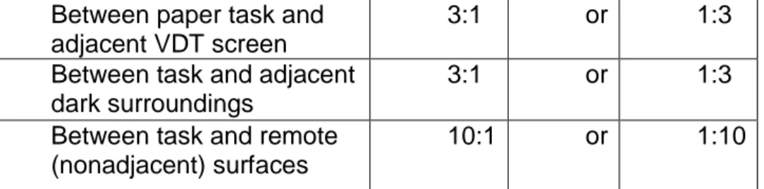
visibility (The Charted Institution of Building Services Engineers (CIBSE), 1984). Moreover, for an office environment, luminance near each task and in other parts of the office interior within the field of view should be balanced against the task illuminance (see Table 2.1). The transient adaptation (light and dark adaptation) and disability glare are two aspects of luminance ratio limits that should be considered in the recommended values for good visibility of the task by the proper eye focus. In addition, the other problematic issue in office environments
is the existence of the direct glare that can be controlled by using Visual Comfort Probability (VCP). It takes into account the proper application of the number of luminaries within the visual field, the luminaries light distribution, size and locations and the room size and reflectances (IESNA, 1993).
Table 2.1. The recommended luminous ratios between task and the other surfaces
Examining these luminous environment considerations is important for the proper lighting design of an office environment. On the other hand, ignoring the
luminous environment can cause annoyance, discomfort, or loss of visual performance and visibility.
2.1.2. Visual Task Considerations
Varieties of visual tasks are required in office work. Thus, lighting design of the offices should provide optimum conditions the various visual tasks that are performed. Contrast with the background, size of the task, the absolute
illuminance of the background, and time duration of the viewing determine the visibility of the details of the task. In general, the higher level of visual
performance entails a great contrast and large size of the task details, a high background luminance and a long viewing duration. Visibility also depends on the
Between paper task and adjacent VDT screen
3:1 or 1:3
Between task and adjacent dark surroundings
3:1 or 1:3
Between task and remote (nonadjacent) surfaces
age of worker. The illuminance selection procedure should provide solutions that take the age of the worker into account. The main subjects about the visual task considerations are quality of lighting, quantity of illumination, illuminance
selection, and recommended illuminance levels (Rea, 2000).
Quality of lighting is related with the proper visibility of the task. The lighting quality can be affected by the location of the luminary relative to the task, the distribution of the luminaries, the specific properties of the task and work surfaces. Poor designing of these variables can cause veiling reflections,
reflected glare, and shadows, which can result in reduced visibility. The degree of glossiness of the task surface, and the geometric relationship between the light sources, the task and the eyes are important issues for the visibility of the task. If an image of luminaries or bright ceiling reflects light into the viewers’ eye or to the task, the contrast will be reduced and visibility will be impaired. This effect is called veiling reflections. The other effect that causes discomfort and loss in visibility is the reflected glare. It usually occurs through a mirror image of the light source in the offending zone reflected from the VDTS and polished or glass desk surfaces to the workers eye. Furthermore, in most office environments shadows cause high luminance ratios on desk surfaces by reducing the illuminance on the task that distracts for the visibility of the task (Rea, 2000).
Quantity of lighting is about deciding on the adequate illumination level for an efficient visual performance of the office task. Knowledge of visual tasks, their importance in the operation of the office and the age of the occupants are essential for the specifications of the lighting levels (IESNA, 1993). In addition,
energy considerations and economics are issues related with the quantity of the lighting. Light loss because of luminaries’ dirt depreciation and lamp lumen depreciation should be considered in order to achieve the desired lighting levels for the tasks and to prevent high energy consumption (CIBSE, 1984). In
determining an appropriate illuminance level, it will be helpful for the designer to analyze the future occupants’ profile and the properties of the activities that will occur in the office. Besides, the designer should consider how the illuminance is to be delivered in the space, to what locations and the room surface conditions. There are recommended illuminance levels for different tasks and locations in office environments (see Table 2.2). Designers have the opportunity to use these values while determining the lighting specifications for offices (Rea, 2000).
Table 2.2. Required illuminance levels for visual tasks
From IESNA Lighting Handbook: Reference& Application. (9th ed.).
New York: Illuminating Engineering Society of North America.
Orientation and simple visual tasks
Public spaces 30 lx
Simple orientation for 50 lx
Working spaces where simple visual tasks are performed 100lx
Common visual tasks
Performance Of visual tasks of high contrast And large size 300lx
Performance of Visual tasks of high contrast and small size 500lx
Performance of visual tasks of low contrast and small size 1000lx
Special visual tasks
Performance of visual tasks near threshold 3000lx- 10.000lx
2.1.3. Psychological Aspects of Lighting in Offices
In the past, the research on the effects of lighting mainly focused on functional aspects like visibility and visual comfort. During the 1960’s and 1970’s lighting designers and researchers started to remark that lighting also influenced people’s subjective impressions of the environment surrounding them. Therefore, besides providing the proper quality and quantity of illumination for visual performance, it became important among designers considering alternative solutions which may provide different cues for subjective responses of users (Murdoch & Caughey, 2004).
Although office spaces are primarily task oriented, other effects of lighting on long-term user satisfaction and well-being should be considered in the design process. There is a body of literature that concentrates on the subjective responses to lighting. Flynn (1977) conducted an early study about the effects of lighting conditions on subjective impressions. Four characteristics of lighting have been found to be important in design process, which are overhead/peripheral, bright/dim, uniform/nonuniform, and visually warm/visually cool. Variations in intensity, distribution and color tone of the lighting exert some influences on subjective impressions about the environment such as spaciousness, relaxation, visual clarity, privacy, order and pleasantness. These influences should also be carefully considered as an integral part of the office lighting; by doing so, the designer has the opportunity to enhance characteristics of the workplace in an adequate way (Rea, 2000).
The presence of visual and psychological comfort conditions in an office environment increases motivation and well-being of the users, so the main purpose of the office lighting is to help to provide comfortable, satisfactory and efficient working environments that will enable higher performance and improved productivity. In this context, research has been conducted to clarify the relation between lighting quality parameters and aesthetic, emotional judgments, productivity and performance in office environments.
Veitch and Newsman (1998) studied on a model for the behavioral definitions of the lighting quality in an office setting. According to the study, the lighting quality exists, when the luminous conditions are suitable for the needs of people who will use it, and these needs include mood state and aesthetic judgments. The
experiment was conducted to test if the designers’ energy efficient lighting
solutions are compatible with good quality lighting since a space can be accepted as appealing and high quality with regard to the aesthetic and emotional
judgments and productivity of the participants. The results showed that energy efficient lighting design and impressions of lighting quality can be compatible. This may be the ideal solution, providing an efficient office environment.
Manav (2007) conducted an experimental study about the effects of color temperature and illumination level on the subjective impressions at an office setting. It was found in this study that high level illuminance (2000 lux) was preferred to low level illumiance (500 lux) for the impression of comfort, spaciousness, brightness, and saturation level. In addition, 4000K color temperature was preferred to 2700K for the impression of comfort and
spaciousness, yet 2700K was suggested for relaxation. A field study in a modern office setting was conducted by Akashi & Boyce (2006) to examine office
workers’ response to lowering the ambient illumiance level and brightness perception related with the color temperature. According to the study, office workers were generally satisfied with the lower level of ambient lighting after an initial adaptation period and they increased the use of task lighting at their task. In addition, applying 6500K lamp increased the perception of brightness with the lower ambient lighting.
In addition to the research related with the subjective impressions of participants in an office environment, there are studies particularly focused on the effect of lighting on performance in the offices. Manav & Küçükdoğu (2006) carried out a study inspired by the statement that productivity and performance at offices can increase as long as comfort conditions are satisfactory. The experimental study examined the effects of illuminance level and color temperature on the
performance. After applying a variety of combinations, the test results indicated that the change in the illuminance level did not affect the performance of the participants. Yet, the change in color temperature affected performance. In addition, the most commonly preferred lighting scenarios were the settlements with mixed color temperature (the combination of 4000k and 2700K).
Ödemiş, Yener & Camgöz (2004) have composed a study investigating whether different types of lighting have an effect on the visual performance of office workers. The experiment was conducted in a controlled environment with wall washing, cove lighting and up lighting types. According to the data collected,
there is not a relation between different types of lighting and human performance. Knez (1995) has investigated two experiments concerning the effects of indoor lighting on cognitive performance and mood occurring in office-like settings, and gender is introduced as an additional grouping factor. In the first experiment, the two varied lighting parameters were illuminance level (bright or dim) and color temperature (cool white or warm white) at high color rendering index (CRI). In the second experiment, the two lighting parameters were identical except the CRI. Results of the first experiment shows that the color temperature that induces the positive mood also enhances the performance in the long-term memory and problem-solving tests. On the other hand, in the results of experiment two, it is observed that subjects’ mood and their cognitive performance vary significantly with the gender differences. Thus, Knez suggests that the criteria for good indoor lighting may be revised towards females’ and males’ emotional and cognitive responses as well. In addition, some studies signify that lighting systems that enables occupants to adjust as many aspects of their lighting conditions as possible without disturbing other workers in the space make them feel more comfortable (Vischer, 1989).
Admittedly, there are variables of different results of these experiments in nature, and the psychological effect of a particular lighting design solution may not be the exact truth for any other situations. However, these studies can establish
guidelines for designers to make better predictions about lighting quality during the design process.
2.2. Color in Office Environments
Color is used in interior design for different purposes since it is a flexible and powerful design element that serves as a tool of communication between people and the built environment (Holtzschue, 2006). Color plays an important role for the variables of environmental design such as theme, ambiance, image, function, built form, location, and direction. Therefore, the correct use of color can reinforce users’ ability to interact with their environment properly. In addition, color as a design tool is relevant for presenting the aesthetical, symbolic or cultural meanings of environments by the appropriate usage of the color combinations (Smith, 2003). It is evident that there are different criteria, and design objectives for different environments that require distinct ambiences and serve for varied functions. Hence, the color design of the spaces should be specified in
accordance with the desired impression and function. Furthermore, colors can have strong influences on people’s moods, emotions and preferences. Thus, it is influential on the people’s perceptions and subjective impressions about their surrounding environment. For instance, it is reported that while red represents energy and power, blue represents relaxation and calmness (Mahnke, 1996).
The functions of color in an office environment are varied, such as to define the space atmospheres or the character of the companies by the accurate color harmony (Faulkner, 1972). Particularly in recent years, color specification of offices has also been considered with its psychological effects on workers, since people spend an increasing amount of time in their offices. In terms of
color combinations as an environmental factor affect workers mood, productivity, and subjective impressions about their environment.
2.2.1. Basic Theory of Color
To make use of color effectively, designers need to understand the basic
terminology of color. Hue, saturation and lightness (value) are three attributes of color, which are used to distinguish one color from all other perceived colors. Hue is the quality or characteristic of color that is usually associated with names such as red, blue, yellow, green, violet, etc., which are determined by wavelength (see Figure 2.2). White, black and gray are perceived as colorless and this lack of color (chroma) causes them to be termed as achromatic. Saturation is the other attribute that refers to relative purity, strength, intensity or chroma of a given color that distinguishes it from a grayed or weaker color. Two colors may be exactly the same hue, but the difference in saturation will appear different in color strength.
Lightness of a color is a measure of how much light is reflected from its surface,
and the quality that generates the light or dark color. Sometimes, the terms brightness or value are used as a synonym for lightness. In this dissertation the term value will be used in the other parts (Mahnke, 1996; Ferhman & Ferhman, 2000).
Figure 2.2. Color Wheel devised by James Maxwell
From .Wise, B. K., & Wise, J. A. (1988). Human factors of color in environmental design: A critical
review. California: Ames Research Center.
For effective color design, comprehending the color contrast is essential to determine how a color is perceived, how a color scheme is developed and how objects are highlighted or concealed. “In everyday experiences, contrast is a comparison that emphasizes differences. Seeing detail and transmitting
information are mediated in the visual world by contrast “(Camgöz, 2000, p.29). When there is an inherent contrast caused by chromatic information, the attribute of saturation of the color is called color contrast. For interior design, color
contrast may be used to create different impression such as emphasizing
contours with hue, value and saturation contrasts, or the contrast between walls and furnishings will make the furnishings more prominent (Mahnke, 1996). Colors are chosen in order to create definite harmonious color schemes of environments. Designers should consider the psychological and physiological effects of color in the environment taking into account both the functional and aesthetical role of the color. Understanding what makes a combination of color pleasing and the other one unattractive can be difficult. Today, many designers
reject rigid rules in favor of applying innovative works. However, awareness of traditional color harmonies can be useful in understanding why certain colors work together and why some of them do not (Ladau, Smith & Place, 1988).
There are four basic color harmonies or schemes which are achromatic, monochromatic, analogous, and complementary (see Figure 2.3). Achromatic schemes occur when only neutrals- white, gray, black and beige- are used. In
monochromatic color scheme, only shades and tints of one color family are used
in color plan; for example pale green with pure green and dark green can be used together. Yet, in such an arrangement, designer should consider the risk of a monotonous atmosphere. Analogous or related harmonious combine a limited number of (no more than two or three) adjacent (colors next to each other) hues on the color wheel, such as the usage of red, yellow-red and yellow together.
Complementary schemes are based on hues directly opposite to each other on
the color wheel. These schemes introduce both warm and cool colors into the environments. The options are the combinations of red and green, orange and blue, or yellow and violet (Ferhman & Ferhman 2000).
achromatic color monochromatic color
analogous color complementary color
Figure 2.3. Examples of Color combinations of color schemes
From Fehrman K. R., & Fehrman, C. (2000). Color: The Secret Influence. New Jersey: Prentice-Hall. (http://www.color.interiordezine.com/colorschemes/how-to-use-the-color-wheel-1.html)
Anyone working seriously with color needs to understand color classification systems to identify color in a systematic manner. These color order systems have been developed to bring an organization into the confusion of the color range towards presenting the colors in sequence, and according to their relationship to each other (Mahnke, 1996). There are different color ordering systems that are developed such as the CIE Lab System, HSB Color System, the Ostwall System, the Munsell System and Natural Color System (NSC). Mahnke (1996) stated that one of the most widely used methods for color notation is the American Munsell
System (see Figure 2.4, 2.5).This system uses five principal and five intermediary hues which are arranged clockwise on the color wheel by the name such as red (R), yellow-red (YR), yellow (Y), green-yellow (GR), green (G), etc. Then, each named hue is subdivided into four sections displayed as 2.5R, 5R, 7.5R, 10R. In addition, the value scale of the Munsell system extends from absolute black (value symbol is 0) to absolute white (value symbol is 10) and the value symbol of 5 stands for the middle value of gray.
Figure 2.4. Munsell’s Arrangement of colors
From Kollmorgen Instruments Corporation. (1991). Munsell Book of color: Glossy finish collection. Baltimore, Maryland.
Figure 2.5. Munsell’s value (vertical) and chroma (horizontal)
From Kollmorgen Instruments Corporation. (1991). Munsell Book of color: Glossy finish collection. Baltimore, Maryland.
In this study, Natural Color System (NSC) was used for the arrangements of the color schemes for the experiment room (see Figure 2.6, 2.7). It is based on
defining six natural color sensations, which are red, yellow, green, blue and black, and white. “In the NSC system, the chromatic hues are arranged in a circle with nine intermediate steps between each, totaling forty hues. Then, for each hue, a triangular chart is developed showing the pure hue and its relationship to white and black “(Ferhman & Ferhman 2000, p.205). The NSC color atlas includes 1750 color samples designated in NCS color triangles in each page with different hues and their relationships with white and black (Swedish Standard Institution, 1996).
Figure 2.6. NSC Color Circle
Figure 2.7. NSC Triangle
From Swedish Standard Institution. (1996). Natural Color System Atlas. Stockholm, Sweden.
2.2.2. Color Vision
In order to gain a true understanding of color, it is essential to know how humans see color. Color does not exist without light, humans see color when different wavelength of light stimulating certain parts of the brain. It has been proposed that color vision is based on three types of cone in our eyes containing three types of visual pigment. These human cone pigments are sensitive to three
different ranges of the spectrum, which are called red, green and blue, and all the other colors are seen through combinations of them. On the other hand, there are color blind people who are not able to see or differentiate between some colors.
This is caused by either a lack or reduced number of cones of a given type. Designers should be sensitive to the situation of defective color vision problems when working with clients (Holtzschue, 2006). It was also demonstrated that the world is colored by reflections and absorptions; it is not an inherent property of an object (see Figure 2.8). Ladau, Smith &Place (1988) explains this situation as following
When light hits an object some of the light waves absorbed by the molecules of the objects surface, while others are completely or partially reflected off the surface. These reflected light waves are picked up by our eyes and transmitted to the brain as color information. To appear red, for example, an object will absorb almost all of the spectral wavelengths except the reds which will reflect (p. 46).
Figure 2.8. The perceived color reflected from the surface
From Ladau, R. F., Smith, B. R., & Place, J. (1988). Color in Interior Design and Architecture. New York: Van Nostrand Reinhold.
Therefore, the experience of color depends on the intensity of light, the spectral characteristics of light falling on a surface, the reflectance characteristic of the surface and the color of surrounding objects. All light sources, whether natural or, variables of artificial such as incandescent, fluorescent, sodium, or vapor, creates
differences in the vision of color. In addition, it is important to consider the combinations of light sources, such as natural daylight with incandescent or natural daylight with fluorescent that affects the way color is viewed. When
considering lighting, designers should be aware that if they choose to use colored light, this will distort the vision of all the colors in the space except its own. For instance, red light converts pale and warm colors into a uniform red and makes dark colors look black (Mahnke, 1996; Ferhman & Ferhman, 2000).
Beside these biological and technical issues affecting the way color perceived, there are some other complex factors including the observer into the process such as the viewing direction, observer characteristics, observer adaptation, time of seeing, what was seen last and how attention was focused on the process (Camgöz, 2000).
2.2.3. Color and Space Perception
The primary aspect for designers to consider for interior color design is to start with understanding the fundamentals, and from there, to find the ultimate color solutions for specific design situations. Throughout the design process, designers should consider both the psychological properties of color and the effects of color on spatial dimensions. Whether it is possible to measure the psychological
responses to color accurately has been questioned since cultural, geographical, economical, or educational differences will affect generalizations on this issue. However, collective findings have shown that there are basic reactions to specific colors common to most people, which make the color a universal language.
Thereby, color impressions, associations, and the character of each major hue can guide designers to understand how people perceive a space to be impressive by the color applications (Birren, 1978).
As mentioned above, color choice and the way of its applications are effective design parameters to create the required and desirable space atmosphere. For instance, red as an arousing, exciting and stimulating color with the associations of passion, strength, and activity, will seize all the attention and defuse all other hues. It creates dynamic interiors. On the other hand, blue with its relaxing, retiring, and cool effect, creates impressions of calmness, security, comfort, and contemplation. Moreover, it was stated that warm and luminous colors produce cheerful, high-spirited and expansive environments, but they may also create a centrifugal action that directs the attention outward, toward the environment. Conversely, cool and lower level of illuminance is accepted as producing
centripetal action that encourages inward orientation and enhances the ability to concentrate (Wilson, 1966; Jacobs & Hustmyer, 1974; Mahnke, 1996).
Furthermore, there are reliable studies that clarify the color’s psychological alphabet including the significant relationship among the color attributes (hue, saturation, value) and perceived volume, weight and size, temperature, noise and sound, complexity, distance, arousal, spaciousness, etc. These associations play an essential role in the design of environments especially where color is used to inform and communicate. About the perceived volume of the spaces, it is indicate that value (lightness) of the color is an important factor in the perception of the openness in interior space. For instance, light and pale colors are admitted to be
colors that increase the apparent room size, yet dark or saturated hues are admitted to be the ones that decrease the volume of the room (Mahnke, 1996; Ferhman & Ferhman 2000).
Across a variety of research, it has been proved that value (lightness) and saturation of colors are attributes that evoke different impressions of weight. In general, darker colors appear heavier, while lighter and less saturated colors seem less heavy, and there is a tendency to perceive the warmer hues as
heavier. Considering these general concepts for interiors, extremely high ceilings painted in darker and warmer hues will seem lower. Likewise, low ceilings will be perceived higher if painted in light and cool colors. In addition, to decrease the height to width ratio of an enclosed space, perceived heavier color can be placed above perceived lighter colors that may also enhance the furniture appearance. It is stated that at constant distance, bright colors appear nearer that dark ones. In this case, brightness or darkness of a color is the operative cue for apparent color distance. In addition, objects showing high contrast with their backgrounds will be in apparent positions. In this case, spaciousness of a space is enhanced by increasing the lightness of the surfaces and decreasing the contrasts between objects and background. Perception of spaciousness can also be enhanced by the uniformity of the colors in a harmonious balance obscuring the appearance of the interior space as a whole that will reverse the desired solution (Wise & Wise, 1988).
Additionally, several studies exist about the relation between the color and the association of the temperature. For instance, Itten (as cited in Mahnke, 1996)
stated that according to the results of their experiment on the subjective feelings of heat and cold between two workrooms, occupants of the blue-green room felt cooler than the occupants of the red-orange room, even though they were adjusted at the same degree of Fahrenheit. In another study by Norwegians, similar results have been obtained about the perception of temperature with regard to color of the space since it was seen that people tended to set the thermostat of the heater four degrees higher in a blue room than in a red room . Some other studies also showed a strong relationship between existing room temperature and color preference of people. For example, when the indoor temperature was low people preferred warm colors like red, but when
temperature was high, people preferred cool colors like blue. With regard to these findings about color and temperature perception, research indicates that interior colors can aid thermal comfort concerning energy conservation since perception of temperature changes in relation to interior colors (Wise & Wise, 1988).
In that sense, Pedersen, Johnson & West (1978) have conducted a study about the effects of room hue on ratings of self, other and environment, requesting size and temperature estimations. 51 subjects were exposed to one of three rooms, which were decorated using either warm (yellow, orange, red), neutral (white), or cool (blue, green) hues. The semantic differential was used to rate the room, and the results showed that the neutral room and the cool room were found smooth and light whereas the neutral and warm rooms were found good and pleasant. However, no significant differences were found between three rooms in terms of the estimations of temperature and size.
The other case among the color and perception related issues is the relation between color and noise-sound perception. According to the psychologists, such as Werner, Krakov, and Schwartz (as cited in Mahnke, 1996), loud noises, strong odors and tastes make the eye more sensitive to green and less sensitive to red. Therefore, for design purposes, the designers may benefit from the relationship between color and noise, especially to compensate for noise problems in work environments such as industrial plants. For instance, it has been claimed that a noisy atmosphere painted with glaring yellows or reds will be experienced as noisier and more bothersome; thus, such noisy environments with shrill and high-pitched sounds can be compensated by the applications of light blue-green colors. In addition, it has been found that muffled sounds are more striking in darker-hued environments, so light colors such as light clean greens can be used to treat the undesired results (Mahnke, 1996).
2.2.3. Color Design in Offices
Color serves many purposes in the office design. It may function to define the space atmospheres or areas and territories between different departments of companies, to facilitate visual recognition in wayfinding and, to define the
character of the company by different impressions of the colors. Besides, in terms of physical and psychological conditions of workers, color is also considered as an environmental factor affecting workers visual health, mood, and productivity (Marberry & Zagon, 1995).
In addition to providing an aesthetical look, the color choice of an office
reducing glare, making seeing easier, lessening contrast, minimizing constant eye adjustment, drawing concentration to task and drawing attention to any possible hazards (Reyes, 1986). Birren has stated that (as cited in Reyes, 1986) skillfully selected colors can create healthier and more comfortable working conditions, since color has the ability to control brightness, adding efficiency and comfort to seeing, while preventing fatigue and eyestrain. Addressing the
functional role of color design in office environments, Kaufman & Christen (1972) mentioned that
A positive contribution to the pleasantness of any office interior is the proper selection of color combinations. These should be selected in consultation with the architect or interior designer, but should have the reflectances necessary to provide the proper luminance ratios for efficient seeing (pp.13).
The luminance on the task should not differ greatly differ from the luminance within the field of view, especially from the surrounding area. The luminance ratios between the task and the adjacent surroundings should not exceed 1 to 1/3, and luminance ratios between the task and the more remote surfaces, should not exceed 1 to 1/10. As the illumination reflected from ceilings, walls, floors, the furniture and office equipments influence these ratios; the surfaces should be at the recommended reflectance levels (IESNA, 1993).
Color selection for offices may have an impact on energy costs of the buildings by supporting the artificial lighting, since according the recent research, artificial lighting is one of the major electricity consuming items in office buildings, accounting for about 20-40% of the total building energy load (Li and Tsang, 2008). Room surfaces including walls, floors and ceilings have a considerable effect on the utilization of light through their reflective qualities. If the
colors), they will act as secondary light sources and will increase the utilization of the light in the environment (Reyes, 1986).
For years, designers have preferred to use white and off white for the walls of offices regarding the energy efficiency and the neutral trend that present a high-tech, clean, impersonal, and unadorned image. By contrast, according to some other studies, white walls are an optical strain and psychological hazard; they describe the color white as empty, neutral and lacking vitality. It is claimed that many complaints of eyestrain are often because of the glare of white walls. The recommend light reflection levels of wall surfaces are 40 to 60 percent and this can be strengthen up to 70 percent depending on the lighting conditions.
However, it is evident that the minimum light reflection level of white or off-white is about 81 percent; that is, not matching with the recommendations for visual comfort (Mahnke, 1996).
For color specifications in offices, Birren stated (as cited in Marberry, 1994) that “Color for the sake of color is hardly sufficient” (p.26). He argued that designers need to appraise color in both functional and human preference terms to improve the comfort and pleasure and he concludes that “Where workplaces are
concerned, simplicity is the keynote. Soft colors, which lack distraction, are modified in tone and get less dirty than clean colors” (p.27). Birren’s color palette for working environments include white for ceilings, and softer hues such as pale blue-green, light green, pink/coral, pale yellow, light gray, sandstone ,beige for wall finishes. All these colors are aesthetically, and physiologically desirable and they prevent monotony and provide a temporary rest and relaxation of the eyes.
He warns designers against using bright colors since this choice may distract workers from their tasks (Marberry, 1996).
To enhance the color design of offices, determinations of the color schemes and hue selections should be in accordance with the lighting design that will help avoid the problem of significant color shifts and of failures in metameric matches. The luminous reflectances of colored surfaces will differ according to the SPD (Spectral Power Distribution) of the light sources (the attributes related with CRI and CCT of the light sources). For instance, with illuminations from incandescent sources, which have long-wavelength portions of the visible spectrum, warm color surfaces such as yellow ones appear lighter and the cool colors such as blue surfaces appear darker than they do under daylight illumination (Rea, 2000). Furthermore, in many office interiors, the absence of natural light need to be compensated with full-spectrum artificial lighting with proper color rendition index (CRI) and a full- spectrum color palette for accessories and office equipments may also enhance the quality of the environments (Marberry & Zagon, 1996).
In office buildings, the appropriate usage of color can assist orientation and define territory. For instance, color can be used to designate a pathway system in a complex environment or it can be an orientating cue by defining different floor levels and corridors. Moreover, by the symbolic meanings of different hues, color may be useful to identify the atmosphere and can define different departments of the companies. For instance, it has been claimed that using bright, rich colors applied to trims in combination with moderate colors or neutrals can create visual
interests for visitors, define workspaces, and distinguish between various business divisions (Reyes, 1986).
2.2.4. Psychological Response to Color in Offices
Workplace environment has been shown to be strongly correlated with workers’ psychological well-being. In this context, the colors on the surfaces are
considered as an environmental factor affecting workers mood, satisfaction, and subjective impression of the spaces. Psychologist have tested whether particular colors excite particular feelings and influence one’s emotional state and
preferences by showing people various hues and asking for associations. The results generally support the idea that different colors elicit different responses, even inconsistent ones. In a study by Hevner (as cited in Sundstrom, 1986) red was associated with excitement and happiness, while blue connoted serenity and dignity. According to some later studies, warm colors were linked to anxiety and stress, while cool colors continued to exhibit tranquility and very inconsistently, even depression (Jacobs & Suess, 1975). Furthermore, saturation and value have been cited as important factors for determining the color pleasantness. Guilford & Smith (as cited in Kwallek, Woodson, Lewis & Sales, 1996) found that as value or saturation increased perceived pleasantness increased independently from color itself. In a study conducted by Brill, Margulis & Konar (as cited in
Kwallek et al., 1996), dealing with the color preference, pastel cool colors (blue-green) were rated as most preferred among 1000 respondents.
Although all these results of the studies can be useful cues for designers to enhance color applications in interiors they were not as realistic as possible,
since judgments were rendered from subjects by viewing color slides, swatches, light or color pictures from a room. This is not how color is seen in the interior environment; individuals need to be exposed in a real, three-dimensional
environment with all its inherent complexities such as color combinations on the different surfaces, different furniture styles, accessories and textures. When research is done in settings that closely stimulate a real interior environment, results will be different from those run in isolation. Regarding these
circumstances, recent studies dealing with human responses to color in office environments aimed to create realistic office settings that would provide possibilities to make measurements more reliable. In that sense, there are studies, investigating how color, color attributes or combination of colors affect workers’ well- being, satisfaction and subjective impression of the spaces.
Kwallek, Lewis & Robbins (1988) have designed an experiment to examine the effect of office interior color on workers’ mood and productivity. 36 subjects were asked to fill out the Eight State Questionnaire, measuring mood in either
monochromatic red or blue office spaces. The experiment consisted of two phases, and in the second phase, subjects were guided to continue the experiment at the same colored office or move to the different colored office. According to the results of the questionnaire, group differences were not
statistically significant, but the mean anxiety and stress scores were higher for the subjects who were always in the red office; the mean depression scores were higher for the subjects who were always in the blue office, and the mean arousal scores were higher for the subjects who moved to the different colored office during the experiment.
Kwallek (1996) has conducted a study examining the effects of office wall colors on the assessment of spaciousness and preference. In the study, three offices painted with red, green and white were evaluated by 124 undergraduate students. The results showed that the white office was perceived as more
spacious, compared to red and green offices, and white was chosen as the most appropriate and preferable color for an office interior. Another study by Kwallek, Lewis, Lin-Hsiao & Woodson (1996) was designed to determine the effects of nine interior office colors on subjects’ performance, mood and color preference. A total of 675 subjects participated in the study and gender was introduced as an additional grouping factor. The statistical analyses showed that subjects were least likely to work in the orange and purple colored offices and preferred to work in the beige and white offices. Further, females indicated more depression, confusion and anger in low-saturated offices’ colors such as white, gray and beige whereas males reported more depression, confusion and anger in high-saturated office colors such as green, blue, red, yellow, and orange. In one of the studies, it was also realized that interior office colors might affect the perceived performance and job satisfaction. Three different color schemes were applied in three laboratory office settings where workers performed specific office tasks for four consecutive days. According to the results, those in the white and
predominantly blue-green offices reported higher perceived performance and job satisfaction than those in the predominantly red office (Kwallek, Soon, Woodson & Alexander, 2005).
A cross-cultural study of indoor work environments directed by Küller, Ballal, Laike, Mikellides & Tonello (2006) aimed to determine whether indoor lighting and
color would have any systematic impact on the mood of people working indoors. The study was carried out in real work environments at different seasons, in countries with different latitudes, and with a total of 988 persons participating to the all of the parts of the study. The results indicated that the color of the
workspaces stands out as a rather important environmental factor for the
workers. It was specified that the index of emotional status was higher throughout the year for those who had the most colorful work environments. According to the results, the use of good color design might contribute to a more positive mood.
2.2.5. Color and Human Performance
Human beings always perform some activities in some contexts in their daily lives, which are the main concept of human to be a living (Bailey, 1982). Human performance can be improved or degraded by the effects of physical and social environment. For instance, poor design decisions may impair the activity being performed including the tools being used or even the context in which an activity is performed (Sundstrom, 1986). Other factors such as motivation, stress, fatigue, etc., play an important role on human performance and must be taken into
account. In this respect, Bailey (1982) developed a human performance model that requires an understanding of the human, the activity being performed, and the context in which it is performed (see Figure 2.9). According to the model the following elements must be taken into account for an acceptable level of human performance: the general state or condition of the human, the specifications of the activity including any required tools or equipments, and the context including the psychical environment such as lighting, temperature, noise, etc. and the social environment such as crowding, isolation, etc.
Figure 2.9. Robert W. Bailey Human Performance Model
From Bailey, R. W. (1982). Human performance engineering: A guide for system designers. New Jersey: Prentice-Hall, Inc.
Office environments are the spaces where people perform a pattern of actions carried out to satisfy an objective according to some standards. Office workers keep records and files, conduct conferences and discussions, perform
calculations, compose written texts and do other tasks involving details about planning and directing the activities. Studies indicate that improvements to the work environment could result in a substantial increase in workers’ comfort and satisfaction, which are directly proportional with their productivity that could be measured by the quality of the productions, resignation rate, time spent in the office, and attendance (Vischer, 1989; Gifford, 2002).
Color is considered as one of the environmental aspects of workspaces, that may affect the performance, yet as mentioned before, very little quality research that directly relates to workplaces has been conducted. Research on the influence of