THE EFFECT OF CHROMATIC AND ACHROMATIC COLOR
SCHEMES ON CHILDREN’S EMOTIONS IN A PRESCHOOL
CLASSROOM
A Master’s Thesis by DONYA DALIRNAGHADEH Department ofInterior Architecture and Environmental Design İhsan Doğramacı Bilkent University
Ankara May 2016
THE EFFECT OF CHROMATIC AND ACHROMATIC COLOR SCHEMES ON CHILDREN’S EMOTIONS IN A PRESCHOOL CLASSROOM
The Graduate School of Economics and Social Sciences of
İhsan Doğramacı Bilkent University
by
DONYA DALIRNAGHADEH
In Partial Fulfillment of the Requirements for the Degree of MASTER OF FINE ARTS
in
THE DEPARTMENT OF
INTERIOR ARCHITECTURE AND ENVIRONMENTAL DESIGN İHSAN DOĞRAMACI BİLKENT UNIVERSITY
ANKARA
iii
ABSTRACT
The Effect of Chromatic and Acin a Preschool Classroom Dalirnaghdeh, Donya
MFA, Department of Interior Architecture and Environmental Design Supervisor: Assoc. Prof. Dr. Nilgün Olguntürk
May 2016
the interior space, it can also trigger specific physical and psychological responses in human beings. Therefore, its proper use in the interior space can lead to positive outcomes such as creating a healthier environment. In that regard, this research examines the effect of chromatic and achromatic color schemes on color-emotion associations in children in the interior space of a general classroom. The goal of this study is determining whether the responses caused by color are strong enough to create a positive or negative emotion in a child. Furthermore, saturation maybe more effective than hue in determining whether a color is calming or exciting, in addition, children prefer brighter and more saturated colors to less saturated ones. In that sense, high and low saturated blue, high and low saturated red as chromatic colors and high and low saturated grey and white were selected as achromatic colors. This study was conducted on eighty preschool children with 5 years of age, from two private preschools in Ankara,
iv
Turkey. Photographic simulations were used as the tool to create different views of the classrooms and the children were asked to match each view to one facial expression representing anger, sadness, neutral and happiness. The results indicated that classrooms with high saturated blue, low saturated red and white as the wall colors elicited positive emotions in the child while the rest were associated with either negative emotions or no emotions at all.
v
ÖZET
Üzerindeki EtkisiDalirnaghdeh, Donya
Tez : Doç. Dr. Nilgün Olguntürk
May s 2016
etkileyen dikkat çekici bir
.
renk- melerindeki etkisini inceler.
olumlu ya da olumsuz duygu yaratmada yeterince güçlü olup .
da heyecan verici olup
doygunluklu mavi renk, ve k rm z
renkler doygunluklu gri ve beyaz renkler
vi
Bu e, yüksek doygunlukt doygunlukt
vii
ACKNOWLEDGEMENTS
This study would not have been possible without the support, the guidance and the help of several people, who contributed to the completion of this study; herby I wish to express my gratitude to all those individuals. First and foremost, I would like to express my sincere gratitude to my supervisor Assoc. Prof. Nilgun Olgunturk who encouraged me throughout this study. Her valuable guidance, both intellectually and emotionally, her understanding and supervision have made this study possible.
I would also like to thank the members of the examining committee, Assis. Prof. Dr. Yasemin Afacan and Assis. Prof. Dr. Elif for their valuable evaluations and recommendations in the critics of the jury.
I am also indebted to my friends and officemates here in turkey, Sila Cankaya, Rengin , Melis , Selin Yar, who supported me directly or indirectly in different stages of my work, and offered me cooperation, patience and trust to complete this study.
vi
Finally, I am eternally grateful to my dearest parents, Prof. Dr. Bahram Dalirnaghadeh and Naghmeh Aghazadeh and my sister, Saba Dalirnaghadeh who have supported me truly and endlessly in every single aspect of my life including all stages of my
education. Words cannot do justice to the tireless patience and support my family offered me.
Lastly, I would like to thank Vahid Tayefeh for his persistent encouragement, patience and companionship through this study.
vii
TABLE OF CONTENTS
ABSTRACT ... iii
ÖZET ... iv
ACKNOWLDEGEMENTS ... viii
TABLE OF CONTENTS ... vii
LIST OF TABLES ...x
LIST OF FIGURES ... xi
CHAPTER 1: INTRODUCTION ...1
1.1 Aim of the Study ...4
1.2 Structure of the Thesis ...4
CHAPTER 2: LITERATURE REVIEW ...6
2.1. Color Studies ...6
2.1.1 Definition of color and its characteristics ...6
2.1.2 Color Order Systems ...8
2.1.2.1 CIELAB ...9
2.1.2.2. RGB Color Model ...10
2.1.2.3. The Munsell color system ...11
2.1.2.4. Natural Color System ...12
viii
2.1.3.1 Physiological Responses to Color ...15
2.1.3.2 Psychological Responses to Color ...17
2.1.4 Preferences to Color ...25
2.2 Emotion Studies ...33
2.2.1 Definition of Emotion and its Categories ...33
2.2.2. Emotional Knowledge of Children ...35
2.2.3 Measuring Emotion ...38
2.3. Color-Emotion Associations of Children ...41
2.4. Color in Preschool Facilities ...43
2.5 Research Methodology ...47
CHAPTER 3: METHODOLOGY OF THE EXPERIMENT ...50
3.1 Aim of the Study ...50
3.1.1. Research Questions ...51
3.1.2. Hypotheses ...51
3.2. Method of the Study ...51
3.2.1. Participants ...52
3.2.2. The child Population ...52
3.2.4. Variables ...53
3.3. Procedures ...54
3.3.1. Specifying the Colors ...54
3.3.2 Photographic Simulations ...57
3.3.3. Phases of the Experiment ...61
3.4. Findings ...64
ix
3.4.3. Achromatic Color Schemes ...70
3.5. Discussion ...76 Chapter 4: CONCLUSION ...83 References ...87 Appendices ...100 Appendix A ...101 Appendix B ...106 Appendix C ...112 Appendix D ...117 Appendix E ...123
x
LIST OF TABLES
1. Physiological and psychological responses to different colors ...24
2. Studies done on color preference ...31
3. Review over research methodologies in color studies ...49
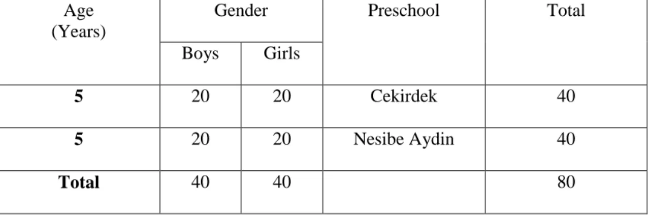
4. Number of subjects by age and gender. ...52
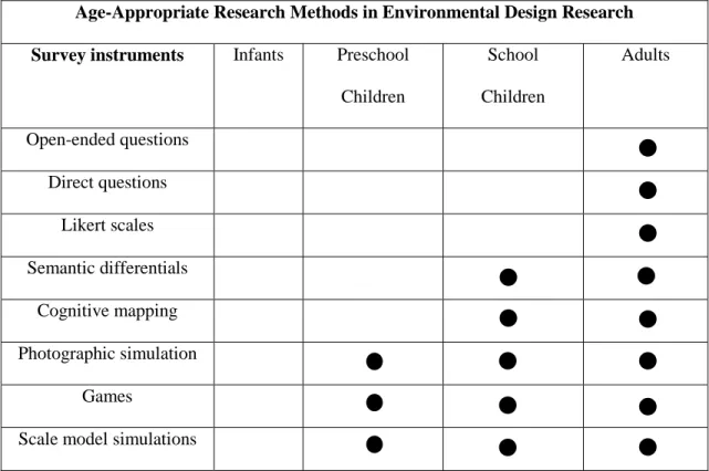
5. Age-appropriate research methods. ...57
6. Summary of experiments ...63
7. Gender difference in emotional responses under different wall colors. ...65
8. The frequency distribution of emotions on each colored classroom in chromatic color schemes. ...67
9. The frequency distribution of preferred classrooms. ...69
10. Gender difference in emotional associations under different wall colors. ...71
11. The frequency distribution of emotions on each colored classroom in achromatic color schemes. ...72
xi
LIST OF FIGURES
1. The CIE chromaticity diagram. ...9
2. RGB color mixture. ...10
3. Munsell Color Solid. ...11
4. NCS Color System. ...13
5. NCS Triangle. ...13
6. Cause of emotional responses. ...34
7. Facial expressions of emotions designed by Paul Ekman. ...40
8. Schematic facial expressions of emotions. ...41
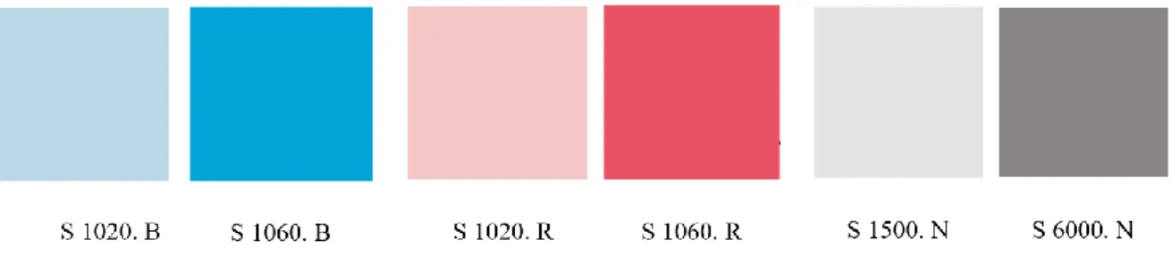
9. High saturated and Low saturated blue chosen from NCS. ...56
10. High saturated and Low saturated red chosen from NCS. ...56
11. The selected wall colors. ...57
12. Original picture of a pre-school classroom. ...59
13. Chromatic colors applied as interior wall surfaces. ...60
14. Achromatic colors applied as interior wall surfaces. ...60
15. The frequency distribution of emotions on each colored classroom in chromatic color schemes. ...67
xii
17. The frequency distribution of emotions on each colored classroom in achromatic color schemes. ...73 18. The frequency distribution of preferred classrooms. ...75
1
CHAPTER 1
INTRODUCTION
Color is in everything we perceive; it is an inseparable part of our lives that has been surrounding us since the day we were born. Most people think that the responses towards colors are simple and innate, however, a complex interplay between light, eyes and the brain are required to elicit a response in the human being (Luke, 1996).
Furthermore, color is one of the most critical design elements that can modify the characteristics of the physical environment easily (Jalil, Yunus & Said, 2012). Despite attributing unique dimensions to a space, color is useful in influencing human behavior, wellbeing, health and decision making. In other words, color impacts human lives physically, psychologically, physiologically and sociologically (Jalil, Yunus & Said, 2012; Manke, 1996). Moreover, color is a salient factor in a child’s life. Children are subjected to a wide variety of colors embedded in their toys, clothes and belongings; these objects and the environment as a whole, convey specific meanings and
psychological messages to the child (Boyatzis & Varghese, 1994; Pope, Butler & Qualter, 2012). As a result, color’s unique characteristics present significance in educational settings including preschools.
2
Physiological and psychological balance is enhanced when the physical environment provides positive stimulations, in addition poor design can have negative impacts on human’s well-being (Ulrich, 1991). A good design with positive stimulations has the ability to reduce negative thoughts and stress while holding the user’s interest and focus (Ulrich. 1991). Color as a design element can have both positive and negative impacts on the child. Awareness of the impact of color in interior space can help professionals in clinical and educational settings, come up with the best solutions in order to help
children to explore and to achieve high developmental accomplishments (Pope, Butler, & Qualter, 2012).
Children are color dominant, as a result, use of color in spaces for children requires extensive care and consideration (Sanoff, 1994). The time spent in educational settings is very long and it is very effective in shaping a human’s identity and characteristics. Among the educational settings, preschools have a great impact on an individual’s development and accomplishments. Since the development process takes place mostly during ages of 0-6, early childhood education is more important than other education periods (Şahin & Dostoğlu, 2012). In that sense, process of preschool education tends to have short and long term impacts not only on the child but also on the society as well, because childhood development is directly associated with social developments (Şahin & Dostoğlu, 2012). The quality of the social and physical environment in preschools influences the development level of the child during the education process. As a result, designers and professionals have tried to grasp the best solutions for designing
3
children’s spaces that match children’s needs, demands and spirit (Birren, 1963). Furthermore, according to Sanoff (1994), a positive stimulation in the learning
environment can lead to an increase in the ability to learn, perform, explore and interact, in addition to effecting the child’s emotions and behaviors.
Recent studies have analyzed the association between color and emotions; the
knowledge gathered from these studies can be put in effective use in various fields such as marketing, advertising, architecture and industrial design. In that sense, it is important to create products and environments that increase user’s affection, admiration and appreciation by eliciting positive emotional responses (Norman & Ortony, 2003).
Studies regarding the association between color and emotions have mostly been carried out on the effect of colors used in isolation on emotional responses in adults. The studies that take the interior space into account are very few and they do not control color attributes such as brightness and saturation (Boyatzis & Varghese, 1994; Child, Hansen, & Hornbeck, 1968; Meerum Terwogt & Hoeksma, 1995; Zentner, 2001). As explained above, a positive stimulation in the physical environment can enhance child’s
development and performance while reducing stress. If appropriate colors can elicit positive emotions, then those colors will hold the child’s attention and interest, improve psychological and physiological balance and enhance learning outcomes and
performances. Regarding the lack of literature concerning the effect of color attributes on child’s emotions in preschool environments, this study aims to fill the gap about children’s color-emotion association in interior spaces.
4 1.1 Aim of the Study
The main purpose of this study is analyzing the effect of achromatic and chromatic color schemes on children’s emotions in a preschool classroom. In the existing literature, there are very few studies exploring the association between color and emotion in preschool children in interior spaces. These studies have applied papers or small color chips, which is completely different from applying the color to a surface in the interior space. Additionally, the existing studies fail to control brightness and saturation, furthermore, the difference between achromatic and chromatic color schemes has not been analyzed. In that sense, this study would try to analyze the difference between high and low saturated colors in both achromatic and chromatic schemes, by using photographic simulations in a preschool classroom. The findings of this study would be useful for interior architects and professionals to select the most appropriate colors for preschool classrooms.
1.2 Structure of the Thesis
This thesis is made up of four chapters. The first chapter talks about the background of the study, by discussing the importance of color in the physical environment and its role in effecting the emotional responses, with briefly going over the importance of the preschool’s physical environment in shaping the child’s identity. In addition, the aim of the study, its significance and the structure of the thesis are explained in this chapter.
The second chapter discusses all the relevant literature in the field of color, emotion, physical environment in preschools and research methodologies in color studies and it
5
consists of five sections. The first section, review of color studies, begins with definition of color, its characteristics, color order systems, physiological and psychological
responses to color and finally it would discuss preference to color in terms of different factors effecting it, namely age and gender. The second section begins with the
definition of emotion and its characteristics, emotional knowledge of children, and finally it would discuss methods of measuring emotion with a focus on non-verbal pictorial scale measurements. The third section would go over the existing literature regarding color-emotion associations of children. The fourth section talks about the impact of color in educational settings with a focus on preschool facilities. the final section would discuss methodologies in color studies.
The experiment is described in the third section. First, aim of the study, research
questions and hypotheses are explained. Afterwards, the method of the study, including the sample, selection of the child population and the variables are discussed. Then, the procedure of the study is explained, regarding how the colors were chosen, why photographic simulations were an appropriate tool for this study and finally the phases of the experiment are explained. Finally, the findings are statistically analyzed in this chapter and they are examined in relation to the relevant literature.
In the last chapter, conclusion of the study, along with limitations and suggestions for further studies are stated.
6
CHAPTER 2
LITERATURE REVIEW
2.1. Review of Color Studies
There are various studies that try to explain the association between color and human behavior in the field of psychology. However, these studies are rare in the field of environmental design. In that sense, this part of the literature review would try to go over the available literature regarding the definition of color, its characteristics, color order systems, human physiological and psychological responses to color and color preference.
2.1.1 Definition of color and its characteristics
Color is an effective element in our everyday life, however, in order to understand the reasons behind its importance as a design element it is important to go over its
definition. There are physical, chemical, physiological and psychological approaches in order to explain color’s definition (Burnham, 1963). In that sense, scientifically
7
interrupted by a dust particle (Meervein, Rodeck, & Mahnke, 2007). Moreover, the physiological aspect of color focuses on the association between particular amounts and kinds of color stimuli and specific color responses; the psychological aspect concerns the behaviors and responses caused by color stimuli that influence attention, memory, motivation, and emotion (Burnham, 1963). In that sense, the focus of this study is on the concept of color “an inherent property of all materials and surfaces including everything from light and paint to art, from aesthetics to functionality and as an inseparable element of design” (Dalke, Little, Niemann, Camgöz, Steadman, Hill, & Stott, 2005, p. 343).
Color is characterized by three dimensions: hue (the pigment of the color, e.g., blue, red, etc.), saturation (chroma of color), and brightness (value or degree of darkness or
lightness of the color) (Fehrman & Fehrman, 2000). Hue is the attribute of a color by which it is discernable from another such as red from blue, or orange from green. In that sense, achromatic colors, black, white and grey, lack hue and are considered neutrals (Wallach, 1963). Saturation, is the strength or vividness of a hue and it discerns a weak color from a strong one. It also presents the amount of pigment in a specific color, as an example the color red can increase in saturation from a pale pink to a vivid vermillion (Fehrman, 1986). The third dimension of color, brightness, also known as lightness and value, distinguishes a light color from a dark one, in other words, it is the lightness value as compared with black or its darkness value as compared with white (Munsell, 1988). Moreover, brightness is the amount of black that exists in a color (Melara, Marks & Potts, 1993).
8
The studies regarding color attributes are generally carried out on color preferences. The findings of these studies demonstrate that at a constant saturation and brightness short-wave length colors are preferred to long-short-wave length colors (Granger, 1955; Guilford, 1934; Guilford & Smith, 1959; Sivik, 1974). In addition to studies done on color
preference, there are also scholars that have investigated the effect of color attributes on emotional responses. The results indicate that saturation is the most effective element in comparison to hue and brightness in altering people’s perception of which color is more pleasurable more calming or exciting (Mikellides, 1990). Furthermore, brighter colors are associated with positive emotions whereas dark colors are associated with negative emotions, among samples of all ages and genders (Boyatzis & Varghese, 1994; Zetner, 2001). The studies regarding the effect of colors on preferences and emotions would be further explained in sections 2.1.4 and 2.3.
2.1.2 Color Order Systems
A color order system is a way of specifying and ordering object colors according to different schemes (Wyszecki & Stiles, 1982). There are three methods of distinguishing these models from each other; color order systems based on subtractive mixture, color order systems based on additive mixture, and color order systems based on perceptual evaluation (Kuehni, 2000; Wyszecki, 1986). In that sense, systems such as Munsell Renotations (REN), Optical Society of America Uniform Color Scales (UCS), Munsell Re-renotations (RERE), Natural Color System (NCS), Color-curve System (CC), CIELAB, and RGB Color Model, have been developed over the years and are regular in use (Kuehni, 2000). These systems usually take hue, brightness and saturation as major
9
attributes of color. Some of these systems will briefly be explained under the scope of this study.
2.1.2.1 CIELAB
This system is “based on spectrophometric measurements of color samples illuminated by specific types of lighting and related to the visual response of a standard observer” (Fehrman & Fehrman, 2000, p. 209). Color attributes, hue, saturation and brightness have X, Y, Z values in this system (Agoston, 1987). As a result, color space has been used to demonstrate these dimensions graphically (See Figure 1).
Figure 1. The CIE chromaticity diagram.
(http://www.cs.berkeley.edu/~sequin/CS184/TOPICS/ColourSpaces/Colour_0.html)
Furthermore, this system has been developed in order to sustain a uniform color scale to distinguish industrial color differences (Agoston, 1987). As a result, this system is
10
widely used by researches conducting scientific experiments with instruments (Grandis, 1986).
2.1.2.2. RGB Color Model
This model has been developed by using primary colors of red, green and blue. A combination of red and green makes yellow, red and blue makes magenta, green and blue makes yellow and a combination of all these colors make the white light (See Figure 2) (Feisner, 2006).
Figure 2. RGB color mixture.
(http://www.d.umn.edu/~mharvey/th1501color.html)
As seen in Figure 2, there are three primary and three secondary colors in this system, in addition to primary and secondary colors, there are also colors that are a mixture of a primary and a secondary color, in that sense, yellow, cyan and magenta are the
secondary colors, whereas orange, yellow-green, cyan- green, cyan-blue, blue-magenta and red-magenta are the tertiary colors.
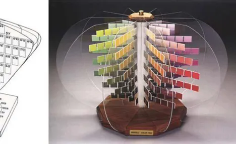
11 2.1.2.3. The Munsell color system
The Munsell color system has been widely used by a wide variety of researchers because of its feasibility and international acceptance (Indow, 1988). This system
defines colors by hue, value and chroma. Hues are demonstrated by letters, there are five major hues, including red, green, yellow, purple and blue, five intermediate hues
including yellow-red, green-yellow, blue-green, purple-blue, and red-purple. There are also colors that are located between principle and intermediate colors. Hues in this system are arranged on a circle with radii of 0 to 10. Value of the color is indicated by numbers ranging from 1 to 10, 1 representing the value of black and 10 representing the value of white, with grey falling in between these value. Chroma is also demonstrated with numbers ranging from 2 to 14, 2 as the least saturated color and 14 as the most saturated color (Beach, Wise, & Wise, 1988) (See Figure 3).
Figure 3: Munsell Color Solid. Source: Adapted from Luke, 1996.
12 2.1.2.4 Natural Color System
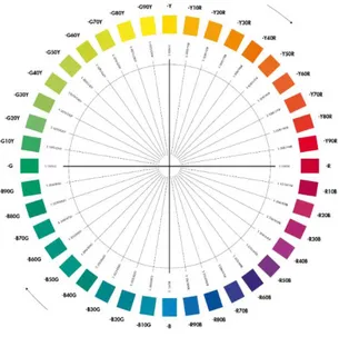
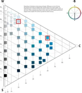
NCS (Natural Color System) is in the form of a color atlas and has been developed as the practical application of Hering’s color theory (Hård& Sivik, 1981). This color system provides a wide range of opportunities to describe colors and the relationships between them (Sivik, 1997). In order to understand the framework of this color system the idea behind Hering’s theory would briefly be explained. According to Hering, yellow, red, green and blue are primary colors since they are not made up combinations of other colors (Hunt, 1987). As an example, the color orange can be described as a yellowish red or a reddish yellow or the color purple can be described as a reddish blue or a bluish red. As a result, this color system is based on these four primary colors, arranged in a circle with nine steps between each, resulting in 40 hues in total (See Figure 4). Furthermore, each individual hue is designated into color triangles consisting of the pure hue along with its relationship with black and white (Swedish Standard Institution, 1996) (See Figure 5).
As it can be seen in Figure 4, all hues are represented with a combination of the primary hues such as YR (Yellow-Red), RB (Red-Blue), BG (Blue-Green), and GY (Green- Yellow). In addition, the numbers between the letters demonstrate the percentage of the combination of primary colors for creating other colors. For example, B10G is a color created with 90 percent blue and 10 percent green. Moreover, by adding other numbers, the level of blackness and lightness of the color would be indicated, as an example S2050-B10G, indicates a 30 percent whiteness (W), 20 percent blackness (S) and 50 percent hue (C) (Hard, 1981).
13
As seen in Figure 5, the color triangle is a vertical cut through the center of the color circle (Hard, 1981). The color triangle demonstrates attributes of blackness, whiteness, and chromaticness. Furthermore, each triangle of each hue is made up of 66 colors which adds up to over 2000 colors in total (Kuehni, 2005).
Figure 4. NCS Color System.
From Swedish Standard Institution. (1996). Natural Color System Atlas. Stockholm, Sweden
Figure 5. NCS Triangle.
From Swedish Standard Institution. (1996). Natural Color System Atlas. Stockholm, Sweden
14
The Natural Color System is one of the most well-known systems and it is widely used by architects and designers because it is based on uniform experiences of observers when dealing with the color stimuli, regardless of the sources (Kuehni & Schwarz, 2008), plus it enables the observer to evaluate colors without color measurement instruments (Agoston, 1987). In conclusion, this system can be used by people with no particular knowledge about colors (Agoston, 1987), in addition it is the only system in psychology domain that focuses on color perception (Tonnquist, 1988).
2.1.3 Human Responses to Color
Color is a tool in design that can influence psychological and physiological responses in humans (Gaines & Curry, 2011). A vast majority of literature have been focused on the association between color preferences, emotions and academic performances of both children and adults (Boyatzis & Varghese, 1993; Karp & Karp, 1987; Meerum Terwogt & Hoeksma, 1995). However, in order to understand the reasons behind the impact of color on psychological and physiological responses, it is important to understand color perception and theory. In that regard, when a wavelength of light shines on an object, the surface absorbs everything except for the one reflected from the object. Afterwards, this color would enter the eye and be deciphered according to one of the red, blue or green cones of the eye (Morton, 1995). After the hue is absorbed by the cells a message would be sent to the brain and the color would be interpreted. In addition, the glands that receive these brain impulses cause physiological and psychological responses (Nielson & Taylor, 2007).
15 2.1.3.1 Physiological responses to color
Responses caused by color can either be physical (physiological) or emotional (psychological). According to Engelbrecht (2003), genetic evolutions taken place in order to increase the chance of survival and reproduction have led to hormonal responses to color in all people. As an example, the color red improves the sense of smell, raises blood pressure and pulse and densifying the muscles (Gaines & Curry, 2011). In contrast, the color blue would lead to a slower heartbeat, a reduced appetite and a lower body temperature (Gaines & Curry, 2011). Other colors such as yellow and green are associated with positive effects on breathing and an increase in speech skills respectively (Gaines & Curry, 2011). Furthermore, orange and pink have comforting effects because of the changes they cause in the circulation and the nervous system (Gaines & Curry, 2011). As a result, the positive impacts of color on physiological responses of the body have been used in medical fields as a medium for therapy for patients of depression and cancer. However, all these changes in the physiological responses are associated with the level of development in the person’s eye and brain. In addition, the lightness and the saturation of the color are also responsible in
physiological responses (Gaines & Curry, 2011). In that sense, bright and high saturated colors are easier to elicit a change in the human-being (Zemach, Chang& Teller, 2007). In conclusion, the changes in human’s vision, the level of development of the brain and color interpretation would lead to physical responses that are different from one
individual to the other. The following paragraphs would go over some of the studies done on the effect of color on physiological functions of the body.
16
The effect of red, blue and white light was analyzed on twenty-four male participants on a study carried out by Gerard (1958; 1959). Physiological changes in blood pressure, heart rate, respiration rate and eye blink were observed under colored screen for a period of ten minutes. The results demonstrate a significant difference between red and blue regarding all physiological dimensions except for the heart rate. Gerard (1959) argued that the reason behind the significant differences in physiological responses were in the arousing nature of the color red on visual cortical activities and nervous system. He found that the color red increased the frequency of eye blink, blood pressure and respiration whereas the color blue had the opposite impacts. He also stated that the physiological responses towards colors are predictable because of the changes they impose on the whole organism.
Another study analyzed the effect of red and green slides on participants for a period of ten minutes (Wilson, 1966) and the results showed a higher level of Galvanic skin response under the red color due to the arousing and stimulating characteristics of the color red. This finding is consistent with those of Jacobs and Hustmyer’s (1974). They examined heart rate, respiratory responses and GSR under red, yellow, green and blue color slides for a period of one minute on twenty-four participants. The results indicated a significant difference in GSR, however no difference was detected in respiration and heart rate. They stated that red was the most arousing color followed by green, yellow and blue as the least arousing color.
In a study done by Grangaard (1995), blood pressure and off-task behaviors of 6-year-old children were being investigated in rooms with different colors and lighting. White
17
walls and cool-white fluorescent lighting were used in the first room whereas the second classroom had light blue walls and full-spectrum lightings. The results indicated a 22 percent decrease in off-task behaviors in the second classroom, additionally, the blood pressure had decreased by 9 percent in the light blue classroom.
Fehrman and Fehrman (2004) investigated the effect of hue on performance and arousal in the interior space by controlling brightness and saturation of the colors. The GSR (Galvanic skin response) and pulse rate of the participants were measured while they performed different exercises in each colored room. The results indicated comparable performance and arousal scores in participants who had experienced colors with equal saturation and brightness. In contrast to the above mentioned studies, this study does not support that red is more arousing than blue.
Moreover, it should be mentioned that the physical changes caused by color in the body are not permanent (Adler, 1999). Even though the color might cause physical responses in the body accompanied by an imbalance, the brain would gradually adjust these changes and sooth the responses, that would eventually neutralize the effect of color after a period of time (Adler, 1999).
2.1.3.2 Psychological Responses
The changes caused by color in physiological functions of the body would lead to psychological responses and bodily reactions (Birren, 1988). Furthermore, since color is a form of energy, it would not only affect the body but also the mind, the mood and the
18
emotions (Birren, 1988). In that sense, the light of the colors that enters the eye would affect the center of emotions in the hypothalamus. The gland produced by this center regulates the hormone level of the endocrine system that would result in a change in the moods and psychological emotions (Helen, 1983; Jin, Yu, Kim, Kim & Chung, 2009). This characteristic of the color makes it a powerful medium in the medical field. Furthermore, this quality of color has been studied in the literature regarding the changes in anxiety, performance, productivity, stress, aggression and happiness levels.
All people assign symbolic meanings to colors, these associations are universal
regardless of gender, race, culture, age and geography (Mahnke, 1996). Studies done on children and adults demonstrate a stronger correlation between colors and emotional responses in children in comparison to adults, in addition a strong preference has been detected for brighter colors (Boyatzis & Varghese, 1993;Valdez & Mehrabian, 1994; Zetner, 2001). These studies would be further investigated in section 2.3.
The studies comparing the preference towards muted colors in children and adults indicate that adults are more inclined towards colors of white, black, grey and brown, in comparison to children, however, even in adults these colors are mostly associated with negative emotions (Gaines & Curry, 2011). As an example, in a study done on college students, colors of red, white, green, orange, yellow, blue, beige, gray, and purple were used for the interior walls and the door of offices (Kwallek, Lewis, Lin-Hsiao & Woodson, 1996). The mood, the performance and the color preference of the students was examined in each classroom. The results indicated gender differences in color preferences. White, green, blue and grey offices were preferred in males, whereas
19
yellow, orange and purple offices were not. In the case of females, green, red and beige work spaces were preferred whereas grey and orange offices were the least preferred ones. Overall, white, blue and green offices were the most preferred working spaces whereas purple and orange offices were the least preferred ones. Gender differences regarding mood in different colored offices were also observed. Females felt more depression, confusion, and anger in offices of white, grey and beige that had low saturated colors. However, males had more negative emotions in green, blue, purple, red, yellow, and orange offices that had high saturated interior spaces. Overall, all participants stated that they preferred to work in white or beige offices. Even though the white office was preferred over blue or red offices, more errors on task performance were detected in the white working space.
The negative impacts of neutral colors such as white and grey should be taken into consideration since these colors are widely used in spaces such as schools, hospitals and offices (Dijkstra, Pieterse & Pruyn, 2008; Kaya & Crosby, 2006). As an example, the effect of color white was compared to green and orange in a healthcare environment in a study done by Dijkstra, Pieterse & Pruyn (2008). The participants were students who were randomly exposed to photographic simulations of a hospital room with either green walls (as the experimental setting) or white walls (as the control setting). The
participants were asked to imagine being hospitalized after a successful surgery in one of the above mentioned rooms after looking at them for at least 15 seconds. Afterwards, the participants were asked to complete a stress arousal checklist. The results indicated that the wall color was only affective in determining the level of stress in participant with a low stimulus screening ability (low-screener). Low-screening participants,
20
experienced more stress in the white room in comparison to the green room. The second phase of the experiment used orange as the wall color (as the experimental setting) and white (as the control setting) and the results indicated that the orange room was more arousing and more attractive than the white room.
Other studies carried out on the effect of white demonstrate a lower productivity and efficiency, more errors, and lower levels of happiness in the users (Kwallek, Woodson, Lewis, & Sales, 1997). This study contrasted a red office with a green/blue office and a white office. The results of the comparisons between red and blue office indicated that participants experienced more dysphoria when in the red room. In addition, the results demonstrated a significant difference between low screeners and high screeners in dysphoria with respect to anger and depression. The anger and depression rates were higher in the white room in comparison to the red room. The authors explained this observation by stating that that color white lacks contrast and pigment that can be disturbing for participants with lower screening abilities (Kwallek et al., 1997).
A later study done by Kwallek, Lewis, and Robbins (1988), investigated the effect of red and blue offices on productivity and mood. The main focus of the study was comparing warm colors and cool colors to see which one is more arousing. The participants were university students who were placed in one of the red or blue offices and were given typing tasks. After the first set of experiment was over, each participant was either placed back in the same colored office or moved to a different office and followed the same procedure. The results indicated a greater number of errors in the participants who had switched offices. Specifically, the participants who moved from
21
the blue room to the red room made greater number of errors compared to any other group. The researchers also found higher anxiety levels for the participants who stayed in the red room, higher depression level for the participants in blue room and higher arousal levels for the participants who had switched offices. Overall, the red room was associated with anxiety, the blue room with depression and changing the environment was associated with arousal that leads to more errors (Kwallek et al.1988).
While the above mentioned studies focus on adults, the study done by Kruczek and Zentall (1988), has focused on the effect of color on activity levels and attentions of hyperactive children. This study examined the difference between black and white stimuli with colored ones. The results demonstrated that color stimuli slowed hyperactive children and increased their attention (Kruczek & Zentall, 1988). Additionally, it was indicated that color stimulation in learning environments would enhance attention, motor processes and a better academic performance whereas monotone spaces created restlessness, excessive emotional reactions, irritation and difficulty in concentrating. (Engelbrecht, 2003; Kruczek & Zentall, 1988). Similar to the study done by Kruczek and Zentall (1988), Torrice and Logrippo (1989) investigated the effect of cool and warm colors on activity levels of hyperactive children. The results demonstrated an incline towards cool colors for active children and an inclination towards warm colors for passive children.
Since the focus of this study is on the color-emotion association, the following
paragraphs would go over the literature concerned with the effect of color on emotions. As an example, Weller and Livingston (1988) investigated the association between color
22
and emotional responses on university students by using colored papers. The
participants were asked to fill out a questionnaire after hearing stories of rape or murder, the questionnaires were ordered in pink – guilty, pink – not guilty; blue – guilty, blue – not guilty; white – guilty and white – not guilty. The results demonstrated that subjects answering the pink questionnaire were less upset than those of blue and white.
Hemphill (1996), analyzed the association between colors and emotions on adults. The participants were asked to answer questions regarding their favorite color, the reasons for their choices, the major colors they wore, and their emotional reactions to colors. The result of the study indicated a preference towards bright colors, additionally, bright colors were associated with positive emotions whereas dark colors were associated with negative emotions. The researcher also found gender differences; females responded more positively towards bright colors in comparison to males. Red was associated with excitement and blue was stated as the most preferred color both in preference rating and as clothing choices.
Going over the literature measuring physiological responses (Gerard, 1958; Jacobs & Hustmyer, 1974; Wilson, 1966;) and psychological responses (Kwallek, Lewis, & Robbins, 1988), the arousing effect of the color red was supported. However, it should be mentioned that the arousing effects of colors are not permanent and no long-term impacts would be warranted (Beach, Wise, & Wise, 1988).
The existence of an association between emotions and colors was also supported by various studies. Brighter colors elicited positive emotions whereas dark colors evoke
23
negative emotions both in children and adults (Boyatzis & Varghese, 1994; Hemphill, 1996). Emotional associations and preferences are influenced by saturation and
brightness (Boyatzis & Varghese, 1994; Guilford & Smith, 1959; Hemphill, 1996). As a result, these variables should be controlled in order to have a successful color study.
In conclusion, similar to the effect of color on physiological functions of the body, the psychological responses are associated with the level of individual development and character. This can be seen in the case of extraverts and introverts; extraverts are more inclined towards warm, bright colors and highly stimulated environments whereas introverts prefer cool colors (Gaines & Curry, 2011; Manhke, 1996). Other confounding variables such as culture, background colors, lighting and context can affect people’s perception about colors, their emotional responses and preferences. As a result, the findings of color studies are not definite and prescriptive. In that sense, Table 1, presents a review of the effects of color on physiological and psychological responses.
24
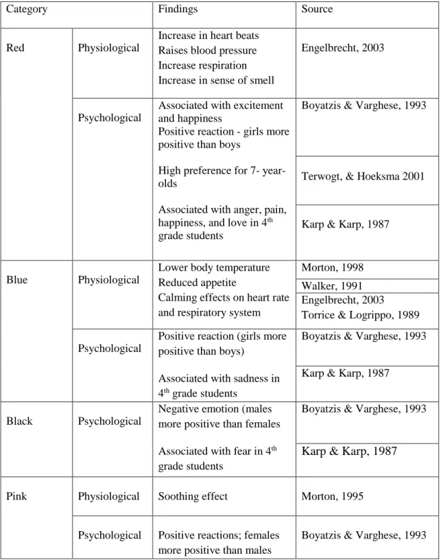
Table 1. Physiological and Psychological responses to different colors
Category Findings Source
Red Physiological
Increase in heart beats Raises blood pressure Increase respiration Increase in sense of smell
Engelbrecht, 2003
Psychological
Associated with excitement and happiness
Positive reaction - girls more positive than boys
High preference for 7- year- olds
Associated with anger, pain, happiness, and love in 4th
grade students
Boyatzis & Varghese, 1993
Terwogt, & Hoeksma 2001
Karp & Karp, 1987
Blue Physiological
Lower body temperature Reduced appetite
Calming effects on heart rate and respiratory system
Morton, 1998 Walker, 1991 Engelbrecht, 2003
Torrice & Logrippo, 1989 Psychological
Positive reaction (girls more positive than boys)
Associated with sadness in 4th grade students
Boyatzis & Varghese, 1993 Karp & Karp, 1987
Black Psychological
Negative emotion (males more positive than females Associated with fear in 4th
grade students
Boyatzis & Varghese, 1993
Karp & Karp, 1987
Pink Physiological Soothing effect Morton, 1995
Psychological Positive reactions; females more positive than males
25
Table 1 (cont’d)
Cool colors Psychological Preferred by active children Recommended for
secondary classrooms
Torrice & Logrippo, 1989 Engelbrecht, 2003
Warm colors Psychological Preferred by passive children Recommended for preschool and elementary students
Torrice & Logrippo, 1989 Engelbrecht, 2003
2.1.4 Preferences to Color
A major number of color studies have found differences in color preference regarding color attributes, age, culture, and gender. However, this study would only focus on the effect of color attributes (hue and saturation), age and gender on color preference. The first intention of this study was carrying out a cross-cultural study between Iranian and Turkish children, however after further investigations, it was found that any finding that suggests a difference in color preference across different cultures is not pervasive because there are other factors, such as background, language, context, light sources and psychological status involved in determining color preference (Manav, 2006). In that sense the following paragraphs would try to go over the studies regarding the effect of color attributes, age and gender on color preference.
Scholars such as Guilford (1934) have tried to demonstrate the effects of the dimensions of color on preference. In that regard, a linear relationship between brightness and saturation was found under a constant hue (Guilford, 1934). Guilford found that lighter
26
and more saturated colors were preferred to darker and less saturated ones, when the hue was kept at a constant rate. At a constant brightness and saturation, blue, green, and red were the most preferred colors whereas yellow and orange were the least preferred ones.
Guilford and Smith (1959) analyzed the effect of hue, saturation and brightness on pleasantness and the results demonstrated that at a constant brightness and saturation a range of green to blue colors were preferred over a range of yellow and yellow-green. They also found a positive relationship between brightness and saturation. Sivik (1974), investigated 71 colors selected from NCS on differential scales, regarding four factors of excitement, evaluation, potency, and temperature. He found that as the brightness
decreased, colors were less preferred. He also found that brighter and more saturated colors were preferred over less bright and less saturated colors. Another interesting finding of the study was that blue was found as the most preferred color regardless of the changes made to its brightness and saturation.
In line with the above mentioned studies, Camgöz, Yener and Güvenç (2002),
investigated the effects of hue, saturation, and brightness on preference. They found that hue, brightness and saturation were all important in determining color preference. Moreover, brightest and most saturated colors were preferred over any other
combinations of brightness and saturation. Consistent with other studies, blue was stated as the most preferred color. Overall, the results of these studies indicate that among color attributes, saturation has been the most effective element in comparison to hue and brightness in altering people’s perception of which color is more pleasurable more calming or exciting (Mikellides, 1990).
27
Smets (1982) analyzed, the effect of hue, saturation and brightness on pleasantness using colors with different brightness and saturations selected from Munsell color system. The result of the study indicated that brightness and hue were not effective factors in determining pleasantness. However, the researcher stated that saturation was positively associated with pleasantness of a color. The interesting result of the study was that the least known color attribute (saturation) has the greatest impact on color
pleasantness. There is only a slight relationship between brightness and pleasantness of a color whereas the effect of hue is negligible.
Children’s color preference was examined on a study carried out by Child, Hansen, and Hornbeck (1968). The participants were over 1,100 students with ages between 6 to 18. The findings of this study was parallel with those mentioned above, in that sense, high saturated colors were preferred over low saturated colors and blue and green were the most preferred colors. The results also demonstrated that with increasing age, hue of the color gets more important than saturation in determining preference to colors. This study indicated no significant effect of brightness, however a slight inclination was observed towards brighter colors. Additionally, other studies have suggested a preference towards long-wavelength colors to short-wavelength ones. In that sense, a range of red and yellow is preferred over blue and green. (Adams, 1987; Zentner, 2001). The details of these studies are presented in Table 2. In conclusion, saturation and brightness
determine color preference within a specific hue in a way that highly saturated and bright colors are mostly preferred. In addition, when saturation and brightness are controlled, short wavelength colors are preferred over long wavelength colors. In other
28
words, high saturated, bright and short wavelength colors are mostly preferred and are associated with positive emotions.
Color preference studies have been done on samples ranging from infant participants to children and adults. The following paragraphs would go through these studies. As an example, studies done on infants, show an inclination towards chromatic colors over achromatic ones (Adams, 1987). Furthermore, studies done on children and adults demonstrate a bias towards red in early childhood, however, as the child grows up, blue tends to be preferred over other colors (Zentner, 2001).
The effect of ageing was analyzed on a study done by Dittmar (2001). The study was done on younger and older adults with ages between 19-90. The results of this study indicated that blue was the most preferred color and yellow was the least preferred color for younger adults. However, with increasing age, the inclination towards blue
decreased whereas the preference towards red and green increased. The researcher concluded that color preference is a phenomenon that changes throughout the life span (Dittmar, 2001).
Manav (2007) analyzed color preferences in residential buildings with samples with different ages. The age groups were divided into three categories, 18-32, 33-47 and 48-62. The results demonstrated that gender and age are important factors in determining the preference towards color black. Black was preferred by all the participants in the 48-62 age group. No difference was detected between different ages in chromatic colors of green, red, brown, blue, orange, pink, and violet and the achromatic color of white.
29
A more recent study investigated the effect of age on color-emotion, preference and harmony (Ou, Luo, Sun, Hu, & Chen, 2012). The aim of the study was analyzing whether preferences and color-emotion responses would change with the increase in age. Single colors and pair colors were both assessed under 4 different word pairs, warm-cool, heavy-light, active-passive, and like-dislike. The sample included 20 young participants and 20 older ones. The results demonstrated that single colors tended to be less active, less liked and cooler for older participants in comparison to younger adults. A significant difference was detected in dark colors, white and achromatic colors that were less liked for older participants. In the case of color pairs, it was found that light colors tended to be less active and cooler for older adults. Achromatic color pairs were also rated as less liked, less active and cool for older participants (Ou et al. 2010).
In addition to age, gender is the other variable that is often analyzed in preference studies. The studies carried out on color preference do not support a gender difference in samples of less than 24 months (Jadva, Hines, & Golombok, 2010), however this
difference becomes more significant with the advancement of age (Karniol, 2011). As an example, preschool boys show a tendency towards green in computer presentations whereas girls prefer red (Passig & Levin, 1999). Another study focusing on gender differences was carried out by Turgeon (2008). She investigated the difference in children’s drawings regarding gender differences in preschools. The results
demonstrated that girls use more colors, especially warm colors of pink and purple, in their drawings in comparison to boys.
30
Gender stereotypes is another issue that is often discussed in color studies. As an example Lobur and Deloache (2011) analyzed the early development of gender-stereotypes color preferences in samples of 7 months to 5 years. The results indicated that by the age of 2, girls tended to choose pink objects more than boys, and by the age of 2.5, this tendency had become more significant in a way that pink was preferred over other colors. As the inclination towards pink increase for girls, boys tend to show more avoidance in the usage of pink.
Color preference studies in adults also demonstrate a gender difference, as an example, in a study done on college students, it was found that males prefer cool colors such as green and blue whereas females prefer warm colors of yellow and red (Ellis & Ficek, 2001). A number of studies detecting gender differences in adults explain this
phenomenon in reference to the hunter-gatherer theory (He, Zhang, Zhu, Xu, Yu, & Chen, 2011; Hurlbert & Ling, 2007). Females prefer pink, purple, red, yellow that can be explained by their role as gatherers of yellow fruit, red and purple berries and red leaves. On the other hand, males prefer green and blue, calm colors of nature, that refers to their role as hunters (He et al, 2011).
In contrast to the studies mentioned above, there are studies that have not support a significant gender difference regrading color preference (Child, Hansen, & Hornbeck, 1968; Dittmar, 2001, Zentner, 2001). These studies suggest a slight preference towards bright colors in females in comparison to males (Valdez & Mehrabian, 1994; Zetner, 2001). Moreover, it should also be mentioned that gender differences regarding
31
emotional associations have also been found in some studies. This difference has been observed in the case of pink and purple (girls rating them as happy, boys rating them as unhappy colors), brown and red (boys rating them as happy, girls rating them as
unhappy) (Pope, Butler & Qualter, 2012; Zenter, 2001). Based on the literature
mentioned above, the current study would investigate the difference between genders in color preference and emotional responses.
Table 2. Studies done on color preference in children
Variables Subjects Findings Authors
Green, Red, Grey, Blue, Yellow
80 children and adults
Chromatic colors were preferred over achromatic colors
Long-wavelength colors are preferred in children, whereas adults prefer short-wavelength colors Adams, 1987 Black, Grey, Red, Brown, Blue, Green, Yellow, Pink, Purple
60 children Females preferred pink Males preferred blue
Positive responses were shown towards bright colors in
comparison to dark ones. Children’s responses towards bright colors are positive.
Boyatzis & Varghes, 1994 Red, Yellow, Blue, White, Black, Green 72 children and adults
Blue was the most preferred color for both children and adults
Black was the least preferred color for both children and adults
Meerum Terwogt & Hoeksma, 1995
32 Table 2 (cont’d) Multiple color pairs More than 1,100 children
Blue and green were the most preferred colors
Saturation had a positive influence on preference
Brightness had no influence on color preference, however, an inclination was observed towards brighter colors
As the age increased, hue became more important than saturation in determining color preference No gender difference Child, Hansen, & Hornbeck, 1968 Blue, Yellow, Red, Green, Brown, Black
89 children Blue was the most preferred color No gender difference Fleming, Holmes, Barton, & Osbahr, 1993 Yellow, Dark and Bright Blue, Dark and Bright Green, Red, Black, Brown, Pink
106 children Red and pink was the most
preferred color for children, brown and black were the least preferred colors.
Dark blue and bright blue were the most preferred colors for adults, pink and brown were the least preferred ones.
No gender stereotype was observed.
Both genders preferred bright colors over dark ones.
Yellow was mostly associated with happiness and blue was mostly associated with sadness.
33 2.2 Emotion Studies
The second part of the literature review starts with defining emotions and its categories. Afterwards, it would go over the literature concerning the emotional knowledge of children and finally it would mention different methods of measuring emotions with a focus on none-verbal scale measurements.
2.2.1 Definition of Emotion and its categories
Even though the literature is replete with psychological definitions of affect, there is no single definition of the term emotion, therefore it has to be clearly defined (Cabanac, Guillaume, Balasko & Fleury, 2002; Chapman & Nakamura, 1998). Emotion has been described as a sudden trouble, ephemeral upheaval caused by an incident of joy, fear, happiness, surprise, etc. (Larousse Dictionary, 1990), or a ‘mental feeling or affection (e.g. pain, desire, hope, etc.) as distinct from cognitions or volitions’ (Oxford English Dictionary, 1987). Moreover, in the field of psychology, emotion has been defined as a mental state that involves cognition and psychological arousal (Plutchik & Ax, 1967; Scherer, 1993). Emotion is a key element in the psychological process and it defines man’s perception of reality, in addition, it expresses an alteration in neuropsychological activity that is reflected in various aspects of the human psyche (Chapman & Nakamura, 1998). All feelings and experiences ranging from deep pain and suffering to inflated stages of joy can be expressed as emotions (Cardinal, Parkinson, Hall & Everitt, 2002).
34
Emotions are intentional states that are dependent on something or someone, in other words, one would be angry at a person or be happy about an incident, rather than just feeling angry or happy (Cardinal et al., 2002). Therefore, emotions are associated with a certain object, person or event that might be real, remembered or imagined (Parkinson, 1997). Furthermore, the association between response and consciousness causes emotions and the bodily responses to emotions (Ekman, Levenson & Friesen, 1983) According to Ekman (1983), six kinds of emotions create distinguished bodily patterns.
Figure 6. Cause of emotional responses.
(Source: Cardinal, R. N., Parkinson, J. A., Hall, J., & Everitt, B. J. (2002). Emotion and motivation: the role of the amygdala, ventral striatum, and prefrontal
35
According to the literature, some emotions are regarded as basic whereas others are not, as an example, Evans (2002), has defined joy, fear, disgust, surprise, anger and distress as basic, universal and intuitive emotions. Being innate and universal are two main characteristics of basic emotions (Evans, 2002). On the other hand, Ekman and Friesen (1971), have described happiness, sadness, fear, anger, surprise and disgust as basic emotions, in addition they have assigned specific facial expressions for each of these emotions.
Other than categorizing emotions as either basic or not, other viewpoints have been taken in order to categorize emotions. As an example, Ortony and Turner (1990), define emotions as either positive or negative. In their definition, surprise, regraded as a basic emotion by various literature (Ekman and Friesen, 1971; Izard, 1971), is not considered a basic emotion, because in contrast to emotions such as shame, relief, happiness, anger and fear no valenced state can be attributed to surprise. In other words, they believe that being valenced is a key characteristic in making a state an emotion.
2.2.2. Emotional Knowledge of Children
Awareness of the development level of children’s emotional knowledge is critical for professionals working with children (Pope, Butler, & Qualter, 2012; Weare & Gray, 2003). This awareness can help professionals discern how children of a certain age understand and explain their surroundings, and how they manage their feelings in emotional situations (Cutting & Dunn, 1999). This knowledge can be put in effective use in clinical and educational contexts in order to help children explore and achieve
36
their developmental accomplishments (Pope, Butler, & Qualter, 2012). Furthermore, this knowledge would contribute to children’s ability to manage displays of emotional experiences and emotions in themselves, recognize, decipher and react to other people’s emotional displays along with helping them understand how situations would affect someone’s feelings (Harris, 1985).
Moreover, emotional understanding in children is concerned with their ability to recall, describe and recognize emotions and emotional experiences both in themselves and in others (Nannis, 1988; Pope, Butler, & Qualter, 2012; Seja & Russ, 1999). This ability would be achieved through understanding emotional experiences along with a cognitive social-emotional proficiency (Pope, Butler, & Qualter, 2012). Moreover, studies have demonstrated that this knowledge becomes apparent in children of two to three years of age (Flavell, 1999). A dearth of emotional understanding, reaction to social clues or recognizing other people’s reaction to situations in the child by the end of the second year can be a signal of a low emotional growth (Flavell, 1999).
Studies show that verbal ability is in direct correlation with emotional understanding (Pope, Butler, & Qualter, 2012; Seja & Russ, 1999), in other words, children use language both as a communication tool and as a medium of shaping their thoughts (Pope, Butler, & Qualter, 2012). Furthermore, females often function better than males when it comes to verbal and language skills, they also perform better on emotional understanding tests. Studies have shown that girls with only three years of age, exhibit a high level of proficiency in labelling different emotions along with understanding convoluted emotions (Bosacki & Moore, 2004; Dunn, 1988).
37
Studies on basic emotions have demonstrated that children first understand a happy situation, followed by sad, angry and finally fearful. Contextual information is used in children’s everyday experiences in order to help them figure out the reasons behind the occurrence of their emotions. Their understandings of the basic emotions help them come up with explanations both for themselves and others. Studies have shown that preschool children have the ability not only to understand emotions in themselves but also in their friends and family members (Bosacki & Moore, 2004; Broderick, 1991; Hughes & Dunn, 1998; Pope, Butler, & Qualter, 2012; Zenter, 2001). As an example, the study done by Widen and Russell (2008), investigated the development of emotion categories in 168 preschool children, between the ages of 2 and 5. The children were asked to label emotions of happiness, surprise, fear, anger, disgust and sadness with emotional facial expressions. The results indicated that labels for happiness, sadness and anger were frequently used whereas labels for fear, surprise and disgust were used less frequently. This study states happiness, sadness and anger as early-emerging emotions whereas disgust, fear and surprise are regarded as later-emerging ones. Additionally, this study found that children tend to use incorrect facial expressions to label emotions of fear, disgust and surprise.
As a result, the sample group of this study is made of 5-year-old preschool children who have been asked to match emotions of happiness, sadness and anger, defined as basic by Ekman and Friesen (1971), with different colors. The reason behind the exclusion of other basic emotions (disgust, surprise and fear), as mentioned above is that preschool children have not reached the development level to distinguish these emotions from each other (Widen & Russell 2008).
38 2.2.3 Measuring Emotion
In order to measure emotions, one must first characterize and differentiate emotions from other states (Desmet, 2003). As explained at the beginning of this chapter, there is no single definition to describe the term emotion, therefore, there are a variety of
definitions about the term, each focusing on a distinct aspect of emotion (Desmet, 2003). As a result, emotion is best described as a multifaceted phenomenon with the following elements; “behavioral reactions (e.g. retreating), expressive reactions (e.g. smiling), physiological reactions (e.g. heart pounding), and subjective feelings (e.g. feeling
amused)” (Desmet, 2003). As a result, the instruments applied to measure emotion focus on one of these elements. These instruments can be categorized as either non-verbal or verbal ones that vary from simple questionnaires to high-tech tools that measure brain waves (Desmet, 2003). The following paragraphs would briefly go over non-verbal methods of measuring emotions, with a focus on pictorial scale measurements that have been applied in this study.
This method is widely used and it can measure subjective feelings (Desmet, 2003). Subjective feelings (feeling sad or feeling inspired), are conscious awareness of an emotional state that a person is in (Desmet, 2003). Self-report method would provide a chance for the participant to express a great deal of information that only he/she has access to, by using different types of rating scales, checklists or open-ended questions (Desmet, 2003).
39
Under the scope of this study rating measures would be explained further. Rating measures ask the participants how they feel during a certain occasion. Rating measures provide the opportunity to analyze the effect of a certain object on the participant. These rating scales might be unipolar or bipolar. The unipolar scales are focused on a single concept like extremely happy to not happy at all whereas bipolar scales, such as the ones used in Mehrabian-Russel Model, use different adjectives at each end of the scale. According to Desmet (2003), the advantage of rating scales is that they can easily measure individual or mixed emotions. However, usage of them across different ages and cultures is not so easy. As a result, non-verbal methods using pictures have been developed in order to ease this process across all ages and cultures.
As explained above non-verbal instruments measure physiological or expressive dimensions of emotion. Expressive reactions (smile, grin or frown) are facial, postural and vocal characters that come along with emotions (Desmet, 2003). According to Ekman (1994), each emotion has its own distinctive facial expression, as an example, anger is accompanied with contracted eyebrows, brisk movements, compressed lips and raised voices (Ekman & Friesen, 1975). Tools that are used to measure this
characteristic of emotion focus on either facial or vocal expressions (Desmet, 2003). Instruments that focus on facial expressions are based on theories that associate specific emotions to distinctive facial features such as Facial Action Coding System (Desmet, 2003). As seen in Figure 7, the non-verbal pictorial scale instruments use universally accepted facial expression. The advantage of the non-verbal measurements is that they are independent of language, which provides an opportunity to use them across all
40
cultures and ages. In addition, they do not distract the participants during the experiment because of their low-key characteristic (Desmet, 2003).
Figure7. Facial expressions of emotions designed by Paul Ekman. (Source: Cardinal, R. N., Parkinson, J. A., Hall, J., & Everitt, B. J. (2002). Emotion and
motivation: the role of the amygdala, ventral striatum, and prefrontal cortex. Neuroscience & Biobehavioral Reviews, 26(3), 321-352).
This study applies schematic facial expressions instead of photographs of actual expressions because according to Sullivan, Kirkpatrick, & MacDonald, (1995) under certain conditions, assessing photographs of adult models might provoke anxiety for children. Therefore, schematic facial expressions developed by Sullivan et al. (1995), were used in this study. Studies done by Camras and Allison (1985) and MacDonald, Kirkpatrick, & Sullivan (1996), indicate the validity of schematic facial expressions. As an example, in the study done by Camras and Allison (1985), it was found that
happiness and sadness were easily identified by preschool children. Furthermore, anger was the most accurately defined emotions by children of 5 to 9 years of age (Camras & Allison, 1985; MacDonald, Kirkpatrick, & Sullivan, 1996). As a result, basic emotions of anger, sadness, neutral and happiness were chosen in this study (See Figure 8).