The Effects of Colour and Light on Space Perception
Banu MANAV *
E-mail: manav.banu@gmail.com, Rana Güvenkaya KUTLU*
E-mail: rana.guvenkaya@gmail.com Mehmet Şener KÜÇÜKDOĞU** E-mail: m.kucukdogu@iku.edu.tr
*Asst.Prof.Dr, İstanbul Kültür University, Faculty of Art and Design, Department of Interior Architecture and Environmental Design, İstanbul-Turkey
**Prof.Dr, İstanbul Kültür University, Faculty of Architecture and Engineering, Head of the Department of Architecture İstanbul-Turkey
ABSTRACT
This study analyzes and compares colour emotions of people with respect to the difference in illuminance and wall colour at a full scale test room, without daylight. 20 undergraduate students from the Department of Interior Architecture and Environmental Design evaluated the visual appraisal of the wall colours and lighting design separately through a semantic differential scale. Statistical test results indicated that, colour emotions are consistent across men and women. It was also observed that a 200 lx gradual increase in the illuminance leads to positive impressions. The results show that when wall colour is the dependant vari-able, while illuminance is constant, light yellow room is associated with positive factors with respect to light blue room. Light yellow room is more “stimulating” than light blue room while mean of the responses are same under both of the rooms for the impression of “intimate”.
Keywords: Colour Emotion, Interior Design, Light-colour Interaction, Space Perception,
1. INTRODUCTION
Light and colour are two basic factors of human perception, they are a matter of well design and, both are considered a neurological process that operates in arousability. Recent researches of Kwallek [1], Küller [2, 3] support that the strength of arousal response to sudden increases in variation and/or unexpectedness of stimuli is effective on indi-vidual’s performance and space perception.
Starting from Flynn [4], Küller [2, 3], Ou et al[5], there are various studies on colour association and colour emo-tions which are greatly concerned with a large number of colour-emotion scales and are evaluated by the method of
Fig.1
Plan of the test office
semantic differential scale. The semantic words describing the characteristics of colours and human response are generally termed as colour emotion. Statistical tests are used for quantifying colour emotions as in the case of Ou et al[5], Gao et al [6]. In order to identify clusters among adjective pairs, factor analysis is used to evaluate the intercor-relations of a set of variables.
Colour studies are conducted through colour models in the studies of Ou et al[5], full scale model studies Küller [2,3], Manav[7]. In these studies, 3 attributes of colour; hue-value (lightness) and saturation (chroma) can be investigated, sometimes colour-light interaction is studied as in the case of Manav [7].
In the present study, colour-light interaction is investigated stressing the importance of wall colour and illuminance as dependant variables on the visual appraisal of an office space. It is aimed to evaluate the relationship between colour emotions, and influence factors as illuminance and wall colour at a full scale test office without daylight penetration. 2. TEST OFFICE DESIGN
A full scale test office which is located in the Lighting Laboratory, at İstanbul Kültür University, at the basement floor with no daylight penetration. The test office is 5.20 m long, 3.50 m wide and 2.30 m high is used for this experimental study. It has two office desks, 2 posture chairs, a locker for the files and documents. Walls are composed of multiple coloured panels that are mounted on a sliding mechanism. The coloured panels can be rotated and the same room can be visualized in different colours (rfloor =0,32, rceiling =0,80). Figure 1 illustrates the plan of the test office.
The automation controlled lighting system is supplied by tubular fluorescent lamps which are connected to dimmable electronic ballasts and are regulated by DALI. For this study, selected and evaluated lighting alternatives are 300 - 4000° K (LA2), 500- 4000° K (LA5 ), 750 lx- 4000° K (LA7 ).
The test office can be visualized under light blue and light yellow wall colours under each of the lighting levels (300 lx, 500 lx, 750 lx) respectively while the colour temperature is constant. With respect to the preprogrammed lighting
al-Fig 2.
Assessment of light blue and light yellow wall colour under three lighting alternatives
ternatives, participants evaluated appraisal of the wall colours. The Natural Colour System (NCS) is used to describe the colour scheme of the walls. An attempt was made to use colour panels as the customary colours for offices. In designing the colour schemes for value, an attempt was made to select colours having aclose distance of lightness. Table 1 gives the technical data of the study.
Lighting system Illuminance level Wall colour NCS CODE Reflectance
factor Luminaire type: TBS 631 Lamp type: TL’5 28W 840 300 lx 500 lx 750 lx Light blue Light yellow L90 C10 H230 L85 C14 H70 %74,1 (r=0,74) %72,3 (r=0,72)
Table 1. Technical data of the study.
Horizontal illuminance and luminance distribution (on the working surface) and the vertical illuminance-luminance distribution (on the wall surface) are measured on various points according to the grid system to evaluate physical comfort conditions. Measured illuminance and luminance values at 54 points indicate that physical comfort conditions are satisfied.
In the study, semantic differential scale through the use of bipolar adjective pairs was developed with reference to previous studies. Bipolar adjective pairs are grouped and they are evaluated under three categories; personal evalu-ation factor, spatial appearance factor and factor of originality were tested by 10 pairs of colour emotional words. 3. HYPOTHESES
In terms of the arousability, it was predicted that wall colour would affect the appraisal of the environment under constant illuminance. It was also hypothesized that the pattern of difference in the illuminance for light blue and light yellow wall colours would be affective on the arousal level. In other words, it was expected that the gradual increase in the illuminance would change personal evaluation factor, spatial appearance factor and factor of originality. Also, the role of gender was assumed to be affective on the arousal level.
4. EXPERIMENTAL PROCEDURES
The participant group was undergraduate students from the Interior Architecture and Environmental Design Depart-ment at IKU, aged between 21-34 and had good colour vision. 21 subjects, 11 male and 10 female participated in the visual assessments. Each student was asked to take Ishihara Colour Blindness Test before the experimental session to ensure they had normal colour vision. 1 subject from the male group was recorded “colour blind” whose results showed great discrepancy. For this reason, statistical results were applied among 20 students; 10 male and 10 female.
asked to view the wall colours at approximately 15° to normal with a distance around 140 cm. After viewing a wall colour (light blue for example), each subject was asked to fill in the questionnaire for each of the ten word pairs to describe the wall colour under the specified lighting alternative. The experimental session was repeated for each of the lighting alternative, for “light blue” and “light yellow” wall colours separately.
Lighting alternative 2 (LA2; 300 lx) Lighting alternative 5 (LA5; 4000° K- 500 lx) Lighting alternative 7 (LA7; 4000° K- 750 lx) p value
Mean Sd Mean Sd Mean Sd
Light Blue wall
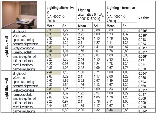
Bright-dull 3,33 1,22 1,56 0,88 0,89 0,78 0,000* Warm-cool 3,33 1,22 2,22 1,09 1,33 1,32 0,010* spacious-boring 3,33 1,12 2,44 1,13 1,78 1,39 0,018 comfort-depressed 3,33 1,22 2,11 1,27 2,11 1,36 0,054 lively-colourless 3,33 1,12 2,33 1,41 1,00 0,87 0,011* luminous-dark 3,44 1,01 1,56 1,01 0,78 0,83 0,001* emotive-quitened 3,33 1,41 2,33 0,87 1,89 0,93 0,006* intimate-distant 2,22 1,30 2,44 1,13 2,33 1,73 0,871 restful-restless 3,22 0,97 2,56 1,24 1,78 1,39 0,031 calm-stimulating 0,89 1,05 2,22 1,09 2,67 1,73 0,030
Light Blue wall
Bright-dull 2,44 1,13 1,00 0,71 1,00 1,00 0,004* Warm-cool 2,67 1,22 2,11 1,17 2,00 1,22 0,056 spacious-boring 2,67 1,66 2,22 0,97 1,89 1,27 0,393 comfort-depressed 2,33 1,50 1,56 1,13 1,67 1,32 0,568 lively-colourless 2,89 1,05 1,22 1,09 1,33 1,00 0,001* luminous-dark 2,00 1,32 1,22 0,97 1,00 1,22 0,047 emotive-quitened 2,67 1,32 2,11 1,05 1,78 1,20 0,209 intimate-distant 2,22 0,97 2,11 0,78 2,11 1,05 0,999 restful-restless 2,44 1,59 1,89 1,17 2,67 1,12 0,250 calm-stimulating 1,11 0,60 2,00 1,32 3,44 0,88 0,004* Friedman test, p<0,016
Table 2. Comparison of the lighting alternatives for light blue and light yellow colours 5. RESULTS AND DISCUSSION
Statistical Package for Social Sciences (SPSS) 17.0 was used for data analysis. Non parametric tests were applied depending on the number of the participant group. The Mann Whitney U Test was used in the study as a measure of gender and illuminance difference in colour emotions. The statistical analysis of gender on the appraisal level of the wall colours under different illuminance indicate that, there is not a significant difference between gender and colour emotions. In other words, there is not any difference between the appraisal level of light blue and light yellow wall
colour for men and women.
Mean of the responses under three lighting alternatives are compared both for the yellow and the blue wall. The bigger value for the mean indicates that participants chose the negative adjectives. Similarly, smaller value indicates that participants chose positive adjectives. Mean of the responses and standard deviation are summarized in the Table 2 above.
The Friedman Test was used as a measure of the influence of lighting alternatives on the colour assessment indi-cated that, there is a significant difference between the three lighting alternatives in terms of the bipolar adjective pairs; bright-dull (p=0,000), warm-cool (p=0,010), lively-dark (p=0,01) and emotive-quitened (p=0,006). When the frequency distribution of each adjective pair is compared in relation to lighting alternatives, results show that light blue wall colour was found more dull, cool, boring, colourless, dark and quitened.
For the light blue wall room, under LA2, the impression of “dull” is significant (meaningful) than the test results at LA5 and LA7. Similarly, under LA2 the impressions of “cool”, “colourless”, “dark” and “quitened” are significant with respect to LA5 and LA7. A gradual decrease in illuminance, the test room is associated with negative impressions. On the contrary, gradual increase in the illuminance (200 lx and 250 lx) leads to positive impressions.
For the light yellow wall room, under LA2, the impression of “dull” and “colourless is significant (meaningful) than the test results at LA5 and LA7. The impression of “stimulating” is significant for the LA7. The gradual increase in the iluminance affected the stimulation level in the light yellow room positively.
As shown in Figure 2, under 300 lx, light yellow room is associated with positive factors with respect to light blue room. Light blue room is more stimulating than light blue room while mean of the responses are same for the impression of intimate (mean value=2,22).
6. CONCLUSION
The experimental study demonstrated that the colour of an interior space has effects on the arousal level and per-ception of people. Significant differences were recorded in the visual assessment of the test room under the same illuminance for light blue and light yellow wall colours. Mean of the responses indicate that, the tested colours had an impact on the appraisal of the test room.
Similarly, a gradual increase in illuminance affected colour evaluation. As the illuminance increased, an increase in the positive assessment has also recorded. In the study, test results show that colour emotions are consistent across men and women.
The experimental research indicates that lighting scheme of an interior is a design factor that shall be studied together with the colour scheme of the interior (wall-ceiling-floor-furniture colour).
It is intended to enlarge the study in order to be more directly relevant for design application. The study can be enlarged with a greater number of subjects, different colour palettes and lighting scheme in order to generalize the results.
adsadadadad
REFERENCES
1.Kwallek et al. “Work week productivity, visual complexity, and individual environment sensitivity in three offices of different colour interiors”. Colour Research and Application, Vol. 32, No.2, 2006, pp.130-143.
2.Küller,R, Mikellidesi B, Janssens J. “Colour, arousal, and performance- a comparison of three experiments”, Colour Research
and Application, Vol.34, No. 2, 2009,pp. 141-152.
3.Küller, R. “Perception of an interior as a function of its interior”, Proceedings of the Architectural Psychology Conference Kigston Polytechnic, ed by Honikman, B. 1970.
4. Flynn, J.E et al “Interim study of procedures for investigating the effect of light on impression and behaviour”. Selected Papers on Architectural Lighting. Ed by Mark Rea, Washington: SPIE Optical Engineering Press; 1992.
5.Ou et al. “Colour preference part 1: colour emotions for single colours”. Colour Research and Application, Vol. 29,No.3, 2004, pp.232-240.
6.Gao et al “Analysis of cross-cultural colour emotion”. Colour Research and Application, Vol. 32, No.3, 2007,pp.223-229. 7.Manav,B, Kutlu R, Küçükdoğu M “An experimental study on the appraisal of an office setting with respect to illuminances and wall colours”, Lux Europa 2009:11th European Lighting Conference Proceeding Book,Vol.1, İstanbul,Turkey, 2009, pp.123-128.