EFFECTS OF COLOR AND COLORED LIGHT ON
DEPTH PERCEPTION
A THESIS
SUBMITTED TO THE DEPARTMENT OF
INTERIOR ARCHITECTURE AND
ENVIRONMENTAL DESIGN AND THE INSTITUTE
OF ECONOMICS AND SOCIAL SCIENCES
OF BİLKENT UNIVERSITY
IN PARTIAL FULFILLMENT OF THE
REQUIREMENTS
FOR THE DEGREE OF
MASTER OF FINE ARTS
By
Deniz Atlı
August, 2010
i
SIGNATURE PAGE
I certify that I have read this thesis and that in my opinion it is fully adequate, in scope and in quality, as a thesis for the degree of Master of Fine Arts.
Assist. Prof. Dr. Nilgün Olguntürk (Principal Advisor)
I certify that I have read this thesis and that in my opinion it is fully adequate, in scope and in quality, as a thesis for the degree of Master of Fine Arts.
Prof. Dr. Halime Demirkan
I certify that I have read this thesis and that in my opinion it is fully adequate, in scope and in quality, as a thesis for the degree of Master of Fine Arts.
Assist. Prof. Dr. Güler Ufuk Demirbaş
Approved by the Institute of Fine Arts
ii
ABSTRACT
EFFECTS OF COLOR AND COLORED LIGHT ON DEPTH PERCEPTION
Deniz Atlı
MFA in Interior Architecture and Environmental Design Supervisor : Assist. Prof. Dr. Nilgün Olguntürk
July, 2010
The main purpose of this study is to understand the relationship between different objects and background colors, and depth perception in interior spaces. The experiment was conducted in two phases which consist of colored background light pairs (cool white-orange, cool white-blue, cool white-green, cool white-red, warm white-cool white, red-green and orange-blue) with colored objects (orange, blue and gray) in front of them. A forced choice paired comparison method was used to evaluate the differences in depth perception caused by colors. The participants were students who were having their internships in Philips Research Eindhoven, Netherlands. Firstly, participants were tested for color blindness and visual acuity, and the ones who passed these tests
participated in the experiment. After the first phase of the experiment, a second part was required in order to obtain more accurate results. The participants who had internally consistent results in the first phase participated in the second phase of the experiment. In both phases, participants judged the distances of two same colored objects in front of colored lit background by choosing the one which they perceived as closer to
themselves. As a result, differences between hues are smaller than the variations in perception of the participants, so hue has a really small effect on depth perception when evaluated monocularly.
iii
ÖZET
RENK VE RENKLİ IŞIĞIN DERİNLİK ALGISINA OLAN ETKİSİ
Deniz Atlı
İç Mimarlık ve Çevre Tasarımı Yüksek Lisans Programı Danışman : Y. Doç. Dr. Nilgün Olguntürk
Temmuz, 2010
Bu çalısmanın amacı, renkli obje ve renkli arka fon ilişkisinin iç mekanda derinlik algısına olan etkilerini anlamak ve karşılaştırmaktır. Deney iki aşamalı olarak renkli fon ışığı çiftlerinin (soğuk beyaz-turuncu, soğuk beyaz-mavi, soğuk beyaz-yeşil, soğuk beyaz-kırmızı, sıcak beyaz-soğuk beyaz, kırmızı-yeşil ve turuncu-mavi) önünde renkli objelerle (turuncu, mavi ve gri) gerçekleştirilmiştir. Renklerin derinlik algısı üzerindeki etkilerini anlamak amacıyla karşılaştırmalı test uygulanmıştır. Katılımcılar, Philips Araştırma Merkezi, Eindhoven, Hollanda‟da stajlarını sürdürmekte olan öğrencilerden oluşmaktadır. İlk olarak katılımcılara, renk körlüğü ve görme testleri verilmiştir. Bu testleri geçenler deneye katılmışlardır. Daha doğru sonuçlar elde etmek amacıyla, birinci bölümün ardından ikinci bir aşama daha deney yapılmıştır. Birinci aşamada kendi içerisinde tutarlı sonuçlara sahip olan katılımcılar, ikinci aşamada tekrar teste alınmıştır. Deneyin iki aşamasında da katılımcılar renkli ışık çiftleriyle aydınlatılmış fonun önünde iki tane, aynı renkli objenin uzaklıklarını kendilerine daha yakın olarak algıladıkları objeyi seçmek süretiyle değerlendirmişlerdir. Sonuç olarak, renk türleri arasındaki farklar katılımcılar arasındaki algı çeşitliliğinden daha küçüktür ve tek göz ile
değerlendirildiğinde renk türünün derinlik algısı üzerinde çok az etkin bir faktör olduğu söylenebilir.
iv
ACKNOWLEDGEMENT
Firstly, I would like to thank my supervisors, Ingrid Vogels, Pieter Seuntiens and Dragan Sekulovski from Philips Research and Assist. Prof. Dr. Nilgün Olguntürk from Bilkent University for their invaluable support, guidance and encouragement throughout the preparation of the thesis.
I would like to express my gratitude to my instructors Assoc. Prof. Dr. Feyzan Erkip, Prof. Dr. Halime Demirkan, Prof. Dr. Mustafa Pultar for their guidance during my graduate studies. I am grateful to my jury members, Prof. Dr. Halime Demirkan and Assist. Prof. Dr. Güler Ufuk Demirbaş for their helpful suggestions and valuable comments.
I would like to thank Philips Research for all the contributions to my thesis and the entire Visual Experiences Group for the very warm atmosphere. I would like to thank Gosia Perz who never deprived me of her help during my studies in Eindhoven. I am grateful to all my friends who did not decline my invitations to be participants in my longstanding experiments for the thesis. I owe special thanks to my housemates Henry Huis, David Caicedo, Jerome Perrin and Guillermo Fernandez-Blanco for both their contribution to my studies and their helpful attitude during my stay in Eindhoven. I thank Begüm Söker, Seden Odabaşıoğlu, İnci Cantimur, Yaprak Tanrıverdi and İpek Sancaktar for their support. I owe special thanks to Segah Sak, Elif Helvacıoğlu,
Papatya Dökmeci, Yonca Yıldırım and Burcu Çakırlar for their friendship, patience and help during these two years. I express my appreciation to my roommate Elif Öztürk for her endless patience and support.
I express my deepest love and gratitude to my beloved friend Volkan Aykaç and my parents Özlem Atlı and Behçet Atlı for their invaluable support, trust and
encouragement.
I want to dedicate this thesis to the memory of my invaluable instructor Cengiz Yener with respect for his guidance and support so that I would be involved in academic research area. Without his inspiration, I would not be able to start my academic studies on lighting design.
v
TABLE OF CONTENT
SIGNATURE PAGE ... i ABSTRACT ... ii ÖZET ... iii ACKNOWLEDGEMENT ... iv TABLE OF CONTENT ... vLIST OF FIGURES ... viii
LIST OF TABLES ... x
1. INTRODUCTION ... 1
1.1. Aim of the Study ... 2
1.2. Structure of the Thesis ... 2
2. THEORY OF SPACE PERCEPTION... 4
2.1. Space Perception ... 4
2.1.1. Parameters of Depth Perception ... 5
2.1.1.1. Monocular Depth Cues ... 6
2.1.1.2. Binocular Depth Cues ... 13
3. COLOR AND LIGHT ... 17
3.1. Color Appearance ... 17
3.1.1. Attributes of Color ... 18
3.1.2. Attributes of Light ... 20
3.1.3. Effects of Light on Attributes of Visual Sensation ... 25
3.1.3.1. Effects on Hue ... 26
vi
3.1.3.3. Effects on Saturation ... 31
3.2. Color in Depth Perception ... 32
3.2.1. Effects of Hue, Brightness and Saturation on Depth Perception ... 33
3.2.2. Effect of Light on Depth Perception ... 39
4. THE EXPERIMENT ... 42
4.1. Aim of the Study ... 42
4.1.1. Research Questions ... 42
4.1.2. Hypotheses ... 42
4.2. Method of the Study ... 43
4.2.1. Sample Group ... 43
4.2.2. Experiment Room and Stimuli ... 43
4.2.3. Procedure ... 49
4.2.3.1. Pilot Studies ... 50
4.2.3.2. Forced Choice Paired Comparison Test ... 51
4.2.3.2.1. First Phase ... 51 4.2.3.2.2. Second Phase ... 54 4.3. Findings ... 56 5. DISCUSSION ... 68 6. CONCLUSION ... 72 REFERENCES ... 75 APPENDICES ... 78 APPENDIX A ... 79 APPENDIX B ... 81 APPENDIX C ... 95
vii
APPENDIX D ... 115 APPENDIX E ... 119
viii
LIST OF FIGURES
Figure 2.1. Graph of different sources of depth information. ... 8
Figure 2.2. Linear perspective cue. ... 9
From:http://www1.appstate.edu/~kms/classes/psy3203/MonocularDepth/linear.gif ... 9
Figure 2.3. Highlights and shadows provide information about depth. ... 10
Figure 3.1. Color attributes (Michel, 1996, p.171). ... 19
Figure 3.2.The CIE 1931 Chromaticity diagram. ... 24
Figure 3.3. Simultaneous contrast (Achromatic). ... 30
Figure 3.4. Simultaneous contrast (Chromatic). ... 30
Figure 3.5. Chromatic aberration. (Sundet, 1987, p.134) ... 34
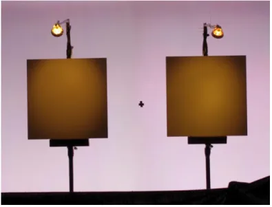
Figure 4.1. The stimuli with cool white lit background and gray objects. ... 46
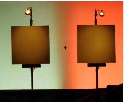
Figure 4.2. The stimuli with one color combination (red-blue) of background light and gray object. ... 47
Figure 4.3. Experiment room. ... 49
Figure 4.5 Psychometric curves for three participants which are represented one by one ... 58
with baseline and background pair measurements. ... 58
Figure 4.6. Psychometric curves for three participants which are represented one by one ... 60
with baseline and background pair measurements. ... 60
Figure 4.7. Psychometric curve for one participant with baseline and background pair 61 measurements. ... 61
Figure 4.8. Psychometric curves for three participants which are represented one by one ... 63
ix
with baseline and background pair measurements. ... 63 Figure B.1 Psychometric curves for the combinations (Follow according to Table B.1). ... 83 Figure D.1. Interaction table of object color and background hue pairs ... 118
x
LIST OF TABLES
Table 4.1. The LCH values of six background colors... 45
Table 4.2. The LCH and NCS values of three object colors. ... 47
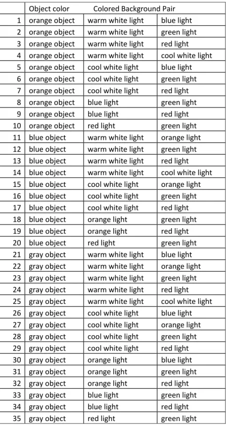
Table 4.3. 35 combinations of object and background colors... 52
Table 4.4. Color combinations evaluated in the second phase. ... 55
Table 4.5. Presentation of which colored object was perceived nearer in front of which colored background and how many participant perceived difference for each background pair... 67
Table A.1 Sample data list for one participant from phase 2. ... 80
Table B.1 The list of color combinations and psychometric curves of Phase 1. ... 82
Table D.1.Univariate analysis of variance ... 116
Table D.2. Post Hoc Tests – Object homogenous subsets ... 117
Table D.3. Post Hoc Tests – Pair homogenous subsets ... 117
Table E.1. Data for first and second phase of the experiment with differences and significances of the color combinations. ... 120
1
1. INTRODUCTION
This thesis concerns color and examines its effects on depth perception as an influential factor of space perception. Perception is one of the main topics in a lot of research. It involves immediate and basic experiences of individuals, generated as stimuli, and it gives them meaning and organization (Matlin and Foley, 1997). One of the observed and experienced stimuli for individuals is the space which they live in. While
experiencing that physical environment, there are two important physical factors: color and light, which start up the psychological process of perception. In that sense, the focus of this thesis is color and light effects on depth perception in interior spaces.
With the emerging technologies, there has been an increase in the use of color and colored light in both exterior and interior spaces. Especially with the LED technology, colored and more flexible uses in lighting design fulfill the expectation of individuals by creating desirable moods, atmospheres and identities of spaces. With different colors and color combinations of architectural objects and other equipments, different depth perception cues are obtained, and accordingly, different room size perceptions can be created. Therefore, it is important to understand the relations between color and colored light, and depth perception, which is the topic of many critical studies (Mount, Case, Sanderson and Brenner, 1956; Bailey, Grimm and Davoli, 2006; Ichihara, Kitagawa and Akutsu, 2007; Huang, 2007).
2
1.1. Aim of the Study
The main purpose of this study is to understand the relation between different objects and their background colors, and depth perception in interior spaces. In this manner, this study aims to understand if colored light has an effect on depth perception in interior spaces and how this can affect depth perception of colored objects.
It is important to understand colored light effects on depth perception because this may contribute to architectural design of interior spaces. Besides, the findings may be helpful not only architects but also lighting designers who have the ability to control the light.
1.2. Structure of the Thesis
The thesis consists of six chapters. The first chapter is the Introduction which gives some information about the topic that the study is going to cover. It gives a brief explanation of the importance of color, colored light and their relation with depth perception. The aim of the study and the structure of the thesis are also explained in this chapter.
The second chapter comprises some basic information on space perception and its relation with depth perception. Firstly, some definitions on the subject of perception are explored and an introduction to space perception is made. After that, the depth cues are categorized under two headings which are monocular and binocular cues, and the studies conducted on depth cues are explained. In the third chapter, basic terms of color
3
and light which are important for this study are defined. In addition, how light and light color affect the appearance of colored surfaces is mentioned. Finally, the studies on both color and light effects on depth perception are reported.
In the fourth chapter, the aim, research questions and hypotheses of the study are described. The details about the methodology of the experiment are explained in categories, namely the sample group, description of the experiment room and stimuli, and the procedure that is conducted through the experiment. The data obtained is evaluated and the statistical method that is used in the analysis is explained. In the fifth chapter, the findings are discussed.
The sixth chapter is the Conclusion, which includes the major results of the study, states the primary outcome observed in the experiment and suggestions for further research topics.
4
2. THEORY OF SPACE PERCEPTION
There have been many definitions and categorizations for explaining the meaning of perception. It has been expressed as “[…] awareness of objects” by an individual in its
simplest way (Ittelson, 1960, p. 4). In order to find out about the relation between individuals and their environment, the topic of perception has come into focus as a research topic for psychologists (Ittelson, 1960). In this manner, perception is explained as a two-way affair which involves incoming and outgoing channels. This two-way affair, covering the individual and his/her environment, is referred to as perceiving and acting, respectively. Besides, “[…] the function of perception is defined as to bring us
into contact with the world outside of ourselves. It is usually stated that this contact is through our senses.” (Ittelson, 1960, p. 9). According to this approach, the familiar five
senses became a topic of research and as this study is on the appearance of color and light, it concerns visual perception.
2.1. Space Perception
The world in which an individual lives and sees is made up of three-dimensional structures, objects and spaces. As perception is one of the aspects that creates the
relation between individual and his/her environment, this three-dimensionality and space are studied under the title of space perception. Besides, as perception drives through our
5
senses, space perception is investigated under different categories such as, auditory or visual space perception. In order to understand how an individual experiences the three-dimensionality around himself/herself with the influence of color and light, this study focuses on visual space perception. Specifically, visual space perception is defined as the ability to perceive the three-dimensional layout of our environment through visual experiences (Boff, Kaufman and Thomas, 1986). The three-dimensionality encloses the arrangement of individual particles, each in given size and location. The apparent location of each particle specifies its direction and distance from the point of view of the observing eye. In this manner, distance becomes one of the most important attributes of visual space perception. Since retinal image occurs two-dimensionally in our visual system, to perceive the distance of an object we need the third-dimension which is known as depth (Sekular and Blake, 1994). Retinal image uses two angles of line of sight which specify the position and the size. Besides these two angles, length of line of sight refers to the third dimension, that is depth (Steven, 1988). To observe distance, the knowledge of depth cues are studied. With the help of these depth cues, an
individual can conduct three consecutive processes which are detection, discrimination and identification, to distinguishing objects from each other (Sekular and Blake, 1994).
2.1.1. Parameters of Depth Perception
Depth perception can be defined in two different ways as absolute distance and relative
distance. The distance from an observer to an object is called absolute distance. If the
6
(Matlin and Foley, 1983). Differentiation between these two definitions is important to name the spatial factor that affects an individuals‟ evaluation of distance. Besides, the
location of an object relative to an observer is also defined as egocentric direction, which is descriptive information for the two-dimensional retinal image dependent on two angles of line of sight (Sekular and Blake, 1994).
As it is mentioned before, depth perception requires sources of information which are studied under the name of „cues‟. These cues are studied under two broad categories of
monocular and binocular depth cues (Sekular and Blake, 1994). While remembering these cues, what the designer must be aware of is how these cues affect the perception of spatial depth and how they can be used to change the appearance of architectural space. Monocular depth cues are the ones that can be controlled by a designer more than the binocular ones when shaping architectural spaces. This is because monocular cues concern mostly the environmental factors, where binocular depth cues are the ones which are more physiological in spatial vision and which are affected by the environmental factors. Both monocular and binocular cues are the attributes that a designer should be aware of.
2.1.1.1. Monocular Depth Cues
Monocular depth cues, which are also known as pictorial depth cues, can be identified as relative size, linear perspective, aerial perspective, interposition (occlusion), texture
7
Blake, 1994; Cutting and Vishton, 1995; Sundet, 1978; Ittelson, 1960). Besides these, another cue that involves information provided by the eye muscles is accommodation. These cues of monocular depth perception are the ones that require no movement either from the object or the observer.
Accommodation in the eye occurs because of the change in the shape of the lens while focusing on objects at different distances. Thus, eye muscles respond differently towards the objects at different distances (Matlin and Foley, 1983). However, it has been
mentioned in many sources that accommodation cue can function just for the distances that are immediately in front of you as it is also represented in Figure 2.1. (Cutting and Vishton, 1995). From the figure, it can be understood that after nearly 1 m, the effect of accommodation cue starts to decrease as it gets lower to the assumed utility threshold for information and after 10 m it has almost no effects. In some other sources, it was claimed that even for close ranges, “distance judgments based solely on accommodation are inaccurate” (Sekular and Blake, 1994, p. 218).
8
Figure 2.1. Graph of different sources of depth information. As the distances change, the effects of cues are also changing. (Cutting and Vishton, 1995, p. 80)
Besides accommodation, when pictorial depth cues are taken into consideration, size is one of the influencing factors of distance perception. From the Figure 2.1. it can easily be seen that it has a continuous effect on depth perception. Size and distance are closely related with each other since the size of the retinal image changes according to the variation between the observer and the distance of the object (Ittelson, 1960). However, without any other cue, retinal image may not give the correct size of the object.
Therefore, familiar size and relative size are the effective cues for distance perception (Sekular and Blake, 1994). When someone always perceives an object according to its environment some simultaneous effects such as a line looking longer near a shorter one
9
close to it occurs (Gombos and Schanda, 2006). This is the case when a familiar sized object appears near an unfamiliar one, so an individual can use this clue to detect the sizes of objects relatively to each other as well as their relative distances. Furthermore, the farther an object from the observer, the smaller it will appear because the retinal image that is going to be created will be smaller (Michel, 1996). In this manner, size cue converges with linear perspective as the appearance of spatial depth becomes
exceptionally strong because of the field of view (Michel, 1996).
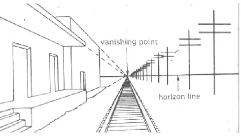
The main idea in linear perspective is that parallel lines appear to meet in the distance while creating a horizon line at the end (Matlin and Foley, 1997). According to linear
perspective cue, the covered portion of the retina gets smaller when the image is closer
to the horizon (and farther from the observer) (see Figure 2.2).
Figure 2.2. Linear perspective cue.
10
Michel (1996) states that linear perspective is the strongest depth cue which can be used to create powerful spatial depth. Cook, Yutsudo, Fujimoto and Murata (2008) add that the density of linear perspective grid lines induces the effect of shadows, texture and color information of the illusion that are produced on depth perception. With respect to the linear perspective, the effects on perceiving depth are strongly influenced by the pictorial cues of shading and shadows of objects on the background and on other objects (Cook et al., 2008).
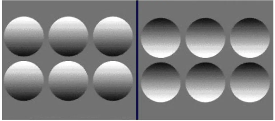
Shade and shadows are also important cues for the appearance of three-dimensionality
and solidity of the objects with regard to the degree of darkness of it as well as perception of depth (Matlin and Foley, 1997; Wyburn, 1964) (see Figure 2.3).
Figure 2.3. Highlights and shadows provide information about depth. The shadows indicate that the left hand image is convex, whereas the right hand image appears concave.
11
In this manner, the interaction of direction of light and the shape of object produces the shadow and gives information about the spatial depth as mentioned by Michel (1996).
Light and shade tools play an important role in differentiating foreground and
background from each other and perceiving the spatial layout (Cutting and Vishton, 1995). Shadows can also give crucial data when it is conveyed in relation with another cue of depth perception such as texture (Michel, 1996; Sekular and Blake, 1994).
Texture gradient is another depth cue that gives clues for the perception of layout and
our environment. “There are at least three gradients of texture in surfaces receding in
depth-depth gradients of size, density and compression” (Cutting and Vishton, 1995, p.94). Cutting and Vishton (1995) explain the effect of size gradient (the change in the largest extent of texture element) as similar with relative size which has a continuous impact on many elements across a surface (see Figure 2.1).
Besides, texture density gradient is defined as the “homogenously distributed markings
[…]” (Steven, 1988, p. 199) and as the distance is increased, the density gets higher in the
visual field. Dissimilarly, according to Cutting and Vishton (1995), the compression gradient, which refers to the shape of the texture gradient, is ineffective on depth perception; however, it gives good information about object shape and curvilinearity. Furthermore, with respect to Palmer and Brooks (2008) experiment, moving, sharp or red textures (as opposed to stationary, blurred and green) are seen closer.
12
Another cue that is also affected by blurriness and color is aerial perspective. It is the atmospheric effect that creates another kind of perspective because of the relative amount of moisture and pollution. Accordingly, with the high degree of these
ingredients, “objects in the distance become bluer and decreased in contrast with respect to objects in the foreground” (Cutting and Vishton, 1995, p. 88). In a way, distance
causes loss of detail and color in a scene (Steven, 1988). However, this is an effective depth cue in exterior spaces, not in interiors.
Another cue of depth perception, interposition (occlusion), is mentioned as if an object appears to overlap with or be a cut off part of another object it tends to appear nearer (Matlin and Foley, 1997; Wyburn, 1964). Besides, the relative sharpness of outline is also given as a cue for perceiving depth by Wyburn (1964). Michel (1996) explains this phenomenon as “when one object or surface is overlapped by another, the one with continuous outer contour appears to be in front and closer” (p. 25). This is one of the
most important cues of depth; it also has an important role in the binocular disparity process that will be discussed later in section 2.1.1.2 (Matlin and Foley, 1997).
In addition to all of these cues, Payne (1964) considers color as a cue for distance perception. He (1964) mentions color as a dependent variable of distance perception although cues of aerial perspective or light and shade can be considered to be some characteristics of color. Studies conducted about the effects of color on depth perception are going to be mentioned broadly later in Section 3.2.
13
2.1.1.2. Binocular Depth Cues
Another set of cues comes from the fact that individuals have two eyes. Besides all the monocular cues that have been discussed above, there are convergence and divergence,
binocular disparity and color stereopsis cues that can be investigated under the title of
binocular depth cues (Coren, Ward and Enns, 1994).
According to binocular vision, eye movements occur to focus the image on two foveae. The movements of two eyes towards different direction are called vergence movements. If this movement is inwards (towards the nose), it is called convergence. The opposite movement (away from each other), which occurs because the target is farther away, is called divergence (Coren et. at., 1994). Both the convergence and divergence are measured by the angles between the optical axes of the two eyes. It is suggested that in the range of up to only 2 m, convergence can be taken as the only source of information for depth. Nevertheless, it is not effective enough to perceive distances correctly at great distances only with convergence (Cutting and Vishton, 1995), Williams and Tresilian (1999) mention a conflicting result that with the additional depth cues, the contribution of vergence information becomes complicated. The complexity which is created by the combinations of cues, can cause unexpected distortions of visual space. For instance, the distances of objects and points can be perceived closer or further than they actually are. Moreover, vergence and accommodation are generally noted as cross couple, in the way that accommodation influences depth perception indirectly via its effect on vergence (Williams and Tresilian, 1999).
14
Similarly, because individuals have two eyes in which pupils are roughly apart up to 6.5 cm, slightly different images of the environment occur in each eye. The difference between the two eyes‟ images is called binocular disparity (Coren et.al., 1994). If the
object is in front of the fixation plane, it is crossed disparity because, in order to fixate on the object, the eyes must cross. However, the objects behind the fixation plane create
uncrossed disparity (Matlin and Foley, 1997). When the distance to the fixation plane
increases, the disparities between the images of two eyes decrease. With all of those cues, binocular disparity “[…] provides the information needed to judge depth
binocularly, an ability known as stereopsis” (Matlin and Foley, 1997, p. 183). Stereopsis allows individuals to judge relative depth with great accuracy while making them see the objects that are invisible to either eye alone (Sekular and Blake, 1994).
Some of the stereoscopic effects are mentioned in Form-And- Color-And- Depth (FACADE) theory of Grossberg (1994). According to this theory, different depth cues are investigated interactively under binocular and monocular conditions. According to the interactions of 3D boundary segmentations of edge, texture, shading and stereo information with filling-in surface properties of brightness, color and depth, the system of binocular viewing is analyzed in FACADE theory (Grossberg, 1994). As the main idea of the theory, pictorial cues are mentioned as activating several types of interaction processes in cortical mechanism that gives rise to three-dimensional scenic percepts (Dresp, Durand and Grossberg, 2002).
15
Considering the FACADE theory of Grossberg (1994), studies are focused on the interaction between interposition and color and texture, in the manner of understanding the figure-ground separation in depth perception in visual cortex, by examining
binocular conditions. With regard to some of the studies, occlusion provides the most important cue for depth perception; however, its interaction with different depth cues is inevitable (Dresp et. al., 2002). Although, Bailey et al. (2006) claim that “perspective cues such as relative size, occlusion and distance to the horizon are generally more effective at conveying depth than shading, luminance and colour” (p. 2),Dresp et. al.
(2002) mention that interposition and occlusion on their own are not strong enough to compete with a strong, conflicting contrast cue. Thus, “interposition and partial occlusion contribute to generate perceived depth when combined with a cooperative contrast cue” (Dresp et al., 2002, p. 273). Likewise, Dresp and Guibal (2004) report that
partial occlusion and interposition compete with luminance contrast of red color and achromatic contrast. Besides luminance, color and contrast interactions with occlusion, texture is also studied as another component of FACADE theory. Kawabe and Miura (2006) stat that the texture edges of interposition or occlusion contribute to depth perception. In their experiment (2006), which indicates the two cues of occlusion and texture together, it is mentioned that the image with textures of random stripes is seen nearer than the textured image of constant stripes.
Additionally, due to the effect of color in binocular vision, differences in depth
16
of depth perception (Matlin and Foley, 1997). These differences can occur depending on the brightness, saturation and hue attributes of color. Furthermore, color stereopsis is also studied considering figure-ground relations which affords opposite effects on depth perception (Dengler and Nitschke, 1993). Those effects of color are discussed in detail in Section 3.2.
17
3. COLOR AND LIGHT
In this section, general definitions of color and light are given. Basic terms determining color and its attributes, besides light and its effect on color, are focused on. After the definitions, color and light effects on depth perception are going to be discussed in detail.
3.1. Color Appearance
In this section, the definitions of color appearance in visual perception are presented in order to understand the fundamental scientific concepts of color. Color appearance is generally considered together with the parameters of hue, saturation and brightness of the visual stimuli that are displayed in the observer‟s field of view. The colored visual stimulus that is observed by the viewer is specified by the physical details of spatial properties (size, shape, and location in the visual field) and temporal properties (steady state, moving, pulsing) and their radiant power distributions (spectral power
distribution) (Boff et al. et al., 1986). The color appearance of the visual stimulus derives from the experience that the observer gets and the judgment of color appearance is directly influenced by the conditions and the environment that the visual stimuli are presented in. Nevertheless, expressing the perceived stimulus has a complicated nature in itself; therefore, there are some mathematical models designed to describe the color appearance precisely and universally.
18
According to the Commission International de l’Éclairage (CIE), color can be defined as an “attribute of visual perception consisting of any combination of chromatic or
achromatic content” (Fairchild, 2005, p. 84) which can be named by chromatic colors as
yellow, orange, green etc. or achromatic colors as white, gray, black etc., and it can be defined by the adjectives of dim, light, dark etc. Besides, perceived color depends on “the spectral composition of the radiant energy concerned by the observer” (Boff et al.,
1986, p. 9-2) according to the size, shape and surrounding of the stimulus areas. These stimulus areas can be both compared to each other as related colors or can be just judged as unrelated colors in which the circumstances will differ, and so their appearance will also differ from each other. Moreover, it is important to notice the difference between the more specified uses of related colors as object color, surface color and light color. In this research, both the use of surface and light colors are going to carry importance.
3.1.1. Attributes of Color
As it was defined before, color mainly deals with three basic attributes called hue,
19
Figure 3.1. Color attributes (Michel, 1996, p.171).
Referring to the literature according to their use and concepts, instead of brightness,
lightness can be used or instead of saturation, chroma can be used to identify colors.
However, in some research these words mean different impositions with regard to the conditions and designs of the research.
Firstly, hue is used as an attribute of visual sensation to characterize the name of colors as red, yellow, green and blue which cannot be described other than its own
(Fairchild,2005). These four colors are the unique hues that are used in combinations to name the hueness of the other color stimulus like orange (yellowish red or reddish yellow) (Boff et al., 1986). Hue is also understood as the variation in color when the wavelength is changed (Padgham and Saunders, 1975).
Secondly, brightness is the aspect of visual sensation which determines the level of emitted light from an area (Fairchild, 2005). It is also defined as the variations in
20
ranges in brightness can be from very bright to very dim. Although in some cases
lightness is used as brightness, the specific definition of it is “the brightness of an area
judged relative to the brightness of a similarly illuminated area that appears to be white or highly transmitted” (Fairchild, 2005, p. 86). In this sense, lightness can be referred to as relative brightness.
Additionally, the terms saturation and chroma are perhaps the most contentious in the literature of color appearance. Chroma is one of the factors in color appearance which involves a judgment between a chromatic color and an achromatic color of the same lightness (Boff et al., 1986). It is the “colorfulness of an area judged as a proportion of
brightness of a similarly illuminated area that appears white or highly saturated” (Fairchild, 2005, p.87). It can be called the relative colorfulness; it approximately stays constant across the changes of luminance levels on the surfaces or objects which have the same hue. Saturation can be defined as relative colorfulness as well; however, it is relative to its own brightness, where chroma is “the relative to the brightness of a similarly illuminated area that appears white.” (Fairchild, 2005, p. 88). At the same time
saturation “[…] permits a judgment to be made of the degree to which a chromatic color differs from an achromatic color regardless of their lightness” (Boff et al., 1986, p. 9-4).
3.1.2. Attributes of Light
As an effective factor in color, basic knowledge of light should also be mentioned in order to have the right explanations of visual perception and color appearance. Light is a
21
form of radiant energy which generates a range of electromagnetic spectrum
(Zukauskas, Shur and Gaska, 2002). The visible radiant energy occupies a small part of this electromagnetic spectrum which is called visible spectrum. Essentially, the light range of the spectrum is the only range of the electromagnetic spectrum which acts like stimuli for the visual system to respond (Zukauskas et. al, 2002). The electromagnetic radiation is generally defined with a wavelength whose unit of length is nanometer (nm). The visible light spectrum includes the wavelength ranging between 380 and 780 nm. Between these ranges of visible spectrum, there are different hues perceived as light colors (Valberg, 2005). Light which is made of a single wavelength is called
monochromatic light, which has the maximum saturation of color in the visible
spectrum (Agoston, 1987).
In the real world, most of the light that is perceived is not monochromatic. A light coming from any lighting source will contain nearly half of the visible spectrum; however, it will be perceived as one hue because of the amount of that hue in the light. For example, green beam in 500-550 nm region of spectrum has a larger amount of green in the light than blue, so it will be perceived to be greener than the light which is in 400-500 nm region of the spectrum that has larger amounts of blue in it. These amounts of radiant energy (power) in the visible range of 380-780 nm can be measured by spectroradiometer in the manner of wavelength interval (portion) of light (Agoston, 1987).
22
The hues in the visible spectrum are called spectral colors. Besides these spectral colors, there are some other colors that can be experienced but do not exist in any of the
sources‟ spectrum as monochromatic radiation; they are known as nonspectral colors.
This portion of colors has purple, purplish red and a range of colors which are
neighboring red hues. They can be produced by combining the monochromatic colors (Agoston, 1987).
Light in our environment is not monochromatic all the time, and its characteristics are related to its source. Every light source has its own rate of radiant energy (power) emitted in wavelength intervals in the visible range of the spectrum. Each light source can be evaluated according to its spectral power, which is related to its radiant energy, and its effect distribution in wavelength intervals. The relation between spectral power and effect distribution is defined as spectral power distribution which defines the characteristic of a light source (Valberg, 2005).
There is also a standardization of light sources which is known as illuminants and it is generated by CIE according to their spectral power distributions. Illuminant A, D65 and F2 are some of these CIE standardized illuminants which represent a typical
incandescent light, daylight and fluorescent light, respectively (Fairchild, 2005). Each of these CIE illuminants are also standardized according to their color temperature which is another descriptive characteristic of a light source. It is a physical characteristic of light which is referenced from a special type of theoretical light source, known as
black-23
body radiator. “The black body radiator emits light with intensity and spectral
distribution depending on the temperature of the material” (Valberg, 2005, p. 38) and
this temperature is originally called color temperature. When the temperature of the radiator increass, the wavelength becomes shorter. The unit of the color temperature is generated in Kelvin and the visible light begins to appear around 1000 K. A tungsten filament lamp can be considered to be the closest to black body radiator; however, as it is generally not possible to obtain the exact required laboratory conditions of black body radiator in the environment, correlated color temperature is generally used for defining light sources (Fairchild, 2005). The CCT is the color temperature of a light source that has almost the same color as the black body radiator.
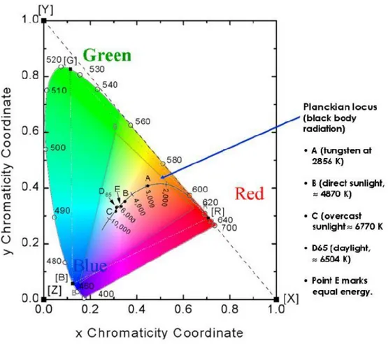
The CCT is mostly used to define the color of white light and it has its locus on the CIE
chromaticity coordinates, so its values can easily be estimated from there. CIE
chromaticity diagram is an industry standard and a common way of visualizing a perceived color according to its CIE tristimulus values (see Figure 3.2).
24
Figure 3.2.The CIE 1931 Chromaticity diagram. The outer horseshoe shaped edge represents the wavelengths of spectral colors. The horizontal axis represents the
x values and the vertical axis represents the y values. Any color inside the
horseshoe shape has its coordinate with x and y values. (Zukauskas et. al, 2002)
Besides correlated color temperature, it is also possible to control different wavelength components of light in order to create different colors of light with different
chromaticity coordinates (Zukauskas et. al, 2002). Different colors can be created by producing different spectra. However, the important thing here is to consider that these different colors of light can have similar CCTs on the CIE chromaticity diagram, while
25
having different x and y values (Valberg, 2005). Therefore, care should be taken when one specifies a light source by CCT only, which can be very misleading.
To understand all the qualities of light, some other measures of it should also be known like intensity, illuminance and luminance. Intensity is the amount of radiant energy transferred per unit area. It is separated into two in light engineering as illuminance and
luminance in order to express the amount of light. Illuminance (lm/m2) tells how much
light flux enters a unit area according to the distance between the source and the illuminated area. Accordingly, “the luminance (cd/m2) of a surface tells us how much light reaches the retina from that surface when the object is imaged through the eye media” (Valberg, 2005, p. 169). These measures also have some effects on the attributes
of color, especially on brightness, which are going to be mentioned in the next section. As light has the greatest importance on appearance of surface and object colors, the next section is going to deal with light effects on color and its parameters.
3.1.3. Effects of Light on Attributes of Visual Sensation
Until now the factors and parameters in the environment that affect the individual‟s visual perception have been discussed. Light is the primary factor which makes all other parameters visible by reflection, absorption or transmission from the surfaces. All the other parameters are additional collateral factors that help individuals to understand their environment and make them perceive their surrounding in detail and with more information. In that sense, texture, color and shades are the ones which give information
26
about surfaces where size, perspective and occlusion determine some relations among different surfaces, objects and spaces. As it is mentioned before, those cues are also used as sources of information interacting with each other. According to the light source and with different combinations of those cues, different surroundings can be created and different appearances of colors, and accordingly different appearances of spaces can be obtained. In this section, characteristics of light source and the surrounding of the colored object are going to be taken into account and how the appearance of color changes is going to be discussed. Color has three basic attributes, each of which is mentioned under a separate title.
3.1.3.1. Effects on Hue
As the surrounding of the observed color stimuli carries importance on how it appears and is perceived, the below phenomena are important in order to have an idea about the effects of light and color on each other. This information may also carry importance for the design of the stimulus in the study.
For the color appearance attribute of hue, a shift occurs after adding white light into a monochromatic light by making it vary in purity and this phenomenon is known as
Abney Effect. According to this phenomenon, Johnson and Fairchild (2005) mention that
it is not possible to judge hue parameter of color just by its wavelength since its
27
chromaticity diagram, the straight lines from the white point to the spectral locus are not lines of constant hue (Fairchild, 2005).
Another similar phenomenon which deals with the changes in hue perception is
Bezold-Brücke shift. This time the reason of the change in hue is the variation in intensity. This
is also a reasonable effect that displays wavelength of monochromatic light as not the only indicator of the perceived hue. Padgham and Saunders (1975) claim that with the increase in luminance, the hue of red becomes yellower and violet becomes bluer. Bezold-Brücke shift differs from Abney effect in because its validity is just for unrelated colors which are seen in isolation from other colors. Hunt has proved that this shift is not valid for related colors which are “[…] perceived to belong to an area or […] seen in relation to other colors” as cited in Fairchild (2005, p.89).
Pridmore (2007) has conducted some studies concentrating on Abney and Bezold-Brücke effects. He notes that this hue shift is an effective factor in perceiving
three-dimensional object shape in the manner of adding hue and lightness differences to its color. According to him, these two effects are directly related to each other depending on the increase in chroma when the lightness gets higher. This is explained with the combination of these two effects, the physical features of an object becomes more definite and the object is perceived more three dimensionally; thereby, all three attributes of color work together to determine the features of the shape of an object.
28
3.1.3.2. Effects on Brightness
One of the parameters that is defined by the Y tristimulus value in CIE system of colorimetry as luminance level is brightness. In fact, most of the time it is assumed that brightness is the function of luminance level; however, when Helmholtz-Kohlrausch
effect is taken into consideration, this is not the case. According to
Helmholtz-Kohlrausch effect, there is a change occurring in perceived brightness with the increase
in purity of the colored stimuli when its luminance is kept constant in the photopic range (CIE, 1988). With reference to this effect, the stimulus appears brighter at a constant luminance if the saturation is increased (Johnson and Fairchild, 2005). Furthermore, Fairchild (2005) claims that this effect is also dependent to the hue of stimulus besides the saturation. Thus, it is less noticeable for yellow than purples.
In addition, another effect on brightness which occurs with changes in the illumination level is Purkinje shift. According to Purkinje shift, when the light level decreases, because of the optical ability of the human eye, the peak sensitivity shifts towards the blue end of the color spectrum (Fairchild, 2005). Purkinje shift is related to the adaptation of the human eye and receptor cells in the retina. Because of the visual functioning of rod and cone cells, in low levels of luminance (less than 0.01 cd/m²) known as scotopic vision, sensitivity to shorterwavelenghts increases (Fairchild, 2005). Anstis (2002) has conducted experiments on light effects on Purkinje shift, and he mentions that because of the switch from cone vision to rod vision through
29
Another basic effect that is known as Stevens effect examines luminance variations and brightness contrast. Regarding the experiments, it is known that depending on an increase in luminance level, brightness contrast also increases, and apparently dark colors appear darker and light colors appear lighter when luminance level is increased. According to Stevens effect, a power function is cited between perceived brightness and measured luminance, which is known as Stevens power law in psychophysics. It shows the estimations of an average relative brightness magnitude as a function of relative luminance for different adaptation levels (Fairchild, 2005).
As it was mentioned before, to do a color matching between stimuli, some conditions should be provided equally. If surrounding or background conditions in two settings are not the same, in manner of luminance levels, a shift of brightness perception named
simultaneous contrast occurs. It can simply be explained as the change in a surface color
appearance caused by an adjacent surface which is brighter or darker than the other (Michel, 1996). Figure 3.3illustrates an example of simultaneous contrast. While the top two small gray square patches are perceived to be the same, the one on the white
30
Figure 3.3. Simultaneous contrast (Achromatic). (Fairchild, 2005, p. 112)
Color changes in simultaneous contrast follow the opponent theory of vision, which mentions the cones system as processing according to three opponent channels of red versus green, blue versus yellow and black versus white (Fairchild,2005). Therefore, simultaneous contrast can also be seen in chromatic colors and “a red background would
tend to induce a green color shift, a green would induce a red, a blue induces yellow, and yellow induces blue” (see Figure 3.4) (Johnson and Fairchild, 2005, p. 42).
31
Lastly, Bartleson- Breneman effect also deals with the variation in luminance level and the effect of surround on complex stimuli. Bartleson and Breneman observed some differences in perception of contrast when the luminance level of a stimulus‟ surround is changed. As the luminance of the surround is increased, perceived contrast also
increased because “when an image is viewed in a dark surround, black colors look lighter while the light colors remain relatively constant” (Johnson and Fairchild, 2005, p. 52). However, black colors start to look darker when the luminance is increased and it causes overall view to appear in higher contrast.
The level of illuminance and luminance are both effective factors in perceived
brightness as well as spatial structure and background of the stimulus. By increasing and decreasing the level of the light source, or creating different combinations of luminance levels, the appearance of an image or a stimulus object dramatically changes.
3.1.3.3. Effects on Saturation
Similar to the effects on hue and brightness, luminance level and color of illumination are also important factors in perceiving the saturation of a stimulus in relation to its surround. One of the effects which deal with perceived saturation is Hunt effect. To observe that effect, Hunt used a haploscopic matching, in which the viewer considers two different stimuli conditions in his two eyes and tries to adjust their color in order to obtain equal colorimetric purity (Fairchild, 2005). As a result, to equalize the saturation of a low luminance surrounding with a high luminance one, there is much more
32
colorimetric purity required. Hunt (1952) mentions in his results that “at high levels of adapting light intensity, increasing the test color intensity caused most colors to become bluer” (p.49). These results highlight the fact that luminance level is an influencing
factor in perceived saturation, as it is for brightness (Johnson and Fairchild, 2005). According to that effect, chromatic contrast of the stimulus increases when the brightness of surround increases.
All of these effects of luminance and illuminance, considering the environmental constraints of the stimuli are significant factors in perceiving color in the visual world. Therefore, they are of great importance for this study, and the design of the experimental set-up takes into account these effects of light and surrounding on color appearance of spaces, in relation to the appearance of surfaces.
3.2. Color in Depth Perception
Color of the objects has a considerable effect on depth perception in the visual field (Dresp and Guibal, 2004). In that sense, it is one of the most commonly debated cues, about which there are critical works (Sundet, 1978). This section is going to cover these works which concern the cues of depth perception and color attributes which affect the perception of depth. Color attributes consist of hue, brightness and saturation. Besides these parameters, the source (light), which makes the color occur in the visible
33
3.2.1. Effects of Hue, Brightness and Saturation on Depth Perception
As Sundet (1978) mentions the effect of color on objects‟ apparent distances has long been known. This situation has mostly been practiced with “highly saturated colors and with objects lying near each other” (Sundet, 1978, p. 133). One of the earliest and
well-known studies on this subject was conducted by Luckiesh (1918) with the letters of red „X‟ and blue „E‟ by asking the participants to move the letters back and forth in an
apparatus until they came on to the same plane. He used tungsten lamp to illuminate the letters and the boxes were equipped with blue and red filters in order to obtain the colored view. In the study, as the advancing quality of the red, most of the time red „X‟ was moved by the participants further away in order to make it appear on the same plane with blue „E‟.
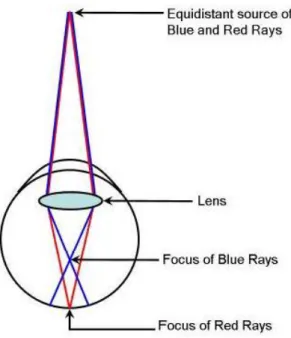
This phenomenon has been explained by Sundet (1978) with an optical case, under two parameters of depth perception, namely monocular and binocular. About the monocular theory, Sundet (1978) states that short-wave light refracts in the eye‟s optical media more than long-wave light, and because of this phenomenon, the equidistant sources of different colors cannot be simultaneously focused on the retina, which is called
chromatic aberration. According to chromatic aberration, a short-wave light source
34
Figure 3.5. Chromatic aberration. (Sundet, 1987, p.134)
Besides, Sundet (1978) points out that all theories of binocular color-distance have chromatic aberration in common and this is taken the point of departure.From the chromatic aberration phenomenon, it is well understood that, wavelength is a stimulus that affects its perceived depth.
As wavelength of the colors refers to their hue, the studies on hues of colors and their relation to distance perception are taken into consideration in this part. Before Sundet (1978) gave the information that colors in themselves have the quality of depth because of the refraction in the eye, Edwards (1955) mentioned in the conclusion of his
experiment that there is no significant evidence of color itself having the quality of depth. However, training and association may lead to seeing of some colors as near or
35
far and may provide effective use of color in art for the expression of depth. In opposition to Edwards (1955), Egusa (1983) explains an effect of hue on perceived depth as green and blue difference is smaller than the red and green one, in which the red one appears nearer.
Furthermore, in the first outdoor study, Mount, et. al. (1956) also mention the hue effects on distance perception. In the experiment, they have compared equal brightness of coloured and gray papers under sunlight. According to the results, they (1956)
express that each color is judged nearer than gray that has equal brightness, and the hues appeared closer when viewed against the dark rather than in light. Additionally, Dengler and Nitschke (1993) mention that when four colors (red, yellow, green and blue) are seen in front of the black background, long-wavelength colors appear in the front; however, in front of the white background, the depth perception of colors are reversed. In that sense, brightness of the background of a stimulus affects depth perception of the colors as well. However, there is still a gap on the depth perception of different hue combinations in terms of the stimuli and the background. Besides that, Mount et. al. (1956) also point out that saturation and brightness contrast are more effective on depth perception than the difference in distance perception of one hue over the other.
As another parameter of color, saturation is also mentioned in many studies. In general, as Sundet (1978) remarks, high saturated colors are used in the experiments. According to Mount et al. (1956), the apparent position of a color is advanced when the saturation
36
of its color is increased in contrast to its background. In this manner, it can be
understood that the saturation difference between the stimulus and the surrounding also bears importance for depth perception. Besides, Egusa (1983) notes that if the higher saturated color is red or green, they are judged nearer, but such an effect cannot be seen with blue color. In a more recent study conducted by Bailey et.al. (2006) with different coloured three dimensional objects of teapots and backgrounds on the computer screen, it is pointed out that similar results with high saturated warm or cool colors are obtained with less saturated colors in apparent distance perception.
Camgöz, Yener and Güvenç (2004) name saturation as the secondary attribute of color in judgment of „nearness‟, whereas the brightness is the most dominant attribute. The apparent brightness and brightness contrast are also one of the most commonly studied cues in depth perception. In Michel‟s (1996) book, the aspect of perceiving brightness is said to be gamma movement. Gamma movement is explained by Michel (1996) as follows: as the object brightness is increased, the object “[…] appears to advance toward the viewer from its initial fixation point […] it returns to its former position” (p. 12) when brightness is decreased.
The relation of brightness with colored object distance perception was explained as insistency quality of color by Katz in 1935, which is cited in Payne (1964). He (1964) describes the insistency of a color as the power of a color to catch the eye and hold it steadily, and he added that the insistent color appears nearer. Sundet (1978) comments
37
on that statement that the perceived relative distance may be affected by relative brightness of the colored objects.
In another study considering the brightness effect on depth perception, Taylor and Sumner (1945) use fluorescent lamps and colored papers (red, yellow, green, blue, white, black and neutral gray) in different brightness levels. Although the papers are in different colors, Taylor and Sumner‟s (1945) focus is on the brightness differences. In the experiment, they observe that the bright colored papers are drawn farther in the apparatus in order to equalize their apparent distances to each other. Thus, they state that at a constant distance light colors appear nearer than dark colors. Furthermore, in
another study by Johns and Sumner (1948) which was conducted to verify the study of Taylor and Sumner (1945), the same result of bright colors appearing nearer than dark colors at the constant distance is obtained. According to the results, the order of the colors from the one that appears nearest to the one that appears farthest is red, white, yellow, green, blue and black. For this experiment, it is noted that the cues which the subjects use to make the equalization are relative sharpness of the vertical edges and relative thickness of the colored papers, which are going to be the cues that the participants will focus on in our experiment as well.
The brightness effect also appears to be one of the contrast differences in adjacent colours referring to stimuli-surrounding relation. Payne (1964) mentions that if a colour differs from the background more, it stands farther away from the background. Thus,
38
one of the two colours which is more similar to the background will appear more distant than the other. In a similar way, Ichihara et. al. (2007) claim that contrast is an
important cue for perceiving the depth of an object. It creates some illusions on the appearance of colored surfaces in the manner of depth perception (Michel, 1996).
Ichihara et. al. (2007) divide contrast into two as area contrast and texture contrast. They (2007) define area contrast as “the difference between the average luminance of the surface area of an object and the average luminance of the background” (p. 686). When area contrast is low, the object looks far from the observer; similarly, it looks near when the contrast is high.Grandis (1986) defines simultaneous or reciprocal contrast, which was particularly explained in the Section 3.1.3.2, as two areas of high contrast in adjacent positions altering the appearance of both. As Grandis (1986) says a light area next to a dark area appears lighter than it really is. Thus, this simultaneous contrast has the effect of darkening the dark color and lightening the light color more. The effect of two colors on each other makes lighter one to be perceived nearer than they are as an effect of color kinetics. He explains color kinetics in relation with simultaneous contrast. He mentions color kinetics as a property which makes color to appear in the front or back rather than at its real location. Moreover, he continues by saying that this effect may be because of the degree of luminosity of each color under lighting.
The literature on brightness, darkness and contrast effects of colors has also been searched under the subject of spaciousness and room size of the space. Taylor and Sumner (1945) state that rooms done in white, light yellow, light green would appear
39
smaller than they really are. However, Mahnke (1996) claim that light or pale colors recede and increase the apparent room size whereas dark or saturated colors decrease the apparent size of the room. Clearwater (1986) mentions that depth perception studies which are conducted with apparatus are also done by full-scaled room with movable walls. She (1986) adds that researchers have studied brightness effect alone; hue and saturation levels of the colors have been controlled in full-scaled studies. She (1986) claims that “apparently, a lightly colored space appears larger, and there is a recession of blue that is highly dependent on its saturation” (p. 76). Michel (1996) also mentions that
regardless of its physical size, a bright room is perceived as more spacious.
3.2.2. Effect of Light on Depth Perception
As it is intensively mentioned many times, for the appearance of surface colors, illumination has a great importance because light makes colors and surfaces visible. Color and light are the parameters which are specified simultaneously while color is also involved in light itself. Thus, the surface has the property of absorbing, reflecting and refracting the light with respect to generating its color. This relation between
illuminance of light and color is mentioned by Yamauchi and Uchikawa (2005) in that the perceived color of an illuminated surface which is observed from a small window changes when the intensity of the illumination increases. The color appears opaque and right on the small window without any depth when the intensity of the illumination is low, and the color appears brighter and distant as the intensity of the illumination increases.
40
Coules (1955) has also set an experiment including illuminated opal glass discs with different intensity levels in order to understand the brightness effect on both monocular and binocular viewing. He (1955) states that both under monocular and binocular conditions, brightness influences judgment of distance. He (1955) mentions that in binocular viewing, the subject who has right eye dominance judges the light stimulus on his right to be nearer although it is in fact farther. Similarly, it is observed that the subject with left eye dominance judges that the light stimulus on the left is nearer.
The most basic distance perception experiment with colored light sources has been done by Pillsbury and Schaefer (1937). In the experiment, they use red neon or blue neon and argon lights which the participants can view through artificial pupil like slits. The participants view the different colored lights monocularly and judge their distances. According to the result, Pillsbury and Schaefer (1937) state that even when they put blue light farther than the red light, blue light is judged nearer. This is an opposite result when compared to distance perception of colored surfaces in which the red one is generally perceived nearer than blue. This effect can be explained by Purkinje shift as blue light appears brighter than red at low luminance levels; however, in their paper there is no specific remark about the luminance level. Besides, there is a relation
obtained between the color of stimulus and the intensity of its surrounding in the manner of depth perception by Dengler and Nitschke (1993). According to their (1993) studies, the short-wavelength colors are seen farther than long-wavelength colors when the
41
intensity levels of these stimuli are greater than the intensity level of stimulus surrounding. This effect is reversed, when the lighting conditions are also reversed.
In recent years, some other experiments by Huang (2007) have been done on colored lights and depth matching tasks. In his experiment, he uses colored lights and colored surfaces in a box-like apparatus and he asks the participants to equalize the distances of the colored chips. The experiment has been done both with monocular and binocular viewing. According to the results, he mentions that the perceived distance difference in binocular viewing is significantly less than the monocular viewing because of the convergence and disparity manipulations on depth. Besides, he has found an effect of green light, under which there are more distance differences perceived than white and yellow light. Moreover, perceived distance under white light is less than blue light. With reference to these results, he determines a significant effect of colored light on distance perception. Upon another study, there were no significant differences obtained between blue and green light conditions, neither with yellow, red and white light conditions (Huang, 2009). However, he declares that since the five colored lights are used in different hues and intensities, it is not specifically known whether the results are due to hue or intensity variations. Referring to that, this study focuses on the hue attribute of color and its relation with its surrounding, in this case the background, in order to understand if hue difference has an effect on depth perception.
42
4. THE EXPERIMENT
4.1. Aim of the Study
The aim of the study is to understand the relationship of color with distance perception in interior spaces. To understand this relationship, different object and background color combinations are tested.
4.1.1. Research Questions
The research questions of study are as follows:
1. Are there any effects of colored light on distance perception in interior spaces? 2. Does background color affect depth perception of different colored objects?
4.1.2. Hypotheses
The hypotheses of the study are as follows:
1. There are depth perception differences between different backgrounds with different hues.
2. There are depth perception differences between different hue combinations of background and object.
3. There are depth perception differences between different color temperatures of white lit background according to the hue of the object in front of it.
43
4.2. Method of the Study
The method of the study is explained under the sections of sample group, experiment room and stimuli, and procedure. The information about experiment considering participants, stimuli and how the experiment is conducted can be followed in detail in the next three sections.
4.2.1. Sample Group
To the first phase of the study, 35 students who were having their internships in Philips Research Eindhoven, Netherlands participated. 4of them were female and 31 of them were male. They had engineering or industrial design backgrounds with the ages between 22-29. They had little to no knowledge of color and depth cues, in order to avoid possible biases and the influence of personal experience. Additionally, the experiment was conducted in English due to having participants from different nationalities who were capable of speaking and understanding English. To the second phase, 21 students who had the most consistent results according to their responses to the questions from the first phase participated.
4.2.2. Experiment Room and Stimuli
The experiment was conducted in the Shoplab of Holst Center, at High Tech Campus, Eindhoven. The room had no exterior windows, however, had shop windows which