Journal of Imaging Science and Technology R60(5): 050408-1–050408-10, 2016. c
Society for Imaging Science and Technology 2016
Effects of Color Pairs on Warmth Perception in Interiors
Begüm Ulusoy and Nilgün Olguntürk
Department of Interior Architecture & Environmental Design, Faculty of Art, Design and Architecture, Bilkent University, Bilkent, Ankara TR-06800, Turkey
E-mail: [email protected]
Abstract. Warmth perception is a physical, emotional, semantic, and
sensorial bond between people and their environments. Although the effects of single colors have been explored, there has been no research on how paired colors affect warmth perception in interiors. Therefore, the main aim of this study is to investigate these effects of colors and color pairs. Each model was assessed by 32 participants, totaling 96 different participants assessed the color models (Red, White, Green, and their pairs) under controlled conditions, both on a seven-point semantic differential scale and through open-ended questions. The results show that both single colors and paired colors affect warmth perception in interiors. White, Green, and Red are warmer than each other, respectively. Red appears to increase and White appears to decrease the warmth perception of their pairs in interiors. Another important finding of the study is that there is no effect of color location in paired colors.
INTRODUCTION
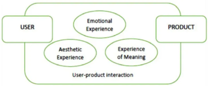
Warmth is a selection criterion for building materials at the design stage, and is used by architects and non-architects to define the physical conditions of interior environments.1 The concept is also a multisensory notion that includes emotions/feelings.2For this study, the researchers embraced the definition of warmth perception as a physical, semantic, emotional, and sensorial bond between people and their environments. The concept not only includes physical warmth but also emotional and semantic aspects, which are perceived through the five senses. According to Desmet and Hekkert, product experience consists of three components: aesthetic experience, experience of meaning, and emotional
experience3 (see Figure 1). In this study, the authors
embraced the framework which is revealed by the previous study in order to clarify the aspects of ‘‘warmth perception’’ and their relations: aesthetic experience correspondence physical aspects, experience of meaning correspondence semantic aspects and emotional experience correspondence emotional aspects.
Earlier studies on warmth have focused mostly on the
physical aspect of warmth perception.4–7 Itten concluded
that participants felt cold in a blue–green room of 15◦C,
whereas they did not feel cold in a red–orange room until 11.1◦
C.4 According to Mahnke and Mahnke,6 Clark7
reported that occupants prefer an indoor temperature
Received Apr. 10, 2016; accepted for publication June 26, 2016; published online Aug. 18, 2016. Associate Editor: Marius Pedersen.
Figure 1. Product experience’s framework (Ref.3, p. 60).
approximately 1.8 C higher in a blue room than in a red room. In addition, participants felt cold in a 22.2◦
C blue room and asked to increase the temperature; however, they felt comfortable in a red room at 22.2◦
C and felt warm at 24◦C in the same red room.6These studies, however, focused only on the effects of a single hue on warmth perception, and further, they confined their experimental settings to the differences between blue and red. Color pairs and warmth were investigated in the context of psychology by two studies.8,9 Hogg found that hue is associated with warmth more than the other two color dimensions (saturation and
brightness) are.8 The second study suggested a formula to
calculate the color emotions of color pairs by averaging single color scales.9 In this experimental study, the authors used 3 × 3 in. color chips to conduct their psychological experiment.
Previous studies have also indicated that warmth perception is affected by different product aspects or
by human perceptions, such as sensorial properties,10
the manufacturing process,11 physical properties,12,13 and emotional properties.2,14–16 Some psychological studies have illustrated the relationship between the physical and
emotional aspects of warmth perception,17,18 and several
other studies have pointed out that color is an important property of warmth perception,1,2,19and that material prop-erties and material type affect warmth perception.1,2,8,20 One study indicated that the influence of color is more important than that of roughness for the warmth perception of indoor wall materials and that indoor wall colors are
powerful determinants of warmth perception.20In addition,
warmth perception has been studied under the subject matters of parental warmth21,22and school psychology.23,24 ‘‘The way a space feels is related to its design and the feeling of warmth is one of the aspects important to the
experience of constructed environment’’ (Ref. 1, p. 359).
Reprinted from
As people judge whether other people are warm, they also judge whether interiors and designs are warm. Warmth perception constitutes a feeling of warmth and affects one’s experience in the built environment, interiors, and with design objects. Therefore, investigating the concept will improve the understanding and creation of ‘‘warm’’ designs. Colors do not usually appear alone; both in interior spaces and with design objects, colors are rarely on their own. Except in spaces such as steam rooms, it is quite difficult to find an indoor environment that consists of the same color. There are also some design objects, such as Post-it Notes, that are produced in only single colors. Although warmth perception research has studied whether isolated single colors have an effect on perception, no research until now has explored the effects of color pairs on warmth perception in interiors. There is a lack of knowledge in the literature about how occupants’/users’ perception of warmth are affected by color pairs in interiors. For this reason, the present study focuses on the warmth perception of color pairs.
The main aim of this study is to investigate how colors and materials affect warmth perception. As they are rarely viewed in isolation, the researchers chose pairs as the stimuli. However, the color pairs and material pairs were investigated separately, although under the same experimental conditions and with the same methodology. To better assure comprehension, the researchers prefer to publish their results in separate articles. Thus, the current article only presents the findings of the color pairs.
Aspects of Warmth Perception
In the light of these definitions ‘‘warmth perception’’ is described as a multisensory concept, consisting of physical, semantic, and emotional aspects which constitute an overall perception of warmth. Warmth is defined as a kind of percept that not only is affected by physical features of the environment, but also affects the emotions of the individuals. The concept is also constituted by semantic aspect which have fundamental effects on interior experience in the context of meaning.
The sensorial aspect of warmth perception encompasses the five senses. Visual warmth, tactile warmth, auditory warmth, gustatory warmth, and olfactory warmth indepen-dently exist, but are also affected by each other and create a multi-sensorial and overall perception of warmth. According to Wastiels, Schifferstein, Heylighen and Wouters, the visual sense dominates one’s overall warmth perception in interior spaces.1
The physical aspect of warmth includes all physical fea-tures of the environment, such as thermal properties, surface properties, density, and ambient temperature, regardless of an individual’s perception. Thermal properties include ther-mal conductivity, therther-mal effusivity, contact surface temper-ature, heat capacity, and initial material temperature.1,2,12,20 All thermal properties except thermal effusivity have a positive linear relationship with warmth perception.1,2,12,20 Surface variables include thickness, glossiness, transparency,
reflectance, pattern, color, and roughness.1 Roughness and
thickness have a positive linear relationship with warmth
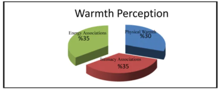
Figure 2. Results of the face-to-face interviews.2
perception.1 The relationship between color variables and
warmth perception is not explicit in the literature. Hue, for example, affects warmth perception independently from
other color variables (lightness and saturation).19 The
literature notes two more properties affecting warmth perception: density and ambient temperature. Both have a linear positive relationship with the concept.1
Gifford25 applied Brunswik’s lens model26 to
envi-ronmental perception. The researchers embrace the same model for an indoor environment to elicit the notion of warmth. Physical aspect corresponds the actual environ-ment, whereas semantic and emotional aspects correspond perceived warmth. The semantic aspect of warmth con-sists of a literal meaning and a figurative meaning: the literal meaning is actual warmth, which is also related to physical aspects, and the figurative meaning includes
energy associations and intimacy associations.2 The latter
two affect warmth perception more than physical warmth
does (see Figure 2).2 Energy associations are related to
connotations of action, energy, excitement, and creativity, whereas intimacy associations include love, being together,
atmosphere, and memories.2 The emotional aspect of the
concept of warmth consists of human social cognition corresponding to emotions. For human social cognition, warmth is one of the essential dimensions for assessing other
individuals and their behaviors.27 The stereotype content
model (SCM)’s researchers discuss how the perception of warmth is essential to perceiving ‘‘others as fully human’’
(Ref. 16, p. 572). According to Fiske, Cuddy and Glick
(Ref. 28), this model ‘‘assesses people’s behavioral and
emotional reactions to others based on perceptions of two dimensions: warmth and competence’’ (Ref.16, p. 572). This cognitive process is important for how people perceive and judge our social and built environment. ‘‘Warmth has been used as an emotion in a number of contexts, appearing
in the literature as a part of lists of emotions,29 as an
experience associated with emotional terms,30 and as a
part of empathetic emotional response’’31 (Ref.32, p. 365). Interpersonal warmth is ‘‘one of the most common, most important’’ but ‘‘perhaps least understood emotions’’ and consists of variables of intimacy, relationship closeness,
bonding, attachment, and involvement.33 Although the
emotional aspect of warmth as an interpersonal perception has been studied extensively in psychology, it has not been studied comprehensively in the context of design.
In this study, the researchers focused on the sematic aspect to elicit the meanings of colors and color pairs in the
Table I. Open-ended and direct questions.
1. Please record at least five adjectives that you think describe these two surfaces when you imagine them as an ordinary interior space. 2. Why do you think these two surfaces inspire you to use these adjectives?
3. Please imagine these surfaces as an ordinary interior space and please rate them according to how warm they make you feel, using the following 7-point scale. 4. Please imagine these surfaces as an ordinary interior space and please rate them according to how energetic you think they are, using the following 7-point scale. 5. Please imagine these surfaces as an ordinary interior space and please rate them according to how intimate you think they are, using the following 7-point scale.
Figure 3. Experiment room.
context of warmth perception in interiors. To that aim, all physical aspects except colors were fixed and the researchers only investigated the visual perception of warmth. They fixed the material (fabric) and interchanged three colors to investigate the effects of different color pairs on warmth perception in interiors.
COLORS AND WARMTH PERCEPTION
The effects of color on warmth perception have been
investigated by different disciplines. Wright19 and Hogg8
stated that hue has a primary influential effect on the
perception of warmth, and Newhall34 demonstrated that
reddish–yellowish colors are perceived as warmer than bluish-green colors. Previous studies have found that visual perception dominates the overall perception of warmth in interior spaces and that materials’ technical parameters can be used as good indicators of warmth perception, which
is why color is a powerful determinant of warmth.1,20
The authors demonstrated that red and yellow induce the perception of warmth in vertical surfaces in interior spaces and that white is perceived to be the coolest color.1 Furthermore, color affects warmth perception more than
roughness of the surface.20 Studies on color and warmth
perception indicate that color influences warmth perception, and that people tend to define red–yellow colors as warmer than blue colors.1,19,20,34
METHOD Present Study
The researchers used three color pairs with one fixed material. There were three sets of models for color pairs. Each set was assessed by 32 different participants (16 male and 16 female) and there were a total of 96 different participants
Table II. Symbols of the color used in TablesIII–VI.
Symbols of colors : Red : Green : White
for the study. Each set consisted of two colors and their pairs, and thus every participant saw a set of models with four different stimuli. Determining the influence of color offerings in a design context should encourage designers to create more effective spaces and designs for their clients, and will contribute to the understanding of the concept. Manipulating warmth perception may also have implications for users’ well-being and satisfaction.
The researchers explored the following research ques-tion: ‘‘How can colors be paired in interiors to induce the effective perception of warmth?’’ The researchers hypothe-sized the following result: ‘‘Different color pairs affect the perception of warmth in interiors’’.
Participants
Ninety-six (96) people participated in this study in Belfast, Northern Ireland, UK. Participants were chosen randomly and voluntarily. They received no payment or encourage-ment. Potential participants who did not have normal color vision were excluded from the experiment. The sample group was between 18 and 70 years of age, and included males and females with no eye deficiencies (corrective lenses, if necessary, were required to be worn). The average age of the
sample group was 25 (see Appendix A, TableA.1).
Experiment Setting
The experiment setting consisted of a box, a lamp, mea-surement equipment (an NCS 96 Atlas, a Konica Minolta Illuminance Meter T-10A, a temperature gauge, and a digital thermometer with Samsung Galaxy S4 sensors) in a room with controlled conditions (see Figure3).
The experiment box (40 cm height, 50 cm width, and 50 cm depth), which the researcher constructed, was used to exhibit the models under controlled conditions. The outside of the box was covered with black cardboard and the inside was lined with gray cardboard. The NCS color code of the gray cardboard was ‘‘S-3000N’’, which is the masking color of the NCS 96 Atlas. The lamp was inside the box, fixed to the center of the top surface to ensure a homogeneous illuminance level in the box’s interior and on the model surfaces. A Philips TL-D 90 Graphica 18W
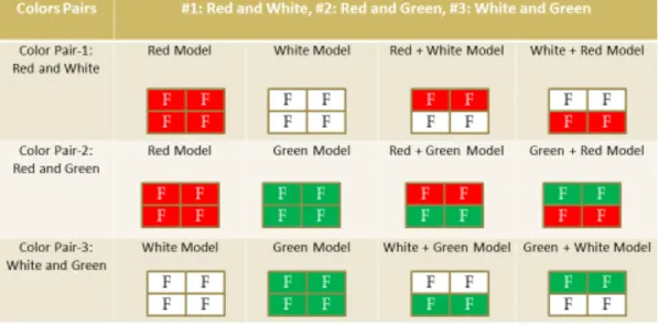
Figure 4. Procedure for representing color pair sets (F: Fabric).
965-59 cm (MASTER) was used for the lamp. This product provides the best visual conditions for accurately viewing colors. In addition, its color temperature is 6500 K, which is the color temperature of average daylight, recommended by the IESNA to provide suitable lighting conditions for
viewing.35However, real daylight cannot be controlled and
is unpredictable; the lamp is constant. The IESNA suggests 500 lux for a horizontal and 300 lux for a vertical illuminance level (approximately 400 lux is also acceptable) in an ordinary
space for reading and working.35 One Thorn PP118 light
bulb with Philips TL-D 90 Graphica 18W 965-59 cm (MASTER) satisfied the required lighting conditions for the model surfaces and the box’s interior.
The setting was under controlled conditions (see Fig.3). Natural light was blocked with curtains and black cardboard. The only light source was the fixture in the experiment box, which was on a table of 90 cm height. A Konica Minolta Illuminance Meter T-10A was used to measure the illuminance level of the box and the surfaces of the models. Participants sat on a chair in front of the box at a distance of 50 cm. Indoor climate conditions were fixed with heating equipment to ensure there were no unpredictable effects on the experiment. The room temperature was measured both by the temperature gauge and the digital thermometer with Samsung Galaxy S4 sensors. As recommended by Neufert, the constant room temperature was kept at 22◦C.36
Stimuli
Colors
The researchers investigated color and material pairs sep-arately under the same experimental conditions and with the same methodology; however, for this study, only color pairs are presented. While selecting colors, timber color was the main concern because it seemed to have the most restricted palette. Colors were selected to ensure that the natural characteristics material remained and that the same color could be obtained from each material. The experiment
aimed to compare shades of Red, Green, and White for their warmth perception responses; therefore, these colors were first explored through timber, as fabric and plasterboard offer wider color ranges. The results of the materials set will not be reported in this study.
The models were painted with warm, cold and achro-matic colors, chosen from the NCS Atlas. Their NCS codes were determined by an NCS Color Scan 2.0 on models. After the painting process, all samples were again measured by the NCS Color Scan 2.0 to ensure their colors were identical. The researchers chose Red, a powerful and attention-grabbing color for interiors, with its afterimage the complementary color Green, and chose White as an achromatic color. To ensure the same saturation and lightness levels, the original paints were watered down with the required proportions to ensure accurate colors (8.5/5 paint/water for Red models; 15/5 paint/water for Green models and 1/0 paint/water for White models). For Red, the researchers used Sirca CT5503 with an ‘‘S 3070-Y90R’’ NCS code; for Green, Sirca PWN143 with an ‘‘S 5040-B80G’’ NCS code; and for White, Dewilux Eco-color A-14-1000 with an ‘‘S 0510-R50B’’ NCS code.
Models
Each color was viewed with another one to create a pair. To eliminate any effect of color location, the pairs were viewed in upper and lower combinations (see Figure4). For this study, upper colors are written first in the text. Fig.4demonstrate how these color pairs were organized. Each color pair had four different models. In Fig.4, the material type was fixed and three different colors were used in the combinations. Red, White, and Green fabrics were used and Red and White, Red and Green, and White and Green pairs were assessed. In the Fig.4, each model was identical except for its color (see Fig.4, color pairs, Set-1, Set-2 and Set-3).
Each participant saw one set of models (e.g., only Color
Pair Set-3 in Fig. 4). The researchers used single colors
single colors with pairs of them (see Fig. 4). Therefore, participants assessed four different models in different orders. To eliminate any differences between the models, the researchers used four fragments for every model regardless of whether they were single or paired. They embraced ‘‘the Information Integration Theory,’’—which is successful in the areas of learning, perception, judgment, decision making, personality impressions, and attitude change.37The theory suggests that individuals react to a stimulus with one integrated response the result of averaging (mixing,
combining) all the information about the stimuli.37 Thus,
four fragments of one model, were perceived as one stimulus and the participants also responded them as one stimulus.
Procedure
Before the main experiment, the researchers conducted two pilot studies to investigate the effectiveness of the measurement instrument and how participants perceived the concept. The first pilot study explored how the color samples should be demonstrated and how the questionnaire should be designed. Ten (five male and five female) randomly selected undergraduate students voluntarily participated in the study. Colored cardboards (Red, Green, and White) were used for the first pilot test instead of real models. The study also gave reasonable feedback about how participants reacted to the questions. After the study, the questionnaire and models were revised according to feedback.
The second pilot study aimed to determine the effective-ness of the experimental setting in controlled conditions with real colors, material (fabric) and four-fragments samples, and as well as whether the questions and questionnaire comprehensible with its new format. Twenty-five partici-pants (six participartici-pants for the Green + White model, seven participants for the White + Red model, six participants for the Red + Green model and six participants for the Timber + Fabric model) participated the pilot study. Both the second pilot study and the main experiment had the same physical conditions (such as light, temperature etc). Based on the results of the pilot study, the researchers also added two additional questions (Questions 1 and 2 at TableI) to probe more deeply into the concept.
The main experiment consisted of two phases for each set. An average duration of the experiment were 25 minutes per a participant. Before the first phase, the researchers asked participants questions about eye or vision deficiencies, and those who required corrective lenses were asked to wear them for the experiment. The volunteers who did not pass the Ishihara’s color-blindness test did not participate in the experiment. After the researchers administered the Ishihara’s tests for color blindness, they gave the remaining volunteers an information form about the experiment and asked them to fill out a consent form. Next, all indoor lighting except the light in the experiment box was turned off. Participants then answered the first part of the questionnaire (gender, date of birth, department/profession, and year of study) as the first phrase of the experiment under the experiment conditions to
Table III. Means of Red and White pair models and their statistical relations. Mean Red model White model Red + White combination model White + Red combination model W arm 6.03 2.53 4.19 4.28 Energetic 4.81 3.31 4.38 4.97 Intimate 5.41 1.53 3.44 3.63 The null hypothesis: two models are the same as each other Red versus White Red versus Red + White Red versus White + Red White versus Red + White White versus White + Red Red + White versus White + Red W arm Rejected (,000) Rejected (,000) Rejected (,000) Rejected (,000) Rejected (,000) Null (,742) Energetic Rejected (,004) Null (,181) Null (,598) Rejected (,007) Rejected (,000) Null (,060) Intimate Rejected (,000) Rejected (,000) Rejected (,000) Rejected (,000) Rejected (,000) Null (,526) W arm Red > Red + White = White + Red > White Energetic Red = Red + White = White + Red > White Intimate Red > Red + White = White + Red > White
Table IV . Means of Red and Green pair models and their statistical relations. Mean Red model Green model Red + Green combination model Green + Red combination model W arm 5.84 3.63 4.59 4.63 Energetic 5.44 3.66 5.03 4.88 Intimate 5.00 3.13 3.25 3.31 The null hypothesis: two models are the same as each other Red versus Green Red versus Red + Green Red versus Green + Red Green versus Red + Green Green versus Green + Red Red + Green versus Green + Red W arm Rejected (,000) Rejected (,001) Rejected (,000) Rejected (,013) Rejected (,013) Null (,924) Energetic Rejected (,000) Null (,242) Null (,067) Rejected (,000) Rejected (,003) Null (,472) Intimate Rejected (,000) Rejected (,000) Rejected (,000) Null (,729) Null (,660) Null (,743) W arm Red > Red + Green = Green + Red > Green Energetic Red = Red + Green = Green + Red > Green Intimate Red > Red + Green = Green + Red > Green Table V. Means of White and Green pair models and their statistical relations. Mean White model Green model White + Green combination model Green + White combination model W arm 2.41 4.06 3.59 3.47 Energetic 3.59 3.16 4.34 3.97 Intimate 2.28 3.56 3.03 3.16 The null hypothesis: two models are the same as each other White versus Green White versus White + Green White versus Green + White Green versus White + Green Green versus Green + White White + Green versus Green + White W arm Rejected (,000) Rejected (,001) Rejected (,005) Null (,105) Rejected (,021) Null (,776) Energetic Null (,427) Null (,097) Null (,377) Rejected (,001) Rejected (,016) Null (,189) Intimate Rejected (,012) Null (,082) Rejected (,034) Null (,131) Null (,201) Null (,693) W arm Green > White, White + Green > White, Green + White > White, White + Green = Green, Green > Green + White, White + Green = Green + White Energetic Green = White, White + Green = White, Green + White = White, White + Green > Green, Green + White > Green, White + Green = Green + White Intimate Green > White, White + Green = White, Green + White > White, White + Green = Green, Green + White = Green, Green + White = White + Green
ensure adaptation time for their eyes. Next, participants were shown the first model in their set.
The second phase of the experiment included assessing the models under the laboratory conditions. Participants answered five different questions. The first two questions were open ended and aimed to determine what associations
the models inspired (see Table I). For the first question,
participants were asked to write down five adjectives inspired by the models. For the second question, they were asked to write down why they chose those adjectives. These two open-ended questions could not be related to warmth perception, therefore, they were not presented. The last three questions were direct questions to measure the effects of the models on the participants about the concept of
warmth (see Table I). A Semantic Differential scale was
used for these questions. ‘‘Warm’’, ‘‘energetic’’, and ‘‘intimate’’ with their opposing adjectives were used as descriptors. According to Heise, evaluation, potency, and activity (EPA) structures must be used for assessing any concept with semantic differential scales to attain reliable results.38 For evaluation, ‘‘warm’’ were used. For potency, ‘‘intimate’’, and for activity, ‘‘energetic’’ was utilized. The researchers chose these adjectives because they are consistently used throughout the literature.1,2,11,20 Hogg stated that the ‘‘warmth’’ scale is as a completely independent from all the others; however, it is one of the most important color
emotions.8 Also, intimacy and energy are two of the three
parameters of warmth.2 In this study, to concentrate the
participants on the concept of warmth, the researchers do not prefer to use any other scales except these three basics.
In this study, the researchers only focused on the visual assessment of warmth perception in interiors. Therefore, participants were not allowed to touch the models before and during the experiment. Participants were informed about the interior which was presented by the experimental setting and were told that the model represented a corner of an empty room, which was defined as an ordinary interior with no door, furniture, window or other interior elements (see Figure5). Each participant sat in the same chair which was fixed to the floor and positioned to the model so that they saw the model as a room interior. The researchers assigned no function to this interior. To provide exactly the same visual properties, the researchers used four fragments in every model to ensure the same conjunction quality for either single or paired colors. Otherwise only paired models would have fragments and single models would not. All models were split horizontally along the height of a wall half way to ensure more commonly encountered interiors of real life application and same area for each color.
The experiment was conducted indoors under con-trolled light and temperature. Natural light was blocked to eliminate any effect of changing daylight. Each participant assessed a set of models using a 7-point itemized subjective rating scale (1: very cold; 7: very warm). Each model set consisted of four different models. Each participant assessed the four different models of his or her set one by one. The sets consisted of two single color models and their colors pair,
with two combinations, to eliminate any effect of location of color (as an example see Fig.5). Each participant assessed the four models of their set in a different order to control the prospective order effect. There were 24 different order types for four different models. Eight extra orders were selected randomly.
RESULTS
With IBM’s SPSS Statistics 20 program, the researchers inves-tigated quantitative questions by the Wilcoxon matched-pair signed-rank test. The researchers compared all single colors with the other color and their color pairs in their model set. In addition, color pairs were compared with each other. The results of the Wilcoxon test are shown in TablesIII–VI(see TableIIfor symbols of colors). The null hypothesis is that two models are the same as each other and there is no difference in warmth perception.
The first color model analyzed was the Red and White pair. For the question regarding ‘‘warm’’, Red was found to be warmer than all other models and White was colder than all others. For the question regarding ‘‘energetic’’, Red was more energetic than White, and White was the least energetic color; however, there was no significant difference between Red, Red + White, and White + Red combinations. For the question regarding ‘‘intimate’’, Red was more intimate than all other models and White was least intimate. There was no difference in perception based on color location in the combination pairs (see TableIII).
Red and Green was the second color pair the researchers analyzed. For the question regarding ‘‘warm’’, Red was found to be warmer than all other models and Green colder than all. For the question regarding ‘‘energetic’’, Red was more energetic than Green, and Green was the least energetic; however, there was no significant difference between Red, Red + Green, and Green + Red combinations. For the question regarding ‘‘intimate’’, Red was more intimate than Green, and Red was the most intimate. There was no significant difference between Green, Red + Green, and Green + Red combinations. There was no difference in perception based on color location in the combination pairs (see TableIV).
The White and Green pair was the third pair analyzed. For the question regarding ‘‘warm’’, Green was found to be warmer than White and White was found to be the coldest color. Green was warmer than the Green + White combination; however, Green and the White + Green combination were the same. For the question regarding ‘‘energetic’’, the only significant difference among the colors was Green (it was less energetic than the White + Green and the Green + White combinations). For the question regarding ‘‘intimate’’, Green was more intimate than White, and the Green + White combination was also more intimate than White. There was no difference in perception based on color location in the combination pairs (see TableV).
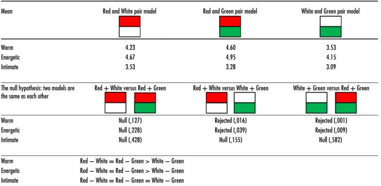
Red and White, Red and Green, and White and Green pairs were compared with each other to determine how color pairs affect warmth perception (see TableVI). Red and White
Figure 5. The Red and White fabric models in the experiment box (Fig.4. Color Pair-2). Table VI. Means of color pairs and their statistical relations.
Mean Red and White pair model Red and Green pair model White and Green pair model
Warm 4.23 4.60 3.53
Energetic 4.67 4.95 4.15
Intimate 3.53 3.28 3.09
The null hypothesis: two models are the same as each other
Red + White versus Red + Green Red + White versus White + Green White + Green versus Red + Green
Warm Null (,127) Rejected (,016) Rejected (,001)
Energetic Null (,228) Rejected (,039) Rejected (,009)
Intimate Null (,428) Null (,155) Null (,582)
Warm Red − White = Red − Green> White − Green Energetic Red − White = Red − Green> White − Green Intimate Red − White = Red − Green = White − Green
Table VII. Color associations with related adjectives (warm, energetic and intimate). Effects of single colors and color pairs on warmth perception in interiors
Too Warm (7) Too Cold (1)
pair and Red and Green pair were perceived to be the same as each other and warmer than the White and Green pair. In terms of energy, the Red and White pair and Red and Green pair were assessed as more energetic than the White and Green pair. For intimacy, there was no difference among color pairs.
DISCUSSION Warmth
The results show that Red is perceived as warmer than Green and Green is perceived as warmer than White. Previous research suggests that reddish and warmer colors are perceived as warmer than greenish and colder colors.1,20,34
In single colors, Red was assessed as the warmest color and White was assessed as the coldest color. When they were paired, however, warmth perception decreased or increased to a medium level. White as a single color was perceived as the coldest color; this assessment is also suggested by a previous study.1
The pair comparisons conclude that there is no differ-ence between Red and White and Red and Green pairs; both were perceived as warmer than the White and Green pair. Color pairs that include Red were assessed as warmer than color pairs without Red. The results demonstrate that Red is associated with warmth, and that including Red in any color pair makes the pair warmer than others.
Energy
The results show that as a single color, White and Green are less energetic than Red. However, when White is paired with Red, the pairs are perceived as energetic as Red and as more energetic than White. In the same way, when Green is paired with Red, their pairs increase and Red itself increases to the same level. When the White and Green pair was analyzed, the results demonstrated that White and Green are perceived the same in interiors in terms of energy. According to our findings, there is also no difference among White and both White + Green combinations in terms of energy. But when Green and the White + Green combinations are compared, Green is less energetic than the combinations. Pairing Green with White increases Green’s level of energy.
As color pairs, Red and White pair and Red and Green pair have the same level of energy and are more energetic than a White and Green color pair. The results show that pairs including Red are perceived as more energetic than the other pairs studied.
Intimacy
The results demonstrate that Red is the most intimate color and White is the least intimate, but when they are paired, the intimacy of both declines to a medium level. As a single color, White is less intimate than Green. As a paired color, there is no difference among the other pairs except when Green is on top and White is on the bottom, which results in the pair being perceived as more intimate than White. Including White in any color pair makes the pair less intimate than their single colors and pairs.
There was no difference between or among color pairs in terms of intimacy, which demonstrates that none of the color pairs in this study has a stronger or lesser effect on intimacy in interiors.
Overall Discussion
The results show that for warmth and energy questions, Red and White is warmer than White and Green, and White and Green is warmer than Red and Green. There was no difference between color pairs in terms of intimacy. Another important finding from the study is that there is no effect of color location in paired colors. The same color, regardless of whether it was on the top or bottom, had the same effect as the total effect of the color pair on warmth perception.
These results show that both single and paired colors affect the perception of warmth in interiors. The study revealed the relationship of paired colors in interiors in addition to single colors. The effects of single colors in interiors are subtle in warmth perception: White, Green, and Red are warmer than each other, respectively. Red as a warm color is warmer than Green as a cold color. However, White as an achromatic color is the least warm, as suggested by
a previous study.1 Adding Red to any pair also increases
these pairs’ warmth perception in interiors. Their pairs have consistently mid-range values compared to their single values for all scales, but are not an exact average value. In other words, the warmth level of single colors is a good indicator for their pairs.
CONCLUSION
As colors, which are ‘‘in the brain of beholder’’, (Ref.39, p. 95) affect purchase, usage, and perception of products,2,10,11,40 they have influential effects on interiors as well. In this study, the researchers used an experimental setting to investigate the relationships between warmth perception and color pairs that frequently appear in interiors (see TableVII). As single colors, Red, Green, and White were assessed as more or less warm alone than their pairs (see TableVII). It is interesting to note that White as a widely used interior wall color has a negative effect on the perception of warmth. Colors as pairs have more moderate warmth than their single colors. Red appears to increase and White appears to decrease the warmth perception of their pairs for interiors. The semantic aspect of warmth seems to be more apparent with single colors; when colors are paired, their strength seems to decline. These results provide designers, architects, interior architects, and industrial designers more knowledge about how color pairs alter the perception of warmth, and thus will enable them to adjust their designs accordingly.
Despite meaningful results, participants’ nationalities could be a limitation of the study, therefore, for comparison, the same experiment could be replicated with participants of different cultural backgrounds. Future studies could concentrate on more color pairs to elicit relationships from all colors within the chromatic circle in the context of warmth perception. For color pairs, different achromatic colors could be investigated with the same Red and Green, and the same White could be paired with different complementary colors (such as Blue–Orange or Yellow–Violet).
ACKNOWLEDGMENTS
This experimental research was conducted as part of Begüm Ulusoy’s PhD dissertation in the Department of Interior Architecture and Environmental Design, Bilkent University. The authors thank Dr. Geraint Ellies (School of Planning, Architecture and Civil Engineering, QUB) and Dr. Gül Kaçmaz Erk (QUB) for their contributions to the questionnaire and the experiment room, Serap Günay Ulusoy and İsmail Orhan Ulusoy for their encouragement, İnci Apaydın (Middle East Technical University, Ankara) for statistical calculations, Rana Nelson (Bilkent University) for proofreading various versions of the article, and Queen’s University Belfast (QUB) and Bilkent University for their support.
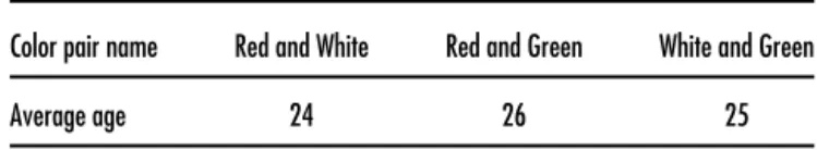
APPENDIX A. AVERAGE AGE OF THE SAMPLE GROUP
Table A.1. Average age of the sample group.
Color pair name Red and White Red and Green White and Green
REFERENCES
1L. Wastiels, H. N. J. Schifferstein, A. Heylighen, and I. Wouters,Build. Environ.49, 359 (2012).
2A. Fenko, H. N. J. Schifferstein, and P. Hekkert, Mater. Des. 31, 1325
(2010).
3P. M. A. Desmet and P. Hekkert, Int. J. Des. 1, 57 (2007).
4G. A. Morgan, F. E. Goodson, and T. Jones,Am. J. Psychol.88, 125 (1975). 5J. Itten, The Elements of Color (Van Nostrand Reinhold, New York, 1970). 6F. H. Mahnke and R. H. Mahnke, Color and Light (Van Nostrand
Reinhold, New York, 1987).
7L. A. Clark, The Ancient Art of Color Therapy (Devin-Adair, Publishers,
Old Greenwich, C.T., 1975).
8J. Hogg,J. Gen. Psychol.80, 129 (1969).
9L. Ou, M. R. Luo, A. Woodcook, and A. Wright,Color Res. Appl.29, 292
(2004).
10A. Fenko, H. N. J. Schifferstein, and P. Hekkert, Appl. Ergon. 31, 34
(2010).
11E. Karana, P. Hekker, and P. V. Kandachar,Mater. Des.30, 2778 (2009). 12Y. Obata, K. Takeuchi, Y. Furuta, and K. Kanayama,Energy 30, 1317
(2005).
13A. J. Fay and J. K. Maner,J. Exp. Soc. Psychol.48, 1369 (2012). 14D. S. Holoien and S. T. Fiske,J. Exp. Soc. Psychol.49, 33 (2013). 15L. E. Williams and J. A. Bargh,Science322, 606 (2008).
16N. A. Heflick, J. L. Goldenberg, D. P. Copper, and E. Puvia,J. Exp. Soc. Psychol.47, 572 (2011).
17J. A. Bargh and I. Shalev,Emotion12, 154 (2012).
18Y. Kang, L. E. Williams, M. S. Clark, J. R. Gray, and J. A. Bargh, Soc. Cogn. Affective Neurosci.6, 507 (2011).
19B. Wright,Am. J. Psychol.75, 232 (1962).
20L. Wastiels, H. N. J. Schifferstein, A. Heylighen, and I. Wouters,Mater. Des.42, 441 (2012).
21E. M. Westrupp, F. K. Mensah, R. Giallo, A. Cookling, and
J. M. Nicholson, J. Am. Acad. Child Adolescent Psychiatry 51, 313
(2012).
22R. M. B. White, M. W. Roosa, and K. H. Zeiders,J. Family Psychol.26,
793 (2012).
23J. Ly, Q. Zhou, K. Chu, and S. H. Chen,J. Sch. Psychol.50, 535 (2012). 24J. L. Spilt, J. N. Hunghes, J. Y. Wu, and O. M. Kwok,Child Dev.83, 1180
(2012).
25R. Gifford, Enviromental Psychology: Principles and Practice, 3rd ed.
(Optimal Books, Canada, 2002).
26E. Brunswik, Perception and the Representative Design of Psychological
Experiments(University of California Press, Berkeley, 1956).
27W. Lin, J. Wang, H. Lin, H. Lin, and B. T. Johnson,J. Psychol.145, 247
(2011).
28S. T. Fiske, A. J. C. Cuddy, and P. Glick,Trends Cogn. Sci.11, 77 (2007). 29L. E. Bush, Journal of Supplement Abstract Service 2, 67 (1972). 30J. R. Davitz, The Language of Emotion (Academic Press, New York, 1969). 31J. S. Coke, D. D. Bateson, and K. McDavis,J. Personality Soc. Psychol.36,
752 (1978).
32D. A. Aaker, D. M. Stayman, and M. R. Hagerty,J. Consum. Res.12, 365
(1986).
33P. A. Anderson and L. K. Guerrero, Handbook of Communication and
Emotion: Research, Theory, Applications and Contexts(Academic Press, London, 1997).
34S. M. Newhall, The Psychological Record 4, 198 (1941).
35M. S. Rea, The IESNA Lighting Handbook: Reference and Application,
9th ed. (Illuminating Engineering Society of North America, New York, 2002).
36E. Neufert, Architect’s Data (2nd Int’l. English Edition) (Halsted Press,
London, 1980).
37N. H. Anderson,Psychol. Rev.78, 171 (1971).
38D. R. Heise, ‘‘The semantic differential and attitude research,’’ in Attitude
Measurement, edited by G. F. Summers (Rand McNally, Chicago, 1979), p. 235.
39J. B. Sampsell, ‘‘Causes of Color: Especially Interference Color,’’ Proc.
IS&T/SID Fourteenth Color Imaging Conf.(IS&T, Springfield, VA, 2006), Vol. 1, p. 90.