THE ROLE OF COLOR
ON THE ASSESSMENT OF RETAIL SPACES:
RESTAURANT ATMOSPHERICS
A THESIS
SUBMITTED TO THE DEPARTMENT OF INTERIOR
ARCHITECTURE AND ENVIRONMENTAL DESIGN
AND THE INSTITUTE OF ECONOMICS AND
SOCIAL SCIENCES
OF BİLKENT UNIVERSITY
IN PARTIAL FULFILLMENT OF THE
REQUIREMENTS
FOR THE DEGREE OF
MASTER OF FINE ARTS
By
Meliha Begüm Söker
July, 2009
iii
ABSTRACT
THE ROLE OF COLOR ON THE ASSESSMENT OF RETAIL SPACES:
RESTAURANT ATMOSPHERICS
Meliha Begüm Söker
MFA in Interior Architecture and Environmental Design Supervisor: Assoc. Prof. Dr. Feyzan Erkip
July, 2009
This study aims to search the effects of color on user perception and
evaluation of restaurant atmospherics. A case study was designed and done with three types of restaurant (lower class, middle class and upper class) using eight basic colors (purple, pink, red, orange, brown, yellow, green and blue). Undergraduate students of the Department of Interior Architecture and Environmental Design at Bilkent University participated in this research. According to the findings of the research, color preferences were effective on certain user perceptions. Results indicated that warm colors are preferred more than cool colors in general. It was found that participants associated lower prices more with warm colors. Contrary to the expectations, gender differences in relation to color preference were not found in this study.
KEY WORDS: Atmospherics, color preferences, color associations, users’ assessments
iv
ÖZET
RENKLERİN PERAKENDE MEKANLARININ
DEĞERLENDİRİLMESİNDEKİ ROLÜ: RESTORAN ATMOSFERİĞİ
Meliha Begüm Söker
İç Mimarlık ve Çevre Tasarımı Yüksek Lisans Programı Danışman: Doç. Dr. Feyzan Erkip
Temmuz, 2009
Bu çalışma, renklerin kullanıcıların restoranların atmosferik unsurlarını algılaması ve değerlendirmesi üzerindeki etkisini araştırmayı amaçlamıştır. Üç farklı restoran tipi (düşük, orta ve yüksek kalitede) ve sekiz temel renk (mor, pembe, kırmızı, turuncu, kahverengi, sarı, yeşil ve mavi) kullanılarak bir alan araştırması yapılmıştır. Araştırma, Bilkent Üniversitesi İç Mimarlık ve Çevre Tasarımı Bölümü’nden 96 öğrencinin katılımlarıyla
gerçekleştirilmiştir. Araştırmanın bulgularına göre, renk seçimleri kullanıcı algılarının bazılarını etkilemiştir. Sonuçlara göre, genel olarak sıcak renkler soğuk renklerden daha çok tercih edilmiştir. Katılımcıların renk tercihleri sıcak renklere doğru kaydıkça fiyat beklentilerinde düşüş gözlenmiştir. Beklenenin aksine, bu çalışmada renk seçimleriyle ilgili cinsiyet farklılığı bulunamamıştır.
Anahtar Kelimeler: Atmosferik unsurlar, renk tercihleri, renk çağrışımları, kullanıcı değerlendirmesi
v
ACKNOWLEDGMENTS
I would like to thank Assoc. Prof. Dr. Feyzan Erkip for her help and guidance throughout the preparation of the thesis.
I also thank Assist. Prof. Dr. Nilgün Olguntürk and Assoc. Prof. Dr. Aysu Akalın for their valuable comments and suggestions.
I also thank to the students of the Interior Architecture and Environmental Design Department of Bilkent University for their participation in the research.
I would like to thank Özge Kalkancı, Elif Helvacıoğlu, Güliz Muğan, İpek Sancaktar, Segah Sak, İnci Cantimur and Papatya Dökmeci for their
friendship and moral support. Also, I owe special thanks to my roommates Seden Odabaşıoğlu and Yaprak Tanrıverdi for their friendship, help and invaluable support.
I wish to express my gratitude to my grandparents Şadıman Esemenli and Yurdakul Esemenli and my father Sezai Söker for their irreplaceable support. I would like to thank my dear cousin Ilgın Esemenli for her patience,
friendship and support.
I owe special thanks to my mother Assoc. Prof. Dr. Gönülden Esemenli Söker for her invaluable help, guidance, support and encouragement throughout the preparation of the thesis. Without her this thesis would not have been prepared. I dedicate this thesis to her.
vi
TABLE OF CONTENTS
SIGNATURE PAGE ... ii ABSTRACT ... iii ÖZET ... iv ACKNOWLEDGMENTS ... v TABLE OF CONTENTS ... viLIST OF TABLES ... viii
LIST OF FIGURES ... x
1. INTRODUCTION 1 1.1. The Aim of the Study ... 2
1.2. Structure of the Thesis ... 3
2. THE ROLE OF COLOR IN ENVIRONMENTAL APPRAISAL 5 2.1. Color Preferences ... 5
2.1.1. Culture and Color Preferences ... 5
2.1.2. Demographic Variables and Color Preferences ... 7
2.2. Color Associations ... 10
2.2.1. Culture and Color Associations ... .11
2.2.2. Demographic Variables and Color Associations ... 12
3. THE EFFECTS OF ATMOSPHERICS ON RETAIL SPACES 14 3.1. Atmospherics ... 14
3.1.1. Definition and Variables ... 15
3.1.1.1. External Variables ... 20
3.1.1.2. General Interior Variables ... 20
3.1.1.3. Layout and Design Variables ... 24
3.1.1.4. Point-of-Purchase and Decoration Variables ... 25
3.1.1.5. Human Variables ... 26
3.1.2. Color in Atmospherics ... 28
vii
4. THE RESEARCH 33
4.1. Objectives of the Study ... 33
4.1.1. Research Questions ... 33
4.1.2. Hypotheses ... 34
4.2. Method of the Study ... 34
4.2.1. Sample Group ... 34 4.2.2. Procedure ... 35 4.3. Results ... 41 4.4. Discussion ... 52 5. CONCLUSION 55 REFERENCES 59 APPENDICES 65 Appendix A ... 66 Appendix B ... 68 Appendix C………..75
viii
LIST OF TABLES
Table 1. The elements of atmosphere ... 17
Table 2. Atmospheric variables ... 19
Table 3. Grades of the participants ... 35
Table 4. Chosen chips for cool colors ... 37
Table 5. Chosen chips for warm colors ... 37
Table A.1. Significantly selected color chips for eight basic color terms in Şahin’s (1998) research ... 67
Table C.1. Chi-square test for preferred basic colors ... 76
Table C.2. Chi-square test for of preferred colors ... 76
Table C.3. ANOVA test results of color preferences between restaurant types ... 77
Table C.4. Chi-square results of the relation between color and price ... 77
Table C.5. T-test results of the relation between color and gender ... 78
Table C.6. T-test results of the relation between price and gender ... 79
Table C.7. T-test results of the relation between spent time and gender ... 80
Table C.8. Chi-square results of the relation between color and spent time ... 81
Table C.9. Chi-square test of selected area for applying ... 81
Table C.10. Chi-square results of the relation between color and selected area for applying preferred color... 82
Table C.11. Chi-square test of reasons for preferred color ... 82
ix
Table C.13. Correlation test of type of cuisine and color preferences ... 83
Table C.14. Chi-square test type of activity ... 84
Table C.15. Correlation test of type of activity and color preferences ... 84
Table C.16. Chi-square test of users’ age ... 85
Table C.17. Chi-square test of users’ status ... 85
Table C.18. Chi-square test of users’ income ... 86
Table C.19. Chi-square test of users’ clothing ... 86
Table C.20. Correlation test of users’ working status and color preferences ... 86
Table C.21. Correlation test of users’ age and color preferences ... 87
Table C.22. Correlation test of users’ income and color preferences ... 87
Table C.23. Correlation test of users’ clothing and color preferences ... 87
Table C.24. Chi-square test of types of accompanying people ... 88
Table C.25. Correlation test of types of accompanying people and color preferences ... 88
x
LIST OF FIGURES
Figure 1.Chips of 8 basic colors ... 37
Figure 2. Bursa Đnegöl Köftecisi... 39
Figure 3. Mum Restaurant ... 40
Figure 4. Niki ... 40
Figure 5. Distribution of color preferences ... 42
Figure 6. Cool and warm color preferences ... 42
Figure 7. Color preferences according to price ... 44
Figure 8. Color preferences according to gender ... 44
Figure 9. Selected area of applying the preferred color ... 45
Figure 10. Reasons for preferred color ... 47
Figure 11. Distribution of preferred cuisine type ... 48
Figure 12. Distribution of preferred activity type ... 48
Figure 13. Distribution of preferred age of the users ... 49
Figure 14. Distribution of preferred working status of users ... 50
Figure 15. Distribution of preferred users’ income ... 50
Figure 16. Distribution of preferred users’ clothing ... 51
1
1.
INTRODUCTION
Color is a part of our everyday life. People define objects, spaces and also
their emotions with colors. Color which has the effect to lead and affect our
judgments and perceptions is studied extensively in the literature.
Color is widely used in retail spaces due to its impact on human judgments.
Restaurant settings are the spaces where people socialize and interact with
others in a leisurely environment. To analyze the connection between
physical environment and color, color preferences and associations of
individuals were chosen as the focus of this study.
As well as color, atmospherics of a retail space influence users’ assessment
on these physical environments. Environmental quality, service quality,
product quality and price compose the factors that lead to the assessment in
restaurant settings. Thus, this study is based on questioning the role of color
2
1.1. The Aim of the Study
The main purpose of this study is to understand the effects of color on users’
assessment on restaurant atmospherics. Researches about atmospherics that
are related to color are limited, but the effect of color may depend on
individuals’ color preferences and color associations, so that these two
subjects are examined in this study. Restaurant environments are chosen as
the case as users prefer these leisurely environments with their own free will.
In this study the assessment of restaurants is analyzed in relation to
individuals’ color preferences and color associations.
Additionally, this study compares colors in different restaurant types in
order to find out their effects on judgments of users about restaurant quality.
Therefore, referring to previous researches (Babin, Hardesty and Suter, 2003;
Bellizzi, Crowley and Hasty, 1983; Crowley, 1993) color is divided into two:
warm colors (red, orange, yellow, pink, brown) and cool colors (blue, green,
purple). Differences in user perception (environmental quality, product
quality, service quality and price) are compared according to this color
groups. Since gender differences were noted in previous researches (Heide
and Grønhaug, 2006; Yıldırım, 2005; Yıldırım, Akalın-Başkaya and
3
1.2. Structure of the Thesis
This study focuses on the role of color on the assessment of restaurant
atmospherics. The first chapter includes introduction. To understand the
relation of color with physical environment, second chapter examines the
role of color in environmental appraisal. Individuals’ color preferences and
color associations are analyzed with respect to cultural and demographic
variables.
The third chapter explains the effects of atmospherics on retail spaces. Firstly,
the term ‘atmospherics’ is described and then to construct a relation between
this term and retail spaces, users’ assessment of restaurants is examined. In
this study, atmospherics is divided into five: exterior variables, general
interior variables, layout and design variables, point-of-purchase and
decoration variables and human variables. In order to find out the effects of
color, color in atmospherics is studied in detail. Then, restaurant setting was
analyzed to understand the users’ assessment in retail spaces.
The fourth chapter describes the research of this study. Objectives of the field
survey are explained with variables, research questions and hypotheses. The
method of the study follows with sample selection and procedure. After
4
Finally, chapter five includes the conclusion of this study. Limitations of the
5
2. THE ROLE OF COLOR IN ENVIRONMENTAL APPRAISAL
To explore the role of color, color preferences and color associations of
individuals are examined in this chapter. The explanation of these two terms
is based on cultural and demographic variables.
2.1. Color Preferences
Color preferences of individuals are regarded as linked with subjectivity
(Ekici, Yener and Camgöz, 2006), so that subjective criteria of individuals
such as cultural and individual differences lead to their judgments on color
preferences (Ou, Luo, Woodcock and Wright, 2004a). In addition to culture,
demographic variables of individuals such as age and gender could have an
impact on their responses to color (Manav, 2007). According to these
findings, color preferences are examined in relation to the effects of cultural
and demographic variables.
2.1.1. Culture and Color Preferences
The role of culture on color preferences is a controversial issue in the
6
that cultural differences affect the color preferences of individuals, whereas
the second one disagrees with this opinion.
Manav (2007) claims that color preferences of people could be affected by
geographical and cultural factors; moreover the order of the preferences is
formed by the contribution of linguistic and cultural factors. These
statements could be supported by the cross-cultural research of Ou, et.al.
(2004b) that is related to color emotion and color preferences. Their research
indicates that there were differences between Chinese subjects and English
subjects in those respects. According to their findings, Chinese subjects
preferred clean, fresh or modern colors for like-dislike color-emotion scales,
whereas the tendency to prefer those colors did not occur with British
subjects. On the other hand, British subjects who took part in this study
preferred active colors for tense-relaxed colors-emotion scales, whereas
Chinese subjects preferred hard, heavy, masculine or dirty colors for this
scale. Another example supporting the first argument is a cross-national
study of consumers’ color preferences. It shows that there are differences in
color preferences of people from eight countries: Austria, Brazil, Canada,
Colombia, Hong Kong, People Republic of China, Taiwan and United States
7
There are also researches which has similar findings of color preferences for
different cultures. In the study of Dittmar (2001), it is found that German
adults mostly preferred blue and least preferred yellow from the colors blue,
green, red and yellow. Although the contexts are different, Camgöz, Yener
and Güvenç (2002) found a similar result as blue was the most preferred
color of Turkish subjects regardless of the background color. Despite cultural
differences, these studies show that blue is the most preferred color in both
cultures.
Another example for this argument is the experiment of Cernovsky,
Haggarty and Kermeen (1998) that defines color preferences of two different
cultures: Arctic Inuit and Southern Canadians. Although the subjects in these
two cultures had been grown in completely different physical and cultural
environments, differences in color preference were not found between these
groups. Thus, the research indicate that although culture appears as an
important factor in color preferences, the influence of it should not be
overestimated because different experiments provide conflicting results.
2.1.2. Demographic Variables and Color Preferences
Age and gender are the selected demographic variables of individuals for
8
differences, researchers (Dittmar, 2001; Ellis and Ficek, 2001; Zentner, 2001)
studied the impact of these variables on color preferences.
Just like the effect of culture, gender is also a controversial issue. Relation
between gender and color preferences is displayed by some experiments; on
the other hand the results of other researches do not verify this relation.
Although there are several studies about gender, the nature of relationship
between gender and color preferences is not clearly stated. Different
experiments indicate different relations between gender and color
preference.
Lange and Rentfrow (2007) claim that gender differences in color preferences
exist since females prefer yellow more than male. Ellis and Ficek (2001)
reveal that there is a significant difference in color preferences of male and
female subjects; males prefer blue and females prefer green. Singh (2006) also
claims that gender differences exist in the perception of color. From another
perspective, de Destefani and Whitfield (2008) claim that females look like
better prepared to handle color selection and preference than males during
the decision making process.
On the other hand, in the experiment of Camgöz et al. (2002), gender has an
9
experiment of Zentner (2001) provides similar results; there is not any
evidence for widespread gender stereotypes in color preferences of 3 to 4
years old children. The extensive experiment of Ellis and Ficek (2001) shows
that sexual orientation of individuals (either heterosexual or
homosexual/bisexual) does not affect their color preferences.
Most of the researches show that one could not ignore the changing relation
between age and color preferences (Dittmar, 2001; Zentner, 2001; Manav,
2007). In some researches, age is used as a base of the study while expressing
the most and the least preferred color of individuals (Terwogt and Hoeksma,
1995; Dittmar, 2001; Zentner, 2001; Pitchford and Mullen, 2005).
Psychological, biological, occupational and medical issues may be the
reasons of age-related changes in color preferences in adulthood (Dittmar,
2001), so that it can be said that color preferences change during life span of
individuals.
According to the research of Manav (2007), age is a significant and defining
factor in the preference of achromatic color black. The well-known color
preference for blue appears to change with age in the experiment of Zentner
(2001). But, the experiment of Terwogt and Hoeksma (1995) shows that the
most preferred color blue did not change in three different age groups (7
10
(2005), it is found that children’s least preferred colors (brown and gray) are
the ones that appear late in their conceptual development. According to this
result, there could be a possible link between the color preference and color
cognition of individuals. There is also another suggestion that color
preferences of children are presented before correct color naming (Pitchford
and Mullen, 2005), so that the relation between linguistic evolution of color
terms and the organization of color perception in early childhood is another
potential link of color preferences in young children (Zentner, 2001).
2.2. Color Associations
Researches of color associations provide enlightening knowledge about the
meaning of color. Although color association is an important issue, most of
the previous color studies are related with color preferences rather than
associations. Osgood, May and Miron (1975: 328) defined color association
with the help of four categories:
(a) concrete color identifications– names of things naturally (or normally) having a given color ( e.g., white–chalk, black–night, red– blood, etc. ) ; (b) concrete color associations–name of things culturally associated with a given color ( e.g., black–necktie, red–sacrifice, yellow–plague); (c) abstract color associations–terms for non-‘ point-at-ables’ which can only have color metaphorically (e.g., grey-Monday, blue–eternity, red–patriotism); (d) abstract color symbolism–culturally significant concept which certain colors ‘stand for’ or represent
traditionally but not in any obvious way metaphorically (e.g., colors associated with castes in India, with certain deities, religions, etc.).
11
Additionally, some cultural differences exist in individuals’ color
associations. The most common difference is that white is the color of
mourning in Asian cultures, whereas black is the color of mourning in
western cultures.
Such as color preferences, researches also question the effect of culture, age
and gender on color associations, so that in the following section color
association is examined in relation to culture and demographic variables.
2.2.1. Culture and Color Associations
While interacting with different cultures, people may have some linguistic
problems. In a cross-cultural relation, these difficulties in association
differences could also be seen during communication. Kitao and Kitao (1986)
claim that communicating problems related to color is important, although
some color associations are shared, people may not be familiar with color
associations as good as natives.
Kaya and Crosby (2006) claim that traditions of different cultures can affect
the associations of certain colors with certain emotions. According to Kitao
and Kitao (1986), cultural differences of color associations exist, since
Americans are more aware of color and have more associations related to
12
associations of Hong Kong Chinese differ from other populations (Yunnan
Chinese and US subjects).
2.2.2. Demographic Variables and Color Associations
On the contrary of adults, children are exposed to a lesser amount of cultural
conditioning, so it is expected to provides to reduce the impact of culture on
color associations (Lawler and Lawler, 1965). Based on this opinion, most of
the researches focused on children’s color associations. Lawler and Lawler
(1965) claim that nursery-school children have color-emotion associations
since they associated brown with sad mood and yellow happy mood.
Similarly, Karp and Karp (2001) found a definite color association with the
stimuli among children. Children’s color-emotion associations turn into a
differentiated and complex structure when their age increases (Boyatzis and
Varghese, 1994). In the study of Byrnes (1983), age range of children is higher
than previous studies and it was found that color associations of older
children were very similar to adults’ associations. Findings of Hemphill
(1996) confirm this claim, similar to children, adults’ emotional associations
are positive for all colors in general.
In addition to age, gender was also examined in previous researches. Colors
contain gender related information with reflecting traditional gender
13
blue associates with boys. Since the number of studies about color
associations is limited, the relation between gender and color association is
unclear. Karp and Karp (2001) and Lawler and Lawler (1965) could not find a
certain distinction between male and female subjects. On the other hand,
Boyatzis and Varghese (1994) and Hemphill (1996) showed that female
subjects react more positively to bright colors and more negatively to dark
colors than male subjects.
Additionally, researchers support that individuals own personal experiences
could play role on color associations of them. The statements of the subjects
in the studies of Boyatzis and Varghese (1994), Kaya and Epps (2004), Kaya
and Crosby (2006) indicate the reflection of past experiences on color
14
3. THE EFFECTS OF ATMOSPHERICS ON RETAIL SPACES
To examine the effects of atmospherics, firstly the term ‘atmospherics’ is
defined and described with its variables in this chapter. Secondly, to make a
link between this term and retail spaces, user assessment in restaurants are
studied.
3.1. Atmospherics
Individuals spent most of their times in men made environments. Until
1960’s psychologists disregarded the effects of physical environment on
human behaviors (Bitner, 1992), but researches in environmental psychology
concluded that the artificial physical environment has an impact on human
behavior (Countryman and Jang, 2006).
In addition to that, Kotler (1973) claims that consumption behavior of
individuals is also influenced by the physical environment so that users’
purchase decisions are affected by the physical surrounding. Since shopping
and consumption behavior are influenced by the environment,
environmental psychologists claim that store environment can be used as a
15
have a similar opinion and moreover, they support that store environment
could be used as an effective and powerful marketing tool, if retailers
comprehend how to use it.
Kotler (1973) introduced the term ‘atmospherics’, to explain consciously
designed consumer settings such as retail spaces to obtain certain effects on
buyers. In the last three decades, more than sixty experiments were done to
examine the relation between atmospherics and human behavior. Content of
the term ‘atmospherics’ is developed and detailed by other researches
(Berman and Evans, 1992, Bitner, 1992, Turley and Milliman, 2000). The
process of the development of this term is explained in the following section.
3.1.1. Definition and Variables
There are researches to develop the term ‘atmospherics’ and explain it with
different variables. According to Kotler (1973), who is one of the pioneers of
this field, “atmospherics is the effort to design buying environments to
produce specific emotional effects in the buyer that enhance his purchase
probability” (p. 50). Atmosphere of a space is understood by the senses, so
that the main four sensory channels (sight, sound, scent and touch) are the
categories of atmospheric dimensions. Kotler (1973) concludes that color,
brightness, size and shapes are the visual dimensions; volume and pitch are
16
softness, smoothness and temperature are the tactile dimensions of an
atmosphere.
After two decades, Bitner (1992) developed a conceptual framework and
replaced the term ‘atmospherics’ with ‘sercivescapes’ for describing how
physical environment affects both consumers and employees in service
settings where both of them play active and important roles. In this research,
environmental dimensions of the servicescapes were divided into three
categories: ambient conditions, spatial layout and functionality, and signs,
symbols and artifacts. Ambient conditions contain background
characteristics (e.g. temperature, lighting, noise, music, scent) of the
environment. Spatial layout and functionality means the arrangement, size,
shape and performance of machinery, equipment, and furnishing of the
environment. Signs, symbols and artifacts are explicit or implicit
communicating tools of an environment.
Berman and Evans (1992) focus on the term ‘atmospherics’ from a slightly
different point of view. They link the term with store and/ or firm image.
According to their opinions, atmospherics could be divided into four key
elements: exterior, general interior, store layout and displays (see Table 1). If
the case is a store-based retailer, atmospherics would develop an image and
nonstore-17
based retailer, the physical attributes of different factors such as catalogs and
vending machines would influence the retailers’ image. Since this case is a
store-based retailer, atmospherics influence its image directly.
Table 1. The elements of atmosphere
1. EXTERIOR
a. Storefront g. Visibility
b. Marquee h. Uniqueness
c. Entrances i. Surrounding stores
d. Display windows j. Surrounding area
e. Height of building k. Parking
f. Size of building l. Congestion
2. GENERAL INTERIOR
a. Flooring j. Vertical transportation
b. Colors k. Dead areas
c. Lighting l. Personnel
d. Scent and sound m. Self-service
e. Fixtures n. Merchandise
f. Wall textures o. Prices (levels and displays)
g. Temperatures h. Width of aisles i. Dressing facilities
p. Cash register placement q. Technology/ modernization r. Cleanliness
3. STORE LAYOUT
a. Allocation of floor space for selling, merchandise, personnel, and customers
d. Space/ merchandise category e. Department location
b. Product groupings c. Traffic flow
f. Arrangements within departments
4. INTERIOR (POINT-OF-PURCHASE) DISPLAYS
a. Assortment e. Cut cases and dump bins
b. Theme-setting f. Posters, signs and cards
c. Ensemble g. Mobiles
d. Racks and cases h. Wall decorations
18
Turley and Milliman (2000) reviewed the literature on about atmospheric
effects on shopping behavior. Framework of their study is based on Berman
and Evans (1992) point of view, but they believe that there should be a fifth
variable- human variable- to complete the term ‘atmospherics’. In retail
spaces, users interact with their environments. Atmospheric variables
construct responses in users, but these responses could vary from individual
to individual or group to group. In addition to that, atmospheric variables
affect the interaction of both users and employees with the store
environment. Due to these reasons, a fifth category involving human
behavior is designed. Furthermore, Turley and Milliman (2000) add more
details to the content of atmospheric variables (see Table 2).
In this study, their categorization is used as the basis of analysis. The
19
Table 2. Atmospheric Variables
1.EXTERNAL VARIABLES
a. Exterior signs h. Lawns and garden
b. Entrances i. Address and location
c. Exterior display windows j. Architectural style
d. Height of building k. Surrounding area
e. Size of building l. Parking availability
f. Color of building m. Congestion and traffic
g. Surrounding stores n. Exterior walls
2. GENERAL INTERIOR VARIABLES
a. Flooring and carpeting h. Width of aisles
b. Color schemes i. Wall composition
c. Lighting j. Paint and wall paper
d. Music k. Ceiling composition
e. P.A. usage l. Merchandise
f. Scents m. Temperature
g. Tobacco smoke n. Cleanliness
3. LAYOUT AND DESIGN VARIABLES
a. Space design and allocation h. Waiting rooms
b. Placement merchandise i. Department locations
c. Grouping of merchandise j. Traffic flow
d. Work station placement k. Racks and cases
e. Placement of equipment l. Waiting queues
f. Placement of cash register m. Furniture
g. Waiting areas n. Dead areas
4. POINT-OF-PURCHASE AND DECORATION VARIABLES
a. Point-of-purchase displays f. Artwork
b. Signs and cards i. Product displays
c. Wall decorations j. Usage instructions
d. Degrees and certificates k. Price displays
e. Pictures l. Teletext 5. HUMAN VARIABLES a. Employee characteristics b. Employee uniforms c. Crowding d. Customer characteristics e. Privacy
20
3.1.1.1. External Variables
Exterior signs, landscaping, parking, entrances and the surrounding area of
store are the examples for the external variables (Turley and Milliman, 2000).
In the literature, there are a few researches about external variables. One of
them is about the prototypicality of retails’ exterior and interior
environments (Ward, Bitner and Barnes, 1992). It is found that external
environmental attributes are more important than internal environmental
attributes of fast food restaurants and help to classify the store. Another
research explains that exterior window displays of clothing retailers affect
consumers’ entry and purchase decisions. (Sen, Block and Chandran, 2002).
On the other hand, Kim and Moon (2009) claim that both exterior decoration
and interior design of restaurants are important and they should meet
customers’ expectations.
3.1.1.2. General Interior Variables
General interior variables consist of ambient features of a retail space such as
lighting, music, scent, temperature and color schemes. These variables are
the most frequently studied ones in the field and the findings of the previous
researches about interiors indicate that interior variables influence user
21
It is known that ambience of a retail store has an impact on users. Ryu and
Jang (2008) support this opinion with the results of their research showing
that ambience of a retail store is a significant factor for affecting users’
emotions such as pleasure. Kim and Moon (2009) also found a similar result,
according to their study, perceived service quality and feeling of pleasure are
associated with ambience of retail spaces. Ambient conditions of a space are
appreciably linked with users’ emotion to that space; so that if the quality of
ambient environment is low, the social environment of a retail space becomes
more important than before (Baker, et. al., 1992).
Although there is a rich lighting literature, researches relating lighting to
atmospherics are limited. Lighting is an important issue in retail spaces since
it either emphasizes or understates the product, its quality and its
environment.
Researches verify the impact of lighting in store environments; shoppers are
provoked to visit store, stay longer and make a purchase in
better-illuminated stores (Summers and Hebert, 2001). In addition to that, lighting
also influences users’ mood, emotional states and behaviors. For example,
bright light contributes liveliness and sociability to an atmosphere, whereas
22
Users’ consumption behavior is also affected by supplemental lighting
treatments of a retail space (Summers and Hebert, 2001). Park and Farr (2008)
state that previous researches about user behavior deal with the quantity of
light rather than the quality of light. They realize this lack and compare user
behaviors from different cultures with different color quality of light. They
found that culture also plays a role on users’ behaviors in retail settings with
different lighting conditions. On the other hand, Areni and Kim (1994)
conclude that lighting does not affect users’ consumption behaviors. In their
research, brighter lighting of a wine store causes more examination and
handling of wines, but has no effect on the sales of wines.
Scent is another variable that is used to attract and affect users in retail
spaces. Although there are various studies about scent as an atmospheric
element, most of them are related with gastronomy. Heide and Grønhaug
(2006) state that retailers know how to take advantage of scent, such as
Danish bakeries direct the ventilation system onto the street to attract
customers. Coffee shops fascinate users with their irresistible coffee aroma.
Since scent has an impact on user behaviors, length of time and the amount
of money spent are positively affected by scent as indicated in some
researches (Heide and Grønhaug, 2006). But, this impact varies with the
density of retail environments. In the research of Michon, Chebat and Turley
23
as their behavior is affected. Not only the aroma of scent, but also the air
quality of a retail setting is an essential element in general interior variables
(Heide and Grønhaug, 2006).
The last general interior variable is music. Most of the previous studies
searched the effects of music on user behavior and perception in restaurant
settings. Generally, tempo, volume and types of music are examined in these
researches (Caldwell and Hibbert, 2002; Sullivan, 2002; Wilson, 2003). It is
known that background music of a retail space affects the interaction
between buyers and sellers (Dubé, Chebat and Morin, 1995). The study of
Sullivan (2002) is an example for this opinion. It shows that playing music at
a low volume in restaurants increases range of expenditure. On the other
hand, tempo has no impact on expenditure. But, tempo of music in
restaurants affects time perception of users (Caldwell and Hibbert, 2002). In
addition to volume, type of music also affects the users’ consumption
behavior. When the music is slow users’ spending on food and drink
increases (Caldwell and Hibbert, 2002, Sullivan, 2002). North, Hargreaves
and McKendrick (1999) claim that the type of music could activate related
knowledge and affect customers’ decisions for a product. Furthermore,
Wilson (2003) concludes that different types of music also influence the
24
Retailers should consider the variety of user characteristics of a store, since
different types of users are affected by different types of music. Heide and
Grønhaug (2006) support that retailers could utilize music to attract certain
customer segments, so that if the characteristics of users vary, “the range of
music played in the restaurant should account for the varying tastes of the
different customer segments” (Caldwell and Hibbert, 2002, p. 913).
3.1.1.3. Layout and Design Variables
Layout and design variables include variables such as space design and
allocations, placement of merchandise and equipments, department
locations, furniture (see Table 1). But, numbers of studies that are focused on
this topic are highly limited. In retail settings, “layout means the way in
which objects (e.g. machinery, equipment, and furnishings) are arranged
within the environment” (Ryu and Jang, 2008, p.1155). In addition to that, the
arrangement and design of seats, aisles, hallways and walkways, food
service lines, restrooms, entrances and exits form restaurant layouts (Kim
and Moon, 2009).
In the literature, it is claimed that design of an environment has an impact on
consumer behavior and perception (Heide and Grønhaug, 2006). Smith and
Burns (1996) support this idea with their research results. They found that
25
Like perception, behavior is also affected by the store layout because when
users are familiar with the layouts (especially in franchise operators), the
probability of customer interaction and participation to service facilities
increases (Heide and Grønhaug, 2006).
3.1.1.4. Point-of-Purchase and Decoration Variables
Point-of-purchase and decoration variables consist of variables such as
displays, signs and cards, wall decorations, artworks (see Table 2). Quelch
and Cannon-Boventre (1983) state “manufacturers are discovering the need
to reach potential buyers directly at the time and place at which the buying
decision is made- the point of purchase” (p. 162). Retailers could change this
need to an advantage. By this way, the displays of point of purchase provide
information to users, influence store atmosphere and have an advertising
role (Berman and Evans, 1992).
In the literature, displays are the most frequently studied point-of-purchase
variable. Gagnon and Osterhaus (1985) claim that displays are effective
because users need something to increase speed and accessibility at the
point-of-purchase. It is claimed that well-designed displays answer the needs
of both retailers and users (Quelch and Cannon-Boventre, 1983). The research
of Gagnon and Osterhaus (1985) supports this claim with the existence of the
26
users’ busy and distract their attention so that they could wait longer. Users’
sensitivity to promotions and prices increases when displays are used in
retail stores (Bawa, Landwehr and Krishna, 1989).
In addition to displays signs, symbols and artifacts serve as signals that
communicate store environment with their users (Heide and Grønhaug,
2006). Mckinnon, Kelly and Robinson (1981) state that presence of signs
increase sales over a no-sign condition, so that the lack of signs is a
disadvantage for retailers.
3.1.1.5. Human Variables
The deficiency of human factor in atmospheric variables directs Turley and
Milliman (2000) to define a fifth category. This category consists of five
variables: employee characteristics, employee uniforms, crowding, customer
characteristics and privacy. According to Turley and Milliman (2000), this
category could be divided into two: the effect of users and the effect of retail
employees on shopping behavior.
Although Berman and Evans (1992) do not use the term human variables, it
is known that human variables play an effective role in retail stores more
than estimated. When a retail store is weak in terms of social environment,
27
1992). According to Wall and Berry (2007), in an ideal condition both human
based and physical based clues of retail store should deliver a consistent
message to users, but if there is an inconsistency, it will be better to be good
in human based clues.
Retailers should regard the importance of employee characteristics, as well as
customer characteristics. Employees play a critical role between retail store
and customers during their interactions and decision making process
(Yıldırım, 2005). According to Ryu and Jang (2008), if retailers want to obtain
certain customer emotions, they should pay attention to the employees when
hiring them.
When retailers define the profile of target users, they should consider the
characteristics of users. The reason of this is that when the target users are
varied, the atmospheric decisions become more complex (Kotler, 1973). The
variation of demographic features of users affects user perceptions of
atmosphere (Heide and Grønhaug, 2006). Previous researches (Yıldırım,
2005; Yıldırım, et.al., 2007) indicated that the rise of age influence the users’
perception negatively. The results may be depended on the user’ past
experience, generation differences and expectations (Yıldırım, 2005). In
addition to age, gender is also another important issue and some perception
28
more positive point of view than females, whereas females approach
atmospherics with a more critical view (Yıldırım, 2005; Yıldırım, et. al., 2007)
3.1.2. Color in Atmospherics
As it is mentioned before, color is defined under the general interior
variables. Since this study searches the effect of color on retail stores, color in
atmospherics is examined in more detail.
The number of researches about color as an atmospheric variable is limited,
but the findings of those researches are remarkable. Generally color is used
as a tool to reflect an image or to obtain a desired atmosphere of a retail
space (Bellizzi, Crowley and Hasty, 1983). Research indicates that color could
affect users’ reactions, responses and attention and could attract users and
influence their perception of store and merchandise image (Bellizzi et. al.,
1983). Singh (2006) states that up to 90 percent of the assessment depends on
colors alone. According to Babin, et. al. (2003) color is isolated from other
factors while searching retail stores in previous studies, so that the
interaction between color and other environmental features is neglected. In
the study of Countryman and Jang (2006), the results show that color appears
to be the most effective one between three significant physical elements
29
As color could affect the users’ assessment of a retail store, researches
examining the effect of color categorize color into two: cool colors and warm
colors. Cool colors include blue, green and purple, whereas warm colors
include orange, red and yellow. To understand the effect of color, researchers
usually compare cool and warm colors.
In general, cool colors have a positive impact on consumers. Users’
evaluations of the store environment become more positive when
wavelength moves from red to blue (Crowley, 1993). Cool colors are
perceived more positively, retailers should use cool colors where
higher-price and higher-risk exist, because cool colors increase confidence about
purchasing and help users during the decision-making process (Bellizzi et.
al., 1983). Findings of other researches (Babin, et. al., 2003; Yıldırım, et. al.,
2007) also demonstrate the existence of a more positive effect of cool colors
on shopping behavior compared to warm colors.
On the contrary, warm colors cause negative perceptions and responses to
retail environments. Subjects in different researches perceive warm colors as
negative and tense (Bellizzi et. al., 1983). Evaluation, excitement, price
fairness, patronage and purchase intentions of users would decrease if the
environment is warm-colored (Babin, et. al., 2003). Although it is seems that
30
in activity factor (Crowley, 1993). Thus, the appropriate place of warm colors
is store windows, entrances and places where users purchase products with
an unplanned behavior (Bellizzi et. al., 1983). According to these findings,
retailers should use warm colors where the impulse of buying and
immediate purchasing are needed.
3.2. Assessment of Restaurants
The previous section showed that atmospheric variables affect users. In this
section, how these variables affect users is examined. The term assessment
shows how users perceive the environmental quality, service quality,
product quality and price of a retail space.
It is known that environmental quality of a retail space causes certain
emotions and behavioral intentions (Kim and Moon, 2009; Baker, et. al.
(1992). They support that environmental quality of a retail store affects users’
purchase decisions. In addition to these findings, Ryu and Jang (2008)
question how these emotions and behavioral intentions change with the
environmental elements of a retail space.
Atmospheric variables are not the only clues and signs for expected service
and product quality (Reimer and Kuehn, 2005). They provoke some
31
the product or services (Kim and Moon, 2009). Moreover, atmospheric
variables of a retail space affect service and product quality in both direct
and indirect way (Reimer and Kuehn, 2005). In addition to atmospheric
variables, environment of retail spaces has also impact on service and
product quality (Michon, et. al., 2005). Researches indicate that price and
merchandise (depends on price) are affected by store atmospherics and
environment such as color (Crowley, 1993), store layout (Smith and Burns,
1996) and customer characteristics (Guéguen and Petr, 2006). Nowadays,
restaurateurs are not only looking for creating differences from other
restaurants, they also benefit from color to get more profit (Singh, 2006).
Restaurants are both retail and service settings. This situation causes the
responsibility to have the ability of influencing before and during customers
experience the restaurants (Wall and Berry, 2007), because users look for
clues to provide influence their expectations (Edwards and Gustafsson,
2008).
Since restaurants are classified as service settings, service quality of a
restaurant is very important for its users and managers. Atmospherics are
effective environmental clues that influence users’ service perceptions by
being part of their experiences (Wall and Berry, 2007). In addition to users’
32
Moon, 2009). Previous researches show that light (Ryu and Jang, 2008), scent
(Guéguen and Petr, 2006), table characteristics (Kimes and Robson, 2004),
dining equipment and layout (Ryu and Jang, 2008) and human variables
(Wall and Berry, 2007) affect users’ assessment of and behaviors in restaurant
settings. Because of being service settings, restaurateur should organized
restaurants’ atmospheric variables as a whole (Kim and Moon, 2009; Wall
and Berry, 2007), they should not neglect the significant effect of human
33
4. THE RESEARCH
This field study is done to explore the relationship between color and
atmospherics of retail spaces. It aims to find out about the role of color on the
assessment of restaurant atmospherics. In this chapter, objectives of the
study, method of the study, results and discussion are explained.
4.1. Objectives of the Study
The aim of this study is to find out the effects of color on the assessment of
restaurant atmospherics. How users evaluate different restaurants in terms of
quality, price, type of customers and food are considered as influential
factors on their assessment. Moreover, the impact of warm and cool colors is
compared in this study. Since gender is an important issue in this field, the
study regards differences of gender on assessments of restaurants in relation
to color. The obtained results of the study are expected for be beneficial
information to interior architects while designing retail spaces.
4.1.1. Research Questions
In order to find out the impact of color, the main question of this study is:
34
grouped into two (cool and warm colors) in this study, this research also asks
if there are differences between these color choices in relation to the
assessment of restaurant atmospherics? Additionally, does the assessment of
restaurant atmospherics according to color differ along gender?
4.1.2. Hypotheses
This study has four main hypotheses:
1. Users’ assessment differs with colors in restaurants.
2. Cool colors relate to higher quality in restaurants, whereas warm colors relate to lower quality.
3. Restaurant types affect assessment in terms of color choice. 4. The assessment of restaurant atmospherics according to color
differs along gender.
4.2. Method of the Study 4.2.1. Sample Group
This study was designed as a survey type research using quota sampling (in
terms of gender and department of subjects). Sample group of this study
includes second, third and fourth grade students from the Department of
Interior Architecture and Environmental Design at Bilkent University (IAED)
(see Table 3). The total number of participants is 96; participants are equally
35
choosing subjects from the department of IAED is depended on the
assumption that their educational background leads their judgments in a
more critical point of view, since this research is related with spatial features
of retail spaces. In addition to that, previous research (Zhang and Montag,
2006) found that appropriate training and knowledge could improve
individuals’ color distinctions.
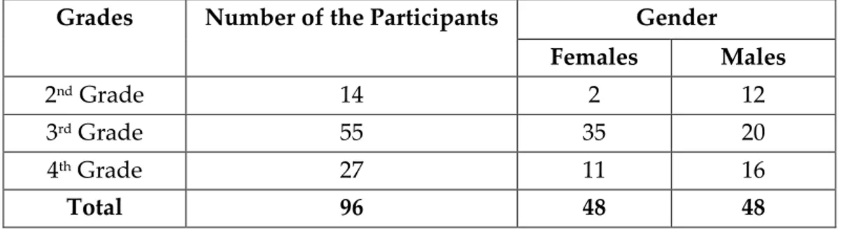
Table 3. Distribution of the participants
Gender
Grades Number of the Participants
Females Males 2nd Grade 14 2 12 3rd Grade 55 35 20 4th Grade 27 11 16 Total 96 48 48 4.2.2. Procedure
All participants were accepted in the same room which was illuminated only
by the north oriented natural daylight, because minimum change occurs
when the daylight comes from the north. Subjects were tested individually.
Before they took the questionnaire, all participants had taken Ishihara’s test for
color blindness (Ishihara, 1975). If the subject did this test accurately, s/he was
given the questionnaire. None of the participants had color blindness in this
36
mid-gray, N 5.0/ in Munsell Book of Color Glossy Finish Collection (1991).
Eight selected color chips, the photograph of the specific restaurant and the
questionnaire were located on that surface during the test.
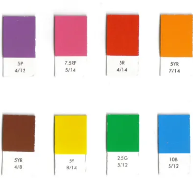
In this research, a total of eight chips of basic colors were shown (see Figure
1). Since the effect of color may change from culture to culture, it was found
appropriate to use the research of Şahin (1998) as the basis of color selection
in this study. Şahin’s (1998) research depends on color naming and color
perception of Turkish people. According to this research, 322 participants
from different regions of Turkey identified 8 basic and 24 non-basic color
terms from Munsell Color System.
In this dissertation, basic color terms of Şahin’s (1998) research were divided
into two as cool and warm colors. So, similar chroma degrees of cool and
warm colors that were significant in that research were chosen from Munsell
Book of Color Glossy Finish Collection (1991) for this study (see Appendix A,
Table A.1). Chroma degree of cool colors (blue, green, purple) is 12 and
except brown, chroma degree of other warm colors (red, orange, yellow,
37
Figure 1. Chips of 8 basic colors
Table 4. Chosen chips for cool colors Cool Colors
Blue 10 B 5/12
Green 2.5 G 5/12
Purple 5 P 4/12
Source: Munsell book of color: glossy finish collection. (1991).
Table 5. Chosen chips for warm colors Warm Colors Red 5 R 4/14 Orange 5 YR 7/14 Yellow 5 Y 8/14 Pink 7.5 RP 5/14 Brown 5 YR 4/8
38
Since this study compares the effect of color on the assessment of different
restaurant types, restaurants that are located in Ankara were selected
according to price range. Before the elimination, eleven restaurants from
different price ranges were chosen, then three of them were selected for this
study. Selection of these three restaurant types depends on their price ranges,
furniture and decoration types, familiarity and location. These three
restaurants are located in Çankaya district. It was intended to choose
unfamiliar and unpopular restaurants for reducing the possibility of
experiencing them because participants’ color preferences could be affected
by their previous knowledge about the restaurants. Since the assessment of
different restaurant types are searched in this study, selection of furniture
and decoration types are also important. According to this, the furniture and
decoration types of these three selected restaurants are different from each
other. Additionally, price ranges of restaurants were the criteria for grouping
restaurant types as lower, middle and high classes.
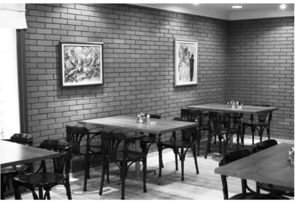
The first restaurant is Bursa İnegöl Köftecisi which is a lower class restaurant
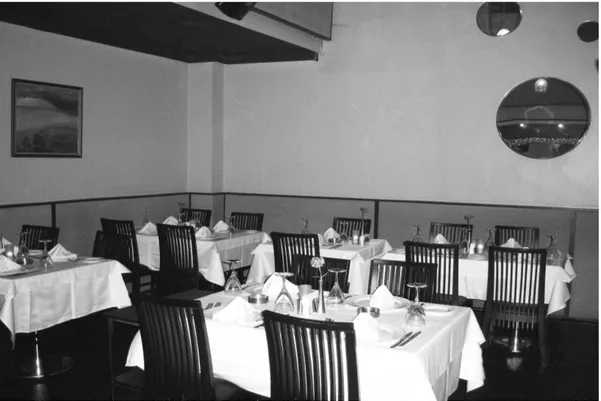
at Cinnah Avenue (see Figure 2). The second one is Mum Restaurant which is
a middle class restaurant at Reşit Galip Avenue (see Figure 3). The third
restaurant is Niki which is a high class restaurant and located in Divan Hotel
39
Name of the restaurants were not revealed to participants neither verbally
nor visually during the test. Photographs showed a corner of each restaurant.
To prevent the effectiveness of colors of restaurant interiors, the photographs
of the interiors of the restaurants were shown in black and white 15x20 cm
size.
40
Figure 3. Mum Restaurant
41
As it was mentioned before, the questionnaire that was used during this
study was the same for all types of restaurants. To prevent a possible
influence of getting familiar with the experience, sample group was divided
into three groups. Each group had 32 subjects (16 males and 16 females) and
one group was shown one photograph only, so that each group evaluated
one restaurant type during the test. The questionnaire was prepared in
subjects’ native language Turkish. An English version was also given in the
Appendix B.
4.3. Results
To analyze the obtained data from questionnaires, Statistical Package for the
Social Sciences (SPSS) 15.0 was used. Frequencies, independent t-tests,
ANOVA, Pearson Correlation and chi-square analysis were used for
analyzing the data.
At first, findings that are related to color choices are explained in this part.
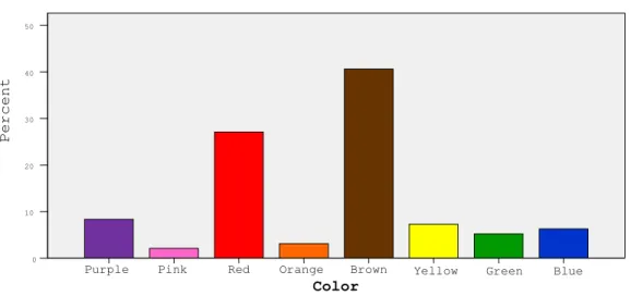
The first finding of this research is that brown is the most and pink is the
least preferred color in general (df=7,p=,000) (see Figure 5) (see also
Appendix C, Table C.1). The results show that warm colors are preferred
more than cool colors regardless of restaurant types (df=1, p=,000) (see Figure
42
Figure 5. Distribution of color preferences
Figure 6. Cool and warm color preferences
As oppose to the expectations, there is not a significant difference in color
preferences between restaurant types according to the ANOVA test (df= 2,
p=, 198) (see Appendix C, Table C.3). But, chi-square test shows that there is
Color Warm Colors Cool Colors P e r c e n t 100,0% 80,0% 60,0% 40,0% 20,0% 0,0% Color Blue Green Yellow Brown Orange Red Pink Purple P e r c e n t 50 40 30 20 10 0 Color
43
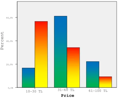
a significant relationship between preferred color and price (df= 2, p=,009)
(see Appendix C, Table C.4). According to this finding, when the preference
of warm color increases, range of price decreases (see Figure 7). This result
supports findings of previous research.
T-test results indicate that there is not a significant relationship between
color preference and gender (df=94, p=,448) (see Figure 8)(see also Appendix
C, Table C.5). A significant relationship could not be found between gender
and evaluation of price (df=92, p=,655) (see Appendix C, Table C.6).
Similarly, t-test results show that there is not a significant relationship
between gender and time spent in the restaurants (df=92, p=,890) (see
Appendix C, Table C.7).
Results of chi-square tests conclude that there is not a significant relationship
between preferred color and users’ spent time in restaurants (df=2, p=,994)
(see Appendix C, Table C.8). The time range between 31 to 60 minutes is the
most chosen one for all types of restaurants. Color does not play statistically
44
Figure 7. Color preferences according to price
Figure 8. Color preferences according to gender
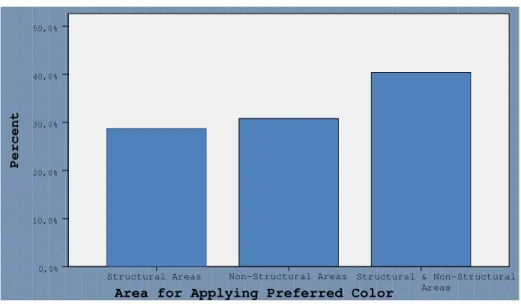
The selected areas for applying preferred color are grouped into three:
structural areas (walls, floor and ceiling), non-structural areas (furniture and
decorative elements) and both structural and non-structural, since
Price 61-100 TL 31-60 TL 10-30 TL P e r c e n t 60,0% 40,0% 20,0% 0,0% Warm Colors Cool Colors Color Colors Warm Colors Cool Colors P e r c e n t 100,0% 80,0% 60,0% 40,0% 20,0% 0,0% Males Females Gender
45
participants were free to select more than one choice in this question.
According to this grouping, participants may choose one or more than one
area in a group or may select areas that belonged to both groups. Findings
show that there is not a significant difference between these three groups to
apply their preferred color (df=2, p=,334) (see Figure 9) (see Appendix C,
Table C.9). In addition to these, the results show that there is not a significant
correlation between the selected area for applying color and color
preferences (df=2, p=,592) (see Appendix C, C.10).
Figure 9. Selected area for applying the preferred color
To find out reasons for preferring colors, participants responded an
open-ended question in the questionnaire. When their answers were analyzed and
examined, it was found that answers could be divided into three groups.
According to these, the reasons may depend on the materials used in the
restaurant, spatial features of the restaurant or participants’ personal
Area for Applying Preferred Color
Structural & Non-Structural Areas Non-Structural Areas Structural Areas 50,0% 40,0% 30,0% 20,0% 10,0% 0,0% P e r c e n t
46
opinion. The results indicate that participants refer to their personal opinion
at most (df=2, p=,000) (see Figure 10) (see Appendix C, Table C.11).
Participants express their opinions with different statements such as “green
color that came from nature, makes cheerful”. Like green, orange was also
referred to as cheerful. As it is expected, red was a warm color and reminded
them food, meat and/or hunger. In addition to these, yellow evokes the
feeling of comfort to participants and creates a plain atmosphere.
Participants stated purple as an elegant color as a color that makes people
royal (asil) who wants to be royal. On the other hand, according to the
participants, brown that is preferred at most has a formal, but not an
apparent style. Like brown, blue has also a formal style with a positive
tranquility effect. In addition to their personal opinions, spatial features also
direct participants’ reasons for preferring color. Participants stated design
and color of furniture, ambience of the space (classic, gloomy, boring, not
lively), clothing of the upholsteries and paintings as spatial features of the
space in this open-ended question. The least rated reason is the materials
used in the space. In general, participants stated that brick wall and wood
47
Figure 10. Reasons for preferred color
To find out possible factors and associations that may affect color preferences
of participants, some questions were asked to the sample group. The first
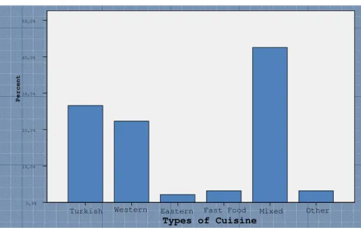
question was related to the type of cuisine that was being served in
displayed restaurant according their opinions. The findings indicate that
participants rated mixed type of cuisine at most (df=5, p=,000) (see Figure 11)
(see Appendix C, Table C.12). But there is not a significant correlation
between cuisine type and color preferences (r=,015, df=94, p=,884) (see
Appendix C, Table C.13). In addition to the cuisine type, participants mostly
preferred dinner as an activity for all those three restaurant types (df=5,
p=,000) (see Figure 12) (see Appendix C, Table C.14). The analysis shows that
there is not a significant correlation between type of activity and color
preferences of individuals (r=-,092, df=94, p=,378) (see Appendix C, Table
C.15) .
Reason for Preferred Color
Personal Opinion Spatial Features Material P e r c e n t 60,0% 40,0% 20,0% 0,0%
48
Figure 11. Distribution of preferred cuisine type
Figure 12. Distribution of preferred activity type
User characteristics of these three restaurants may affect participants’ color
preferences so that to investigate these possible associations participants
answered questions that were related to assumed users. Although all of the
Activity
Other Mixed
Both Lunch & Dinner Alcoholic & Non-
Alcoholic Beverages Dinner Lunch P e r c e n t 40,0% 30,0% 20,0% 10,0% 0,0% Types of Cuisine Other Mixed Fast Food Eastern Western Turkish P e r c e n t 50,0% 40,0% 30,0% 20,0% 10,0% 0,0%
49
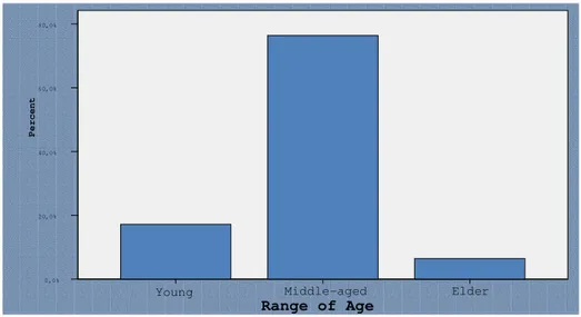
participants were students in a university, all of them rated users as working
people (df=2, p=,000) who are middle-aged (df=2, p=,000) and middle-class
(df=2, p=,000) (see Figures 13-15) (see Appendix C, Table C.16-C.18)
Participants imagined users of restaurants wear casual clothes at most (df=1,
p=,000) (see Figure 16) (see Appendix C, Table C.19). Except the work status
of assumed users (r=,229, df=94, p=,026), there are not any significant
correlations between color preferences of participants and assumed users’
age ,049, df=93, p=,644), income levels ,184,df=94, p=,075), clothing
(r=-,122, df=94, p=,241) (see Appendix C, Table C.20-C.23).
Figure 13. Distribution of age of the users
Range of Age Elder Middle-aged Young P e r c e n t 80,0% 60,0% 40,0% 20,0% 0,0%
50
Figure 14. Distribution of work status of users
Figure 15. Distribution of users’ income
Income of Users Upper Class Middle Class Lower Class P e r c e n t 80,0% 60,0% 40,0% 20,0% 0,0% Work Status Student Unemployed Employed Percent 100,0% 80,0% 60,0% 40,0% 20,0% 0,0%
51
Figure 16. Distribution of users’ clothing type
Answers that are related to accompanying people are grouped into four:
people who go to the restaurant with only their families, only their friends,
only their co-workers and with more than one of these groups of people. The
results indicate that participants chose more than one type of accompanying
people in restaurants (df=3, p=,000) (see Figure 17) (see Appendix C, Table
C.24). Findings could not indicate a significant correlation between assumed
accompanying people and color preferences of participants (r=,088, df=94,
p=,399) (see Appendix C, Table C.25).
Clothing Type of Users
Chic Casual P e r c e n t 80,0% 60,0% 40,0% 20,0% 0,0%
52
Figure 17. Distribution of accompanying people
4.3. Discussion
In this research, the effect of color on the assessment of restaurant
atmospherics was examined. The results of the study show that brown is the
most and pink is the least preferred color in general. Preferences of brown
may depend on the material association since participants stated the
influence of wood furnishing. The distribution of color preferences indicates
that participants preferred warm colors more than cool colors in this
research.
Previously, it was hypothesized that users’ assessment differs with colors in
restaurants. It was expected that cool colors make people to spend more time
in restaurants. Because it is known that designers use blue to calm and relax
Types of Accompanying
More Than One Type Colleagues Friends Family P e r c e n t 60,0% 50,0% 40,0% 30,0% 20,0% 10,0% 0,0%