THE IMPACT OF ART OBJECT COLOR AND STYLE ON MUSEUM VISITORS’ CORRELATED COLOR TEMPERATURE (CCT) LIGHT
PREFERENCES
A Master’s Thesis
by
TUNA ZİŞAN EMİRTEKİN
The Department of
Interior Architecture and Environmental Design İhsan Doğramacı Bilkent University
Ankara May 2018
THE IMPACT OF ART OBJECT COLOR AND STYLE ON MUSEUM VISITORS’ CORRELATED COLOR TEMPERATURE (CCT) LIGHT
PREFERENCES
The Graduate School of Economics and Social Sciences of
İhsan Doğramacı Bilkent University by
TUNA ZİŞAN EMİRTEKİN
In Partial Fulfillment of the Requirements for the Degree of MASTER OF FINE ARTS
THE DEPARTMENT OF
INTERIOR ARCHITECTURE AND ENVIRONMENTAL DESIGN İHSAN DOĞRAMACI BİLKENT UNIVERSITY
ANKARA
I certify that I have read this thesis and have found that it is fully adequate, in scope and in
quality, as a thesis for the degree of Master ofFine Arts in Interior Architecture and
Environmental Design.
Assoc. Prof. Dr. Nilgiin Olguntilrk Supervisor
I certify that I have read this thesis and have found that it is fully adequate, in scope and in
quality, as a thesis for the degree of Master ofFine Arts in Interior Architecture and
Environmental Design.
Asst. Prof. Dr. Qa[rr imamollu
Examining Committee Member
I certify that I have read this thesis and have found that it is fully adequate, in scope and in
quality, as a thesis for the degree of Master ofFine Arts in Interior Architecture and
Environmental Design.
Asst. Prof. Dr. Elif Giineq
Examining Committee Member
Approval ofthe Graduate School of Economics and Social Sciences
Prof. Dr. Halime Derdirkan Director
iii
ABSTRACT
THE IMPACT OF ART OBJECT COLOR AND STYLE ON
MUSEUM VISITORS’ CORRELATED COLOR TEMPERATURE
(CCT) LIGHT PREFERENCES
Emirtekin, Tuna Zişan
MFA, Department of Interior Architecture and Environmental Design Supervisor: Assoc. Prof. Dr. Nilgün Olguntürk
May 2018
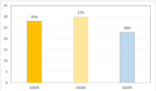
The aim of this study is to understand the effect of art objects’ color and style on museum visitors’ CCT light preferences. In order to analyze both color and style of art objects’ effect on museum lighting preference, a small exhibition room was designed. The study was conducted with three sample groups for three styles of paintings. Those styles were still life paintings, drip paintings and contemporary figurative art paintings with three color schemes for each style which are blue, red and neutral. Three CCT of light were used in the experiment which are 3000 K warm white, 4000 K neutral white and 6000 K cool white LED spots all at 200 lux
illuminance. Besides the CCT preference, participants were asked to evaluate factors that would appropriately describe the exhibited objects, painting color and lighting relations. Those evaluative factors were warmth, brightness, comfort, pleasantness, naturalness and relaxation. The results showed that most preferred CCT of light was 4000 K for all styles and colors. The general indication that could be done about the CCT preference results is that visitors want to see warm color paintings under lower
iv
CCTs while in case of cool color paintings the choice of visitors are towards higher CCTs. This preference tendency is the most significant on paintings that have facial depictions. According to the evaluative emotional states results, for all bipolar adjectives both color and CCT have an impact. The results of the study can be beneficial for museum curators, lighting designers and interior architects while designing a museum environment.
Keywords: Art Objects, Color, Correlated Color Temperature, Display Lighting,
v
ÖZET
SANAT OBJESİNİN RENK VE STİLİNİN MÜZE
ZİYARETÇİLERİNİN IŞIK RENK SICAKLIĞI TERCİHİ
ÜZERİNE ETKİSİ
Emirtekin, Tuna Zişan
İç Mimarlık ve Çevre Tasarımı Yüksek Lisans Programı Tez Danışmanı: Doç. Dr. Nilgün Olguntürk
Mayıs 2018
Bu çalışmanın amacı, sanat objelerinin renk ve tarzının müze ziyaretçilerinin ışık renk sıcaklığı üzerindeki etkisini anlamaktır. Sanat objelerinin müze ziyaretçilerinin aydınlatma tercihi üzerindeki etkisini hem renk hem de stil açısından analiz etmek için küçük bir sergi salonu tasarlandı. Çalışma üç farklı resim stili için üç farklı denek grubu ile gerçekleştirilmiştir. Deneyde kullanılan stiller mavi, kırmızı ve nötr renk opsiyonları ile natürmort resimler, damlatma resimler ve çağdaş figüratif sanat resimlerdi. Deneyde 3000 K (sıcak beyaz ışık), 4000 K (nötr beyaz ışık) ve 6000 K (soğuk beyaz ışık) LED spotlarla 200 lux aydınlık ile sağlanan üç farklı ışık sıcaklığı kullanılmıştır. CCT tercihinin yanı sıra katılımcılardan sergilenen nesneleri, resim renklerini ve aydınlatma ilişkilerini tanımlamak üzere seçilmiş faktörleri
değerlendirmeleri istenmiştir. Bu değerlendirme faktörleri sıcaklık, parıltı, konfor, hoşluk, doğallık ve rahatlık olarak belirlenmiştir. Sonuçlar, tüm stil ve renkler için en çok tercih edilen ışık renk sıcaklığının 4000 K olduğunu göstermektedir.
vi
resimlerin düşük ışık renk sıcaklığı, soğuk renkli resimlerin ise yüksek ışık renk sıcaklığı altında görülmek istendikleri belirlenmiştir. Bu tercih eğilimi en belirgin şekilde yüz tasviri içeren resimlerde gözlenmiştir. Duygusal durum gösteren faktörlerin hepsinin hem renk hem ışık renk sıcaklığından etkilendiği görülmüştür. Bu çalışmanın sonuçları bir müze mekanı tasarlarken müze küratörleri, aydınlatma tasarımcıları ve iç mimarlar için faydalı olabilir.
Anahtar Kelimeler: Işık Renk Sıcaklığı, Müze Aydınlatması, Renk, Sanat Eseri,
vii
ACKNOWLEDGEMENTS
Firstly, I would like to thank my supervisor Assoc. Prof. Dr. Nilgün Olguntürk for her invaluable support, endless patience, guidance and encouragement throughout this study. It has been a pleasure to work with her. I consider myself as privileged for being one of her students.
Secondly, I am grateful to my jury members, Assist. Prof. Dr. Çağrı İmamoğlu and Assist. Prof. Dr. Elif Güneş for their contributions, helpful advices and valuable comments.
I would also like to thank Volkan Polat to his endless support and trust and Hatice Müge Karataş for her friendship and being a motivating workmate throughout the preparation of this thesis.
The last but not the least, I would like to express my gratitude and appreciation to my beloved family for their inestimable support, their invaluable tolerance and never ending patience through my thesis process.
viii
TABLE OF CONTENTS
ABSTRACT……….. iii
ÖZET ……….. v
ACKNOWLEDGEMENTS ………. vii
TABLE OF CONTENTS ……….... viii
LIST OF TABLES ………... xii
LIST OF FIGURES ………. xv
CHAPTER 1: INTRODUCTION ……… 1
1.1. Aim of the Study ………. 3
1.2. Structure of the Thesis ………. 4
CHAPTER 2: LIGHTING IN MUSEUMS AND COLOR……… 6
2.1. Museum Experience and Psychology in Museums……….. 6
2.2. Lighting in Museums……… 8
2.2.1. Luminous Environment………. 9
2.2.2. CCT Preference Observations……….. 16
2.2.3. Museum Lighting Basics………. 22
2.3. Review of Museum Lighting Studies………. 30
2.4. Fundamentals of Color……… 35
ix
2.4.2. Color Order Systems……… 37
CHAPTER 3: EXPERIMENTAL STUDY………... 38
3.1. Aim of the Study………. 38
3.1.1. Research Questions ………. 39
3.1.2. Hypotheses………... 40
3.2. Methodology……….. 42
3.2.1. Sample Group……….. 42
3.2.2. Procedure………. 42
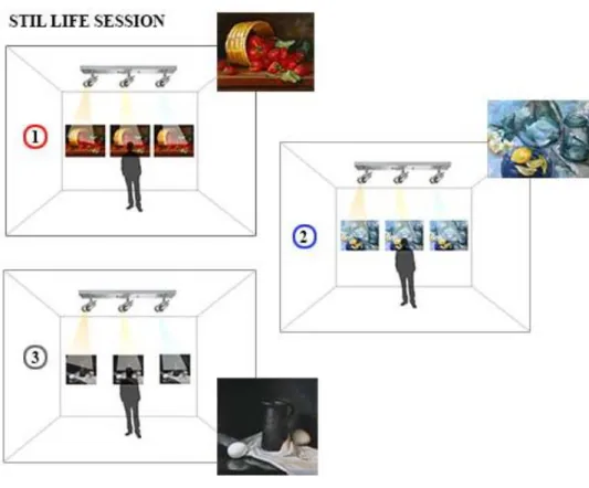
3.2.2.1. Setting of the Experiment……….. 42
3.2.2.2. Sets of the Experiment……….. 47
3.2.2.3. Experimental Procedure……… 48
3.3. Findings……….. 52
3.3.1. Finding of Participants’ Demographic Information……… 52
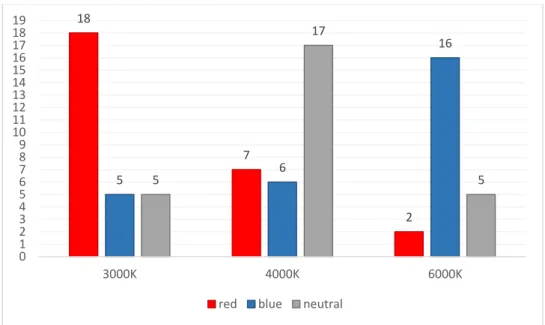
3.3.2. The Effects of Color of the Paintings on CCT Preference for Different Styles Separately……… 54
3.3.2.1. The Effects of Color of the Artwork on CCT Preference for Drip Paintings……….. 55
3.3.2.2. The Effects of Color of the Artwork on CCT Preference for Contemporary Figurative Art Paintings…………...…………. 57
3.3.2.3. The Effects of Color of the Artwork on CCT Preference for Still Life Paintings………...………. 60
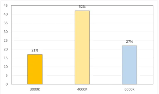
3.3.3. The Effects of Color of the Paintings on CCT Preference for All Styles………. 64
3.3.4. The Effects of CCT on Evaluation of Selected Word Pairs…………. 66
3.3.4.1 The Effects of CCT on Evaluation of Selected Word Pairs for Red Color Schemed Paintings……….... 67
x 3.3.4.1.1. Warmth Perception……… 67 3.3.4.1.2. Brightness Perception……… 69 3.3.4.1.3. Comfort Perception………... 71 3.3.4.1.4. Pleasantness Perception……… 73 3.3.4.1.5. Naturalness Perception……….. 74 3.3.4.1.6. Relaxation Perception……… 76
3.3.4.2 The Effects of CCT on Evaluation of Selected Word Pairs for Blue Color Schemed Paintings………...……….. 79
3.3.4.2.1. Warmth Perception……… 79 3.3.4.2.2. Brightness Perception……… 80 3.3.4.2.3. Comfort Perception………... 82 3.3.4.2.4. Pleasantness Perception………. 84 3.3.4.2.5. Naturalness Perception……….. 85 3.3.4.2.6. Relaxation Perception……… 86
3.3.4.3 The Effects of CCT on Evaluation of Selected Word Pairs for Neutral Color Schemed Paintings……….... 89
3.3.4.3.1. Warmth Perception……… 89 3.3.4.3.2. Brightness Perception……… 90 3.3.4.3.3. Comfort Perception………... 92 3.3.4.3.4. Pleasantness Perception……… 93 3.3.4.3.5. Naturalness Perception……….. 95 3.3.4.3.6. Relaxation Perception……… 96 3.4. Discussion………. 104 CHAPTER 4: CONCLUSION ……… 116 REFERENCES……….. 119 APPENDICES……… 127
xi
A. THE QUESTIONNAIRE………. 127 B. WORD PAIRS FROM THE LITERATURE……….. 134 C. PHOTOGRAPHS OF THE EXPERIMENT SETTING WITH DIFFERENT
STYLES AND COLORS……… 137 D. NCS CODES OF PAINTINGS………... 147 E. MEASURED ILLUMINANCE LEVEL OF THE PAINTINGS………… 151 F. STATISTICAL DATA……… 155
xii
LIST OF TABLES
1. Recommended lux level in museums according to sensitivity of the
objects……….... 11
2. Limiting illuminances and annual exposures for material sensitivity classifications………. 11
3. A chart demonstrates specifications of correlated color temperature………. 14
4. Review of CCT preference studies……… 21
5. Review of museum lighting studies………... 34
6. Distribution of Participants (n=81)……… 49
7. Characteristics of Participants (n=81)……… 53
8. Statistical results and distributions for CCT preference of three styles……. 63
9. All statistical results for bipolar adjectives……… 99
10. Positive-negative state of all evaluative word pairs for all colors………... 100
11. Adjective pairs from Zhai et al (2015)………. 135
12. Adjective pairs from Chen et al. (2015)………... 135
13. Adjective pairs from Vienot et al. (2009)……….... 135
14. Adjective pairs from Luo et al. (2013)………. 136
15. Kruskal-Wallis H test results for order effect of red drip paintings……… 156
16. Kruskal-Wallis H test results for order effect of blue drip paintings……... 156
17. Kruskal-Wallis H test results for order effect of neutral drip paintings….. 156
18. Friedman test results for drip paintings……….…….. 157
xiii
20. Kruskal-Wallis H test results for order effect of red contemporary figurative art paintings………..… 158 21. Kruskal-Wallis H test results for order effect of blue contemporary figurative
art paintings……….………. 158 22. Kruskal-Wallis H test results for order effect of neutral contemporary
figurative art paintings………... 158 23. Friedman test results for contemporary figurative art paintings………….. 159 24. Wilcoxon Signed Rank test for contemporary figurative art paintings…... 159 25. Kruskal-Wallis H test results for order effect of red still life paintings….. 160 26. Kruskal-Wallis H test results for order effect of blue still life paintings…. 160 27. Kruskal-Wallis H test results for order effect of neutral still life paintings. 160 28. Friedman test results for still life paintings……….. 161 29. Wilcoxon Signed Rank test for still life paintings………... 161 30. Kruskal-Wallis H test results for effect of style on CCT preference for red
paintings………... 162 31. Kruskal-Wallis H test results for effect of style on CCT preference for blue
paintings………... 162 32. Kruskal-Wallis H test results for effect of style on CCT preference for neutral paintings………... 162 33. Kruskal-Wallis H test results for effect of color on CCT preference for all
styles……… 163 34. Mann- Whitney U Test results for red-blue color differences……… 163 35. Mann- Whitney U Test results for red-neutral color differences………… 163 36. Mann- Whitney U Test results for blue-neutral color differences………... 164 37. Kruskal-Wallis H test of evaluative word pairs for red paintings………... 164
xiv
38. Mann-Whitney U Test results for the difference of 3000 K and 4000 K of red paintings………... 165 39. Mann-Whitney U Test results for the difference of 3000 K and 6000 K of red
paintings………... 165 40. Mann-Whitney U Test results for the difference of 4000 K and 6000 K of red
paintings………... 165 41. Kruskal-Wallis H test of evaluative word pairs for blue paintings……….. 166 42. Mann-Whitney U Test results for the difference of 3000 K and 4000 K of
blue paintings………... 166 43. Mann-Whitney U Test results for the difference of 3000 K and 6000 K of
blue paintings………... 167 44. Mann-Whitney U Test results for the difference of 4000 K and 6000 K of
blue paintings………... 167 45. Kruskal-Wallis H test of evaluative word pairs for neutral paintings……. 168 46. Mann-Whitney U Test results for the difference of 3000 K and 4000 K of
neutral paintings………... 168 47. Mann-Whitney U Test results for the difference of 3000 K and 6000 K of
neutral paintings……….. 169 48. Mann-Whitney U Test results for the difference of 4000 K and 6000 K of
xv
LIST OF FIGURES
1. Color Differentiation under Different CRI values……….. 12
2. Black body locus on CIE chromaticity diagram………. 13
3. A diagram showing the Kruithof Curve………. 15
4. a) Diffuse lighting for the room, directional lighting for the wall …………. 25
b) Supplementary directional lighting for objects in the room ………. 25
c) Indirect and direct illumination……….. 25
d) Directional Lighting………... 25
5. Different levels of contrast in the exhibition environment………. 28
6. Hue, chroma and value………... 36
7. Reflected ceiling plan of the experiment room………... 44
8. Section of the experiment room……….. 44
9. A diagram showing the artist and names of the drip paintings……… 45
10. A diagram showing the artist and names of the contemporary figurative art paintings………. 46
11. A diagram showing the artist and names of the still life paintings………… 46
12. A diagram showing the optimal positioning of the luminaire and observation distance……….. 48
13. A diagram demonstrating the drip painting session of the experiment……. 50
14. A diagram demonstrating the contemporary figurative art painting session of the experiment……… 50 15. A diagram demonstrating the still life painting session of the experiment… 51
xvi
16. A diagram demonstrating the applied three order in the experiment………. 54 17. Preference distribution of the CCT according to different colors for drip
paintings………. 56 18. Preference distribution of visitors on CCT for drip paintings………... 57 19. Preference distribution of the CCT according to different colors for
contemporary figurative art paintings……….... 59 20. Preference distribution of visitors on CCT for contemporary figurative art
paintings………. 60 21. Preference distribution of the CCT according to different colors for still life
paintings………. 62 22. Preference distribution of visitors on CCT for still life paintings…………. 62 23. Preference distribution of the CCT according to different colors for all
styles……….. 66 24. Preference distribution of visitors on CCT for all styles………... 66 25. Mean scores of warmth state according to different CCTs for red color
paintings………. 69 26. Mean scores of brightness state according to different CCTs for red color
paintings………. 71 27. Mean scores of comfort state according to different CCTs for red color
paintings………. 73 28. Mean scores of pleasantness state according to different CCTs for red color
paintings………. 74 29. Mean scores of naturalness state according to different CCTs for red color
paintings………. 76 30. Mean scores of relax state according to different CCTs for red color
xvii
31. Mean scores of for all evaluative word pairs for red color paintings……… 78 32. Mean scores of warmth state according to different CCTs for blue color
paintings………. 80 33. Mean scores of brightness state according to different CCTs for blue color
paintings………. 82 34. Mean scores of comfort state according to different CCTs for blue color
paintings………. 83 35. Mean scores of pleasantness state according to different CCTs for blue color
paintings………. 85 36. Mean scores of naturalness state according to different CCTs for blue color
paintings………. 86 37. Mean scores of relax state according to different CCTs for blue color
paintings………. 87 38. Mean scores of for all evaluative word pairs for blue color paintings……... 88 39. Mean scores of warmth state according to different CCTs for neutral color
paintings………. 90 40. Mean scores of brightness state according to different CCTs for neutral color
paintings………. 92 41. Mean scores of comfort state according to different CCTs for neutral color
paintings………. 93 42. Mean scores of pleasantness state according to different CCTs for neutral
color paintings……… 94 43. Mean scores of naturalness state according to different CCTs for neutral color paintings………. 96 44. Mean scores of relax state according to different CCTs for neutral color
xviii
45. Mean scores of for all evaluative word pairs for neutral color
paintings………. 98 46. Mean scores of all evaluative word pairs for all colors………... 103 47. Example participant in the experiment setting observing blue drip
paintings ………...138 48. A view from experiment with blue drip paintings………... 138 49. Example participant in the experiment setting observing red drip
paintings………... 139 50. A view from experiment with red drip paintings………. 139 51. Example participant in the experiment setting observing neutral drip
paintings………... 140 52. A view from experiment with neutral drip paintings………... 140 53. Example participant in the experiment setting observing blue contemporary
figurative art paintings………. 141 54. A view from experiment with blue contemporary figurative art
paintings………... 141 55. Example participant in the experiment setting observing red contemporary
figurative art paintings………. 142 56. A view from experiment with red contemporary figurative art
paintings……….. 142 57. Example participant in the experiment setting observing neutral
contemporary figurative art paintings……….. 143 58. A view from experiment with neutral contemporary figurative art
paintings………... 143 59. Example participant in the experiment setting observing blue still life
xix
60. A view from experiment with blue still life paintings………. 144
61. Example participant in the experiment setting observing red still life paintings………... 145
62. A view from experiment with red still life paintings………... 145
63. Example participant in the experiment setting observing neutral still life paintings ……….. 146
64. A view from experiment with neutral still life paintings………. 146
65. NCS codes for drip paintings………... 148
66. NCS codes for contemporary figurative art paintings………. 149
67. NCS codes for still life paintings………. 150
68. Measured illuminance levels of drip paintings……… 152
69. Measured illuminance levels of contemporary figurative art paintings…... 153
1
CHAPTER I
INTRODUCTION
A museum is a place where people understand the world, explore and learn about the past, present and future of creativity and discover history by using objects and ideas (Hume & Mills, 2011, p.275; Hunt, 2009). While presenting history through
historical objects and presenting future and present through creative art objects; conservation, presentation and education are the main purposes (Berns, 2011). In here, lighting plays a significant role for the first two, conservation and presentation issues, in museum spaces. For the presented objects, it is required to have adequate illumination for detailed appearance, while it is a must that lighting is controlled not to damage them (Kurtay et al., 2003). In a museum space with its interiors and lighting design influence, the visitors’ understand the presented artwork that lead them to comprehend the particular concept of that exhibition. Visitors’ experience is positively affected from comfortable environments having appropriate lighting design (Lee, 2010). Thus, lighting designer should provide a solution of aesthetical and satisfying appearance for objects without damaging them. According to The Commission Internationale de L’Eclairage (CIE), the illumination of museum interiors must be in the range of 50-200 lx with respect to the sensitivity level of
2
museum objects in order not to damage them and UV radiation below 400 nm must be eliminated. Also, there are limits for annual lighting exposures measured with lux-hours per year for objects (CIE, 2004). There is no specific CCT preference for
museum lighting in CIE, but it is suggested to have high color rendering index (CRI).
Kruithof associated CCT and illuminance level with a curve called ‘Kruithof curve’ and proposed a ‘pleasing area’ for indoor lighting. (Rea,2000) With respect to this curve, lower CCTs at lower illumination levels and higher CCTs at higher
illumination levels make pleasant feelings possible about interior lighting
(Kruithof,1941). The contemporary application of pleasing illumination for interiors is based on Kruithof’s rule. Not to damage presented objects in museum interiors, higher illuminances are not preferred in display areas especially for having the ultraviolet (UV) and infrared (IR) spectral components (Cuttle,2000). For both appearance and conservation issues of museum lighting, LED lighting is the most suitable option for the displays because of its individual characteristics of having next to none IR and UV radiation (Zhai et al., 2015).
When CIE guidelines and Kruithof’s rule are analyzed together, required low illumination level of museum interiors must combine with lower CCTs range between 2700-4000K (Chen et al., 2016). Nevertheless, in museum spaces art preservation is crucial but not the only concern, so this low illumination-low CCT combination for display lighting may not be suitable for general museum lighting concerns.
3
When the concern is appearance of the exhibits, it can be important to produce spaces through intentions of the artist or more basically preference of the observer’s. Observers’ preferences are affected by naturalness and variety of colors, but also this interaction give signals about illumination effect on art object’s impression (Pinto et al., 2008).
1.1. Aim of the Study
The study aims to measure whether there is a preference difference in museum lighting between CCT of lighting and color scheme and style of the painting. In the literature, although there are many experimental studies based on illumination preference in museums, there is no significant research to analyze CCT preference over both color scheme and style of the paintings. The study also aims to understand effect of the CCT on the selected evaluative bipolar adjectives which are warm-cool, natural-unnatural, relaxing-tense, pleasant-unpleasant, comfortable-uncomfortable, bright-dark. So, this study aims to fill the gap in the literature. The findings of the study can be useful for museum curators, lighting designers and interior architects while designing a museum environment.
4
1.2.Structure of the Thesis
This thesis contains four chapters. The first chapter is the introduction, the museum environment, lighting issues, importance of CCT in museum environment and
lighting design criteria for museum areas are briefly indicated. In addition, the aim of the study and the structure of the thesis are stated in this chapter.
In the second chapter, lighting and color in museum environment are investigated. Psychological effect of museum on the visitors and a whole museum experience are explained. The general information about lighting design terms which are
illuminance, luminance, color rendering index and correlated color temperature are clarified. Relation between correlated color temperature and illuminance level are discussed in the structure of pleasant interior lighting and more specifically proper lighting design of museum spaces. Main features of museum lighting and CCT preference observations in previous studies are discussed. In this study, color is also an important concern, so color basics and color order systems are briefly indicated. Finally, review of museum lighting studies are clarified.
Third chapter is the methodology part that explain the aim and the method of the study. With the research questions and hypothesis of the study, the aim of the study are defined. The method of the study is stated with the explanation of the sample group, setting of the experiment, sets of the experiment and experimental procedure. In the experimental procedure part, how the designed museum room is generated, how lighting arrangements are done, the selected paintings and sessions of the experiment are explained in detail. Participants’ demographic information, statistical
5
analysis of all data and evaluation of the data are explained. Finally, the findings are examined and compared with results of previous works in the literature.
In the fourth chapter, conclusion of the study are signified. Moreover, limitations and suggestions for further research are given.
6
CHAPTER II
LIGHTING IN MUSEUMS AND COLOR
2.1. Museum Experience and Psychology in Museums
A museum is an institution that helps people investigate and find out about past, present and future and understand the world by using objects and ideas (Hume & Mills, 2011, Hunt,2009). According to Goulding, museum and art gallery visitors come to the exhibition environment to become socialized, experience the nature and customer service besides experience the exhibited work (2000). Visitors go to the museum mainly with the aim of social-recreational reasons, educational reasons and reverential reasons. (Graburn 1977; Falk and Dierking 1992).Museums are designed to present historical objects that visitors educate themselves with or creative art objects that visitors enjoy and renew their minds. Thus, a visitor coming to a museum environment anticipate to find an experience with enjoyable, educational and peaceful aspects (Paulino, 2013). Approaching the museum space beyond educational considerations and engaging in restorative aspects make contribution to health and welfare of museum visitors (Packer & Bond, 2010, p. 432). The museum
7
space must be designed comfortable enough for visitors spend more time, educate themselves, interact with others and have intellectual conversations (Gurian,2005). Museum spaces must also be restorative with the meaning of “the process of renewing physical, psychological and social capabilities diminished in ongoing efforts to meet adaptive demands” (Packer & Bond, 2010). The words restoration also refers to “the experience of a psychological and/or physiological recovery process that is triggered by particular environments and environmental
configurations.” People improve their health and can be away from their tense lives with the help of restorative environments. As reported by Packer and Bond, people are in search of a place to restore themselves.
For perception and interaction with the museum environment, physical characteristics of the space is important. It is essential for visitors to create meaningful experiences and obtain satisfying outcomes from the museum space (Lee, 2010). According to Newman, the museum building effect the way visitors experience the presented objects, in other words the museum building can be regarded as the work of art itself (1991). Crowding level, scene setting and circulation mapping are important aspects that affect relation between museum visitor and museum environment. Beginning from the entrance of the space, location decisions of the area and mapping and signage of the environment must be clearly defined to provide a distressful space for visitors and let them more focus on the exhibited work. Signage of the circulation, descriptive labels and informative wall texts are crucial for true perception of the museum environment. Inadequacy of informative labelling, lessen the positive perception of the visitors (Gurian,1991). In a museum space with its interiors and lighting design influence the visitors’
8
understanding on the artwork that presented and lead them to comprehend the concept of the exhibition itself. In 2010 Lee stated that, visitors’ experience is positively affected from comfortable environments with appropriate temperature, seating arrangement and lighting design. These aspects influence visitor’s emotional, cognitive and physiological responses to the designed space (Packer, 2008). According to the results of his research, appropriate lighting design is
suggested in museum environment and it is concluded that inadequate lighting design interfere with the pleasure visitor get from the exhibitions. According to Gurian, visitors of museums can spend more time in the museum space under favour of the design layout of the space. The museum space must be both comfortable and alluring. To provide such a space, open air connections of the interior circulation areas must be well defined and lighting design of the environment must not be disturbing (Gurian, 2005).
2.2. Lighting in Museums
Light can be considered as the focal concept of visual experience and architecture, because it enables people to see and interpret the environment. The physical qualities of the environment cannot be noticed without presence of light (Egan & Olgyay, 2002). Lighting design of an interior space affect its’ users both physiologically and psychologically, so light is a very important architectural element that should be considered well to have better quality environments (Karlen et al., 2017).
9
2.2.1. The Luminous Environment
A museum is a place where people understand the world, explore and learn about the past, present and future of creativity and discover history by using objects and ideas (Hume & Mills, 2011; Hunt,2009). While displaying objects one of the most
important issues is light. In a display environment, the place of light is indispensable for creating a museum place to discover and learn for visitors and also preserving the artwork (Hunt,2009). With respect to visualization and conservation issues, museum and art gallery lighting has its own specific requirements (Pinto et al., 2008). Display lighting affects different professionals such as administrative staff of museum, museum curators, designers and visitors of the museum. There are expectation differences and different concerns among these groups about lighting decisions. For example, administrative staff of museum want to have a sustainable and economic lighting system, while designers demand firstly to achieve clear object form. Meantime, for the museum curators detrimental effect of the lighting is the major concern, because colored surfaces of artworks can be damaged by visible and invisible radiation of lights. On the other hand, visitors are most concerned with object form and perception of true color. Successful and competent museum lighting must consider each groups’ considerations. Lighting design is a collaborative art (IESNA, 1996).
In order to discuss effect of art objects’ color and style on CCT light preferences of museum visitors, first understanding the main elements of lighting is important.
10
Lighting parameters such as the color rendering index, correlated color
temperature, luminance and illuminance are extremely important aspects of the
museum lighting environment (IESNA, 1996).
Luminance and illuminance are the two major properties of light. Luminance is the intensity per unit area radiated by a surface in a given direction. It is measured with cd/m2. Illuminance is the density of the luminous flux incident on a surface; it is the quotient of the luminous flux by the area of the surface (IESNA, 1996). It is
measured in lumens per square meter, lux. Lux can be measured with an illuminance meter (Egan & Olgyay, 2002).
According to The Commission Internationale de L’Eclairage (CIE), the illumination of museum interiors must be in the range of 50-200 lx with respect to the sensitivity level of museum objects in order not to damage them. According to IESNA
guidelines, accessible lighting levels for museums range from 50-300 lux according to the exhibit and lighting type (1996). High sensitivity materials like paintings, watercolors, manuscripts and colored silk having sensitive pigments are
recommended to lit illuminance level up to 50 lx, while medium sensitivity materials such as wood, leather and canvases should be illuminated up to 100 lx. In case of low sensitivity materials lux level can be raised to 300 lx (See Table 1). If the object is stone even daylight could be used which has much higher levels of illuminance.
11
Table 1. Recommended lux level in museums according to sensitivity of the objects (Sylvania, 2015)
Light contains UV and IR radiations and while former one causes pigment
photodegradation, latter one produces heat. For protecting unwanted effects of these radiations, UV and IR light must be filtered, illuminance level must be controlled and light exposures of artworks must be limited (Pinto et al, 2008) (See Table 2).
Table 2. Limiting illuminances and annual exposures for material sensitivity classifications
(Source: http://www.kolumbus.fi/jold/tiedostot/museumlight.pdf)
Color rendering is another major factor that should be considered when lighting museums and galleries. The Color Rendering Index (Ra) gives a general indication of the rendering ability of a light source (CIBSE, 1994). The Color Rendering Index
12
(Ra) is the measure of how well the light source renders color. The higher the CRI, the better the light source render true and natural color of the object (IESNA,1996). A CRI of 100 means true color rendering, while those over 80 are considered good. Museum curators aim to have an object appear as ‘natural’ as possible when
illuminated (See Figure 1). Good color rendering is significantly essential when the viewing true color of the object is important especially in the case of paintings (Philips Lighting Manual, 1986). With good color rendering, in addition to natural appearance of color, discrimination of similar colors are also achieved (Rea, 2000; van der Burgt & van Kemenade, 2010).
Figure 1. Color Differentiation under Different CRI values (Source: Sylvania, F. (2015) Lighting for Museums and Art Galleries)
Correlated color temperature of a light source is defined in the Planckian Locus
with chromaticity coordinates of the light. It means blackbody temperature of the Planckian radiator (McCamy, 1992). According to the Planck’s law of radiation, blackbody features at distinct temperatures are described. With the rise of the color temperature, light of the color show an alteration from warm to cool as such reddish to bluish (Rea, 2000). In the planckian locus diagram, color temperature is
13
black body which gives the light source color is the correlated color temperature (See Figure 4). The correlated color temperature is not spectral power distribution of the light source nor the physical temperature. It describes coolness and warmth of the light for the appearance (Egan & Olgyay, 2002).
Figure 2. Black body locus on CIE chromaticity diagram
(Source: https://www.led-professional.com/resources-1/articles/guidance-on-specifying-solid-state-lighting-luminaires)
Blue appearance of the light source increases with higher color temperature, while with the lower color temperature the appearance is red (Katsuura, 2000). In this study 3000 K, 4000 K and 6000 K are used since 3000 K signify warm white light, 4000 K signify mid- range neutral white and 6000 K means daylight white (See Figure 2).
14
Table 3. A chart demonstrates specifications of correlated color temperature (Source: http://www.westinghouselighting.com/color-temperature.aspx)
Traditional standards determine the illuminance level of a museum environment between 50 and 300 lux with a relatively warm CCT of 3000K. These limits have been accepted solely true for the basis of surveys by a set of major museums. Low illuminance levels are better for artwork preservation and common spectrum is decided by accessible light sources (Scuello & Abramov, 2003). Kruithof worked with CCT and illuminance level to define pleasing combinations of these two for interior lighting. For ‘pleasing area’ Kruithof proposed that higher illuminance level with higher CCT and lower illuminance level with lower CCT are required (Scuello et al. ,2004) (See Figure 3).
15
Figure 3. A diagram showing the Kruithof Curve (Source: https://en.wikipedia.org/wiki/Kruithof_curve)
The contemporary application of pleasing illumination for interiors is based on Kruithof’s rule. According to him the color temperature of the light change according to the illuminance level. For an illumination scenario of 50 lux, the color temperature must be ranged between 2200-2500 K, while from 2000 lux the color temperature range between 3500 K to 10.000 K. The common application of 200 lux is 3000 K. However Kruithof did not straightly work with the museum lighting, he worked for defining optimal lighting for interiors with the aim of best cool or warm color temperature. Some current studies done to validate Kruithof’s study for interior lighting are contradicted with the Kruithof’s finding. Oi and Takahashi examined several combinations of CCT and illuminance for different domestic activities such as dining, cooking, studying and resting (2007). They resulted that the CCT and illuminance combination preferences depend on the specific activity and case. Also
16
they concluded that Kruithof’s rule is not appropriate when studying with especially relaxing activities.
2.2.2. CCT Preference Observations
In the literature, there are various works that focus on correlated color temperature of light. Pardo et al. (2014) worked on effect of CCT on color discrimination. They worked with 14 color samples from Farnsworth-Munsell 100 Hue test and 7
participants who evaluated these samples under six different CCT of light which are 2800, 3800, 5000, 6500, 7800, and 9700 K. Subjects saw the juxtaposed FM100 test samples from 50 cm distance and they were questioned if the colors of the samples were different from each other under different CCT conditions. The color
discrimination success rate was at the maximum for 5000 K with the percentage of 88.6. The average correct answer ratio of all lighting conditions was 84%. While designing an interior if the color discrimination is an important design input, this data can be used.
Another research conducted by Dangol et al. (2013) focused on naturalness preference of people according to the LED and fluorescent lamp spectral power distributions at CCT of 2700 K, 4000 K and 6500 K. They used a three partition light booth which was coated with matte gray paint. They experimented with 24 different spectral distribution conditions at CCT of 2700 K, 4000 K and 6500 K. As evaluated objects they chose a Coke can, a smartphone, a picture, a wooden sample, printed texts and Macbeth Color Checker (MCC) chart and total 60 subjects were
17
spectral distributions and CCT conditions. For 2700 K, different spectras of fluorescent lamp and LED, subjects mostly chose fluorescent lamp for naturalness and preference with the evaluated objects and difference results between these lamps were statistically significant. For the evaluation of 4000 K and 6500 K, according to the evaluative objects preference between LED lamp and fluorescent lamp varied. Another result from the study was, color rendering index of the light did not describe the naturalness of the evaluated objects and preference.
Baniya et al. (2015) worked on favored combination of CCT and illuminance level of the office environments. They experimented with fifty three observers and nine different lighting conditions which are combinations of 3000 K, 4000 K and 5000 K and 300 lux, 500 lux and 750 lux. They concluded that CCT was more significant than a higher illuminance level for supplying a better visual impression with lighting. For pleasantness, visual comfort and naturalness the preferred lighting conditions were 750 lux with 4000 K CCT. It was also stated that the brightness perception increased with a higher CCT. Compared to a lower CCT, with a high CCT arousal of people also increased.
The study conducted by Kim et al. (2015) experimented brightness perception of subjects under different CCT conditions of LED light. They concluded that, under same illuminance level, higher CCT are perceived brighter than a lower CCT level.
Another study was conducted by Manav (2007) who worked on the appraisal of the visual environment at offices in relation to color temperature and illuminance. For the illuminance level she used 500, 750, 1000 and 2000 lux and for the CCT levels of
18
light 2700 K and 4000 K were used in the experiment. The illumination level and CCT were tested independently controlling one variable while testing the other. According to the results, as illumination level increases comfort and spaciousness levels of subjects increased. Also, with the rise of illumination level, brightness perception and subjective impressions except relaxation had a positive impact on participants. For the comparison of the CCT levels, it was found that 2700 K was preferred for relaxation while 4000 K was chosen for comfort and spaciousness. In addition to these, the results showed that particularly warm colors were noticed as more saturated at 2700 K than 4000 K.
According to Huang et al. (2017), with a higher CCT at the same luminance discomfort glare of the subjects increased.
The study conducted by Huang et al. (2015) investigated the effect of correlated color temperature on focused and sustained attention with white LED light conditions. They worked with three different CCT conditions which are 2700 K, 4300 K and 6500 K. Beyond focused and sustained attention, in this experiment comfort and clarity issues depending on the CCT were also tested. According to the results, there was not a significant difference among the CCT levels with respect to the comfort issue, while for the clarity there was an increase with the rise of the CCT level.
According to the study of Ju et al. (2011) which experimented with nine lighting combinations of 3000 K, 5000 K, 8000 K and 100 lux, 300 lux, 500 lux on spatial
19
brightness perception, with the rise of correlated color temperature, spatial brightness perception of subjects also increased.
Hong et al. (2017) worked with colored samples to evaluate visibility characteristics of objects under LED light with different correlated color temperature. According to their results, at lower CCTs visibility of red color is good while purple, blue, blue green, green and green yellow colors have good visibility under higher CCTs with higher brightness perception. Also, for warm colors such as red, yellow and yellow red higher color visibility can be achieved with lower CCTs while brightness perception is relatively low.
In the study of Wang et al. (2016) the influence of correlated color temperature of light on comfort and preference of the subjects for LED lighting was investigated. They used twelve CCT conditions from 2000 K to 100000 K and three illuminance levels which were 350lux, 500 lux and 1000 lux. They concluded that, lower CCTs were preferred for relaxing activities and chosen as more comfortable, while for working activities higher CCTs were considered comfortable and preferred.
Masuda and Nascimento (2013), worked with commercial food counters that include fruit, vegetables and meat to evaluate subjects’ naturalness and preference inclination for lighting conditions. They used hyperspectral images of the food counters to ask the subjects and they concluded that subjects found 6040 K as most natural and 4410 K as most preferred.
20
Vienot et al. (2009) worked on effect of CCT and illuminance level on visual
responses of the subjects. They used three different CCTs which are 2700 K, 4000 K and 6500 K and three different illuminance levels namely 150, 300 and 600 lux. In their experiment, they examined with subjective scales of brightness, clearness, glare, pleasantness, comfort, relax, warmth, cheerfulness and color rendering. According to mean results of 20 subjects, at all illumination levels higher CCT was perceived as brighter and clear, while in case of pleasantness, relax, warmth and comfort lower CCTs were preferred more.
In a research conducted by Liu et al. (2017) the effect of different correlated color temperature on color preference were examined. They used LED lights to illuminate selected objects with different CCTs and subjects were asked to evaluate these objects and lighting conditions by a 5 level ranking and 7 point scale method. The 9 CCT were ranged between 2500 K and 6500 K. They used a variety of objects which are different colored fruits and vegetables, Chinese calligraphies with different colors, mural painting, a Van Gogh painting, a Chinese traditional painting, modern oil painting and multicolor flowers. The illumination level was fixed at 200 lux of all cases. They stated that light, object and the observer affect the color preference and concluded about that the light is the most significant factor of all. According to the mean values of the 7 point scale for red, green and multicolor fruit and vegetables the most preferred CCT was 4500 K while for the yellow fruit and vegetables it was 5500 K. For orange, white, light white and yellowish white Chinese calligraphies CCT of 3500 K was preferred mostly while for red calligraphy 4500 K was chosen mostly. For multicolor flowers and modern oil painting composed of mostly cool colors most liked CCT was 5500 K while for mural painting with neutral colors the
21
most liked CCT was 3500 K. Van Gogh painting and Chinese traditional painting was in the color of green and yellow and they evaluated in 5 level ranking method and the top ranked CCT of two was 4500 K. They stated that people prefer cool and higher CCTs for cool and cold colors while they prefer a warm and lower CCT for warm colors. They also indicated that people mostly choose lighting conditions that enable the objects to be seen more saturated.
Table 4. Review of the CCT Preference Studies
Authors Subject Results
Pardo et al.
(2014) Color Discrimination
The color discrimination success rate was at the maximum for 5000 K. Dangol et al.
(2013) Naturalness Preference
Color rendering index of the light did not describe the naturalness of the evaluated objects and preference. Baniya et al.
(2015)
Favored Combination of CCT and illuminance
For pleasantness, comfort and naturalness preferred lighting condition was 4000 K at 750 lux. Brightness perception increased with a higher CCT.
Kim et al. (2015)
Brightness Perception with Different CCTs
Under same illuminance level, higher
CCT are perceived brighter.
Manav (2007)
Appraisal of the Visual Environment
at Offices
2700 K was preferred for relaxation, 4000 K was chosen for comfort and
spaciousness. Warm colors were noticed more saturated at 2700 K than 4000 K.
Huang et al.
(2017) Discomfort Glare with LEDs
With a higher CCT at the same illuminance, discomfort glare increased.
Huang et al. (2015)
Effect of CCT on Focused and Sustained
Attention
There was not a significant difference among the CCT levels with respect to the comfort issue.
Ju et al. (2011) Spatial Brightness Perception
With the rise of CCT, spatial brightness perception of subjects increased. Hong et al. (2017) Visibility Characteristics of Objects under LED light
With lower CCTs visibility of warm colors are better. Brightness
perception is relatively low at lower
CCTs.
Wang et al. (2016)
Effect of CCT on Comfort and Preference
Lower CCTs were preferred for
relaxing activities, while for working activities higher CCTs were considered comfortable.
22
Table 4 (cont’d) Masuda and
Nascimento (2013)
Naturalness and Preference with Lighting
6040 K was found as the most natural
and 4410 K as most preferred CCT.
Vienot et al. (2009)
Effect of CCT and Illuminance on Visual
Responses
Higher CCTs was perceived as
brighter and clear, while in case of pleasantness, relaxation, warmth and comfort lower CCTs were preferred more.
Liu et al.
(2017) Effect of CCT on Color Preference
Light, object and observer affect the color preference and concluded about that light is the most significant factor of all. Higher CCTs were preferred for cool colors while lower CCTs were chosen for warm colors.
2.2.3. Museum Lighting Basics
In exhibition context, presentation requires to be the most interesting and appealing work regardless of the focus that can be technology, history, art or science. To build visual experiences in an exhibition, lighting design plays a significant role. Lighting design adjusts and emphasizes the visual landscape, it increases the effect of
displayed items. Ambiance of the exhibition must not raise the feeling of dullness and it should excite people (IESNA,1996). For the amusement of art and spatial impression, lighting is essential. According to the different needs of the exhibition, different lighting applications can be designed by using different colors of light, beam angles, luminaire arrangements and lamp specifications. While designing the exhibition, lighting conservation issues must not be forgotton. In any exhibition area, light exposure of the presented object is an important matter (Raynham et al., 2012).
23
Besides the display function of a museum, it is a place where people search and artworks are collected, conserved and administered. Museum staff can productively work in an appropriate lighting condition. Also, lighting attracts notice in the circulation environment and decreases the danger of accidents. Even though the critical issue in exhibition context is display lighting, functional lighting is also a design issue in museums (FGL, 2015).
There are many parameters to design lighting of the exhibition area. The most critical among these parameters is architecture of the building which the lighting design must be compatible (Gurian, 2005). Proportions of the area, interior design, selected colors, daylight properties and intended ambiance of the exhibition are the other important factors. In an exhibition area, because the exhibits are repeatedly changed the lighting installation must be flexible and support different display choices (Philips Lighting Manual, 1986).
Diffuse and directional or accent lighting are used to illuminate exhibition areas (See Figure 7). Harmonious use of these lighting systems specify the volume and
distribution of the shadows on pictures and also three dimensional effect of sculptures. The overall effect of the exhibition space is also an outcome of using proportion and shape of diffuse and directional lighting (FGL, 2015). There is a distinction between overall illumination of the room and specific lighting of the exhibit. Diffuse lighting is used for general illumination of the space, but this may not satisfy the lighting requirements of the exhibition. So, directional or accent lighting is used to illuminate exhibited objects specifically (Karlen et al., 2017).
24
To illuminate individual items on the exhibition, rigid directional lighting is used. As a supplementary lighting with this directional lighting a soft diffuse lighting is also used. If a particular dramatic impression is desired, spot lighting can be used for the exhibits (Zumtobel, 2017). However, for an arousal spatial impression of the
exhibition space, diffuse lighting and directional lighting must be used harmoniously. Diffuse lighting illuminates whole space or objects from an illuminant system that radiates light in all directions (Oksanen & Norvasuo,2011). The lighting source direction cannot be apparently decided at the illuminated area, because the light into the illuminated space is not directional, it comes from all directions and the light generates almost no shadowing (Egan, 1997).
Directional lighting is mostly produced by small and punctual luminaires and spots with a small distance to the illuminated object (Boer & Fischer, 1981). Light rays fall straight to the illuminated object and reveal shadows. With directional lighting, a focal illumination is achieved for the two or three dimensional object. According to the needs of the exhibitions usage proportions and lighting design of the diffuse and directional lighting is differed (FGL, 2015).
25
(a) (b)
(c) (d)
Figure 4. a) Diffuse lighting for the room, directional lighting for the wall b)Supplementary directional lighting for objects in the room c) Indirect and
direct illumination d) Directional Lighting
(Source: http://en.licht.de/fileadmin/Publications/licht-wissen/0703_lw18_E_light_museums_galleries_web.pdf)
The most used lighting systems in exhibition spaces are luminous ceilings, diffuse lighting by indirect luminaires, cove lighting, wallwashers and accent lighting with spots.
In exhibition spaces, regarding conservation issues illumination with daylight is very restricted. The idea to use luminous ceiling is to pretend the daylight. Luminous ceilings can be an appropriate choice for museums especially painting galleries. It emits a diffuse lighting over the entire area (Sylvania, 2015). Generally, fluorescent tubes are used for luminous ceilings and because it can constitute dark areas between the lamps, the distances and placement of the lamps are important to decide (Egan
26
and Olgyay, 2002). The contrast ratio between walls, floors and ceiling must be appropriate to avoid discomfort glare in luminous ceilings (Boer and Fischer, 1981).
With indirect luminaires, an identical effect of a luminous ceiling can be achieved. A uniform diffuse light is obtained with this lighting and it is mostly used in spaces with no daylight. Indirect lighting is acquired with luminaires that illuminate the light upwards. Suspended rail systems can be a choice for indirect luminaries, while spots for accent lighting are placed at a lower level (Philips, 2000). Another diffuse
lighting or ambient luminescence solution for museum lighting is cove lighting. With a proper placement of cove on the wall, a diffuse lighting situation can be achieved from the ceiling. Illuminated ceilings can give people a sense of orientation and a diffuse light from ceiling can reduce the adaptation difficulty between the brightest direct light and the rest of the place. However, enormous amount of luminance from ceiling may cause glare and should be prevented for accurate perception of the space. For cove lighting fluorescent tubes are widely used (Egan,1997)
Wall washing is a continuous and even illumination over a wall area (Egan, 1997). Different luminaires can be used as wallwashers such as fluorescent, compact fluorescent halogen lamps. The choice of the light source is related with measurements of the area, light intensity and requested texture level (Egan and Olgyay, 2002). For emphasizing the texture on the wall, the placement of the luminaire must be close to the wall surface (Bean, 2004). For the artwork
illumination grazing is not an appropriate choice, because the distance between the wall and the luminaire is too close and only the upper part of the artwork can be illuminated (Egan, 1997). Wall washing can be achieved with both continuous
27
arrangement of light and individual luminaires. By using continuous arrangement of light a diffuse-directional lighting is obtained and at the edges of the two dimensional objects on the wall shadows will occur (Bean, 2004). Individual luminaires or point sources for wall washing create a scallop effect and uneven distribution of light. The created scallops must be in coordination with design of the wall and in museum case placement of the artwork (Egan & Olgyay, 2002).
If a particular dramatic impression is desired, spot lighting can be used for the
exhibits. With the appropriate beam angle, spots are the most used lighting fixtures in museum and art gallery environment (Boer & Fischer, 1981). With spot lighting, a focal illumination is achieved for the two or three dimensional object. By means of using spot light, brightness of the illuminated area is above the rest of the space. (FGL, 2015).
For visual performance, contrast, brightness, adaptation and glare are important factors. Contrast is the ratio between the luminance of the object and the luminance of the background (Egan and Olgyay, 2002). Luminance ratio or brightness
perception is significant for comfortable museum lighting. Having a proper contrast ratio with no shadows and avoiding as much glare as possible are main objectives (Rainer and Hilger, 2004). For creating bright and spacious interiors and let people to perceive the space as a whole low levels of contrast are applicable. On the other hand, with high levels of contrast more concentrated and focal points are created in the whole area and this builds a more theatric environment (Sylvania,2015) (See Figure 5).
28
Figure 5. Different levels of contrast in the exhibition environment (Source: http://en.licht.de/fileadmin/Publications/licht-wissen/0703_lw18_E_light_museums_galleries_web.pdf)
In the museum environment the displayed objects must be the brightest element in the perception area. According to Cuttle, for noticeable perception of the focus the contrast ratio must be 1.5 to 1, for a distinct perception it must be 3 to 1, for a strong perception it must be 10 to 1 and 40 to 1 for an emphatic perception of the focal object (2008). According to Sylvania, the contrast ratio advised for the museum spaces is 6 to 1 and 2 to 1 for the art galleries (2015).
Under bright lighting conditions, human eye must adapt itself to the different lighting levels. The amount of time that it takes a human eye adapt to different lighting conditions is called adaptation (CIBSE, 2004). Accommodation is the ability of human eye to change its shape to focus on objects. Depending on visual impairments and age of the visitors in museum, illuminance differentiation may influence
adaptation and accommodation of people (Hunt, 2009). According to IESNA, eye can adapt between high to low illuminance levels in eight minutes in normal conditions while one hour for extreme conditions (1996). With the decrease of size of objects, more light is essential to see details of these objects. The human eye is
29
capable of responding to light, however while illuminating a museum environment passing through one luminance to another, the amount of difference is significantly important.
“Glare is the bright light that can interfere with visual perception” (Egan and
Olgyay, 2002). Discomfort glare does not prevent visibility action, however it creates uncomfortable situations. Disability glare restrict the visibility action required for task performance (Egan, 1997). In museum environment, glare can create serious visual problems and cause a decrease in spatial perception. In the exhibition environment it is important to diminish or remove glare (CIBS, 1980).
The most current types of museum lighting are natural daylight, tungsten halogen lamps and fluorescent lamps. Also modern light sources such as SoLux lamps with different CCT and white LED lamps are commonly used for display lighting (Pinto et al, 2008). LED lighting has many advantages over fluorescent, halogen, gas and incandescent lamps. Traditional lamps, even with protective filters, can damage exhibits in museums very quickly. LED technology however, does not create IR and UV light and is therefore ideal for sensitive environments such as galleries and museums. (Sylvania, 2015) LED lamps have lower power consumption and longer lamp life than the other lamps (Hong et al., 2016). For both appearance and
conservation issues of museum lighting, LED lighting is the suitable option for the displays because of its individual characteristics of having little IR and UV radiation. (Zhai et al., 2015) With the improved technology, LED lamps with high color
rendering, a wide range of beam angles and color temperature can be found (Sylvania, 2015).
30
2.3. Review of Museum Lighting Studies
In the literature, there are many studies that focus on museum lighting design, color, correlated color temperature and LED lighting in museum environment. Pinto et al. (2008) worked on most preferred correlated color temperatures for the illumination of artistic paintings. They used 11 oil paintings and with hyperspectral data the paintings were digitalized. The CCT of light ranged between 3600 K and 25000 K. According to the results of 80 subjects, the most preferred CCT for illuminating artistic paintings was found to be 5100 K.
In a study conduct by Masuda and Nascimento (2014), they examined best lighting option for artistic paintings. They evaluated the lighting condition both on real and monitor conditions with 11 oil paintings. Their CCT choices ranged between 3600 K and 20000 K. They concluded that for the real museum conditions the most preferred CCT for the painting was 5500 K while in the monitor viewing similar to the real condition the most preferred CCT was 5700 K. This indicated that the best lighting for artistic paintings was found to be higher than traditionally used in museums.
The study conducted by Chen et al. (2016) evaluated museum lighting environments to define proper combinations of CCT and illuminance. They used 9 oil paintings illuminated by LED lamps with CCT range 2700 K to 5000 K and illuminance level with 50 to 200 lux. They made two different experimentation setup which included a light booth experience and a real museum experience. The evaluative adjective pairs were used in the experiments which were high visibility/low visibility, comfortable/ uncomfortable, colorful/dull, relaxing/tense, bright/dark, pleasant/unpleasant, clear/
31
blurry, natural/unnatural, warm/cold, soft/hard, active/passive, classic/modern and lively/boring. With the evaluative results they reduced the emotional scales into two groups: visibility and warmth. They concluded about emotional scales that
illuminance was in a correlation with visibility issue while CCT was correlated with warmth. According to this the emotional scales related with appearance like
comfortable-uncomfortable, clear-blur, bright dark were influenced by the
illuminance while warm-cold and soft-hard were inconsiderably in a relation with the illuminance but in correlation with the CCT. Also, their study partly concurred with the Kruithof’s rule. Their results included a pleasant area of 2700 K-4000 K with 100 to 300 lux and 3000 K-5000 K with 150 to 500 lux in concurrence with Kruithof’s curve.
A study conducted by Scuello et al. (2004) focused on the museum lighting and especially correlated color temperature. They used three light booths that were separated from each other with a partition illuminated by 200-250 lux illuminance and 11 different correlated color temperatures ranged between 2500 K and 7000 K. They used postcard reproductions as evaluative paintings in the light booth.
According to CIE chromaticity diagram two violet blue and two yellow red postcards were used. The most preferred CCT of all conditions was 3600 K for this study, but there was a relation between illumination and dominant color of the painting. The cool colored paintings had a positive perception under cooler color temperatures, while warm colored paintings under warm color temperatures were more liked by observers.
32
Luo et al. (2013) conducted a study about museum lighting environment. They used three different illumination levels which were 50, 150 and 300 lux and five
correlated color temperatures ranged between 2700 K and 6500 K in a light booth. They used 11 emotional scales and with the results they reduced them into two: visibility and warmth. They concluded about the study that pleasantness would rise with higher illuminance while brightness, clearness and coolness will increase with higher CCT level.
Yoshizawa et al. (2013) worked on the artwork illumination with LED lighting at different correlated color temperatures, illumination levels and color rendering index. They used adjective pairs to describe the relation of oil paintings and lighting
conditions and they stated that the most significant of two were texture and visibility. They indicated that CCT was positively correlated with visibility while it had a negative correlation with texture. On the other hand, higher illuminance affected the visibility and texture positively.
In a study conducted by Zhai et al. (2015) the impact of CCT and illuminance on lighting art paintings were evaluated. The experiment was done in an empty room illuminated by four CCTs which were 2850 K, 4000 K, 5000 K and 6500 K and three illuminance levels that were 50, 200 and 800 lux combinations. They used 14
evaluative scales that were grouped into two: atmosphere and appearance. As evaluative paintings they used four oil and two gouache paintings. According to the results with the rise of CCT, naturalness, relax, warmth, comfort and pleasantness perceptions were negatively affected. But, brightness, clearness and contrast
33
with the rise of CCT the perception of coolness also increased while with the rise of illuminance level brightness perception increased. 4000 K at 200 lux level was found to be optimal illumination for museums.
Another research conducted by Zhai et al. (2016) evaluated the impact of LED lighting parameters on artwork paintings. They used oil and gouache paintings and evaluative scales that were used in their former study. They concluded that CCT of 3500 K was the most preferred lighting condition and high color rendering index is vital for the lighting of art paintings.
The study conducted by Khanh et al. (2017) researched about color preference of still life arrangements with different CCT levels. They used multi channel LED device of four different CCTs which were 3100 K, 4100 K, 5000 K and 5600 K. All of them had nine different spectra at 750 lux illuminance level. According to the results, a significant inclination through 4100 K a neutral white light and cool white lights 5000 K and 5600 K were observed against warm white light which was 3100 K. The art paintings are presented both in museums and art galleries. In the art galleries beyond visual pleasure commercial sale of the artworks are also important (Haja, 2013; Sunish, 2015). Areni and Kim (1994) conducted an experiment in a wine store to evaluate the lighting conditions effect on customers’ behavior in the store. They concluded that at bright light conditions the purchase and the items touched on the store had a significant increase.
As a summary, as it was mentioned above in the example studies, it can be said that CCT and illuminance level are important criteria in museum environments and