THE ROLE AND IMPORTANCE OF ICONS ON
MOBILE GRAPHICAL USER INTERFACE
A Master’s Thesis
by
ZAHİDE İDİL KANMAZ
Department of
Communication and Design
İhsan Doğramacı Bilkent University
THE ROLE AND IMPORTANCE OF ICONS ON
MOBILE GRAPHICAL USER INTERFACE
Graduate School of Economics and Social Sciences
of
İhsan Doğramacı Bilkent University
by
ZAHİDE İDİL KANMAZ
In Partial Fulfilment of the Requirements for the Degree of
MASTER OF FINE ARTS
in
THE DEPARTMENT OF
COMMUNICATION AND DESIGN
İHSAN DOĞRAMACI BİLKENT UNIVERSITY
ANKARA
August 2015
I certify that I have read this thesis and have found that it is fully adequate, in scope and in quality, as a thesis for the degree of Master of Fine Arts in Media and Design.
--- Ekin Kılıç Supervisor
I certify that I have read this thesis and have found that it is fully adequate, in scope and in quality, as a thesis for the degree of Master of Arts in Media and Design.
--- Asst. Prof. Ahmet Gürata
Examining Committee Member
I certify that I have read this thesis and have found that it is fully adequate, in scope and in quality, as a thesis for the degree of Master of Arts in Media and Design.
--- Asst. Prof. Elif Ergen
Examining Committee Member
Approval of the Graduate School of Economics and Social Sciences
--- Prof. Erdal Erel
ABSTRACT
THE ROLE AND IMPORTANCE OF ICONS ON
MOBILE GRAPHICAL USER INTERFACE
Kanmaz, Zahide İdil
M.F.A., Department of Communication and Design
Supervisor: Ekin Kılıç
August 2015
This research investigates how icons evolved throughout the history as a fundamental part of the mobile user interface design, the connection between icons’ visual representations and audience’s perception, the functional role of icons in the interaction between the user and the portable smart device, and their conceptual definition on the Graphical User Interface is examined by considering the location and its significance.
“Wish Tree Application”, which is designed as an artwork project for this thesis disputes the interaction between the codes that icons carry on while they are being designed and the audience’s perception by embodying it.
Keywords: Graphical User Interface (GUI); Icon; Icon Recognition; Visual
ÖZET
İKONLARIN
MOBİL GRAFİKSEL KULLANICI ARAYÜZ TASARIMINDAKİ
ROLÜ VE ÖNEMİ
Kanmaz, Zahide İdil
Yüksek Lisans, Grafik Tasarım Bölümü
Tez Yöneticisi: Ekin Kılıç
Ağustos, 2015
Bu araştırma, mobil kullanıcı arayüz tasarımının yapıtaşı olan ikonların tarihsel süreçte nasıl evrildiğini, görsel temsilleri ile algı arasındaki bağlantıyı, taşınabilir akıllı cihaz ile kullanıcı arasında oluşan etkileşimdeki işlevsel rolünü, Görsel Kullanıcı Arayüzündeki kavramsal tanımı, konumu ve önemini ele alarak incelemektedir.
Bu tez çerçevesinde sanat projesi olarak icra edilen “Dilek Ağacı Uygulaması” (Wish Tree Application), ikonların tasarlanırken taşıdığı anlamsal kodlar ile izleyici algısındaki etkileşimi somutlaştırarak tartışmaktadır.
Anahtar Kelimeler: Görsel Kullanıcı Arayüz Tasarımı; İkon; İkon Tanıma; Görsel
ACKNOWLEDGEMENTS
I feel indebted to the people who did not withhold their precious friendships from me, believed me and felt the same pride with me for their support and friendship from the first day to the day my artwork has been finished. I thank to the first of the people whom I would fail express how lucky I am to have them in my life, my supervisor Ekin Kılıç, for her comments at the most critical times and her help to improve my thesis.
Besides my supervisor, I want to express my gratitude to my thesis commitee members: Asst. Prof. Ahmet Gürata and Asst. Prof. Elif Ergen. I would like to thank them for their insightful comments and hard questions.
I would thank to my dear friend Turhan Yağız Merpez, who supported me to during the embodiment of the terms “interactive and participative” of artwork of this thesis, Wish Tree Application. I would also thank to Bugra Gokalp Okcu for his priceless support, patience, assistance whenever I needed and precious friendship from first day to last day.
I would like to thank to my mom Makbule Taykara, my aunt Maviye Fidanci and my cousins Ilgin and Pelin Fidanci for their endless joy and love, backing me up and believing me during this thesis. And of course, I would also thank to my cat Dali who is the most precious member, joy and color of our family, for being part of my life.
Lastly, I would like to thank to all artists, graphic and user interface designers, theorists and academicians whom I am influenced, envied and see as an idol.
TABLE OF CONTENTS
ABSTRACT ………..……... iii ÖZET ………...………….... iv ACKNOWLEDGEMENTS ………... v TABLE OF CONTENTS ………... vi CHAPTER 1: INTRODUCTION ………...…….... 1CHAPTER 2: ICON AND ICONOGRAPHY ………...………. 5
2.1 What is Icon and Iconography? ………...……….…... 6
2.1.1 Definition of Icon ……….... 6
2.1.2 Definition of Iconography ………...…...… 6
2.2 Historical Evolution of Icon and Iconography ………...…… 7
2.3 Relation between Icon, Iconography and Art ………. 24
CHAPTER 3: ICON AND ICONOGRAPHY IN COMPUTER AGE ……… 27
3.1 What is Icon and Iconography in Computer Age ………. 27
3.1.1 Definition of Icon and Iconography in Computer Age ………. 28
3.2 History and Evolution of Icon and Iconography in Computer Age ...…... 30
3.3 History and Evolution of Icon and Iconography on Mobile GUI ……... 39
3.4 Creation, Classification and Semiotics of Icons on the Mobile Device’s GUI ………...……. 45
CHAPTER 4: ARTWORK: WISH TREE APPLICATION ………. 54
4.1.1 What is Wish Tree? ………...……… 55
4.1.2 What is the Aim of Wish Tree? ………...…….. 58
4.1.3 Specifics of Wish Tree ………... 61
4.2 How Wish Tree Works as an (Art) Application ………...………. 61
4.3 Social Responsibility ………...….. 74
CHAPTER 5: CONCLUSION ………...……… 75
REFERENCES ………...………. 77
LIST OF FIGURES
Figure 1: Cave painting ………....………… 6
Figure 2: Abstract shapes, animals and human figures …………..………. 8
Figure 3: Spirals and simple animal forms ……….. 8
Figure 4: A clay tablet ………...… 9
Figure 5: Mayan Hieroglyphics ………. 10
Figure 6: The three glyphs; vulture, torch and a bundle of pine ……….. 11
Figure 7: Bamum Script of Africa ……….………… 12
Figure 8: Egyptian hieroglyphic symbol of ankh ……….. 13
Figure 9: Iconography examples from Christianity ………... 14
Figure 10: Special abbreviations ………...……….... 15
Figure 11: Examples of Folk Art ………...… 16
Figure 12: Esoteric and occult symbols ………. 16
Figure 13: Some Stick examples from Dakota ……….. 17
Figure 14: Property Mark of Lizard Ranch ………... 18
Figure 15: Property mark examples ………... 18
Figure 16: Examples of seal ………... 19
Figure 17: Ashanti Pipe ………. 21
Figure 18: Traffic Sign ……….. 21
Figure 19: The toilet symbol ………. 22
Figure 21: Guernica by Picasso, 1937 ………... 26
Figure 22: The original Xerox Star GUI ……… 32
Figure 23: Xerox Star icons ………...… 33
Figure 24: Susan Kare icons for Apple Macintosh ……… 34
Figure 25: The icons from Amiga Workbench System, 1985 ………... 35
Figure 26: The colored icons from the Macintosh in System 7, 1991 ………... 35
Figure 27: Icon examples from 1995’s GUI ………. 36
Figure 28: Icons in different characteristic styles ………. 36
Figure 29: Icons in 2001, Mac OS X v10.0. ………. 37
Figure 30: Icons in Windows 8 ……… 38
Figure 31: Simon’s icons and graphical user interface designs on various screen ………...…………...……… 40
Figure 32: Icons on Graphical User Interface of Siemens S10 …...……… 41
Figure 33: Icons on Graphical User Interface of Nokia 9210 Communicator …...… 42
Figure 34: Icons on Graphical User Interface of Nokia N95 …...……… 43
Figure 35: Icons on Graphical User Interface of iPhone …...……… 44
Figure 36: “Photos” icons of different operating systems of iPhone …...… 44
Figure 37: “Photos” icons of last two operating systems of iPhone …... 45
Figure 38: Peircian Triad of printing icon ………. 47
Figure 39: Icon metaphor examples of application, toolbar and object icon … 48
Figure 40: Stop icon metaphors ……… 50
Figure 41: Wish Tree Application Icon ……….…. 54
Figure 42: Old wish tree example in real time ………... 56
Figure 43: Garden in Sochi by Archille Gorky, 1941 ….…………....………... 58
Figure 44: Wish Tree Application - View of the virtual wish tree in the
application ….………...…... 58
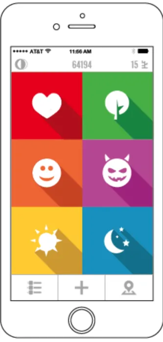
Figure 45: Wish Tree Application - View of six colors in application …... 60
Figure 46: First map of Wish Tree as a mobile application ………... 62
Figure 47: Wish Tree Application - Loading Screen ………..…...…... 63
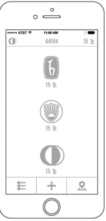
Figure 48: Wish Tree Application - 3 Locations of virtual tree ….……....…... 64
Figure 49: Wish Tree Application: Icons are refering “Old Wishes - New Wish – Change Location” sections ………...…... 65
Figure 50: Wish Tree Application: Representation of love wish icon in passive and active form ……...………... 67
Figure 51: Wish Tree Application: Representation of life wish icon in passive and active form ……...………... 67
Figure 52: Wish Tree Application: Representation of good wish icon in passive and active form ……...………... 68
Figure 53: Wish Tree Application: Representation of evil wish icon in passive and active form ……...………... 69
Figure 54: Wish Tree Application: Representation of one day wish icon in passive and active form ……...………... 69
Figure 55: Wish Tree Application: Representation of imaginary wish icon in passive and active form ……...………... 70
Figure 56: Wish Tree Application: Location Selection Screen ... 72
Figure 57: Wish Tree Application: View of Pst Wishes Screen ... 73
Figure 58: Wish Tree Application: Workflow ... 80
Figure 59: Wish Tree Application: Graphical User Interface of Loading Screen ……...………...……... 81
Figure 60: Wish Tree Application: Graphical User Interface of Main
Screen ……...………...……... 82
Figure 61: Wish Tree Application: Graphical User Interface of “Full and
Closed / Past” Wish Tree Selection ……...…... 83
Figure 62: Wish Tree Application: Graphical User Interface of Full and Closed
Wish Tree ……...………...……... 84
Figure 63: Wish Tree Application: Graphical User Interface of Wish Tree’s
Location Selection ……...……….……... 85
Figure 64: Wish Tree Application: Graphical User Interface of Hacettepe
University’s Wish Tree Selection ……...……... 86
Figure 65: Wish Tree Application: Graphical User Interface of İ.D. Bilkent
University’s Wish Tree Selection ……...…... 87
Figure 66: Wish Tree Application: Graphical User Interface of Middle East
Technical University’s Wish Tree Selection ……...…... 88
Figure 67: Wish Tree Application: Graphical User Interface of Past Wishes ... 89 Figure 68: Wish Tree Application: Graphical User Interface of Add New
Wish ……...…... 90
Figure 69: Wish Tree Application: Graphical User Interface of Add New
“Love” Wish ……...…... 91 Figure 70: Wish Tree Application: Graphical User Interface of A New “Love”
Wish Selection ……...…... 92
Figure 71: Wish Tree Application: Graphical User Interface of Add New
Figure 72: Wish Tree Application: Graphical User Interface of A New “Life”
Wish Selection ……...…... 94
Figure 73: Wish Tree Application: Graphical User Interface of Add New
“Good” Wish ……...…... 95
Figure 74: Wish Tree Application: Graphical User Interface of A New “Good”
Wish Selection ……...…... 96
Figure 75: Wish Tree Application: Graphical User Interface of Add New
“Evil” Wish ……... 97
Figure 76: Wish Tree Application: Graphical User Interface of A New “Evil”
Wish Selection ……...…... 98
Figure 77: Wish Tree Application: Graphical User Interface of Add New “One
Day” Wish ……... 99
Figure 78: Wish Tree Application: Graphical User Interface of A New “One Day”
Wish Selection ……...….... 100
Figure 79: Wish Tree Application: Graphical User Interface of Add New
“Imaginary” Wish ……... 101
Figure 80: Wish Tree Application: Graphical User Interface of A New “Imaginary”
Wish Selection …... 102
Figure 81: Wish Tree Application: Graphical User Interface of Six (6) Wishes on
Wish Tree ……... 103
Figure 82: Wish Tree Application: Graphical User Interface of One
Hundred Fifty (150) Wishes on Wish Tree ... 104
Figure 83: Wish Tree Application: Graphical representation of “Love
Figure 84: Wish Tree Application: Graphical representation of “Life
Wish Icons” in active form ... 107
Figure 85: Wish Tree Application: Graphical representation of “Good
Wish Icons” in active form ... 110
Figure 86: Wish Tree Application: Graphical representation of “Evil
Wish Icons” in active form ... 112
Figure 87: Wish Tree Application: Graphical representation of “One Day
Wish Icons” in active form ... 114
Figure 88: Wish Tree Application: Graphical representation of “Imaginary
CHAPTER 1
INTRODUCTION
Since the first invention of the mobile devices, the applications and the device modulus types have been developed day by day. According to development of technology, mobile devices maintenance cost decreased and this reality ensures that the usage of area getting widely. This reality is also backed by fact that there exist an exponential growth in numbers of users who lack of the general commands of computer and mobile device use, as the usage of new technologies and internet, has become widespread. Now these ordinary users, or so called novice users, are at the heart of the market which readily ships new apps very rapidly. However, there has been a limited effort towards understanding how ordinary mobile users perceive the graphical user interface icons. It is obvious that, while more people started to use mobile devices as a part of their daily life, the new era called “Graphical User Interface (GUI) on Mobile Devices” got specific importance.
GUI is a bridge that connects mobile device and the novice user. More precisely, GUI relates the device functions and operations to elements that constitutes the notion of interaction (i.e. sounds and visuals). In this regard, functionality that users require while performing actions on mobile user interfaces are represented by icons.
An icon is essentially a pictogram that symbolically represents an action. Advocates of interfaces which contain icons claim that they have advantages. Shneiderman suggests that they are effortlessly recognized (1993). Similarly, as Seoul implies, graphical representations makes it easier to recognize and memorize functions of an application (2005). Considering the importance of iconic interfaces for novice users, it is easy to see that effectiveness of an icon relies on several aspects such as visibility, legibility and comprehensibility.
Matsey (1996) stressed on simplicity and clearness of a good icon design whereas several studies stressed the cognitive features of icons which affects the effectiveness of the icons, as pointed out in Blattner (1989) and Familant and Detweiler (1993). Recent practice around mobile design benefits and supports these ideas and they are popular since they represent the functionality of the tasks more than other entities, they are space saving, they reduce complexity and they provide direct access. This thesis addresses the question that whether graphical icons can effectively represent the functions and attributes that they refer to according to the novice user, target media and audience.
This thesis, consisting of 3 main chapters, investigates the historical development and evolution of icons in detail from the cave paintings to today’s contemporary ideas. The first chapter will be expanded upon the historical and theoretical background of the process of icon creation, icon’s recognition rate and icon as an ultimate communicator before the computer age. In other words, the timeline of icons from the ancient times to 1960s will be examined in this first chapter which aims to uncover the questions of when icons were appeared and how did they developed. Experimentation of icons, or in other words “non-linguistic visual language tools” by their creators in various forms is investigated in detail. In this chapter, the relationship of icons with petroglyphs, hieroglyphs, tallies, property marks, memory aids, pottery decorations, traffic signs and pictorial narratives is addressed.
The second chapter analyses the desktop icons, which were introduced into our lives with a different definition when the computer age started 50 years ago. This chapter firstly addresses the historical development and evolution of desktop icons in detail and then it rigorously looks at the visual and structural relationship of icons used in the mobile devices with the mobile user interfaces, also including the extensive review of the new definition of icons, their position in the digital media and their purpose of use in the graphical user interfaces. In addition to these, creation, classification and semiotics of icons on mobile device graphical user interface are the additional topics, which are covered through this chapter.
The third chapter describes the artwork of this thesis from the perspective of textual elements and visual communication. Starting with the explanation of the process of artwork development, which is the part that composes the subject of this thesis, this chapter concludes with presenting how the final project was embodied. The resulting art project was experimented by considering the icons with their form, functionality, perception, structure and design fundamentals.
CHAPTER 2
ICON AND ICONOGRAPHY
“Icons have been part of the collective subconscious of the human race since earliest times.”
Albertine Gaur, 1997
The present time, blended with the traces of the past, is shaping the future as much as possible. Icons are always in human’s mind with their joint existence in these three different time concepts. From images engraved onto the walls of caves and rocks to the user interfaces of today’s technology, icons are evolving in a trajectory without boundaries as an extension of human life.
Human history bears all the traces and remnants of the experiences. Even though these traces and remnants has affected and changed the content of the present time in which the humans are living in, they cannot touch the codes that are necessary for life to go on. In other words, ‘life’ needs these essential codes to continue.
Humans maintain their vital functions with the actual codes of life. While trying to maintain their vital functions, human beings interact with each other as well as the surrounding objects and they try to communicate while performing this interaction. It
is possible that there are differentiation of representations but functionally all the communication tools have same duty to express what will be presented. Based on anthropological studies it is suggested that paintings, signs, symbols and icons decorated on the caves are the first ways of communication (Meggs and Purvis, 2012).
2.1 What is Icon and Iconography?
2.1.1 Definition of Icon
According to dictionary, word of icon’s origin is Greek “eikon”. Eikon, in other words icon, is explicated as “figure” and “image”.
Icons can be considered as non-verbal visual language and representative symbols. They are also graphical representations to express the idea directly. They can be an abstract representation of everyday objects, as well as it is concerned as a pictorial representation of any actions (Barker, 2000).
2.1.2 Definition of Iconography
Process of icon creation, or in other words, the ability to formulate and record thoughts and ideas using graphic symbols, is called Iconography, which can also explained as “iconic communication”. According to definition of Webster’s New World College Dictionary, iconography comes from the Greek “eikongraphia” which refers to “a sketch or drawing of an image”. Iconography tries to understand and explicate the meaning behind representations which are mostly dealing with one or two dimensional depictions (Gaur and Sassoon,1997).
2.2 Historical Evolution of Icon and Iconography
Research on human race shows that usage of icons seems like visual representation is known from since ancient times. History of iconography, or in other words “iconic communication”, dates back to 35000 B.C. Ancestry of icons still reflects the important facts and experiences of the age they were produced. These very first cave paintings and drawings made by settlers of ancient times consist of signs and symbols.
Numerous studies suggest that cave drawings and paintings are the foundations of communication with non-verbal visual language. These are representations of single animal and human figures in some cases but for the later periods, which date to around 10000-8000 BC, there are frescoes which includes narration of warfare, hunters hunting animals or dancers among animals (Leroi - Gourhan, 1965).
Figure 1: Cave painting. 16.000 BC. Lascaux, France. http://www.redicecreations.com
Simple pictorial images are used in order to tell stories, document myths and provide instructions by primitive people from the cave paintings times to Petroglyphs Era (Horton, 1994). There are other academic researches and scholars which provide and support Horton’s academic research result. Abstract shapes and representations similar
to the these which were engraved in the caves, can also seen in the symbols that are drawn by shamans while performing their religious rituals. According to some scholars, these symbolic sketches, that shamans use are, utilized to communicate with the “spirit of the world” (Meggs and Purvis, 2012).
The abstract shapes and representations, animal figures, human figures, petroglyphic figures and signs that were drawn by the prehistoric people, who lived between 15.000-10.000 BCE, to record their experiences to cave paintings were in fact simple. It is clear that human beings were unable to generate complex idea in that time. In other words, since the abstract thinking was not sophisticated compared to today’s ideas (process of thinking), it was given importance to simplification while making cave paintings. This importance given to simplification not only formed the ancestry of pictographs but also marked start of the history of iconography.
Interestingly, though geometric and emblematic symbols like dots, squares, triangles and rectangles are not present in the nature, paleolithic man perfectly depicted and attached these geometric and emblematic symbols into the simple animal and human figures (Herzog, 2010).
Figure 2: Abstract shapes, animals and human figures. Philip B. Meggs and Alston W. Purvis. Meggs’
History of Graphic Design. 2012. “Found carved and sometimes painted on rocks in the western United States, these petroglyphic figures, animals, and signs are similar to those found all over the world”(
Philip Meggs, 2012.)
On the other hand, As can be seen at Figure 2, some of these geometric and emblematic symbols; lines, dots, triangles accompanied with animals are in fact pictographs, ideographs and symbols that represent ideas when examined from visual communication perspective (Meggs and Purvis, 2012).
Important aspects of tribal life were depicted to create a considerably complex iconography such as spirals indicating water holes, simple animal forms, or lines showing the rivers (Figure: 3) by North American Indians using a special technique called pecking (Stokes, 1980).
Studies show that primitive people switched to cuneiform in the Sumerian ages whereas they used their fingers and also various tools to depict objects (Gaur and Sassoon, 1997). They started to represent the ideas using pictograms, phonograms and graphic symbols together in an abstract way using cuneiforms. With the civilization, community life and commerce had developed significantly and people started to think more complex ideas. They needed to express abstract ideas to deliver these complex ideas. In other words, transition to cuneiform and civilisation of society gave rise to ideograms.
Cuneiform transformed to rebus writing that represented as phonograms, pictographs or graphical symbols for the sound as the object instead of itself (Figure: 4). Ideas which are being represented with those ideograms eventually evolved to represent "same and similar sound as the object depicted" (Meggs and Purvis, 2012).
Figure 4: A clay tablet the shows the evolution of Sumerian symbols of star (has also meaning of heaven or god as an ideogram), head and water from early pictographs (3100 BC). Philip B. Meggs and Alston W. Purvis. Meggs’ History of Graphic Design. 2012.
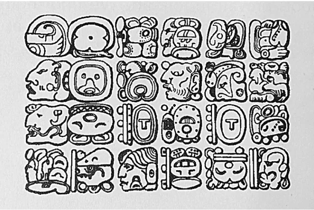
Iconography or in other words "the iconic communication" has become the milestone for visual verbal communication while evolving with the introduction of pictograms. Studies show that all written languages has emerged while pictograms are getting simpler by time. First instances of simplified pictograms can be seen in Mayan hieroglyphics (Figure: 5).
Figure 5: Mayan Hieroglyphics. William Horton. The Icon Book: Visual Symbols for Computer
Systems and Documentation. 1994.
Gaur suggests that connection between iconography and writing goes back to Maya’s era. Similar to ancient Egyptians, Mayans used logograms (icons) and the rebus principle (phonetic), transferred the sound of a word using the same sign to another word. Even the people who are not familiar with Maya writing can recognize these three glyphs; vulture, torch and a bundle of pine which can also represent phonetic parts of the other words like affixes (Figure: 6).
Figure 6: The three glyphs; vulture, torch and a bundle of pine. Rosemary Sassoon and Albertine Gaur.
Sign, Symbol and Icons: Prehistory of the Computer Age. 1997.
Non-verbal communication had continued to evolve from Mayan Hieroglyphics to Chinese Alphabet. The similarity between real world objects and symbols in chinese alphabet is more obvious than the symbolic representations that other alphabets also have (today, some of the symbols in the Chinese Alphabet had subtle changes whereas other symbols has been the same for ages). While this change was going on, alphabets has transitioned from using rich drawings to simple line drawings (Horton, 1994).
People who favor the theory of most scripts more or less emerged from iconography, often refer to the simple communities in Africa, America and Alaska which in the course of 19th and 20th century evolved (Schmitt, 1980). Same pattern in their development can be seen in most cases. Scripts start with iconographic design in most cases, similar to those used in tribal community, then follows the introduction of phonetic elements, mostly by means of rebus principle, then comes the syllabic script (Gaur and Sassoon, 1997).
Bamum script (Figure: 7) is one of the most important African scripts as an example which was found by King Njoya and his dignitaries between 1903 and 1918 (Jensen, 1970; Schmitt, 1980). Initially a picture script; it developed into a script that facilitates simplification of signs and use of phonetic values. This can be used to exemplify the origin of writing, while remembering that development of writing moved from abstract to pictorial icons. In the light of these facts, development pattern seems to follow abstract script signs to pictorial ones related to art or magic, to abstract writing systems and back to icon signs related to computer (Gaur and Sassoon, 1997).
Figure 7: Bamum Script of Africa. Rosemary Sassoon and Albertine Gaur. Sign, Symbol and Icons:
Prehistory of the Computer Age. 1997.
As it can be seen in the ancient Egyptian Hieroglyphics (Davies, 1987) and also cuneiform script of Mesopotamia, to form the basis of systematic writing, icon is at first fits into a convention and starts to represent by means of rebus transfer.
As Moore points out, iconography was also important in ancient Egypt since it is used in all aspects of life, religion and thought. Before their decryption, hieroglyphics were thought as symbols of basic meaning and wisdom but not a form
of writing. This is true in some cases like the hieroglyphics for ankh, symbol of eternal life, which also appears in Coptic Christianity as a cross alternative (Figure: 8).
Figure 8: Egyptian hieroglyphic symbol of ankh. Rosemary Sassoon and Albertine Gaur. Sign, Symbol
and Icons: Prehistory of the Computer Age. 1997.
Egyptian Hieroglyphics were also used in the secret communications in government, military, diplomatic and commercial communications, thus important in the development in cryptography. To the end of Ptolemaic period and during to Roman emperors, a spelling unintelligible to other people were developed by using certain hieroglyphics (Gaur and Sassoon, 1997).
Even though some scholars think that phonetic writing overshadowed the iconography, the arrival of systematic and phonetic writing did not end the iconography; in fact, many phonetic scripts facilitated a high level of iconography. For example, Mayan writing used in many pictorial representations (Thompson, 1972). Using iconographic elements of important aspects of Mayan life, were shown this way. Texts become intelligible even to people without literary competence due to the wealth of iconography that is used (Houston, 1989). Iconographic elements also can be used to distinguish Aztecian Scripts. Interestingly, using pictures and symbols can be also found in some Buddhist and Hindu manuscripts which aims to assist to the those with limited literacy (Gaur and Sassoon, 1997).
A wealth of iconographic devices can be seen in Western medieval manuscripts such as ornaments in the text, colored carpet pages or putting contrast on important pictorial initials. Western calligraphy gave importance to initials until the invention of printing in 15th century. They have various features like abstract patterns, religious motifs,
natural or monstrously depicted animals, architectural forms, humans, biblical portraits or historical persons. Initials can hint the theme of the text or can have images usually related to Christianity (Figure: 9).
Figure 9: Iconography examples from Christianity. “The nails, a symbol of the crucifixion of Christ. The key of St Peter (St Matthews 16:19 'I will give unto thee the keys to the kingdom of heaven'). The fish as symbol of Christ. The dragon as a symbol of the devil, the enemy of God. The scorpion which can stand for Judas. The shell, now associated with St James and pilgrimage but originally a symbol of
Venus.” (Ferguson, 1954). Rosemary Sassoon and Albertine Gaur. Sign, Symbol and Icons: Prehistory of the Computer Age. 1997.
Usefulness of manuscripts has been decreased by the Gutenberg revolution which was a consequence of the increased importance given to systematic writing around 3000 BC which initiated the destruction of oral communication traditions (Gaur and Sassoon, 1997). The need for iconographic aid did not disappear when importance of the printing has increased. Printers even tried to use those abbreviations and imitate handwritten book. A large number of iconic symbols is still used today, £, $, %,, #, @, [, ], <, >, /, +, =, or *; and punctuation marks like ?, !, :,.
According to Albertine Gaur (1997), there is a system of shorthand invented by the secretary of Cicero, Marcus Tullius Tiro was used to derive abbreviations in order to record speeches made in the Senate, which became importance in the middle ages. In Figure 10, some special abbreviations can be seen.
Figure 10: Special abbreviations. Rosemary Sassoon and Albertine Gaur. Sign, Symbol and Icons:
Prehistory of the Computer Age. 1997.
In addition to these, some authors and scientists have used their own iconic abbreviations. They can be seen in their diaries, personal notes, letters and secret files. For instance, German traveller and physician Engelbert Kaempfer used this kind of abbreviations in the book he wrote in 1688 titled Notitiae Malabarica (Gaur and Sassoon, 1997).
Almost all phonetic writing systems has integrated iconographic elements. For example, Latin or Roman Alphabet goes back to Greek Alphabet via Etruscan Script which was a modification of Phoenician Consonant Script. Middle age scribers used lots of abbreviations to save time and space. Readers were familiar Biblical texts or Latin texts since it was important to be familiar with them to understand iconographic devices. However increasing complexity of the texts and printing mistakes has obscured some abbreviations by time (Gaur and Sassoon, 1997).
At the same time, streamed lines and stylized symbols (in other words icons) has been used in the pottery, in the clothing as patterns or as a decoration on jewellery since Folk Art Era (Figure: 11).
Figure 11: Examples of Folk Art. “Consider these bird signs from pottery of the Pueblo People from
the Southwest Indians, by Dorothy Smith Sides. Left part: Zuni. Right part: Acoma”. William Horton. The Icon Book: Visual Symbols for Computer Systems and Documentation. 1994.
The era of the Pueblo People from American Southwest to Alchemy, Astrology, Masonry and even Christianity has continued to use icons (Figure: 12) to communicate in a way that everyone can understand or sometimes in an esoteric manner that only selected individuals can understand (Koch, 1955).
Figure 12: Esoteric and occult symbols. William Horton. The Icon Book: Visual Symbols for Computer
Systems and Documentation. 1994. “In the middle Ages esoteric signs were developed by practitioners of alchemy, astrology and masonry. It is noticeable that esoteric and occult symbols are designed as icon-like simplicity.” (Rudolf Koch, 1955).
Throughout the history, humans have positioned the concept of “possessing” and “belonging to” into their lives. Icons has been used in the field of marks and ownership for centuries. As Gaur’s History of Icon studies suggests, “As time goes by, tribal people such as Aborigines from Australia sophisticated the iconic communication between other tribes as well as in the tribe they belong to” (Gaur and Sassoon, 1997).
Message sticks have appeared for this purpose and been used universally since then. These message sticks forms symbolic meanings which can be understood by other people when used alone or used in combination with other sticks (Figure: 13). The combination patterns on the sticks, different color schemes, simple and distinct symbols hints which tribe these sticks belong to even though they have the same meaning (Gaur and Sassoon, 1997).
Figure 13: Some Stick examples from Dakota. “Dakota winter counts are usually written on buffalo
skin, sometimes in a spiral from the centre outward, each picture recording the most important events of the year; here the period 1800-70” (Mallery, 1893). Rosemary Sassoon and Albertine Gaur. Sign, Symbol and Icons: Prehistory of the Computer Age. 1997.
Just as the visual symbols (such as; logo and trademark) related to the their names are more recognizable rather than names of the products on the market today, items belonging to tribes with their specific symbols are used for both to differentiate and identify their belongings (Horton, 1994). For instance, American Southwest cattle ranchers marked cattles with distinct, simple and robust symbols (Lehner, 1950). An example of robust symbol is can be seen in Figure 14.
Figure 14: “Lizard Ranch. Texas. 1857.” Ernst Lehner. Symbols, Signs and Signets. 1950.
The icons on these wooden sticks started to cover the surface of properties by time. These icons, which are called “property marks”, has design aspects as being abstract or pictorial. They are usually used to indicate prestige as in the regimental badges, prestigious family or lineage marks, banners and national flags (Gaur and Sassoon, 1997) Different property mark examples can be seen in Figure 15.
Figure 15: Property mark examples. Rosemary Sassoon and Albertine Gaur. Sign, Symbol and Icons:
Whether using a symbol referring a property of a tribe or to represent and differentiating a ranches or tribes among others; icons are used since the prehistoric ages to today. Today, every institutions, political parties and commercial firms have used property marks in the iconic form of logos recently. These icon based logos are designed by consultants or graphic artists to exhibit the prestige, authority and essence of the group that owns a particular product or idea. Interestingly, there exists no relationship between products or ideas and the iconic logo that is designed to represent them in modern logo design (Gaur and Sassoon, 1997).
Another medium from ancient times that uses iconic representation is seals (Figure:16). According to Gaur’s research, seal is a form of highly sophisticated property mark. Seals had personalized patterns and were used as signatures dating to as early as 4000 BC (Gaur and Sassoon, 1997). Even though the writing was well established around 3000 BC, importance of the seals increased around the same time trade and commerce was in rapid development which also influenced the development of writing in Crete with the influence of the pictorial representations on those seals. Personal seals are still in use in China by painters and calligraphers to claim authorship (Gaur and Sassoon, 1997).
Figure 16: Examples of seal. Rosemary Sassoon and Albertine Gaur. Sign, Symbol and Icons:
As it can be seen from early clay tablets and seals, evolution of writing was centered around property and business transactions in Mesopotamia. Sumerian contribution to the this evolution was cylindrical seals used to combine writing with pictures which reached to a high level of technical and artistic excellence (Gaur and Sassoon, 1997).
As seals can be seen as signatures, a handwritten signature is an iconic way of representing the personal logo that lacks phonetic aspect most of the time that is supposed to signal signator’s name. In a way, a signature is an insight into the way people see and value (Sassoon, 1993).
Icons are used also the representation of a special memory aid form called the tally. Main idea of the tally was to record debt. In other words, they were mainly used in commerce. Another field that iconography is used is the representation of the proverbs. This kind of icons are are called mnemonic icons which have linguistic implications (Gaur and Sassoon, 1997). Mnemonic icons represent the whole sentence. Even though the iconographic visuals of the proverbs does not possess the properties that the linguistic versions have, they successfully deliver the meaning mentally. As Mcleod points out, they are the starting point for a mental or spoken chain of saying (Mcleod, 1981). In the Figure 17; the image of a bird turning its head backwards can mean “a person should not hesitate to turn back to undo past mistakes” (Gaur, 1992).
Figure 17: Ashanti Pipe showing a sankofa bird (right side of stem) turning its head backwards, representing a proverb: Shana West Africa. Albertine Gaur. Origin and Development of Writing. 1992.
Throughout the history, icons have been always an important bridge between word and image. Icons are used traditionally and universally for calculation in commerce, representation of property or individuals as well as notifying, informing or transmitting a message. One of the most important modern day usage is traffic signs (Figure: 18).
Figure 18: Traffic Sign. “Iconography to represent whole sentences, notices, or warnings is also used
in our own environment. Incidentally, the practice of representing water by one or more zigzag (or wavy) lines has persisted throughout history, indeed the Egyptian hieroglyph for 'water' was written in this way.” (Albertine Gaur, 1997). Rosemary Sassoon and Albertine Gaur. Sign, Symbol and Icons: Prehistory of the Computer Age. 1997
One of the most important features of iconographic design is being universally recognizable (Figure: 19). Iconographic designs or representations can express themselves without using any verbal language. In other words, semantic unity of meaning that icons aim to deliver is not limited by language. However, to communicate with icons, audience’s experience and background is very important for icon’s direct meaning to be understood by that audience. Icons, or in other words logograms, are designed in parallel to field of use as well as the socio-economic and socio-cultural facts of the target audience. As Gaur suggests, because all experience is shared by the group, icons can serve an instrument of communication (Gaur, 1997) .
Figure 19: The toilet symbols are an example to iconic communication. It is simple graphical representation. It provides clear and direct information. It can recognizable easly and fast.
Beacker suggests that icons are compact and quickly recognizable (Beacker, 1991, page: 1-6). This is leading to expansion of the its areas of use. They occupy very little
space but represent a lot of information, as Hemenway states, and they can be more distinctive one another more than words can be (Hemenway, 1982, p.20). They become less confusing when they are simpler and less detailed. As number of details used for creating an icon increases, its recognizability decreases. Vaillaincourt suggests that adding too much elements while designing an icon destroys the usefulness of iconic representation (Vaillaincourt, 1998, p.9). Bryne states that simplicity and clarity of icons is important since they should be simple and easily recognizable to benefit visual search effectively. Usefulness of icons is questionable for complex icons since more complex designs make icons harder to discriminate the the simple designs, even the blank icons (Bryne, 1993, p.452).
2.3 Relation between Icon, Iconography and Art
Historically, artist’s use of imagery has been associated with iconography from a secular perspective. An example of this kind of study is Iconologia of Cesare Ripa (Published in 1593). Being translated into pictorial expressions, this is a catalogue consists of designations like symbols and emblems that was brought in from antique literature. Such works centered around iconography in the 18th century mainly studied the account of classification of subjects and figures in early monuments. 19th century studies mainly centered around Christian art religious symbols after these studies detached themselves from archeology. As a matter of fact, iconography was considered as the study of Christian symbols and figures in those days. In the 20th century within a more open minded and liberal Europe, iconographic characteristics of eastern religion and art were eventually brought in.
Ben Nicholson (born in 1894) prefers circles and squares in his works which tends to remind of Zen calligraphers. Highly stylistic eyes and the fish motif in in the frescoes
of John Cocteau (born in 1891) in the Chapel of St Pierre are evocative and difficult to ignore.
However, western painters, independently from these trends, used their personal iconographic expressions to give more insight and meaning to their works. An example of this would be Joan Miro (born in 1893) who created a workbook on furled, rounded and hooked figures which frequently appear in his works (Figure: 20).
Figure 20: Portrait by Miro. 1927.
Picasso (born in 1881) puts figures of bullfight as a central theme which is an idea finely executed in his famous painting Guernica (Figure: 21).
Figure 21: Guernica by Picasso. 1937. “It shows the tragedies of war and the suffering it inflicts upon individuals, particularly innocent civilians. The rampaging bull, a major motif of destruction here represents the onslaught of Fascism. Guernica meant brutality and darkness, presumably reminiscent of their prophetic. The horse represented the people of Guernica.” (Picasso, 1937).
CHAPTER 3
ICON AND ICONOGRAPHY IN COMPUTER AGE
“Before writing there were symbolic shapes. Different symbolic shapes developed into various writing systems. And symbolic iconographies persisted from earliest writing to the present day. Only the symbols changed. As the computer replaces the pen and the brush, so iconography, with today’s symbols, signs and icons prepares for tomorrow.”
Rosemary Sassoon, 1997
3.1 What is Icon and Iconography in Computer Age
In the previous chapter, the definition of icon was given as non-verbal visual language, image and figure. However, in the context of today’s technology icon’s definition has been revised. In this chapter, the new identity of the icons with the start of computer age will be investigated in detail and their definition, evolution and development will be addressed as well.
3.1.1 Definition of Icon and Iconography in Computer Age
The definition of the icon which evolved after the invention of computers is small pictorial symbols or visual representations which are placed on computer or mobile devices’ screen as a part of visual interface. Interface can be explained as “surface regarded as the common boundary of two bodies, spaces, or phases”. This means that “interface is communicator between a sender (application or program on computer), a medium (digitized visual representation of an object or action) and a receptor (audience or user)”. Visual interface is a type of interface which tries to deliver the message to the audience using graphical elements and symbols. Interfaces based on graphical elements are called Graphical User Interface (GUI). Icons are one of the fundamental part of graphical user interface within the “Windows - Icon - Menu - Pointer” (WIMP) model.
Icons are designed to identify any application (such as; program, file, folder, device, web page or command) on computer or mobile devices’ Graphical User Interface (GUI). Icons can be activated by click on with mouse, pointer, finger or voice commands by the user. Aim of the composing them is to help user to navigate application (on computers or mobile devices) and they also supply further information to the user about how to use them.
While lots of resources related to study or science of signs investigate the meaning of icons in the context of semiotics, resources specializing in graphics and visual design investigate the visual quality of icons. Claiming that he uses these two perspectives at the same time, Bryne suggests that 5 main properties are important while classifying the visual quality of icons (1993, p.447). These properties are size, color, form, resolution and organization.
Size: Icons have differences from other images on computer or mobile device screens.
One of the most important difference is that icons have standardization formats. This standardisation is mainly about their size. In other words, icons have specific size, resolution and colors on computer or mobile device screens. Since the
area is limited on computer or mobile device screens, they are usually designed in small sizes.
Color: Color is an important aspect in visual communication. According to Horton,
color makes message of the icon clearer, understandable and opaque (1994, p. 163). The range of colors in the digital media is determined by the device limitations. Icons can be used to communicate if the colors are used accordingly but wrong coloring may mislead and can be confusing. According to Alben, the main principle behind the visual communication of interface is color and color theory and he suggests that colors have a vital impact on human cognition (Alben, page:18-19)
Form: Horton classifies icon forms into 5. These classification is based on how in
detail the icons are designed and how similar they look like real objects. These 5 forms are photograph, drawing caricature, outline and silhouette (1996, page: 372). On the other hand, Rubens suggest that visual forms of digital icons fall into 3 major categories which are “pictographic, representative and abstract”. He states that these 3 forms are sorted from high graphical range to low graphical range while doing visual analysis (Rubens, 1988. p: 25-34).
Resolution: Computers and mobile devices have their own screen sizes. The total
number of pixels in a device increases or decreases proportionally to screen size. Screens on mobile devices or computers work based on bitmap but this does not require icons to be in bitmap format. Icons can be of paths. Those icons based on paths
are in vectorial formats. Icons which consist of pixels are bitmap based. The reason that icons are not overdesigned, complex or detailed is this resolution limitation and designs are as simple as possible since it becomes harder to recognize icon when there is a change in resolution.
Organization: Bryne states that the organization of icons in the spatial medium can be
assessed by looking at the icon’s purpose, placement, in what visual form it was designed as well as color and size. Some interfaces have a grid-like organization and some have staggered grid organization. When designing icons, multiple graphical symbols can be used with same visual representation and graphical symbols. These visual representation or graphical symbols can be different size and color. Different colors can be also used in the backgrounds of graphical symbols of icons. Icons can contain different visual aspects between transparent to opaque. This means icon can have areas which are non-opaque (transparent), or in other words having an opacity of 0. And icons can be fully opaque without any transparent areas (Bryne, 1993, page: 447).
3.2 History and Evolution of Icon and Iconography in Computer Age
As it was always a part of human history, icons again gained a new seat in human life with the start of the electronics age. With one of the most important revolutions in the electronics age, the invention of computer, icons secured their place thoroughly. While icons are being used to help communication as in the ancient times, they also claimed the role of providing and solidifying ‘human computer interaction` (HCI).
With the development of technology at unpreventable speed, computers and mobile devices became one of the everyday objects of human life and they required Graphical
User Interface (GUI) to provide the interaction between the device and the user. History and evolution of GUI started when the computers came into our life in 1975.
Before 1975, HCI was carried out using a word based interaction. This form was called command line interface (CLI) in which the keyboard had a major role. Evolution of digital icons has found their true meaning with the invention of mouse by Douglas Engelbart in 1963 (Figure: 23). Icons are part of the Graphical User Interface to provide communication between user and the computer or mobile device. “GUI is the body of application or machine. And olsa GUI is the facing part of applications” (Lal, 2013). Icons are building blocks of the GUIs.
Another development that has contributed to the evolution of icons is Sketchpad, an application by Ivan Sutherland which has the one of the first instances of a GUI (Sutherland, 2003). First instances of icons are also can be seen in WIMP model GUI designed by Alan Kay for Xerox PARC in 1975. After Xerox PARC with WIMP GUI, first commercial GUI has been released with Xerox Star (Tuck, 2001) (Figure: 22).
Figure 22: The original Xerox Star GUI. “Workstation introduced the first commercial GUI operating system.” (Wikipedia 2005 – This image used under Creative Commons License).
The icon design and the interface design was black and white and bitmap. It can be seen that icons have an internal unity. Being the ancestors of the most of the desktop icons that are being used today, they are designed with the amount of efficiency and degree of availability in mind (Figure: 23). In other words, first icons of the computer age did not lose their semantic unity. This means that icons are metaphor and interaction idioms which preserve their meaning not only in the time they are designed but for every time.
Figure 23: Xerox Star icons. “In 1981, the Xerox Star used a graphic user interface introducing large
and unicolor icons. This system, successor of the Xerox Alto was the father of the current folders, trash bins and other icons still around.” (http://iconlibrary.iconshock.com/icon-history/ – This image used
under Creative Commons License).
The emergence and development of icons in the digital medium that were already being used in mobile devices has started with the icons in Xerox Star and continued with Apple Lisa, which was the Apple’s first commercial mass production computer (1983). In 1984, Apple Macintosh, whose icons were designed by Susan Kare, has created the foundations of the today's icons like recycle bin, hand, paint bucket, mail, pencil, spray, arrow and so on (Figure: 24).
Figure 24: Susan Kare icons for Apple Macintosh. It is obvious that simplicity is Kare's major philosophy on icon design. She said that; "I believe that good icons are more a kind to road signs rather
than illustrations, and ideally should present an idea in a clear, concise, and memorable way. I try to optimize for clarity and simplicity even as palette and resolution options have increased." (Susan Kare)
(http://www.kare.com/articles/sjmerc.html – This image used under Creative Commons License).
According to my analysis, the common feature of the icons that have been being used in the computer age is that they are designed with clarity and simplicity. Ideogrammatic representation is one of the categories that Doblin used while describing the iconographic symbols, in other words symbols that carry visual information. Ideogrammatic representations are symbols that have a single meaning such as road signs (Doblin, 1980). In agreement with Doblin’s idea, Susan Kare believed that good icon should be similar the road sign and she made her icon designs in a simplicity based design way (Kare, 1984).
The journey that started with the idea of simplicity had another perspective when Hunter, Crismore and Pearson suggested that the evolution of icon and orthography has a photographic base and going forward they also added that icons are evolving from realistic towards abstract (Hunter, Crismore and Pearson, 1987). According to Wileman, any representation of an object can be seen as a symbol and pictorial symbols (icons) are one of the most frequently used forms of those representations (Wileman, 1993). While the studies around the description and the development of the link between icons and digital media, most frequently used icons had their places on the color screens. Starting with four colors in 1985 (Figure: 25), icons had more colors, shadow, outline and a square form (because pixel density did not allow rounded shapes) and became more stylized in 1991 (Figure: 26).
Figure 25: “The icons in the Amiga Workbench system, 1985.”
(http://design.tutsplus.com/articles/sd-9805#disqus_thread – This image used under Creative Commons License).
Figure 26: The colored icons from the Macintosh in System 7 , 1991
(http://design.tutsplus.com/articles/know-your-icons-part-1-a-brief-history-of-computer-icons--psd-9805#disqus_thread – This image used under Creative Commons License).
In 1995, icon design had less stricter rules after due to the advancement in technology. Use of rounded corners started which was not allowed due to pixel density of the screens. Designers used isometric design in some cases, favoring a plain but with multiple colors as well as rounded corners (Figure: 27).
Figure 27: Icon examples from 1995’s GUI: More colors to the icons and few more isometric designs.(http://design.tutsplus.com/articles/know-your-icons-part-1-a-brief-history-of-computer-icons--psd-9805#disqus_thread – This image used under Creative Commons License).
In 1997, icons were empowered by the light, gradient and shadow and they had a more realistic view. Menu icons were still plain, flat and had little shadow, system icons were in 3d shapes (Figure: 28).
Figure 28: Icons in different characteristic styles. (http://design.tutsplus.com/articles/know-your-icons-part-1-a-brief-history-of-computer-icons--psd-9805#disqus_thread – This image used under Creative Commons License).
In 2001, icon were dramatically realistic, almost a photographic view. Some advocated the change of icons in this way and they contrasted the representation of reality was perfect in this kind of depictions (Figure: 29). They were seen as works of art which have visual elements so well designed that they wouldn’t need texts or similar additional complementary items.
Figure 29: Icons in 2001, Mac OS X v10.0. Icons are ultra shiny and they look like plastic-jelly.” (http://design.tutsplus.com/articles/know-your-icons-part-1-a-brief-history-of-computer-icons--psd-9805#disqus_thread – This image used under Creative Commons License).
Flat design was emerged in 2000s since there were too many imitative designs which have glossy elements, realistic shapes and so on. This was a reasonable shift because flat design requires fewer hardware resources and mobile devices did not have a significant performance, so designers preferred to design as simple as possible (Figure: 30).
Though there was a shift towards responsive web and flat design in icons as well. Major companies did not have flat design until the release of the flattest OS of its time
in 2012. Note that icon design trends lost its tie to computer operating systems with emergence of these design as computers lost their position to mobile devices.
Figure 30: In Windows 8, the icons look like traffic signals and pictograms. (http://iconlibrary.iconshock.com/icon-history/ – This image used under Creative Commons License).
Using plain frames and solid colors and removing any shadows, patterns and similar design elements, icons bear a resemblance to traffic signals and pictograms. They become more stylized and attractive compared to 80s even though they don’t have rounded corners when pixel density had increased with the advancement in display technology.
If the consider the computer screens as the primary living spaces of the icons, secondary living place is, without any doubt, the mobile device user interfaces. It is a truth that as the usage of smartphones increased, novice users become face to face with mobile device graphical user interfaces more than they do with computer user
interfaces. This led to the appearance of mobile user interfaces as the secondary home and also led the emergence of developing new visual strategies.
3.3 History and Evolution of Icon and Iconography on Mobile Device’s GUI
The term “mobile” is used to describe things that can move in the space. Even though we are used to hear the term “mobile” in the today’s digital devices such as smartphones, tablet computers and so on, its history goes back to papyruses. In fact, the change in the culture becomes very significant when a medium that had been considered to be fixed gains mobility. For example when engravings on the stone pieces evolved into marks on papyrus or paper, culture has undergone a significant transformation. Similarly, this kind of shift has been in progress between computers and mobile devices. With this shift, a new body emerged in the digital age. As McCullough notes on the importance of activity and variability of the device, “Computing, not computers will characterize the next era of the computer age” (2004). Being a trending idea in technology, mobile devices have an indispensible position in human life last 20 years. These humans as novice users continue their lives by internalizing the icons in the screens of the mobile devices.
At the beginning, novice users interacted with these icons to activate or deactivate the mobile devices and the applications on mobile devices. History of graphical user interface on mobile devices started with the introduction of the first commercial phone DynaTac 8000X by Motorola in 1983, which had an interface that is letter and number based. Since the screen size of DynaTac 8000X was narrow and small. It’s screen has a single lined area which represented only phone number. Numbers was visualized in
portable mobile phone, MicroTac 9800X. MicroTac 9800X had the same screen properties but additionally it had the (red) color. In 1992, Nokia released the first mass production mobile phone Nokia 1110. It had a bitmap interface like its predecessors. From 1983 to 1993, mobile phones were built around one application, which is making a call. However, in 1993, IBM announced Simon Personal Communicator, which had additional applications, namely a message, send and receive an email, a calculator, a calendar and an address book. Screen of Simon was designed as touchable and had dimensions of 36x115mm. Simon’s screen size was considerably bigger compared to the screens of its predecessors and its interface had bitmap icons (Figure: 31).
According to Lewis, replacing standard keyboard with touch screen made it available to introduce more applications to Simon (1996). These applications, which have different functions, were represented with icons. From the visual identity perspective, mobile GUIs, which evolve in parallel with computer GUIs, was represented as outlined at first. Simon’s icon designs were familiar with computer icons and this made icons in Simon more user friendly and understandable. Blended with desktop computer icons, Simon’s application icons were stylized in bitmap format. Active and deactivated forms of these simple and tiny icons were emphasized with changing their background color.
The “color” element which was not used before 1998 was chosen to be tried by Siemens and was implemented to the model called S10 which was released as the first mobile phone with color display (Figure: 32). Icons in this model consist of primitive colors (red, green, blue and white). Designed as bitmapped, colorful and outlined, these icons revolutionized the mobile graphical user interfaces and had named themselves in the mobile icon design literature.
In 2000, Samsung integrated a camera for the first time for a mobile phone and released Sharp J-SH04. Icons were pixel-based and colorful. In 2001, Nokia developed a cartoonistic mobile interface in Nokia 9210 Communicator, which had an LCD screen of size 640 x 200 pixels and 4096-color palette. Icons in this interface were designed as plain, colorful, detailed, shadowy and angular. These icons were well designed, consistent and relatively attractive at that time. (Figure: 33).
Figure 33: Icons on Graphical User Interface of Nokia 9210 Communicator
Nokia N95 was released in 2006 and icons used in its interfaces had lights, color, gradients, shading, transparency and shadows (Figure: 34). This kind of structure provided a realistic look than the previous designs in graphical mobile user interfaces.
Figure 34: Icons on Graphical User Interface of Nokia N95
In 2007, Apple announced iPhone, later to be considered as a revolutionary product. The design principle for the icons used in iphone’s interface was skeuomorphism, which relies on real-world metaphor textures such as realistic vectoral representation of leather, wood, paper and glass. One of the distinctive features of the icons in iOS, the operating system behind the iPhone, is that all the icons in the interface have the same size and shapes, in addition to the icons edges that are beveled and makes semi-realistic convexed style icons (Figure: 35).