A COMPARATIVE STUDY ON COLOR PREFERENCES OF CHILDREN FOR THEIR SCHOOL ENVIRONMENTS:
TWO PRIVATE SCHOOLS IN ANKARA
A THESIS
SUBMITTED TO THE DEPARTMENT OF
INTERIOR ARCHITECTURE AND ENVIRONMENTAL DESIGN AND THE INSTITUTE OF FINE ARTS
OF BİLKENT UNIVERSITY
IN PARTIAL FULFILLMENT OF THE REQUIREMENTS FOR THE DEGREE OF
MASTER OF FINE ARTS
By Zeynep Başoğlu
I certify that I have read this thesis and that in my opinion it is fully adequate, in scope and in quality, as a thesis for the degree of Masters of Fine Arts.
_________________________________ Dr. Sibel Ertez Ural (Principal Advisor)
I certify that I have read this thesis and that in my opinion it is fully adequate, in scope and in quality, as a thesis for the degree of Masters of Fine Arts.
__________________________ Assoc. Prof. Dr. Cengiz Yener
I certify that I have read this thesis and that in my opinion it is fully adequate, in scope and in quality, as a thesis for the degree of Masters of Fine Arts.
__________________________ Assoc. Prof. Dr. Feyzan Erkip
Approved by the Institute of Fine Arts
_________________________________________________ Prof. Dr. Bülent Özgüç, Director of the Institute of Fine Arts
ABSTRACT
A COMPARATIVE STUDY ON COLOR PREFERENCES OF CHILDREN FOR THEIR SCHOOL ENVIRONMENTS:
TWO PRIVATE SCHOOLS IN ANKARA
Zeynep Başoğlu
M.F.A. in Interior Architecture and Environmental Design Supervisor: Dr. Sibel Ertez Ural
February, 2002
In this study, abstract single color and color scheme preferences of children for their school environments and the effects of age, gender, and functions on preferences have been analyzed. Also, the importance of the use of the appropriate and preferred colors in the environments has been explored. For the study, two urban private schools with different color scheme applications in Ankara have been chosen and examined according to the objectives. The two chosen schools are the ODTÜ Geliştirme Vakfı İlköğretim Okulu and Özel Bilkent İlköğretim Okulu. Depending on the outcomes of the results, comparisons between the subjects of the two chosen schools have been done, the reasons for differences in the preferences have been discussed and suggestions for color applications in the school environments have been done.
Keywords: Color in architecture, Color schemes, Color preferences, Elementary school environments, Elementary school children.
ÖZET
ÇOCUKLARIN İLKOKUL ÇEVRELERİNDE RENK TERCİHLERİ ÜZERİNE KARŞILAŞTIRMALI ÇALIŞMA:
ANKARA'DA İKİ ÖZEL OKUL
Zeynep Başoğlu
İç Mimarlık ve Çevre Tasarımı Bölümü Yüksek Lisans
Tez Yöneticisi: Dr. Sibel Ertez Ural Şubat, 2002
Bu çalışmada, ilkokul çocuklarının soyut renk tercihleri ve okul çevreleri için renk tercihleri ve yaş, cinsiyet ve fonksiyonun bu tercihler üzerindeki etkisi araştırılmıştır. Ayrıca, rengin mekanda doğru kullanımının ve tercih edilen renklerin mekanlarda kullanımının önemi araştırılmıştır. Çalışma için farklı renk düzenlerine sahip iki özel ilkokul seçilmiş, ODTÜ Geliştirme Vakfı İlköğretim Okulu ve Özel Bilkent İlköğretim Okulu, ve amaçlar doğrultusunda incelenmiştir. Sonuçlar gözönünde bulundurularak iki okulun öğrencilerinin tercihleri arasında karsılaştırma yapılmış, nedenleri tartışılmış ve okullarda kullanılması öngörülen renk düzenlerine dair öneriler yapılmıştır.
Anahtar Sözcükler: Mimaride renk, Renk düzenleri, Renk tercihleri, İlkokul çevreleri, İlkokul öğrencileri.
TABLE OF CONTENTS
SIGNATURE PAGE ………...ii
ABSTRACT……….iii ÖZET………iv TABLE OF CONTENTS……….v LIST OF TABLES………viii LIST OF FIGURES……….ix 1 INTRODUCTION 1
1.1 Objectives and Methodology of the Study 1
1.2 Structure of the Study 8
2 COLOR 10
2.1 General Aspects of Color 10
2.1.1 Color Basics 10
2.1.2 The Role of Color for Human Beings 12
2.2 Color Systems and Harmonies 17
2.3 Architectural Aspects of Color 22
2.3.1 The Use of Color in Architecture and Design 22
2.3.2 The Factors Affecting the Color Decisions in Architecture 27
2.4 Color Preferences as a Criterion for Architectural Coloring 29
3 ELEMENTARY SCHOOL ENVIRONMENTS 34
3.1 The Effects of the Elementary School Environments on Children 34
3.2 Use of Color in Elementary School Environments 37
4 RESEARCH 43 4.1 Experimental Study 44 4.1.1 Site Characteristics 47 4.1.2 Research Procedure 48 4.1.3 Subjects 49 4.1.4 Questionnaire 50
4.1.5 Application of the Research 51
4.2 Data Analysis 51
4.2.1 Abstract Single Color Preferences 52
4.2.2 Color Preferences for School Environments 56
4.2.2.1 Like Dislike for the School Environments 56
4.2.2.2 Classroom Preferences 59
4.2.2.3 Corridor Preferences 62 vi
4.2.2.4 Cafeteria Preferences 66
4.2.2.5 Preferences According to Function 70
4.3 Discussions 74
5 CONCLUSION 81
WORKS CITED 87
APPENDICES Appendix A. The effects and meaning of the major hues in the color wheel 93
Appendix B. Questionnaire 96
Appendix C. Anket 97
Appendix D. Checklist 98
Appendix E. Color chart according to R:G:B color system 99
LIST OF TABLES
Table Page
1 Abstract single color preferences according to age ……….53
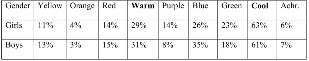
2 Abstract single color preferences according to gender ………54
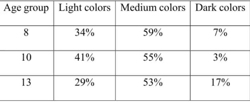
3 Brightness preferences according to age ……….55
4 Brightness preferences according to gender ………56
5 Like-dislike according to gender ……….58
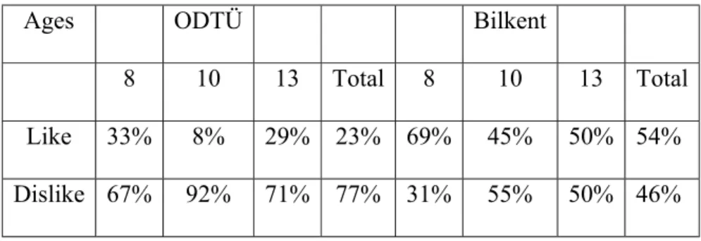
6 Like-dislike according to age ………..58
7 Classroom preferences according to gender ………61
8 Classroom preferences according to age ……….62
9 Corridor preferences according to gender ………...65
10 Corridor preferences according to age ……….….66
11 Cafeteria preferences according to gender……….69
12 Cafeteria preferences according to age ………..70
13 Preferences according to functions ………72
14 Preferences for functions according to schools ……….73
LIST OF FIGURES
Figure 1. Color chart.
Figure 2. Classroom color scheme alternatives for ODTÜ. Figure 3. Corridor color scheme alternatives for ODTÜ. Figure 4. Cafeteria color scheme alternatives for ODTÜ. Figure 5. Classroom color scheme alternatives for Bilkent. Figure 6. Corridor color scheme alternatives for Bilkent. Figure 7. Cafeteria color scheme alternatives for Bilkent. Figure 8. Hue preferences.
Figure 9. Brightness preferences.
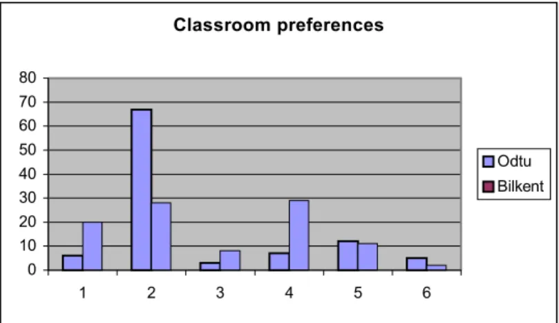
Figure 10. Like-dislike according to schools. Figure 11. Classroom preferences.
Figure 12. Classroom preferences according to schools. Figure 13. Corridor preferences.
Figure 14. Corridor preferences according to schools. Figure 15. Cafeteria preferences.
Figure 16. Cafeteria preferences according to schools. Figure 17. Preferences according to functions.
1 INTRODUCTION
1.1 Objectives and Methodology of the Study
Color is an important topic for all the disciplines, in art, architecture, physics, chemistry, psychology, physiology, biology, literature, and health. It is also an undistinguishable aspect of everyday life. It has major effects on plants, animals, insects, as well as the human beings. Studies have been and are being conducted about the influence of color on humans, the resulting psycho-physiological responses, which are variously measured or defined, and the social aberrations of color. Color is also a language, it conveys the messages faster than anything else. "It (color) is stronger than words and faster than speech. It is a language all in itself" (Neal, 2000, p.24).
Color is first and foremost an experience. Color is a given gift to the human beings to enhance the total experience of the world around. The contacts of the human beings to the world are through the senses. People with normally functioning visual systems obtain perhaps the largest amount of information about their surroundings from the visual sense and color plays a very important part in this flow of communication. As stated before, color is an experience. Not only does it provides vital information about the surroundings, but like the effluences of the other senses, it gives considerable
pleasure to the observers. Being able to use the sense of color at its best advantage in the visual arts, clothing, external architecture, landscape architecture and interior architecture is one of the distincive features of the human kind (Kuehni, 1983).
Color is an immensely evocative medium, possesing in herent powers to provoke immediate and marked reactions in the viewer, as such it has been developed as a language of symbol in both the natural and man-made worlds. "Color is conceptual. There is no building technology for color, no hi-tech of color. Color is just pure idea, pure intellectuality, pure emotion. Color animates, bringing past and the future in the present. Color makes things come toward life" (Linton, 1999, p.83).
Color is one of the most important architectural elements that affect the quality of environments, and not only that it has major influences on the psychology and physiology of people. Its use in architecture and the built environment is serving to dramatically affect perception of architectural space and from. However, when incorporated into these disciplines color's highly subjective nature is also emphasized. Its use has been one of the most unpredictable areas of architectural decoration; each individal's experiences differ, and no amount of analysis can succesfully foretell how people will respond to the same color. Almost any generalization that can be made about color can be overturned into practice (Linton, 1999). The responses to colors may vary with each person depending on age, gender, race, cultural background, education, psychology, and physiology.
Color is important for all the living things. It is a vital aspect of perception of life. For humans it is a form of representation of mood, behavior, psychology, and physiology. With children the issue of color is even more sensitive. Children are very pure, excited, and full of imagination, and they are always learning new things and discovering new emotions. Color is one of the best ways they can represent these feelings they realize. Therefore the effects of color on children are vital for a psychologically and physiologically healthy life in their adult years.
Children are more color dominant than being form dominant, regarding this the application of color in the spaces where children occupy requires extra professional attention. One of the most important places where children occupy is the elementary school. Elementary schools are not only learning environments, but also the places where children socialize, interact, perform, and grow up to be healthy citizens. Children, after the age of six or seven, start spending most of their time at schools. Therefore, the school environments are very important places for children. The quality of the student life and the quality of education are affected directly by the quality of the school environment (Sanoff, 1994). The schools ought to have positive effects on children, in order to increase the ability to learn and perform, desire to stay, explore and interact with other children and their teachers, also on their moods and behaviors.
Regarding these aspects, the use of color in the schools becomes a very sensitive issue. Even though color is such an important application in the school environments, it is the one thing that is disregarded the most. There are many reasons lying behind this, the
major factor is that color is not considered as a design element but as paint on the surfaces. The functional aspects of color are hardly considered, leave aside the aesthetical and psychological aspects. This is a problem in many elementary schools not only in our country but also in the schools around the world. Yet, colorful is not a solution like colorless is not. “Color for the sake of color accomplishes little that is constructive, just as bleak environments accomplish nothing constructive either” (Mahnke, 1996, p.180). The use of appropriate colors is important in protecting eyesight, creating surroundings that are conductive to study, and in promoting physical and mental health. Unconscious application of multicolor can create problems on the issues of function, aesthetics, and psychology, similar to no application of color. Also the economical problems, especially in Turkey, affect the application of colors in environments. Many schools do not have enough money to apply color to school buildings. Even though it is not a very expensive application school administrations overlook the effects of colors and prefer to spend the money on other necessities.
Preference for color is an important issue as a design criteria in the case of applying color in environments. The preference for color also varies with age, gender, education, race, cultural background, psychology and physiology. The use of preferred colors in an environment would increase the attractiveness of the environment and the sense of belonging to that environment. Regarding this, the use of preferred colors and color schemes in the school environments is also necessary. Children’s preference for color should be regarded while choosing the colors to be applied in the school buildings. But this issue is generally or almost always disregarded. The schools are painted with
certain colors concerning the maintenance aspect generally, not concerning the preferences of children. But the school environments should be designed so that, they become preferred environments by children. If they are painted with the preferred colors of children, it is obvious that they would enjoy their time more, the sense of belonging to the environment would increase and the education process would be more fruitful.
This study aims at analyzing the children's preferences for color schemes for the spaces in their school environments. The reasons why a study as such is important is mostly because education, children and psychology are issues that are interrelated and can not/should not be disregarded or considered apart. One of the places where these three aspects intersect is the school environment; therefore the design of the school environment would have a great impact on children's education and psychology and should be done accordingly.
The primary education in Turkey is coeducational. With the new regulations, the primary education has been extended to eight years. As a result of this situation, students in a wider range of age group are expected to use the same educational buildings or facilities for longer periods. Also with the efforts of spreading the education to whole day, the needs for spaces that serve different functions and activities have increased. All these aspects bring forth the importance of choosing color schemes in relation to the gender and age of the users and the functions of the spaces, as well as the preferences of the users.
The main aim of this experimental study is to find out the abstract color preferences and the color scheme preferences of elementary school children in their school environments, in their classrooms, corridors, and cafeterias and to observe probable differences depending on gender and age if there is any. In the duration of the change in the primary education curriculum, the school buildings are also going through certain changes. These changes can be observed in the colors of the school buildings at the first glance. Observing that the government schools have not either completed or started their renovations, the private elementary schools have been exemplified in the study. Accordingly, the students of two private elementary schools in Ankara with different color applications have been tested about their preferences for their school environments. The results of the study have been analyzed and examined. Comparisons have been made between the existing school environments and the preferred school environments in relation to age, gender, and differences in functions.
The objectives of the study are:
(1) To find out the abstract color preferences and the color scheme preferences of elementary school children in their school environments, and the effects of age and gender on the preference of color.
(2) To observe the changes in the color scheme preferences in the given spaces with different functions (classroom, corridor, cafeteria).
(3) To compare the existing and the preferred color schemes in the specified spaces in the school environments.
(4) To compare the differences in preferences of children who occupy school environments with different color applications.
The study is consisting of two major sections; literature search and research based on observation and survey. The research is based on the field survey. As a first step in the research, an observation was made in all of the private elementary schools downtown Ankara. The observation was done through a checklist (Appendix D), consisting of the spaces in a school; and according to the results of the observation two schools were chosen for further studies. The schools were chosen according to their application of color, also regarding the socio-economic levels of the students and the populations of the schools. The schools chosen are Özel Bilkent İlköğretim Okulu and ODTÜ Geliştirme Vakfı İlköğretim Okulu.
For the survey the classrooms, corridors, and cafeterias of the two schools have been photographed. Alternative color schemes for these spaces have been prepared depending on the literature search and the color theory. Then the schools have been revisited with the alternatives for the survey. A total of 275 subjects have been questioned. The subjects are the second (8 year olds), fourth (10 year olds), and seventh (13 year olds) grade students of the chosen schools. The resulting data have been analyzed depending on the objectives of the study.
1.2 Structure of the Study
Following the first chapter introducing the objectives, methodology and structure, the second chapter, "Color", deals with the general and architectural aspects of colors. In this chapter, the basics of color are presented along with definitions of color. Also, the role of color on human beings is discussed, which covers the physiological and psychological effects of color on people, and the psychological and physiological reactions of people towards color. The color systems and the color harmonies are also presented in this chapter with definitions, explanations, and examples. The architectural aspects of color are studied and finally the color preferences as a criterion for architectural coloring are discussed. The aspects of color preferences and the studies that have been conducted about the color preferences of humans are presented.
The third chapter is called “The Elementary School Environments”. There are two main discussions in this chapter. The effects of elementary schools on children and the use of color in the elementary school environments. The effects of elementary school environments are discussed from the point of the effects on children’s behaviors, learning and performing abilities, and psychology. The use of color in the school environments is discussed along with the expert views on the proposed appropriate use of color in the school environments and the effects of appropriate use of color on children in relation to the color preferences of children.
The fourth chapter covers the research, which consists of the experimental study and the data analysis. The objectives are presented again and then, the research is explained and finally the data analysis is done.
The final chapter is the "Conclusion" where the results of the study will be discussed and tied to certain conclusions.
2 COLOR
2.1 General Aspects of Color 2.1.1 Color Basics
Color is a subjective sensation caused by the light and it is not a quality of the object itself. Colors cannot exist without light since the color is a sensation that is conveyed through the medium of energy in the form of light waves within the visible spectrum. The light waves do not constitute color in them. The eye and the brain of the observer interpret the meanings of these energy messages and perceive them as a sensation of color (Porter and Mikkelides, 1976). Color is the enhancer and modifier of space and form, it is a symbol and it is the generator of mood. It has psychological and physiological effects on humans and even on insects and animals (Davey, 1998). Color is a very powerful tool in everyday life. It deeply affects the emotions and can convey any mood, from delight to despair. Color can be subtle or dramatic, capture attention or stimulate desire (Zelanski and Fisher, 1989).
Itten (1970, p.8) states that, “Color is life; for a world without colors appears to us as dead. Colors are primordial ideas, children of the aboriginal colorless light and its counterpart, colorless darkness. As flame begets light, so light engenders colors.
Colors are the children of light, and light is their mother. Light, that first phenomenon of the world, reveals to us the spirit and living soul of the world through colors." Kuehni (1983) makes another approach to the definition of color, where he says that the colors are not real and the world is actually not colorful. He claims that the brain creates the sensations of colors often from the quantities and qualities of electromagnetic radiation that strikes the sensory organ, the eye. Some scientists provide a definition for color that considers color as a perception: "…perceived color is the attribute of visual perception that can be described by color names: white, gray, black, yellow, orange, brown, red and so on or by combinations of such names" (Kuehni, 1983, p.7). Porter and Mikkelides (1976, p.13) have another definition of color close to Itten's approach; “Color is a part of total sensory experience of our environment and contributes immeasurable beauty to the visual world. As an integral part of our perceptual system it helps us to identify and define objects in space and acts as a signaling device, which is evidence of certain conditions, conveying information about our surroundings.”
The problems of color are examined by several disciplines; physics, chemistry, physiology, psychology, and art. The physicist examines the nature of the electromagnetic energy vibrations and particles that are involved in the phenomena of light. The chemist studies the molecular structure of dyes and pigments. The physiologist studies the various effects of light and color on the visual apparatus (eye and brain) and their anatomical relationships and functions. The psychologist is interested in the problems of color radiation on the mind and spirit of the human heart.
And finally the artist examines the color effects from their aesthetic aspect in the light of both physiological and psychological information (Itten, 1970).
A very basic terminology of color is presented to give brief information about certain terms in the color terminology. Hue, value (brightness), and saturation (chroma) are the three dimensions of the contemporary color systems. They help the observer to describe specific colors. Hue is a synonym for color. It is the dominant wavelength of light reflected by a colored object. It is also the quality or characteristic by which the colors are distinguished from each other. Value (brightness) is the lightness or the darkness of a color. Brightness varies inversely with the amount of black contained in the color. Saturation (chroma) it describes the intensity of a color; that is what amount of gray the color contains. It is the strength, intensity or purity of a color. There are also two other terms explaining the monochromatic changes of a single hue; tint and shade. Tint is the mixture of a saturated color (pure hue) with white. Shade is the mixture of a fully saturated color (pure hue) with black (Eiseman, 1990)
2.1.2 The Role of Color for Human Beings
The role of color for all living things is very important. Color affects the living both psychologically and physiologically. All the plants and animals as well as the human beings, have their own responses towards color and are affected by color.
“Color effects are in the eye of the beholder. Yet the deepest and truest secrets of color effect are invisible even to the eye, and are beheld by the heart alone. The essential eludes conceptual formulation” (Itten, 1970, p.7).
Color is a creation of light. It is therefore a form of energy and this certain energy affects the bodily functions, and in relation to that it influences the mind and emotion (Mahnke and Mahnke, 1987). Color is unique in its own way in triggering reactions, which are both physical and psychological in nature; therefore it is both physically and psychologically a vital part of the human life. “…it (color) motivates people in a way that is largely subconscious and it is difficult to say where physical, visual processes end and mental processes begin” (Danger, 1987, p.54). Itten (1970) makes an analogy between color and force, saying that colors are radiant energies that affect the humans positively or negatively, with or without the consciousness of the human brain. He also suggests that the effects of colors should be experienced and understood not only visually but also psychologically and symbolically. Color has a definite and psychotherapeutic value in life but the ones who are skeptical of the physiological and psychological effects of color generally overlook it. Color helps to draw attention from the self to the environment, or vice versa, which affects the mood of the humans. “In effect, the cheerful colors are relaxing and diverting; neutral colors are a big bore” (Birren, 1983, p.169).
Color is necessary for the total man, both the physical and the spiritual one. Color has a very important role in the design of the environments. It is ahead of form in the man’s
unconscious regard. According to the studies done on psychology and psychiatry, it has been found that response to form is seems to arouse intellectual process, whereas the reactions to color are more impulsive and emotional. David Katz claims that color is more closely related emotion than space (Birren, 1988).
Mahnke and Mahnke (1987) state that there have been many studies conducted on the effects of color on human body and it is known that color affects cortical activation (brain waves), functions of the autonomic nervous system (which regulates the internal environment of the body), muscular tension, heart rate, respiration, and hormonal activity. Also it is found that color arouses definite emotional and aesthetic associations. The response of the human to color is total; color affects the humans both psychologically and physiologically (Manhke and Mahnke, 1987). The psychological reactions to color can be grouped as follows: sensitivity to brightness and dimness, to lightness and darkness, and to warmth and coolness of color. These reactions are considered as physical, visual reactions but their interpretations made in the brain are psychological. So, the psychological reactions can be defined as the way in which color affects the mind and the emotions and are partly the result of the physical reactions described. Psychological reactions affect the body as a result of interpretation, experience, association and tradition. Color also affects the appetite and behavior of humans and these reactions vary with age, race, culture, nationality, gender, seasons, locations, economic conditions, and personal characteristics (Danger, 1987).
The physical reactions of humans to color are similar to the psychological reactions. The reactions to the saturation (intensity) of the color are more towards to light than to color. There should be light for the color to exist. The human organism shows a significant reaction to the presence or absence of light, and this affects the eye, the brain and the whole body. The high-saturated light conditions the human body for vigorous muscular activity, but it hinders the mental tasks. It can be so that under certain conditions where the degree of the brightness is very high, the concentration can become impossible. The saturated the light the more body tends to direct its attention outwards. “A high degree of saturation demands attention, consumes bodily energy, and stimulates the nervous system to such an extend that energy is directed from the task to the environment itself, and if this happens, seeing and concentration become difficult” (Danger, 1987, p.55). With lower levels of light and saturation, the body turns away from the environment towards itself, there is less distraction and the individuals are able to concentrate better on the visual and mental tasks.
Lightness and darkness of color affect the humans the same way the intensity of light do. Lightness or the value of color is the quality by which a light color is differentiated from a dark color. The brightness produced by the light color depends partly on the intensity of the light falling on a colored surface or object. But it mainly depends on the percentage of that light reflecting from the colored object or surface. In general terms, the light colors stimulate a greater extent than dark ones; they increase size whereas the dark colors reduce size; they make an object look lighter in weight, the dark colors
make an object look heavier; and light colors are generally preferred to dark colors and this is due to their greater brightness. (Danger, 1987)
The reaction to the warmth and coolness of a color is a reaction relying on the wavelength of color. Unlike the previous two groups, which are physiological reactions to light and to the intensity of light, this reaction is to the color, therefore radiation. Hues with different wavelengths cause different effects on humans. The reactions are towards the two ends of the color spectrum, towards the red end and towards the blue end. Due to these characteristics, the colors are grouped into two categories according to their wavelengths; red, orange and yellow being the warm colors, blue, green, and violet being the cool colors. (Danger, 1987) The warmth and the coolness of the colors are the dynamic qualities of color. From emotional standpoint, the red end of the spectrum is exciting and in contrast the blue end of the spectrum is calming. This aspect is true in the physical reactions. The reds tend to increase the bodily tension, stimulate body and nervous system. The greens and the blues release tension and have a subduing effect. These reactions are automatic, and take place independent from the consciousness of the human mind (Birren, 1963).
It has been found earlier that individuals readily associate colors with adjectives of emotions, regarding the visual stimuli. This holds true across cultures as well. The speakers of unrelated languages tend to relate colors and emotions in similar ways, this means that there was a cross-cultural agreement detected as to which colors were regarded as strong, weak and so on. In the study conducted by D'Andrade and Egan in
1974, it was found that the color-emotion associations were not predominantly due to a hue but to the degree of saturation and brightness (Hupka et al, 1997). The emotions are grouped into two; the primary emotions, which are the inherited emotions and the compound emotions, which are the learned emotions. Anger and fear, for example are primary emotions and they have strong roots in evolution and are genetically based. Whereas, envy and jealousy are emotions that are compound emotions and are learned in time. Thus, the primary emotions that are common to all human beings should arise similar color-emotion associations (Hupka et al, 1997).
2.2 Color Systems and Harmonies
The dimensions of color have been described by systems that model its variability according to a variety of schemes. The well-known systems take the three major attributes of color into consideration, hue (red, blue, etc.), brightness (value), saturation (chroma), and arrange them three dimensionally. The most well-known and detailed color system is The Munsell system. It is shaped like a tree and it has an axis, which is a vertical scale of values or gradations of brightness, from which hues radiate outward in a series of planes arranged around it as a circle. The distance of a given hue on this radial coordinate from the vertical axis of brightness, defined the saturation of the hue. The Munsell system is modeled asymmetrically in account of the discrepancies between hue, saturation and brightness. The Otswald system is a variant on the Munsell system. It displaces the hues on the radial axis, so that any hue at its maximum saturation is placed equally distant from the vertical scale of values. The symmetry of the Otswald system depends on visual experience unlike the Munsell system (Swirnoff, 1988).
The basis of the standard twelve-hue color wheel lies in the color continuum that includes all the primary colors and all the intermediate hues, which are produced as each hue overlaps the adjacent hue. The red end of the spectrum can be joined to the purple end to form the complete color wheel. These twelve basic pigment colors can be divided into three groups: primaries, secondaries, and tertiaries. There are three primary colors (blue, red, and yellow), three secondary colors that are the combinations of any two primary colors (violet, orange, and green), and six tertiary colors that are the combinations of one primary and one secondary color (blue-violet, violet, red-orange, yellow-red-orange, yellow-green and blue-green) (Fehrman and Fehrman, 2000).
Colors are not isolated entities; they exist in the presence of each other, in a certain combination, and they are affected by each other’s presence. The color is perceived together with the environment. The art of combining colors to produce pleasing harmonies has been the concern of both the artists and the scientists. Certain color groups were thought to be more aesthetically appropriate than others, and there were many attempts to list and prescribe the relations that seemed to work best (Zelanski and Fisher, 1989). As Albers (1975) stated a color can not be conceived as what it actually is physically. Without the use of special devices a color can never be seen singly, or by itself, as a single tone may be heard, but only in relation to the many factors that influence the human vision, which transfer the optical (physiological) influence into a psychological effect (perception).
The color harmonies are developed in relation to the color contrasts. There are seven basic color contrasts: the pure color contrast, the light-dark contrast, the cold-warm contrast, the complementary contrast, the simultaneous contrast, the contrast of quality, and finally the contrast of quantity. The pure color contrast occurs when pure colors are used in random combinations. The light-dark contrast is based on the use of different brightnesses and tone values of the colors. The colors are lightened by adding white and darkened by adding black. The cold-warm contrast is made by using cold and warm colors together in a combination. The most effective contrast is achieved with colors orange-red and blue-green. The complementary contrast consists of colors that are across from each other in the color wheel and when these colors are mixed together the result is a neutral gray-black. The simultaneous contrast's effect is derived from the law of the complementary colors. The law recalls that each pure color physiologically demands its opposite color and in the absence of that color the eye will produce it simultaneously. For example, a strong green would make the adjacent neutral gray look reddish gray and vice versa. The contrast of quality is the contrast between the luminous and dull colors. The contrast of quality is based on the opposition of colored areas of different sizes (Itten, 1975). These principles of the color contrasts determine how a color is perceived, how objects are highlighted or partially concealed, and how a color scheme is developed (Mahnke and Mahnke, 1987).
Color schemes are color harmonies that are composed of either closely related chromas or of different colors in the same shades that meet without sharp contrasts. The achievement of harmony or discord depends on an agreeable-disagreeable or
attractive-unattractive scale. Itten (1970) defines harmony as the craft of developing themes from systematic color relationships capable of serving as a basis for composition.
According to the findings of Chevreul in his famous 1839 work, there are six distinct color harmonies, comprised in two kinds: the harmonies of analogy and the harmonies of contrast. The harmonies of analogy consist of the harmony of scale, in which closely related values of a single hue are used together; the harmony of hues, where analogous colors of similar value are used together; and the harmony of a dominant colored light, where a combination of different hues and values is pervaded as if by a dominant tinted light. The harmonies of contrast consist of the harmony of contrast of scale, where different values of a single hue are combined; the harmony of contrast of hues, in which related colors are used in strongly different values; and the harmony of contrast of colors, where colors belonging to scales very far asunder are featured, meaning the complementaries, split-complementaries, triad and tetrad combinations (Birren, 1987). The color harmonies that are being considered in this study are the harmony of scale, monochromatic color scheme; the harmony of hues, analogous color schemes; and the harmony of contrast of colors, complementary color schemes.
The simplest color scheme is the monochromatic color scheme. Monochromatic color schemes use only one hue in varying tints, shades, and intensities, and this is done to avoid a very possible monotony (Eiseman, 1990).
Analogous color schemes are the most harmonious and foolproof color schemes. These color schemes offer more variety than the monochromatic color schemes. They are made up of the combination of the colors, which are immediately adjacent to each other that literally flow into each other, for example: red, red-orange, orange. The three hues are unified due to the use of a shared color (Eiseman, 1990). Also, analogous colors have emotional quality because they favor either the warm or the cool side of the color spectrum if they are arranged properly (Birren, 1987).
Complementary color schemes consist of colors that lie directly across from each other on the color wheel. When the complements are placed side by side they appear more intense. Some examples of this color scheme are blue-green and red, yellow-red and blue, purple-blue and yellow. These combinations introduce both warm and cool colors into the environment and offer more contrast, exhibiting a natural balance (Eiseman, 1990). There are three types of complementary color schemes. The first one is the analogous-complementary scheme. This harmony is achieved by using two colors that are next to each other and the complementary of one of the two colors. Split-complementary harmonies are made up of one color and the two colors that are next to the complementary of that color. The last scheme is the double-complementary scheme. This scheme is achieved by the use of two closely related hues and their complements (Mahnke and Mahnke, 1987). The complementary colors have a visual quality for they generally set a warm color against a cool color, causing a positive quality to offset a passive one (Birren, 1987).
2.3 Architectural Aspects of Color
2.3.1 The Use of Color In Architecture and Design
In order to be able to communicate an overall impression in an architectural space to the viewer, the use all architectural elements- color, light, pattern, furnishings, accessories- is necessary. This sort of an impression engenders a reaction, which carries some type of emotional content. This reaction can be positive or negative depending on the use of the named architectural elements. The designer’s goal in this case must be to avoid choices that will trigger negative emotional reactions (Mahnke, 1996). Along with the other design elements, color has an important effect on the impression of the environments. Color not only produces mood associations and subjective and objective impressions, but also influences the estimation of volume, weight, temperature, time, and noise in the environments. Unfortunately, the concept of color is mostly disregarded or taken into consideration at a late level of design. Therefore the environments either lack the intended impression or the impression turns out to be less impressive than what has been intended. The correct use and application of color in the environments is vital in creating the desired or intended impression as well as providing the required psychological and physiological comfort for the users. “…the atmosphere of a space can be manipulated to align it with the function of the space. The degree of mood creation depends on particular color use” (Danger, 1987, p.64).
Color has physical qualities that present how color can be translated into real space. The use of color can be grouped into six elements: definition, progression, emotion, aesthetics, manipulation and dimension (Ladau, 1988). Definition essentially fixes the
limits or boundaries of an object in space. Color has the ability to define; it allows the eye to precisely identify the shape of a form and the position of an object in a space. Light and shadow provide a great deal of information about a three dimensional object and color completes the image, giving the form a more precise shape as well as expressive impact.
Progression tells how to move in a space, literally or visually. It provides sequence or
succession for a space. Color influences the way to move through a space. It tells the way to go, when to turn or to stop. The sense of progression occurs when there is a comparative color change; that is moving from dark to light, from one color to another, from tints to shades, or from one point of interest to another. All of these illustrate a continued series of changes that lead through space.
Emotion attacks the senses providing strong feelings or causing strong reactions to color in a space. Color elicits response, which occurs on both the physical and the cultural level. Color preference is generally a cultural phenomenon, whereas the response to color is a combination of reactions to physical phenomena and cultural associations. Together they affect the feeling of the color and the way it is used.
Aesthetics uses light and color to elicit a response based in history or creative sources.
The aesthetic qualities of a color define its relationship to culture, style and design. Culture gives color associations that are comfortable and reassuring because of their familiarity. Style gives color choices dictated by the trends of the moment in fashion
and art. Design provides color choices based on the contrast between non-specific colors for particular effects. All of these three elements can be combined to formulate the aesthetic taste.
Manipulation modifies the perception of a form or space to suit a particular purpose.
Color can manipulate in both physical and mental ways in convincing one to see a different reality. Every color has its own vast array of associations that give information about how to respond to that color, both in and out of context. Color also manipulates the perception of space.
Dimension defines the focus of an object or space in terms of adjacent objects or
surroundings. It establishes the relative size and importance. Color alters both time and measurement in a space. The dimensional effects influence how long a person can comfortably stay in a space or environment. Color affects measurement through illusion. A distant object has a lighter color than an up close object. If a warm color is placed against a cool color, the warm color would advance whereas the cool color would recede. Also colors look more intense when they are applied on a large surface than a small one. Color can be used to affect the dimensions of a space very effectively (Ladau, 1988).
As mentioned before, color along with form, texture, layout, scale and size, is a design element that creates the communication in architecture. All of the elements of design help the designer convey to the observer the various aesthetic, social, political, and
historical messages that are purposefully injected in the structure. Color plays the major role in conveying the messages of the man-made structures. In most cases, it is easier to understand these messages through color than the design itself. This understanding relies on past experiences, associations and acquired cultural knowledge. The concern of the architect and the designer is to create a healthy and livable environment for the users. The architect is more interested in color as an aspect of architectural composition- “something to attract interest and to induce movement, but also, essentially, to create restfulness, in spaces in which the potential of life, work and human continuity are embedded” (Lloyd, 1987, p.47), therefore as a part of the design composition. Since this is the case, the architect and the designer should be aware of the psychological and physiological effects of the colors as well as the meanings attached to colors. Also, it should be kept in mind that the colors could not be seen in isolation except in special laboratory conditions. All the colors are in relation to each other in the environments.
The use of color in the spaces is an important factor in the design of the environments. Color is used to serve more important functions than mere beauty and pleasure, as the designer and the client realize the importance of color. In general, the reaction to color is emotional but it may be studied objectively. The color is being applied in all of the public and private spaces, schools, industry, hospitals, hotels and homes. It has a tremendous value in dealing with human moods. It is used for promoting greater comfort and lessening neurotic tension and anxiety. The lessons learned from its use in the public places can be applied in homes as well. “With allowances made for human
likes and predilections, color may be engineered intelligently to make any interior a more comfortable place in which to live, read, work and relax” (Birren, 1955).
Color serves many aesthetic purposes in the design of the buildings. Color creates atmosphere and mood in the environments. It suggests either unity or diversity. It expresses the character of the materials used in the spaces. It defines form, and affects the proportions in the environments, as well as giving a sense of weight and bringing out scale (Faulkner, 1972).
There are two major reactions to the use of color and light in the environments. The first one is the centrifugal action, which is an action that is away from a person’s self to his environment. This action takes place in environments where there is high illumination, warm and luminous colors (yellow, peach, pink). In such environments, the body tends to direct its attention outward, towards the environment and such an environment is conductive to muscular effort, action and cheerful spirit. These environments are suitable for factories, schools and homes where there are manual tasks are performed or where sports are engaged in. The second reaction is the centripetal action, which is the action that is away from the environment toward the self. These environments are necessary to perform difficult visual and mental tasks, with maximum concentration and least distraction from the work at hand. This can be achieved by softer surroundings, coolers hues (gray, blue, green, turquoise), and lower levels of brightness. Environments that have such requirements are offices, study rooms, fine assembly in industry and bedrooms (Birren, 1963). Birren (1983, p.168) also quotes
that “…a dull environment tends to prod adverse human reactions; a colorful environment tends to lessen them and to lead to a slower heart rate. The prodded activity in a monotonous setting may well induce anxiety, fear, distress.”
The effects of color on both the exterior and the interior spaces are tremendous. For proper mental and emotional balance, there should be a resourceful and dynamic use of color in the environments. The use of color in the man-made spaces serves two important realms; visual realm and emotional realm. The visual realm can remove glare from the field of view, and in the emotional realm color can introduce sensory stimulation, break up monotony, and establish an interesting change of pace (Birren, 1976).
The location of the color within the space makes a great change in influencing a room’s character, the way it is perceived psychologically, and subsequent reactions to it. A color that is suitable for the wall may have a very different effect when applied to the ceiling or the floor.
2.3.2 The Factors Affecting the Color Decisions in Architecture
There are two basic questions that need to be asked in order to realize the factors affecting the design considerations. The first question is: what are the major design goals for the given environment? The second question is: how can these goals be met with some measure of predictable accuracy? In the answers of these two questions lie the information about the type of the building or space, and the function the space it
serves. It is evident that different environmental criteria and design objectives exist for various environments. Naturally, the design of a school and a bar, and the supporting ambience for each of the designs are vastly different. Also, the sections in a given structure are treated very differently, according to their functions. A classroom, school corridor, cafeteria, library, auditorium, gymnasium all serve different functions and should be treated differently; according to the functions they serve and the requirements of those functions (Mahnke,1996).
There are some fundamental rules and considerations that must be regarded. These are; (1) the need to consider psychological and physiological effects in design for the well being of the user, in some cases disregarding the personal tastes of the user, should be clarified. (2) the balance between unity and complexity, color variety within reason, must be respected. (3) visual ergonomics depend on the colors used and on the contrasts. These rules of visual ergonomics should especially be kept in mind in the education facilities, hospitals, industry, and the offices. (4) the mood or atmosphere desired on the specification of the colors based on their psychological content must be satisfied (Mahnke, 1996).
A color design that serves a purpose in an environment has three simple rules that must be adhered to; (1) the color design supports the function of a building or the given space, and the given tasks that it carries out. (2) the color design avoids over stimulation and under stimulation. (3) the color design helps to avoid negative psychological and physiological effects (Mahnke, 1996).
2.4 Color Preferences as a Criterion for Architectural Coloring
The preference for color is one of the most intensively researched areas within the field of color. The investigations have explored the relationship between feelings, emotions and color for almost over a hundred years. The common problem of such studies in this area is determining exactly what is being studied in color preference. The researchers have looked for the answers to the question of whether certain color were able to elicit certain emotional responses consistently. "They (the researchers) have wondered whether there was an inherent physical relationship between color and people that resulted in consistent emotional reactions, or if the linkage between specific and emotions was a purely cognitive one. They wanted to discover whether the color-emotion link was biological or learned" (Fehrman and Fehrman, 2000, p.78). According to the results obtained from these studies, some of the factors that influence the color preference are the learned color bias, variations in the saturation or value of the color under study, the interaction between light source, background color, and the color of the object being viewed, the contrast between colors in combination, and the size and placement of light sources. There are culturally learned associations and there are true biological associations of colors. In order to understand color, it is important to be able to differentiate between these two associations (Fehrman and Fehrman, 2000).
There are many aspects of color preferences other than the aspects mentioned above. These aspects are culture, education level, past experience, memories, history, perception of color, the meanings attached to colors, color symbolization, age and gender, aesthetic attributes, values and value judgments, the psychological and
physiological conditions of the perceiver, and the sub-consciousness. Each color has its own meaning, denotation, symbol and emotional association for each person. Every color connotes a different meaning, feeling or emotion to the perceiver of the color in relation to his associations with colors. Even though this seems to be the proper way of color preference, there are accepted meanings, connotations and effects of certain colors on humans, relying on the experiments done and being done throughout the years. These studies try and find an objective approach to color from the preference point of view, a common color preference scale, regardless of the culture, race, history, education, age, gender, and the other factors mentioned previously.
The most important and fruitful study about finding a color preference scale has been carried out in 1941 by Hans Eysenk. He has used 21,060 subjects from different races, ages, and cultural backgrounds. He came up with the result that there is a universal scale for color preference and that there is some strong biological basis for color preference. The resulting universal scale was (1) blue, (2) red, (3) green, (4) violet, (5) orange, and (6) yellow. He also came up with the suggestion that short wavelength colors are generally preferred to long wavelength colors and this has a biological reason. However, a more recent study conducted by Acking, Kuller, and Sivik in 1973, has resulted differently. In that study the researchers have investigated the dimensions of brightness and saturation using semantic differential techniques. According to the outcomes of the study, they found no significant order for preference, but they claimed that the liking or preference for color did not rely on the hue but on the saturation and brightness dimensions, that there is no correspondence between the color experience
and wavelength (Porter and Mikkelides, 1976). In the current study that is being followed, the concern is on the hue and brightness dimensions of preferences of children rather than the saturation dimension. Therefore Hans Eysenk's study is taken into consideration in more detail.
The color spectrum is divided into two parts, as mentioned earlier. The colors of long wavelength (red, orange) and the colors of short wavelength (green, blue) with yellow occupying the middle position. According to Birren (1961), the humans therefore can be categorized into two distinct groups in their preferences. The people who prefer the clear and distinct hues which are usually the warm hues and the ones that prefer the cooler hues and tones of less saturation. The warm color dominant subjects are generally characterized by an intimate relation to the visually perceptible world. These subjects are receptive and open to outside influences. They seem to submerge into the social environments rather readily. The emotional lives of these subjects are characterized by warm feelings, suggestibility and strong affects. The cool color dominant subjects are characterized to have a detached attitude to the outside world. They find it difficult to adopt themselves freely to new circumstances and to express themselves freely. The emotional lives of such subjects are cold and reserved (Birren, 1961).
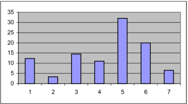
In a study conducted by Heinrich Freiling of the Institute of Color Psychology, color preferences of children, according to their ages, has been tested. The study has been conducted on ten thousand children in all corners of the world between ages 5 to 19.
The general results are that black, white, gray and dark brown are rejected by children between the ages of 5 and 8; whereas red, orange, yellow and violet are preferred. At ages 9 and 10, gray, dark brown, black, pastel green, and blue are rejected and red, red-orange, and blue-green are preferred. The 11 and 12 year olds rejected the achromatic colors, olive, violet and lilac. The 13 and 14 year olds preferred blue, ultramarine, and orange (Mahnke, 1996). “As a rule, most persons, young or old, will prefer light colors to dark ones, pure colors to grayish ones, and primary colors to intermediate ones” (Birren, 1963, p.186).
Small children are more color dominant than form dominant. During the early years of life, warm colors- red, pink, yellow, and orange- seem to be preferred more. As the age progresses, the preference turns to blue, red and green, and this occurs regardless of race, nationality, and culture. The color preferences during the childhood years of life are in the order of yellow, pink, red, orange, blue, green, and purple. After childhood and into adolescence the order changes to red, blue, green, pink, purple, yellow, and orange (Birren, 1963).
In a practical sense, young people, who are more adventurous in their choice of colors than their elders, usually prefer brighter and stronger colors than their elders. They are willing to experiment and have a less conservative approach to the use of color in their environments. They choose colors on the assumption that they will be able to change it after a short period of time. Youngsters react favorably to the enterprising use of strong
colors and to unusual color combinations, but there are periods when they are attracted to earthy and depressing colors, which last in short time spans (Danger, 1987).
Danger (1987) claims that although color preferences vary with age, it is difficult to draw a hard-and-fast line between children and adults. If people were grouped as children and adults and asked which colors they like, the results of the poll would be consistent and more and less true worldwide. The order of preference of children is yellow, white, pink, red, orange, blue, green, violet. The order of preference of adults is blue, red, green, white, pink, violet, orange, yellow. There two orders show the changes in preference as the age increases. For example, blue is quite down the list of preferences of young children but the liking increase with age and blue reaches the top with the preference of the adults (Birren, 1976).
The preferred color of the users who will inhibit the spaces must always be considered. The psychological benefits of living with the preferred colors are inestimable (Fehrman and Fehrman, 2000). Even though it may be quite difficult to reach a consensus with big groups generalizations can be done and neutral colors may be used. In the case of the school environments, the use of correct and preferred colors will decrease the problems of nervousness, irritability, lack of interest, and behavior, as well as facilitating learning new subject matters (Birren, 1988)
3 ELEMENTARY SCHOOL ENVIRONMENTS
3.1 The Effects of Elementary School Environments on Children
The environments are more than just simple physical settings. They include “all the external conditions and factors potentially capable of influencing an organism” (Greenman, 1988, p.5). The environments structure the time, and assign roles to the users of the environments; they also structure the behaviors and the physical surroundings (Greenman, 1988). The same environment may affect different people in different ways. Some reasons for this is that people may have different physiological make ups, they may differ in attitudes toward, and past experiences with, various places; also in the ways people cognitively process the information they receive from their surroundings (Mehrabian, 1976).
The built environment is deficient in two important respects, competence and cognition. The following statements best summarize the environmental situation regarding competence and cognition. "(1) we are immersed in a physical environment upon which it is very difficult to have any impact, (2) we are immersed in a physical environment which is very difficult to know and understand" (Friedman, 1976, p.31). Competence may be defined as an organism's capacity to interact effectively with its environments,
the organism's capacity to have both the social and physical environment. Cognition may be defined as the mental processes organisms perform in order to know or understand an object or event and psychological theories that place such processes at the center of their explanations of behavior. If people's desires to know (cognition) and have impact upon (competence) are not satisfied in the built environments, two general solutions may come to mind to reduce this dissatisfaction. First is the policy solution, which aims directly at influencing and changing organisms and their behaviors. The second can be called the technological solution, which refers to the design of the environments that are both easier to know and to have impact upon. " … knowing and understanding an environment is a necessary precondition of having impact upon it, and conversely, the process and products of having impact upon an environment enable us to know it more fully" (Friedman, 1976, p.34).
The amount of time young people spend in the learning environments, from preschool to high school (first to twelfth grade), is very long and significant in the life span of humans. It is important to realize that much of this time is devoted to living as well as learning. The quality of the student life and the quality of the education are directly affected by the quality of the school environment (Sanoff, 1994). The elementary school years are critical years in a child’s life. The children start looking for tasks that they can carry through to completion. A great development in the sense of accomplishment is seen. The child wants to settle down and learn exactly how to do things and how to do them well (Binter and Frey, 1972).
The school environments are important places for they are very influential on children. It has an important and potent cultural force in the life of the children because it systematizes the child’s experiences according to some organizational plan. But the schools are generally organized and designed according to traditional administrative lines that meet the needs of the adults rather than the children’s. It is indicated that the children’s needs and feelings must be taken into account when designing something for them (Binter and Frey, 1972). Children who learn in environments that are designed to elicit and reinforce their development will enjoy schooling more than children who learn in an environment designed with other criteria in consideration (Sturck, 1992). The look and feel of a school matter to children and they are deeply connected to their attitudes and behavior. The self-esteem, sense of belonging, and ambivalent needs of children both for control over their world against boundaries and to guide that control can be shaped trough the thoughtful design of the school and the classroom environments. "When children experience a school with obviously designed with their needs in mind, they notice it and demonstrate a more natural disposition toward respectful behavior and a willingness to contribute to the classroom community" (Herbert, 1998, p.69).
The schools, therefore, must have positive effects on the children’s ability to learn and perform, increase the desire to stay, explore and interact with others. To be able to achieve these results, the environmental design of the school should be done accordingly (Mehrabien, 1976). Color plays an important role in the achievement of these results. The modern application of color to the school environments improves the
scholastic performance of the school students. The school children are extraverted by their nature. The use of correct and preferred colors will decrease the problems of nervousness, irritability, lack of interest, and behavior, as well as facilitating learning new subject matters (Birren, 1988).
3.2 Use of Color in the Elementary School Environments
The quality of the environment can have a direct impact on human behavior. In conjunction with this belief, it has been suggested that the use of appropriate use of color can enhance the overall quality of the environment and thus, influence behavior, especially in environments where people are confined for long periods of time under artificial conditions. Many prisons, hospitals, companies and schools have adopted systematic color schemes that have been designed to produce particular performance states in their inhabitants (Etnier and Hardy, 1997). The use of functional color gains great importance in environments as such. The term functional color can be described as the art or science of increasing efficiency, profitability, and safety through the use of color in industrial, commercial, and institutional environments (Danger, 1987). Birren (1961, p.243) proposes another approach to functional color. According to him, the functional color is concerned with measurable facts. Color problems are handled through technical methods rather than artistic methods as the "… : beauty in a decorative color scheme has no criterion other than taste or opinion; functionalism in a color scheme is entirely dependant upon tangible evidence"
The children start to recognize their environments through the use of color. Color also has a definite message conveyed to it about the nature of learning process and the comprehensibility of the environment. The colors of the environmental components draw attention towards these components, demanding that the children utilize them as elements of learning. "Color and object are united, each being primary to the understanding of the environment" (Friedman, 1976, p.34). An application of color coding in the primary school environments would help the children come to understand and recognize the environment where their education is taking place (Friedman, 1976).
School environments are places where children spend most of their time. Previous studies have shown that the use of color in the schools is in the realm of psychology. Small children are generally outwardly directed and nervous, as stated before. Birren (1963) claims that these facts should not be disregarded and considering these he says that the school environments should match the children’s spirits. The children would relax and concentrate on work in actively colored environments, and the reason for this is that the visual and emotional excitement in such environments match the spirits of the children and set them at ease. Using passive or cool colors to calm children down or to make them concentrate on their tasks would be no help, but only make them more nervous and anxious. Careful selection of paint color can help increase the students' attention spans and brighten a facility. Certain color schemes can have tremendous effects on students' concentration levels, eye fatigue, attention span and morale (Trent, 1995).
Small children are extroverts by their nature. They are impulsive, physically active, and responsive to what goes on around them, but with short attention spans. For example, putting children in a blue room with hopes of quieting down their restless and impetuous ways is an ill-advised and wrong suggestion. The melancholy of the blue environment would “bottle up the agitated spirit of the child, even prompting the child to burst forth in bitter crying” (Birren, 1983, p.168). The anxiety of the child should be released to quiet him down and this can be accomplished by a bold and vivid use of color. The bright environment would match the nervousness in the child and therefore he would feel relieved and comforted in the environment (Birren, 1983). The results of the study performed by Fehrman (1986) has indicated that colors of equal value produce comparable arousal and performance results, therefore the color balance of an environment is of greater significance than a specific hue.
Children at different grade levels respond to color in different ways. Therefore this case should be taken into consideration while choosing a color scheme for a classroom. Early-elementary years are the most active and lively years of a child. The colors and designs selected for their school environments, classrooms, should reflect these traits. To be able to convey vitality without overwhelming a room, bright warm colors could be used on doors, cabinets, furniture and other accent areas. Upper-level students need to concentrate for longer time spans. Since this is the case, a calming environment with sophisticated accent colors using light-to mid-value cool colors for walls could be considered. Wall colors can include blue-greens, teal blues, greens, warm beiges and grays (Trent, 1995).