. * т у Г: :.r^.r П^ЛйП· ^ г И г -* . ».. і (МШ-. ■ W л ірнч^г. «1-4·.: -·ί>«|. Il .ψ ':. , ¿ „ ^ 3 , Ні к и i n.t! пж.· Ϊ í Utu iui»?· w ' І*^'й ^W? ' i ■’■» ••‘î^ v :- J t l -Ï-.J "υ » C.f· Z / / S
AS
s щ т мTHE DESIGN
OF THE BOOK AS OBJECT
A THESIS
SUBMITTED TO THE DEPARTMENT OF GRAPHIC DESIGN
AND THE INSTITUTE OF FINE ARTS OF BILKENT UNIVERSITY
IN PARTIAL FULFILMENT OF THE REQUIREMENTS FOR THE DEGREE OF
MASTER OF FINE ARTS
C^i\aJ~ies
' .1 ■'- y
£/
By
Jeremy Charles Steel September, 1997
İ İ 6 *A3> ' S ^ 4 1ЭЭ> 2 о О 8
I certify that I have read this thesis and that in my opinion it is fully adequate, in scope and in quality, as a thesis for the degree of Master of Fine Arts.
Assoc. Pr^^i^rdağ Aksel (Principle Advisor)
I certify that I have read this thesis and that in my opinion it is fully adequate, in scope and in quality, as a thesis for the degree of Master of Fine Arts.
U ________________
Vis. Ins. Marek Brzozowski
I certify that I have read this thesis and that in my opinion it is fully adequate, in scope and in quality, as a thesis for the degree of Master of Fine Arts.
I certify that I have read this thesis and that in my opinion it is fully adequate, in scope and in quality, as a thesis for the degree of Master of Fine Arts.
Vis. Assoc. Prof. Pi
Approved by the Institute of Fine Arts
ABSTRACT
THE DESIGN OF TH E BOOK AS OBJECT
Jeremy Charles Steel MFA in Graphic Design Supervisor: Assoc. Prof. Erdag Aksel
September 1997
The book is an important cultural product that, as well as being a site in which text and image can be found, is first and foremost a physical object. To access a text there must always be a physical support through which the text is embodied. When this physical support takes the form of a book, it becomes a designed and coercive space. It also becomes a contributor to the ‘polyvocality’ of the text such that rather than the text being a multiplicity, the book as a whole becomes a multiplicity. This habitation of the text by the materiality of the book occurs because the physicality and visuality of the book helps determine readership. It also contributes to the inter pretation and meaning that the reader believes the text possesses. The aim of this thesis is to explore and articulate questions as to how the materiality of the book comes to inhabit the text and what the designer’s response should be. It will be argued that designers should declare their presence in their work, that they should design the whole book and not just the cover, and also that they should seek a design that respects cultural diversity and historical change. The core of this thesis is the nine books I have designed. As such, they are my response to the semiotic and semantic load that the materiality of the book brings to the text.
Keywords: Graphic Design, Book Design, Readership, Meaning.
ÖZET
NESNE OLARAK KİTABIN TASARIMI
Jeremy Charles Steel Grafik Tasanm Bölümü
Y üksek Lisans
Tez Yöneticisi: Doç. Erdağ Aksel Eylül 1997
Kitap, metin ve görüntünün birlikte bulunduğu önemli bir kültür ürünü olmasından öte bir fiziksel nesnedir. Bir metne ulaşabilmek için metnin cisimieştiği fiziksel bir taşıyıcıya herzaman ihtiyaç vardır. Bu fiziksel taşıyıcı bir kitap şeklini oluşturduğunda tasarlanmış ve zorlanmış bir alan oluşturur. Bu şekilde metnin çoksesliliğine de katkıda bulunmaya başlar; metnin kendisinin bir çoğulluk oluşturması yerine kitabın tümü bir çoğulluk olur. Nesne olarak kitabın metni etkilemesinin sebebi kitabın fiziksel ve görsel yapısının okuyucunun belirlenmesinde oynadığı roldür. Ayrıca, bu yapı okuyucunun metnin sahip olduğunu düşündüğü yorum ve anlama da katkıda bulunur. Bu tezin amacı, nesne olarak kitabın metni nasıl etkilediği ve tasarımcının bu duruma yaklaşımımn nasıl olması gerektiği sorularının irdelenip araştınimasıdır. Tasarımcıların işlerinde varlıklanm göstermelerinin, kitabın sadece kapağını değil tamamını tasarlanmalarının, ve kültürel farklılıklar ve tarihsel değişime uyum sağlayabilen tasarımlar oluşturmalanmn gerekliliği belirtilecektir. Tezin temelini tasarladığım 9 kitap oluşturmaktadır. Bu tasarımlar kitabın nesnesinin metne getirdiği göstergebilimsel ve anlambilimsel yüke yaklaşımımı yansıtmaktadır.
Anahtar Kelimeler: Grafik Tasarım, Kitap Tasarımı, Okuyucu, Anlam
I would like to express my gratitude and thanks to Assoc. Prof. Erdağ Aksel for the advice and support he has provided throughout the production of this thesis. His generosity of spirit coupled with a keen and critical eye has made the production of this thesis both enjoyable and demanding. Mostly though, I would like to express thanks for the belief he chose to have in me and the self-confidence that has helped engender.
I would also like to say a hearty thankyou to my co-supervisor Özlem Özkal for the criticism and direction she has given me in the production of this thesis. The clarity and quality of her thought are second to none and what I have learned from her in our discussions of design will, I am sure, continue to influence me in my future as a designer.
I am also indebted to many of the instructors and many of the graduate students for the instruction they have given, the ideas they have argued, and the friendship they have shown. And so to all of them I express sincere thanks.
ACKNOWLEDGMENTS
Finally, I owe my wife Feride, some long overdue praise for encouraging me to pur sue something I believe in. Her support and interest in what I am thinking and doing has meant the difference between success and failure. And so to her I offer a big thankyou.
Abstract... iii Özet...iv Acknowledgments... v Table of Contents... vi List of Figures... ix 1. INTRODUCTION 1 1.1 The Book as Medieval Descendant... 1
1.2 The Book as Modern Artefact... 3
2. THE BOOK AS EMBODIMENT OF A TEXT 6 2.1 The Book Object as a Designed and Coercive Space... 7
2.2 The Book Object as Multiplicity... 8
3. HOW MATERIALITY COMES TO INHABIT TEXT 10 3.1 The Book Object Determines Readership... 10
3.2 The Book Object Influences Interpretation and Meaning... 12 TABLE OF CONTENTS
4. WHAT DOES ALL THIS MEAN FOR THE DESIGNER? 16
4.1 The Designer Must Declare His or Her Presence... 16
4.2 The Designer Must Work with the Whole Book... 19
4.3 A Design Theory ‘Oriented Toward Cultural Interpretation’ is Appropriate... 19
5. A DESCRIPTION AND DISCUSSION OF MY DESIGNS 20 5.1 Criteria for My Designs... 20
5.2 Two Categories of Design... 21
5.3 Category 1: The Misappropriation of Existing Conventions... 22
5.3.1 The Design of Roland Barthes’A/yr/io/og/ci...22
5.3.2 The Design of Debord’s The Society o f the Spectacle...24
5.3.3 The Design of Albert Camus’ The Rebel... 26
5.3.4 The Design of Bertrand Russell’s The Problems o f Philosophy... 28
5.3.5 The Design of Poetry with an Edge... 31
5.4 Category 2: Novel Departures from Existing Conventions...33
5.4.1 The Design of Robert Hnghcs' Nothing if Not Critical...33
5.4.2 The Design of Carl Jung’s Memories, Dreams, Reflections... 35
5.4.3 The Design of Noam Chomsky’s Year 501: The Conquest Continues...38
5.4.4 The Design of Charles Darwin’s The Origin o f Species...39
6. CONCLUSION 42
REFERENCES 44
LIST OF FIGURES
Figure 1. The cover of Roland Barthes’ Mythologies.
Figure 2. The back cover of Barthes’ Mythologies. A simulated ad for one of Barthes’ contemporaries.
Figure 3. The front cover of The Society o f the Spectacle coffee table book. Figure 4. The back cover of The Society o f the Spectacle coffee table book. Figure 5. Camus masquerading as Arthur Hailey.
Figure 6. The Camus masquerade from behind.
Figure 7. Bertrand Russell’s The Problems o f Philosophy in calender format. Figure 8. Chapter VIII / June 14, 1997 in The Problems o f Philosophy. Figure 9. An anthology of contemporary poetry, Poetry with an Edge. Figure 10. The utilitarian look for Poetry with an Edge.
Figure 11. Hughes’ Nothing if Not Critical. The choice is between the cover and the book.
Figure 12. The back cover of Nothing if Not Critical. Unopened and therefore unread.
Figure 13. Jung’s Memories, Dreams and Reflections. Spaces that are “both/and”. Figure 14. Jung’s Memories, Dreams and Reflections. The opening of the
‘irrational’ part.
Figure 15. Chomsky’s Year 501: The Conquest Continues. Again, spaces that are “both/and”.
Figure 16. Darwin’s The Origin o f Species. To experiment with form is to experiment with the functionality of spaces.
1. INTRODUCTION
The aim of my thesis is to explore the design of the book as object. Books are first and foremost physical objects that usually conform to a regular and predictable form. Through the design of books, it is my intention to explore how, to use conventional terms, form and content interact. In other words, how does the physicality and visuality of a book affect the meaning of the text, our desire for it and the readership of a particular text? For example, can there be a scenario in which we desire the text but not the book? My intention isn’t to provide unambiguous answers to these questions but rather to explore the questions, underline them, use them as a directive for design and, I hope, unearth other questions yet unasked, about the book, and our relation to it.
1.1 The Book as Medieval Descendant.
To begin with, I think it is important to make a few remarks of an historical nature concerning the book. In western civilisation, the book is a cherished element, a “relative newcomer in western society” (Febvre and Martin 10) that, nonetheless, has quite a long history. It is an object upon and within which writing is inscribed. However, it is not the only object upon which we find writing. It is one amongst many. Formally, the book as we know it today is a descendent of the manuscript and therefore of the monasteries and ecclesiastical establishments that for seven hundred years “enjoyed an almost complete monopoly of book production and book culture” (Febvre and Martin 15). The manuscript was a non-printed individually
produced object, that to a radical extent, at least from our point of view, depended upon the human hand. This formal resemblance can be seen in, for example, the rectangular shape of the book. This shape may be a convenient, even a beautiful shape for a writing surface, yet its origin lay in something more ‘down to earth’: the efficient use of an animal hide. Christopher de Hamel writes that the reason for the rectangular shape of the book is “because animals are oblong, and the reason why books even today are taller than they are wide is because in their medieval ancestry there was a millennium when they were made from folding animal-shaped
parchment” (20).
Another connection between manuscripts and books of today is that our books, like manuscripts, are cut and bound accumulations of rectangular sheets. The vast majority of manuscripts were made up of parchment, which was considered a flexible, robust and durable medium on which to write. Unlike papyrus, which according to de Hamel is suitable for scrolls but “not satisfactory for texts bound in book form because pages tend to snap off when they are turned repeatedly...” (16), the paper that was used in the first days of printing was made from linen rag and could mimic the form of the manuscript by being cut and bound into a book. In fact, the similarity between the first printed books and medieval manuscripts was such that “The earliest incunabula look exactly like manuscripts” (Febvre and Martin 77).
Another similarity between the books of today and the medieval manuscript is the delimiting of an interior and an exterior. This seems, at least in part, a consequence of the codex format coupled with pragmatic concerns about protecting the pages against damage. However, the significance of this goes beyond the pragmatic when we consider symbolic aspects of the book. Especially those in regard to what Marshall McLuhan calls “the means of fostering habits of private property, privacy, and many forms of “enclosure” . . . ” (131). The codex form is seen by McLuhan as a Christian alternative to the pagan scroll. It is something that can be carried around
and kept in the pocket; something accessible because it is portable. This portability of the book - something fully realised with the introduction of print - “contributed a great deal to individualism” (206) according to McLuhan.
1.2 The Book as Modern Artefact.
Inspite of its formal connection with the so-called ‘Middle Ages’, culturally the books we produce and consume today are quite distant from the manuscript. One feature which clearly distinguishes the modem book from the manuscript is the identity and authority of the author. The historian Roger Chattier refers to this as “the full visibility of the author, the original creator of a work from which he could legitimately expect to profit” (39). This ‘modern’ form of authorship stands in contrast to the medieval form of authorship in two ways. Firstly, the medieval writer isn’t an ‘original creator’, rather he is “a man who ‘makes books’ with a pen just as a cobbler is a man who makes shoes on a last” (Eisenstein 122). He is, to echo McLuhan’s description, a ‘builder of mosaics’. Secondly, medieval authorship wasn’t predicated on the notion of an individual authority; it was a ‘collective authority’. Writing on authorship in “scribal culture” McLuhan says: “Not only was the assembly of the parts of the book often a collective scribal affair, but librarians and users of books took a large hand in composition . . . ” (132). The ‘modem’ notion of authorship that we take as a given is a vital part of western culture because it declares the existence of the autonomous, Cartesian subject. It makes claims to individuality and a definable locatable origin for the work. Thus if the author as isolated subject, can sit before a blank page “not possessed by the voices of the world” but “confronted by an object” (Certeau 134) then the text becomes, as Michel de Certeau goes onto say, the production of an order, something made not
received; “The model of productive reason is written on the nowhere of the paper”
Certeau writes (135). Thus the page and therefore the book becomes “a transitional place in which an industrial inversion is made” (Certeau 135). In other words, the modem book is an appropriation of the external world. It is a production, a site of
transformation. It is the dominating Cartesian subject at work. Thus when Carla Hesse says: “the book is an expression of a cultural ideal which the modem West has cherished but which has had very little to do with the technology that has produced it” (23), I understand her as saying that the book is a privileged and much loved item of the modern West, not because it is the product of print technology. Rather, it is because it is the expression of man as sovereign creator, man as authority, man as origin.
Another feature of the modern book is the presence of a title page. Eisenstein calls the use of the title page a “significant reversal of scribal procedures” (59), for what it meant was the bringing forth of the publisher into greater prominence. According to Eisenstein, medieval habits of book production contrasted with this because scribal colophons were at the end of the book, not the beginning. The title page also provided a space in which publishers could promote authors and artists. This
contributed to the “celebration of lay culture-heroes and to their achievement of personal celebrity and eponymous fame” (59). The title page not only helped in the promotion of writers and publishers but also contributed to new habits of dating, placing and cataloguing books. In short, Eisenstein concludes: “Most studies of printing have, quite rightly, singled out the regular provision of title pages as the most significant new feature associated with the printed book format” (106).
An important point to make in regards to this thesis is that this modern authorial presence isn’t just in the naming of the author on cover and title page, that is, “the attribution of a proper name to a work” (Chattier 29); it is also the intervention of the author in the form in which his work would appear. Chattier writes: “That first and manifest form of the presence of the author in the book was accompanied by another less visible to the reader, which is the control exercised by the writer over the form of the publication of the text” (53). He goes on to give the example of Congreve’s Works published in 1710, which he describes as “emblematic of the
author’s intentions in the process of publishing his works” (53). As I will make clear later, what I claim and what my designs set out to explore is that the physical
form o f the book affects the meaning o f the text. That authors have sought to
influence the form that their writings take, testifies at least to the seriousness with which they take the material manifestation of things they have written.
2. THE BOOK AS EMBODIMENT OF A TEXT
As I have already mentioned, books are first and foremost objects. Although the materials for making books have changed throughout history, the fundamental nature of the book remains unchanged - namely, as an object the book is an
embodiment of a text. To put it another way, the book, or as I now prefer to say, the book object, is a bound accumulation of sheets, that make manifest the text.
Roger Chartier has written: “...we need to remember that there is no text apart from the physical support that offers it for reading (or hearing), hence there is no
comprehension of any written piece that does not at least in part depend upon the forms in which it reaches its reader” (9). To consider the book as the embodiment or incarnation of a text is to shift consideration of the book from something purely ‘literary’ to something material and phenomenal. It is to expand the semantic potential of the text from something purely abstract to something that combines the material and intellectual aspects of the book. It is also to acknowledge the semiotic potential of the book object. According to Regis Debray, when Sartre reflects on the book as object he “unearths what is unthinkable to “literature”: the book as object (just as the film as object - reel, celluloid and projection - is unthinkable to
cinematic art)” (141). From a ‘literary point of view’ then, to approach a book as an object can be considered odd, perhaps even ludicrous, yet a text can only ever be accessed through some kind of materialisation of it; a text can only ever be studied via the literal approach by the critic to an object. To call the book an incarnation of
the text is to go beyond the usual and inadequate assumption that the text is an immaterial substance “defined by a protective, invisible but insurmountable membrane” (Simone 240) that exists in some permanent, incorruptible realm; and that a book is merely a place in which the text fixes itself in order to become visible and accessible. In other words, there is supposed to be a meaning to the text that remains constant regardless of the material forms in which the reader receives it. Those material forms are, apparently, a transparent device through which an omnipresent, eternal, Platonic word, free of the ephemera and flux of a
phenomenological existence is available - the word made flesh, so to speak. The task of the reader then is to listen for the one true meaning.
2.1 The Book Object as a Designed and Coercive Space.
Chartier argues against this by reminding us that wherever there is a text, there is a reader and that “Readers and hearers, in point of fact, are never confronted with abstract or ideal texts detached from all materiality; they manipulate and perceive objects and forms whose structures and modalities govern their reading (or their hearing), thus the possible comprehension of the text read (or heard)” (3). And so the reader is always confronted by an object. It is an object that demands from the reader certain physical responses and imposes upon the reader a certain kind of behaviour. Reading “brings the body into play” (Chartier 8). “In fact,” says Michel de Certeau, “to read is to wander through an imposed system (that of the text, analogous to the constructed order of the city or of a supermarket)” (169). One is reminded here of Foucault’s claim that “stones make people docile”. Just as one is manoeuvred by the building one seeks to manoeuvre through, so one is made to behave by the book one feels control over. To consider the materiality of the book, is to realise that the book has its own architectural quality - something that is overlooked because of scale not function. Debray writes of the book:
And it is perhaps because the text could take the rigid form of an architectural enclosure, be closed up into an
ordered and clearly demarcated rectangle, because it could be held and weighed in the hand, leafed through by thumb and forefinger, be prominently displayed in its place for all to see, become a permanent fixture, be hoarded, incorruptible, spatially delimited that the order of books was able for so long to provide so much emotional security. To serve as a pledge of legitimacy and permanence, a shelter against the flight of time, degeneration, death. (144)
The book provides an order, a shelter, a security. It is a designed space, an
environment that like the prison, the working class home and the shopping mall, is “engineered for effect.” There is a logic to which the reader submits. Debray says the medieval manuscript “duplicates the closure of the cloister . . . One passes through it like a worshipper in a church” (144). One can only read a text when one submits to the behavioural demands imposed by the book object. One reads with the whole body, not just the eye. The book positions the body relative to itself and like a supermarket gives one a peculiar, paternal kind of freedom. One can do what one wants but only within a given space. This is not just the space of the page, but also the space the book projects and circumscribes around itself. Chartier says: “The book always aims at installing an order, whether it is the order in which it is deciphered, the order in which it is to be understood, or the order intended by the authority who commanded or permitted the work” (vii).
2.2 The Book Object as Multiplicity
To say that there are no ideal texts is to say that there are no independent texts. Texts are dependent not only upon materiality, but also upon readers and how they articulate with this materiality. Certeau writes how the text isn’t a manifestation that one hears as passive recipient. Rather the meaning of the text is a joint creation between author and reader.
Whether it is a question of newspapers or Proust, the text has a meaning only through its readers; it is ordered in accord with codes of perception that it does not control. It becomes a text only in its relation to the exteriority of the reader. (170)
In the words of Roland Barthes, the text is “a tissue of quotations drawn from the innumerable centres of culture” (146). It is “made of multiple writings, drawn from many cultures and entering into mutual relations of dialogue, parody,
contestation . . ( 1 4 8 ) . If the text can be considered polyvocal and open, then what can be said of the book object and it its hitherto ‘non-literary’ aspects? I would like to take the idea of an open poly vocal text one step further and say that it isn’t only author and reader that create this meaning, but also anyone who contributes to the creation of the book object. This definitely includes designers, publishers and printers. Chartier reminds us, via a quote from Roger Stoddard, that “Books are not written at all. They are manufactured by scribes and other artisans, by mechanics and other engineers, and by printing presses and other machines” (9). To engage the book at the level of object, isn’t to deny the poly vocal nature of the text. Rather, it is to take seriously the sheer physicality of book and reader, and to consider the possibility that a reader not only engages with the text of an author, but also the book of a publisher, the pages of a printer, the work of a designer. According to Barthes, the reader is the space in which the multiplicity of a text is focused, the destination in which the text finds a unity. This multiplicity isn’t just within the text, it is within the whole book, of which the text is one part. As soon as an author begins to write, the text is open and many enter.
3. HOW MATERIALITY COMES TO INHABIT TEXT
As I have already alluded to, to consider a book’s meaning and therefore its value as something resident in the text and in the text only is to assume an idealist position in which the physicality and visuality of the book is ignored and its power to influence, if not significantly determine meaning is denied. It is my contention that the physicality and visuality of the book significantly determines readership and also influences interpretation and meaning of the text it embodies.
3.1 The Book Object Determines Readership.
In terms of readership, the book object has a deterministic function, which is made possible because of the sign value or signifying properties that book designers exploit. An airport paperback looks different to a treatise on ethics. A commentary on Freud isn’t presented according to the dimensions of a coffee table book. An anthology of contemporary poetry won’t look like the latest edition of Sports
Illustrated. Books are designed to look a certain way and eventually become
signifiers because of a regular and predictable contiguity.
From a Peircian semiotic point of view, the book object is a symbol, a “vehicle that stands for something else which is understood as an idea in the mind of the
interprétant” (Gottdiener 12). This means that as a signifier of something absent, it is a motivated, conventional sign regulated by culture. Without an interprétant to maintain the integrity of the sign, the symbol ceases to exist. Convention brings the
symbol into existence and habit maintains it. To break the habit is to challenge the existence of the symbol. An example is the airport paperback, epitomised by the novels of Frederick Forsyth, Arthur Hailey and Jeffrey Archer. A small, thick
paperback with embossed gold type (e.g.. Condensed Helvetica Black) coupled with some congratulatory hyperbole crowding the front cover is typical of the airport paperback genre and thus can alone connote signifieds like ‘entertaining fiction’, ‘an easy read’, ‘drama, possibly scandal’. In contrast, the so-called “B format” paperback (a large paperback approaching the dimensions of a hardback)
exemplified by Vintage books and Faber, connotes ‘highbrow’, ‘serious fiction’, ‘discerning reader’, ‘quasi-academic content’. One thinks of writers like Salman Rushdie and Amy Tan. Designer Alan Dye says of his work for Faber: “The look is a guarantee of quality . . . It means readers always know the sort of highbrow book they can expect from Faber” (Redhead 48). The design of the book object is there to sort people out, to divide and corral consumers into predetermined groups and give “guarantees” regarding the “sort of book” they’ll pick and buy. It is the book object functioning as a sign that makes this possible. As I have already mentioned, the book object is “engineered for effect”. Here it is the dividing up of social space, or the constructing of a specific space according to a codified ideology. The book object is an ideological product which “calls out” to a predetermined audience. To answer this call is to confirm the ideological stmctures that pattern our lives and consciousness. In regards to the airport paperback and the B format paperback, this ideological structuring is one in which there are “serious” readers of “quality fiction”, and other readers of “popular fiction”. It’s a case of Orhan Pamuk versus Stephen King.
An example in which the consumer is decided according to the form in which the text is presented is given by Lawrence Levine’s analysis of opera and Shakespeare performances in eighteenth century America. Levine argues that in the first half of the eighteenth century, America shared a public culture “less hierarchically
organised, less fragmented into relatively rigid adjectival boxes than their
descendants were to experience a century later” (9). A manifestation of this is that, unlike today, performances of Shakespeare and opera were simultaneously popular and elite. Opera was performed with the inclusion of a “favourite scotch song”. In fact, it was “common for opera companies to insert favourite airs of the day” (90). Along with opera, performances of Shakespeare were often accompanied by vaudeville, juggling and animal acts. The audience was therefore a cross-section of the community and not a divided one. It was only when Shakespeare performances and opera started to be isolated from other genres that a divided audience was created. Of this dividing up of people Chattier says: “works and objects produce their social area of reception much more than they are produced by crystallized and previously existing divisions” (14). In a specific reference to the proliferation of books that occurred in France following the adoption of print technology Chattier argues that when books were scarce “the mere possession of a book had long
signified cultural difference” (16). However, once books were easily obtainable “. . . reading postures and typographical objects were gradually invested with that
function. Henceforth, readers of distinction and handsome books stood opposed to hastily printed works and their awkward decipherers” (16).
The form of the text, the ‘look’ of the book isn’t an innocent element in the
accessibility of a particular text. It functions to sort, divide, and decide readership. It can do this because of its potential to function as a signifier of what the reader is supposed to be like and supposedly wants.
3.2 The Book Object Influences Interpretation and Meaning
The physicality of the book also affects interpretation and therefore the meaning of the text. One way in which it does this is in the layout of the page. Gunther Kress and Theo van Leeuwen in their paper, ‘Structures of Visual Representation’, argue that in any printed work there is a visual semiotic at work and that structure
determines the meaning of a text significantly. They argue: “And layout practices - with their implied readers - have effects on the writers of texts, whether they are producers of concrete poetry, reports in tabloid papers, or novels” (91). Text, image and design are interconnected on a semiotic and semantic level. There is no text without visual structure and thus there is no meaning apart from that which the design of the text colours and contributes to. Kress and van Leeuwen argue that the vertical and horizontal axes of the page contribute to meaning. In other words, the much loved grid of modernist design brings with it a semantic load. Kress and van Leeuwen write:
When the composition of a picture or the layout of a page makes significant use of the horizontal axis, so that some elements (e.g. the text) are placed on the left, and others (e.g. the pictures) are placed on the right, the element on the left is treated as Given, that is as something already familiar to and accepted by the viewer, something that can be taken for granted. The element on the right is the New, that is, something to which the viewer must therefore pay particular attention, and something which is potentially the issue,
potentially problematic, potentially an object of disagreement. (95)
Regarding the vertical axis, they argue:
When the composition of a picture or the layout of a page makes significant use of the vertical axis, of top and
bottom,. . . , it creates an opposition between what is placed at the top and what is placed at the bottom of the page, . . . So in some senses what is placed at the top is the Ideal - an
idealised (or essentialised, or generalised, or summarised)
representation -, and what is placed at the bottom the Real, a more down to earth, or more practically oriented representation. (96)
Thus, the design of the page is more than something that conforms to principles of design - balance, contrast, hierarchy, etc. It is something that is co-opted into the overall meaning of the work. It is a contributor to the reader’s desire and
understanding of the work.
Another example in which the physicality of the book influences meaning is given by Chartier’s reference to the work of D. F. McKenzie:
In his study of the innovations introduced into editions of William Congreve’s plays at the beginning of the eighteenth century, D. F. McKenzie has shown how
apparently insignificant formal changes . . . had an important effect on the status of the works. (11)
Chartier goes on to discuss how formal changes produced a new manner of reading and a new readership. He concludes by saying that “Variations in the most purely formal aspects of a text’s presentation can thus modify both its register of reference and its mode of interpretation” (11).
Historians and researchers aside, one philosopher who believed that the form in which a text was presented could affect understanding was the English empiricist John Locke. Hesse writes of him: “He was aware that the very form of the book, by fixing, tends to reify the information inscribed in it” (23). Chartier refers to Locke’s misgivings about the division of Biblical text into chapter and verse. “John Locke was troubled by the new custom of dividing the text of the Bible into chapter and verse. For him it risked obliterating the powerful coherence of the Word of God” (12). In fact, being an empiricist, Locke - along with some other Enlightenment
philosophes - could only regard the book with anxiety and suspicion, seeing it not
as a secure repository of truth, but something equally capable of preserving and perpetuating untruths. Locke’s discontent with the fixed form of the book is supported by McLuhan’s insights into the effect printing, that is, a change of physical form, had on the meaning of the biblical text.
The new homogeneity of the printed page seemed to inspire a subliminal faith in the validity of the printed Bible as bypassing the traditional oral authority of the church on the one hand, and the need for rational, critical scholarship on the other. It was as if print, uniform and repeatable commodity that it was, had the power of creating a new hypnotic superstition of the book as independent of
and uncontaminated by human agency. Nobody who had read manuscripts could achieve this state of mind concerning the nature of the written word. (144)
This uniformity of printed type, residing on an ordered and spacious page connotes an objectivity and a security that handwritten text can never achieve. A state o f
mind is generated via the physical form of the text. The connotative potential of
physical form is absorbed by the text and thus a different meaning is engendered.
What this means is that the cover doesn’t package the book. It is materiality and visuality that packages a text. Something conventional and historical. Just as one can never encounter cornflakes, tomato paste or beer without encountering a container that gives it a status, an identity, a meaning, so we can never encounter a text without a material package which gives an identity and meaning to that text. One never simply drinks “beer”. Likewise one never simply reads a “book”.
4. WHAT DOES ALL THIS MEAN FOR THE DESIGNER?
If, as I have argued, the materiality of the book determines readership and
significantly influences meaning and understanding then the designer must accept that he/she is a manipulator of people and meaning. The designer stands alongside the author, as do others like publishers and printers, in presenting before the reader an object and sign that elicits a response, a reaction, an idea, a mode of behaviour from the reader. If the text is a “tissue of quotes,” then the book is a collaborative product of many. It has more in common with the medieval notion of the book, than the modernist myth of the author as sole creator and authority.
4.1 The Designer Must Declare His or Her Presence
As a manipulator of people and meaning, any idea that the designer should erase his or her signature is a denial of one’s presence and a lie regarding one’s work. The designer must find a way of declaring his or her presence to the consumer. The designer must offer some sort of confessional gesture. Such an idea is a clear departure from the ideas of designers like Jan Tschichold and Frederick Goudy - both key influences in twentieth century design. Both assume that type is capable of bringing forth the text in a transparent and non-interruptive way. Tschichold writes:
. a book designer has to be the loyal and faithful servant of the written word” (8). In his typically moralising tone he also writes: “In a masterpiece of typography, the artist’s signature has been eliminated . . . Personal typography is defective typography. Only beginners and fools will insist on using it” (4). Tschichold can
insist on such self-denial because for him, form and content are like two separate creatures that come together to form something harmonious and agreeable. A
marriage of oppositions in which content is privileged over form. Thus he can write: “The more significant the content of the book, the longer it has to be preserved, and the more balanced, indeed the more perfect its typography has to be” (6). In other words, only a “perfect” typography can adequately embody a “significant” text. Needless to say, his opinion begs the question: significant according to whom and perfect according to whose standard? Tschichold didn’t believe that type is co-opted by content and that content is co-opted by type. He believed in a type that served by reflecting the status of the text. Contrary to Tschichold's assumptions that the text is something sacred and to be honoured with loyal, unquestioning service, this thesis approaches the text as one element in an object which, in the end, has a concocted meaning rather than a fixed and indisputable one. Type, design and text isn’t a question of agreement, contradiction or even transformation. Rather, meaning is an unpredictable concoction of many elements - text, type, layout, material, the reader and all her or his idiosyncrasies - just to name a few. To deny the presence of the designer is to deny the existence of a key element in this concocted meaning.
Unlike Tschichold and Goudy, three designers who do declare their presence, albeit in diverse ways, are Jonathan Bambrook, David Carson and Pierre di Sciullo. Many of Bambrook’s typefaces and designs have a socio-political edge to them which is unmistakably and unapologetically personal. Typeface names like Patriot, Nixon and Manşon reflect the discontent and ambivalence he feels with the
‘Americanisation’ of other cultures and traditions. In his recent font catalogue titled ‘Welcome to the Cult of Virus’ Bambrook describes Nixon as “the typeface to tell lies in” as well as promoting it with descriptions like “This is the typeface to talk about the lie of the American dream with”. Another typeface “Delux” he describes as “gas guzzling, resource using, species endangering, rainforest destroying, ozone depleting, labour exploiting Delux”. Even his own foundry named Virus, he
describes as “a cheap ploy to sell useless typefaces for computers”.
David Carson, who is famous for his design of Surfer and Beach Culture, makes clear the manipulative, one might say pushy, practice of graphic design by
deliberately going against common expectations of the reader/consumer. In setting text in columns, he has sometimes designed the text to run across columns, not down columns. He has sometimes obliterated page numbers or rearranged them into an idiosyncratic order. His book The End o f Print, begins at the back and it is only after a struggle to discover the order peculiar to that book, that the reader finds a more conventional pathway through the text. The coded nature of writing and design is reinvented by Carson, via a code that he has developed and readers over time learn to decipher. Carson says: “If you pick up the magazine one time, you will be lost, but after an issue or two the reader who catches on feels he’s a member of the club” (Heller 36). There is then, a kind of Carson literacy which is idiosyncratic and peculiar to his designs. Thus when someone encounters work by David Carson, they are aware that someone has done something to the page and thus is doing something to them and eliciting behaviour and responses from them.
The French designer, Pierre di Sciullo, also offers such a ‘confessional gesture’ in his work. Some of his fonts like Quantange are phonetically based and as such make clear the direction in which the readers are being pushed by the designer, namely to read and thus read aloud the spoken language. In an interview Sciullo said: “I set a poem by Rimbaud in Quantange, and people really liked it - it makes you want to read aloud...” (Held 42). In other words, the reader experiences a consciousness regarding what they are doing because o f the designer. In the case of setting a text in Quantange, it is a seduction to open one’s mouth and resume an ancient habit - reading aloud.
4.2 The Designer Must Work With the Whole Book.
Because it is the materiality that packages the text, rather than the cover packaging the book, the designer should work with the whole book, not just the page or the cover. In that way much less is left to conventions and the standards of industry. As a result, the conventional, historical nature of a text’s packaging can be exposed and explored.
4.3 A Design Theory ‘Oriented Toward Cultural Interpretation’ is Appropriate.
Since the packaging of a text is historical and conventional, the designer should abandon his or her quest for a universal language and a “perfect” form and instead articulate and express a theory “oriented toward cultural interpretation rather than universal perception” (Lupton and Miller 63). What this means is that graphic design is regarded as the production of cultural objects which “exist in a culture that pre-exists their production” (Crafton Smith 308). Thus the directives and
justifications for design are ordered according to the spatial and temporal diversity of culture - something historical and fluid - rather than something uniform, fixed, universal, abstract, ideal. This culture isn’t just at the level of the social group, but also at the level of private culture; Crafton Smith says readers have “individual contexts” which “include their social locations, their histories, subjective interests, private worlds and the contexts of both immediate situations (domestic) and the larger historical ones” (308). Therefore the designer should anticipate reception as something irregular, nomadic, idiosyncratic. In the words of Certeau, it is an “unsolicited return” that resists standardisation. Thus the nomadic mobility of the reader is respected and a prescriptive theory of perception, speaking for all of humanity, rejected. Again, the work of Jonathan Barnbrook and the work of David Carson accommodates such ideas. I say this because their work is often expressive of a loose hierarchy, a repetition of elements, multiple points of entry, and multiple pathways that the reader helps create rather than blithely follows.
5. A DESCRIPTION AND DISCUSSION OF MY DESIGNS
Since the physical form of the book affects the meaning of the text, as well as determining readership, I have suggested that the designer should find a way of declaring his or her presence, that they should work with the whole book, and that they should articulate a design sympathetic to the cultural demands of the time and place they find themselves in.
5.1 Criteria for My Designs.
Prior to working on my designs, criteria I set for myself are that all books must be functional, readable, usable. Also I decided to design books that have already been published and are well known titles. This provides a point of comparison between my designs and present designs. It also gives accessibility to the ideas motivating the works. In using existing forms and conventions I have sought to avoid the combination of exact opposites. This is because with well known oppositions, the presence of one half of the opposition implies the other half. An absence always implies a presence. With existing forms and conventions I have tried to use forms that are common and recognisable. For example, the coffee table book. However, when I have generated more novel forms I have aimed for meaningful effects. That is, I have looked for departures from convention that have a purpose other than departure for the sake of departure. For example, a book in the form of a wedge not only plays with the functionality and identity of conventional spaces, it also uses and at the same time ignores what Tschichold calls “beautiful” proportions. Whilst
designing the exterior of the book, the identity of the text of the book has been considered carefully. This is because the text identity is a vital part of the meaning of the design. The success of the design is dependent on the text it packages and embodies. In other words, the ‘deconventionalising’ of a book only makes sense in relation to the text. In this sense we can think of the design of the book as the combining of something given to the designer (the text) with something created (the form) to produce something new and inseparable. Also, I have limited myself to experimenting with form since this is an important component of design and therefore meaning, as well as being something that is a comfortable expectation of the consumer and therefore very suitable to re-design.
5.2 Two Categories of Design.
The designs which I have worked on in order to explore this question of how form affects meaning and readership fall into two categories. One category is the mixing or misappropriation of existing forms and conventions. These are designs that work within the boundaries of readily acceptable and quite familiar conventions but which attempt to expose the historical nature of these conventions by using them in unexpected ways. The second category of designs consist of novel departures from these existing conventions. This category provides a counterbalance to the first category and is my attempt at working formally with the book as an object in space. Within this category, I have chosen to explore the interior/exterior opposition that the codex format exhibits quite unambiguously. In other words, from a formal point of view I intend to explore the fact that the inside and the outside of the book are very clearly marked. The form of the book is an important aspect of the materiality of the book that designers usually get little chance to work on and yet it is
something vital to the book’s status as an “architectural enclosure”. Debray, as I have already mentioned, describes the book as “closed up into an ordered and clearly demarcated rectangle” (144). This clear demarcation of an ordered inside and outside is explored in various ways through my book designs. Another reason
for focusing on this aspect of the book is that any changes are immediately apparent, perhaps dangerous and therefore valuable.
5.3 Category 1: The Misappropriation of Existing Conventions.
These designs force a collision of signifiers that calls attention to the role that objects play in the production of social space. Books qualify as “formal and material mechanisms” for “sociocultural differentiation”. In my designs I have deliberately fragmented the mode of address, or to put it another way, confused the target audience. This puts the integrity of the sign in doubt because the signifier is split from its signified. This is possible when the sign qualifies as a symbol, because it is the act of the interprétant that maintains the composition of the sign. In other words, habit not nature maintains the sign. By forcing a collision of signifiers, the designer can denaturalise the historical, and remind the consumer that things can and could have been another way. It is also an expression of Chartier’s belief that the form of the text determines readership. To mix convention is to encourage accidental discoveries by the consumer and thus hopefully assist in generating a new audience and thus fmstrate the maintenance of an imposed ideological order. It is to reveal ideological categories that designers, as part of an elite, usually help to maintain. Rather than maintaining this order, designers can declare their presence by interrupting the habitual and re-directing the consumer across established
boundaries like “serious fiction” and “popular fiction”. They can force a change in behaviour and thus remind the consumer more clearly “you are being manipulated”.
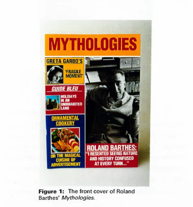
5.3.1 The Design of Roland Barthes’ M y th o lo g ie s ,
The design of Barthes’ Mythologies is done according to the conventions of a cheap gossip magazine exemplified by Klips, G ente, or The National Enquirer. I have taken a text which was originally written as regular columns for a magazine in the 1950’s, but which is now only available in the form of an academic looking book, and refused to continue the highbrow conservative academic form that publishers
and designers believe appropriate for Mythologies. By choosing the form of a cheap gossip magazine I hope for a ‘look’ that would be foreign, perhaps even offensive or uncomfortable for the usual readers of Mythologies and yet attractive and
‘approachable’ by people who may be put off Barthes because of the category in which booksellers and libraries pigeon hole his books. The colliding of signifiers occurs when the name “Barthes” which signifies ‘highbrow French intellectualism’, ‘serious, critical thought’ , ‘academic food for academic thought’ crosses the path of a form that signifies ‘ephemera’, ‘scandal’, ‘gossip’. Such a design may help to generate a new non-academic audience who instead of being lulled into passive envy by the drivel of some dull journalistic hack, end up confronted by the critical attitude and thought of an important post-war writer and thinker.
MYTHOLOGIES
GRETA GARBO’S ‘ FRAGILE MOMENT’ HOLIDAYS W AN UNINHABITED LAND R N A M EN TA L C OOKERY OR THE MAGICAL CUISINE OF a d v e r t is e m e n t“ I RESENTED SEEING NATURE AND HISTORY CONFUSED
AT EVERY TURN...”
Figure 1: The front cover of Roland
Barthes' M y th o lo g ie s .
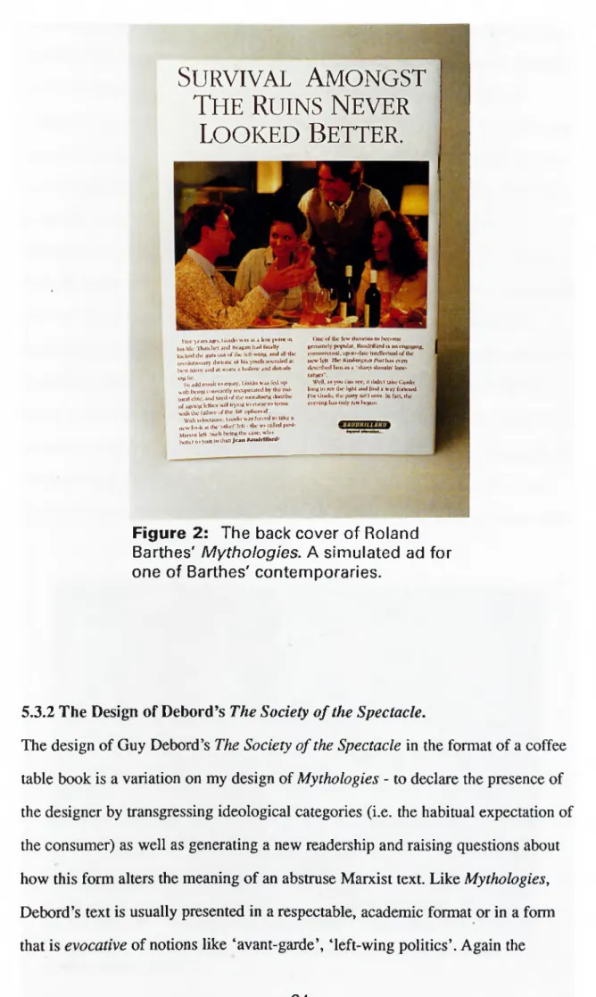
S
urvival
A
mongst
T
he
R
uins
N
ever
LOOKED B
etter
.
IIVC year» atto. Guido was »I a low |x)Ini m 111» life. 'H u u licr and KcaKan lu d finally kK kwl «Ik-· km«» «ki« o f «Ik· lcl«-\MnK. and all «lu.· rcNtdiMKiiury tlKMiKK- o f liis y<Hi«h MHindetl a« IxrM nanx· and a« wx)iM a luillow and iliMuil»·
ihkIic.
To aikl Inwil« «o ii)|ury. (.uldo wa» f« l up \^i«h Ix-ii'H ton»«an«ly imi|>cia«cd l»y «he cul- tuial cine, and «ired o f «Ik- iiKKaliNng ihainlK· of anetUK l‘-·f^K1· Mill irying «o co*>w «·» «ein» w U i ilK· failure of «he 6H u|)»K-ava|·.
Wiih tehiiiaiHv. Guhk» was fo u n l «<> lake a new hxik ai «Ik· •o«her' Id« - «Ik· M>-«lled |km«· MaialM Id« >uih iK-lng «he ta»e. wlio iKiKf «I» «un« "> «han Je a n llaudrillanli'
One o f tile few «heoriau to ImtMiK· genuinely popular. Ilamlnllard » an engaging, toolm m M al. up-«cMlaie Intelleetual o f ilic iK-K· Id« Ihc V’luhinniun /V»/ l u t e\en «lexTilK-d him as a '»luf]! »iKKgin' lo n o ranger".
W dl, as you r an »cc, 1« lUdnl lake Guklo ItMig «0 see «lie liglK and (ind a w ay forward. I (X Guido, «Ik* |Miiy isn i lAvr. In fail, «lie ciYnlng hat only |uM lx*gun.
Figure 2: The back cover of Roland
Barthes' M y th o lo g ie s . A simulated ad for one of Barthes' contemporaries.
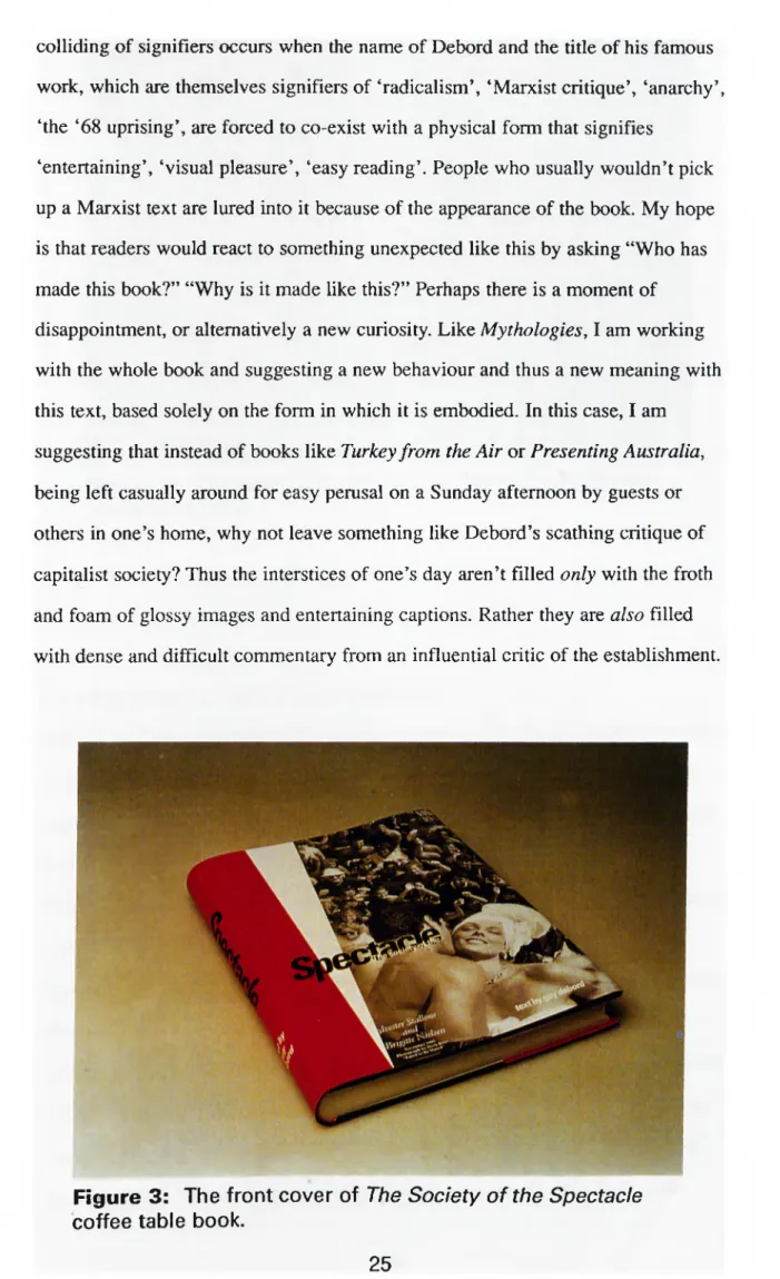
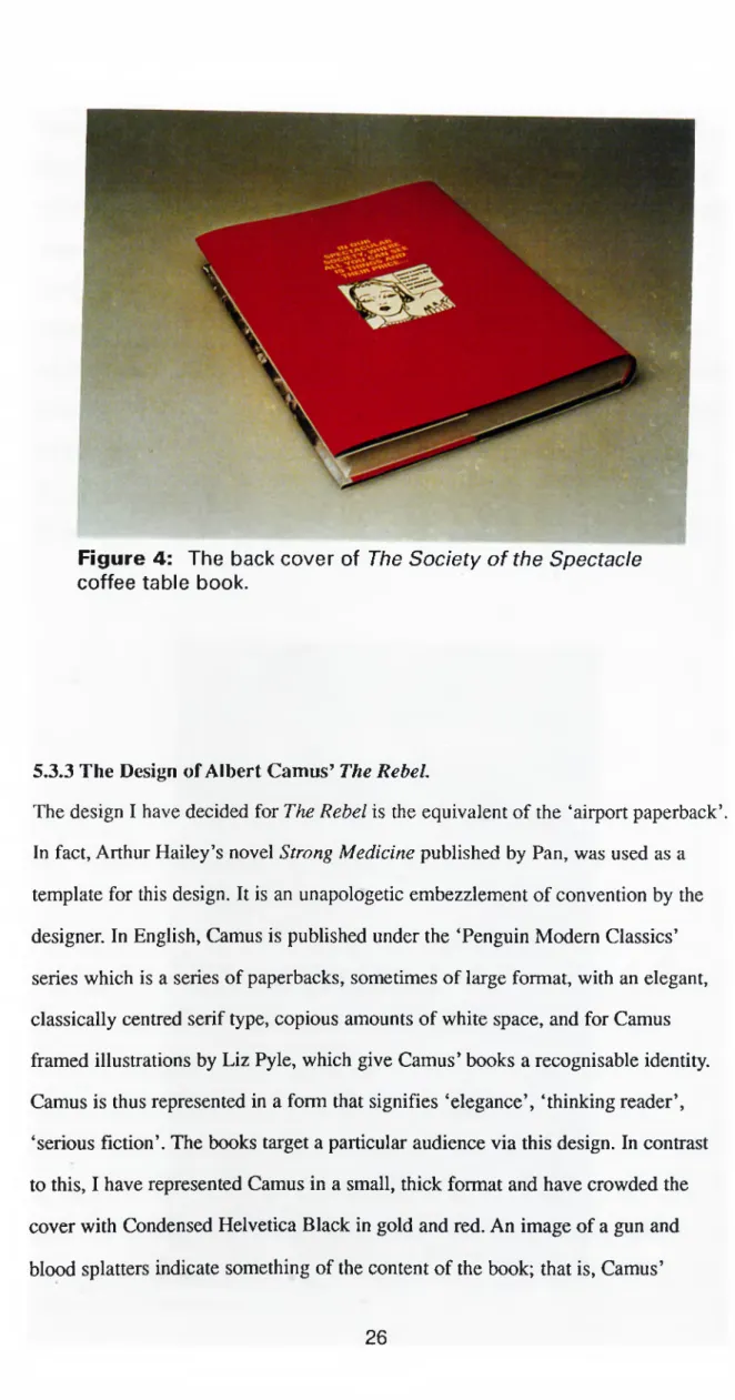
5.3.2 The Design of Debord’s The Society o f the Spectacle.
The design of Guy Debord’s The Society o f the Spectacle in the format of a coffee table book is a variation on my design of Mythologies - to declare the presence of the designer by transgressing ideological categories (i.e. the habitual expectation of the consumer) as well as generating a new readership and raising questions about how this form alters the meaning of an abstruse Marxist text. Like Mythologies, Debord’s text is usually presented in a respectable, academic format or in a form that is evocative of notions like ‘avant-garde’, ‘left-wing politics’. Again the
colliding of signifiers occurs when the name of Debord and the title of his famous work, which are themselves signifiers of ‘radicalism’, ‘Marxist critique’, ‘anarchy’, ‘the ‘68 uprising’, are forced to co-exist with a physical form that signifies
‘entertaining’, ‘visual pleasure’, ‘easy reading’. People who usually wouldn’t pick up a Marxist text are lured into it because of the appearance of the book. My hope is that readers would react to something unexpected like this by asking “Who has made this book?” “Why is it made like this?” Perhaps there is a moment of disappointment, or alternatively a new curiosity. Like Mythologies, I am working with the whole book and suggesting a new behaviour and thus a new meaning with this text, based solely on the form in which it is embodied. In this case, I am suggesting that instead of books like Turkey from the Air or Presenting Australia, being left casually around for easy pemsal on a Sunday afternoon by guests or others in one’s home, why not leave something like Debord’s scathing critique of capitalist society? Thus the interstices of one’s day aren’t filled only with the froth and foam of glossy images and entertaining captions. Rather they are also filled with dense and difficult commentary from an influential critic of the establishment.
Figure 3: The front cover of T h e S o c ie t y o f th e S p e c ta c le
coffee table book.
Figure 4: The back cover of Th e S o c ie ty o f the S p e c ta c le
coffee table book.
5.3.3 The Design of Albert Camus’ T h e R e b e l.
The design I have decided for The Rebel is the equivalent of the ‘airport paperback’. In fact, Arthur Hailey’s novel Strong Medicine published by Pan, was used as a template for this design. It is an unapologetic embezzlement of convention by the designer. In English, Camus is published under the ‘Penguin Modern Classics’ series which is a series of paperbacks, sometimes of large format, with an elegant, classically centred serif type, copious amounts of white space, and for Camus framed illustrations by Liz Pyle, which give Camus’ books a recognisable identity. Camus is thus represented in a form that signifies ‘elegance’, ‘thinking reader’, ‘serious fiction’. The books target a particular audience via this design. In contrast to this, I have represented Camus in a small, thick format and have crowded the cover with Condensed Helvetica Black in gold and red. An image of a gun and blood splatters indicate something of the content of the book; that is, Camus’
attempts to understand the most barbaric century of humankind’s existence - our own. This design, or what I like to think of as the clothing of Camus in pulp drag, targets a different audience to that of Penguin because the design signifies ‘scandal’, ‘entertaining fiction’, ‘an easy read’. However, readers won’t find the usual
comfortable fiction between the covers. Instead, they are offered the intensity of Camus and his musings on violence, rebellion, suicide. In fact, if we forget about the Foreword of the Penguin edition - a presumptuous and tedious imposition - and launch straight into the book, Camus facilitates the melodramatic excess of the form via his opening lines: “There are crimes of passion and crimes of logic. The line that divides them is not clear” (11). Arthur Hailey couldn’t have put it better himself.
Figure 5: Camus masquerading as Arthur
Hailey.
I
REBEL
! * « ^ €
i ff^ a ïC a * i · ^ «
ALBFd y·«. ^ •'"“'•''•SS?"^· •*ober ‘^ o »7"i> " 330 - 2Figure 6: The Camus masquerade from
behind.
5.3.4 The Design of B ertrand Russell’s The Problems o f Philosophy. This design deliberately mixes the form and function of a desk calender with
Bertrand Russell’s The Problems o f Philosophy, a book which was Russell’s attempt to present to the non-philosopher, problems that were of central concern to the philosopher. One can think of it as the philosopher’s equivalent to Stephen Hawking’s A Brief History o f Time. The calender is a utilitarian device that has a clearly defined function - to help with the organisation of one’s day, week, and year such that one can work more efficiently and more productively in a bureaucratic, work regime. It is a device that helps one work at the pace of the workplace. When
Russell introduces the ‘common’ person to philosophy, he is in effect encouraging them to philosophise. To philosophise one needs a leisurely routine, something akin to Wittgenstein’s escape to Norway, to work out his later philosophy. In other words, one must submit to the pace of critical reflection - something slow and leisurely, something medieval. This design is an experiment at imposing an order on the book such that not only is one required to turn the pages (i.e. submit to the demands of the codex format) but also turn them on a particular day, or at least have the book open at a certain day in a certain place. There are no page numbers, only dates. Thus one can only ever locate a particular passage or chapter according to the day on which it can be read. The designer as manipulator is represented in a new way. Not only does the designer tell the reader where to turn but also when. The pace of reading a book is demanded by the designer. The reader can choose to conform or not to conform. Both are conscious responses by the reader.
On a more personal level, this design is my response to Russell’s attempt to bring philosophy to the common person. Amidst appointments, meetings, phone calls and the often frantic pace of the workplace, the non-philosopher, when using the
calender, is reminded of an alternate pace, an alternate position, an alternate frame of mind that exists for humanity.
Figure 7: Bertrand Russell's T h e P r o b le m s o f P h ilo s o p h y in calender format.
Figure 8: Chapter VIII / June 14, 1997 in T h e P r o b le m s o f P h ilo s o p h y .
5.3.5 The Design of P o e try w ith a n E d g e .
Poetry with an Edge is an anthology of contemporary poetry that I have designed in
a form reminiscent of a work manual - the kind one might find listing spare parts for cars or specifying details for plumbing fixtures. The pages of this book aren’t bound by stitching or gluing. Rather, they are bound by a metal ring that can be opened and closed. What this means is that as an anthology, the collection isn’t fixed. Instead, the reader can change the anthology by taking away poems he or she doesn’t like as well as by adding poems or other texts she or he does like. Also, the order can be changed according to the whims of the reader. Hesse writes of the anthology: “. .. the relative stasis, not to say intransigence, of the printed book is the anomaly in the history of the written w ord,. . . user made anthologies are the norm” (42). Thus to present an anthology of poetry in a more utilitarian format, is to echo something of the history of the printed word as well as to deny the
canonical-like aura that the fixing of pages delivers to the text. From the point of view of production and reception, it is the designer trying to make room for the idiosyncrasies of the reader in terms of content and order, as well as a clear example of the designer working with the whole book. In other words, it is an attempt to realise something of the theoretical re-orientation of design along the lines of cultural interpretation rather than universal perception. A subjective consumer response is encouraged.
Figure 9: An anthology of contemporary poetry. P o e try w ith an Edge.
Figure 10: The utilitarian look of P o e try w ith a n Edge.
5.4 Category 2: Novel Departures from Existing Conventions.
The four designs that make up this category are my attempts at going beyond the traditional two dimensional space of graphic design. They are the beginning of working with the book as a whole. They are also my attempts to offer to the
consumer a ‘confessional gesture’ regarding the presence of the designer in bringing before the consumer an embodied text. They do this not only through the formal and visual aspects of the book, but also because they interrupt the habits of the consumer in terms of what one is required to do with and because of the book. The focus of my designs is the functionality of the spaces that make up the cover of the book and how they work in creating a dichotomy between the interior and the exterior of the book. I have chosen to focus on this aspect of the book object because as I mentioned before the book can be considered an “architectural
enclosure” that enjoys an aura of incorruptibility, security and permanence because of the interior/exterior dichotomy. In order to read a book, it has to be opened. When one is finished, it is closed. The spaces on a book are either interior or exterior. The reader is either inside the book or outside the book. The cover and each page that follows are like hinged doors that one opens and closes.
5.4.1 The Design of Robert Hughes’ Nothing i f Not Critical.
The way in which I worked with this book was to take the interior/exterior
dichotomy to an extreme and isolate the inside from the outside by sealing a plain, undesigned book in a jacket that has been designed. This is a rhetorical act, as well as a strategy for the designer to declare to the consumer that things are ‘engineered for effect’. It is rhetorical because what it does is to underscore the functionality of the jacket as bourgeois ornament, and of the book as a decorative item presented to the consumer by the designer. It is a way of confessing the designer as manipulator because it is forcing the consumer to choose between cover and book, between ornament and function, between the outside and the inside. In other words, the designer is saying to the consumer, “See. You are being made to act. You are being
pushed into a certain position.” Similar to designs like the coffee table book, my hope is that the consumer will react to the object and the interruption of habit and usual expectation, and ask themselves questions like “Who has done this? Why have they done this?”
Figure 11: Hughes' N o th in g i f N o t C ritical. The choice is between the cover and the contents.
i ^ ^ ? l = ~ = =
>+SoH^J?^’^9Vdc4vn>f.L ,. '? * * fsvaw on n stations. , c * - · *'"’«ve,;,i*'^^'<R.tfiK.«,::' 6«»«d b„,„„N.
« in „ ,w . world ,n ‘" " '" ’'f-taiov ~ ·
>
4^
Figure 12: The back cover of N o th in g i f N o t Critical. Unopened and therefore unread.
5.4.2 The Design of Carl Ju n g ’s Memories, Dreams, Reflections. With this book, and its variant Noam Chomsky’s Year 501: The Conquest
Continues, I have worked with the interior/exterior opposition in terms of trying to
overcome them rather than divide them. The motive for this book begins with Robert Venturi’s book Complexity and Contradiction in Architecture, a book that has had an important influence on recent graphic design and architecture. Venturi is in favour of an architecture that embodies “ambiguity and tension”. This means a rejection of the modernist mantra “less is more”, or to put it another way, the either/or mentality of modernist dogma. For Venturi, contradiction employs a
“both/and” mentality; it involves “the paradoxical contrast implied by the
conjunctive ‘yet’” (23). Thus, this design is an attempt to provide spaces that are both inside and outside. This can be seen in the three ‘covers’ of the book. It focuses on the form as a whole, for as Venturi says: “. . . an architecture of complexity and contradiction has a special obligation toward the whole: its truths must be in its totality or its implications of totality” (16). It is also another way for the designer to declare his or her presence for what it does is make people think about how to read the book, where to put the book, as well as encouraging curiosity about what is going on within the book. A consciousness regarding the physicality of the book is enlivened because habit is threatened and curiosity stimulated.
In regards to size and proportion I wanted to re-use some of the ideals and history of book design in a way that employed both the acceptable and the unacceptable. For Tschichold, page proportions are divided into those that are “intentional and definite” and those that are “unclear and accidental” (38). The former are about utility and beauty, whilst the latter are about the “monstrous” and the “irksome”. This book is a combination of both the beautiful and the monstrous, the useful and the irksome, for if one takes the time to study the proportions one will find such co habitation. For example, the top cover is the irrational proportion of the Golden Section, whilst the last cover is the rational ratio of 2:3. Both of these are
considered ideal proportions for book production. However, inbetween I have used a square, something designers like Tschichold consider clumsy and ugly. Also, the 2:3 ratio I have turned ninety degrees thus making use of something ideal in a perverse way.
CiD U J i»SCV> l O i S
lo>
S m e f l e c t i o n smo
Figure 13: Jung's M e m o rie s , D re a m s, R e fle ctio n s. Spaces that are "both/and".
Figure 14: Jung's M e m o r ie s , D re a m s, R e fle c tio n s . The open ing of the 'irrational' part.