ís^rí* ÎİP v¿ ÿ líf ra w 1^ Φ ,'4ími^W ir ííí *s^ “
,i;,^ .· .:r.:r* ■,. li·: ;. r:
: r . ’ ’ 1 ··.
COLOR IN INTERIOR SPACES
A THESIS
SUBMITTED TO THE DEPARTMENT OF
INTERIOR ARCHITECTURE AND ENVIRONMENTAL DESIGN AND THE INSTITUTE OF FINE ARTS
OF BILKENT UNIVERSITY
IN PARTIAL FULFILLMENT OF THE REQUIREMENTS FOR THE DEGREE OF
MASTER OF FINE ARTS
By
Mijge Demirors (Bozbsyli) February^ 1992
Nt
2 ^ / S S
. C G
I certify that I have read this thesis and that in my opinion it is fully adequate, in scope and in quality, as a thesis for the degree of Master of Fine Arts.
Assoc. Prof. Dr, Yeber (Principal Advisor)
I certify that I have read this thesis and that in my opinion it is fully adequate, in scope and in quality, as a thesis for the degree of Master of Fine Arts.
Prof. Dr. Bülent Özgüç
I certify that I have read this thesis and that in my opinion it is fully adequate, in scope and in quality, as a thesis for the degree of Master of Fine Arts.
Prof. Dr. Mustafa Pul tar
Approved by the Institute of Fine Arts
P r o f . Dr. B ü l e n t ö z g ü ç , D i r e c t o r of the Institute of Fine Arts
ABSTRACT
COLOR IN INTERIOR SPACES
MÜGE DEMIRÖRS (BOZBEYLl)
M.F-A. in Interior Architecture and Environmental Design Supervisor: Assoc. Prof. Dr. Cengiz Yener
February, 1992
Color can be approached from different perspectives and disciplines such as, biology, theory, technology,
and psychology. This thesis discusses color, from the stand point of interior spaces, which to some extent
involves most of these disciplines.
The aim of this study is to review the research on environmental color. It will summarize what is empirically known about our responses to color, how, if at all, color
)
influences the perception of an interior, how it is effected under different light sources or if it is effected from each other. The effects of light on color will try to be verified by using a 'color and light simulator'.
Keywords: color, light, surface color, space color, color psychology, color theory, color
Ö Z E T
İÇ M E K A N L A R D A RE NK MÜ GE DEMİRÖRS (BOZBEYLÎ)
İç Mimari ve Çevre Tasarımı Bölümü Yü ksek Lisans
Tez Yön eti cisi: Doç. Dr. Cengiz Yener Şubat, 1992
R e n k kav ra mı , b i y o l o j i , teori, t e k n o l o j i ve p s i k o l o j i gibi, çeşitli d i s i p l i n l e r i n de ğişik bakış açı l a r ı n d a n ele alınabilir. Bu tez, rengi iç meka n l a r açısından tartıştığı
i ç i n , b i r ö l ç ü y e k a d a r bu d i s i p l i n l e r i n h e p s i n i i çermektedi r .
Bu ç a l ı ş m a n ı n a m a c ı , m e k a n r e n g i ü z e r i n e y a p ı l a n ç a l ı ş m a l a r ı i n c e l e m e k t i r . B u r a d a a m p i r i k o l a r a k reng e karşı t e p k i l e r i m i z l e ilgili n e l e r i n b i l i n d i ğ i , rengin, e ğ e r e t k i l i y o r s a , m e k a n a l g ı l a m a s ı n ı nasıl e t k i l e d i ğ i , değ işi k ışık k a y n a k l a r ı n da n veya renklerin b i r b i r 1 erinden nasıl e t k i l e n d i k l e r i ö z e t l e n m i ş t i r . I ş ı ğ ı n rengi nasıl e t k i l e d i ğ i , bir 'renk ve ı ş ı k s i mu 1a t ö r ü ’ k u l l a n ı l a r a k
isp atla nma ya ça lış ılm ıştır.
A n a h t a r Sözcükler: Renk, ışık, yüzey rengi, mekan rengi, renk psikolojisi, renk teorisi
A C K N O W L E D G M E N T S
I gratefully acknowledge my indebtedness to Assoc. Prof. Dr. Cengiz Yener, who guided me in p reparation of my thesis. I wish to express my gratitude to Feyzan Beler, for her valuable criticism. I would like to thank Emre and my family for their all time supports. Finally I would
like to thank Çiğdem and Elif, who helped me to finalize this thesis.
TAB L E OF C O N T E N T S ABSTRACT OZET ACKNOWLEDGMENTS TABLE OF CONTENTS LIST OF TABLES LIST OF FIGURES 1 INTRODUCTION 2 COLOR PERCEPTION 111 iv V V i viii ix 1 6 2.1 Light Rays ... 6
2.2 The Human Eye ... iO 2.3 Chromatic and Achromatic Surfaces ... 17
3 THEORY OF COLOR 19 3.1 Modes of Color ... 19
3.2 Color Systems ... 20
3.2.1 The CIE System ... . 21
3.2.2 The Munsell System ... ... 23
3.3 Mixing of Color ... 27
3.3.1 Additive Principle of Color Mixing... 27
3.3.2 Subtractive Principle of Color Mixing. 29 3.3.2.1 The Color Circle ... 30
3.3.2.2 Color Contrasts ... ... 32
4 PSYCHOLOGY OF COLOR IN INTERIORS 34 4.1 Different Effects of Long Wavelengths and Short Wavelengths ... 35
4.2 Unity and Complexity Balance ... 38
4.3 Personality and Reaction to Stimulation .... 41
4.4 Centrifugal and Centripetal Action ... 44
4.5 Color Effecting Different Perceptions ... 46
4.5.1 Perception of Volume (Color and Spaciousness) ... 46
4.5.2 Perception of Weight and Size ... 50
4.5.3 Estimation of Time ... 52
4.5.4 Estimation of Temperature ... 53 vi
5 RELATION OF LIGHT AND COLOR 55 5.1 Natural Light and Color ... 55 5.2 Artificial Light and Color ... 57 5.2.1 Types of Light Sources Effecting Color 60 5.2.2 Metamerism ... 76 5.2.3 Color Constancy ... 79
6 RELATION OF SURFACES AND COLOR 81
6.1 Types of Surfaces Effecting Color ... 81 6.2 Reflectance of Surfaces Effecting Color .... 83
7 A CHECKLIST FOR COLOR PLANNING 87
8 CONCLUSION 90
REFERENCES 95
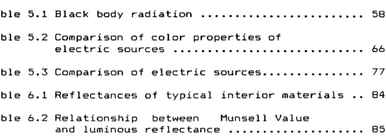
LIST OF T A B LES Table Table 5.1 Table 5.2 Table 5.3 Table 6.1 Tab 1 e 6.2
Table 5.2 Comparison of color properties of electric sources ...
Page
58
66
Table 5.3 Comparison of electric sources... 77 Table 6.1 Reflectances of typical interior materials .. 84 Table 6.2 Relationship between liunsell Value
and luminous reflectance ... 85
L IST OF FIG UR ES
Figure Page
Figure 1.1 Color and Light Simulator ... 5
Figure 2.1 Electromagnetic spectrum ... ... 9
Figure 2.2 The human eye ... ... 10
Figure 2.3 The spectral sensitivity curves of cones and rods ... 15
Figure 2.4 CIE tristimulus values ... 16
Figure 3.1 The CIE triangle ... 21
Figure 3.2 Munsell color scales ... 24
Figure 3.3 Munsell color circle ... 25
Figure 3.4 A particular section of red from the color solid ... 26
Figure 3.5 The additive color circle ... 27
Figure 3.6 The subtractive color circle ... 29
Figure 3.7 The color circle ... 30
Figure 5.1 Color temperatures (natural- electric source comparison) ... 59
Figure 5.2 Spectral diagram of incandescent lamp ... 61
Figure 5.3 Spectral diagram of cool-white fluorescent lamp ... 62
Figure 5.4 Spectral diagram of HID lamp ... 64 Figure 5.5 Materials under fluorescent lamp (500 lux) 69 Figure 5.6 Materials under incandescent lamp (500 lux) 69 Figure 5.7 Materials under halogen lamp (500 lux) . 70 Figure 5.8 Materials under incandescent lamp (1000 lux) 70
Figure 5.9 Materials under halogen lamp (1000 lux) ... 71
Figure 5.10 Materials under halogen lamp (100 lux) .... 71
Figure 5.11 Materials under fluorescent lamp and colored wall surfaces ... 72
Materials under incandescent lamp and colored wall surfaces ... 72
Materials under halogen lamp and colored wall surfaces ... 73
Materials under fluorescent plus incandescent lamp ... 73
Materials under fluorescent plus halogen lamp ... 74
Figure 5.16 Objects under red light ... 74
Figure 5.17 Objects under green light ... 75
Figure 5.18 Objects under blue light ... 75
Figure 5.19 Objects under purple light ... 76
Figure 6.1 Light reflection from different surfaces .. 82 Figure 5.12
Figure 5.13
Figure 5.14
1 INTRODUCTION
Scientists have claimed that given proper food and exercise, man could survive in total darkness (Birren, 1970). This is a cruel statement, which denies the purpose and significance of life itself- Man, who is becoming more and more enclosed with his environment, needs not only proper food and exercise, but agreeable visual sights and colors, to help him maintain a pleasing and rational norma 1i t y
-Many designers and architects deal with forms as if they are colorless and exist in open spaces. Many colors and forms are originally conceived without refe»^enc0 to environment. Their main emphasis is on, line, mass or proportion. However, what is seen by the eye can not be colorless, and color is an integral dimension of form which cannot be separated from it. It must be clarified that, color is one of the basic space requirements of human beings. The functionally adequate environment demands not only adequate lighting, temperature and noise control, efficient circulation and space relationships but colors and color effects, that avoid monotony and are meaningful beyond beauty alone.
is to base color decisions on instincts and stereotypes, which is perhaps more dangerous. Among designers there seems to be a desire to be unique. However the needs of a particular problem should not be overshadowed by the personal fancy of the designer. This is especially true for offices, schools, hospitals, mass housing; where people young and old, well and ill, are trying to perform useful work, learn something, be cured of illness and be spared isolation. Careful color planning, appropriate to the context of the space, increases the efficiency of the activities people perform- This can be achieved by examining the research material, in understanding the requirements for beneficial
environments-Color is a tool in space creation. The placement of color reinforces the reading of a space by articulating certain elements and organizing to the viewer. Therefore, a clear description of this tool is necessary in order to develop further arguments. Color has been described as a subjective visual sensation produced by light. The relation of light and color, and the environment where they are to be applied, have to be adapted to the physiological laws of vision- So, discussions in environmental design demand a brief knowledge of the human optical system. Color fundamentals, such as its notations and systems, are the vocabulary of color, which is the key to actually using it.
In interior spaces, color is always considered in relation to other colors; it is never evaluated in isolation. Therefore, an understanding of certain effects, particularly contrast effects, is essential in avoiding optical
illusions-There are certain stereotypes about color's power. All of these suggest that colors possess inherent qualities, which can evoke mood associations, estimation of things, influence our judgment, evaluation and even our behavior towards people, places and things where color is applied. One of the aims of this study is to examine if these are realistic appraisals of colors role; what is known scientifically about the effects of color in environmental design, and whether such effects of color can be accepted as true for all combinations of color dimensions, under all qualities of illumination and types of surfaces.
Color, in addition to psychologically affecting perception, itself is affected by physical elements in the environment. In the field of interior color, true color has no meaning, because light is such a variable item. There are times when a room will be lighted by daylight or times when different qualities of artificial
light will be used. By interreflections in a space, the light reaching a surface will have undergone several
reflections from the surfaces- So color in interiors is an interaction of 'space colors' produced by luminance and 'surface colors' produced by selective reflection of incident il
lumination-Interior color is a fairly complex subject. This study will try to summarize and compare various studies in this field, without trying to make color specifications or proposals, which are the designer's role. It is aimed at providing a critical thinking about color usage, that will help to organize a knowledgable approach to color, that avoids personal fancy for a more objective attention to human needs.
During this thesis, in order to be able to visually verify and observe the effects of light on color, a 'color and light simulator' has been designed, constructed and used. As mentioned in the text, because of color constancy and metamerism, it is usually very difficult to make correct color selections, unless through direct comparisons (see section 5 -
2)-Color and light simulator is a tool, on which there are two rooms with a variety of light sources and changeable colored panels are placed to simulate walls of a space (Figure 1.1). In the simulator, the quality and intensity of the light, colors of the room surfaces and materials
^ I
F i g u r e i , i C o l o r a n d L i g h t S i m u l a t o r c o n t a i n e d in c a n b e c h a n g e d · T h i s p r o v i d e s t h e v i e w e r to e x p e r i e n c e t h e c o l o r d e v i a t i o n s c a u s e d , b y b o t h t h e q u a l i t y a n d q u a n t i t y o f t h e l i g h t a n d b y in t e r r e f 1e c t i o n s b e t w e e n t h e s u r f a c e s ·2 COLOR PERCEPTION
Man perceives objects in his environment when light transmitted through or reflected from these objects reaches to his
eye-As color is reflected light and the phenomenon of color has been described as a subjective visual sensation produced by light , not as property of objects (Wineman et.al., cited in Space Human Factors Office, 1986, p.3), it is necessary to know something about how light becomes
C O1or
-Briefly, color perception results from the interaction of the three factors; light, surface and the eye. In the following sections, how light produces color is described and the three factors of visual perception are explained.
2.1 Light Rays
Color is light, which is a form of e 1ectromagnetic radiation. Other widely known electromagnetic radiations include radio-waves, x-rays, gamma rays, cosmic
nm (violet) and 780nm (red). This small interval of the spectrum that contains visible light is given to us as sunlight, which is white or uncolored and contains all spectral colors; red, orange, yellow, green, blue, and violet
-The theories about electromagnetic radiation, in other words, about how light travels have been narrowed down into two; wave theory and quantum theory.
The first one, Maxwell's wave theory, suggests that light travels in a wave-like motion- These waves vibrate at different frequencies and each frequency determines an individual color. Red has the lowest number of vibrations, violet the highest.
The second one, Max Planck's quantum theory, is considered as a further refinement of the wave theory- It suggests that the waves of light exist as quanta and they travel as streams of particles. These particles gain and loose energy in varying amounts, thereby producing different c o l o r s .
White light does not automatically separate into different colors, rather the emanating wavelengths must be interrupted in some way before they will break up into colors that can be perceived by our eyes and brain. This can occur in many ways like dispersion, diffraction and
interference (Kuehni, 1983).
Dispersion is the well known way discovered by Newton, which is what happens when light passes through a prism. Newton discovered that the light is refracted, resulting in an ordered display of individual colors. The arrangement of these colors is always the same from the longest wavelength to the shortest, with orange, yellow, green and blue falling between two extremes as red and violet. Between each of the spectral colors, there are infinite gradations which are difficult to detect with specific names. He gave the name spectrum to the progression of colors and demonstrated that, each color of the spectrum is incapable of being broken down because it is composed of only one wavelength (Brandis, 1906).
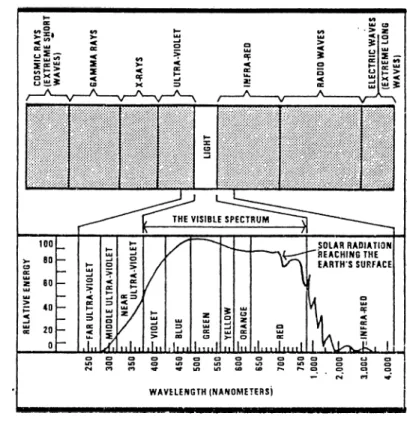
Figure 2.1 shows the electromagnetic spectrum on which colors are represented by the corresponding wavelengths approximately as follows: red 630-780 nm orange__^600-630 nm yellow__565-600 nm green____500-565 nm blue_____^435-500 nm violet 380-435 nm
Figure 2.1 E 1ectromagnetic spectrum
The name or the number of these colors may differ in different references. Some authors, like Parramon (1989), add indigo (deep blue) to arrive at the number of seven rainbow colors. The sequence, however, is always the same.
Interference is what happens to light when it hits a thin transparent film, such as an oil film on water. In this case, the light wave is temporarily split into two parts, which are later recombined. The resulting colors are called iridescent; they change with the viewing angle of the surfaces.
Diffraction is the combined effect of dispersion and interference. When daylight strikes the edge of a solid
material, such as a razor blade or crack of glass, depending on its iMavelength and dimensional properties of the edge, the waves are split in different directions and a display of spectral colors can be viewed from many a n g l e s
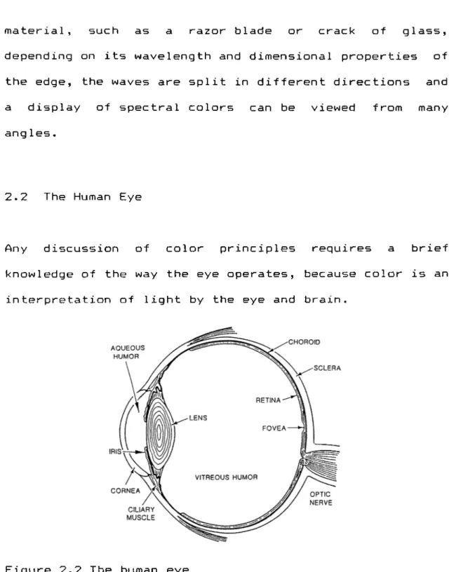
-2.2 The Human Eye
Any discussion of color principles requires a brief knowledge of the way the eye operates, because color is an in terprêtation of light by the eye and brain.
Figure 2.2 The human eye
The human eye is spherical, with a diameter of around 25 millimeters- Basically the eye consists of the cornea,
iris, lens and the retina (Figure 2.2).
eye- It serves as a preliminary lens, helping to focus light. Iris is at the entrance of the eye- The color of iris defines the color of the
eye-In the center of the iris, there is a hole called pupil, which acts as a diaphragm. It controls the amount of light entering by varying its diameter- When the light is strong, the muscles automatically close the diaphragm, so that the eye is not damaged- The iris opens to its fullest extent when light is very dim. The movement of the iris is coordinated with the movement of the cornea- When the eye is subject to constant changes from light to dark, these muscles become tired and end with the disability known as eyestrain
-The lens collects the light rays and focuses them on the retina, at the back of the eye. It has a complex movement which compensates for distance and also adjusts, so that the images in both eyes are perceived as one- The lens is also sensitive to different wavelengths of light by flattening out or becoming concave to deal with them- This adjustment is possible because of flexible layers and ciliary muscles, which contact to make it more rounded. The actual point of focus is not the same in all cases; colors of shorter wavelengths tend to focus at a point slightly in front of the retina, the longer wavelengths slightly behind it- As the eye automatically tries to correct this imbalance, short wavelengths seem closer and
long wavelengths seem further away· These perception differences between wavelengths will be explained in section 4·5·1·
The retina is the covering at the back of the eye and it is directly connected to the brain by nerves which transmit impulses. It consists of more than a hundred million light sensitive nerve endings of two types which are called rods and cones because of their
shape-Rods, distributed over the entire surface, react to brightness and motion even in dim light and provide low- intensity vision. Cones, mainly concentrated in the central area of the retina and fovea, produce high intensity vision.
The fovea centralis is a spot in the center of the visual axis, and has no rods. Near the fovea there is the blind spot where the optic nerve connects the eye to the brain. This region has no rods or cones.
The outer coat of the eye consists of a dense fibrous, white colored membrane, the sclera. Between the sclera and the retina, is another membrane, the chroid, which contains many blood vessels to supply the eye with oxygen and nutrition.
The part of the brain that is responsible for visual perception is situated at the surface, at both sides of the fissure that separates the two brain halves. It is called the visual cortex. The part of the eye between the cornea and the lens is filled with a liquid called aqueous humor. Between the lens and the retina, the eye is filled with a jelly like substance called vitreous humor, which keeps the eye in shape.
Seeing, in general terms, works in two ways; physical stimuli from the outside world enters the eye which then sends impulses to the brain, the brain adds its experience, judgment and perception to what it receives, and looks back at the world and sees it (Birren, 1988).
Although the exact process of vision is not very clear, there are several theories about it. Today science generally approves the duplicity theory, first stated by Max Schultz. This theory states that low intensity vision is a function of the rods of the retina and high intensity vision is a function of the cones. According to this theory, the rods are highly light sensitive and principally responsible for the detection of shape and movement, but cannot distinguish colors. Cones on the other hand, are less sensitive to light, but can distinguish colors and fine detail.
rod or cone is stimulated in the retina, its chemical composition changes temporarily. This results in an electric current which passes to the brain through the nerve fibres. In the case of rods, about one hundred of them are connected to one and the same nerve fibre. The accumulation of the stimulus of many rods is the reason why rods are highly sensitive to light. Rods are also responsible for peripheral vision. On the outer boundaries of vision, they can detect faint images, brightness changes and motion.
Cones are sparsely distributed over the entire retina, but they are densely found in the fovea. Unlike rods, at least in the foveal area, each cone is individually connected to the brain, resulting in a very high resolving power. Because of this reason, the fovea is the only place where the eye can distinguish fine details, texture and color. On the other hand, sensitivity to light for cones is far
2
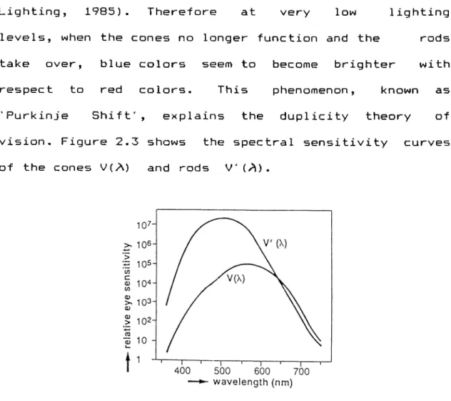
less than for rods. At luminance levels of 3.5 cd\m and less, they gradually stop to function.
Although no colors can be distinguished with cones, a sensitivity is found at a wavelength of 507 nm (green), and it steeply decreases toward the red end of the spectrum. The maximum sensitivity of cones are found at a wavelength of 555nm (bright yellow), and the fall toward the red side of the spectrum is less clear (Philips
Lighting, 1985). Therefore at very low lighting levels, when the cones no longer function and the rods take over, blue colors seem to become brighter with respect to red colors. This phenomenon, known as 'Purkinje Shift', explains the duplicity theory of vision. Figure 2.3 shows the spectral sensitivity curves of the cones V(A) and rods V'(A).
Figure 2-3 Spectral sensitivity curves of cones and rods
The Young-Helmho1tz trichromatic theory explains another aspect of color vision. According to this theory, there are three types of cones, sensitive to red, green and blue parts of the spectrum, which are actually the primary colors of the additive color mixing (see section 3-3-1). Through these cones, all other colors are perceived as the result of the sum of their combination. Persons who miss one type of cone are partially color blind.
When the three types of cones, which Livingstone (1988) termed short wavelegth for blue, middle wavelength for
green and long wavelength for red, are stimulated equally, the eye and brain see the light as white- But if one type of cone is stimulated more than the other two, the image appears to be colored with the corresponding dominant wavelength. The principle here is called the additive color mixing, which will be explained in the next chapter.
The red, green and blue receptors are named shortly as the X j y : receptors and their stimulation levels have been measured. Taking the maximum stimulation level of y as one, the CIE tristimulus values are formed (Unver, 1985), as shown in figure
2-4-violet blue qreen yellowioranqe red
The human eye has an adaptation mechanism, that continually attempts to adjust to an average perception level. The visual system can adjust to quantitative and qualitative changes in the conditions of illumination and observation (Kueppers, 1982).
Quantitative adjustment is called "achromatic adaptation". When lighting level in the environment changes, the eye momentarily changes its sensitivity to the new level.
Qualitative adjustment is called "chromatic adaptation". It occurs, because the three sensory capacities in cones adjust differently, to keep with the spectral composition of the light. Chromatic adaptation is the reason why we can recognize and distinguish colors relatively well, even in the case of major-changes in light qualities. This concept will be explained in detail in section 5.2.3.
2.3 Chromatic and Achromatic Surfaces
After all the information about eye, color, vision and light, it is possible to talk about the absorption- reflection property of surfaces, which is the summary of how surface colors are seen.
Surfaces influence the light that strikes them, modifying its spectral composition by partly reflecting it, partly absorbing it, partly transmitting it according to their molecular composition. The reflected and transmitted light waves are picked up by the eye and transmitted to the brain as color information, as explained in the previous section.
A surface that absorbs some rays and reflects ail others owes its color to those reflected rays. In other words, if the incident white light rays are not reflected from the surface in the same proportion, it seems colored- For example, if a surface appears green this means that the surface reflects the green light in greater percentage than the other lights. If a surface
a. Absorbs only about 10 "/. of the incident rays and reflects all the others, without any dominant wavelength, it appears white.
b. Absorbs nearly all the incident light rays appears black.
c. Absorbs about 50"/. of the incident light rays appears to be gray,termed uncolored (Grandis, 1986, p -57).
Achromatic surfaces reflect the incident light, without any deviation in their spectral compositions. In other words they do not change the color of the light.
Despite the statement of Ching (1988), color therefore is not a visual property inherent in surfaces. Bodies are colored by their molecular structure, which allows certain wavelengths of light to be absorbed into their surfaces and others to be reflected in order to be perceived by our eyes. The relation of light, surface and color will be studied in detail, in chapters 5 and 6.
3 THEORY OF COLOR
3.1 Modes of Color
There are five different ways of seeing color namely the surface, film, volume, illuminant and illumination modes
(Barna,1989, Albers,1975, Hesselgren, 1967).
The surface mode, as occurs in looking at an object, gives visual information about color, location and material. In the film mode, as occurs for example when looking at the sky, color information is received but there is no sense of location or materiality. In the volume mode, as when looking into water, color is seen in an awareness of finite space or volume. In the illuminant mode, as in a neon sign, color is seen as a light source.
In the illumination mode color fills space, affects all other modes and shifts the colors of all surfaces. Actually this mode can be considered as the summary of interior space colors. For, in the illumination mode, the boundaries between color and light begin to dissolve. As Barna (1989) indicated, "they can be seen as one and the same thing; field of light. The field of light is the integration of color and light" (p.63) .
3-2 Color Systems
For centuries many scholars have tried to develop color systems and separate color into its components. In some of these researches, color is considered as surface color, and in some, it was considered as radiant stimulations.
The main color systems are the following; The CIE Color System, Munsell Color System and Atlas, Ostwald Color System and Color Harmony Manual, Hickethier's Color System and Atlas, DIN 6164 Color System and Atlas, ISCC- NBS System, NCS and Natural Color Atlas, GAFT System, I.C.I. Color Atlas, Nu~Hue Color Atlas, OSA Color Atlas, Maerz and Paul Color Atlas, Plochere Color Atlas, American Color Card, Horticultural Color
Card-Among these systems, the CIE System is the reference color system. It has not been developed for surface colors, but explains color as a radiant stimulus. All the other systems, including Munsell, use it as a reference. On the other hand, the Munsell Color System is the one that is most often cited in the literature, and the ease of its use and its familiarity give it a universal acceptance. It has a clear, direct correlation with CIE (x,y,z) System. In the other systems, the notations of the colors may be transposed to CIE coordinates and to Munsell notations.
For these reasons, in this study the CIE and Munsell Systems are further examined and the arguments about the effects of color, are explained by taking the Munsell notations as a
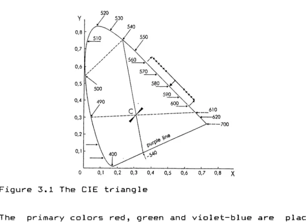
reference-3-2.1 The CIE System
In order to identify the wavelength of a given color and its degree of saturation, a reference diagram was developed by the CIE (Commission Internationale d e l 'Eclairage) in 1931- As seen in figure 3-1, the diagram
is in the form of a deformed triangle on v^Jhich the spectral colors are plotted along the two sides.
520
Figure 3.1 The CIE triangle
The primary colors red, green and violet-blue are placed at the corners of this triangle. The purples are not
present on the triangle because they do not correspond to any spectral radiation. Still, being transitional values between red (700nm) and violet (400nm), they are found along the base of the triangle.
The most saturated colors are found at the circumference of the color triangle. Going inwards, they become lighter and less saturated. The center of the triangle, where all colors meet, is white. This is based on the law of additive color mixing. Any two colors at the tips of any segment, that passes through the center, are opposed or c o m p 1emen tary.
The color triangle is placed on x and y chromaticity coordinates, which makes it possible to locate the position of every color arising from the mixture of two or more colors.
All the nonspectral colors are situated inside the triangle. From the diagram, it is possible to find out the dominant wavelength of the composite nonspectral colors, present at different points inside the diagram. It is also possible to find the degree of purity or saturation of colors, which will increase or decrease according to their distance from the curve of spectral c o l o r s .
Munsell System can be determined by the corresponding point on the spectrum locus and the chroma by the distance of that point to axes. Both are defined by the chromaticity coordinates of the color, also called the color point. For surface colors only, the value in the Munsell System is replaced by the reflectance of the colored surface. But in the CIE System, a color is defined by the chromaticity coordinates x and y, in the case of a surface color, also by reflectance. For surface colors reflectance is also taken into account.
3.2.2 The Munsell System
This is a color s y st e m which originated in the U.S.A.,
developed by Albert Munsell around 1900. Widely used in the U.S.A. and elsewhere, it is a system of specifying color on three scales of hue, value, chroma. Colors are
ex e m p l i f i e d by a c o l l e c t i o n of color chips, forming an
atlas that show linear series for which two of the three
variables are constant. A color is defined by these three
scales (Figure 3.2). The three variables are explained
b e l o w .
1. Hue is the quality by which one color is distinguished from another. The hue scale contains five principals
which are red, yellow, green, blue and violet. All colors are judged to be und e r one hue or a proportion of two of
t h e s p e c t r a l h u e s - P h y s i c a l l y h u e is d e t e r m i n e d b y w a v e l e n g t h ; w h i t e , <3ind b l a c k a r e p e r c e i v e d a s c o l o r l e s s , b e i n g n e i t h e r r e d d i s h , y e l l o w i s h , g r e e n i s h a n d b l u i s h . T h i s l a c k o f c o l o r c a u s e s t h e m t o b e t e r m e d a c h r o m a t i c . F i g u r e 3 . 2 M u n s e l l c o l o r s c a l e s B y a r r a n g i n g f i v e p r i n c i p a l h u e s o f M u n s e l l S y s t e m o n a c i r c l e , t h e c o l o r c i r c l e is o b t a i n e d . D i v i d i n g t h e s e p r i m a r i e s in e q u a l i n t e r v a l s , t h e f i v e i n t e r m e d i a t e h u e s a r e o b t a i n e d ( y e l l o w ~ r e d , g r e e n - y e 1 1 o w , b l u e - g r e e n , v i o l e t - b l u e , r e d - v i o l e t ) . E v e r y i n t e r v a l o f i n t e r m e d i a t e h u e s is a g a i n d i v i d e d i n t o t e n e q u a l s e c t i o n s a n d a h u n d r e d d i f f e r e n t h u e s a r e o b t a i n e d ( F i g u r e 3 , 3 ) . T h u s e v e r y h u e is d e t e r m i n e d b y a n u m b e r on t h e c o l o r c i r c l e . M u n s e l l u s e d t h e c a p i t a l s o f t h e n a m e o f t h e h u e s in o r d e r to c o d e t h e m .
r e d (R) 5 r e d - y e 1 1 o w 15 ( R Y) y e 1 1 o w (Y) 2 5 v e l l o w - g r e e n 3 5 ( Y G) g r e e n (G) 4 5 a r e e n - b l u e 55 (G B) b 1 u e (B) 6 5 b l u e - v i o l e t 7 5 ( B V) v i o l e t (P) 8 5 v i o l e t - r e d 9 5 (V R ) r e d (R) 5 r e d F i g u r e 3 , 3 M u n s e l l c o l o r c i r c l e 2- V a l u e , a l s o n a m e d t h e l i g h t n e s s , is t h e q u a l i t y t h a t d i f f e r e n t i a t e s a d a r k c o l o r f r o m a l i g h t o n e . C o l o r s , a l t h o u g h s a m e in h u e , m a y b e d a r k e r o r l i g h t e r t h a n t h e o t h e r . T h e v a l u e o f a p i g m e n t is t h e m e a s u r e o f hoi/vi m u c h l i g h t is r e f l e c t e d f r o m i t s s u r f a c e . T h e v a l u e s c a l e c o n t a i n s t e n s t e p s f r o m b l a c k t o w h i t s ; 0 to 1 0. A c o l o r c a n n e v e r b e a s l i g h t a s w h i t e , o r a s d a r k a s b l a c k . In o t h e r w o r d s t h e v a l u e o f a s u r f a c e w i t h a d e f i n i t e h u e c a n n o t b e 0 o r 10 , w h i c h r e p r e s e n t t h e i d e a l c o n d i t i o n ( F i g u r e 3.2).
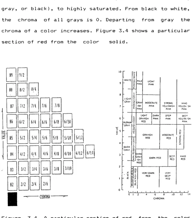
3· Chroma, also named the saturation, intensity or strength, describes the purity of a color or the extent of its departure from gray. Two colors may be the same in hue and value, one no lighter or darker than the other, but still they may appear different in chroma. The chroma scale contains up to 16 or more steps from neutral (white, gray, or black), to highly saturated. From black to white, the chroma of all grays is 0. Departing from gray the chroma of a color increases. Figure 3.4 shows a particular section of red from the color solid.
■
H9 9/2 US 8/2 3/4 N7 111 7/4 H6 6/2 6/4 S5 5/2 5/4j
S4 ■ 4/2 4/4 Ü3 3/2 3/4 N2 2/2 2/4 7/6 7/86/6
6/86/10
5/6 5/8 5/10 5/12 4/6 4/10 4/12 4/14 3/6 3/8 3/102/6
LIGHT C R A Y M tO iU V GRAY DARK G R A Y P A lE LIGHT PINK PINKGRAY MODERATE STRONG VIVID
ISM PINK YELLOWISH YELLOV. SH
PINK PINK PINK
LIGHT DARK DEEP OEE‘=
GRAYISH PINK PINK YELLOV.:SH
RED PINK Q GRAYISH MODERATE (X o RED RED z o (/> c: DARK ~ GRAY ISM RED VERY DARK RED DEEP RED VERY DEER RfD VIVID RED I ■ I ■ I t 1 » 1 1 I___ I I . I 1 1 0 12 '1 •G a lO 12 u CHROMA
Figure 3.4 A particular section of red from the color so lid
3.3 Mixing of Color
Color mixing is a confused subject- A failure to understand this fact prevents all attempts to use colors. There are two ways of mixing color; additive and subtractive m i xing.
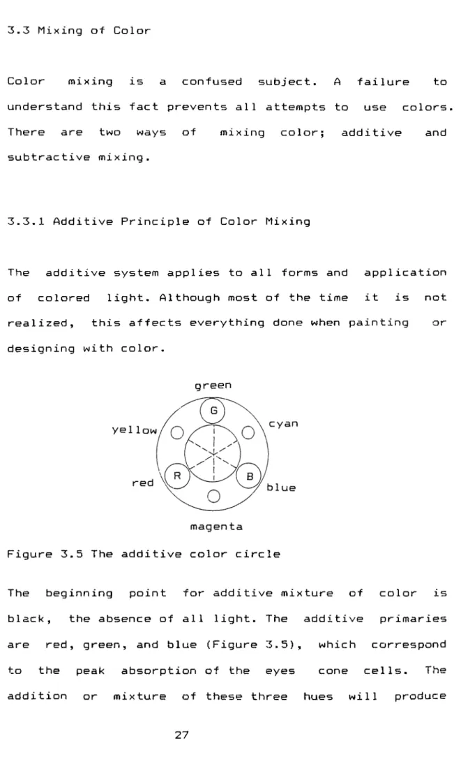
3.3.1 Additive Principle of Color Mixing
The additive system applies to all forms and application of colored light. Although most of the time it is not realized, this affects everything done when painting or designing with
color-green
Figure 3.5 The additive color circle
The beginning point for additive mixture of color is black, the absence of all light. The additive primaries are red, green, and blue (Figure 3.5), which correspond to the peak absorption of the eyes cone cells. The addition or mixture of these three hues will produce
white light. When each primary is introduced, light energy is added and the number of stimulated cone cells increases. The mixed color is always lighter than its component
parts-The mixtures of complementaries like blue and yellow, on the additive hue circle, also produce white light. This is an especially important fact when designers are combining light sources for effect. If blue and yellow spotlights are lit to obtain a green light the combination produces white, not green light. Mixtures of any two additive primaries (indicated by larger circles in figure 3.5) will produce an additive secondary (indicated by smaller circles in figure 3.5). As seen in the additive hue circle, overlapping red and green light produces yellow light; overlapping blue and red light produces magenta light.
A significant point that must be remembered is that all effects of simultaneous contrast are additive in principle (see 3.3.2-2). The colors we see in afterimage, are the additive (light) complements of original hues, not subtractive complements. Additive color formation will occur in any situation where small dots, patches particles, or geometric arrays of various colors are present in the space, because the edges of adjacent colors, especially complementary colors, will provide
additive color generation (simultaneous contrast). To give an example, if red is observed with a chromatic sequence of cool hues, it appears to change hue because reflected light waves from the cool colors and red mix in our eyes additively.
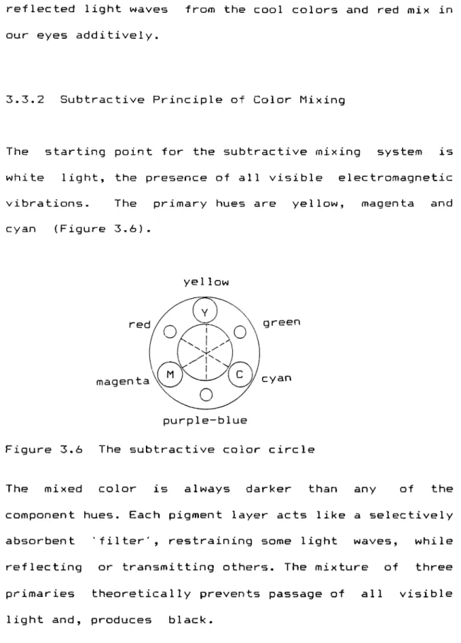
3-3-2 Subtractive Principle of Color Mixing
The starting point for the subtractive mixing system is white light, the presence of all visible electromagnetic vibrations- The primary hues are yellow, magenta and cyan (Figure
3-6)-yellow
green
cyan
Figure 3.6 The subtractive color circle
The mixed color is always darker than any of the component hues- Each pigment layer acts like a selectively absorbent 'filter', restraining some light waves, while reflecting or transmitting others. The mixture of three primaries theoretica11y prevents passage of all visible light and, produces black.
Each of the subtractive primaries is a complement to one of the additive primaries and is formed by taking away,
that is absorbing, one of those from white light. Cyan is white light minus red, magenta is white light minus green, yellow is white light minus blue.
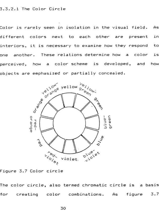
3.3.2.1 The Color Circle
Color is rarely seen in isolation in the visual field. As different colors next to each other are present in interiors, it is necessary to examine how they respond to one another. These relations determine how a color is perceived, how a color scheme is developed, and how objects are emphasized or partially concealed.
Figure 3.7 Color circle
The color circle, also termed chromatic circle is a basis for creating color combinations. As figure 3.7
illustrates, by arranging the primaries and secondaries of subtractive color mixture, the color circle is obtained- The colors next to each other on the circle are named adjacents, opposites to one another are named c o m p 1emen
ts-Color scheme is in a way a subjective concept- Wong (1987) indicates that as tastes change from generation to generation, according to individuals sex, age, race, education and cultural background, it is difficult to establish specific rules for creating color
combinations-Color combinations are sometimes explained within the context of harmonies, sometimes of contrasts. Also, their number and classification differ by different authors- To give an example, Itten (1970) includes seven combinations under the title of 'contrasts', where some of the pairs are adjacents.
All the classifications are based on the adjacent or complementary relations of colors on the circle. Related combinations are based on one hue varied in value and saturation whereas contrasting combinations unite hues that are separated on the color circle. For Birren:
a number of studies in the field of psychology, have verified the observations of Chevreul, that colors look best a) when they are closely
related or analogous, b) when they are complementary or in strong contrast
(Quoted in Sloane, 1989,
p-311)-In general terms, complementary colors are considered to produce harmony and balance, opposites or noncomplementaries to produce asymmetry and tension. Combinations of intermediate hues are considered less attractive.
3.3.2.2 Color Contrasts
If the eye becomes adapted to a particular hue by staring at it for some time, and then when it is shifted to a white or gray surface, the complementary color will appear on that surface. This is called successive contrast and, is also referred as the afterimage phenomenon. It becomes especially important in working environments, when performing tasks which require the eye to be fixed continuously upon objects of the same color. The eye requires any given color to be balanced by the complementary, and will spontaneously generate it, if it is not present.
There is another optical effect between colors seen simultaneously, closely related to afterimage. In this case, the eye will generate the complementary of the dominant hue in the environment and project it toward the
adjacent zones. For example, if red and blue colors are dominant in a space, they will project green and orange lights toward each other. The simultaneous effect occurs either between a gray and a strong chromatic color, or between any two colors that are not complementary.
The phenomenon also occurs in two dimensional works, but becomes much more crucial in interiors, where surfaces are opposed in three dimension. Because hues will tend to shift the other towards its own complement, so will loose some of their character (see 6.2).
To avoid this effect it is suggested that first the complementary of the color should present in the environment, and second, the hues may be used in different values (Itten, IS’TO).
4 PSYCHOLOGY OF COLOR IN INTERIORS
Color and light are major factors in man-made environments; their impact influences man's psychological reactions and physiological well-being. Research has proven that light and color affect the human organism on both a visual and nonvisual basis. It is no longer valid to assume that the only significant role of light and color is to provide adequate illumination and a pleasant visual environment. Color effects brain waves, functions of the autonomic nervous system, hormonal activity and arouses definite emotional and aesthetic associations (Mahnke, 1990, p-169). In short, our response to color is total; it influences us both physiologically and psychologically. In order to apply environmental color effectively, man-environment relations must be understood. It is necessary to study how man reacts to color not only on a physiological but psychological bases also. As Kower stated :
Color perception is not an art involving only the retina and consciousness but the body as totally (Quoted in Ladau, 1987, p.62).
Colors in the design world and in scientific studies, are discussed in terms of the two poles warmness and
coolness, signifying long wavelength and short wavelength.
Are colors "warm" and "cool"? Birren (1978) mentions a study made in the lighting field with negative results, and he indicates that the Lighting Handbook of the
Illuminating Engineering Society declared that in fact this appears to have no foundation- Actually, if a red is a warm color to one person and a cool to another, such are subjective facts, personal to each one- But, as the majority of people use these terms, it effects the terminology. The comparisons and discussions presented in this chapter are based on these two
poles-Using the research done by the Space Human Factors Office (1986) as a main reference, this section will mention some of the more important studies that question the rule like effects, and will try to give a more conscious and wider perspective
-4.1 Different Effects of Long Wavelengths and Short Wavelengths
Perhaps best known studies in the design world are those that compare the light of long wavelength to that of short wavelengths (red versus blue-green surroundings). As cited by Birren (1988), the observations of Jaensch proves that with the longer wavelength goes the primitive
response of children and excitation, with the short wavelength goes the more mature response and
tranqui1ization-Indeed, long and short wavelengths, which are termed as warmth and coolness in color most of the time, are dynamic qualities, the first one signifying contact with environments and the other signifying withdrawal into oneself.
Mahnke (1987) mentions some studies in which red and blue are used for warm and cool colors- These studies seem to indicate that colors warm in hues are more arousing than those of cool ones. Partly because of these findings, it is often concluded incorrectly that exposure to a red room for example will have a continuously higher arousal effect. In fact, exposure to any strong hue v^iill cause an immediate reaction that can be measured easily, but the duration of the effect is not continuous. He also indicates that if a red room, unrelieved by other hues, is considered aggravating, then this is because of its limited visual stimulation.
The research done by Space Human Factors Office (1986) brings another argument to the subject. It indicates that, in general, colors that do not occur frequently in nature, take on a high symbolic content due to their signal capacity in standing out from the background. Ones
response to red is a reflexive one- It serves the purpose of preparing one to take some form of action which is defined by the context. However such arousal lasts beyond a short duration, especially if presented within a context.
The same source also indicates that there is a high correlation between the saturation of a color and the perceived excitement of the space; strong colors will make a room appear exciting, weak colors give an impression of calmness, regardless of hue. Color contrast also contributes to the apparent excitement a space.
So, claims that certain colors will arouse an individual, make one alert and thus more productive is certainly not warranted by the findings so far. It is especially clear that, arousal effects of color are neither strong, reliable nor durable enough, to warrant their use as a rationalization for applying "high" or "low" activity spaces. For instance "a poor bedroom or private sleep space is not rendered into suitable one by painting it blue" (Space Human Factors Office, 1986, pp.24-26).
The greater concern in regard to psycho-physiological effects or response is not based on warmness or coolness of colors, but on variety and the lack or overuse of it. The need for variety within the space will be discussed in
the following
section-4.2 Unity and Complexity Balance
If visual information could be measured in a space, two opposite poles could be identified called unity and complexity. Unity involves various components and parts fitting together into a coherent unit. Complexity involves more
Variation-Many clinical studies have been done on the effects of monotonous, homcgeneous and unvarying environments
(Mahnke, 1987, 1990; Birren 1978, 1988, 1990; Sundstrom, 1986). The results points out the need for variety. Blank surfaces tend to fade out if viewed continuously, even colors may fade into neutral gray, vision seems to degenerate unless stimulated and the mind itself drops into inertness. Subjects reported difficulty in concentration, periodic anxiety feelings, loss of ability to judge time, restlessness distortion of reality and visual hallucinations.
In the contemporary world, such hallucinations may become an occupational hazard for men, who sit at automated environments, lacking spiritual quality.
isolation and the taking of certain drugs. As cited in Birren (1988), Woodburn et.al. conclude that when the disturbances during isolation are considered, it appears that exposing the subject to a monotonous sensory environment can cause disorganization of brain function similar to, and in some respects, as great as that produced by drugs. Among the disturbed brain functions, there are impairment of color perception, hallucinations involving color, and the distortion of color images.
Another hazard of unvarying environments is sensory deprivation, which brings serious problems with it- Vernon states:
Normal consciousness, perception and thought can be maintained only in a constantly changing environment. When there is no change a state of sensory deprivation occurs; the capacity of adults to concentrate deteriorates and normal perception fades. In infants who have not developed a full understanding of their environment, the whole personality may be effected and readjustment to a normal environment may be difficult (Quoted in Mahnke, 1987, p - 6 ) .
□n the other hand, over— stimulated environment is as unacceptable as the under— stimulated one. Extreme complexity can lead to over— stimulation, which is distracting and fatiguing. Exposure to over— stimulation can cause changes in the rate of breathing, blood pressure, increase in muscle tension, psychiatric
reactions of varying types and ulcers. The 'stress search', conducted in 1960s and 1970s (cited in Mahnke,1990) showed that these symptoms are typical effects on those persons who have been subjected to over— stimu1 ation
-The Space Human Factors Office (1986) points out a relation between color scales and complexity:
Complexity was seen to decrease with decreasing .value. Complexity appears to be more of an interaction between chroma and value; with colors of low chroma but low or high value, regarded as simple, while complex colors are generally of medium value (Space Human Factors Office, 1986, p.92) .
Therefore in the total environment there must be colors in changing degrees of brightness, chromatics and in order to prevent simultaneous contrast, the complementary of the dominant color should be present to some extent. Maximum favorable color effects depend on variety and contrast within reason. As Crewdson wrote:
Balance is the securing of unity in the midst of variety. Both variety and unity are necessary to sustain interest, and these opposing forces must be balanced. Variety is necessary to attract and arouse interest; unity is essential to create a favorable impression and to satisfy the moods and desires. Variety overdone is confusing and unpleasant; unity overdone is monotonous. The mark of good color arrangement is in knowing
where to stop between these two extremes- (Quoted in Mahnke, 1978, p.7)
Taking all research collectively, it can be concluded and suggested that color variety is psychologically most beneficial. It is not just that one color is better than another for a specific purpose, that one may be considered psychologically exciting or another calming, but a variety of visual stimulation and change in atmosphere is requi r e d .
4.3 Personality and Reaction to Stimulation
Another important consideration in creating beneficial environments is the reaction tendency of people; how their personalities effect their reaction to stimulation- As cited in Birren (1988), the psychologist Eysenck named these reactions as extroversion and introversion, terms that express the degree of excitability.
Abstract, nonobjective and surrealistic forms, as well as modern styles of interior design, tend to have a greater acceptance among extroverts than among introverts- Introverts prefer tradition and period styles. The outwardly oriented individual may appreciate color for the sake of color; those who are inwardly oriented require realism, if colors are to make sense.
It may be generally assumed that emotionally responsive persons will react freely to color, inhibited persons may be shocked by it (Ladau, 1987, p.72).
However, because of these findings, there is a wrong tradition among designers to prescribe passive environments for the extroverted temperaments in order to calm them down, and active environments for the subdued personalities in order to draw them out of their introspection. Actually quite the opposite occurs; neither will be happier in surroundings contrary to their personality. This is because, the nervous system of the introvert IS more excitable than that of the extrovert. The afferent flow of stimulation, regardless of its origin, is facilitated in the introvert but obstructed in the extrovert. In other words, there is a difference in the amount of stimulation passing through the cerebral cortex for each of these personality types (Birren, 1988).
In general terms, this means that the extroverted personality type has a greater inclination toward the more intensive stimulation and enjoys more colorful surroundings with warmer hues- In fact, incorrect environmental conditions for the extroverted personality can lead to lack of interest and boredom.
On the other hand, because introverts are very sensitive to stimulation and have a great need for privacy and calm.
they prefer environments with cool hues and a lower degree of stimulation. An attempt to cheer up a mood of depression through color, may serve only to aggravate the misery and drive it even deeper. For them over-stimulated environments will lead to intensive anxiety (Birren, 1978)·
Although for normal people it is better that their surroundings match instead of contrast with their personalities, it has been stated by Birren that for people with some forms of mental illness this method have to be reversed (Cited in Mahnke,1987). Color has been used therapeutically in treating emotionally and mentally ill patients, in the belief that manic and aggressive patients need cool colors to calm them dawn, while depressive and suicidal patients need warm colors to compensate for melancholic inner state.
When activeness and passiveness are generally related to warmness and coolness of colors, the studies cited in Space Human Factors Office (1986) attribute these moods to the two variables of color. It is suggested that the relation of activity to color appears to be a direct function of saturation :
The more saturated a color, the more potent and active it was perceived, the greater the contrast in perceived value, the more potent and active a pair was
judged (Space Human Factors Office, 1986, p.40).
The same reference mentions a study done by Sivik, which showed that no difference was exhibited between hues, with equal chromaticness on the excitement factor. The author assumes that the reason red, yellow were labeled exciting, may be attributed to the fact that strong reds and yellows are more prevalent than strong (pure) greens and blues. So one can have a dull red and exciting green, based on the purity of color. These findings contradict the stereotype that warm colors are exciting while cool colors are calming.
4.4 Centrifugal and Centripetal Action
In meeting design objectives, it must be stressed that the mood or atmosphere of a space can be manipulated to conform with the function of that space. The degree of mood creation may depend on the particular color usage. A general office space, where people perform tasks that demand high concentration, should not have the same surroundings as a recreational area although both spaces may want to appear cheerful, warm, and friendly.
In color and light, there is first a centrifugal action away from the organism to its environment. With warm colors and high levels of illumination in the
surroundings, the body tends to direct its attention outward (Mahnke, 1987). Such environment is believed to be conductive to muscular effort and action. It is considered a good setting for factories, schools and gymnasiums, where manual tasks are performed or where sports are engaged i n .
Second, on the other hand, color and light may have a centripetal action away from the environment and toward the organism- With softer surroundings, cool colors and lower brightness, there is less distraction and a person is better able to concentrate on difficult visual and mental tasks (Mahnke, 1987). Good inward orientation is furthered. Such environments are considered appropriate for sedentary occupations, requiring severe use of the eyes or brain, like offices, study rooms and assemblies in industry.
However, whereas Mahnke (1987) talks about warmness and coolness of colors, the Space Human Factors Office (1986) relates these action types to the value of colors regardless of hue. They indicate that colors with high value invite centrifugal action, whereas when value decreases centripetal action takes place. For work environments, the same research suggests limiting the number of hues to one, and producing variations through changes in value or chroma in order to decrease what might
Again for work environments, it is indicated that strong color, too much visual pattern, and high brightness demand voluntary and involuntary attention- Vivid design in work areas can impair productivity by seriously interfering with work tasks that require visual concentration
(Sundstrom, 1986).
4.5 Color Effecting Different Perceptions
One of the most common uses of color in design is to alter the perceptions in interior spaces. Without going through the detail of the experiments, this section will discuss the conclusions of some of the more important studies that improve the development of thought in this
f i e l d
-o t h e r w i s e be perceived as a visually busy envir-onment-
environment-4.5.1 Perception of Volume (Color and Spaciousness)
One of the rules of thumb in color usage is that warm colors advance, appear closer and make space seem smaller, while cool colors recede, appearing farther away and make space seem
larger-However, recent experiments in color perception have given much more insight into color's effects on perceived
spaciousness than the simple 'advance- recede' rule would suggest
-Taylor and Summer found that when apparent distances of different colors are held constant, the brighter colors are seen nearer than dark ones (Cited in Space Human Factors Office, 1986). So according to this finding, a cool hue like a bright blue can appear closer than warm hue like a dark red.
While it is possible to try to find which dimension of color is responsible for apparent distance, it is also possible to investigate the context of color stimuli, and see how surrounds or backgrounds affect the observer's judgments. After all, in interior spaces, color is never seen in isolation.
The research done by the Space Human Factors Office (1986) mentions a study done by Tedford et.al., who proved that
there appears to be both a saturation and a brightness contrast effect in perceived distance. As saturation of a color increases with respect to its background, its apparent position advances. The effect observed was small, equal at most to 1.5 7. of the standard distance (Cited in Space Human Factors Office, 1986, p. 70).
object's color and the description of its context. Mount et.al. say:
As
No color variable has an inherent or unique position in space, thus color can influence judgments of distance only in a specific context involving primary and other secondary cues of relative position (Quoted in Space Human Factors Office, 198(S, pp.70-71).
This appears to admit color manipulations of much greater variety than suggested by the red-advaneing, blue-receding r u l e .
It seems that the controller for apparent distance is strong contrast, induced primarily by brightness but also by saturation between a judged element and some established reference frame, which can be a background or a room. Increasing relative contrast, by increasing an object's brightness and saturation as compared to its background, will make the object apparently closer.
What can be concluded about color effects on apparent distance and spaciousness? First, that distance effects of colors are not as simple or as direct as designers may have since believed. These phenomena are not rightfully attributable to hues as the rule of thumb about warm and cool advancement and recession implies. Rather, spatial impressions are most influenced by contrast effects, induced by saturation, and particularly brightness