DESKTOP ICONS: A COMPARATIVE STUDY OF TEXTUAL
AND ICONIC HUMAN USER INTERFACE
ELEMENTS IN
VISUAL COMMUNICATION
A thesis submitted to the department of Graphic Design and the Institute of Fine Arts of Bilkent University
in partial fulfillment of the requirements for the degree of Master of Fine Arts
By Çağlar Önder
I certify that I have read this thesis and that in my opinion it is fully adequate, in scope and in quality as a thesis for the
degree of Master of Fine Arts.
_______________________________________________
Assoc. Prof. Emre Becer (Principal Advisor)I certify that I have read this thesis and that in my opinion it is fully adequate, in scope and in quality as a thesis for the
degree of Master of Fine Arts.
_______________________________________________
Assist. Prof. Andreas Treske (Co-advisor)I certify that I have read this thesis and that in my opinion it is fully adequate, in scope and in quality as a thesis for the
degree of Master of Fine Arts.
_______________________________________________
Assist. Prof. Marek BrozozowskiApproved by the Institute of Fine Arts
_______________________________________________
Prof. Dr. Bülent Özgüç.ABSTRACT
DESKTOP ICONS: A COMPARATIVE STUDY OF TEXTUAL
AND ICONIC HUMAN USER INTERFACE ELEMENTS IN
VISUAL COMMUNICATION
Çağlar Önder M.F.A. in Graphic Design Supervisor: Assoc. Prof. Emre Becer
June, 2003
This research examines “Desktop Icons” in correlation to contemporary developments, changes and expanding possibilities in the usage and integration of multimedia into applications and interfaces; outlining how textual and iconic elements function, work and reflect changes in the study of Human-Computer Interaction and Graphic Design as a medium of digital technologies.
Keywords: Icons, Desktop, Windows, Menus, Human-Computer Interaction, Graphical User Interface, Textual Interface, Visual Communication.
ÖZET
MASAÜSTÜ İKONLARI: GÖRSEL İLETİŞİMDE METNE
DAYALI VE İKONİK KULLANICI ARAYÜZÜ
ELEMANLARININ KARŞILAŞTIRMALI BİR ANALİZİ
Çağlar Önder Grafik Tasarım Bölümü
Yüksek Lisans
Tez Yöneticisi: Doç. Dr. Emre Becer Haziran, 2003
Bu çalışma, “Masaüstü İkonları”nı multimedyanın gelişen, değişen ve artan imkanlarla yazılımlar ve arayüzler içinde kullanımı ve bunlarla bütünleşmesi çerçevesinde incelemekte; metne dayalı ve ikonik elemanların işlevselliğini, çalışma prensiplerini ve İnsan-Bilgisayar Etkileşimi ve sayısal teknolojilerin aracı olan Grafik Tasarımdaki gelişmeleri nasıl yansıttığını ele almaktadır.
Anahtar kelimeler: İkonlar, Masaüstü, Pencereler, Menüler, İnsan-Bilgisayar Etkileşimi, Görsel Kullanıcı Arayüzü, Metne Dayalı Arayüz, Görsel İletişim.
ACKNOWLEDGEMENTS
I would like to foremost thank my advisors and former instructors Assoc. Prof. Emre Becer and Assist. Prof. Andreas Treske for their support, guidance and everlasting patience, especially at times when I delayed the deadlines. I furthermore thank them for all the knowledge and experience they have passed on to me both for my career and for my life.
I thank all my friends, Okan in particular who kept me company most of the time, Güzden, Emre and Nur who were companions at hard times and best understood and shared the difficulties of writing a thesis since they were concurrently working on their own. My special thanks go to Ahu whose support was essentially important, and who continually motivated me and showed the utmost support against all negative circumstances that would arise.
Last but not least, I thank my family – my parents Halil and Nursel, and my sister Sara Pınar who all gave me the greatest assurance and
TABLE OF CONTENTS
ABSTRACT...iv
ÖZET...v
ACKNOWLEDGEMENTS... vi
1. INTRODUCTION... 1
2. OVERVIEW OF THE HUMAN USER INTERFACE... 7
2.1. WINDOWS ... 14
2.2. ICONS... 19
2.3. MENUS... 23
2.4. POINTER (POINTING DEVICE)... 26
2.5. METAPHORS... 29
3. DESKTOP ICONS...37
3.1. THE DEFINITION OF THE ICON... 39
3.2. VISUAL QUALITIES OF ICONS... 50
3.2.1. FORM... 52
3.2.1.1. Pictographic Icons... 53
3.2.1.2. Representative Icons... 56
3.2.1.3. Abstract Icons... 57
3.2.2. COLOUR AND RESOLUTION... 59
3.2.3. MOTION... 69
3.3. CLASSIFICATION OF ICONS IN THE GRAPHICAL USER INTERFACE... 71
4. THE COMPARISON OF TEXTUAL AND ICONIC COMMUNICATION...74
4.1. TEXTUAL COMMUNICATION... 76
4.2. ICONIC (GRAPHIC) COMMUNICATION... 79
4.3. THE COMPARISON OF TEXTUAL AND ICONIC COMMUNICATION... 83
4.3.1. Immediacy in recognition... 89
4.3.2. Identification and Interpretation... 94
4.3.3. Space Occupation... 99 4.3.4. Universality... 105 4.3.5. Similarity in Depictions... 108 4.3.6. Modification... 111 5. CONCLUSION... 113 REFERENCES... 119
LIST OF FIGURES
Figure 1: The latest widespread commercial Graphical User Interfaces:...5
Figure 2: The initial desktop computers... 9
Figure 3: The Xerox Graphical User Interface... 9
Figure 4: The MacOS 1 Operating System... 11
Figure 5: The first Microsoft Operating Systems... 12
Figure 6: A classic window and it's components... 15
Figure 7: Various window examples over time...16
Figure 8: Specialized Windows... 18
Figure 9: Screenshot of a folder icon opened in Axialis Icon Workshop... 20
Figure 10: Icons inside an icon customization application window in MacOSX.... 21
Figure 11: Various custom-designed alternative system and application icons... 22
Figure 12: A typical pull-down menu and it's components... 23
Figure 13: A pull-down menu with a sub-menu... 25
Figure 14: Examples of context sensitive menus... 25
Figure 15: Examples of pointing devices... 27
Figure 16: Microsoft BOB... 32
Figure 17: Common Trashcan icons (Empty and full)... 34
Figure 18: The first signs of iconic representation... 40
Figure 19: Examples of Chinese Ideographs... 41
Figure 20: Examples from the first writing systems...43
Figure 21: Mayan alphabet (a) and Egyptian Hieroglyphics (b) examples...44
Figure 22: The same letter in various different Chinese Script examples...45
Figure 23: Examples of Pictographic Icons...54
Figure 24: Examples of Representative Icons... 57
Figure 25: Examples of Abstract Icons... 57
Figure 26: The different desktop colour schemes of Windows XP... 60
Figure 27: Illustrations showing 1-bit, 8-bit and 24-bit display resolutions...64
Figure 28: System and web-safe colour palletes... 66
Figure 29: Example of an image in 256 colour and its custom colour pallete... 67
Figure 30: Examples of icons with varying size and bit-depth... 68
Figure 34: Mac OS X Toolbar and Icons... 72
Figure 35: Examples of command prompt operating environments (MS DOS)... 77
Figure 36: The Microsoft Start Menu (XP) and Apple menu (OS 7)...84
Figure 37: Two different 3D application Interfaces... 87
Figure 38: The toilet symbols are an example to iconic communication... 89
Figure 39: Figure showing incomprehensibility of icons... 91
Figure 40: Examples showing the importance of position... 98
Figure 41: An example of palm device icons... 100
Figure 42: Example showing the importance of space occupation... 101
Figure 43: Example showing the levels of menu hierarchy...104
Figure 44: Menu hierarchy... 104
Figure 45: Different iconic representations for various countries... 106
1. INTRODUCTION
As computer systems, applications and user interfaces develop with extensive integration of various complex media types; and as their distribution and exposure rapidly continue to expand via the world-wide web, workstations and other network systems, visual communication of digital domains continues to change considerably. This research examines the “Desktop Icons” in correlation to contemporary developments,
changes and expanding possibilities in the usage and integration of graphical user interfaces and outlines how the sophistication of icons reflects changes in the study of human computer interaction and graphic design as a medium of digital technologies.
Although the G.U.I. (Graphical User Interface) is the most common and widespread interface used today within the field of Human Computer Interaction, it is arguably not the most successful, or even so, is only one1 of the many existing and imaginable ways that communication between the human user and the computer can be achieved. Many other
developed for a great many number of purposes throughout Human Computer Interaction. My research does not intend to argue in favour of claiming the G.U.I. as a superior means of interaction or an ideal interface. Rather, this research intends to analyze the evolution of icons2 to
highlight and discuss how graphic communication within computer interaction has been so favourable among users of all kind, and how the G.U.I. has shaped over recent time. This study will not neglect the issues mentioned just precedent, and will include notes on past and ongoing issues on the development of interfaces and critical factors that compromise Human Computer Interaction, but will try to limit its boundaries to visual and graphical entities concentrating mainly on features that regard iconic property.
One problem regarding the build-up of this paper was to properly formulate and place the subject of icons into a meaningful array of information situated in one logical subject area. Since the field of Human Computer Interaction is highly interdisciplinary, related to material from many different and contrasting areas of academic and professional vocations, it was difficult to place the research of icons into a single perspective and attempting to neglect or undermine the least amount of information available at hand. Computer Interaction is equally related to a vast number of areas such as Computer Science, Visual Communication and Graphic Design, Cognitive sciences, Semiotics, and among many
others. Even broadening the subject to User Interface design and Software design that relates more adequately to this study, the same diverse
number of interdisciplinary fields are concerned.
“The question “Who is the designer?” often means “Who understands the whole problem, and who has all the skills needed to solve it?” For software design, the answer is that no one person can be “the designer,” because software design is too complex, requires too many skills, and crosses too many boundaries between disciplines. As a result, several disciplines must be brought to bear. The difficulty in this is that each brings its own methodology and point of view, and the
confluence of these can blur the vision needed to archive good design...Putting the user into the process helps put things back into focus. User-centered design methodologies may be innately interdisciplinary because no single repertoire of skills can adequetaley adress the complexity of users and their tasks.” (Alben, 20)
While conducting this research another problem that I faced was that I found great difficulty in finding appropriate information that was relevant to the framework that I had opted to take, and also because most
sources, examples and especially visual materials related to the subject consisted of less formal, more commercial and on a large-scale non-academic material. The critical subject of a computer icon could have well been taken as part of a string of literature examining a “re-defining” of the medium of multi-media, computers, technology and user experience; whereby the basis of the problematic would consist more of about how necessary the use of icons within a H.U.I. (Human User Interface) is or not,
purposes. However, my intentions are to examine a more ‘popular,’ more widespread and a significantly more commercially affected and controlled set of icons, primarily due to the fact that they are both statistically and profoundly exposed to a greater many number of users and continue to rapidly expand bringing with this the expectancy to have yet reached their maximum exposure.
Consequently, the examples that I refer will be primarily those belonging to more widespread consumer operating systems [Microsoft Windows (XP) and the Apple MacOS (X) (Figure 1) in particular] and applications. My reasons in depicting such distinct samples neither come from the fact that they convey the most successful, aesthetic or functional set of models, nor because they are the most problematic examples to be covered in this perspective. While there may be notions that these examples are not merely successful examples and are not on the contrary it is perhaps the very thought that they are the least and the most problematic examples.
The first sections of this study briefly outlines some of the critical issues of Human Computer Interaction, the significance of the Graphical User Interface amongst this domain, and some of the key elements that form the desktop environment of operating systems and applications. The idea is to give an informative portrait of the underlying foundation that
desktop icons reside amongst and a summary of the main elements that work cooperatively with icons for user interaction.
Figure 1: The latest widespread commercial Graphical User Interfaces: a. Apple Mac OSX.
After comprehension of the foundation, this study presents an analysis of desktop icons to define both an introductory historical background of the term, a look at the visual qualities and structural attributes to portray an anatomy of icons. Finally, the argumentative part of the study included in the latter parts deals with a comparison of textual and iconic
communication that tries to formulize the issues regarding the
functionality, perception, structure and necessity of iconic and textual elements in the framework of Human Computer Interaction and visual communication theory.
2. OVERVIEW OF THE HUMAN USER INTERFACE
After the invention of computers, the first interfaces consisted of keyboard inputs and text based commands as means of employing commands, communicating and task performing on machines. These developments later on gave way to the creation of menu based interfaces that used pointing devices like the mouse, and eventually developed into being fully visual Graphical User Interfaces, common in most applications and platforms today, and composed of hybrid usage of both text and graphical elements. There have been numerous attempts at developing ideal interfaces, in the most Utopian sense; interfaces that would appeal to and satisfy all the needs and desires of every user and able to form ground to accomplish every task necessary. Most of these attempts have however failed, some due to their failure to neglect certain usability features, some because of their delayed delivery and a few because of their over-complex features to pertain to average user’s needs. Also coming from the fact that consumerism is at large the largest exposure of Graphical User Interfaces is achieved by large commercial enterprises that are apparently more involved in products that are sold rather than making
interfaces have evolved from the first examples, and certain aspects remain unchanged or modified only very little since then.
The historical development and the commencement of the Graphical User Interface took place during the late 1970’s at the Xerox Palo Alto
Research Center (PARC), where many developers collaborated to produce research in information and physical sciences. The first example of the usage of a pointing device and a visually oriented approach to control the computer was prototyped at the Palo Alto Research Center along with other innovations regarding studies related to Human Computer Interaction. In 1982 the first personal computer (Figure 2a) was in
working condition and in the years following the first WYSIWYG (What You See Is What You Get) editor, a commercial mouse for input, a graphical user interface (G.U.I.), and bit-mapped display, menus and icons and a link to a local area network (Figure 3). The use of multiple windows and the aid of a pointing device controlled cursor were first evident in the “ONLine System (NLS)” as part of the “SRI (Stanford Research Institute)” Project led by Douglas Engelbart in the 1960s. Graphical display systems for computers were developed in the “SAGE (Semi-Automatic Ground Environment)” Project and Ivan Sutherland’s “Sketchpad” (Graphical User Interface, Foldoc). Alan Kay is also noted as being the founder of the graphical user interface by implementation of iconic and graphical
representations of computing functions, or the icons, folders, menus and overlapping windows conventionally used in the desktop metaphor. (Multimedia, 122)
Figure 2: The initial desktop computers: a. Xerox Parc Alto Computer
After the developments at Parc, Jef Raskin and a group of former researchers of Parc joined the Apple Macintosh Corporation and continued their established ideas on Graphical User Interfaces as a
commercial product, which in effect lead to the first widespread usage of the desktop computer. In 1984 the first Apple Computer (Figure 2b) was released and is considered to be the first successful implementation of the graphical user interface as a commercial product. During the same years, Microsoft Corporation implemented this idea to their own operating system and the desktop computer with the G.U.I. which at first did not supersede the usage of the Macintosh operating system (Figure 4) but after the release of Microsoft Windows 3.0 in 1990, eventually to Windows 95, 98 and XP (The latest Microsoft Operating system that has been officially released at present) diffused to become as widespread as it is today. Figure 5 shows the first Microsoft Operating systems. (There are many other operating systems both text oriented and graphically interfaced, some window-based examples including X-Windows, Acorn RISC OS, Nextstep, Linux, Solaris, etc.
There are a number of different terms and definitions when it comes to commenting on computer interfaces. The following three are the
fundamental terms that are used when dealing with issues belonging to computer interfaces; these are H.C.I.3 (Human Computer Interaction), the H.U.I. (Human User Interface) and the G.U.I. (Graphical User Interface). H.C.I. (Human Computer Interaction) is the general name for the study of
how humans interact with computers and how efficient these interactions are to what extent. In this respect the H.U.I. and the G.U.I. can be
considered part of the study of H.C.I. This field is a relatively new area in research, most certainly interdisciplinary and is usually defined by making use of a certain model of thought or perspective to comment on it.4
Considering the H.U.I. (Human User Interface) amongst the study of
Human-Computer Interaction, it is specifically concentrated on the idea of an interface, and deals primarily with how communication between the user and the computer take place. The G.U.I. on the other hand is a more
Figure 5: The first Microsoft Operating Systems: a. Microsoft Windows 1.
b. Microsoft Windows 2. c. Microsoft Windows 3. Source: The GUI Gallery
specific term, an entity among H.C.I. dealing specifically with visual and graphical elements where computer interaction is concerned. As the H.U.I. stands for a more generalized concept (although in some cases denoted for G.U.I.), it does not have to consist strictly of a visual representation system as the G.U.I. does.
The G.U.I. as its title suggests, is strictly composed of graphical
components and functions on the basis of visual entities. The importance of a visually oriented interface is that it enables the user to omit learning computer languages and commands to use the computer, but rather use images as a negotiator between man and machine. This aspect is perhaps what is most relevant and parallel to the subject of this study; the fact that icons are signifiers and tools to start and manipulate applications and commands, and the tasks employed among them becoming more and more diverse as computers develop. The Graphical User Interface is a dominant feature of most applications and operating systems today, and has been developing for the past decades, changing considerably.
When the preliminary Graphical User Interface based operating system was developed, it was often referred to as a WIMP G.U.I., where the abbreviation stands for the primary elements that compose the Graphical User Interface, i.e. Windows, Icons, Menus and Pointing device. While summarizing and defining the Human User Interface I will be faithful to this approach (The main elements of the latest Graphical User Interfaces
2.1.
Windows
The idea of having a window as an interface is most apparent in the issue of Graphical User Interfaces, since a window defines a frame, distinct boundaries and a strict implication for a platform or application, creating the base for graphical objects that represent code, text and other non-visible features that computers possess. The window is the foundation component of the Graphical User Interface (The Microsoft Windows operating system has adopted this element as its sole unique name due to this occurrence), all other graphical objects are nested amongst it (scroll bars are located to the sides to control its dimensions, menu bars usually at its top to create a navigation pane, and icons belonging to coherent windows specify aliases and commands that are related to the contents and category of their possessive window) and it operates fully as the main interface element.
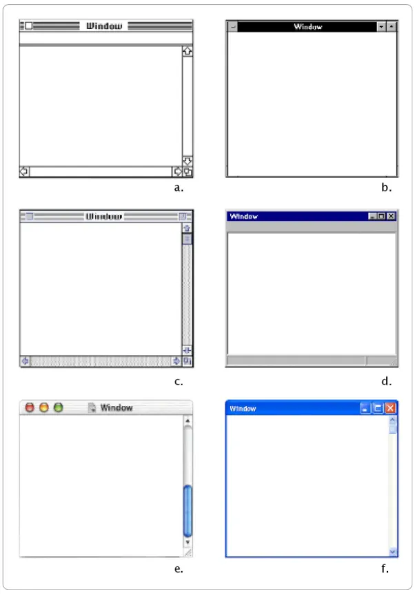
Most operating systems and applications both past and present have had similar typical features, which have been modified little over time. In this respect, as seen in Figure 6, a typical window consists of a main body space for the items that it bears and a top and bottom space for
additional information and tasks, similar to that of a header and footer in text based documents. In the case of Microsoft Windows, these sections are the Title and Menu bar and the Status bar respectively.
The Title bar contains both the names of the documents or applications that are open in the window along with a small icon and name for
identification. The Menu bar, usually located directly below the Title bar is on the other hand where menus are classified into hierarchical categories to perform all main commands and functions. The Status bar at the bottom conveys information related to the contents of the window such as how many files are present in a directory represented by the window, the name of the file selected, the file size, etc. As I mentioned earlier, these elements have had little change overall since the beginning of their appearance such as using separators, including different sized icons and
Figure 6: A classic window and it's components. Source. Apple MacOS8 Human Interface Guidelines.
Figure 7: Various window examples over time
a. Apple Mac OS 1.0 b. Microsoft Windows 3.0
c. Apple Mac OS 7 d. Microsoft Windows 95
One of the oldest features of a window is its ability to resize. Usually located at the top right corner there are the maximize, minimize and close buttons to hide or shrink the whole window into the operating systems general menu bar (Taskbar as it is called in Windows, or Dock as a newer term for the MacOSX) and ranging from platform to platform various other preset sizing and locating features. Again, usually the bottom right includes a “gripper” or a “size box” that lets the user manually adjust the size of the window into whatever dimensions are needed. Both the appearances and exact functions of these elements do vary between different operating systems and applications but function in very similar properties for the same purposes, hence I find it unnecessary to explain each and every one separately.
As mentioned in the beginning of this section, the window can be considered the primary element of the Graphical User Interface.
Speculating on the characteristics of windows will reveal that it renders a virtual visual space and a platform for visual entities to represent and operate commands, instructions and applications hence forming a basis for visual communication and interaction driven by graphical elements. In terms of innovative development, it has remained pretty much unchanged over time except for visual enhancements and functional properties such as colours, textures and sizes. The fact that other elements residing amongst windows have evolved also contributed to overall window development. (Figure 8)
Figure 8: Specialized Windows
a. A textured application window in Mac OS X.
b. Applications window for browsing files in Mac OS X. c. An explorer window in Microsoft Windows XP.
2.2.
Icons
Although the subject of this thesis primarily concentrates on the issue of iconic evolution and visual communication related to the icon, this subcategory describes the fundamentals of the icon just to give a brief definition and description of this element as a context of its belonging to the Graphical User Interface and as a part of Human Computer
Interaction. The latter chapter will be a more detailed analysis describing in depth all features of the icon, and thorough explanations will be given therein. This section of the thesis is placed here in order to follow the preliminary structure of user interfaces, i.e. the WIMP GUI model that was initially developed in order to form a hierarchical definition of the
Graphical User Interface.
Icons are pictorial and graphic representations of files, folders and applications used to employ commands. The use of icons were employed to substitute conventional command prompting by textual input devices such as the keyboard to graphical point and command systems aided by pointing devices. Icons were derived from providing the user with
advantages and features of using graphical entities, to use a different approach to comprehensibility, usability and task performing. Figure 9 shows a screenshot of a folder icon in an icon editing program. The various sizes (left in figure), colour palettes (right in figure) and the enlarged icon in the grid emphasize characteristics of the icon.
Apart from regular system and application icons, customization of icons made by graphics designers, software designers, etc. can also be noted to be present. Users can customize their working environments with these icons. (Example Figure 10) Many icons are distributed, shared and sold as or with software packages and through the Internet contributing to icon design. Figure 11 Shows examples of customized icons.
Icons differ from one another both with respect to (a) the features of the corresponding commands that they represent; and (b) how the command-features are represented. Icons directly or indirectly represent either the operations a command carries out (called "command-operations"), or the objects operated on (called "command objects"), or both; and the objects/operations are commonly represented by conventional or abstract symbols, or by depictions of relevant objects. (Hemenway, 21)
Figure 10: Icons inside an icon customization application window in MacOSX GUI. Source: Iconfactory
Figure 11: Various custom-designed alternative system and application icons. Source: Iconfactory
2.3.
Menus
Menus (Figure 12) are one of the oldest methods of achieving tasks in applications. A menu can be defined as a list from which the user can select operations to be performed. This is achieved by the use of a pointing device such as a mouse as stated earlier, and this method of computer use was the transition to Graphical User Interfaces. Menus are often part of the various bars located inside windows (also described in the previous sections) and are usually nested to the top, bottom or the sides. Similar to the nature of windows, menus have also remained similar throughout the development of the Graphical User Interface. Apart from visual changes, colour and stylistic conventions however, one main evolution is apparent which is the change in the hierarchical structure of
the menu. In older systems and applications, menus would consist of simple single level lists that would either open a corresponding window or operate a command. This functionality has expanded to include subsets of sub-menus and commands, expanding to deeper levels and providing access to functions that are of lower hierarchical level.
Types of menus include pull-down menus and context-sensitive menus as most common. Pull down menus (Figure 13) consist of content that reveal when the user activates it with the use of a pointing device and the menu items appear below the title. After clicking either on the item or somewhere else, the menu automatically closes itself. The items in the menu can be selected by dragging the mouse from the menu title to the item and releasing the mouse or by clicking the title and then the item. Context-sensitive menus (Figure 14) on the other hand are operated by secondary buttons of the pointing device (such as the right button of a typical mouse) and include quick access to fundamental functions that are usually from the menu bar. However, there is no rule to the operations and contents of any of the menu types and again they vary from platform to platform. For example a typical Microsoft Windows application would call a context-sensitive menu by right-clicking, whilst a Macintosh application would bring up the menu by pressing the mouse button (The majority of mice used for Macintosh systems are composed of only one button) for a longer duration of time, as with other applications, no context-sensitive menu may be present.
Figure 14: Examples of context sensitive menus Source: Apple Aqua Human Interface Guidelines Figure 13: A pull-down menu with a sub-menu Source: Apple Aqua Human Interface Guidelines
2.4.
Pointer (Pointing Device)
A pointing device is a hardware component that allows a user to input spatial data to a computer. In the case of Graphical User Interfaces the pointing device allows for physical gestures to control and provide data to the computer. The current types of pointing devices include the Mouse, Tracker balls, Trackpads, Lightpens, Digitising tablets and Data gloves. (Figure 15) Among these devices, the mouse is the most commonly used (Developed in 1968 by Douglas Engelbart). The gestures that control pointing devices consist of a variety of movements, for example in the case of the mouse, the device allows the user to point, click and drag. The physical movement of the mouse on the desktop surface is represented on-screen in a meaningful relation and the activation of buttons and switches on the apparatus cause other functions to operate.
A roller-ball mouse (the most widespread pointing device that is used) includes a ball that lies in an opening at its bottom which rotates synchronous to the mouse’s movements. A formation inside the mouse including shafts and sensors that detect and measure how much the ball, hence the shafts, have rotated send this information to the computer through a wire or an infrared device enabling it to render the mouse pointer on the screen mimicking the mouse’s movements, in other words following the hand gestures of the user. This action is operated on the surface of the desk, usually on a mouse mat. The mouse usually includes a number of buttons from 1-3 which are used to click and operate
applications, open files, etc. The primary mouse button (usually the left one on a two button mouse) is operated to activate represented objects on the screen, whilst the other button(s) usually operates secondary functions (differing from system to system and depending on the
graphical user interface type) such as opening context-sensitive menus, modifying selections, pasting texts and commands of a similar nature. Mouse with fewer buttons may require a longer duration of depressing or a combination of mouse and keyboard functions to perform the same
Figure 15: Examples of pointing devices: a. Mouse b. Rollerball c. Trackpad d. Light pen e. Digitizing tablet f. Data glove
tasks. A Mouse may also include wheels for scrolling, and software to setup the mouse to perform special actions and changing the functions of its buttons.
There are five main gestures that can be performed with a typical mouse. These are point, click, double-click, right-click, and drag. These
fundamental gestures allow the user to perform most primary operations on any application of system task under a Graphical User Interface. Apart from specially programmed or scripted applications, the sole movement of a mouse pointer has no function until positioned or gestures over a menu or an icon or other object.
Pointing devices are usually standard equipment that are used with most Graphical User Interfaces. Portable computers such as Laptops and Notebooks generally include other pointing devices such as a Trackball, Touchpad or Trackpoint which have the same usage as a mouse but are more space-efficient. Other types of pointing devices that are derived from the conventional mouse are the infrared mouse, the foot-controlled mouse, the optical mouse and similar devices.
2.5.
Metaphors
The previous sections explain the basic elements of a Graphical User Interface, elements that have constructed the basis of most Operating systems and applications today. The WIMP GUI model consists of
Windows, Menus, Icons and the Pointer in terms of physical elements to compose the skeleton of an Interface. However there is also a conceptual property of the Graphical User Interface, that is the use of metaphors to convey information and compose a representation system to employ means of conveying information and tasks amongst the user Interface, also a very common attribute in today’s systems and applications.
If we consider the computer as a product or tool that is used for storing, manipulating, and modifying digital data, the existence of merely
graphical elements is not enough to achieve an interface for interaction between the computer and the user. A hierarchical structure and a model for arranging, organizing and rules are needed to perform tasks and maintain computer use as intended. The foundation of the Graphical User Interface depends on the desktop metaphor.
Before the usage of the computers for work and personal use, for
publishing, data manipulation, and so forth, all tasks were done tangibly in a more physical manner, i.e. writing on paper, organizing on files, typing on typewriters, figuration and drawing on various materials, and a
number of methods in all fields that had no digital substitute. The concept of metaphors transported these tasks onto a simulated virtual environment onto the screen or other viewing device.
The name 'Interface' stands for an in-between mechanism of translation, a tool for controlling a mechanism and a communication device
translating actions of one source to another. The Graphical User Interface was developed in this order to mimic the activities of a “desktop” and all functions were developed in correlation to elements of the desktop and their functioning conditions. Perhaps the most cliché example to this use is the text-editors which are based on the typewriter metaphor, and try to adapt old features of the typewriter along with new features that are not possible in physical conditions to employ a tool which is more
advantageous to older technologies and machines. Although alternative approaches to the desktop metaphor may seem like an inevitable
advancement, this does bring with it problems that are regarded in the following parts of this study.
After around 30 years of Human Computer Interaction development and the rise of the Graphical User Interface, the world is now at a point where nearly all tasks are accomplished by computer use, where communication, work and leisure takes place on the computer screen and User Interfaces are a compulsory part of many people’s lives. Even though developments can be easily seen in the technological sense and significant change can be traced back to very recent past, recent criticisms tend to regard the
progression of Human Computer Interaction as being more negative than positive. Jakob Nielsen, and Don Gentners essay entitled the “Antimac”, starts with the following words,
“At recent user interface conferences, several speakers have lamented that the human interface is stuck. We seem to have settled on the WIMP (windows, icons, menus, pointer) model, and there is very little real innovation in interface design anymore.”
In this article, Nielsen and Gentner give reference to the Macintosh guidelines, and criticize that the metaphors based on real instances from daily life can often lead to disadvantages and damage navigation and interactivity, limiting and slowing down user experience. They depict the examples that use 3D virtual spaces in opposition to the common desktop metaphor, but does not speak in its favour. In this respect their criticism regards the idea of using metaphors of any kind, and if overstated, perhaps to the idea of whether using a Graphical User Interface is profound or not.
There have been attempts to use different metaphors, even by Microsoft (Figure 16), owner of the most widespread operating system, but
problems of usability never enabled it to succeed as a commercial product. To brief the problems that they show about metaphors, the following can be summarized; firstly the functions that are not possible in real life circumstances (the reference for the metaphor) are often easily
unnoticeable when represented in the user interface because of the very fact that they are referenced to something that cannot be done. Nielsen and Gentner give the examples of the following:
The three classic problems with metaphors are:
•
The target domain has features not in the source domain” (e.g., telling the user that "a word processor is like a typewriter would not lead the user to look for the replace command).” Some other problems that they relate to can be quoted as follows:Figure 16: Microsoft BOB, a product conveying an alternative approach rather than the desktop environment, but without success to stay on the market.
•
The source domain has features not in the target domain (a typewriter has the ability to mark up any form you receive in the mail, but a user trying to do that on current computer systems will normally fail).•
Some features exist in both domains but work very differently (the treatment of white space representing space characters, tabs, and line feeds is very different on typewriters and in word processors). Therefore, users may have trouble seeing beyond the metaphor to use the system in the ways it was intended. It is possible to design interfaces to map very closely to metaphors (e.g., Bob Mack's NOSE-no-surprise editor-really did act like a typewriter in all respects), but those interfaces will often be very low-powered and suited mainly for walk-up-and-use situations. (Gentner, 72-3)This article refers to many features that the desktop metaphor has forcefully tried to adapt within itself in order not to give way to any restrictions compared to the tangible environment, causing
misinterpretations and clumsiness in effect. As an example Gentner and Nielsen also draw attention to the working principles of the trash can icon (Figure 17) , a metaphor of the wastebasket, where when all items
disrespectful to where they physically are located end up in the same trash can folder before complete deletion, and although they seem to be located in the same volume, are actually in different trash can folders respectful to their initial physical location, hence when are deleted the operation takes place in all physical drives. This results in unnecessary operations and confusion on the user's behalf. “The desktop metaphor has enforced a limitation on the interface that does not serve the user's
One other important aspect of metaphors that they emphasize is the restrictions that metaphors cause for people both using and designing the interface. Since metaphors are directly related to analogy and their main purpose is to represent in some conceivable form, actions or objects related to real life situations, any situations bring limitation compared to alternative means that could result in operations that are much more efficient and meaningful. The traditional desktop may have been the tangible user interface of the 1980s and could be argued to be the best way of doing things, however today the metaphor is “tired” in their words and tasks, communication methods and items of the desktop need replacing in order to present the most up-to-date and efficient objects and tasks in using interfaces.
Many more ideas can be developed from these propositions rendering the desktop metaphor as exhausted; The generation that started using the first examples of graphical user interfaces and the concept of a desktop metaphor were adapting their real life skill into the digital platform. In
Figure 17: Common Trashcan icons (Empty and full)
other words they were using the typewriter, using physical file cabinets and folders and were used to all the applications, objects, appliances and chores that the desktop environment simulate. However the new
generation of present time, children especially have become directly acquainted to the older revisions and higher capable devices that have built up on the premature graphical user interface and desktop metaphor. Files and folders, typewriters, and all other common objects that are descendants of the desktop metaphor are no longer used anymore, are obsolete so the idea of representing exhausted, replaced technologies and analogies that do not refer to the “real world” any longer is deeply problematic in trying to improve, expand or evolve a user interface, hence to develop and progress in what is actually the aim and function of the user interface.
The desktop metaphor assumes we save training time by taking advantage of the time that users have already invested in learning to operate the traditional office with its paper
documents and filing cabinets. But the next generation of users will make their learning investments with computers, and it is counterproductive to give them interfaces based on awkward imitations of obsolete technologies. Instead, we need to develop new interface paradigms based on the structure of computer systems and the tasks users really have to perform, rather than paradigms that enshrine outmoded technology. The way to advance the interface is not to develop ever-more-faithful imitations of the desktop, but instead to escape the limitations of the desktop especially as computers themselves become ubiquitous [21] and are used away from the desk. (Gentner)
Although metaphors, the Graphical User Interface and hence the use of iconic communication to interact with the computer may have its problems, it is still the most widespread example of human computer interaction today, and when compared to alternatives is leading by far. Many users are overly familiar with visual interfaces and iconic
communication to the extent that passing to textual or language based interfacing or other means of gestural interaction may be too awkward to be faced with. Although much can be imaginable as alternatives to the graphical user interface, it would take an extremely difficult path to be realized and just as pure textual interfaces have their advantages in certain cases over graphical and iconic interfaces and are far from diminishing, newer alternatives that are of highest promise will most likely fall into the same situation.
The graphical user interface has its limitations and has indeed become exhausted to a degree that is not to be disregarded. As can be expected without surprise, newer ideas on interfaces will most certainly replace certain criteria amongst the conventional graphical user interface and therefore also iconic communication, but just as the mutual relationship between images and text is concerned, these new innovations are most likely to adapt and implement themselves within the roots of current Human User interfaces.
3. DESKTOP ICONS
After the development of the first Graphical User Interfaces, the first set of icons were produced as pictorial representations of commands, files and folders, software and hardware, and were used for the first time in accordance with the other new visual features that were discussed in the first chapter of the study. (Parc) The concept of the Graphical User Interface was entirely new along with the use of computers regarding people that were not engaged distinctively in areas of computer research and development and had just superseded the conventional command prompt that was more familiar to software developers and computer programmers (Some users still prefer text only programming platforms due to faster commandment and excess of unnecessary functions). The concept of the desktop metaphor was a new one and users at that time were trying to get used to both using the computer and the interface, and getting used to a new way of accomplishing tangible tasks that would conventionally be done outside the presence of computers. The first set of icons along with the other Graphical User Interface elements, whether directly accredited to or not, were the first examples that started the
The early application of icons consisted of simple but effective 1-bit black and white illustrations occupying a very limited amount of space and performed simple straightforward tasks having both similar and different functionalities as compared to ones that are designed today. Present system and applications icons however, have the capacity of complex high resolution photo-realistic or photo-illustrative imagery; being capable performing multiple tasks and conveying different categories of
information with a wide band of flexibility. Such an evolution is
correspondent to the fact that user interaction, navigation and possibility of multiplicity in applications have changed substantially. Together with technical advancements, higher memory allocation, faster processing units and a build-up of software developments, iconic function has
somewhat paralleled the capacities and functional purposes of multimedia applications and developing operating system capabilities.
The following segments of this chapter will include an in-depth definition of all aspects regarding the significance of icons in the Graphical User Interface and will define and interpret the characteristics and features that icons possess. First a brief definition will be given to explain what the fundamental functions and roles of the icon are and where the concept has been derived from, followed by the technical features and
3.1.
The Definition of the Icon
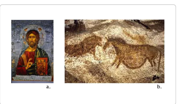
The term ‘Icon’ originates back to a considerable past and its roots come from the Greek word for ‘Image’. In its most traditional context, it is a term referred to a single image that represents a religious subject or person usually of divine importance, and exists most commonly in the form of paintings of holy people, places, subjects or ideas. Traditional “Icons” (Figure 18a) were especially used in the practices of the Christian Church and although their functionality and visual impact has changed compared to its past, it is still used and practiced today in this context. Analogical to traditional iconic imagery signifying importance, divinity and holy subjects, computer icons intend to perform the task of representing the most fundamental and important groups of applications, functions and commands on the desktop environment. Since the whole idea of the desktop metaphor and the essentials of the Graphical User Interface rely on, or more modestly put; have progressed upon representation and metaphors, the concept of the icon can also be regarded as a metaphor to its traditional meaning.
In its most general sense, the icon is a term used “to mean any image used to represent a person, place, thing or idea.” (McCloud, 27) McCloud talks about symbols, language and science related icons and pictorial icons in depicting examples in his definition of the icon. Pierce's definition as a semiotic model is also commonly used where he separates the icon,
of the computer icon, many definitions apply and can be useful for analysis and speculation. The computer icon uses many mixed semiotic and visual communication attributes to signify meaning and perform functional tasks. Although Pierce separates the icon from the symbol for example, a computer icon can be in either or both forms. In this sense the definition of the icon will be related with representation in a more general sense, and in relation to this study, will also be closely related to writing.
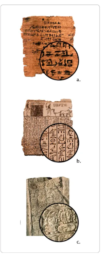
Regarding the originations of iconic imagery, it becomes primarily
important to establish the differences and similarities of some definitions between images and writing. Haramundanis compiles an account of the of icons' relationships with the origins of writing by referring to
Figure 18: The first signs of iconic representation
a. An example of a “traditional icon,” as a portrait of Jesus. b. Photograph of a cave painting from Lascaux Caves.
documentation from Gelb and Diringer where she refers to as sources having “exhaustively documented” the history of writing (4) From these sources she mentions that Pictographic and Logographic scripts were developed before the presence of alphabetic scripts, hence concluding from her research, what may be called the initial forms of writing were closer to an imagery based system rather than a text based system, linking writing and text further to each other. (Example, Figure 19)
Goppold's more concentrated account on the typology and history of writing states that the oldest forms of symbolic representation dated back to over 400,000 years ago appear in the Altamira and Lascaux paintings
Figure 19: Examples of Chinese Ideographs, a writing system that has evolved from imagery.
figures represent, these examples of a combination of pictorial and abstract symbols are noted to be the initial forms of symbolic
representation. In terms of the first forms of writing, the Mesopotamian, early Egyptian and Chineese are exemplified in Goppold's article.
Haramundanis also gives the primary examples to these initial
logographic scripts in her article as Sumerian, Babylonian cuneiform and Chineese logographs. (Figure 20, Figure 21)
When tracing back iconic representation to writing, it then becomes necessary to categorize the different typologies of writing systems in order to differentiate how images are related to writing systems and how they have evolved. In Goppold's article (quoted to be derived from
Microsoft Encharta) these are first taken as “Limited Writing Systems” and “Full Writing Systems.” Limited writing systems intensely include the various pictographic and ideographic symbols capable of limited expression, whilst full systems include the categorizations of words (logographic), syllabic or alphabetic; able to fully express all language formulation. Although these systems are taken separately, they are related to one another essentially as once again highlighting how iconic representation is interlinked with writing. The Mesopotamian web site of the British Museum illustrates an instance of how Pictographs eventually evolved into cuneiform scripts in the early Mesopotamian culture.5
Figure 20: Examples from the first writing systems:
The fundamental difference here is that pictograms stood for whole words and concepts whilst scripts used characters representing sounds to form words. Hence it is possible to write the same language by both forms of symbolic and writing systems and in the same sense it is possible to write several different languages by using the same cuneiform script. (Figure 22)
Writing systems are evident in the major forms consisting of
Logographic, Pictographic, Ideographic, Phonographic, Syllabic and Alphabetic6 (Goppold, 16.2) According to this categorization, Abstract Logographic symbols are composed of forms that are often common and universal, such as mathematical, scientific, notational and technical symbols. McCloud refers to these types as icons belonging to the
“practical realm.” (27) Pictographic symbols on the other hand are those that represent a word or phrase.
Figure 22: The same letter in various different Chinese Script examples. Source: The British Museum's Mesopotamia Page.
Haramundanis's main argument, evident in the title of her article, “Why Icons Cannot Stand Alone,” emphasizes that the origins of icons and writing come from similar roots and that there is no clear distinction between text-based scripts and iconic imagery. (Haramundanis, 1) Therefore her ideas on this subject could be summarized as icons and text being regarded together without isolation, that icons must be guided or founded upon some form of written explanation or label. A more
detailed argumentation about this idea will be presented in the following chapter that compares textual and iconic communication. Regarding the definition of the icon, Rubens comments on how they can be regarded, and places them into another visual category that has a wider and clearer terms of classification:
The difficulty of placing icons into discrete domains presents a major impediment to the development of useful iconic
vocabularies. One way of considering the impact of the presence of various domains of icons in one context can be found in the anthropological studies of the development of glyphs. Glyphs are arbitrary visual signs with no associated vocal form (much like mad signs in which a right arrow represents the shape of the road but not the word “curve”): in addition they are not part of a system designed to account for a complete “real” language or vocabulary. Glyphs generally fall into five categories: pure, bound, set, system, and proper. Pure glyphs cannot be analyzed into component parts by applying systematic grammatic rules. Bound glyphs act as signs for components of a message in a particular language; they normally represent nouns or functors. Set glyphs are members of a system associated with a set of combinatorial rules
independent of a spoken grammar, heraldry, chemical formulae, musical notations, and many international symbols for specific
professions are examples of these glyphs. A glyph system contains glyphs that have a systematic relationship. Particular lighting systems, such as traffic signals, and directional signs for various purposes fall into this category. Finally, a proper glyph stands for an individual institution; corporate logograms, trademarks, and certain cultural icons -- crosses, yin and yang, etc.-- ail belong to this category. (Rubens, 27)
The context of the metaphor regarding cultural and historic significance is important as Brami shortly mentions. Change in time, cultural traits and other factors substantially change the comprehensibility and the
meaningfulness of an idea, concept or understanding and hence the whole metaphorical concept that depends on it. These traits however, can also work in favour of empowering the comprehensibility of the icon.
“Throughout human history, the typical course of development in a culture’s creation of iconographic imagery is to first produce archetypes that are frontal and rigid, in “poses” that reflect a particular action, attitude, or meaning. As the culture develops the imagery, it becomes more specific in appearance and more loaded with nuances.” (Brami, 13)
What this idea suggests is that through continued depictions of a certain concept that underlies as the foundation of the representative icon, certain ideal figures, poses or imagery with stylistic similarities start to evolve and become typical examples for that particular concept. When applied to desktop icons, we can encounter a similar tendency. To
instances of these icons in a number of different operating systems and applications, we encounter very similar, in some cases near-identical representations and metaphoric depictions of these functions and
concepts. For example the zoom icon that is used in a number of graphic and document editing programs, browsers and other similar applications is commonly and widely represented by a magnifying glass, and usually inherits a '+' or a '-' sign to relate whether it is zooming in or out. Even though the names of the icons may be different from one application to another, such as magnify, zoom, enlarge, the representative figure used to convey this metaphor is substantially the same.
Just as there are sets of ideographs forming the unified array of languages, computers also include many sets of icons to enable widespread use of a diverse number of actions and commands. Some icons are directly referenced to older civilizations’ pictorial and symbolic cases, and communication methods operate in a very similar nature to these instances.
“The practice of grouping collections of attributes together is becoming increasingly common. For example, the PHIGS graphics standard [2] uses “bundles” of drawing attributes, while Microsoft Word [5] allows the user to group parameters controlling the appearance of text, such as font, size, and spacing, into a single text “style.” In our work we apply the notion of grouped attributes to a graphical interaction method,. (Salesin, 103)
In order to perform tasks as intended and function properly icons have to be properly designed and formed. As Brami defines it, the iconic image must be “a recognizable image with a power to transcend cultures and be immediately understood by the viewer” (16) A user has to quickly
distinguish one icon from another, recognize it and understand what the icon signifies or what command the icon deploys. Whether figurative, illustrative or photographic, black, white or coloured, the main purpose of icons are to represent the needed task. An icon is basically a pictorial representation of a concept or idea and therefore its technical features can be somewhat parallel to that of an image, only to have certain
limitations as to the area it occupies, the number of colours it uses and its symbolic properties. Rubens states the following about designing sign systems,
”If one attempts to define the salient features of a conventional sign system, one could suggest that it will have three aspects: leveling, sharpening, and assimilation. Leveling simply means that extraneous detail and objects have been deleted.
Sharpening involves making the remaining detail stand-out from the background. Finally, assimilation means that exaggeration and other deformation techniques are used to interpolate from mimetic, or real, to imaginative, or metaphoric, detail. Techniques of this variety allow developers of icons to represent fairly complex environments with relatively simple graphics.” (Rubens, 25)
3.2.
Visual Qualities of Icons
Icons are the most intricate, customized and varying elements of the Graphical User Interface. Other elements such as windows, scrollbars and menus include differences in terms of their categorizations and content but in visual form are regularly consistent throughout. Changes in themes, tones, colours, textures and features such as menus, displaying options and bars do vary within these elements coresponding to their functional properties but unlike icons that rely on unique image representations, they are not intended to differ among themselves.
Icons and windows are the most important visual objects as they correspond to real objects of the applications. Buttons and scrollbars are used in the decoration of windows: buttons trigger operations on the window (for instance open/close), and scrollbars are used to control the visible part of a window’s content. (Beaudouin-Lafon, 145)
Many sources aim to define or at the least interested in establishing points regarding the classification and categorization of icons to produce a comprehensible portrait and understanding of the general factors of the icon. When a number of these are examined, two different perspectives seem to be of most importance. The first of these approaches is the icon as taken in the framework of semiotics; the study or science of signs, and the other approach analyzing the icon in terms of visual quality as part of graphic design/ visual communication. Although these two perspectives
rely on and are related to one another, it is important to look at both separately to underly different factors. Bryne's account of visual factors is one that effectively summarizes the different qualities of icons:
Size. Generally, all of the icons on a display are the same size. So while size may be a useful way to discriminate between icons, it is typically not employed in current displays. Color. This is an interesting dimension, because many GUI displays do not support color. Thus, even if using color as a discriminating feature is effective, reliance on color differences may not be appropriate for icon designers.
Form. This is the primary dimension on which icons vary and includes a number of sub-dimensions, such as the level of detail in the form and the meaningfulness of the form. Spatial organization. Some interfaces impose a grid-like organization on icons, others a”staggered grid” organization, and still others no organization at all-icons can be anywhere. This may or may not have an effect on search.
Number of objects. Both the size of the search set and the number of icons with pictures matching the target can vary widely from trial to trial. Probably the best-studied factor in visual search is that of set size, while the effect of multiple visual matches has been relatively ignored. (Bryne, 447)
3.2.1.Form
There appear to be three major categories for classifying the different forms of icons. Although sources give different names, and some include more than three, the underlying descriptions suggest that they can be grouped into Pictographic, Representative and Abstract.
“Manning posits three modes that serve as models for
comparative visual analysis: order, graphic, and literal. The first ranges from high to low order the second from high graphic to low graphic; and the third from high literal to low literal. In each instance, he makes some suggestions about visual
representations that characterize each of these modes.” (Rubens, 26)
Horton states different terms, “We can draw icons in five different degrees of detail and realism:Photograph, Drawing, Caricature, Outline, and
Silhouette” (Horton, 372) The instances of the three types of forms included in this study are relevant to what is being represented and how the icon is to function. In some cases all methods may be suited, whilst in other situations, neither three will be able to properly represent the intended function. Rubens explains this situation:
One difficulty presented by icons in computing, already discussed, is that they span the boundary of several iconic types. The representational or mimetic sign appears as surrogates for corporate logos; the pictogram is employed for specific elements or tasks (such as file folders and disks); diagrams (such as arrows) are used to indicate direction: prosodic (in the form of punctuation marks) and mathematical
and verbal support to provide redundancy occur. Thus, viewers, as users of computer equipment, must be facile enough at decoding iconic signs from various domains to be able to move successfully among those domains with some degree of
comprehension. (Rubens, 29)
3.2.1.1. Pictographic Icons
As older operating systems and applications permitted limited use of graphical entities due to technological limits, earlier examples of icons fell primarily to this category of visualization. Figuration or illustration was used for pictographic depictions of representing an idea, concept or subject by using fewer lines, summarizing details and conveying only the most important features of the object. This type of representation proved very effective, functional and suited for earlier operating systems and applications primarily to the fact of technical restrictions, and was an economical solution for allowing metaphoric communication methods. Icons were pure and simple in this sense and were remembered, easier distinguished and perceived at shorter times. The overall use of figurative and illustrative icons proved to be well suited for fast and easy task performing and apprehension. A comparison of this method can be directly related to logos, emblems and symbols used in industries, companies, institutes and other foundations which employ the use of a simple image to represent their institution in the most comprehensive and effective way. This information is apparent in the interface as many
software developers use their company logotype as icons for their products and applications, or in other words the logo of a company can be directly substituted to function as an icon.
“For the most part, these icons would be termed symbolic signs. Symbolic signs can be defined as a pictogram; that is, certain analogies connect the icon to its referent, but the primary referent is deformed to allow the icon to refer, by analogy, to a secondary referent. For instance, in our later discussion of a telephone icon for a telecommunication program, we will maintain that this icon is appropriate even though the telephone is associated with voice rather than data transmission.”(Rubens, 28)
Figure 23: Examples of Pictographic Icons Source: Iconfactory, anonymous.
Caricatures, comics and cartoons also fit into this category. Pictographic icons can be said to be the most common and widespread types of icons used, presumably because the tradition of older systems still enforces pictography to be popular, and because the use of highly representative icons have only possible in recent time, available in only the newest operating systems and applications. Although some icon designers aim to experiment and deploy the latest technical possibilities and trends, may stick to more solid standards and design for the widest audience expected to be using older systems and applications. Although icons are capable of resizing into a number of standard sizes, highly realistic icons cannot be effectively displayed with the lower dimensions that most systems are limited of displaying, so most executions of icon design are aimed directly to these limited sizes to preserve design and style consistency.
Glyph research provides a glimpse into the difficulty of creating icons that fit into specific categories. An additional difficulty in creating icons, and perhaps a more far-reaching one, is the difficulty in designing a finite icon set. International road signs are a good case in point. For the most part, road signs try to represent their meaning independent of the sound of a spoken language. Pictures are used to represent objects rather than the sound of the object’s name. Highway pictographs, for example, depict an upcoming bend with a curved arrow. The arrow represents the shape of the road rather than the sound of the word “bend”. Pictographs, therefore, are very useful when people speak different languages. (Rubens, 28)
3.2.1.2. Representative Icons
This is perhaps the most apparent form of evolution that has occurred considering the visual features of the computer icon. As discussed previously, this evolution is mostly regarded to technical advancements and the developing of platforms which allow for more complex
dimensions, details and digital expansion. With the coming of technical possibilites, newer user interfaces such as the Apple Mac OSX and Microsoft Windows XP can now equipped with near photo-realistic and photo illustrative icons. Departing from this new opportunity, the number of representative and realistic icons have grown. The new technical
possibilities allow icons to possess direct realistic depictions of objects or subjects that refer to a concept, similar to a photograph or realistic drawing. For metaphors that represent tangible objects and material subjects, this method provides an effective and applicable technique.
However parallel with symbolic properties and necessities for successful implementation of metaphors and analogies, and also because of space consistency, this type of icon form also includes restrictions, in most apparent terms, the represented object must be clearly depicted, usually in full size against a solid colour background to be perceptible. It must be simple enough to communicate its message clearly and represent a key concept without trouble. At the moment within the latest technical possibilities, iconic communication can only benefit from using highly representative techniques within certain limits.
3.2.1.3. Abstract Icons
Abstract icons are very common in applications and operating systems since it is not possible to represent concepts, ideas or commands that do not possess physical material quality. Icons of this type either assign symbolic and expressive figures to convey its message or take advantage of conventions to display ideas. Usage of national flags to convey
language settings can be an example to the use of conventional
symbolism. (Flag icons also fit into the other two categories depending on its stylistic properties and resemblance to the flag as a physical object.
Figure 24: Examples of Representative Icons
Although abstract symbols and icons may make successful expressions of representing less clear concepts and commands, and can prove to be highly recognizable due to their different complex visual language, they can and are commonly problematic. Without prior knowledge, explanatory text or some form of explanation, there is no way of comprehending the icon initially. This means that there is no way to figure out what the represented command or object is, or is related to, except for triggering the icon to find out. Also memorization is required to perform the task for the next time and abstraction makes remembrance harder.