The Effects of Achromatic and Chromatic
Color Schemes on Participants’ Task
Performance in and Appraisals of an
Office Environment
Elif O
¨ ztu¨rk, Semiha Yılmazer,* Sibel Ertez Ural
Faculty of Art, Design and Architecture, Department of Interior Architecture and Environmental Design, Bilkent University, Bilkent, Ankara 06800, Turkey
Received 24 November 2010; revised 14 January 2011; accepted 21 January 2011
Abstract: This study explores the effects of chroma on participants’ performance and environmental appraisal of an office. The research was conducted in a full-scale ex-perimental room designed as a private office where achro-matic and chroachro-matic color schemes with coequal values were applied. Sixty participants were assigned tasks and given a questionnaire to appraise the spatial color schemes. The findings show that chroma significantly affects performance and space appraisal. In terms of accu-racy and time spent performance scores measured signifi-cantly better in the room with the chromatic scheme than those in the room with the achromatic scheme. The office with the chromatic scheme was found to be more pleasant, attractive, satisfying and dynamic than the one with the achromatic scheme, whereas the achromatic scheme was thought to be more formal and harmonious. Categorization of pleasantness, harmony, dynamism and spaciousness by factor analysis also showed differences between the achro-matic and chroachro-matic schemes. Ó 2011 Wiley Periodicals, Inc.
Col Res Appl, 37, 359 – 366, 2012; Published online 12 August 2011 in Wiley Online Library (wileyonlinelibrary.com). DOI 10.1002/col.20697
Key words: office environment; chroma, achromatic and chromatic color schemes; environmental appraisal; task performance
INTRODUCTION
Color is a powerful design element, serving as a tool of communication between people and the built environment.
It plays an important role in environmental design, inform-ing theme, ambiance, image, function, built form, location and direction. The correct use of color can enhance peoples’ interaction with their environment. In addition, the appro-priate usage of color combinations is also relevant for presenting the aesthetic, symbolic and cultural meanings of an environment.1
In interior color design the fundamentals must first be understood, and from there, designers must find the ultimate color solutions for specific design situations. Throughout the design process, designers should consider the psycho-logical properties of color and the effects of color on spatial dimensions. Whether it is possible to measure accurately psychological responses to color is debatable; cultural, geographical, economical, and educational differences affect generalizations on this issue. However, collective findings have shown that most people exhibit the same reac-tions to certain colors, and therefore color impressions, associations and their general characters can guide designers to understand how people may perceive a space.2
The functions of color in an office environment are varied. It can define the space’s atmosphere or solidify a company’s brand.3 With the increasing amount of time people are spending at work, the psychological effects of office color is becoming a topic of study. In terms of psychological conditions of workers, research in literature has focused on how color and color combinations affect workers’ mood, productivity, and subjective impressions. Numerous studies have also shown that environmental factors (air quality, thermal comfort, spatial comfort, pri-vacy, office noise control, building noise control, lighting comfort, color and workstations) affect workers’ percep-tions and behaviors.4,5
Many studies provide clues to enhancing interior color design. However, as Kwalleket al.6stated, simply viewing
*Correspondence to: Semiha Yılmazer (e-mail: [email protected]).
V
pictures or slides of interiors cannot result in a subjective evaluation; people need to be exposed to real interior envi-ronments. In addition, studies about the relation between color and human performance that were conducted in sets with isolated stimulus or restricted objects7 were not enough to provide conclusive evidence.
Kwalleket al.8 designed an experiment to examine the effect of office color on workers’ mood and productivity. Sitting in a red or blue office, 36 subjects were asked to fill out an eight state questionnaire, measuring their mood. Partway through the experiment, subjects were guided to either continue the experiment in the same office or move to the different colored office. According to the results of the questionnaire, group differences were not statistically significant, but mean anxiety and stress scores were higher for the subjects who stayed in the red office. Mean depression scores were higher for the subjects who stayed in the blue office, and mean arousal scores were higher for the subjects who moved to the different colored office during the experiment.
Kwallek9 conducted a study examining the effects of office wall colors on feelings of spaciousness and prefer-ence. One red office, one green and one white were eval-uated by 124 undergraduate students. The results showed that the white office was perceived as the most spacious and white was chosen as the most appropriate and prefer-able color for an office interior. Another study by Kwal-lek et al.10 was designed to determine the effects of nine office colors on subjects’ performance, mood and color preference. A total of 675 subjects participated in the study and gender was introduced as an additional group-ing factor. The statistical analyses showed that subjects were least likely to work in orange and purple offices and preferred to work in beige and white offices. Further, females indicated more depression, confusion and anger in offices with low-saturated colors such as white, gray and beige, whereas males reported more depression, con-fusion and anger in high-saturated offices such as green, blue, red, yellow, and orange. One study determined that interior office color might affect perceived performance and job satisfaction. Three different color schemes were applied in three laboratory office settings where workers performed specific office tasks for 4 consecutive days. According to the results, those in the white and predo-minantly blue–green offices reported higher perceived performance and job satisfaction than those in the pre-dominantly red office.11
A cross-cultural study of indoor work environments directed by Ku¨ller et al.12 aimed to determine whether indoor lighting and color would have any systematic impact on workers’ moods. The study was carried out on 988 subjects in real work environments in different seasons and in countries with different latitudes, with all subjects participating in all parts of the study. The results indicated that workspace color is an important environ-mental factor. It was determined that the index of emo-tional status was higher throughout the year for those who had the most colorful work environments. According to
the results, the use of good color design might contribute to a more positive mood.
The research mentioned above was mostly conducted to analyze the effects of different hues (red, green, blue, etc.) on workers’ mood and performance. Still there is much to research and understand about the other two dimensions of color –value and chroma – in workplaces.
Office spaces are primarily task-oriented work envi-ronments related to the performance of visual tasks. According to Katzev,13 designing lighting for an office environment not only involves technical issues regarding the individuals’ work-related tasks, but also influences workers’ general motivational states, psychological well-being and comfort. The Standard Practice Subcommittee of the Office Lighting Committee of the Illuminating Engi-neering Society of North America (IESNA)14 notes that the major purpose of good lighting design in the office environment is to provide effective human visual comfort, to recognize human perception about the appearance of space and to consider energy efficient applications. IESNA sets standards and recommendations such as required illu-minance levels for visual tasks,14 recommended surface reflectance values15,16and recommended luminousity ratios between the lighting for the surface of the task and other surfaces14. These considerations imply constraints on the dimension ofvalue.
Recent research has shown that although there are many potentially objectionable features in office environ-ments (e.g., poor lighting, low visual comfort, etc.), users are most affected by office color design by means of their color preferences17 Thus, understanding the effect(s) of chroma in terms of task performance and environmental appraisal can contribute to providing physically and psy-chologically sufficient working environments that can enhance workers’ well-being and productivity. The aim of this study, therefore, is to explore the effects of chroma on participants’ task performances and appraisal of a full-scale office environment.
The research questions of the study were as follows: 1. Are there any differences between achromatic and
chromatic color schemes of an office environment in terms of task performance?
2. Are there any differences between achromatic and chromatic color schemes in terms of appraisals of an office environment?
EXPERIMENTAL STUDY
To understand how individuals experience office environ-ments where achromatic and chromatic color schemes have been applied, the study was carried out in a full-scale setting that was designed as an ordinary private office. In the study, it was crucial to use colors with the same value (lightness) in the achromatic and chromatic schemes to understand the effect of chroma. During the research, subject groups were given a set of task perform-ance tests and a questionnaire.
The Experiment Room
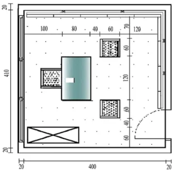
The study was carried out in an office room at the Department of Interior Architecture and Environmental Design at Bilkent University in Ankara. The room meas-ured 4 3 4.10 m, and the ceiling height was 3.20 m (Fig. 1). The windows of the room were covered with thick black panel, preventing the penetration of daylight to control for its effect during the research. The existing general (downward) lighting with homogeneously distrib-uted illuminance was used for the experiment. The speci-fications of the lighting are shown in Table I.
On two adjacent walls, a plywood sliding panel system was constructed to provide two-sided surfaces for easy implementation of the different color schemes. One side of the panels was painted with the chromatic scheme, and the other side was painted with the achromatic scheme with an equivalent achromatic gray. The natural color sys-tem (NCS) color scanner was used for measuring colors.18 Because of its low cost and ease of implementation, fabric was used as carpet the floor and upholstery for the furniture. To change the wall colors, the panels were slid to the corner and turned to the other side. The value of the colors was limited to within the range of surface reflectance recommended for office environments.14,15 For the chromatic scheme, monochromatic colors were applied to avoid the effect of contrasting hues, as this subject is not within the scope of this study (see Fig. 2). The NCS codes and surface reflectances of the applied colors are shown in Table II. The furniture, consisting of a desk, an office chair, two armchairs and a filing cabinet, was arranged so that the subjects could see three sides of the room during the experiments (including the colored wall in the chromatic scheme).
Subject Groups
The 60 subjects were randomly chosen from among the academic and administrative staff of Bilkent University and participated in the experiment voluntarily. To alter-nately test chromatic and achromatic schemes, the subjects were divided into two groups, according to their age and gender. One of the groups evaluated the achromatic scheme first and the chromatic scheme second, while the other group made their evaluations in the opposite way. Task Performance Tests
Human performance measurement reflects the man–envi-ronment relationship since it is known that enviman–envi-ronmental quality impacts performance. In recent research, clerical tasks such as typing, proofreading, comparisons and cogni-tive performance in memory and problem-solving tasks19–21 have been used for measuring performance of subjects under different circumstances. In this study two kinds of perform-ance tasks were used: problem solving22and proofreading.
In the problem-solving task, 30 items were tested. Each item contained a figure with a missing piece, and involved a different principle or theme for obtaining the missing piece. Below the figure, there were either six or eight pieces to choose from to complete the figure, and only one correct answer. The proofreading task showed two paragraphs. In one paragraph, participants were asked to count how often a certain word appeared; in the other paragraph participants were asked to find the typographic errors.23
Questionnaire
The questionnaire consisted of four parts. First, the participants were asked to evaluate their performance of the given tasks. The second part asked participants to eval-uate the office environment by means of five-point seman-tic scales. Twelve adjective pairs were chosen: unpleasant/ pleasant, unattractive/attractive, unsatisfying/satisfying, static/dynamic, tense/relaxing, uncomfortable/comfortable,
FIG. 1. The plan of the experimental room. [Color figure can be viewed in the online issue, which is available at wileyonlinelibrary.com.]
TABLE I. Specifications of the artificial lighting of the experiment room. Light source Four Philips fluorescent lamps (TL-D36W 840) Color temperature 4000 8K Color rendering 85 Ra
Luminary of the experiment room
Illuminance level on the working surface (measured by Minolta Illuminance Meter)
disorganized/organized, nonfunctional/functional, informal/ formal, unusual/usual, discordant/harmonious, and con-fined/spacious. The questions of the third part asked whether participants liked, preferred and found the color schemes appropriate for an office in general and for their own office. In the final section, the subjects’ further opin-ions, complaints and suggestions about the office settings were solicited by open-ended questions.
Experimental Process
The experiment was conducted in the following phases: the participants were taken to the experimental room one by one at scheduled time. In the experiment room, partici-pants were first tested for color vision with the Isihara color blindness test. After a few minutes for visual adap-tation, the experimental procedure was explained to them. Each participant first performed the problem-solving and proofreading tests, whereas the pollster recorded the time spent. Then they were administered the questionnaire. After these phases, participants were scheduled for the the other color scheme, with at least 4 days between the two experiments to avoid the learning effect. In the second experiment, participants performed the same kinds of tasks but with different text, and filled in the same questionnaire. The Statistical Package for the Social Sciences (SPSS) 13.0 was used to analyze the data of the study.
RESULTS
Effects of Color Scheme on Task Performance
According to Bailey24 adequate human performance can be measured by utilizing accuracy, speed of performance and user satisfaction. To investigate whether there are any differences between achromatic and chromatic color schemes of an office environment in terms of task per-formance accuracy and the speed of perper-formance were analysed. The mean value of accuracy in the achromatic colored room was 43.10/45 (SD ¼ 2.11) and in the chro-matic colored room 44.13/45 (SD¼ 0.98), differing signif-icantly (t ¼ 23.89, df ¼ 59, P \ 0.001). The mean value of time spent on the performance tasks in the achromatic colored room was 4.80 min. (SD¼ 1.59) and in the chro-matic colored room 4.33 min. (SD¼ 1.33). These figures also differ significantly (t ¼ 3.26, df ¼ 59, P ¼ 0.002). The figures also show that in terms of accuracy and speed the participants’ performances were better in the chromatic scheme than in the achromatic scheme. However, the results of the self-reports by the participants (about their accuracy, timing and percieved effect of color scheme on their performences) showed no significant difference between the achromatic and chromatic schemes (Wilcoxon, self-reports on accuracy; z ¼ 21.52, P ¼ 0.129, self-reports on timing; z ¼ 20.72, P ¼ 0.467, self-reports on perceived effect of color scheme;z¼ 20.97, P ¼ 0.331).
FIG. 2. The experimental room with the chromatic (left) and achromatic (right) color schemes.
TABLE II. NCS codes and reflectances of the surfaces (measured by NCS color scanner).
Achromatic scheme Chromatic scheme
NCS codes Reflectances (%) NCS codes Reflectances (%)
Ceiling S 0500N 87 Ceiling S 0500N 87
Walls 12 S1500N 68 Walls 12 S1500N 68
22 S 3000N 50 22 S 3000N 50
32 S 0530- Y30R 68
Furniture Furniture
Table S 4000N 35 Table S 3050 Y20R 30
Armchair S 6500N 19 Armchair S 4050 Y30R 19
In the study, the same subjects performed the procedure for both the achromatic and chromatic settings. Although the order of the achromatic and chromatic settings changed for the participants alternately, the learning effect was tested to prove the reliability of the findings on per-formance tasks. The scores of the participants who were presented one scheme first and the scores of the others who were presented that scheme second were analyzed through independent sample t-tests. The results showed that there are no significant learning effects on the task peformances.
Effects of Color Scheme on Appraisal of the Office Environment
The effects of color scheme on the appraisal of the office environment were analyzed under three sections, namely, analysis of the semantic scales, analysis of the open-ended questions and analysis of the participants’
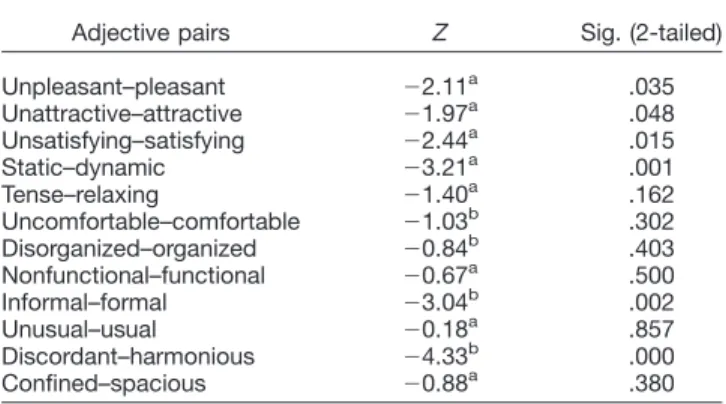
evaluations on the appropriateness of the color schemes for real office environments. First, the Wilcoxon Rank test was performed to see whether there were any differences between appraisals of the office environment of the differ-ent schemes. According to the results there are significant differences between the achromatic and chromatic schemes in terms of pleasantness, attractivness, satisfac-tion, dynamism, formality and harmony (Table III). The negative and positive ranks explain that the office with the chromatic scheme was found to be more pleasant, attractive, satisfying and dynamic, whereas the achromatic scheme was evaluated as more formal and harmonious.
The results of the factor analysis showed that there are both similarities and differences between the appraisals of the achromatic and chromatic schemes. For the achro-matic scheme, 12 adjective pairs were sorted under three factors, whereas four factors were extracted for the chro-matic scheme. Table IV presents the extracted factors, accounted percentages of the factors and factor loadings of the adjectives for both schemes. The results showed that pleasantness and dynamism from the first factor and harmony from the second factor under ‘‘achromatic scheme’’ were categorized as a new – fourth factor – under ‘‘chromatic scheme.’’In addition, spaciousness was dissociated from formality (informal/formal) and familiar-ity (unusual/usual), and joined with functionalfamiliar-ity (non-functional/functional) and order (disorganized/organized).
Second, the appropriateness of the color schemes for real office interiors was evaluated by asking subjects whether they liked, preferred and found applicable the color schemes for an/their own office. The results indi-cated that there was no significant difference between the achromatic and chromatic schemes in terms of pleasent-ness, preference and applicability of the color schemes (pleasentness; z ¼ 21.281, P ¼ 0.200, preference; z ¼ 21.199, P¼ 0.231 applicability z ¼ 21.756, P ¼ 0.079). From the frequency distribution of each in the achromatic and chromatic schemes, it can be interpreted that partici-TABLE III. Significance of semantic differences
between office setups presented in the achromatic and chromatic schemes (Wilcoxon Z values and Asymp. 2-tailed significancies).
Adjective pairs Z Sig. (2-tailed) Unpleasant–pleasant 22.11a .035 Unattractive–attractive 21.97a .048 Unsatisfying–satisfying 22.44a .015 Static–dynamic 23.21a .001 Tense–relaxing 21.40a .162 Uncomfortable–comfortable 21.03b .302 Disorganized–organized 20.84b .403 Nonfunctional–functional 20.67a .500 Informal–formal 23.04b .002 Unusual–usual 20.18a .857 Discordant–harmonious 24.33b .000 Confined–spacious 20.88a .380
aBased on negative ranks. b
Based on positive ranks.
TABLE IV. Extracted factors, accounted percentages of factors and factor loadings of adjectives for the achromatic and chromatic schemes.
Achromatic scheme Chromatic scheme
Factor 1 Unpleasant–pleasant 0.85 Unattractive–attractive 0.84
Unattractive–attractive 0.83 Uncomfortable–comfortable 0.84 Unsatisfying–satisfying 0.74 Unsatisfying–satisfying 0.69 Tense–relaxing 0.73 Tense–relaxing 0.68 Static–dynamic 0.65 Uncomfortable–comfortable 0.62 29% 25%
Factor 2 Discordant–harmonious 0.82 Disorganized–organized 0.75
Informal–formal 0.80 Nonfunctional–functional 0.73
Unusual–usual 0.65 Confined–spacious 0.70
Confined–spacious 0.64
20% 15%
Factor 3 Nonfunctional–functional 0.81 Unusual–usual 0.84
Disorganized–organized 0.80 Informal–formal 0.74 16% 14% Factor 4 Static–dynamic 0.76 Discordant–harmonious 0.69 Unpleasant–pleasant 0.60 14%
pants did not like, prefer or find appropriate any of the color schemes for their own offices.
Finally, open-ended questions on different color schemes were examined to obtain additional interpretation and suggestions by the participants. The findings showed that participants felt the office environment with the achromatic scheme was monotonous, boring, simple and ar-tificial, while the chromatic scheme was found to be cozy, pleasant, and restful, but also calm and boring. For both color schemes, participants complained about the quality of the artificial lighting, lack of daylight, lack of outside view and lack of items related to affinity, attachment, and decora-tion. The majority of the participants criticized the lack of colors for both schemes; they suggested the addition of any color(s) for achromatic scheme, with bright (strong chroma) colors most frequently suggested.
DISCUSSION
In the literature, there are no studies comparing achro-matic and chroachro-matic color schemes in office environ-ments; prior research generally focuses on examining the effects of hue.6–11 In this experiment, the differences between achromatic and chromatic schemes were ana-lyzed through task performance tests and a questionnaire for measuring appraisal of the environment. The experi-ment was designed as a full-scale setup, because other visualization/simulation techniques have been shown to be questionable when light and color effects are studied together.6,17 In the study, the IESNA’s technical recom-mendations for surface reflectance for visual comfort and energy saving were taken into consideration, and the value of the surface colors were kept constant in both schemes. To analyze performance, the subjects were asked to participate in problem-solving and proofreading tasks. The self-reports of the subjects were also recorded. Evaluation of Participants’ Task Performances
This research indicates a significant effect of chroma on the performance of office workers; the findings show that there are significant differences between achromatic and chromatic color schemes in an office environment in terms of task performance scores (measurements of accu-racy and speed). However, there is no significant differ-ence in self-reports of the tasks by the participants. According to the analysis of task performance, it was found that participants performed better in the chromatic scheme than in the achromatic scheme. This result shows similarities with previous studies in the literature. Kwal-lek25 studied workers’ performance in white, green and red office interiors and the results indicated that partici-pants made significantly more errors in the white office than participants in the red and green offices. In a study on the effects of nine different hues on workers’ produc-tivity, the findings showed that participants performed worse in the white office interior than in offices with any of the other hues.10 However, in this study, the results of
self-reports of the task performance indicated that there was not a significant difference between achromatic and chromatic schemes. This result is similar to a experiment that examined the effects of study environments on adult students’ mood, satisfaction, motivation, and performance; it was found that task perception was not affected by the variables of environment.26 In this study, the analysis of adjective pairs showed that the office environment with the chromatic scheme was found to be more pleasant, attractive, satisfying, and dynamic than the office environ-ment with the achromatic scheme. Such impressions by the participants about the chromatic scheme possibly led to better performance in the chromatic color scheme. Evaluation on Participants’ Appraisals
of the Office Environment
The statistical analysis shows that participants found the office environment with the chromatic scheme more pleasant, attractive, satisfying, and dynamic than the office environment with the achromatic scheme. These results are similar to a study examining the impact of light and color on the mood of indoor workers’,12 since pleasantness, attractivity, satisfaction and dynamism have positive effects on emotional status. Yet, these results differed from a study by Ku¨lleret al. about arousal in multicolored and gray spaces.27 They found that there is no difference between multicolored and gray spaces in terms of pleasant-ness. This contradiction may be caused by other dynamics of the multicolored scheme applied, as color combinations house complex relations among color dimensions.
This study also indicates a significant effect of chroma on evaluations of harmony and dynamism (the achromatic scheme was found more harmonious and the chromatic scheme was found more dynamic). The construct of ‘‘harmony’’ is synonymous with and/or covered by ‘‘unity’’ in most languages/terminology, and ‘‘dynamism’’ mostly associates with ‘‘energy,’’ ‘‘variability,’’ ‘‘multiplicity’’ and hence ‘‘complexity’’ – at least within the context of color constructs. Therefore, the effects of chroma on harmony and dynamism in this study are similar to those found by Ku¨lleret al.27 who recorded high unity values in the gray room, while complexity scores were high in the colorful room.
The result of factor analysis not only supports the significant difference between the appraisals of the achro-matic and chroachro-matic color schemes in this study, but also indicates a more complex relationship between color con-structs in the dimension chroma. For the achromatic scheme adjectives related with pleasure, arousal and com-fort are categorized under same factor, while harmony and spaciousness go together with formality and usuality. However, for the chromatic scheme, harmony is matched with dynamism and pleasantness, and spaciousness is con-nected to organization and function. This finding implies the altering nature of harmony and spaciousness in color research, especially within the context of architectural space.28
The results of this study also indicate that there is no significant difference between the ‘‘appropriateness’’ of presented achromatic and chromatic schemes for subjects’ own offices, which is contrary to the ratings of the adjec-tive pairs. This paradox can be explained by the partici-pants’ unfamiliarity with color schemes of experimental setups, which may look artificial compared to real set-tings, where many items of varying colors are in offices with usually white or off-white walls.29 Likewise, Kwal-lek9 found that among the three offices with white, red and green walls, subjects rated the white office as the one they would most like to work in and considered white as the most appropriate color for an office wall. The study by Kwallek et al.10 also supports this finding, indicating that individuals preferred to work in beige and white rooms significantly more than in red, blue, yellow, purple, or orange rooms. Moreover, in one of the experiments examining the effects of red, green and white office envi-ronments on worker productivity and mood, it was found that the subjects in the white office reported that they would like to work in this environment because they regarded white environments as sterile and conductive to work.25 Therefore, it can not be ignored that to some extent, color preference is guided by an environmental or social context, given the predominance of a white or off-white color palette in most commercial spaces, office settings and institutions.
In this study participants complained about the artificial lighting, lack of daylight, lack of outside view and lack of items related to affinity, attachment and decoration in the experiment room. Such feelings may have led the participants to not prefer either of the color schemes. It has been demonstrated in the literature that there is a strong preference for windows in offices to allow the pene-tration of daylight and provide a view to the outside.30–32 Moreover, participants suggested adding (any) color(s) to the achromatic scheme, with bright (strong chroma) colors the most frequently suggested. This finding emphasizes the need and importance of color and color design in the architectural space.
Evaluation of Chroma Effects
The study concluded that there are similarities and differences between achromatic and chromatic schemes in terms of task performance and appraisal. It was found that the office environment with the chromatic scheme was eval-uated as more pleasant, attractive, satisfying and dynamic than the office with the achromatic scheme, and partici-pants’ performance was better in the chromatic scheme than their performance in the achromatic scheme. As seen in the literature, environmental appraisals embody individuals’ judgments about places from their own experiences and psychological constructs (such as meaning, concern, and preference). The variety of personal and environmental characteristics and interactions between them influence appraisals. Personal characteristics include such aspects as culture, age, gender, and familiarity with the space, whereas
environmental characteristics can include room design, complexity, contrasts, architectural style, and contents.33 The results of this study are useful for interior designers in general and for designers who use color as an element to enhance environmental quality. The ubiquitous use of white walls and dark office furniture should be reconsidered, perhaps with an aim to create more dynamic and visually comfortable workplaces. In some experimental studies of color, applications of very strong colors resulted in undesir-able responses.
In this study, however, it was initially seen that a moder-ate increase in the use of good color design can improve workers’ overall comfort and productivity. For future stud-ies and experiments, note that the specific colors that will be used in the office environment experiments is an impor-tant factor.34To understand whether the effect of a specific color is because of its hue, its chroma (saturation) or its value (lightness), at least one of the three dimensions of color should be the same to control the variables. This study concentrated on examining the effect of chroma in the office environment; the other dimensions of color were con-trolled for in both schemes. Further research could explore the effect of the other two dimensions of color. A limitation of this study is that only a yellow-red monochromatic scheme was used in the comparison between achromatic and chromatic schemes; cool colors and/or complementary color schemes could be studied to achieve extensive results. The findings also pointed out notable affectibility against chroma for the constructs ‘‘harmony’’ and ‘‘spaciousness.’’ Future research concentrating particularly on these con-structs would sustain a comprehensive conclusion, espe-cially within the context of architectural space.
Further studies could also explore any demographic effects, such as age, gender and profession, on task per-formance and the assessment of different color schemes; these factors were not considered in this study. Moreover, in this study the age of participants ranged between 22 and 65 years old, which is a wide range to control for the effects of variables on impressions and performance. In the further studies, the age range of participants should be limited to control for the effects of age in measuring the hypothesis.
ACKNOWLEDGMENTS
The authors are grateful to Bilkent University, Depart-ment of Interior Architecture and EnvironDepart-mental Design in Ankara, Turkey for funding the experimental room.
1. Smith D. Environmental coloration and/or the design process. Color Res Appl 2003;28:360–365.
2. Birren F. Color and Human Response. NY: Van Nostrand Reinhold; 1978.
3. Faulkner W. Architecture and Color. NY: Wiley – Interscience; 1972. 4. Visher CJ. Workspace Strategies: Environment as a Tool of Work.
NY: Chapman & Hall; 1996.
5. Sundstrom E. Work Places: The Psychology of the Physical Environ-ment in Offices and Factories. Cambridge: Cambridge University Press; 1986.
6. Kwallek N, Woodson H, Lewis CM, Sales C. Impact of three inte-rior color schemes on worker mood and performance relative to indi-vidual environmental sensitivity. Color Res Appl 1997;22:121–132. 7. Jacobs KW, Hustmyer FE. Effects of four psychological primary
colors on GRS, heart rate, and respiration rate. Percept Motor Skill 1974;38:763–766.
8. Kwallek N, Lewis CM, Robbins AN. Effects of office interior color on workers’ mood and productivity. Percept Motor Skill 1988;66: 123–128.
9. Kwallek N. Office wall color: An assessment of spaciousness and preference. Percept Motor Skill 1996;83:49–50.
10. Kwallek N, Lewis MC, Lin-Hsiao JMD, Woodson H. Effects of nine monochromatic office interior colors on clerical tasks and worker mood. Color Res Appl 1996;21:448–458.
11. Kwallek N, Soon K, Woodson H, Alexander JL. Effect of color schemes and environmental sensitivity on job satisfaction and per-ceived performance. Percept Motor Skill, 2005;101:473–486. 12. Ku¨ller R, Ballal S, Laike T, Mikellides B, Tonello G. The impact of
light and color on psychological mood: A cross-cultural study of indoor work environments. Ergonomics 2006;49:1496–1507. 13. Katzev R. The impact of energy-efficient office lighting strategies
on employee satisfaction and productivity. Environ Behav 1992;24: 759–778.
14. Standard Practice Subcommittee of the Office Lighting Committee of the IESNA. American National Standard Practice for Office Lighting. (RP.1). NY: Illuminating Engineering Society of North America; 1993.
15. CIBSE CODE. Code for Interior Lighting, California: Yale Press; 1984.
16. Gordon G, Nuckolls JL. Interior Lighting for Designers, NY: Wiley; 1995.
17. Yılmazer S, Ural SE, Tanrıo¨ver S. A discussion on spatial color design with the emphasis on technical specifications: Energy effi-ciency and visual quality, in the proceedings of the Lux Europe 2009 – International Congress, _Istanbul, Turkey, 9–11 Sept. 2009, pp. 59–66.
18. NSC Color Scanner. Retrieved April 28, 2010 from http://www.ncscolor. com/en/lm/solutions/ncs-favourites/colorscan/
19. Knez I. Effects of indoor lighting on mood and cognition. J Environ Psychol 1995;15:39–51.
20. Veitch JA, Newsham GR. Lighting quality and energy-efficiency effects on task performance, mood, health, satisfaction and comfort. J Illum Eng Soc 1998;27:107–130.
21. Kwallek N, Soon K, Lewis CM. Work week productivity, visual complexity, and individual environmental sensitivity in three offices of different color interiors. Color Res Appl 2007;32:130–143. 22. The Raven’s Progressive Matrices. Retrieved April 28, 2010 from
http://en.wikipedia.org/wiki/Raven’s_Progressive_Matrices.
23. Ozturk E and Yilmazer S. An Experimental Study on Task Perform-ance in Workplace Applied with Achromatic and Chromatic Color Scheme, International Conference- Colour and Light in Architecture, 11–12 November 2010, Venice, Italy.
24. Bailey RW. Human Performance Engineering: A Guide for System Designers. NJ: Prentice-Hall, Inc; 1982.
25. Kwallek N, Lewis, CM. Effects of environmental color on males and females: A red or white or green office. Appl Ergon 1990;21:275–278. 26. Stone NJ. Designing effective study environments. J Environ Psychol
2001;21:179–190.
27. Ku¨ller R, Mikellides B. Janssens J. Color, arousal, and performance-A comparison of three experiments. Color Res Appl 2009;34:141–152. 28. Ural SE, Yilmazer S. Architectural Color Design Process: An
Evalu-ation on Sequential Media via Semantic Ratings, Color Res Appl 2010;35:343–351.
29. Mahnke FH. Color, Environment and Human Response. New York: Van Nostrand Reinhold; 1996.
30. Galasiu AD, Veitch JA. Occupant preferences and satisfaction with the Luminous environment and control systems in daylight offices: A literature review. Energ Buildings 2006;38:728–742.
31. Menzies GF, Wherrett JR. Windows in workplace: Examining issues of environmental sustainability and occupant comfort in the selection of multi-glazed windows. Energ Buildings 2005;37:623–630. 32. Manav B. An experimental study on the appraisal of the visual
envi-ronment at offices in relation to color temperature and illuminance. Build Enviro 2007;42:979–983.
33. Gifford R. Environmental Psychology: Principles and Practice. 3rd Ed. Colville, WA: Optimal Books; 2002.
34. O¨ ztu¨rk E. The Effects of Color Scheme on the Appraisal of an Office Environment and Task Performance, Master Thesis Super-vised by Yilmazer S, Bilkent University, Ankara, 2010.
Publications Briefly Mentioned
CIE 203:2012 A Computerized Approach to Transmis-sion and Absorption Characteristics of the Human Eye, CIE Central Bureau, Vienna, 2012 pp 66 ISBN 978 3 902842 41 1 EUR 135.
There has long been a need for a series of reference spectral transmission and absorption data for the human eye for applications in eye research and optical safety studies. TC 6-15 collected spectral data from the literature and deter-mined from that literature the best form for the wavelength dependence of the transmission and absorption of the components of the human eye. After critical review, the data have been compiled in tabular form in comma-delim-ited computer-accessible data files. The tabulated data
consist of the transmission and absorption data of the clear ocular media, including the cornea, the aqueous, the lens, and the vitreous of the young (\ 10 years old) human eye and the rhesus eye for the wavelength range of 0.2–2.5 lm. Transmittance data of the total clear ocular media in the human eye for the wavelength range 0.3–0.7 lm and for ages between 1 year and 100 years are also tabulated. These data can be downloaded by readers of this Technical Report from the CIE website.
LEOTRAUSNITH
Published online 18 July 2012 in Wiley Online Library (wileyonlinelibrary.com). DOI 10.1002/col.21759