Pre-Service Elementary Teachers'
Understandings of Graphs
Article in Eurasia Journal of Mathematics, Science and Technology Education · February 2011 DOI: 10.12973/ejmste/75171 CITATIONS9
READS28
4 authors, including: Some of the authors of this publication are also working on these related projects: Climate Change EducationView project
Cengiz Alacacı Istanbul Medeniyet Universitesi 14 PUBLICATIONS 40 CITATIONS SEE PROFILE Scott Lewis BioBot Consulting 7 PUBLICATIONS 144 CITATIONS SEE PROFILE Zhonghong Jiang Texas State University 14 PUBLICATIONS 38 CITATIONS SEE PROFILE All content following this page was uploaded by Cengiz Alacacı on 28 August 2015. The user has requested enhancement of the downloaded file.Copyright © 2011by EURASIA ISSN: 1305-8223
Pre-Service Elementary Teachers’
Understandings of Graphs
Cengiz Alacaci
Bilkent University, Ankara, TURKEY
Scott Lewis
Florida Atlantic University, Boca Raton, FL, USA
George E. O’Brien
Florida International University, Miami, FL, USA
Zhonghong Jiang
Texas State University-San Marcos, San Marcos, Texas, USA Received 13 April 2010; accepted 25 July 2010
Choosing graphs to display quantitative information is a component of graph sense. An important aspect of pre-service elementary teachers’ content knowledge; ability to choose appropriate graphs in applied contexts is investigated in this study. They were given three scenarios followed by four graphs representing the same quantitative data. They rated the appropriateness of each graph and indicated the reasons for their choices. Results showed that pre-service elementary teachers can recognize the situations appropriate for bar graphs, pie charts, and line graphs and match the suitable graphs to these situations. However, they had limited knowledge of scatterplots and did not recognize the situations for which they are typically used. Implications of findings for elementary pre-service teacher education programs are drawn.
Keywords: Statistics, Graphing, Graph Choice, Teacher Knowledge, Teacher Education
INTRODUCTION Purpose
Data analysis is an important part of elementary mathematics curriculum. It refers to visual display of quantitative data using graphical representations such as bar and line graphs, pie charts and scatterplots. Quantitative information is increasingly prevalent in our society, and students should be prepared to read, understand and use quantitative information to solve
problems in their lives and to function effectively in workplaces (MEB, 2009; NCTM, 2000).
For example, according to official Turkish curriculum guidelines, all students in the middle school should be able to represent data by appropriate graphs and interpret graphical information (MEB, 2009, p. 78). Similarly, Principles and Standards for School Mathematics published by the National Council of Teachers of Mathematics in the US recommends that
“students in grades 6-8 should begin to compare the effectiveness of various types of displays in organizing the data for further analysis or interpreting them clearly to an audience.” (NCTM, 2000; p. 48)
Data analysis provides rich connections within mathematics. In order to comprehend data represented in pie charts, for example, students should have an understanding of proportions and percents. Line graphs require the skill of plotting paired values in the
Correspondence to: Cengiz Alacaci, Ed.D. of Mathematics
Education,
Bilkent Üniversitesi,Graduate School of Education, G269, Bilkent, 06800 Ankara, TURKEY
4
© 2011 EURASIA, Eurasia J. Math. Sci. & Tech. Ed., 7(1), 3-14 Cartesian coordinate system (Russell, 1991). Analyzingchange in various contexts is an important educational goal. Investigating how a change in one variable relates to a change in a second variable should be taught starting in grade 5 in mathematics (MEB, 2009; NCTM, 2000, p.158). Scatterplots provide a visual tool to display how one variable changes with respect to the second variable.
Data analysis also connects mathematics with other disciplines taught in school. Science and social studies make frequent use of graphs. There are intimate connections between graphs and important concepts in these disciplines. For example, the concept of looking for correlation in a data set which is an important form of inquiry in science curriculum is visually embodied in scatterplots (Rezba, Sprague and Fiel, 2003).
Ability to choose appropriate graphs is critical when students are engaged in science investigations or other generative learning activities (Friel, Curcio and Bright, 2001).
Most textbooks and instruction on data analysis focus however, on reading and interpreting ready-made graphs, and on how to construct graphs. These experiences can only support procedural knowledge and are not sufficient to help students develop the conceptual understanding with respect to the conditions under which they should be used.
The importance of graph choice fits into an age-old goal of pedagogy; teaching concepts and procedures so that learners can use them in new situations. A prominent cognitive psychologist Herbert Simon (1980) once said “meaningful learning will be enhanced if the student understands that a large part of his [sic] professional skill resides in the ability to recognize situational cues that signal the appropriateness of particular actions.” (p. 81). In data analysis, meaningful learning of graphs necessitates recognizing situational cues for appropriate graph use.
Although graph choice is an important cognitive skill and a curriculum goal, there is a dearth of research on this topic. We do not, for example, know whether pre-service teachers can choose appropriate graphs for applied research situations. If teachers do not possess the knowledge needed for graph choice, they will not be able to teach it effectively. It has been known that teachers should have a deep understanding of the concepts in order to teach them well. (Rice, 2003; Hill, Rowan and Ball, 2005)
Context
Following the recommendations of national curriculum guidelines (e.g., MEB, 2009; NCTM, 2000; and NRC, 1996), and given the necessity of developing teachers’ content knowledge for effective teaching (Hill, Rowan and Ball, 2005) mathematics and science education faculty in an elementary education program collaborated to integrate coursework. Our pre-service elementary teachers pursued authentic science inquiries following a Project Based Science (PBS) approach (Krajcik, Czerniak, and Berger, 2003). In PBS, students work in groups to plan and conduct science inquiries. These projects often provide rich contexts for representing data in graphs.
In an earlier study, to better understand pre-service teacher needs, the authors looked at a set of 23 project-based science inquiries to investigate the use of graphs and other mathematical tools (Lewis, Alacaci, O’Brien and Jiang, 2002). It was found that graphs were generally underutilized in these reports. Further, about one in every five graphs included procedural errors such as mislabeling axis, using incorrect scale, not using measurement units or using incorrect units, or not using legends when in fact needed.
What was of more serious concern however, was the fact that in about half of the cases when graphs were State of the literature
• Choosing appropriate graphs for applied research situations is an important goal in primary and middle school mathematics programs. Understanding the conditions under which graphs are used is an important component of graph sense.
• Teachers need to have developed the knowledge and skills to choose appropriate graphs before they can teach it to students. However, there is a dearth of research on pre-service teachers’ understanding of graphs.
• The cognitive task of graph comprehension can be modeled after Simkin & Hastie’s four judgment tasks; comparison, proportion, trend analysis and
correlation.
Contribution of this paper to the literature
• When pre-service teachers were asked to choose from among multiple graphs of the same data set for a given purpose, they display reasonable competence for bar and line graphs, and pie charts, but not for scatter plots.
• Competence with scatterplots requires an understanding of co-variation between two data sets. Helping pre-service teachers develop an understanding of co-variation appears to be an important topic of teacher education.
• For learning to be deep, it is necessary to engage pre-service teachers in authentic inquiry situations that necessitate use of graphs for all of the four
© 2011 EURASIA, Eurasia J. Math. Sci. & Tech. Ed., 7(1), 3-14
5
used, students did not choose an appropriate graph thatbest matched their research questions and types of data. Graphs such as scatterplots, stacked bar graphs, and map graphs were not used at all, though they were reasonable choices for some projects. Line graphs were used less than their optimal level. On the other hand, bar graphs were three times more likely to be used than the situations in which they would be appropriate.
The mismatch between the graphs and the research questions represented a conceptual difficulty of understanding the use of graphs, which was different than procedural difficulties such as mislabeling or not labeling axes, or not using legends discussed above (Lewis, Alacaci, O’Brien and Jiang, 2002). Failing to use graphs in situations where they are appropriate or using wrong graphs will constrain data analysis in two ways: It will hinder pre-service teachers’ (and hence their future students’) ability to show the patterns that are warranted by the data. At the same time, because graphs are the cognitive tools that mediate thinking in data analysis, the lack of such tools in a student’s repertoire may limit the conceptualization of the study. For example, if someone is not familiar with scatterplots, (s)he will probably be less likely to design correlation studies.
These findings prompted the authors to conduct the present study. Given a research scenario with quantitative data and a research question, we wanted to find to what degree pre-service elementary teachers can actually select appropriate graphs from among alternatives, and what rationales they give for their choices.
Graph Comprehension from a Cognitive Perspective
According to Fry (1984), a graph is information transmitted using spatial characteristics such as position of a point, line or area to represent quantity (cited in Friel, Curcio and Bright, 2001). Unlike graphs, maps and architectural plans use spatial characteristics to represent spatial relationships (Friel, Curcio, and Bright, 2001).
Graphs have four common structural components. The framework of a graph is related to the elements that give information about the kinds of measurements being used such as axes, scales, and grids. Most graphs such as bar graphs, line graphs, and histograms have an L-shaped framework, some have a T-shaped framework such as tables and stem and leaf plots, and yet others have a polar coordinate framework such as pie charts (Fry, 1984). The specifiers of a graph refer to visual tools that are used to represent the data such as lines, bars and angles. The labels are the ways we name quantities and their relationships in a graph. Labels specify the axes or the whole graph such as in graph
title. The background of a graph provides the aesthetic ways to improve the visual appeal of a graph such as colors, shading, and pictures.
Graph comprehension is defined as readers’ ability to derive meaning from graphs. Different levels of questions can evoke different levels of comprehension. For example, elementary questions about the data represented in a graph requires direct extraction of information from the data (which is also termed reading the data), intermediate questions require finding relationships in the data (reading between the data), and advanced questions require interpolating and extrapolating (reading beyond data). Graph comprehension entails not only reading and interpreting graphs but also the ability to construct and to choose graphs from among alternatives. (Friel, Curcio and Bright; 2001)
On Graph Choice
Drawing an analogy with the definition of number sense, Friel, Curcio and Bright (2001) described graph sense which includes “recognizing when one graph is more useful than another on the basis of the tasks and the kinds of data being represented.”
Deciding which graph is most useful for representing a set of data requires consideration of both the nature of data and the purpose of analysis. Some graphs are more suitable for certain types of data (for example, frequency counts for bar graphs, percentages for pie charts, time series data for line graphs) and specific purposes (for example, displaying comparisons is best facilitated by bar graphs, patterns over time by line graphs, and relationships by scatterplots) than others. (Landwehr and Watkins, 1986; Graham, 1987, both cited in Friel et al., 2001).
There are several factors that affect correct perception of data in a graph that have been experimentally verified including factors of judgment tasks that we will elaborate here (Friel, Curcio and Bright, 2001).
Categories of judgment tasks: These types of factors relate to the kind of summary of the information that should be inferred from the display. They represent an interaction of display design and purpose. For example, bar graphs typically draw attention to individual bars. Hence as bars sit next to each other, bar graphs facilitate comparison judgments. Pie charts on the other hand, call attention to the whole represented by the circle and the sectors that make up the whole, and they facilitate proportion judgments. Line graphs contain a line changing directions, and they facilitate trend analysis judgments. Scatterplots typically hide the identity of pairs of data, but re-direct attention to the overall distribution of the pair-wise data. So, they facilitate correlation judgments (Simkin and Hastie, 1987). The
6
© 2011 EURASIA, Eurasia J. Math. Sci. & Tech. Ed., 7(1), 3-14 implication of judgment task factors for graph choice isthat when there is compatibility between the task and the type of display, perception of the judged characteristic is direct, requiring simpler or fewer mental operations.
To summarize, judgment tasks are the conceptual tools that direct graph choice. In this study, we tried to understand pre-service elementary teachers’ ability to choose graphs in relation to four categories of judgments; comparison, proportion, trend analysis and correlation judgments in the context of three science investigation scenarios.
METHODOLOGY
Instrument, Participants and Procedures
An instrument was developed for this study that consisted of three science investigation scenarios. Each scenario included a description of the context of a science investigation, how data were collected, a table presenting the data, and a research question. The instrument was reviewed for construct validity by two mathematics education professors from outside the research group and was field tested before actual data collection. Changes in wording were made for clarity.
The first scenario (The Beach Clean Up modified from the National Center For Ecological Analysis and Synthesis, 2001) was about a fifth grade class involved in a beach clean up. Students visited a beach regularly, collected, classified and tallied each kind of trash found. Their purpose was to create a graphical summary of the findings to show what kind of trash was found most on the beach. So, the required judgment task in the scenario was comparison (Simkin and Hastie, 1987). Although this could best be done by a bar graph, it is also possible to infer a proportion judgment in this scenario. This judgment type would require using a pie chart.
The second scenario (Major Hurricane Strikes At Mainland U.S. By Decade in The Last Century) was taken from a science unit on weather. It contained information about how often major hurricanes (category 3 or higher) visited the U.S. mainland in the last century for each decade. The task was to visually represent the summary data so that it is easy to see whether major hurricanes struck the U.S. more often in the latter part of the century compared to the early part of the century. Accordingly, the required judgment task was trend analysis in time series data. Trend analysis can best be displayed in a line graph.
The third scenario (Do Taller People Tend To Be Heavier Too?) was about a unit on the human body. Students wanted to find out whether body height was related to body weight by having their height and weight measured by the school nurse and created a graph of the
measurements. Because there were two measurements from each student, the scenario required a consideration of the relationship between them. Hence, the required judgment task was correlation which could best be seen in a scatterplot.
Each scenario was followed by four different graphs of the data provided in the scenarios. The graphs were given in the order of bar graph, scatterplot, line graph and pie chart. The reader was then invited to rate each of the four graph choices using a Likert scale for how much he/she thought the graph facilitated the display of information to best answer the research question given in the scenario. The ratings provided a measure of how much the reader thought a particular graph was appropriate to represent the data. The ratings made it also possible to choose more than one graph (if applicable) that might be appropriate for the same data by rating both of them high, and hence this high rating of more than one graph type indicated interchangeability of graphs as viewed by the participant.
After the ratings of the four graphs were completed, participants were asked to explain the reasons for their ratings in a space provided. Their comments were used as the basis for analyzing the reason behind their answers. They were however not probed to explain the reasons beyond what they wrote and no follow up interviews were held. The written explanations provided qualitative information about understandings, misconceptions and affective considerations about graphs. The task also included a section about mathematical background in which participants were asked to list the mathematics courses they took and the grades they received. Fifty-one pre-service elementary teachers from Florida International University participated in the study. The pre-service teachers were students taking the Teaching Elementary Science or Teaching Elementary Mathematics courses, both of which are required third-year courses in undergraduate elementary education program. The science course requires three college level science classes as prerequisite and the math course requires three college level mathematics (two college level algebra and one geometry) courses. Most of the participants were female and were of Hispanic background. The participants volunteered to participate in the study, results were not used for a grade or as part of the instruction for the course
Data collection was completed in one session and lasted about 45 minutes. Participants worked individually. The participants were asked to first read the scenarios carefully, consider the four graphs following each scenario and indicate their preference of graphs by rating them. They were asked to do the rating by using a scale of 1 to 5, 1 standing for “not preferred at all” and 5 for “major preference,” and using the
© 2011 EURASIA, Eurasia J. Math. Sci. & Tech. Ed., 7(1), 3-14
7
values in between accordingly. They were also asked toexplain the reasons for their ratings after each scenario in the given space.
Quantitative and qualitative measures and data analysis
The instrument collected two kinds of data from participants. The quantitative information included ratings of the four graphs for each scenario, twelve ratings altogether. Overall averages of ratings across individuals gave a quantitative measure of the graph choice of participants for each graph.
The comments written after the ratings to explain the rationale provided the qualitative data about understandings, misconceptions, and other factors that played a role in pre-service teachers’ considerations of graph choice. Almost all participants commented about their most favorite graph, least favorite graph and some participants commented about the other graphs as well. The reasons given for choosing a graph were classified for each scenario - using the classification scheme below. In addition, students’ reasons for not choosing graphs were classified using the same scheme:
conceptual explanation: explanation for choosing (or
not choosing) the graph referred explicitly to the type of judgment tasks implied in the scenario,
indirect conceptual explanation: explanation for
choosing (or not choosing) the graph made indirect reference to the type of judgment task,
explanation about structural components of graphs: explanation was about the perception of structural components of graphs (e.g., bars, dots, slices, lines, labels, etc.) facilitating or not facilitating the visual power of graph,
other explanations: explanation was based on other
reasons such as personal opinions or personal preferences (e.g., I just like it, it was ok, it shows clearly, etc.).
These categories were developed based on the commonalities among the comments written by pre-service elementary teachers. There are however, conceptual similarities between these categories and the constructs related to graphs and graph comprehension discussed earlier.
We postulate that a hierarchy of reasoning is suggested by these categories. For example, rationales using conceptual explanations represent the explicit consideration of judgment tasks given in the scenarios. Judgment tasks are the main conceptual tools with which graphs are chosen for a given situation. Hence these explanations represent a higher level of sophistication in graph choice compared to other categories. Indirect conceptual explanations imply the consideration of judgment tasks, rather than explicitly referring to them. Hence, though they still characterize a level of understanding of judgment tasks, these
explanations are not at the same level of sophistication as the conceptual explanations.
Explanations about structural components of graphs resemble components of graphs as proposed by Fry (1984), both of which are secondary to the judgment task in graph choice. When a pre-service teacher chooses a graph based on preferences, for example, of axis labels (e.g., “units look jumbled up in horizontal axis”), or specifiers (e.g. “bars stick out more than lines, or dots”), he/she is considering structural factors of graphs qualitatively different than conceptual factors such as judgment tasks. So rationales in this category represent elementary forms of reasoning compared to the two categories discussed above. Explanations based on other reasons on the other hand do not reflect a principled reason for the graph choice and hence represent the least sophisticated reasoning among the four categories.
RESULTS OF THE STUDY
In the next section, we report on responses that students gave and their reasons for doing so. We report and discuss reasons only for the best mathematical answers for each scenario and then compare these responses and reasons across tasks.
Graph Choice in the First Scenario: The Beach Clean Up
This scenario provided frequency of categorical data; the types of substances collected from a local beach by fifth grade students. The purpose was to represent it so that it is easy to see what type of substance was found most on the beach. The implied judgment task was comparison of categories of data. The bar graph was the type of graph that best facilitated the comparison. A pie chart was another reasonable alternative as it draws attention to the set of data as a whole.
Table 1 presents average ratings of the four graphs for this scenario. Higher ratings indicate a higher level of preference for these graphs. Not surprisingly, the table shows that the bar graph received the highest rating (4.5 out of 5) among the four alternatives and had the smallest standard deviation. It was clearly “the choice” of the most participants for this scenario. The pie chart was also rated high (3.9), although it was second to the bar graph.
Table 1. The average ratings (and standard deviations) for graphs in the first scenario
Bar Graph Scatterplot Line Graph Pie Chart
8
© 2011 EURASIA, Eurasia J. Math. Sci. & Tech. Ed., 7(1), 3-14 Looking at the reasons given by the participantsprovides a window into their thinking about graph choices. Below, an analysis of the comments for choosing and not choosing the graphs are discussed separately for the two answers – bar graph and pie graph- that are best for this question.
BAR GRAPH: Forty-nine individuals (96%) rated bar graph as an appropriate tool to represent data (a rating of a 4 or 5). Thirty-two individuals (62%) wrote comments about why they chose bar graph. The comments were classified into the following four categories:
Conceptual explanation: Explanation for choosing the bar graph referred to the type of judgment task implied in the scenario (comparison) using explicit comparison language.
Examples include; you can compare the amounts of types of trash, easy to tell which is the most, the least, you can see the major cause of trash, the least cause of trash, shows the most trashed substance.
Indirect conceptual explanation: Explanation for choosing made indirect reference to the type of judgment task implied in the scenario focusing on the number of trash collected.
Examples are; it shows the amounts of trash, it shows the number of trash, you can see how much of each trash there is.
Explanation about structural components of graphs: Explanation was about structural components of bar graph facilitating the visual power of the display. An example is; thick bars look better than dots or lines.
Other: Explanation was based on other reasons such as personal opinions or preferences and did not offer a principled reason. Examples are; it shows the information clearly and obviously, it is easy to read and
handle.
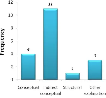
Figure 1 presents the distribution of the reasons for choosing bar graph in the four categories. Of the 32 individuals who gave a rationale for choosing the bar graph, less than half gave a conceptual explanation (that the bar graph facilitated comparison). Another set of 11 comments gave an indirect conceptual explanation by suggesting that bar graphs could show numbers or amounts of trash. To summarize, altogether three fourths of individuals who wrote a comment gave a direct or indirect conceptual rationale for their choices (and only about half the individuals who chose the bar graph did so).
There were three comments about why the bar graph was not chosen. All of these comments contained personal opinions such as, it was not as creative as others, and it was not impressive, etc.
PIE CHART: Thirty eight individuals (73%) rated pie chart an appropriate graph for this scenario. There were 18 comments (35%) about why pie chart was chosen and these were classified using the same categories above. Examples of these comments are given below, and the distribution of comments into these categories is presented in Figure 2.
Conceptual explanation: A pie chart shows the proportion of the types of trash, you can visualize each type of trash in comparison to the whole.
Indirect conceptual explanation: The graph shows which is less, more in percentages, can see differences in percentages,
Explanation about structural components of graphs: The colors, stripes are easy to distinguish,
Explanation based on other reasons: The graph is
Figure 1. Distribution of types of reasons given for Figure 2. Distribution of types of reasons given for choosing the bar graph in the first scenario choosing the pie chart in the first scenario
© 2011 EURASIA, Eurasia J. Math. Sci. & Tech. Ed., 7(1), 3-14
9
more accurate, easier to understand.Of the 18 comments written, 4 gave a complete conceptual explanation (that pie charts showed proportions of parts of whole), 11 gave an indirect conceptual explanation that pie charts show percentages. The association of pie charts with percentages was a primary concern for some pre-service elementary teachers. Overall, less than half of individuals who chose pie chart gave a direct or indirect conceptual rationale.
Seventeen individuals commented about why they did not choose pie chart. Six of these expressed preference for actual numbers over percentages (e.g., percentages do not show amount, actual numbers are better than percents, etc.). Seven comments mentioned dislike of percents in general as the reason why they did not choose a pie chart (e.g., percents confuse people, percents are hard, percents make it complicated.) The remaining four comments contained other negative reasons about this type of graph such as pie chart is not clear, it is not simple as others, etc.
To summarize the findings for this scenario, the bar graph and the pie chart were the two primary choices. Almost all of the pre-service teachers rated bar graph as their major choice. Also, three-fourths of individuals rated pie chart as appropriate. About half of the individuals who chose bar graph gave a conceptual explanation (direct) for this choice, and less than half did so for pie chart. Pie charts using percentages seemed to be a factor for choosing this graph for some pre-service teachers and this same factor seemed to be the reason for not choosing it for a similar portion of the others.
Graph Choice in the Second Scenario: Hurricane Strikes in the U.S.
This scenario contained information about the number of major hurricanes that struck the U.S. in the last century. The data were given by decades. The question was about whether more hurricanes struck the U.S. in the latter part of the century or in the early part. Because line graph is most suitable to show time series data, it would effectively facilitate trend analysis and it was the required judgment task in this scenario.
Table 2 shows that line graph received the highest (4.0) rating in this scenario as would be expected, followed by the bar graph (3.8). This is not surprising because it is possible to replace line graphs by bar graphs, although the reverse is not always true.
LINE GRAPH: Written comments about the choice of line graphs were analyzed by using the same categories in the previous scenario: conceptual explanations referring to line graphs can show changes over time, indirect conceptual explanations referring to line graphs can display patterns, comments about
structural components, and finally personal comments. Figure 3 gives the distribution of comments into these categories.
Thirty-seven pre-service elementary teachers (73%) chose line graph as their major preference (a rating of a 4 or 5). There were a total of 33 comments (63%) about why the line graph was chosen. Figure 3 shows that a great majority of them (27 individuals) gave a conceptual explanation for their choice, with an additional four individuals giving an indirect conceptual explanation. In short, about six in ten of all individuals, and a great majority of those who chose line graph provided a direct or indirect conceptual explanation.
Twelve individuals commented about why they did not choose line graph. Seven of these comments were other explanations and four were about the structural issues of line graphs such as decade labels in the horizontal axis are being too close, or lines going in different directions being confusing.
To summarize, the line graph was picked as a primary choice by three-fourths of the sample in this study. The bar graph was also chosen by six of every ten participants. Almost all pre-service teachers who chose the line graph gave a conceptual explanation (that it can show changes over time) whereas less than half of those who picked the bar graph provided a conceptual explanation for their choice.
Graph Choice in the Third Scenario: Height and Weight
This scenario included two quantitative measurements, body height and weight from a group of 26 students. The purpose was to find out whether these measurements were related by creating a graphical representation of the data. The question required a correlation judgment which could best be facilitated by a scatterplot.
Table 3 gives the summary ratings for this scenario. The bar graph received the highest rating (4.3) while the line graph (2.8) received the second highest rating. Interestingly, the scatterplot which was the only appropriate graph in this scenario, was given the lowest rating (1.3) among the four and had the smallest Table 2. Average ratings (and standard deviations) for graphs in the second scenario
Bar Graph Scatterplot Line Graph Pie Chart
3.8 (1.3) 1.5 (0.8) 4.0 (1.3) 1.9 (1.2) Table 3. Average ratings (and standard deviations) for graphs in the third scenario
Bar Graph Scatterplot Line Graph Pie Chart
10
© 2011 EURASIA, Eurasia J. Math. Sci. & Tech. Ed., 7(1), 3-14 standard deviation. This was obviously the leastpreferred graph by the pre-service teachers.
SCATTERPLOT: Only three pre-service teachers (6%) chose scatterplot as an appropriate graph for this data set. All of these individuals gave explanations that were conceptual in nature (e.g., it serves the purpose: the
relationship between height and weight, and it shows the correlation in a clear way).
There were however 36 comments discussing why scatter plot was not chosen. A very small portion of these comments was conceptual in nature as figure 4 shows. The following six comments referred to structural issues: you can not tell who the students were in the graph, there were no lines to connect the data with the axes (5 comments). It is clear that participants had two main reasons for not choosing scatterplots: i. the scatterplot did not show the identity of the student when displaying a measurement and ii. the points of the plot are not connected. The remaining 26 comments were based on personal opinions.
To summarize, the bar graph was the major choice of pre-service teachers in this scenario, and not the scatterplot which would be the appropriate choice given the required judgment task. Most of the students who chose bar graph did so based on the presumption that it helps to compare the two data sets, although this was not the required judgment in the scenario. Pre-service teachers’ explanations for not choosing the scatterplot were not based on conceptual reasons, but on other explanations such as personal preferences and opinions.
DISCUSSION OF RESULTS
Figure 5 provides a way to compare the justifications given for each type of appropriate graphs (bar, pie, line graphs and scatter plot), or the best judgment choices.
Examining these reasons, we see an interesting pattern in response to the best options. In this case (problem 1 pie or bar graph, problem 2 line graph) we see that the majority of reasons provided were either conceptual or indirect conceptual. Thus it seems that students are able to justify their choices on grounds that are related to understanding the judgment tasks, though we believe that those categorized at conceptual level reflect a more robust understanding than those with indirect conceptual explanations. In contrast, when we look at student answers in response to the correct option in the scatterplot problem, almost 90% of the student reasons tended to be of the structural or personal opinion type, conceptually the least sophisticated reasoning.
Bar Graphs
It appears that pre-service elementary teachers can recognize the situation that requires comparison tasks and can successfully match bar graph to this situation. A great majority of pre-service teachers rated bar graph as an appropriate display of data in the first scenario. About half of these participants were also able to provide a conceptual rationale for their choice.
Figure 3. Distribution of types of reasons given for Figure 4. Distribution of types of reasons for choosing the line graph in the second scenario not choosing the scatterplot in the third scenario
© 2011 EURASIA, Eurasia J. Math. Sci. & Tech. Ed., 7(1), 3-14
11
Bar graphs were rated high in three of the fourscenarios. We can conjecture that pre-service elementary teachers displayed a good understanding of interchangeability of bar graphs with pie charts and line graphs. In the first scenario, all of the pre-service elementary teachers who rated pie chart high (a rating of a 4 or 5) also rated the bar graph high. When the data to be displayed represent a whole, all bar graphs can be replaced by a pie chart and all pie charts can be replaced by a bar graph.
In the second scenario, the bar graph was rated the second highest after the line graph, and about half of these choices were accompanied by a conceptual explanation. The majority of those who rated the bar graph high also rated the line graph high, and the majority of the pre-service teachers who rated the line graph high rated also the bar graph high. Line graphs can be replaced by bar graphs; however, if the data is time series type data as it is in this scenario, line graphs can show patterns over time better than bar graphs.
The bar graph was the highest rated display in the third scenario, although it was not the kind of graph that matched the intended judgment task. The rationales given for choosing the bar graph were compatible with a comparison task, which was the judgment task that the bar graph best served. This shows that when pre-service teachers were not sure about which graph to use, they fell back on choosing the bar graph, which was probably the kind of graph that they were most familiar with. It is also possible to conjecture that when pre-service teachers did not possess the conceptual knowledge to deduce the intended judgment task in the third scenario, they imposed a judgment task (comparison) they felt comfortable with and chose the graph that matched.
It seemed that among the four graphs addressed in this study, pre-service elementary teachers were most
familiar with the bar graph. This finding supports ourobservations in an earlier study that pre-service elementary teachers tended to use the bar graph in more situations than appropriate (Lewis, Alacaci, O’Brien and Jiang, 2002). It was evident that the bar graph occupied a prominent place in the repertoire of graphs available to pre-service elementary teachers.
Pie Charts
Pre-service elementary teachers were able to distinguish the situations that involved proportion judgment tasks and they were able to select and match pie charts to these situations. The pie chart was rated the second highest (3.9) after the bar graph in the beach clean up scenario and about three-fourths of the pre-service elementary teachers rated the pie chart high. On the other hand, the ratings of pie charts in other scenarios were notably low (1.9 for the second and 1.6 for the third scenario) as these situations did not involve proportion tasks and the appropriate graphs for these scenarios were not interchangeable with pie charts.
A considerable portion of those who chose pie chart gave evidence of conceptual understanding of this graph. About half of the individuals who rated the pie chart high in the first scenario gave a conceptual explanation for their choice based on the proportion judgment task. Most of these pre-service teachers referred to the fact that pie charts could show percentages of categories in their justifications. Interestingly the same reason for not choosing the pie chart was given by a similar number of other individuals. It was clear that lack of confidence for handling percentages was a reason for not choosing pie charts for some pre-service elementary teachers. This raises an important issue about the mathematical content knowledge and preparation of these individuals. Figure 5. Types of reasons given for the best four answers in the graphing tasks
12
© 2011 EURASIA, Eurasia J. Math. Sci. & Tech. Ed., 7(1), 3-14 Line GraphsThere was evidence in this study that pre-service elementary teachers had a robust understanding of the line graph. Participants were able to recognize the situation with trend analysis judgment tasks and match the line graph corresponding to this task. The line graph was the intended type of display for the second scenario and it received the highest average rating (4.0) among the four graphs. This high level of rating was accompanied by conceptual justifications in more than half of participants’ explanations. The ratings of line graphs were considerably lower in the other two scenarios (2.3 for the second scenario and 2.8 for the third scenario) with different judgment tasks. When line graphs were not chosen, conceptual reasons were given in a majority of the participants’ justifications.
Scatterplots
Pre-service elementary teachers gave little or no evidence of knowledge and familiarity with the scatterplot as a tool of data display in this study. They were not able to identify the correlation judgment task in their explanations in the third scenario and were not able to choose the scatterplot corresponding to this judgment task. Only three individuals (out of 51) rated the scatterplot high in the third scenario and all of these individuals gave a conceptual explanation for the ratings. In fact, with an average rating of 1.3, the scatterplot received the lowest rating among the four alternatives in this scenario. This was in fact the lowest average rating of any graph in any of the three scenarios. This finding is in line with our earlier observation that pre-service elementary teachers did not use the scatterplot in their project-based science investigation reports (Lewis et al., 2002). Accordingly, it is clear that if an individual does not have knowledge of a particular graph (or any mathematical concept or tool to generalize), they can not use it when it is called for. This observation lends credit to the contention that if a teacher does not have a knowledge of a concept, they will most likely not be able to teach it to their students either.
There was also evidence that most pre-service elementary teachers did not possess the language to talk about this type of display in a principled way. A majority of the comments about why the scatterplot was not chosen were based on other explanations such as personal opinions in all three scenarios.
The two reasons given why scatterplots were not chosen in the third scenario were: 1) the dots plotted as coordinate pairs were not explicitly connected to the axes and 2) the dots did not indicate the identity of the data (or the names of students from whom the measurements were taken in the third scenario). There
were similar comments about scatterplots in other scenarios as well. These two issues imply that some pre-service elementary teachers focused on the actual values of individual dots of the scatterplot, rather than considering the overall shape of the data cloud in the graph and deducing the type of correlation between the two variables. Indeed, a scatterplot is a display that can facilitate making global inferences about the whole data set, rather than reading individual data values. Inferring the type or existence of correlation is a higher form of graph comprehension than reading individual data points (Curcio,1987). Similar cognitive difficulties of moving from localized to global perceptions in scatterplots even after significant instruction were reported in middle grade students (Ben Zvi and Arcavi, 2001; Cobb, 1999).
CONCLUSIONS AND IMPLICATIONS
Our findings paint a mixed picture of pre-service elementary teachers’ understanding of graphs. On the one hand, they were very competent with bar graphs, and reasonably competent with line graphs and pie charts, and were able to choose them appropriately. This is a positive finding and is interesting in the light of our initial finding that such students often did not utilize such graphs adequately in their inquiry projects earlier (Lewis, Alacaci, O’Brien, and Jiang, 2002) . On the other hand, the students had little or no knowledge of scatterplots.
We conjecture that complete, appropriate understanding of the use of one graph is not independent of understanding of the use of other types of graphs. When an individual’s understanding of graphs has a gap for certain types, (such as for scatterplots), (s)he tends to use familiar forms of graphs to fill this gap (such as bar graph) when faced with making a choice. In our opinion, this situation is not only a sign of weakness of the knowledge of scatterplots, but also a sign of incomplete (or only partial) understanding of bar graphs. Because a complete understanding of such graphs would demonstrate knowing situations when to use them as well as when not to use them.
Our results also point to the interdependence of graph knowledge with general mathematical knowledge. For example, in the first scenario, some pre-service teachers commented that they did not want to deal with percentages as the reason for not choosing a pie graph. Pre-service elementary teachers’ lack of knowledge of the scatterplot - raises important issues in mathematics education. Teaching about co-variation between two variables is an important curricular goal and a significant form of algebraic reasoning (Curcio, 1987).
© 2011 EURASIA, Eurasia J. Math. Sci. & Tech. Ed., 7(1), 3-14
13
In addition, the pre-service teachers’ unfamiliaritywith scatterplots poses a challenge for their ability to teach important forms of inquiry in other areas such as elementary science education where the scatterplot is an indispensable tool for science investigations that embody correlation. Hence, pre-service teachers’ limited understanding of scatterplots would severely constrain the support they could eventually provide to their own students in utilizing this type of graph in science activities. This has critical implications for science curricula that require extensive use of inquiry for instruction such as Project-Based Science (e.g., Krajcik, Czerniak, Berger, 2003).
Why didn’t the pre-service elementary teachers possess the knowledge and understanding of scatterplots? Three possibilities might have contributed to this result:
First, it may be the case that scatterplots require a cognitively more demanding form of reasoning compared to other graphs. For example, numerical comparison (as typically used in a bar graph) is a more elementary form of reasoning than deducing the shape of correlation or the type of relationship between two variables. Thus students who do not have strong reasoning skills might perform well in a simple type of judgment task but more poorly in others which might require these types of skills.
Second, scatterplots are not used in daily life as often as other graphs such as bar graphs, line graphs or pie charts. Hence the pre-service teachers might have little exposure to scatterplots in non-school contexts.
Yet a third explanation may be that pre-service teachers might have had little instructional exposure to this type of display in school. We felt it would be informative to investigate this third possibility by looking into students’ pre-college education as well as the contents of mathematics courses taken at college level for evidence of instruction in scatterplots. Most of our participants attended the Miami-Dade public school system for elementary and secondary education. Since 1989, Miami-Dade public schools have followed a standard code of curriculum called the Competency Based Curriculum (CBC) in mathematics. Our analysis of the grade level expectations of CBC revealed that scatterplots were identified explicitly as a curriculum goal in grade 7. It is clear that pre-service teachers who participated in our study were either not taught this piece of “intended curriculum” or did not retain the knowledge of scatterplots.
Only four participants chose scatterplots correctly for the third scenario in this study. We reviewed the mathematics courses that they reported taking in college and compared this information to the other students in the study. All four of the students who were successful on the scatterplot task had taken either Algebra I or
Introduction to Statistics, and the syllabi of these courses
clearly indicated scatterplots as a topic of instruction. However, there were many more participants (thirty seven) in our sample who had taken the same courses but failed to choose the scatterplot in the third scenario. It is possible that most of the students who took Algebra
I or Introduction to Statistics either did not understand
scatterplots conceptually at the time of instruction or they did not retain the knowledge, even though they were taught about it.
We suggest several implications based on our findings in this study. First, it is important to keep in mind that the participants in this study had only one scenario where a scatterplot was appropriate to use for this study. If, however, this is indicative of a general trend among pre-service elementary teachers -as we believe it is-, it may be important to conduct a thorough task analysis of the elements present in scatterplots to pinpoint the probable areas of difficulty.
It is clear that most pre-service teachers in our sample were able to identify the conditions under which bar graphs, pie charts and line graphs were used and could choose these graphs for appropriate situations, although the bar graphs were also used in situations where they were not appropriate. However, pre-service teachers’ knowledge of scatterplots leaves a something to be desired, even though they received instruction on the topic. It is critical that pre-service teachers learn mathematical topics such as scatterplots conceptually in order to use and teach them effectively. We suspect that the disconnect between pre-service teachers’ knowledge of scatterplots and the instruction they had received in the past may be due to a procedural emphasis in most college and pre-college math classes which fail to help students develop the understandings for knowing using specific types of graphs. Thus the source of this difficulty may be in the methods of teaching and learning and/or the amount of time spent with such problem solving, or other reasons, more than whether it was “covered or not covered” in the official curriculum. This also leads to additional research questions about the most effective ways to help pre-service teachers develop the skills and understanding needed for choosing graphs. We believe that graph sense can be taught by involving pre-service teachers and students in authentic situations in which they are required to choose graphs and reflect about their choices. Understanding of graph choice may better be accomplished when it is taught in an integrated manner with other disciplines such as science (and more time on task to solve problems) in which graphing is heavily used. Giving students multiple opportunities to use a variety of graphs across disciplines may lead to better conceptual understanding. Encouraging this deeper understanding in pre-service teachers may eventually lead to the development of teachers who have a wider range of mathematical tools at their disposal, and and who in
14
© 2011 EURASIA, Eurasia J. Math. Sci. & Tech. Ed., 7(1), 3-14 turn can better support their own students’mathematical learning and growth. REFERENCES
Alacaci, C., O’Brien, G., Lewis, S. & Jiang, Z. (2003). Integrating mathematics and science in a pre-service elementary level teacher education program. In S. McGraw (Ed.) Integrated Mathematics: Choices and
Challenges. Reston, VA: National Council of Teachers of
Mathematics.
Ben Zvi, D., & Arcavi, A. (2001). Junior high school students’ construction of global views of data and data representations. Educational Studies in Mathematics, 45, 35-65.
Cleveland, W.S. (1985). The elements of graphing data. Monterey, CA: Wadsworth.
Cobb, P. (1999). Individual and collective mathematical development: The case of statistical data analysis.
Mathematical Thinking and Learning. 1, 4-43.
Curcio, F. (1987). Comprehension of mathematical relationships expressed in graphs. Journal For Research In
Mathematics Education, 18, 382-393.
diSessa, A., Hammer, D. Sherin, B. & Kolpakowski, T. (1991). Inventing graphing: Meta representational expertise in children. Journal of Mathematical Behavior. 10, 117 – 160.
Friel, S.N., Curcio, F.R., Bright, G.W. (2001). Making sense of graphs: Critical factors influencing comprehension and instructional implications. Journal for Research In
Mathematics Education, 32(2), 124-158.
Fry, E. (1984). A Theory of graphs for reading comprehension and
writing communication. New Brunswick, NJ: Rutgers
University. (ERIC Document Reproduction Service No. ED 240 528)
Graham, A. (1987). Statistical investigations in the secondary school. NY: Cambridge University Press.
Hill, H.C., Rowan, B, Ball, D. L. (2005) Effects of teachers’ mathematical knowledge for teaching on student achievement. American Educational Research Journal. 42(2), 371-476.
Krajcik, J., Czerniak, C., Berger, C. (2003). Teaching children
science: A project based approach. Boston, MA: McGraw
Hill College.
Landwehr, J.M., & Watkins, A.E. (1986). Exploring data. Palo Alto, CA: Dale Seymour.
Lewis, S., Alacaci, C., O’Brien, G. & Jiang, Z. (2002). Pre-service elementary teachers’ use of mathematics in a project-based science approach. School Science and
Mathematics, 102(4), 172 – 179.
MEB - Milli Eğitim Bakanlığı (National Ministry of Education), (2009). İlköğretim Matematik Dersi 6-8. Sınıflar Öğretim Programı ve Kılavuzu (Program Guidelines for Upper Elementary School Mathematics Curriculum, Grades 6-8). Ankara, Turkey: MEB Publications.
National Center For Ecological Analysis and Synthesis,
(05.20.2001).http://www.nceas.ucsb.edu/nceas-web/kids/data/cleanup/graphit.html
National Council of Teachers of Mathematics. (2000).
Principles and Standards of School Mathematics. Reston, VA:
Author.
National Research Council. (1996). National Science Education
Standards. Washington, DC: National Academy Press.
Rezba, R.J., Sprague, C. & Fiel, R.L. (2003). Learning and
Assessing Science Process Skills. Dubuque, IO: Kendall
Hunt.
Rice, J.K. (2003). Teacher Quality: Understanding the Effectiveness
of Teacher Attributes. Washington, D.C.: Economic Policy
Institute Publications.
Russel, S.J. (1991). Counting noses and scary things: Children construct their ideas about data. In D. Vere-Jones (Ed.), Proceedings of the third international conference on teaching
statistics. (Vol. 1, pp. 158-164). Voorburg, The
Netherlands: International Statistical Institute.
Simkin, D. & Hastie, R. (1987). An information processing analysis of graph perception. Journal of the American
Statistical Association. 82, 454 – 465.
Simon, H. (1980). Problem solving and education. In D. Tuma and F. Reif. (Ed.s) Problem Solving and Education. Hillsdale, NJ: Erlbaum. (pp. 81-96).
View publication stats View publication stats