Article Type:
Research Paper
Original Title of Article:
A study on conceptual associations of colors in preschool children
Turkish Title of Article:
Renklerin okul öncesi dönem çocuklarındaki kavramsal çağrışımlarına yönelik bir inceleme
Author(s):
Özge MAZLUM, Fehmi Soner MAZLUM
For Cite in:
Mazlum, Ö., & Mazlum, F. S. (2019). A study on conceptual associations of colors in preschool children.
Pegem Eğitim ve Öğretim Dergisi, 9(3), 729-764, http://dx.doi.org/10.14527/pegegog.2019.024
Makale Türü:
Özgün Makale
Orijinal Makale Başlığı:
A study on conceptual associations of colors in preschool children
Makalenin Türkçe Başlığı:
Renklerin okul öncesi dönem çocuklarındaki kavramsal çağrışımlarına yönelik bir inceleme
Yazar(lar):
Özge MAZLUM, Fehmi Soner MAZLUM
Kaynak Gösterimi İçin:
Mazlum, Ö., & Mazlum, F. S. (2019). A study on conceptual associations of colors in preschool children.
A study on conceptual associations of colors in preschool children
Özge MAZLUM
*a, Fehmi Soner MAZLUM
**aa
Başkent University, Faculty of Fine Arts, Ankara/Turkey
Article Info Abstract
DOI: 10.14527/pegegog.2019.024 In this study, the conceptual associations of colors in preschool children were
examined with an interdisciplinary perspective. Designed as a preliminary review, this study provides insights and suggestions about how conceptual associations of colors can be used for developing products and services for kids and improving the effectiveness of learning activities in education. This study was designed as descriptive survey because it describes an existing situation. This research’s working group was chosen through a purposive sampling method. The study also includes interpreted components. Two-stage interviews were made with 204 children aged between 60 and 72 months in pre-school education in Ankara with active participation of their form teachers, and the data were collected using the context analysis technique. The study found that children show dominant preference for certain colors in connection with certain concepts and they made consistent spectrum preference for certain concepts. These preferences indicate that the children aged between 60 and 72 months are able to make associations between concepts and colors and attribute meanings to colors in the background, with important hints for the use of colors in designing products and planning learning activities for children.
Article History: Received Revised Accepted Online 09 May 2018 11 January 2019 29 April 2019 16 June 2019 Keywords: Preschool children, Color learning, Visual communication, Color association, Color concepts. Article Type: Research paper
Renklerin okul öncesi dönem çocuklarındaki kavramsal çağrışımlarına yönelik
bir inceleme
Makale Bilgisi Öz
DOI: 10.14527/pegegog.2019.024 Bu araştırmada, renklerin okul öncesi dönem çocuklardaki kavramsal çağrışımları
disiplinlerarası bakış açısı ile incelenmektedir. Bir başlangıç incelemesi olarak tasarlanan bu çalışmada çocukları ilgilendiren ürün ve hizmetlerin geliştirilmesinde ve eğitimde öğrenme etkinliklerinin verimliliğinin artırılmasında renklerin kavramsal çağrışımlarının nasıl kullanılabileceğine ilişkin tespitler yapılmakta, önermeler sunulmaktadır; ayrıca çalışma yorumlanmış unsurlar içermektedir. Bu araştırma, var olan durumu belirlemeye yönelik olduğundan betimsel tarama modelindedir. Araştırmanın çalışma grubu; amaçlı örnekleme yöntemlerinden uygun örnekleme yöntemiyle seçilmiştir. Bu araştırma kapsamında Ankara’da okul öncesi eğitim almakta olan 60-72 aylık 204 çocuk ile sınıf öğretmenlerinin etkin katılımıyla, iki kademeli bir görüşme yapılmıştır ve içerik analizi tekniği ile veriler analiz edilmiştir. Araştırma sonucunda çocukların bazı kavramlar için baskın bir yönelimle renk tercihinde bulunurlarken, bazı kavramlarda tutarlı bir spektrum tercihinde bulundukları gözlenmiştir. Bu eğilimler 60-72 ay grubu çocukların kavramlar ile renkleri ilişkilendirebildiğini ve arka planda renklere anlamlar yüklediklerini gösterirken çocuklara yönelik ürün tasarımında ve öğrenme etkinlikleri planlanmasında renklerin kullanımına yönelik önemli ipuçları vermiştir.
Makale Geçmişi: Geliş Düzeltme Kabul Çevrimiçi 09 Mayıs 2018 11 Ocak 2019 29 Nisan 2019 16 Haziran 2019 Anahtar Kelimeler: Okulöncesi çocuklar, Renk öğrenme, Görsel iletişim, Renk çağrışımı, Renk kavram ilişkisi.
Makale Türü:
Özgün makale
*
Author:[email protected] Orcid ID: https://orcid.org/0000-0003-2284-563X
**
Author: [email protected] Orcid ID: https://orcid.org/0000-0002-9821-8547
Pegem Eğitim ve Öğretim Dergisi, 9(3), 2019, 729-764
www.pegegog.net
Introduction
The academic scope of this study is to understand how colors and certain concepts are acquired and internalized in the process of learning and socialization and how secondary (social, cultural and hegemonic) socialization processes like consumption, culture industries and other leisure activities are involved in making sense of colors and certain concepts. An inquiry into how colors are learned and how they are associated with colors would be stimulating for the understanding of the social learning process with an inductive perspective. An individual's externalization of his/her own existence in a social world is, at the same time, an internalization of this world as an objective reality. In other words, being inside a society means participating in the society's dialectics, and this process comprises both the person's understanding himself/herself and his/her perceiving the world as a meaningful social reality. In this study, colors will be examined as a phenomenon of this interactive sense-making process. We try to find out the place of colors in individuals' primary socialization --i.e., the events individuals experience during their childhood and the process which help them become members of the community-- as well as secondary socialization --i.e., the processes which facilitate already socialized individuals' increased involvement in the society-- (Berger & Luckmann, 2008:79). When colors are articulated with conceptual associations, it will be possible to monitor and make sense of them in both social learning processes.
Colors constitute an ontological attribute for entities. All entities have a special attribute called color and all together, they create a "colorful" world. Color is an intricate sensory capacity rather than being a superficial functionality, say, for facilitating the way objects are distinguished from each other, and it is used for endowing chromatic stimuli with prominence and meaning. One indicator is that people not only exhibit preferences for specific colors, but also attribute emotional characteristics to colors (Boyatzis & Varghese, 1994; Guilford & Smith, 1959; Karp & Karp, 1988; Terwogt & Hoeksma, 1995; Valdez & Mehrabian, 1994; Whitfield & Wiltshire, 1990; Zentner, 2001). In all learning practices, childhood is considered as a period when the capacity for learning is the highest. The process of learning colors and attributing senses to colors may be monitored during this active learning process in childhood. The mechanism with which children show reaction to colors needs to be taken into consideration in psychology, education, marketing communications as they affect social behaviors and psychological attitudes of children. For instance, the effective use of colors in designing education places, materials and activities is particularly important. Colors have their unique language and they are considered as a language in visual communication. Depending on its own effectiveness and characteristics, each color affects a person's psychology and, as a result, results in psycho-social reactions and effects.
In sum, the findings of the color association studies with sampling restricted to children may be used in visual communication design as well as in the branding for children as a consumer group. These findings may also prove beneficial in formulating learning strategies, designing educational spaces, planning learning activities, developing auxiliary educational materials, and improving the efficiency of all sorts of comprehension/learning practices. In short, they can facilitate learning in education. Indeed, the colors to which children show positive reactions may be used to help them remember and recall the information given to them. Moreover, they can be functionally used for interpreting the interaction among adults, children and the media, and analyzing and criticizing the consumption culture as well. The original contribution our study makes to the intellectual arena is that it offers an interdisciplinary perspective for interpreting how associations are made between colors and certain basic concepts by turning the spotlight on findings regarding the sources of learning the colors, images, and linguistic expressions in a way to facilitate the understanding of children's color perceptions. A number of descriptive studies were previously performed on the color preferences of children. Researchers agree that colors have significant effects on children. Existing research is inspiring. But these studies do not offer learning resources of colors and certain basic concepts. As they investigate the relationship between consumption preferences and colors, they generally focus on foods. For instance, they do not take into consideration the effects of today's major reference sources such as the media. Original research designs that focus on color-associated consumption styles are limited as well. The relative
scarcity of the existing studies as well as the fact these studies were performed using small sampling groups without forming age groups gave rise to the question of reliability of the phenomena studied. We are motivated to conduct this study as colors and their emotional associations require further research. As a matter of fact, the findings of previous research are insufficient in terms of color preferences, age, gender, stimulating material and food type (Choungourian, 1968; Silver et al., 1988), more distinctive studies on color preferences of children need to be conducted.
The importance of this study is that it does not focus solely on the identification of color preferences of children, but it also proceeds to interpret the effect of colors in the process of children’s making sense of the world as well as the sources of learning the colors. This study essentially focuses on how 12 primary/secondary and neutral colors, which are best known to children (yellow, orange, red, purple, green, blue, ultramarine, white, brown, black, gray, and pink), are associated with 14 fundamental concepts (sweet, bitter, hot, cold, boring, amusing, fast, strong, clean, dirty, dangerous, beautiful, scary, and funny). In this way, (1) colors associations and learning sources of these colors, (2) associations of certain basic concepts and learning sources of these associations, (3) the color-concept interactions and learning sources of these interactions, and (4) the gender differences in the conceptual associations of colors for preschool children can be described and analyzed. Also, specific proposals for using research findings in design, branding, training material development, and other areas were made.
Related Research
Hine (1997) believes that colors are experienced at three different levels: physiological, cultural and relational. Physiological experience is universal and involuntary. Cultural experience emerges out of the virtual traditions established over time. Relational experience is related to color expectations in packaging directly as a result of marketing in product categories. However, it is not clear how the findings in Hine's study address children. But when children are in question, the minds of children are open and their souls are soft and vulnerable. Noting that all of components in their lives will affect some way or other the way they learn and what they learn, Mohebbi (2013) found that children tend to like energetic, exhilarating, shiny and bright colors more than dark, gloomy and saddening colors. Colors are visual reinforcement components with a critical significance in the enrichment of the learning processes. Colors are believed to trigger negative behaviors such as avoidance or withdrawal, influence performance and stimulate the senses (Jalil, Yunus & Said, 2012). The stimulating nature of colors was a focus of attention for researchers.
An early study by Burnham, Hanes and Bartleson (1963) focused on color preferences (Norman & Scott, 1952, cite in: Birren, 1963). Pitchford and Mullen (2005) discovered that children preferred gray and brown less than other colors (purple, pink, red, orange, yellow, green, blue, white and black) and proposed a link between color preferences and the development of language and color perception. In their study on small children, Terwogt and Hoeksma (1995) identified a link between colors and emotions and observed that small children make associations between colors and emotions when they express their color preferences. Their preferences were blue, yellow and red while white wasn't generally preferred. When the findings of this study are interpreted, one should remember that the children aged below seven years haven't completed their mental development, in other words, their skills for mediation and abstraction are insufficient and they process limited knowledge and they tend to focus on the single dimension of a stimulus (centration) (John, 1981, 1999; Piaget, 1952). In support of this reminder, certain findings indicate that the selection of colors by children may change depending on whether visual or verbal information is taken back.
It is generally accepted that preschoolers have the ability to understand certain metaphors (Gardner & Winner, 1986; Vosniadou, 1987). Moreover, children are found to have higher sensitivity to metaphors that describe psychological phenomena (Winner, Rosenstiel & Gardner, 1976). More recent studies on metaphors found that preschool children have certain basic intuitive understanding about the metaphors that are related to emotions (Broderick, 1991; Waggoner & Palermo, 1989). Boyatzis and Varghese (1994) examined children's emotional association with colors and interviewed 60 children
aged between five and six and half years about their favorite colors and what they feel about each color. 69 percent of the children gave positive answers (e.g., happiness, enthusiasm). The children's answers also highlighted certain associations between colors and emotions. There were gender differences in making sense of brightness and darkness effects and colors. Girls found dark colors as repulsive while boys expressed positive connotations regarding dark colors. It is interesting to note that this study found black to be associated with positive emotions in nearly half of the answers. Positive connotations regarding the black color implies that the effects of learning sources and other environmental factors on the conception of colors should be investigated.
There are also studies that focus directly on the relationship between colors and children's emotional associations. In such a study (Cimbalo, Beck & Sendziak, 1978), the second and third graders were shown pictures which would be rated as happy or sad by arbiters. The children's preferences indicated strong emotion-color associations. The children used orange, yellow, green and blue colors when they looked at happy pictures, but they tended to use brown, black and red colors when they looked at sad pictures. An earlier study (Lawler & Lawler, 1965) found that preschool children used yellow coloring pen in their drawings after hearing a happy story, but they used a brown pen after listening to a sad story. In a more recent story (Buckalew & Bell, 1985), 18 children aged between four and six years were shown drawings of men and women without faces but wearing blue, green, red, yellow, white, black or brown clothes. They were asked to draw faces to these figures. The researchers categorized the facial expression drawn by the children as happy, sad or indifferent and found that the children didn't associate specific emotions with the colors of clothes. Regardless of the color of the clothing, the children tended to draw happy faces, and no gender difference could be found in the emotions that could be linked to the colors. This study suggests that children are oriented toward happiness. Walsh et al. (1990) found five-year-old children tended to prefer red-colored candies to green, orange or yellow-colored ones. Based on the findings of majority of these studies, it is generally agreed that the red color is the favorite color for children. However, these studies failed to indicate clearly the children's preferential priority for each color. An examination of general color preferences that are associated with things and products, the red and yellow colors draws the most consistent attention of the children aged below two years (Staples, 1932). Red is the favorite color of the children aged between two and four years and red is followed by green and blue (Sharpe, 1980). Choungourian (1968) observed that red is the favorite color for the five-year-old children while green is their least preferred color. Katz and Breed (1922) indicated that as kids grow older, they tend to prefer blue. Thus, color preferences of children change as they grow older. Their liking for yellow declines or completely disappears. With maturation, the preference for long wavelength (red, orange, yellow) is replaced with short wavelength (blue, green). Some multicultural studies identified striking similarities for color preferences (Birren, 1978; Garth, 1931); others advocated prominent national determinants and questioned the idea of universal color preferences (Choungourian, 1968).
The research on the relationship between consumption preferences and colors mostly focused on food preferences and color came to be regarded as an important factor for food selection. Colors are often linked to expectations about tastes (Hutchings, 2003; Lavin & Lawless, 1998; Leon, Couronne, Marcuz, & Koster, 1999; Walsh, Toma, Tuveson & Sondhi, 1990). Lowenberg (1934) found that the color of the food is linked to its appetitive character and preschool children preferred yellow and orange. Birren (1956) discovered that red, orange and limpid green are generally the most alluring food colors. Walker, Hill and Millman (1973) observed that the colors that are linked to fruits are strongly linked to expectations of pleasant favors and vegetables with light and medium green colors are preferred more than dark green vegetables. Tourila-Ollikainen (1982) established that colors have more positive effects when they are linked with taste while Hyman (1983) found that when there are sufficient tastes for interaction, colors have the greatest effect on the perceptions. As it is seen, various effects are involved in the food selection (Booth, 1981; Christensen, 1985; Schutz & Wahl, 1981). People tend to distinguish between foods based on color, texture, taste, shape, warmth, appearance, smell and other sensory properties (Moskowitz, 1978). Marshall et al. (2006) interviewed preschool children about their favorite colors in the packaging with the purpose of identifying the role of the packaging color in product
selection in three product categories (cereals, biscuits and drinks) based on age and gender. Their favorite colors turned out to be pink, purple and yellow. There was high correlation between favorite colors and production selection. The potential effects of the background color, combined use of colors, the identification of the brand with specific colors and the elements based on other colors on product preferences need to be categorized. Indeed, these factors are of strategic importance in any branding process.
Method Research Design
This study was designed as descriptive survey because it describes an existing situation. In the descriptive survey model, the individual or the object of descriptive survey studies is described in its own condition without any attempt to change or influence it (Karasar, 2009). This study is a preliminary review designed with an interdisciplinary approach consisting of quantitative and qualitative analysis techniques. The study's quantitative data collection tool is a survey containing close-ended and open-ended questions while its qualitative data collection tool is the interview method. For Patton (1987), the purpose of interview is to penetrate into the inner worlds of individuals and understand their perspectives. During the interview, efforts are made to understand that which cannot be observed such as experienced, attitudes, thoughts, intentions, comments and mental perceptions and reactions (quoted in Yıldırım and Şimşek, 2004: 106). In order to ensure that children can be free from the everyday life’s effects during the interview and they can focus on their inner feelings and they can use their imagination without any obstruction, qualitative data that includes children's comments were obtained using open ended questions, and were analyzed using content analysis technique. The study refrained from asking direct questions that may extract the tastes of the children in the target group about any known brand or product category. Instead, associations related to certain basic concepts used when the brand identity is being built were examined. In essence, the relationship between imagination and colors and certain basic concepts were studied. Indeed, the functioning of the mind is closely related to imagination. Imagination under various influences is encoded by language, value systems, and learning resources; the construction of reality is reflected on the language/discourse.
Study Group
This research’s working group was chosen through a purposive sampling method. The study group consisted of 204 children (107 girls and 97 boys) aged between 60 and 72 months, attending a private education institution in Ankara. This age category was selected because the children in this age category receive both formal and information education. They have sufficient vocabulary and grammar knowledge to express their feelings. Moreover, they are able to express their likes and dislikes freely and talk about their wishes and plans. They are equipped with grammar and vocabulary knowledge to describe their feelings.
Data Collection Tools
A two-stage data collection tool was developed to identify the conceptual associations of colors in preschool children under the study. As the data collection tool was being developed and the concepts to be studied were being identified, a mixed literature review, consisting of child development, visual communication design and communications disciplines, was made.
The study used interview forms as the data collection tool. The forms contained a section where demographic characteristics such age, gender and education institution of the children who participated in the study were written. In the data collection phase, classroom teachers working in preschool institutions were involved. Form teachers were briefed about the data collection method. Classroom teachers having lessons with 60-72 months old children were present on the date determined by the researcher. The teachers were trained on the basis of institutions.
The duration of the interview with the students was between 15 and 30 minutes. Interviews were conducted privately with the kids in the mornings before the start of the lessons when they were more fresh. In this way, the children were kept away from influences from each other as well as from training subjects. During the process of selecting the participants, the children who were adversely conditioned in terms of mood at the time of the study (the children whose parents were in the process of a divorce, or those children who lost a relative, etc.) were identified, and they were not included in the study.
Reliability tests were conducted on the interview forms prepared by the researchers. Validity and reliability measurements were made on a group of children representing the study group, and at this phase, the number of the concepts that were included in the study design decreased from 22 to 14.
A play-like environment to which the children in this age group were accustomed and in which they could freely express their opinions was set up. An introductory story was used to improve the answer quality of the children. The leading characters in “Friends’ Story” are colorful balloons and each balloon has a name. These names are as follows: "Sweet," "Bitter," "Hot," "Cold," "Boring," "Amusing," "Fast," "Strong," "Clean," "Dirty," "Dangerous," "Beautiful," "Scary," and "Funny." "One day, these friends were playing games in a playground. An uncle sold colorful balloons in the park, and each of these children had a color. Which balloon do you think “bitter” chose?" This was the setup used in the study.
The interviews were conducted with a two-stage application. In the first stage, the teacher told the children an introductory story to facilitate their preparation and motivation and help them look inside. In the second stage, a schematic questionnaire that would enable the children to make color matching in connection with certain basic concepts was filled. In the questionnaire, there are sections in which the children could mark the color they chose in connection with the concepts that were told to them about the introductory story, and there were also sections in which they could write down their associations about certain basic concepts.
To ensure that the children do not establish direct links to everyday life, no object or food categories were created. This was done to avoid the risk that the color of the packaging of a product popular among the children might directly affect their color preferences. Biological determinations regarding color preferences do not fall within the scope of this study.
Data Analysis Method
A questionnaire was conducted for the students in the study group for the purpose of collecting quantitative data. Using questionnaire forms as the data collection tool, the way the children described their associations of colors with certain basic concepts was determined and the sources of those associations were analyzed. Also, indirect information on how senses were used in creating those associations was obtained.
The study employed the interview method as a qualitative data collection tool. This method was used to collect students' views via open-ended questions and analyze them with content analysis technique. Content analysis is a research technique in which valid comments are extracted from the text through various operations. These comments are about the message's sender, the message itself, and the message's receiver (Weber, 1989: 5). In this study, the context was classified, and linguistic categories were created; and a distinction was made among the immediate environment, distant environment and virtual environment. These environment categories were used to distinguish the judgments the children acquired with their direct experiences from those acquired from the secondary learn sources. In sum, repetitive and valid relationships between subjects, concepts and phenomena were sought.
Specifically, Kolmogorov–Smirnov test was used to analyze whether gender differences exhibited any significant difference in color preferences concerning certain basic concepts. This test measures if the respondent population is from the same distribution. It is used specifically when the number of subjects in the study group is small while the number of the cases for which answers are sought is high (such as the number of colors and concepts in this study) (Razali & Wah, 2011; Senger, 2013).
Findings and Comments
The matching between colors and certain basic concepts and the learning sources of certain basic concepts and the interpretation of the findings are given in figures.
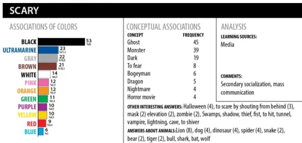
Figure 1. Concept-color associations “Bitter”.
"Bitter" is strongly bonded to red. Its color association is sharp. It is interesting to note that black is
correlated to "strong." Bitter is dominantly related to the sense of taste. Associations rely on sensory, practical and experiential sources. The concept of bitter has linguistic expressions that are associated with the object. An experience that upsets children is, in our opinion, a major factor in the construction of the association of bitter.
"Sweet" is related to yellow. Its source is the sense of taste. Yet, it was observed that "sweet" is
conceptualized with "cuteness." In assessing the association of sweet with yellow, it should be noted that the color of popular dumpling sweets produced in Turkey, where the study was conducted, is "yellowish." Moreover, the fact that kids with yellow hairs in cartoons tend to be described as cute may play a role in this association.
Figure 3. Concept-color associations “Hot”.
"Hot" is associated with red and yellow. The effects of experiences and stimuli on the associations of
this concept were observed. The effects of social learning, modeling and indirect experience (advice, warnings, etc.) were monitored. This finding suggests that as argued in the Ecologic Systems Theory, kids are affected by their immediate social environment (family, teachers, etc.) and, at the same time, they affect it. Based on this, it can be maintained that children formulate their associations in connection with colorful and hot food in their environment. For instance, we were urged to think that they frequently observe red-tinged black teas or yellow-colored herbal teas in their surroundings. In addition, perceptions stemming from the sense of touch are also noteworthy in this association.
"Cold" tended to be associated primarily with blue and then with white. The strongest color
association the study found was between cold and blue. This association is experiential and its source is the sense of touch. However, unlike with "hot" and "bitter," its sources of experience were multiple. The direct media effect was not observed. The findings suggest that children tend to associate the universe which they find it hard to imagine in terms of perception depth with white.
Figure 5. Concept-color associations “Fast”.
"Fast" can be described as a concept without a color or a concept whose color children failed to
agree on. They selected cool and warm colors from a wide spectrum. It can be said that the color association for "fast" is neutral in kids. Associations of "fast" were imperative as they were expressed with verbs. However, they were weak and based on observations, and their media effects were observed to be strong.
"Dirty" was associated strongly with black. It was associated with brown as well. From a sensory
perspective, it was associated with the sense of smell. Clothing and body constitute the micro-universe of the association of "dirty." It is known that the sense of taste is strongly related to the smell. In our study, the connection between "dirty" and the associations of "bitter" and "sweet" is noteworthy. Object and action structures shape the imagination of "dirty." In particularly, the fact that the children referred to mud as dirty implies certain alienation from the nature in kids and the immediate human environment in their learning sources. In the imagination of this concept, it was observed that visual elements were involved in the intellectual process. As a main category, black was used as the color of "dirty clothes." Adult discourse and learning effects were the learning sources of this association. Compared to "clean," "dirty" had a stronger association.
Figure 7. Concept-color associations “Clean”.
"Clean" was strongly associated with white. It had a consistent contrast to the relationship between
dirty and black. As for the associations, the positive state of an action was associated with white while the state of inaction was linked to black. Clean was imperative and it was associated with the senses of smell and vision. Perhaps due to acts of cleaning (washing hands, brushing the teeth, etc.), "clean" harbors action, and cultural influences and ecological traces in its imagination are noteworthy.
"Scary" was associated with black. It was linked to cool colors. It was observed that obscurity in
expressions was found/perceived as "scary." Scary was associated strongly with the object and weakly with the action. The imagination of scary was produced by structured associations. Metaphorically speaking based on a concept from the communications studies, "scary" was taught by adults to kids using a hypothetical syringe. "Scary" covers the child's imagination with obscurity it harbors and eventually chokes it. In addition, a scary thing heard in the media, especially in cartoons, is perceived as unimaginably scary.
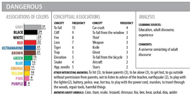
Figure 9. Concept-color associations “Dangerous”.
"Dangerous" was associated with gray. It was linked to cool colors, but given its distribution, its
relationship to colors was virtually neutral. In other words, no color was associated with "dangerous." This concept is constructed by blending a broad universe of connotations, stereotypes, adult suggestions and direct experiences. It is remarkable that the concepts of "scary" and "dangerous" do not contain concepts related to children's imagination. The minds of children are under pressure regarding these two concepts. As adults, we teach to children what they should be afraid of in alliance with different roles (mother or screenwriter).
"Boring" is directly associated with black. It was expressed with verbs having negative connotations.
We believe children have the associations of "boring" which are mirrored with boring experiences. "Boring" was expressed with neutral colors. It was associated with stagnation and negativity. It is a state in which children are passive and without any occupation, emerges as an emotion that stem from repetitive experiences in which they are sidelined or fail to participate. As for associations of "boring," it can be said that the states in which children are forced by adults to remain passive under their authority are experienced as extremely boring moments.
Figure 11. Concept-color associations “Beautiful”.
"Beautiful" is associated with pink, but its relationship with colors is neutral as it has a broad
spectrum of colors. This concept emerges as a combination of connotations which nurtures all senses or which are nurtured by them, but which have a dominantly visual nature. In short, a mixture of multiple senses, particularly including the sense of vision, is linked with "beautiful." This concept is feminine. It is interesting to note that boys tend to describe beautiful as pink. In other words, for boys, beauty harbors a layer associated with gender. From the reverse angle, beautiful is something and the color of this beautiful thing is pink.
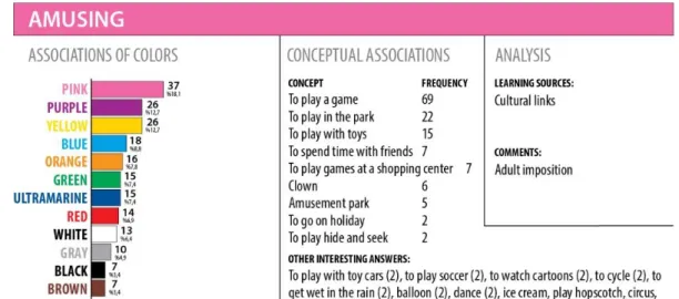
"Amusing" is associated with pink. It is consistently the opposite of "boring." It is close connotations
with "funny." It is expressed with verbs. It is an action-based experience. It is used to express outside the house or actions which are performed freely and fun and experiences outside responsibilities. It is connected to the imagination of freedom. Just as "scary" harbors traces of adults, "amusing" is extremely far from traces of adults. The children exhibited less pressure as they envisaged this concept. In other words, the children remained as children in the most powerful manner with this concept. Rarely, actions outside home and action themselves were described as amusing. We believe that children tend to have fun when they can act freely and independently and when they are busy with the output of such cases.
Figure 13. Concept-color associations “Strong”.
"Strong" is neutral. It was the only concept that didn't produce any distinguishing answer. It is not
experiential. It is something that is observed physically. "Strong" is a connotation linked to now. It does not imply a distant time. Its association is difficult. It is linked with adults themselves. "Strong" makes sense not among children, but in the world of adults. This is the way this concept makes into the imagination of children. We believe that this result is good news for children while it is thought-provoking for adults. We face once again the fact that power is an ideological device and an artifact of the world of adults.
"Funny" is associated with red. It is something warm. It is a manifestation of, amusing, nice and
lovely things. It imparts energy. It has colors similar to those of "amusing." Both phrases and sentences were used to describe "funny." The effects of the popular culture were visible in associations of "funny." For instance, clowns are not part of the traditional Turkish culture, but they are familiar, funny things for kids. It is implicated that what is funny facilitates learning. "Funny" is a concept that is hard to describe directly. The children made use of situations to describe this concept.
The hegemonic influence of adult discourses on the imagination of children was visible in the learning sources of the children's associations. The phrases used by the children such as "muscle," "do sports," and "eat" exhibit traces of adult influences on children. This applies to such assertions as "If you eat your food, you will be strong" or "If you are muscular, then you are strong." The phrases related to the "father" have signs of motivations for "achievement" and "determination." In other words, the "father" is a figure that is associated with "power." Regarding the concept of "strong," the children didn't express any association with the mother. This implies that the domination or gender relations have penetrated into the world of children as well. In the context of cleaning, children tend to make sense of living by making observations from adults. It is interesting to note that the children placed greater emphasis on taking a bath than on washing hands or the water itself in connection with the associations of cleaning. The children hear these reminders frequently and image as the reality itself. The matching between colors and basic concepts and gender differences are given in Table 1.
Table 1.
Personal Characteristics of Teachers.
Colors Kolmogorov-Smirnov Z Statistics P value
Bitter_color .83 .50 Sweet_color .92 .37 Hot_color .49 .97 Cold_color .74 .65 Fast_color .54 .93 Dirty_color .44 .99 Clean_color .92 .37 Scary_color .84 .48 Dangerous_color .67 .76 Boring_color .64 .81 Beautiful_color 1.47 .03 Amusing_color 1.22 .10 Strong_color .79 .56 Funny_color .82 .51 p≤ .05
In the signification of colors, Kolmogorov-Smirnov test produced a gender-based difference only regarding the concept "beautiful." No gender-based difference was found in connection with other concepts. These findings suggest that gender is not a distinctive factor in color preferences related to certain basic concepts in preschool children.
Discussion, Conclusion and Implications
This study with an interdisciplinary approach indicates that color is a multi-layered phenomenon. Colors are among food for children's receptive minds and children make sense of them through social learning. Images are kept outside the self-consciousness part of the adult mind, but they are part of that very part in the children's perceptive mind. Children use their own mental muscles and, to this end, use whatever they find in their surroundings.
Children tend to treat colors as an integral part of objects and it is hard for them to regard colors independently of the objects they observe (Vernon, 1971). It is believed that smaller children are affected by visual cues and they rely on perceptible dominant characteristics like color and size to categorize products and brands (John & Lakshmi-Ratan, 1992; Leon, Couronne, Marcuz, & Koster, 1999; Macklin, 1996; Zaltman, 1997). The fact that, depending on their age and development level, children are unable to distinguish between an object and its color is an opportunity for our study. As identifying the sources of learning constitutes one of our study's basic goals, this will help us monitor how these children learn by making associations between colors and objects. In Zentner's study (2001), the order of preference for colors for the children aged three and four years was red, pink, dark blue, yellow, bright green, bright blue, dark green, brown and black. No gender-based difference was found in these preferences. Our study also looks for gender-based differences in color preferences.
Boyatzis and Varghese (1994) examined children's emotional association with colors and interviewed 60 children aged between five and six and half years about their favorite colors and what they feel about each color. There were gender differences in making sense of brightness and darkness effects and colors. In our study; it was found that gender was not distinctive in the color preferences of some basic concepts in pre-school age children.
Marshall et al. (2006) interviewed preschool children about their favorite colors in the packaging with the purpose of identifying the role of the packaging color in product selection in three product categories (cereals, biscuits and drinks) based on age and gender. Their favorite colors turned out to be pink, purple and yellow. There was high correlation between favorite colors and production selection. Our research is not limited to the relationship between color and food. Indeed, curiosity solely about the effects of colors on food preferences is not enough. This study is designed with a multi-tier (color-concept interaction) and a holistic (identifying sources of learning, interdisciplinary approach) perspective.
Mohebbi (2013) found that children tend to like energetic, exhilarating, shiny and bright colors more than dark, gloomy and saddening colors. Colors are visual reinforcement components with a critical significance in the enrichment of the learning processes, in this research. It is striking that the children had very similar color preferences for the concepts "beautiful" and "amusing," and we can say that the children had a color spectrum that started with bright colors and ended with neutral colors for these two positive concepts. In this context, it can be argued that the colors like pink, purple, yellow, blue, and orange can be used in the messages which are intended for beautiful and amusing associations, and they should not be preferred for the "dangerous" or "fast" messages.
Warm colors and cool colors were strongly associated with the concepts "hot" and "cold," respectively, and this conceptually signifies parallelism with the color information literature.
It should be noted that associations cannot be linked only with a single color. A specific color was chosen strongly in connection with certain concepts while certain secondary and tertiary color preferences appeared to be more salient compared to other colors. In designs that seek to create associations regarding these concepts, the use of two and three colors in combination rather than one color may strengthen the perceptions of these concepts. For instance, while blue is chosen for the concept "cold," white and ultramarine have stronger effects than other colors. If these three colors are used in combination in the designs which seek to create the perception of cold, this will enhance the message. Certain positive concepts may unite to support a stronger positive concept at a higher layer. For instance, the concepts "sweet, amusing, clean and beautiful" and the bright colors which are associated with them will bring about happiness. Otherwise, negative emotions may emerge. A strong correlation was identified between black and negative emotions. Therefore, it should be taken into consideration that black will limit children's imagination and reduce the sense of happiness. In designing messages, black may be used to describe the cases which make children unhappy, but when the experience of unhappiness ceases to exist, it should be removed from the message in order to improve its effectiveness. Basically, cool colors tend to have a negative impact on perception.
The fact that the four colors which were perceived as "boring" (or not amusing) were associated also with other negative concepts --"dirty," "scary," and "dangerous"-- implies that these colors are associated by the children with negative concepts. Color preferences for the opposite concepts such as hot-cold or bitter-sweet, or clean-dirty have an internal consistency like the contrast between the concepts.
It is striking that the children had very similar color preferences for the concepts "beautiful" and "amusing." A color spectrum was observed in the children for these two concepts. These colors were pink, purple and yellow from the strong to the weak.
The consistent relations that emerge in children's color-concept associations have direct tips that can be used in visual communication design:
It was observed that the children's color preferences regarding the concept "boring" didn't produce
any strong relationship with any color, but four colors were associated with the concept "boring" with an equal distribution. These four colors which we may describe as neutral colors --namely, black, white, gray and brown-- were the least preferred colors with an equal distribution as regards the concept "amusing," which is the opposite of the concept "boring." This relationship suggests that children do not consider black, brown, gray and white as "amusing." For instance, if its walls are painted blue, the classroom may be perceived as cold by children. Likewise, the covers of children's books shouldn't have the colors that are associated with the concept "boring."
The fact that the four colors which were perceived as "boring" (or not amusing) were associated also
with other negative concepts --"dirty," "scary," and "dangerous"-- implies that these colors are associated by the children with negative concepts. For instance, when the colors that are associated with "dangerous" are used, other negative emotions like "dirty" and "scary" may be expressed simultaneously.
Implications
Senses are active in the process of making sense of colors. Blue, pink, white and similar colors which
create positive feelings in children and which do not give them a sense of spatial or motional restriction may be preferred in learning spaces (actually, every environment can be regarded as learning space) to boost the children's motivation for experiencing, discovering and imagining, and increase the efficiency of learning. As seen in the associations of danger, if learning spaces contain colors which are associated with danger, they may turn into a barricade warning. For instance, if walls of learning spaces are painted white, this will eliminate boundaries and support mobility and creativity. These suggestions are not restricted to the color use in learning spaces, but they can be considered as recommendations for urban architecture as well
A teaching method shouldn't be designed to ensure that children stand still without moving.
Stagnation and repeated stagnation or mobility that gives the impression of stagnation due to repetition will make the content of learning, and, in a broader sense, the education itself boring. If the colors which are perceived as boring such as black, brown and gray are not used in the spaces or materials that are intended for children, this may decrease the sense of tedium.
In this study, the learned concepts which are not authentic like "ghosts" or "monsters" appeared as
symbols for scary things in the children's answers. This means that the sense of uncertainty is one of the components of the imagination of scary in children. To say, "I will give you a scary punishment; ghosts will come," is hardly pedagogical. The remote feelings which children cannot imagine in their experiential universe are associated with cool colors. For this reason, adults who are capable to adopting positive perspectives on matters at all times can teach their children how to think positively.
What colors should be used in the color identity of any brand? What colors should not be used? The
findings of this study suggests that red is bitter, hot and funny and it is not dirty, strong or scary. Black is dirty, scary and boring; it is not funny, amusing, beautiful or clean. Pink is beautiful and amusing; it is not fast or boring. Purple is strong; it is not warm, cold or dangerous. Brown is dirty and boring; it is
not clean, amusing or beautiful. Yellow is sweet; it is not cold or boring. Blue is cold; it is not scary. Gray is fast and dangerous. Beautiful is the mother; strong is the man/the father; scary is unknown; amusing is motion; bitter is what they taste; cold is what they touch; boring is static. The findings of this study can be of use for branding. For instance, a brand that promises amusement may boost its perception in the market through effective use of concepts and colors. If we want to keep our children away from certain objects in everyday life, we may chose colors they find boring. Further research may be conducted to study the relationship between multi-layered concepts and colors.
Essentially, in this study:
Linguistic differences were observed in children's associations regarding colors. Some associations are related to nouns while others are linked with adjectives. Others are directly connected to verbs in a dominant manner. In this case, a color can be interpreted as an independent phenomenon with an independent sensation rather than something that adds qualification to a phenomenon.
The quality of the content in the media productions that globalize popular culture products should be improved. The effects of the mass media in formation of connotations about negative phenomena are openly visible.
Children tend to think intuitively rather than logically. The ecological effects on children, suggestions, adult discourses, other learning effects and cultural and religious belonging of adults are reflected in the associations. Metaphorically speaking, children act like sponges in making sense of the world. Colors constitute one of the phenomena of this multilayered world which they try to understand.
An adult who reads this article with a pedagogical approach should remember that children know or perceive this world via adults (Saxe, Guberman & Gearhart, 1987). Every child is a unique subject. Every child can develop unique relationship with any color.
Türkçe Sürüm
Giriş
Bu araştırmanın akademik kapsamı, renklerin ve bazı kavramların öğrenme-sosyalizasyon sürecinde nasıl edinildiğini ve içselleştirildiğini; tüketim, kültür endüstrileri, diğer boş zaman etkenleri gibi (toplumsal-kültürel, hegemonik) tali sosyalizasyon süreçlerinin renklerin ve bazı kavramların anlamlandırılmasına nasıl dahil olduğunu anlamaya çalışmaktır. Renklerin nasıl öğrenildiğine ve kavramlarla ilişkisine bakmak, tümevarımsal bakış açısında sosyal öğrenme sürecinin anlaşılması için ufuk açıcı olacaktır. Bir bireyin sosyal dünya içinde kendi varlığını dışsallaştırması, aynı anda bu dünyayı nesnel bir gerçeklik olarak içselleştirmesidir. Yani “toplum içinde olmak”, toplumun diyalektiğine katılmak anlamına gelir ve kişinin hem kendisini anlamasını hem de yaşadığı dünyayı anlamlı bir sosyal gerçeklik olarak kavramasını içerir. Bu çalışmada, renkler de bu etkileşimli anlam üretim sürecinin bir unsuru olarak incelenecektir. Odaklandığımız bireyin asli sosyalizasyon olarak adlandırılan yani bireyin çocukluk döneminde başından geçenler onu toplumun bir üyesi haline getirmeye yarayan süreç ve tali sosyalizasyon olarak adlandırılan yani zaten sosyalleşmiş bir bireyi, toplumun yeni kısımlarına sokan sonraki süreçlerde (Berger & Luckmann, 2008:79) renk olgusunun yeri nedir anlamaya çalışılacaktır. Renkler, kavramsal çağrışımlara eklemlendiğinde, her iki sosyal öğrenme sürecinde de izlenebilir-anlamlandırılabilir hale gelecektir.
Renk, varlıklar için ontolojik bir niteliktir. Tüm varlıklar, renk adı verilen özel bir nitelikten oluşur ve hep birlikte “renkli” bir dünya yaratırlar. Renk, nesneleri birbirlerinden ayırt edilmesini kolaylaştırma gibi yüzeysel bir işlevsellikten öte, girift bir duyu kapasitesidir ve kromatik uyaranlara belirginlik ve anlam atfetmek için kullanılmaktadır. Bunun göstergelerinden biri insanın yalnızca özel renk tercihleri sergilemekle kalmayıp, aynı zamanda okul yaşından itibaren renklere duygusal özellikler de atfetmesidir (Boyatzis & Varghese, 1994; Guilford & Smith, 1959; Karp & Karp, 1988; Terwogt & Hoeksma, 1995; Valdez & Mehrabian, 1994; Whitfield & Wiltshire, 1990; Zentner, 2001). Tüm öğrenme pratiklerinde, öğrenme kapasitesinin yüksek olduğu dönem çocukluk olarak kabul edilir. Renklerin öğrenilmesi ve renklere anlam yüklenmesi de çocukluktaki bu aktif öğrenme sürecinde izlenebilir. Rengin çocukların sosyal davranışlarını ve psikolojik tutumlarını etkilemesi, çocukların renklere reaksiyon gösterme mekanizmaları nedeniyle psikolojide, eğitimde, pazarlama iletişiminde dikkate alınmak durumundadır. Örneğin, eğitim mekânlarının-materyallerinin-etkinliklerinin tasarımında rengin etkin kullanımı özel bir önem taşır. Rengin kendine özgü bir dili vardır ve görsel iletişimde bir dil olarak kabul edilir. Her renk, kendi etkinliğine ve özelliğine bağlı olarak, kişinin psikolojisini bir şekilde etkileyecek ve sonuç olarak psiko-sosyal tepkilere-etkilere neden olacaktır.
Özetle, örneklemi çocuklar ile sınırlandırılmış renk-çağrışım araştırmalarının sonuçlarından, görsel iletişim tasarımında ve tüketici grubu çocuklar olan markalamada yararlanılabilir. Eğitimde öğrenme stratejilerinin oluşturulmasında, eğitim mekanlarının tasarımında, öğrenme etkinliği planlanmasında, yardımcı eğitim materyali geliştirilmesinde, her türlü anlama-öğrenme pratiğinin verimliliğini iyileştirmede yararlanabilir. Kısaca eğitimde öğrenmeyi kolaylaştırabilir. Çünkü, çocukların olumlu cevap verdikleri renkler kullanılarak sunulan bilgileri hatırlamaları ve geri çağırabilmeleri daha olasıdır. Ayrıca yetişkin, medya-çocuk etkileşiminin yorumlanmasında ve tüketim kültürünün analiz edilmesinde, eleştirilmesinde de işlevsel olarak kullanılabilir. Bizim çalışmamızın düşünce alanına özgün katkısı, çocukların renk tasavvurunun anlaşılmasını sağlayacak şekilde renklerin öğrenme kaynaklarını, imgeler ve dilsel ifadelerde ortaya çıkan bulguları mercek altına alarak renk ile kavramların nasıl ilişkilendirildiğini yorumlayan disiplinlerarası bir bakış açısı sunmasıdır. Daha önce çocukların renk tercihleri üzerine betimleyici birçok çalışma yapılmıştır. Araştırmacılar, renklerin çocuklar üzerinde önemli etkilerinin varlığı hususunda görüş birliği içindedir. Mevcut araştırmalar ilham vericidir. Ancak bu çalışmalarda, renklerin ve bazı temel kavramların öğrenme kaynakları sunulmamıştır. Tüketim tercihleri ile renklerin
ilişkisi araştırılırken genellikle yiyeceklere vurgu yapılmıştır. Örneğin, medya gibi günümüzün önemli referans kaynaklarının etkileri dikkate alınmamıştır. Renk ile ilişkili tüketim tarzlarına odaklanmış için özgün araştırma tasarımları da sınırlıdır. Mevcut araştırmaların az sayıda olması, bu az sayıdaki araştırmada çok küçük örneklem gruplarıyla bazen yaş grupları oluşturulmadan yapılmış olması açıklanmaya çalışılan olayların güvenilirlik sorununu beraberinde getirmiştir. Bizim araştırma motivasyonumuz, renk ve rengin duygusal çağrışımlarının daha ileri araştırmalar gerektiğidir. Çünkü önceki araştırmaların sonuçları renk tercihi, yaş, cinsiyet, uyaran malzeme ve yiyecek türü açısından yetersiz kaldığından (Choungourian, 1968; Silver et al., 1988), çocukların renk tercihleri hakkında çok daha özgün öngörüler geliştirilmesi gereklidir.
Bu çalışmanın önemi, çocukların renk tercihlerini tespit etmekten öte, çocukların dünyayı anlamlandırma sürecinde rengin etkisini ve rengin öğrenme kaynaklarının yorumlamasıdır. Özde bu çalışma; çocukların en çok bildiği ara-ana ve nötr renklerden 12’sinin; “sarı, turuncu, kırmızı, mor, yeşil, mavi, lacivert, beyaz, kahverengi, siyah, gri, pembe”, 14 temel kavramın (tatlı, acı, sıcak, soğuk, sıkıcı, eğlenceli, hızlı, güçlü, temiz, kirli, tehlikeli, güzel, korkunç, komik) nasıl ilişkilendirildiğine odaklanmıştır. Bu sayede, okul öncesi dönemde çocuklarda: 1. Renklerin çağrışımları ve bu renklerin öğrenme kaynakları 2. Bazı temel kavramların çağrışımları ve bu çağrışımların öğrenme kaynakları 3. Renk-kavram etkileşimi ve bu etkileşimlerin öğrenme kaynakları 4. Renklerin kavramsal çağrışımlarında cinsiyet farklılıkları, betimlenmektedir ve yorumlanmaktadır. Ek olarak, araştırma bulgularından tasarım, markalama, eğitim materyali geliştirme gibi alanlarda nasıl yararlanılabileceğine ilişkin somut öneriler geliştirilmiştir.
İlgili Araştırmalar
Hine (1997), renk deneyiminin üç farklı düzeyde meydana geldiğine inanmaktadır: fizyolojik, kültürel ve ilişkisel. Fizyolojik deneyim evrenseldir ve istemsizdir. Kültürel deneyim zaman içerisinde kurulan görsel geleneklerden doğar. İlişkisel deneyim ise özellikle ürün kategorilerinde pazarlamanın doğrudan bir sonucu olarak, ambalajlardaki renk beklentileri ile ilgilidir. Fakat, Hine’nın çalışmasında bulgularının çocuklara nasıl hitap ettiği açık değildir. Ancak söz konusu olan çocuklar olduğunda (vurgu bize ait), çocukların zihni açık, ruhu yumuşak ve savunmasızdır. Yaşamlarındaki bileşenlerin tümünün onların öğrenme şeklini ve ne öğrendiklerini bir şekilde etkileyeceğini belirten Mohebbi (2013), çocukların, enerji taşıyan neşe ve mutluluk verici parlak, aydınlık renkleri, karanlık ve üzüntü verici renklerden daha fazla sevme eğiliminde olduklarını tespit etmiştir. Renk, öğrenme sürecini zenginleştirmede kritik bir önemi olan görsel bir güçlendirme unsurudur. Rengin kaçınma veya çekilme davranışı gibi olumsuz bir davranışa neden olabileceğine, performansı etkilediğine ve duyuları uyardığına inanılmaktadır (Jalil, Yunus & Said, 2012). Rengin uyarıcı değeri, araştırmacılarının ilgisini çekmiştir.
Erken tarihli Burnham, Hanes, ve Bartleson’ın çalışması renk tercihlerine odaklanmıştır (Norman & Scott, 1952 Cite in: Birren, 1963). Çocukların griyi ve kahverengiyi diğer temel renklerden (mor, pembe, kırmızı, turuncu, sarı, yeşil, mavi, beyaz ve siyah) daha az tercih ettiklerini ortaya çıkaran Pitchford ve Mullen (2005), renk tercihi, dil ve renk idrakinin gelişmesi arasında bir bağlantı önermişlerdir. Terwogt ve Hoeksma (1995), küçük çocuklar ile ilgili araştırmalarında renkler ve duygular arasında bir bağlantı bulmuş, küçük çocukların renk tercihlerini ifade ederken renk ve duyguyu birbirine bağladıklarını izlemiştir. Mavi, sarı ve kırmızı tercih edilmiş ve beyaz genel olarak tercih edilmemiştir. Bu çalışmanın bulguları yorumlanırken, yedi yaşın altındaki çocukların zihinsel gelişimi henüz tamamlanmamış yani dolayımlama, soyutlama yetersizliklerinin bulunduğunu ve sınırlı bilgi işledikleri ve bir uyaranın tek bir boyutuna odaklanan “merkezleme” özelliği ile tanımlandığı (John, 1981, 1999; Piaget, 1952) unutulmamalıdır. Bu hatırlatmayı destekler nitelikteki bazı bulgular da çocukların seçimlerinin görsel veya sözlü bilgilerin geri alınıp alınmadığına bağlı olarak değişebileceğini göstermiştir.
Okul öncesi dönemdeki çocukların belli başlı metaforları anlama yeteneği olduğu genel olarak kabul edilmektedir (Gardner & Winner, 1986; Vosniadou, 1987). Ayrıca, çocukların duyguları, psikolojik olguları açıklayan metaforlara karşı duyarlılığının daha yüksek olduğu bulunmuştur (Winner, Rosenstiel, & Gardner, 1976). Metafor temalı daha yakın dönem çalışmalar, okul öncesi dönemdeki çocukların
duygular ile ilgili metaforlar hakkında bazı temel sezgisel anlayışlarının var olduğunu tespit etmiştir (Broderick, 1991; Waggoner & Palermo, 1989). Boyatzis ve Varghese’ın (1994), çocukların renkler ile ilişkili duygusal çağrışımlarını incelediği araştırmasında beş ile altı buçuk yaşındaki 60 çocuğa en sevdikleri renkler ve her bir rengin kendisine ne hissettirdiği sorulmuştur. Çocukların % 69.00’u olumlu (örn; mutluluk, coşku) cevap vermiştir. Cevaplar aynı zamanda belirgin renk-duygu birlikteliklerini işaret etmiştir. Parlaklık, koyuluk etkileri ve renkleri anlamlandırmada cinsiyet farklılıkları bulunmuştur. Kızlar, koyu renkleri “itici” bulmuşlar, erkek çocuklar ise koyu renklere ilişkin olumlu çağrışımlarda bulunmuşlardır. Bu araştırmada dikkat çekici olan, cevapların neredeyse yarısında siyah rengin olumlu duygular çağrıştırmasıdır. Siyahın olumlu görülmesi, renkler tasavvurunda öğrenme kaynaklarının ve diğer çevresel faktörlerin etkilerinin araştırılması gerektiğini işaret etmektedir.
Çocukların renkler ile duygusal çağrışımları arasındaki doğrudan ilişkiye odaklanan çalışmalar da bulunmaktadır. Bir araştırmada (Cimbalo, Beck & Sendziak, 1978), ikinci ve üçüncü sınıf öğrencilerine hakemlerin mutlu veya üzgün olarak derecelendirdikleri resimler gösterilmiştir. Çocukların tercihleri, güçlü duygu-renk çağrışımlarını yansıtmıştır. Çocuklar, mutlu sahnelere bakarken turuncu, sarı, yeşil ve mavi kullanmışlar, buna karşın üzücü sahnelere bakarken kahverengi, siyah ve kırmızı kullanma eğilimi göstermişlerdir. Daha eski bir çalışmada ise (Lawler & Lawler, 1965), okul öncesi çocukların mutluluk içerikli bir hikâye duyduktan sonra sarı bir kalem ile; üzücü içerikli bir hikâye duyduktan sonra ise kahverengi bir kalem ile boyama yaptıkları tespit edilmiştir. Ancak, daha yakın tarihli bir araştırmada (Buckalew & Bell, 1985), dört ile altı yaş arasındaki 18 çocuğa mavi, yeşil, kırmızı, sarı, beyaz, siyah, kahverengi giysili ancak yüz çizimleri eksik bırakılmış erkek ve kadın çizimleri gösterilmiştir. Ardından, çocuklardan her bir şekil üzerine yüzler çizmeleri istenmiştir. Araştırmacılar çocukların çizdikleri yüz ifadelerini, mutlu, üzgün veya kayıtsız olmak üzere üç kategoriye ayırmış ve çocukların spesifik duyguları giysilerin renklerine dayandırmadıklarını bulmuşlardır. Çocuklar giysisinin rengine bakılmaksızın mutlu yüzler çizme eğilimi göstermişlerdir ve renklere bağlanan duygularda cinsiyet farkları tespit edilmemiştir. Bu çalışma bize, çocukların mutluluk yönelimli olduklarını düşündürmüştür. Walsh ve arkadaşları (1990), araştırmalarında beş yaşındaki çocukların genel olarak kırmızı şekeri yeşil, turuncu ve sarı olanlara tercih ettiklerini bulmuştur. Bu araştırmaların çoğunluğunun bulgularına dayalı olarak, kırmızının küçük çocuklar tarafından en çok tercih edilen renk olduğu kabul edilmektedir. Fakat bu araştırmalarda, çocukların her bir renk için tercih üstünlüğü açık bir şekilde gösterilmemiştir. Eşyalar ve ürünler ile ilişkilendirilmemiş genel renk tercihlerine bakıldığında kırmızı ve sarı iki yaşın altında en tutarlı ilgiyi çekmektedir (Staples, 1932). Kırmızı, iki ile dört yaş arasındaki çocuklar için gözde renktir ve kırmızıyı yeşil ve ardından mavi izlemektedir (Sharpe, 1980). Choungourian (1968) kırmızının beş yaşındaki çocuklar için en çok tercih edilen ve yeşilin en az tercih edilen renk olduğunu bulmuştur. Katz ve Breed (1922), çocuklar büyüdükçe tercihlerinin maviye kaydığını belirlemiştir. Çocuklar büyüdükçe renk tercihleri değişmektedir. Sarı beğenisi azalmakta veya tamamen yok olmaktadır. Olgunlaşma ile uzun dalga boyu (kırmızı, turuncu, sarı) yerine daha kısa dalga boyu (mavi, yeşil) lehine bir tercih ortaya çıkmaktadır. Bazı çok kültürlü çalışmalar, renk tercihleri konusunda çarpıcı benzerlikler bulmuştur (Birren, 1978; Garth, 1931), bazıları ise belirgin ulusal belirleyicilikleri savunmaktadır ve evrensel bir renk tercihi fikrini sorgulamaktadır (Choungourian, 1968).
Tüketim tercihi- renk ilişkisi araştırmaları daha çok yiyecek tercihleri üzerine yapılmıştır ve yiyecek seçiminde renk önemli bir unsur olarak kabul edilmiştir. Renkler sıklıkla tatlara ilişkin beklentileri yansıtmaktadır (Hutchings, 2003; Lavin & Lawless, 1998; Leon, Couronne, Marcuz & Koster, 1999; Walsh, Toma, Tuveson & Sondhi, 1990). Lowenberg (1934), yiyecekte rengin yiyeceğin iştah çekiciliği ile bağlantılı olduğu ve okul öncesi çocukların sarıyı ve turuncuyu tercih ettiğini fark etmiştir. Birren (1956) kırmızı, turuncu ve açık yeşilin genel olarak en çok tercih edilen yiyecek renkleri olduğunu tespit etmiştir. Walker, Hill ve Millman (1973), meyveler ile bağlantılı renklerin kuvvetli bir şekilde hoş tat beklentileri ile bağlantılı olduğunu ve sebzelerde açık ile orta derecede yeşilin koyu yeşilden daha çok tercih edildiğini fark etmişlerdir. Tourila-Ollikainen (1982), rengin tat ile ilişkili olduğu zaman daha olumlu bir etkisi olduğunu tespit etmiş ve Hyman (1983) etkileşim için yeterli tat bulunduğunda algıyı en fazla rengin etkilediğini belirlemiştir. Görüldüğü üzere (vurgu bize ait), yiyecek seçimi sayısız etkiler yansıtır (Booth, 1981; Christensen, 1985; Schutz & Wahl, 1981). İnsanlar renk, doku, tat, şekil, sıcaklık, görünüm ve koku